Featured
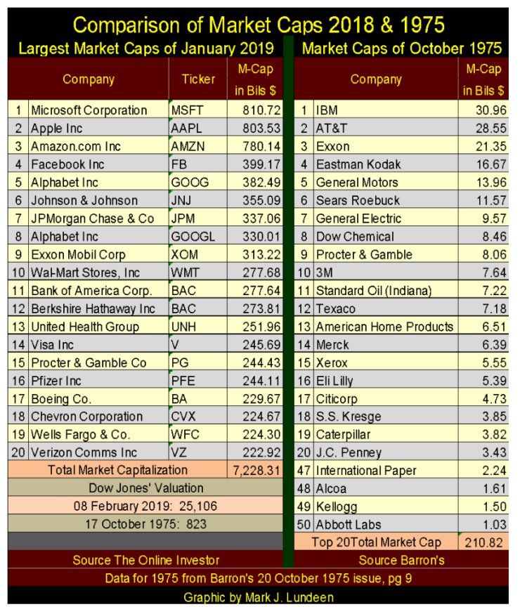
The differences in market capitalization between 1975 and 2019
Daily volatility has been reduced since early last month and the Dow Jones is expected to continue advancing to new all-time highs.

Another week of nothing much happening with the Dow Jones; since last Friday it has advanced by only 42.44 points. What’s to make of that? After the impressive advance that began after December 24 the market is taking a break. Don’t be surprised should the coming weeks bring more of the same.
However I remain short-term bullish, expecting the Dow Jones to make additional BEV Zeros in the BEV chart below come this spring or summer. These anticipated (but not guaranteed) new all-time highs will be the last hurrah of a monster bull market that began in August 1982. Following them come the deluge; a deflationary bear market that will claw back most of the inflationary gains seen since Ronald Reagan was president.
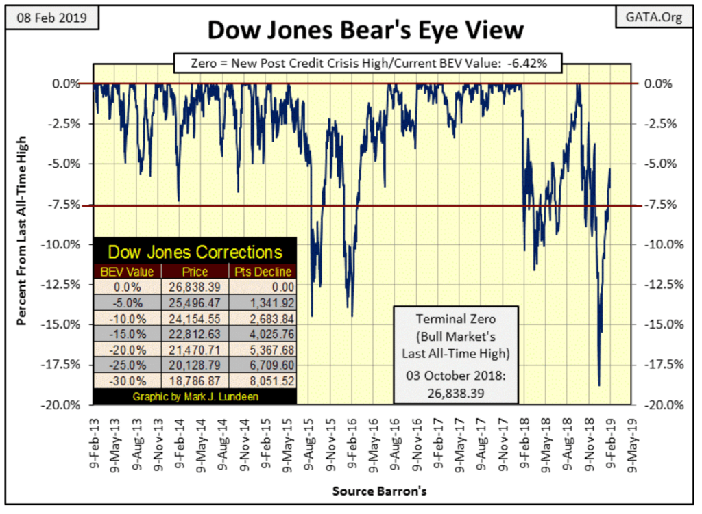
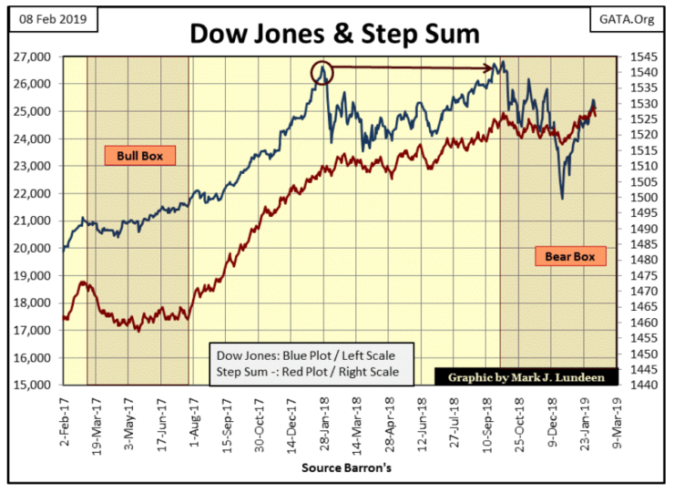
In my step sum chart for the Dow Jones further down in this article, there is a bear box I was ready to declare a failure. I used the declining trend line in the daily bar chart below as a trigger of when I was going to declare it a failure, when the Dow Jones’ rising trend cleared this line of resistance.
Looking at this chart one week later I can’t say the Dow Jones has met this measure, so the bear box remains on life support.
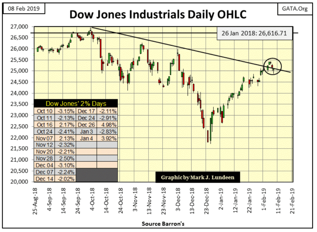
But looking at the bar chart above, there’s good reason for expecting the Dow Jones to continue advancing to new all-time highs, primarily because daily volatility has been greatly reduced since early January.
To see the importance of this we only have to look at what happened after October 3rd, the last all-time high for the Dow Jones. On October 10th the Dow Jones saw its first day of extreme volatility, declining 3.15% from a previous day’s closing price. It wasn’t the last the Dow Jones saw. A further fifteen extreme days of volatility took place during this 18% market correction, with the last seen on January 4th.
Okay, daily volatility has been greatly reduced. What is there to be concerned about as we progress through 2019?
Here’s what I’m looking at; the Dow Jones daily volatility’s 200D M/A below. In November 2017 daily volatility declined to levels not seen since the mid-1940s. This was a historic market extreme, and it’s not unusual for such extremes to be followed by a historic market reaction in the opposite direction.
But note that wasn’t the case for the mid-1940s experience of low market volatility. After the one-two punch of the Great Depression 89.19% crash and burn, followed by the 1937-42, 52.20% bear market bottom, the American stock market was pretty much purged of inflationary excesses flowing from the Federal Reserve. Need I say that this is not the case for the Dow Jones in February 2019.
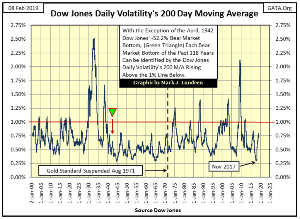
Post the November 2017 bottom (0.30%), daily volatility increased to 0.79% in early January but has declined to 0.73% at the close of this week. All that is true, but looking at the above long-term chart of daily volatility, all I see is rising daily volatility for the Dow Jones AND THAT ISN’T BULLISH. This is especially so when I consider how grossly over-inflated stock market valuations are today.
And exactly how grossly overinflated are our current market valuations? You have to consider how grossly inflated the financial system has become since the United States decoupled the US dollar from the Bretton Woods’ $35 gold peg in August 1971.
In Barron’s 20 October 1975 issue (page 9) they had an article on the 50 favorite blue-chip stocks held by institutional money managers. They listed these holdings by how many billions of dollars these institutional investors had of them and what percentage of the public float that was. That’s enough data for me to compute the market capitalization of these companies, which you see on the right side of the table below.
For today’s market capitalization of the twenty largest blue chip stocks, I used data from The Online Investor.
Not many of the old blue chips made the new list, but Procter & Gamble did. In 1975 it had a market capitalization of a then-whopping $8.06 billion. Forty-four years later its market capitalization has been inflated to $244.43 billion. That’s a 30.32 fold increase in the market capitalization for P&G. By weight, does P&G sell 30.32 times the tonnage of soap and toothpaste in 2019 than it did in 1975? I doubt it, but I know it costs much more now than then.
And at the bottom of the table’s left side I’ve given the market valuation for the Dow Jones, then and now; from 823 (not even a thousand) to over twenty-five thousand. The Dow Jones too saw a 30.5-factor advance.
And look at who are the big boys on Wall Street are then and are now. The top five in 1975 were companies that produced what we call today “hardware” – real stuff for sale in the market place.
Today’s top five deal primarily with “information”, mostly information on the lives of private citizens. A quick comparison of market caps then and now tells us the inflationary consequences of freeing the dollar from its $35 gold peg many decades ago. As I remember, IBM was the largest company in the world in 1975, a time when $30 billion dollars was an enormous sum. Today in 2019, how many private citizens have $30 billion for their net worth? More than a hand full!
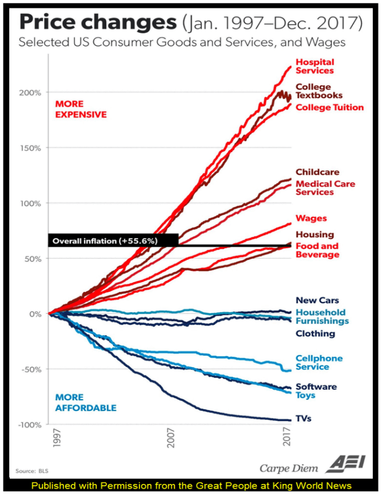
And it’s not just stock market valuations that have become inflated since the US Government decoupled the dollar from the Bretton Woods $35 gold peg. King World News last week published a chart of price changes since 1997, and except for wages, it’s just shocking how expensive things have become.
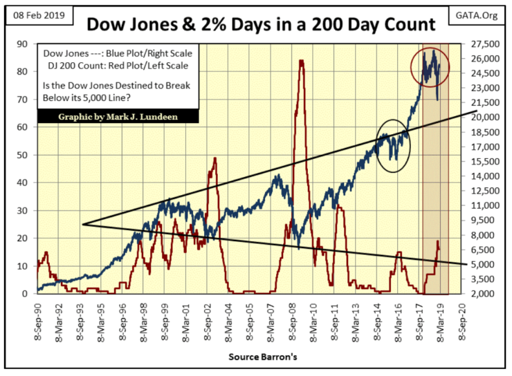
Moving on to the Dow Jones and its 200 count (the number of Dow Jones 2% days in a moving 200 day sample), the current count is at sixteen. Don’t expect much change in the Dow’s 200 count until the stock market once again feels the hot breadth of Mr Bear on the back of its neck, or until July when the days of extreme volatility from last October begin to expire in the count.
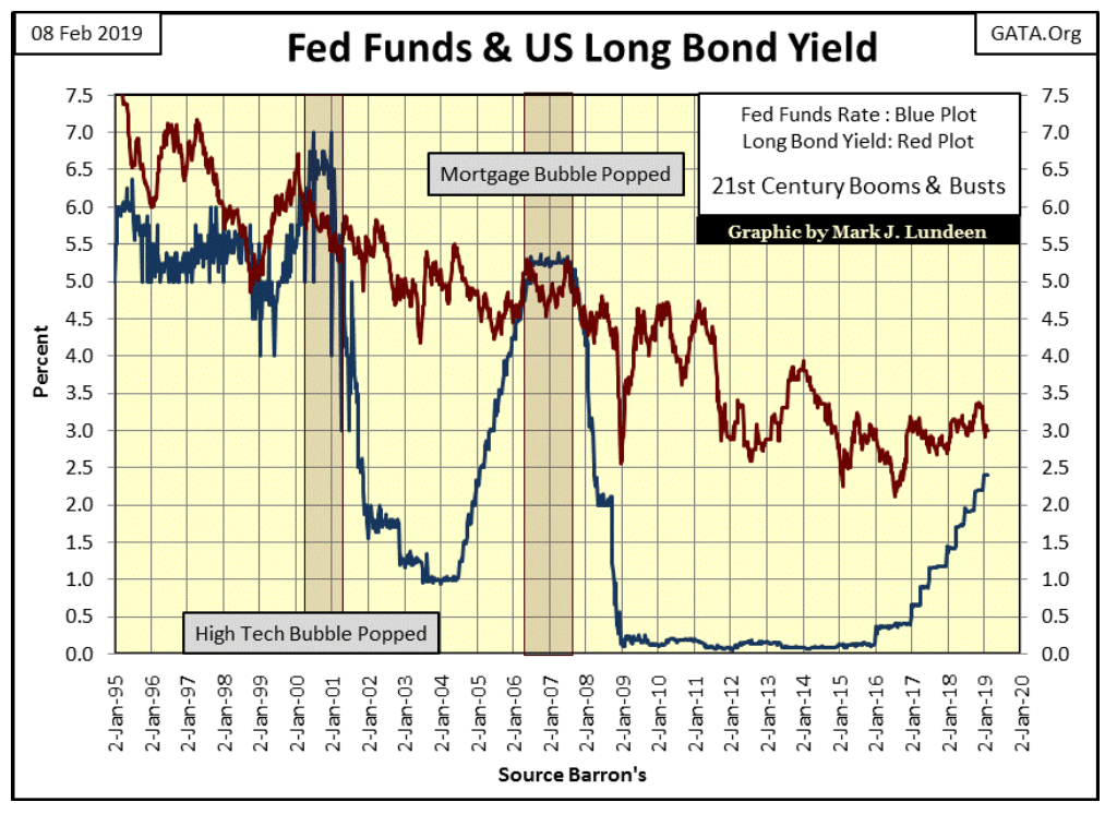
So which is it to be for 2019? More volatility (deflating market valuations) or continuing low volatility (inflating market valuations)? You should have asked that question to someone who is really smart. But since you asked me, I’m going to show you a chart of the Fed Funds Rate and the yields for the Treasury’s long bond below.
This is not a good chart for the bulls, which market history shows they make their big money when the gap between the Fed Funds Rate and Treasury yields is widening – not contracting as they have since 2016. Take a look at the chart. Does the gap (spread) between these two interest rates appear to be widening or contracting? That’s my answer whether or not being a bull in the stock market has much of a future.
And what happens when the Fed Funds Rate is increased to something above the yields for long-term Treasury bonds? When that happened in 2000 the Dow Jones saw a bear-market decline of 38% in October 2002. In 2007 a tiny yield inversion between these two rates resulted in monster 54% decline in the Dow Jones as the global financial system came within inches of melting down.
Recently, Fed Chair Powell announced he was going to slow down his program of stepping up the Fed Fund Rates. Exactly why can be seen in the chart below; he fears what Mr Bear may do should he continue increasing the Fed Funds Rate.
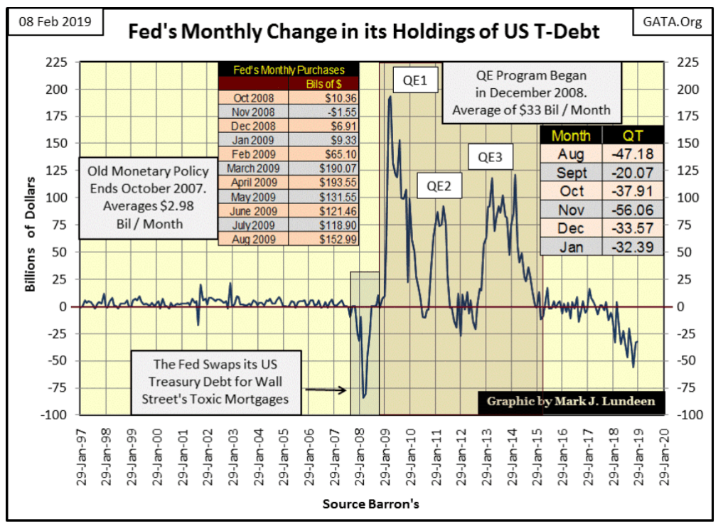
But Chairman Powell’s fear of Mr Bear may be doubted by the continuation of his program of quantitative tightening (QT) seen in the chart below. These are the monthly changes to the Federal Reserve’s holdings of US Treasury debt held as monetary reserves. Since March 2018 the FOMC has contracted its holdings of T-debt by double-digit billion dollar reductions.
The market can’t maintain its current inflated market valuations if the FOMC continues deflating its balance sheet.
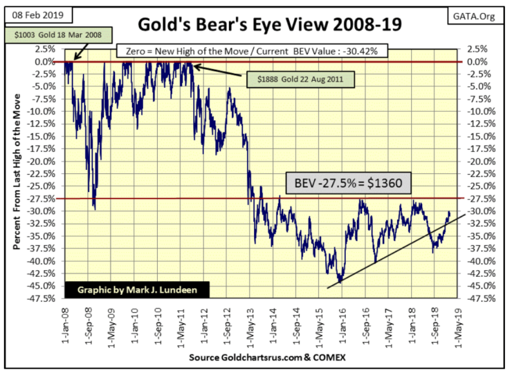
Like the stock market, current market action in the gold and silver market is tedious. In the chart below; whether the next big move for gold will be to break below my trend line, or break above it BEV -27.5 line, should current market conditions continue, it will do so with as few people watching as possible as gold is such a boring market.
I’m not making any predictions here, but bull markets typically begin with few people paying any attention to its advancement. I know the bull market for gold began in 2001, but the current lull in market excitement for gold may be the springboard to its next big move up.
Not that many “market experts” care, but currently in gold’s step sum chart market reality (price) and market sentiment (the step sum) are both trending up. But we should care as the most bullish thing any market can do is advance in price. Should these plots continue advancing, a day will come when everyone will care, but at much higher prices, which is exactly what happened when the late 1990s’ bull box closed.
A step sum plot is only a single item A-D line using the daily closing prices of a market series for its inputs. So, with the decline of the step sum in the late 1990s we see down days overwhelming the gold market, creating a foul market sentiment.
And what were the consequences of the multi-year declining step sum (market sentiment) on the price of gold (market reality)? Not much at all as the price of gold oscillated between $250 and $300. When the bull box closed in 2001, and gold’s price and step sum plots reversed to the upside, the second post Bretton Woods gold bull market began. A bull market that I believe continues today, though it may not feel like it.
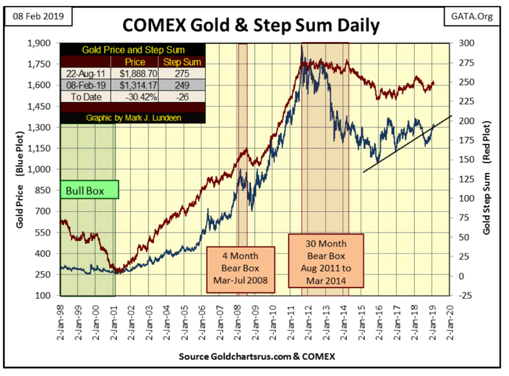
We see a little four month bear box in 2008. Then after gold saw its last all-time high in August 2001, a thirty month bear box developed. For the next two and a half years the price of gold did little but decline, while gold’s step sum (market sentiment) refused to follow. This was because the bulls in the gold market saw every daily decline as a buying opportunity, and bid up the price of gold the following day. This bullish market sentiment during a major market decline resulted in about as many up days as down, creating the bear box in the gold step sum chart.
This bear box closed as market sentiment (the step sum plot) once again recoupled to the bearish price trend gold found itself in for over two years. Typically, at the closing of this bear box most of the decline in the price of gold had already occurred. That didn’t matter to the bulls, who now only wanting out. The step sum’s decline signals the change in market psychology where the bulls now saw every daily advance as an opportunity to sell.
Note the near vertical collapse in the step sum from November to December 2015. This marks the capitulation stage of the August 2011 to December 2015 bear market in gold, making the close of 02 December 2015 ($1053.16) a very hard bottom for our current advance in the gold market.
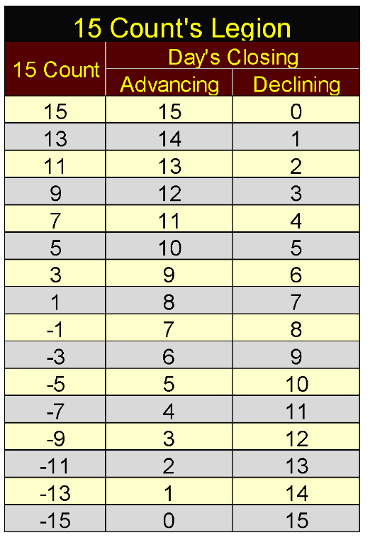
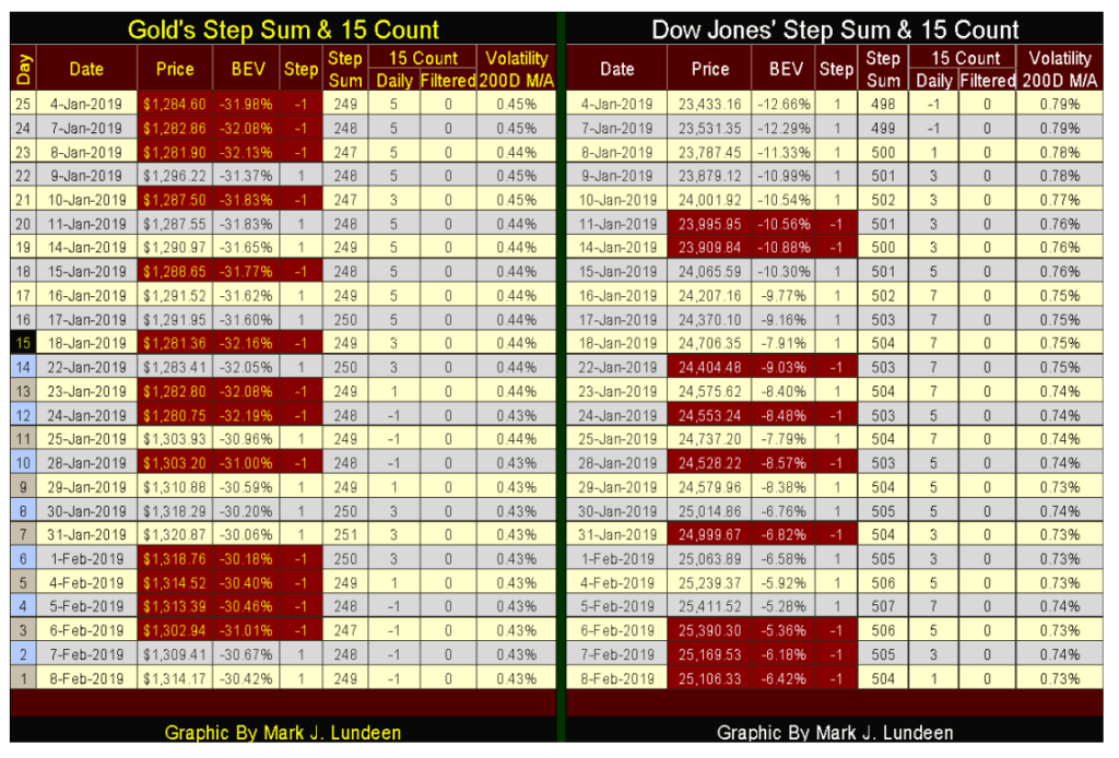
How hard a bottom? The November 17th 2015 gold step sum was a -13, and silver’s step sum was a historic -15 a day later on the 18th. The following table displaying the 15 count shows this historic market action; with gold seeing only one up day in fifteen, and silver seeing fifteen consecutive daily declines. It’s from bear-market extremes such as these that historic advances come from.
© Mark Lundeen
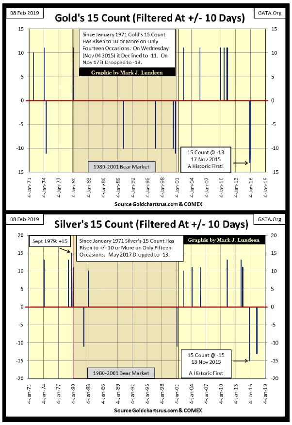
Here are two charts showing the history of gold and silver’s 15 count extremes.Seeing a (+/-) double-digit 15 count is rare market event, but the extreme lows gold and silver hit in November 2015 were historic.
© Mark Lundeen
Here’s the step sum chart for the Dow Jones. As I said at the beginning of this article, I’d like to declare our current bear box as a failure. But I’m not going to do it until the Dow Jones clears the line of resistance in its daily bar chart seen above.
In gold’s step sum table below, its 15 count fell from +5s down to a -1 at the close of this week. Well, gold has seen plenty of down days since January 4th. But its step sum is unchanged at 249, as the price of gold itself has advanced in the past month regardless of all those down days. All and all very constructive market action at a time when gold and silver are regarded as something less than desirable assets by most investors.
As for the Dow Jones and its step sum, both are going up nicely, though since the end of January the venerable Dow is taking a well-deserved break.
(Featured image by katjen via Shutterstock)
—
DISCLAIMER: This article expresses my own ideas and opinions. Any information I have shared are from sources that I believe to be reliable and accurate. I did not receive any financial compensation for writing this post, nor do I own any shares in any company I’ve mentioned. I encourage any reader to do their own diligent research first before making any investment decisions.


The TopRanked.io Guide to 2026’s Biggest and Best Affiliate Opportunities
Want to earn affiliate commissions on literal billions of dollars worth of revenue? Then this week, we've got something special...


Eni Advances Energy Transition with Major Investment and Emissions Cuts
Eni showcased its “Just Transition” report in Rome, highlighting stakeholder collaboration and progress toward decarbonization goals. The company invested over...


The German Fintech Market Shows Resilience and Strong Investment Growth in 2026
Germany’s fintech sector remained resilient in 2026 despite economic crisis and rising insolvencies. Investments reached €14.2 billion, showing strong investor...


Cannabis Legalization in Germany: A Mixed Interim Assessment
Germany’s cannabis legalization has reduced criminal cases and eased pressure on the justice system, while the black market is slowly...


Sustainable Restoration of the Haus Hövener Garden in Brilon
The Brilon Construction Workers Association is restoring the Haus Hövener garden into a cultural community space, funded through a €10,000...
 |
|
 |  |
 |
|
-

 Biotech1 week ago
Molecular Health Insolvency Leads to Restructuring Under New Company Name Lucera GmbH
-
 Fintech23 hours ago
The German Fintech Market Shows Resilience and Strong Investment Growth in 2026
-

 Cannabis1 week ago
Medical Cannabis in England Sees Shift Toward Vaporizers and Pills Amid Rapid Market Growth
-

 Africa2 weeks ago
Bank of Africa Leads Winners at African Banker Awards