Business
The Dow Jones May Be Going Up, but Investors Should Still Be Cautious
At the time of writing, the Dow Jones closed at 33,390. But it did not close over 100 until 28 September 1909. Still, from February 1885 to September 1909, the Dow Jones saw new all-time highs and percentage pullbacks from them. New all-time highs that were celebrated as much then as they are now. A 40% bear market decline in the 1890s hurt investors then as much as a 40% market decline would today.

This week, the Dow Jones recovered from last week’s close below its BEV -10% line. Or it did so on Friday, as the other days of this week it closed below its BEV -10% line. I don’t care. I’ll remain bearish on the Dow Jones until it closes in scoring position (above its BEV -5% line), and makes an honest effort to once again close at a new all-time high at the BEV 0.0% line.
So, is that all it would take to make me bullish on the stock market; yet one more all-time high for the Dow Jones? Yes, it would. But not bullish enough to encourage anyone to actually take a position in the stock market.
Geeze Louise NO! Whether the Dow Jones in the weeks and months to come sees yet another BEV Zero in its Bear’s Eye View chart below, or not, matters nothing to me, as I believe a terrible day-of-reckoning is coming to Wall Street.
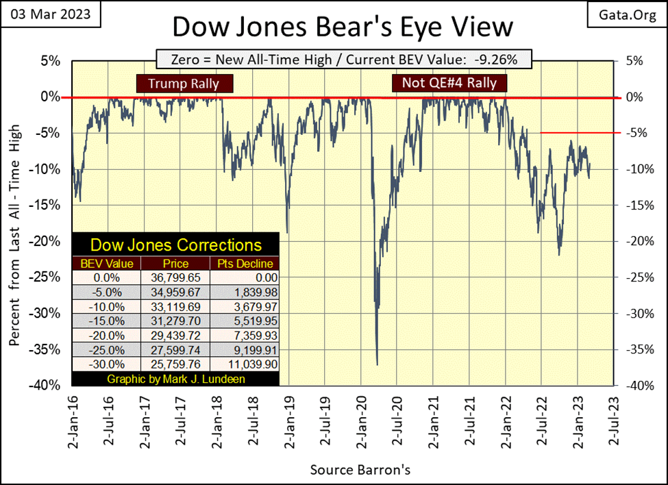
Keep in mind that at all market tops, risks to invested funds are maximum, while the potential for rewards for assuming those risks are at a minimum. This is what makes a market top, a market top; after a prolonged advance, there is nowhere else for the market to go but downward.
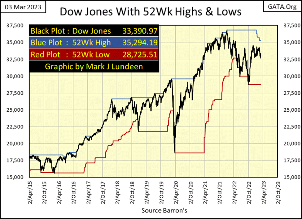
Let’s look at the Dow Jones (Black Plot), with its 52 Wk H&L lines below. Since 2016 (the last seven years), the Dow Jones advanced from around 15,000, to over 36,000; better than a double in seven years. As I see it, the prospects of it advancing 100% plus by 2030 are next to nil, so I’m bearish.
But if someone can look at this chart, and believe the Dow Jones will be closing at dollar values of something over 75,000 by 2030, well God bless you. However, I believe Mr Bear is not going to allow that to happen. In the chart below, the Dow Jones hasn’t advanced to a new 52Wk High for over a year, instead it has been pushing down on its 52Wk Low line, not a strong-buy signal for the broad stock market in my opinion.
Should the Dow Jones fail to push-up on its 52Wk High line sometime soon, but continue making new 52Wk Lows, daily closes something below 28,725, that would be very bearish. I believe that is going to happen next in this chart, is for the Dow Jones to once again push down on its 52Wk Low line. But we all have opinions, so we will have to wait to see what actually happens.
The major market indexes I follow lost ground all week long. Then came Friday, which recouped most of this week’s losses seen in the table below.
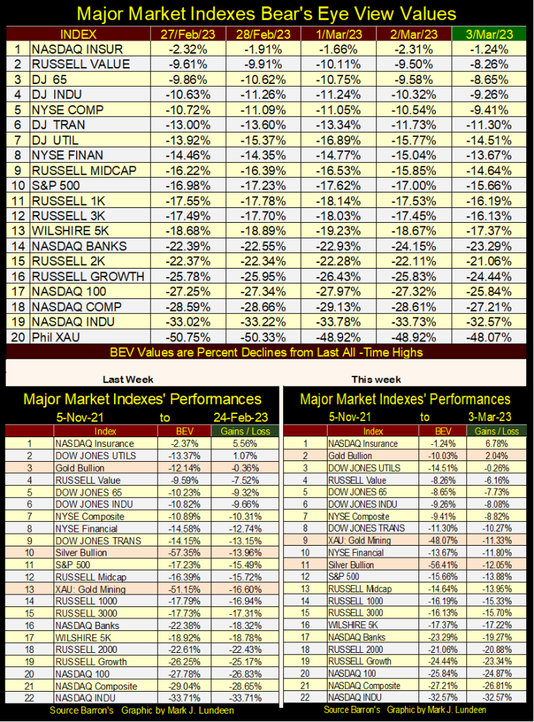
This week was a solid week for gold, silver and the XAU. Gold finally closed above where it was on 05 November 2021, and both silver and the XAU advanced a few percentage points from last week. The XAU really did good this week, moving up from #13 last week, to #9 this week.
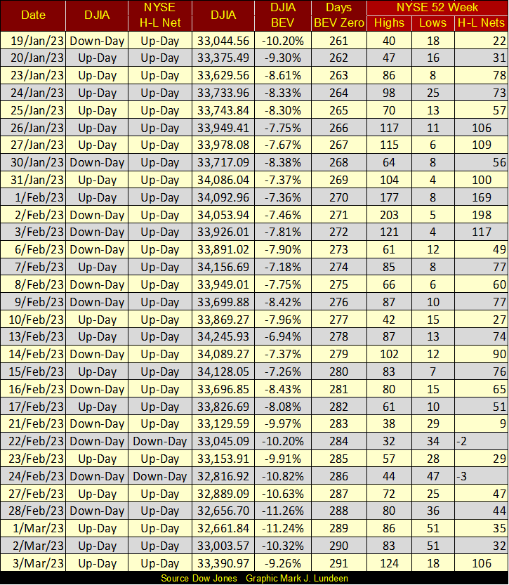
The Dow Jones may be going up, but 52Wk H-L Nets at the NYSE continue to be weak, as seen in the table below. At the NYSE, about 3,100 issues trade daily. If the market was advancing strongly, we’d see many more daily 52Wk highs. But we don’t, and exactly why is that?
I’m just a market enthusiast, someone who for some God-awful reason, began following the markets as a hobby while I was out at sea with the US Navy. So, what do I know? After four decades of following markets, not as much as I’d like to.
Still, this isn’t my first rodeo. Observing the inability of the bulls to generate sufficient buying power to create more 52Wk Highs at the NYSE, it’s apparent the market has topped over a year ago, at its last all-time high of 36,799 on January 4th 2022, and has slowly deflated since then. This is no time to become bullish!
Okay, when should investors become bullish? Let’s look at the NYSE 52Wk Nets during the March 2020 flash crash (below). Back then, the time to begin thinking about becoming bullish, if not actually buying, was when the bears ability to generate new 52Wk Lows began to wane; after March 24th below.
This flash crash was incredible. The “Days BEV Zero” column below lists the number of NYSE trading sessions since the Dow Jones last all-time high. In March 2020, just 10 trading days after the Dow Jones’ last all-time high, 52Wk Lows at the NYSE exploded, as panic gripped the market.
In the history of the NYSE, nothing else like this has happened; an explosion of 52Wk Lows just days after a new all-time high for the Dow Jones. This provides a warning to all that things in our “regulated markets” can go from great to horrible very quickly.
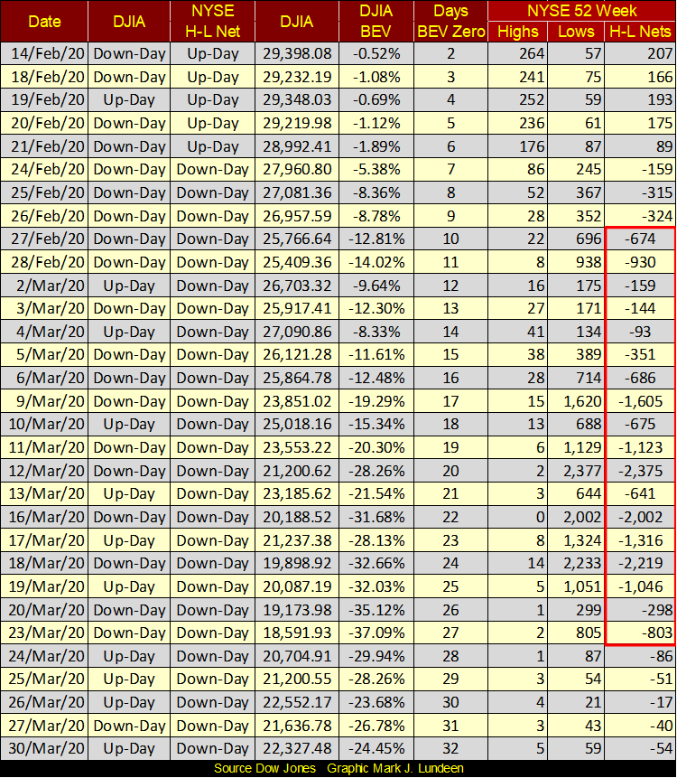
In the table above, we can see when Fed Chairman Powell’s Not QE #4 kicked in; on March 20th with the big reduction of NYSE 52Wk Lows. Had he not “injected” a few trillion dollars of “liquidity” into the financial system, the stock market would have collapsed into a second Great Depression market collapse. But Powell only bought some time with his Not QE #4. A historic market crash is currently pending, and what does he do then?
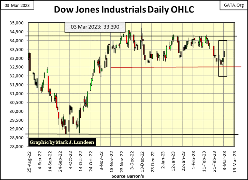
Looking at the Dow Jones in daily bars below, it tried but failed to close this week below its line of support at 32,500. Just as the Dow Jones tried, but failed to close above its line of resistance at 34,250 two weeks ago.
The Dow Jones has, for the most part, traded between these two lines since November; four months now. This won’t go on forever. Whichever line the Dow Jones does break to end this stalemate between the bulls and bears, should provide a good clue to what is to come next in the stock market.
But the truth be told, even if the Dow Jones goes on to a new all-time high, I’d still be bearish on the market.
Mark, why are you so bearish? Because there is too much debt in the financial system, and too much debt owed by consumers and the government. There will be massive defaults as bond yields and interest rates continue rising, and that will take down the entire banking system because the big banks are counter-party to a few hundreds-of-trillions in the interest-rate derivatives market.
Even the idiots at the FOMC know they can’t bail out Wall Street should their losses be on that scale. But they may try a hundred-trillion dollar QE #5 all the same. What do they have to lose?
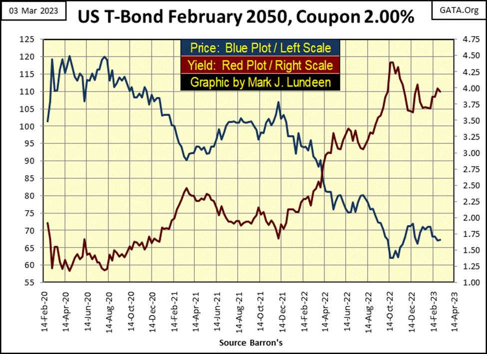
Below is a 30Yr T-bond, issued three years ago. It came with a coupon of 2%, but closed the week with a current yield of 3.94%, but was yielding 4.40% last October. All this bond has done for the past three years has been to lose money for its owner, and its losses (seen in the blue plot) were larger than any taken by the major market indexes I track. That isn’t supposed to happen in the T-bond market, and don’t think the global financial markets haven’t noticed it.
Here is a table for some bond yields I follow. They peaked in October / November, and have come down since then. BUT, once again are on the rise.
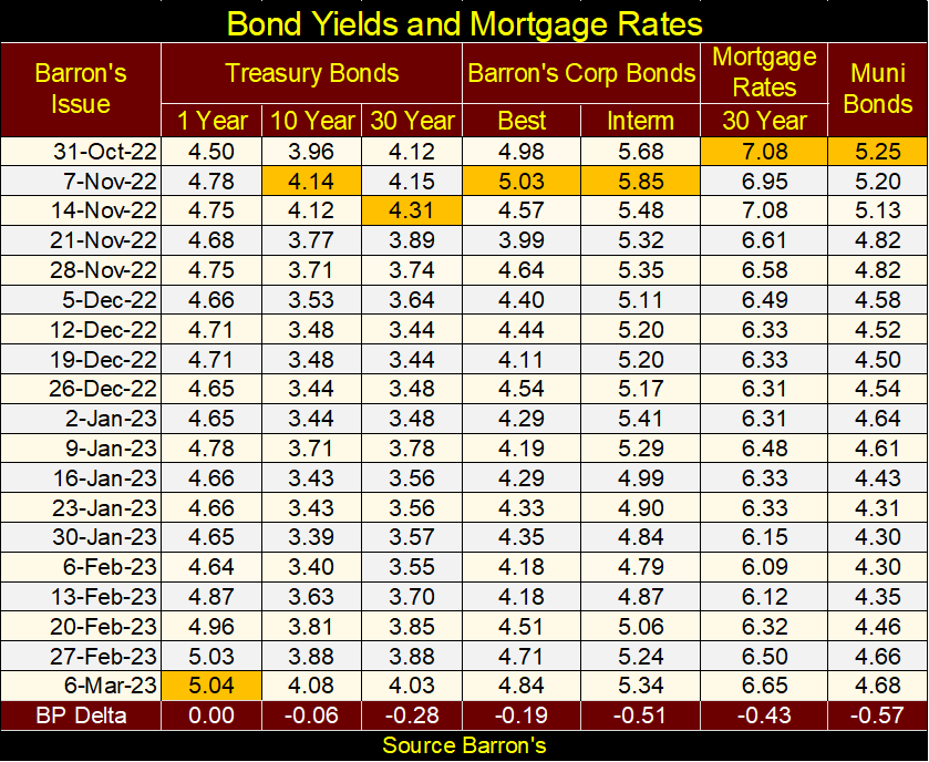
You want to know when Mr Bear is once again going to do his stuff on Wall Street, and when gold and silver once again resume their bull markets? I don’t know exactly when that will be in terms of time. But before these bond yields above approach 8%, and mortgage rates approach 10%, I expect we’ll see all hell break loose on Wall Street, and you’ll be happy to have some gold and silver bullion on hand.
I don’t cover silver as much as I do gold. Actually, I don’t cover silver at all, as it must be the most frustrating market to invest in, and comment upon, and has been for decades. Bullish developments in silver come to nothing. As a market commentator, commentating on silver is an excellent way to lose credibility with my readers. Still, my personal position in silver far outweighs my position in gold bullion, because I expect one day, the advance in the price of silver will be one long remembered.
Due to the abundance of gold, and scarcity of silver available in the market, the possibility of having the valuation of silver one day exceed the price of gold should not be ruled out. If that happens, well good for the owners of silver. But as seen in my chart below, plotting the silver to gold ratio (SGR) since 1969, during precious metal bull markets, the SGR declines to something below 40 ounces of silver for one ounce of gold. With the current SGR of 87.36, that would provide silver bulls with twice the gains of holding gold.
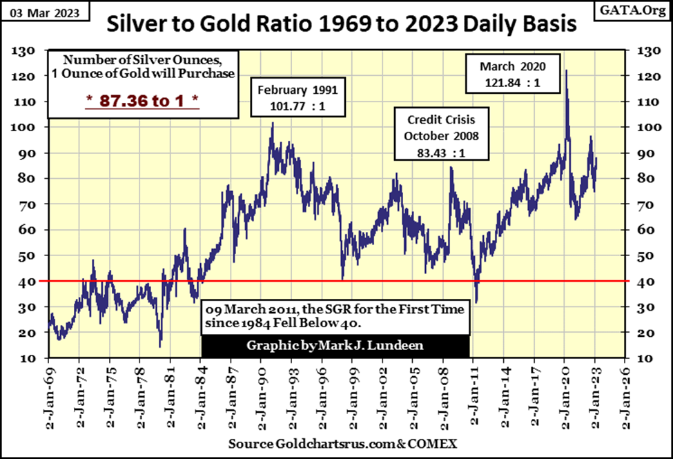
But if one is going to commit a few hundred of thousands of dollars towards buying precious metal bullion, the silver bullion that sum of money would purchase weighs quite a bit. So, purchasing some gold, currently a more concentrated form of wealth, is more practical for larger purchases.
Let’s compare the Bear’s Eye View (BEV) for gold and silver below. Remember, a BEV chart plots a market as Mr Bear sees it; with each new all-time high valued at only 0.00%, and never more, a BEV value I call a BEV Zero. All data points not a BEV Zero, registers as a negative percentage claw-back from its last all-time high. In effect, a BEV plot takes dollar data and compresses it between two percentage extremes;
- 0.00% (BEV Zero) – new all-time high,
- -100% – total wipeout in valuation.
This Bear’s Eye View of the market may seem much to do about nothing, but that is not so for any data series that goes back decades. Charting the Dow Jones, or gold in dollars over the decades of monetary inflation renders an inflation-distorted view of the market.
Today, the Dow Jones closed at 33,390. But it did not close over 100 until 28 September 1909. Still, from February 1885 to September 1909, the Dow Jones saw new all-time highs and percentage pullbacks from them. New all-time highs that were celebrated as much then as they are now. A 40% bear market decline in the 1890s hurt investors then as much as a 40% market decline would today.
So, a Bear’s Eye View of a data series that spans decades of inflation, as gold and silver has below, provides a superior view of the market than simply plotting their dollar values over the decades; a view of new all-time highs (0.0% / BEV Zeros), and percentage claw-backs from them.
A BEV chart is not intended to replace charts plotting market series with dollars. I use them both in my studies. But, if I were forced to choose one or the other, I’d much rather analyze any market in a BEV format, as it allows direct comparisons between any era of the market to any other in the BEV plot. This is something that cannot be done with charts plotted in dollars.
First, my BEV plot of gold goes back to January 1969, when gold was trading daily at around $43 an ounce. At the time, the official price of gold was $35 an ounce, and seeing gold being bought and sold at $8 an ounce above the official price of gold was a point of great concern at the time.
In the BEV chart below, gold has seen two bull markets and one big bear market separating the two since 1969. In the first gold bull market (1969 to 1980), gold saw higher daily volatility than in its second bull market (2001 to 2023). Before 1980, it was not unusual for gold’s valuation to be clawed back 20%, or more from a BEV Zero, before returning to a new BEV Zero.
Gold had a massive bear market from 1980 to 2001, which saw a 70% claw-back from its Terminal Zero (TZ = Last BEV Zero of a bull market). In dollars, gold went from $825.50 in January 1980, down to $255.10 in February 2001.
In gold’s second bull market, a bull market that continues today, gold saw a nice rebound from the 70% bear market bottom in February 2001, to its next BEV Zero in November 2007. It then saw a 25% claw-back during the 2007-09 sub-prime mortgage crisis, but then quickly rebounded to new all-time highs. Prospects for the bulls were looking good, until gold saw its second TZ in August 2011. Gold then began a decade-long bear market that saw a 45% claw-back at its December 2015 bottom.
But was this a bear market, or only a correction within a bull market in gold? After all, during gold’s first bull market, it saw a correction that was deeper, a BEV value of -47% in August 1976, and no one calls that correction in gold from the 1970s a bear market. But then, that correction didn’t last an entire decade. We’ll call the 2011 to 2015 market decline a bear market. But personally, I think of it as a very painful, decade-long correction.
Whatever, from that December 2015, 45% market bottom, gold again advanced, making a new all-time high in August 2020. Since then, it’s traded below scoring position; BEV values of greater than -5% for the most part. Though a year ago gold attempted to make a new all-time high, but fell short of it by only a few dollars. I believe it’s only a matter of time before gold once again begins making market history, by closing above its last all-time high of August 2020.
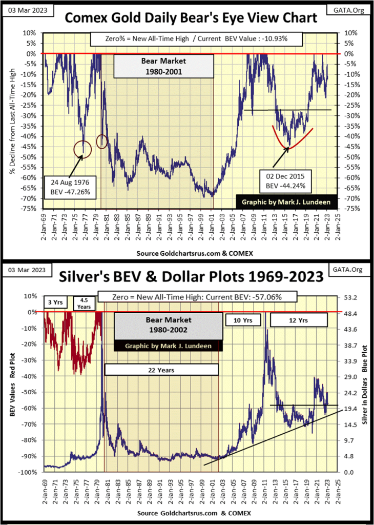
Silver’s BEV chart above is unique. As silver’s last all-time high was in January 1980, it’s possible to overlay its BEV plot over a plot of silver in dollars, and will be until silver once again makes a new all-time high. But until then, in the chart above, from January 1980 to today, one can see silver’s BEV value on the left scale, or its dollar value on its right scale.
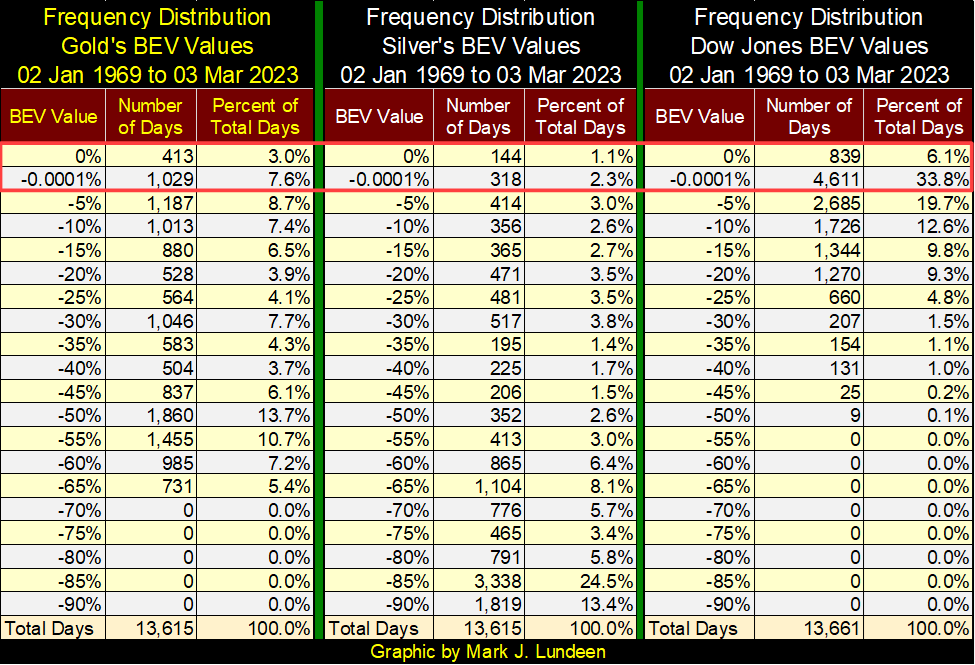
I’m going to skip the blow-by-blow description for the silver market I gave gold’s BEV chart. Instead, I created three frequency distribution tables below, one for gold and silver, and a third for the Dow Jones showing the frequency these markets’ BEV plots were at this or that BEV value for the past fifty-four years.
For instance, looking at their BEV Zeros (0.0% = new all-time highs), which in the tables below are found in their 0% rows. Since January 1969, gold has seen only 413 days where it closed at a new all-time high, while silver has seen only 144 daily closes at new all-time highs. And for silver, all of them occurring before February 1980. During this same time, the Dow Jones has seen 839 daily new all-time highs.
As bull markets in BEV charts are identified by their BEV Zeros, and daily closings in scoring position (BEV values less than -5%). These daily closings are found in the 0% and -0.0001% rows in the frequency distribution tables below.
By adding the percentage values in the tables’ 0% and -0.0001% rows, the frequency of the gold and silver markets making new all-time highs in bull markets can be seen; 10.6% for gold and 3.4% for silver. And for the Dow Jones? Since 1969, 39.9% of its daily closings have occurred in bull markets. Precious metal performance has been subpar compared to what the stock market has done for investors since 1969.
But as a matter of “policy”, the Federal Reserve has supported the stock market, while suppressing the gold and silver markets since 1969. In the coming years, their market rigs are all going to come undone, and what a terrible thing that will be for the stock and bond markets, but should be a good thing for precious metals and their miners.
Let’s take a look at gold’s BEV chart. Last week gold closed with a BEV of -12.14%. This week it almost closed above its BEV -10% line, which is reason enough for me to suspect the next big thing in the chart below is for gold to break above its BEV -5% line.
It’s been over 2.5 years since gold’s last all-time high in August 2020. If gold is in a bull market; it’s time for it to do something for the bulls. I expect gold will see some excitement as summer approaches, and that should also be good for silver and the mining shares.
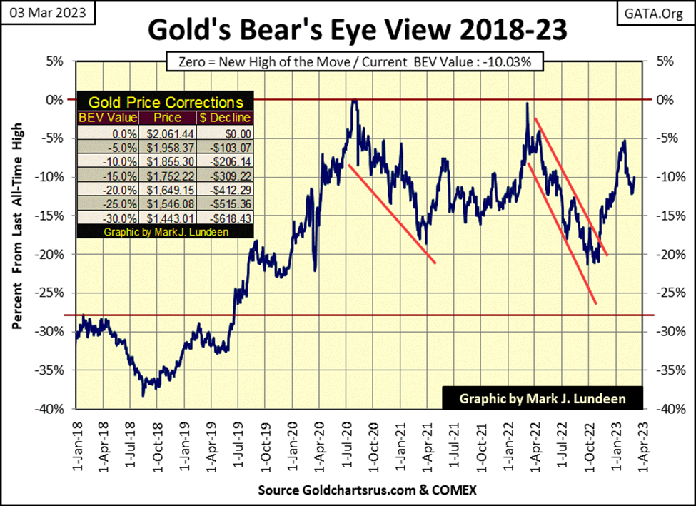
Moving down to the step sum tables for gold and the Dow Jones, last week I was hoping gold’s 15-count would go down to a -7 to possibly a -11, making gold an oversold market. But that didn’t happen, not with gold advancing each day this week. Still, gold worked off its 15-count of +9 from January, a very overbought 15-count, and is now ready to make another attempt at its first new all-time high since August 2020.
Still, I wish gold’s daily volatility’s 200D M/A would begin to rise. Gold bull markets are volatile markets, as flight capital flees the financial markets into gold and silver. That isn’t happening, not yet anyway.
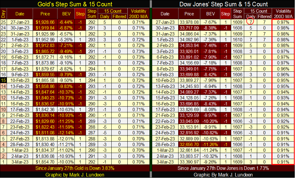
The selloff for the Dow Jones may be ending, and then again maybe not. One thing the Dow Jones has going for it, is its daily volatility’s 200D M/A is going down. We’ll know more next week.
__
(Featured image by geralt via Pixabay)
DISCLAIMER: This article was written by a third party contributor and does not reflect the opinion of Born2Invest, its management, staff or its associates. Please review our disclaimer for more information.
This article may include forward-looking statements. These forward-looking statements generally are identified by the words “believe,” “project,” “estimate,” “become,” “plan,” “will,” and similar expressions. These forward-looking statements involve known and unknown risks as well as uncertainties, including those discussed in the following cautionary statements and elsewhere in this article and on this site. Although the Company may believe that its expectations are based on reasonable assumptions, the actual results that the Company may achieve may differ materially from any forward-looking statements, which reflect the opinions of the management of the Company only as of the date hereof. Additionally, please make sure to read these important disclosures.


Blockchain Evolves Toward AI, Finance and Quantum Security
Blockchain is evolving beyond crypto into finance, AI applications, and digital markets, while security and regulation remain challenges. Quantum threats...


The Italian Crowdinvesting Market Faces Sharp Decline in 2026
Italian crowdinvesting market continued to decline in 2026, with fundraising falling 36.8% year-on-year to €164.19 million. Platforms and active campaigns...


Sartorius Stedim Biotech Maintains Growth Momentum in H1 2026
Sartorius Stedim Biotech reported solid H1 2026 results, with revenue reaching €1.527 billion and EBITDA rising to €479 million. Growth...


Bank of Africa Launches BOA MDM Network to Boost Diaspora Investment in Morocco
Bank of Africa launched the BOA MDM Network to channel diaspora remittances into productive investment, aiming to raise their share...


Switzerland’s Medical Cannabis Reform Advances Access, But Barriers Remain
Switzerland’s 2022 medical cannabis reform improved patient access by removing federal approval requirements, but challenges remain. MEDCAN highlights barriers including...
 |
|
 |  |
 |
|
-
 Markets2 weeks ago
Quiet Markets Await a Catalyst as Jobs and Oil Support Sentiment
-
 Crypto2 days ago
Bitcoin ETFs Lead as German Stock Exchange Debuts Mining ETF
-

 Crowdfunding1 week ago
Insight Foto Festival Launches €4,500 Crowdfunding Campaign to Support 2026 Edition
-

 Business5 days ago
Dow Jones’ Record Run Faces Early Signs of Potential Shift