Business
The Story of Illiquid Woe: Coming to a Bond Market Near You Soon
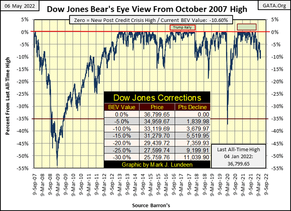
In the past two weeks, Mr Bear was a bad bear, with his five Dow Jones 2% days, and one NYSE 70% A-D day. They had an effect on the Dow Jones too, as seen in its BEV value. What is seen in Mr Bear’s Report Card is typical of the early stages of a bear market; as the 200-count rises, the Dow Jones BEV will continue to deflate. Though, we should expect upward corrections, relief rallies during this bear market.

As in early March, this week the Dow Jones closed below its BEV -10% line. Could this become a bad habit for the stock market, and what comes from there? Keep your eyes on the Dow Jones’ BEV -5% & BEV -15% lines. Whichever is first crossed, may be the key to knowing the stock market’s future.
But, and this is a VERY BIG, and unattractive BUT; but for the past five months, there has been a blood bath in progress in the corporate-bond market. Since the first of the year; to have owned corporate bonds was to lose money. That is not an attractive feature for a multi-trillion-dollar market, where fiduciaries for pension funds and life insurance companies are a major presence.
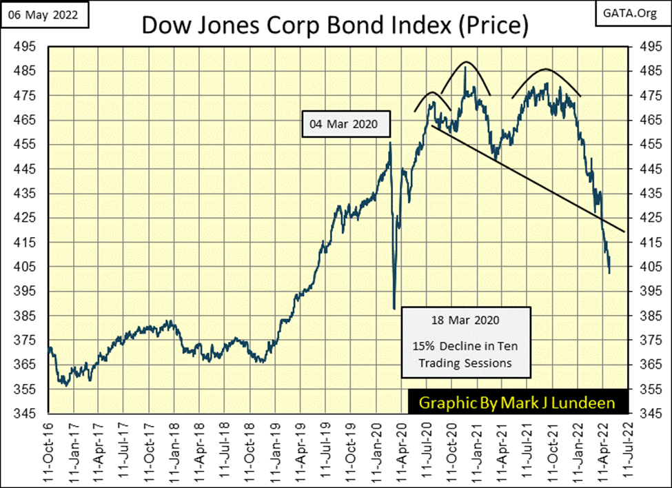
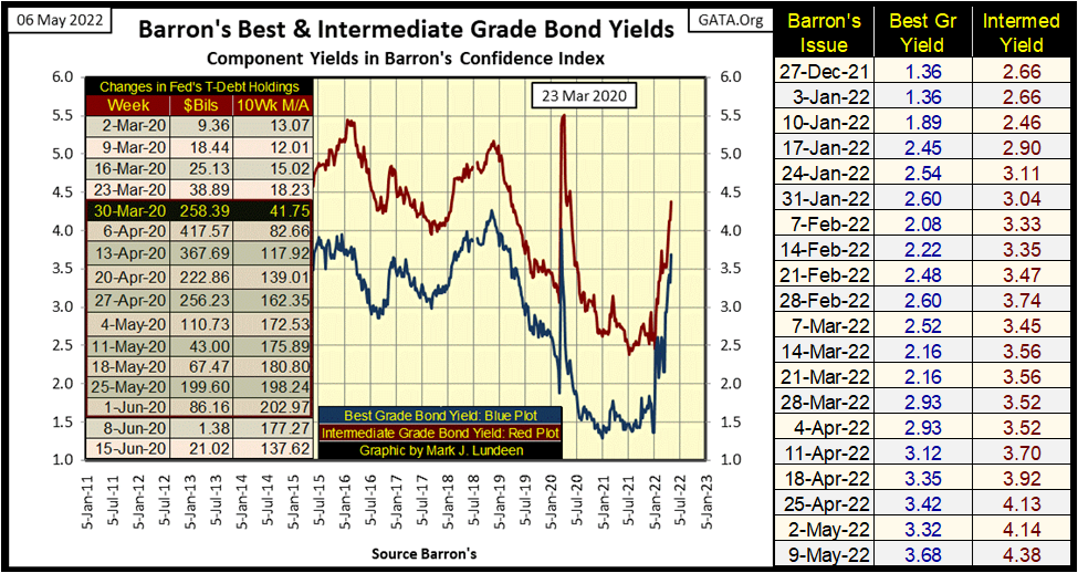
Look at Barron’s Best & Intermediate Grade Bond Yields below. Since Barron’s 28-Dec-2022 issue, corporate bond yields have surged upwards (bond valuations downward). Does the mainstream financial media cover this? I don’t know, as I don’t follow them except for catching some numbers on the market during the day. I suspect for most of my readers, this in-progress disaster in the bond market is something they only see covered in my market comments.
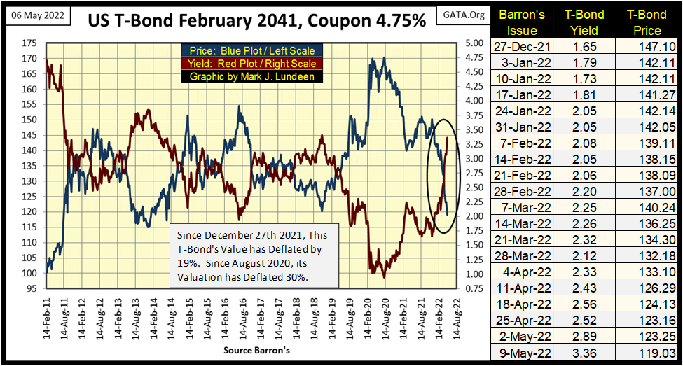
And the bloodbath isn’t just going on in the corporate bond market, as seen in this chart for a T-Bond maturing in February 2041 below. Since the end of last year, this T-bond’s valuation has deflated by 19%, as its yield has more than doubled, increasing its yield by 1.71% in the past nineteen weeks. Since its highs of August 2020, when it was yielding an incredible 0.97%, this bond has lost 30% of its valuation. Ouch!
We’re looking at the T-bond market. A place where managed money, like pension funds and life insurance are supposed to find safety. However, in fact since Dr. Bernanke began his three QEs, and his Operation Twist which actually targeted long term debt to reduce their yields, the bond market has become a plaything for the “policy makers.” A place where idiots manipulated the economy via lowering interest rates and bond yields far below where natural market forces would have them.
But that was then, and this is now. And now all this manipulation from the past is coming undone, with the process just starting. With actual CPI inflation rates in the double-digits, it’s only a matter of time before bond yields match, or actually exceed the rate of CPI inflation.
What the hell; why was this 20yr T-bond yielding 0.97% twenty-one months ago? The idiot savants at the FOMC made all that, plus more market madness possible. We are now on the reverse slope of “monetary policy”, where Mr Bear comes in and undoes all the idiots have done. I don’t see these trends in the bond market reversing any time soon.
And the strong dollar all the “market experts” talk about? Let me tell you all about that. If you’re a billionaire or leader of an oil sheikdom on the Persian Gulf, you don’t have bricks of $100 dollar bills stacked high and deep in your basement. Instead, you buy bonds to get a rate of return on those dollars. What we are seeing in these charts for the debt market, is an ongoing bloodbath of the net worth of the wealthiest people in the world. That the bond market has become a place of great hostility for the many trillions of dollars of invested funds.
God Save the Queen, the King of Saudi Arabia, and union pension funds everywhere! As for Putin and Russia, they got rid of their dollar bonds years ago, and I’m sure they’re now glad they did.
Things are no different in the mortgage market. As seen below, since the first of the year mortgage rates have shot up. Homeowners who purchased a home since January 2021 may not be aware of it – yet – but their homes are now upside down. Meaning their home’s market valuations are now less than the value of the mortgages they used to purchase their homes with.
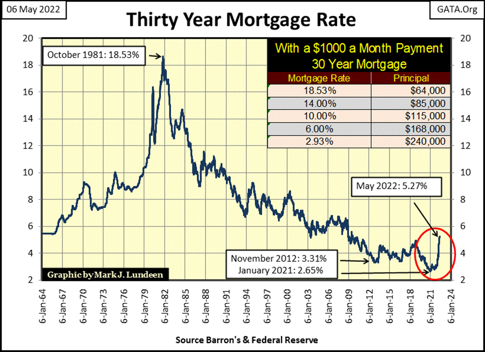
That’s not good, as homeowners are now bound to their mortgage in an arrangement that currently is very detrimental to them. Sure, they can still sell their homes. No law against that, yet. But with current mortgage rates having doubled from January 2021, most people shopping around for homes can’t afford to pay a price sufficient to free current home sellers from their mortgage obligations from the bank. Go ahead and sell your home at current market prices: you’ll still owe $30,000 to the bank.
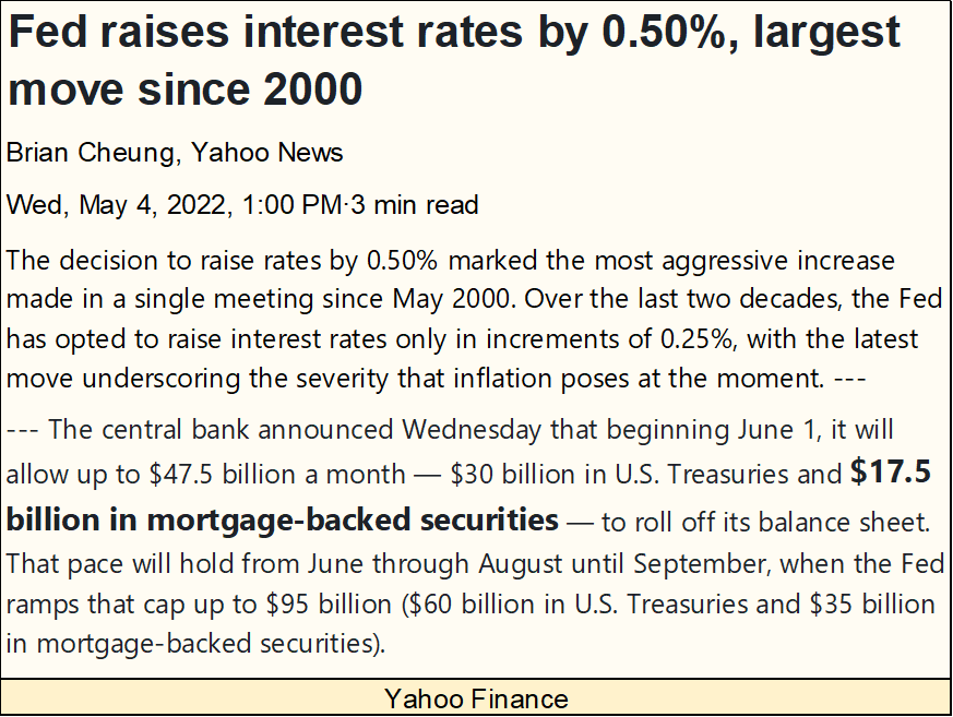
It’s only going to get worse for the housing market. As per Yahoo Finance (below), the FOMC is delaying their QT by a month, will begin selling their T-debt and MORTGAGES in June instead of May of this year. When they do begin selling their mortgages, mortgage rates will rise, and home values to deflate.
This is how it works; the idiots create bull markets by “monetizing” financial assets by buying them. When they decide to reduce their bloated balance sheet by selling these same assets, this process is reversed. Raising their Fed Funds Rate will increase deflationary pressure on the debt markets. The stock market isn’t going to be spared from the pain coming the debt markets way.
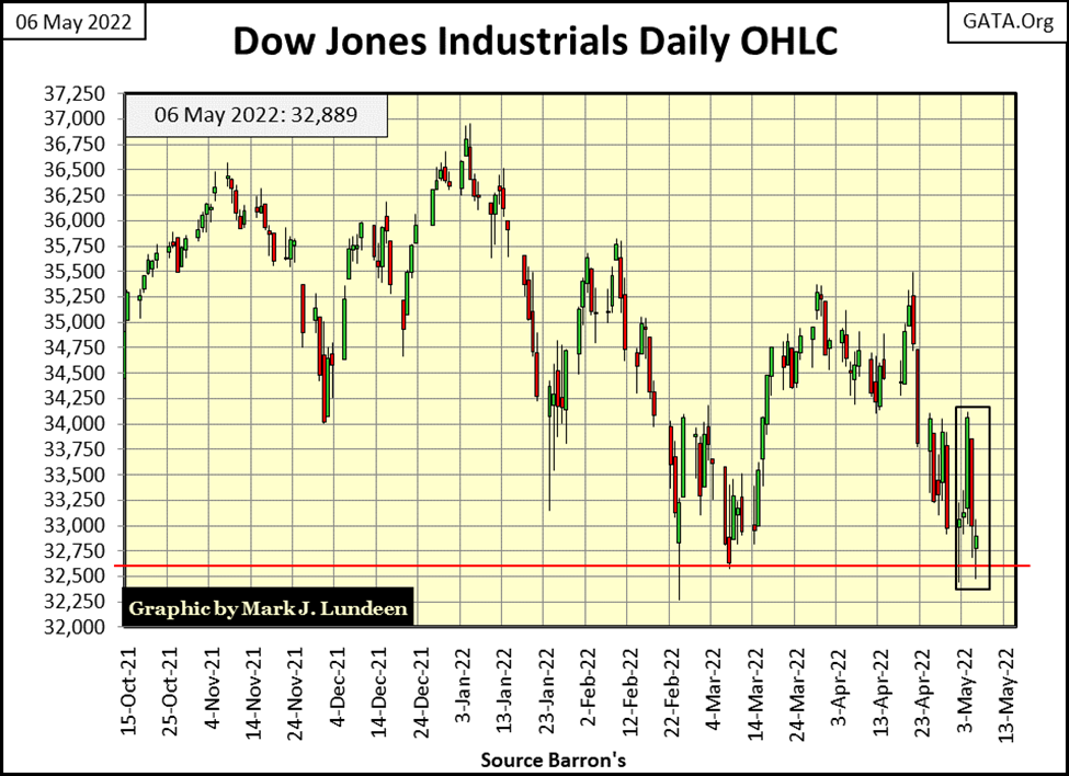
Let’s look at the Dow Jones in daily bars below. This is a very weak chart for the stock market. The FOMC made the above press release on Thursday, resulting in the Dow Jones declining over 1000 points, swamping the 900 point gain the Dow Jones saw the day before on Wednesday.
The line of support at 33,600 is looking weaker all the time. Don’t be surprised if the Dow Jones cuts through it like a hot knife through butter in the weeks (days?) to come. Considering all of the problems the markets and economy are now confronted with, I believe the market is overvalued by a lot.
What’s a lot? I don’t know. I’m just a high-school graduate who became a market enthusiast when I sailed the seven seas with my Uncle Sam. You’ll never see me on CNBC as a “market expert.”
But over the decades, I’ve studied the markets in detail. I’ve done my homework on bull and bear markets alike. Considering everything I see in my data files, I believe we are on the cusp of something historic, something like the Dow Jones closing down 2000 points from one day to the next. A couple of days like that, and the idiots at the FOMC will call their yet to be implemented QT off.
It’s an election year. Should something like a one-day 2000 point drop in the Dow Jones happen, and the phone lines between the Federal Reserve and the Capitol Hill will be glowing cherry red. I forgot, today everyone is using cell phones. So, let’s say something like that happens, and the microwave radiation density between the Federal Reserve and Capitol Hill will become intense enough to drop flying birds from the sky.
NYSE 52Wk Lows continue dominating 52Wk Highs, and increasing in volume in my table below. Since April 5th, the NYSE has seen only one day with more 52Wk Highs than Lows (April 20th).
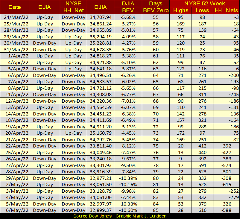
Here is a little math for the masses. On Friday (May 6th) there were 3426 companies trading at the NYSE, of which 616 deflated to a 52Wk Low. That makes 17.9% of all companies trading at the NYSE hitting a new 52Wk Low on Friday. That really isn’t good news, which is why I’m still a bear.
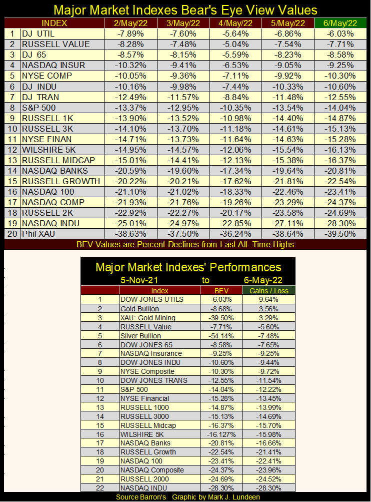
So, let’s move on to my major market indexes BEV values table below. All this week, no BEV Zeros, or indexes in scoring position. Look at the big gains seen on Wednesday, May 4th. Come Thursday the 5th, Mr Bear snatched those away, and then some in most cases.
The BEV -30% level is getting interesting. How much longer will the gold and silver miners in the XAU trade below, as the rest of these indexes trade above it? That’s another good question I don’t have the answer to. But I know it’s going to happen. Maybe sometime this year.
The chart below plots each day of extreme-market volatility the Dow Jones has seen since January 1900, a 122-year record of extreme-market volatility. What is an extreme day of market volatility? Any day the Dow Jones closes (+/-) 2% or more from its previous day’s closing price. I call such days “2% days.” But the 2% is a threshold value. So, when I also call a day that moved (+/-) 5% or more from its previous day’s close a 2% day, I’m only noting how that day’s volatility exceeded the 2% volatility threshold.
These 2% days in the Dow Jones are rare market events, unless Mr Bear is making mischief on Wall Street. Since 02 January 1900, the NYSE has seen 33,502 trading sessions. Of these, only 1904 of these trading sessions saw a Dow Jones 2% day, or 5.68% of NYSE trading sessions for the past 122 years. That’s about one day out of every twenty. However, as we’ll soon see, Dow Jones’ 2% days are primarily a bear market phenomenon.
Bull and bear markets each have their own temperament. Bull markets typically are docile creatures, much beloved by all, advancing upward into history in tiny baby steps. Bear markets on the other hand are wild animals, sometimes expressing themselves as pent-up rage shaking the markets with insane volatility. What kind of volatility – insane, really?
They can be! In the chart below, look at the daily volatility for the Dow Jones during the Great Depression Crash. There were days the Dow Jones closed 10%, or more from a previous day’s closing price. Note, the * LARGEST DAILY ADVANCES IN DOW JONES HISTORY * didn’t occur during a bull market, but during a historic bear market in the depressing 1930s that deflated Dow Jones’ valuations by 89%.
Compare the market action of the Depressing 1930s with that of the 1942 to 1966 bull market, a twenty-four-year bull market advance that saw the Dow Jones rise from 92.92 in April 1942, to 995.15 in February 1966. This 971%, bull market saw the least daily volatility of the 20th century. Not until the “policy makers” took the dollar off the Bretton Woods’ $35 gold peg in August 1971 did significant daily volatility return to the stock market.
Let’s take a look at the big down days. During the autumn of 1929, at the start of the Great Crash, on October 28th (Black Tuesday) the Dow Jones closed down -12.82% from its previous day’s closing price. That was the day when no one on Wall Street could deny it any longer; something big, bad and ugly was coming their way.
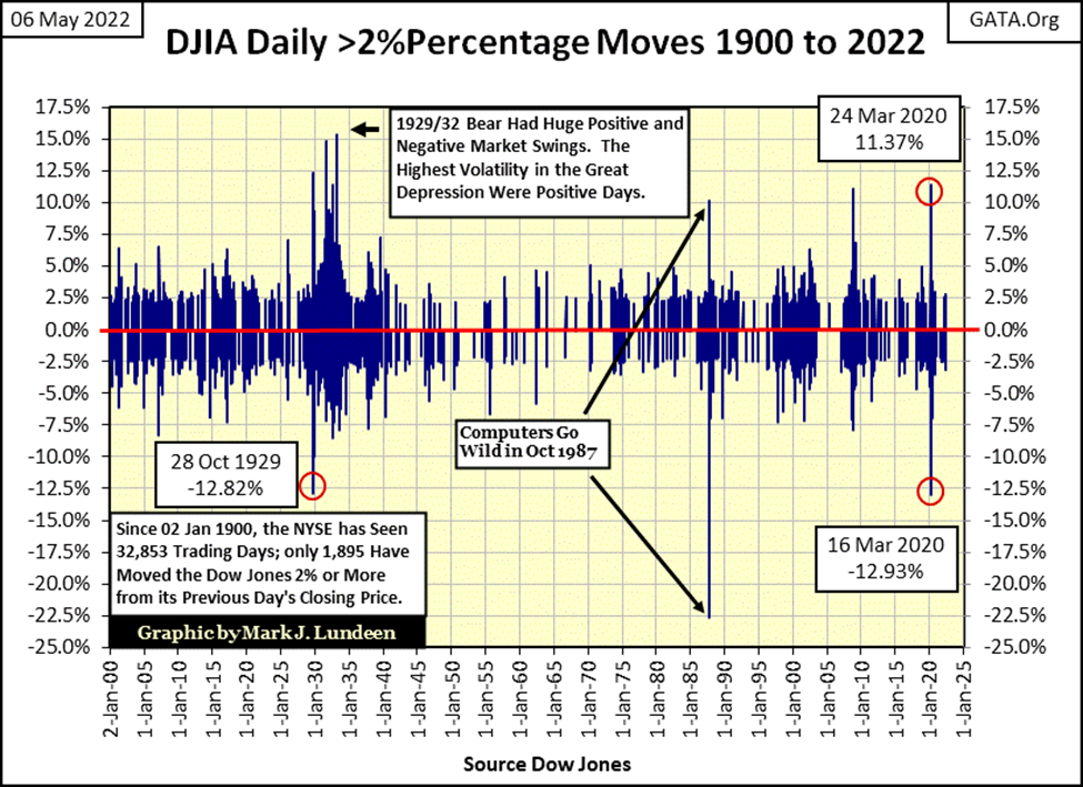
Black Tuesday’s -12.82% one-day decline was a one-time market event. Not before or after Black Tuesday did the Dow Jones, on a close-to-close basis, decline by double-digit percentages, that was until March 2020.
The March 2020 Flash Crash, that “market experts” no longer talk about. But I still do. How can’t I when on March 16th 2020, the Dow Jones broke its record close-to-close decline from Black Tuesday, a market event from ninety-one years before. That caught my attention, and kept it ever since!
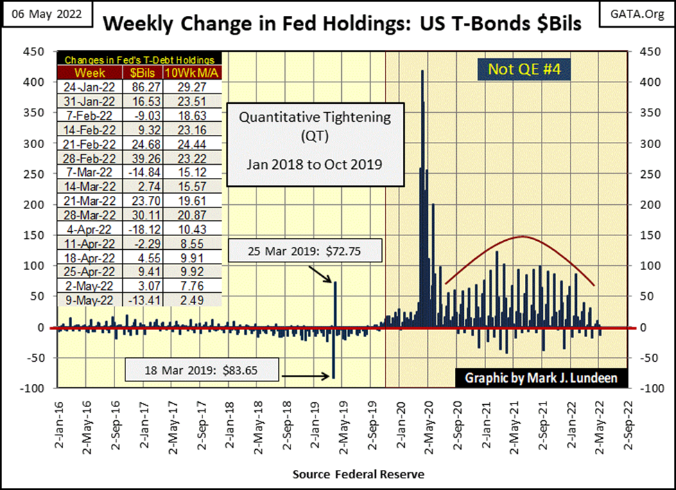
I’ll tell you who else’s attention was caught by this historic daily decline in the Dow Jones; Chairman Powell and his idiot savants at the FOMC. Who soon after March 16th were “stabilizing” the stock market with weekly “injections” of multi-hundred billions-of-dollars in their Not QE #4 (see below).
The Dow Jones’ 2%-day chart above plots the raw data for the Dow Jones days of extreme market volatility. This is an interesting chart, but there are better methods of displaying Dow Jones daily volatility data. Such as plotting a running 200-day sample of Dow Jones 2% days I call my 200-Day Count, seen below.
Each (+/-) 2% day is equal to 1. All daily closings not breaking this threshold are equal to 0. I take the sums of the 1s & 0s in a running 200-day sample and plot the results, seen below.
Previous to the creation of the Federal Reserve, Wall Street was a volatile market. It just was. But the pre-Fed market’s daily volatility paled to what was to follow in the 1930s. Volatility spike (A) was the Great Depression Crash, where at its peak saw a 2% day, every other day.
The other spikes in daily volatility (B-G), are a rollcall of bear markets of the past 100 years. The only exemption this was the April 1942, 52.2% bear market bottom. Following the turmoil of the 1930s, the public was out of the market, and everyone was sick of Wall Street. As the United States had then just entered WWII, I doubt most people at the time were even aware of this bear market that cut the Dow Jones in half.
I want you to note spike (G). This spike in volatility was from the March 2020 flash crash. This market decline was an only 37% decline in the Dow Jones, a market decline that took only twenty-seven NYSE Trading Sessions. WHAT??
Such an intense market downdraft had never happened before. That these twenty-seven days also produced a volatility spike, makes March 2020 a significant market event. If two years ago, had the FOMC hadn’t “injected” over a trillion dollars of “liquidity” in a few weeks to “stabilize” valuations in the stock market, I believe the stock market would have gotten very ugly, very soon.
This is nice to know; for investors, this chart is priceless, as it provides a system, using 122 years of Dow Jones history, for timing when to buy into a bull market, and when to sell in bear markets.
- Bull markets occur as the Dow Jones’ 200-counts decline from a volatility peak.
- Bear markets occur as the Dow Jones’ 200-counts advance in a volatility peak
From the perspective of Risk & Reward, this chart is also very useful.
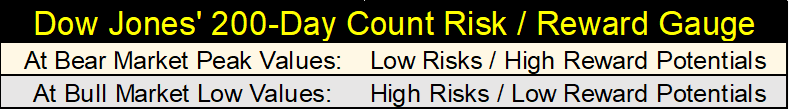
When to buy into a bull market? Obviously, following the bottom of the previous bear market, which are market events easily identified in the chart below. When the volatility spike has peaked, and has begun trending down towards a 200-day count of near or at Zero.
This system doesn’t promise to get you in at an absolute bear market bottom. But it does allow investors to miss most of the previous bear-market decline, and get them back in the markets in the very early stages of a developing bull market.
When to sell the market, and just go away before a bear market decline. When the Dow Jones’ 200-day count is approaching zero, say below 5. Most of the gains possible during the bull market are now things of the past, best seen in the market’s rearview mirror. Markets with low, but rising Dow Jones 200-counts, such as our current market, are high risk markets, with little potential for making any returns on your investments.
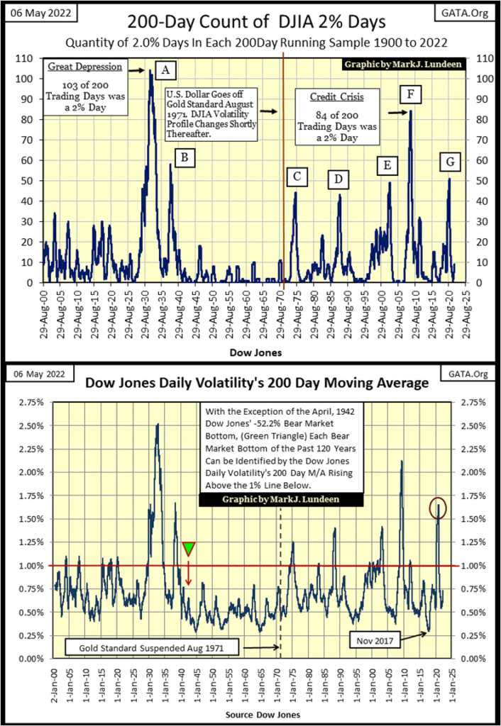
The chart above is the 200Dy M/A for Dow Jones daily volatility. Not surprisingly, it looks very much, if not exactly like the upper chart plotting the Dow Jones 200 count. Which is best? They’re both good.
In my step sum table for the Dow Jones, this is the data series from where I get my 200Da M/A for Dow Jones volatility, where I frequently comment that you won’t need me telling you the market is selling off when this metric increases to something over 1.0%. Now you see why I say that.
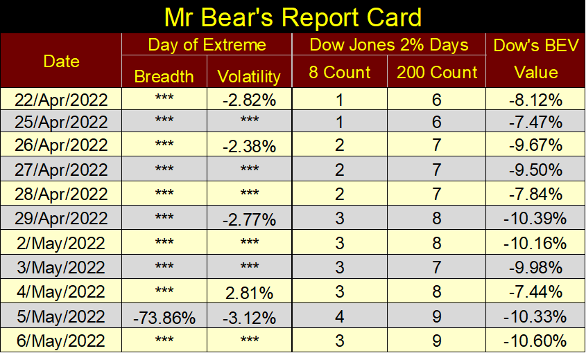
Here is something not seen in my commentary since the March 2020 sell off; Mr Bear’s Report Card. This is a tally of volatility for the Dow Jones using its 8-count & 200-count. With the 8-count, a 2% day is in the count for only eight NYSE trading sessions, where with the 200-count it remains in the count for 200 NYSE trading sessions.
I also include NYSE 70% A-D Days, or days of extreme-market breadth. I didn’t have time to cover this topic this week, but I will in the future.
In the past two weeks, Mr Bear was a bad bear, with his five Dow Jones 2% days, and one NYSE 70% A-D day. They had an effect on the Dow Jones too, as seen in its BEV value.
What is seen in Mr Bear’s Report Card is typical of the early stages of a bear market; as the 200-count rises, the Dow Jones BEV will continue to deflate. Though, we should expect upward corrections, relief rallies during this bear market.
This is exactly the type of market investors need to get their money out of! I don’t know how high this volatility spike will increase to, or how long it will take before it reaches its peak. But, until this bear market volatility does peak, why risk your investment capital?
Note how the 200-count went from an 8 on May 2nd, to a 7 on May 3rd. This is because the 2% day from last July 19th finally fell outside this indicator’s 200-day parameter. It’s a 200-count, not a 201-count.
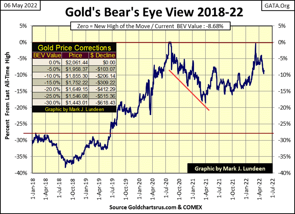
Let’s take a look at gold’s BEV chart. Unlike the Dow Jones, gold’s BEV remains above its BEV -10% line in the chart below. It may stay that way, and then maybe it won’t. One key factor for gold, and silver is that the old monetary metals have ZERO COUNTERPARTY RISK; they can’t default, unlike a few trillion dollars now trading in the bond markets.
Before this bear market is over, Mr Bear is going to force less than worthy credits into bankruptcy. He almost did this during the 2007-09 credit crisis. But since then, there have been three QEs and one massive Not QE that were very successful in swelling everyone’s’ balance sheet with unserviceable debt.
The bond market will, in its own good time become a huge story of illiquid woe to those who dwell there. That’s when gold and silver will shine brightly.
Until then, I don’t worry too much about where gold is in its BEV chart below. I wouldn’t enjoy it should gold go down to its BEV -20% level ($1649). But with everything else happening in our world and the global markets, I wouldn’t panic and sell any of my precious metal assets because the COMEX goons and FOMC idiots continue playing their shitty-little games in our “regulated markets.”
In the step sum tables below, the COMEX goons continue pressuring gold and silver down in the futures markets. This scandal has been going on for decades, but it can’t go on forever. Look at the bright side of this; if you’re buying, the goons are subsidizing your purchases.
That plus, since last November, the XAU, gold and silver bullion have been some of the best performing assets trading in the market, as seen in the Major Market Indexes BEV table above. Be happy your money wasn’t invested in the NASDAQ glamor issues these past six months.
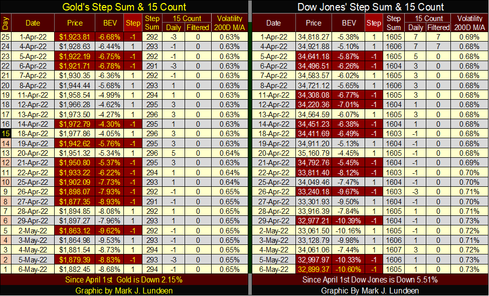
Daily volatility for the Dow Jones continues creeping up. Like I said, you won’t need me to tell you that the stock market is in a major sell off when the Dow Jones’ daily volatility’s 200D M/A exceeds 1.0%.
That is for this week. For next week; I’m wondering if bond yields will continue rising, if the Dow Jones will continue seeing additional 2% days, and if gold can remain above its BEV -10% line.
__
(Featured image by RyanMcGuire via Pixabay)
DISCLAIMER: This article was written by a third party contributor and does not reflect the opinion of Born2Invest, its management, sthttps://pixabay.com/photos/laboratory-care-health-medical-2821207/aff or its associates. Please review our disclaimer for more information.
This article may include forward-looking statements. These forward-looking statements generally are identified by the words “believe,” “project,” “estimate,” “become,” “plan,” “will,” and similar expressions. These forward-looking statements involve known and unknown risks as well as uncertainties, including those discussed in the following cautionary statements and elsewhere in this article and on this site. Although the Company may believe that its expectations are based on reasonable assumptions, the actual results that the Company may achieve may differ materially from any forward-looking statements, which reflect the opinions of the management of the Company only as of the date hereof. Additionally, please make sure to read these important disclosures.


Bitcoin Stalls Near $60K as Strategy Moves, ETFs Outflow, and EU MiCA Rules Take Effect
Bitcoin hovers near $60,000 with ETF outflows, while Strategy boosts reserves, sells BTC, and raises dividends to reassure investors. Ethereum...


Cannabis Dominates Global Drug Use: Trends, Risks, and Shifting Markets
Cannabis remains the world’s most widely used illicit drug, with 256 million users in 2024, surpassing all others combined. Growth...


Italy Approves First Hydrogen-Powered Train for National Rail Network
ANSFISA has approved Italy’s first hydrogen-powered train, the Alstom HMU214, for use on the Brescia–Iseo–Edolo line. Capable of 140 km/h,...


Cotton Market Weakness Persists Despite Brief Rebound
Cotton prices fell to new lows last week before a modest rebound. USDA data shows crop conditions remain worse than...


Eli Lilly Hits $1 Trillion Valuation Amid Strong Bullish Momentum
Eli Lilly stock hit a record high, surpassing $1 trillion market value after strong product demand. Shares surged over 7%,...
 |
|
 |  |
 |
|
-

 Impact Investing1 week ago
Edison Accelerates Renewable Growth and ESG Impact in 2025
-

 Cannabis7 days ago
Spain Cannabis Laws: Private Use, Fines, and Grey Areas
-

 Crowdfunding2 weeks ago
Wyrmgold Launches Crowdfunding Campaign for Believe in me! (please)
-
 Business2 days ago
Dow Jones Near Highs Signals Strength Until Volatility Returns