Business
Using Dow Jones Daily Volatility to Time Entry and Exit Points
Since 25 May 1926, the Dow Jones on 08 Dec 2022 increased to 33,791. Note how by using Dow Jones daily volatility’s 200d M/A (DV) to time entry and exit points for the Dow Jones, the investment position increased to 176,905.70, as it missed most of the bear market declines, and benefited from most of the bull market advances for the past 100 years.

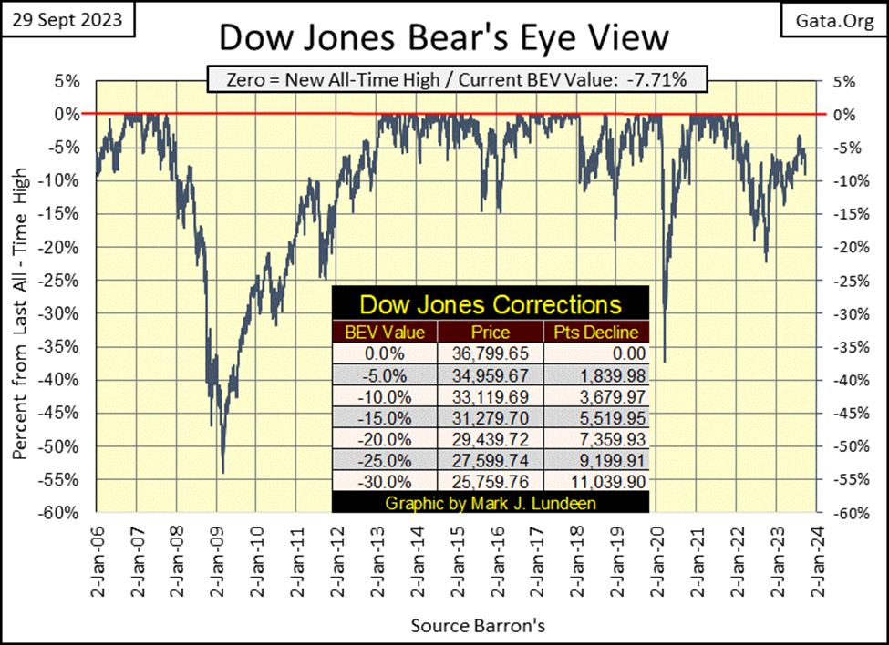
This week the Dow Jones closed with its BEV value closer to the -10% line than its -5% line in its BEV chart below. What to think about that? Well, it hasn’t seen a double-digit BEV value since June 1st, and then the Dow Jones hasn’t seen a BEV Zero (new all-time high) since January 4th of 2022. Should the Dow Jones fall below its BEV -10% line in the weeks to come, I think it will then test the lows of last autumn, below its BEV -20% line.
This summer’s market action must be disappointing for the bulls. On August 1st the Dow Jones closed with a BEV of -3.18%. The Dow Jones was only 3.18% away from making a new all-time high, and the bulls couldn’t close that gap and make it happen. That is so weak. Is there any reason to believe Wall Street’s bulls will finally grow a backbone, and get the Dow Jones to do what they failed to make it do last summer; have the Dow Jones close at a new all-time high? Not that I see.
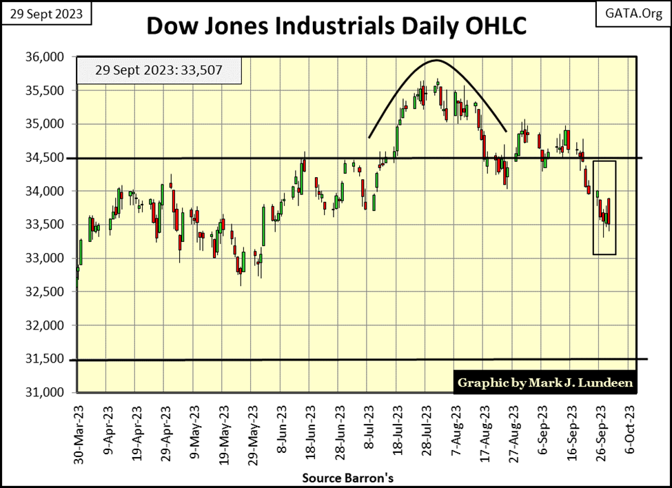
The last two weeks for the Dow Jones in its daily bar chart below are lame. So far, the 33,500 level is holding. On Friday’s close, this key level held on by 7 points, by its fingernails. I think 33,500 is history, so I’m moving on. The question now is; will the Dow Jones close next week above or below its 33,000 level, and then what?
Moving on to my table listing the BEV values for major market indexes I follow, except for the Dow Jones and the NASDAQ Insurance index, the BEV values for everything else are double-digit, and trending down. How much lower the broad market can go is still a mystery, most likely down farther than most people currently expect. In a market of mush such as this, a good time to buy is following a selling climax, something we’ve not seen for a while.
What exactly is a selling climax? When the NYSE sees its daily 52Wk High – 52Wk Low Nets below -1000, for several days, or better yet below -1500, it’s usually safe to come back into the market. It may not be the bottom of a bear market decline, but an astute trader may find this a good opportunity to make a short-term trade to the upside.
The last time the market saw a selling climax was exactly a year ago. As the Dow Jones finally broke below its BEV -20% line in late September 2022, the NYSE saw two days of its 52Wk H-L Nets breaking below -1000;
- Friday, September 23rd: H-L Net of -1106,
- Monday, September 26th; H-L Net of -1083.
Last year’s selling climax proved to be a profitable short-term buy signal. But it didn’t have to be. In a big-bear market decline, seeing the NYSE generate many new 52Wk Lows, for longer than one would think possible, is just how things sometimes go.
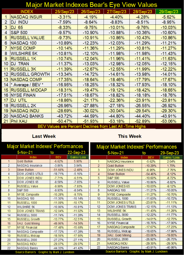
Gold and silver remain at the top of the performance table above, both are outperforming most of the major market indexes. However, the XAU continues to drop in the ratings. It’s almost as if someone of influence on Wall Street really hates the gold and silver miners. Well, someone really does, and if they could, they’d drag gold and silver bullion down in these performance tables above with their miners too.
If you liked the precious metal miners before, you have to like them even more now as their share prices continue to get cheaper. So, if you got them, hold them. If you’re thinking of buying the gold and silver miners, now is a good time to do it.
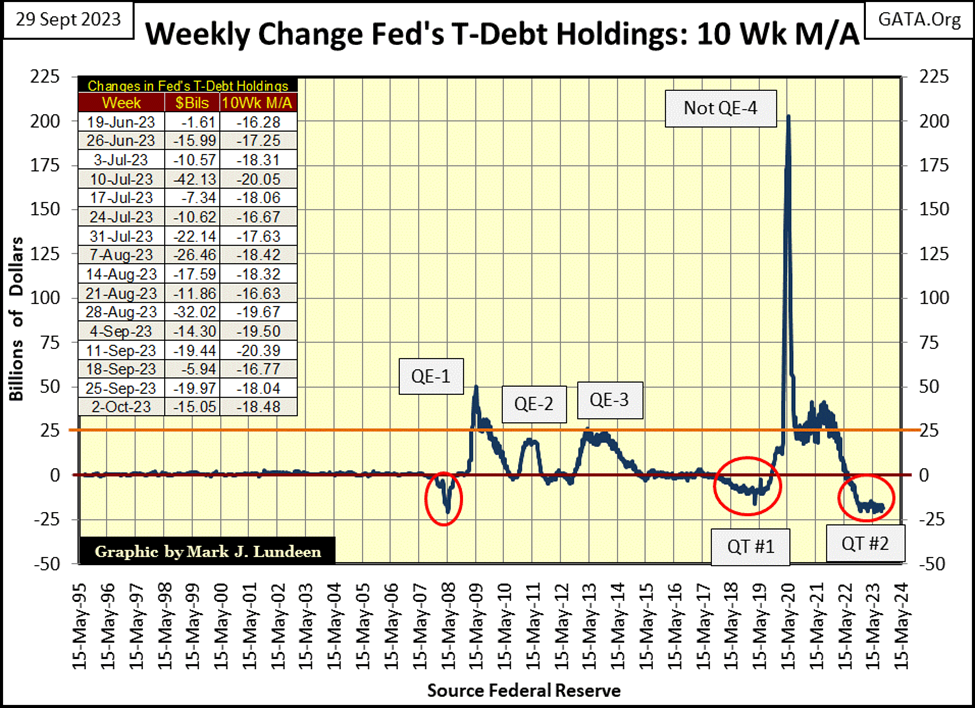
The Idiots at the FOMC continue with the QT they began in May 2020. It’s difficult to make a bullish case for the Dow Jones, my proxy for the broad stock market, as long as the FOMC continues draining “liquidity” from the financial system.
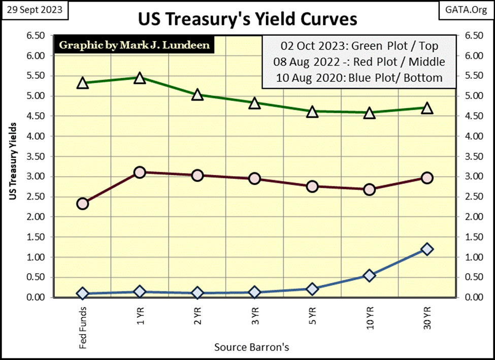
Below, the yield curve continues to be bearish; inverted with short-term yields above the longer-term bond yields, and the entire curve has shifted far above where it was three years ago in August 2020. The effect of these rising yields on the bond market has been devastating.
Looking at the QT above, and the yield curve below, it’s remarkable we’ve not seen the stock market crash, where the major market indexes in my BEV table above, would be down 40%, or more from their last all-time high.
The stock market may not be crashing, but the market value for this 30Yr T-bond at the close of this week was down by 51.5% from its highs of August 2020 (Blue Plot). As bond yields continue to rise, market valuations in the bond market will continue to deflate. The chart below is what pain looks like in the bond market; it will only get worse as bond yields continue to rise.
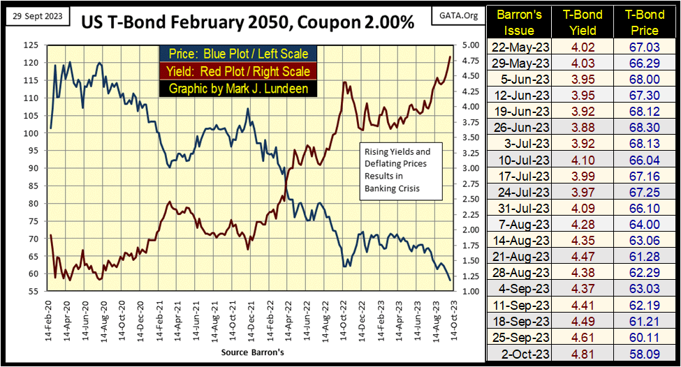
Many banks purchased high-quality long-term bonds for their reserves, as “market experts” everywhere knew these bonds were safe and liquid, easily sold to raise cash should depositors demand their money back. But the entire long-term bond market, both Treasury and corporate, is now deep underwater as yields have risen these past three years. Buying bonds, when their yields are at historic lows, no longer seems like a good idea.
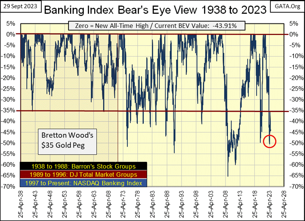
Go back up and look at the NASDAQ Banking Index in my BEV table for the major market indexes. The banks are #20 in the table, down over 40% from their last all-time high. Except for the XAU and long-term T-bonds, no other major stock index is down more. The reason for that sad fact can be seen in the bond chart above. It’s only a matter of time before we once again see news of another bank failing.
This is one of the reasons banks want a digital currency issued by the Federal Reserve. Come the day when their depositors demand the return of their cash, good luck with that in a world where money exists only on the bank’s hard drive, where all a depositor can do is check their balance with a cell phone, or home computer.
We live in an evil world, where the “policymakers” want everyone to roll up their sleeves to take their jabs, later they’ll insist we allow them to insert their chip into our brain, so we too become part of their internet-of-things. Twenty years ago, who would have believed this was possible? If you believe in the Bible, which I do, it’s only going to get worse. Do you know the most common metaphor for humanity is in the Bible? Sheep. Jesus, the Good Shepherd, sure has us pegged.
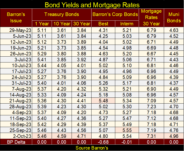
Next is a table listing bond yields. Since late May, yields have only gone up.
Keep in mind there are hundreds of trillions of interest-rate derivatives bundled with these bonds. They may be worthless today, but will come into the money should certain (but unknown) thresholds in bond yields be exceeded. The mainstream financial media doesn’t talk about derivatives anymore, but they haven’t gone away.
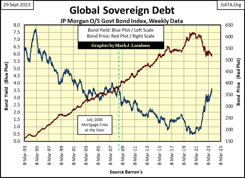
One more bond chart; JP Morgan’s Global Sovereign Debt. It tells the same story but on a global basis. Note what happened following the 2007-09 mortgage crisis; the global central banking cartel forced bond yields down to absurd levels, below 0.5% for this global index. And like the Treasury market, yields have been rising since the summer of 2020. All over the world, reserves for banks, and insurance companies are deflating. That can’t be good.
Today, there is absolutely no reason to risk your money in the stock or bond market; the same for investing in real estate. Every day the sun rises, and things appear much the same as they did the day before. But we’re at a massive market top, where risks are maximum, and the potential for rewards for assuming those risks are minimum.
The day is coming when these massive losses in the financial markets must be taken by someone. I know I don’t want my wealth exposed to the shock waves of counter-party failure that are destined to come. That is what makes gold and silver bullion so attractive, they represent wealth decoupled from counter-party risk.
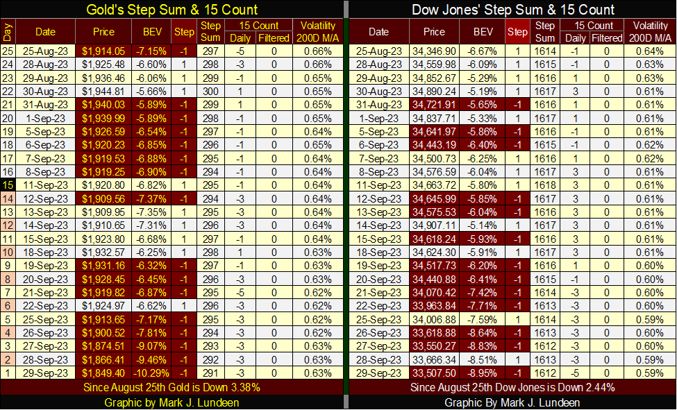
So, why did gold this week close below its BEV -10% line in its BEV chart below? I know, it looks bad, but the old monetary metals have not yet broken free from the malignant grasp of the “policymakers,” and their goons at the COMEX futures market. Look at today’s price of gold and silver for what they actually are; subsidized by the global-central banking cartel. I advise my readers to take advantage of gold and silver’s greatly discounted prices, while they can.
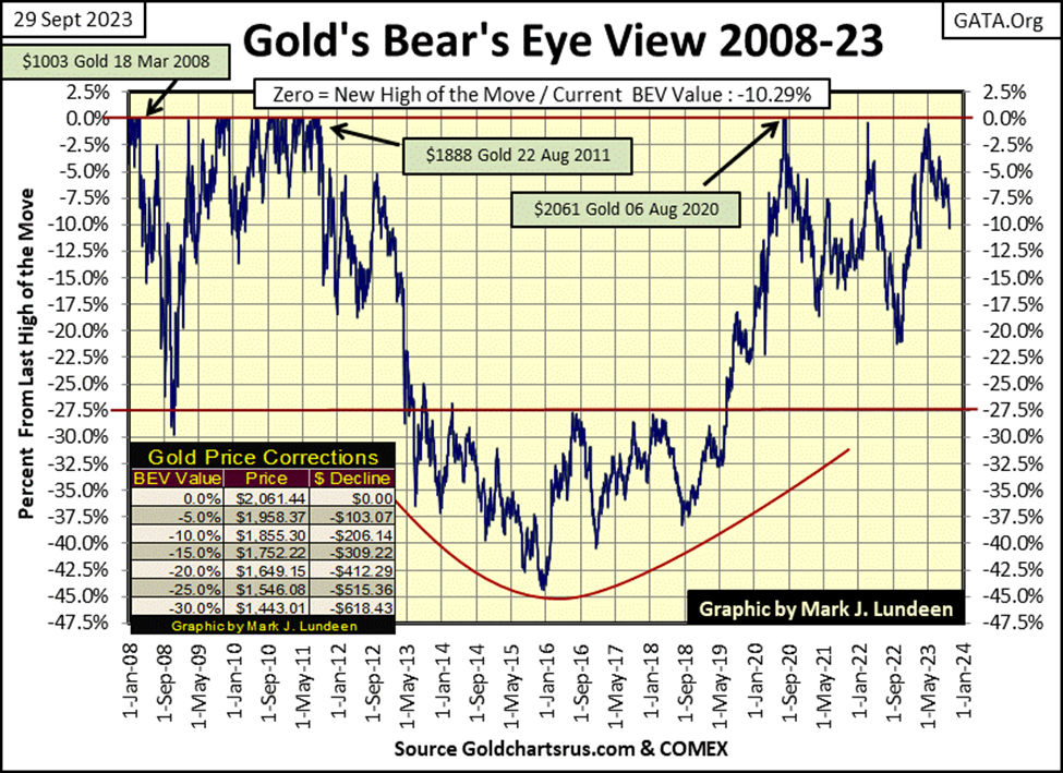
In gold’s step sum table below, the pressure being applied to keep its price low can be seen. In the past twenty-five trading sessions, sixteen saw gold close lower than the day before. The goons finally got gold to close below $1900, gold closed the week at $1849.40. With gold’s 15-count at a -3, gold isn’t oversold yet. But if next week looks like this week, five continuous down days, that would change quickly. I expect we’re close to a bottom in the gold market. Soon we’ll see daily advances overwhelm daily declines, and hopefully, the price of gold will do something when that happens.
As it is, it’s best not to allow the poor price action in gold to upset and frustrate us. As there is nothing we can do about the poor price action in gold and silver, I’m keeping an iron hand on the tiller in this storm, as what is happening is very strange. The NASDAQ Banking Index is down 44%, and every long-bond, Treasury or corporate, has seen their market valuation deflate by a big double-digit percentage since August 2020. In such a market, one would expect gold and silver to be advancing. That they haven’t is odd.
Daily volatility for the Dow Jones’ 200D M/A this week closed at 0.59%. So what? What is the big deal with noting daily volatility for the Dow Jones? This is as good a time as any to explain why following daily volatility for the Dow Jones is a good idea.
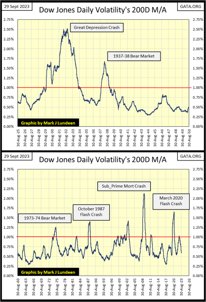
Below we see Dow Jones’ daily volatility’s 200D M/A plotted since 1900, 123 years of data. I’m going to ignore the data prior to 1925, as before 1925 the Federal Reserve’s influence in the market was minimal. Why would that be? The Federal Reserve Act was signed into law by President Wilson in late December 1913, so the Federal Reserve didn’t exist until 1914. WWI (1914 to 1918) kept the “policymakers” busy financing a World War for the Allies. Following the war, the economy fell into a deep recession, that bottomed in 1921.
The Federal Reserve’s influence in the financial markets didn’t begin until 1925 when the United States Treasury and Federal Reserve rendered assistance to Great Britain in their attempt to return to the prewar gold standard. Vast sums of cash and credit were extended to the UK, which in 1925 meant something like $250 million. An unimaginable amount of money 100 years ago. They failed to restore the UK pound back to the gold standard.
This foreign aid to the Bank of England was one of the sources that supplied the fuel necessary to inflate the stock market to historic valuations during the “Roaring 1920s.” The Federal Reserve System also provided “liquidity” to Wall Street, enabling the big banks to make margin loans to purchase stocks, loans where the banks’ clients posted only 10% for these leveraged purchases. For Wall Street, the 1920s was a massive inflationary boom, and when it went bust, resulted in the depressing deflation during the 1930s.
With this background, let’s look at the plot from 1925 to 2023. Bull markets can be identified when volatility declines from the peak of a volatility spike to something below the red 1.00% line.
Bear markets can be identified by noting when daily volatility increases to something above the red 1.00% line, ultimately forming a spike in daily Dow Jones’ volatility. The higher the daily volatility for the Dow Jones increases, the deeper the bear market bottom.
At the peak of the volatility spikes seen below, holders of shares trading at the NYSE are exiting the market at any price, as it’s at the bottom of any bear market where the bulls finally give up, and just want out – now!
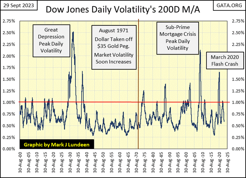
The depressing 1930s saw two spikes in Dow Jones daily volatility, volatility spikes precisely corresponding to the two bear markets during the 1930s;
- the Great Depression market crash (1929 to 1932),
- the 1937-1938 bear market.
The depressing 1930s had a deep psychological impact on all who lived through it. Seeing the low daily volatility for the Dow Jones from 1938 to the early 1970s suggests that even the “policymakers” were traumatized by the 1930s. The same can be seen in my BEV chart for the banks below. Prior to 1971, the banks never saw a BEV value below their -35% line. After 1971, they saw too many weekly closes below their BEV -35% line, such as this week’s close, a BEV of -43.91%.
But a new generation came of age, one with no personal memory of the depressing 1930s. Let’s call them the Baby Boomers, born between 1946 to 1962. The boomer elites who began devising “monetary policy,” soon recognized the awesome potential of the Federal Reserve, especially after the Bretton Wood’s $35 gold peg was tossed on the ash heap of history in August 1971.
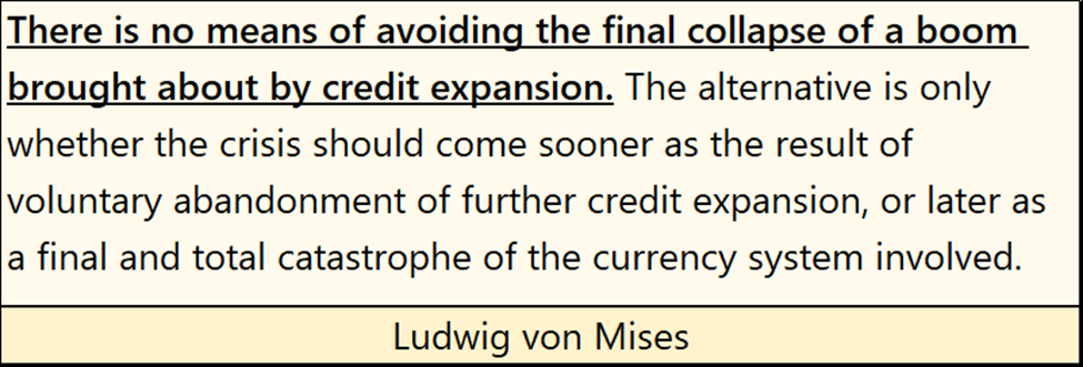
Following August 1971, volatility spikes in the Dow Jones’ daily volatility once again became regular features in the plots above and below, each noting the various booms and busts the idiots at the FOMC induced in the financial markets. These charts also prove that with every boom inflated into the market by the FOMC, Mr Bear also sees his day under the sun with a deflationary bust – no exception, as noted by von Mises below.
So, how can investors use this information? They can use it to mechanically time entry and exit points into the stock market; for decades it has worked very well. But note; using Dow Jones daily volatility’s 200D M/A * WILL NOT * get an investor out at the very top of the bull market, or back in at the absolute bottom of a bear market. But over time, the gains earned by investors, when compared to the Dow Jones itself are impressive.
Currently, declining daily volatility is a buy or hold for the stock market, a signal I choose to ignore, as I want nothing to do with this market. More on that later.
To make the data plotted above easier to see, I broke the data up into the two charts below, I’ve omitted the low daily volatility of the 1950s.
How does one mechanically time their entry and exit points into the market using the Dow Jones daily volatility’s 200D M/A, or DV? Here are the rules;
- Sell when the Dow Jones’ DV breaks above 1.00%
- Buy when the Dow Jones’ DV falls 5% to 10% below its peak bear market volatility.
Note; the 5% to 10% reduction is not a 5% to 10% reduction in DV itself, but a 5% to 10% reduction from a DV spike’s peak volatility.
Using the DV spike during the Great Depression as an example, its peak in DV was 2.52% in November 1932. Multiply this 2.52% peak by 0.90% to calculate a 10% buy trigger in the reduction in peak DV. Doing so generates a buy trigger of 2.27%. But in the table below, I actually used a buy trigger of 2.30%. This isn’t chemistry. It’s just important to trigger your entry back into the market on the downside of the DV volatility spike, which always follows the bottom of the bear market.
In the table below, Trade #1, and looking at the top chart above, my first BUY signal was on 25 May 1926, which I chose as I had to begin somewhere. So, I began with this day’s DV of 0.81%, as it was still early in the massive bubble the idiots at the FOMC were beginning to inflate on Wall Street.
My first sell signal was on 25 July 1929 when the Dow Jones’ DV broke above 1.00%, five weeks before the actual Roaring 1920s top. So, I came into the market in May 1926 with the Dow Jones at 141.20, and got out in July 1929 with the Dow Jones at 344.67.
I didn’t buy at the bottom of the Roaring 1920s Bull Market or got out at its top. But for every $1.00 I risked in the market, I took out $2.44. That is something 99.9% of investors in the 1920s didn’t do. I’m also not returning to the market until I see a significant decline in peak DV, as seen above, which triggers Trade #2 in the table below.
Trade #3 lasted from 1938 to 1974, as from 1938, the DV for the Dow Jones didn’t rise up to 1.00% until 1974. But it was a profitable trade when compared to the performance of the Dow Jones itself. Investing 141.20 in the Dow Jones on 25 May 1926, and holding firm with no exits from the market, by February 1974 the Dow Jones increased to 821.50. Using this technique, at the closeout of Trade #3, the investment position had increased to 4,534.02.
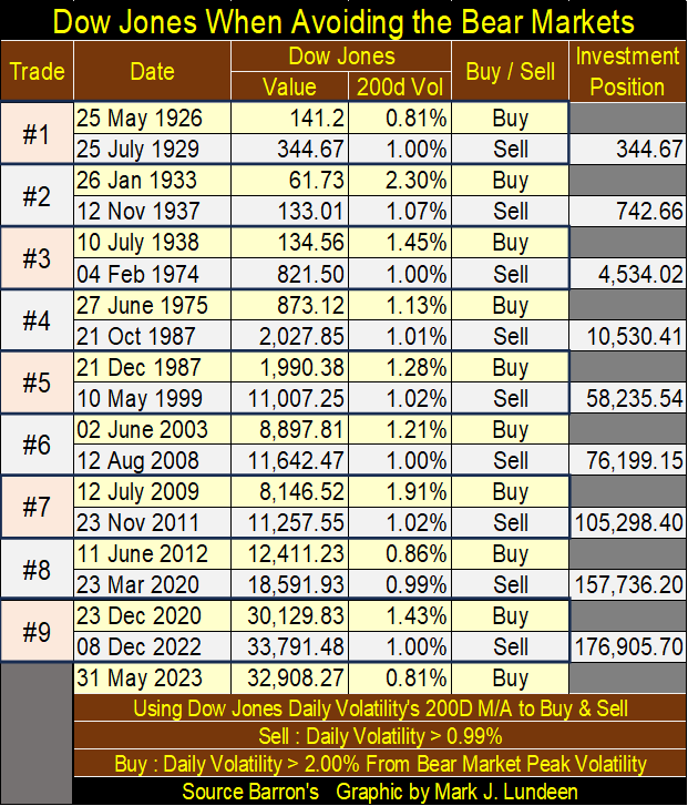
Since 25 May 1926, the Dow Jones on 08 Dec 2022 increased to 33,791. Note how by using Dow Jones daily volatility’s 200d M/A (DV) to time entry and exit points for the Dow Jones, the investment position increased to 176,905.70, as it missed most of the bear market declines, and benefitted from most of the bull market advances for the past 100 years.
It goes without saying; that the selection of stocks to buy could range far from the thirty blue-chip stocks that make up the Dow Jones. But the Dow Jones has been an effective proxy for the broad stock market since 1885, so it’s acceptable to use it to time buy and sell points for investments in other stocks.
Of course, this model doesn’t take taxes and dividends into account or accounts for when someone took some of their profits to make purchases for this or that, which would impact the gains possible. And to be frank, I doubt I’d have the discipline needed to keep to this method of mechanically timing my exit and entry points into the market.
Still, it’s an interesting model, showing the potential for investment gains using daily volatility for the Dow Jones to time when to be in and out of the stock market. If I were thirty or forty years old, I’d consider this system very seriously.
As noted, this model currently is signaling a buy and will continue to until DV once again breaks above 1.00%. But I don’t like this market, so I’m out, and I’m staying out until I see the Dow Jones dividend yield of something over 6%. And waiting for the inevitable DV spike to form as the pending bear market comes to its climax, taking that peak DV, whatever it may be, and multiplying it by 0.90 for a buy trigger, doesn’t seem like a bad idea.
__
(Featured image by Kelly Sikkema via Unsplash)
DISCLAIMER: This article was written by a third party contributor and does not reflect the opinion of Born2Invest, its management, staff or its associates. Please review our disclaimer for more information.
This article may include forward-looking statements. These forward-looking statements generally are identified by the words “believe,” “project,” “estimate,” “become,” “plan,” “will,” and similar expressions. These forward-looking statements involve known and unknown risks as well as uncertainties, including those discussed in the following cautionary statements and elsewhere in this article and on this site. Although the Company may believe that its expectations are based on reasonable assumptions, the actual results that the Company may achieve may differ materially from any forward-looking statements, which reflect the opinions of the management of the Company only as of the date hereof. Additionally, please make sure to read these important disclosures.


Avant Devices Moves Toward Electric Wheelchair Kit Production with New Funding Drive
Murcia-based Avant Devices is seeking €260,000 in crowdfunding to launch mass production of its electric wheelchair conversion kit. The funds...


Legend Biotech: Growth Driven by CAR-T Innovation and Carvykti Expansion
Legend Biotech's stock reflects demand for innovative CAR-T cancer therapies. The US biotech focuses on commercializing Carvykti with partner Janssen...


Senegal’s Debt Strategy: Choosing Between Restructuring and Financial Innovation
Senegal’s upcoming choice of debt advisor, with Lazard reportedly leading the race, reflects a broader strategic decision. Rather than pursuing...


Pictet Raises $253 Million for Environmental Investment Fund
Pictet Group closed its Environment Co-Investment Fund I at $253 million, surpassing its $200 million goal. The Article 8 SFDR...


Virginia Cannabis Market Could Reshape Regional Competition
Virginia’s planned recreational cannabis market could reshape the Washington region’s economic landscape. With nine million residents, it may draw consumers...
 |
|
 |  |
 |
|
-

 Crypto1 week ago
Crypto Markets Shaken by Geopolitics and Industry Tensions
-

 Markets6 days ago
Dow Jones Pauses Near Record Highs as Precious Metals Lead
-

 Africa2 weeks ago
Fes-Meknes Sees Strong Recovery in Cereal Production Thanks to Increased Rainfall
-

 Fintech3 days ago
Advanced Blockchain Under Pressure Amid Crypto Market Shifts