Featured
What’s with 21st Century NYSE Market Breadth?
There’s something really odd going on at the NYSE for the past two decades. For the past eighteen years advancing shares at the NYSE have dominated decliners, as never before in history. Even the 2007-09 Sub-Prime Mortgage Bear Market, a massive -54% market bottom, the second deepest percentage decline in the Dow Jones since 1885, had little impact slowing down the ratio’s advance.

For the past year the Dow Jones has been advancing off the bottom of an 18% correction, and has been daily closing at new all-time highs or within 5% of one. It’s good market action, but having to write market commentary on a market that changes little from one week to the next for over a year becomes tedious. This being the case I thought I’d go over the bull-market mechanics of the last few decades.
Since 1982 the Federal Reserve’s “monetary policy” has become one that dictates ever-rising valuations in the financial markets. It just has. For decades now, anytime the financial markets see their valuations begin to deflate, all eyes turn to the Chairman of the Federal Reserve to see what he or she is going to do about it. So far the Chairman has never disappointed.
But it’s a mug’s game expecting this game of cat and mouse the FOMC is playing with Mr Bear can continue forever, because it won’t.
Here’s the Dow Jones Bear’s Eye View (BEV) chart going back to January 1982, or the last four decades of the Dow Jones. It’s also a study of the effects of monetary inflation on market valuations.
What’s a Bear’s Eye View chart? It looks at a market series as Mr Bear does; with each new all-time high is equal to 0% (BEV Zero), and all other data points not a new all-time high seen as a percentage claw back from a BEV Zero.
Effectively the Bear’s Eye View compresses market data into a range of 100%, with each new all-time highs registering 0% (and never more), and a total wipeout in valuation registering -100%.
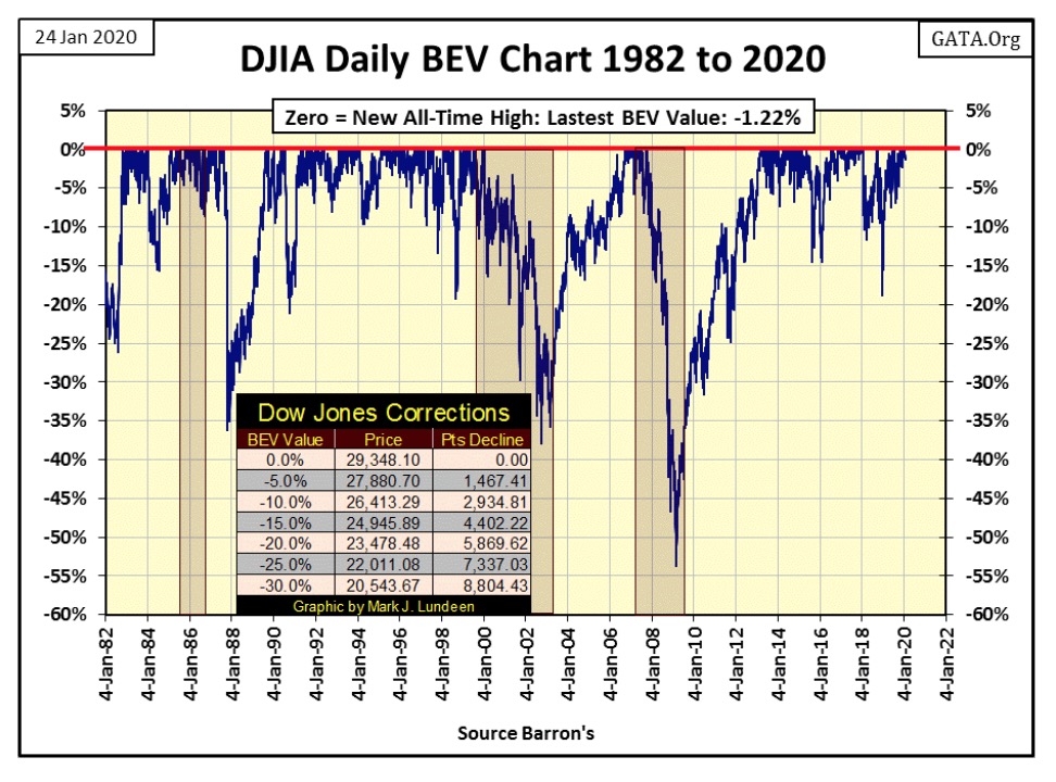
Note all the daily closings between the 0% and the -5% lines, the daily closings at or within 5% of the Dow Jones’ last all-time highs since January 1982. The specific numbers of these closings can be seen on the right side table below; between these two lines contains 50.53% of all daily closings of the past thirty-eight years.
That’s an enormous percentage when compared to the Dow Jones first four decades of trading (left side table below), where these two lines contained only 12.25% of the daily closings.
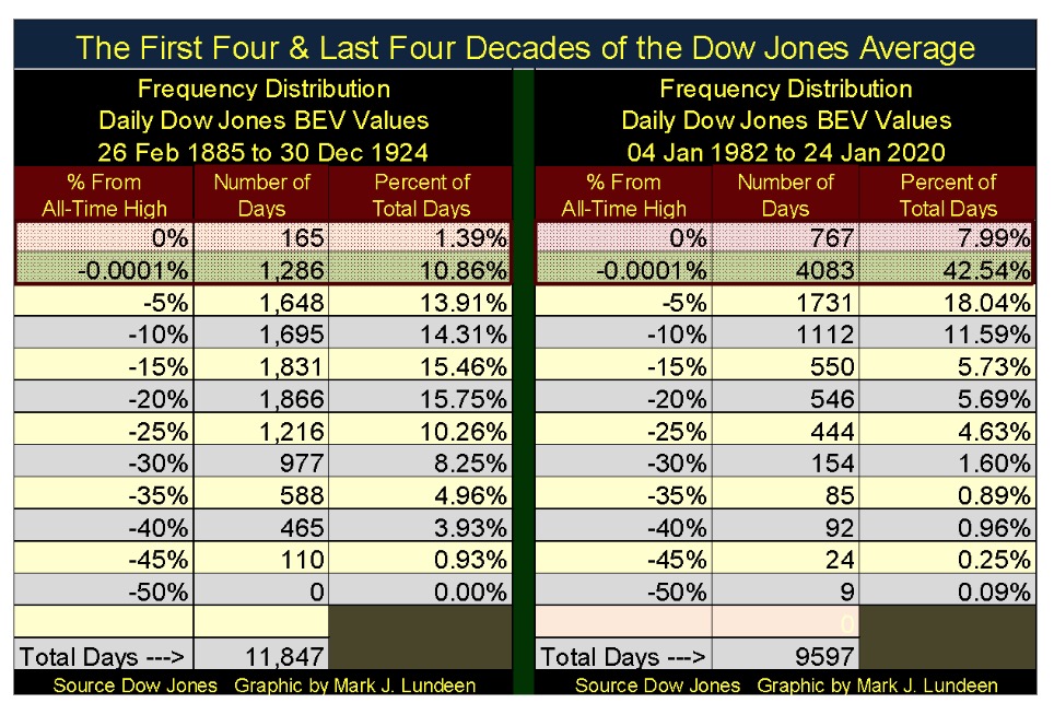
The actual difference between these two eras of market history is the first four decades of the Dow Jones existence; the Federal Reserve either didn’t exist (before 1914), or the Federal Reserve hadn’t yet begun “inject liquidity” into the financial markets.
Here’s a chart plotting the Federal Reserve’s balance sheet plus Currency in Circulation (paper money) since April 1953. The first three decades seen in the chart below saw monetary inflation flow into consumer goods. During the Carter Administration (1977 to 1980) CPI inflation increased to over 10% annually.
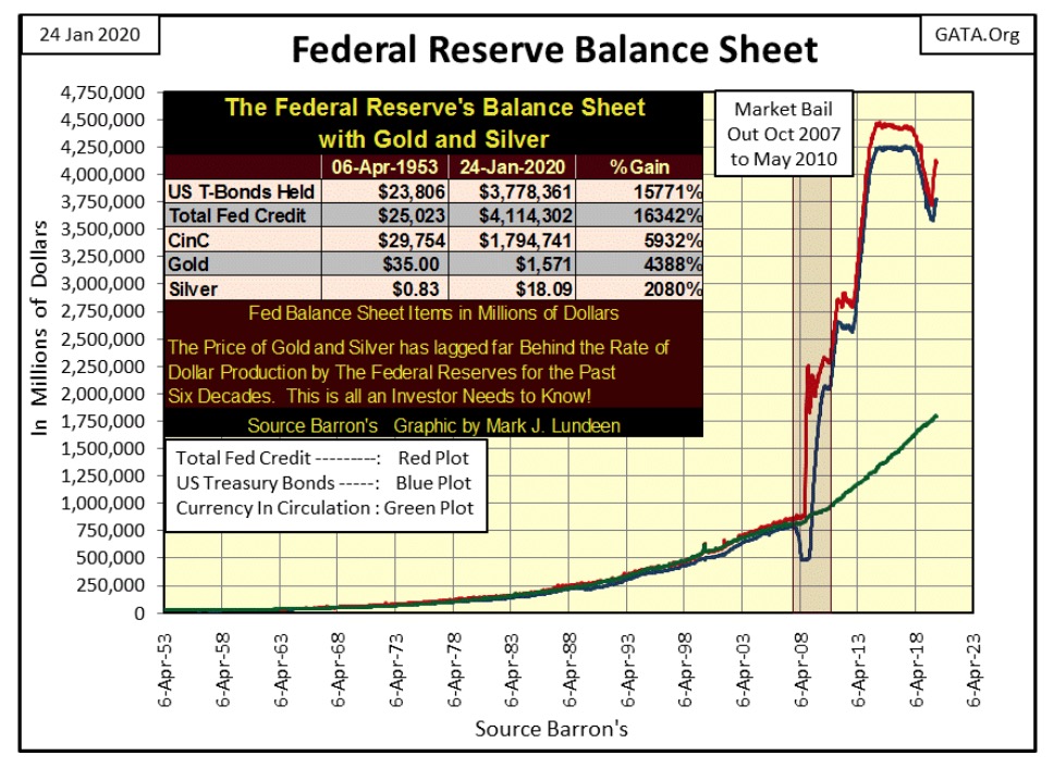
Then Fed Chairman Paul Volcker, by increasing interest rates to double-digits for five years (1978 to 1982 chart below) stopped monetary inflation flowing into consumer goods.
But once dollars are created by the Federal Reserve, they have to go somewhere in the economy. Beginning in August 1982 monetary inflation coming from the Federal Reserve began flowing into financial-market valuations such as stocks and bonds resulting in a series of bull and bear markets (inflationary booms and deflationary busts) recorded in the Dow Jones’ BEV chart above.
But whether it’s consumer goods, or stock and real-estate valuations expanding at annual double-digit percentage rates, it’s not actual “economic growth.” What we see above is a decades long, systematic devaluation of the global-reserve currency, and that is something the “policy makers” promised they would not do when they created the Bretton Wood’s Monetary Accords in 1945.
But “monetary history” is paved with lies. Doctor Bernanke told this whopper under oath before Congress, as he was actively implementing his QE1 (chart above).
(When asked directly during congressional testimony if the Federal Reserve would monetize U.S. government debt, the Fed Chairman responded) “The Federal Reserve will not monetize the debt.”
Doctor Benjamin Bernanke: June 03, 2009
The following chart of interest rates has an important point to keep in mind. Paul Volcker increased interest rates and US Long Bond Yields to well over 10% for many years because he could without causing bankruptcy to become a national disaster. This was because before 1982 personal, corporate and government balance sheets were strong, meaning the nation funded itself primarily on cash flow, NOT debt assumption.
Back then people were thrilled they could get 18% interest rates on their savings at a bank, because unlike today, before 1982 most people had much more in savings than they owed in debt. The same was true for corporations.
These double-digit rates seen below did create a painful economic recession. Unemployment was up, and finding a new job for the unemployed was more difficult. But it’s important to note these double-digit rates didn’t result in bankruptcies rolling throughout the economy and on a whole were seen as a blessing by many.
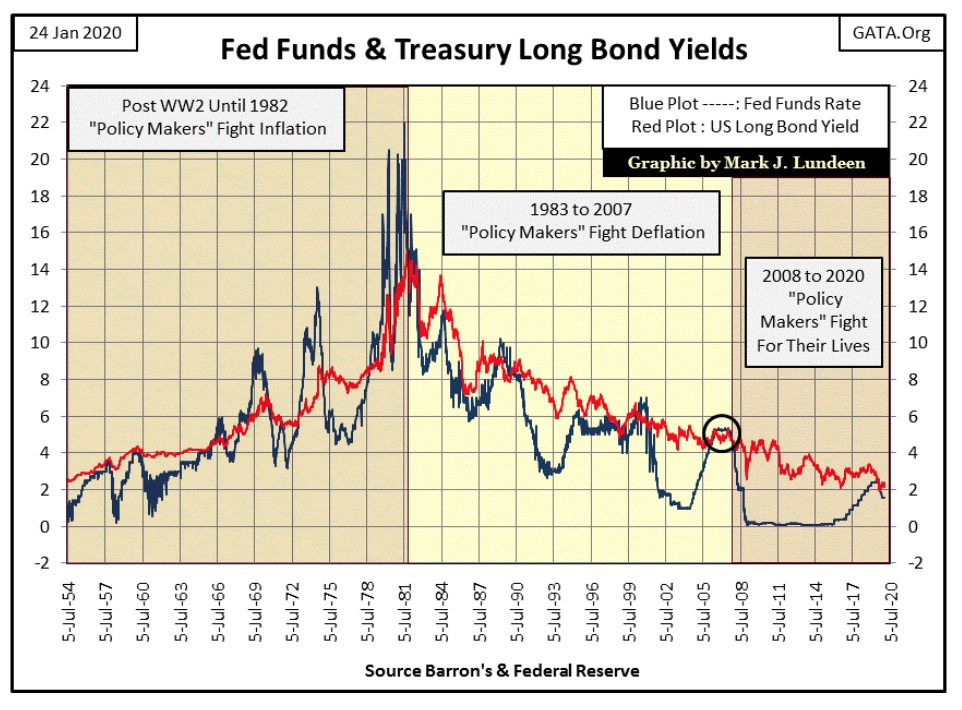
Now in 2020, the debt burden created by the Federal Reserve’s “monetary policy” of the past four decades, makes it impossible for the FOMC to raise interest rates and bond yields to where they were in late 2007 (circle). For example the US National Debt was only $1.01 trillion in January 1982, today in January 2020 it has increased to $23.2 trillion.
So, unlike forty years ago increasing interest rates today would be an act of monetary suicide as the rate-of-interest is no longer primarily what the bank pays its depositors, but what people, corporations and governments now pay to their bank or creditors in the bond market.
Before 1982 the United States was the world’s largest creditor. Now in 2020 we’ve become the world’s largest debtor.
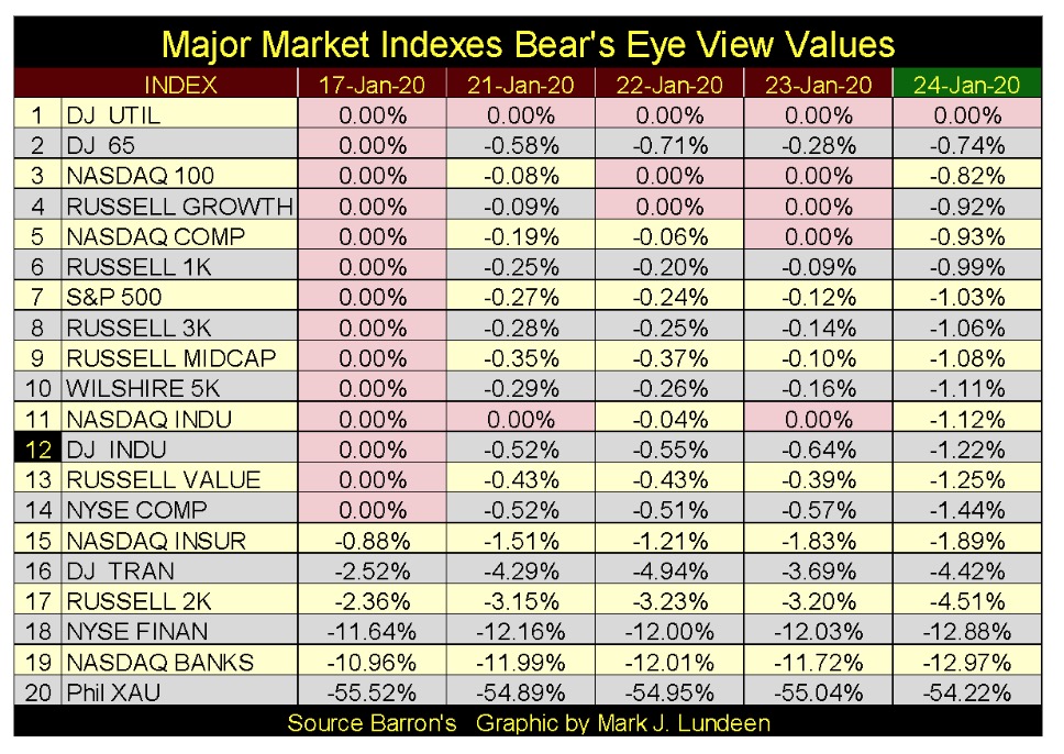
But with the stock market doing so well so far in 2020, no one is thinking about that. Here are this week’s BEV values for the major market indexes I follow. The week closed with only the Dow Jones Utility Average at a new all-time high. But the indexes going down to #17 remain in scoring position, within 5% of making a new all-time high.
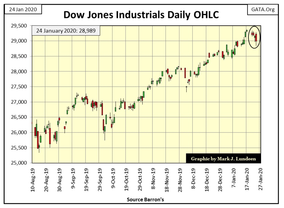
Next is the Dow Jones in daily bars. This week saw some selling pressure, but I remain short-term bullish on the stock market, and will remain so until the Dow Jones once again begins producing days of extreme volatility – Dow Jones 2% days. Until that happens, and it may not happen for a while, the path of least resistance for the Dow Jones is up as the FOMC continues “injecting liquidity” into the financial system.
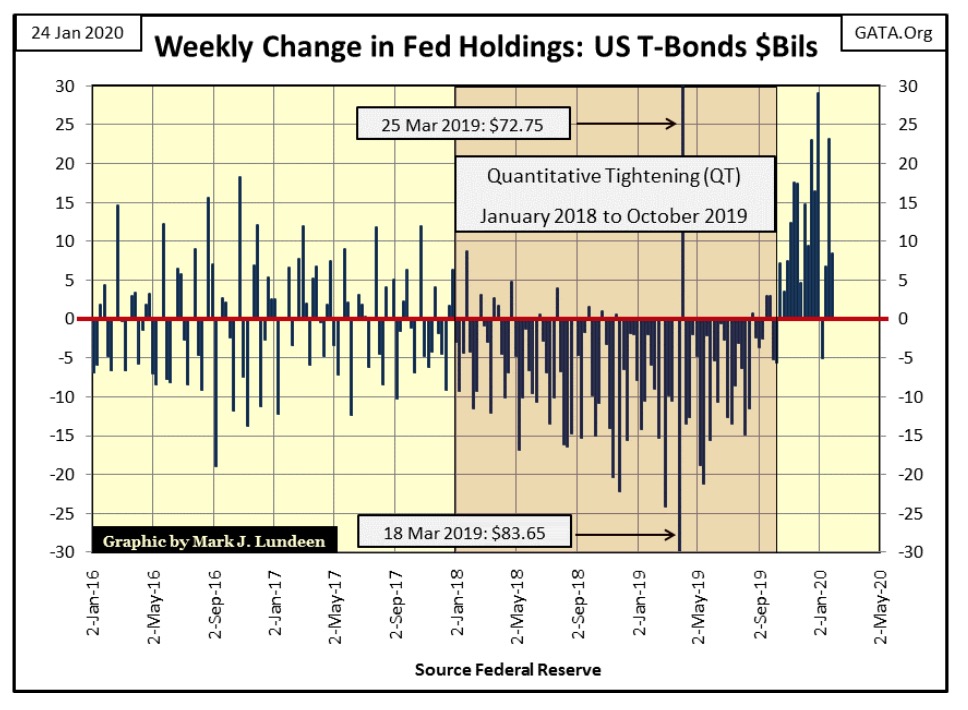
And the FOMC is “monetizing the national debt”, as seen in the chart below. Since the end of September they’ve terminated their Quantitative Tightening, and begun their fourth round of Quantitative Easing since 2008. This should have been a much bigger story in the financial media than it has.
Once started, I doubt they can stop this bout of QE without the consequence of its termination becoming painfully evident to all, as the short history of quantitative easings since 2008 have always been to keep the doors open for an insolvent banking system. It will be interesting seeing how long it will take before the FOMC is forced to “monetize” well over $30 billion a week to “maintain stability” in the financial markets. Will this happen before or after the Dow Jones begins seeing its next round of 2% days?
That’s what I’m wondering about.
There are things that when one looks at, one wonders what is going on; for instance NYSE market breadth in the 21st century.
But first I need to explain the data plotted below. It’s based on daily NYSE Advances and Declines, but it’s not a typical Advance – Decline Line. Issues (publicly held companies) trading daily at the New York Stock Exchange have since January 1926 expanding from about 500 to over 3,000 in the past century. Had I used a straight A-D line, recent data would have six times the impact in the plot as those days during the 1920s.
To normalize daily NYSE A-D data over the past century I used a ratio of:
Advancing Issues – Declining issues
———————————————–
Issues traded at the NYSE for that day
Using the above ratio (NYSE A – D Ratio) gives the daily A-D data from a century ago equal weighting (equal significance) in the plot as the current daily trading.
What is this plot telling us? Those days where we see more issues trading at the NYSE advance than decline, the plot rises. And those days more issues trading at the NYSE decline than advance, the plot declines. During prolonged market advances the NYSE A-D Ratio advance, as it declines during prolonged market declines.
However, nothing is ever so simple in the stock market. Let’s look at a bull market, bull markets begin at the end of a bear market with compelling values throughout the market. In the summer of 1932, after the Dow Jones 89% market bottom, anything and everything trading on the NYSE was going up. But as any market advance ages, the market develops favored sectors and individual stocks that out-perform the broad market.
This results in a flow-of-funds from average return issues trading on the NYSE towards the issues outperforming everything else. A good example of this can be seen in 1956 (below), where the NYSE A-D Ratio topped with the Dow Jones at 485. The Dow Jones itself wouldn’t top until 1966 at 995, doubling its value in the next decade as the NYSE A-D Ratio trended at best sideways for the next ten years.
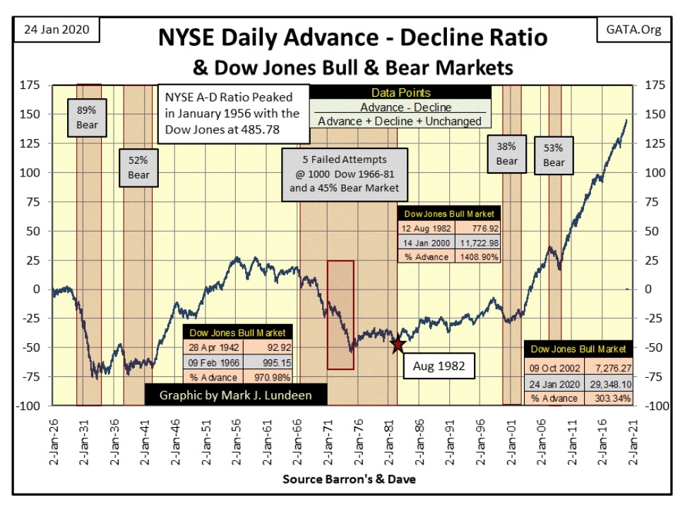
I’m not going into detail on this data. As I’ve included data for Dow Jones bull and bear markets in the chart, with a little effort my readers can understand this data as well as I do. Instead I’m going to focus on this data since August 1982 (Red Star to today).
The eighteen years spanning 1982 to 2000 (the top of the high-tech market bubble) saw the Dow Jones increase 1408% as the NYSE A-D Ratio increased by little more than 100%. Okay, I can live with that.
But what really stands out is that since October 2002 to today (again about eighteen years) the Dow Jones has increased by only 303% as the NYSE A-D Ratio made a moon shot from -25 to just short of 150. For the past eighteen years advancing shares at the NYSE have dominated decliners as never before in history. Even the 2007-09 Sub-Prime Mortgage Bear Market, a massive -54% market bottom, the second deepest percentage decline in the Dow Jones since 1885, had little impact slowing down the ratio’s advance.
There’s something really odd going on at the NYSE for the past two decades. I believe what we are seeing in the plot above since October 2002 is another one of those finger prints left behind on the markets by the “policy makers” as they manipulate the financial markets.
What’s the big deal? The stock market and people’s investment portfolios have done well as the “policy makers” have manipulated the market since 2002. However, if you believe in the principle of the revision to the mean, that what goes up must come down, the following chart is rather alarming.
I track what I call extreme-market events. One of these market extremes are Dow Jones 2% days, or days the Dow Jones moves (+/-) 2% or more from a previous day’s closing price in a running 200 day count. As a bull market approaches its terminal point, and during the following bear market, the frequency of these 2% days in the Dow Jones increase dramatically.
Another series of market extremes I follow are NYSE 70% days, or days of extreme market breadth when the above NYSE A-D Ratio (the same data plotted above) increases to or above (+/-) 70%.
Since 02 January 1926 the NYSE has seen 24,808 trading sessions, but only 393 (1.6%) of these trading sessions have seen the NYSE A-D Ratio increase to, or exceed (+/-) 70%. However, as seen below the bulk of these extreme-market events have cluster ether during the late 1920s to the beginning of World War Two, and then again beginning in February 2007 as the sub-prime mortgage bubble began developing problems to the present day. The last day of extreme market breadth was on 05 Aug 2019, a -79.69% day.
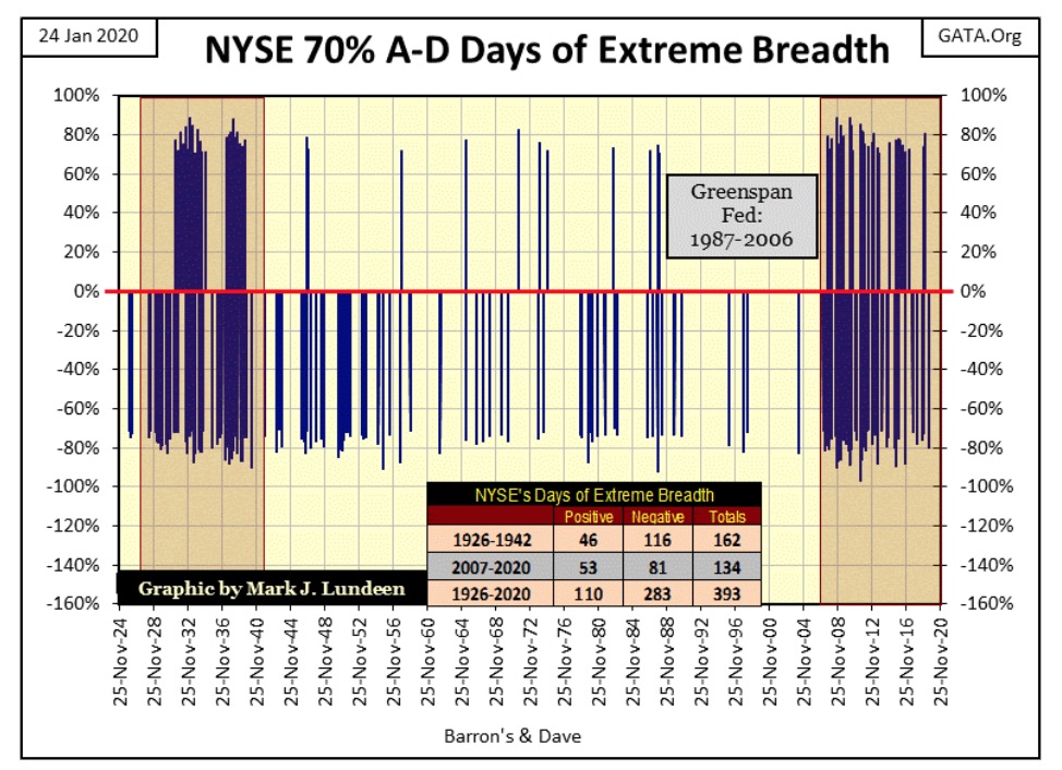
Looking at the cluster of NYSE 70% days from 1928 to 1942 above, its net effect on the market was to drive the public from Wall Street, and the public didn’t return until a generation (the baby boomers) who had no personal memory of this period came of age in the 1970s and 80s. One can predict with certainty our current cluster of NYSE 70% days will also come to an end, as did the cluster from the 1920s and 30s. But as it does will the public once again develop a revulsion to Wall Street’s siren song of easy money?
Next is a chart of this data from 1977 to the close of this week. Note how few NYSE 70% days occurred during the years of the Greenspan Fed, as well as during the High-Tech Bear Market. Then a year after Greenspan retired from the Federal Reserve, our current cluster of days of extreme-market breadth began.
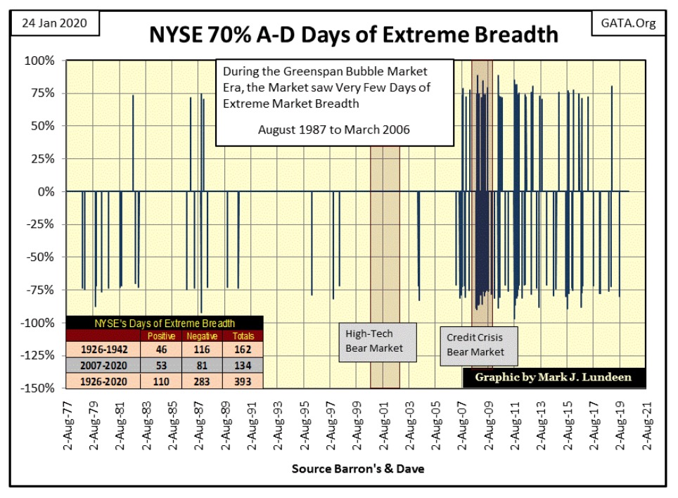
When the stock market once again begins deflating, we can anticipate NYSE 70% days increasing in frequency.
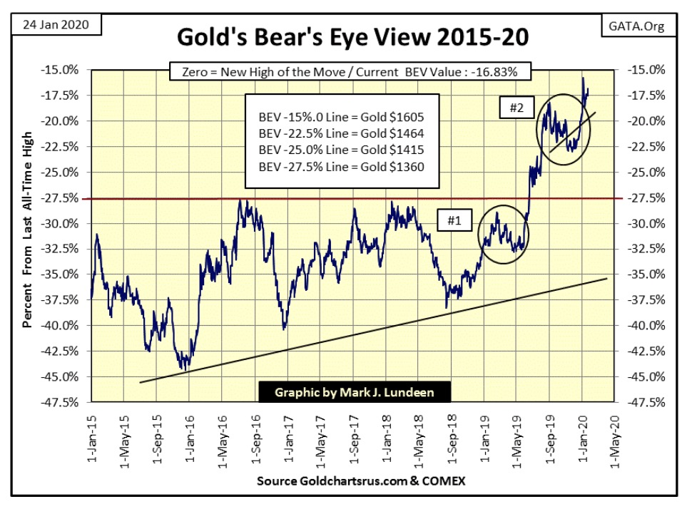
Gold is holding on to its gains. The next thing to watch for is for it to break above its BEV -15% line ($1605). That’s only a 1.83% advance from this week’s close; we could see it happen next week or the week following.
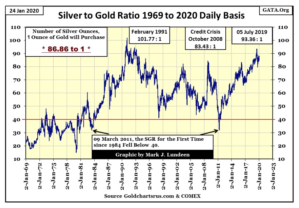
The price of silver continues lagging gold’s advance. We know that as the Silver to Gold Ratio (SGR below) remains mired in the mid-80s. When the precious metals bull market once again breaks out, it will be immediately apparent as the SGR once again declines towards its 40 ounces of silver to one ounce of gold red line below.
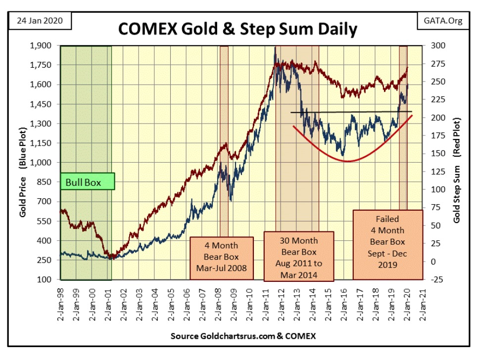
Next is my gold step sum chart. As noted last week the bear box that gold began last September failed in December, with January taking gold to just short of $1600 as of the close of this week. For six years gold struggled with its $1360 level (black line). After breaking above $1360 last summer, and then forcing a step sum bear box from last fall to fail a month ago, the potential for the current move in gold is immense.
Also immense is the open interest in the COMEX gold market. The shorts are flooding the market with digital gold, but so far the gold bulls are shrugging off this flood of fool’s gold. I’m hopeful the current advance will continue until gold sees new all-time highs, but considering everything I’m taking this market action one day at a time.
Moving to the Dow Jones’ step sum chart below everything remains intact for further gains in the stock market.
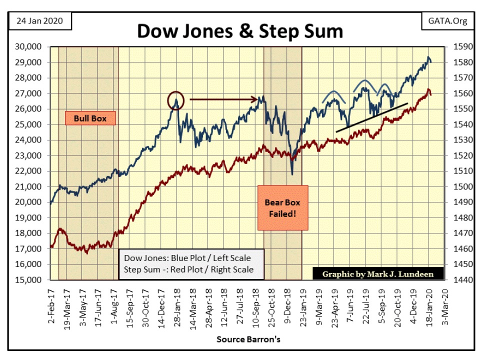
But as seen in gold’s step sum table below, the Dow Jones is losing energy. Its 15 count is ready to go negative, and is step sum has only increased by six steps in the past twenty-five trading sessions. This could all change by next week, but at this week’s close these are the trends I see for the Dow Jones. In favor of the Dow Jones is its daily volatility remains low. Currently it’s at 0.53%, which is bullish. But should daily volatility increase to 1.0% or more – that’s bad for the bulls at the NYSE.
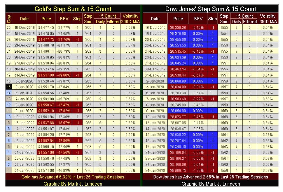
As for gold, it too is seeing an increase in daily volatility. But bull markets for gold are volatile markets, so the faster its daily volatility rises to something above 1.0% the more I’ll like it. Just seeing volatility for gold increase from 0.57% since mid-December to 0.60% this week has benefited the bulls in the gold market.
Gold’s 15 count hasn’t been negative since early December, meaning that advancing days are dominating declining days. Gold also saw some 9s and lots of 7s in its 15 count since December 18th. These are high counts, and high counts typically indicate a short term sell off is pending. That a selloff in gold hasn’t happened yet is damn bullish.
But the item from the above tables I like best is how since December 18th, gold has advanced by 6.32% while the Dow Jones has only advanced by 2.66%. One week doesn’t mean much. But should gold continue to outperform the stock market for the next few months – and it could – that would attract lots of attention of money looking for somewhere to go.
Like I said before, I’m taking this market one day at a time, but I can still dream.
—
(Featured image by Ahmad Ardity from Pixabay)
DISCLAIMER: This article was written by a third party contributor and does not reflect the opinion of Born2Invest, its management, staff or its associates. Please review our disclaimer for more information.
This article may include forward-looking statements. These forward-looking statements generally are identified by the words “believe,” “project,” “estimate,” “become,” “plan,” “will,” and similar expressions. These forward-looking statements involve known and unknown risks as well as uncertainties, including those discussed in the following cautionary statements and elsewhere in this article and on this site. Although the Company may believe that its expectations are based on reasonable assumptions, the actual results that the Company may achieve may differ materially from any forward-looking statements, which reflect the opinions of the management of the Company only as of the date hereof. Additionally, please make sure to read these important disclosures.


Youth Cannabis Use in Colorado Is Falling — But the Full Story Is More Complex
The 2026 Colorado survey shows teen cannabis use fell to 10 percent in 2025, down from 21 percent in 2015....


Morocco’s Growth Holds at 4.6% as Agriculture Offsets Economic Pressures
Morocco’s economy grew 4.6% in Q1 2026, driven by a strong agricultural rebound offsetting declines in industry. Services expanded moderately...


Abivax Shares Surge as New Trial Data Eases Safety Concerns Over Ulcerative Colitis Drug
Abivax shares surged nearly 36% after positive updated trial results for its ulcerative colitis drug obefazimod reassured investors following earlier...


El Dorado Raises $9M to Expand Cross-Border Fintech Platform
El Dorado, a Latin American fintech improving cross-border financial services, raised a $9 million Series A led by Paradigm with...


Bitcoin Stalls Near $60K as Strategy Moves, ETFs Outflow, and EU MiCA Rules Take Effect
Bitcoin hovers near $60,000 with ETF outflows, while Strategy boosts reserves, sells BTC, and raises dividends to reassure investors. Ethereum...
 |
|
 |  |
 |
|
-

 Africa1 week ago
Moroccan Bond Market Shows Mixed Signals as Primary Eases and Secondary Pressures Persist
-

 Fintech7 days ago
Talentir Secures €4M to Transform Global Payouts
-

 Cannabis2 weeks ago
WNBA Removes Cannabis From Banned Substances List in New CBA
-

 Markets2 days ago
Cotton Market Weakness Persists Despite Brief Rebound