Featured
Why Is the FOMC Buying Corporate Bonds
Since March 2020, the FOMC has been in the market buying corporate bonds too. In March 2020 the corporate bond market was in a free fall (yield spike in chart below). So, once again, FOMC “stabilized” a major American market using monetary inflation to fund purchases of something trading on Wall Street, with the FOMC paying prices no one else was willing to offer.

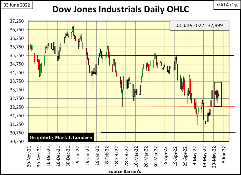
It’s been 104 NYSE trading sessions since the Dow Jones had seen its last BEV Zero in its BEV chart below (04 January 2022). Since then, the Dow Jones broke below its BEV -15% line on the 19th & 20th of May. Then, in the past week it broke above its BEV -10% line twice, first on the 27th of May and again yesterday on the 2nd of June.
So, what’s next for the Dow Jones? Begin advancing towards its next BEV Zero, or continue deflating into market history? Just looking at its BEV chart, it’s tempting believing the Dow Jones has just seen the bottom of a correction, as it did below in January 2019 when it almost, but failed to break below its BEV -20% line.
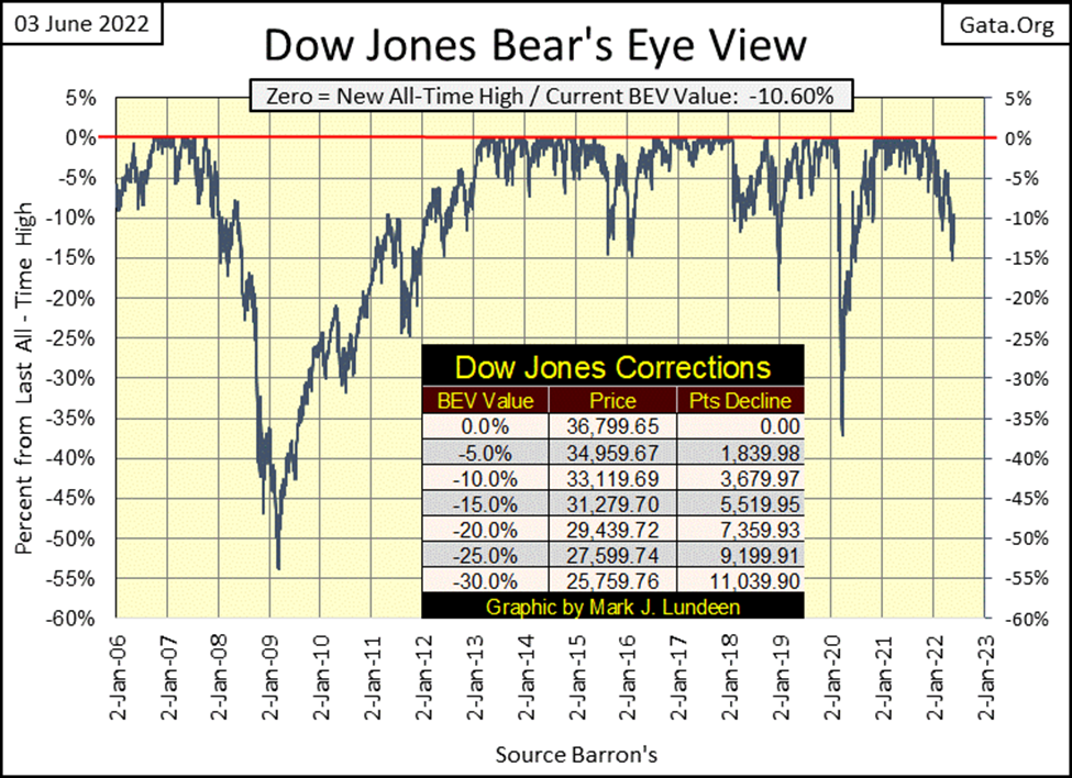
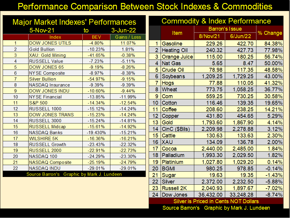
But the Dow Jones, while I use it for my proxy for the broad stock market, is a market index containing only thirty large blue-chip stocks. How are the other major stock indexes doing in the table below? Most are underperforming the Dow Jones. Last year’s hot NASDAQ Indexes are down over 20%.
What about the XAU? It slipped back below its BEV -40% line. I don’t know what to say. The XAU’s last BEV Zero was in late April 2011, over a decade ago.
Since then, the FOMC has “injected” 6.22 trillion dollars of “liquidity” into the financial system. Simple logic strongly suggests not only the miners of gold and silver, but gold and silver themselves would now be trading far above where they were over eleven years ago. That they aren’t strongly suggests something is amiss, which I believe is the global central banking system cartel, of which the Federal Reserve is a member of distinction.
I believe it was Paul Volcker (the Fed Chairman who during the late 1970s increased interest rates and bond yields deep into double digits), who stated the FOMC’s official policy on the price of gold:
“The price of gold down: good. The price of gold up: bad.
So far, the idiot savants managing “monetary policy” at the FOMC, along with the COMEX goons, running amuck in the gold and silver futures markets, have been able to do “good” things with the old monetary metals; gold and silver. But one of these days, and I believe not all that far from now, that is going to change. When it does, I want exposure to precious metal assets, like the miners of gold and silver.
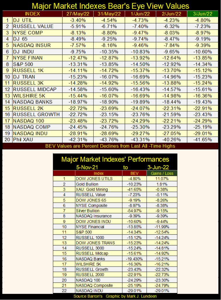
Looking at these indexes’ performance since 05 November 2021 in the table above, only the Dow Jones Utilities are up for the last seven months. Seeing the XAU at #3 in the table above should give its gold and silver miners a little more street credibility.
Even so, maybe the declines seen above are near the bottoms of their current correction. Should the bears out there begin to curb their longings for further, and deeper market declines?
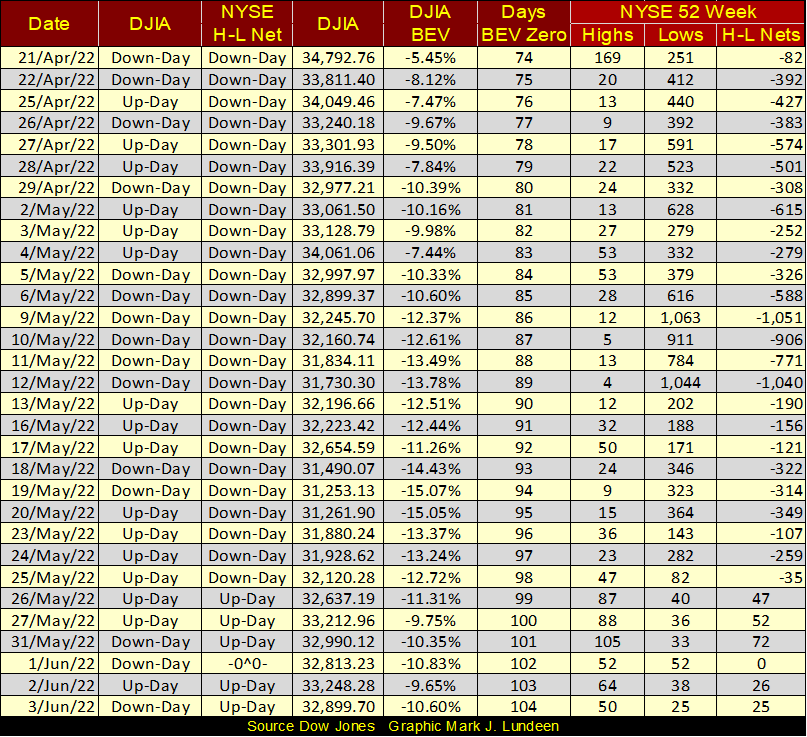
One very positive factor the stock market has going for it; NYSE 52Wk H-L Nets. After seeing two H-L Nets of greater than -1000 a few weeks ago, have since the 25th of May, once again turned positive. This indicates the majority of stocks trading at the NYSE have stopped going down, and have again begun advancing.
So, is the stock market a buy-in early June 2022?
I think we’ll have to look elsewhere to determine whether or not the stock market is near a correction bottom, or if more, and deeper bear-market declines are still pending.
First, and most important of all, what is the Federal Reserve doing? It’s been known for many decades that one doesn’t “Fight the Fed.” Not only is that rude, historically fighting the Fed just isn’t profitable.
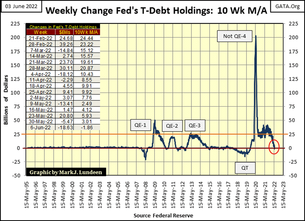
So, what are the idiot savants at the FOMC doing to the markets? Oh, that is a simple question to answer: the idiots are going to push the economy and financial markets off the edge of a cliff with their QT, which, as seen in the chart below, they’ve implemented this week, as promised.
For the first time in over two years, this 10Wk M/A has slipped into negative territory. I don’t expect it to become positive again until, as in March 2020, the idiots at the FOMC are once again forced by a market meltdown to implement another panic motivated “Not QE.”
So, the idiots have begun draining the “liquidity” they “injected” into the financial system via their QE #1-3, and their awesome Not QE #4, as promised (see chart below). I believe they made this promise sincerely, so let’s see what happens to market valuations when the Federal Reserve’s 8.87 trillion-dollar balance sheet is reduced by 5% or 10%. For the bulls who used to run wild and free on Wall Street, I’m expecting nothing good will come from this QT.
To paraphrase Fed Chairman Paul Volcker’s quote above, from the bulls’ point of view, I believe we’ll once again discover:
“Injecting liquidity” into the market: good. Draining “liquidity” from the market: bad.
With this 10Wk M/A now going negative in the chart below; the idiots at the FOMC have begun draining “liquidity” from the financial system. Is that good or bad? We’ll all discover the answer to that question in the months to come.
Going back to the Dow Jones, its daily bar chart below, this week it hit a glass ceiling at the 33,250 line. Last week saw five nice daily advances, so maybe this week’s market action was just a pause that refreshes. I’m not ruling out further gains in the weeks to come, as anything can happen in the market.
But considering the FACT that the FOMC is implementing another QT, what I’m really waiting for is an increase in daily volatility, the return of the dreaded Dow Jones 2% days in this chart. As there is usually a delay between cause and effect when examining “monetary policy”, even for such things as QEs and QTs, it may be a few months before we see their impact on the stock and bond markets. Then again, the dreaded Dow Jones 2% days may start next week, but most likely not.
If someone is looking for another bull market somewhere to participate in, I don’t believe they will find it at the NYSE or NASDAQ for a considerable time. The exception to that being gold and silver miners, as well as other commodity based listed companies.
Look at the comparison between the stock indexes and commodity prices since the first week of last November in the table below. Except for the Dow Jones Utility Average in the table on the left, most of these indexes have been losers for the past seven months, some by a lot.
Now look at the commodities in the right table. Since the first week of November, most have been winners, some by a lot.
In the table on the right, we’re seeing a huge increase in consumer prices. Rising CPI inflation has never been good for the bond market. And what is bad for the bond market, is also bad for the stock market.
I was inspired by the above graphic to fabricate another Bear’s Eye View table, but for commodities using * Weekly Closing Data *, as seen below. Unlike the major stock indexes, this week we saw some BEV Zeros (new all-time highs) below in heating oil and gasoline. The other commodity’s BEV values in this table are fairly deep, but it’s early in the bull market for commodities, so this will not be true in the months and years to come.
Anyways, when we look at how these same commodities have advanced since last November in the table above, who cares about their BEVs in the table below?
So why did I create this table? So that one day I can weekly track which commodities are making BEV Zeros, or closing in scoring position; BEVs of -0.01% to -4.99%. If someone is a bull, this is what they want to see; repetitive BEV Zeros and closes in scoring position.
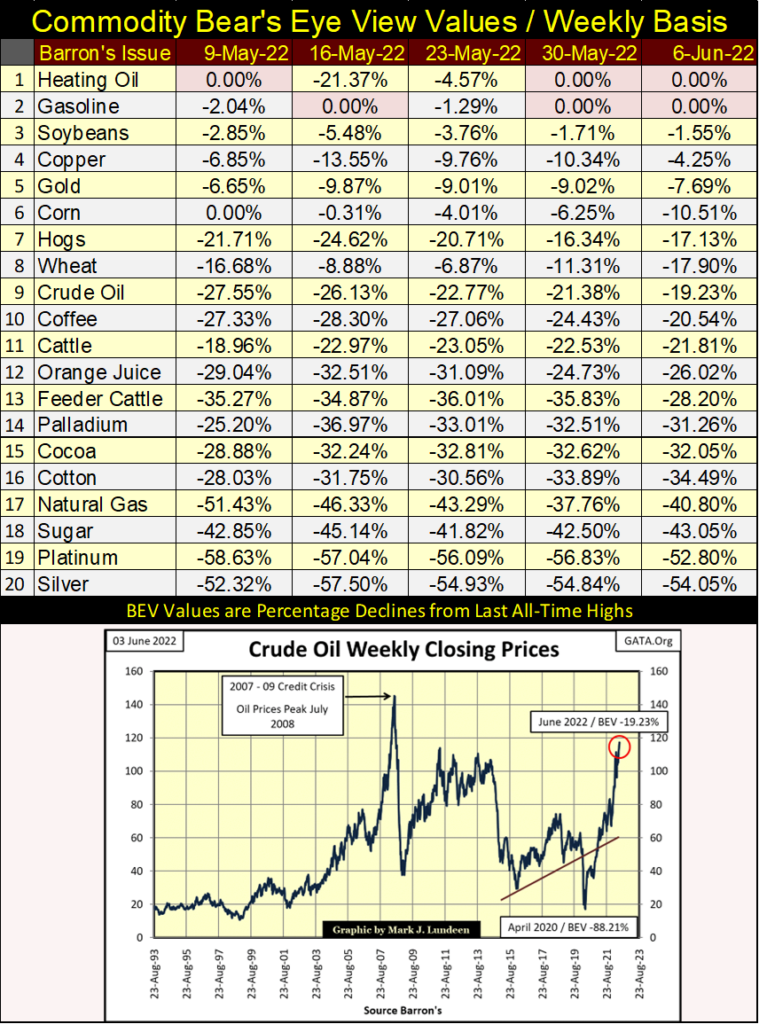
Let’s look at crude oil in the chart above. In March 2020 crude oil had a BEV of -88.12% from its last all-time high of July 2008. This week it closed with a BEV of -19.23%, an advance from $17 to $117 for a barrel of crude in a little more than two years – ouch!
As a humorous sidebar, Senate Majority Leader; Chuck Schumer actually said the best way to get crude oil and gasoline prices under control again was to raise taxes on the rich. Schumer, a Democrat (aka Marxist) is also a strong advocate of shutting down America’s drilling of oil and gas, and blocking the construction of new pipelines. As always, for the Democrats there is no better way to help the little guys than to raise taxes on rich people, those making more than a $40K a year.
There are other commodities, whose performance these past two years are very similar to the energy complex. With idiots also running amuck at the nation’s capital and the White House, how long before crude oil, and other commodities are also making weekly BEV Zeros, or closing in scoring position?
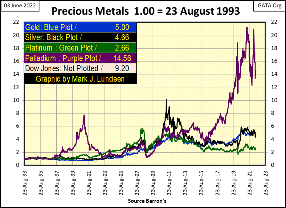
Unfortunately, so far, the precious metals are not on that list. So, let’s look at the precious metals below, indexed to 1.00 = August 1993. The only standout is palladium (Purple Plot), though since February 2020 it has been rangebound between 12 to 22. However, to my way of understanding what is to be, not long from now palladium will go on to new all-time highs once again.
Since 1993, the Dow Jones has outperformed the precious metals. But had I chosen another index date, such as October 2007 (the top of its sub-prime mortgage bull market), this chart would look much different.
So, why did I use August 1993? Because I have weekly data for all the metals going back to then. For copper, corn, soybeans, silver, and others, I have weekly data going back to 1957.
I should also note the weekly commodity prices I track are from Thursday’s closing prices. I use Thursday’s closing prices because I have enough to do on Friday to get my market commentaries out. When someone is a one-man operation, they have to know where to cut corners.
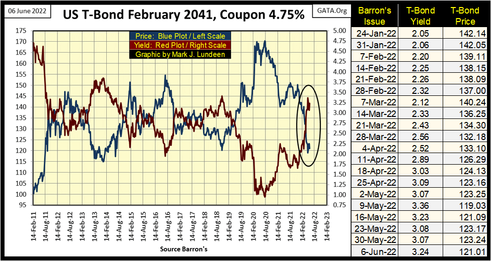
The bond market is an important market when considering how things go on Wall Street. As seen below with my chart for a 30Yr T-bond issued in February 2011, the Treasury market has yet to recover from a market decline that began in August 2020.
As the idiots from the FOMC conduct their QT, they plan to sell into the open Treasury bond market about 50 billion of dollars of their holdings of Treasury debt, per month for the remainder of the 2022. Then there is the US Treasury itself issuing new debt, by the billions too in months to come. Who is there to buy this flood of Uncle Sam’s IOUs?
Oh, there will be someone. Unfortunately, most likely it will be my life insurance company, or possibly your pension fund. But something tells me they are going to demand steep discounts from today’s prices (Blue Plot below) for any new Treasury debt they purchase as the QT progresses in earnest.
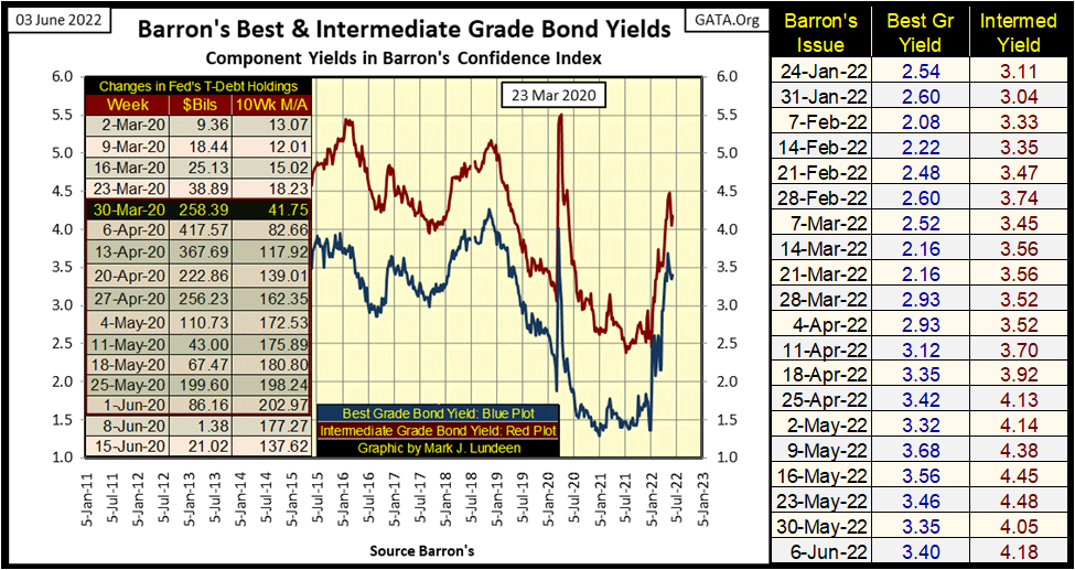
Since March 2020, the FOMC has been in the market buying corporate bonds too. In March 2020 the corporate bond market was in a free fall (yield spike in chart below). So, the idiots once again “stabilized” a major American market using monetary inflation to fund purchases of something trading on Wall Street, with the FOMC paying prices no one else was willing to offer.
Are the idiots planning to dump some of their holdings of corporate bonds into the bond market? I don’t believe they have officially said they would, but that doesn’t mean they won’t.
It will be interesting following Barron’s Best and Intermediate Grade Bond Yields in the chart below, as the FOMC’s QT progresses this summer. Should the T-bond market above, and the corporate bonds below continue to come under pressure, as seen in rising yields, the prospects for a return of the bull market for stocks becomes ever dimmer.
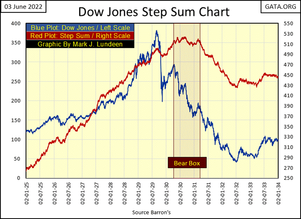
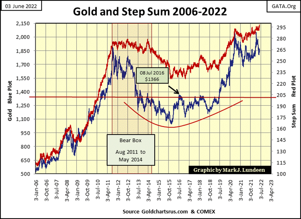
Let’s talk about step sum boxes, where, in a step-sum chart, Market Reality (market valuation) and Market Sentiment (the step sum) diverge from one another. In the Dow Jones step sum chart below covering the Roaring 1920s Bull Market boom, and the Great Depression bust, the Dow Jones and its step sum formed a bear box for a year; from April 1930 to April 1931.
Exactly when the bear box below began, and when it ended is subjective, as step-sum analysis is more art than science. Not only that, but the boundaries of a step sum box are usually best identified a few months after it begins or terminates. As a rule of thumb, I won’t claim a step box is forming until two or three months has passed by. That’s also be a wise thing to do when deciding a box closes.
In June 2022, defining the start and stop dates for the box below from the 20th century is easy to do. But in April 1931, where I have this box closing (terminating), I can’t honestly say I would have closed this bear box from the depressing 1930s. Possibly, I wouldn’t have seen this box’s April 1931 close until August 1931; four months later.
What is happening in the chart below? Usually, market reality and market sentiment are in phase, rising and declining with each other. Maybe not perfectly, but a quick study of the chart below, except for the one year spanning April 1930 to April 1931, you’ll see my point.
Outside the box (before and after) rising prices in the Dow Jones created bullish market sentiment; declining prices for the Dow Jones created bearish market sentiment. But inside the box, during the early part of the Great Depression Crash, market sentiment rejected the possibility the Dow Jones was in a bear market. It was a mistake. After all, a bear box is a bear box, a technical formation where the bulls get punished.
Inside the bear box, market sentiment was such that following a bad day in the market, lower prices were understood as opportunities for the bulls to scoop up bargains. Unfortunately for the bulls, from April 1930 to April 1931, market valuations only became ever bigger bargains.
Following April 1931, the bear box closed (terminated) with the collapse in market sentiment (the step sum). This collapse in market sentiment marks the shift in market psychology; from the bulls buying bargains on market weakness, to cutting their losses as best as the now penitent bulls could, by selling on market strength. And so, the step sum collapsed, until the last errant bull exited the market.
And so it went until July 1932, the absolute bottom of the stock market’s Great Depression bust, when both market sentiment and reality bottomed, and then bounced. Marking a hard bottom for the Dow Jones, the point when pent-up selling pressure exhausted itself, and once again it became safe to enter the stock market.
With all the above in mind, in the Dow Jones’ step sum chart below has developed a Bear Box, where once again the Dow Jones valuation (Blue Plot / Market Reality) is in disagreement with its step sum (Red Plot / Market Expectations). Currently market reality is bearish, while market sentiment remains bullish.
How long this bear box will last is at present unknowable. It could be months, or possibly years, but it will end in one of two ways.
Typically, with the bulls surrendering to Mr Bear, as seen with the red step sum plot collapsing down towards market reality’s blue plot. Most likely nothing as dramatic as seen above in the early 1930s, but we live in historic times, so who knows?
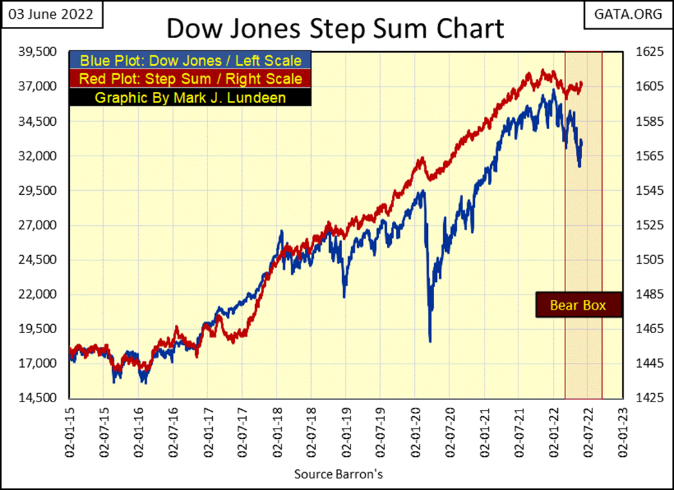
The other way this bear box could be terminated, would be to invalidate it, by seeing the blue market reality plot rise up towards its red step sum plot (market sentiment). Should the Dow Jones see a daily close above 35,000, as its step sum plot continues advancing, this box would be closed (terminated). In other words, the bulls were right buying on market weakness.
As I said before, step sum analysis is more art than science. Still, it will be interesting following this box as it evolves over time. It must be noted, that usually it is the bulls who are wrong when it comes to these bear boxes, but this is a very immature box. Should it continue to December of this year, it has the potential to become something historic.
There is another bear box we need to follow, in the gold market. I didn’t highlight gold’s bear box with a red box, as it would be too thin. Still, since March 8th when gold closed at $2052, gold has only declined as its step sum (market sentiment) refused to follow the price of gold down (market reality).
+
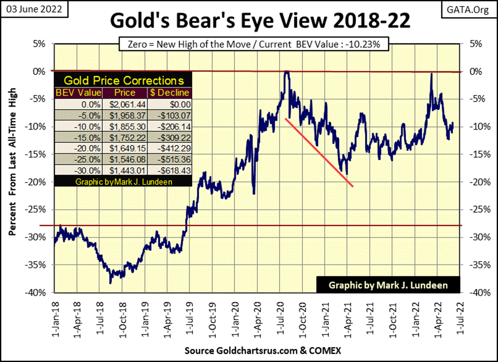
Let’s move on to gold’s BEV chart. Having broken below its BEV -10% line, it now is trending back above it. Question; what BEV line will gold next cross? Its BEV -5%, or BEV -15? Gold’s bear box in the chart above suggests it will next break below its BEV -15% line. But being a bull on the gold market as it stands today, why should I care about that?
When the FOMC’s QT begins draining “liquidity” from the stock and bond markets, I’m anticipating gold’s next move will be above its BEV -5% line as flight capital fleeing deflation at the NYSE and debt markets, seeks inflation in commodities. Precious metals assets should also benefit from this anticipated flow of flight capital, as it did during the 1970s.
Time will tell who is right; the bearish COMEX goons who sell gold that doesn’t exist by the tons into the futures markets. Or a humble, but bullish market enthusiast, such as myself. If bond yields continue rising in the weeks and months to come, the smart move should prove to be betting on the humble market enthusiast.
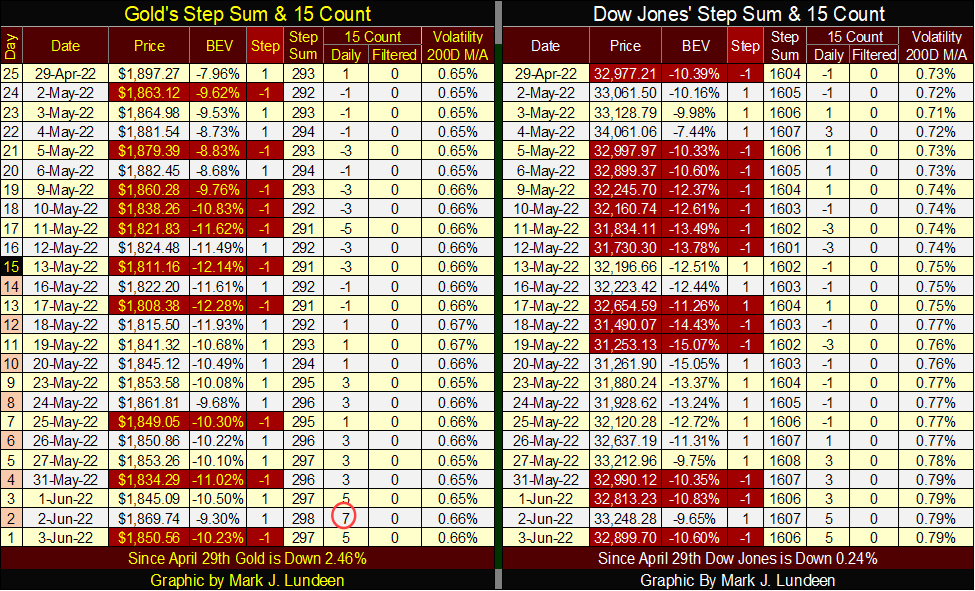
Let’s move on to gold’s and the Dow Jones’ step sum tables below. The gold market isn’t making its bulls happy, but the bears aren’t happy either.
On May 17th gold closed at $1808. The bears must have wanted it to close below $1800 in the days that followed, hoping the weak hands in the market would provide further downward pressure as they exited the market. But that didn’t happen.
For the bulls, gold did become overbought on Thursday this week, with a 15-count of +7. But it took only an advance in the price of gold of $61 from the lows of May 17th to do that. So, what is wrong with the gold market? I’d say it’s the lack of daily volatility, or days of extreme volatility, which for gold is (+/-) 3% moves from a previous day’s closing price.
The chart below hasn’t been updated for the last two years, as since 2020, there has been a total absence of 3% days for gold. So, I didn’t make the effort to update the chart.
Volatility for gold is different that it is for the Dow Jones. High daily volatility for the stock market is ALWAYS bearish. While for gold; high daily volatility occurs during both bull and bear markets. While tedious gold markets, such as ours, are markets that are relatively free of extreme daily volatility; 3% days in the gold market, as seen below.
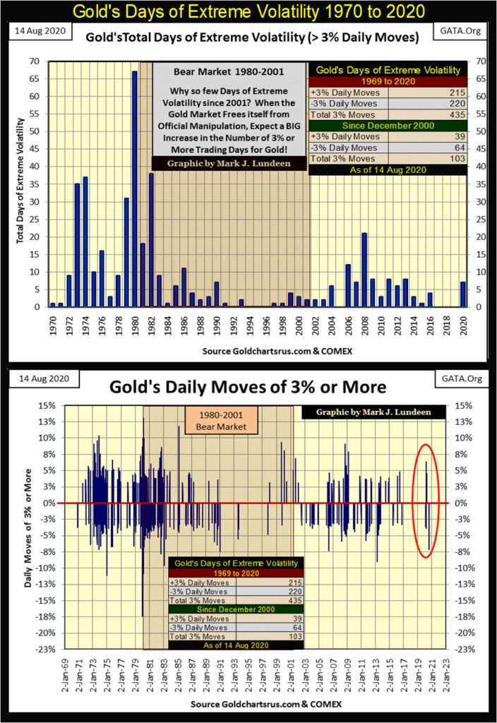
One day this will change, hopefully before September, and we’ll see a significant increase in daily volatility in the gold market, as the price of gold begins to soar far above its highs of August 2020.
As far as the Dow Jones goes, it too isn’t doing much to keep its bulls happy. I’m looking at its daily volatility’s 200D M/A below. On January 3rd, the day before the Dow Jones’ last all-time high, it was 0.57%. This week it closed at 0.79%, and its advancement in 2022 has been relentless. This is a stock market that is in the early stages of developing a fever. If this trend continues, it won’t be long before the bulls begin upchucking dollars.
__
(Featured image by AbsolutVision via Pixabay)
DISCLAIMER: This article was written by a third party contributor and does not reflect the opinion of Born2Invest, its management, staff or its associates. Please review our disclaimer for more information.
This article may include forward-looking statements. These forward-looking statements generally are identified by the words “believe,” “project,” “estimate,” “become,” “plan,” “will,” and similar expressions. These forward-looking statements involve known and unknown risks as well as uncertainties, including those discussed in the following cautionary statements and elsewhere in this article and on this site. Although the Company may believe that its expectations are based on reasonable assumptions, the actual results that the Company may achieve may differ materially from any forward-looking statements, which reflect the opinions of the management of the Company only as of the date hereof. Additionally, please make sure to read these important disclosures


Youth Cannabis Use in Colorado Is Falling — But the Full Story Is More Complex
The 2026 Colorado survey shows teen cannabis use fell to 10 percent in 2025, down from 21 percent in 2015....


Morocco’s Growth Holds at 4.6% as Agriculture Offsets Economic Pressures
Morocco’s economy grew 4.6% in Q1 2026, driven by a strong agricultural rebound offsetting declines in industry. Services expanded moderately...


Abivax Shares Surge as New Trial Data Eases Safety Concerns Over Ulcerative Colitis Drug
Abivax shares surged nearly 36% after positive updated trial results for its ulcerative colitis drug obefazimod reassured investors following earlier...


El Dorado Raises $9M to Expand Cross-Border Fintech Platform
El Dorado, a Latin American fintech improving cross-border financial services, raised a $9 million Series A led by Paradigm with...


Bitcoin Stalls Near $60K as Strategy Moves, ETFs Outflow, and EU MiCA Rules Take Effect
Bitcoin hovers near $60,000 with ETF outflows, while Strategy boosts reserves, sells BTC, and raises dividends to reassure investors. Ethereum...
 |
|
 |  |
 |
|
-

 Impact Investing6 days ago
Coastal Cities Lead as Heat Strains Italy’s Urban Livability
-

 Fintech2 weeks ago
Trade Republic Brings Back Human Support and Launches Customer Council
-

 Biotech2 days ago
Eli Lilly Hits $1 Trillion Valuation Amid Strong Bullish Momentum
-

 Africa1 week ago
Moroccan Bond Market Shows Mixed Signals as Primary Eases and Secondary Pressures Persist