Featured
Why is the stock market soaring with so much chaos?
BLM protests are rocking America, thousands are still without jobs, yet the stock market continues to see record rises. In order to understand why we need to take a look at the data. Rising inequality, exacerbated by the stock market, has created a disconnect between real economic data and the markets, this disconnect is going to contribute to further unrest.
The 1918 pandemic, the 1929 depression, the 1967 Detroit race riots! All rolled into one. But the stock market is soaring. So, what’s the problem?
It is as if we live in two different worlds. In the U.S. there are more than 100,000 dead from the pandemic, 41 million unemployed, and riots on the streets. But what does it matter? The stock market is up over 40% from the March lows and getting near its all-time highs once again. So, no worries. The pandemic is slowing, soon everyone, well most everyone, will be back to work, a vaccine will be found, and the riots on the streets will burn themselves out or be suppressed.
If only it were so easy. Numerous pundits and economists have been twisting themselves into pretzels trying to explain the disconnect between Main Street and Wall Street. It is two different worlds and the two are rarely, if at all, connected. An easy measure of the two is to look at income. Since 2000, corporate profits in the U.S. have gone up 103%. Real median income, however, has gone up only 7%, real household income is up 3%, and real family income up 6%. When one looks at income by percentile, we discover that the top 10% had their incomes rise almost 13% in real terms, the top 5% gained 15%, while the top 1% saw their real income rise 22%. Financial inequality, along with racial inequality, is one of the main drivers of the current social unrest on the streets of the U.S.
To put this in further perspective, the number of people living in poverty in the U.S. is 36.1 million which is also roughly the same number who are food stamp recipients. That represents some 11 % of the U.S. population. Poverty is defined as living on $34/day for an individual and $69/day for a family of four. There are an estimated 18.1 million millionaires in the U.S.—about 5.5% of the population or half the number that live in poverty. There are 621 billionaires, the highest of any country in the world. They represent roughly 0.0002% of the U.S. population. Their political and financial clout overwhelms everyone else. With real median income of $34,088 in the U.S., that translates into half the U.S. population that earns below that level. Real median family income is $78,646, so once again that means half the U.S. population is below that level.
In terms of wealth, statistics show that the top 1% holds 43% of the wealth and the top 20% holds 93% of the wealth. That leaves 7% for the remaining 80%. It is no surprise to learn that the share of the top 1% has been growing since 2000 while the share of the lower 80% has been declining. Upwards of 60% of the population has a net worth under $10,000, many of them under $1,000 or even a negative net worth. Wealth inequality is one of the main drivers of the current unrest on the streets of America.
George Friedman, in his recent book The Storm Before the Calm: America’s Discord, the Coming Crisis of the 2020’s, and the Triumph Beyond, predicted that the decade would be one of social, economic, and international instability. We appear to be off to a rousing start with a pandemic, a depression, and social unrest—all unfolding at once. His comparison was that the period will be more like the 1960s and 1970s, a period defined by the Vietnam War and anti-war protests, race riots, high-profile assassinations, high unemployment, oil embargos, and inflation. The period of relative prosperity, that has now ended, got underway during the Reagan years. The tensions have been building for years with the events of 9/11, the 2008 financial crisis, and now culminating in the current period where the growing tensions have erupted on the streets. The trigger was the killing of George Floyd, not unlike the civil rights marches and the assassination of Martin Luther King which triggered unrest in the 1960s.
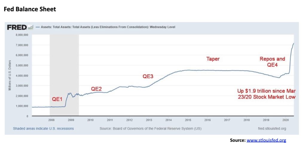
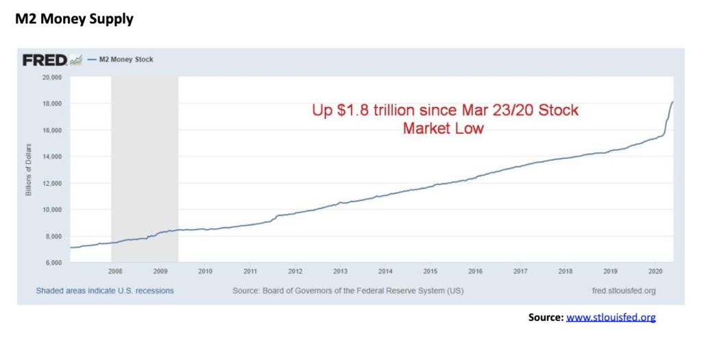
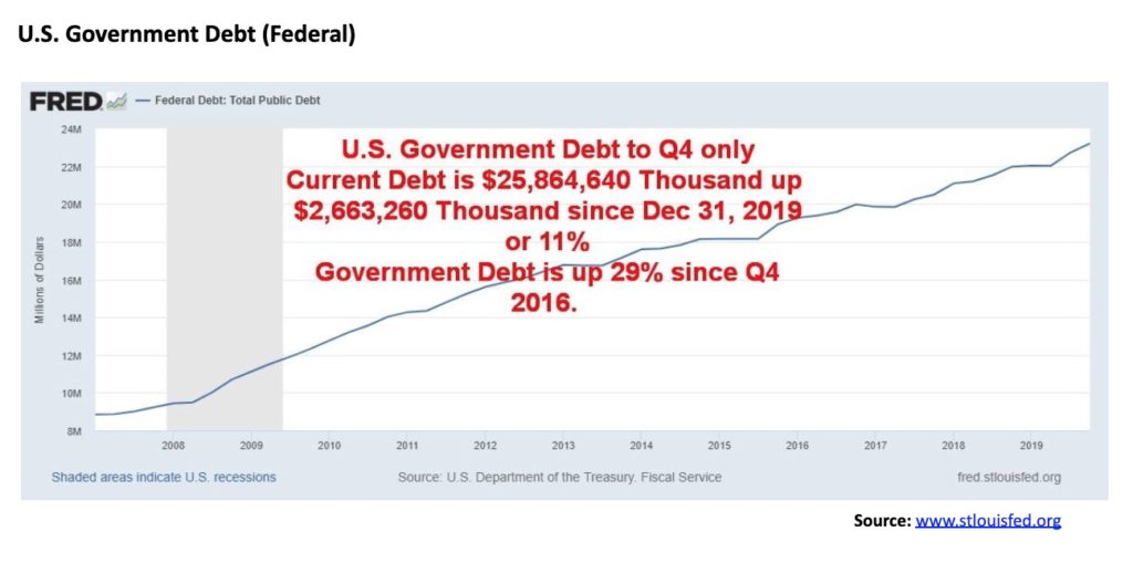
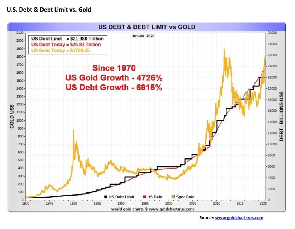
One of the main drivers of wealth for the 1% in the U.S. (which holds for Canada and other countries) is the rise in the stock market, coupled with a rise in real estate equity and in business equity. Of the $6 trillion injection into the economy by the Federal Reserve and the U.S. Treasury, the bulk of it has found its way to the wealthy classes and the corporate world. It is no surprise that, since the low in the stock market on March 23, 2020, the Fed balance sheet has gone up 35% or $1.8 trillion, M2 is up 11% and also $1.8 trillion, and the stock market capitalization of the U.S. stock market has gone up even more, $2.8 trillion. The correlation between the Fed’s balance sheet and the rise in stock market capitalization is 90%. As to the performance of the real economy and the rise of the Fed’s balance and stock market capitalization, the correlation is zero according to economist David Rosenberg, Chief Economist of Rosenberg Research & Associates and formerly Chief Economist of Gluskin Sheff & Associates and Merrill Lynch, New York.
We are in a world where corporate profits are falling, bankruptcies are rising, and wealth in the real economy is very low. Yet the stock market keeps on rising. The stock market appears to be viewing the world through a pre-pandemic lens. Technology makes up some 27% of the S&P 500 and it is technology that has led the way up. Of that, five firms (six, actually) have dominated: the FAANGs (Facebook, Apple, Amazon, Netflix, Google (Alphabet)), along with Microsoft. Since the beginning of the year, the FAANGs have gone from 18% of the S&P 500 to currently 22% of the index. The technology sector of the S&P 500 is up 39% since the March lows. But the big five dominate, led by Netflix and Amazon.
The S&P 500 and stocks are viewed as a better place to invest, given the low rates available on bonds. Also, there is less concern as to credit rating, so the stock market is viewed as a safe haven. It could be the investment community is viewing the stock market through rose-coloured glasses, but they also feel the Fed has their back. There appears to be little concern over dwindling corporate profits. Given the huge amounts of institutional money available at the money center banks and their large trading desks, they are very active in the stock market as well as having their ears glued to the Fed. The more the markets rely on the Fed, the more the real economy is going to suffer. In some respects, Wall Street is not overly concerned about Main Street until it has to be.
So, is this the new “irrational exuberance,” a phrase once coined by former Fed Chairman Alan Greenspan? On one side, a printing press to guarantee income for Wall Street. On the other side a cheque for $1,200 ($2,000 in Canada) in the mail to keep Main Street happy. This is not a way to grow the economy. But it could make the stock market go up, even as Main Street is in a depression. It has nothing to do with hopes for a vaccine, the economy opening up again, or a depression ending. Wall Street relies on the Fed, Main Street relies on a cheque in the mail. Wall Street counts their profits; Main Street takes to the streets. But what if the Fed took away the punch bowl? Could they do that? And, if they did, then what?
Our charts are below.
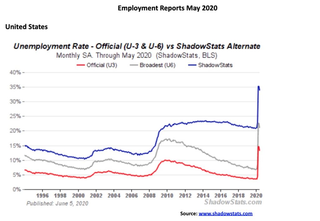
Happy days are here again? Must be. In a completely unexpected announcement, the May nonfarm payrolls rose 2.5 million vs. the 20.7 million decline seen in April. The increase is the most on record and reverses a portion of the 22.1 million jobs lost in March and April. The market had expected a decline of 8 million. It was a dramatic reversal. Stock markets soared, the U.S. dollar rose, gold plunged, and bond yields rose.
The unemployment rate (U3) fell to 13.3% from 14.7%, well below market expectations of 19.8%. The labour force participation rate increased to 60.8% from 60.2% while the employment population ratio rose to 52.8% from 51.3% in April. The number of people employed rose to 137,242 thousand, up from 133,403 thousand. Full-time employment rose to 116,523 thousand, up from 114,322 thousand while part-time employment rose to 20,741 thousand, up from 19,106 thousand. Given the controversy on the streets of America, we couldn’t help but notice that the black unemployment rate actually went up to 16.8% from 16.7%. The black employment population ratio rose to 49.6% from 48.8% while the actual number employed barely changed in May to 16,523 thousand from 16,240 thousand.
The U6 unemployment rate, the Bureau of Labour Statistics’ (BLS) highest measurement of unemployment fell to 21.2% from 22.8%. The U6 rate is the U3 unemployment rate plus short-term discouraged workers and marginally attached workers, plus those forced to work part-time who can’t find full-time employmment. The Shadow Stats unemployment rate, which is U6 plus long-term discouraged workers and those defined out of existence in 1994 revisions, slipped to 34.0% from 35.4%.
Shadow Stats has written that the employment numbers are not credible. There were major prior-period downward revisions, low response levels, plus revised methodologies and seasonal adjustments that would add 4.9 million to the May unemployed (reported in the BLS report) as “employed.” These are people who may return to their old job consider themselves employed but are currently actually unemployed. That would hike the unemployment rate (U3) to at least 16% instead of the reported 13.3%. This is the third month in a row this has happened. Irrespective of this, we saw no economic survey suggesting that nonfarm payrolls would actually go up in May. Universally, the reports were calling for a further decline. If you take the BLS error in reporting and add it as well to the Shadow Stats number, the Shadow Stats unemployment number rises closer to 38%.
Maybe the clue came earlier in the week when the ADP employment report showed a job loss of only 2,760 thousand instead of the expected loss of 9 million jobs. Initial claims this week were reported pretty well as expected—1,877 thousand, mildly above the expected 1.8 million—but the surprise was continuing claims that jumped to 21,487 thousand, up from 20,838 thousand the previous week and well above the expected 20,050 thousand. Despite the drop in initial claims, the 11-week tally is now 42.6 million. Another reason the nonfarm payrolls increase was such a surprise.
Employment improved in every category, especially leisure and hospitality, but one stood out for falling. State and local governments saw a drop of 571 thousand—the second month in a row that has fallen sharply. State and local governments that provide most of the services are in bad need of an infusion, not unlike Canada to keep them out of bankruptcy. The share of unemployed on temporary layoff fell to 73% from a record 78.3%.
What this jobs report is not reflecting is the number of jobs that are soon to be lost in areas where there weren’t job losses previously. Most of the early job losses were in low-wage retail, leisure, hospitality. The second wave of job losses is going to come in administration, banks, professional services, trade, education, real estate, and more as the reality of the closures catches up. We are already seeing announcements. These numbers are not being reflected in the current employment situation. It has been a delayed reaction for those services. As we noted, the big gains this month were in leisure and hospitality, the very ones who were the first out the door. Most of these jobs are low wage. Many retail jobs and many in the leisure and hospitality are not coming back as doors close for good.
The collapse of the U.S. economy is not over yet, despite the seemingly good numbers this month. The worst may be yet to come.
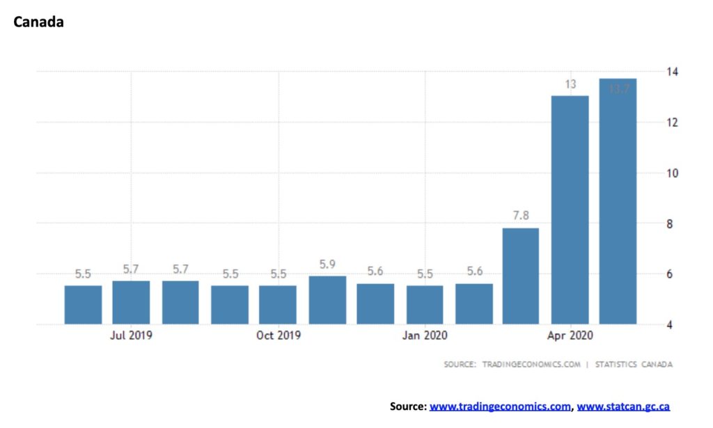
Like the U.S., the question begs—is the crisis over? Canada unexpectedly added 289,600 jobs in May vs. a loss of 1,993,000 jobs in April. The market had expected a loss of 500,000 jobs. Full-time work jumped 219,300 while part-time work was up 70,300. The unemployment rate, however, jumped to 13.7%, up from 13% in April but below the expected 15%. Helping push up the unemployment rate was a jump in the labour force participation from 59.8% in April to 61.4% in May. The higher unemployment rate was heavily seen in youth unemployment as that rate jumped to 29.4% from 27.2%. The R8 unemployment rate that includes the official rate plus discouraged workers and those waiting for recall and other involuntary part-timers rose to 18.2% from 17.9% in April. If one adds on those wanting to work but not looking for work because of the poor job market, the unemployment rate was 19.6% unchanged from April. Unofficially, some have calculated Canada’s real unemployment rate could be as high as 33%. This would be a number comparable to the Shadow Stats unemployment we report on every month.
The report was a combination of good news/bad news. Good news—jobs rose instead of falling; bad news—the unemployment rate rose because more people were looking and a huge number remain unemployed. The number of self-employed workers was steady while the number of employed persons working from home held steady at 4.9 million. Probably helping to push up the labour force participation rate is the fact that now, even temporary economic supports such as CERB for students and others requires that they are at least trying to find work. Still, the labour force participation rate remains below the pre-COVID-19 levels of 65.5% last seen in February.
The total number of employed persons in Canada rose to 16,474.5 thousand from 16,184.9 thousand in April, reflecting the gain of 289.6 thousand. The number of unemployed persons in May was 2,619.2 thousand vs. 2,418.3 thousand in April.
For whatever reason, the biggest jump in employment was seen in Quebec with a gain of 231,000. This was possibly due to the huge easing in restrictions seen in May particularly in construction, retail, and manufacturing. Quebec accounted for nearly 80% of the gains. British Columbia was up 43,000, Alberta gained 28,000, and Manitoba gained 13,000. But Ontario lost 65,000. The Atlantic provinces gained 38,200.
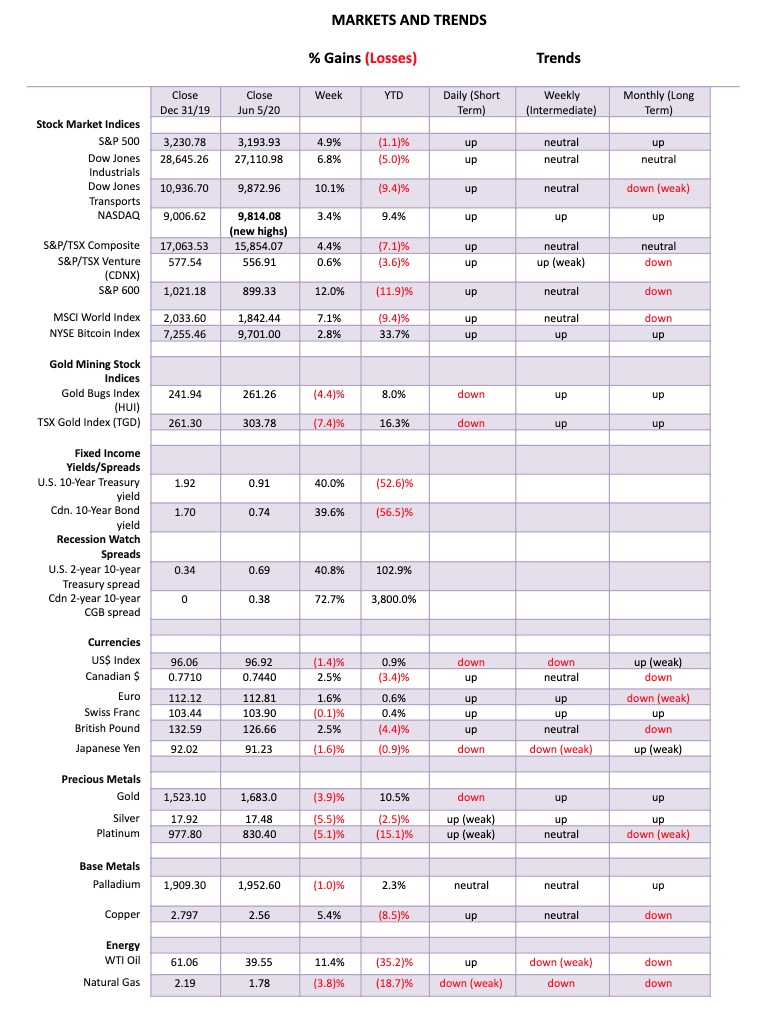
Happy days are here again. The S&P 500 soared 2.6% on Friday following the much better than expected job numbers. That helped the S&P 500 to a gain of 4.9% on the week. Everybody gained on Friday—well, not everybody as gold and silver and the gold miners all fell, along with materials and mining stocks. Volume even picked up and the expectations of a V recovery soared. The bears were sent packing. Gains were seen everywhere. The Dow Jones Industrials (DJI) was up 6.8% as the rising markets attracted more international funds, the Dow Jones Transportations (DJT) gained 10.1%, the NASDAQ made a new all-time high up 3.4% but the gain was the weakest of the major indices; and the small cap S&P 600 was up a sharp 12.0% although it remains down 11.9% on the year. Banks were one of the key leaders on the week as the KBW bank index gained 17.4%. Early leaders of this rally like the Semi-Conductors (SOX) were up 8.2%. The SOX made new all-time highs as they are a key component of the NASDAQ. More telling is the KBW Bank Index that is actually down 23.5% from its December 2019 top. Worse, the KBW’s all-time high was seen in 2007 and it is still down 28% from that level.
In Canada, the TSX Composite was up 4.4% on the week but the TSX Venture Exchange (CDNX) faltered and was up only 0.6%. Still, it continued its recent winning ways. In the EU, the London FTSE was up 5.8%, the Paris CAC 40 gained 10.7%, and the German DAX jumped 10.9%. In Asia, China’s Shanghai Index (SSEC) was up 2.8% and the Tokyo Nikkei Dow (TKN) gained 3.6%. Hong Kong’s Hang Seng Index was up 7.9% as major businesses signaled approval of China’s security law. The MSCI World Index gained 7.1%.
For the S&P 500 it is the fastest 50-day advance in nine decades. Such is the power of the trillions of dollars thrown out by the Fed and the U.S. Treasury. Given the big jump on Friday and on the week, the Fed and the Treasury may begin to rethink the need for more stimulus. Where’s the urgency? Could the Fed take away the punch bowl? Yes, but then a falling stock market is not conducive for the re-election of the president. The market, we suspect, is also relying on further stimulus. They could be in for a shock. Still, the S&P 500 is now less than 1% away from making new all-time highs. To get there, it will need the real heavyweights of banks and major industrial companies to show leadership. Up until now it has been technology and the FAANGs. Others must assume leadership. Certainly the banks had a good week, not only in the U.S. but also in Canada. Yet the real iceberg of bankruptcies is probably to come as courts and ability to file have been severely constrained during COVID. Outside of some high-profile bankruptcies or insolvencies, there has actually been an overall drop in filings from both corporates and individuals, just because of court closures and lack of good ability to file. So it is being delayed.
And what of the unemployed? Despite the huge unexpected gain, the unemployment rate is still very high and bringing it down further is going to be a slog as long as social distancing and other measures remain in play. Hundreds of thousands of jobs are not coming back and when the assistance cheques run out, what then? The U.S./China trade war could also rear its ugly head once again as it is becoming clear that China is going to have difficulty in meeting phase 1 requirements. That could once again raise the ire of the President who needs a “beating boy” as he will turn his attention to China if the protests on the street ease. Given the President’s reaction to the job numbers on Friday and his praise for the Dow rising, it is clear he plays on the success of the stock market as a prime reason for the success of his presidency. But will the Fed accommodate him? Or will the Fed pause? The job numbers were better than expected, but the economy is still expected to contract sharply and economic weakness will linger through the summer and into the fall and the election. Note most assistance for unemployment such as the CARES program expires at the end of July. Even here in Canada CERB doesn’t go on forever.
While the Fed may not be willing to take the punch bowl away immediately, they have to be concerned about the risk they are creating and the potential for another bubble that inevitably will burst. And what if the employment numbers seen this week are an aberration? After all, they are subject to revisions and, in the chaos of the COVID, getting good data has been harder than usual. The BLS has even admitted errors in gathering data, such as counting people employed who are sitting at home awaiting callback, so they say they are employed but they aren’t. But let’s not forget that 42.6 million filed for claims in the past 11 weeks. That’s one third of the labour force and a far cry from 13.3% unemployment. Finally, a reminder that the stock market is not the economy but is merely a reflection of it. No sign yet that the economy is shifting from negative growth to positive growth.
June 2020 is a month that could be given to volatility. We can’t help but note that Friday was a lunar eclipse. Lunar eclipses have a history of bringing volatility to markets and Friday was no exception. On June 21 there is a solar eclipse and solar eclipses have often been associated with turns or changes in direction in the markets. July 6 brings another lunar eclipse but a partial one only. So, more volatility? None of this is to say turns or volatility will happen, but merely to point out the possibility.
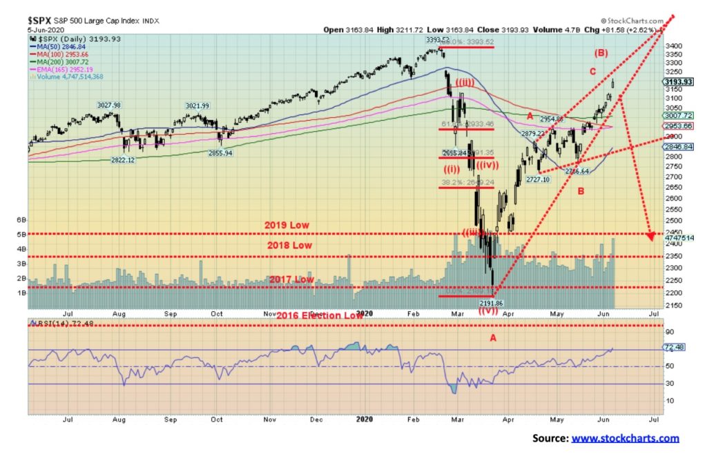
We look at the S&P 500 and it appears that an ascending wedge triangle could be forming. The breakdown point is around 3,100. Resistance appears to be currently up to 3,275. The rally since the March lows appears to be unfolding in an ABC corrective pattern. The S&P 500 is up 45.7% from those lows after falling over 35% in a mere 33 days. The rally, so far, is 74 days old.
The stock market probably can’t rely on stock buybacks like it did before. And some part of this rally has been shorts scurrying for cover. It is no surprise that bullish sentiment is at high levels. But the prime reason has been the massive stimulus programs from the Fed. But we know the Fed giveth and the Fed taketh away. The bet is on that the Fed will continue to give. Valuations, as we show below, certainly don’t justify these lofty levels. And eventually markets return to the mean. By overvaluation alone, that suggests a drop of 50% or more eventually.
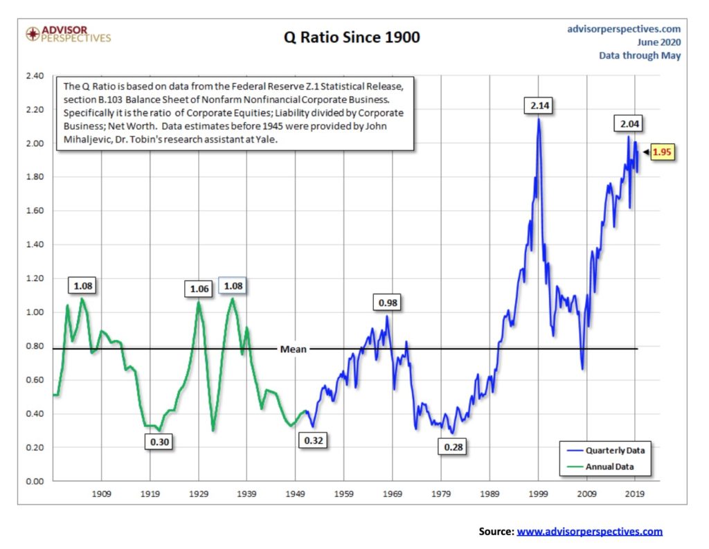
The Q ratio or, as it is sometimes known, the Tobin ratio is a method of estimating the fair value of the stock market. The concept is simple; the calculation is laborious. The Q Ratio is the total price of the market divided by the replacement cost of all its companies. The data comes primarily from the Federal Reserves Z.1 Financial Accounts of the U.S. (www.federalreserve.gov/releases/z1). It is released quarterly. And therein lies a timeliness problem so the presentation of this data relies on an estimate for the most recent quarter using the VTI price (The Vanguard Total Market ETF) as a surrogate.
Fair value is supposed to be 1:1. But, over the years, the ratio has ranged from 0.28 in 1982 (at the bottom of the 1966–1982 bear market) to a high of 2.14 in 1999 (at the top of the high-tech/dot.com bubble). Note the other lows were 1921, the bottom of the 1920–1921 depression, and 1950, the bottom of the Great Depression and War. The last high was seen in 2018 just before the outbreak of the U.S./China trade wars. Despite the market making a higher high in February 2020, the Tobin Q ratio made a lower high, a divergence. That last low was seen during the 2008 financial crisis.
As with many indicators of this nature, it is a warning, and not necessarily a suggestion that the market is topping. Given the high level of the Q ratio and its divergence with earlier highs it suggests that the valuation of the market is at potential extremes.
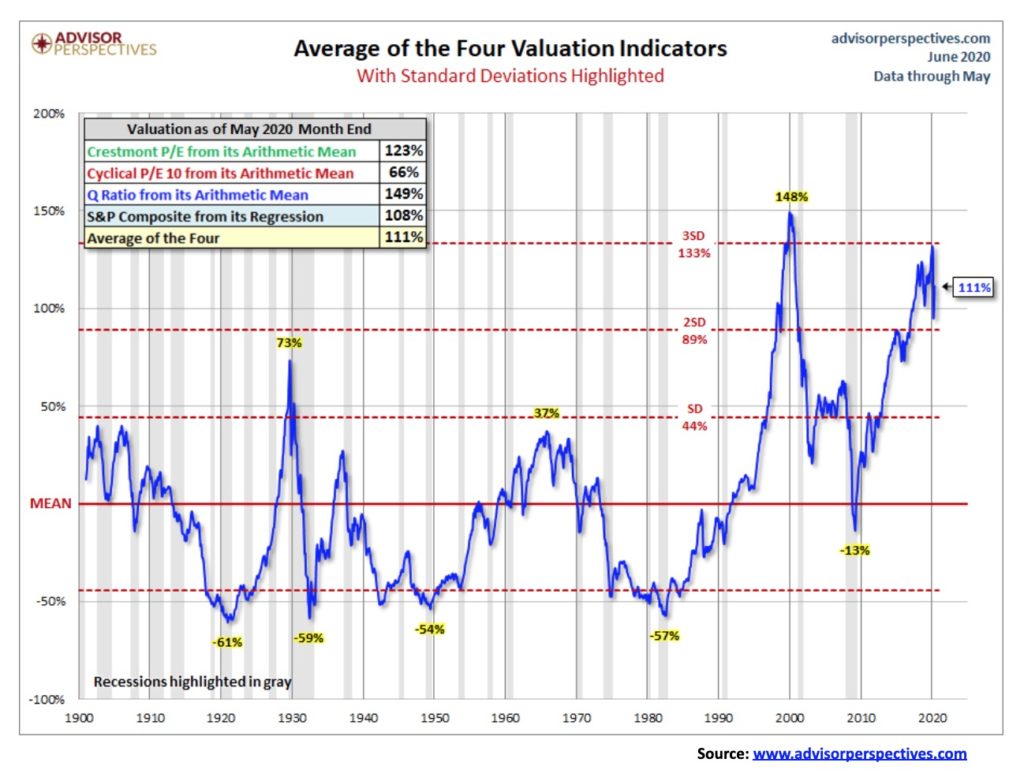
Here is another valuation chart, courtesy of Advisor Perspectives. Advisor Perspectives updates on a monthly basis four market valuation indicators. They are:
- the Crestmont Research P/E Ratio
- the cyclical P/E ratio, using the 10-year earnings as the divisor
- the Q Ratio, which we noted above
- the relationship of the S&P Composite price to a regression trendline
Advisor Perspectives has further adjusted the two P/E ratios and Q Ratio to their arithmetic means and the inflation-adjusted S&P Composite to its exponential regression in order to facilitate comparisons. Based on these indicators, the market is overvalued anywhere from 66% to 149% with an average of 111%. Standard deviations have been highlighted. The average of 111% as of the end of May was up from 99% at the end of April.
As with any of these indicators, periods of over-valuation and/or under-valuation can last for years. But they are useful in terms of formulating where things are and expectations going forward. Note the periods of undervaluation during the early 1920s (depression), the 1930s (depression) and into the late 1940s (recession) and again in the 1970s and early 1980s (recessions). The last period of negative under-valuations was during the Great Recession of 2007-2009; however, it is interesting to note it never hit the levels seen in earlier periods of recessions and depressions. Currently, the market is quite overvalued. It’s just another warning. It doesn’t mean the market is about to fall; however, it does suggest that if a sell-off gets underway the market would most likely have to fall 50% plus in order to reach fair value levels once again. This is similar to what we saw during the 2008 financial crisis.
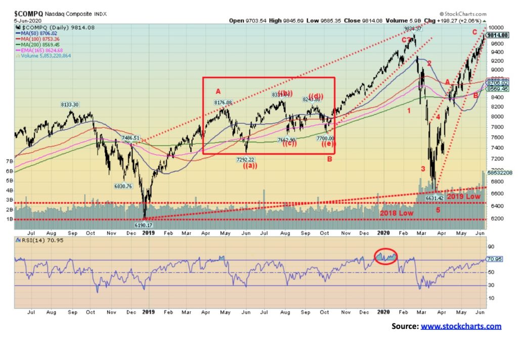
The star of the show has been the NASDAQ that just made a new all-time high this past week. It was the only index to do so. At this stage, the NASDAQ is diverging with the other indices as it is non-confirmation but it does not signal that the market is making a top. The other indices could join the NASDAQ in the following days. The NASDAQ was about the only index that did not break under its 2018 low during the March crash. The NASDAQ has been led up by the FAANGs. The new high was barely at 9,846 vs. a high of 9,838 on February 19. The NASDAQ could be forming a huge ascending triangle (bearish). The breakdown comes almost immediately at 9,600. Confirmation would be seen under 9,200. Looking at this index, it suggests to us that there is not much room to move higher. The RSI is now over 70 and other indicators are also at extremes. However, we note the RSI persisted over 70 for several weeks from December 2019 through February 2020 before the collapse came. But the longer these extremes persist, the more dangerous the potential for a collapse becomes.
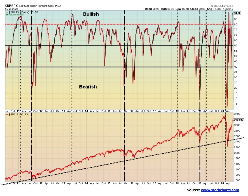
The S&P 500 Bullish Percent Index (BPSPX) is flashing a warning with a reading of 90%. Readings at 90% or higher are a signal the market is extremely bullish and could be poised for a fall. No, it does not signal a final high. It is merely a warning that the market is extremely bullish and could be poised for at least a pullback.
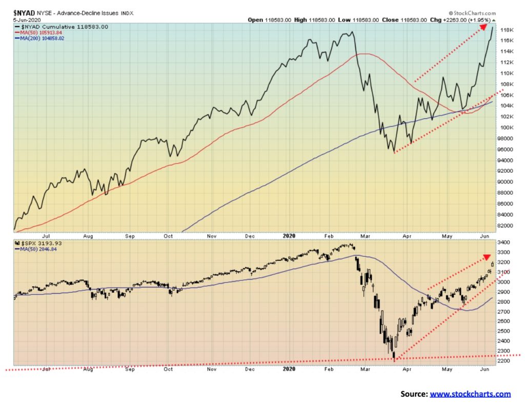
The bulls are happy as the NYSE advance-decline line has made new highs, even as the S&P 500 has not yet made new highs. This indicator is signaling that the market remains on an upward trajectory and there is no sign of a top. With a top, we usually get divergences with the index making new highs but the AD line making a lower high. That did not happen in February. So, as it turned out, it was misleading and did not give us a warning of the collapse to come.
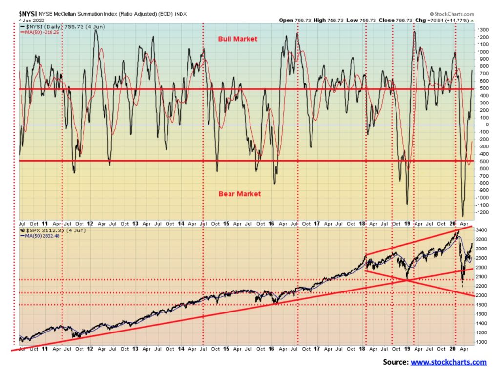
The McClellan Summation Index (ratio-adjusted), known as the RASI, has officially turned bullish, reaching a level of 755 this past week. It is an odd indicator as peaks are usually seen well before the final high. By the time the market makes it final high the indicator is making lower highs, signaling the divergence. A good sell signal usually doesn’t appear until the indicator falls below zero. It is caution under 500.
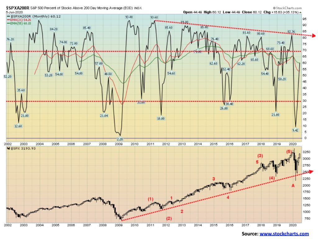
The S&P 500 is over its 200-day MA and it seems a lot of stocks are joining the party as well. The percentage of stocks trading over their 200-day MA is now up to 60%, the highest level seen since late February 2020 just before the pandemic collapse. It’s not at levels usually associated with peaks. The index would have to get well over 80% to signal a possible top. This here is a monthly indicator, so one doesn’t see the extremes one might see in a daily indicator.
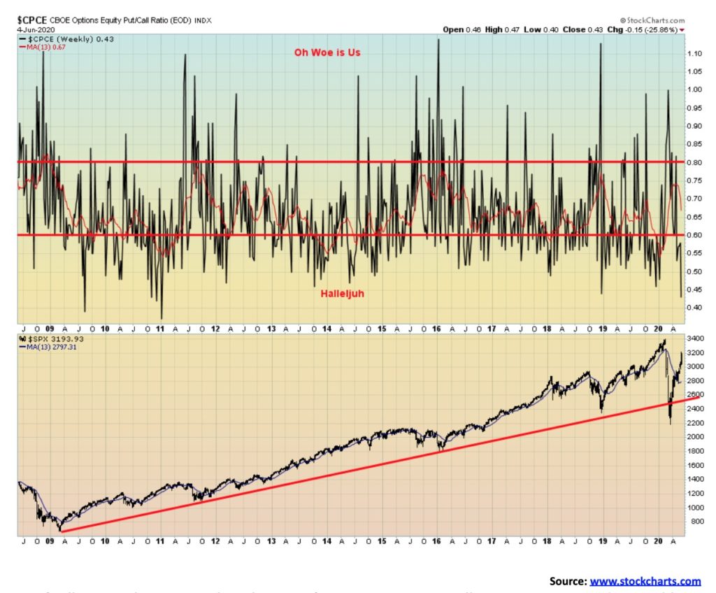
Lots of call options but not much in the way of put options. We usually note extremes and a possible coming turn when the put/call ratio gets too out of line one way or the other. A heavy preponderance of puts at bottoms often signals a low while a heavy preponderance of calls at tops signals a high. At 0.43 the put/call ratio is the lowest we’ve seen since late 2018, just before a 20% drop in the markets. At the other extreme, the put/call ratio was 1.00 or higher at the March lows.
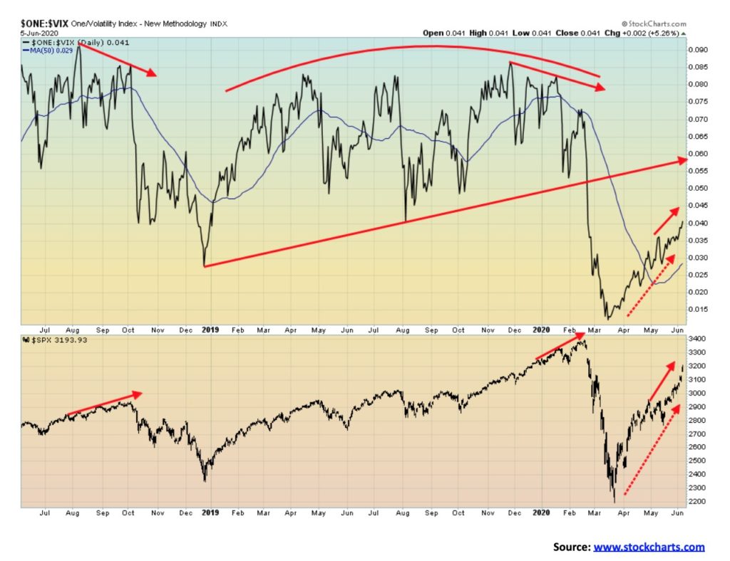
No divergences here. The VIX Volatility Index (Inverted) made new highs this past week along with the S&P 500. At tops in September/October 2018 and again in January/February 2020, the VIX was making a lower high even as the S&P 500 was making new highs. A divergence is a warning. It does not tell us when the market will break. But with no divergences it is possible to see further gains for the stock market. To set up a divergence we’d need to see a pullback followed by a run to new highs for the S&P 500 but not for the VIX. Usually the divergence plays out over a few weeks, even for a couple of months. Divergences are not uncommon at tops but admittedly rarer at bottoms.
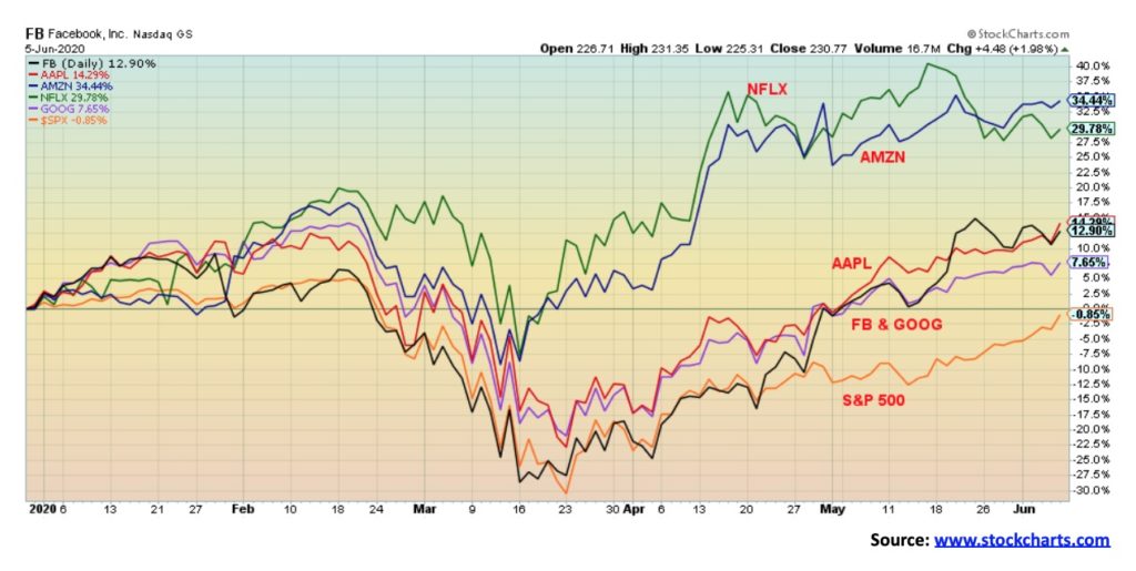
Once again, a picture of the power of the FAANGs. All five FAANGs are up on the year, but the S&P 500 is still down 0.9%. Leading the way has been Amazon, up 34.4% on the year. Amazon hit an all-time high this week. Netflix has gained 29%, Apple is up 14.3%, Facebook 12.9%, and Google 7.7%. Not listed as a FAANG but just as important is Microsoft (MSFT), up 19.5%. The FAANGs make up 22% of the S&P 500, up from 18% at the end of 2019. So, just where would the S&P 500 be without the FAANGs? They dominate just about everything.
The TSX jumped higher on Friday following the unexpected stronger jobs report in Canada and in the U.S. The TSX gained 2.1% on Friday and was up 4.4% on the week. Leading the way were banks, consumers, and real estate. Energy stocks also had a good week, thanks to higher oil prices. Of the 14 sub-indices on the TSX, five posted losses led by Golds (TGD), down 7.6%. Materials (TMT) was off 4.2%, and Metals & Mining (TGM) was down 1.4%. Consumer Staples (TCS) also fell off 1.2% and the big leader on the way up Information Technology (TTK) dropped 0.7%. The big winner was Energy (TEN), up 18.2% followed by Financials (TFS), up 10.1%. Other big gains were seen for Real Estate (TRE), up 9.1% and Consumer Discretionary (TCD), up 8.0%. But the key for the TSX on the week was Financials who make up almost a 1/3rd of the index followed by the big gain for Energy.
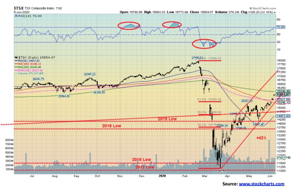
The rally for the TSX has now pushed it past the Fibonacci 61.8% retracement level. Lying just above is the 200-day MA at 16,050. A move above it would be positive, but the TSX needs to rise above 16,370 to suggest that new highs are possible. Overall, the TSX is up 42% from the March lows. As a result of the strong up move this past week the RSI is now at 70. Any rise above 70 suggests the market is becoming overbought but it does not necessarily signal a top. It’s a warning. Like the U.S. markets, the TSX appears to be have risen on an ABC-type pattern. The A wave ended at 15,257, while the B wave bottomed at 14,187 in May. First signs of a top would not come until the TSX fell back under 15,000. A breakdown under the B wave low of 14,187 would confirm the top. The TSX fell 38% in February/March and has now recovered 42%. So far, we view this as a normal corrective pattern. The TSX Composite Bullish Percent Indicator is currently at 75, a level associated with tops. In February, the BPTSE reached 77 before turning down. This is actually a divergence as the BPTSE hit a high of 82 on April 28. A higher high on the TSX and a lower high on the BPTSE is a divergence worth noting. With the TSX still below its 200-day MA it is also of note that the number of stocks trading above its 200-day MA is now at 40%. At the February top that indicator reached 76%.
The world continues to be in the grip of the coronavirus COVID-19. Numbers have been on a steady upward climb within the context of a bull channel. The increase is coming from elsewhere especially Brazil where the number of cases has soared past 675,000 the 2nd highest behind the U.S. Other places that continue to see elevated numbers or rising numbers include Russia, Pakistan, Bangladesh, Mexico, and, India. Rising numbers have been seen throughout Latin America and parts of Asia. North America and Europe are seeing declining numbers. But that is just cases and the suspicion is these numbers are only capturing some but not all of the numbers given the poverty in many of these countries where there may be cases and deaths that are not included in official numbers. Deaths have been steady to a mild decline which doesn’t seem to jibe with the rising number of cases. Are they being underreported?
June 7, 2020 13:48 GMT
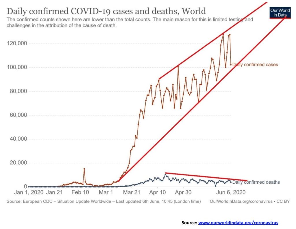
Cases – 7,016,024
Deaths – 402,787
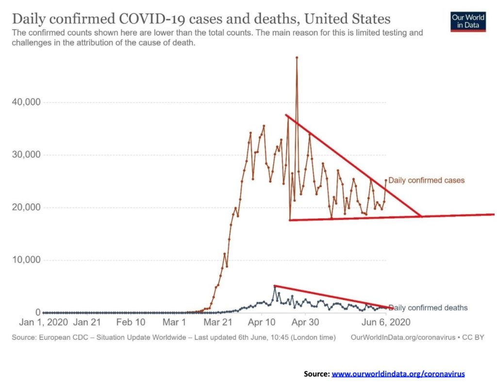
While the number of deaths appear to be on the decline the number of cases in the U.S. has held relatively steady of late. Could they be about to rise again? Naturally the appearance here of breaking upwards out of triangle could prove to mean little or it could be suggesting that numbers are about to rise again. But deaths have been in on a generally downward trajectory.
June 7, 2020 13:48 GMT
Cases – 1,990,046
Deaths – 112,113
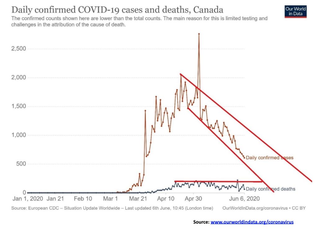
Could Canada be getting the COVID under control? The chart indicates that the number of cases in Canada are on a definitive downward trajectory. That is positive for the country in trying to get things open again. But with still elevated numbers in the U.S. the border may still not be opening any time soon. The number of deaths has generally held steady within a range and a slight downward trajectory with occasional spikes.
June 7, 2020 13:48 GMT
Cases – 95,057
Deaths – 7,773
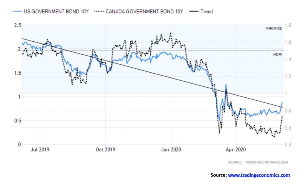
Bonds responded to the stronger than expected job numbers on Friday and jumped in both Canada and the U.S. The U.S 10-year treasury note closed up 26 bp to 0.91% while the Canadian 10-year Government of Canada bond was up 21 bp to 0.74%. As a result, the yield curve widened to its highest level in weeks. The 2–10 spread in the U.S. widened to 69 bp while the Canadian 2–10 spread jumped up to 38 bp. The U.S. 10-year did test up to 1.00% this past week but did not make it over that key psychological level. Longer dated bonds are reflecting what appears to be an improvement in the economy. The reality is we are going to have see far more evidence than just one of a stronger jobs number. Other numbers must start to show improvement as well. A too-fast rise in bond yields could jeopardize the recovery. Due to high debt levels, borrowers cannot sustain higher interest rates. Corporations alone in the U.S. sold over $1 trillion in new bonds (debt) over the past few months. The belief is the Fed has their back, so “borrow away.” Pile more debt on top of debt. At the growing astounding levels, we all know it will never be repaid. The U.S. 10-year now has support at 0.70% and the Cdn 10-year has support at 0.40%. Irrespective there is no widespread belief that bond yields are about to embark on a sustained rise. However, declines from here may be limited.
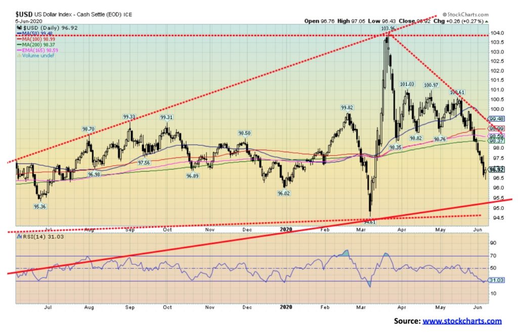
The US$ Index was sinking this past week until Friday’s job numbers. Following a stronger than expected report, the U.S. dollar rallied 0.3% on the day but still closed the week down 1.4%. Other currencies benefited with the euro up 1.6%, the Swiss franc off a small 0.1%, while the pound sterling was up 2.5%. The Japanese yen, however, fell losing 1.6%. The Canadian dollar gained 2.5% on the week and is now at its best level in weeks. A strong jobs report coupled with rising oil prices is helping the Canadian dollar. With the rebound on Friday, is the US$ index mini-bear over? Well, one day does not make a rebound, but the pattern left on Friday’s charts was a hammer pattern. A hammer is formed when the market opens, falls to new lows for the day and then rebounds back, often closing up on the day and leaving what looks like a small head at the top. Hammers are seen at bottoms. At tops they are called a hanging man. Follow through to the upside is key this coming week.
A rallying U.S. dollar could be negative for gold. Strangely, here was a week that the U.S. dollar fell but gold also fell. That usually doesn’t happen which is a reason to be a bit concerned about gold. However, recently gold had rallied even as the U.S. dollar rose. The US$ Index is approaching oversold levels but it is not quite there. There are no extremes seen in sentiment indicators. For that reason, any rebound may just be a bounce. There is resistance up to 98 to 98.50. Above 99 the US$ Index could turn positive again and suggest a move to 100. Above 100 the US$ Index would be breaking out. We are currently about 1.5% below the 200-day MA, so even a test of the 200-day MA at this point would not be unusual (currently 98.37). If the pattern down from the 103.96 high was corrective, then it is possible it’s over. The US$ Index has made what appears to be an ABC decline which suggests a corrective move, not a new sustained downtrend developing.

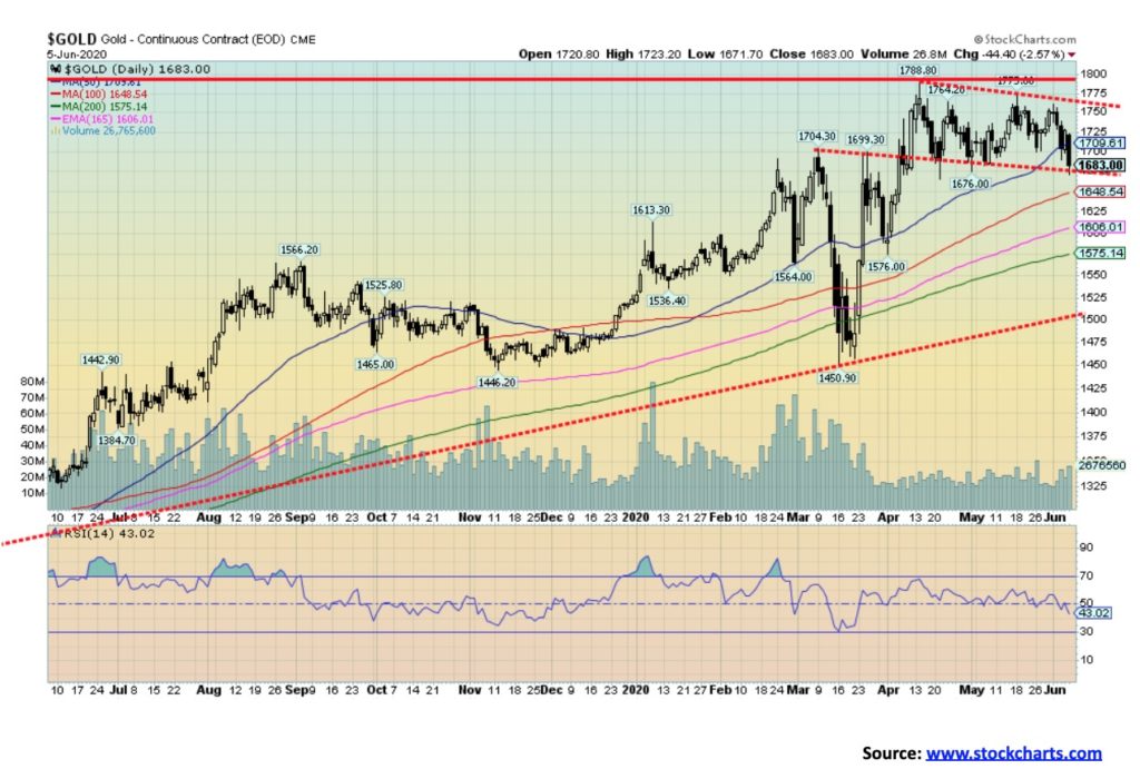
Gold did not have a good week. For the second week in a row, gold prices fell, this time off 3.9%. That still leaves gold up 10.5% on the year. The catalyst Friday was the stronger than expected job numbers that in turn triggered a stronger U.S. dollar and higher bond yields. Higher bond yields can attract funds away from gold. As well, the cost of carry would get more expensive. Silver also fell down 5.5%, platinum dropped 5.1%, but the industrial metals fared better with palladium down only 1.0% and copper, responding to the strong job numbers, up 5.4%. The gold mining stocks also fell with the TSX Gold Index (TGD) down 7.4% and the Gold Bugs Index (HUI) off 4.4%. Gold stocks topped before both gold and silver, suggesting that the gold miners were actually leading the way.
The drop in gold prices has brought out the gold bears (there are many) who are chortling that they told us so. With the stock market soaring towards new heights, who needs gold? Where’s the crisis? Well, the pandemic is not over; unemployment is at horrendous levels and there are riots on the streets. But no worries, the stock market is going up, the Fed has their back, all is good. However, does one good week change everything? Gold sentiment has dropped, along with the decline in gold prices. That is starting to take some of the bullish enthusiasm away which is a good thing. Gold prices were never really overbought at the recent top and, so far, they are not particularly oversold at these levels, either. With an RSI of 43 we have room to move lower. The daily trend has turned mildly negative, but the intermediate and long-term trend remains positive.
Does this decline invalidate what we thought was a head and shoulders bottom formation at the recent lows? No. It’s a setback but not terminal. The head and shoulders pattern suggested targets up to $1,935/$1,950 but first we had to firmly take out $1,800. We didn’t, so we are testing lower. We are at/near support here down to $1,675, but below that level we could fall further towards $1,650. Below $1,650, a further decline could take us to $1,600. We would consider a drop below $1,575 as being of considerable concern. Under $1,530, new lows could be seen below $1,450, the pandemic panic low.
One of the things we have been buoyed by is the improvement in the junior gold mining exploration stocks. These stocks have been in a bear market for years with occasional upward “burps”, but this one feels different. There is a lack of new supply, and at $1,600 and $1,700 for gold, many of these projects are considerably more viable. Coverage from brokerage firms has been expanding as a result on this beaten-down sector.
A rebound could develop for gold this coming week but the reality is, as long as gold remains under $1,765, the odds of breaking above $1,800 are slim to none. There is resistance that goes up to $1,740 so a move above that level raises the odds of breaking above $1,765. After that, next up would be $1,800.
Gold appears headed to making a low in June following a May high. That is not unusual and seasonally that fits. The question is, will gold make a low now or wait until into July? Key dates going forward are June 21 and July 6. We note that June 5 saw a lunar eclipse and, in keeping with the volatility that event normally triggers, all markets had a what one would call a “wild day.” June 21 sees a solar eclipse and July 6 sees another lunar eclipse although only a partial one. Those events often trigger volatility and changes in direction in markets.
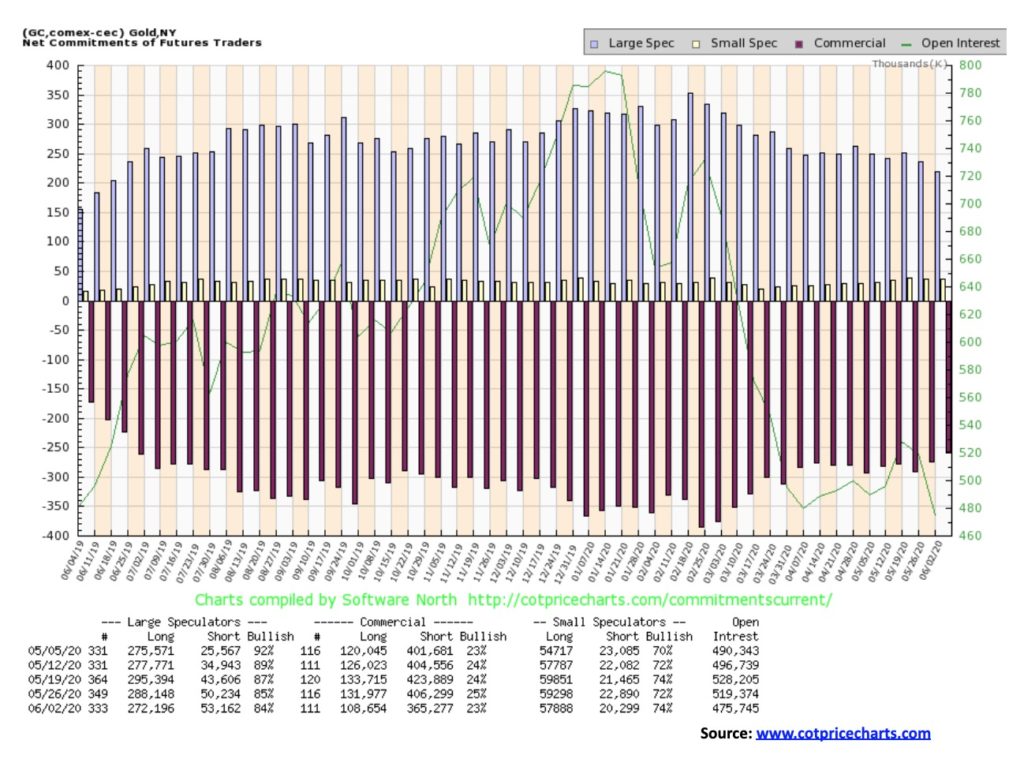
The gold commercial COT fell this past week to 23% from 25%. Long open interest was down over 23,000 contracts while short open interest fell around 41,000 contracts. The large speculators COT (hedge funds, managed futures, etc.) slipped to 84% from 85% as they saw a roughly 16,000 contracts drop in long open interest but a rise of about 3,000 contracts in short open interest. Overall, open interest fell along with the price drop for gold. Despite the drop in the commercial COT, we view the week’s action as somewhat positive, particularly given the big drop in short open interest by the commercials, suggesting they were covering shorts. Given further declines following this report we’d like to see a further drop in short open interest in this week’s COT report.
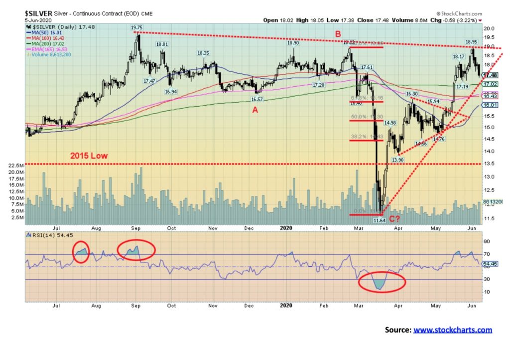
For the first time in five weeks silver prices fell, dropping 5.5%. After finally turning positive on the year, silver returned to the downside off 2.5% in 2020. Silver led the way down with the largest drop of the precious metals and near precious metals. Only copper was up on the week. While the uptrend remains, it has been weakened. Silver is rapidly approaching both an uptrend line and the 200-day MA, currently at $17.02. A firm break under 17 could send silver prices down to support at $16.50, then $16. A breakdown under $16 would be of bigger concern as it could trigger a decline to $14.75/$15.00. Under $14.75 would be terminal and a test of the lows or even new lows could follow. This decline has followed what appeared to be a breakout for silver as it hit a high of $18.95 before turning down. Like gold, this could be a 4th wave correction. Fourth waves can sometimes be scary drops and silver is leading. That’s why a drop under $16 would be of bigger concern that a longer and more sustained was underway. The gold/silver ratio closed at 96.29 this past week, up 1.7% on the week. The gold/silver ratio is down from its peak at 131 but it remains highly elevated. Gold is expensive, silver is cheap on a comparative basis. Despite the drop this past week, silver prices are up 50% from the March pandemic low. Yes, it took a 50% gain just to get silver back to basically break even on the year. Like gold, silver reacted negatively to the higher than expected job numbers, higher bond yields, and a rising U.S. dollar. With an RSI of about 55, silver is about neutral here and nowhere near oversold, suggesting that more downside could lie ahead. Given that silver has fallen into a zone of support, a retracement rally could occur but could be capped at resistance between $18.00 to $18.20. Only new highs right now could change this current bearish scenario. But we emphasize at this point this is still a correction with the context of a bull market.
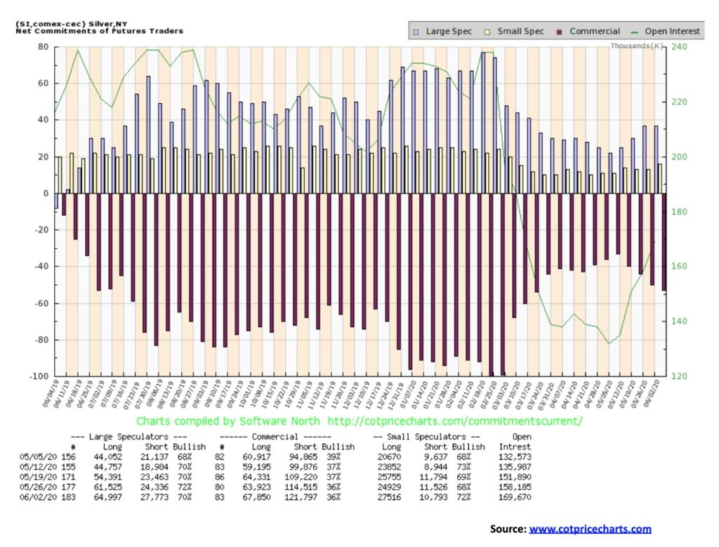
The silver commercial COT was unchanged this past week at 36%. However, both long and short open interest rose. Long open interest was up roughly 4,000 contracts while short open interest jumped just over 7,000 contracts. The large speculators COT fell to 70% from 72% as, like the commercials, both long and short open interest rose on the week. Total open interest expanded along with the fall in prices. The COT remains somewhat bearish for silver.
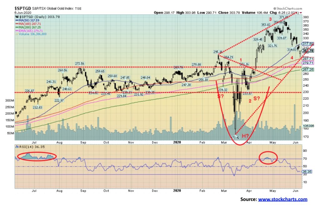
There was some good news and bad news this past week with the gold mining stocks. First, it was another bad week with the TSX Gold Index (TGD) falling 7.4% and the Gold Bugs Index (HUI) off 4.4%. The good news was that Friday started out very badly following the release of the job numbers but the TGD bounced off the 100-day MA and then recouped a good half of the day’s low. It left a possible hammer on the charts, suggesting a possible low. With RSI levels stretched, a bounce from these levels would not be surprising. We were very disappointed that our objectives from the possible head and shoulders bottom were not met. That level was seen at around 385. The high was at 371. So far, it has been a fairly normal correction. The 50% retracement level is seen at 272 with the fibonnaci 38.2% retracement level at 295. The low this week was just under 291. There is considerable support between 250 and 300. However, a breakdown under 250 would be more difficult as it could suggest a decline to the 230 zone. To the upside there is some resistance at 315/320 and again at 330. But over 330 things are looking up again. The drop still has a the feel of a 4th wave correction up from the March lows. But we must be aware of the support zones below that they hold. The TGD is still up 16.3% on the year despite the drop. We saw similar action during the strong 2016 rally that took us into July. Registering lows in June is not unusual for gold and the gold stocks.
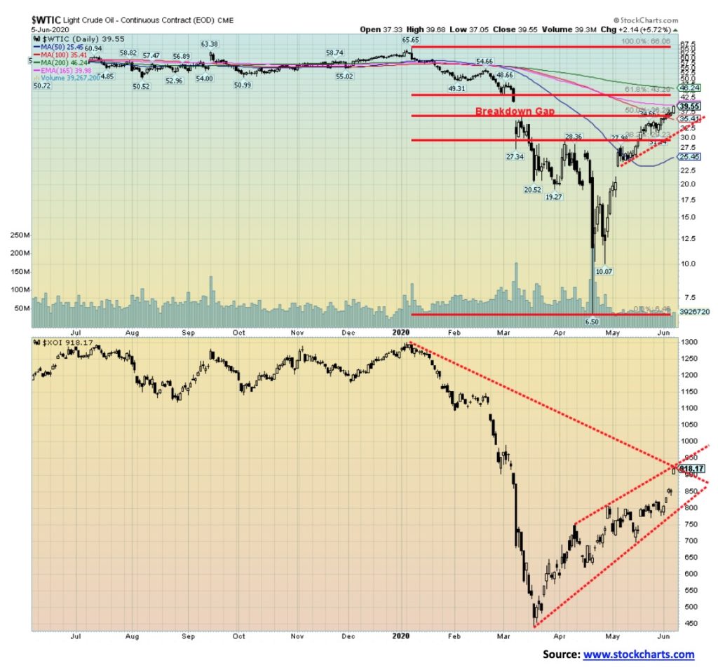
The rally in oil prices continues. This past week it was driven by OPEC and the jump in the nonfarm payrolls. Seems that OPEC for once is actually trying to cut a deal that continues the recent cuts of upwards of 10 bpd. A problem child has been Iraq who has not wanted to completely go along. The positive job numbers helped spur thoughts that the economic recovery might be faster and therefore there will be a surge in demand. It has also helped that China is back to 90% of its pre-COVID demand. Further supplies could be curtailed as the hurricane season gets underway. Already, because of a storm brewing, some cutback has taken place in the Gulf of Mexico.
Against the positive backdrop there continued to be a surge in bankruptcies in the sector with most likely more to come. For the week, WTI oil gained 11.4% and has now recouped almost to the 61.8% retracement level of the collapse from $65. Natural gas (NG) continues its woes, falling 3.8%. Too much supply of NG. The energy stocks enjoyed a very positive week with the ARCA Oil & Gas Index (XOI) up 16.4% and the TSX Energy Index (TEN) jumping 18.2%.
WTI Oil has hit up to 165-day EMA, a possible resistance level. Oil has pretty well filled that big gap left back in March. There is a bit more room to rise to the $41 level. The 200-day MA is up at $46. That could be a possible target zone. The XOI has run into a possible band of resistance just above 900. The 200-day MA is still a way off at 1,035. Note the XOI gapped higher on Friday. Could it be a possible running gap which would suggest further gains this coming week?
The surge in oil prices all comes down to increased demand coupled with continued control of supply maintaining the cuts. It will all break down if the demand fails to materialize and producers start pumping oil and breaking the control on supply. In the oil world, all of that is possible. With RSIs now crawling above 70, we are reaching into overbought territory. No, it doesn’t mean that the market is about to fall but it does suggest that we are in warning territory where a return to the downside becomes possible.
—
(Featured image by 272447 via Pixabay)
DISCLAIMER: This article was written by a third party contributor and does not reflect the opinion of Born2Invest, its management, staff or its associates. Please review our disclaimer for more information.
This article may include forward-looking statements. These forward-looking statements generally are identified by the words “believe,” “project,” “estimate,” “become,” “plan,” “will,” and similar expressions. These forward-looking statements involve known and unknown risks as well as uncertainties, including those discussed in the following cautionary statements and elsewhere in this article and on this site. Although the Company may believe that its expectations are based on reasonable assumptions, the actual results that the Company may achieve may differ materially from any forward-looking statements, which reflect the opinions of the management of the Company only as of the date hereof. Additionally, please make sure to read these important disclosures.


Graph Therapeutics Secures $5M to Advance AI-Driven Precision Therapies
Biotechnology company Graph Therapeutics raised 5 million dollars in a funding round led by Daphni, with support from existing investors....


DEA Hearing Signals Historic Turning Point for U.S. Cannabis Policy
The DEA has begun a key hearing on reclassifying cannabis from Schedule I to Schedule III, following a recommendation from...


Italy Leads Europe in Digital Sustainability Reporting for SMEs, EFRAG Finds
Italy leads Europe in digital sustainability reporting tools for SMEs, according to EFRAG’s second mapping of VSME platforms. The ecosystem...


RLUSD Launch in Japan Amid XRP Price Decline and Uncertain Outlook
Ripple and SBI launched the RLUSD stablecoin in Japan after JFSA approval, signaling strong progress in tokenization. However, XRP fell...


Youth Cannabis Use in Colorado Is Falling — But the Full Story Is More Complex
The 2026 Colorado survey shows teen cannabis use fell to 10 percent in 2025, down from 21 percent in 2015....
 |
|
 |  |
 |
|
-

 Impact Investing1 week ago
Coastal Cities Lead as Heat Strains Italy’s Urban Livability
-

 Fintech2 weeks ago
Trade Republic Brings Back Human Support and Launches Customer Council
-

 Biotech4 days ago
Eli Lilly Hits $1 Trillion Valuation Amid Strong Bullish Momentum
-

 Africa1 week ago
Moroccan Bond Market Shows Mixed Signals as Primary Eases and Secondary Pressures Persist