Business
A Look at NYSE Market Breadth (1926 to 2022)
As is the next time the NYSE’s 52Wk H-L Ratio sees a -90% day, it will signal at best only a short-term trade to the upside. As today’s market valuations have been massively inflated for the past four decades, ultimately, in the next cycle of deflation of market values, it will be a repeat of the Depressing 1930s, where it just didn’t pay becoming a long-term bull.

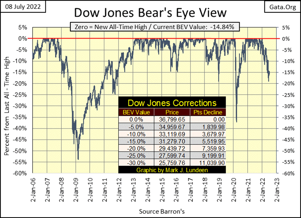
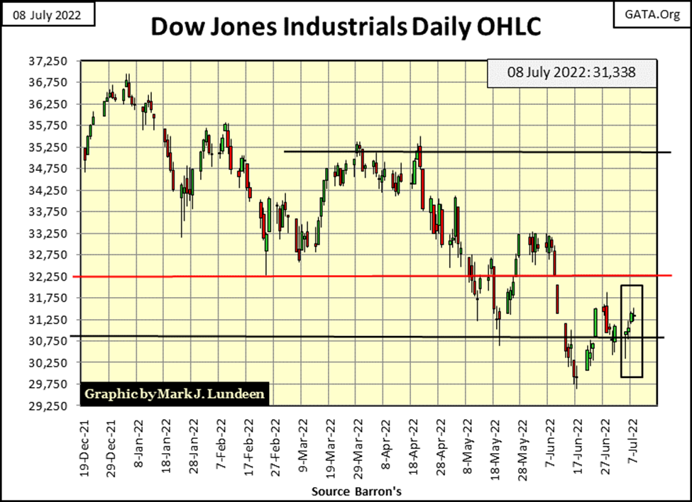
This week, the Dow Jones closed above its BEV -15% line in its Bear’s Eye View Chart below. I guess that is something to be appreciated because the day the Dow Jones breaks below its lows of March 2020 below, we’ll all live in a very different world; a world I’m in no hurry to see.
The Dow Jones had a four-day trading week, with two down, and two up days on a daily close-to-close basis. However, trying to see which was which in the bar chart below isn’t easy, as daily volatility this week was very small. Obviously, both Mr Bear and the bulls were taking a break after the 4th of July holiday.
I’m expecting them both to be back, doing their thing in the weeks to come. If the bulls can take the Dow Jones back up above its 32,250 line, and keep it there, that would be bullish. But, if Mr Bear can claw the Dow Jones back below its 29,750 line, that would not be good.
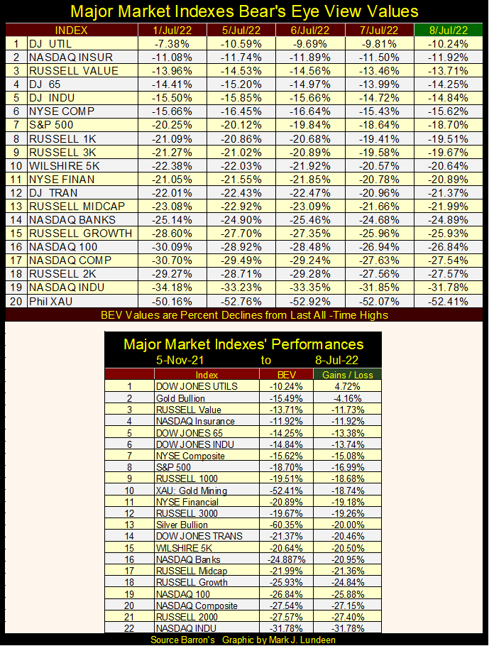
In the major markets’ BEV table below, most, if not all of these indexes advanced a few percentage points from last Friday’s close (01 July 2022). Whether or not these indexes can keep this up for the rest of the year is the question in my mind.
Next is the table listing BEV values for the commodities I follow. Exactly like the BEV table for stock indexes above, except the above table has a daily basis, while the table below is weekly basis.
At first glance, it appears the commodities are also in a bear market. But that isn’t true, as a year ago most had even deeper BEV values than those seen below. In time, we’ll see many BEV Zero and weekly closes in scoring position (BEV less than -5%).
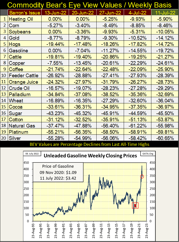
To give readers a feel for what is happening in commodities in July 2022, look at the chart for gasoline above. The Red X marks the November 2020 presidential election, and the effect of having the Democratic Party in control of “policy” since then. Most commodities have yet to see new all-time highs, yet their prices in the main have risen significantly since November 2020.
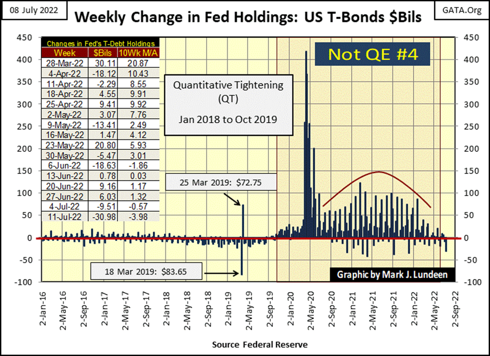
The idiot savants finally made good on their promised QT, withdrawing $31 billion from the Federal Reserve’s balance sheet this week. This was done by increasing supply in the T-bond market this week by $31 billion, hoping market demand for T-debt would willingly buy this flood of Uncle Sam’s IOUs at current prices. This act of “policy” didn’t have much of a deflationary impact on the stock market this week. But T-bonds this week did see slightly lower prices, and higher yields.
The NYSE continues generating more 52Wk Lows than 52Wk Highs in the table below, which as I understand it, indicates the path of least resistance for the market remains to the downside. Until the NYSE once again begins generating more 52Wk Highs than Lows, telling us that rising valuations in the stock market are at hand, I remain bearish on the stock market.
But then, within the red box below, the NYSE did begin generating more 52Wk Highs than Lows. How much aid and comfort did those positive NYSE 52Wk H-L Nets provide to the bulls? Not much.
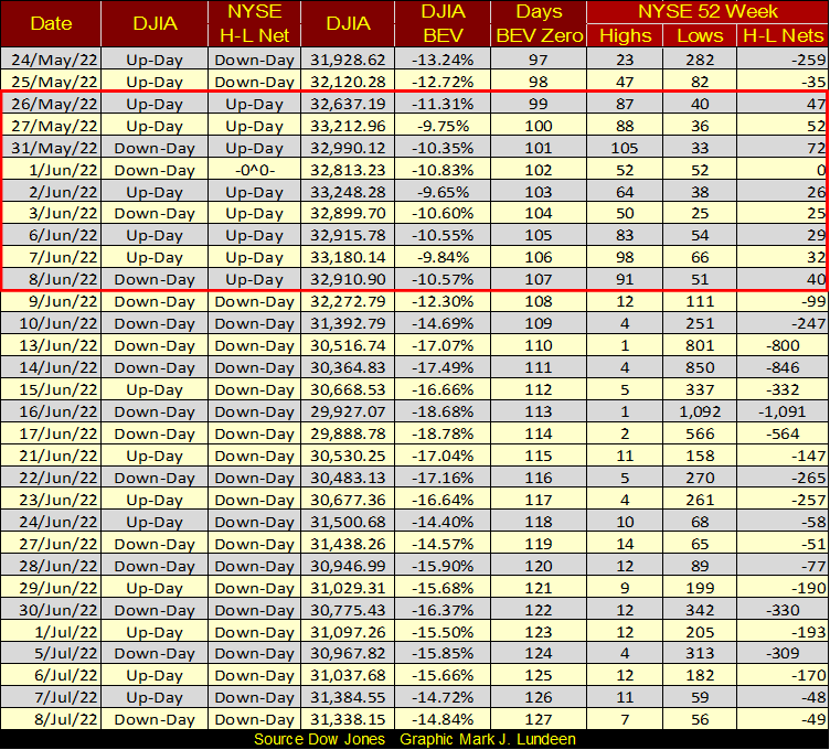
This could change quickly. I see in the table above, 52Wk Lows began tapering off at week’s end. But if the big one is around the corner, seeing the NYSE generating copious 52Wk Lows may continue being a trend for the future.
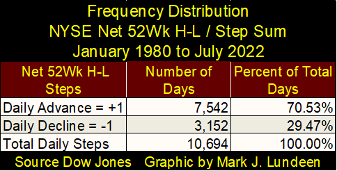
Since 1979, 70% of all NYSE daily trading sessions closed with more 52Wk highs than lows (Table Below). So, currently seeing the NYSE trading sessions chronically closing with more 52Wk lows than highs is unusual. Something seen only during market declines. What does that tell us about the stock market? That right now, Mr Bear has more to say about the stock market than do the bulls, and he has for most of 2022.
Something else that provides information on the market are the extremes in the 52Wk H-L Nets. As a matter of practice, I highlight in my breadth files anytime a 52Wk H-L Net exceeds (+/-) 300, but they can be much higher, as seen on June 16th with its H-L net of -1,091.
Let’s look at the NYSE’s extremes in its 52Wk H-L Nets going back to 1980. Note; to eliminate daily noise in the chart below, I filtered out all 52Wk H-L daily nets of less than (+/-) 10%. Actually, the chart doesn’t plot the actual H-L nets, but a ratio of NYSE 52Wk H-L Nets / NYSE Issues Traded That Day.
Using this ratio is necessary as the number of issues trading at the NYSE has changed greatly since January 1980. In January 1980, about 1900 issues traded daily at the NYSE. Today about 3,400 issues trade daily. Using this ratio, gives every day’s trading since 1979 equal weighting in the chart.
For your information, today it would take a daily 52Wk H-L Net of (+/-) 340 (10% of 3,400), or more before that H-L Net is included in the plot below. While in 1980, a H-L Net of (+/-) 190 (10% of 1,900) would exceed the 10% threshold, and so be included in the plot.
The chart below provides an excellent visual to see when the stock market was advancing or declining. Positive spikes in 52Wk H-L Nets fixes when NYSE’s issues’ valuations were inflating. Negative spikes in 52Wk H-L Nets fixes when NYSE’s issues’ valuations were deflating.
Note: positive extremes of NYSE 52Wk H-L Nets are much smaller than the negative 52Wk H-L Nets. Why would that be? I really don’t know. Maybe this chart provides a visual proof to an old saying on Wall Street; that fear (the need to sell during a selling panic), is a greater motivator than is greed (the need to buy when market valuations seem to only go up).
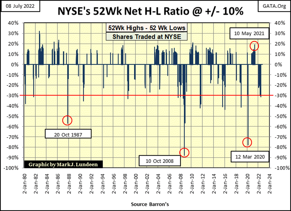
I placed a red line at the -30% level. Typically, during a correction in a bull market, seeing the NYSE 52Wk H-L Net break below this level is a good, if not perfect indicator the stock market has hit a bottom in the correction. Which is exactly what happened in our correction, when on June 16th the NYSE 52Wk H-L Ratio hit a -31.44%, which at face value, is a good indication our current market correction is near its bottom. Of course, all that assumes the stock market is in a bull market.
There are times when these negative 52Wk H-L nets can decline far below their -30% level. The three occasions seen above (Red Circles) are from;
- October 1987 Flash Crash,
- October 2008 Sub-Prime Mortgage Crisis,
- March 2020 Flash Crash.
What is so unusual about these three market extremes above, is the Federal Reserve aggressively entered the market on each of these occasions, “injecting” massive amounts of “liquidity” to place a floor under the market during a selling panic in the stock market.
As I see it; when 50%, or more of the issues trading at the NYSE hit 52Wk Lows, a selling panic is taking place at the NYSE, because investors want out of the market – NOW – at any price. Making that day, a bad day on Wall Street.
- The first; the flash crash of October 1987 happened during the first few weeks of Alan Greenspan’s term as Fed Chairman. The duration of this flash crash was only a day or two, but it got everyone’s attention. Greenspan promising to “provide ample liquidity” (monetary inflation) to Wall Street. The stock market recovered quickly.
- Then there was the subprime mortgage bear market crash, where on October 10th 2008, 90% of the issues trading at the NYSE hit a 52Wk Low. CNBC on commercial free, live TV, covered Congressional hearings on the selling panic in the stock market. The Dow Jones itself had another five months before it bottomed (March 9th 2009). But it was in October 2008, when 90% of the issues trading at the NYSE simultaneously hit 52Wk Lows, that the political decision allowing Dr. Bernanke to create a “new tool”, that of a Quantitative Easing, was made.
- The March 2020 flash crash. “Market experts” blame this selling panic on the covid pandemic. I blame the March 2020 selling panic, that saw 79% of the issues trading at the NYSE to deflate to a 52Wk Low on the same day, as an inevitable consequence of the FOMC’s January 2018 – October 2019 Quantitative Tightening (QT).
In all three of the above selling panics, the decision to buy when everyone else was selling their positions – at any price – proved to be an excellent, if gutsy market call. I believe we’ll once again see a selling panic at the NYSE. Should one come sometime in the next twelve months, I wouldn’t be surprised.
Should you be buying what Wall Street is selling, at steep discounts, when the NYSE next sees a day where 90%, or more of their issues are hitting 52Wk Lows? I really can’t say. After forty years of the FOMC “injecting liquidity” into market valuations, the NYSE must see many more 52Wk Lows before its valuations once again becomes truly undervalued.
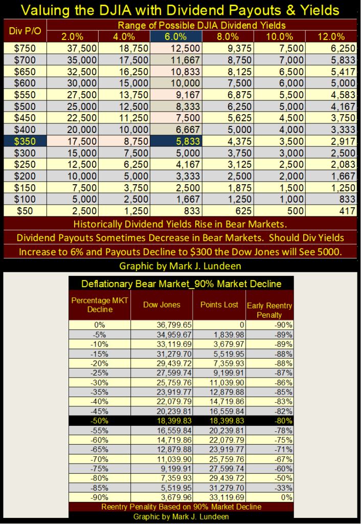
As I see it, until the Dow Jones once again sees a dividend yield of 6%, and probably even higher, I don’t want to take any long-term positions in the stock market. This is because when Mr Bear finally comes to do what he does best; that is popping massive inflationary bubbles in market valuations, he is going to take stock market valuations down 90%, or more. That will take much time, and many, many NYSE 52Wk Lows to accomplish.
The above is just my opinion. As is the next time the NYSE’s 52Wk H-L Ratio sees a -90% day, it will signal at best only a short-term trade to the upside. As today’s market valuations have been massively inflated for the past four decades, ultimately, in the next cycle of deflation of market values, it will be a repeat of the Depressing 1930s, where it just didn’t pay becoming a long-term bull.
In the early 1930s, until the Dow Jones dividend was yielding something well above 6%, after its dividend payouts were cut by over 50%, being a bull on Wall Street was a mug’s game. In the table below, a 6% yield for the Dow Jones, and halving its payout, would deflate the Dow Jones’ valuation to 5,833. That would be an 84% bear market decline from last January’s last all-time high of 36,799.
Before I would even consider returning to the stock market, intending to “invest for the long term”, I’m going to demand a big discount in the market, using Dow Jones’ dividends as my guide. At the bottom of the Great Depression 89% Crash, the Dow Jones was yielding over 10%, as its dividend payout was cut by 75%.
In the 21st century, is such a thing possible? That everybody, including ivy-league economists and “market experts” all agree such a thing is not possible, oddly makes such a thing very likely.
For a select few at the top, let’s call them the proprietors of the deep state, they operate in a world free from personal-negative consequences for anything they do, regardless of the impact their conduct has on others.
For decades, government bureaucrats, multi-billion-dollar hedge funds and speculators, and the Wall Street establishment itself behaved in a reckless manner. They have lost all fear of consequence, such as a repeat of the 1930s market crash, because today’s markets are “regulated.”
Which everyone understands as the Federal Reserve’s ability, NO (!) its obligation of putting things right when things go wrong. In such a system, these people will push markets to the breaking point, using leverage so willingly provided by the idiot savants at the FOMC. The 2002-2009 sub-prime mortgage boom / bust is a perfect example of what I’m talking about.
But such a market event, a second Great Depression market crash is within historical possibilities. There is no barrier preventing the Dow Jones’ dividend to once again yield 10%, or having its dividend payout cut by 75%, as it was in July 1932.
Should bond yields continue rising in response to rising CPI inflation, dividend yields will also rise. During major recessions, business conditions become difficult, possibly making a profit becomes impossible. In the next economic downturn, many, maybe most corporations will be forced to cut, or completely eliminate their dividend payouts.
So, I can’t rule out that one day the Dow Jones will once again, as in the early 1930s, sees a dividend yield of 10%, as its payouts are cut by 75%; fixing the Dow Jones (get ready for it) at 1,750. A fall from grace of some 95% from the Dow’s last all-time high of 36,799.
Why am I so pessimistic? Because there is something very wrong with the market, and it’s been very wrong for a long time.
Take for example NYSE’s 70% A-D Days, or days of extreme market breadth. On any given day at the NYSE, every issue trading will either advance, or decline in price from the day before. It’s called “market breadth.” Decades ago, it used to be said that days with more NYSE advancing issues than declining were days with good breadth; days with more declining than advancing issues had bad breadth.
But there are extremes in daily breadth. As noted above, the number of issues trading at the NYSE has changed greatly over time. In the 1920s, the NYSE had about 500 listed issues trading daily. Today it has about 3,400 issues trading daily. To give equal weight to each day’s market breadth for the past century below, I use a ratio:
Advancing issues – Declining Issues / Total Issues Trading that Day
When this ratio reaches (+/-) 70%, I call it a day of extreme market breadth, a NYSE 70% A-D Day.
Since January 1926, where my breadth data begins, there has been only 424 days of extreme market breadth, in the 25,425 NYSE trading sessions of the past ninety-six years. Though, looking at these days of extreme market breadth in the chart below, they appear as common market events. However, actually they are rare market events that are almost exclusive to bear market declines. Look at the Greenspan’s era of market bubbles below (1987 – 2006: 19 years), the NYSE saw less than ten days of extreme market breadth.
In the top chart, below, there are two clusters of NYSE 70% A-D days. The first during the depressing 1930s. After the Dow Jones bottom of April 1942, days of extreme market breadth (70% A-D days) once again became rare market events as distance from the 1930s increased. From April 1942 to February 2007 (65 Years), the NYSE saw only 97 days of extreme market breadth.
Then in February 2007, as specific-performance problems in the sub-prime mortgage market began surfacing, once again a cluster of 70% A-D days began forming, a cluster that continues to this day. So far in 2022, the NYSE has seen five 70% A-D days.
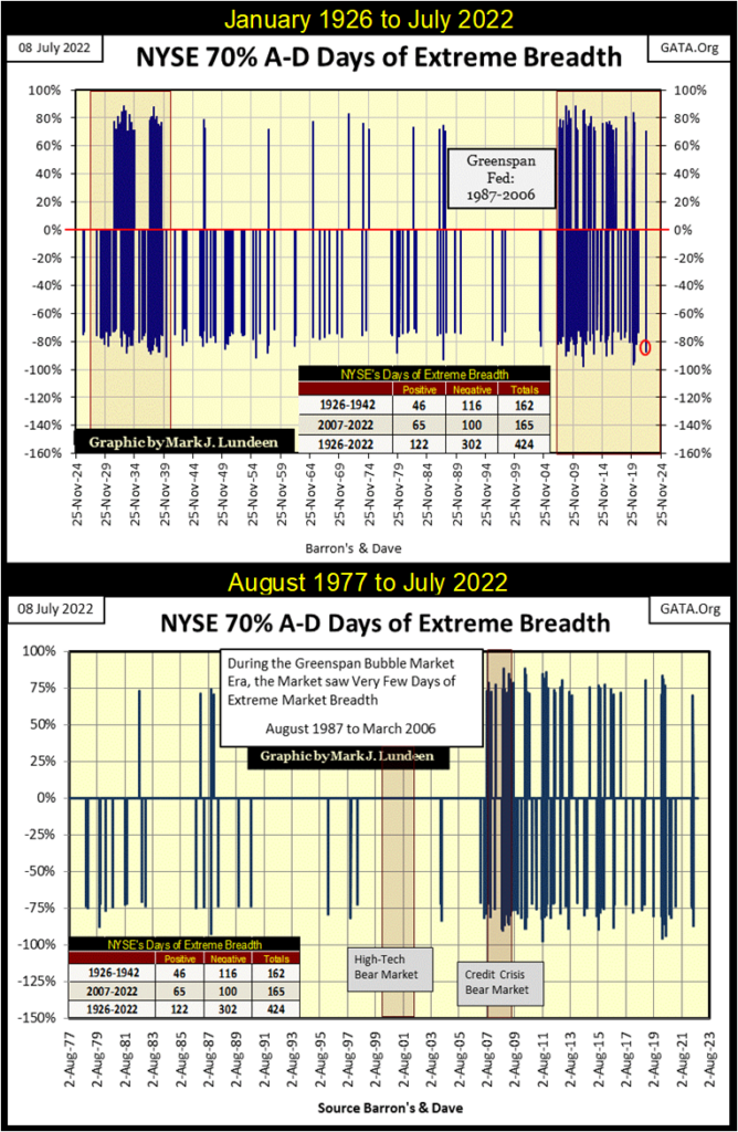
The lower chart above plots the NYSE 70% A-D days since August 1977.
I don’t make this stuff up. I went to the public library to compile market data in a spread sheet. Not wanting to duplicate the technical analysis of others, I devised my own market indicators. And in the two charts above, you’re seeing what I discovered hidden in the NYSE’s Advance Decline data.
To my eyes, this second cluster of extreme market breadth, which began in February 2007, a cluster that continues to this day, is alarming. These charts strongly suggest, to me if no one else, that the stock market, and its financial system still has huge-unresolved issues carried over from the 2002-2007 single-family mortgage bubble.
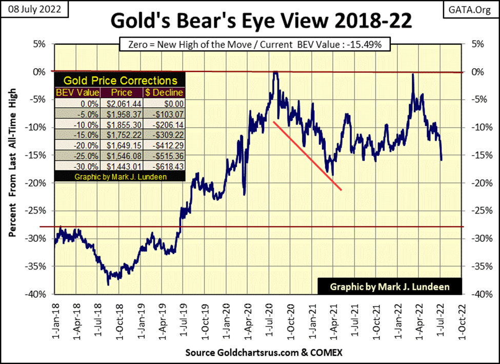
Enough of that, let’s next look at gold’s BEV chart. Yikes! This week gold broke below its BEV -15% line!!
My first inclination when looking at this chart was to think; who cares? Well, I care, that a bunch of goons selling nonexistent gold by the ton at the COMEX, are allowed to distort market valuations, such as we see below. Obviously, no one at the COMEX is afraid of going bankrupt shorting gold in our world of great, and growing uncertainty, or going to prison for years should they be caught.
One of these days this will blow up in their faces, and I want to be there to see it happen. In March 1980, gold once advanced from one daily closing to its next by over 13%. At Friday’s closing price, should this happen on Monday of next week, gold would see a daily advance of $226, or a closing price of $1968.52. A BEV of -4.51% in the BEV chart below.
I’m not holding my breath. But one of these days —!
__
(Featured image by sergeitokmakov via Pixabay)
DISCLAIMER: This article was written by a third party contributor and does not reflect the opinion of Born2Invest, its management, staff or its associates. Please review our disclaimer for more information.
This article may include forward-looking statements. These forward-looking statements generally are identified by the words “believe,” “project,” “estimate,” “become,” “plan,” “will,” and similar expressions. These forward-looking statements involve known and unknown risks as well as uncertainties, including those discussed in the following cautionary statements and elsewhere in this article and on this site. Although the Company may believe that its expectations are based on reasonable assumptions, the actual results that the Company may achieve may differ materially from any forward-looking statements, which reflect the opinions of the management of the Company only as of the date hereof. Additionally, please make sure to read these important disclosures


Blockchain Evolves Toward AI, Finance and Quantum Security
Blockchain is evolving beyond crypto into finance, AI applications, and digital markets, while security and regulation remain challenges. Quantum threats...


The Italian Crowdinvesting Market Faces Sharp Decline in 2026
Italian crowdinvesting market continued to decline in 2026, with fundraising falling 36.8% year-on-year to €164.19 million. Platforms and active campaigns...


Sartorius Stedim Biotech Maintains Growth Momentum in H1 2026
Sartorius Stedim Biotech reported solid H1 2026 results, with revenue reaching €1.527 billion and EBITDA rising to €479 million. Growth...


Bank of Africa Launches BOA MDM Network to Boost Diaspora Investment in Morocco
Bank of Africa launched the BOA MDM Network to channel diaspora remittances into productive investment, aiming to raise their share...


Switzerland’s Medical Cannabis Reform Advances Access, But Barriers Remain
Switzerland’s 2022 medical cannabis reform improved patient access by removing federal approval requirements, but challenges remain. MEDCAN highlights barriers including...
 |
|
 |  |
 |
|
-

 Fintech2 weeks ago
Payhawk Reaches $100M ARR Milestone with AI-Driven Growth
-

 Africa2 days ago
PAASIFEJ: Results-Based Financing Driving Inclusive and Sustainable Rural Growth in Morocco
-

 Impact Investing1 week ago
Italy’s Startup Ecosystem Shrinks but Becomes More Digital and Specialized
-
 Fintech4 hours ago
Blockchain Evolves Toward AI, Finance and Quantum Security