Business
A look at the sudden steep rise in interest rates at the long end of the curve
Global economies are in a funk. Since at least the 1980’s recoveries following each recession have been increasingly weaker. If there is improvement it comes in the form of technological improvements. But stock markets, without exception, have marched relentlessly higher fueled by interest rates that have fallen to levels never before seen in history and endless amounts of liquidity provided through the central banks along with unprecedented amounts of debt.

“The complaints of the privileged are too often confused with the voice of the masses.”
—John Kenneth Galbraith, Canadian-American economist, diplomat, public official, intellectual, author, professor at Harvard University, served in four Democratic Party administrations, U.S. Ambassador to India 1961–1963; 1908–2006
G7 plus China Annualized Growth GDP
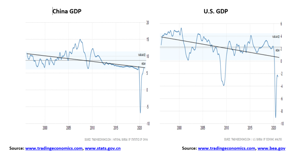
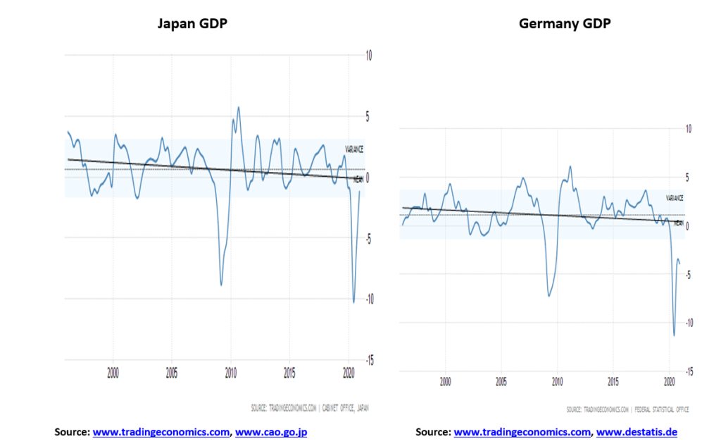
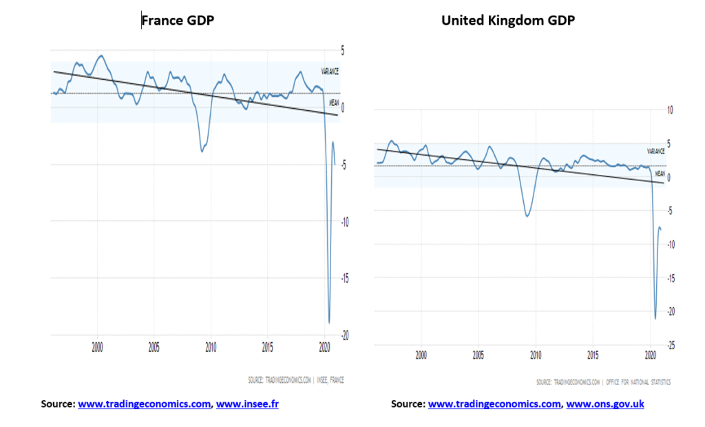
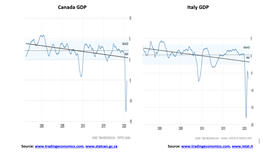
The first thing that caught our attention with GDP annualized growth was the downward tilt that has taken place over the past 25 years. If one goes back further, starting post-war, the tilt is the same. The strong growth rates took place in the 1950s, 1960s, and even in the 1970s. But following the steep recession of 1980–1982, growth rates coming out of recessions have been feeble. Since then, we saw recessions in 1990–1991, 2001–2002, 2007–2009, and 2020–present. Growth rates following each recession were consistently lower than the growth rate of the previous one. Even China is following the same pattern. The only difference for China is that their economy grew in 2020, whereas all of the G7 members saw their economies contract. While there remains hope for a recovery in 2021, the recovery is tenuous at best, especially if there was a third wave to the pandemic. Historically, pandemics are never one and done; they come in waves over a period of decades, even years. All G7 members also saw their debt explode for governments, corporations, and households.
| GDP 2020 % change from a year ago | Government debt to GDP % | |
| United States | (3.6)% | 129.5% |
| China | 1.9% | 53.8% |
| Euro Area | (7.6)% | 97.3% |
| Japan | (5.3)% | 270.9% |
| United Kingdom | (9.9)% | 109.2% |
| Germany | (5.3)% | 84.4% |
| France | (8.3)% | 117.4% |
| Canada | (5.3)% | 110.7% |
| Italy | (9.1)% | 164.0% |
U.S. GDP Annual Growth Rate 1948-2020
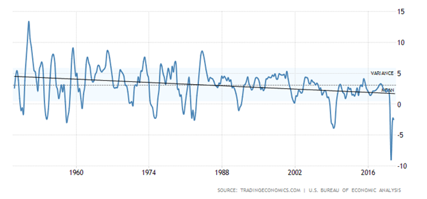
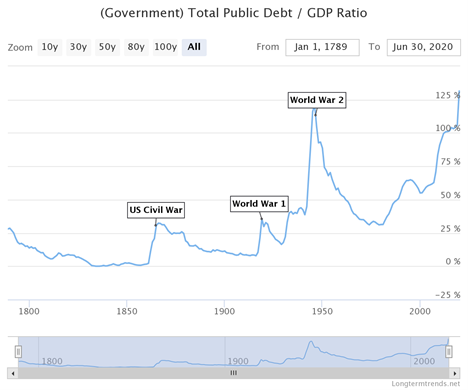
The above chart of annualized growth of GDP for the U.S. from 1948 shows how each rebound following the recession has been on a downward track, particularly since the early 1980s recession. The conclusion we draw from this given the debt loads is that any recovery from the COVID-19 recession will be very feeble. Debt has exploded since the pandemic got underway. Global debt today has exploded to $281 trillion, up from $255 trillion in 2020. U.S. government debt has exploded. Since the start of 2020 U.S. government debt is up $4.7 trillion or 20%. By 2030, total U.S. government debt could be as high as $40 trillion. Of that, an estimated $33 trillion would be held by the public (source: www.cbo.gov). See also our long-term chart of U.S. Government Debt to GDP (next page) dating from 1789. The ratio has never been so high, not even in wartime.
While many will consider the burden of government debt a huge problem, it is actually the least of the problems. The government is backed by the Federal Reserve and the U.S. dollar is also the world’s reserve currency. That alone gives the U.S. considerable advantage. Fed debt purchases effectively monetizes the debt. Irrespective the debt is a burden and a drag on the economy. However, the real drag on the economy is the huge corporate debt. Corporate debt, made up of both financial and non-financial corporate debt, is estimated in the U.S. to be $33.4 trillion. Of that debt some 69% or an estimated $23 trillion is rated BBB or lower.
This has created what we many call zombie companies—companies that earn just enough money to continue operating and service their debt but are so weighed down with debt they can never hope to pay it off. A serious slowdown for them could result in a high number of bankruptcies. These companies require perpetual bailouts just to keep going. Zombie companies are not investing in anything productive that could grow the economy. It is all misallocated capital. They are just trying to stay alive. Zombie companies are not just a U.S. problem as Japan is littered with them as is the euro area and even China.
Bloomberg (www.bloomberg.com) has estimated that some 200 companies have joined the ranks of zombie companies. Their names are some of America’s biggest—Boeing, Carnival, Delta Air Lines, Exxon Mobil, Macy’s, and AMC Theatres are but a few. Total obligations for these firms are estimated to be at least $2 trillion. Yes, the Fed is purchasing bonds like crazy every month, estimated at around $120 billion, and, yes, interest rates are at historical lows, but the reality is hundreds of companies are being kept artificially alive (and hundreds more are just above them). Under normal circumstances these companies would have all collapsed into bankruptcy. And they employ a lot of people as well, estimated at over 2 million. Zombie firms are spread across a number of industries including industrial companies, computer hardware and storage companies, energy companies, hotels, restaurants and leisure companies, retail companies, and software companies. Airlines, cruise lines and large retail department stores are prominent. In Japan and China, the zombie companies are primarily banks as well as a lot of corporations. The euro area is littered with barely-alive companies and financial institutions.
It has been the mantra: debt, debt, debt along with accommodative central banks, and historical ultra-low interest rates. But what is the alternative? A depression that could make the Great Depression look like a walk in the park? And what happens if the central banks turn off the money spigot? What happens if the governments turn off the bailout spigot? Unemployment would soar. And along with sharply rising unemployment would come major social unrest. The level of social unrest that took place during the Great Depression is often overlooked. It was also a period where politics shifted to the extremes, both left and right, something we are seeing once again today. The best one can hope for is what Japan has been experiencing since 1990—an economy that can best be described as “The Walking Dead.”
The money that is being “shovelled” into the economy is very uneven. This has resulted in what is being called the K recovery where the rich get richer (Wall Street), the middle-class gets squeezed, and everyone else tries to survive (Main Street). Actually, that has been going on since the 1980s when it got underway with huge tax cuts that primarily benefitted the wealthy and the mantra of trickle-down economics that has been proven over and over not to work.
One measure of wealth and income inequality is what is known as the Gini Coefficient. The index is fairly simple to interpret. The index ranges from 0 to 100. Absolute equality would be 0 while absolute inequality would be 100. The table below notes the Gini Coefficient for the G7 and China. Data is bit older and could be higher now for all. Some estimates we have seen for the U.S. puts its Gini currently as high as 48. The highest in the world is South Africa with a Gini Coefficient of 63.
| Gini Coefficient | Last Update | Poverty Rates % 2019 | Official Unemployment Rate 2021 % | Life Expectancy (both sexes) 2019 | |
| United States | 43.4 | 2017 | 17.8% | 6.3% | 79.11 |
| China | 38.5 | 2016 | 24.0% * | 5.2% | 77.47 |
| Italy | 37.3 | 2017 | 13.9% | 9.0% | 84.01 |
| United Kingdom | 39.2 | 2016 | 11.7% | 5.0% | 81.77 |
| Canada | 35.2 | 2017 | 11.8% | 9.4% | 82.96 |
| Japan | 36.3 | 2017 | 15.7% | 2.9% | 85.03 |
| Germany | 35.1 | 2016 | 10.4% | 4.6% | 81.88 |
| France | 32.6 | 2017 | 8.5% | 8.9% | 83.13 |
Note: * 2016 data. An estimated 0.6% of the population lives in extreme poverty in 2019 according to the OECD.
Maybe not surprisingly, of the G7 nations the U.S. has the highest income and wealth inequality. In 1968 the top 20% earned 43% of the nation’s income. By 2018 that had risen to 52%. There are sharp differences amongst races with Black households earning only about 60% of white households. There are sharp differences amongst the political parties with 78% of Democrats believing income inequality is a major problem vs. only 41% of Republicans. The gap between the richest and poorest has more than doubled since 1989. In 1989 the richest 5% had 114 times more wealth than the second quintile. By 2016 they had 248 times more wealth. The top 5% saw their wealth leap following the financial crisis of 2008 and again during the COVID crisis. It is estimated that the net worth of billionaires has gone up over $1 trillion since the start of the COVID crisis. Meanwhile, minimum wages have not gone up since 2009. An estimated 1.8 million U.S. workers are at or even below the minimum wage. Some 25 million U.S. workers work part-time, many of them involuntarily. Millions more are no longer in the work force and survive on benefits. Millions face an uncertain future of no employment or underemployment. (Source: Pew Research Center www.pewresearch.org).
If there is any good news about growing wealth and income inequality it is that other areas of the world are even higher, particularly in Asia, Latin America, the Middle East, Africa, and Russia/Ukraine. But the North American disparities are considerably wider than those seen in Europe and Oceana. EU countries have the lowest Gini Coefficient for the most part.
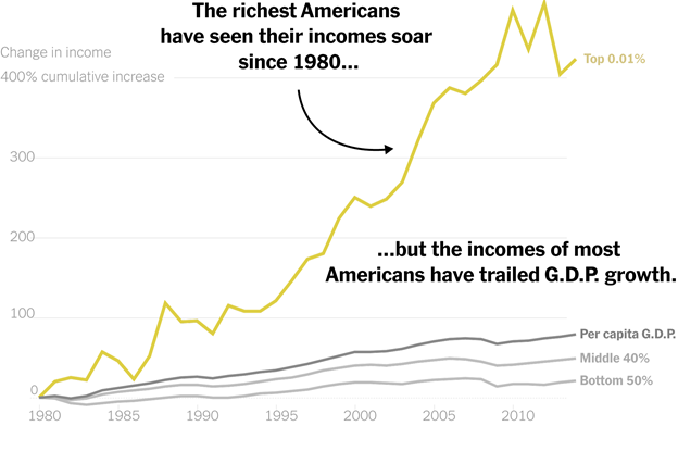
All of this plays into the stock market as it is the top 20% of the population that is more likely to own stocks, to have a secure, well-paying job, be able to work from home during the pandemic and own their own home. The massive injections of liquidity into the financial system (QE), coupled with historically low interest rates, along with bailouts and tax cuts have largely benefitted the richest (Wall Street) while the rest lag sharply behind. A patchwork of programs is trying to keep them and many small companies afloat. Homelessness is rising. The middle-class has been steadily shrinking since the 1980s.
A lingering stagnant economy, rising debt, zombie companies, high unemployment and higher underemployment, rising inequality—the walking dead are amongst us. All this has given rise to social unrest, and deep, possibly irreconcilable, political divisions. And what if the stock market should collapse? Then what?
The Pandemic Rages On!
Since about mid-January 2021 the number of daily cases has been in decline. Today it sits about half where it was in January. The number of daily deaths is also down but only by about a third. In the U.S. the numbers are even better as the number of daily cases has fallen by almost 75%. However, deaths have only fallen by about 40%. In Canada, the story is the same. Cases are down by roughly two-thirds and deaths have fallen by about 70%. Good news? Yes, but only if a third wave does not develop. Pandemics come in waves. Historically they have lasted years, even decades coming in waves with each wave varying from the previous one. Yet everyone is pumping how things are so much better that the economy will open up that growth out of this will be spectacular due to pent up demand. False hopes? The second wave was deadlier than the first. Some are saying a third wave could be even worse.
Sunday February 28, 2021 – 15:59 GMT
World
Number of cases: 114,515,704
Number of deaths: 2,539,745
U.S.A.
Number of cases: 29,203,913
Number of deaths: 524,690
Canada
Number of cases: 865,251
Number of deaths: 21,980
Source: www.worldometers.info/coronavirus
Chart of the Week
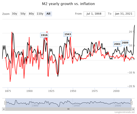
We recently came across the Long-Term Trends (www.longtermtrends.com) website. Its mission statement is “to find the most interesting and educational charts with rich historical data – and to make these charts available online.”With that in mind, we found the above chart comparing long-term inflation with the growth of money supply (M2) quite interesting. Without doing a correlation analysis we visually noted that a decline in inflation generally preceded a decline in M2 and vice-versa. So, it was quite interesting to note that the recent huge rise in M2 has not yet been accompanied by any significant change in the rate of inflation.
M2 is up $3.9 trillion in the past year or 25%. The core CPI inflation rate has increased by 3 points or 1.1%. Yet all we read is how the huge increase in money supply—and by extension huge government expenditures (the latest being the $1.9 trillion stimulus package)—as well as growth in the U.S. government debt and the Fed’s balance sheet during the same period are about to unleash a wave of inflation, even hyperinflation. Hyperbole? Or basis in reality? U.S. government debt has gone up $4.7 trillion or 20% and the Fed’s balance sheet has exploded by $3.4 trillion or 82%, thanks to QE and the expenditures to prevent the Great Depression II. As to inflation, well, to parse an old phrase “where’s the beef?”
Oh, for sure there have been some signs of inflation. The euro area experienced its fastest growth in five years in January. We are seeing a rise in commodity prices, not because of demand but because of shortages. We have noted that the pandemic has sparked bottlenecks and supply constraints. There is a shortage of containers and container prices have shot up. One area of demand has been for tech equipment and there is now a shortage of semiconductors. That impacts everything from cars to computers to cellphones. The ongoing trade war with China isn’t helping, although China is only about 11% of the market. Taiwan is the largest with almost 24% of the market. Closer to China are South Korea and Singapore. The result is the U.S. and the world is heavily dependent on Asia, even if some large U.S. corporations are dominate.
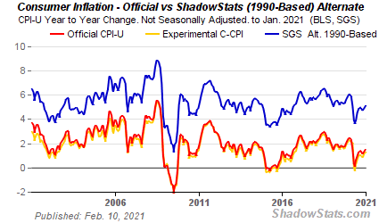
Inflation is sure to creep in. There are growing expectations of a strong recovery later this year, fueled by everyone getting vaccinated. Oil prices have gone up about $30 since November 2020. We have seen pressure on food prices. Copper prices are up 21% so far in 2021. However, if one were to check with Shadow Stats (www.shadowstats.com) one would find that, basing inflation on the way it was calculated in 1990, the Shadow Stats number is not as reported at 1.4% but instead it is at 9.1%. Quite the difference. The difference is methodological changes moving to substitutions as prices rise. Technological improvements also impact the method of calculation.
Inflation expectations work their way into the markets. The result is we have seen a sharp rise in bond yields at the longer end of the yield curve. The U.S. 10-year treasury note that bottomed out at 0.51% in August 2020 is now at 1.40% but hit as high as 1.60%. Ditto in Canada where the 10-year Government of Canada bond (CGB) bottomed at 0.43% also in August is now at 1.36%. Both the Fed and the Bank of Canada (BofC) are on record promising to keep interest rates low. Their bond-buying programs are firmly in place. The Fed buys $120 billion/month while the amounts the BofC buy varies. Effectively it is monetizing the debt and does help keep a lid on inflation.
While the Fed and the BofC are happy to see a rise in inflation, they also don’t want to see a big rise in bond yields. If inflation picks up, the odds of them hiking interest rates is about nil. But they also don’t want to see bond yields at the far end of the curve heating up. The Fed and BofC control the short end of the curve but the market decides the long end of the curve. And rising rates feed back into the economy with rising mortgage rates and more. And that in turn could turn the economy down again. The rates may not be at 1980 levels but a 200% rise in rates is nothing to ignore. We have memories of the bond debacles of 1984, 1994, and even in 2000 and 2007 where we wake up one day and some huge bond fund has collapsed. The 2007 debacle was more closely related to sub-prime mortgages, but ultimately it is the same thing. Once that happens the stock market invariably follows.
We’d hate to think that the Fed and BofC could intervene in the bond market through yield curve control. Under yield curve control the Fed would try to cap the long end of the curve by pledging to buy enough long-term bonds to keep the rate from rising above whatever target it sets. It also targets rates for the 1,3, 5, and 10-year yields. Right now, all the Fed does is keep a lid on the Fed funds rate which impacts the lower end of the curve out to no more than 2 years.
But could the Fed be spooked by the terrible 7-year bond auction on February 25? There was record low demand for the issue with what is called the bid-to-cover coming in at 2.04, well below the average 2.35. That sparked rates higher all along the curve. It negatively impacted rates everywhere, particularly in the Eurodollar market. There was also news of a possible $50 billion position unwind in the market (note what we said earlier about a bond fund collapse). The result is liquidity dries up. The Fed will have to get to work to purchase the issue if the market can’t or won’t. Monetizing the debt. No matter what, the Fed will intervene and rumours of Fed rate hikes are just that—rumours.
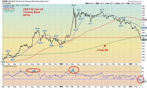
The U.S. 30-year treasury bond prices (prices move inversely to yields) are back at levels last seen in 2019. Could they be headed to the levels seen in 2018 when the price bottomed at 136? Both 2013 and 2018 saw a sharp sell-off in bond prices. The RSIs at the time were recording levels well under 30 as is the case today. The prices were also below the 4-year MA, indicated by the green line on the chart above. So, it is possible that we are approaching a low or at least a temporary one.
As to inflation, well, higher inflation is certainly possible given indications we could go higher, but it would be potentially dangerous for the world economy as it could set off all sorts of dislocations. Higher interest rates in the U.S. also siphon funds out of other G7 countries and emerging economies, putting them at peril as well. And it could hike the U.S. dollar which would be negative for gold. Although we note that the huge bond price collapse and high inflation of the late 1970s was very positive for gold. But we also note that 2013 and 2018 saw gold sell off, with the 2013 gold decline being particularly steep.
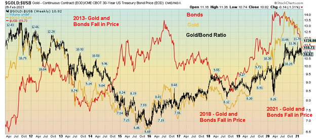
Gold is down in 2021 8.8% while the 30-year is down 7.3%. To the August low in 2018 gold fell 10.9% vs. a decline of 6.9% for the 30-year. And in 2013 gold was destroyed, down 28% as the 30-year fell 13.2%. As we can also see a rising bond market in 2015 did nothing for gold as it continued its sell-off even as bonds were rising.
The question is, how much inflation are the monetary authorities willing to accept? Too much, coupled with an improving economy, might trigger a hike in interest rates. But, given the huge levels of debt, rising interest rates are not in their interest. Hence thoughts that they might cap the long end of the curve. In 2020 it is estimated by The Institution of International Finance (www.iif.com) that governments added some $12 trillion in debt in 2020. It is estimated that they might add an additional $10 trillion in 2021. But as we have consistently said, it’s not the government debt we are concerned about; it’s the corporate and household debt that is of concern. Governments can monetize their debt. Corporations and consumers can’t.
If a recovery does not manifest itself in 2021 as many expect, then bonds will rally and, we suspect, so will gold and silver.
MARKETS AND TRENDS
| % Gains (Losses) Trends | ||||||||
| Close Dec 31/20 | Close Feb 26/21 | Week | YTD | Daily (Short Term) | Weekly (Intermediate) | Monthly (Long Term) | ||
| Stock Market Indices | ||||||||
| S&P 500 | 3,756.07 | 3,811.15 | (2.5)% | 1.5% | neutral | up | up | |
| Dow Jones Industrials | 30,606.48 | 30,932.37 (new highs) | (1.8)% | 1.1% | neutral | up | up | |
| Dow Jones Transports | 12,506.93 | 13,331.27 (new highs) | 0.4% | 6.6% | up | up | up | |
| NASDAQ | 12,888.28 | 13,192.34 | (4.9)% | 2.4% | down (weak) | up | up | |
| S&P/TSX Composite | 17,433.36 | 18,060.26 | (1.8)% | 3.6% | neutral | up | up | |
| S&P/TSX Venture (CDNX) | 875.36 | 1,018.50 (new highs) | (7.3)% | 16.4% | up (weak) | up | up | |
| S&P 600 | 1,118.93 | 1,278.56 (new highs) | (0.8)% | 14.3% | up | up | up | |
| MSCI World Index | 2,140.71 | 2,168.02 | (2.8)% | 1.3% | down (weak) | up | up | |
| NYSE Bitcoin Index | 28,775.36 | 47,557.39 (new highs) | (11.6)% | 64.9% | up | up | up | |
| Gold Mining Stock Indices | ||||||||
| Gold Bugs Index (HUI) | 299.64 | 250.16 | (5.1)% | (16.5)% | down | down | up | |
| TSX Gold Index (TGD) | 315.29 | 269.89 | (4.0)% | (14.4)% | down | down | up | |
| Fixed Income Yields/Spreads | ||||||||
| U.S. 10-Year Treasury Bond yield | 0.91 | 1.41% (new highs) | 5.2% | 55.0% | ||||
| Cdn. 10-Year Bond CGB yield | 0.68 | 1.36% (new highs) | 12.4% | 100.0% | ||||
| Recession Watch Spreads | ||||||||
| U.S. 2-year 10-year Treasury spread | 0.79 | 1.28% (new highs) | 4.1% | 62.0% | ||||
| Cdn 2-year 10-year CGB spread | 0.48 | 1.06% (new highs) | 8.2% | 120.8% | ||||
| Currencies | ||||||||
| US$ Index | 89.89 | 90.88 | 0.6% | 1.1% | up | down | down | |
| Canadian $ | 0.7830 | 0.7870 (new highs) | (0.7)% | 0.5% | up (weak) | up | up | |
| Euro | 122.39 | 120.68 | (0.4)% | (1.4)% | down | up | up | |
| Swiss Franc | 113.14 | 109.98 | (1.4)% | (2.8)% | down | up (weak) | up | |
| British Pound | 136.72 | 139.35 (new highs) | (0.5)% | 0.5% | up | up | up | |
| Japanese Yen | 96.87 | 93.85 | (1.0)% | (3.1)% | down | down (weak) | up | |
| Precious Metals | ||||||||
| Gold | 1,895.10 | 1,728.80 | (2.7)% | (8.8)% | down | down | up | |
| Silver | 26.41 | 26.44 | (3.0)% | 0.1% | neutral | up | up | |
| Platinum | 1,079.20 | 1,185.30 | (8.3)% | 9.8% | up (weak) | up | up | |
| Base Metals | ||||||||
| Palladium | 2,453.80 | 2,310.10 | (2.5)% | (5.9)% | down (weak) | up (weak) | up | |
| Copper | 3.52 | 4.09 (new highs) | 0.5% | 16.2% | up | up | up | |
| Energy | ||||||||
| WTI Oil | 48.52 | 61.50 (new highs) | 3.8% | 26.8% | up | up | up (weak) | |
| Natural Gas | 2.54 | 2.77 | (7.4)% | 9.1% | neutral | up | up (weak) |
Is the party over? We have to ask ourselves that, given that all the indices fell this past week. Well, almost all of them. The S&P 500 closed lower on the week, losing almost 2.5%. The S&P 500 did not make new all-time highs. But the Dow Jones Indices did. The Dow Jones Industrials (DJI) made new all-time highs, then reversed and closed down 1.8%. The Dow Jones Transportations (DJT) also made new all-time highs but held its gains up 0.5%. The Dow Jones Utilities (DJU) was nowhere near all-time highs, falling 6.0%. And the Dow Jones Composite (DJC) made new all-time highs and closed down 1.8%. The NASDAQ lost 4.9% but did not make new all-time highs while the S&P 500 equal weight index fell 1.1% after making new all-time highs. The S&P 600 (small cap) made new all-time highs and fell 0.8% while the S&P 400 (mid cap) also made new all-time highs and fell 1.5%. The Value Line Index also made new all-time highs and lost 1.5%. The all-time highs continued with the NYSE Composite but it lost 2.3%. The Wilshire 5000 did not make new all-time highs but lost 3.0%.
In Canada, the TSX Composite fell 1.8% and while the TSX Venture Exchange (CDNX) made 52-week highs it fell 7.3%. In the EU, the London FTSE lost 1.7%, the Paris CAC 40 was the only one to make new all-time highs but fell 1.2%, and the German DAX was down 1.5%. In Asia, China’s Shanghai Index (SSEC) lost 5.1% and the Tokyo Nikkei Dow (TKN) dropped 3.5%. Neither index made new highs. The MSCI World Index lost 2.8%.
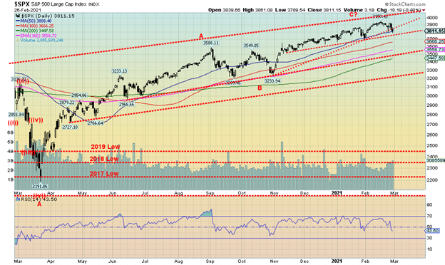
The S&P 500 could be breaking down under an ascending wedge triangle. This could target down to the October low near 3,200. That level is an important line in the sand as a breakdown under that level could spark a panic. A drop to 3,200 would entail a 19% decline. We see interim support at 3,800 and considerable support between 3,500 and 3,600. The 4-year MA is currently at 3,440. The interim January low is near 3,700 and a break under that level would tell us for sure we are going lower. With an RSI at 43.50 we have considerable room to move lower.
Are we facing a debacle like last March 2020? We doubt that but we could see a spike low in March. It would, we believe, present a buying opportunity. Rallies would be triggered by constant dip buyers but if we are going down, they will be short lived. The market was spooked this week by rising interest rates in the long end of the curve. If a big bond rally develops, then we could see the stock market also rally. The market needs to regain back above 3,900 to tell us we are going higher with possible once again new highs. Short-term trends have turned neutral and in the case of the NASDAQ the trend has turned down, albeit it is still weak.
The question on our mind is, this drop just a short-term correction or is it the start of a bigger drop? A normal correction should see the S&P 500 hold the 3,500/3,600 area. A break under 3,500 would signal something more is amiss and we’d fall towards 3,200.
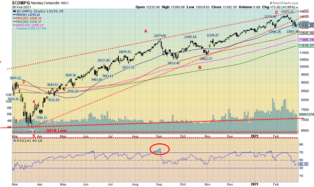
The NASDAQ led the way up and now it appears poised to lead the way down. The tech-heavy NASDAQ fell 4.9% this past week, the sharpest drop of any of the other main indices. Unlike the S&P 500 and the DJI the NASDAQ did not make new all-time highs this past week. The FAANGs were the leaders to the upside and they could now be leading to the downside. The NYSE FANG Plus Index fell 6.3% this past week. It too made its all-time high the previous week. The index had spent weeks with its RSI mostly above 70 so it was overdue for a fall. Apple was the biggest loser, down 6.4%. We have a target down to 110 for Apple. Amazon fell 4.9%, Google was down 3.1%, Facebook lost 1.6%, and Netflix was off 0.3%. The FANG Index also contains Baidu (down 16.6%), NIVIDIA (down 8.1%), Alibaba (down 9.8%), Tesla (down 14.0%), and Twitter (the big winner, up 6.6% to new all-time highs). The NASDAQ appears to have broken down under a possible ascending wedge triangle. The target could be down to that October low near 10,800. That would take the NASDAQ under the 4-year MA, currently near 11,500. It would also be a 24% drop from the all-time highs. There is interim support at 12,500 and 12,000. Unless we can regain 14,000 the odds are now favoring the downside. As a comparison, the ultimate value stock Warren Buffett’s Berkshire Hathaway also made new all-time highs and fell 0.1%. It is noteworthy that Buffett is fearful about the market.
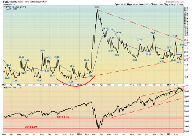
The VIX Volatility Index rose this past week but at this time it remains below the recent peak seen earlier. If this drop continues, the VIX could break out above 35, signaling potential new highs. With the S&P 500 appeared poised to break down under what appears as an ascending triangle the expectation is that it will rise further. We appear to have a good bottom in place.
We are not showing other indicators but they are rolling over. But one to note is the put/call ratio which amazingly enough closed Friday at 0.63, the highest level seen in weeks. However, this indicator has considerable room to rise before it gets into fear territory and gives us a signal that the market could be bottoming. It is the first time it has been over 0.60 since October 2020.
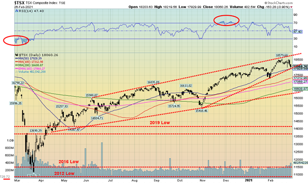
The TSX Composite joined the others to the downside this past week, losing 1.8%. Unlike some others, however, the TSX did not make new all-time highs. The TSX now sits perilously on the edge of the 50-day MA and an uptrend line that looks dangerously like an ascending triangle (bearish). If we firmly break under 17,900, we could be off to 17,300 as the next stop. The short-term trend has turned neutral, so another down week would turn the trend to the downside. Only regaining back above 18,500 could turn the bearish scenario around. Of the 14 sub-indices four of them were up on the week. The big winner was Energy (TEN) up 3.1%. The others were Consumer Discretionary (TCD), Financials (TFS), and Real Estate (TRE) up 0.7%, 0.4%, and 0.9% respectively. TEN, TFS, and TCD all made new highs. The biggest loser was Health Care (THC), down 8.4%. THC was followed by Information Technology (TKK) down 5.6%, Utilities (TUT) off 4.8%, and Golds (TGD) down 4.0%. Utilities were negatively impacted by rising interest rates. With an RSI at 47 the TSX would appear to have plenty of room to move lower before it becomes oversold. If it is any consolation, the TSX Venture Exchange (CDNX) also took a hit down 7.3% on the week but the CDNX remains up 16.4% on the year.
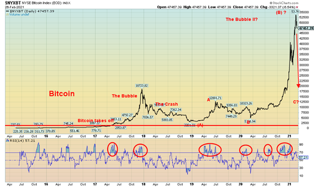
Is the Bitcoin bubble about to burst? It is still too early to tell but this week, after making new all-time highs once again at $57,540 (the NYSE Bitcoin Index high was $53,532), the market reversed and closed lower on the week, down 11.6%. With the last significant low just above $30,000, we are not yet in any danger of confirming the high. Still, we can observe that we are coming down from grossly oversold levels and where the chatter has been all about Bitcoin, GameStop, and numerous other flavor-of-the-day stocks as the discount brokers have been overwhelmed with new accounts and phone calls stretching into an hour or longer wait. However, we can’t help but wonder whether the bubble is about to burst. We do recall reading on Martin Armstrong’s page (www.armstrongeconomics.com) that he had a target up near $58,000 but figured it shouldn’t be much, if any, more than that. So maybe we’ve seen the top. And if that is correct, the C wave down could be nasty. But no, it won’t happen overnight. We freely admit we are still trying to figure out what Bitcoin is good for other than laundering money in an anonymous fashion and speculating. As they have noted, mining in the crypto universe uses more electrical power than Argentina. It has also been a universe for scams. And, to top it off, there are over 8,600 cryptos. What do they do with them all? But Bitcoin is the perfect poster child for the markets that are now nothing more than gambling casinos. The market cap of the crypto universe is currently $1.4 trillion and Bitcoin has now fallen back under $1 trillion market cap. Bitcoin is an incredible 60.7% of the entire crypto universe. That doesn’t leave much for the other 8,599 cryptos. Nine of them have market caps over $10 billion and Dogecoin still has a market cap of $6.4 billion and everyone admits it’s a joke. Maybe like the rest of the crypto market.
U.S. 10-year Treasury Bond/Canadian 10-year Government Bond (CGB)
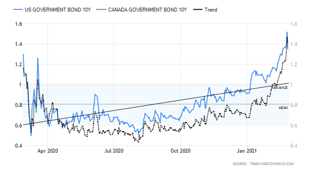
The yield on the U.S. 10-year treasury note surged at one point to 1.60% this past week before falling back to 1.41% by the end of the week. Is that signaling at least a temporary high for the 10-year? The yield on the 30-year fell back to 2.13% after hitting a peak of 2.33%. Signs of an improving economy dominated the week plus fears of rising inflation helped spark bond yields higher. Economic numbers of note this past week included: the Dallas Fed for February came in higher than expected at 17.2 vs. 7 in January and an expectation of a negative 30 reading; the Case Shiller home prices year over year was 10.1% vs. 9.2% last month and an expectation of 9%; house prices rose 11.4% year over year vs. 11.1% in January and an expectation of 10.7%; the Richmond Fed was at 14 vs. an expectation of 11; new home sales rose 4.3% above expectations of 2%; weekly jobless claims fell more than expected, coming in at 730,000 vs. an expectation of 810,000 and last week’s tally of 841,000; the Kansas Fed came in 26 vs. expectations of 17; personal income in January rose 0.6% while personal spending fell 0.2% vs. expectations of a rise of 8.5% and 1.9% respectively; the January trade deficit was $82.47 billion about as expected; the Chicago PMI was 63.8 vs 61.1 in January and an expectation of 58; and, finally, the Michigan Consumer Sentiment Index was at 79 vs. an expectation of 76.2 and January’s 76.5. The big day this coming week is Friday when the February employment numbers will be released. Nonfarm payrolls are expected to rise 140,000 but the unemployment rate will remain steady at 6.3%.
Rising bond yields are about to put pressure on mortgage and auto loan rates. Here in Canada, we read that the TD Bank’s mortgage rate is about to go up. Greater optimism about the economy has helped push yields higher, along with rising inflation expectations. Vaccinations are also helping as forecasters are seeing a rosy second half. The huge $1.9 trillion rescue package is also helping push yields higher. A poor 7-year bond auction also played a role this past week. Rising yields put the Fed in a bit of a bind, as we noted they can control the short end but not the long end. That is, unless they put in caps on the long end of the curve. But then, what if they did and inflation rose faster?
Bond bears and gold bears are often connected. We put together a little table below that shows the significant bond bears of the past 40 years vs. the gold bears that were taking place simultaneously. The only exception was the 1986–1987 bond bear where instead of falling gold actually rose. That seems to have been an outlier as normally the two fall in tandem. Bond bears are usually not friendly affairs and suddenly one hears of big withdrawals from funds or a bond fund collapses. Prices move inversely to yields. So, there could be some hope that the spike to 1.60% this past week was it at least that for the moment. Falling bond yields would most likely spark a rebound in gold prices as well.
Bond Bears vs. Gold Bears
| Bond Bear | Bond Loss% | Gold Loss% |
| 1980–1981 | (35.2)% | (66.0)% |
| 1983–1984 | (25.2)% | (45.6)% |
| 1986–1987 | (20.1)% | 48.0% |
| 1993–1994 | (25.4)% | (5.8)% |
| 1999–2000 | (22.2)% | (18.6)% |
| 2012–2013 | (17.0)% | (33.8)% |
| 2017–2018 | (22.5)% | (9.1)% |
| 2020–2021 | (13.8)% – To date | (17.3)% – To date |
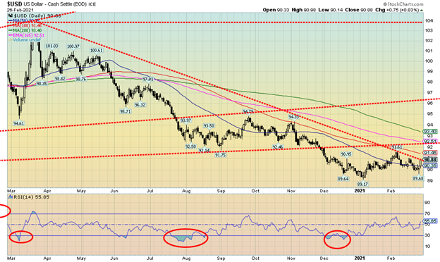
Signs of an improving economy along with rising bond yields and growing spreads over comparable instruments in the EU and Japan helped push the U.S. dollar higher this past week. The US$ Index rebounded, gaining 0.6% on the week. The euro fell 0.4%, the Swiss franc was off 1.4%, the pound sterling made new highs but closed down 0.5% on the week, while the Japanese yen was weak, losing 1.0%. The Canadian dollar fell 0.7% after making 52-week highs at 80.21, the first time it has been over 80 since 2018. It was, however, short-lived. The US$ Index is now back at a level where it must push higher or it could fail here just below 91. That line-up at 92.50 could still be a magnet. We briefly looked like we were about to break lower this past week with a low at 89.68. That point is now important to take out to the downside if the US$ Index slide is to resume.
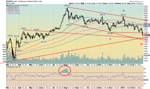
Gold broke down through support this past week under $1,775 and now $1,700 is looming into focus. $1,700 now becomes important support (we’d give it some wiggle room under that level). But if we broke $1,700 and also broke under $1,670, we’d know that we are on course for a major drop in gold prices. Gold is being pushed down by higher interest rates and, as we have noted, gold and bond prices falling together is not unusual. Bond bears are often gold bears. We continue to believe that we are still trying to find our 31.3-month cycle low which is due April 2021 +/- 5 months. Once we determine that low, we should embark on a rebound rally. But if that rally fails to make new highs, we would then know that we are embarking on the 7.83 year and 23–25-year cycle low which is technically due sometime around 2024 +/- 4 years. So, the range is 2020–2028 although more narrowly 2021–2025. Further, if we narrow it again the projected timing of the low would occur between 2023-2024. We have noted we find it surprising that none of silver, platinum, nor copper are making new lows. Only gold. A divergence? Silver, platinum and copper normally lead so our belief is that this decline is a correction and once it is over, we should embark on a new up-leg.
This past week gold fell 2.7%, silver dropped 3.0%, platinum came sharply off its high losing 8.3%, palladium dropped 2.5%, but copper once again made fresh 52-week highs and gained 0.5% on the week. Gold is now down 8.8% on the year but silver is still up a small 0.1%. Platinum remains up 9.8% in 2021. There is little doubt that we are in a downtrend with lower lows seen at $1,874, $1,851, $1,767 and now we are below that last level. Lower highs were seen from the August top at $2,089 at $1,966 and then in early January at $1,962. As the chart shows, there is considerable support down to $1,675/$1,700, emphasizing why that zone must hold.
Gold is being driven higher by rising bond yields and a rising U.S. dollar. And, as we have noted, falling gold prices and falling bond prices along with a rising U.S. dollar are not mutually exclusive. They usually go in tandem. As one pundit quipped, unless bond yields fall and the dollar turns lower again the outlook for gold remains murky at best and bearish at worst. An improving economy isn’t helping as consumer spending was the best in some time.
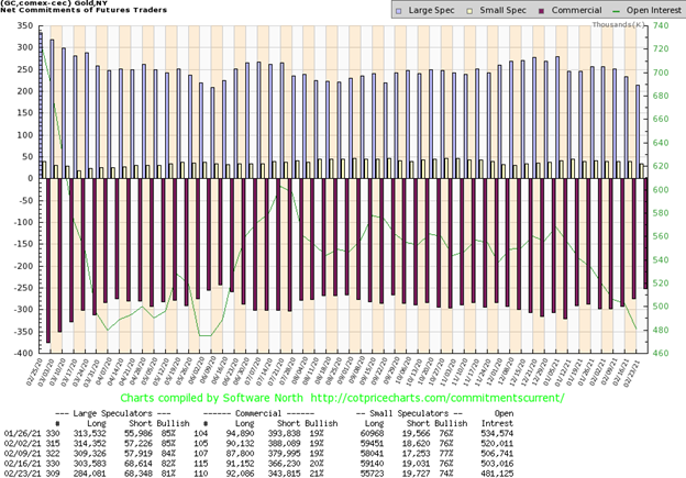
At last, some improvement in the commercial COT. The gold commercial COT improved to 21% this past week from 20%. Short open interest fell almost 22,500 contracts while long open interest actually rose by about 1,000 contracts. The large speculators COT (hedge funds, managed futures, etc.) slipped to 81% from 82% as long open interest fell by almost 20,000 contracts while short open interest was largely unchanged. Overall open interest fell about 22,000 contracts which is indicative of a corrective behavior during a week in which gold fell. It’s an improvement but nowhere we’d like to see it get bullish.
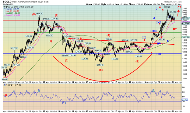
We wanted to note two potential interpretations of the rise for gold from the August 2018 low of $1,167. In red we labeled a rise of 1,2,3,4,5 waves up to the August 2020 peak. We believe we are in the B wave down with a C wave to the upside to follow. The bearish interpretation is in blue labelled (i), (ii), (iii), (iv), (v) for the A wave. The B wave in blue is the sharp March 2020 collapse and the C wave (blue) topped in August 2020. We have fallen below the 40-week MA and the 65-week EMA. The 4-year MA is well below near $1,450 and the March 2020 low. Only a collapse under $1,675 would signal to us that a decline to the 4-year MA was underway. If gold is to recover, not only do we have to get through $1,800/$1,825 but we must plow through $1,900 and the recent high at $1,962 as well. Above $2,000 new highs are possible. We wanted to warn of this possibility so that no one is fooled that we are about to embark on the biggest bull market gold ever as some pundits have quipped. There is a bearish interpretation to the recent action. And, as noted, we need to see a turnaround in bond yields and the U.S. dollar as well.
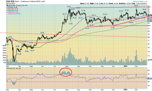
Silver fell almost 3.0% this past week, outperforming gold to the downside for the first time in awhile. Still, silver remains well ahead of gold as gold has made new lows below its November low, but silver remains well above that level. Silver fell back to the 50-day MA this past week and is just above a trendline connecting the November and January lows. That breakdown comes in at around $25.75 this week so we would like to see that level hold if we are to maintain our bullish position. A breakdown under that level would bring the November low of $21.96 into focus. The January low is just above $24. Our main hope for the market is that silver, platinum, and copper are all outpacing gold. In bull and bear markets they usually lead while gold lags. To the upside, the February 23 high of $28.42 is a hurdle that must be overcome if we are to move higher.
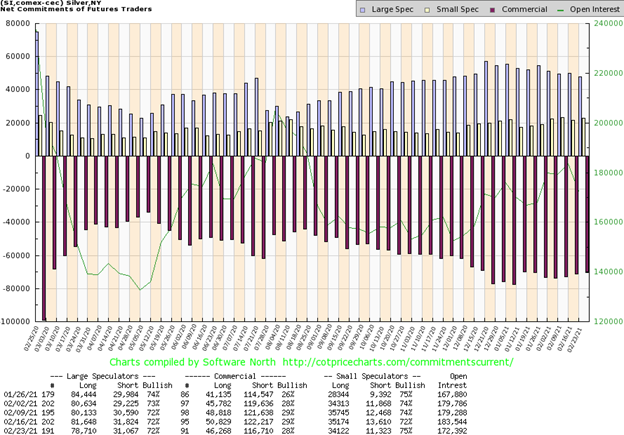
The silver commercial COT slipped slightly this past week to 28% from 29%. Both long and short open interest fell with short open interest down about 6,000 contracts and long open interest down over 4,000 contracts. Overall open interest fell over 10,000 contracts on a week that silver fell. This is indicative of a corrective market. The large speculators COT was steady at 72% with only long open interest off about 3,000 contracts. Overall, the COT remains slightly bearish.
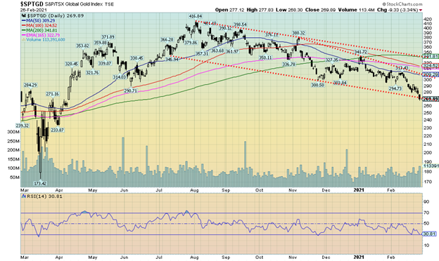
The gold stocks continue to struggle. This past week the TSX Gold Index (TGD) fell 4.0% while the Gold Bugs Index (HUI) dropped 5.1%. The TGD and the HUI are now down on the year by 14.4% and 16.5% respectively. After being one of the best performers in 2020 they are off to a poor start and are one of the worst performers so far in 2021. It is, however, selective as silver stocks have outperformed gold stocks and many silver stocks still maintained good gains despite yet another drop overall. The TGD has now fallen down to a support line near 270. It could be poised to break under the line. The RSI has fallen to the 30 level but admittedly could go lower before we find a bottom. If we want a worst-case scenario, the entire move down from the August high of 416.84 could be a falling triangle and in theory it could fall to as low as 150/155 below the March 2020 low. There is resistance up to 300/310 and we would need to regain above 310 to begin to suggest a low is in place. The Gold Miners Bullish Percent Index (BPGDM) has fallen to 34.48 which is still not bearish enough to suggest that a low might be in place. Sentiment has certain weakened but it has not reached the “throw in the towel” stage.
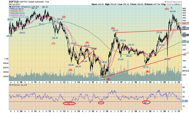
We could make a bearish case here that the TGD, and by extension the HUI as well, could be in for a much bigger fall. The TGD fell in five clear waves from the all-time high seen in September 2011. Since then, we are arguably making a huge ABC corrective wave to the upside. We don’t like the fact we took out the weekly June 2020 low at 290. And we don’t like the fact that we have fallen back below the resistance line formed joining the August 2016 high with the February 2020 high. The 4-year MA is down at 234. Could that be a draw? The weekly RSI is down to 31.65 not as low as seen at lows in 2013, 2015, and 2018 but starting to approach them. As we note with gold itself, it could be that we are starting the decline to the 7.83 cycle and 23–25-year cycle low now. However, the timing just doesn’t feel quite right. But we did want to warn in the event we see more evidence that we could indeed be poised to fall further now.
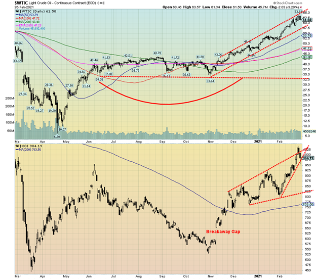
Oil prices keep chugging higher. Now analysts are talking up $100 oil. Of course, that could be a warning sign that we are getting a bit ahead of ourselves and a pullback is about to occur. Both WTI oil and the energy indices made fresh 52-week highs this past week. But then on Friday, following the stock market rout on Thursday, oil got nervous and fell with WTI oil dropping $2+. The energy stocks quickly followed. However, WTI oil still wound up on the week by 3.8% while the TSX Energy Index (TEN) gained 3.1% and the ARCA Oil & Gas Index (XOI) leaped 3.9%. The TEN and the XOI are now up on the year by 21.3% and 24.2% respectively. WTI oil is up 26.8%. Natural gas (NG), however, didn’t fare as well, dropping 7.4%. But at the end of the week the question was, is the oil market due for a pullback?
It is not likely that OPEC and Russia will step in to cap the price of oil. With the rise in prices, it is taking some pressure off them. And it is helping, albeit not much yet, the shale industry in the U.S. and the oil sands in Canada. There wasn’t a lot of news this past week unless one counts five executives of ERCOT resigning in the face of the Texas storm debacle. Another withdrew from a promotion. We also read that the $100 call options leaped in value this past week and open interest also leaped. Another sign, in our opinion, that could give rise to a correction. We read that an Israeli-owned cargo ship had an explosion in the Gulf of Oman. Iran was immediately blamed. However, the ship was off the coast of Muscat, the opposite shore to Iran in a gulf that is up to 340 km wide. So, of course, it was all very murky.
WTI oil touched up to an upper bull trendline before reversing and falling on Friday. Friday’s drop saw WTI oil lose 3.2%. The XOI broke out of a channel but Friday’s reversal which actually got underway on Thursday put it right back in the channel. Any breakdown now could quickly take the XOI back to 800/825. WTI oil could correct back to $57.50 and still be in a bull channel. Further support is seen down to $53/$54.
Friday’s reversal is potentially ominous for oil prices, at least for the short term. What’s key now is that on any pullback support zones hold. But overall, we don’t see any signs of a major top and, once any correction is over, we could well resume the uptrend. There is considerable resistance up to $70/$75 so we expect at least that area would cap any advance at least temporarily. There is also congestion resistance in the $60/$65 zone which oil prices peaked into this past week.
_
(Featured image by Anna Nekrashevich via Pexels)
DISCLAIMER: This article was written by a third party contributor and does not reflect the opinion of Born2Invest, its management, staff or its associates. Please review our disclaimer for more information.
This article may include forward-looking statements. These forward-looking statements generally are identified by the words “believe,” “project,” “estimate,” “become,” “plan,” “will,” and similar expressions. These forward-looking statements involve known and unknown risks as well as uncertainties, including those discussed in the following cautionary statements and elsewhere in this article and on this site. Although the Company may believe that its expectations are based on reasonable assumptions, the actual results that the Company may achieve may differ materially from any forward-looking statements, which reflect the opinions of the management of the Company only as of the date hereof. Additionally, please make sure to read these important disclosures.
David Chapman is not a registered advisory service and is not an exempt market dealer (EMD) nor a licensed financial advisor. We do not and cannot give individualised market advice. David Chapman has worked in the financial industry for over 40 years including large financial corporations, banks, and investment dealers. The information in this newsletter is intended only for informational and educational purposes. It should not be considered a solicitation of an offer or sale of any security. The reader assumes all risk when trading in securities and David Chapman advises consulting a licensed professional financial advisor before proceeding with any trade or idea presented in this newsletter. David Chapman may own shares in companies mentioned in this newsletter. We share our ideas and opinions for informational and educational purposes only and expect the reader to perform due diligence before considering a position in any security. That includes consulting with your own licensed professional financial advisor.


Tilray Acquires HelloMD to Expand Medical Cannabis Digital Platform
Tilray Brands acquired HelloMD, a digital healthcare and medical cannabis platform, pending court approval on June 29, 2026. The deal...


Spanish Crowdfunding Market Reaches Record €761.6M in 2025, Driven by Real Estate and Crowdlending Growth
Spanish crowdfunding market reaches record €761.6M in 2025, driven by strong real estate dominance and rapid crowdlending growth, while donations...


Swedish fintech Lysa is preparing to enter the European ETF market
Swedish fintech Lysa is entering the European ETF market, registering its first ETF and expanding beyond its robo-advisor model. Managing...


Bitcoin Stalls Near $60K as Strategy Moves, ETFs Outflow, and EU MiCA Rules Take Effect
Bitcoin hovers near $60,000 with ETF outflows, while Strategy boosts reserves, sells BTC, and raises dividends to reassure investors. Ethereum...


Morocco’s Growth Holds at 4.6% as Agriculture Offsets Economic Pressures
Morocco’s economy grew 4.6% in Q1 2026, driven by a strong agricultural rebound offsetting declines in industry. Services expanded moderately...
 |
|
 |  |
 |
|
-

 Business1 week ago
Markets Diverge as Oil Falls, Rates Hold, and Inflation Persists
-

 Biotech2 days ago
Abivax Shares Surge as New Trial Data Eases Safety Concerns Over Ulcerative Colitis Drug
-

 Markets1 week ago
Commodity Markets Pause as Oil Falls, Metals Correct, and Grains Show Mixed Signals
-

 Fintech1 week ago
PayPal’s Slowdown: From Fintech Leader to Low-Growth Dividend Stock