Featured
The American stock market starts to resemble a ‘hurry up and wait’ market
The national debt of the U.S. is on the rise again and going beyond the $20 trillion mark.

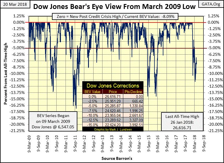
The American stock market is beginning to remind me of boot camp: a “hurry up and wait” market. Waiting for what they’d never tell you, but I will. The bulls are waiting for the Dow Jones to break above last Feb. 26‘s -3.41% in the BEV chart below, while the bears are waiting for it to break below March 23’s -11.58%, and it’s apparent the Dow Jones is in no hurry to do either.
This is a difficult market where everyone is waiting for the next significant move in the Dow Jones. But it is what it is, so we’d better just get used to it. What do I think the next significant move in the Dow Jones will be? As a bear, I’d like it to break below the BEV -12.5% line sometime before May; however, I’d be surprised—but pleased—if it did. As far as the Dow Jones breaking above its BEV -2.50% line for the bulls, I’d be even more surprised, but I know it could happen in our “regulated market.”
© Mark Lundeen
The problem with this market is that it has little to do with economic fundamentals. Politicians and the mainstream-financial media have been successful in connecting the advancing stock market with “economic growth” and “economic growth” with “government policy” originating somewhere in the minds of the “best and brightest” employed by Washington. As it is, seeing the market deflate is a signal for Washington’s “market regulators” to do whatever is necessary to keep those valuations inflated. This is especially so during election years such as 2018.
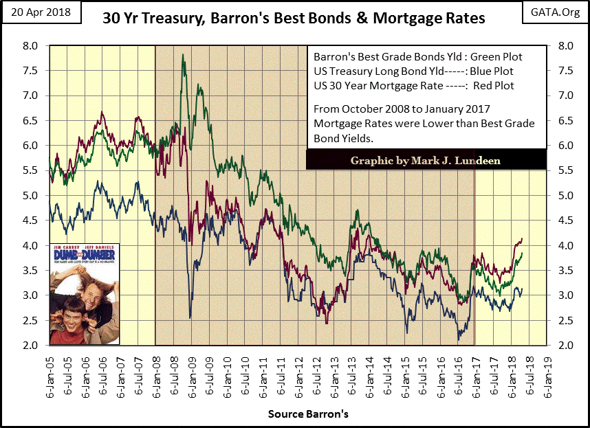
Still, one of these days, this will prove to be a mission that was doomed to fail. For one thing, interest rates are once again rising. It’s no secret interest rates, like stock valuations, have been managed for decades. But the following chart shows that something has changed.
Look at the highlighted area from January 2008 to January 2017, where mortgages rates (Red Plot) were lower than Barron’s Best Grade Bond Yields (Green Plot). If you study what happened during the 2007-09 credit crisis, mortgage rates gapped far below Best Grade Bond Yields. This was during a time when the secondary-mortgage market, a market that once traded trillions of dollars in mortgages, actually went no bid during the crisis and shut down, never to reopen for lack of buyers.
Logically, mortgages rates in 2008 should have gapped up above 20% to attract buyers back into this market, but that would have made the single-family mortgage (and home prices) collapse. As “policy” would never approve of that, something had to be done.
What made mortgage rates decline below bond yields was the Federal Reserve supporting the mortgage market by purchasing mortgages at prices far above those a free market demanded and in such volume that mortgage rates for nine years were below Best Grade Bond Yields. Years ago, I called it the Dumb and Dumber market and so included the poster of the Jim Carrey and Jeffrey Daniels movie of the same name.
© Mark Lundeen
Then, beginning in January 2017, mortgage rates have once again increased above Best Grade Bond Yields for the first time since 2008, and like all yields and rates, they have been rising since the summer of 2016. This has to mean something, and in my humble opinion, the Federal Reserve—like a college graduate with a Ph.D. from Harvard in “gender studies” financed with school loans—is beginning to feel the burden of an overwhelming debt load taken on for something that in the light of experience was something best never taken on in the first place.
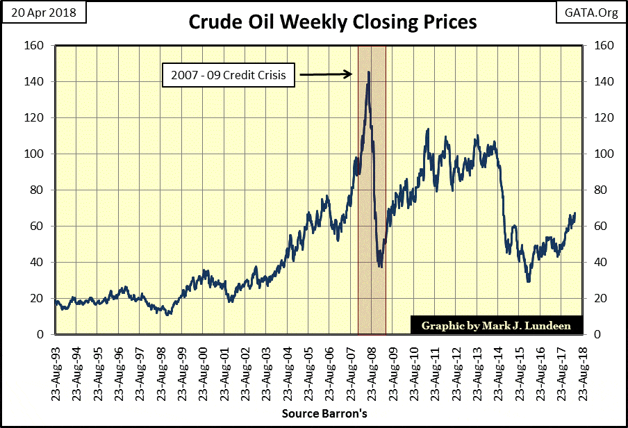
Crude oil prices have been increasing since 2016. There’s talk of oil going over $100 a barrel, maybe. But oil prices, like everything else in today’s market, are dictated by the “policymakers.” I expect the most poignant reason for the “policymakers” to allow oil prices to increase above $100 would be to drive President Trump out of office because they hate him that much. All the more reason for me and my readers to support our president as we hate the “policymakers” so much more for mucking up everything they touch.
© Mark Lundeen
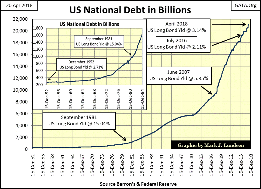
The U.S. national debt is going up, again. What’s seen below is going to kill the financial system and economy at some point in the future. People today are decoupled from reality, unlike they were in the early ’80s. It was no accident as the national debt first broke above the $1 trillion level; the U.S. Treasury had to offer the bond market coupons well above 10%. In 1981, there was one T-bond issued with a 15% coupon!
© Mark Lundeen
Today, with the national debt above $20 trillion, T-bond yields are below where they were in the early ’60s, and I’m old-fashioned enough to believe there is something very wrong with that. One of these days, there is going to be a bloodbath in the bond markets but obviously not next week or even this year.
But Trump’s administration is spending a lot of borrowed money. There’s talk of trillion dollar deficits coming by the end of the 2018. That means someone has to buy these new bonds, not yet issued, at CURRENT RATES to keep bond yields this low, but who?
The Federal Reserve could, but it’s attempting to sell some of its T-bonds too. China is also talking of selling T-bonds, and as of last August (table below), they and other nations hold trillions of Uncle Sam’s IOUs. At some point, these nations will have a lot of buyer’s regret when bond yields begin to rise.
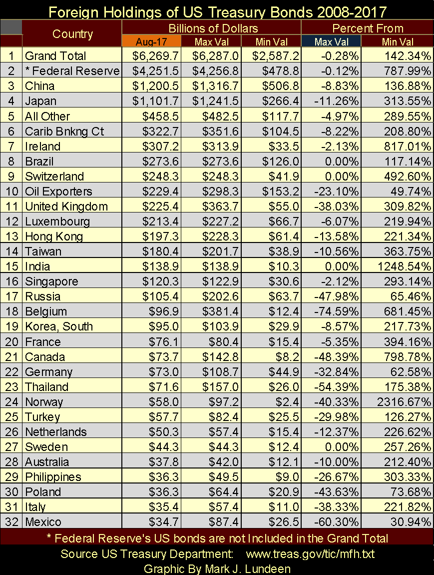
© Mark Lundeen
Maybe by Christmas, we’ll see bond yields far above where they are now in April, and that would change everything in the financial and precious metals markets.
For the Dow Jones, higher bond yields would mean that for the first time since 2009, it would be pushing down its 52-Wk Low line in a meaningful way in the chart below. It has to happen someday, and when it does, none of us are going to like it. Pension funds are having a hard time today meeting their commitments. What’s it going to be like for retirees when the Dow Jones pushes its 52-Wk Low line below its 14,500 level?
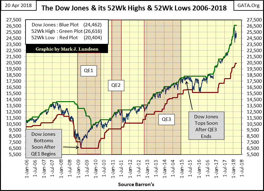
© Mark Lundeen
The chart below shows just how crazy today’s stock market is. Trading volume is demand for what Wall Street is selling—stocks. Since January 1900, rising volume went with rising valuations and declining volume with declining valuations. Their relationship (valuations with volume) isn’t bolted together, so there have been exceptions to this rule in the hundred years from January 1900 to January 2000.
But what’s seen below beginning in 2000 is bizarre: two massive Dow Jones bear market bottoms with all-time high trading volume? Bear market bottoms are known for being illiquid markets, markets whose volume have been greatly reduced from their bull market highs. But that isn’t what happened at the bottoms of the NASDAQ High-Tech and Sub-Prime Mortgage bear markets (Red & Green Stars), where Dow Jones (Blue Plot) & NYSE (Red Plot) trading volume soared to new all-time highs.
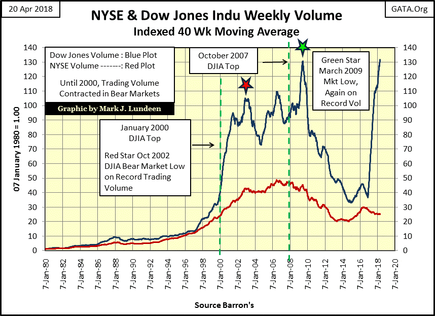
© Mark Lundeen
Then, the post-November 2016 election market advance, as in days of old, took off on soaring trading volume for the Dow Jones anyway, if not the NYSE. Looking at its 40Wk M/A, trading volume for the Dow Jones at the close of the week is at levels not seen since the 2009 bottom of the sub-prime bear market.
If we were to take this chart back to the 1990s for the benefit of the “market experts” from three decades ago, they’d tell us the Dow Jones trading volume of the last 18 years couldn’t happen—but there it is. What’s going on here? Politics interfering in the working of the financial markets using inflation flowing from the Federal Reserve to finance pseudo-demand for the 30 stocks listed in the Dow Jones Industrial Average. This is banana republic stuff.
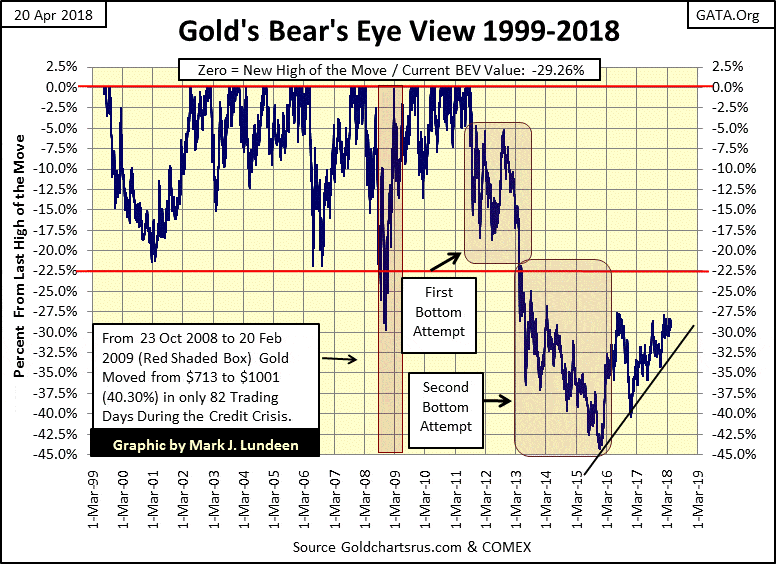
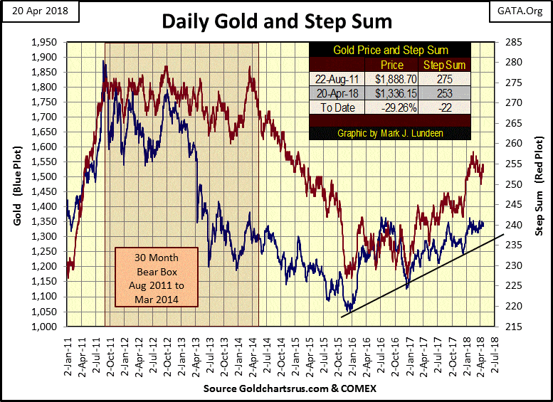
Gold, like the Dow Jones, is making everyone hurry up and wait. But the bad old days for gold are now best seen in the market’s rear-view mirror. That was quite a correction from gold’s August 2011 market top, a decline of over 40%. Gold since then has recovered nicely, as we are now focusing our attention on its BEV -27.5% line. When gold takes that out ($1,370), the bull market resumes, or so it should.
© Mark Lundeen
Here’s gold and its step sum. What a classic bear box gold had from August 2011 to March 2014. Market sentiment (the red step sum plot) for two and a half years refused to follow the price of gold down. When the box closed (step sum’s trend recouples with valuation trend), market sentiment (Red Plot) just collapses. Note how most of the damaged done to the price of gold had already occurred by March 2014.
© Mark Lundeen
In the last two months of the collapse in market sentiment (Oct-Dec 2015), the step sum plot drops like a rock as the bulls arrive in a state of total despair. And they did too! Letters from readers at that time were proof of total surrender by the bulls in the gold market, at a time when the price of gold was beginning to ignore the overwhelming number of declining days in the gold market. By December 2015, gold and its step sum plots bottomed in an environment of total loathing for gold and silver, and that sounds like a hard bottom to me—a hard bottom the bears in the COMEX market must now struggle with.
If you take a few moments of your time to compare the charts above for the Dow Jones and gold, the Dow within 10% of a historic all-time high, and gold coming off the hard bottom seen in the chart above, choosing gold over the stock market is a reasonable reaction.
Here is gold’s and the Dow Jones step sum charts, both are currently trading in a range.
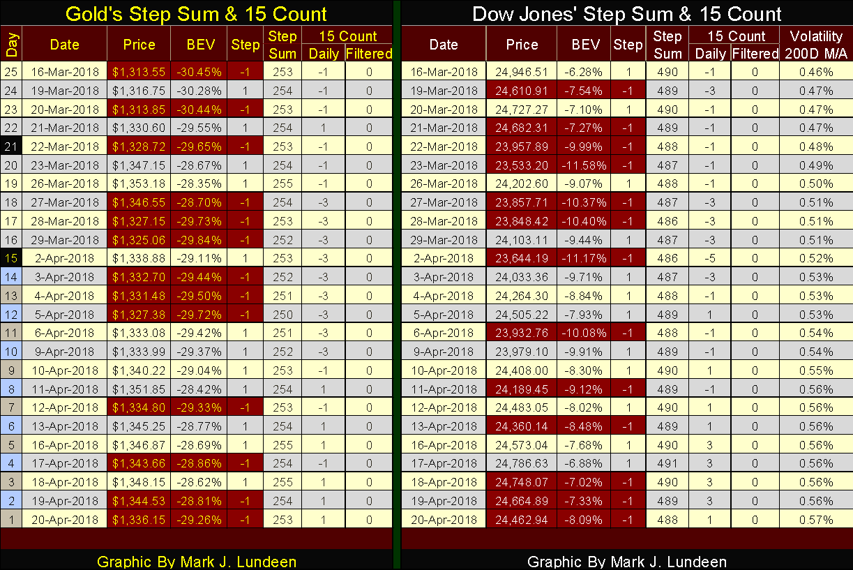
© Mark Lundeen
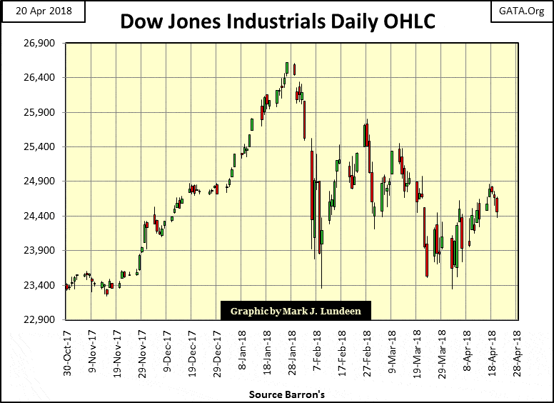
But the Dow Jones volatility’s 200-day moving average ended the week at 0.57%, and that’s not good. The Open, High, Low, and Closing price chart below shows why. Up to the Jan. 26 top, volatility in the Dow Jones was low—no big intra-day moves or large percentage moves in day-to-day closing prices.
© Mark Lundeen
All that changed with the market correction as Mr. Bear began to rock everyone’s boat with a huge increase in volatility. The frequency distribution tables below are useful to understanding the chart above. Just note that the cutoff date in the tables below is Dec. 1, so the first two months of data in the table on the right are from the last two months of the advance, two months of low volatility.
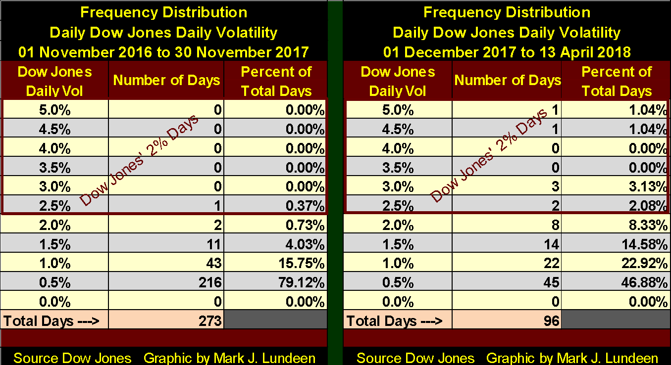
© Mark Lundeen
One more note on the chart above. In the past two weeks, daily volatility has calmed down. Should this continue, the Dow Jones may again be making new all-time highs. But that wouldn’t change the bears’ case against the stock and bond markets—they are dangerously overvalued, priced for perfection in an imperfect world.
Mac Balkam of Eskay Mining issued another press release on the company’s exploration project for the coming summer.
The text in the press release is mostly technical geological jargon. But in a nutshell, Eskay’s 130,000-acre property is right in the middle of a huge geological zone that hosts huge mineral deposits. In a gold and silver bull market, investors want some exposure to gold and silver mining and a little exposure to precious metal exploration too. Canada’s Golden Triangle offers investors exposure to both established mining companies and exploration plays such as Eskay Mining in a country known to be friendly to miners.
If you’re interested, you can look here for information on Canada’s Golden Triangle.
—
DISCLAIMER: This article expresses my own ideas and opinions. Any information I have shared are from sources that I believe to be reliable and accurate. I did not receive any financial compensation in writing this post. I encourage any reader to do their own diligent research first before making any investment decisions.
(Featured image via DepositPhotos)


Youth Cannabis Use in Colorado Is Falling — But the Full Story Is More Complex
The 2026 Colorado survey shows teen cannabis use fell to 10 percent in 2025, down from 21 percent in 2015....


Morocco’s Growth Holds at 4.6% as Agriculture Offsets Economic Pressures
Morocco’s economy grew 4.6% in Q1 2026, driven by a strong agricultural rebound offsetting declines in industry. Services expanded moderately...


Abivax Shares Surge as New Trial Data Eases Safety Concerns Over Ulcerative Colitis Drug
Abivax shares surged nearly 36% after positive updated trial results for its ulcerative colitis drug obefazimod reassured investors following earlier...


El Dorado Raises $9M to Expand Cross-Border Fintech Platform
El Dorado, a Latin American fintech improving cross-border financial services, raised a $9 million Series A led by Paradigm with...


Bitcoin Stalls Near $60K as Strategy Moves, ETFs Outflow, and EU MiCA Rules Take Effect
Bitcoin hovers near $60,000 with ETF outflows, while Strategy boosts reserves, sells BTC, and raises dividends to reassure investors. Ethereum...
 |
|
 |  |
 |
|
-

 Crowdfunding2 weeks ago
Temotiva Launches Crowdfunding Campaign to Advance Preventive Mental Health
-
 Fintech4 hours ago
El Dorado Raises $9M to Expand Cross-Border Fintech Platform
-

 Crypto1 week ago
Bitcoin Holds Steady as Microtransactions Surge and ETF Inflows Continue
-

 Biotech2 weeks ago
AseBio 2025 Report Highlights Growth and Future Potential of Spanish Biotechnology
You must be logged in to post a comment Login