Featured
American stock market shows good outcome with increases
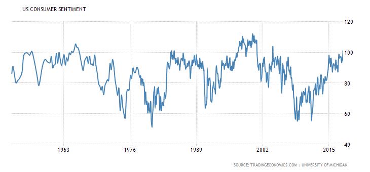
Aside from the stock market’s good news, the American consumer sentiment seemed to be at its peak as it rarely goes higher than 100.
The American stock market finds itself in a positive light as indices like the S&P 500 and the NYSE increase. Meanwhile, bitcoin may tumble down and head toward $5,500, which can lead to a further drop and to the $5,000 level.
Weekly Update
For we can fly, we can fly
Up, up, and away –
5th Dimension, Jimmy Webb
Can stock markets fly? Or is it really different this time? As we outlined last week, in celebration of the 30th anniversary of the 1987 October stock market crash, stock markets, it appears, can fly or soar as you may wish to call it. Just when you think the stock market couldn’t go any higher it does. Last week we noted the Dow Jones Industrials (DJI) had soared 30% since the US election on November 4, 2016. When compared with other stock market blow-offs such as the “Roaring Twenties,” the dot.com bubble of the 1990s, or the Tokyo Nikkei Dow (TKN) of the 1980s it was a rather puny performance, so far.
A more appropriate start point might actually be the 11-February-2016-low. That low came following six months of stock market gyrations mostly to the downside because of the ending of quantitative easing (QE). The DJI only fell about 15% during that time but it was the steepest correction since the 2011 EU/Greece crisis and only the second time the DJI fell more than 10% since the financial crisis of 2007–2009. The DJI fell 6% during the Brexit mini-panic and was down just over 4% into the November election. Pullbacks since then have been even shallower. So, given no correction over 10% maybe we should be looking at this blow-off as having started with the February 2016 low.
Since then the DJI is up just under 52% over a period of 624 days. We noted last week the average of six blow-offs we examined had seen gains of 176% over a period of 658 days. Based on this we are doing well time-wise but not so well on the gains. The longest period seen for a blow-off was about 1,050 days. There is no denying the stock market could rise further and longer than many expect.
Some believe even now the stock market is cheap compared with historic valuations. This seems to have everyone pumped up that things are going to continue that way. The Investor’s Intelligence Advisor’s Survey is at historic highs just as it was at historic lows back in 2008 at the bottom of the market. Investors love them at a high and hate them at a low. The Market Vane’s bullish consensus is over 70 levels usually associated with tops seen in 2007 and 1999. The University of Michigan survey of those expecting stocks to rise over the next year is at a record high. The equity exposure of money managers is nearly 100% and cash almost nil. Even pessimistic money managers have thrown in the towel and are now invested. The question begs that with so much optimism and everyone already committed, who is left to buy?
The consumer is quite optimistic that all is well. This despite the beating of war drums, the dysfunctional Presidency, dysfunctional politics, and a host of other things that should have people concerned. It has become “what, me worry?” The University of Michigan consumer sentiment index is at levels only sometimes seen. The October consumer sentiment came in at 101.1 up from 95.1 the previous month. The consumer sentiment index rarely rises above 100. The most notable ones were in the mid-sixties, the mid-eighties, and the late 1990s. All were at or near stock market tops. Grant you, once again strong consumer sentiment can remain for some time before the stock market tops for good. Sentiment is higher today than before the financial crisis of 2007–2009.
© David Chapman
The market is showing what many might term extreme optimism. Elliott Wave International wrote a series of articles on the markets from many angles. A recent one was entitled Historic Optimism Among Investors Fits the Case for a Major Top in Stocks (December 2017 issue, October 23, 2017). We certainly can’t cover all its points but we can highlight a few as many that Elliott Wave notes are things we have noted in the past.
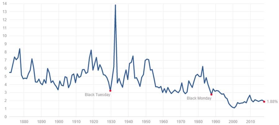
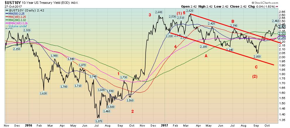
One item rarely discussed is dividend yield. The DJI’s annual dividend yield historically had fluctuated between 3% and 6%. Even at a historical top like 1929, the dividend yield was 2.83%. But today that level would look good. Today it sits around 1.88%. At the market top in 2000, it reached a record low of 1.11%. The DJI dividend yield started falling in the 1990s below 3% and it has never been that high since. Maybe a low dividend yield is a new norm. With the US Treasury 10-year note yield rising (currently 2.42%) could it tempt major players to switch from stocks to bonds?
Current Yield DJI
© David Chapman
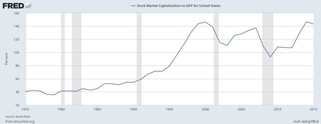
The Elliott Wave article also notes that the S&P 400 price/book value remains historically high near where it was just before the 2000 stock market top. Another way of looking at things is stock market capitalization to GDP. It too is at levels last seen before the stock market top in 2000 and higher than it was at the top in 2007 and the subsequent financial crisis/crash of 2007–2009. Again, maybe this is the new norm. But it might not be, either.
© David Chapman
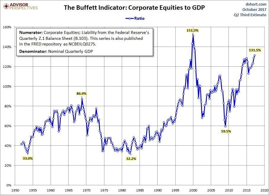
Another way of looking at the market capitalization of the stock market to GDP is what is known as the “Buffett Indicator,” named after investment guru Warren Buffett. This indicator takes the corporate equities from the Federal Reserve’s publications and divides it by nominal GDP. This indicator is also high historically although it remains below the levels seen at the time of the 2000 top but well above the highs of 2007. Again, these are indicators and not necessarily a sign that the market will actually make a top.
© David Chapman
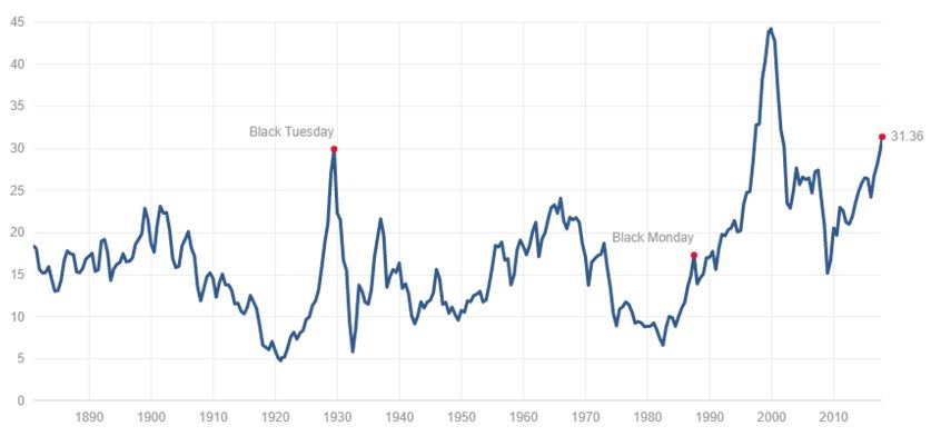
P/E ratios remain at or near historical highs. The Shiller P/E ratio for the S&P 500 is at its second-highest level ever with only the highs before the 2000 stock market above. The P/E ratio is now marginally higher than it was in 1929. The P/E is not necessarily the best indicator. However, it is another potential sign that the markets may be stretched and investors might be wary going forward. Historically the average P/E hovers around 16.8.
Apparently, an indicator the Fed focuses on is bond/stock yield spread. With both the yields on stocks and bonds as measured by the US 10-year Treasury note historically low it would appear both stocks and bonds should be a sale, not a buy. High yields on both would be more indicative of them being buys.
Shiller P/E Ratio
© David Chapman
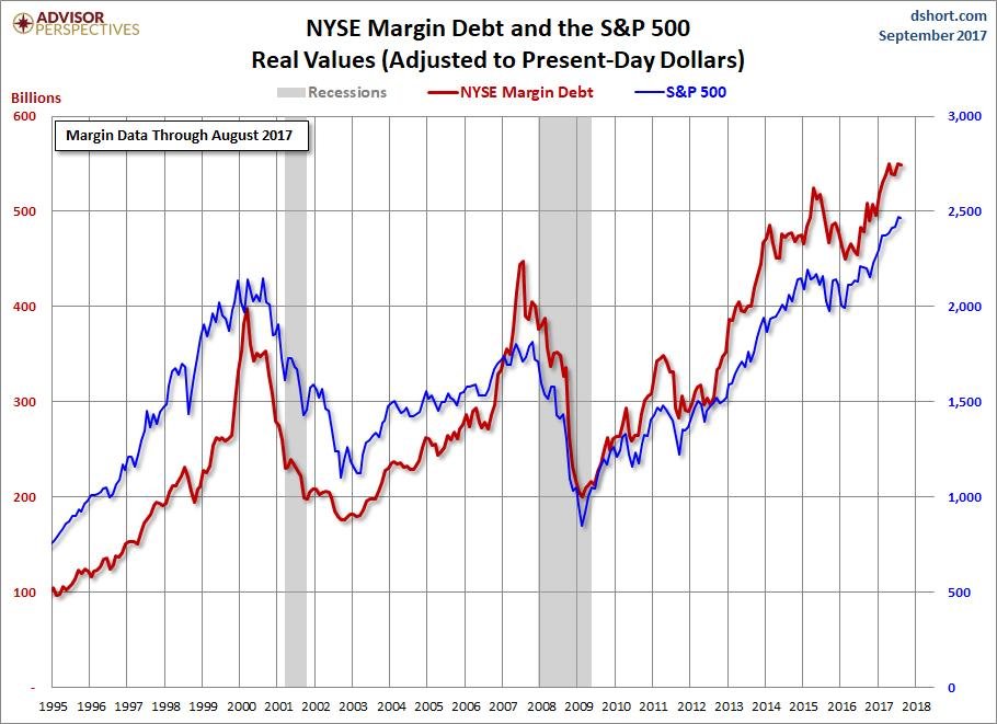
Finally, here is one more chart to show the level of irrational exuberance that has seized the market. Never before has margin debt been so high. While the S&P 500 sets record margin debt is also setting records. Since the 2009 financial crisis bottom, the S&P 500 is up roughly 290%. But margin debt has soared by over 300%. Debt fuels the rally and low-interest rates have encouraged borrowing that goes into the stock market. (See next chart.)
We had noted markets have been rising on a wave of optimism of just about everything. Yet in the background lurks threats of war, political dysfunctions, and massive debt that could spark a stock market panic. The current rise in the markets is being called the everything bubble and it has impacted stocks, bonds, coins, art, collectibles, and especially the massive rise seen in Bitcoin and the cryptocurrencies. We can’t say when the bubble will burst, only that the signs are there it will burst. If past history is any indication, the fall won’t be pretty.
© David Chapman
Bitcoin Watch!
© David Chapman
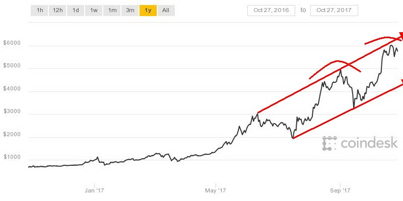
Bitcoin has been flirting with the $6,000 level over the past couple of weeks but may now be rolling over. A firm break back under $5,500 could send Bitcoin tumbling to at least $5,000. The channel that was created joining the high of June 2017 with the high of August 2017 showed the top of the channel was just above $6,000. The expectation was that the channel would act as a resistance. It has so far. Note how earlier Bitcoin paused at $1,000, $3,000, and $5,000 before breaking through. Somehow, it just blew through $2,000. A collapse to the bottom of the channel could see Bitcoin fall back towards the $4,000 zone.
Based on the price (currently around US$5,700) and supply (16,650,000 according to Coindesk) of Bitcoin, Bitcoin would have a market cap of about $95 billion. That is actually interesting. Why? We learned this week that Russia added 34 metric tonnes of gold to their holdings in September, bringing their total holdings to 1,779 metric tonnes. At a price of US$1,275 per troy ounce, the value of Russia’s holdings is about $73 billion. Bitcoin is worth more than the holdings of the Bank of Russia (BOR). It took years for the Russians to accumulate their current hoard of gold. The rise in Bitcoin has been mere months.
Is Bitcoin more valuable than gold? Well, not really. According to a study done by Goldman Sachs, gold remains a better store of value. Many might say, oh! Gold is up roughly 11% so far in 2017. Bitcoin is up 600%!!!! Bitcoin, along with numerous other cryptocurrencies has become highly speculative vehicles. New issues of cryptocurrencies (known as ICOs – Initial Coin Offerings) are an almost daily affair. They are proliferating and some (many?) are not going to make it. Some are just outright scams. The volatility of Bitcoin and other cryptocurrencies makes gold look calm by comparison.
Cryptocurrencies may be stored in an online wallet but they are subject to hackers busting into the wallet or the user’s cellphone or computer. We have long noted that regulatory agencies are looking at the cryptocurrency market and are circling. And if for some reason the grid went down you won’t be able to access cryptocurrencies. But gold held in secure safes is accessible. Yes, you could rob the bank as was portrayed in films like “Goldfinger” and “The Italian Job” but that requires a lot of planning and daring. And moving all those gold bars requires a truck. Anyway, that’s all fiction. Okay, it does happen as we saw in the heist of the $1 million Canadian gold coin (weight 100 Kg) from the Berlin Museum. And there have been heists involving gold coins. But no one has ever broken into Fort Knox (that we are aware of).
Of course, Bitcoin and other cryptocurrencies can be moved quickly over the internet. Gold has to be transported and, depending on how much gold is being transported, it could be expensive as well.
With the proliferation of cryptocurrencies, the supply of them appears to be endless. They can be created it seems almost overnight. So where is the control on supply? Cryptocurrencies, like fiat paper money, have no intrinsic value. Gold, on the other hand, is a limited commodity. There is only so much of it in the ground. And it takes years to find more plus build a mine. Some believe we have already passed peak gold. Gold also has value—it has been around for thousands of years, and unlike fiat money and cryptocurrencies, it does have intrinsic value.
Gold has held its purchasing power over the centuries. Cryptocurrencies, on the other hand, have only been around for a few years and the price has been extremely volatile.
So which would you rather hold as a store of value? To coin a phrase – What’s in your wallet?
Markets and Trends
|
|
Percentage Gains Trends
|
|||||||
| Stock Market Indices | Close
Dec 31/16 |
Close
Oct 27/17 |
Week | YTD | Daily (Short Term) | Weekly (Intermediate) | Monthly (Long Term) | |
| S&P 500 | 2,238.83 | 2,581.07 (new highs) | 0.2 | 15.3 | up | up | up (topping) | |
| Dow Jones Industrials | 19,762.60 | 23,434.19 (new highs) | 0.5 | 18.6
|
up | up | up (topping) | |
| Dow Jones Transports | 9,043.90 | 9,931.65 | (0.4) | 9.8 | up | up | up (topping) | |
| NASDAQ | 5,383.12 | 6,701.26 (new highs) | 1.1 | 24.5 | up | up | up (topping) | |
| S&P/TSX Composite | 15,287.59 | 15,953.51 (new highs) | 0.6 | 4.4 | up | up | up | |
| S&P/TSX Venture (CDNX) | 762.37 | 787.38 | (0.3) | 3.3 | up | neutral | up (weak) | |
| Russell 2000 | 1,357.14 | 1,508.32 | (0.1) | 11.1 | up | up | up (topping) | |
| MSCI World Index | 1,690.93 | 1,984.03 | (0.5) | 17.3 | up | up | up | |
| Gold Mining Stock Indices | ||||||||
| Gold Bugs Index (HUI) | 182.31 | 187.04 | (5.3) | 2.6 | down | down | neutral | |
| TSX Gold Index (TGD) | 194.35 | 194.63 | (2.0) | 0.1 | down | down | up (weak) | |
| Fixed Income Yields | ||||||||
| U.S. 10-Year Treasury yield | 2.45 | 2.42
|
1.3 | (1.2) | ||||
| Cdn. 10-Year Bond yield | 1.72 | 2.03 | 0.5 | 18.0 | ||||
| Currencies | ||||||||
| US$ Index | 102.28 | 94.82 | 1.3 | (7.3) | up | up (weak) | up (weak) | |
| Canadian $ | 0.7440 | 0.7790 | (1.6) | 4.7 | down | up (weak) | neutral | |
| Euro | 105.22 | 116.04 | (1.5) | 10.3 | down | up | up (weak) | |
| British Pound | 123.21 | 131.32 | (0.4) | 6.6 | down | up | down | |
| Japanese Yen | 85.57 | 87.97 | (0.2)
|
2.8 | down | down | neutral | |
| Precious Metals | ||||||||
| Gold | 1,151.70 | 1,271.08 | (0.7) | 10.4 | down | up (weak) | up | |
| Silver | 15.99 | 16.75 | (1.9) | 4.8 | down | down (weak) | neutral | |
| Platinum | 905.70 | 914.60 | (1.3) | 1.0
|
down | down | down | |
| Base Metals | ||||||||
| Palladium | 683.25 | 958.25 | (1.2)
|
40.3 | Up | up | up | |
| Copper | 2.5055 | 3.10 | (2.2) | 23.7 | up (weak) | up | up | |
| Energy | ||||||||
| WTI Oil | 53.72 | 53.90 | 4.0 | 0.3 | up | up | neutral | |
| Natural Gas | 3.72 | 2.96 | 1.7 | (20.4) | neutral | neutral | neutral | |
© David Chapman
Note: For an explanation of the trends, see the glossary at the end of this article.
New highs/lows refer to new 52-week highs/lows.
© David Chapman
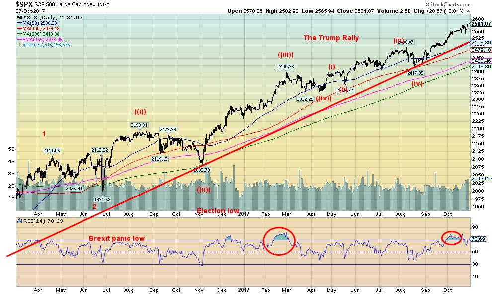
As they say—up, up, and away. The US indices surged once again to new all-time highs this past week spurred on by the higher than expected Q3 GDP number (see next chart). As well, Congress passed the budget resolution paving the way to passing the tax reforms where the cheery estimates emanating from the White House and others with self-interest in passing the legislation are projecting even further surges in growth because of the tax cuts. Others are not so optimistic. And the tax cuts could leave upwards of $1.5 trillion in deficits over the next decade.
So how high could we go? Well, we reached one target in the 2,460 zone. The next target could be as high as 2,660. So not much further. If we were to plow through that level then the next target could be 2,980. But let’s see how we do at the 2,660 level. The first sign of a possible top is a break under 2,550. A more definitive break would come under 2,500. Finally, a break under 2,400 would confirm the top. But even a drop to 2,400 would only be a 7% correction or slightly more than the Brexit drop. A more serious bear market would be signaled with a drop under 2,300.
But right now the market keeps going higher and as noted that next target could well be 2,660.
© David Chapman
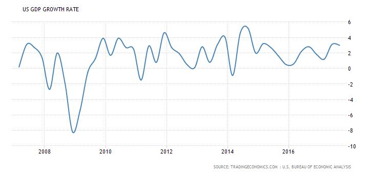
The US economy expanded at a rate of 3% in Q3. This was above the expected 2.5% growth and also a surprise as the hurricanes did not appear to have much impact. That doesn’t eliminate them having an impact in Q4. The 3% in Q3 was only marginally below the 3.1% in Q2. Keep in mind, however, that this is just the first estimate. Revisions could yet take it lower. It was also interesting that the BEA did not discuss the impact of the hurricanes. Sales growth (net of inventories) was actually lower in Q3 vs. Q2 2.26% vs. 2.94%. Earlier in the week, durable goods and new home sales came in better than expected. The passing of the House budget plan also helped this past week. Despite the last two quarters’ estimates for 2017 GDP growth is still an anaemic 2.3%.
© David Chapman
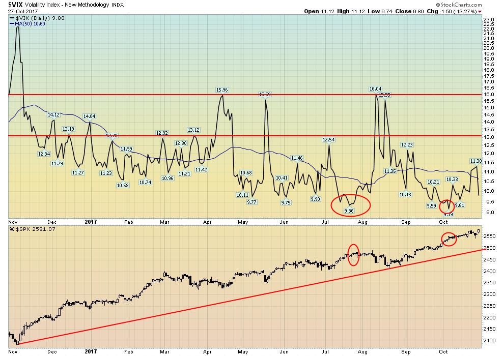
The VIX volatility indicator, a measurement of fear and greed in the market, fell to 9.8 this past week. That is well above the low recorded in October at 9.19. The recent minor pullback in the market earlier this week pushed the VIX up to 11.3, which was the highest level seen in weeks. The current VIX is diverging negatively with earlier readings; i.e., making a higher low even as the market makes a higher high. The VIX like other indicators is merely a sign in this case of extreme optimism and complacency in the market. It is not an indication that a top is in place. But there are a couple of points to consider here. First, there is a record net short position on the VIX. That indicates that traders believe the VIX is going to continue to remain low (or even lower) for some time. We noted in our essay that the Investors Intelligence Advisors’ survey was also at an extreme high. There were 4 times as many bulls as there were bears. Once again, these are merely indications that a top could be forming, not that a top is forming. To confirm a top we need to break down and take out certain support levels below. That has not happened.
© David Chapman
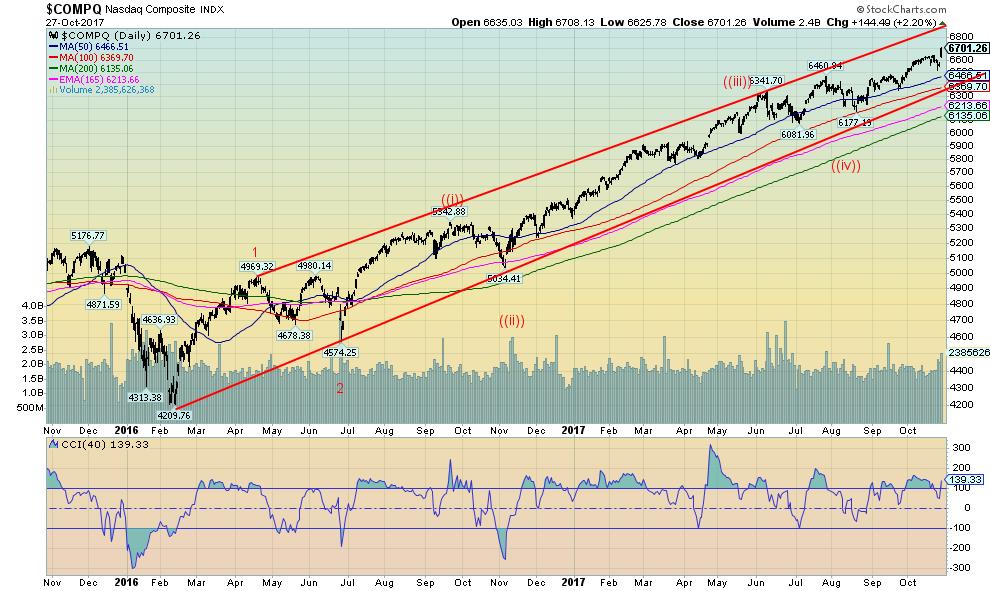
The NASDAQ continues to suggest to us that when we have a correction it will only be a minor wave 4 correction and not the start of new bear market. That suggests even if we have a corrective drop now we could still see a run to new all-time highs once that takes us into Q1 2018. One thing we do note about the NASDAQ is the index is not at the top of the channel. Oddly, the S&P 500 and the Dow Jones Industrials (DJI) did hit the top of their respective channels this past week. The NASDAQ is being led higher by the tech stocks, in particular the FAANGs (Facebook, Apple, Amazon, Netflix, and Google). A breakdown under 6,350 would signal a top for the NASDAQ as that would break the up trend line from the February 2016 low. The NASDAQ has climbed 59% from the February 2016 low, outpacing the S&P 500 (up 42.5%) and the DJI (up 51.7%). The Dow Jones Transportations (DJT) is up 55% from the February 2016 low. However, for the 2nd week in a row the DJT has failed to make new all-time highs diverging from the DJI.
© David Chapman
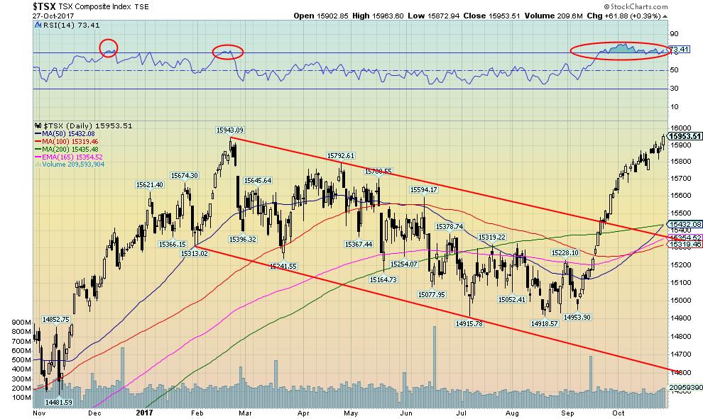
The S&P TSX Composite has surged, with little interruption, from a low seen in August/September. The gain is only about 7% but it still looks impressive. The TSX made new all-time highs this past week led by the energy stocks (TSX Energy Index (TEN)). The TEN has surged 13% since August and at one point was even higher. Energy stocks still look good as they are just coming out of a long funk. They recently ran into the 200-day MA that has acted as resistance. More importantly, the TSX Financials Index (TFS) has surged 10% since August helping to lead the way higher. Other strong areas leading the TSX higher have been Telecommunications, Technology, Industrials, and Consumers.
© David Chapman
While the House may have passed the budget resolution paving the way for the tax cuts the bond market is more concerned about the rosy estimates coming out of the White House that are not being supported by most economists and the CBO. The US 10-year Treasury note has surged from 2.05% back in September to 2.42% today. It hit a high of 2.46% earlier in the week. We continue to target at least 3% for the current move to the upside. The bond market is also concerned about who might become the next Fed Chair. The market still awaits that announcement. With the rise in yields (fall in prices as prices move inversely to yields) there is some concern that somewhere a bond fund could blow up. It has happened in the past. As well, spreads are beginning to widen a bit with junk bonds. So the market is seeing some concern not only about higher interest rates but also credit quality.
© David Chapman
Spread watch
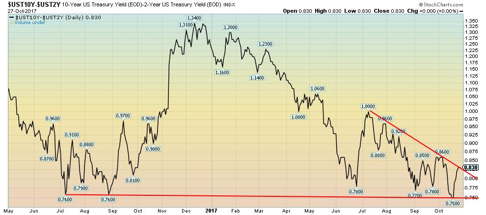
The 2–10 spread widened again this week to 0.83% from 0.79% the previous week. This is a reflection of the rising yields in the long end of market vs. stagnant yields in the short end of the market. While many still believe the Fed will hike in December there is an air of uncertainty surrounding the Fed mostly in who will be the next Fed Chair. Will all things stay the same with the appointment of someone who will continue the measured policies of Janet Yellen or will we see an interest rate hawk-like John Taylor? It is interesting to note the ECB this past week announced that they will continue their asset purchases but at a slower pace. They also extended their bond-buying program through to September 2018. This continues the growing divergence between the ECB and the Fed.
© David Chapman
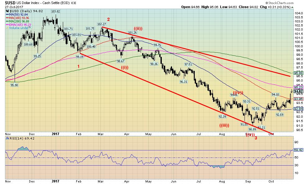
The US$ Index continues its recent ascent. It has now reached into resistance near 95. Passing of the budget resolution, continued thoughts of further Fed rate hikes, and stronger earnings especially in the tech sector have helped spur the US$ higher. For the Euro, the ongoing conflict in Spain has not helped. The sentiment for the US$ has switched dramatically in the past few weeks. In late August one was hard pressed to find a US$ bull. Now it is becoming hard to find a US$ bear. Sentiment has reached 87% in favour of the bulls. For the Euro the sentiment has become increasingly bearish.
The downtrend line from the February high may be the ultimate target zone. That is currently up near 96.50. Support is now seen at 94. Below that 93 would provide the best support. The US$ tends to exhibit strong positive seasonals in the latter part of the year, usually topping out late in the year or early in the new year.
In the background, China is continuing its move towards paying for its oil in Yuan. From what we understand, the Saudis are not against it. However, that is not expected take effect until the New Year.
Given that the current market is somewhat overextended and the US$ Index is at resistance, a pullback might be expected this coming week.
© David Chapman
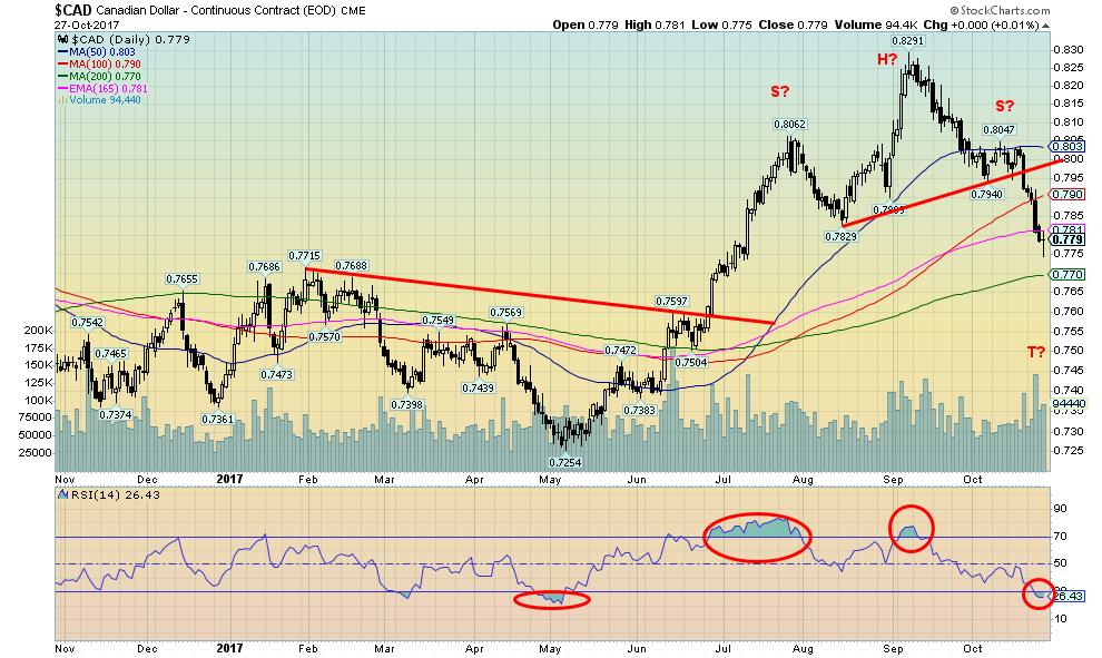
Following a strong run from a low of 72.54 in May the Cdn$ appears to have topped just under 83. The Cdn$ may have formed what appears as a head and shoulders top pattern. The target zone appears to be around 75 (T?). The Cdn$ is currently somewhat oversold so a bounce might be expected. However, there is now considerable resistance above at 78 and up to 79. Major support can be seen at 77 but once that falls, a drop to 75 would most likely get underway. The recent decline has been rather sharp. The BofC has taken a go-slow approach to interest rate hikes despite the stronger performance of the Canadian economy. Canada even reported a much smaller deficit than expected because of the stronger than expected economic performance. Canada’s growth outlook means that the BofC could still lean on the side of further interest rate hikes going forward. Another hike might occur in either December of January. Meanwhile, interest rate spreads between Canada and the US continue to widen. The differential between the US 10-year Treasury note and the 10-year Government of Canada bond (CGB) is currently 39 bp vs. 18 bp a month ago.
© David Chapman
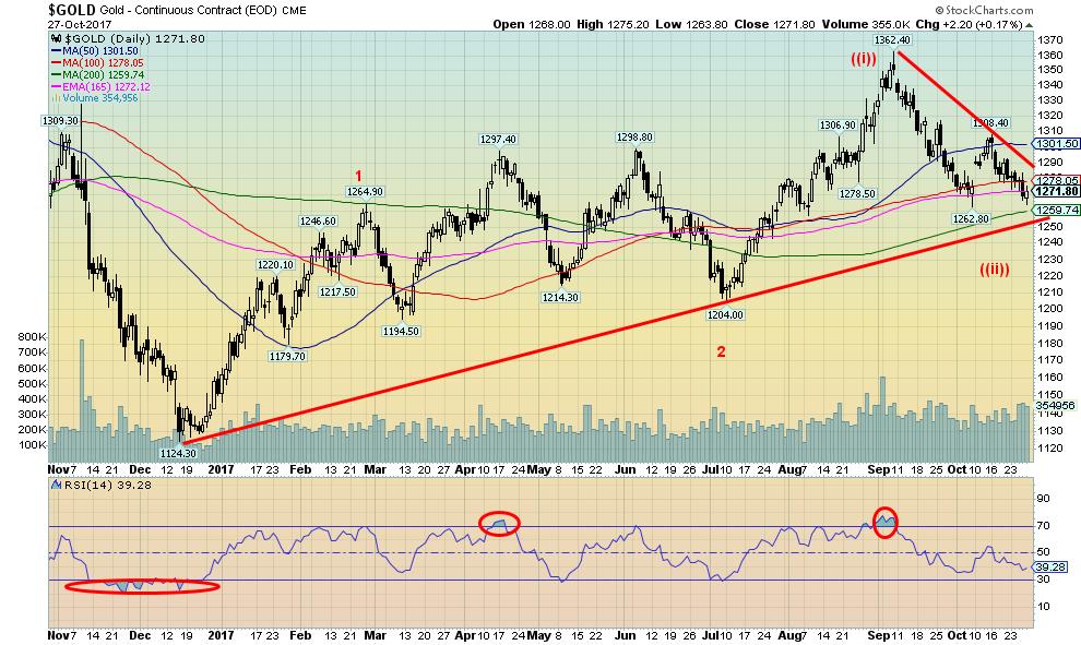
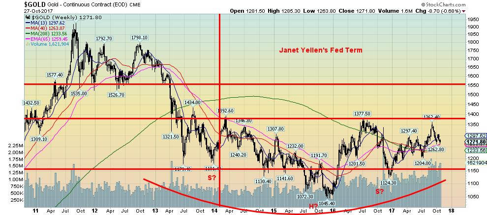
Gold continues to struggle. This past week gold tested the recent low of $1,262.80. For the moment at least, that low has held. However, gold did make a new low close this past week. Silver did not. Gold sentiment is falling but it is still not at levels that might signal a bottom. There appears to be strong support below currently down towards $1,250. That line has been in place since the low of December 2016. Gold may now be trying to find support above the 200-day MA. Note how it acted as resistance on the way up before finally breaking through July. The recent downtrend line is at $1,290 so a break above that level could signal the end of the downtrend. A move above $1,300/$1,305 would add to the thought that the downtrend is over. It is difficult to say when this current corrective period might be over. The past few years have seen important bottoms in the November/December period. This has been followed by the strong seasonals of December to March. A breakout to new highs above $1,362 could take gold up above $1,400. The risk is a breakdown under $1,250 opening up the potential for a test of the July 2017 low of $1,204.
© David Chapman
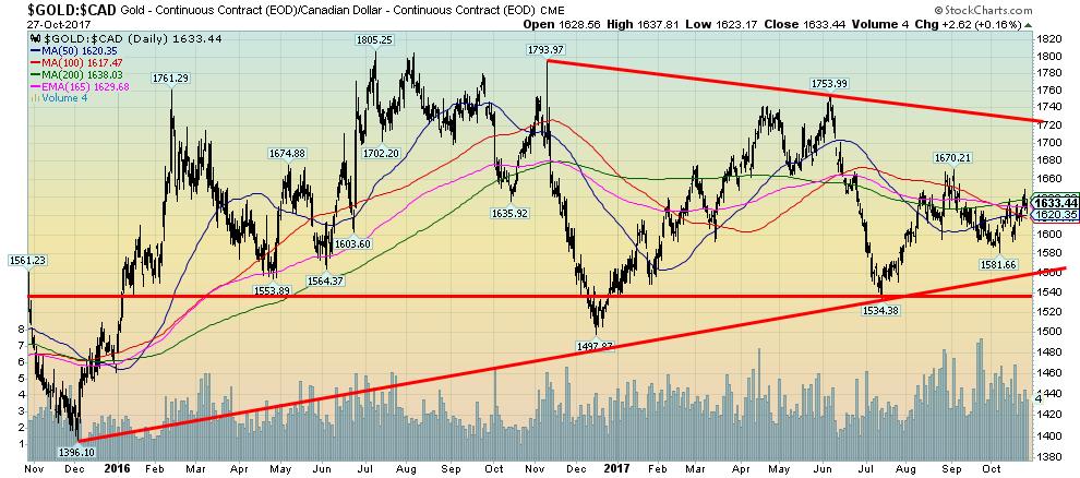
If there is a positive about gold, it is that gold is rising in currencies other than US$. Gold in Cdn$ was up this past week just over 1% vs. gold in US$ down 0.7%. Gold in Euros was up a small 0.1%. However, gold in Pound Sterling was flat and gold in Japanese Yen was off about 0.1%. Gold in Cdn$ has been struggling to break over the 200-day MA currently at $1,638. Gold in Cdn$ is up thus far in 2017 5.5% lagging the gain in the US$ primarily because of the strong Cdn$ in 2017. Gold in Cdn$ made its major low back in 2013 at $1,241 vs. gold in US$ making its low in 2015 at $1,045. Since then gold in Cdn$ is up 31.6% vs. a gain of about 22% in US$ terms. This demonstrates how gold maintains its purchasing power as a currency falls.
© David Chapman
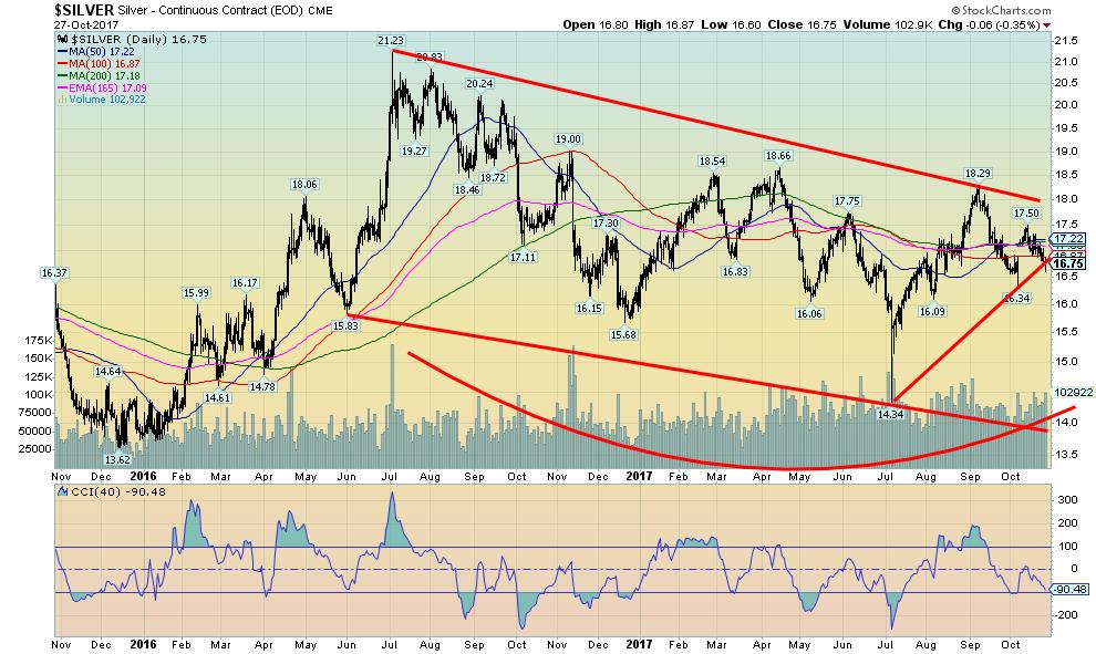
Silver failed to make new highs above $18.66 on its recent run-up to a high of $18.29. The recent pullback for silver remains well above its recent low of $16.34. This is a divergence with gold as gold did take out its April 2017 high even as silver failed to do the same. As we noted in the gold commentary, gold made a new low close this past week and came close to making a new low below its low seen in early October. This is another potential divergence that should be watched. We often see divergences of this nature at significant tops and bottoms. Silver remains cheap in relation to gold with a current gold/silver ratio of 75.92. Anything above 70 is historically high. At the 2011 peak, the gold/silver ratio was at 31.50. Since 2000 the average appears to be around 55.
© David Chapman
We picked up a story through GATA citing an editorial in the NY Sun that asked the question as to whether America was on a gold standard. It seems that when Janet Yellen took over as Fed Chair back in 2014 gold was trading at $1,262. Today, four years later as she approaches the end of her term gold is trading at $1,271. Grant you, there was that decline to $1,045 in December 2015 and gold has seen a roller coaster ride over the past four years, but for the most part through Janet Yellen’s term gold has traded between $1,150 and $1,377. The article can be found here.
We still view the chart as a huge potential head and shoulder’s bottom pattern. A firm breakout over $1,375 could in theory target a move to $1,765. Grant you, it is important that gold continue to hold above the December 2016 low of $1,124 and preferably above the July 2017 low of $1,204.
© David Chapman
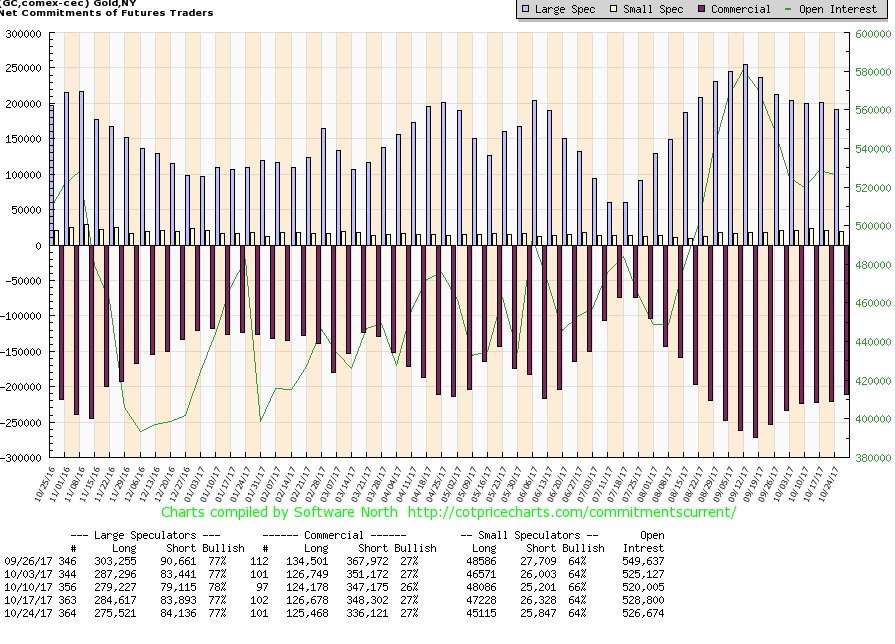
The commercial COT for gold did not move this past week remaining at 27%. Short open interest did fall roughly 12,000 contracts even as long open interest fell about 1,000 contracts. The commercial COT has remained relatively stable at around 27% for the past five weeks. None of this is encouraging in terms of indicating a bottom for us. The large speculators’ COT (hedge funds, managed futures, etc.) has remained consistent around 77% also for the past five weeks. The silver commercial COT stayed at 28% this past week and it too has remained at about 28/29% for the past five weeks. For a bottom, we would like to see the commercial COT up over 35% and preferably around 40%. The commercial COT indicates to us that gold needs more work before a bottom is seen.
© David Chapman
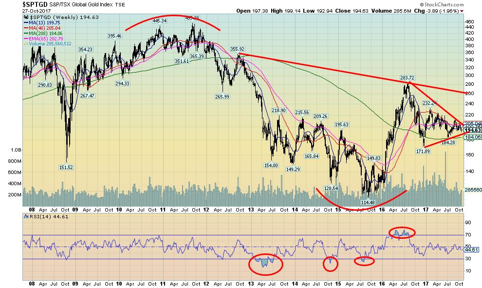
The TSX Gold Index (TGD) appears to be forming a large symmetrical triangle following the move from 114.48 back in September 2015 to the high of August 2016 at 283.72. Since the symmetrical triangle is forming following a bullish move the odds favor a breakout to the upside once the triangle is complete. Given where it appears in the apex of the triangle that move could come sooner rather than later. The symmetrical triangle has a projected target up to 315/320 once it makes a firm breakout over 205. Major resistance would be seen up at 260. The TGD is up a paltry 0.1% thus far in 2017. The TGD remains down about 57% from its 2011 high of 455. Nonetheless, we are encouraged by what appears as a large bottoming pattern. Major support can be seen down to 184 and the December 2016 low of 172. The TGD outperformed the Gold Bugs Index (HUI) this past week. This was most likely a reflection of the weak Cdn$.
© David Chapman
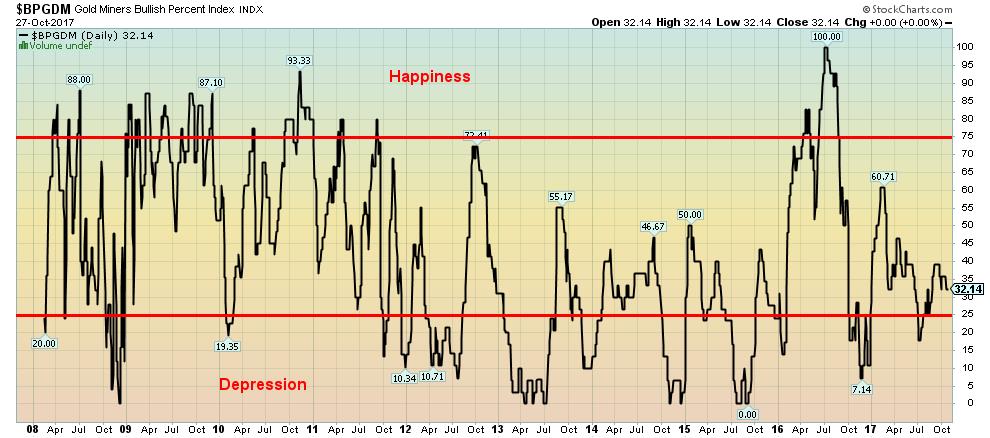
This is the Gold Miners Bullish Percent Index (BPGDM) a measurement of bullish and bearish sentiment for the gold miners. At 32.14 the index remains closer to bearish territory (under 25 and labeled as Depression) then it does to 75 and higher (labeled as Happiness). The sentiment index is effectively caught in no man’s land but still a lot closer to depression than to happiness. Extreme depression as was seen back in August/September 2015 signaled a low. On the other hand, when the index hit 100 in July 2016 it signaled extreme happiness and a top. Based on where the index currently is we would still be accumulating the gold stocks.
GLOSSARY
Trends
Daily – Short-term trend (For swing traders)
Weekly – Intermediate-term trend (For long-term trend followers)
Monthly – Long-term secular trend (For long-term trend followers)
Up – The trend is up.
Down – The trend is down
Neutral – Indicators are mostly neutral. A trend change might be in the offing.
Weak – The trend is still up or down but it is weakening. It is also a sign that the trend might change.
Topping – Indicators are suggesting that while the trend remains up there are considerable signs that suggest that the market is topping.
Bottoming – Indicators are suggesting that while the trend is down there are considerable signs that suggest that the market is bottoming.
__
DISCLAIMER: David Chapman is not a registered advisory service and is not an exempt market dealer (EMD). We do not and cannot give individualised market advice. The information in this newsletter is intended only for informational and educational purposes. It should not be considered a solicitation of an offer or sale of any security. The reader assumes all risk when trading in securities and David Chapman advises consulting a licensed professional financial advisor before proceeding with any trade or idea presented in this newsletter. We share our ideas and opinions for informational and educational purposes only and expect the reader to perform due diligence before considering a position in any security. That includes consulting with your own licensed professional financial advisor.


Youth Cannabis Use in Colorado Is Falling — But the Full Story Is More Complex
The 2026 Colorado survey shows teen cannabis use fell to 10 percent in 2025, down from 21 percent in 2015....


Morocco’s Growth Holds at 4.6% as Agriculture Offsets Economic Pressures
Morocco’s economy grew 4.6% in Q1 2026, driven by a strong agricultural rebound offsetting declines in industry. Services expanded moderately...


Abivax Shares Surge as New Trial Data Eases Safety Concerns Over Ulcerative Colitis Drug
Abivax shares surged nearly 36% after positive updated trial results for its ulcerative colitis drug obefazimod reassured investors following earlier...


El Dorado Raises $9M to Expand Cross-Border Fintech Platform
El Dorado, a Latin American fintech improving cross-border financial services, raised a $9 million Series A led by Paradigm with...


Bitcoin Stalls Near $60K as Strategy Moves, ETFs Outflow, and EU MiCA Rules Take Effect
Bitcoin hovers near $60,000 with ETF outflows, while Strategy boosts reserves, sells BTC, and raises dividends to reassure investors. Ethereum...
 |
|
 |  |
 |
|
-

 Markets6 days ago
Commodity Markets Pause as Oil Falls, Metals Correct, and Grains Show Mixed Signals
-

 Africa2 weeks ago
Egypt’s Net Foreign Assets Rise as External Position Continues Gradual Strengthening
-

 Markets2 days ago
Oil Surges on U.S.–Iran Tensions as Global Markets Show Diverging Trends and Rising Risk Fears
-

 Markets1 week ago
Cocoa Market Faces Mixed Trends Amid Rising Supply and Weak Demand
You must be logged in to post a comment Login