Featured
The annual forecast of the stock markets: what will happen with gold and silver?
This is our annual forecast issue. Actually it is more like identifying the themes that dominate and will continue to dominate into the next decade. Forecasts abound that the stock market records will continue to fall. But cycles suggest that at least some sharp corrections will occur. But they most likely will be buying opportunities. Gold (and silver) continue to look good as well and we made them the subject of our “Chart of the Week”.

Forecasting is a mug’s game. Make a forecast, get mugged. One of our favorite old sayings comes from John Kenneth Galbraith is, “The only function of economic forecasting is to make astrology look respectable.” Galbraith was considered a giant of economics. He was also 6’9” tall. His political activism, literary output, and outspokenness brought him fame, but he was also widely criticized because of his unabashed liberalism.
The stock markets have flown into the stratosphere. Complacency reigns. The market has been described by one bullish prognosticator as “One Rip-snorting Bull…” Others have described it as an “accident waiting to happen.” We read now that we will see Dow Jones Industrials (DJI) 100,000 in the next decade. That is more than a triple from here. It is possible. The 1990s (January 1991–December 2000) saw the DJI gain 310%. It also sounds like there is an expectation that the decade will be the “Roaring Twenties” all over again. Just like the Roaring Twenties, we are starting off with a pandemic—the COVID-19.
We are reminded that the Spanish flu came after a 4-year war that left Europe in a mess, along with roughly 20 million dead. The Spanish flu killed even more, estimated up to 50 million globally and 675,000 in the U.S. The war was followed by a deep recession in 1918–1919 that was followed by an even steeper depression in 1920–1921. The stock market (DJI) peaked in November 1919 and then plummeted 47% over the next two years until August 1921. David Rosenberg, who some call a perma-bear, has written to not expect a return to the Roaring Twenties (The Globe and Mail, November 29, 2020). There are some important differences, as Rosenberg notes.
The U.S. was primarily a young agrarian society in 1920 with well over half the population in a rural economy. Today, the U.S. is over 80% urban and it is aging. Back then, only 6% of the population was over 65. Today it is 20% and climbing. Seniors don’t spend, they save. In the 1920s, the U.S. accounted for upwards of half of global manufacturing production, thanks to the devastation in Europe. The U.S. was the undisputed economic powerhouse of the world. Today, China leads with upwards of 30% of global manufacturing. The U.S. is half that. Also, the flu was handled differently back in the 20s. They basically waited until it ran its course and large parts of the economy didn’t shut down. Charity was in place rather than unemployment insurance, welfare, and bailouts. There was no internet and social media to spread stories and stir up emotions. U.S federal debt was small, representing no more than 10% of GDP. Today it is 130% of GDP. Corporate and consumer debt was also small, especially consumer debt as there was not yet a large consumer society.
In 1920 the Schiller PE ratio was 5%. Today it is almost 34%. In 1929 when the stock market peaked it had reached 30%. Today the stock market appears to be impervious to a PE ratio over 30%. It’s “who cares.” Clearly it doesn’t bother some, as they say that “this is no ordinary bull market, but a powerful secular bull market that will go on for years, maybe even decades” (Leon Tuey—December 7, 2020). Maybe he’s right. This time it is different. After all, record ultra-low interest rates are in place it seems forever, and stimulus cheques and unlimited QE can fuel a big rise in the stock market. Given that seniors need income, the ultra-low interest rates have pushed many of them into the higher-risk stock market seeking yield. It is the “fear of missing out (FOMA)” syndrome.
All that money going into the financial system creates bubbles—in the stock market and housing. And eventually bubbles get pricked. Many indicators, we have noted, are in what we would call “nose-bleed” territory. But for the ultra-bulls it is “who cares.” Indicators in nose-bleed territory can stay there longer than the bears can stay solvent. Complacency reigns. Maybe the coming of the vaccine will save the day. But in the interim the numbers are getting worse, not better. And the devastation in the consumer economy continues. But is it the hope of the vaccine that is driving the stock market higher? Buy the rumour? Sell the news? And what if the rollout for the vaccine is slower than many expect? What if there are side effects that haven’t been found yet?
Over the past few months, we have had a few occasions where the markets reversed or left a bearish pattern on the charts, only to see those bearish patterns evaporate almost as quickly as they came. Clearly, we are headed into year-end with the markets putting in another up year. Since the major low in March 2009, only two of the twelve years were down for the DJI—2015 and 2018. And in both instances the declines were small. Years ending in one (1) tend to be mixed. Since 1841 there have been ten up years and eight down years. But that period included 1931 which was the worst year ever when the DJI fell 52.7%. Since 1951 there have been only two down years—1981 and 2001. So, in this case, the odds would seem to favour another up year. However, it is also the first year of the presidential cycle and the first year tends to be the weakest of the four years. Since 1833 there have been 23 up years and 25 down years.
The question is, can the stock markets ignore all the negatives and keep chugging higher? The answer, of course, is yes. So, what do we see going forward? We have identified five themes that will dominate our thinking going forward.
- The Aging Society: We have noted the aging society. Demographics will continue to be a drag on the economy going forward. The population over the age of 65 is growing in North America, Europe, and Asia. By 2050 the proportion of the population over the age of 65 could be approaching 50%. By then the world’s youngest populations could be in Africa.
- Growing urbanization: Today, roughly half the world lives in urban areas. This is expected to continue to grow and it could be over 60% by 2050. Growing urban populations tend to be more liberal and earn more, thus pushing more into the middle-class. This should help GDP to continue to grow despite the current setback because of the pandemic. The growing global urbanization is and continues to give rise to mega-cities, with most of them in Asia.
- The debt just keeps on growing: With estimates of global debt now up to $277 trillion by year end and $300 trillion in 2021, the world is awash in debt. But with record low interest rates (ZIRP), including negative rates in Europe and Japan, coupled with the central banks’ just keep on printing money, the debt problem is just going to keep on growing and growing until it can’t anymore. The debt is a drag on GDP. No wonder growth in North America, Europe, and Japan in particular is sluggish and minimal even once it recovers from the COVID-19 induced recession.
The trouble with all the debt is there remains high risk for a debt default. The question is, by whom and where? The basket cases (debt-ridden countries) are already known. While there is risk of sovereign debt, the real debt scare could come in a corporate collapse, given the huge amount of debt in the Chinese Shadow Banking System and the huge amount of debt rated BBB (the lowest investment grade rating) or lower.
The 2008 financial crisis was sparked by the collapse of derivative-linked debt. Yet there remains considerable derivative-linked debt in today’s world. The estimated amount of global derivatives (futures, options, credit default swaps, interest, currency and commodity swaps, interest, currency and commodity forwards) according to the Bank for International Settlements (BIS) in 2019 was $640 trillion although some estimates put it over $1 quadrillion. That’s face value. When one looks at actual credit exposure the amount falls to about $15 trillion. Taking netting agreements into consideration and the exposure falls further to around $3 trillion. The vast amount of global derivatives are held by large U.S. money center banks and also British banks.
In addition to the U.S. having the largest national debt in the world—currently at $27.4 trillion—the U.S. also has $156 trillion in unfunded liabilities in Social Security liability and Medicare liability. Some believe that Social Security and Medicare will be bankrupt soon. Social Security and Medicare/Medicaid currently make up 36% of the U.S. budget expenditures. In addition to government debt, the U.S. is the most indebted nation in the world with an estimated $86.2 trillion, over 30% of all global debt. That number includes both government debt (national, state, municipal – $30.7 trillion) as well as corporate debt (financials, non-financials – $34.6 trillion) and consumer debt (student loans, credit card debt, lines of credit and mortgages – $20.9 trillion).
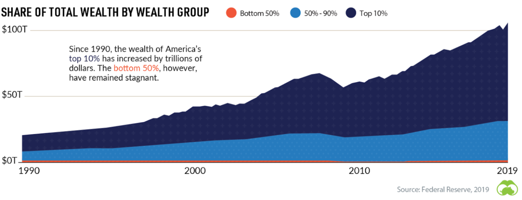
- Rising wealth inequality: If there is one thing the pandemic has fully revealed, it is the growing wealth inequality. It’s the K recovery: Wall Street up, Main Street down. The top 1% own 30% of the wealth. The top 10% own 68%. Doesn’t leave much for everyone else. Much of the wealth for the wealthy is in stocks, bonds, and real estate. The top 10% own 46% of the real estate and 88% of stocks and bonds. With both the stock market and the housing market rising, the bottom 90% are largely missing out on both. That is particularly pronounced with the wealthy holding the majority of stocks and bonds. The U.S. has become a deeply divided country with 18 million millionaires, 35 million living in poverty, and over 45 million on food stamps. There are 705 billionaires in the U.S. as well and over 2,600 in the world. But the U.S. has the most. Billionaires purchase political clout. Huge wealth disparity triggers social unrest. Wealth disparity is even more pronounced in African and Latin American countries. But there is considerable wealth disparity in Europe and Asia as well.
- Environmental pressures and global warming: Since 1850 the global average temperature of land areas has risen twice as fast as the global average. Global warming is a global problem and can only be resolved with a global approach. But, politically, it remains elusive. Rising temperatures have created all sorts of problems already with super tornadoes and storms, deadly fires—even Siberia is on fire—fiercer hurricanes or cyclones, extreme rain or snow, flooding and storm surges, rising droughts, and extreme heat. The past five years have seen the warmest 5-year stretch in recorded history. Yet the politicization of global warming prevents a coordinated approach, which is badly needed. Even the words of the “Great Reset” have been politicized almost beyond recognition. All of this could prevent anything serious being done to mitigate global warming and that could have profound impact down the road. Other problems include deforestation and the monstrous amount of plastic polluting and choking the world’s oceans. The costs to mitigate all of this is not in the trillions but in the quadrillions. But the potential costs of doing little are higher than the costs of doing something. It is estimated that millions could be displaced because of global warming. Climate wars could erupt.
Stock markets go through bull and bear markets (see chart on next page). The U.S. started off with a bear market that lasted on and off from roughly 1789 to 1813, a period of 24 years. Bear markets (6) have averaged 19 years in length since 1789. Bull markets (5) have averaged 21 years in length. That was helped by the long bull market between 1896 and 1929, although the early years of that bull until 1921 saw some sharp ups and downs. But generally, the markets were rising during that period. The most recent bear market lasted only nine years, from 2000 to 2009, culminating in the 2008 financial crisis. The collapse ended with the biggest bailout in economic history. That collapse was also the biggest since the Great Depression. The current bull market is now in its 11th year and, in theory, could continue the rest of this decade. But that doesn’t mean there won’t be corrections along the way. Since the final low in 2009 we have seen stock market corrections exceeding 15% in 2011, 2015/2016, 2018, and 2020. The steepest was the March 2020 pandemic panic when the DJI fell 38.4%.
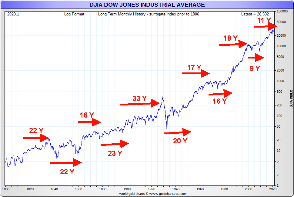
We have noted the longest cycle cited by Ray Merriman of MMA Cycles (www.mmacycles.com) is one of 75 years. Starting with a significant low in 1783 there were lows seen in 1857 (74 years), 1932 (75 years), and 2009 (77 years). We have wondered whether there is a 90-year cycle. Starting again with a significant low in 1761 there were lows in 1843 (82 years) or 1857 (96 years), 1932 (89 years from 1843). Here we are roughly 90 years from the Great Depression low of 1932, and we are in the midst of the steepest recession since the Great Depression. Homelessness has gone up substantially, tent cities proliferate, food lines stretch for blocks, and there has been reported an upswing in the theft of food and essentials. But, no worries; the stock market is at record highs. The K recovery. Given that the stock market is at record highs, the current period might be better compared to what was known as the Gilded Age (roughly 1870 to 1900), a period where the wealthy dominated—living in the lap of luxury while millions lived in abject poverty. The period was also called the Long Depression that lasted for roughly the same period.
Of greater importance to the current situation are the half cycles of 37.5 years and 18.75 years. The 18.75-year cycle (historic range 13–22 years) is the one of most interest. From 1932 we saw a significant low in 1949 (17 years), 1970 (21 years), 1987 (17 years), and 2009 (22 years). That cycle is next due in 2022–2031. The 18.75-year cycle breaks down usually into three 6.5-year cycles (range 5–8 years). From 2009 we saw a significant low in 2016 (7 years). So, in theory the next one is due in 2021–2023 or maybe at the latest 2024. The March 2020 low, we believe, came in too early for that cycle low. Since we subsequently moved quickly to new all-time highs, it is highly unlikely that March 2020 was that low.
What the March 2020 low might have been was the 4-year cycle low. This cycle, according to Merriman, comes in accurately 81.25% of the time. The 4-year cycle low was last seen in February 2016. So, the next one was due August 2018–April 2020. Both the December 2018 low and the March 2020 low came during that period. Since the March 2020 low was lower than the December 2018 low it is possible that was our 4-year cycle low. So, using a wide range, our next 4-year cycle low could occur anywhere from December 2021 to as late as November 2024. There is some good overlap with the 6.5-year cycle so our expectation is that sometime over the next year we should see the start of a correction of at least 15% or more.
The question is, when does this current market crest? March 2020 was a strange phenomenon as we had made a new all-time high in February and then in March; we took out not only the 2019 low but also the 2018 and 2017 low, coming very close to taking out the 2016 low (DJI). Usually when we take out a previous year’s low we are signaling the start of a more serious bear market. But, instead, we turned around and made new all-time highs in November. Yes, we have had huge monthly reversals before but never one that has recovered so quickly. The economy may well remain in a recession through much of 2021. Even the most optimistic don’t see the majority of the population getting the vaccine until well into Q3. And they may discover there are problems with the vaccine that hadn’t been seen before. The vaccine is coming, but at this time it can’t be viewed as a panacea for what ails the economy. Still, optimism reigns for a strong GDP recovery in 2021.
Nonetheless, it also tells us that high unemployment is going to be with us well into 2021 and the economy should remain in a recession, possibly even into 2022. But with the huge amounts of QE, that is what is driving the stock market. We have noted how much money supply (M2) has jumped since March 2020, up roughly $4 trillion. But M1 (funds immediately accessible; i.e., currency, travelers’ cheques, demand deposits such as chequing accounts and chequable deposits) is up about $2.3 trillion since the end of February. But the velocity of money (how quickly a unit of currency is finding its way into the economy) has actually fallen further. The result is that the personal savings rate is the highest seen in over 60 years.
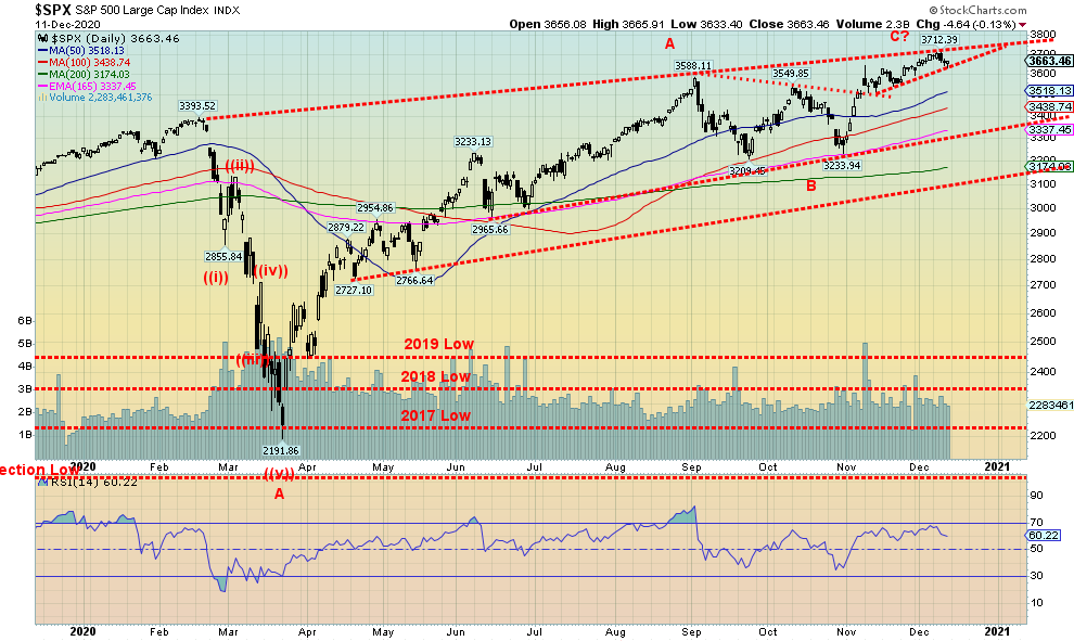
A key for us going forward is the S&P 500 taking out 3,700. That could put targets up to 4,000–4,100 for the S&P 500. We could see those prices in 2021 as long as we don’t take out 3,200 to the downside first. The market may be overbought and indicators may be screaming, but oodles of liquidity supplied by the Fed could send Wall Street into even greater heights of euphoria. Maybe it is really all that cannabis.
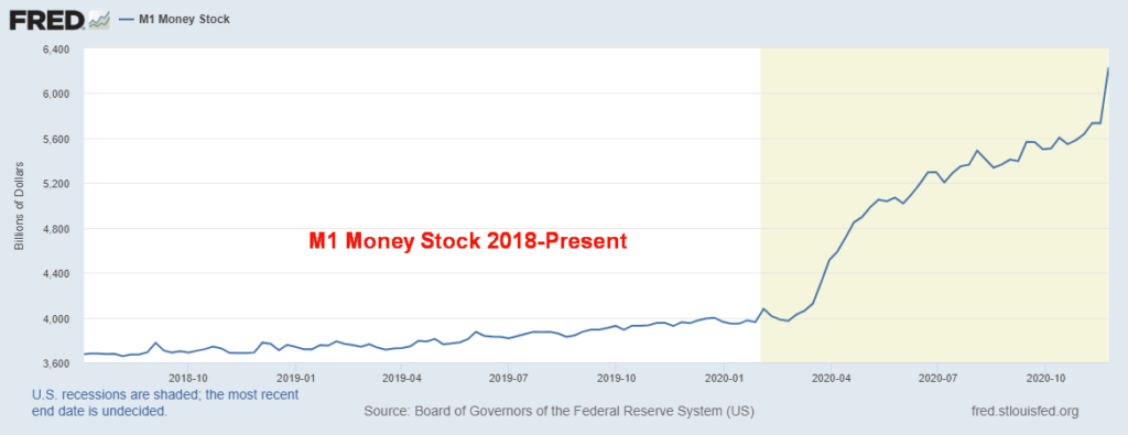
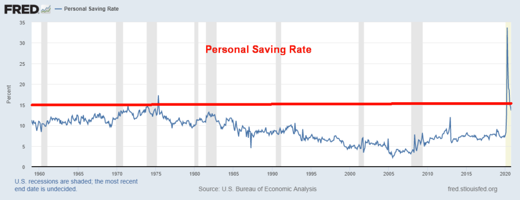
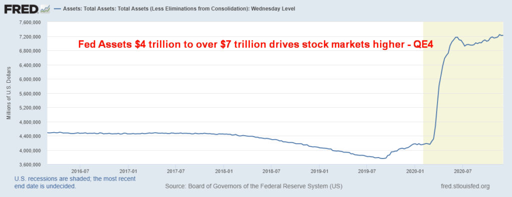
Chart of the Week
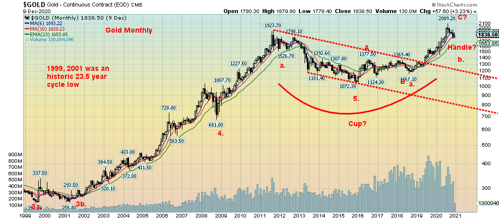
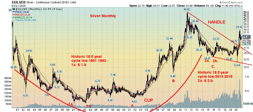
We have shown the long-term charts of gold and silver in the past, but we thought it best to show them again. The long-term charts for both gold and silver remain very bullish. Gold broke out of a long basing pattern in 2019. Silver followed, finally breaking out in 2020. Our original objective for gold was a minimum move to around $2,200. The high thus far has been $2,089 seen in July 2020. For silver, its longer-term target could be up to $56/$57. So far, the high has been $29.92. The driver has been the ultra-loose monetary policy of the central banks, negative interest rates, and a falling U.S. dollar. The pandemic has also played a role as has the growing civil unrest in the U.S. and elsewhere. Global geopolitical tensions can also play a role in the price of gold and silver.
The move so far has been constrained and there are negatives down the road. But before the negatives fully kick in, we could see in a best-case scenario a bubble runup in 2021 that could achieve the noted targets and go even higher. Many analysts recommend that you own physical coins. Owning physical does require storage so that has to be taken into consideration. The next best thing is gold and silver funds that invest only in gold and silver bullion. Examples of that are the mutual funds of BMG Group Inc. (www.bmg-group.com) or the physical ETFs offered by Sprott Securities (www.sprott.com). The next level down are various ETFs that are gold and silver-based but could be predominantly paper gold and silver; i.e., backed by futures, not physical. The next level is the stocks of gold and silver producers, senior, intermediate, and junior. The final level is junior gold and silver stocks that range from exploration companies to ones nearing production. Each level has its own level of risk, ranging from very high to moderate to low. The lowest risk is physical gold and silver and some recommend that physical gold and silver form the base of a well-diversified portfolio. Physical gold and silver are negatively correlated to both stocks and bonds.
There was a major low for gold in December 2015 at $1,045. While the level has been tested it has held. We believe that was an important 7.83 cycle low (range 7–9 years). That low was 86 months (7.2 years) from the important October 2008 low. That low in turn was 90 months (7.5 years) from an important April 2001 low. It is also believed that April 2001 was an example of a possible 23–25 cycle low as it came 25 years after an important 1976 low. If the cycles are correct, then the next 23–25 year cycle low is due on a wide range anywhere from 2022 to 2026. The next 7.83 cycle low would be due anywhere from 2022–2024. The two would most likely coincide.
What we believe is occurring right now is gold trying to find its 31.3-month cycle low (range 26–36 months). From the important December 2015 low, we saw a very good low at $1,167 in August 2018 (32 months). The next one is due April 2021 +/- 5 months. We are right in that time frame. With the first 31.3-month cycle a higher low, it is probably no surprise that this one too will be higher low. Eight of the past ten years have seen lows in December (mostly) or November. Silver has not made new lows as its cycles are slightly different than gold’s. Both copper and platinum have been making new 52-week highs and gold is closely tied to both. Shakedowns like what we have seen recently are futures driven, paper gold, not the selling of physical gold.
Odds highly favour that gold could be making an important low this month. Confirmation of a low comes when gold clears $1,950 and silver clears $25/$26. The next phase, the final 31.3-month phase in the current 7.83-year cycle, could see gold move into a bubble runup before it crests. A bearish rebound from here would see gold struggle to make new highs past $2,089 the August 2020 high. A strong move past our initial target of $2,200 would tell us we are headed a lot higher.
The conditions are there. We’re looking at record spending and deficits, a stock market bubble that sees more money chasing fewer goods (stocks)—i.e., asset inflation—a falling U.S. dollar (fiat currencies), geopolitical tensions and domestic political tensions that could, as some believe, lead to civil war in the U.S., millions unemployed, food lines, and growing poverty. Crypto currencies have benefited, but they are not real and they are still subject to hacks and scams. Overall, the crypto market remains small. If problems start in other countries, funds flee usually to the U.S. and the U.S. stock market benefits as does gold. Cycles suggest gold could be making an important low now, December 2020.
Below is a chart called the Gold Cycle Indicator (GCI) originally from Gold Predict (www.goldpredict.com). Apparently, it suggests market bottoming when it goes under a certain level. This chart is dated November 27, 2020, so if anything, it might be worse now. Irrespective of this, the analyst who posted this suggested that there would probably be another dip into December before gold bottoms for good. We are now in the process of making that low.
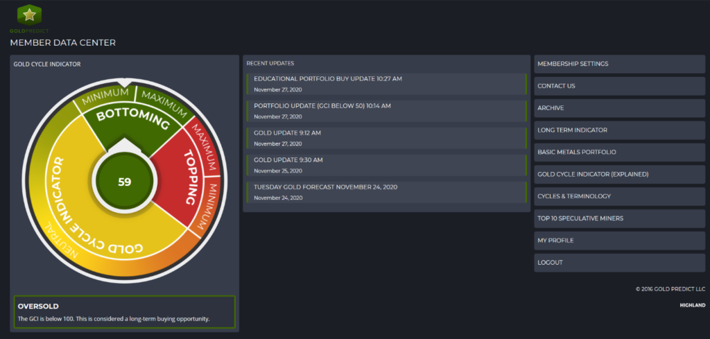
Source: www.fxempire.com, www.goldpredict.com
MARKETS AND TRENDS
| % Gains (Losses) Trends | |||||||
| CloseDec 31/19 | CloseDec 11/20 | Week | YTD | Daily (Short Term) | Weekly (Intermediate) | Monthly (Long Term) | |
| Stock Market Indices | |||||||
| S&P 500 | 3,230.78 | 3,663.46 (new highs) | (1.0)% | 13.4% | up | up | up |
| Dow Jones Industrials | 28,645.26 | 30,046.37 (new highs) | (0.6)% | 5.3% | up | up | up |
| Dow Jones Transports | 10,936.70 | 12,672.38 (new highs) | (0.6)% | 16.3% | up | up | up |
| NASDAQ | 9,006.62 | 12,377.87 (new highs) | (0.7)% | 38.0% | up | up | up |
| S&P/TSX Composite | 17,063.53 | 17,548.92 | 0.2% | 2.8% | up | up | up |
| S&P/TSX Venture (CDNX) | 577.54 | 780.30 (new highs) | 1.5% | 35.1% | up | up | up |
| S&P 600 | 1,021.18 | 1,086.59 (new highs) | 0.1% | 6.4% | up | up | up |
| MSCI World Index | 2,033.60 | 2,089.65 (new highs) | (0.4)% | 2.8% | up | up | up |
| NYSE Bitcoin Index | 7,255.46 | 18,058.07 | (4.9)% | 148.9% | up | up | up |
| Gold Mining Stock Indices | |||||||
| Gold Bugs Index (HUI) | 241.94 | 291.68 | (0.3)% | 20.6% | down | neutral | up |
| TSX Gold Index (TGD) | 261.30 | 310.88 | (0.5)% | 19.0% | down | down (weak) | up |
| Fixed Income Yields/Spreads | |||||||
| U.S. 10-Year Treasury yield | 1.92 | 0.90 | (7.2)% | (53.1)% | |||
| Cdn. 10-Year Bond yield | 1.70 | 0.71 | (10.1)% | (58.2)% | |||
| Recession Watch Spreads | |||||||
| U.S. 2-year 10-year Treasury spread | 0.34 | 0.78 | (4.9)% | 129.4% | |||
| Cdn 2-year 10-year CGB spread | 0 | 0.45 | (13.5)% | 4,500.0% | |||
| Currencies | |||||||
| US$ Index | 96.06 | 90.92 | 0.3% | (5.4)% | down | down | down |
| Canadian $ | 0.7710 | 0.7840 (new highs) | 0.1% | 1.8% | up | up | neutral |
| Euro | 112.12 | 121.14 | flat | 8.0% | up | up | up |
| Swiss Franc | 103.44 | 112.45 (new highs) | 0.3% | 8.7% | up | up | up |
| British Pound | 132.59 | 132.24 | (1.6)% | (0.2)% | neutral | up | up |
| Japanese Yen | 92.02 | 96.12 | 0.1% | 4.4% | up | up | up |
| Precious Metals | |||||||
| Gold | 1,523.10 | 1,843.60 | 0.2% | 21.0% | down | neutral | up |
| Silver | 17.92 | 24.09 | (0.7)% | 34.4% | down (weak) | up (weak) | up |
| Platinum | 977.80 | 1,021.80 | (4.8)% | 4.5% | up | up | up |
| Base Metals | |||||||
| Palladium | 1,909.30 | 2,333.10 | (1.1)% | 22.2% | up | up | up |
| Copper | 2.797 | 3.53 (new highs) | 0.3% | 26.2% | up | up | up |
| Energy | |||||||
| WTI Oil | 61.06 | 46.57 | 0.7% | (23.7)% | up | up | down |
| Natural Gas | 2.19 | 2.59 | 0.4% | 18.3% | down | up | neutral |
Note: For an explanation of the trends, see the glossary at the end of this article.
New highs/lows refer to new 52-week highs/lows.
The markets put in a bit of a reversal week this past week. We first saw new all-time highs, then the markets reversed and closed lower on the week. But the S&P 500 did not put in an outside week so it was just a reversal but not a key reversal week. The S&P 500 fell about 1.0% this past week. The Dow Jones Industrials (DJI) was down 0.7% while the Dow Jones Transportations (DJT) was off 0.6%. The NASDAQ fell 0.7%. The S&P 500 equal weight index was down 1.1%. But small caps continued to buck the trend as the S&P 600 rose 0.1%. The Russell 2000 also gained up 1.1%. Both indices made new all-time highs. The small cap stocks rallying is supposed to show how strong this market is. But is it everyone rushing in at the top? In a possible telling tale, Bitcoin did not make new all-time highs again and fell 4.9%, its sharpest drop in weeks. Is this a sign? Bitcoin and the stock markets have been closely correlated in the past.
In Canada, the TSX gained 0.2% but the small cap TSX Venture Exchange (CDNX) was up 1.5%. In the EU, the London FTSE was up a small 0.1%, the Paris CAC 40 was down 1.8%, while the German DAX fell 1.4%. In Asia, China’s Shanghai Index (SSEC) fell 2.8% and the Tokyo Nikkei Dow (TKN) made new 52-week highs again but closed down 0.4% on the week. The MSCI World Index lost 0.4% but once again made new all-time highs as well.
The markets may remain in nose-bleed territory, but that doesn’t mean we are going to fall immediately. In fact, the Santa Claus rally and the January effect may soon be getting underway. The prime beneficiary of the Santa Claus rally is often the small cap stocks represented on the S&P 600, the Russell 2000 and the TSX Venture Exchange (CDNX). Overall, historically small cap stocks tend to outperform during January.
The markets may move lower first before we begin the Santa Claus rally. So, we are coming into those periods. What one has to watch is the last six trading days of the year and the first three trading days of January. They are usually the clue for the January effect. If they are down, then that could continue into January. But if they are up, then January could be a good month.
We are at a bit of a crossroads here. The indicators are screaming overbought. Sentiment is in the stratosphere. Yet the market does not fall. Unless, of course, some support zones fall. That is all we can look at for clues that the rally may finally be over. We continue to bounce up against the top of a channel. So, we really need to break through that level to tell us we are going higher. A firm move above 3,700 and consecutive closes over that level would tell us we are headed for 4,000–4,100. But a breakdown below 3,500 would suggest at least a temporary top. Under 3,300 would tell us that a top of some significance could be in and under 3,100 we could start a panic decline. This past week may have once again given us a bearish sign but to confirm it we need to break down lower. Otherwise, any good move over 3,700 would point us higher once again.
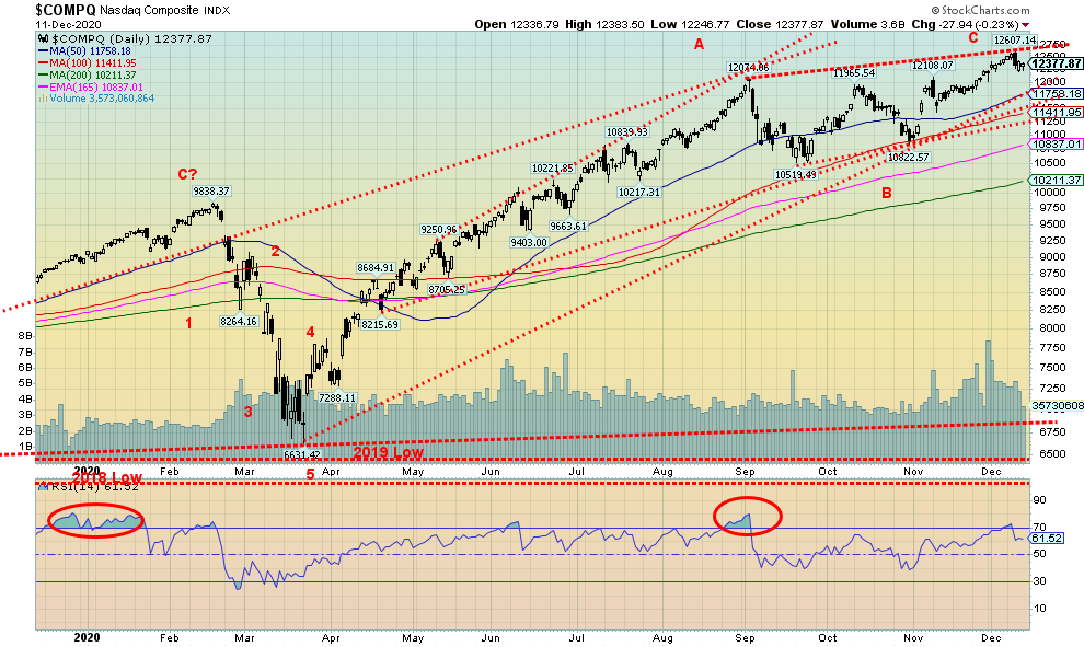
The NASDAQ continues its march into record territory. Okay, it pulled back a bit at the end of the week. After making yet another all-time high on Tuesday the NASDAQ was slammed on Wednesday as the bloom came off the FAANGs. Facebook faces calls to break it up. Facebook fell 2.2% this past week. Google (Alphabet) was worse, down 2.5%. Amazon lost 1.5% while Microsoft was off 0.5%. But Netflix gained 1.0% while Apple was up 0.1%. Tesla got even bigger, up 1.8% to even higher new highs. The big value stock Berkshire Hathaway fell 2.0%. With the NASDAQ making new all-time highs once again, then closing lower on the week, it qualifies again as a reversal week. But it wasn’t an outside reversal week; meaning, it did not take out the lows of the previous week. It left what we call an evening star on the charts. It’s a bearish pattern, but as we have seen so many times in the past few months, we get these bear patterns, there is slight follow-through, and then it is onward and upward once again. So, we won’t put much faith in it until we break key support areas. And that we don’t see happening until we break under 11,400. A breakdown under 11,200 could then send the NASDAQ down to the 200-day MA near 10,200. If the market is serious about falling, we first need to see some downside follow-through this week.
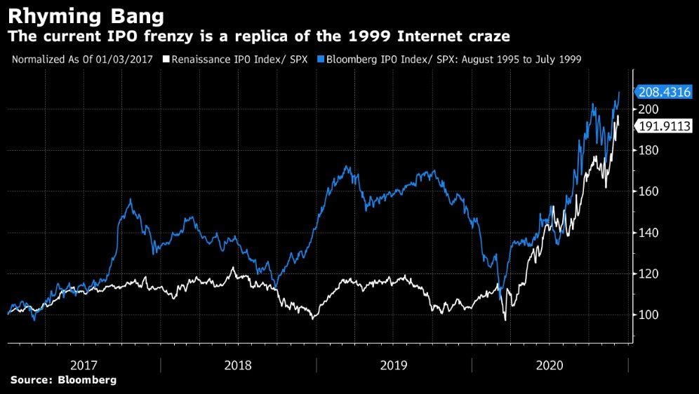
Maybe a frenzy of IPOs is what marks a stock market top. We do recall the frenzy that was in the late 1990s as the NASDAQ soared into the stratosphere and we all kept wondering—why are people buying this stuff? Eventually we got the answer when it all crashed. The crash in the NASDAQ during 2000–2002 was 78.4%. That fell short of the 89% decline experienced by the DJI 1929-1932. It took the DJI until 1954 to regain its 1929 high. The NASDAQ regained its high a little faster, taking only until 2015. The NASDAQ has gained another 140% since then.
But 2020, like 1999, has seen a frenzy of IPOs. We can only guess it’s because of an appetite for them but, like 1999, many of them don’t make any sense. They are already overvalued by the time one buys them. Airbnb (ABNB) and DoorDash (DASH) are but the latest. Both came out in a frenzy. Airbnb soared quickly from its original offering price of $68 to $146, making it a $100 billion company quickly. This is a company that lost $697 million up to September 30 and has been hit hard by the pandemic. We can only guess it works if one thinks travel will quickly recover. DoorDash also soared in its debut to a value of $71 billion or almost as much as FedEx. And they have to compete with Uber Eats and SkipTheDishes. Airbnb quickly surpassed Bookings Holdings (BKNG), Expedia (EXPE), and TripAdvisor (TRIP).
Others that took part in the recent frenzy include Certara (CERT), Pharma Live, AbCellera (ABCL), Snowflake (SNOW), and Ant Group (trades in Hong Kong). Overall, it has been a frenzy of offerings and it feels like 1999 all over again.
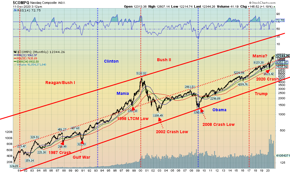
Here’s the monthly NASDAQ since 1981. Yes, after years of trading below the middle line the NASDAQ broke out above it just this year after the March 2020 pandemic crash. So, does this mean we are on our way to the heights? The top of that channel is way up around 20,000. It’s actually off the chart. Now that should get the bulls chortling. Or will reality set in? That chart suggests that the NASDAQ could continue to soar into 2021. Mania anyone?
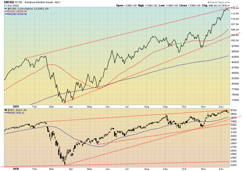
The bulls are elated. The NYSE advance/decline line continues onward and upward into record territory. What can we say? The bulls are in charge. Is there a bear alive? Anywhere?
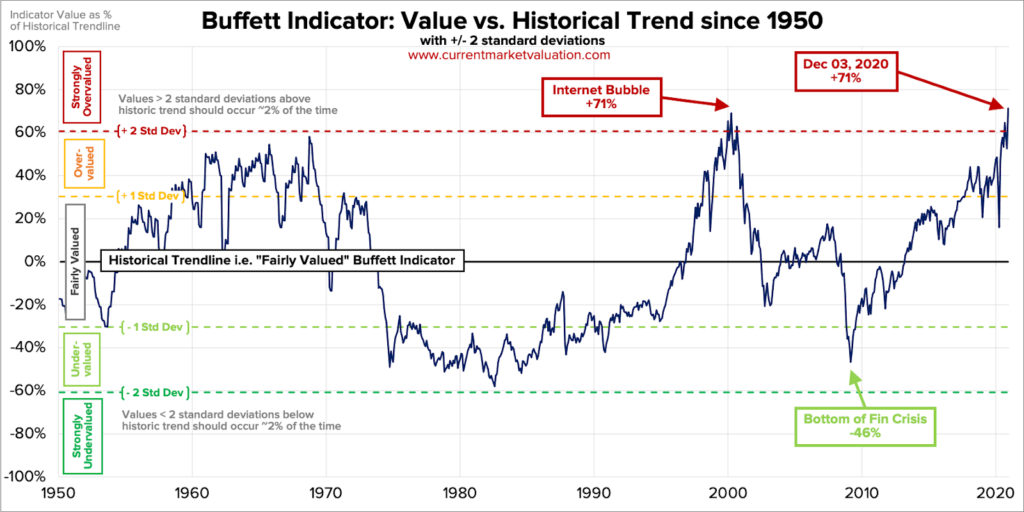
Yes, the advance/decline line may continue into record territory but the Buffett indicator is also in record territory. We are now back where we were at the peak of the internet bubble in 1999/2000. The Buffett indicator is the market cap of the U.S. stock market divided by GDP. Note it also exceeds the highs seen during the 1960s. Big buys came when the indicator was dragging near historical lows seen in the early 1980s and at the bottom of the 2007–2009 financial crisis. Yes, it is just a warning sign. It doesn’t tell us the top is in. For that we need other confirmations.
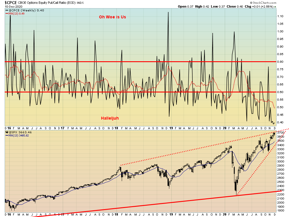
Just when we thought the CBOE put/call ratio couldn’t get any lower favouring calls, it set another record, hitting down to 0.37. Never before has it been that low. We are speechless. Obviously, the market is at a record level of complacency. But the bulls don’t care and many call for the market to go even higher. Given the Santa Claus rally might soon be underway, we’d be remiss if we didn’t note that. The put/call ratio could get even lower than it already is.
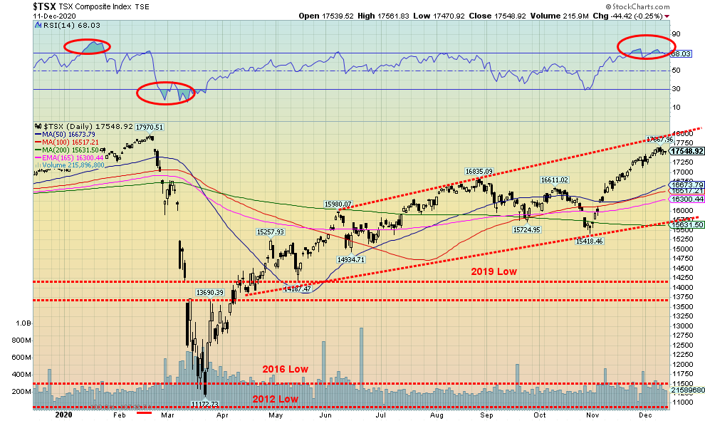
The TSX gained a small 0.2% this past week, bucking the trend seen in the U.S. The TSX Venture Exchange (CDNX) enjoyed another good week, seeing fresh 52-week highs gaining 1.5%. Eight of the 14 sub-indices were down on the week led by Health Care (THC), which was off 4.8%. However, Health Care is not a large component so its impact was minimal. Consumer Discretionary (TCD) fell 1.5% and was the only other loser, off more than 1%. Of the winners, Energy (TEN) led the way again, up 3.8%. Energy is one of the larger components in the index. No other sub-index gained more than 1%. Technically, the TSX is now approaching the top of the channel. Its top is up between 17,750 and 18,000. So, it is quite possible that the TSX reaches those levels in the remaining three weeks of the year. However, we wouldn’t be surprised if the TSX were to roll over and down from those levels. But in the near term, at least the TSX keeps chugging higher. We note the RSI has been consistently at or near or over 70 for the past couple of weeks. But overbought is just a state and does not necessarily call the top. Right now, a break under 17,000 would most likely suggest that a top is in. But we wouldn’t go all out confirming a top under it broke under 16,600. A major breakdown does not happen until we get under 15,600.
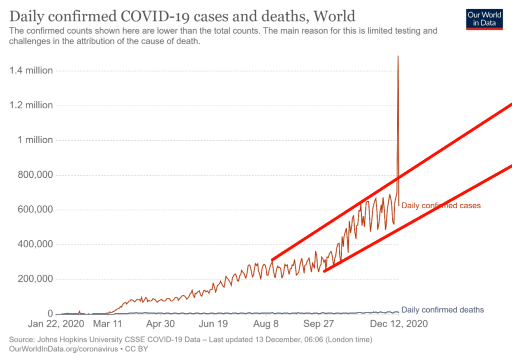
The records keep on falling. On December 11, 2020 over 700,000 cases were recorded globally. That spike is incorrect. It suggests the number of cases soared to over 1.4 million. It was actually half that. So, we tried to draw our lines to take that into consideration. Nonetheless, 700,000 plus in a day is nothing to sneeze at. We do a million cases every day and half now, maybe faster. That’s over 5 million a week. Over 12 thousand died as well on December 11, 2020. 75-80 thousand die every week. Fifteen countries have recorded over one million cases. Peru will soon become the 16th. The U.S. leads the world in cases and deaths. No one else is even close. Only three other countries have recorded over 100,000 dead – Brazil, India and Mexico. Czechia leads the world in cases/million population with over 53,000. Belgium leads the world in deaths/million population with over 1,500. Doesn’t sound like a lot but then the disease apparently can spread quickly if not checked.
Reported cases and deaths: December 13, 2020 15:55 GMT
Number of Cases: 72,313,865
Number of Deaths: 1,615,191
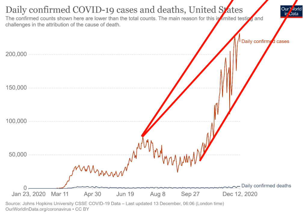
In terms of cases and deaths from the coronavirus the U.S. remains the world’s basket case. Over 16 million cases. Over 300,000 dead. Only deaths recorded from WW2, the Spanish Flu and the U.S. Civil War have been higher. Records keep on falling. The U.S. set a record on December 11, 2020 with upwards of 250,000 cases and over 3,300 deaths. That day was the third highest death toll from disease or war ever recorded surpassing the number killed on 9/11. Only the death toll at Antietam (U.S. Civil War) September 17, 1862 (est. 3,650) and the Galveston hurricane September 8, 1900 (est. 8,000) were higher. Three states have recorded over one million cases – Texas, California and Florida. Three states have recorded over 20,000 dead – New York, Texas and California. Florida should soon join them. The U.S. is now regularly reporting over 200,000 cases every day and upwards of 3,000 dead every day. Hospitals are overwhelmed. Mobile morgues pick up bodies.
Reported cases and deaths: December 13, 2020 15:55 GMT
Number of Cases: 16,563,650
Number of Deaths: 305,144
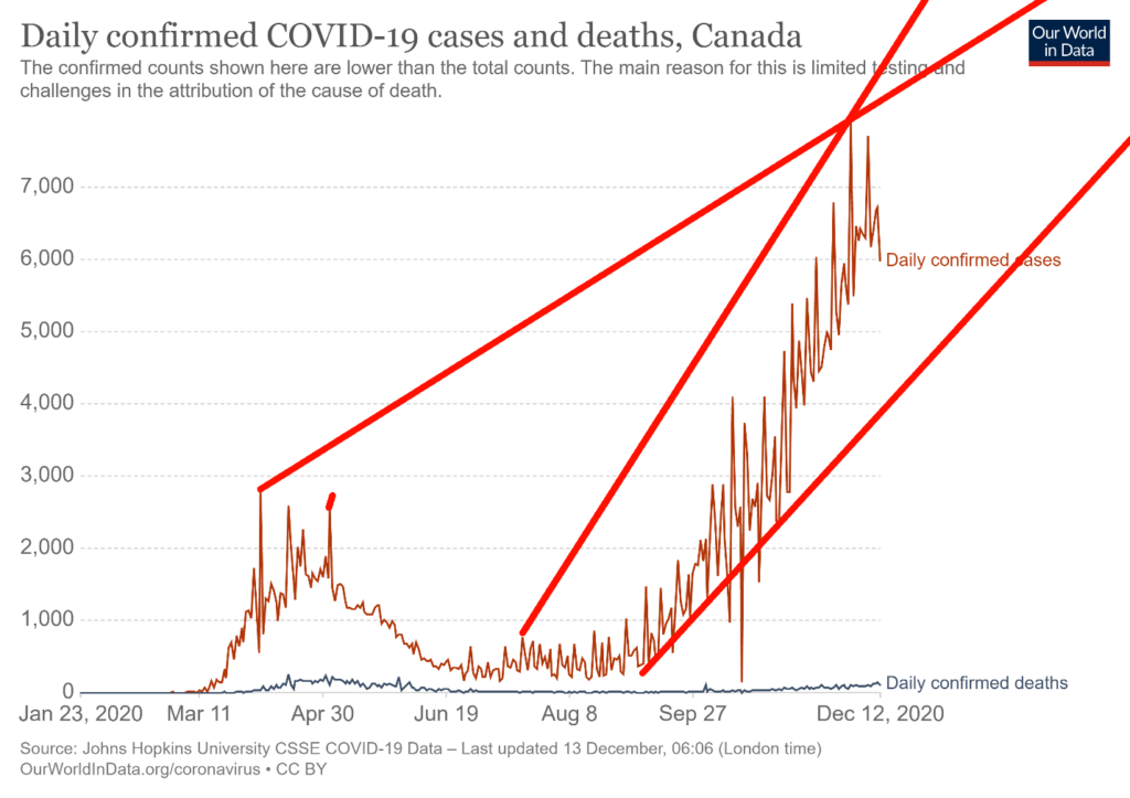
The number of cases in Canada continue to rise. Canada has had days with over 7,000 cases. The good news is that deaths are way down from what was recorded in spring. Canada has leaped into 27th place globally with over 445,000 cases. Canada sits 23rd in terms of deaths with over 13,000. The COVID-19 has become highly politicized as it has everywhere in North America and Europe with demonstrations against masks, lockdowns and more. Alberta leads in cases and deaths per million of population even as Ontario and Quebec record the highest number of cases and deaths. However, they have a higher population. Canada is much further down when it comes to cases/million population sitting in 86th place. The same is true for deaths/million population as Canada sits in 48th place. But the big chunk of those deaths was recorded in the spring wave.
Reported cases and deaths: December 13, 2020 15:55 GMT
Number of Cases: 448,841
Number of Deaths: 13,251
US 10-Year Treasury Note, Canada 10-Year Government Bond (CGB)
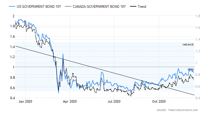
Well, thoughts of higher interest rates are on pause for the moment. The fall came Thursday/Friday following release of the weekly claims that saw a sudden increase to 853,000, up from 716,000 the previous week. The market had expected 725,000. This bodes poorly for the December nonfarm payrolls due out on January 8. Another number that caught our attention this past week was consumer credit which rose only $7.2 billion in October, well below the expected $16 billion and September’s $15 billion. This is behind, obviously. But it is not a great start for Q4. The December RedBook fell 2.4%, another sign of weakness for Q4. The core inflation rate was 1.6% year over year to November. That keeps the 10-year note negative below the inflation rate. The preliminary December Michigan Sentiment Index was at 81.4, expressing some optimism as it was above expectations of 76.5. Maybe the announcements of the vaccines helped. Otherwise, it was a pretty quiet week for numbers. This coming week we get November retail sales along with some of the PMI indices. Canada had hardly any numbers out this past week of note. But this coming week we get the inflation numbers. Yields continue their choppy rise. But, based on what we saw this past week, we don’t expect a push over 1% for the U.S. 10-year the rest of this month.
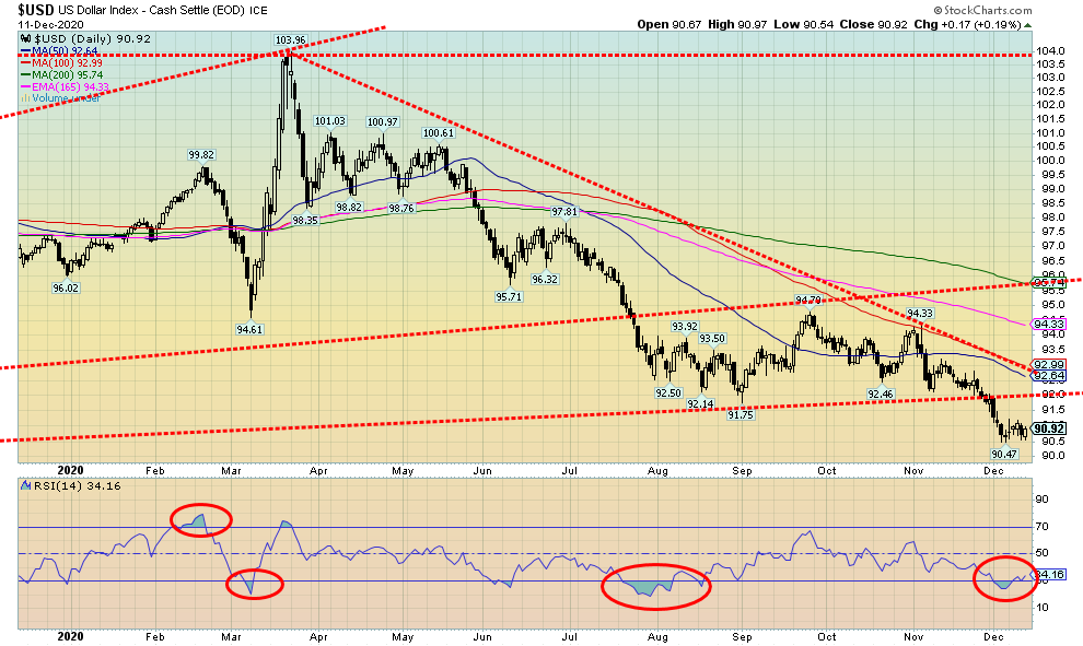
The US$ Index bounced back this week for the first gain in the past four. The US$ Index rose about 0.3% this past week. The euro was flat, the Swiss franc rose 0.3%, and the Japanese yen was up 0.1%. But it was the Brexit-challenged pound sterling that helped the US$ Index the most as it fell 1.6%. The Canadian $ was up a small 0.1%. Take out the drop in sterling and the US$ Index would most likely have fallen again this past week. If, for whatever reason, the U.K. pulls off a miracle and does come to a deal with the EU the pound would likely rally again and the US$ Index would fall. Although, admittedly, that depends on how the euro would react to a Brexit deal. The gain for the US$ Index this past week was small so we don’t read too much into it. A pause was needed to ease the oversold conditions. There is resistance up to around 92. The breakdown to new lows still suggests to us that ultimate targets are down to around 88/89. That worst case on any bounce-back for the US$ Index is a runup to 92 but even that we believe is unlikely. Above 92 there is further resistance up to 93.
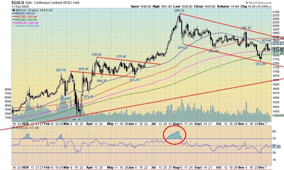
Gold started a rally at the end of November, but it appears to have culminated this past week with a high of $1,880 on December 8. Since than, gold has fallen back roughly 2%; however, most of the damage was done on December 9 when gold fell $36 in one fell swoop. Silver fell 0.7% while platinum, which has been on a bit of tear, finally pulled back off 4.8%. Of the near precious metals, palladium slipped 1.1% while copper made new 52-week highs, once again gaining 0.3%. We are buoyed by both copper and platinum making new highs as that suggests that gold could soon follow. They tend to move together. The gold/copper ratio is at levels suggesting that leadership could revert once again to gold.
Gold ran into resistance at $1,880 which coincided with the falling 50-day MA. There is support down to $1,810, but below that and especially under $1,800 a decline to major support near $1,750 is possible. We have been buoyed going forward by the fact that, throughout this correction, gold has moved to new lows, taking out its September low, but silver has not followed. That’s an interesting divergence that would appear to favour a resumption of the bull market once this correction is finished. Gold was buoyed earlier by thoughts of a stimulus package given the ongoing pandemic as well as an uptick in joblessness as seen by the weaker than expected initial claims this week. That may have buoyed the market on Thursday/Friday following the sharp $36 drop on Wednesday when the odds of stimulus package faded. Gold might also be buoyed by the Supreme Court refusing to hear the latest attempt by Trump to overturn the election. A confirmed Biden win would strengthen the odds of a stimulus package. On Monday the Electoral College meets.
Gold has resistance up to $1,880, but above that level gold needs to clear $1,925 and then $1,950 to confirm that a low is in. Only above $2,015 could gold potentially be headed for new highs above $2,089. As we noted in the Chart of Week forecast, we could then see gold take a run to $2,200 to $2,300. Odds favour that eventually a package will be worked out. A weaker U.S. dollar also helps and this week the U.S. dollar bounced back. But, overall, we expect another test of the lows first and it is very possible we test down to $1,750 before this is over.
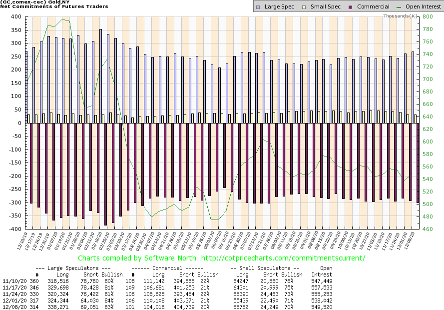
The commercial COT for gold slipped this past week to 20% from 21%. That is as low as we have ever seen it. Long open interest fell over 6,000 contracts while short open interest rose over 1,000 contracts. What that suggests is that the commercials were covering longs on this recent rally. That potentially sets up gold to go lower once again. The large speculators COT (hedge funds, managed futures, etc.) also slipped to 83% from 84%. But there long open interest soared by upwards of 14,000 contracts while short open interest also rose by roughly 5,000 contracts. Oddly, it had the effect of lowering the COT, not raising it. Overall, open interest rose on the week by over 11,000 contracts. The rise in open interest left us mystified as in an up week (albeit a small up week) rising open interest is usually bullish. But, overall, the COT remains bearish and our expectations are that gold could once again test lower before this is over.
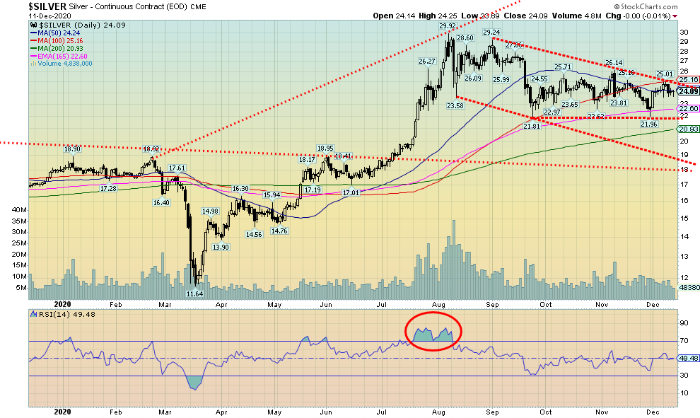
Silver ran into resistance at our breakout point at $25, then failed and pulled back, losing 0.7% this past week. Still, silver remains well up on the year by 34.4%. Odds favour silver to now move lower in line with gold and the bearish commercial COT out this past week. Silver has good support down to $22.50, then down to $22. Below $22 could, however, be problematic and see silver fall to $21. Below $21 silver could fall to new lows with significant support near $19. To the upside, $25 remains elusive. To suggest higher prices, we first need to break out over $25 then over $26. Above $28 new highs are probable. Silver, along with gold, has struggled since the August high at $29.92. We are currently down almost 20% from that high. Even within the context of a bull market, which we believe we are in, a 20% correction is not abnormal. During the 2008–2011 bull run there were three 20–25% corrections. It was only in the final year that silver prices ran up with only shallow pullbacks. This has been the first good correction since the low of March 2020.
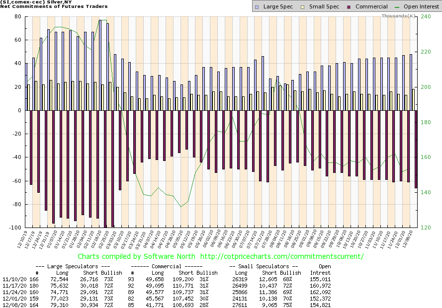
The commercial COT for silver continues to be bearish. This past week the commercial COT for silver fell to 28%, down from 30% the previous week. Long open interest fell roughly 4,000 contracts, suggesting that on the recent rally longs covered. Short open interest rose just over 1,000 contracts. The large speculators COT also slipped to 72% from 73%. Except there the longs rose over 2,000 contracts while shorts also rose almost 2,000 contracts. Overall, open interest rose over 2,000 contracts. But that was helped mainly by the small speculators adding over 3,000 longs while their shorts fell just over 1,000 contracts. We continue to view the silver COT as somewhat bearish going forward.
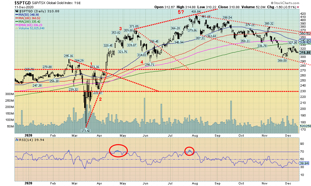
The gold stocks continue to struggle. This past week the TSX Gold Index (TGD) fell 0.5% while the Gold Bugs Index (HUI) was off 0.3%. The TGD ran into resistance just below 330 (high 327). Irrespective of this, there is considerable resistance for the TGD between 330 and 350. Based on the current channel, there is support for the TGD down to 290. Both the TGD and the HUI appear destined to finish the year in the black. The TGD is up about 19% and the HUI has gained 20.6%. The decline since August has been orderly but persistent. The TGD is currently down 25.4% from its August high. The HUI is off only 22%. There is a solid level of support for the TGD between 290/300. For that reason, we would not want to see the TGD fall below 290. The TGD is currently finding support at the 65-week exponential MA. Above 350 the TGD’s prospects are considerably better. Above 400 new highs are probable. As we noted in our Chart of the Week, gold’s outlook remains positive into 2021. That should once again translate into higher prices for the gold stocks. Gold remains expensive vis-à-vis the stocks. However, the Gold/HUI ratio continues to trace out what appears to be a huge topping pattern. The current ratio is 6.32 whereas a ratio that says that gold stocks are expensive vs. gold is below 2.5. That level persisted from roughly 2002 to 2008 before gold stocks went into a huge collapse after the peak in 2011. The recent low for the TGD was at 300.50. As long as that low stays in place, the odds favour higher prices going forward.
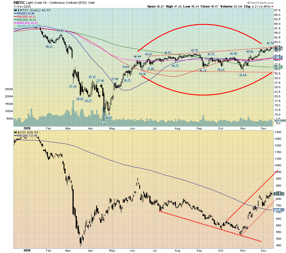
Oil continued to benefit from two things. First, OPEC came to an agreement and, second, there is more optimism surrounding vaccinations. There was also a small attack on an Iraqi oil field that sparked higher prices for a day. WTI oil rose 0.7% on the week even as it settled back on Friday. Brent crude hit $50 for the first time since March. The energy stocks continued to benefit as the ARCA Oil & Gas Index (XOI) rose 0.8% on the week while the TSX Energy Index (TEN) did even better, gaining 3.8%. Natural gas (NG) also rose up 0.4%. Brent crude rose 1.5% on the week, outpacing even WTI oil.
Even Europe was expressing some optimism, even though much of the continent had gone back into lockdown in November. But they are once again loosening. Like North America, they are also facing their heavy share of protests (usually violent) over lockdown measures.
Despite the rise in WTI oil this past week we note it is mostly crawling up the rising channel line rather than bursting its way through. This suggests that oil prices could continue to rise; however, the rise would be incremental rather than a big upward push. While conflict in the Middle East (Iran?) could quickly change the situation, the odds of a conflict right now are low. But one never knows with Trump’s threats and whether the Pentagon would go along with it.
Meanwhile, energy stocks continue to do well and there is room to move higher within the context of the rising channel. Support for the XOI is down to 600, but upside potential is to 1,000. WTI oil’s high so far is $47.74. Oil has support down to $43 and below that to about $40. Only below $40 could oil prices crack and fall down into the $30s. Upside potential is up to $53 on the weekly charts. Given the current incremental rise, that level would not be seen any time soon. Major resistance for oil prices runs from roughly $50 to $65. Long-term support is down to $36.
__
(Featured image by MayoFi via Pixabay)
DISCLAIMER: This article was written by a third party contributor and does not reflect the opinion of Born2Invest, its management, staff or its associates. Please review our disclaimer for more information.
This article may include forward-looking statements. These forward-looking statements generally are identified by the words “believe,” “project,” “estimate,” “become,” “plan,” “will,” and similar expressions. These forward-looking statements involve known and unknown risks as well as uncertainties, including those discussed in the following cautionary statements and elsewhere in this article and on this site. Although the Company may believe that its expectations are based on reasonable assumptions, the actual results that the Company may achieve may differ materially from any forward-looking statements, which reflect the opinions of the management of the Company only as of the date hereof. Additionally, please make sure to read these important disclosures.


The TopRanked.io Weekly Affiliate Marketing Digest [The Top VPN Affiliate Programs Roundup]
Want to be let in on a little secret about two massive affiliate opportunities you can take advantage of today?...


Sustainable Finance Faces Hurdles as Green Asset Ratio Reforms Fall Short of Full Transparency
The Green Asset Ratio (GAR) measures banks' alignment with the EU Taxonomy but remains low due to methodological flaws and...


XRP Hits New All-Time High Amid U.S. Crypto Policy Shift and Ripple’s Expansion
XRP surged past its 2018 all-time high, reaching $3.65 amid renewed political support for crypto in the U.S. under Trump....


Germany Moves to Curb Medical Cannabis Abuse, Sparking Access Concerns
Medical cannabis imports in Germany have surged, but health insurance-covered prescriptions remain low. Easy online access raises concerns about abuse...


JPMorgan’s Data Fees Shake Fintech: PayPal Takes a Hit
JPMorgan Chase will charge fintechs for customer data, threatening business models reliant on free access. PayPal’s stock plunged 5.7% after...
 |
|
 |  |
 |
|
-

 Africa1 week ago
BLS Secures 500 Million Dirhams to Drive Morocco’s Next-Gen Logistics Expansion
-
 Fintech2 weeks ago
Ripple Targets Banking License to Boost RLUSD Stablecoin Amid U.S. Regulatory Shift
-

 Impact Investing3 days ago
Sustainable Investments Surge in Q2 2025 Amid Green and Tech Rebound
-

 Biotech1 week ago
Biotech Booster: €196.4M Fund to Accelerate Dutch Innovation