Featured
A forecast for what might happen in the world economy this week
As the world turns into a potentially pivotal week, a lot is happening: central bank meetings, potential end of negative interest rates, impeachments, and more. The repo crisis drags on and still no one really seems to know why. Are falling freight shipments a precursor to a recession? Gold is consolidating again but a couple of key gold stock ETF’s look bullish for our “Chart of the Week”.

“As the World Turns” was a long-running TV soap opera (1954–2010). Today we have long-running wars (2001–present) and long-running stock market bulls (2009–present). Sometimes they too feel like a soap opera. But it is as the world turns.
This coming week could prove to be interesting. Why? The central banks are meeting. No, not all at once or together. PBOC of China meets on January 20, BOJ of Japan meets on January 21, and the ECB of the EU meets on January 23. The following week, the Fed meets on January 28–29 and the BOE, United Kingdom meets on January 30. And, lest we overlook ourselves, the BofC of Canada meets on January 22. So, why should we care if all the major central banks are meeting in such a short space of time? It happens all the time. This coming week will also bring us the impeachment trial of Donald Trump and, on January 21, and, the extradition trial of Huawei’s CFO Meng Wenzhou. And, as well, Russia has triggered a constitutional crisis and the Iranian protests continue. We could be in for an interesting week.
The era of negative rate bonds could be coming to an end. It was estimated that outstanding negative rate bonds reached as high as $18 trillion by June 2019. By year-end it was estimated that the total, according to Bloomberg, was down to around $11 to $12 trillion although some believe it remains closer to the higher level. In December 2019 the Riksbank, which is the central bank of Sweden, ended its experiment with negative interest rates, hiking the rate from minus 0.25% to zero. Central banks have been trying to stimulate their economies since the financial crisis of 2008. They lowered interest rates to unheard-of levels. They provided trillions to the economy through quantitative easing (QE); i.e., purchasing bonds, even lower quality ones. And what did it get them?
The euro area projected GDP for 2019 is a weak 1.2% with key countries such as Germany GDP projected at 0.6%, France 1.3%, Italy 0.2%, and the Brexiting United Kingdom 1.3%. Japan is projected to grow at 0.8% while China continues to steamroll with growth of 6.1%, although that has been falling steadily for the past number of years and is now falling under 6%. The U.S. is projected to grow 2.3% while Canada is at 1.7%. Sweden’s growth is projected at 1.2%. Which countries have negative interest rates? The euro zone, Japan, and not in the euro zone Denmark, Switzerland, and Hungary. The question is, what happens if the era of negative rates does come to an end? A lot of the debt was short-term, but there are also outstanding 10-year and longer bonds. Raising rates puts all those who purchased bonds when the rates were negative in a negative equity position.
About all we can say is that years of ultra-low and negative interest rates, plus QE, have brought paltry growth. However, stock markets and real estate have soared to record levels. All that cash and cheap money has to go somewhere. And, speaking of cheap money, debt has exploded by upwards of $100 trillion since the financial crisis of 2008 and today stands at around $252 trillion. We have often repeated this truism, but it needs to emphasized because we know the growth and the amount outstanding are unsustainable. It has been estimated global debt could hit as high as $257 trillion by year-end 2020, according to the Institute of International Finance (IIF). Total debt is made up of government, household, and corporate debt.
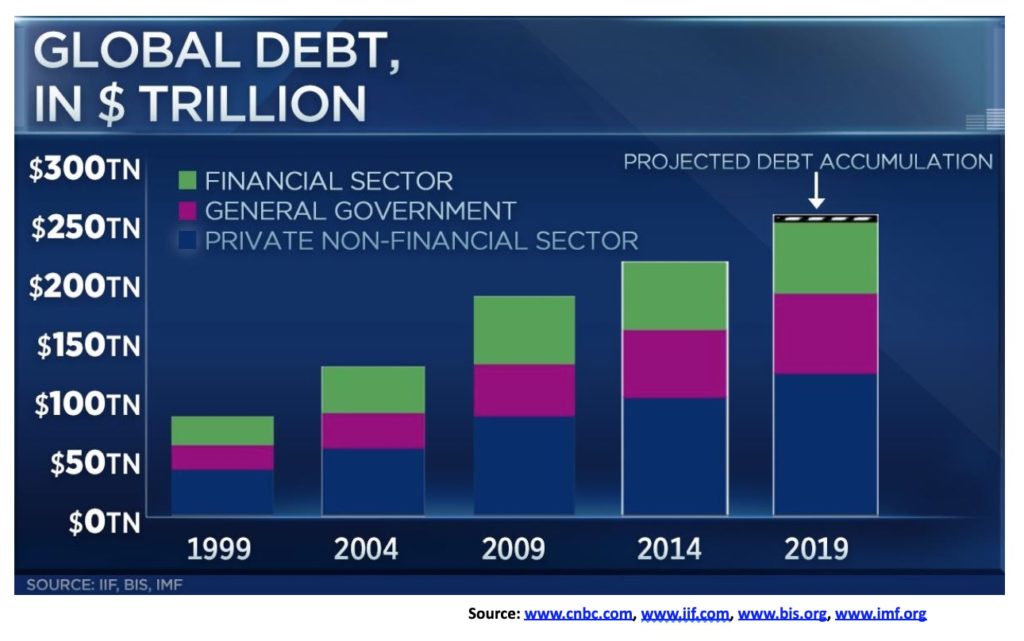
With global GDP estimated for 2019 to be $86.6 trillion, the debt to GDP ratio is an astounding 291%. Some have noted that it is as high as 322%. The world’s most indebted country is the U.S. with an estimated $75.4 trillion outstanding, representing almost 30% of all global debt. The U.S.’s debt to GDP ratio is 347%. It’s not the highest. Japan is estimated to be 525%. High debt to GDP levels means that the ability of their economies to grow is severely compromised. Yet, despite all that, stock markets keep rising to record levels.
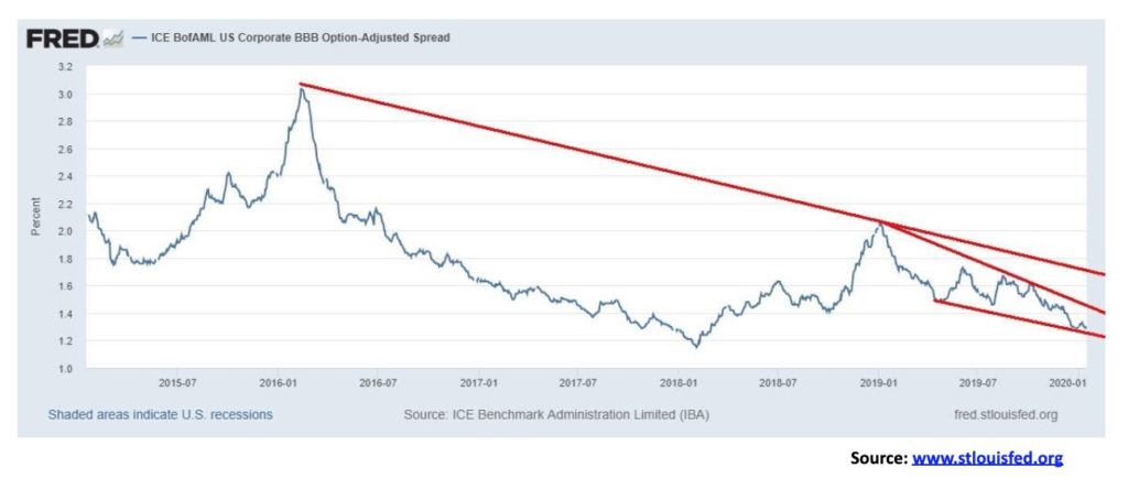
If the era of negative interest rates were to come to an end, what does that mean? After all, pension funds and insurance companies have to maintain bonds for payouts for their liabilities. That translates into them taking bigger risks to ensure a return. Cheap debt has kept “zombie” banks and firms alive, particularly in Japan and the EU. U.S. corporations are the largest holders of corporate debt in the world, last estimated at around $15.5 trillion, but could actually be double that amount. While over 70% of U.S. corporate debt is investment grade the largest category is BBB debt, one notch above speculative grade, yet that constitutes some 41% of the total. Any hike in interest rates and there could be a lot of institutions forced to sell because they are not allowed to hold speculative grade debt.
If there are any concerns about BBB-rated bonds, it is not showing up in the credit spread to U.S. treasuries. The spread is at an abnormally low 1.30%. The appetite for risk appears to have no boundaries. The danger for holders is that the spread could rise—and rise rapidly as was seen back in 2015–2016 as the interest rate hike cycle got underway, coupled with quantitative tightening (QT). Could the Fed hike rates once again?
Anything is possible, considering there was a lot of questioning as to why the Fed started lowering interest rates in July 2019 with the U.S. stock market at record highs and unemployment at a 50-year low. There is even precedence, as economist Martin Armstrong noted when, during the huge stock market run-up in the 1920s, the Fed lowered interest rates in 1927 to support European currencies. With the euro zone’s negative interest rates, lowering the spread between U.S. and euro zone bonds was at least part of the reason for lowering rates this time as well. Except that, in the 1920s, it was later followed by the Fed hiking interest rates once as the economy was good and the stock market rising into its 1929 top.
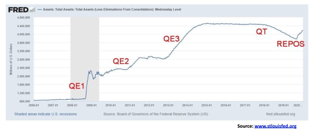
Everyone continues to be baffled about the repo program. The Fed has already announced that the program will continue into February and beyond. The Fed has confirmed that the “temporary” (as they described the repo program) liquidity injections that were for six months have been extended for another “temporary” six months. But what happens if they end the program? Given what is now at stake, we may not wish to contemplate that event. While many are calling it QE4, and it certainly has had that effect in terms of a sharply rising stock market, the other belief is that there is a liquidity problem out there and banks are reluctant to lend to one another, thus forcing the Fed to step in. It is also a mystery as to why is the Fed doing this with interest rates already low, the stock market at record levels and unemployment at a 50-year low.
With pressure for interest rates to rise, the Fed is keeping a lid on them. As to institutions in trouble, the euro zone banks have been mentioned, led by Germany’s Deutsche Bank, and now we are hearing concerns about the Japanese banking system led by Mitsubishi Bank. That BBB spread could be forming a descending wedge triangle and that ultimately is bearish, suggesting that the spread will rise again at some point.
Since August 28, 2019, the Fed balance sheet has grown by $415.9 billion, effectively putting it back where it was in October 2018 as QT progressed. That’s a gain of 11.1%. The S&P 500 has outpaced it, up 15.1%. Coincidence that both are up? There is considerable room to grow to bring the Fed’s balance sheet back to peak levels seen in January 2015. That would require growth of least an additional $365 billion. At current rates, that could be seen by April 2020. Nonetheless, we ask ourselves, what happens if the Fed decides they don’t need to continue with the repo program any longer? Simply put, bond yields would rise and the stock market would most likely fall. And gold would more likely rise.
The U.S. national debt keeps on growing. It is now up to $23.2 trillion and growing at over $1.0 trillion/annually. The U.S. budget deficit grew to $1.4 trillion in 2009 after the 2008 financial crisis. Trillion-dollar deficits persisted through 2012, but by 2013 the deficit was wrestled under $1 trillion and hit a low of $438 billion in 2015. It started rising again in 2016 and by 2019 it surpassed $1 trillion, once again following the massive tax cuts of late 2017. Trillion-dollar plus deficits are now forecast well into the future. Defense spending that was just over $700 billion in 2015 is now almost $1 trillion/annually. And that is just the on-balance sheet military spending.
When one takes into account social security liability ($20.2 trillion), Medicare liability ($31.3 trillion), unfunded pension liabilities ($6.9 trillion), plus others, U.S. unfunded liabilities comes to $127.7 trillion. With a national debt to GDP of almost 107% one has to wonder could the U.S. go the way of Greece? Greece’s debt to GDP currently stands at 181%. The repo program may also be the way they are going to try and monetize the debt. By monetizing the debt, the central bank holds the debt and returns the funds to the treasury. The treasury effectively borrows the funds without ever needing to repay it. Monetizing the debt is also inflationary.
And, as a reminder, the trade wars are not finished. Yes, the U.S. and China may have signed a phase 1 deal with lots of self-congratulations spread around. However, at best it only reduces some tariffs. Considerably more tariffs ($370 billion) remain in place until after the U.S. election in November and more than half of U.S. exports to China remain under retaliatory tariffs. Many issues remain unresolved, particularly surrounding Huawei’s 5G as an example. China says it will purchase more agricultural goods, but they are going to buy them somewhere anyway. The deal overall is skimpy and even tougher negotiations lie ahead. There are also back-out clauses for both parties. Finally, contrary to claims otherwise, U.S. corporations and farmers have paid the major price of Trump’s trade wars.
Of bigger concern and as yet unresolved, is the EU and the U.S. where the U.S. is threatening more tariffs on French goods plus others. The EU and the U.K. seem destined to be locked in a trade dispute once Brexit happens, yet they have to have a deal in place by the end of 2020 or trade barriers go up. The current phase 1 deal between the U.S. and China seems more like a deal to save face and prove that the two parties did something.
Despite the elation for the record-breaking stock market, the risks are growing. Debt spending has taken on a life of its own and they believe there are really no limits. The Fed can monetize the national debt, but households and corporations can’t monetize theirs. They just go bankrupt. The euro zone is trapped in its world of NIRP (negative interest rate policy) and they may discover that raising NIRP to ZIRP (zero interest rate policy) has its own dangers. Central banks are trapped because if we had another financial crisis on the scale of 2008, they would not be able to cope. The impeachment crisis could take unknown twists. Geopolitical storms could erupt once again as the current Iranian crisis has cooled but is not over by any means. The costs of climate change are rising and the financial world and more are taking notice and action. Witness Blackrock’s (BLK) commitment to making climate change central to its investment decisions. That has extended to central banks, banks, and corporations. The recalcitrant politicians could soon have to pay a lot more attention. The costs of doing nothing could well far exceed the costs of doing something. Who said the 2020s would be dull?
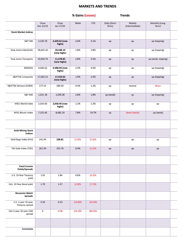
Nothing seems to get in the way of this runaway train. The records just keep on falling almost daily. Any thoughts of tops of channels, ascending wedges, or whatever other bearish configuration we can come up with just keeps on getting blown away. This past week the S&P 500 gained almost 2%. The Dow Jones Industrials (DJI) was up 1.8% while the Dow Jones Industrials (DJT) gained 2.8%. The healthy gain by the DJT did push it to new 52-week highs, but not to new all-time highs. The DJT continues to diverge with the DJI in that respect. The September 2018 high for the DJT remains intact. It is, however, only about 400 points from that level. The NASDAQ gained 2.3% and joined the all-time parade. Also joining the all-time parade were the Value Line, NYSE, Dow Jones Composite (DJC), Dow Jones Utilities (DJU), NASDAQ 100, S&P 100 (OEX), S&P 400 (Mid), and the Wilshire 5000. Making new 52-week highs but not new all-time highs were the AMEX and the S&P 600 (Small). Of the FAANGs, APPL, GOOG, and FB made all-time highs. NFLX and AMZN did not.
Elsewhere, the TSX Composite joined the all-time parade with a gain of 1.9%. The TSX Venture Exchange (CDNX) gained 0.4% but is not even remotely near its all-time high. In the EU, the London FTSE was up 1.5% and is just short of new all-time highs, the Paris CAC 40 gained 1.1%, and the German DAX was up 0.3% as both made all-time highs. In Asia, all-time highs were harder to come by as the Shanghai Index (SSEC) was down 0.6% while the Tokyo Nikkei Dow (TKN) rose 0.7%. Neither are anywhere near their all-time highs.
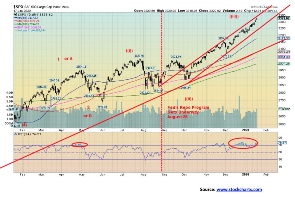
So, what to make of all this? The bulls are chortling that nothing can stop this train. But, as we well know, the party ends sometime and when it ends it is usually not pleasant. You are left with the hangover. Ironically, it was 20 years ago this month that the DJI hit a record high, and two months later in March the S&P 500 and the NASDAQ made all-time highs but the DJI did not. Thus, started the two-year decline as the high-tech/dot.com bubble burst. It took the NASDAQ until 2016 before it regained the 2000 high. In between was the 2008 financial crash. The 2000s were a lost decade.
Not so the 2000’s teen years. It has been one big party, driven by historically ultra-low interest rates, trillions in quantitative easing (QE), and trillions in debt, bringing debt loads to unheard-of levels. All that money, whether artificially created or not, has to go somewhere and into the stock markets it went. Today the markets seem impervious to anything. That is, until they don’t and the music stops and the hangover follows.
It is no surprise that bullish sentiment has reached extremely high levels. The Daily Sentiment Index reached 92% on Friday. The last time it was this high was January 2018, just before the trade wars got underway. A year ago, in December 2018 it was 4%. As well, we note that the CNN Fear & Greed Index has hit 97%. Last year, roughly at this time, it was 26% as the market was coming out of the 20% collapse into December 2018. Extreme fear to extreme greed in a year. You can continue to buy this market but it is clearly caveat emptor.
There is little fear in this market. The VIX volatility indicator is just above its lows seen in November 2019. A minor divergence. The put/call ratio is heavily weighted towards calls. The S&P 500 Bullish Percent Index is at 83 as high as it has been over the past 20 years at peaks. The number of stocks trading over their 200-day MA is also at levels usually associated with tops. The McLellan Summation Index (RASI) is high but off its peak a divergence. But the NYSE advance-decline steams ahead and that remains one positive indicator that the bulls can point to. Numerous indices and stocks are breaking out. But is it a real breakout this late in the game? Or a sucker move? We are seeing headlines that the DJI will be crossing 30,000 in another week.
Clearly one buys here at their own risk. A top would be in if the S&P 500 breaks 3,200. Under 3,000, the bear gets underway.
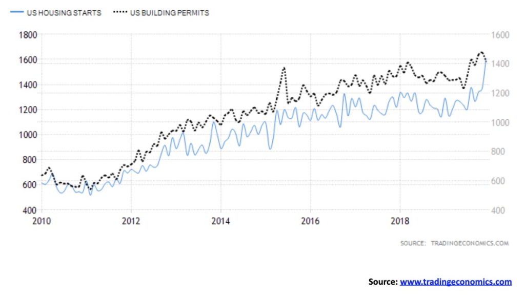
Housing starts for December 2019 leaped 16.9% from a month earlier. The market had expected a gain of only 2.6%. Grant you, it did come against the backdrop of falling building permits, off 3.9% at the same time. The market had expected a gain instead of 0.9%. The adjusted annual rate is 1,608 million units, the highest total since Dec 2006 and the largest gain since Oct 2016. The strong housing starts was a prime reason the stock market was buoyed on Friday. The falling building permits, however, could portend a decline in housing starts. This has been seen in the past. On another note, industrial production fell 0.3% in December after the market expected a gain of 0.8%. Industrial production has been generally in downward trend over the past year. The question is, which number is the outlier—the strong housing starts or the weak industrial production?
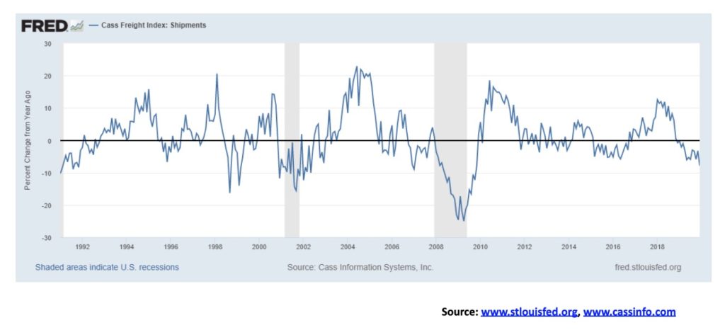
Last week we noted how the Baltic Dry Index (BDI) was falling rapidly, reflecting a contraction in world trade. Above is the Cass Freight shipments rate of change. The Cass Freight Index is a measurement of the monthly aggregate deliveries of U.S. freight. The index has been falling for seven months. In the most recent month, it fell 7.9% YOY. The index is warning of a potential slowdown, a contraction. Naturally, it is an open question as the index has gone negative in the past without sparking a recession. But we do note that this time we took out the series of lows seen from 2011 through 2016. That is not a good sign. Volumes have been falling, particularly for international freight shipments. The European equivalent has been falling since March 2018 while the Asia-Pacific equivalent turned negative in November. Historically, a fall in freight shipments precedes a decline in GDP. The breakdown in the index could be a warning sign.
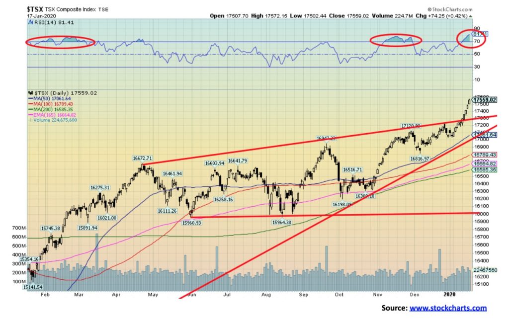
Is this a big breakout for the TSX Composite or merely the terminal phase? Volume is not overly impressive; however, on balance volume remains positive but not excessive. Each time the TSX got about 3–4% above the 50-day MA it fell back to earth. What looked like a developing wedge triangle has broken. The result is, this may have been instead an ascending triangle, although we prefer flat tops and rising bottoms for an ascending triangle, not rising tops as we see above. The breakout could imply a potential move to 18,550 or about another 100 points from current levels. As to the sub-indices, the big winner this past week was health care, up a whopping 13.9% on the week. Because of its poor performance in 2019 we had noted that health care may be the place to be in 2020. Financials make up the biggest portion of the TSX, representing 32.1% of the index. Health care makes up a mere 1.7% of the TSX, a small component. Financials rose 1.9% this past week which was the same as the TSX itself. The only loser on the week was energy, down 2.5%. Materials eked out a gain of 0.5%. The TSX has broken out, but we could be fast approaching a top. What we won’t know is, will it be a temporary top or a final one? The market is getting frothy, as we noted under the S&P 500. We also can’t help but note that the RSI has reached over 80, a level often associated with tops but not necessarily a major top.
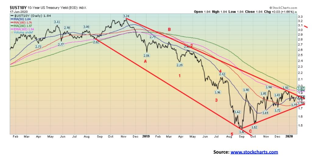
If the Fed is trying to keep a lid on interest rates through the repo program, then they are doing a reasonable job. The 10-year U.S. treasury note began to rise in yield (with a fall in price as prices move inversely to yields) in September 2019, coinciding with the start of the repo program. After all, rising interest rates could be fall in a debt-laden U.S. and a debt-laden world, especially in this day of trillion dollar deficits in the U.S. However, we have noted that the Fed could be monetizing the debt as its balance sheet rises. At the current rate, the Fed could soon own 20% of the U.S. national debt of over $23 trillion. Keep in mind China isn’t buying much U.S. debt these days. Its holdings have fallen $32 billion in the past year. Doesn’t sound like much, but at the same time China has become the number two holder of U.S. debt behind Japan, whose holdings have increased $124 billion in the past year. Foreign holdings of U.S. treasuries have increased $541 billion in the past year. Numerous central banks have picked up the slack with Japan being the largest, followed by the U.K. that has increased its holdings $69 billion in the past year. It feels as if the Fed has picked up the rest as its balance sheet has ballooned $415 billion since late August 2019. The 10-year has run into resistance just under the 200-day MA near 1.97%. The 10-year rose 1 bp this past week, so the Fed’s program appears to be working to keep a lid on rates. But if we were to break above 1.97%, then the odds favour a further rise.
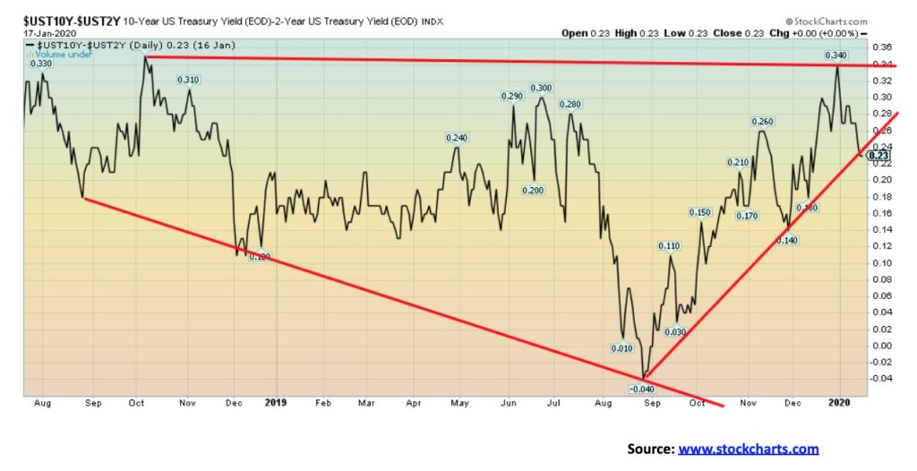
Our recession watch spread, known as the 2–10 spread (2-year U.S. treasury note minus 10-year U.S. treasury note) fell to 23 bp this past week from 27 bp the previous week. Our other watched spread of 3m–10 (3-month U.S. treasury bills minus 10-year U.S. treasury note) fell to 28 bp from 29 bp. There is little to read into this. Since bottoming at negative 4 bp back in late August 2019 the 2–10 spread has been in an uptrend. The 3m–10 spread bottomed at negative 52 bp around the same time. If a negative spread is a forewarning of a potential recession, it is when the spread returns positive once again that suggests we could be getting closer to a recession.
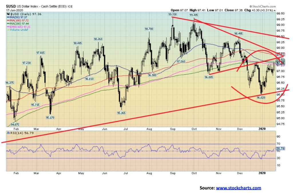
In the past, we have emphasized how the 96 level for the US$ Index is key support. The low thus far is 96.02. We have now rebounded to just under resistance near 97.70–98. There is further resistance up to 99.50. We doubt we’ll carry that far, but we must be aware that it could. Our expectations are that the US$ Index should fail somewhere in the range up to 98. A return back under 96.50 would tell us that the next wave down should be underway. A breakdown under 96 would confirm it.
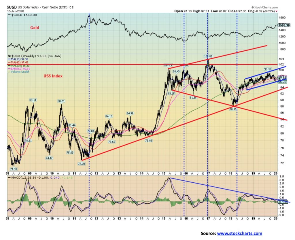
We have often noted that the U.S. dollar appears to do well under Democrat presidents and poorly under Republican ones. Obama (Democrat) assumed office in 2009 at the height of the 2008 financial crisis. The U.S. dollar made its low in July 2008 and the stock market made its low in March 2009. Since then, both the U.S. dollar and the stock market have been on a rise. The U.S. dollar did make a secondary higher low in April 2011 at the outset of the EU/Greek crisis. But, oddly, its peak came in January 2017 as Trump (Republican) took over. After making a low in 2018, coinciding with the outbreak of Trump’s trade wars, the U.S. dollar has made a recovery. But the past twenty months have seen a laboured affair. With cries from Trump for a lower U.S. dollar and a Fed that appears to be trying to accommodate that, we may yet get that big drop in the U.S. dollar. Note how upside momentum has fizzled over the past several months (MACD). The US$ Index should eventually break 94. It is then a long way down to that next major support line near 84.
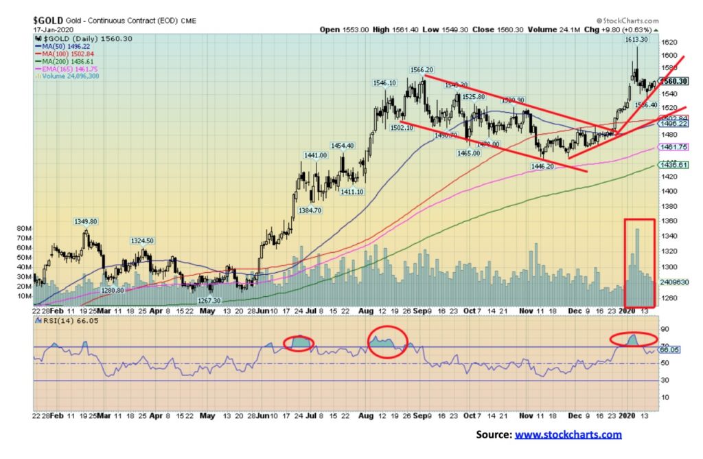
Gold has eased its gross overbought levels and that is positive. The spike on the Iran war news January 8 actually left what is known as a shooting star on the charts. There was also one a couple of days earlier on January 6. So, what is a shooting star? It is a Japanese candlestick formation. A shooting star is a long upper shadow (or line) and a body near the bottom end of the day’s (or week’s, etc.) range. A shooting star is usually seen at tops (not necessarily a major top) and its implications are at least short-term bearish. Its bull counterpart is a hammer and it is seen at bottoms. We had a target of at least $1,605 for gold following the August–November consolidation. Gold hit a peak of $1,613, fulfilling the target. That we exceeded that suggests it is possible that, following another consolidation, we could see new highs once again. We maintain targets of upwards of $1,725 from the huge multi-year head and shoulders bottom that formed on gold 2013–2019. No surprise that volume peaked at the recent top along with an RSI that reached to 80. The question is, what next? Gold could easily pull back to $1,500 and still remain in an uptrend. Key then becomes the $1,446 low seen in November. A break of that level could be terminal. In the interim, we could see some choppy trading and would not be surprised at a pullback to the $1,500 level. No surprise that the 50- and 100-day MAs are at $1,496 and $1,502 respectively.
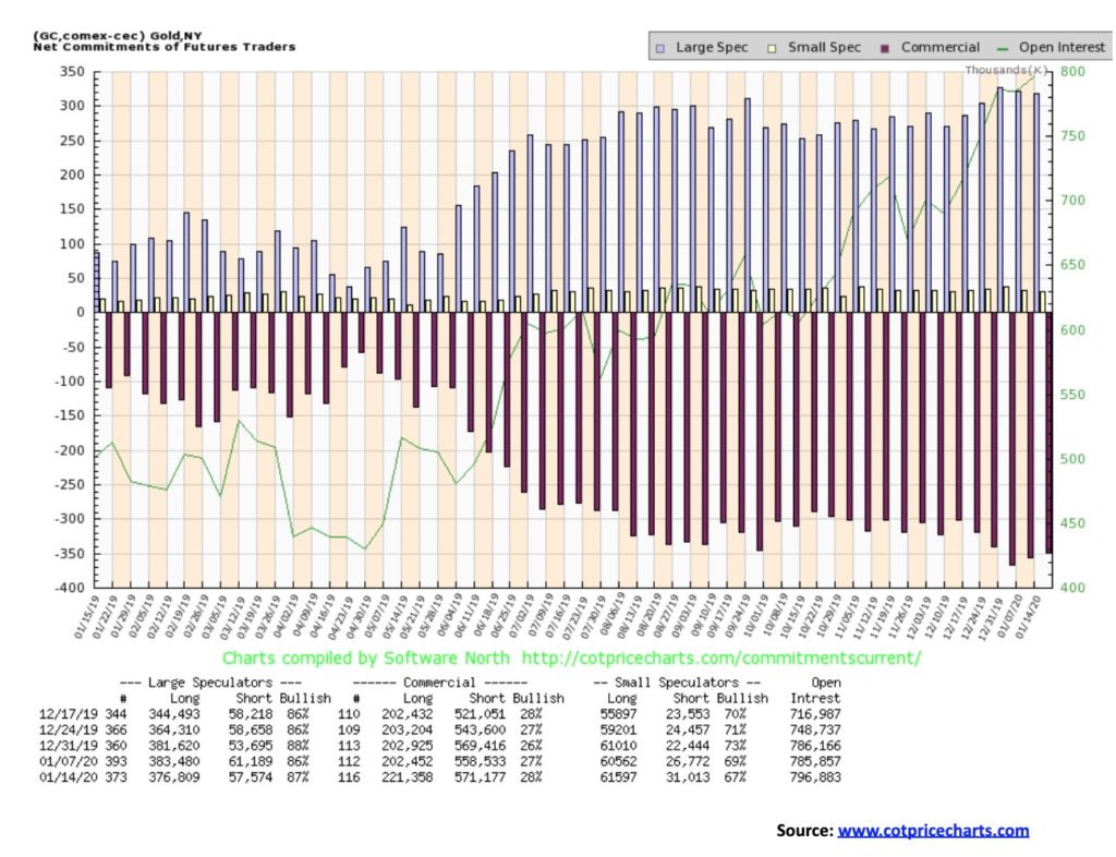
The commercial COT for gold improved slightly this past week to 28% from 27%. The improvement is welcome; however, it does not remove the negatives from the gold commercial COT. Long open interest rose almost 19,000 contracts while short open interest also rose up just over 12,500 contracts. The large speculators COT also rose to 87% from 86%. We do not like to see the large speculators so bullish. On the other hand, both their long and short open interest fell this past week, suggesting they were covering both longs and shorts. The commercials added to their positions, the exact opposite. The commercial COT remains negative, but we are pleased with the slight improvement.

Palladium has quite a run since a major bottom in 2016. There have been two big run-ups, culminating in the recent run to just over $2,000 a level unheard of for palladium. But that is what supply shortages will do for you. The first run-up ran from January 2016 to January 2018. After a pause of about seven months, the bull resumed. Since August 2018, palladium is up over $1,000. There was one short pause from March to May 2019 before the run-up resumed. Is palladium in a bubble? Could be. Certainly, Friday’s action saw palladium soar to a peak of $2,298 before closing just above where it opened at $2,225. It left what we call a shooting star on the charts. That’s a potential top. As well, with the RSI at a screaming overbought 85.32, caution and profit-taking are probably the wise idea for palladium.
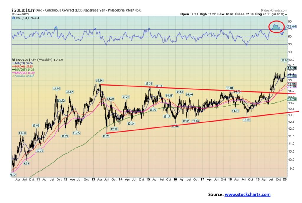
Last week we showed gold in Canadian dollars. This week we are showing gold in Japanese yen. We have a tendency to think of gold only in U.S. dollar terms. But if you live in Canada as we do, then we have been blessed with record prices for gold. So have the Japanese and those in the EU and the U.K. as well. It is all because of the weakness of the Cdn$, the yen, the euro, and the pound vs. the U.S. dollar. Numerous other countries are experiencing the same with record gold prices in their home currency. What it tells us is that gold is already in a major bull market but gold in U.S. dollar terms has yet to confirm. We believe it will and should on this current run-up that should not yet be finished.
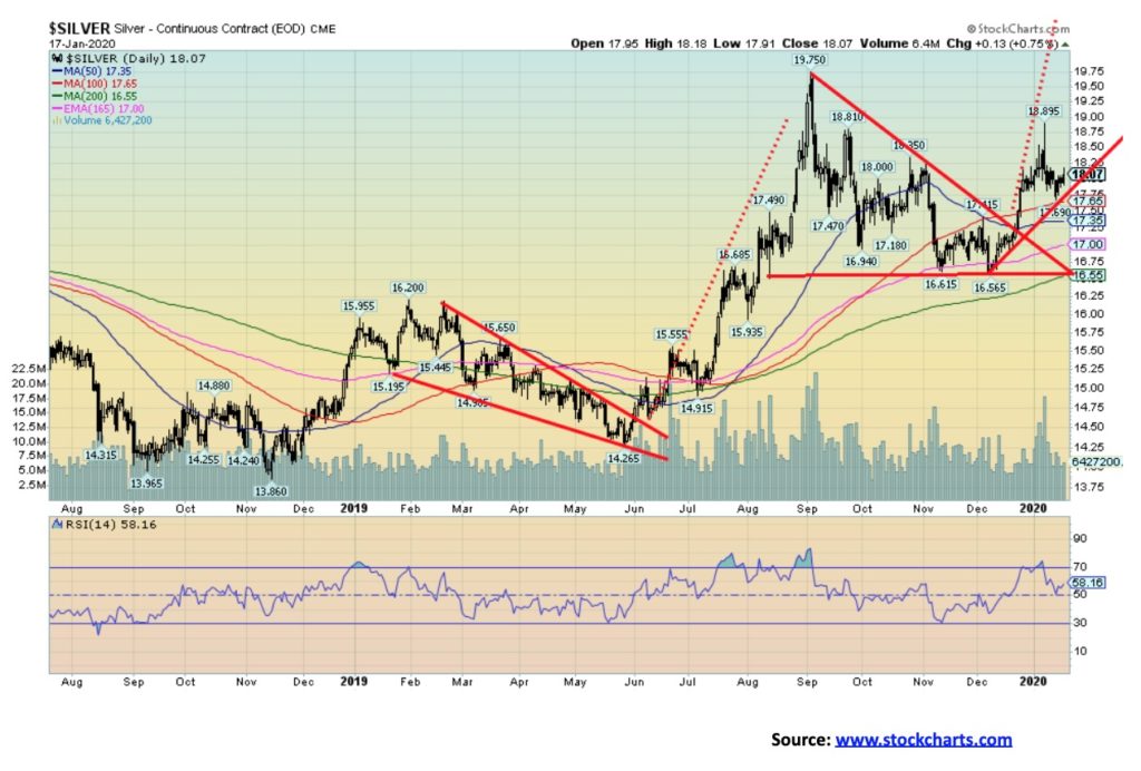
After breaking out of the triangle that formed between August and December, silver took a run that culminated in a spike high during the threat of war with Iran. Like gold, silver left what we call a shooting star on the charts. Since then, silver has fallen back to earth. The triangle breakout suggested that we could have targets up to $20.50. To confirm the breakout, we needed silver to break out over $18.35. It did, but it has failed to hold the level and that is of some concern. We can view this pullback as merely a consolidation following the spike high. However, if silver were to continue downward there are points to keep in mind. A break under $17.50 could suggest a test of the 200-day MA near $16.55. A firm breakdown under $16.50 could suggest further losses to $16–$16.25. A breakdown under $16 would be terminal and set silver into a bear market. All that suggests to us that it is important that silver hold support levels. If silver (and gold) were to return to a bear market it would be a “throw in the towel” moment for the gold stocks. We don’t believe this up wave is complete just yet, but we do wish to be wary just in case we are proven wrong. First, we need to regain $18.35 on a close basis.
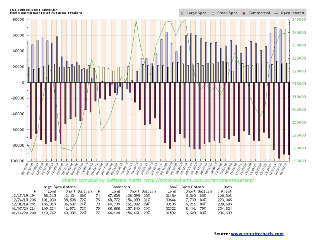
The silver commercial COT weakened slightly this past week, falling to 29% from 30%. Long open interest was off just over 2,500 contracts even as short open interest fell about 1,400 contracts. As a result, the COT isn’t telling us a lot this week except that the commercials, for the most part, remain net short. And that is a note of caution for the silver price.
If we have any concern about the performance of gold recently it is the underwhelming performance of the gold stocks. The Gold Bugs Index (HUI) fell 1.0% this past week but the TSX Gold Index (TGD) did manage to eke out a 0.4% gain. This, against the backdrop of both gold and silver, effectively flat on the week. Given both indices put in 30% gains in 2019, a pause might not actually be that bad. Both indices are down slightly on the year with the HUI off 5.4% and the TGD down 2.1%. Still we believe the TGD made a firm breakout in November and any pullback is a test of the breakout. There is a divergence, however, as the HUI did make new 52-week highs during the recent run-up but the TGD did not. So far, the TGD appears to be holding the 50-day MA near 248. A break under that level could have the TGD test down to the 200-day MA near 228. A breakdown under 225 would be of some concern. Remember, if gold were to fall just 10% from its recent high of $1,610, the TGD and HUI could easily be down 20% or more from their recent high. If gold stocks were to outperform gold then that would be a bullish sign. In the interim, this choppy consolidation/correction could continue. Only regaining new highs above 266 will convince us that the correction is over. Otherwise, the gold stocks seem plagued with apathy recently and that helps explain why we seem to be churning going nowhere. The Gold Miners Bullish Percent (BPGDM) Index remains high at 84.62 (extreme bullishness is 100) so that is another caution on the gold stocks. For the longer term we still remain bullish, but the short-term picture is cloudy and more consolidation may be required. We’d be happy to see the BPGDM pull back under 80 to ease the bullishness.
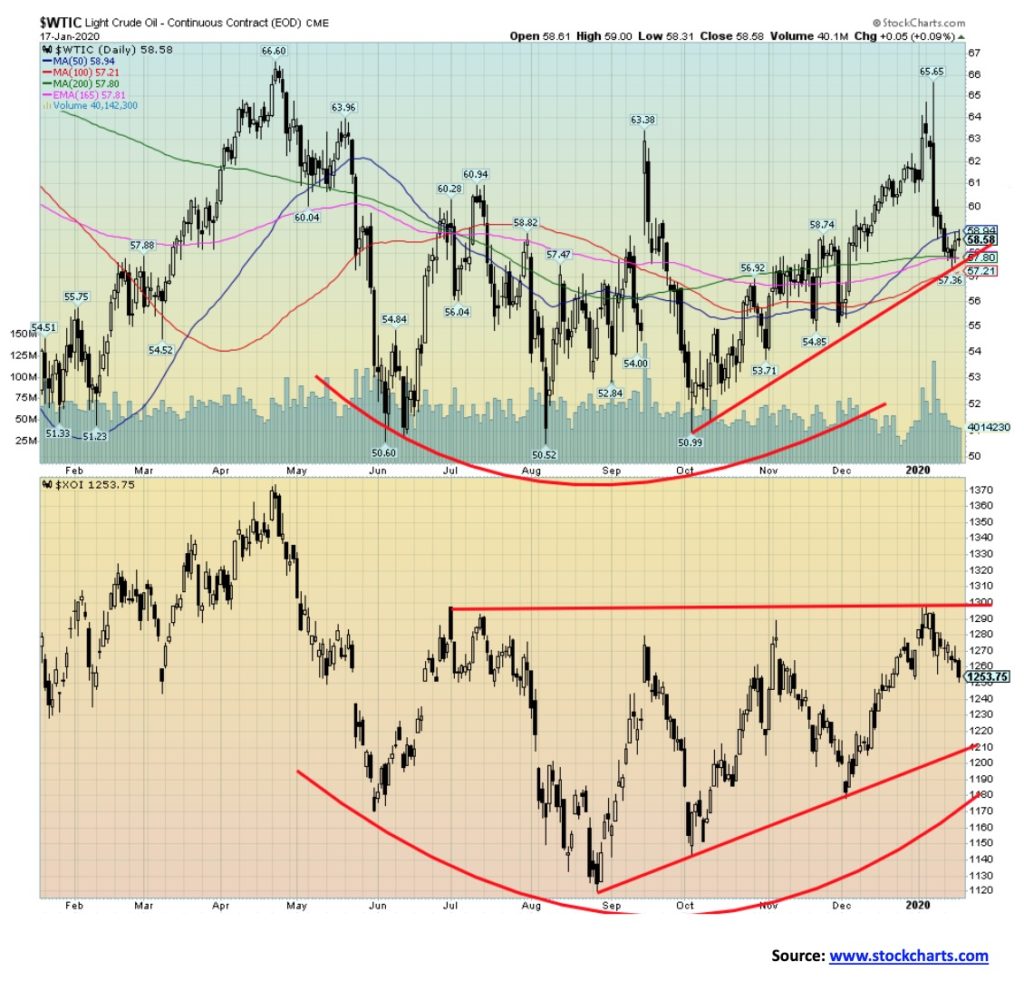
With no war with Iran to fret about, oil prices refocused on growth and supply and demand. Oil was buoyed by the U.S./China trade deal signing, but then China reported lower than expected growth and prices softened again. A reminder, however, that the U.S./Iran war is most likely just on hold and the trade pact is fraught with its own potential self-destruction. It is admittedly hard trying to get a handle on oil. Since April 2019, WTI oil has gone on a roller coaster rise, largely between $50 and $65. It seems that the ride is continuing as, following a $14 rise from October to January, WTI oil has now retreated $7 from the top. It did find support at converging MAs that themselves range from $57.20 to $58.95. The entire pattern forming still looks like some sort of big bottom. The chart of the Arca Oil & Gas Index (XOI) is even more compelling in terms of forming what appears to be a large bottom. But the only thing on the horizon that could send oil prices rising again is a renewal of hostilities in the Middle East. Slowing global growth would have the opposite effect. And if oil is having its troubles rising, then natural gas (NG) is in an even bigger slump as it fell 20 cents or 9.1% this past week. NG is threatening to fall under $2. The energy stocks didn’t fare well either as the XOI lost 1.5% on the week and the TSX Energy Index (TEN) was hit harder down 2.5%. Still, the chart of the XOI and, as well, the TEN continue to look positive and are under accumulation. We are in a positive period for both oil and gas prices that does extend to about June—although you’d never know it with the way NG is performing. NG is plagued with over-supply. Is there a point that would indicate this is going to break down completely? Technically, a break under $57 could see oil prices weaken further. But then we expect the $50 range would hold any further decline. The XOI breaks down under 1,200. For the XOI, 1,300 is proving formidable resistance.
In 2019, gold broke out of a multi-year bottom formation when it moved above $1,370 and $1,435 in June to August 2019. Gold, expressed in a number of currencies, has seen new all-time highs recently. But not everyone has enjoyed the breakouts, despite excellent bottom patterns forming. Silver remains below its highs near $21.50, and both the Gold Bugs Index (HUI) and the TSX Gold Index (TGD) are also below their highs seen during the same 2013–2019 period. Nonetheless, the patterns forming on the gold stocks remain compelling.
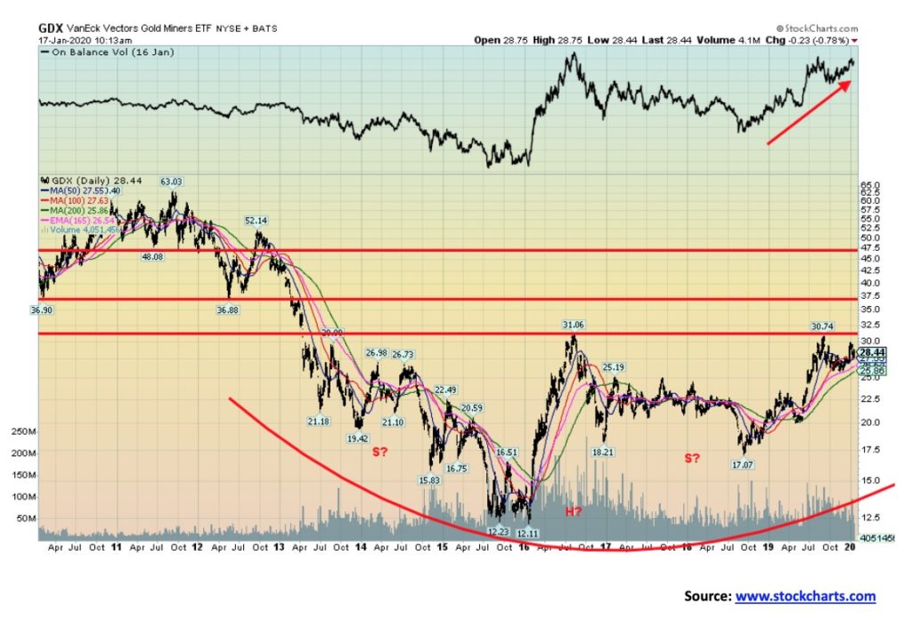
Above is a 10-year chart of the VanEck Gold Miners ETF (GDX). The GDX appears to be forming a rather complex looking multi-year head and shoulders bottom pattern. If the pattern is correct and the GDX were break above the neckline that appears to be near $31.70, then the ensuing move could be rapid to at least the next line of resistance near $37.50. Further resistance zones can be seen up at $47.50. The potential targets for the huge H&S pattern could be $50.50/$50.75, a 78% move from current levels. We like how on balance volume (OBV) has been rising nicely with the recent rise in the stock price reflecting the strength of the move. The accumulation/distribution line is showing strength as well.
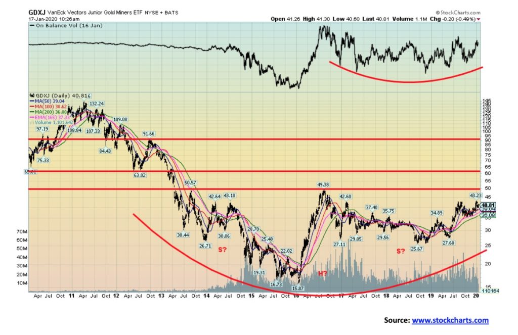
The chart of the GDX’s junior partner, the VanEck Vectors Junior Gold Miners (GDXJ) is not quite as clear but also is compelling. If it is forming a head and shoulders bottom, then it is a rather awkward one. Nonetheless, we like to see both the GDX and the GDXJ in sync. The breakout point for the GDXJ appears to be near $50 and could project up to $83.50 if correct. The on-balance volume is not as clear either, but it has at least been rising recently. The OBV also appears to be forming a bottom pattern. Resistance for the GDXJ is up around $60, then again up to $90. The accumulation/distribution line for the GDXJ is also not as compelling but is at least exhibiting some strength.
Gold analyst Clive Maund recently noted both the GDX and the GDXJ in a report that showed up on Streetwise Reports. He described the outlook for gold and silver as “strongly bullish.” Maund also centered on the recent geopolitical events as well as the massive monetary expansion as reasons for the bid in the precious metals sector. The charts for both the GDX and the GDXJ are compelling and complement the reason that one should have some exposure to precious metals in their portfolio.
—
(Featured image by David Schwarzenberg from Pixabay)
DISCLAIMER: This article was written by a third party contributor and does not reflect the opinion of Born2Invest, its management, staff or its associates. Please review our disclaimer for more information.
This article may include forward-looking statements. These forward-looking statements generally are identified by the words “believe,” “project,” “estimate,” “become,” “plan,” “will,” and similar expressions. These forward-looking statements involve known and unknown risks as well as uncertainties, including those discussed in the following cautionary statements and elsewhere in this article and on this site. Although the Company may believe that its expectations are based on reasonable assumptions, the actual results that the Company may achieve may differ materially from any forward-looking statements, which reflect the opinions of the management of the Company only as of the date hereof. Additionally, please make sure to read these important disclosures.


The TopRanked.io Weekly Affiliate Marketing Digest [The Top VPN Affiliate Programs Roundup]
Want to be let in on a little secret about two massive affiliate opportunities you can take advantage of today?...


Sustainable Finance Faces Hurdles as Green Asset Ratio Reforms Fall Short of Full Transparency
The Green Asset Ratio (GAR) measures banks' alignment with the EU Taxonomy but remains low due to methodological flaws and...


XRP Hits New All-Time High Amid U.S. Crypto Policy Shift and Ripple’s Expansion
XRP surged past its 2018 all-time high, reaching $3.65 amid renewed political support for crypto in the U.S. under Trump....


Germany Moves to Curb Medical Cannabis Abuse, Sparking Access Concerns
Medical cannabis imports in Germany have surged, but health insurance-covered prescriptions remain low. Easy online access raises concerns about abuse...


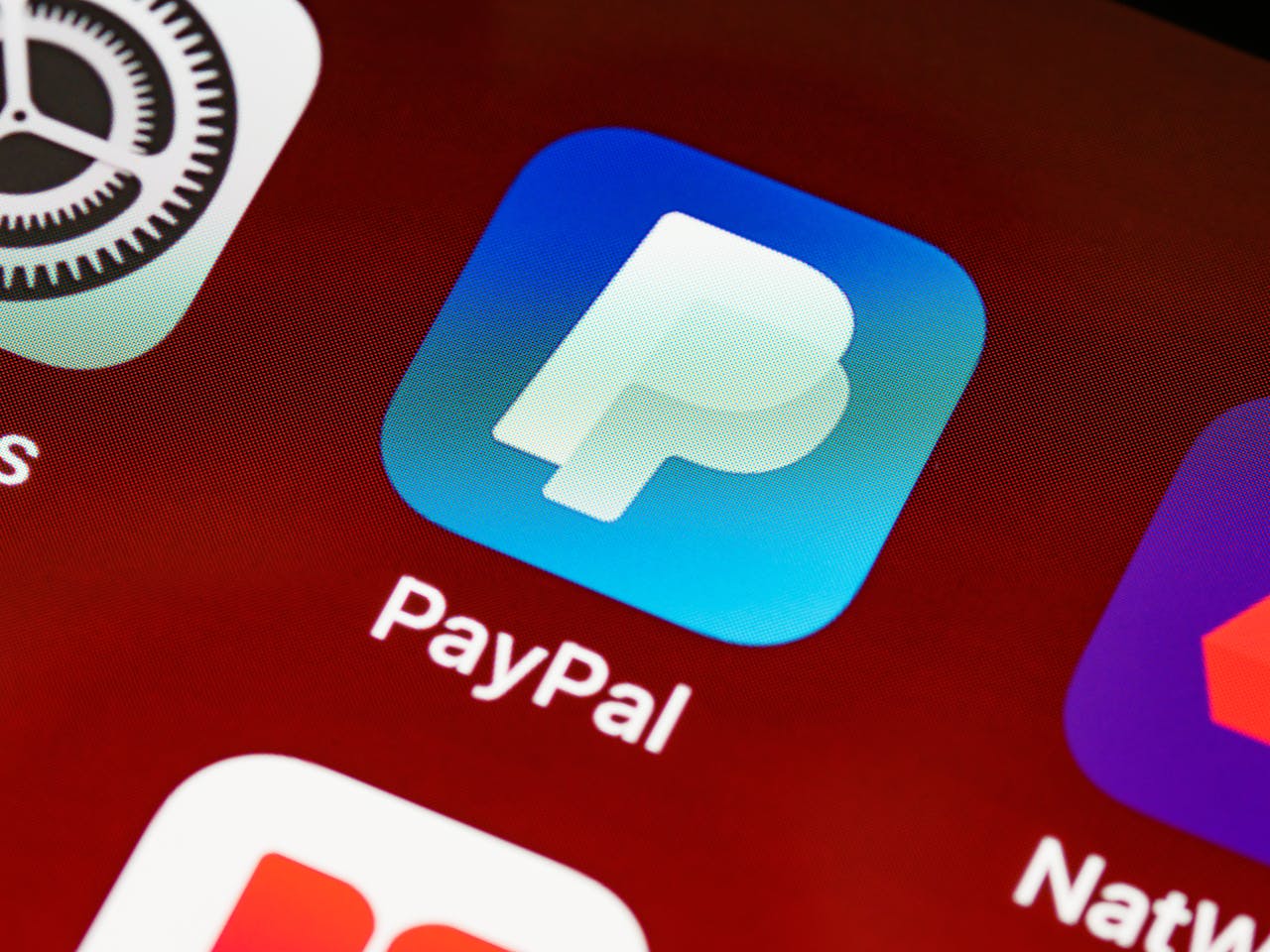
JPMorgan’s Data Fees Shake Fintech: PayPal Takes a Hit
JPMorgan Chase will charge fintechs for customer data, threatening business models reliant on free access. PayPal’s stock plunged 5.7% after...
 |
|
 |  |
 |
|
-

 Impact Investing1 week ago
Vernazza Autogru Secures €5M Green Loan to Drive Sustainable Innovation in Heavy Transport
-

 Markets4 days ago
Rice Market Slips Amid USDA Revisions and Quality Concerns
-

 Business2 weeks ago
Legal Process for Dividing Real Estate Inheritance
-
 Fintech13 hours ago
JPMorgan’s Data Fees Shake Fintech: PayPal Takes a Hit