Featured
Bear market volatility and the 200 count
All-time highs for Dow Jones, which have become a trend in 2017, is not likely to continue in the future.
Until the financial markets begin upchucking the “liquidity” being forced fed to them, we can anticipate the stock market will continue going up as the old monetary metals, for the most part, continue holding on to what they have.
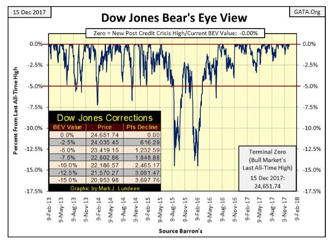
Except for Thursday, the Dow Jones closed at new all-time highs every day last week. That should be big news, however in 2017 that seems to have become the rule rather than the exception. Will the Dow Jones ever again find itself below its BEV -5% line in its BEV chart below? Yes, it will, and that will be big news! As you can see in the corrections table in the chart, the Dow Jones today would have to shed 1,233 points to do it.
This market is so insanely overvalued the Dow Jones could go down 15% and still find itself above its 20,000 level. Heck, before the November 2016 election the Dow was a then-lofty 18,332. To return to there would take a little bear market, a 26% decline in the Dow Jones. But since then it’s seen 86 new all-time highs and 6,319 points with no indication of when the good.
© Mark Lundeen
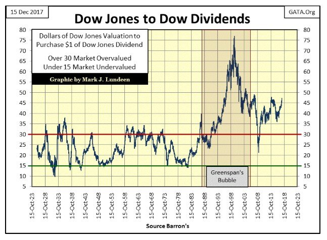
I like historical data; it places things as they are today into perspective. Here’s a chart showing how many dollars of Dow Jones valuation it takes to purchase $1 in Dow Jones dividend payment since 1925.
At the top of the Roaring 1920s bull market, it took $35 of Dow Jones valuation to receive $1 in dividend payment, a 2.86% yield. At the July 1932 bottom of the Great Depression crash, it took $10 of valuation for $1 in dividend payment, a 10% yield.And so it went until August 1987, when Alan Greenspan became Chairman of the Federal Reserve.
Before Greenspan, one could use Dow Jones dividends to see when the stock market was overvalued (bull market top) when it took more than $30 in valuation to purchase a $1 in dividend payouts. Safe reentry points back into the market were given when it took only $15 in Dow Jones valuation to receive $1 in dividend payout.
That sounds like the old rule of thumb of exiting the market when the Dow Jones is yielding 3% and returning when it’s yielding 6%. Well, it is. This week I’m just displaying the data in a different format to keep things interesting.
© Mark Lundeen
We can see the problem the “policy makers” are currently having; after eighteen years of Greenspan inflating bubbles in the financial markets (1987-2006) the stock market remains wildly overvalued to this day. At week’s close it took $47 of Dow Jones valuation to purchase $1 in dividend payout for the Dow, and to most people, all seems well with the world.
Remember the pain the sub-prime mortgage bear market inflicted on everyone? That’s when this ratio deflated to just above $20 of valuation for $1 in dividend payout. Had this ratio declined down to where it would have before Greenspan, to $15, the Dow Jones would have.
seen a decline of 67% from its highs of October 2007, and who knows how much further the Dow Jones would have deflated from there?
Question: will this ratio once again operate within the historical parameters it had before Greenspan? That it hasn’t since August 1987 when Greenspan became Fed Chairman is because the Federal Reserve and other central banks have set their meat-hooks deep into the market’s pricing mechanism.
In December 2017, the least of these bankers’ fears is that the market is overvalued. Inflated market value is something they feel they can manage. What they actually fear is that the market may one day return to a fair market value, set by the market’s pricing mechanism, not them.
For decades now, every time a market attempts to find a fair value that the college professors managing “monetary policy” disagree with, they veto the misbehaving market by flooding it with monetary inflation. This only jacked up valuations of economic assets in an economy that on its own merits would not bear them. Other than encouraging the public to engage in ruinous speculation, and enriching Wall Street, what other purpose was served?
But this system, devised by the best and brightest academia has to offer, is self-destructive. So yes I expect we’ll once again return to the sell at the $30 and buy at the $15 seen in this chart from 1925 to 1987. But not until Mr. Bear is allowed to do what must be done – take out the trash Wall Street placed on everyone’s balance sheet. I hope I’m wrong, but I expect that means another market crash on the scale of the 1929-32, 89% decline in the Dow Jones before we can return to normal.
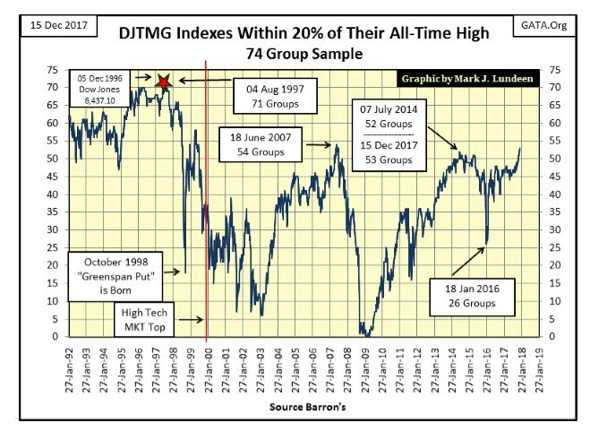
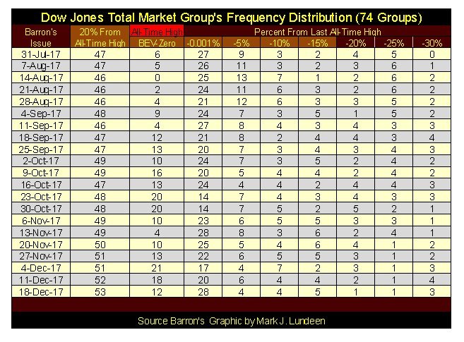
But we’re not there just yet. The Dow Jones Total Market Group (DJTMG)’s top 20 made a new post-March 2009 high this week. Fifty-three of the seventy-four groups in my sample closed this week within 20% of their last all-time high. What does that mean? The “policy makers” are having great success in inflating the broad market to ever higher valuations. The question I have is how much longer will economic reality allow these central banks to continue this farce.
The answer to that question is for longer than you or I believe they can. So if you’re in the market and making money, keep doing it until the stock market once again begins seeing extreme days in market volatility and market breadth. A topic I cover more in-depth later in this article
© Mark Lundeen
Here’s the frequency table where the above plot is calculated. This is going to end in tears, but apparently not in 2017.
© Mark Lundeen
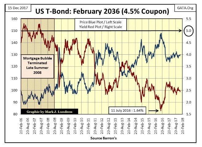
Another key to the success the “policy makers” are having in managing values in the stock market is that they are also having success in managing bond yields. Here’s a long-term (30yr) T-Bond I’ve been tracking since it was issued in February 2006.
Their managing of bond yields (Red Plot) to lower levels as a reaction to the sub-prime mortgage crisis is apparent with this bond. As with our current inflated market valuations, the current low yields in the bond market aren’t going to become a permanent fixture in the debt markets.
When the Federal Government issued this bond in February 2006 the national debt was a then horrendous $8.2 trillion dollars. Still, when in the following months of this bond’s issuing, and bond yields increased to above 5%, it wasn’t the end of the world.
© Mark Lundeen
But that was twelve years ago and another $12 trillion in the national debt. When this bond once again is yielding 5%, how will that impact the US Treasury now that it has over $20 trillion dollars of debt to service?
I realize this bond is a fixed income instrument. That bond yields change weekly makes no difference to its owners who will receive only $45 in annual interest payment from it come what may. But the US Treasury never really pays off its debts. It’s been rolling over debt taken on by FDR to pay for his New Deal for the past nine decades. That plus most of the current $20 trillion in the national debt has less than five years before it has to be refinanced.
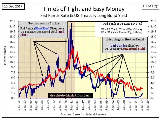
What happens to the bulk of this $20 trillion in debt when it has to be refinanced at interest rates and yields the market saw in 2007 when the Fed Funds rate and Treasury long bond yields were both at 5% (Circle in Chart Below)? Back then this yield inversion resulted in the 2007-09 bear market, the second biggest bear market since 1885, but at the time no one questioned the solvency of the US Treasury.
Yields rising to 5% today would be much worse, because people would be wondering when the US Treasury will declare bankruptcy for its inability to service its interest obligations. We know what the answer to that will prove to be, the Federal Reserve will become the primary source of demand in the Treasury bond market, and just print dollars to finance the Federal Government’s wasteful ways.
I don’t know when, but sometime in the next ten years, we’ll see both the Fed Funds Rate and US Treasury long bond yields rising once again into the double digits because of what the swamp creatures now in control over America’s finances are doing in Washington.
© Mark Lundeen
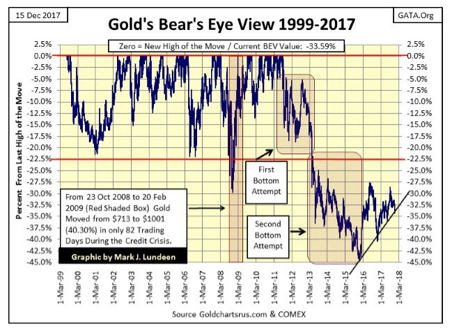
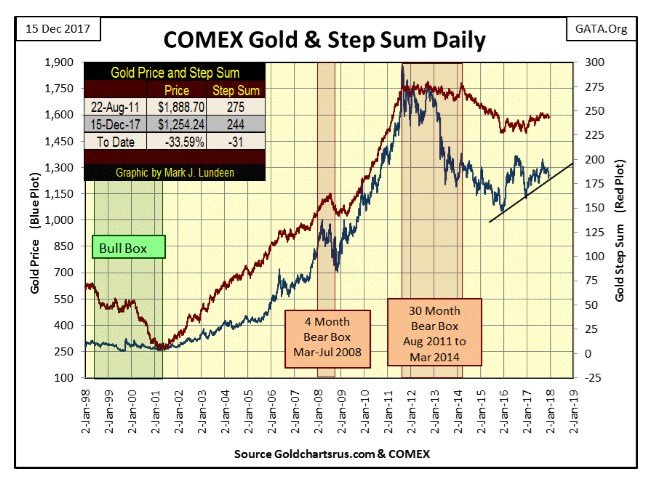
All the more reason for us to like gold and silver, assets with no counterparty risks. The good news for gold this week is it held above the rising trend line in the chart below. Hopefully, when I return in January we’ll see the highs of 2016 (BEV -27.5% Line) taken out.
© Mark Lundeen
Here’s gold’s step sum chart going back twenty years. Following the collapse in the step sum from March 2014 to December 2015, gold hit a hard bottom. Try as they may, since that bottom the bears in the gold market are not having an easy time containing the rising spirits of the old monetary metal.
We may see some bad days and weeks in the coming year. But the bad-old-days of August 2011 to December 2015 are now in the market’s rear-view mirror.
© Mark Lundeen
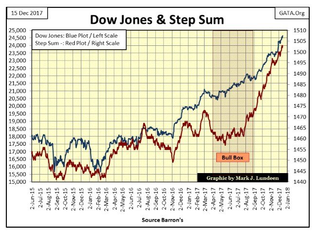
Moving on to the Dow Jones step sum chart below, that was one powerful bull box. The Dow Jones totally ignored all the down days from March to August of this year, and just kept advancing, with no proper correction in sight during or after the bull box closed.
We’re watching history being made. Market historians and our children’s’ children will be discussing this bull market a hundred years from now. But my guess is that most of their discussion will be on the inevitable deflationary bear market that follows.
© Mark Lundeen
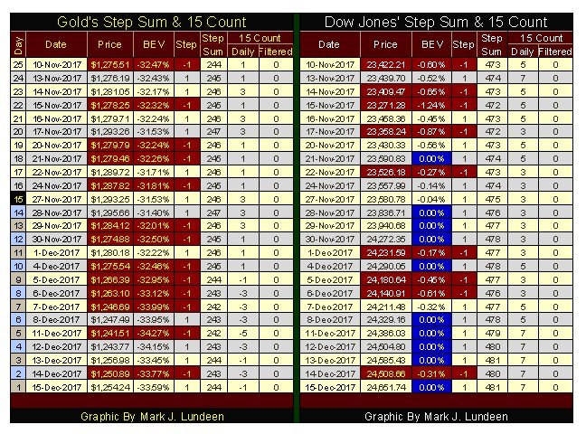
Anything I say this week may appear foolish next Friday. Uncertainty is the nature of the beast we struggle with. But looking at what I see today in gold’s charts above and its step sum table below, gold turned the corner this week. After Monday’s low of $1241, we began seeing more advancing days than decliners. Should this continue into a trend, and it should, gold and silver will see some nice gains.
But as I’ve said many times before, I’m not expecting much from the old monetary metals until rising bond yields become a focus in the market and stock and bond prices begin deflating.
© Mark Lundeen
As far as the Dow Jones is concerned, the “policy makers” are using an enema bag to inject their “liquidity” into that geriatric bull. Any time the old geezer even looks like he wants to lay down to chew his cud, their minions jump out from behind a rock to beat him with bamboo canes to get him charging up the hill once again.
The Dow Jones at 25,000? What’s stopping the “policy makers” from inflating the Dow Jones to 26,000 – PETA? And where is Mr. Bear? Well, he’s not here right now. But we’ll know when the market begins feeling his hot breath on the back of its neck when the Dow Jones’ 200 count begins to rise.
The 200-count is the number of days the Dow Jones has moved (+/-) 2% or more from a previous day’s closing price in a 200-day running sample. The 200 count is an excellent indicator of market volatility. As rising volatility is an indicator of increasing deflationary pressures on the stock market, a rising 200 count is a sure sign the stock market’s valuation is under pressure.
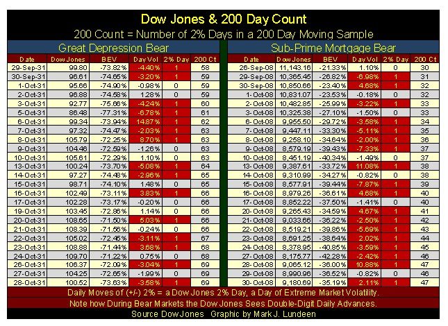
Here’s a table showing twenty-five days during the Great Depression and Sub-Prime Mortgage bear markets, the #1&2 all-time bear markets for the Dow Jones. I highlighted the 2% days (days of extreme volatility) in red. Note the 2% is just my threshold percentage change from day-to-day. Whether a day moves +2% or -10% from a previous day’s closing price, I call it a “2% day”, and into the 200-count it goes for the next 200 trading sessions at the NYSE.
These are big bear markets, but note the number of positive 2% days on the table. Also, note how in bear markets the Dow Jones sees its largest daily advances. On 06 Oct 1931 the Dow Jones saw a single day advance of 14.87%; on 13 & 28 October 2008 it advanced by over 10% in each of these two NYSE trading sessions. Seeing double-digit percentage daily ADVANCES in the Dow Jones is real bear market action!
Compare the daily volatility in the table below with what we are seeing now; a (+/-) 1.5% move in the Dow Jones today is big news and has been for years. But when the stock market is actively deflating, 2% days for the Dow Jones are common.
© Mark Lundeen
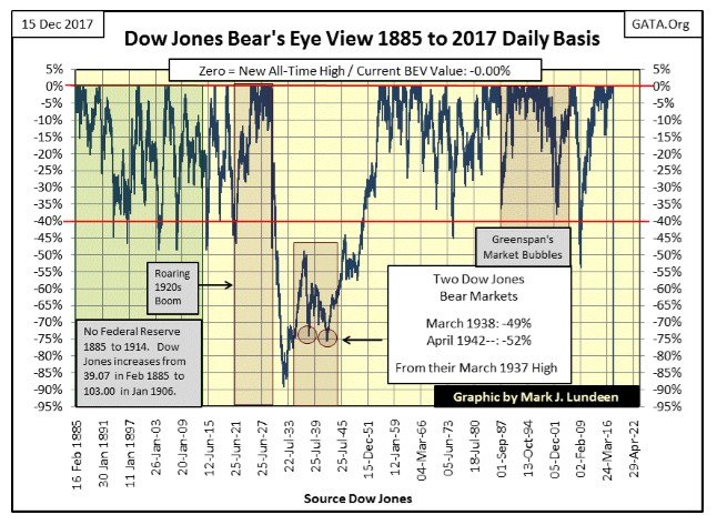
Here’s the Bear’s Eye View (BEV) of the Dow Jones from 1885 to the close of this week. Within the BEV each new all-time high is registered as 0.00%, and never more; in BEV lingo, new all-time highs are called BEV Zeros. In the BEV a price series can only decline down to its -100% line, as a 100% decline is always a total wipeout in valuation. Basically, a BEV plot compresses price data within a 100% range, 0.00% are new all-time highs, -100% for a total wipeout in valuation.
What makes a BEV plot so useful is how it allows a direct comparison between past bear markets, though separated by many decades from each other. In the BEV plot below we can compare the Sub-Prime Mortgage bear market to the massive bear market of the 1890s. The Sub-Prime Mortgage bear market saw a deeper percentage decline (53.78% to 46.64%), but the bear market of the 1890s was more prolonged (325 to 77 weeks).
But in the Dow Jones BEV plot below, no other bear market comes close in either percentage decline or the length of time before recovery to a new all-time high than the Great Depression’s bear market. It has the appearance of a crater in the BEV chart below and within it contains two other Dow Jones 40% bear markets.
© Mark Lundeen
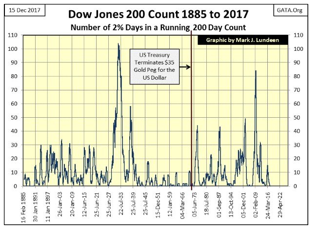
The next chart is the Dow Jones’ 200 count from 1885 to the close of this week. The 200 count is easy to understand; it’s the number of Dow Jones 2% days, days of extreme volatility contained within a running 200-day sample (see the “200 Ct” columns in the table above).
Each Dow Jones 40% declines seen above has a corresponding spike in the Dow Jones’ 200-count below, except for the following two exceptions.
- The 1921 Bear Market
- The 1942 Bear Market
I haven’t a clue why the 1921 bear market has such low volatility, but it’s easy to understand why the April 1942 bear market bottom was free of volatility. After the 89% decline of July 1932 and the 49% decline of March 1938, the public was out of the stock market, and wouldn’t return until the 1970s. Also, April 1942 was four months after Pearl Harbor. Following the trauma of the depressing 1930s, and with the United States at war, in April 1942, most people (foreign and domestic) didn’t know or cared if the Dow Jones saw a big 52% market decline.
As this chart spans back to 1885, we can do a little market archaeology, look over the market’s dried bones and broken pot shards with it.
Up to January 1914, the market operated free from interference from the Federal Reserve. Looking at the Dow Jones’ 200-count, the Federal Reserve left the stock market unmolested until it began inflating a bubble in the stock market in the 1920s.
The great bear market of 1907, of which many books have documented, saw its 200 count increase to only 31. It wasn’t until the Great Depression Crash that the January 1904’s 200-count of 34 was exceeded. The point being, during the bear markets from 1885 to 1921, the Dow Jones’ 200-count never broke above 35. After 1921, bear markets would always take the 200 count above 40. It seems the FOMC’s “monetary policy” has increased market volatility.
© Mark Lundeen
It wasn’t until the 1920s that the Federal Reserve’s “monetary policy” bloomed into full flower. History tells us it was bootlegged liquor and jazz music that made the 1920s Roar. No doubt that was true for the nightlife. But it was the Federal Reserve’s “monetary policy” of ample credit at attractive low rates that made the bulls on Wall Street run wild, and the Dow Jones’ 200 count tally so few 2% days from 1921 to 1927.
The results were predictable. There’s a William Powell movie from 1930, a who-murdered-the-stockbroker-that-liquidated-my-margin-account detective story. The first seven minutes provides an excellent view of the Great Depression Crash by people who lived through it: sell, sell, sell!!!
Above we see how the Roaring 20s was followed by the depressing 30s, then came the Post War years, a period of market history remarkable for its low volatility, that plus the Dow Jones never saw a 40% decline from 1945 to 1972.
I placed a vertical-red line marking August 1971, when the US Government illegally decoupled the US dollar from the Bretton Wood Monetary Accords’ $35 gold peg. Three years later the Dow Jones saw its first 40% bear market since April 1942, as the Dow Jones’ 200-count surged to 43 days of extreme volatility in a 200-day sample.
In the past 132 years of market history seen above, the 1930s saw the most extreme in daily volatility, but that was a single decade. It’s been 46 years since the dollar was decoupled from its $35 gold peg, and the chart above makes clear how the last five decades have also been the stock market’s most turbulent since 1885.
I expect more volatility to come, and don’t rule out the possibility that the coming bear market could ultimately take out the 103 days of extreme volatility in a running 200-day sample seen in 1932 before the dust settles.
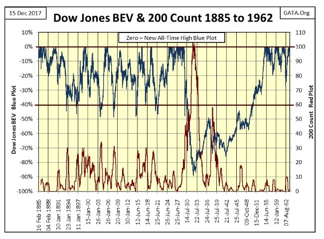
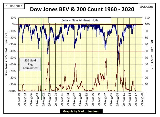
As I’ve mentioned before, I’m not going to make any predictions about the stock market other than its going up, until once again it begins seeing extreme days in the market. I’ve made this decision based on the following two charts plotting the Dow Jones BEV plot (Blue Plot / Left Scale) with its 200-count (Red Plot / Right Scale).
© Mark Lundeen
Note from 1893 to 1938 (above), the Dow Jones frequently saw declines of 40%, while its 200-count never broke above 35. Below, since 1960 the Dow Jones has only twice seen 40% declines, but volatility has increased to where its 200 count easily increases to over 40.
© Mark Lundeen
The Dow’s 200 count is currently at zero, a level that since 1972 is not a long-lasting condition.
Eskay Mining’s CEO, Mac Balkam, sent me a link on British Columbia’s Golden Triangle (BCGT). It’s an excellent video providing the history and recent developments, not on Eskay Mining but in the Golden Triangle in general.
Considering the potential for the discovery of huge precious and base metals ore bodies, and the political stability to be found in Canada, a country very friendly to miners, I think everyone should have some exposure to the mining companies located in British Columbia’s Golden Triangle.
I like Eskay Mining, an early stage grassroots junior exploration speculation. But there are also major miners located in the BCGT that should prove to be excellent investments in the years to come. Take a few minutes and watch the video to see what’s there.
With Christmas less than two weeks away, this is a good time to consider all the blessings God has sent our way. We have our family and friends, and hopefully our health. But our biggest blessing was that on Christmas day two thousand years ago, God sent his son to us, to be born in the little town of Bethlehem. Thank you, Jesus and Happy Birthday!
(Charts are courtesy of Dow Jones, Comex, Goldchartsrus, Barron’s, GATA)
—
DISCLAIMER: This article expresses my own ideas and opinions. Any information I have shared are from sources that I believe to be reliable and accurate. I did not receive any financial compensation in writing this post. I encourage any reader to do their own diligent research first before making any investment decisions.


PayPal’s Slowdown: From Fintech Leader to Low-Growth Dividend Stock
PayPal has shifted from fintech leader to low-growth, value-style stock, losing over 25% in market value and trading at a...

Tilray (TLRY) Falls as Bearish Momentum Persists Despite Marketing Push
Tilray (TLRY) fell 3.32% to $4.44, remaining below key moving averages and signaling continued bearish pressure. Despite a £1 million...


ESG Gap Persists as Firms Struggle to Link Sustainability to Financial Value
KPMG’s Global Survey shows a major gap between ESG awareness and financial integration. While 72% of managers understand sustainability strategies,...


Bitcoin and Ethereum Slide as Market Pressure Builds Amid Strategy Concerns and Layer 2 Disruptions
Bitcoin fell below $60,000 with heavy ETF outflows, pressured by concerns over Strategy’s finances and its STRC stock decline. Ethereum...


AI Venture Builder Launches €600K Crowdfunding Round to Scale Secure AI Solutions
AI Venture Builder, an Italian-British firm developing AI applications and vertical startups, returns to CrowdFundMe with a equity campaign. After...
 |
|
 |  |
 |
|
-

 Impact Investing2 weeks ago
SBTi Net-Zero Standard 2.0 Enhances Corporate Climate Action
-
 Crypto3 days ago
Bitcoin and Ethereum Slide as Market Pressure Builds Amid Strategy Concerns and Layer 2 Disruptions
-

 Business1 week ago
Fed Policy Shift Raises Concerns Over Debt and Inflation Risks
-

 Biotech5 days ago
Galicia Launches €805M Biotechnology Strategy to Drive Innovation and Competitiveness (2026–2030)
You must be logged in to post a comment Login