Business
Using the Bear’s Eye View to Gauge Market Tops and Bottoms
We can compare any period of a data series with any other when using the Bear’s Eye View technique. Let’s now compare the four decades our current bull market has seen (1982 to today), with the previous four decades (1940 to 1982). Feel free to compare these eighty-three years (1940 to 2023) with the 1920s and 1930s BEV charts and frequency tables in this article.

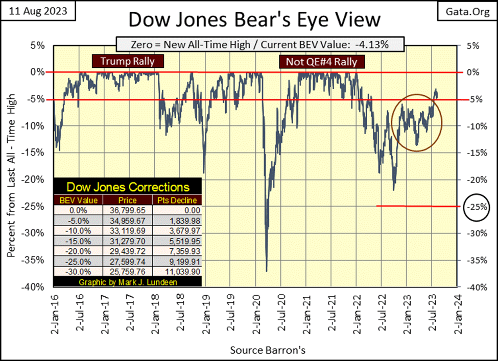
This week the Dow Jones closed in scoring position, just barely. Not much to say about the stock market when the bulls are less than 5% away from making a new all-time high, and don’t seem motivated enough to make that happen.
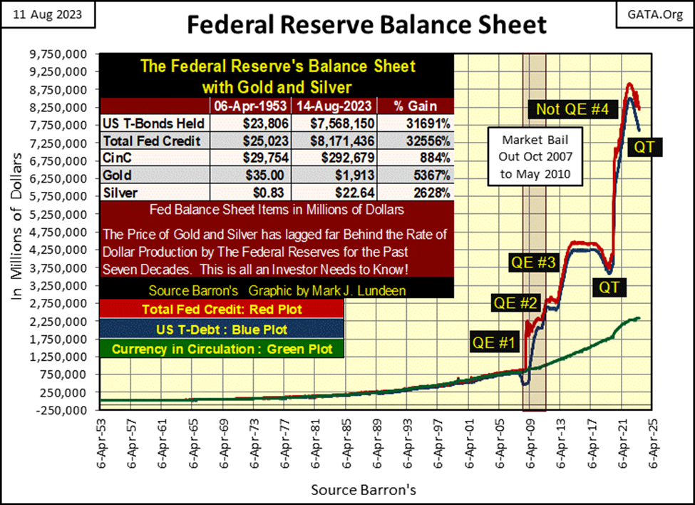
One has to ask; what drives market advances? Money flowing into it from the bulls. The biggest bulls in the stock market are the idiots at the FOMC. Since May 2022, week after week, they’ve pulled money from the stock market with their QT, to reduce the Federal Reserve’s bloated balance sheet, as seen in the chart below.
After four QEs, their balance sheet became obscenely distended as these idiots “stabilized market valuations,” in single-family mortgages, corporate bonds, the stock market, and who knows what else? As a consequence of all this “stabilization,” the Federal Reserve’s balance sheet increased from $750 billion dollars in 2008, to over $8,000 billion dollars in 2022.
In the chart below, the success the idiots have had reducing their balance sheet has been underwhelming, considering its growth since 2008. What has been impressive is the success these idiots have had in not causing the stock and bond markets to crash, after reducing their balance sheet as much as they have.
Instead of asking why the Dow Jones hasn’t seen a new all-time high, the better question would be; why hasn’t the Dow Jones crashed after the FOMC has pulled out of the financial system, as much “liquidity” as they have since May 2022?
Last week I suspected 35,500 would become the new line of resistance for the Dow Jones. This week it appears I got that right, as seen in the daily bar chart for the Dow Jones below. Dow Jones 34,500 was the former line of resistance from April 2022, until a month ago. Since then, this line of resistance has advanced by a thousand points.
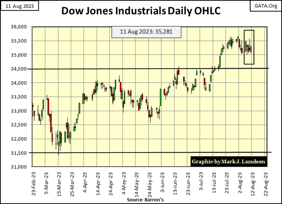
If the Dow Jones is to make a new all-time high anytime soon, it won’t be long before it puts 35,500 far behind it. Then there is another possibility, that the Dow Jones once again deflates below its old 34,500 line of resistance. As a big bear on the stock market, and knowing the FOMC has been pulling “liquidity” from the financial system for the past fifteen months, I’m inclined to believe the second possibility is the more likely, sometime in the not too distance future.
The major market indexes I follow below all saw their BEV values deflate this week, with only four indexes closing the week in scoring position. These indexes’ average (#13) was down for the week by one BEV point at Friday’s close.
All in all, a very uneventful week in the stock market. Then most weeks in the stock market are uneventful. Don’t worry, sometime in the coming twelve months we’ll see plenty of excitement, possibly more than most people will want to see.
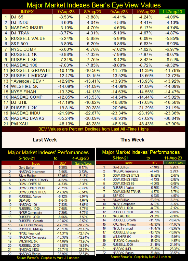
Looking at this week’s performance table above, silver fell from #3 from the week before, to #9 this week. Other than silver, most other items remained close to where they were last week, from where they were on 05 November 2021.
What is so special with the first week of November 2021, that I’d used it as a basis for the market performance tables above? As far as this set of market indexes is concerned, 05 November 2021 was the top of the Not QE#4 Market Rally, from the bottom of the March 2020 flash crash.
Below is the major market index BEV value table from early November 2021. Fifteen of these indexes closed this week at BEV Zeros, four in scoring position, and as expected, the XAU with a BEV of -41.43%. This is what a market top looks like; when market risks are maximum, and the possibility for reward is minimum.
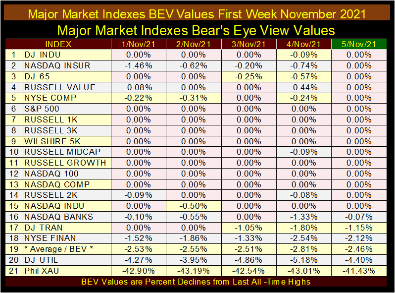
But the major market BEV table for this week (August 2023) looks nothing like the table for November 2021. In August 2023, haven’t market risks been reduced as the potential for reward in risking money in the stock market increased? Yes, it has, but the market is still overvalued, where risks still overwhelm the potential for rewards.
So, how overvalued is today’s stock market? And if so, how is it overvalued? Is the stock market overvalued in dollars? If so, what does that even mean? That isn’t a bad question, in Barron’s 09 November 1981 issue, the US national debt first went over $1 trillion dollars.
Was the $1 trillion dollar US national debt in November 1981 “overvalued”, somehow excessive? The bond market certainly believed it was. Since the late 1950s, bond yields increased from single, to double digits as the US government took on ever more debt. How things have changed; beginning in Barron’s 09 November 1981 issue, bond yields began declining as the US national debt continued rising. Very strange.
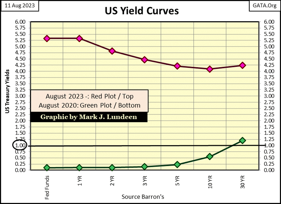
For all Treasury bonds, yields bottomed at historical single digits, and near zero, sub-single digits in August 2020 (Green Plot Below), as the US national debt rose to $26 trillion. T-bond yields have since been going up, with the US national debt. This week the national debt increased to $32.62 trillion dollars, as yields for 30Yr Treasury bonds (Red Plot Below) increased from 1.20% in August 2020 to 4.32% three years later.
Gauging whether something from decade to decade is over, or undervalued in dollar terms is problematical, as the US dollar since August 1971 is no longer defined in terms of gold, or anything else, not even by pigs or even chickens.
The dollar used to be defined, by law, at $35 paper dollars / each ounce of gold held by the US Treasury. Today, the dollar has no legal definition, which to my way of thinking means the dollar by itself, or by the trillions is meaningless. Though, don’t get me wrong, if someone did send me a shoebox stuffed full of $100 bills, I would not return it to the sender, as for now dollars still buy the stuff I want and need.
So, if not in dollar terms, how best then to gauge whether the stock market is overvalued? I’m inclined to look at the frequency a market is making new all-time highs, and how deeply a market has deflated from those all-time highs.
In other words, I prefer using the Bear’s Eye View (BEV) to evaluate whether a market is over or undervalued. An excellent example of that is comparing the Dow Jones during its bull market of the 1920s, to its performance during the bear market of the 1930s.
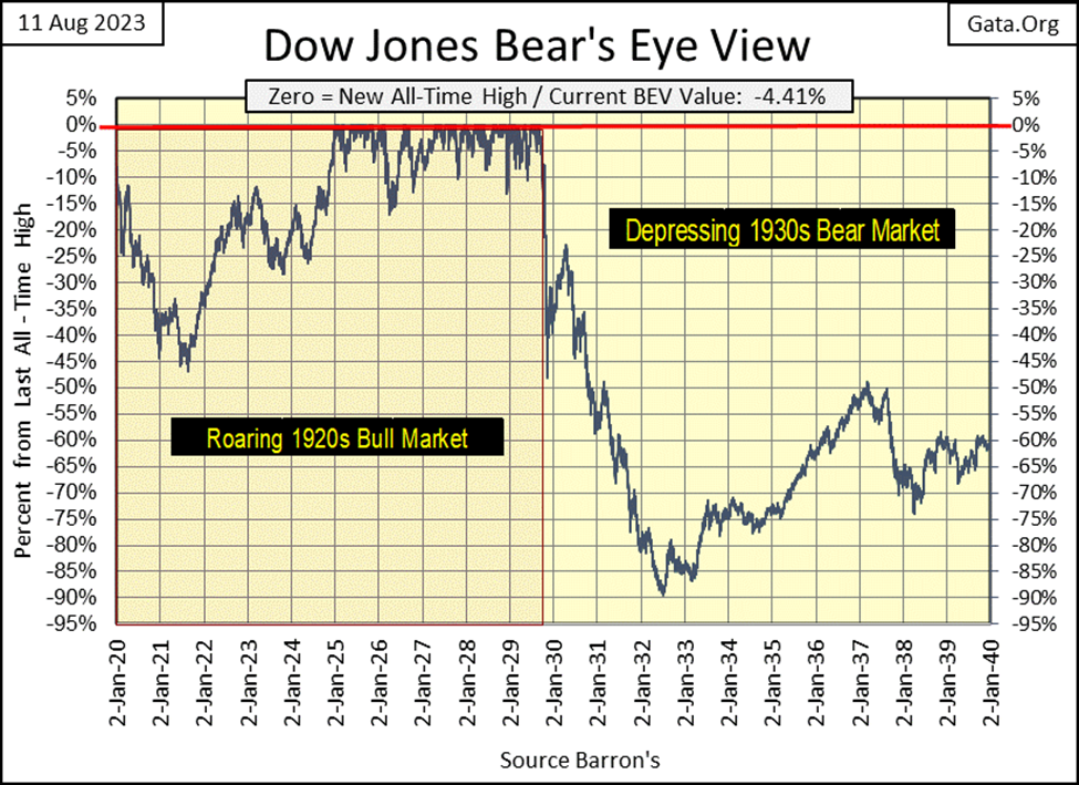
Below is a BEV chart for the Dow Jones from January 1920 to January 1940, which places the 1920s’ Dow Jones bull market top (03 September 1929) right in the middle of the chart. A Bear’s Eye View plot ignores dollar values. Instead, it converts dollar values into percentage terms spanning 100 percentage points;
- 0.0% = New All-Time High
- -100% = Total Wipeout in Valuation
So, the Dow Jones’ new all-time high of 05 February 1900 (68.36), is equivalent to the Dow Jones’ latest new all-time high of 04 January 2022 (36,799.65). In the Bear’s Eye View; both new all-time highs, separated by 122 years, are rated only a BEV Zero (0.0%) in the BEV plot. All BEV values not new all-time highs in a BEV plot, are percentage claw backs from their last All-Time Highs, be that 68.36 in February 1900, or 36,799.65 in January 2022.
On the Roaring 1920s side of the chart, the Dow Jones begins making BEV Zeros (0.0% = New All-Time Highs) in January 1925, and until this bull market’s Terminal Zero (TZ = Last BEV Zero of a Bull Market Advance), saw no bull market correction greater than -18%.
On the Depressing 1930s side of the chart, there are no BEV Zeros, and wouldn’t be until November 1954. We do see lots of valuation deflation, bottoming in July 1932 with a -89% BEV value, an 89% decline from the September 1929 Terminal Zero.
Why the difference between the 1920s and 1930s? During the boomtimes of the 1920s, “liquidity” flowing from the Federal Reserve flooded the NYSE, inflating the valuations in the Dow Jones. During the bust of the 1930s, the “liquidity” from the Federal Reserve flowed out of the stock market.
Most people would be curious what the dollar values would be in this BEV chart. But that is the point of a BEV chart; to remove the dollar values, as dollar values plotted over decades become meaningless. If that was not so, then why aren’t charts using dollar values over the decades used by the financial media? They never post a chart of the Dow Jones, or S&P 500 going back twenty years, for fear of showing the market’s inflated valuations, or so I believe.
The nice thing about a BEV plot, like the one below, is it can be compared directly to any other period in the series, like the BEV plot for the Dow Jones today, which I posted at the top of this article. That is something that can’t be done when plotting the Dow Jones in dollars.
Another nice feature of a BEV plot; one can use a frequency table to see how often the plot above saw a new all-time high (BEV Zero / 0.0%), as seen in the freq table below. From January 1920 to September 1929, the Dow Jones saw 215 daily new all-time highs, which at the time was an astounding amount of new all-time highs, something that never happened before. Something made possible only by the inflation created by the Federal Reserve System during the 1920s.
Daily closings in scoring position were 852, as seen in the -0.0001% row, or 852 daily closings with BEV values spanning from -0.01% to -4.99%. Daily closings in scoring position are important, as during every bull market advance, not every daily closing is a new all-time high. Most daily closings during any advance, in any market are in scoring position, where the market is in position for making a new BEV Zero.
One can tell the strength and duration of a market advance by looking at the two-top rows in the frequency tables below;
- 0.0% = New All-Time Highs
- -0.0001% = Daily Closings in Scoring Position
Looking at the two top rows for the 1920s, it becomes obvious why the 1920s was called the “Roaring 1920s” on Wall Street, where 36.86% of the 2,895 daily closings for the Dow Jones were either New All-Time Highs, or in scoring position.
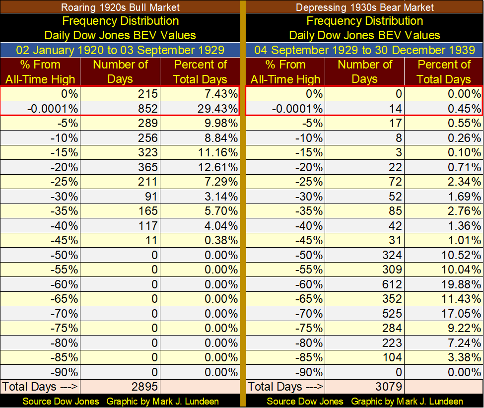
Moving on from the booming 1920s to the bust in the 1930s (right side of the table), during this ten-year period of Dow Jones history, the Dow Jones saw no BEV Zeros, and only 14 daily closings in scoring position. What the Dow Jones did see during its depressing 1930s, was copious daily closings below its BEV -45% line.
The 1930s was so depressing, most people of my parents’ and grandparents’ generations never returned to the stock market. It wasn’t until the Baby-Boomers came of age in the 1970s and 1980s, before investing in the stock market became popular again.
We can compare any period of a data series with any other when using the Bear’s Eye View technique. Let’s now compare the four decades our current bull market has seen (1982 to today), with the previous four decades (1940 to 1982). Feel free to compare these eighty-three years (1940 to 2023) with the 1920s and 1930s BEV charts and frequency tables above.
1982 is an important year in Dow Jones History, as that was when the Dow Jones not only broke above its 1000 level, but left it far behind in a massive four-decade long bull market advance, an advance that so far peaked in January 2022 at 36,799.
Below I have two BEV charts spanning 1940 to today. The top BEV chart begins as the depressing 1930s ends, but uses BEV values based on the September 1929 TZ, from which the Dow Jones saw an 89% market decline, and wouldn’t see a new all-time high until November 1954. That places a huge hole from the late 1930s to the early 1950s, that the bulls must climb out of.
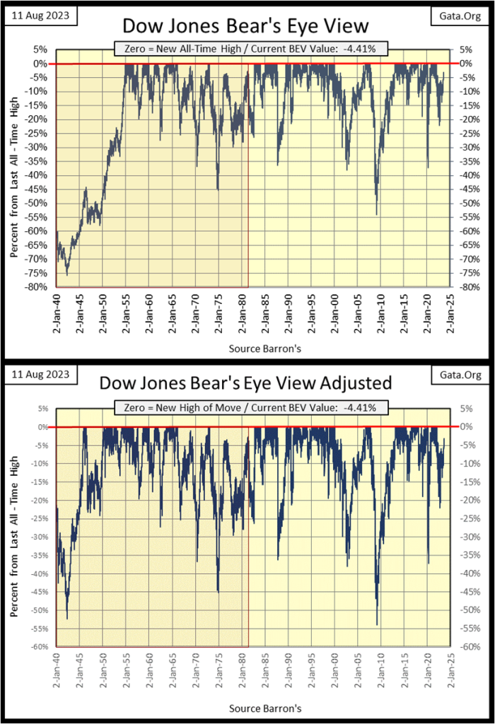
So, what I did in the bottom chart (above) was a little statistical hijinks, something the Department-of-Labor does all the time with its numbers; I “adjusted” the BEV values in the series. It wasn’t hard. I just began a new BEV series at the July 1932, 89% bottom, resetting the Dow Jones’ BEV series from that point on.
It made sense doing this. From July 1932 to March 1937, the Dow Jones advanced by over 300%. That was a wonderful bull market, but one that never cleared the BEV -50% line following the Great Depression’s massive 89% bear market bottom. For the study seen in the frequency tables below, it made sense putting the depressing 1930s out of mind, and that is how I did it.
For the four decades spanning from 1941 to 1981 (left table), the Dow Jones saw 30.69% of its daily closings at BEV Zeros, or in scoring position, one day out of every three. Which in dollar terms took the Dow Jones up from 119.15 on 17 October 1941, to 882.52 on 31 December 1981, a 640% advance in 40 years.
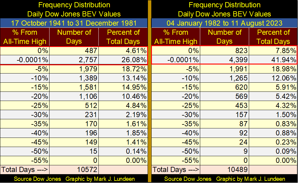
For the four decades spanning 1982 to today (right table), the period of time encompassing the massive Dow Jones’ bull market that began in August 1982, and so far, has peaked in January 2022, 49.79% of its daily closings, close at BEV Zeros, or in scoring position. Or, every other day during the past four decades closed in bull market advance.
In dollar terms, the Dow Jones increased from 882.52 on 04 January 1982, to 36,799.65 on 04 January 2022, a massive advance of 4069.84% during these four decades.
Comparing the two market periods seen in the frequency tables above, whether in BEV or dollar terms, it’s obvious the stock market today is massively overvalued, and due for a historic bust. Whether I’m right or wrong, I expect the next forty years of Dow Jones history will be much less bullish than the past forty years.
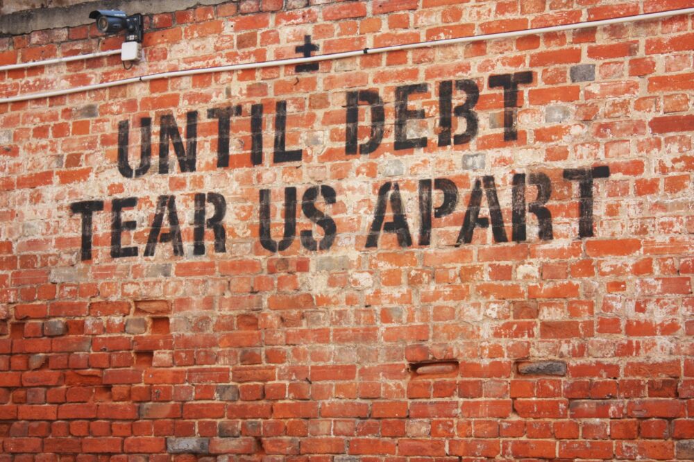
Okay, still why would a bust in the stock market be pending? Because of the simple fact, it isn’t just the stock market that the idiots at the FOMC have been “injecting liquidity” into. “Liquidity” flowing from the Federal Reserve has allowed credit card debt to increase to over $1 trillion dollars.
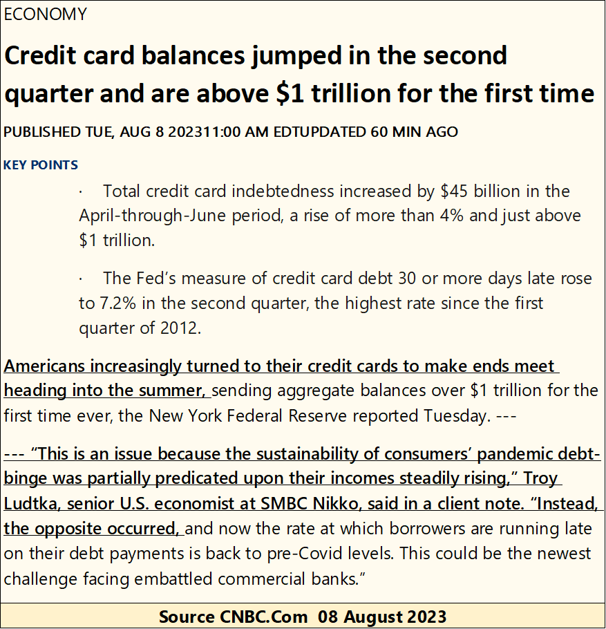
Much of this credit-card debt is taken on by desperate people. People unable to pay their bills with wages, resort to using credit from banks to make ends meet. We’ve seen this before, and it never ends with good results for those assuming debts they can’t service, or the banking system they owe this money to.
Here is a chart for consumer debt from January 1945 to January 2023, the latest data for the series.
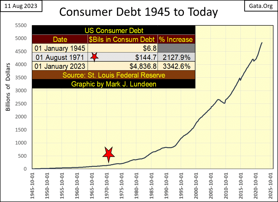
Think of the above data as the working class’s liabilities. But people have assets too; for instance, in the stock market. In the table below, I’ve listed the values for the Dow Jones and consumer debt from the St. Louis Fed for the months of January 1945 and January 2023. Liabilities for “consumers” have not been offset by gains in the stock market; far from it.
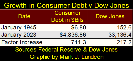
And “consumers” have liabilities other than consumer debt; mortgages, school and auto loans to mention a few. Come the next economic recession, how much of this debt will go unserved by a population that finds itself unemployed? I suspect much of it.
Few market commentators today mention the multi-hundred trillion dollar, over the counter derivatives market anymore. Back in the late 1990s, you couldn’t get “market experts” to shut up about how these derivatives shifted market risks to “those best to bear them.” And exactly who could “best bear these market risks?” We found that out during the 2007-09 sub-prime mortgage crisis; the American Tax Payer!
Rising bond yields and interest rates could create margin calls from this little-known market, of vast sums on a banking system incapable of honoring them. During the sub-prime mortgage crisis, it was this unregulated derivative market that was ground zero for the banking crisis of 2008-09, and the reason Doctor Bernanke, then idiot primate of the FOMC, initiated his QE-1; to bail out Wall Street.
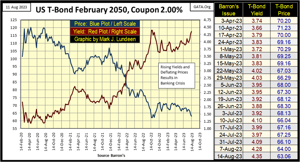
Are bond yields rising? Long-term Treasury bond yields certainly are, as seen in the chart below (Red Plot). This 2020 to 2023 rise in long-term T-bond yields is credited by the financial media for the run on several banks in Silicone Valley.
When last October’s yield highs are exceeded, then what? Another surge in yields and more bank failures? At what level of bond yields do the big Wall Street banks finally get overwhelming margin calls from the OTC derivative market they can’t honor, as happened in 2008-09 during the sub-prime mortgage crisis?
So many questions to be answered, and until they are, I believe it is very dangerous to be bullish on the stock market.
So, what is a retail investor to do? I expect the place to be during the coming crisis, is in precious metal investments; gold and silver bullion, and in precious metal mining.
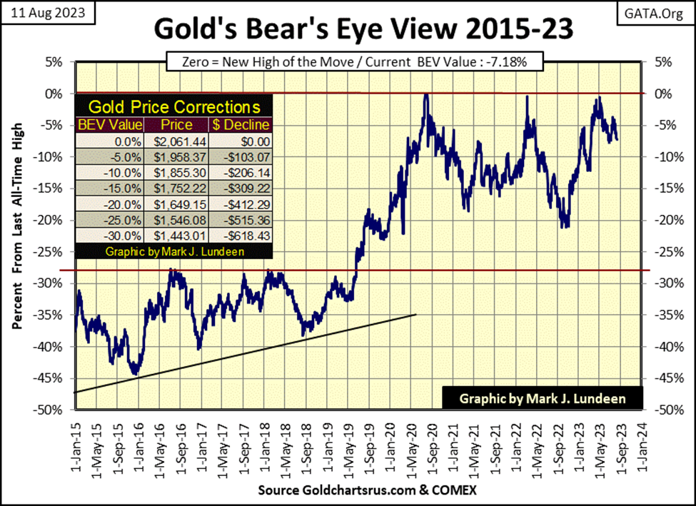
Here is gold’s BEV chart for this week. It could be better, since August 1st gold hasn’t been in scoring position. Then the COMEX goons haven’t been able to push gold down below its BEV -10% line either, and they would love to do exactly that.
Looking at gold in March 2022, where it came just short of making a new BEV Zero, following that the goons pushed it down below its BEV -20% line six months later. Then in May of this year, gold once again came close to making a new BEV Zero. Three months later in August, gold is holding on, keeping a healthy space above its BEV -10% line in the chart below.
In the market, anything can happen. The bears may give the bulls a Christmas present of gold closing with a BEV of -50%. But is that, or even a decline for gold down to its BEV -20% line likely? I think not!
If the goons can’t get gold to close below its BEV -10% line ($1855) in the weeks to come, we gold bulls may once again see gold making several new BEV Zeros by Christmas, taking gold a good measure above its old all-time high of $2,061.
Is that going to happen? I’ll tell my readers all about the good, the bad and the ugly in the gold market come January 2024. Until then, like me, everyone is going to have to sweat it out. But I’m very optimistic that the highs of August 2020 will be taken out, before 2023 comes to its conclusion.
Gold in its step sum table below, has seen lots of selling since July 19th, when its 15-count saw a +7. As a +7 for a 15-count is considered an overbought market, that isn’t surprising.
What is pleasantly surprising; gold has kept above $1900 since July 19th. With another $13 drop in the price of gold, that will change, but will the bulls allow the goons to do that to them? Holding the line at $1900, and the strength of the counter-attack to regain $1900, should the gold bulls see gold fall below it, is what I’m looking for in next week’s trading.
Gold’s daily volatility’s 200D M/A continues dropping, closing the week at 0.69%. This is no reason to panic, but gold-bull markets are volatile markets, markets where gold can, and does move +/- 3% or more from a previous day’s close.
So, when are we going to see big daily moves in the gold market again? Before the T-bond chart I posted above is yielding something over 6%, I expect we’ll see some real action in the gold and silver markets, as flight capital flees Wall Street, into the safety of the old-monetary metals.
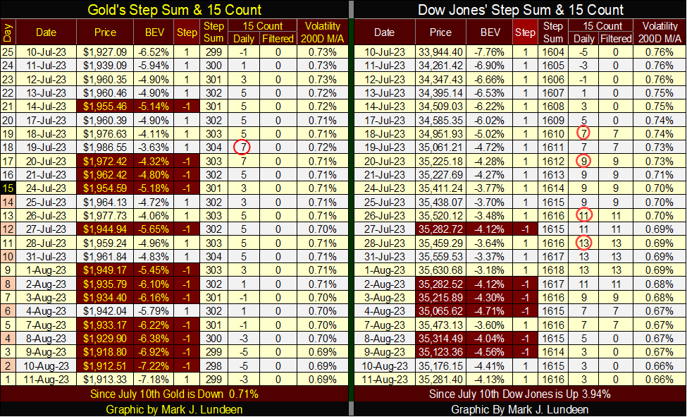
The Dow Jones’ 15-count saw a +13 on July 28th. That is something seen only a handful of times since 1970, making the Dow Jones really, really overbought, making the stock market due for a selloff. So far that hasn’t happened, as seen following gold’s +7, 15-count on July 19th.
So, what is pending on the Dow Jones; a big sell off maybe? Yea, sure. But my primary interest currently isn’t focused on the stock market, but the yield for the 30Yr T-bond. At week’s close, the 30Yr yielded 4.264%. What happens when it closes over 4.500%? And does the world as we know it ceases to exist when the 30Yr T-bond yields over 5.000%? I hope not, but it may.
I don’t remember if it was a leading Astro-Biologist, or a well-respected Ph.D. in the LGBT Studies Program at Yale predict; should the 30Yr T-bond yield something over 8.000%, that would inhibit the sun from fusing hydrogen into helium, preventing the sun from radiating energy to Earth, extinguishing all life in our planet. Do I believe that? If that is what “science” tells us – damn right I believe that, and you should too, or Doctor Fauci will be very mad at you.
I’ll tell you something else I believe; if an 8% yield for a 30Yr T-bond can’t get gold and silver off their asses, and advance on the double-quick deep into market history, then nothing can. An 8% yield for US 30Yr T-bonds? It’s only a matter of time.
—
(Featured image by Thomas Lefebvre via Unsplash)
DISCLAIMER: This article was written by a third party contributor and does not reflect the opinion of Born2Invest, its management, staff or its associates. Please review our disclaimer for more information.
This article may include forward-looking statements. These forward-looking statements generally are identified by the words “believe,” “project,” “estimate,” “become,” “plan,” “will,” and similar expressions. These forward-looking statements involve known and unknown risks as well as uncertainties, including those discussed in the following cautionary statements and elsewhere in this article and on this site. Although the Company may believe that its expectations are based on reasonable assumptions, the actual results that the Company may achieve may differ materially from any forward-looking statements, which reflect the opinions of the management of the Company only as of the date hereof. Additionally, please make sure to read these important disclosures.


Switzerland’s Medical Cannabis Reform Advances Access, But Barriers Remain
Switzerland’s 2022 medical cannabis reform improved patient access by removing federal approval requirements, but challenges remain. MEDCAN highlights barriers including...


Swisscanto Launches Catastrophe Bond Fund for Portfolio Diversification
Swisscanto launches a Luxembourg UCITS catastrophe bond fund, giving qualified investors access to insurance-linked securities tied to extreme natural events....


AI Agents Transform Payments as Visa, Mastercard, and Qonto Tackle Trust, Liability, and Regulation
Visa and Mastercard are advancing AI-driven autonomous payments, shifting focus to trust, liability, and regulation when agents act without real-time...

Bitcoin ETFs Lead as German Stock Exchange Debuts Mining ETF
Bitcoin and Ethereum remain largely flat, with BTC near 66,600 and ETH around 1,920, while ETFs see steady inflows. A...


Ali G Makes Surprise Wimbledon Appearance with Cannabis-Themed Satire
Sacha Baron Cohen revived his iconic Ali G character at Wimbledon’s men’s final, blending satire with British high society. Dressed...
 |
|
 |  |
 |
|
-

 Biotech1 week ago
Emily.AI: Personalized Oxygen Therapy Earns Global AI Recognition
-

 Fintech2 weeks ago
Revolut Updates Crypto Rules for Deposits and System Errors
-
 Business3 days ago
The $40 Trillion Trap: Disinflation Is Not Deliverance
-

 Cannabis2 weeks ago
Germany Tightens Cannabis Reimbursement Rules: Approved Medicines Must Come First