Featured
Bonds: The graveyard of private wealth
Because of the relentless monetary inflation funneled into the economy and financial system by the Federal Reserve, fixed income (bonds) stopped being a safe harbor for capital during bear markets at the NYSE.
Last week, the Dow Jones closed just 0.03% from its last all-time high (BEV Zero) of just eight trading days ago (September 20th). Well, when a market refuses to go down, there is only one way for it to go—up. This I believe this market will continue to do until it begins seeing a return of extreme days of volatility—days where the Dow Jones sees multiple daily moves (+ or -) of 2% or more and NYSE days of extreme market breadth.
Not surprisingly, we haven’t seen many of those for quite a while now. The last Dow Jones 2% day occurred on 06 September 2016, which is over a year ago (-2.13%). And the last NYSE 70% day occurred on August 10th of this year (-71.89%), but the one before that happened ten months earlier on 11 October 2016 (-71.98%).
The absence of these extreme market events are a hallmark of a good market advance, and since last November’s election, the Dow Jones has closed at a new all-time high for 59 of its 225 daily closes (26%), advancing 22.2% as it did so.
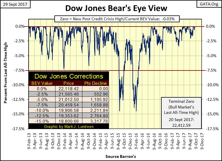
© Mark Lundeen
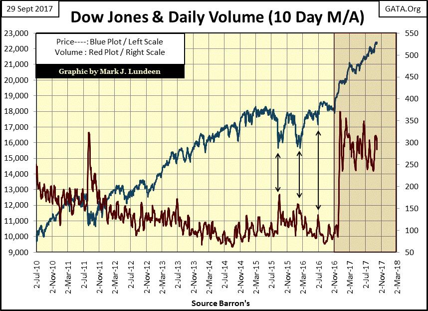
Dow Jones and daily volume (10 Day M/A)
Looking at the Dow Jones (Blue Plot below) with its daily trading volume (Red Plot), we see the November 2016 surge in trading volume at the beginning of the post-election advance. It’s what one would expect—rising prices resulting from a rising demand for what’s being sold at the NYSE.
But what’s odd about this is that since January 2000, up to last November (seventeen years), the Dow Jones declined on rising trading volume, and advanced as trading volume declined.
In a total reversal of the law of supply and demand, the Dow Jones bottomed during the 2000-02 high-tech and the 2007-2009 credit crisis bear markets on historic high trading volume. Nothing like that happened during the bear markets of the 20th century!
However, as we see below that’s all over now. Or is it?
Yes, since November 8th of last year, Dow Jones’ trading volume has expanded greatly. But its peaks are declining peaks. None have exceeded its December 20th peak of last year, for all the gains the Dow Jones has seen since then, and that strikes me as odd.
© Mark Lundeen
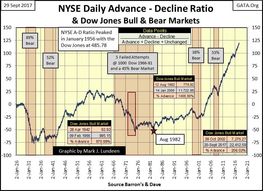
NYSE Daily Advance-Decline Ratio
What also strikes me as odd is the action in the NYSE A-D Ratio below. This plot is not for an Advance-Decline Line. There were fewer than 800 issues trading on the NYSE in 1926, with many of them not traded on a daily basis.
Today the NYSE sees over 3000 issues trading on a daily basis. Using NYSE breadth data as a straight A-D line would grossly overweight the data in favor of the past few decades.
To normalize this data I use an A-D Ratio:
Daily Advancing – Declining issues
————————————————-
Total issues traded for the day
Using a ratio gives each daily-data point, regardless of how many issues traded, equal weight to all others since 1926.
I’ve identified the bull and bear markets in the chart, and it’s worth your time to study this chart in detail. If you do, you’ll see the oddity of seeing the most extreme advance in the NYSE A-D Ratio of the past century occurring after the bottom of the high-tech bear market. It just takes off, with the credit-crisis bear market being just a speed bump in the most incredible advance since 1926.
© Mark Lundeen
Look at the Dow Jones bull markets (the three tables) in conjunction with the A-D ratio above. The NYSE A-D Ratio has exploded since October 2002, yet with advancing shares dominating the decliners at the NYSE for the past fifteen years, the Dow Jones has advanced by only 208%.
What’s up with that? I expect Mr Bear is providing the “policy makers” at the FOMC with a remedial course on the Law of Diminishing Returns.

© Mark Lundeen
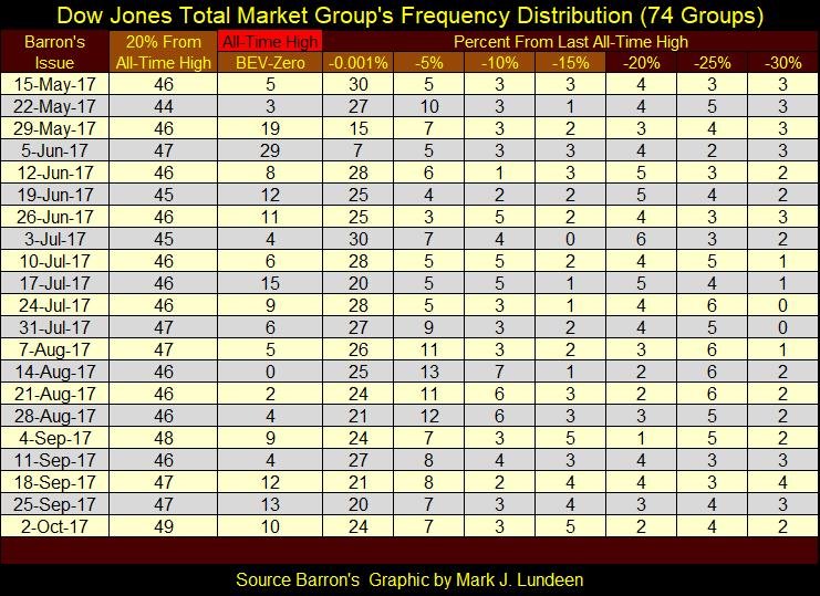
The Dow Jones Total Market Group’s (DJTMG) top 20 is almost breaking above 50 (table below). Of the 74 groups I follow in the DJTMG, currently, 49 of them closed the week within 20% of their last all-time high. Will it break above 50 in the weeks to come? It could, but that won’t change my mind that the best of what the post-March 2009 advance had to offer investors is now best seen in the market’s rearview mirror.
© Mark Lundeen
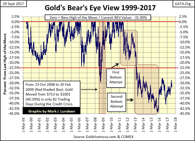
Gold’s bear’s eye view 1999-2017
Here’s gold’s BEV chart for the current bull market, and I say the gold-bull market in spite of the horrible, 45% market correction gold has seen since August 2011. At the end of the week, gold closed 31.90% from its last all-time high of August 2011, and now we wait to see what happens next.
© Mark Lundeen
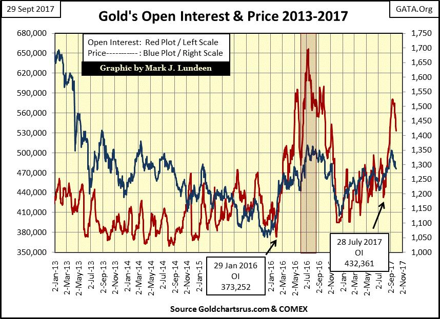
The key to the short-term future for the price of gold is most likely to be found in its open interest (OI); the number of open contracts trading at the COMEX. Currently, OI in the gold market is contracting, and the price of gold is holding up under this selling pressure pretty good. Let’s hope that unlike last year’s market decline, gold will continue to do so as COMEX OI continues declining, or better yet begin an advance that takes out its highs of 2016 as OI continues declining.
© Mark Lundeen
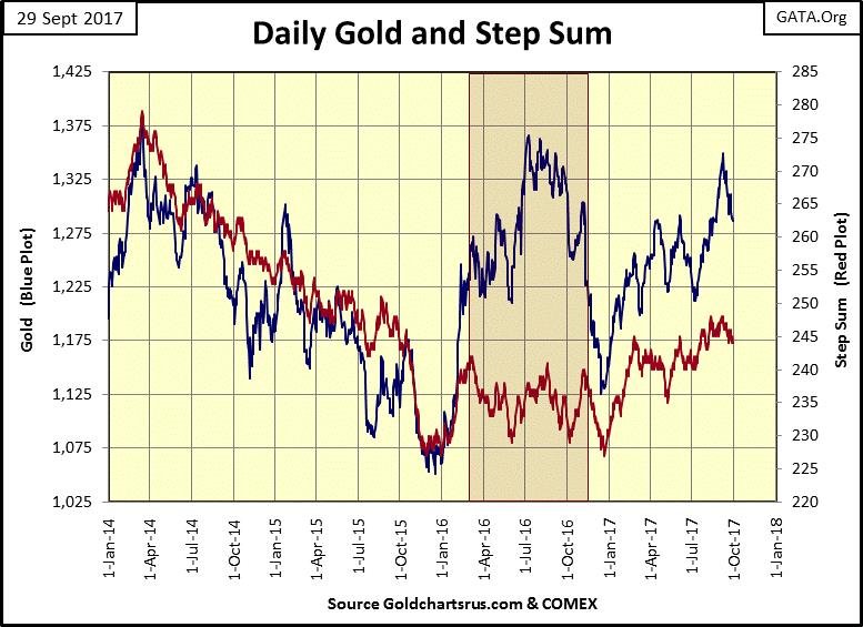
Daily gold and step sum
Nothing new with gold and its step sum below. I’d like to see gold stay above $1275, but I believe gold’s $1250 level is key. What if gold should break below $1250? I’d say buy more of it.
What other choice do you have? Both the stock and bond markets are at multi-decade highs. After such extended multi-decade advances, their risk to reward ratios lean heavily towards the risk side of the equation. While for gold, silver, and their miners, it’s the exact opposite. At times like this, patience is a virtue.
© Mark Lundeen
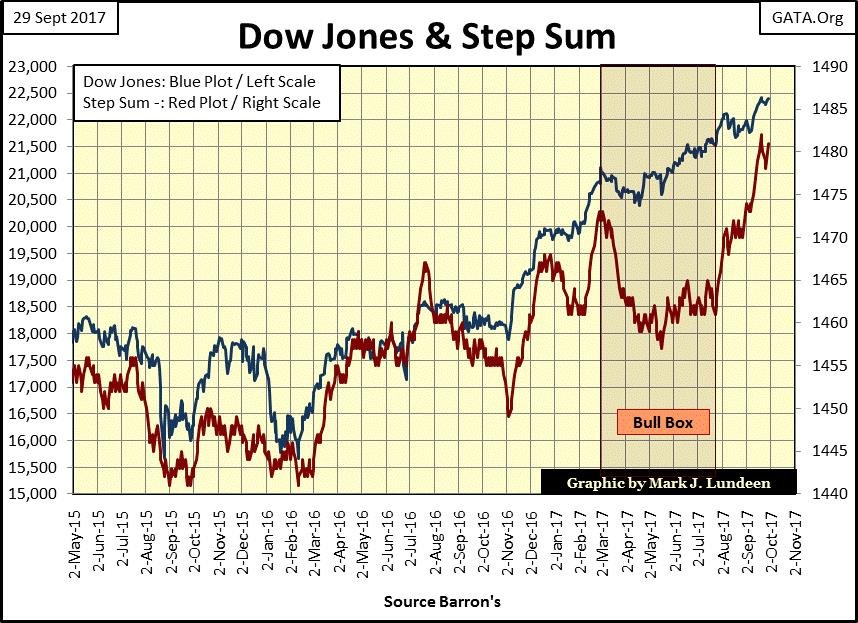
Dow Jones and step sum
Here’s the Dow Jones’ step sum chart. Coming out of its bull box in late July, the Dow Jones’ step sum has advanced by almost 20 net up days. That’s a lot of net up days, but in the past two months, the Dow Jones’ itself benefitted little from it. This is a tired and aging market advance, but I don’t see any reason to expect a big market decline anytime soon.
But until Mr. Bear does return to the NYSE, I expect the action in the old monetary metals will continue being uninspiring bullish. You know, slogging upward in fits and starts as their detractors and supporters have less than favorable comments on their performance.
But consider this, as noted above; since the October 2002 bottom of the high-tech bear market, the Dow Jones has advanced by 208%. “Market experts” and everyone else is happy about that. But during this same time gold, despite being near the bottom of a 45% market correction, has advanced by 306%, and silver near the bottom of a 72% market correction has still advanced by 293% since October 2002, yet little good is said about them. Well, I think that’s a mistake!
© Mark Lundeen
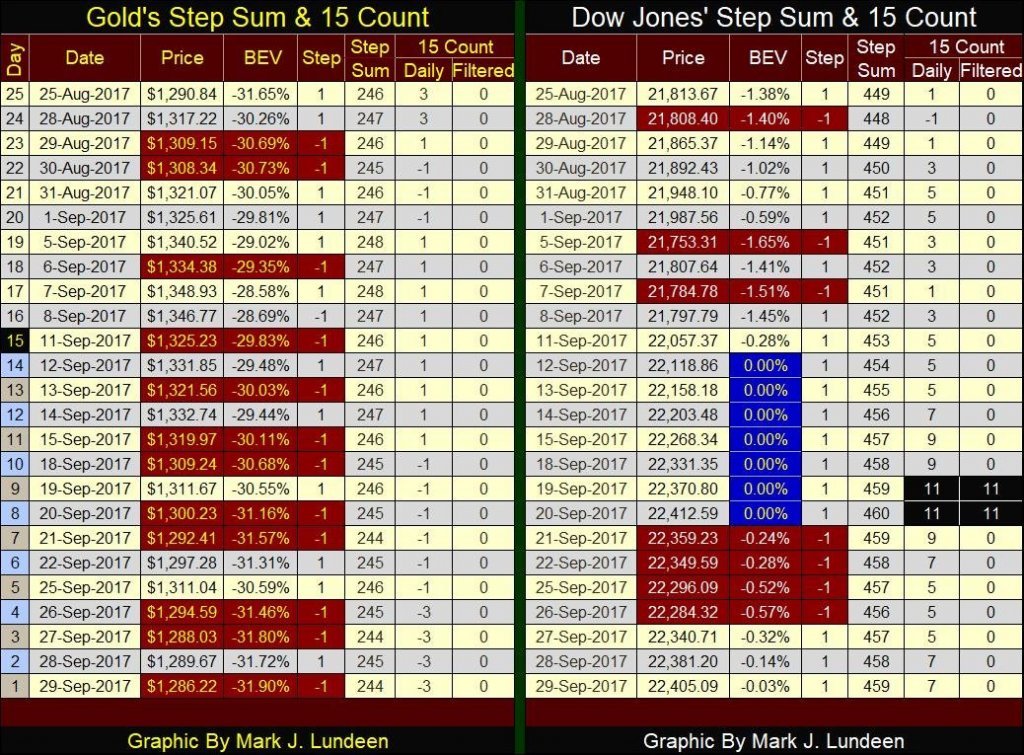
Moving on to gold and the Dow Jones’ step sum and 15 count table below we get a different perspective of what is happening in the step-sum charts above. Look at all the down day in the gold market. Its step sum is down by two days since August 25th and we see its 15 count closing the week at a -3. That’s a lot of pressure on the longs in the gold market. Will the bulls tough it out and hold firm, or will they break and head for the tall grass as they did in late summer/autumn 2016?
As a buy it and hold it type of investor in gold and silver, I really don’t have a horse in this race, but you know I’m cheering for the bulls in the COMEX market.
© Mark Lundeen
On the Dow Jones side of the table, we see advancing days overwhelming decliners and a nice string of BEV Zeros. Its step sum is up by a net of ten advancing days since August 25th, and its 15 count closing the week at +7, very impressive. True, there is that block of down days in late September, but at the end of this week the Dow Jones closed only 7.5 points (0.03%) below its last all-time high of September 20th, so who really cares about that?
Reading my tea leaves for the coming weeks, I see gold continuing correcting, hopefully holding above its $1250 level. And the Dow Jones, my proxy for the stock market, will continue advancing to new all-time highs.
I moan and groan a lot about “monetary policy”, but what am I talking about? To be perfectly clear, I really resent the “policy makers” for their serial monetary sin of issuing more paper money than they have gold to back it. It’s for that reason that I favor Currency in Circulation (CinC / Paper Money) over the Consumer or Producer Price Index (CPI or PPI) as my gauge for monetary inflation. The over-issuance of digital or paper dollars is the cause, while the price inflation somewhere in the economy is the effect.
CPI & PPI is calculated by the US Department of Labor and supposedly measures inflation by the price increases in consumer or producer prices. But the Department of Labor is more interested in pleasing their political masters than producing an accurate inflation metric for the benefit of the general public.
However, even if the Department of Labor was sincere in measuring price increases in consumer and producer prices, it purposely ignores the fact that monetary inflation flowing from the Federal Reserve has many paths to flow. These paths aren’t considered by the Labor Department as consumer or producer prices. Paths that lead the flow-of-funds into the financial markets:
- Stocks
- Bonds
- Real estate
The increases in prices Keynesian economists always confound to any who listen as “economic growth.” In fact, today’s rising Dow Jones is a more accurate, if still far from a perfect index of inflation that is the CPI, than a metric of “economic growth” so frequently cited by “market experts.”
I’ve gone through every issue of Barron’s since early May of 1921 when for $0.20 people could have purchased its first issue. The first four years of its publication were lean as far as data goes, providing key interest rates such as the Prime Rate, the Fed’s Discount Rate, and the most closely followed interest rate of the Roaring 1920s: the Brokers Call Rate.
In January 1925 Barron’s began publishing weekly US gold reserve data in dollars, with the US dollar-priced at $20.67/ounce of US gold. In February 1931 they began publishing weekly CinC data. To fill in the six-year gap below I used the annual CinC data provided by Milton Freedman and Anna Schwartz’s “Monetary History of the United States.”
The 1920s was a decade of monetary inflation. However, as seen below it wasn’t a decade of paper money inflation, but one in the expansion of bank credit from the newly created Federal Reserve. It was in the 1920s when the Singer Sewing Machine Company coined the slogan: “buy now, pay later”, a term, and practice very familiar with consumers today, all made possible then as now by the Federal Reserve’s control over the credit system.
As seen below, from 1925 to 1931 the US money supply had more dollars in gold coins in circulation (Red Plot) than paper money (Blue Plot) as was the practice in a functioning gold standard.
It was in the autumn of 1931 (Two Years into the Great Depression) when President Hoover / Federal Reserve began inflating CinC to the point where a run on the US gold reserves developed (Red Box). Paper money inflation motivated people to hold their gold coins, instead of spending them or depositing them in the bank for fear of paper money losing its value. By inflating CinC, the US “policymakers” of the 1930s hoped they would stem the deflation running rampant in the economy, but history shows they were wrong.
The imbalance in dollars gold and dollars paper continued until President Roosevelt devalued the US dollar to $35 from $20.67 / one ounce of US gold in 1934 (Green Box). With this devaluation, Roosevelt also made ownership of gold illegal for US citizens, an unconstitutional action, which to this day the Supreme Court refuses to rule on.
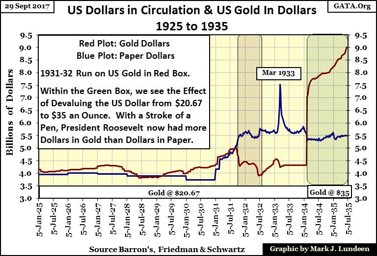
© Mark Lundeen
The effect of allowing the “policy makers” to have their way with the US dollar is painfully evident in the chart below. Where during the 1920s there were only about four billion paper dollars in CinC; the college professors dictating “monetary policy” have increased CinC (Blue Plot) to almost 1,600 billion in the past century, backed by Treasury gold reserves (Red Plot) that today are only 11 billion dollars.
Why does this matter? The monetary inflation seen below has had a huge effect on the cost of living, as well as on the financial markets in the past century. In the insert of the chart below the second run on the US gold reserves can be seen; beginning in 1958 that was only stopped when President Nixon “closed the gold window” in 1971.
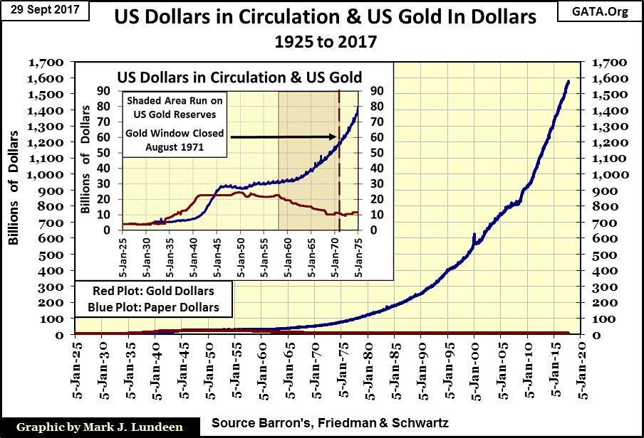
© Mark Lundeen
The impact on the financial market began by this second run on the US gold continues today.
In any entry-level course in economics, professors inform their students that markets price risk; the higher risk any particular asset has, the market will demand a higher rate of return to compensate investors for the risks they assume. Economic classes also assumed that the stock market has higher risks than does the bond market, which since 1958 is no longer true.
The chart below plots the yields for the Dow Jones (Blue Plot) and Barron’s Best Grade Bonds (Red Plot) from 1934 to present. An interesting fact successful investors long ago (and today) recognized is that at market extremes the market misprices risks.
Before 1958 (Left Box) it was possible to use the yields seen below to time the stock market. For example, blue-chip companies have both stocks and bonds trading in the financial markets. Prudent investors refused to purchase a company’s stocks unless their dividend yields were above 6%.
Before 1958, it just happened when the Dow Jones’ dividend yield was above 6%, you could be sure the stock market was not only in a bear market, but the bear market was close to its bottom. For whatever risk was left for holding a company’s shares, with its dividend yield far above that for a blue-chip company’s bonds, investors long ago were well compensated for the risks of holding the shares of say General Electric or AT&T.
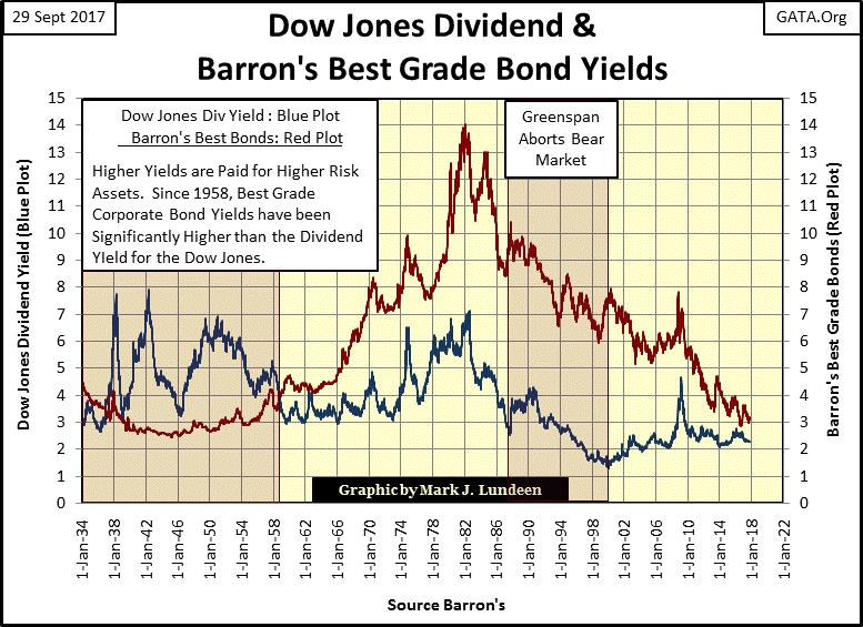
© Mark Lundeen
When the Dividend yield for the Dow Jones approached that of a blue-chip corporation bond, say 3%, investors knew the stock market was near a bull market top. A 3% yield didn’t compensate owners of a company’s shares for the risks of holding stocks at the top of a bull market, so they’d sell their stocks and purchase the blue-chip company’s bonds, which they would hold until the coming bear market drove stock dividend back up and over 6%.
All that changed beginning with the 1958 run on the US gold reserves. Because of the relentless monetary inflation funneled into the economy and financial system by the Federal Reserve, fixed income (bonds) stopped being a safe harbor for capital during bear markets at the NYSE, instead, bonds became a graveyard for private wealth.
Beginning with the 1958 run on the US gold reserves, Barron’s Best Grade Bond yields went from 4% to over 14% over the next twenty-three years, disrupting the interplay between stocks and bonds investors once had with bull and bear markets. Also, after Alan Greenspan became Fed Chairman in August 1987, a 3% yield in the Dow Jones no longer signaled the beginning of a bear market in stocks, as since 1987 “monetary policy” had outlawed deflation in financial assets.
Here’s a chart for prices (Blue & Green Plots) and yields (Red Plot) of the discontinued Dow Jones 10 Utility Bond Average from 1938 to 2002. Something to keep in mind with this data is that over time all bond indexes are adjusted for constant maturity. In other words, as bonds mature they are replaced with a newer bond of different coupon yields, and that does impact the prices; the actual losses sustained by bondholders were likely worse than those seen below.
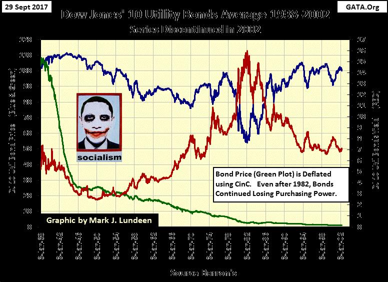
© Mark Lundeen
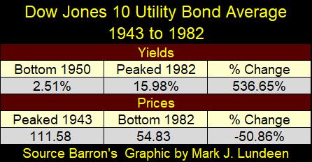
The table below lists the specifics on the 1943-1982 bond bear market (Blue Plot above). Keep in mind this data was adjusted for constant maturity. Had this been one bond in a market that saw its current yield increase from 2.51% to 15.98% during these four decades, assuming the bond never matured, its losses in price would have been greatly more than the 50.86% the Dow Jones 10Util Bond Average saw.
© Mark Lundeen
The impact monetary inflation flowing from the Federal Reserve has had on private wealth can be seen in the table below. Comparing the Dow Jones, and CinC with the DJ 10Util Bond Average data above, the Dow and CinC increased over 8000% from 1938 to 2002, while the DJ 10Util Bond Average lost 1.45% in nominal dollar terms.
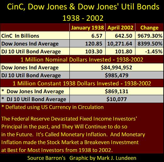
© Mark Lundeen
But what a dollar purchased in 2002 was but a small fraction of what it did in 1938. Deflating the prices of the Dow Jones and the DJ 10Util Bond Average with CinC, we see that even though a million dollars invested in the Dow Jones in 1938 became $84.99 million dollars in 2002, in 1938 dollar terms the Dow Jones still lost 13.09% from inflation.
Real returns for the DJ 10Bond Average were horrific! In 1938 dollar terms, a million dollars invested in utility bonds in 1938 became worth only $10,077 in 2002, a loss of 98.99% in purchasing power.
Next is the chart for Barron’s Intermediate Grade Bond yields from 1926 to 2017. These are lesser grade bonds than Barron’s Best Grade, but investment grade bonds nonetheless.
Today, with these bonds yielding almost a full percentage point more than best grade bonds, they’re very attractive to individuals and money managers seeking income.
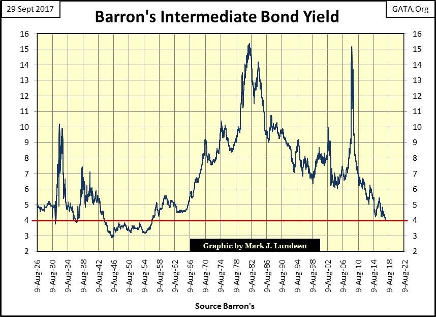
© Mark Lundeen
But as noted earlier, at market extremes (bull market tops and bear market bottoms) financial assets are typically mispriced for the risks they pose to investors. That was certainly true for these bonds during the Great Depression when their yields jumped from just under 4% in 1930 to over 10% in 1932, a greater than 50% reduction in their value.
These bonds saw another bear market from 1935 to 1938. During the 2007-09 credit crisis, their yields surged up to over 15%, delivering losses to their owners as great as the Dow Jones’ 54% credit-crisis decline – money invested in the bond market isn’t supposed to do that.
Today, the bond market is at the tail end of a bull market that began in the early 1980s, and the current yield for lesser quality, investment grade corporate debt, as seen above, is grotesquely mispriced at a 4% yield.
A day of woe is pending for current holders of government and corporate debt when the market finally reprices these assets to reality.
I take no joy in saying it, but when the decades of inflated values in the bond and stock market begin to deflate, and capital flees for its life from these grossly overpriced financial assets, it will be to the great benefit of gold, silver, and the precious-metals mining shares.
If I have to wait for however long to benefit from this mass exodus of capital from Wall Street to the old monetary metals, then I’ll wait. And damn what the “market experts” have to say about gold and silver next week, next month, or next year.
—
DISCLAIMER: This article expresses my own ideas and opinions. Any information I have shared are from sources that I believe to be reliable and accurate. I did not receive any financial compensation in writing this post. I encourage any reader to do their own diligent research first before making any investment decisions.


Temotiva Launches Crowdfunding Campaign to Advance Preventive Mental Health
Temotiva Innovación Lab has launched a crowdfunding campaign through Santander X Explorer, marking a new phase for the University of...


Fed Policy Shift Raises Concerns Over Debt and Inflation Risks
The Federal Reserve is criticized for resuming balance sheet expansion through Treasury purchases despite expectations of tighter policy under new...


AI Adoption in Italian Retail Stalls Despite Strong Experimentation
A survey on AI in Italian large-scale retail trade shows companies are increasingly adopting artificial intelligence, but only 1.4% have...


Crypto Market Stays Stable as Bitcoin and Ethereum See Mild Declines
The crypto market remained stable despite slight declines in major coins like Bitcoin and Ethereum. Bitcoin held near $64,362, while...


WNBA Removes Cannabis From Banned Substances List in New CBA
WNBA removed cannabis from its banned substances list in a new CBA running 2026–2032, aligning with NBA policy and allowing...
 |
|
 |  |
 |
|
-

 Crypto2 weeks ago
Bitcoin and Ethereum Stabilize as Markets Watch ETF Flows and Institutional Moves
-
 Business2 days ago
Fed Policy Shift Raises Concerns Over Debt and Inflation Risks
-

 Fintech1 week ago
The German Fintech Market Shows Resilience and Strong Investment Growth in 2026
-

 Crypto4 days ago
Bitcoin and Ethereum Markets Steady as Strategy and Bitmine Expand Holdings Amid World Cup Crypto Activity
You must be logged in to post a comment Login