Featured
China’s petro-yuan causes stock market to dip; Bitcoin’s price soars higher
The Bureau of Labor Statistics’ recent employment report indicated that there was an increase in nonfarm payrolls last April.
For the past two centuries or so, the world has been dominated by two empires—the British empire and the American empire. Some refer to it as the Anglo-American empire because the two have had significant historical, ethnic, linguistic, and cultural ties. Throughout it, their currencies—the pound sterling and the U.S. dollar—have been the dominant currencies, acting as the world’s reserve currencies.thuo
It is no surprise the dominant superpower is also the main currency. It has been that way since ancient times. But increasingly, in a multipolar world, their power is coming under question and pressure.
First, a little history. The first currency that was circulated widely outside its borders was probably the Athenian silver drachma. It dates from at least the 5th century B.C.E. From about the 1st century B.C.E. to the 4th century B.C.E., the world was dominated by Rome. The currency was the Roman denarius followed later by the Roman gold solidus. As the Roman empire fell into decline, the Roman gold solidus gave way to the Byzantine empire’s heavy gold solidus.
That currency lasted for the most part until about the 11th century. Then, starting in the 7th century, the Arab gold dinar emerged as the dominant currency as the Arab caliphate controlled the Mediterranean and beyond from the Atlantic Ocean to the borders of India and China.
As both the Byzantine and Arab empires fell into decline by the 15th century because of high financing needs of their empires, no currency emerged as dominant. The Florentine florin became widely used in commercial transactions in the 13th century, particularly through the Mediterranean world. By the 15th century, the Venetian gold ducat supplanted the Florentine florin.
As the world moved into the 17th century, the Netherlands’ Dutch guilder became the leading currency because of the said country’s rise as a major financial and commercial power. Paper money also started to come into circulation even though it was not backed by anything. During this period, the Spanish real also played a key role, particularly through the vast reach of the Spanish empire and dominance in what was later known as Latin America.
Both the guilder and the real began to fade into the 18th century, and following the Seven Years’ War (1756–1763), the British pound sterling emerged as the global currency. This lasted until the First World War (1914–1918) when the costs of the empire and the debilitating costs of the war started the decline of the pound sterling. At the end of the Second World War (1939-1945), Bretton Woods established the U.S. dollar as the world’s reserve currency so that other currencies fixed their currency to the U.S. dollar. Bretton Woods set the U.S. dollar convertible to gold at a price of $35 per ounce.
But Bretton Woods started to break down during the 1960s. In August 1971, Richard Nixon, the U.S. president at the time, shut the gold window, and the U.S. dollar’s convertibility into gold ended, setting in motion the current period of fiat currencies and floating exchange rates.
As history has shown, empires rise and fall, as well as the currencies of the dominant empire. Given that the U.S. dollar has been the dominant reserve currency for over 70 years, most people cannot perceive a world without it.
While all other previously prevalent currencies no longer exist, the British pound sterling is still around. It is currently the oldest surviving currency, dating from Anglo-Saxon England during the reign of King Offa of Mercia (757–796).
The era of the U.S. dollar not tied to anything may eventually be called the era of debt. Since the world came off the gold standard in 1971, debt has exploded. We’re witnessing the greatest level of debt ever recorded ($237 trillion at last count). There is an old saying from Norm Franz in his 2002 book called “Money and Wealth in the New Millennium,” and it goes like: “Gold is the currency of kings, silver is the money of gentlemen, barter is the money of peasants, but debt is the money of slaves.”
Today, we are slaves to a debt that will never be repaid. We may think of debt as normal, but it is anything but. And the debt build-up is aided by governments more than willing to create more currency. It is fiat currency—backed by nothing and with no inherent value except what the government tells you it is worth.
And now, the U.S. dollar’s dominance is being challenged against the backdrop of the U.S. being the most indebted nation in the world ($70.1 trillion and counting, almost 30% of all the debt outstanding in the world). The challenge to U.S. dollar supremacy, which has the potential to be globally destabilizing, is coming primarily from China. China has launched the Petro-yuan to challenge the influence of what is known as the Petro-dollar.
The purpose is to shift oil trading out of U.S. dollars and into the Chinese Yuan, giving China greater clout in global trade. China is also challenging U.S. global hegemony by launching a China-backed version of the IMF and the World Bank. They are even building an alternative global payments system to challenge the U.S-controlled SWIFT system.
Then, there is the building of Ancient Silk Road, a trade route overland from China to Europe. Only today, it would be railways. China is spending upwards of $1 trillion to build the road that will involve over 60 countries and 65% of the world’s population and transport at least one-quarter of the world’s goods. The dominant currency would be the Chinese Yuan. All countries along the way would benefit from increased trade.
All of this presents a major challenge to the U.S. and to the U.S. dollar as the world’s reserve currency. If there is a fly in the ointment, it is that there is an enormous amount of debt outside the U.S. denominated in dollars. That means debt has to be paid back in U.S. dollars. A rising dollar is potentially destabilizing to that debt because it means the debtor has to use more of its local currency to purchase U.S. dollars to service and pay back the debt.
There are those who have tried to wean themselves off of the U.S. dollar by demanding payment for their trade, and in particular oil, in a currency other than U.S. dollars. In 2000, Iraq, a major oil producer, announced that it was going to dump the U.S. dollar in favor of Euros for oil payments. After September 11, 2001, Iraq was suddenly on the hit list for invasion even though it had nothing to do with 9/11, but there were suspicions that it might have weapons of mass destruction.
Libya gave notice that it was going to set up an African-based currency zone whereby the Arab gold dinar would be the currency. Libya was lining up its neighbors to join the currency zone and was bombing their citizens—the U.S. and NATO have a right to protect. Libyan leader Muammar Gaddafi was overthrown by rebels backed by NATO in 2011.
Syria also dropped the U.S. dollar in 2006, although as an oil producer, the said country was small. It, too, faced a rebellion and is accused of gassing and bombing its citizens. But Syria asked Russia and Iran for assistance. Now, it is difficult to invade them and overthrow Assad without risking a clash with Russia, a nuclear superpower.
Now, it is Iran that is being demonized daily with calls for regime change given that it also has announced that it will no longer be conducting trade, particularly oil, in U.S. dollars. They are doing this with China’s support. Pakistan as well has announced that trade with China will no longer be conducted in U.S. dollars. Apparently, the U.S has placed Pakistan on a watch list for violations of religious freedom.
While the U.S. dollar is being challenged, one should keep in mind that debt, wars, and global overreach are the real culprits. This was the bane of all empires: Greek, Roman, Arab, Byzantine, Spanish, and British. No, the U.S dollar is not about to be dethroned as the world’s currency.
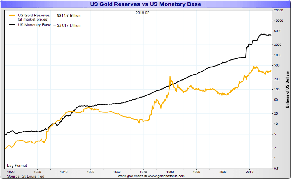
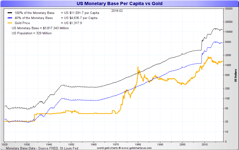
Curiously, the U.S. also holds the world’s largest horde of gold reserves—8,133 metric tons. A revaluation of gold prices to around $11,500 per ounce would allow its gold reserves to cover the monetary base. It would put the world back on a gold standard, and it would be a de-facto devaluation of the U.S. dollar.
There are precedents for a revaluation of gold. In 1934, at the height of the Great Depression, the Gold Reserve Act allowed for the confiscation of gold and gold certificates to be surrendered at the then-prevailing price of $20.67 an ounce. The gold was then stored at Fort Knox and revalued upwards to $35 an ounce. Foreign investors exported their gold to the U.S., devaluing the U.S. dollar and sparking inflation. This, in turn, increased the U.S. money supply, lowered real interest rates, and sparked economic activity. This also allowed for a large accumulation of gold in Fort Knox.
Could similar action today accomplish the same thing? Confiscation, however, would not go over well, and many in the U.S. have accumulated their gold outside of the country. The charts below show the U.S. monetary base per capita vs. gold based on covering 100% of the monetary base and 40% of the monetary base.
Interestingly, the revaluation of gold and moving the world back to a gold standard is a concept that has been discussed by American monetary authorities in order to pull the world out of its current debt malaise. There is also considerable resistance to such a plan, particularly by the global banking community and even central banks. Both Russia and China have been increasing their gold reserves to back their currencies. While they have seen their reserves grow, they remain far behind the U.S. in terms of gold reserves per capita.
© David Chapman
© David Chapman
Wars, debt, and global overreach are familiar themes played out over the years. They always try to say that this time is different. The only thing different is the nature of the wars, the massive size of the debt, and global overreach. The U.S. dollar and the U.S.’s global hegemony are under pressure. One can only hope that the results are different than 100 years ago when another empire saw its global hegemony and global currency being challenged.
It’s the debt!
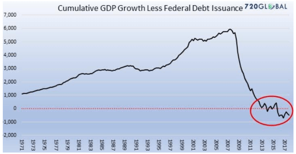
We thought it’s interesting to repost this chart that we saw originally at Jim Sinclair’s MineSet. The chart takes GDP growth by year and subtracts the U.S.’s federal debt issuance by year. The chart is cumulative. If in a year GDP grows by $500 billion while debt issuance grows by $250 billion, then the net gain is $250 billion. Obviously, it is the opposite if debt grows faster than GDP.
© David Chapman
So what this chart says is from 1971 to 2008, the GDP grew at a faster rate than debt. But since 2008 onward, it is the opposite. It is so contradictory that in a space of 10 years, cumulative growth has fallen from $6,000 billion to negative. No surprise—we note that the total U.S. federal debt is now at some $21,170 billion vs. GDP of $20,017 billion. Cumulative deficit is now in excess of $1 trillion. Since Trump assumed the presidency on Jan. 20, 2017, U.S. debt has grown by $1,124 billion.
Another way of interpreting this is that from 1971 to 2008, new debt was creating additional GDP. Since then, it has been the opposite. This phenomenon has played out in all the major industrial countries since the financial crisis of 2008. They saved the system, but now, they have blown their credit limits. No wonder all major industrial countries have passed bail-in legislation.
In 2008, they bailed out the financial system, saving it from certain collapse to be followed most likely by another Great Depression. With bail-ins, the next financial crisis will find depositors and lenders turned into equity holders—equity that, most likely, will be largely worthless.
It is also interesting that Holter started this chart in 1971. That was the year the world came off the gold standard. With money now having no value except what governments say it is worth, debt has exploded. In 1971, U.S. federal debt outstanding stood at $398 billion, and the debt/GDP ratio was 34%. Now, it stands at $21,170 billion, and the debt/GDP ratio is 106%. Keep in mind that this focuses only on the growth of federal debt. In 1980, all U.S. debt (federal, state, corporate, consumers) totaled $4.4 trillion, and the debt/GDP ratio was 177%. Today, all U.S. debt totals $70.1 trillion, and the debt/GDP ratio is 350%. All major industrial countries have experienced the same. The highest is found in the United Kingdom and Japan, where total debt/GDP exceeds 600%. The world on average exceeds 300%.
No wonder Bill Holter has called it “debt saturation.” He says it is “plain and simple”—the world is awash in debt. Yet we proceed as if it is not a problem. With global debt now totaling $237 trillion, some of it might just be worthless.
U.S. employment report
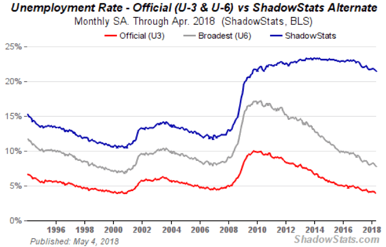
The Bureau of Labor Statistics (BLS) released its monthly employment report on Friday. The BLS reported that nonfarm payrolls rose 163,000 in April 2018 against an expectation of 193,000 but an improvement over the March 2018 nonfarm payroll of 135,000. Still, it was the second successive below-expectations report. The unemployment rate (U3) fell to 3.9% from 4.1%, the first time that U3 was below 4% since 2000.
The BLS’s broad measurement of unemployment (U6), which is the U3 unemployment plus short-term discouraged workers and other marginally attached workers as well as workers forced to work part-time fell to 7.8% from 8%. The Shadow Stats number (U6 plus long-term discouraged workers and workers defined out of existence in 1994) fell to 21.5% from 21.7%. Wages have grown by 2.6% in the past year. Surprisingly, employers are complaining it is difficult to find qualified workers as the labor market has tightened. At 2.6%, that is barely above the rate of inflation.
© David Chapman
Given the drop in unemployment (U3), it was not surprising to find the labor force participation rate fell to 62.8% from 62.9%. Interestingly, it is the older prime-age workers, those aged 45 to 54, who are leaving the workforce as their participation rate fell to 80.2% from 80.7%. In all, it was reported the labor force actually shrunk by 236,000. From that perspective, the drop in unemployment makes sense. It is not because more are employed but because fewer are in the labor force. Those numbers tend to show up in long-term discouraged workers. Back in 2000, the labor force participation rate was at its peak high of 67.3%. The 45–54 prime-age workers labor force participation rate was over 83%.
To further put this into perspective, the civilian employment-population ratio fell to 60.3% from 60.4% in April. Again, this reflects the fact that more have dropped out of the labor force. In March, the labor force totaled 161,763 and fell to 161,527 in April.
Those deemed to be not in the labor force rose to 95,745,000 in April vs. 95,335,000 in March, a gain of 410,000. Yet somehow, 163,000 found jobs in April. Furthermore, only 79.2% of Americans ages 25–54 were working in April. In 2000 that ratio was 81.4%. It means some 2.3 million of prime working age are somehow not in the labor force. They can’t all be students.
Naturally, the authorities will all hail the number. The reality seems to be a much cloudier picture.
Bitcoin watch!
© David Chapman
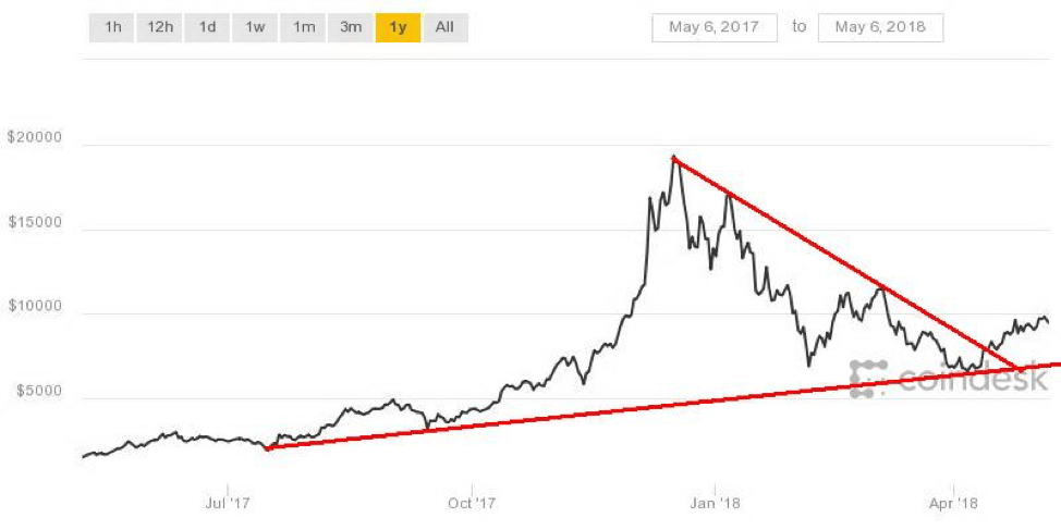
Is Bitcoin headed off to a new stratosphere? It has now climbed to over $9,000 and appears to be on its way to $10,000. A bounce-back is in its step, and it is being talked about again in a more positive light. The crypto bulls are quickly predicting that it will soon surpass $10,000.
Goldman Sachs has announced it is going to begin trading Bitcoin-related contracts on behalf of clients using the firm’s own money. Goldman said clients had been asking about holding Bitcoin as an alternative asset. It has even hired traders and numerous computer experts to help with its endeavor.
Oddly, there are even skeptics at Goldman, and they are also well aware of the risks inherent in entering this market. The timing is interesting as it was back in December when the CBOE trading of futures got underway. Futures opens up all sorts of possibilities in the crypto world. But it also introduces the ability to do arbitrage and other derivative games that can narrow spreads. Futures can also be sold short, something that can’t be done with cryptos themselves.
This past week, the market cap of cryptos went past $460 billion for the first time since early March. It was a gain of over 15% on the week. Bitcoin was up 8.5% on the week. New cryptos keep popping up as the number of cryptos listed at Coin Market Cap leaped to 1,613 from 1,574 the previous week. So far, our thoughts that the crypto world would retreat are also in retreat. It is, in a sense, unbelievable. Many of them haven’t even got a circulating supply so far.
Over 500 have a market cap of under $1,000,000, 278 are showing no market cap, 29 have a market cap in excess of $1 billion, and only five have a market cap of over $10 billion. Bitcoin leads the pack with a market cap of about $165 billion, which is still down roughly 50% from its all-time high.
Cryptos still have issues: regulatory concerns, security issues, lack of understanding, still a small market, price manipulation due to thin trading, pump-and-dump ICO schemes, a not so necessarily transparent pricing, transaction delays, and cybercriminals. It remains a market that is caveat emptor.
There should be considerable resistance for Bitcoin at $10,000 and up to $11,000. Right now, it is running into resistance between $9,500 and $10,000 and has failed thus far to penetrate above $10,000. It is not to say it won’t. But from here on in, it could be a struggle as there are so many issues outstanding.
Markets and Trends
| % Gains (Losses) Trends | ||||||||
| Close
Dec 31/17 |
Close
May 4/18 |
Week | YTD | Daily (Short Term) | Weekly (Intermediate) | Monthly (Long Term) | ||
| Stock Market Indices | ||||||||
| S&P 500 | 2,673.63 | 2,663.42 | (0.2)% | (0.4)% | down (weak) | neutral | up (topping) | |
| Dow Jones Industrials | 24,719.22 | 24,262.51 | (0.2)% | (1.9)% | down (weak) | neutral | up (topping) | |
| Dow Jones Transports | 10,612.29 | 10,370.23 | (1.7)% | (2.3)% | down | up (weak) | up (topping) | |
| NASDAQ | 6,903.39 | 7,209.62 | 1.3% | 4.4% | neutral | up | up (topping) | |
| S&P/TSX Composite | 16,209.13 | 15,729.40 | 0.4% | (3.0)% | up | neutral | up | |
| S&P/TSX Venture (CDNX) | 850.72 | 772.24 | (1.5)% | (9.2)% | down | down | up (weak) | |
| Russell 2000 | 1,535.51 | 1,565.60 | 0.6% | 2.0% | neutral | up | up (topping) | |
| MSCI World Index | 2,046.47 | 2,019.01 | (0.5)% | (1.3)% | neutral | neutral | up | |
| NYSE Bitcoin Index | 14,492.18 | 9,593.07 | 3.9% | (33.8)% | up | neutral | up (weak) | |
| Gold Mining Stock Indices | ||||||||
| Gold Bugs Index (HUI) | 192.31 | 181.39 | (0.4)% | (5.7)% | up | down | neutral | |
| TSX Gold Index (TGD) | 195.71 | 191.55 | (0.2)% | (2.1)% | up | down (weak) | neutral | |
| Fixed Income Yields/Spreads | ||||||||
| U.S. 10-Year Treasury yield | 2.40 | 2.95 | (0.3)% | 22.9% | ||||
| Cdn. 10-Year Bond yield | 2.04 | 2.33 | (1.7)% | 14.2% | ||||
| Recession Watch Spreads | ||||||||
| U.S. 2-year 10-year Treasury spread | 0.51 | 0.44 | (6.4)% | (13.7)% | ||||
| Cdn 2-year 10-year CGB spread | 0.36 | 0.42 | (4.6)% | 16.7% | ||||
| Currencies | ||||||||
| US$ Index | 91.99 | 92.60 | 1.4% | 0.7% | up | down (weak) | down | |
| Canadian $ | 0.7990 | 0.7790 | 0.1% | (2.5)% | down (weak) | down | neutral | |
| Euro | 120.03 | 119.56 | (1.4)% | (0.4)% | down | neutral | up | |
| British Pound | 135.04 | 135.36 | (1.8)% | 0.2% | down | neutral | neutral | |
| Japanese Yen | 88.76 | 91.65 | flat | 3.3% | down | up (weak) | up | |
| Precious Metals | ||||||||
| Gold | 1,309.30 | 1,314.70 | (0.2)% | 0.4% | down | neutral | up | |
| Silver | 17.15 | 16.52 | 0.2% | (3.7)% | neutral | down | neutral | |
| Platinum | 938.30 | 910.30 | (0.7)% | (3.0)% | down | down | down | |
| Base Metals | ||||||||
| Palladium | 1,061.00 | 957.25 | (0.6)% | (9.8)% | down (weak) | down (weak) | neutral | |
| Copper | 3.30 | 3.09 | (0.6)% | (6.4)% | neutral | neutral | up | |
| Energy | ||||||||
| WTI Oil | 60.42 | 69.72 (new highs*) | 2.2% | 15.4% | up | up | up | |
| Natural Gas | 2.95 | 2.71 | (4.6)% | (8.1)% | neutral | down | neutral | |
© David Chapman
*New highs/lows refer to new 52-week highs/lows.
© David Chapman
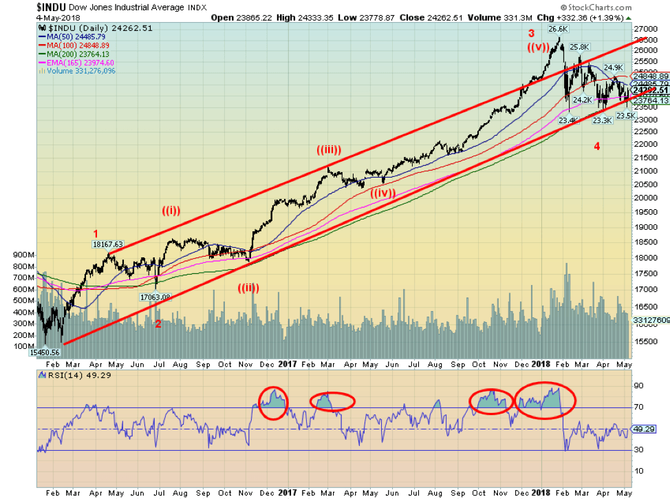
The stock market, as represented here by the Dow Jones Industrials (DJI), rallied on Friday when the market learned that Berkshire Hathaway (BKR.A-NYSE) (Warren Buffett) had purchased 75 million shares of Apple (AAPL-NASDAQ) since January. The news of Berkshire’s purchase largely coincided with AAPL’s quarterly numbers that beat the street. It was accompanied by the news of a massive buyback of shares of AAPL. It was biggest ever share repurchase of any U.S. company.
The Berkshire move was a surprise as Buffett had been quite tech-averse, “never invest[ing] in anything that he [I] didn’t understand.” But Berkshire does like companies that have a lot of cash. Not surprisingly, AAPL leaped to new all-time highs, closing the week at $183.83.
Despite all the excitement over AAPL, the markets still ended the week down thanks to weakness in the early part of the week on the usual fears of late—trade, interest rates, etc. But Thursday brought a sharp reversal in the market, and Friday followed through to the upside. Once again, the 200-day MA acted as pretty solid support. This is the third test of that zone since the stock started its collapse in February, hitting the level on Feb. 9, April 2, and May 3. Each time, the market rebounded. Some might even say there was a helping hand, and it couldn’t be the so-called “Plunge Protection Team (PPT).”
Our wave count says we have completed three major waves to the upside since the significant low of February 2016. This count does differ from Elliott Wave International in that it has the DJI completing five waves to the upside with the January high. Elliott wave can be quite interpretative. We have been encouraged by the DJI (and the other U.S. exchanges) continuing to hold their 200-day MA. The DJI would signal a break above the downtrend line from the January high over 24,480. Over 24,850, the DJI could be signaling a potential move towards the January highs.
It is noteworthy this past week that the Dow Jones Transportations (DJT) were weaker, losing 1.7% on the week vs. 0.2% for the DJI. To date, there has been no divergence between the two indices. Like DJI, the DJT has also held its 200-day MA. Ideally, we would love to see one of them make new all-time highs while the other does not before both turn down. This could give us a Dow Theory sell signal, something that as we note has been absent to date.
© David Chapman
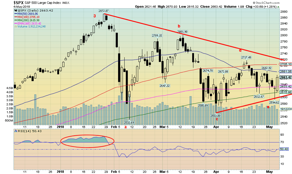
Here is that alternate wave count applied to the S&P 500. The action since the January high is playing out as a symmetrical triangle of the type abcde. Given our third test of the 200-day MA, it is possible we have completed the e wave and we are priming for a rally. The key break-out level for the S&P 500 appears to be at 2,720. The Fibonacci retracement levels from the January high are seen at 38.2% – 2,662, 50% – 2,700, 61.8% – 2,742, and 76.4% – 2,792. Above 2,792, odds increase that the market should make new all-time highs.
© David Chapman
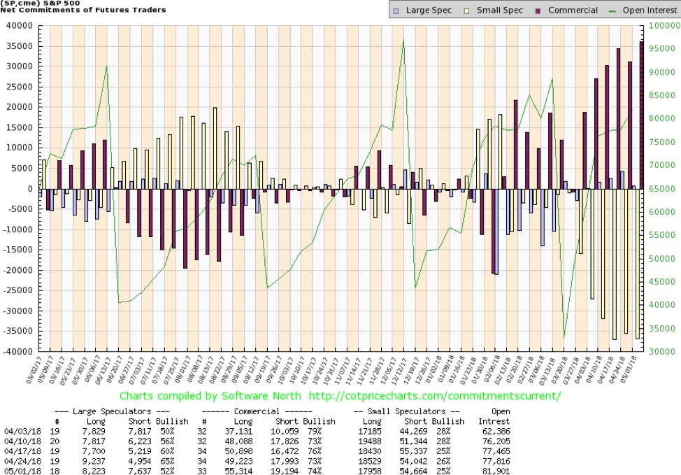
The commercial COT for the S&P 500 remains bullish. It improved slightly this past week to 74% from 73% the previous week. The large speculators COT (hedge funds, managed futures, etc.) fell sharply to 52% from 65%. Commercials increased their long open interest over 6,000 contracts vs. a gain of roughly 1,200 contracts on short open interest. This is as bullish as the commercial COT has been for the past several weeks and seems to hint at higher prices ahead.
© David Chapman
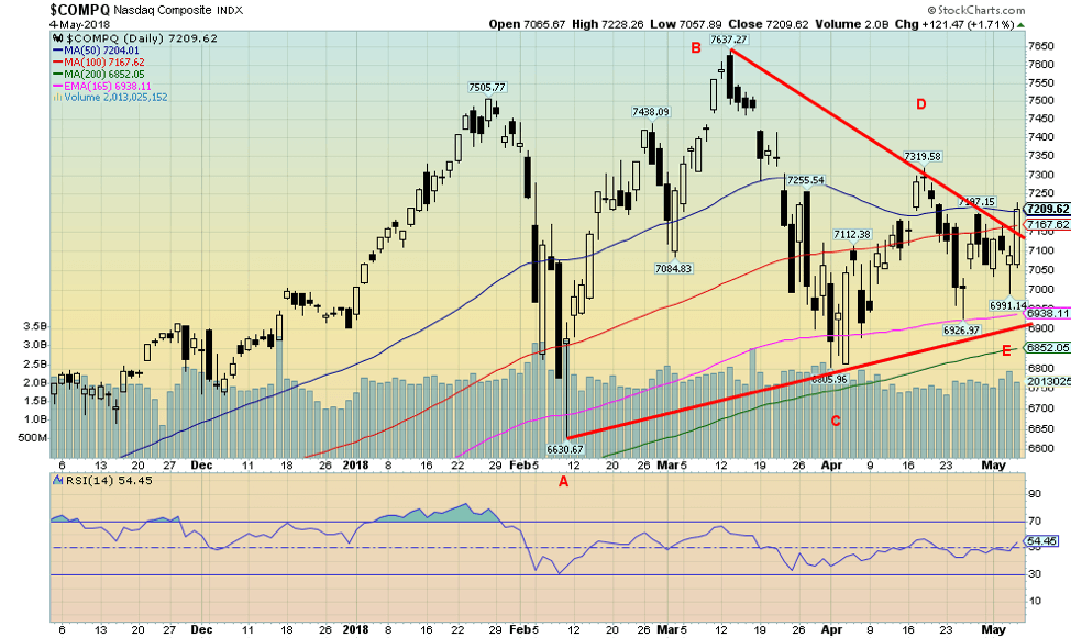
The NASDAQ appears to have broken its downtrend line from the January 2018 all-time high. This is a potentially positive development. Naturally, follow-through is important as the NASDAQ is attempting to break out over its 50-day MA. In the last thrust to the downside, the NASDAQ did not test the 200-day MA as was seen with the DJI, the DJT, and the S&P 500. A positive divergence? Nonetheless, we’d like to see the NASDAQ over 7,400 to give us confidence that new highs are possible.
© David Chapman
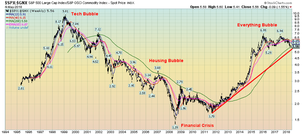
Above is a chart of the ratio of the S&P 500 and the S&P GSCI Commodity Index. This chart appears to be on the cusp of potentially breaking down, suggesting that commodities should outperform the S&P 500 going forward. Note how the ratio topped back in 1999, coinciding with the tech bubble and bottomed in 2008, which also coincided with the financial crisis. Now, it is possible it has made another top, and it is trying to break the uptrend line and the 4-year MA. Something to consider moving forward.
© David Chapman
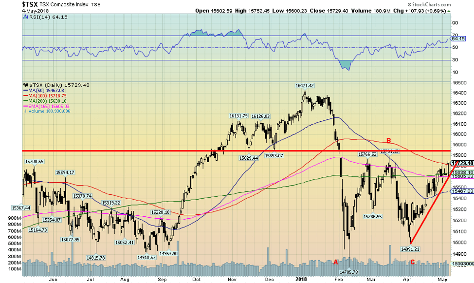
The S&P TSX Composite also enjoyed an up week this past week gaining 0.4%. This is another index that appears poised to move higher as it tests the 100-day MA. The TSX overall was considerably weaker than the U.S. exchanges, but given its bent towards commodities, it may well outperform going forward and the TSX’s commodity-based stocks all appear poised to move higher. That would fit with the previous chart—the S&P 500 and S&P GSCI Commodity Index ratio. A number of material and energy stocks are appearing bullish.
© David Chapman
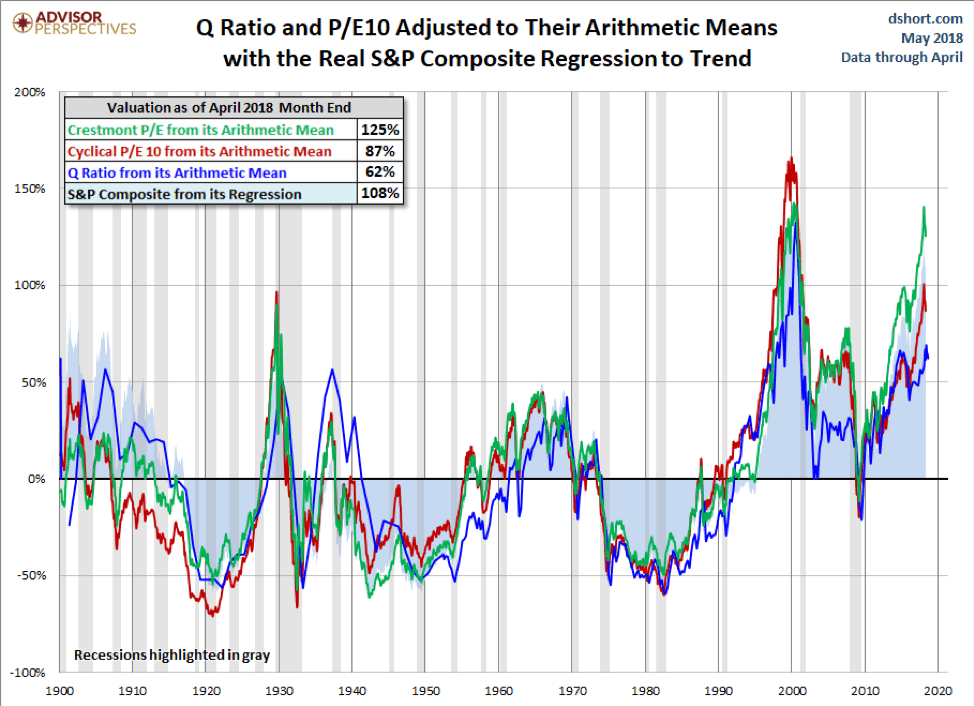
Advisor Perspectives updates four valuation indicators monthly. They are:
- the Crestmont Research PE ratio
- the cyclical PE ratio using the trailing 10-year earnings as the divisor
- the Q ratio, which is the total price of the market divided by its replacement cost
- the relationship of the S&P Composite to a regression trendline
What the chart is showing is that all four valuation indicators are quite high on an historical basis, suggesting the markets could be due for a severe correction starting anytime. Currently, they are at their second highest level ever with only the highs of the 1999–2000 tech bubble surpassing current levels. The valuations are well above the highs seen at the time of the 1929 stock market top and well above the highs of the 2007 housing bubble top that was followed by a 55% stock market correction. Yet another warning sign that investors should be extra cautious going forward, even if the markets were to make new highs as we believe could still happen.
© David Chapman
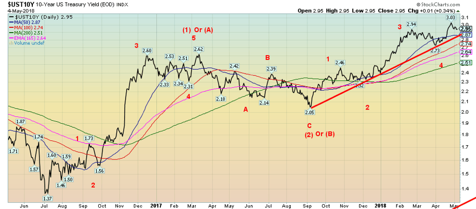
The U.S. 10-year Treasury note was relatively flat this past week, slipping to 2.95% from 2.96% the previous week. The uptrend that has been in place since a low in September 2017 remains intact. We continue to maintain that targets of 3.20% are still in place. However, a breakdown under 2.87% and especially under 2.51% would be a clear sign that bond yields are headed lower. The Fed did nothing at its most recent meeting, and it continues to indicate that further interest rate hikes could take place in 2018. The next most likely date is the June meeting on the 12th–13th. Mark it on your calendar as it could be important. It is noteworthy that the current effective Fed funds rate is 1.7% vs. a Fed rate of 1.50% to 1.75%. Inflation (core) has shown signs of rising above 2%. The Fed’s target is 2%.
Recession watch spread
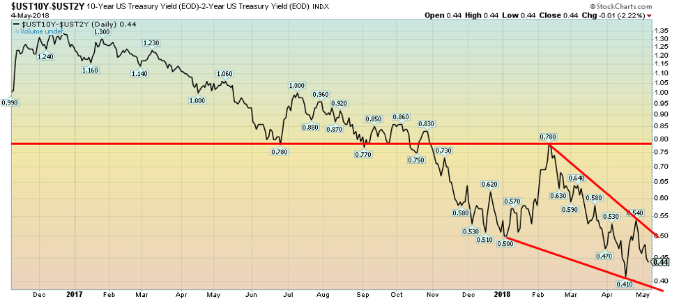
© David Chapman
The 2-year–10-year spread slipped to 0.44% this past week from 0.47% the previous week. It remains above the most recent low of 0.41%. Nonetheless, the downtrend appears to have renewed although the 2–10 spread remains far from previous lows, which were negative. Before both the 2000–2002 recession and the 2007–2009 recession, the 2–10 spread was negative for a period of at least six months before the recession hit (and a severe stock market correction as well). In Canada, the 2–10 spread has fallen to 0.42%. In both instances, the trend is down but is not yet at the point that a recession might be imminent.
© David Chapman
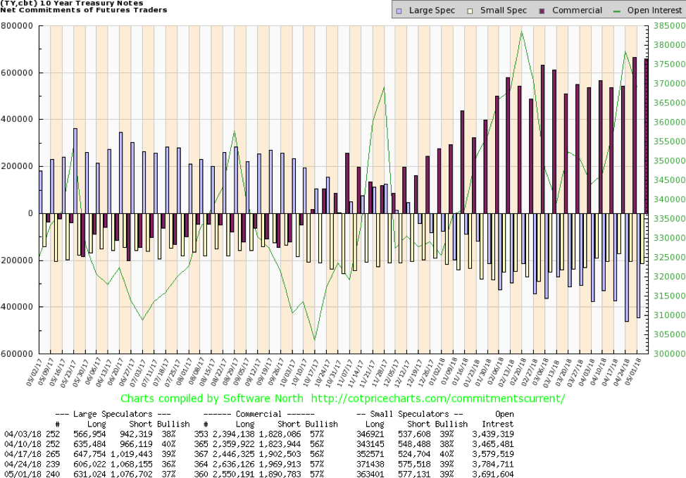
The commercial COT for the 10-year U.S. Treasury note remains somewhat bullish. It currently sits at 57%, the same as the previous week. The large speculators COT is at 37% up from 36% the previous week. This is not necessarily telling us that higher yields are possible first before yields start to fall, but it is a sign that the commercials at least are finding current yields attractive. Any strong rally decline in yields would most likely help flatten the yield curve further.
© David Chapman
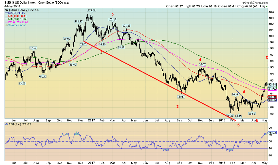
The U.S. dollar rally continues. This past week, the US$ Index surged over 92, closing the week at 92.41, up 1.2% on the week. The Euro, which constitutes 57.4% of the US$ Index, fell 1.4%. Meanwhile, the Pound sterling fell 1.8%. The Japanese Yen was relatively flat, and the CA$ gained a small 0.1%. The US$ continues to defy predictions of its demise. It has now jumped over the 200-day MA for the first time since March 2017.
There is little doubt now that the US$ Index is correcting the entire decline from 103.82 in December 2016 to the low of 88.15 in February 2018. Potential targets are the Fibonacci 38.2% retracement level of 94.14, the 50% retracement level at 96, and the 61.8% retracement level at 97.83. Only above 100.12 is it possible that the US$ Index could make new highs. The most likely target zone is somewhere between 94.14 and 96.
Currently, the US$ Index is overbought so a pullback correction is clearly possible. The index has already achieved minimum targets just under 92, so odds favor a run to the next target level of 94.14 but not before a correction. Support would be seen down to 91 and below that, down to 90. Below 90, the rally could be over.
© David Chapman
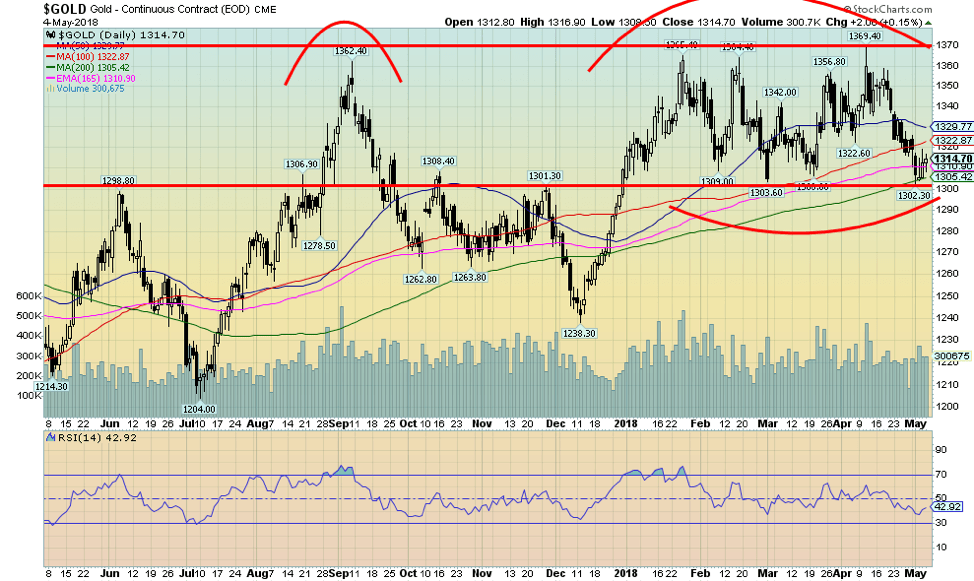
Driven by a higher US$, gold prices fell once again this past week losing a small 0.2%. A rebound on Thursday and Friday helped prevent the loss from worsening. Gold hit a new low at $1,302 this past week. It was the lowest level seen since late December. The 200-day MA at $1,305 appeared to contain the drop.
A bullish commercial COT gives us hope this coming week that a price rise could occur. The major resistance zone is at $1,370, a level we are sure everyone knows about. Interim resistance can be seen at $1,320 and $1,330. Support at $1,300 held with next good support down to $1,290. If $1,300 continues to hold, then gold appears to have formed a box formation with the breakdown under $1,300 and the breakout above $1,370.
Given the continued testing of the $1,360 to $1,370 zone, the expectation is that the breakout should eventually occur to the upside. Admittedly, trying to read gold over the past few months has become difficult. However, we continue to believe that gold made a significant low back in December 2015 coming as it did seven years after the major low of October 2008.
Gold, according to Ray Merriman of Merriman Cycles, shows that gold has a cycle low roughly every 7.3 to 7.8 years. Major lows were seen in August 1976, February 1985, March 1993, August 1999 or April 2001, October 2008, and December 2015. That means we should still be on the major up cycle, and the next major cycle low is not due until February 2023 to June 2024. The current up move should either test the September 2011 of $1,923 or even explode higher to over $2,000 and even up to $2,700. A firm breakout over $1,370 could target up to $1,525 and the 2013 breakdown level.
The current commercial COT as we note below is bullish. Intriguingly, an Egyptian billionaire named Naguib Sawiris has put half his net worth of $5.7 billion into gold. Sawiris noted two things in particular as to why he put half his wealth into gold—the turmoil in the Middle East and the ongoing turmoil surrounding Donald Trump.
© David Chapman
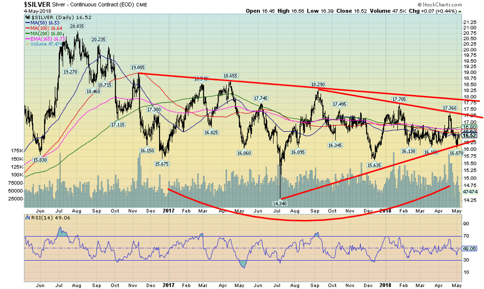
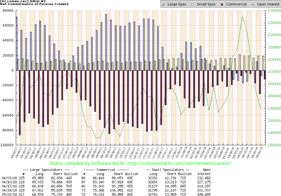
Silver actually led this past week with a gain of 0.2%. Given some leading strength this past week and a continued bullish commercial COT, we are optimistic about higher prices going forward. We have consistently said that silver remains exceptionally cheap compared to gold. Every time the gold-silver ratio went over 80, it proved to be top. The recent high was at 83.21. The ratio currently is at 79.59. A breakdown of the ratio under 70 could spark a sharper rally for silver.
Silver appears to have formed a triangular formation, and while it appeared that it might break down, it didn’t. Instead, the white metal rebounded nicely in the latter part of the week, and it did see a new low price for 2018 at $16.07 this past week. But support at $16 appears to have held. Considerable resistance remains up to $16.80 and $17.25. A break over $17.25 could see silver move swiftly to $17.75. Going over $18, it would firmly break out.
Silver appears to have formed an interesting head and shoulders bottom pattern. The neckline is currently at about $17.90, which is why we say a breakout over $18 would be quite important. The potential target of the head and shoulders bottom is $22.60. That would take out the July 2016 high. Major support is seen at $16 and down to $15.65.
© David Chapman
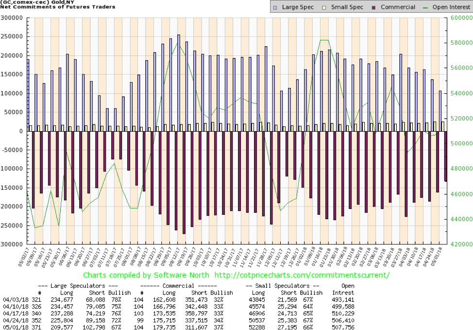
The commercial COT for gold jumped this week to 37% from 34% the previous week. The large speculators COT (hedge funds, managed futures, etc.) fell to 67% from 72%, which is a potentially bullish development. Long open interest for the commercials rose roughly 4,000 contracts, but it was the fall in short open interest that was larger at about 26,000 contracts. The commercials were largely covering their shorts.
Meanwhile, the large speculators cut their longs by roughly 16,000 contracts and increased their shorts by almost 14,000 contracts. It is as if the large speculators threw in the towel. A rise next week in gold prices would go a long way to confirm what the COT appears to be telling us.
© David Chapman
Like the gold COT, the silver COT also improved this past week. The commercial COT rose to 46% from 41%, while the large speculators COT fell to 48% from 55%. The commercials increased their long position by just under 3,000 contracts and, more significantly, cut their short position by 17,000 contracts. The large speculators actually added just under 1,000 contracts to their long position but added about 20,000 contracts to their short position. We are with the commercials. Couple this with the gold COT, and the precious metals are appearing positive going forward.
© David Chapman
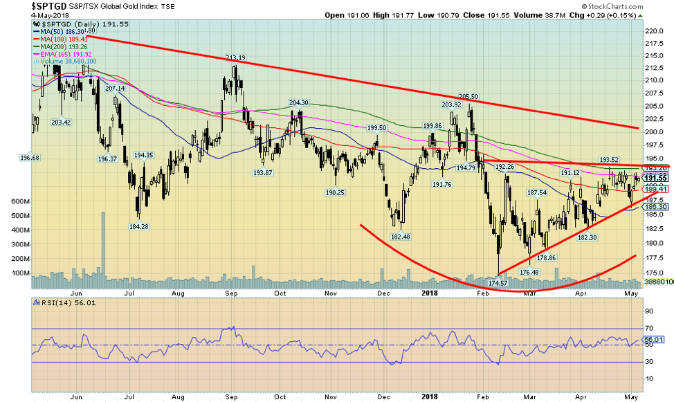
We like what appears to be a rising or ascending triangle forming on the gold stocks as represented here by the TSX Gold Index (TGD). Considering that gold was off on the week although silver was up, the TGD held in losing only a small 0.2%. The Gold Bugs Index (HUI) was off almost 0.4%. The ascending triangle pattern is characterized by a rising series of higher lows with a relatively flat top. A breakout could occur over 194 with an even firmer breakout over 200.
Over 194, the potential target could be 215, but over, 200 the target could be 260, a gain of 35% from current levels. Support appears at 186 and even stronger support at 182. However, we would not want to see the series of higher lows broken. The last low was at 186.33. Significantly, that day, the market reversed and closed higher. We have constantly pointed out that the gold stocks remain very cheap to gold. Price history suggests that it won’t remain that way forever.
© David Chapman
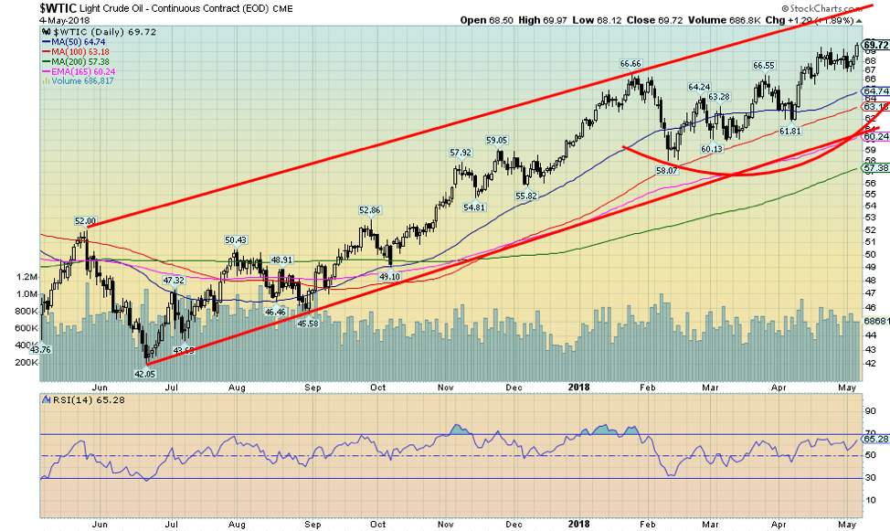
Oil prices continue to rise despite the strong US$. This past week, WTI oil hit a high of $69.97, the highest level seen since November 2014 and was up 2.2% on the week. Ongoing turmoil in the Middle East is helping oil prices as is a desire by both Saudi Arabia and Russia to get the price of oil back into at least the $85 range. They have been cutting back on production to help push oil prices higher. That oil prices have been rallying despite the higher US$ is considered quite bullish.
Oil was considered to have made an important 18-year cycle in February 2016 at $26.05. The previous 18-year cycle low was seen in December 1998 at $10.65. With a range of 15–21 years, the previous 18-year cycle low occurred in February 1986 at $9.95. If the cycle is correct, then WTI oil is in its up phase. Typically, cycles break down into a two-phase, meaning two cycles of nine years, or a three-phase, meaning three cycles of six years. Longer term oil prices break out over $80. There is now significant support down to $55.
Chart of the week

Supporting our thoughts that WTI oil could move sharply higher, this chart of the gold-oil ratio suggests that oil prices should outperform gold prices going forward. We appear to have broken down from the period of oil gluts and are moving into a period of tighter supply. As well, there remains considerable turmoil in the Middle East, particularly with the threats to tear up the Iran nuclear deal.
War with Iran would send oil prices soaring. Notice how the gold-oil ratio dropped during the war, as in both Gulf Wars; it fell to under 10. We note all this even as we have indicated we believe gold has a considerable potential to rally further. But oil could rally even more. The ratio has broken down under the 4-year MA and appears to be headed lower.
—
DISCLAIMER: David Chapman is not a registered advisory service and is not an exempt market dealer (EMD). We do not and cannot give individualised market advice. The information in this newsletter is intended only for informational and educational purposes. It should not be considered a solicitation of an offer or sale of any security. The reader assumes all risk when trading in securities and David Chapman advises consulting a licensed professional financial advisor before proceeding with any trade or idea presented in this newsletter. We share our ideas and opinions for informational and educational purposes only and expect the reader to perform due diligence before considering a position in any security. That includes consulting with your own licensed professional financial advisor.


Abivax Shares Surge as New Trial Data Eases Safety Concerns Over Ulcerative Colitis Drug
Abivax shares surged nearly 36% after positive updated trial results for its ulcerative colitis drug obefazimod reassured investors following earlier...


El Dorado Raises $9M to Expand Cross-Border Fintech Platform
El Dorado, a Latin American fintech improving cross-border financial services, raised a $9 million Series A led by Paradigm with...


Bitcoin Stalls Near $60K as Strategy Moves, ETFs Outflow, and EU MiCA Rules Take Effect
Bitcoin hovers near $60,000 with ETF outflows, while Strategy boosts reserves, sells BTC, and raises dividends to reassure investors. Ethereum...


Cannabis Dominates Global Drug Use: Trends, Risks, and Shifting Markets
Cannabis remains the world’s most widely used illicit drug, with 256 million users in 2024, surpassing all others combined. Growth...


Italy Approves First Hydrogen-Powered Train for National Rail Network
ANSFISA has approved Italy’s first hydrogen-powered train, the Alstom HMU214, for use on the Brescia–Iseo–Edolo line. Capable of 140 km/h,...
 |
|
 |  |
 |
|
-

 Biotech1 week ago
Galicia Launches €805M Biotechnology Strategy to Drive Innovation and Competitiveness (2026–2030)
-

 Crypto2 weeks ago
Bitcoin and Ethereum Markets Steady as Strategy and Bitmine Expand Holdings Amid World Cup Crypto Activity
-

 Impact Investing5 days ago
ESG Gap Persists as Firms Struggle to Link Sustainability to Financial Value
-

 Crowdfunding2 weeks ago
Temotiva Launches Crowdfunding Campaign to Advance Preventive Mental Health
You must be logged in to post a comment Login