Featured
U.S. consumer confidence slides while housing sales continue to rise
World trade is beginning to slide as Italy and Germany could be leading the Eurozone into a recession. Meanwhile, U.S. unemployment rate jumped.

“The usual bull market successfully weathers a number of tests until it is considered invulnerable, whereupon it is ripe for a bust.”
—George Soros, financier, philanthropist, political activist, author, philosopher, b. 1930
“Banking establishments are more dangerous than standing armies; and that the principle of spending money to be paid by posterity under the name of funding, is but swindling futurity on a large scale.”
—Thomas Jefferson, 3rd U.S. President, 1743–1826, 1816 letter to John Taylor of Carolina
“Financial markets will find and exploit hidden flaws, particularly in untested new innovations – and do so at a time that will inflict the most damage on the most people.”
—Raymond F. DeVoe, Jr., market strategist, Jesup & Lamont, The DeVoe Report, March 30, 2007
Did the Fed blink? That has to be the question following the Fed statement at the FOMC meeting of January 28, 2019. The Fed signaled that it is done raising interest rates for now and going forward will move cautiously with reducing its vast bond holdings (quantitative tightening – QT). This was a huge about-face from where it was even a month ago.
The about-face comes after a barrage of tweets and comments from President Donald Trump attacking the Fed and Jerome Powell. Powell never responded to the attacks, nor should he have, but it begs the question—not only did the Fed and Powell blink, but did they cave?
“It is incredible that with a very strong dollar and virtually no inflation, the outside world blowing up around us, Paris is burning and China way down, the Fed is even considering yet another interest rate hike. Take the Victory!”
—Donald Trump, tweet, December 18, 2018
“I’m not even a little bit happy with my selection of Jay. I think the Fed is a bigger problem than China.”
—Donald Trump, to The Washington Post, November 27, 2018
“Maybe I regret appointing Powell to head the Fed. But I’m not going to fire him.”
—Donald Trump, to The Wall Street Journal, October 23, 2018
We could go on. For months there has been a barrage of these comments from Donald Trump. Presidents are not supposed to meddle with the Fed. Until they do. No, not in deed, but with words and constant attack. A very public fight that Fed cannot be seen to respond to as it needs to maintain its independence. Now, one wonders—has the Fed been compromised?
For 35 days—from December 22, 2018 to January 25, 2019—the U.S. government was in partial shutdown, with 800,000 employees shut down partially or in full. It was the longest shutdown in U.S. history. And it is not over, as it is just temporary. The deal struck is good only until February 15, 2019. It did not include funds for Trump’s “wall,” an amount of $5.7 billion. Trump continues to insist on his wall and Congress has not acceded. According to the Congressional Budget Office, the shutdown cost the U.S. economy $11 billion, excluding indirect costs that are difficult to quantify. That is almost twice the projected cost for the “wall.”
So, it is possible that the Fed saw this, plus other limited economic numbers that were released during the shutdown and concluded that the U.S. economy could indeed be headed for trouble? Or is it? The numbers are now mixed. The Bureau of Labour Services released the monthly job numbers on February 1, 2019 where the nonfarm payrolls jumped an astounding 304,000 in January, boosted by hiring in construction, retail, and business services. The market expected only 165,000. As usual, downward revisions hit November and December so they fell by 90,000. Still, against the backdrop of the furloughed government workers, the January numbers were an eye-opener. The unemployment rate rose to 4.0% from 3.9%, but then we note that the labour force participation rate also rose to 63.2% from 63.1%, the highest level in some time as more people were looking for work.
Earlier in the week, consumer confidence took a hit as the shutdown dragged on.
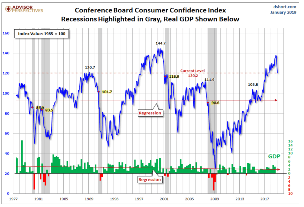
The Conference Board consumer confidence index fell to 120.2 in January, down from 126.6 the previous month. The market had expected 124.7. Sharp drops in consumer confidence preceded both the 2000–2002 recession and the 2007–2009 recession. However, as was seen before the drop in 2007, there was a drop in 2006 as well, and it rebounded. So, a rebound is possible, especially if the shutdown due for mid-February is avoided, progress is made on China/U.S. trade talks, and people are buoyed by the still-good job numbers.
But no matter how rosy one may wish to present the current numbers, trouble continues to brew in the background. In Europe, Italy has moved officially into a recession (defined as two consecutive quarters of negative growth). Italy is the EU’s fourth largest economy behind Germany, the U.K., and France. Italy also has the shakiest banking system in the EU. French and German banks have considerable exposure to Italian sovereign debt. Italian banks are also burdened with sovereign debt and questionable corporate debt. Italy is currently governed by a Eurosceptic party who are trying to bust outside the EU’s tight rules by sharply increasing Italian debt. Italy’s politics are fractious at best and Italy’s relationship with the EU has become increasingly contentious. Italy’s debt currently stands at €2.3 trillion with a debt to GDP ratio of 131.8%, the second highest in the EU behind Greece. A full-blown financial crisis in Italy would have global implications.
Germany is also threatening to fall into a recession. Germany has already reported one quarter of negative growth in Q3. We await Q4 with some expectation that it too will be negative. Given Brexit, the U.K. could also fall into a recession, even as its recent growth numbers remain positive (barely). Japan is also threatening to slide into recession, reporting negative growth in Q3 of -0.6%. It was the second period of negative growth reported in 2018, as Q1 was also negative although Q2 was positive. Japan has been in a slow growth/negative growth since the Japanese economy peaked back in the late 1980s. That is, despite years of low to negative interest rates and massive injections of quantitative easing (QE).
Eurozone GDP
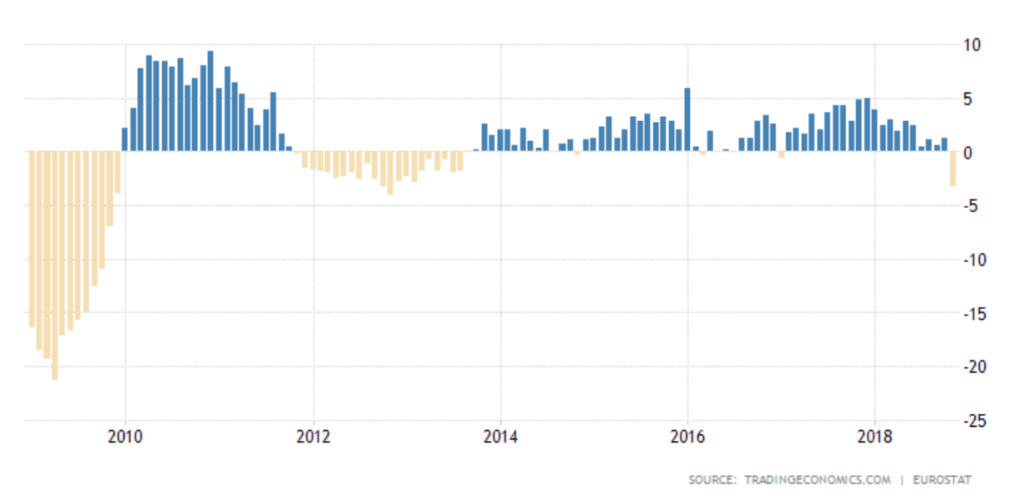
The above chart is another sign that growth that the Eurozone is weak and could well get weaker. Over the past year, industrial production has plunged 3.3%. While IP has been weak since 2010, the fact that it has plunged so quickly is a negative sign for the entire euro zone. The last time it was negative was during the European sovereign debt crisis centered around Greece in 2011–2012.
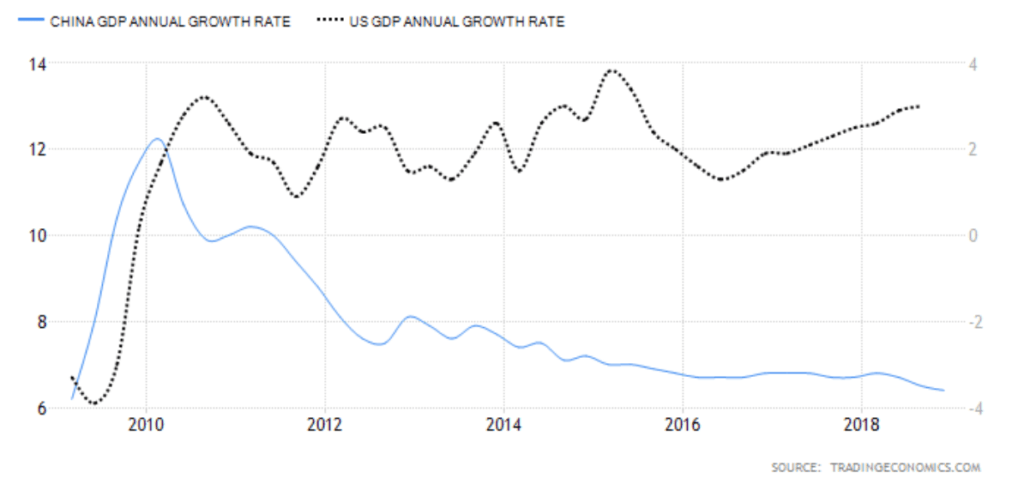
While GDP growth in the U.S. remains positive, China’s is slowing. China’s growth number is the lowest in 28 years. A slowdown in China’s growth is particularly troublesome for global growth as they make up 15% of world growth. Just moving China down to more normal growth of 3–3.5% could have negative impact on both global growth and global trade. China runs a huge trade surplus with the U.S. that, oddly, is growing even as Trump slaps tariffs on them. Even if China/US trade were to become more equal it would not help global growth. Given China actually sells more to the U.S. than it buys from them means China actually has more to lose than the U.S. in a protracted trade war with them.
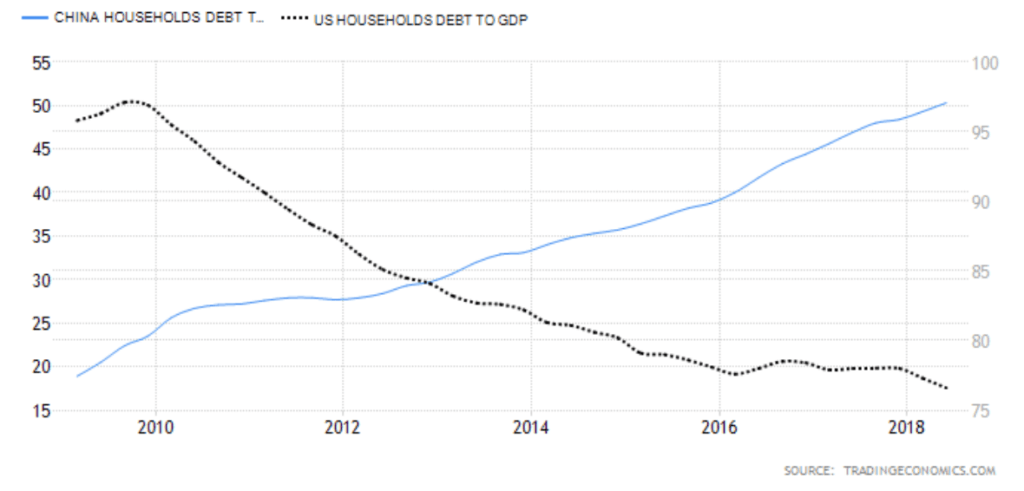
Chinese debt, especially corporate and consumer debt, has been growing since the financial crisis of 2008. China’s household debt to GDP has gone from roughly 20% back in 2009 to 50% today. In the U.S. it has gone in the opposite direction, falling from almost 95% back in 2009 to about 75% today. The chart below shows that comparison. But the real danger in China is corporate debt, particularly in the real estate sector. China’s corporate debt growth has far outstripped economic growth. Much of the debt was borrowed in US$, thus exposing them to currency risk. Non-financial debt to GDP in China exceeds 175%. The good news is that China’s national debt is still less than 60% of GDP, compared to 105% in the U.S. The U.S. corporate debt to GDP is high at about 150% but that is still less than in China. The Chinese government has been trying to curb speculation and cracking down on risky lending practices in China’s shadow banking system. All of this has a potentially negative effect on China’s growth numbers.
Growth in the U.S. has been sub-par following the financial crisis of 2008. Long-term growth per expansion since 1980 has been roughly 3.22%. Since June 2009, average annual growth has only been 2.23%. But even that expansion growth, is suspect. John Williams of Shadow Stats reports that the headline GDP number is distorted by methodological changes made over the years, and that inflation-adjusted changes give the numbers an upside bias. Williams reports that GDP growth in Q3 was more like negative 1.2% rather than the headline GDP reported of +3.0%. According to Williams, U.S. GDP growth has been consistently negative since Q4 2000 except for a few quarters in late 2003 and early 2004. In other words, the U.S. has been, and remains in, a constant recession. We’ll call it the “long recession.”
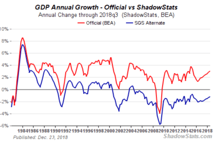
This has taken place against the backdrop of massive doses of quantitative easing (QE), ultra record low interest rates and massive amounts of debt. If debt growth had been only about 3% annually, then the reported GDP numbers would be considered good as budget deficits would be declining, as would debt-to-GDP. That has not been the case. Since 2008, total U.S. debt has exploded from $49.9 trillion to $72.1 trillion, a rise of $22.2 trillion. The growth rate has been roughly 5% annually. Government national debt has jumped even faster, rising from $9.7 trillion in 2008 to almost $22.0 trillion today. Government debt growth has averaged about 14% annually. With the current rate of adding $1 trillion to the U.S. debt, it could reach $25 trillion in just three years (2022). Then there are unfunded liabilities of $122.4 trillion, made up mostly of Medicare and Social Security obligations. The U.S. government debt to GDP today is 105.3% vs. 71.1% in 2008 at the time of the financial crisis. Anything above 100% leaves the economy subject to slow growth, rising inflation, and the potential for a shock to create a debt crisis.
Since 2008, it has taken roughly $3 of new debt to produce $1 of GDP. This is not sustainable without increasing the risk of a major debt default that could threaten the entire financial system, as happened in 2008 with the collapse of Lehman Brothers. The longer this goes on, the risks rise exponentially and a full-blown banking crisis—à la 2008—could once again be upon us. Rising inflation isn’t going to help as the Fed’s official inflation numbers show that they have trouble getting over 2%. A debt crisis would create a deflationary wave, GDP growth would turn negative, and unemployment could rise sharply.
All of this brings us back to the Fed and its sudden move to caution and patience with further interest rate hikes. Did the Fed feel pressure from the White House and blink? Or is the Fed seeing the slowing growth elsewhere and concerned that it will eventually hit the U.S. too? Given the massive amount of debt outstanding today, one can only hope the world is not hit with another Lehman Brothers event. The ability to withstand it just doesn’t exist compared to 2008.
Markets and trends
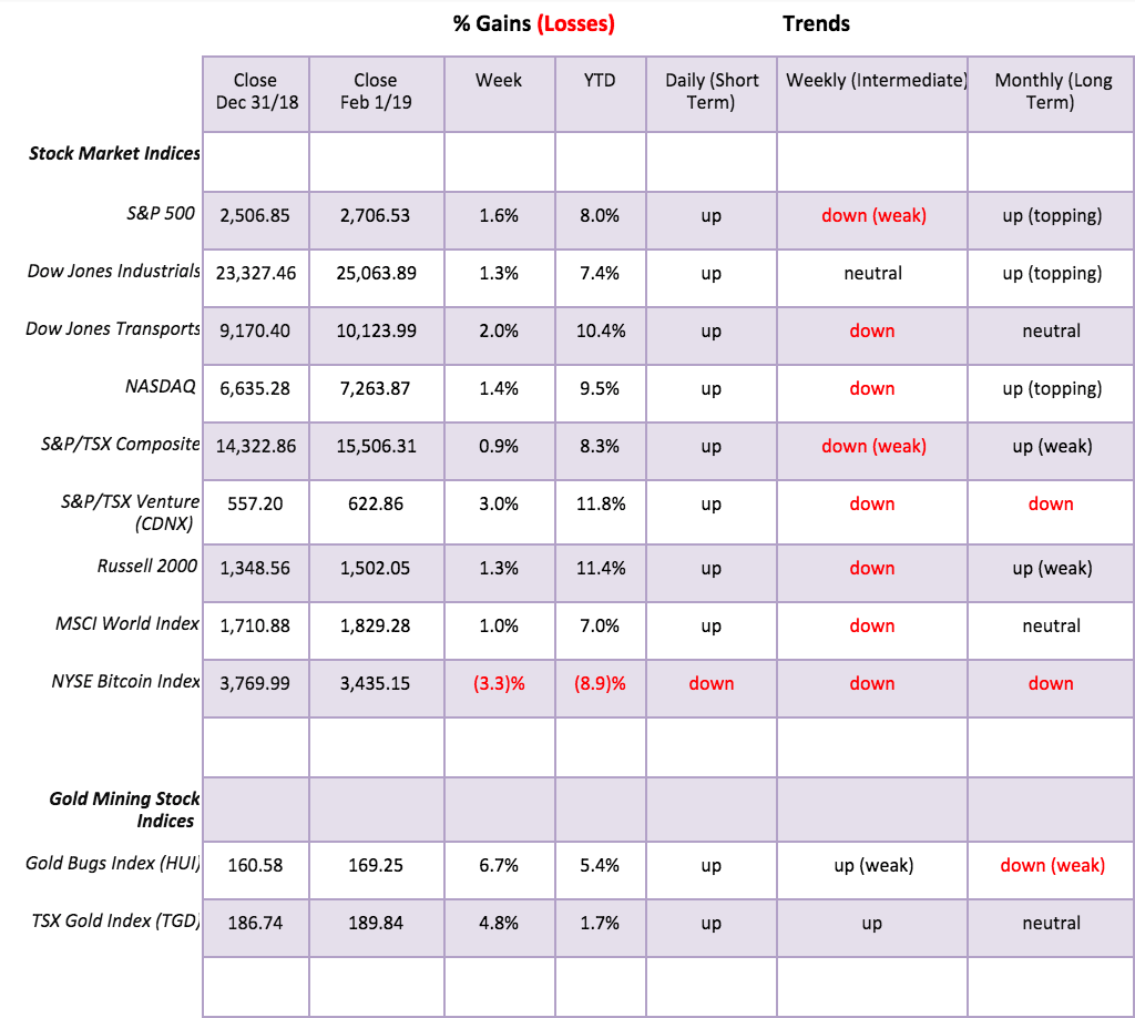
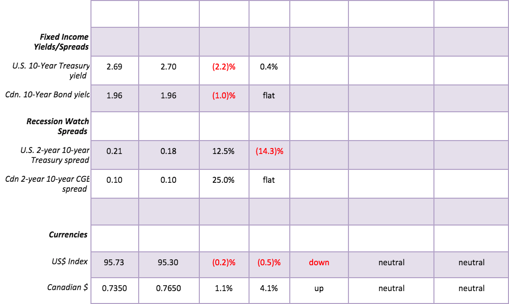
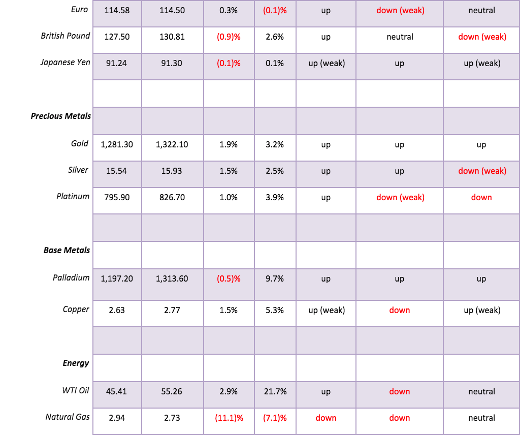
Note: For an explanation of the trends, see the glossary at the end of this article.
New highs/lows refer to new 52-week highs/lows.
© David Chapman
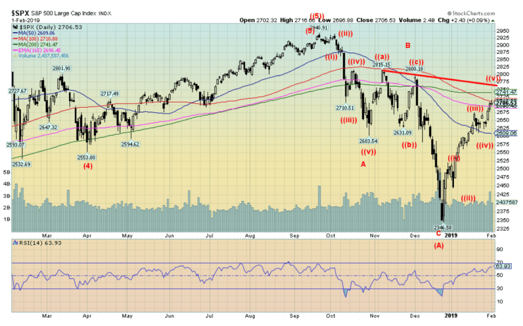
The stock market keeps going up. The market was buoyed this past week by the change of heart from the Fed to a more dovish stance and by the stronger than expected nonfarm payrolls on Friday. The S&P 500 gained 1.6% on the week while the Dow Jones Industrials (DJI) was up 1.3%. The Dow Jones Transportations (DJT) jumped 2% while the NASDAQ gained 1.4%. The TSX Composite was up 0.9% on the week, but the TSX Venture Exchange (CDNX) continued its recent winning ways, up 3% and now up 8.3% in 2019. We expect the CDNX to be a big winner in 2019. Internationally, the London FTSE shook off Brexit woes and gained 3.1%, the Paris CAC 40 was up 1.9%, but the slipping-into-recession German DAX fell 0.9%. The Tokyo Nikkei Dow (TKN) was up a small 0.1% while China’s Shanghai Index (SSEC) gained 0.6%. All in all, a positive week for global indices.
But now the S&P 500 and the major stock indices are running into a major resistance zone so a pause might be in order. February is notable as the weakest link in the “best six months.” The month tends to rank 8th or 9th amongst the major U.S. indices. The S&P 500 shows that over the past 69 years the S&P 500 registered 38 up months and 31 down months. On average the index has gained a tiny 0.04% in February; however, in pre-election years the record shows a gain of 1.1%. Nonetheless, we wouldn’t be surprised that a pause develops this month before the index might make an assault on major resistance above. Given we see five waves up from the December 2018 low, we may be completing wave A of a possible ABC correction that could still play itself out over the next several months. Only above 2,800 could the market see new all-time highs. A breakdown under 2,600 would signal that a deeper decline could be in order. Oddly enough, volume picked up a bit this week, but that is not unusual if we are indeed approaching at least a temporary high. None of this suggests that the rebound that got underway in December is over, but a pause now would help work off some overbought conditions and set the S&P 500 up for another upward assault later. We continue to believe this is nothing more than a bear market rally, but one that could play itself out over a number of months and see higher prices.
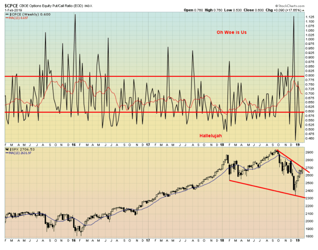
We continue to watch the put/call ratio. The put/call ratio still remains in hallelujah territory even as it has turned back up. On the other hand, the S&P 500 keeps on rising. The put/call ratio continues to indicate that traders and investors have become increasingly bullish as the market moves higher. A high level of puts to calls would be quite bullish as it would indicate to us that the market is still too bearish. Not so as the market has become bullish reflecting the rise in the market. It may be that the put/call ratio becomes more neutral going forward which could allow the S&P 500 to continue its recent rise. We’ll continue to monitor the put/call ratio.
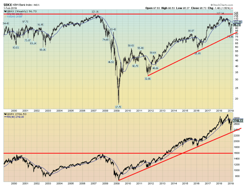
Divergences are quite important in technical analysis because they point out anomalies between markets. One would think that the S&P 500 and the KBW Bank Index (which covers 24 banks, including major money center banks, regional banks, and thrifts as a stand in for the banking sector) would be in sync. They haven’t been. Even as the S&P 500 soared past its 2007 high, the KBW failed to even reach its 2007 high. This is a significant divergence that we have noted in the past. Banks are the heart of the economy, yet banks acted more like a drag on the index than a leader. Now both of them have turned down—in sync at last, but not for the right reasons.
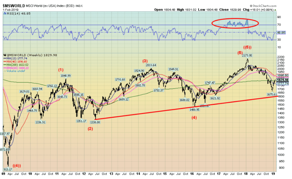
The MSCI World Index peaked back in January 2018. Since then, it has fallen about 16% to date. The MSCI Index completed five waves up from the depths of the 2008 financial crisis, telling us that it has probably made its final top. It has fallen below all of its key weekly MAs, including the 13- and 40-week MA and the 65-week EMA. As well it is below the four-year MA. The index is currently testing the 4-year MA. The faster-moving 13-week MA has crossed down over all of the other MAs. Technicians call those death crosses. The last time was during the 2016 decline. However, it wasn’t until 2017 that the index crossed back over the 4-year MA. By then, all of the MAs had crossed under the 4-year MA. Given the five-wave up pattern, it suggests to us that, this time, the correction should be more severe than what was seen in both 2011/2012 and 2015/2016.
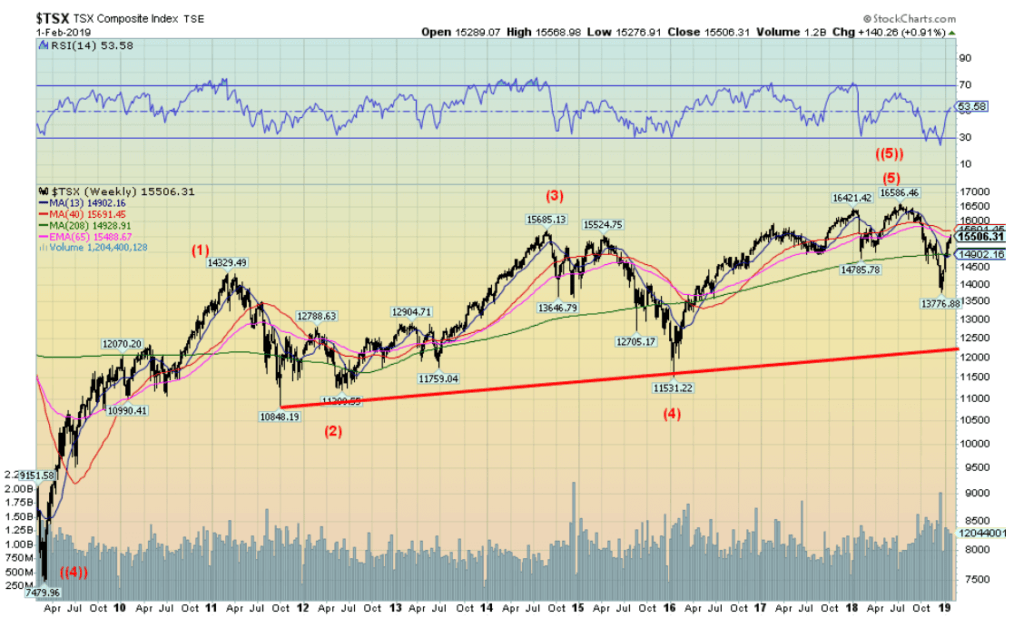
The TSX Composite is similar to the MSCI World Index in that it has made a five-wave advance from the depths of the 2008 financial crisis. The TSX, however, has managed to reclaim the 4-year MA and none of the other key MAs have crossed under the 4-year MA. This is somewhat positive for the TSX. The TSX is dominated by cyclicals such as energy and materials, and it is these two sectors that could help keep the TSX alive going forward. They were the weak areas as the index rose to its all-time high in July 2018. However, of late the two have exhibited strength.
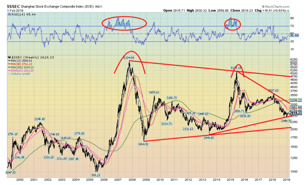
China’s Shanghai Stock Exchange Composite (SSEC) is on a completely different train than the previous two charts. The SSEC saw its peak back in 2007 and then plunge viciously during the 2008 financial crisis. The recovery took us in three waves (ABC) up to a secondary top in 2015. But it has been all downhill since then. Now China is slowing and we are hearing that PBOC (the central bank of China) could be buying Chinese stocks to help boost the market. The SSEC is up recently, but has considerable work to do to regain even the 4-year MA, currently near 3,200. There could be a small double bottom on the charts so that could prove positive. Only above 3,600 would the SSEC be in a position to challenge the 2015 highs. Under 2,500 and the SSEC could fall further to major support near 2,000. There could be a trade here in Chinese stocks but the chart doesn’t suggest a major long-term buy.
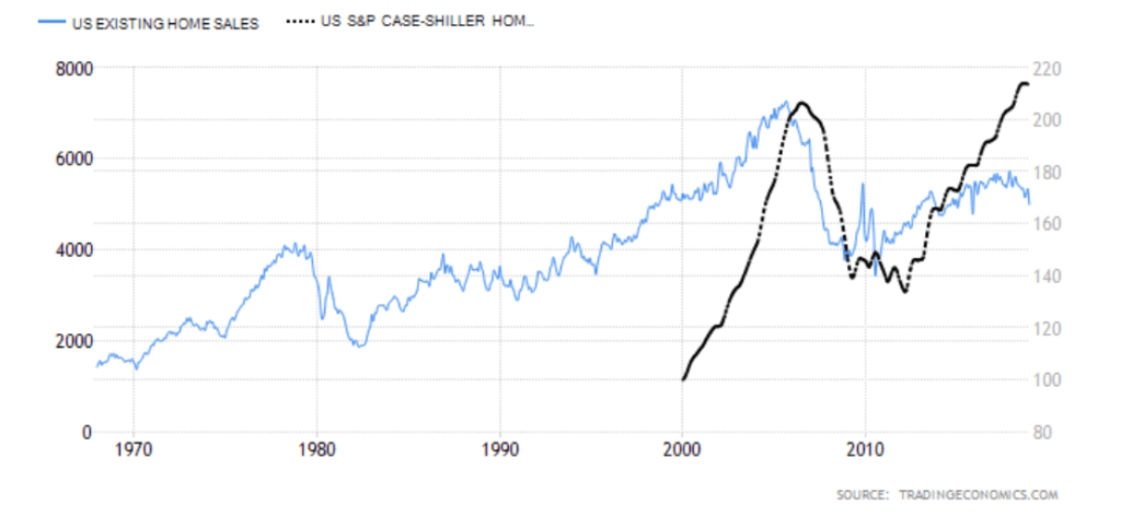
This is an interesting divergence. Existing home sales are tipping over, but the Case Shiller Home Price Index keeps on rising. If we look back to the mid 2000s, we note that existing home sales began to tip over before the peak in the Case Shiller Index. But the signs were there and the Case Shiller index plunged into the depths of the 2008 financial crisis. Existing home sales may be acting as a leading indicator. We note that, as the market came out of the slump, existing home sales were rising as the Case Shiller Index was still falling. Divergences at tops and bottoms are good indicators of where things may be headed. This divergence tells us that home prices should soon follow home sales down. We note that in Canada as well, home sales have started to fall but the price index remains elevated even as it has flatlined over the past five months. This is another indicator that Canadian housing prices, including prices for condos, should soon fall as well.
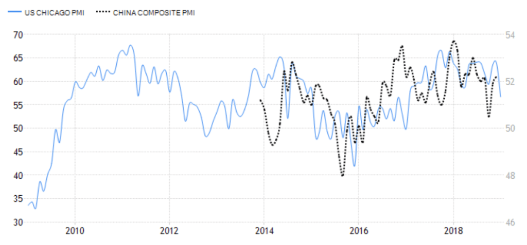
Talk about mixed signals on the economy. We have overlaid key purchasing managers indices (PMI) for the world’s two largest economies—the U.S. and China. Both continue to report positive PMI. The U.S. reported a reading of 56.7 for the Chicago PMI in January 2019. It was revised downward from 63.8 in December and was below expectations of a reading of 61.5. But still it is positive. Any reading above 50 is considered a sign that the economy is expanding. Below 50 tends to indicate recession. The U.S.’s composite PMI of different manufacturing PMIs came in at 54.50—still positive. China’s latest PMI report was December and it came in at 52.2 vs. 51.9 in November. In China, the services PMI expanded although the manufacturing PMI contracted. It is well off the highs of a year ago. China’s PMI actually slipped below 50 back in 2014 but did not remain there long.
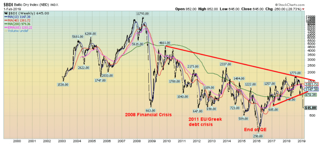
The Baltic Dry Index, which is reported daily in London, appears to have broken down. This index provides a benchmark for the price of moving major raw materials by sea. No, it is not just about Baltic Sea countries or just a few commodities like oil. The Baltic Dry Index takes into account 23 different shipping routes carrying numerous commodities including oil, coal, grains, iron ore, and more. The index acts as a proxy for shipping dry bulk goods and as a shipping bellwether. So, a falling index reflects the potential for falling trade and decreasing economic activity. We note three important declines on the chart: first, the collapse during the financial crisis of 2008; second, the depths of the EU/Greek debt crisis; and, third, the end of QE in 2011. Now it is falling again, having broke down under the uptrend line from 2017 and under the uptrend line from the 2016 low. It indicates possible trouble ahead and therefore should be heeded.
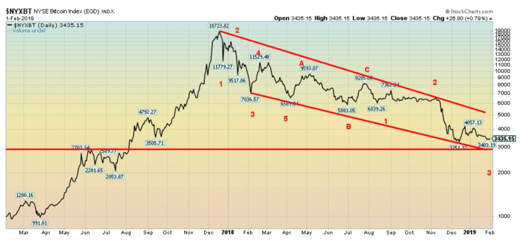
Are Bitcoins and the cryptos days really over? We continue to see bullish stories, but more and more they are turning to despair. Of course, those who got in early and cashed out are happy. Many became crypto millionaires. But the vast majority usually get in late as the bubble peaks and today have either bailed to take their losses or are still holding on, hoping and praying. Bitcoin is down some 82% from its all-time high and many cryptos are down over 90% from the high. We don’t believe the final washout has arrived yet which is why we believe that Bitcoin will eventually crash through $3,000 and could even fall back to $1,000 (or lower). Truly, it has been a momentous bubble on the scale of tulip mania in the 17th century. Bitcoin is down over 3% on the week and almost 9% so far in 2019. Not a great start to the year. We are picking up stories that disgruntled crypto funds are coming out of the cryptos and moving into bullion. There remain over 2,100 different cryptos, but the market cap of all of the cryptos is only $114.1 billion, roughly 1/3rd of what Bitcoin’s market cap alone was at the top. Bitcoin makes up 52% of the market. Doesn’t leave a lot for the other 2,099 cryptos. The technology will survive. But will the cryptos?
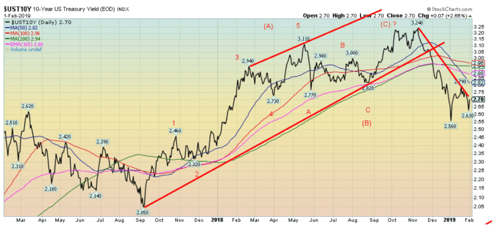
The U.S. 10-year Treasury note rallied on the Fed, falling as low as 2.63% before rebounding on the stronger than expected jobs number released on Friday. Unless we make a move below the 2.56% low, then it is possible that bond yields could be on an upward move once again. A break above 2.75% would send the 10-year into resistance between 2.82% and 2.96%. Above 2.96%, new highs above 3.24% would be possible. It is possible that the 10-year is merely starting a corrective wave to the upside following the move down to 2.56%. But any strong move over 2.96% and especially over 3.00% could suggest new highs ahead. The dovish Fed should be positive for bond yields, but the stronger than expected jobs numbers suggest that the economy is alive and well and the Fed might have to reassess that dovish tone down the road.
Recession watch spread
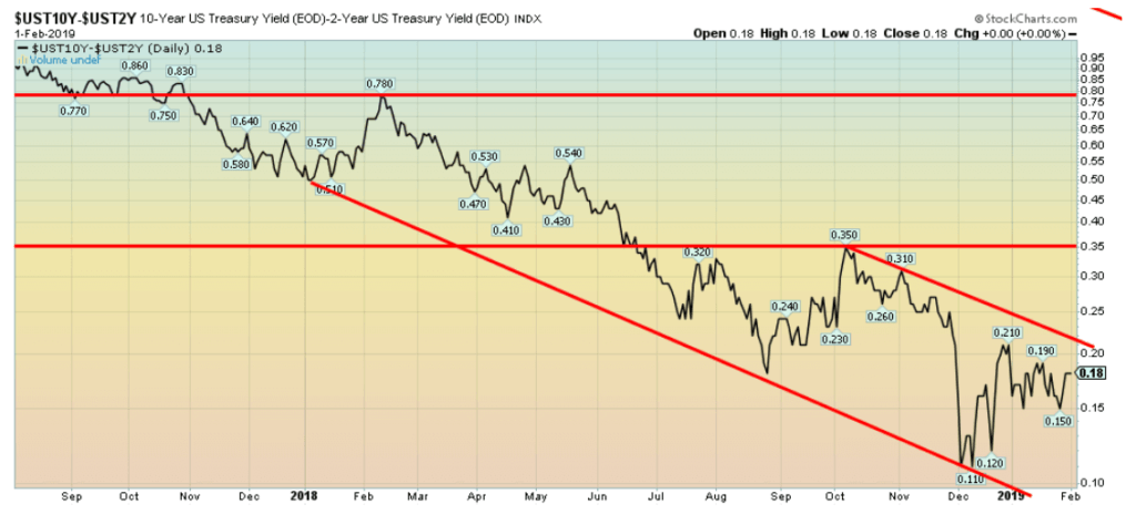
Our recession watch 10-year Treasury note less the 2-year Treasury note spread rose this past week to 18 bp. While the 10-year backed up late in the week following the release of January’s job numbers the 2-year didn’t follow fully. The result was that the 2-10 spread widened. The trend remains down; however, the current positive spread does not indicate any recession yet. In the past, the 2–10 spread was negative for upwards of six months before a recession got underway.
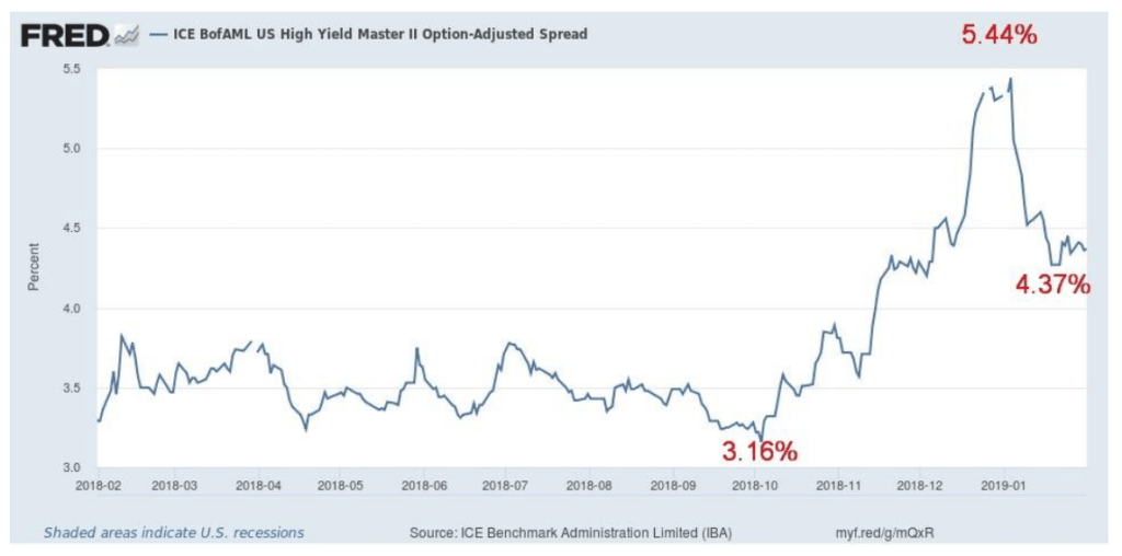
Here is another sign that fears of an imminent recession remain but a distant threat. This shows high-yield bond spreads, better known as junk bonds. The spread to U.S. Treasuries bottomed back in October at 3.16% and, as the crisis grew in October through December, the spread widened out to a peak of 5.44%. Now it has fallen down again to currently 4.37%. What this tells us is that risk is on and buyers of junk bonds are not fearing any major problems soon. Otherwise, that spread would have remained high and not fallen. The spread hit a high of 19.88% back in November 2008 at the height of the financial crisis. A falling spread indicates that buyers of junk bonds are not too worried about an imminent recession threat or defaults in the sector.
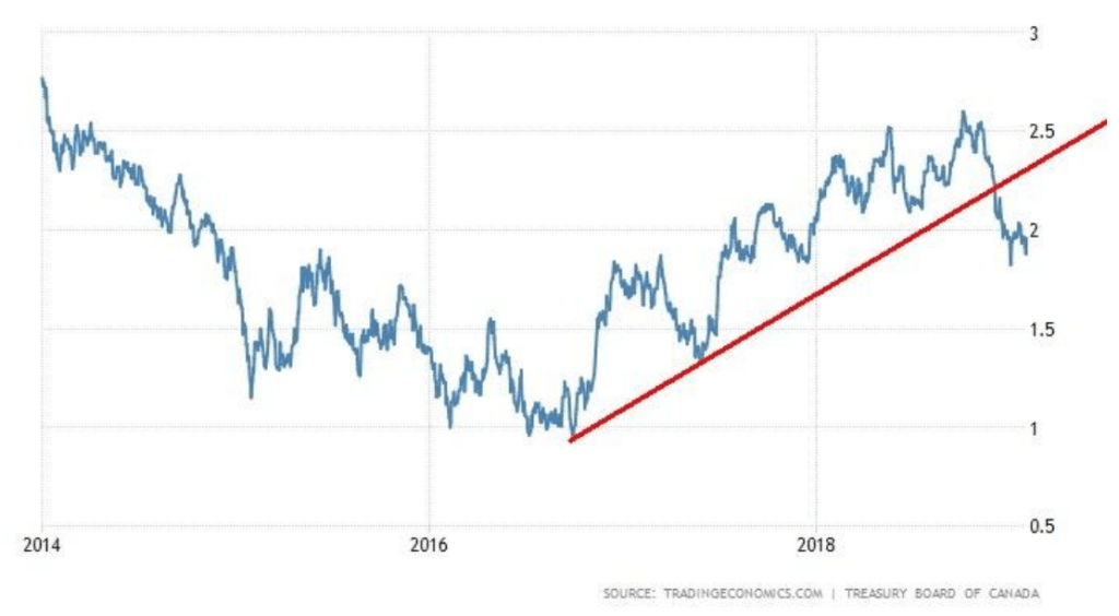
Canada bond yields have been falling in line with U.S. bond yields. The Canadian Government 10-year bond (CGBs) closed at 1.96% after falling as low as 1.88% earlier in the week. The recent trend has been down. However, like the U.S. 10-year, it hit a low of 1.82% earlier in January before backing up. The 2–10 recession spread for Canada also backed up this week to 12 bp from 10 bp the previous week. Basically, the Canadian bond market is following the U.S. bond market. Poloz’s hands are tied with the Fed. As well, Canada reported that November’s GDP was down 0.1% led by a decline in the energy sector. It was the second negative month in the past three months. The weakening conditions in Canada have no doubt put the BofC on hold as to rate hikes going forward.
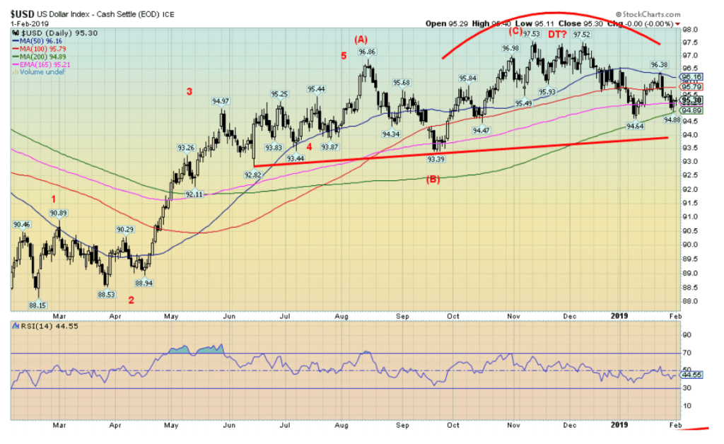
A dovish Fed sent the US$ Index tumbling this past week, although the US dollar regained a little following the stronger than expected January job numbers. The US$ Index fell 0.2% this past week. The main beneficiary was, surprisingly, the Cdn$, gaining 1.1%. The euro was up 0.3%, despite growing signs of a recession in Germany and Italy tumbling into a recession. The Brexit-challenged pound sterling fell 0.9% while the Japanese yen was off less than 0.1%. Our outlook for the U.S. dollar remains the same. The U.S. dollar could be in the early stages of a major decline. The recent high 96.38 failed at the 50-day MA and is now falling back down. The major breakdown zone remains at 94 and, once through that level, the potential targets are down to around 89 to 89.50. On the other hand, the euro continues to look positive and we would look for it to rise to 118 to 120.
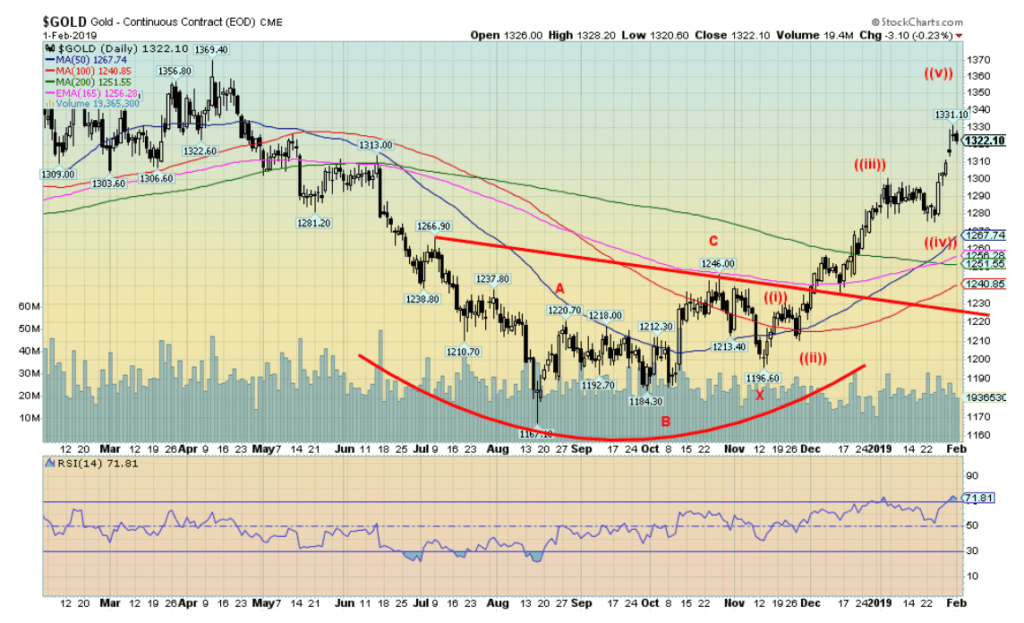
Gold continued its rise this past week, spurred on by the Fed’s dovish tone. No more rate hikes or, at least, the possibility of no more rate hikes and a more accommodating stance are music to gold’s ears. The stronger than expected job numbers on Friday steadied gold and it came off slightly after hitting the highest levels since April 2018. Gold was up 1.9% this past week while silver gained 1.5%. Platinum was also up, but a smaller 1.0% gain. Palladium continued its recent correction/consolidation, losing a small 0.5%. Gold is now into our initial target zone that could range up to $1,350 or even $1,360. Our expectations are that gold could have trouble getting through major resistance at $1,370 at least initially. It has failed there three times over the past three years, hitting highs of $1,377 in 2016, $1,362 in 2017, and $1,369 in 2018. We could still reach that level, but we note that the most recent daily sentiment index for gold is now up to 80%. No, that is not the 90%-plus we often see at highs but it is now getting up there. So, it is just a note of caution. Following a high, gold should correct back with the zone of $1,240 to $1,270 acting as major support. Once that correction is out of the way we believe gold could then take off and take out the major resistance zone surround $1,370 as well as $1,400 and head to levels up near $1,500 with even higher potential. Following four long years down from 2011 to 2015 gold fell from $1,923 to $1,045. A sharp rally in 2016 was our A wave, while all of the meandering over the past three years we believe is our B wave. The C wave to come should take us to new heights through 2019 and 2020. Once that high is in, however, gold could well have a major crash once again. In the interim, we are the bottom of our resistance zone but still have potential to rise higher first. Just a warning that sentiment is starting to become too bullish and that is usually a bad sign for gold.
We still haven’t seen the CFTC COT report. Possibly Monday.
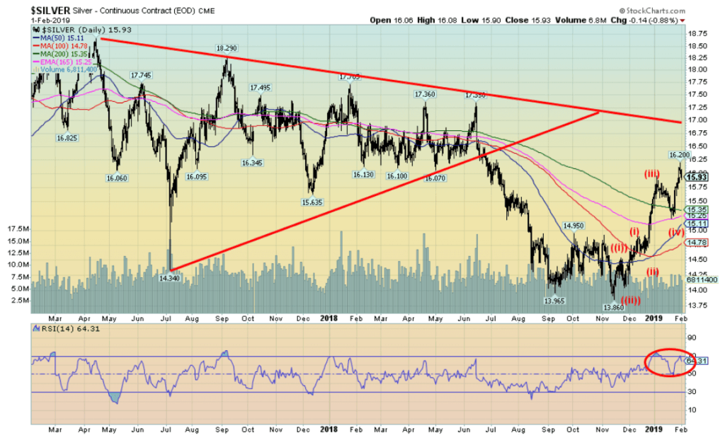
Silver, like gold, enjoyed a positive up week. Silver hit a high of $16.20 this past week, finally getting past the $16 level. Overall, however, silver has lagged gold and the gold/silver ratio is still a very high 82.99, barely down from the high of 86.99. Our preference is that silver leads the market higher. Its stickiness is a concern. Silver, like gold, has moved into a resistance zone that stretches from roughly $16 to $16.75. Above $16.75, silver should move above $17. Silver currently has support in the $15.60 to $15.80 zone. Below that, silver could fall further towards $15. Like gold, we remain positive on silver and believe that ultimately silver will regain the highs of 2016 near $21.25. Silver, like gold, is encouraged by the sudden dovishness of the Fed.
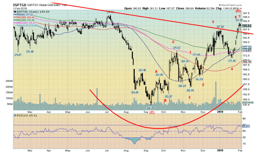
The gold stocks, as represented here by the TSX Gold Index (TGD), enjoyed a good week. The TGD gained 4.8% while the Gold Bugs Index (HUI) was even better, up 6.7%. Sentiment indicators on the gold stocks are still at levels that indicate that they have more room to move higher. The TGD has moved into a resistance zone that stretches up to the highs of July 2018 near 196. However, they have broken above a trend line, down from a secondary 2016 high near 232. The 2016 high of 284 remains quite a distance away. We believe that the TGD completed a corrective pattern that bottomed in August at 147. The TGD should now be in a multi-month advance that could challenge the 2016 high. The all-time high of 455 was seen back in 2011. Indicators are high but still not overbought, confirming our thoughts that there is more room to move higher. Good support should be seen down to 175 and below that 170. Weekly and monthly indicators are rising and have considerably more room to rise. Many individual gold stocks have been making new highs. Furthermore, the market is encouraged by the potential for more mergers, given the recent purchase of Goldcorp by Newmont. Other companies could also be takeover targets. The junior exploration market is showing some signs of life as well; however, we really don’t expect that market to show real life until gold clears $1,400. Above that level, the junior exploration miners could explode to the upside as many would come into play as potential takeovers because of the need for new resources by the larger companies.
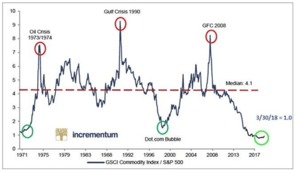
This is a great long chart of the S&P GSCI Commodity Index/S&P 500 ratio going back to the 1970s. Since 1970, there were only two other major buying opportunities for commodities—in particular, the precious metals—occurred. That was in the early 1970s and again in the late 1990s. The opportunity is once again upon us. What this chart tells us is that the next few years could be excellent for commodities: oil, precious metals, and metals. As was seen previously, bull markets in the commodities last more than few years and the gains during that period are considerable. This chart only goes to March 2018. However, based on current levels, the commodity boom is still in its very early stages.
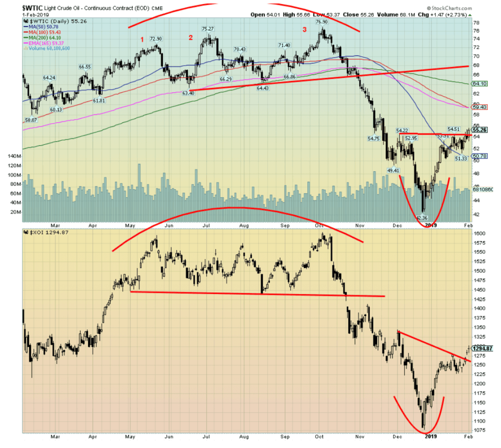
WTI oil prices jumped 2.9% this past week as a dovish Fed, resulting in a weakening US$ and coupled with the positive job numbers on Friday, helped push oil prices higher. The situation in Venezuela also helped as sanctions could be blocking U.S. imports from the beleaguered country. Venezuela still exports some 15–20 thousand barrels daily to the U.S. Venezuela was still trying to find a way around it as the week wore on. Nonetheless, both WTI oil and the Philadelphia Oil & Gas Index (XOI) appeared to break out this past week. The XOI gained 2.9% on the week, but the TSX Energy Index (TEN) was down 0.5% on the week as confusion about the Alberta situation continued. Alberta had ordered a cut in production to help oil prices, but many companies complained it was hurting them so the cuts are now easing. Couple that with the cuts because of sanctions on Venezuela and U.S. oil refiners were looking for product. Both WTI oil and the XOI appear to have made V bottoms (which is rare, actually). There is, however, considerable resistance above for oil up to $59 and $64. Above $65, WTI oil could be set to make new highs above $77. Support is seen down to $50. Below $50, a test of the recent low near $42 could occur.
Chart of the week
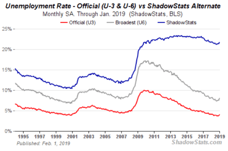
Shutdown? Pfft! Trade wars? Who cares! Massive debt? Bring it on! Slowing eurozone and China? We’re booming!
For the 100th straight month, U.S. nonfarm payrolls rose. The January numbers came in up 304,000 when all that was expected was a rise of 165,000 to maybe 175,000. Oh, the headline unemployment rate (U3) ticked higher to 4.0% from 3.9%, but that was because the participation rate was also higher to 63.2%, up from 63.1%. More people looking. That usually helps push the unemployment rate higher. Few pay much attention to the U6 unemployment rate which is the BLS’s broadest measurement—it includes short-term discouraged workers and other marginally attached workers, plus those working part-time who are looking for full-time work. The U6 unemployment rate rose to 8.1%, up from 7.6%—the biggest jump since 2009. Even fewer pay attention to the Shadow Stats (www.shadowstats.com) number that includes long term discouraged workers and those defined out of existence in 1994 under the Clinton administration. The Shadow Stats rate rose to 21.8% from 21.4%.
Still, after months of decline in the unemployment rate, the rise this past month has to be viewed as somewhat concerning. As to the nonfarm payrolls a great deal of the rise was due to seasonal adjustments. The December nonfarm payrolls were reduced by 90,000 to 222,000. It seems that those seasonal adjustments eventually get adjusted out. The civilian labour force rose to 163,229 thousand, a decline of 11,000. The number not in the labour force fell 639,000 to 95,010 thousand. Of that, 53 million are considered retirees. The number of people not in labour force but looking for work rose to 1,614,000, up 58,000 on the month. The number of people that usually work full-time fell 76,000 from December to 129,837 thousand. The number of part-time workers was 26,752 thousand, some 17% of the labour force. That was a decline of 242,000 from December. The number of people actually working fell but nonfarm payrolls were reported at over 300,000. No wonder we have problems trying to reconcile the numbers.
Other interesting numbers include those who hold multiple jobs. Those who work full-time and also hold a part-time job rose 123,000 in January to 4,452 thousand. The number of people who work two part-time jobs fell 298,000 in January to 1,879 thousand. The BLS reported that the number of people who are on temporary layoff jumped 173,000 in January. This was most likely due to the shutdown furlough. It was reported that those temporarily laid off jumped 23% in January to 937,000 and involuntary part-timers rose 500,000 to 5.1 million. Again, these numbers were no doubt influenced by the shutdown and were most likely contractors.
If it is any consolation, the furloughed workers will receive back pay so that could provide a boost in spending for February. Average hourly earnings in January rose 0.1%, but the market had expected a rise of 0.3%. It is up 3.2% from last year. This should have little impact on the Fed as they are watching the inflation numbers that continue to hover around 2%.
Canada reports its employment numbers next week.
(Featured image by DepositPhotos)
—
DISCLAIMER: This article expresses my own ideas and opinions. Any information I have shared are from sources that I believe to be reliable and accurate. I did not receive any financial compensation for writing this post, nor do I own any shares in any company I’ve mentioned. I encourage any reader to do their own diligent research first before making any investment decisions.

-

 Fintech2 weeks ago
Swiss Fintech Sector Enters Maturity as AI and Infrastructure Take the Lead
-

 Business2 days ago
TopRanked.io Weekly Affiliate Digest: What’s Hot in Affiliate Marketing [1xBet Affiliate Program]
-

 Biotech1 week ago
EU Biotechnology Law Aims to Boost Innovation and Cut Trial Delays
-

 Cannabis4 days ago
Aurora Shifts Strategy Toward Global Medical Cannabis Markets


