Markets
Copper’s New Base-Line Shift in Price?
In his latest analysis of the market, Mark J. Lundeen notes increased market volatility and the potential onset of a bear market, despite current bullish signals. He highlights rising copper prices and their historical context, attributing shifts to monetary inflation. Lundeen suggests a cautious stance, particularly regarding precious metals, amid broader market uncertainties and volatility.

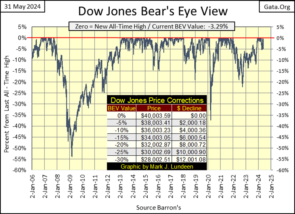
The last two weeks have been hard on the bulls, still at this week’s close, the Dow Jones closed in scoring position, or where its BEV value is somewhere between -0.01% and -4.99%. So what? Only that if someone is bullish on the stock market, at the close of this week with the Dow Jones’ BEV at -3.29%, they can still safely be bullish, and not lose any sleep over the stock market. Not yet anyways.
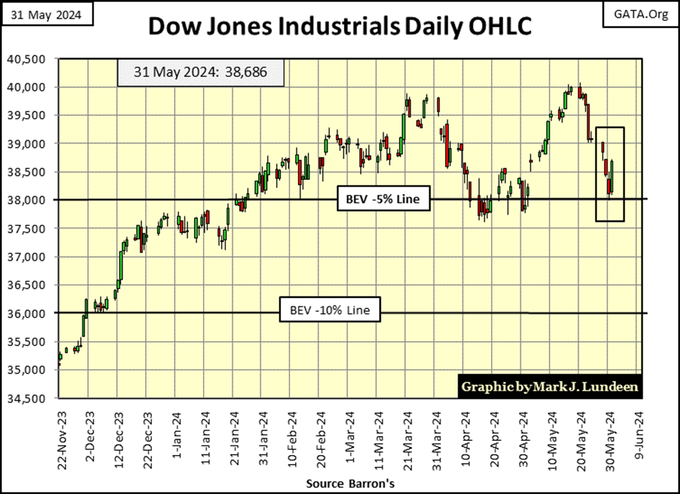
Looking at the Dow Jones in daily bars below, there is something happening these past two weeks that is making my “spider-sense tingle,” and it’s not only that there are so many down days seen since May 17th. Rather, the daily bars are becoming longer, which = rising daily volatility.
Bull markets are quiet markets, with their daily advances, and declines taken in little baby steps. Bear markets are the exact opposite, with their daily advances, and declines in big, oversized moves sure to catch everyone’s attention. It’s as if Mr Bear is shouting at anyone willing to listen; “look at me, look at me!”
Looking at the daily bars below for the past two weeks, even this Friday’s oversized big-bounce off its BEV -5% line, I’m thinking bear market.
So, is it? It’s too early to say. If things settle down, and the Dow Jones once again begins advancing towards a new all-time high in much reduced daily steps, the advance that began last November, making twenty-five new all-time highs since then, could continue all this summer.
If in the weeks to come, should the Dow Jones continue seeing its daily advances and declines percentage moves increase, as it also breaks below its BEV -5%, that isn’t good for the bulls. And as I’ve recommended before, should the Dow Jones close below its BEV -10% line, just sell everything, and not come back unless the Dow Jones once again rises above its BEV -5% line in the chart (s) above. Of course, when I say sell everything, I’m not talking about gold or silver miners. In a bear market on Wall Street, the precious metal miners are where you’ll want to be.
Moving on to my table of the major market indexes’ BEV values below, last Friday and this Tuesday saw a few BEV Zeros (0.00% = new all-time highs), but those stopped on Wednesday. Friday closed with 14 of these indexes in scoring position, with BEV values within 5% of their last all-time highs.
The Dow Jones (#13) almost slipped below scoring position on Thursday, but bounced back nicely on Friday. I note that since last Friday, most of the top 14 indexes seen below are holding on, keeping a respectable distance from their BEV -5% lines. Looking at this table, I have to say the bull market remains intact, and will continue be so until these indexes BEV values, one by one, slip below their BEV -5% levels, and on to lower levels.
Daily, I keep an eye out for the NASDAQ Banks (#20) and the XAU (#21). The XAU has been at the bottom of this table since the last half of 2011, thirteen years now. But all things, both good and bad, eventually come to an end. Is 2024 the year the XAU begins rising to much higher levels, as everything else in the table below eventually slips below the XAU? This is something that is going to happen. After thirteen years, why can’t this begin in 2024?
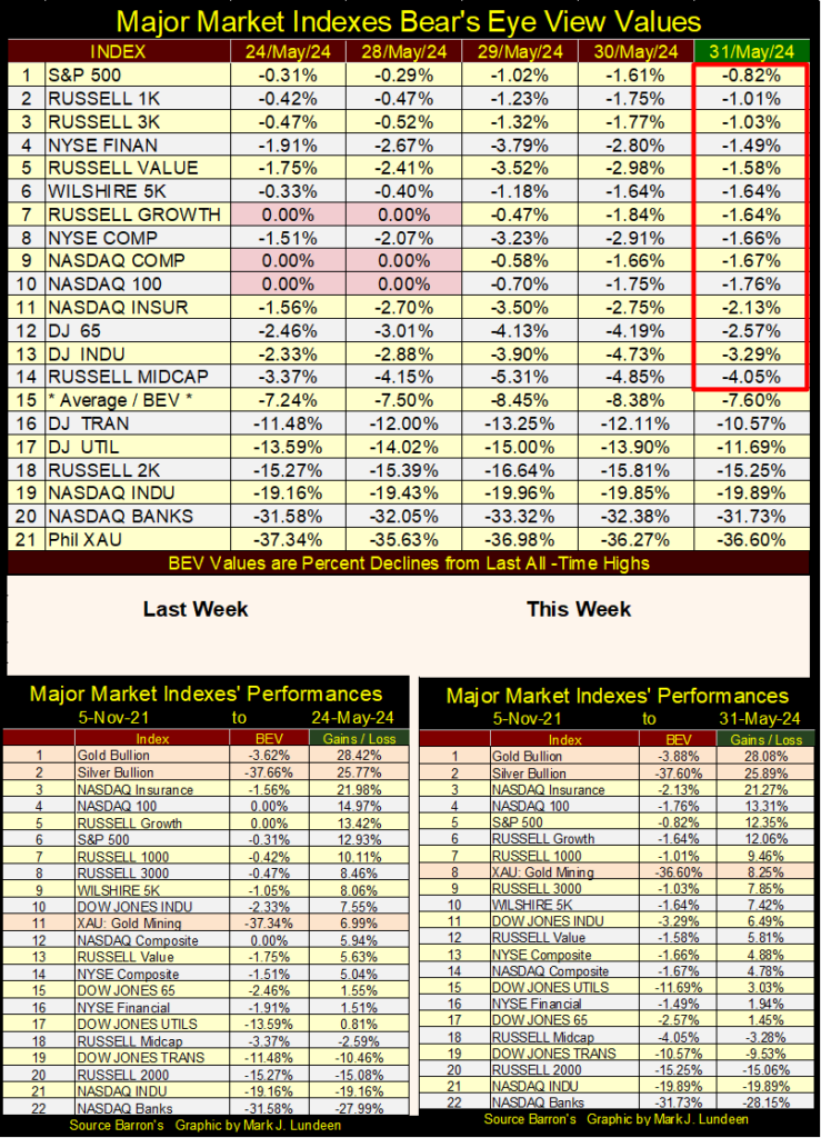
Will the XAU rise above these other stock indexes? If you use 05 November 2021 as a basis, instead of using these indexes last all-time highs (BEV Values as in the top table), looking at the performance tables above, the XAU has already risen to #8 in the list. Where is the NASDAQ Banks in the above performance tables? Way down below, at #22, down 28.15% from where it was on 05 November 2021.
Seeing the banks doing so poorly, way down at #22 is not a good sign for the rest of the market. This market’s oral hygiene isn’t all the financial mainstream-media’s “market experts” would have us believe it to be.
Gold and silver are keeping a tight grip on their top positions in the table. I like that. In time, the XAU being a leveraged play on the gold and silver these companies mine, should rise above the old monetary metals, and close at #1. But when? As if I know when.
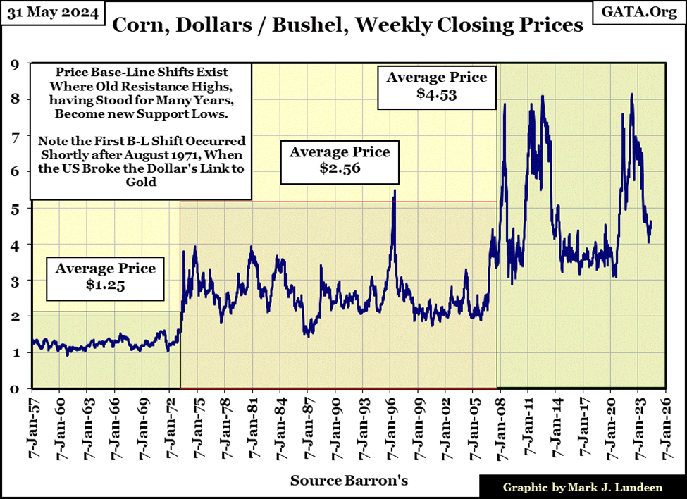
I haven’t posted this chart on copper for a while, making this a good time to do so once again, especially as copper last week closed at a new all-time high.
My copper prices are from the futures markets, as they have been since the mid-1970s. Previous to that, Barron’s published weekly closes for spot prices on agricultural commodities and various metals, and copper was one of them.
Way back then, copper prices were given in pennies / pound. In Barron’s 1957 issues, where I began compiling this data series, it took about forty-seven pennies, less than a half of a dollar to buy a pound of copper. This is why the plot of copper is listed in cents (pennies) / pound, though the average price of copper for the three base-lines are given in dollars.
Base-line shifts in the price of copper? I don’t really have to explain them in the chart below, as they are so evident in the price of copper for the past seven decades.
From 1957 to 1973, the price of copper averaged around $0.37 a pound. There wasn’t much volatility in the price of silver for these sixteen years, but copper prices were trending upwards, beginning in 1958.
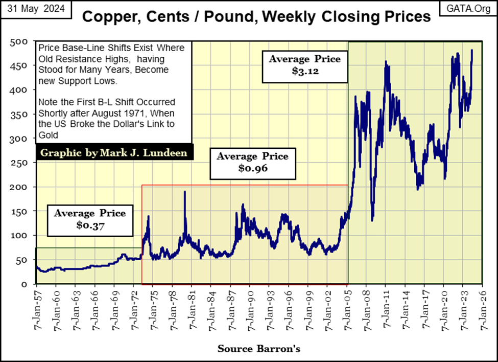
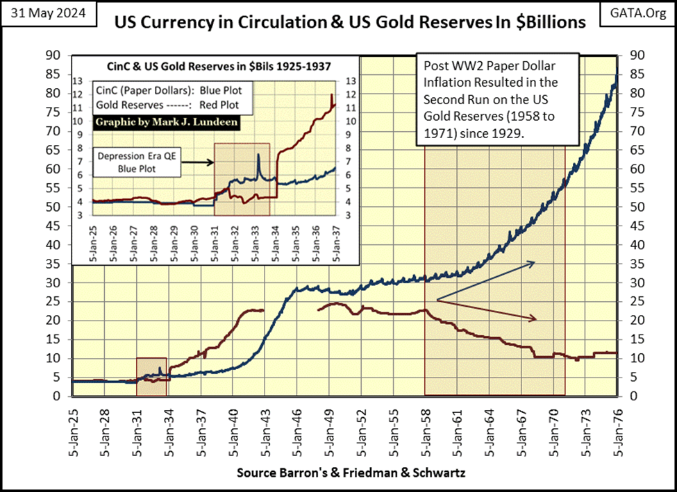
Did something happen in 1958 that would explain this creeping inflation in the price of copper? I think so (chart below); in 1958 a run on the US Gold Reserves began, that ultimately would end with half of the US gold reserves gone, and the US Treasury decoupling the dollar from the Bretton Wood’s $35 gold peg in August 1971. A run on the US Gold Reserves began, because the US Government was printing more paper dollars (Blue Plot below), than they had physical gold (Red Plot below) to back them.
Barron’s has been publishing this data since the 1920s, so it’s obvious foreign central banks were very aware of this too, that the US Government was violating the $35 gold peg it was supposed to have kept the dollar under, as a check on monetary inflation.
Beginning in 1958, foreign central banks began returning paper dollars to the US Treasury, to exchange them for physical gold at the Bretton’s Woods’ gold peg, of thirty-five paper dollars / one ounce of US Treasury gold. Thus began the drain seen below, of the US’s Gold Reserves.
The table below shows how extreme the paper dollar inflation was before the US Treasury decoupled the dollar from its $35 gold peg in 1971. Which is totally nonsense, as seen below, as from the start, the US Treasury never honored its $35 gold peg.
A monetary system can’t have a $35 gold peg, if they continue inflating its float of paper dollars. By August 1971, the US Government had issued $198.82 in paper dollars, for each ounce of gold held by the US Treasury. The dollar’s last link to gold, its $35 gold peg, never existed. When President Nixon announced the termination of the gold standard in August 1971, he was only making official what was already a monetary fact; the dollar had no link to gold.
I haven’t updated this table for a year. In Barron’s 30 January 2023 issue, the US Treasury had issued $8,763.39 dollars for each ounce of gold it claimed to hold in reserves. In May 2024, most likely there are now over $9000 paper dollars for each ounce of gold in the bullion reserves.
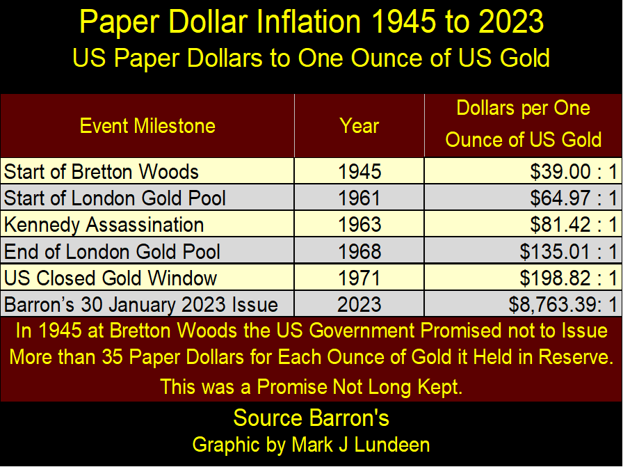
Next time an economist or “market expert” tells you the Federal Reserve is “fighting inflation” by doing this or that with their “monetary policy,” know that it’s all a lie, as the table, and chart above reveals the dollar’s true source of inflation; the US Government issuing more dollars, paper and digital, than it should, and has been doing that for many decades.
Moving back up to my chart on copper, this paper-money inflation explains, to me if no one else, why the price of copper was trending upwards from 1957 to 1973.
The first base-line shift in the price of copper began in 1973, two years following the termination of the Bretton Woods $35 gold peg, when the price of copper spiked to over $1.30 a pound. For large industrial users of copper, this spike in the price of copper was quite a shock, as estimates of expenses for their long-term projects, projects that require years to complete, were confounded by this spike in the price of copper, and most likely other industrial commodities too.
The best example for these inflationary driven cost overruns can be seen in the military-industrial complex. During the 1970s, the mainstream media loved reporting on any instance where the final cost of a ship for the Navy, or aircraft for the Air Force had large “cost overruns.”
Projects for the Navy and Air Force frequently have very long lead-times, from the time a ship or jet fighter is first conceived, to when these projects are actually at sea or flying in the air, can take over a decade. Monetary inflation from the Federal Reserve System made nonsense of any original bid price, given at the time of signing a contract, to when a ship or fighter was actually delivered to the Department of Defense.
Blame for these cost overruns by the media were always assigned to the defense contractor’s greed or incompetence. No doubt, they weren’t angels. However, anyone who takes a quick look at the chart above, at the growth in Currency-in-Circulation (CinC = paper dollars in circulation), would have to wonder if a significant portion of these costs over runs in the 1970s were because of “monetary policy,” as managed by the idiots at the FOMC.
Some method of allowing industrial users of copper some means of hedging these disrupting swings in the price of silver had to be found. So, copper began to be traded in the futures markets, something that didn’t happen before the 1970s, because, I assume, it wasn’t needed.
In the years following the 1971 decoupling of the dollar from its $35 gold peg, I’m sure Wall Street found trading metals, currencies, stock-market indexes, and T-bonds in their futures markets, very profitable. The more the idiots at the FOMC mangled their “monetary policy,” the more money Wall Street made, at the expense of everyone else.
Copper’s second base-line shift began in 2005, as the price of copper spiked to over $3.80 a pound. For the next two decades, since 2005, copper has rarely traded for less than $2.00 a pound. And now copper in May 2024, has risen to a new all-time high. Are we in the opening weeks of its third base-line shift in price? Time will tell.
Below is a chart for corn since 1957, which like copper, has seen two base-line shifts in price in the past seven decades. I wonder how long before corn rises to a new all-time high, and then refuse to return to price levels seen before 2024?
The Silver to Gold Ratio (SGR = Ounces of Silver per one Ounce of Gold), is declining in a significant way, and that is good for the precious metal bulls.
What is seen in the SGR chart below is as follows. During bull markets in gold and silver, the price of silver increases at a greater rate than does the price of gold, as the price of silver is more volatile than the price of gold. So, during bull markets in gold and silver, the SGR declines.
However, the price of silver is more volatile than the price of gold during bear markets too. So, as the price of gold goes down in a bear market, the price of silver goes down even more than the price of gold, which drives the SGR to higher levels during market declines in the old monetary metals.
Looking at the SGR chart above, and taking the price data of gold and silver for;
- 25 April 2011, when for the first time in decades the SGR was below 40,
- and at 19 March 2020, during the March 2020 flash crash, when FOMC Primate Idiot Powell flooded the markets with a few trillions of dollars of monetary inflation in a few months,
- and at this week’s Thursday’s close,
I constructed the table below.
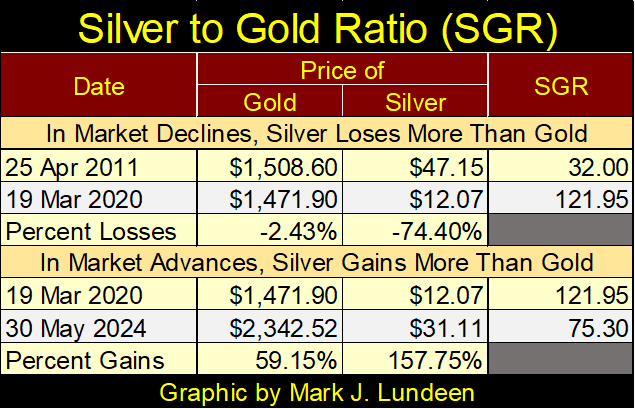
As seen above, holding silver in a gold and silver bear market is an expensive habit to have. But for someone with patience, using the SGR to time purchases of silver can be very profitable. In April 2011, an ounce of gold could purchase two pounds of silver. Nine years later in March 2020, an ounce of gold could purchase 7.62 pounds of silver, 7.62 pounds of silver that gained 157.75% four years later in May 2024. So properly timed purchases in silver, are leveraged plays on the price of gold.
So, why isn’t silver a more popular investment? Because to make these trades between gold and silver, one may have to haul several hundred pounds of silver back and forth to a bullion dealer. One could also use gold and silver ETFs, but then one would then have their gold and silver in paper form, paper promises that one day * WILL * be defaulted on by a big house on Wall Street. Washington will bailout the bank, while the bank’s ETF holders will be left holding an empty bag.
As things are now, we are entering an era of rising gold and silver prices. For retail investors of gold and silver, people with $100 to $100,000 to buy precious metal, buying silver bullion, or silver eagles from the US Mint, rather than gold bullion makes a lot of sense.
If we are in a bull market in gold and silver, and I believe we are, the SGR will once again decline to the 32 level it was at in 2011. When it does, investments in silver bullion will outperform gold bullion by over 100% from current prices. How can someone say no to that?
Here is gold’s BEV chart going back to 1999. Let’s take a moment to study it. Note; * NOT ALL * BEV Zeros seen in this chart are new all-time highs, as I started this BEV series in 1999; the bottom of the 1980 to 1999 bear market in gold. So, keep in mind, before 07 November 2007, this chart’s BEV Zeros are only new highs for the move, from the bottom of a 20-year bear market in gold. After 07 November 2007, BEV Zeros in this chart are actual new all-time highs in the price of gold.
Not that this matters, as what matters is that BEV Zeros before November 2007 still caught the attention of the public, because the rising price of gold made these BEV Zeros happen.
By August 2011, just before the price of gold fell into the crater seen below, there were many investors with exposure to the gold market. Investors who would soon regret that they ever bought a single ounce of gold, as gold slipped into a 45% market decline, bottoming four years later in December 2015. And what a great buying opportunity December 2015 was to gold bulls! But the gold bulls of August 2011 didn’t see it that way, most of them were long gone by December 2015, and still haven’t come back.
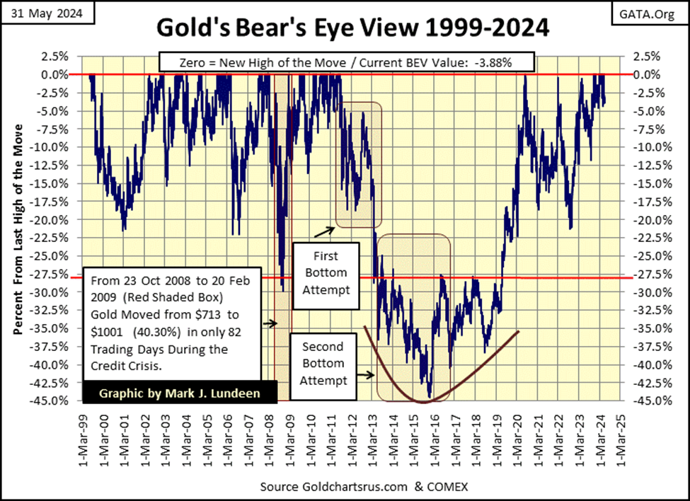
That left the gold market in what is called; strong hands, investors who have taken the time to study the gold market. For instance, let’s ask ourselves what makes most people buy any investment. It certainly isn’t low prices, actual bargain valuations in a market, as seen in the gold market in 1999 and again in 2015. Most investors’ attention of any market is dependent upon one thing, and one thing only; is that market making new all-time highs, aka BEV Zeros in the BEV chart above? This is called momentum investing, and this isn’t necessarily a bad way to invest.
But the higher the market goes, the more most investors fall in love with what becomes a femme fatale, a dangerous seduction that lures them to their doom. This is why most investors never walk away from Wall Street with any profits; their emotional entanglement in the market makes them incapable of selling at the top.
For gold, from August 2011 to 30 November 2023 in the chart above, gold made only nine BEV Zeros in July & August 2020. This poverty of new all-time highs tells me the public has been out of the gold market for a long time. But as gold has made twenty-three new BEV Zeros since 01 December 2023, the last on May 21st, just a few weeks ago, soon the public will once again be drawn into the gold market, especially should the stock market turn down in the coming months.
I’m no “market expert.” But when this market enthusiast looks at the BEV chart above, this is how I’m appraising the current situation in the gold market. Thinking about the possibilities for the price of gold for the rest of 2024, I’m feeling pretty frisky about the potential for old monetary metals and their miners in the months to come.
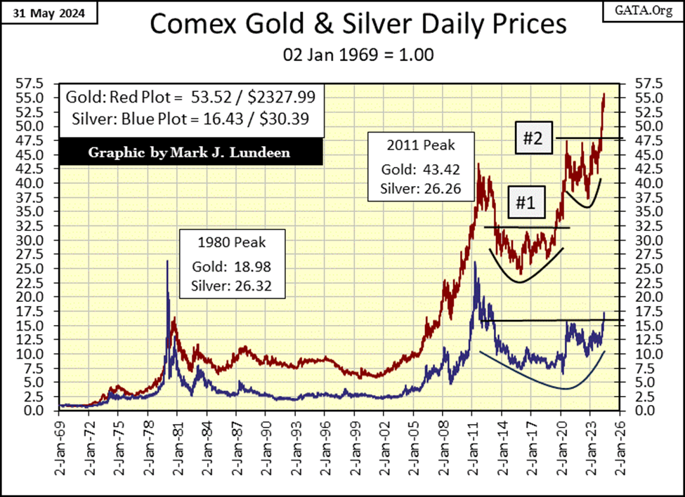
Moving on to gold & silver’s indexed values chart below, not much has changed from last week. Still waiting for silver’s break out above 16, to move on to something well above 20. Give it some time, this and much more will happen.
Looking at gold’s step sum table below, its advance appears to be on solid ground. Since its last BEV Zero on May 21st, gold has seen four down days, and only three advancing days, but that isn’t necessarily bad, as that indicates the gold market’s advance isn’t overheating. Seeing gold’s BEV value still in scoring position, closing the week with a BEV of -3.88% is a healthy sign for the bulls.
Another healthy indicator for the bulls, is gold’s daily volatility’s 200D M/A has increased from 0.57% on April 26th, to 0.62% on this week’s close. Bull markets for gold are exciting markets. Seeing gold daily volatility begin to rise is an indicator that things are getting exciting.
The gold bull market now needs some days of extreme market volatility, some 3% days where the price of gold moves up or down 3%, or more from a previous day’s closing price. So far for 2024, gold has seen no 3% days. But if this is a true bull market in gold, they will come, and be noticed by investors who currently own no gold, but will soon wish they had.
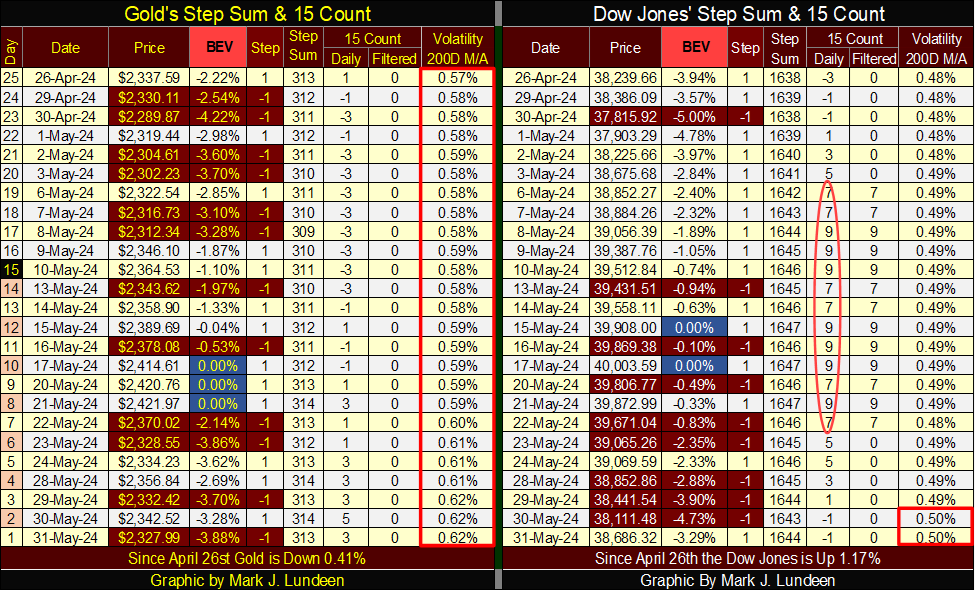
The Dow Jones in its step sum table (above) almost fell below scoring position on Thursday, but came back nicely on Friday. The Dow Jones is seeing a lot of down days. But after being very overbought (15-counts of +9) all during May, this is only to be expected, and we’ll most likely see down days dominate the market for the next few weeks. As long as the Dow Jones’ BEV remains in, or very close to scoring position (BEVs of -0.01% to -4.99%), I’m not going to worry about that.
Here is something to worry about; the Dow Jones daily volatility’s 200D M/A has increased to 0.50%. Not that there is anything special about its 0.50% level. However, for this indicator to rise from 0.47% just a month ago, to 0.50% at the close of May is something to be aware of, as rising daily volatility for the stock market is always bearish.
__
(Featured image by Ra Dragon via Unsplash)
DISCLAIMER: This article was written by a third party contributor and does not reflect the opinion of Born2Invest, its management, staff or its associates. Please review our disclaimer for more information.
This article may include forward-looking statements. These forward-looking statements generally are identified by the words “believe,” “project,” “estimate,” “become,” “plan,” “will,” and similar expressions. These forward-looking statements involve known and unknown risks as well as uncertainties, including those discussed in the following cautionary statements and elsewhere in this article and on this site. Although the Company may believe that its expectations are based on reasonable assumptions, the actual results that the Company may achieve may differ materially from any forward-looking statements, which reflect the opinions of the management of the Company only as of the date hereof. Additionally, please make sure to read these important disclosures.


Crypto Lending Hits $30 Billion, Becomes Key DeFi Pillar
The decentralized crypto lending market has surpassed $30 billion, signaling a structural shift in capital use. Protocols like Aave and...


Advances in LDL Cholesterol Management for Familial Hypercholesterolemia: From Statins to Innovative PCSK9 and CETP Inhibitors
PCSK9 inhibitors have transformed LDL cholesterol management in familial hypercholesterolemia, with new antibodies and CETP inhibitors like obicetrapib expanding options....


Italian Unlisted Banks Lag on ESG Sustainability
Standard Ethics’ benchmark of 25 major unlisted Italian banks finds only 36% meet full ESG sustainability standards, while 60% lag...


Cotton Prices Rise Amid War Tensions, Weather Risks, and Supply Concerns
Cotton prices rose last week amid the US–Iran conflict, production cost increases, and adverse weather. Hot, dry conditions in key...


Bitcoin Slides, Ethereum EEZ Emerges, Worldcoin Hits Low
Bitcoin slipped to around $67,000 amid geopolitical tensions and ETF outflows, while high mining costs push miners toward AI deals...
 |
|
 |  |
 |
|
-

 Fintech5 days ago
DZ Bank Pioneers Blockchain Bond Issuance, Advancing Tokenized Finance
-

 Crypto2 weeks ago
Crypto Markets Now Steady as Fed Decision Looms
-
 Markets6 hours ago
Cotton Prices Rise Amid War Tensions, Weather Risks, and Supply Concerns
-

 Biotech1 week ago
Italy’s Pharmaceutical Sector Drives Innovation, Sustainability, and European Leadership