Featured
Could irrational exuberance be behind the bull market?
Is “irrational exuberance” back? Records keep getting broken. Maybe this time it is different. But Friday steadied the market with a downdraft as some economic numbers came in on the low side. Capital flight has been driving the market pushing the U.S. dollar up and money flowing into U.S. bonds and the U.S. stock market. Then on Friday the U.S. dollar dropped sharply and gold soared.

Is “irrational exuberance” back? This is how some people are now referring to the bull market that is approaching its eleventh anniversary. It is a bull market like no other. Naturally, it depends on how one terms a bull market. A bear market is generally defined as a decline of 20% or more. So, if the market doesn’t fall 20% or more, the bull continues. On that basis, the current bull is now 4,000 days old or just shy of 11 years. Yes, there were three corrections along the way. The steepest decline saw the Dow Jones Industrials (DJI) lose 19.4% from October to December 2018. The other two corrections occurred in April to October 2011 (down 16.8%) and in May 2015 to February 2016 (down 14.5%). Other stock market indices may have fallen more than the DJI did, but our reference point is the DJI.
“Irrational exuberance” was coined by former Fed Chairman Alan Greenspan in a 1996 speech. Ironically, that was about when the late 1990s high-tech/dot.com bubble was getting underway. The 1990s bull market got underway in October 1990 and topped in January 2000. There was one 19.3% correction in 1998. Altogether, that bull lasted 3,382 days with a gain of 396%. The current bull market is up 349% to date. For the record, the 1920s bull market that lasted from August 1921 to September 1929 was 2,932 days and gained 497%. There was one 18.6% correction in 1923.
So, are we in a bubble? Many would argue that we are. But then, many would also argue that we are in a long-term bull market that has years to run with the odd correction along the way. With all due respect to the bulls, that is the classic “this time it is different.” Except usually it isn’t.
While the current bull is now the longest on record, it is not the best performing. As we noted, the 1921–1929 bull gained 497% and the 1990–2000 bull was up 396%, but the current one is up only 349%. In all fairness, the quoted gains are for the DJI only. The S&P 500 is up 396% and the tech-laden NASDAQ has led the way, up 659%. The much-beleaguered Dow Jones Transportations (DJT) that made its top back in 2018 remains up 399%. Canada’s resource-laden TSX Composite is up only 136% in the same period. Gold has been a serious laggard during this period, up only 71%.
But if one goes back to the turn of the century the picture is a little different. The best performer since 2000, is gold up 456%. The DJI is up only 156%, the S&P 500 up 131%, the NASDAQ up 143%, and the DJT up 269%. It all depends on what time frame one wishes to look at.
The 1920s bull was considered the classic bubble of all time. The 1990s was also a bubble, led by the high-tech/dot.com stocks. The NASDAQ gained 1370% from 1990 to 2000. What was behind the bubbles? The themes were similar. A lowering of interest rates, an easing of credit requirements to spur borrowing, and an increase in the money supply to stimulate the economy. In the 1920s, the U.S. and the world had just come out of the war years, the pandemic of the Spanish influenza, and the depression of 1920–1921. The end of the 1980s saw the crash of 1987 and the Savings and Loans crisis. All efforts were made to prevent it from happening again.
The 2010s haven’t been any different. We will call this one the central banks bubble. We have had historically low interest rates, massive easing of credit resulting in the biggest borrowing binge in history, and massive monetary stimulation through quantitative easing (QE) and just plain old massive injections of liquidity. The result: too much money chasing too few goods—the classic definition of inflation, except the inflation showed up in a stock market bubble. It is the most “juiced” stock market in history. Bubbles have appeared everywhere—stocks, bonds, housing, art, and more. Everywhere, that is, except wages for the vast majority of the population. Despite all the stimulus, the stock market has still not returned as much as the 1920s or 1990s bubbles.
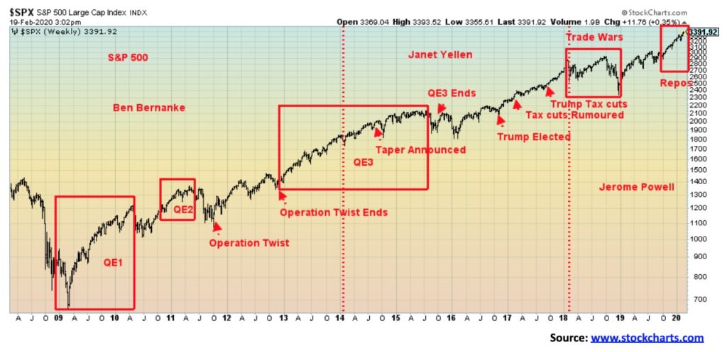
Our chart shows the impact of each phase of QE plus Operation Twist and, more recently, the Fed’s repo program that many are calling QE4. And now comes word that President Trump wants another stimulus package that could help give incentive to households to buy stocks, and the creation of some sort of tax-free account. Here in Canada we already have a Tax-Free Savings Account (TFSA). All this is coming with stocks at record highs, and unemployment at a 50-year low. And, of course, an election in November. Nothing like further stimulus to help one get re-elected.
No wonder the bulls say to ignore the background noise: coronavirus (COVID-19), trade wars, climate destruction, geopolitical conflicts (U.S., China, Russia, Iran), the deep polarized divisions in domestic politics, looming recessions in Japan, France, Austria, Mexico, Hong Kong, and Italy, with the potential for a slowing in China, Germany, and the United Kingdom—and finally the debt bubble and potential for massive defaults. Oh, and did we mention the locusts devouring parts of Africa?
We are already seeing the negative impact of COVID-19 with negative impact on tourism, airlines, supply chains, shipping, and more. While the number of reported cases is slowing, we learn that China is changing its methodology again, raising the potential for suspicious numbers. There are reports that the cases count is not only understated but grossly understated. Meanwhile, cases are rising sharply in South Korea and Japan, making Asia particularly vulnerable to disruption. And that flows over into Europe and North America (U.S. and Canada). Despite all that, there are many who claim this is just temporary, and when it ends things will return to normal.
The question we do have to ask ourselves is, when does the system reach the “tipping point” or, as economist Nouriel Roubini called it, the “Minsky Moment” when a boom and a bubble turn into a crash and a bust. Rather than “black swans,” Roubini calls them “white swans.” The risks are “known unknowns,” not “unknown unknowns.”
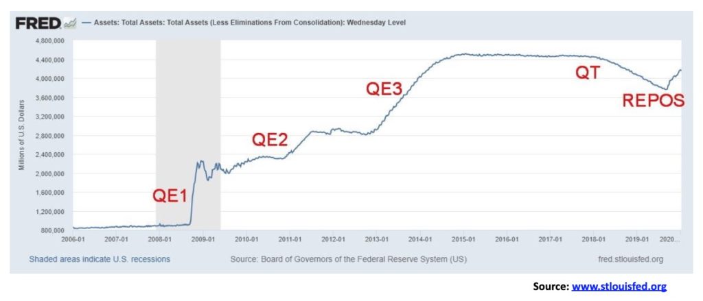
The chart above shows the massive growth of the Federal Reserve’s balance sheet. It exploded from around $800 billion in 2007 to over $4 trillion by 2014. Never in the history of the Fed had its balance sheet exploded so much in such a short period of time. All that money has to go somewhere and it did not find its way into Main Street. Instead, it went into Wall Street. With QT biting a bit and Fed hiking interest rates, it did play a role in the market decline in 2018, even if it was not the prime reason. Nonetheless, the Fed stopped hiking rates, then started lowering them and, in response to what some believe was a need to put a lid on interest rates, they started their repo program in September 2019. The result is the Fed’s balance sheet is growing once again.
By the end of 2020, at the current rate, the Fed’s balance sheet could grow by upwards of $1 trillion. And where does that money go? Into Wall Street. Printing presses are working overtime, even if the repo program is ostensibly to prevent a market collapse because of a problem we suspect in the EU banking system or possibly the Japanese banking system. They might also want to check the Chinese banking system which is also vulnerable because of huge amounts of loans denominated in U.S. dollars.
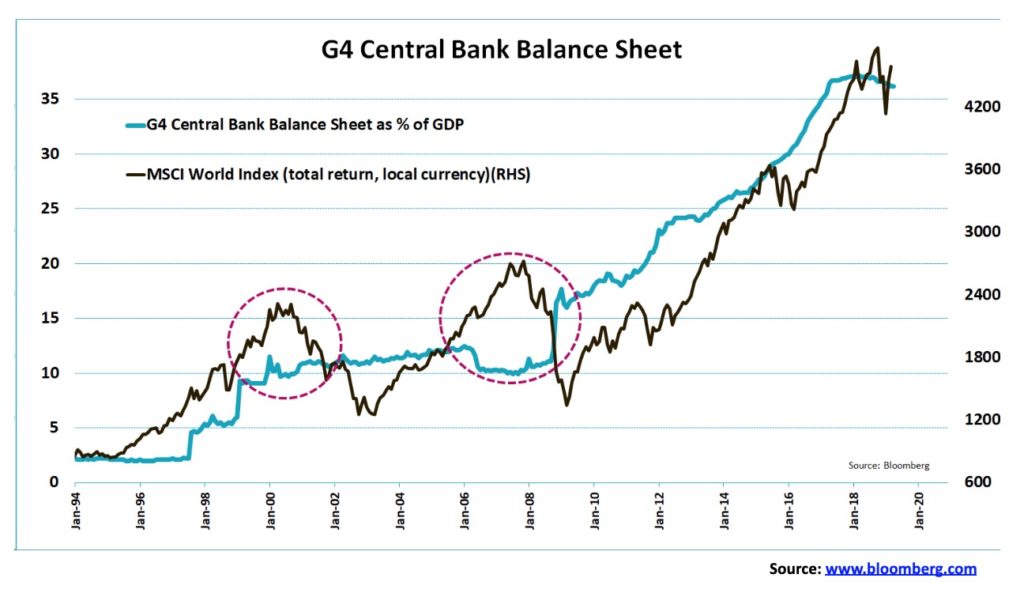
The next chart shows the G4 central bank balance sheets as a % of GDP (the G4 is U.S., Japan, Germany, and the U.K.). It compares the rise with the rise of the MSCI World Index (ex. U.S.). As their balance sheets exploded upward, the MSCI followed. All that money primarily went into the stock markets, not the economies whose growth has been anaemic at best since 2009. Many are now falling back into recessions despite years of QE and historically ultra-low interest rates, including negative rates. If this doesn’t work, then the question is, what will? Add in money flows (capital flight) out of the EU and Japan because of negative interest rates and money flows out of China because of problems in Hong Kong and COVID-19 and you have upward pressure on the U.S. dollar and more money flows into U.S. stocks and bonds. And yes, even some flows into gold.
As some say, bull markets do not have an expiration date. A truism is that stories of doom and gloom and bear markets are far more popular than stories of growing economies and bull markets. But 11-year bull markets have never happened before. And when previous bull markets came to an end, as they inevitably do, sorry, this time is not different, and then the finger pointing starts. As the maxim says, “don’t put all your eggs in one basket.”
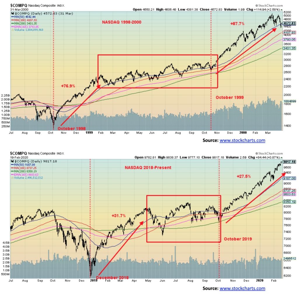
We often see similar chart patterns popping up in even unrelated stocks. After all, there are only so many chart patterns. But when we see a similar chart on, in this case, the NASDAQ 20 years apart it catches our attention. We found this rather remarkable. But does it mean anything? Only if the ending is the same. For the NASDAQ in 2000, it topped in March and by October 2002 it had fallen over 80%. Do we expect that this time? Not likely, but then who knows.
Certainly, the rise has not been as steep today as it was back in 1999 to 2000. As well, 2020 is an election year just like 2000. The odds of the stock market falling too far in an election year are low. After topping in March 2000, the NASDAQ did fall roughly 40% into April. But the S&P 500 was only down about 13% in the same time frame. After that, the markets recovered into the November election. The major drop came in 2001 and 2002. Our expectations are similar that the market should hold together in 2020 with the big drop to come in 2021–2022.
In 1998 the NASDAQ found a bottom in October. 1998 was the year of the Russian/LTCM collapse. The subsequent rally saw the NASDAQ rise almost 77% into February 1999, a period of four months. Fast-forward to 2018 and, following a sharp drop into December 2018, the NASDAQ found a bottom and rose for the next five months for a gain of about 32%. Following the rise into February 1999, the NASDAQ consolidated in an upward manner until October 1999. What followed was the final spectacular rise of about 88% into March 2000. This time around the consolidation also lasted until October 2019 and has thus far seen the NASDAQ rise about 28%. Since we do not officially have a top, it is possible that the NASDAQ does keep rising into March 2020. While the rise is not as spectacular as in 1998–2000, the direction is the same; the looks of the two charts are very similar and we have the same complacency that nothing can stop this market. That is, until it does.
Another week, another all-time high and then, poof, just like that the market tanks on Friday in the face of rising numbers for COVID-19 outside of China. Korea is seeing a doubling almost every day in the latter part of the week while a surprise surge is being seen in Iran. It’s a surprise because it isn’t as if Iran gets visitors from China. We are also seeing jumps in Italy and Japan. While numbers are rising outside of China, we have heard reports that China is underreporting cases by a considerable amount. St. Louis Fed President James Bullard believes this is all just temporary (it might be) and will soon blow over. So it is with known unknowns.
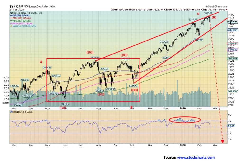
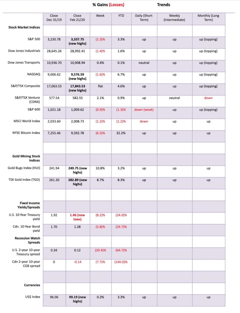
It was actually lousy economic numbers that sunk the markets at the end of the week as a bunch of MARKIT indices came in below expectations and at levels suggesting a recession. As well, existing home sales fell. We cover those more under our bond comment. The markets suffered their first loss since the COVID-19 crisis broke in late January. The S&P 500 dropped 1.3% on the week and is now down 1.7% from its all-time high set Wednesday at 3,393. The S&P 500 has not broken any key points that suggest the top is in, but Friday’s action certainly felt like a temporary top could be in. Confirmations will come when we break 3,300 and will really be confirmed under 3,275.
Other indices were also down. The Dow Jones Industrials (DJI) lost 1.4% and, significantly, did not make new all-time highs even as the S&P 500 and the NASDAQ did. The NASDAQ fell the sharpest, off 1.6%. The Dow Jones Transportations (DJT) surprisingly had a gain of 0.4%. Strange when airlines are expected to lose billions to the COVID-19 scare, and does anyone really want to go on a cruise these days? Airlines could be facing a $29 billion loss because of sharply reduced air travel. Tourism has taken a pounding, especially since the Chinese were major tourists everywhere. As well, millions visited China every year. Well, not so much any more. The small cap S&P 600 lost 0.9% on the week.
Elsewhere, the TSX Composite was flat after making new all-time highs but a surprise winner was the TSX Venture Exchange (CDNX), gaining 2.1%. In Europe, the London FTSE was off a small 0.1%, the Paris CAC 40 fell 0.1% as well after making new all-time highs, and the German DAX also made new all-time highs, then fell 0.6% on the week. There are signs the German economy could be falling into recession. In Asia, the indices surprised as China’s Shanghai Index (SSEC) gained 4.2% but the Tokyo Nikkei Dow (TKN) lost 1.4%. Strange for the SSEC but China is trying to get back to work despite the COVID-19. Seems that things can’t fully grind to a halt. The World MSCI Index lost 1.2% on the week. Most indices have not given sell signals yet, but another week down and a sell signal would be in.
So, how much could the market fall if a correction is to get underway? We don’t believe 2020 will see a major drop, largely because it is an election year. If we hark back to 2000 it too was an election year. The S&P 500 fell 13.8% from a high on March 24, 2000 to a low on April 14, 2000. It tested the 200-day MA before a rebound got underway that effectively lasted until the next high in September 2000. The NASDAQ got hit harder, losing 40% into May 2000. It too made a feeble recovery into September 2000. A decline to the 200-day MA for the S&P 500 now would be a loss of another 300 points or roughly 9% from current levels. For more recent election years, 2008 was the year of the financial crisis and 2012 was a year of market recovery while 2016 saw the election of Trump. 2008 was a horrible year while 2012 and 2016 were positive years.
If we are following a pattern not dissimilar to 2000 where the market topped following a long bull market, our expectation is that we would not be hit hard in 2020, but watch out for 2021 once the election is out of the way. Trump will, no doubt, want to see the markets rising to help his election chances. A correction now would be ideal as it would get it out of the way with still eight months to go before the election. It’s interesting that, with the market making new all-time highs again this week, we saw a surge in call option buying and huge volumes at discount brokerage firms. Tesla and Shopify have become two popular stocks for the retail crowd to buy, with speculative retail traders chasing the latest craze. That’s the way it is at tops.
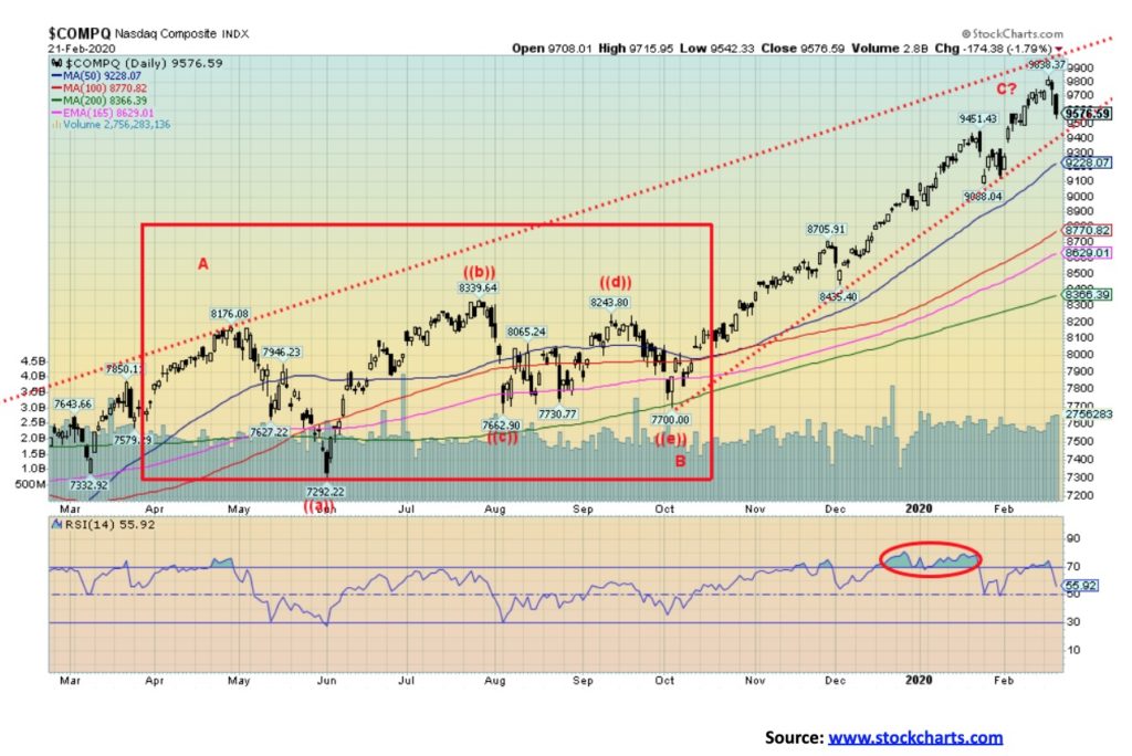
The NASDAQ took the biggest hit this past week of the major indices, losing 1.6% on the week. The NASDAQ fell 1.8% on Friday and is now down 2% from the all-time high seen on Wednesday. We can’t say that is a positive sign as the swift decline on Friday appeared impulsive. We note the divergence between the RSI making a lower high as the NASDAQ made a higher high. These kinds of divergences are not unusual at significant tops. The NASDAQ has been the big winner, led by the FAANGs, but it is the FAANGs that could also lead the market down. This past week Facebook fell 1.9%, Amazon lost 1.8%, the now challenged Apple, because of problems in China from COVID-19, fell a sharp 3.7%, Netflix only lost 0.1% as people will still watch TV, and finally Google lost 2.3%. As well, Microsoft lost 3.4%. The Semiconductor Index (SOX) lost 3.4% and a key ETF, the Technology Select SPDR Fund (XLK), dropped 2.5%. If we do have a decline into March as we suspect, the tech-heavy NASDAQ will probably face the biggest decline. Of the high fliers, Shopify lost 2% but Tesla continued its raging bull, up 12.6%. Tesla is, we believe, the poster child of high-flying tech stocks. It could also face the biggest collapse once the bloom wears off, despite this week’s gain that actually fell short of a new all-time high.
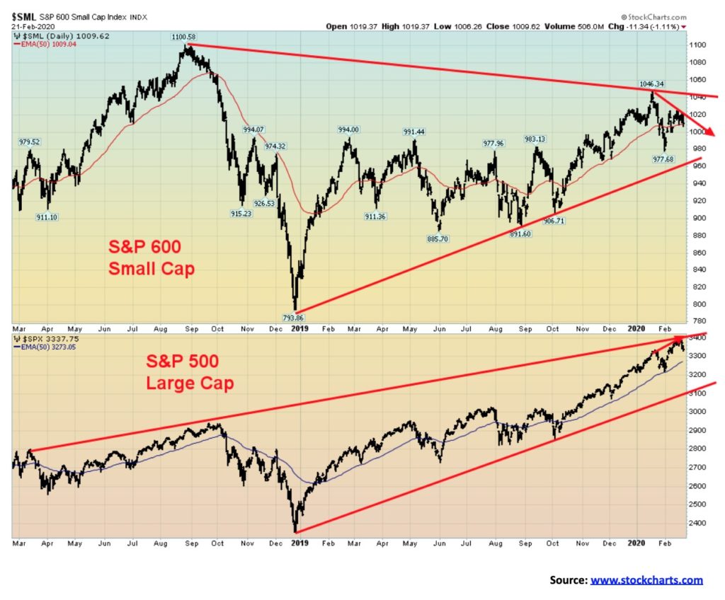
We have often noted how the large cap stocks are diverging with the small cap stocks, a non-confirmation. The S&P 600 topped way back in August 2018. It has been nowhere near there since. Even more recently, the S&P 600 put in a high in January 2020 at 1,046. The high this month was a lower high. On the other hand, the S&P 500 not only went on to take out its high of September 2018 but more recently the S&P 500 moved above its January 2020 high. Divergences and non-confirmations are often seen at major turning points. No, it doesn’t mean it happens right away and things may need some time to play out. But our experience is that once these divergences show up and are never resolved it usually signifies a potential major turning point. We have also noted the non-confirmation between the DJI and the DJT with the DJI making new highs not confirmed by the DJT.
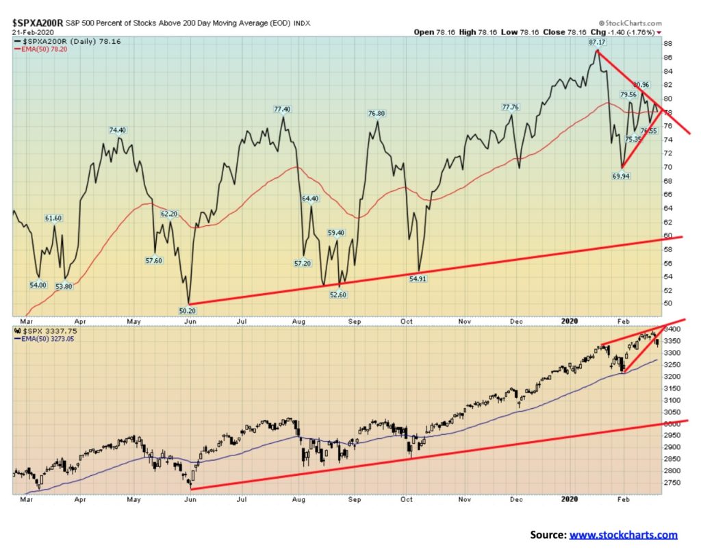
We have previously noted the negative divergence between the VIX volatility indicator and the S&P 500. Here’s another one. This is the percentage of stocks above their 200-day MA. Despite the S&P 500 making new all-time highs, the percentage of stocks above their 200-day MA was making a lower high. The most recent high was at 80.96% vs. the January 2020 high of 87.17%. Fewer stocks above their 200-day MA even as the index is making new all-time highs is a divergence that we should pay attention to—another warning that a top may be at hand.
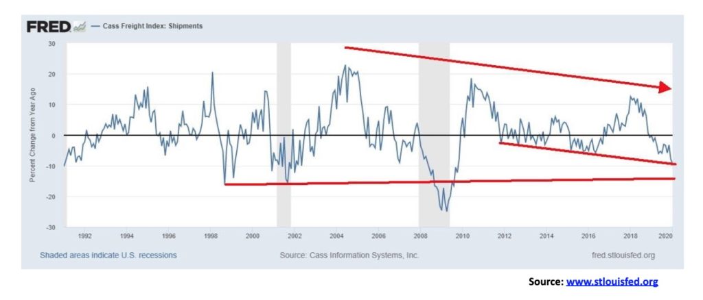
The Cass Freight Index, a measure of North American freight volumes continues to plunge. January 2020 freight activity continued to plunge year-over-year down 9.4%. The plunge is comparable to what was seen as the U.S. slid into the “Great Recession” of 2007-2009. It is an indication that despite claims this is not exactly a booming economy. Nor is it good for sustainable growth. Maybe we’ll get a bounce rebound as the index is hitting a support line. But if plunges through and takes out those lows seen in 1996 and 2000 then we could be headed for the 2008/2009 lows.
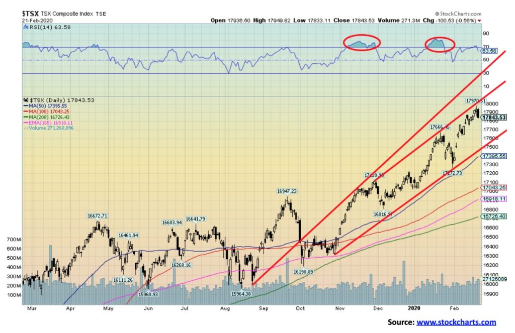
Another week, another record high. The TSX Composite once again saw new all-time highs this past week as it was flat on the week (actually it lost a tiny 0.03%). The TSX touched might be the top of a channel created by drawing a line from the November 2019 high through the January 2020 high. With a high of 17,970 the TSX fell short of the 18,000 mark. Friday’s down day left a large engulfing candle on the charts suggesting a potential top. Our first sign of a top will be a break under 17,750. However, confirmation would not come until we break back under 17,500. The sub-indices had a mixed week with 7 on the plus side and 7 on the negative side. No wonder the TSX was flat on the week. The big winner was Golds (+8.7%) while the big loser was Information Technology (-2.7%). Other significant winners were Materials (+3.9%) and Metals & Mining (+2.9%). Losers included Health Care (-2.6%) and Consumer Discretionary (-1.6%). A key sector is Financials and they fell 0.1% this past week. Since Financials make up almost a third of the TSX, we need to see them rising if the TSX is to go up. Golds do not make up a huge proportion of the TSX Composite. Note that, despite the new all-time high, the RSI is below its previous highs, making a negative divergence.
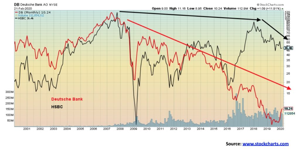
Dual trouble? We have mused about the Fed’s repo program. We wondered if there are some banks out there in trouble and therefore the Fed needs to keep a lid on interest rates. One of the biggest suspicions has fallen on Deutsche Bank (DB). But then this past week HSBC (HSBC), also known as Hong Kong Shanghai Banking Corp., popped up with the news that they were laying off 35,000 over three years and dumping a $100 billion in assets. DB took a $7.3 billion hit. They are also the bank that bailed out Trump, but that is another story. DB has a huge amount of its capital (estimated at 30%) allocated to businesses that is below their cost of funds. As someone noted, these two banking behemoths are dying a slow death. DB has been falling for years and now HSBC is starting to decline as well, although at a much slower pace. HSBC has been lower in 2009, 2009, and 2016.
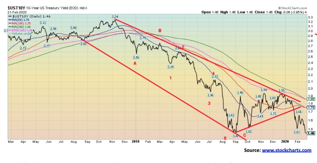
Capital flight is driving both the U.S. dollar and U.S. treasuries. Capital flight from the EU and Japan, because of negative interest rates and capital flight from China and Hong Kong because of COVID-19 and protests in Hong Kong. This past week the 10-year U.S. treasury note fell to 1.46%, down from 1.59% the previous week. We are now 1 bp below the previous low seen in September at 1.47% and gaining rapidly on the all-time low seen in 2016 at 1.37%. Another low in 2012 was at 1.43%. The 30-year U.S. treasury bond has fallen under 2.00%, currently at 1.90%. Not only is that yield a new 52-week low but it is an all-time low. Here in Canada the 10-year Government of Canada bond (CGB) has fallen to 1.28%. Still, that is above the last low 1.16% seen in July 2019 and above the all-time low of 0.96% set in July 2016. Helping push yields lower and also helping push the US$ Index lower on Friday were the below-expectations MARKIT manufacturing and services indices. The MARKIT manufacturing PMI came in at 50.8 (just above flashing recession) when the market expected a reading of 51.5. The January number was 51.9. The MARKIT services PMI came in at a recessionary 49.4 vs. expectations of 53 and last month’s 53.4. As well, on Friday the existing home sales for January fell 1.3%. That was actually good as the market had expected a fall of 1.8%. We can’t help but note junk bond yield spreads that are at 3.49% to the 10-year. A month ago they were at 3.15%. The below CCC-rated spread is 9.85% vs. 10.19% a month ago. Can the 10-year fall further? Yes, it could, but we are getting near what we suspect is a bottom. The pattern that has formed of making a bottom, then a strong counter rally followed by another plunge, is a pattern we have seen many times in the past. What usually happens is that we see new lows, accompanied in this case with extreme bullish sentiment. Then rates begin to rise again.
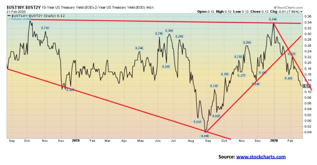
Are we sliding closer to recession territory? The closely watched 2–10 recession spread (2-year U.S. treasury notes less 10-year U.S. treasury notes) bottomed last August at -4 bp. Our other closely watched spread 3m–10 (3-month U.S. treasury bills less 10-year U.S. treasury notes) bottomed around the same time at -52 bp. This past week the 2-10 spread fell to +12 bp, down from +17 bp the previous week while the 3m–10 spread fell to -10 bp, down from +1 bp last week. Analyst Tom McClellan has noted there is a 15-month lag between negative or inverted yield curves and any recession. If that’s correct, then no sign of a recession should show up until later in 2020. But it points to potential problems in 2021.
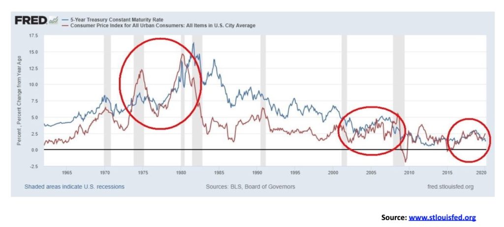
We can’t help but notice that the spread between the annual change for CPI and the yield on U.S. 5-year treasury notes has turned negative. It is the same thing with the 10-year and just this past week the 30-year U.S. treasury bond slipped under the CPI rate. Negative real interest rates are joy to gold. We note in particular two earlier periods: the 1970s, particularly the period from 1975 to 1980, and the 2000s. Gold rose sharply in the 1970s and was rising sharply as well in the 2000s before peaking in 2011. The long period between 1980 and 2000 saw positive real interest rates and gold underperformed. The spread between CPI and the 5-year started narrowing after 2015. Not surprisingly, gold’s bottom was seen in December 2015. How long this persists is anybody’s guess, but with the Fed trying to push interest rates lower with the repo program plus money flows into U.S. treasuries, negative real rates could persist. And that is music to gold’s ears.
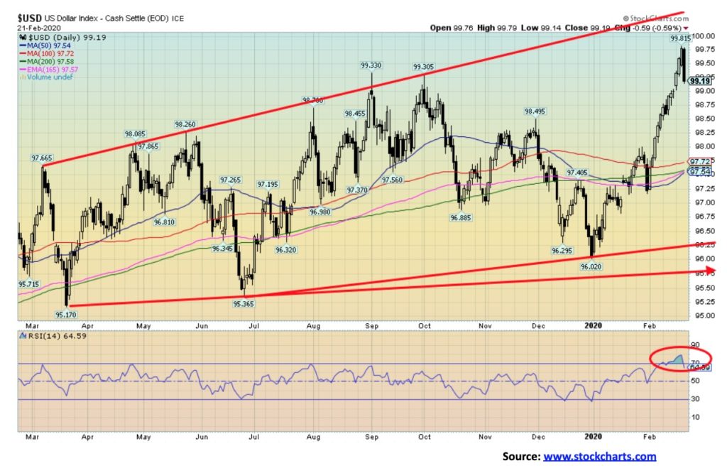
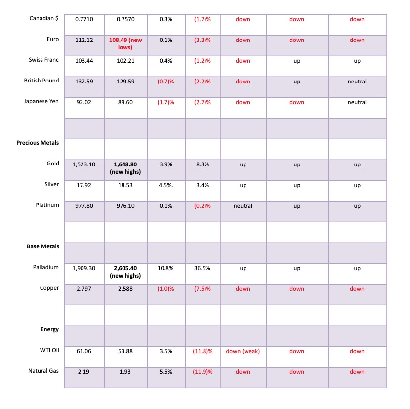
The US$ Index soared this past week to new 52-week highs and then on Friday it all reversed. The US$ Index fell 59 bp or 0.6% and closed the week barely up 0.2%. The US$ has been driven higher with money flows out of Europe and Japan because of negative interest rates and out of China and Hong Kong dealing with COVID-19 and protests in Hong Kong. So, is the US$ Index rally over? While Friday’s huge engulfing bearish candle looks terminal, we need to see further evidence. The up move has been quite steep and it was no surprise that indicators quickly became overbought. As well, sentiment for other currencies plunged. Numbers we saw this week had sentiment towards the euro, the Swiss franc and the Aussie dollar, down below 10%. The Japanese yen fell to 16%. The euro, after making new 52-week lows, rebounded closing up 0.1% on the week. The Swiss franc gained 0.4%. However, the British pound sterling fell 0.7% while the Japanese yen fell 1.7%. The Canadian dollar managed to eke out a gain of 0.3%. One surprise on the week was the ability for gold to rally in the face of the US$ rally. Usually gold falls when the US$ goes up. Not this time. Given the steep rise for the US$ Index we need to fall back under 98.50 to confirm to us that a top is in. The breakdown level for the US$ Index is now under 96.25. The 0.6% decline for the US$ Index on Friday was the steepest sell-off this year.
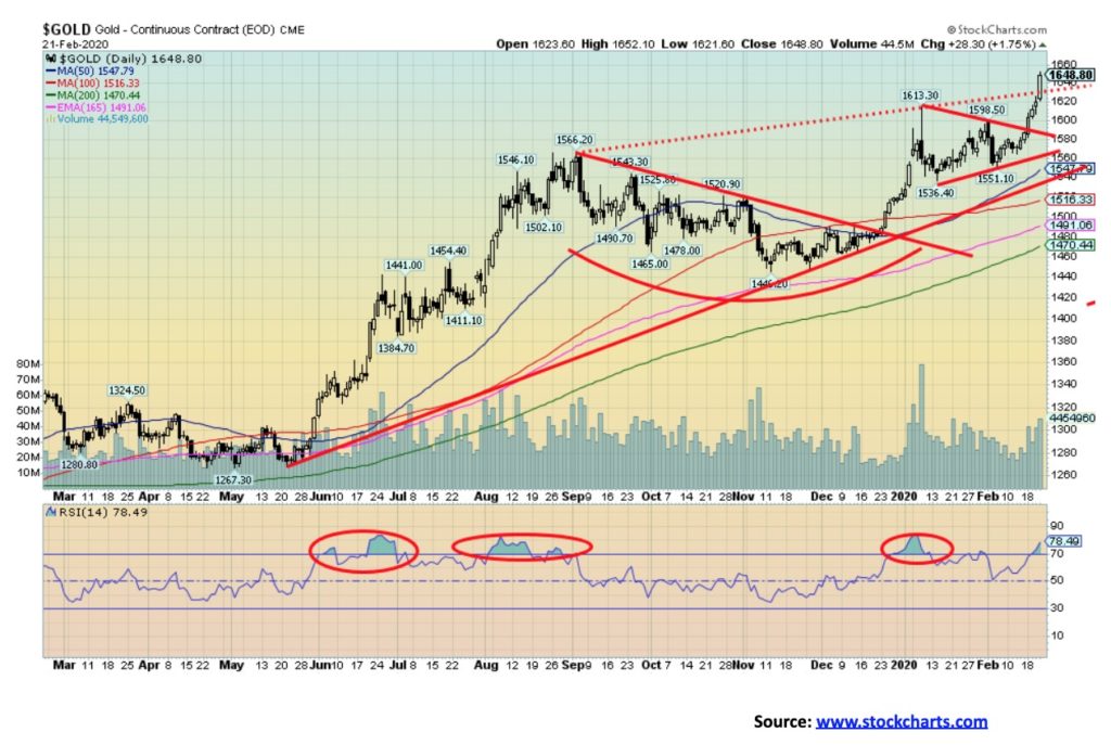
Gold enjoyed a very strong up week, gaining $62 and hitting a high of $1,652 before settling back to close at $1,648. Gold is getting close to the pennant target of $1,667. Our longer-term target of $1,725/$1,750 is also now within sight. Despite the elation we are sure the gold bugs are feeling there are some notes of caution. First the RSI is now well over 70 (currently 78). Over 70 is overbought and a sign that we could see a pullback. The gold commercial COT fell to 24% this past week, the lowest level we have ever seen. The Daily Sentiment Index at www.trade-futures.com hit 93% this week. The large speculators COT net long position is as high as we have ever seen it, although its COT was steady at 88%. Is a top imminent? These are cautionary signals and they do not necessarily signal a top. Gold typically rallies into the annual Prospectors and Developers Association of Canada (PDAC) convention to be held March 1–4, 2020. That’s only a week away. If gold is still rallying hard this coming week, traders and even investors may wish to think to about some profit-taking as the bullish sentiment is rising too fast too soon. Nonetheless, gold is responding to the COVID-19 crisis, the threat of a global economic slowdown, negative yield curves, and, negative real interest rates. There may also be thoughts that the Fed and others are running out of “bullets” to deal with another potential financial crisis. QE to infinity is all they can do and have been doing. Prudence now dictates caution and stops starting at the old highs around $1,613. If we were to reverse and close back below that level by the end of the month, we would have signaled a top. One thing we have been impressed with is gold’s ability to rally despite the sharp rise in the U.S. dollar this past week. Despite that, beware of a potential top that could come early in the week or towards the end of the week. We’d prefer to hit our targets of $1,725–$1,750, but a failure just below $1,700 could also happen. The move overall has been too fast. Once a correction sets in, it could easily last 3 or 4 months.
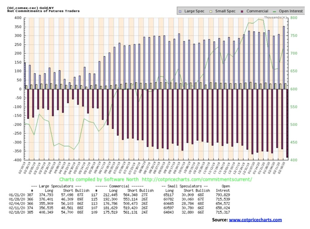
We suppose this shouldn’t be a surprise, given gold’s rise this past week. Further, the numbers are as of Wednesday so it doesn’t include Friday’s big move. The gold commercial COT fell to 24% this past week from 26% the previous week. We’ve never really seen it so low. So that is a bit worrisome. Long open interest fell roughly 6,000 contracts while short open interest rose almost 42,000 contracts. Total open interest leaped 57,000 contracts. The large speculators (hedge funds, managed futures, etc.) was steady at 88% despite long open interest jumping nearly 52,000 contracts and even as short open interest also rose but only just over 6,000 contracts. The COT is becoming more bearish.
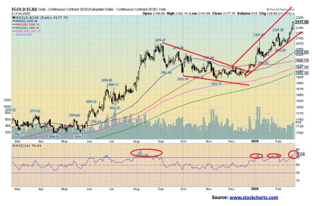
As gold pushed higher in U.S. dollars, gold was making record highs in Canadian dollars, euros, Japanese yen, Swiss francs, Australian dollars, and a host of other currencies. We continue to believe that at some point gold will also make new all-time highs in U.S. dollars. Gold in some currencies is quite overbought with RSIs screaming above 70. But that can persist for some time as it did back in August 2019 before a corrective period set in. It’s a warning sign, not a guarantee, of an immediate top. There is certainly room for gold in Canadian dollars to hit $2,200 and somewhat higher.
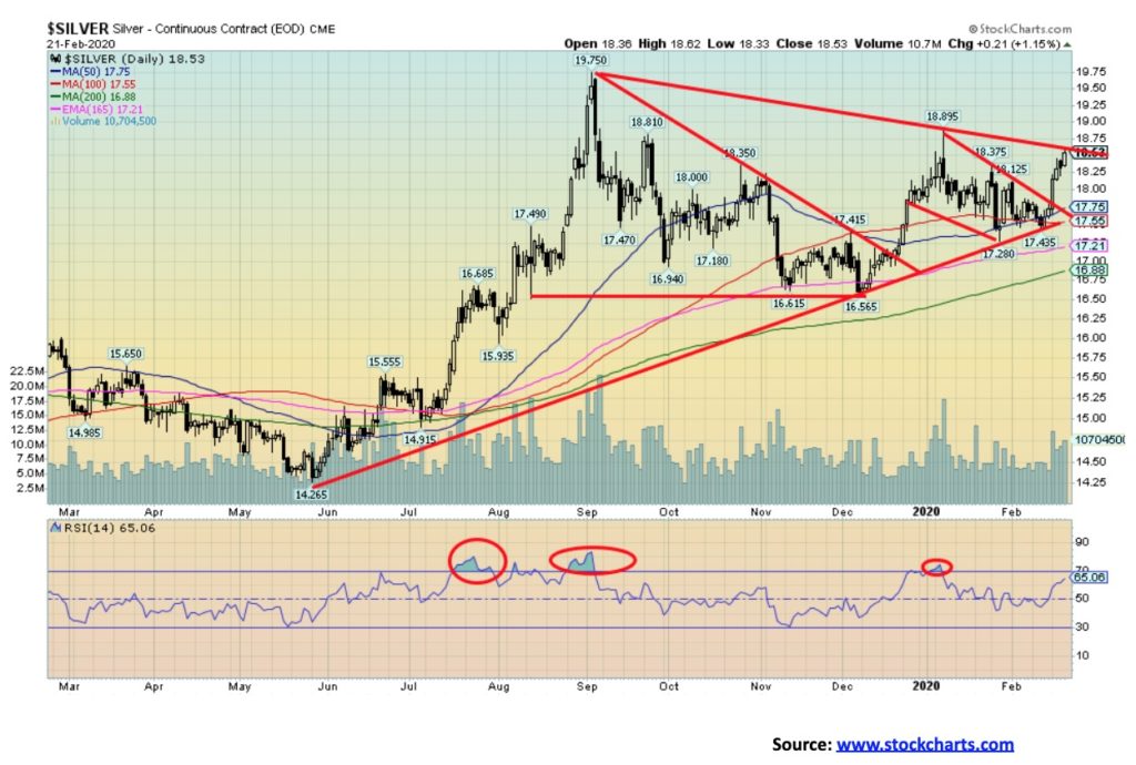
Silver finally showed some spark with a solid 4.5% gain this past week. With an RSI still under overbought levels at 70 silver could have further to run. Our only concern, as we note below, is that while gold is making new 52-week highs silver is not. Silver is still suggesting that it could hit potential targets up to $20.30/$20.50 based on the triangle that formed August to December 2019. The flag formation that formed in January/February 2020 suggests targets of $19.40/$19.50. Once silver breaks over $18.60 we could also have potential targets up to $21.80. Some words of caution are that besides silver lagging gold the commercial COT for silver is sliding further as well. Nonetheless, the action was positive this past week for silver and we should see higher prices this coming week. There is some resistance at $18.90 and again up to the August 2019 high of $19.75.
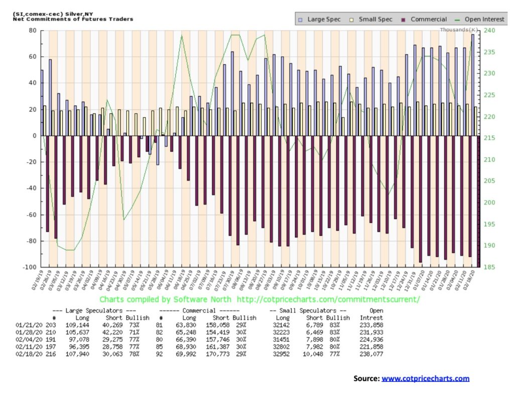
Just as the gold commercial COT fell, so did the silver commercial COT, falling to 29% from 30%. Long open interest rose about 1,000 contracts while short open interest jumped just over 9,000 contracts. The large speculators COT rose to 78% from 77%. Like the gold COT, the silver COT is also bearish. So we have to keep this in mind as gold and silver rise in price.
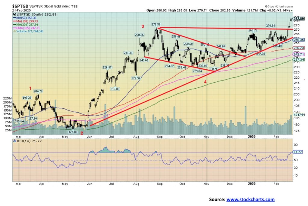
Gold stocks went gangbusters this past week with both the TSX Gold Index (TGD) and the Gold Bugs Index (HUI) showing substantial gains and both hitting new 52-week highs. The TGD gained 8.7% on the week and is now up 8.3% on the year while the HUI jumped 10.8% on the week and finally is in the black for the year, up 3.2%. The rising triangular pattern that formed on the TGD suggests potential targets up to 312/315, another 10% gain from current levels. As we noted with gold, some prudent profit-taking is suggested. The RSI on the TGD is just over 70 but it can, as it has in the past, get much higher before profit-taking kicks in. The breakout this past week over 270 came on increased volume, suggesting that this move should have some legs. But stops are prudent. For the TGD the reversal point would come with a break back under 258.
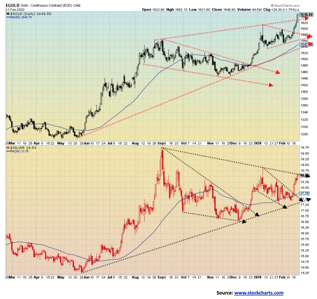
While we were pleased that both gold and silver enjoyed a good up week with gold breaking out of the top of the channel, silver stopped Friday at the top of the channel. We still expect silver to take it out, but what is of concern is that gold is making new highs while silver is not. As long as this divergence persists, it sounds a note of caution as gold and silver rise.
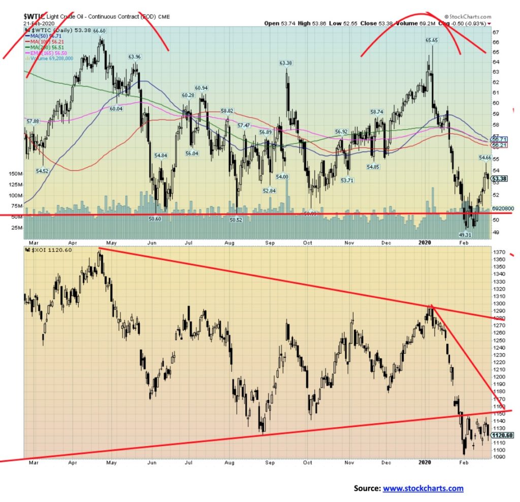
Oil prices were attempting to rebound this past week on hopes that OPEC would cut production. But by week’s end that basically fell apart as Russia indicated they have no plans to cut production further. OPEC also decided not to move its March meeting forward even as Saudi Arabia, the UAE and others continue to discuss production cuts. The result was that WTI oil prices fell about 1% on Friday but still managed to gain 3.5% on the week. Based on Friday’s action, the rebound rally may be over. WTI oil broke support in late January, trading under $50. New lows below $49.31 could send WTI oil prices downward towards the lows of 2018 near $42. With the COVID-19 crisis not resolving itself and potentially spreading and increasing in other countries it does not bode well for oil demand that could suffer further drops. Natural gas (NG) also managed to bounce back a bit this past week, gaining 5.5%. However, we still see no sign of a bottom forming. The energy stocks were mixed with the ARCA Oil & Gas Index (XOI) down 0.2% while the TSX Energy Index (TEN) gained 0.9%. The best that can be hoped for with WTI oil prices here is that they continue to find some support just above $50. The falling MAs up around $56/$57 remain enticing rebound targets, but there is no law it has to reach that high. The XOI appears to be forming a bear pennant after finding an initial bottom at 1,094. A break of 1,105 could target the XOI down to 1,045/1,050. Based on the broad pattern that formed on WTI oil between June/July 2019 and the high in January 2020, the potential long-term target could be $34/$35. Only regaining back above $57 could this potential scenario change.
—
(Featured image by Adam Nowakowski on Unsplash)
DISCLAIMER: This article was written by a third party contributor and does not reflect the opinion of Born2Invest, its management, staff or its associates. Please review our disclaimer for more information.
This article may include forward-looking statements. These forward-looking statements generally are identified by the words “believe,” “project,” “estimate,” “become,” “plan,” “will,” and similar expressions. These forward-looking statements involve known and unknown risks as well as uncertainties, including those discussed in the following cautionary statements and elsewhere in this article and on this site. Although the Company may believe that its expectations are based on reasonable assumptions, the actual results that the Company may achieve may differ materially from any forward-looking statements, which reflect the opinions of the management of the Company only as of the date hereof. Additionally, please make sure to read these important disclosures.


Youth Cannabis Use in Colorado Is Falling — But the Full Story Is More Complex
The 2026 Colorado survey shows teen cannabis use fell to 10 percent in 2025, down from 21 percent in 2015....


Morocco’s Growth Holds at 4.6% as Agriculture Offsets Economic Pressures
Morocco’s economy grew 4.6% in Q1 2026, driven by a strong agricultural rebound offsetting declines in industry. Services expanded moderately...


Abivax Shares Surge as New Trial Data Eases Safety Concerns Over Ulcerative Colitis Drug
Abivax shares surged nearly 36% after positive updated trial results for its ulcerative colitis drug obefazimod reassured investors following earlier...


El Dorado Raises $9M to Expand Cross-Border Fintech Platform
El Dorado, a Latin American fintech improving cross-border financial services, raised a $9 million Series A led by Paradigm with...


Bitcoin Stalls Near $60K as Strategy Moves, ETFs Outflow, and EU MiCA Rules Take Effect
Bitcoin hovers near $60,000 with ETF outflows, while Strategy boosts reserves, sells BTC, and raises dividends to reassure investors. Ethereum...
 |
|
 |  |
 |
|
-

 Impact Investing6 days ago
Coastal Cities Lead as Heat Strains Italy’s Urban Livability
-

 Fintech2 weeks ago
Trade Republic Brings Back Human Support and Launches Customer Council
-

 Biotech2 days ago
Eli Lilly Hits $1 Trillion Valuation Amid Strong Bullish Momentum
-

 Africa1 week ago
Moroccan Bond Market Shows Mixed Signals as Primary Eases and Secondary Pressures Persist