Featured
Could the Coronavirus finally burst the debt bubble?
Nothing seems to be getting in the way of the melt-up. Not even coronavirus has knocked it off its upward climb except for a few brief days. The central banks are going to save the world. Our recession watch spread remains positive. No signal of it, though we can’t help but note that parts of the EU are falling into recession. So is Hong Kong and who knows what happens with China and the COVID-19.

Sir John Templeton’s words struck a chord. “This time it’s different.” It is a phrase that has been heard throughout history. As we watch the stock indices roar to new all-time highs, it is a phrase that keeps recurring. It appears that not even coronavirus, or COVID-19 as it is called now, can stop this historic market. As to Sir John Templeton, we wouldn’t exactly refer to him as a perma-bear.
This Time Is Different, Eight Centuries of Financial Folly is the title of a classic by economists Carmen M. Reinhart and Kenneth S. Rogoff. The book chronicles history through periods of lending, borrowing, crashing, and recovery from a series of financial crises. Reinhart and Rogoff write that “no matter how different the latest financial frenzy or crisis always appears, there are usually remarkable similarities with past experience from other countries and from history…If there is one common theme to the vast range of crises we consider in this book, it is that excessive debt accumulation, whether it be by the government, banks, corporations or consumers, often poses greater systemic risks than it seems during a boom.”
They are so right. We have been on a five-decade long explosion of debt that we can trace back to the end of the gold standard in August 1971. It was the day that money became essentially worthless, backed by nothing except a government promise to pay the very definition of a fiat currency or IOU. So many pieces of paper, or more likely so many digital flashes on a computer screen. The process was accelerated with the stock market crash of October 1987 and Fed Chairman Alan Greenspan unleashing a torrent of money to bail out Wall Street and effectively prevent the world from plunging into another Great Depression.
The names of the crises resonate. The 1970s brought us the Arab oil embargo and oil shock. At the end of the decade, the Latin American debt crisis gripped South America and the financial world. The 1980s brought us the Japanese stock market bubble followed by the crash (1990), the October 1987 crash, and the Savings & Loans crisis. The 1990s saw the Mexican economic crisis (1994), the Asian contagion (1997), the Russian financial collapse and Long-Term Capital Management (LTCM) (1998), and the NASDAQ high-tech/dot.com bubble. The 2000s saw the bursting of the high-tech/dot.com bubble, the housing bubble, the sub-prime mortgage crisis, an oil price bubble and collapse, the 2007–2009 financial collapse, and the Venezuelan banking collapse. The 2010s started off with the EU/Greek sovereign debt crisis that also engulfed Portugal, Spain, and Ireland or was it Iceland (PIGS), another Russian financial crisis (2014), the Chinese stock market crash, and the “everything” bubble. And need we mention historically low interest rates and QE to infinity, it seems? The question that begs is, will the 2020s bring us the reckoning that is overdue? Or will the central banks once again save the day?
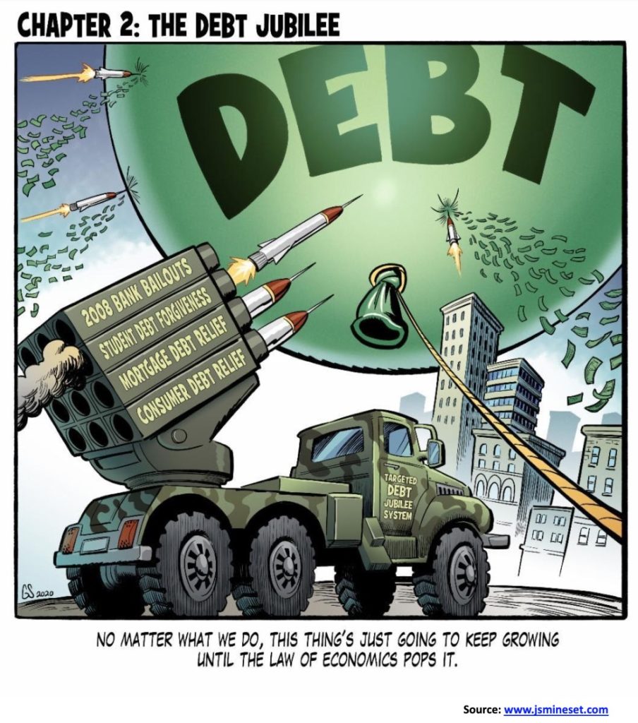
As we have so often noted, the world is awash in debt—currently estimated at $255 trillion, giving us a global debt to GDP ratio of over 300%. The U.S. has $75.7 trillion of that debt or almost 30%. We don’t even want to think about U.S. unfunded obligations estimated at over $128 trillion. The U.S. debt to GDP is approaching 350%. It’s adding debt now at an incredible $1 trillion annually. Actually, it is probably even more. And that is just the government. Corporations, banks, and consumers are doing the same thing. Yet no one seems too concerned. And it is not as if they are using credit to invest, unless one means throwing it into the stock market. Corporations borrow to buy back their stock to push up the price and pay their executives huge bonuses. The consumer borrows for products, holidays, and that next bigger house. The endless credit card is working overtime. It is living in a delusional world. It is not a question of when it will end, it is a question of when. It will end in broken dreams.
Interest rates have been pushed down to historically low levels. They can’t afford to let interest rates rise or the entire debt bubble will blow up and collapse. The EU and Japan have negative interest rates and that is causing capital to flow out of those countries seeking higher returns. Where does it go? It goes into the U.S. dollar and then to purchase U.S. treasuries or stocks. Some even buy gold.
With interest rates effectively suppressed, the 10-year U.S. treasury note acts as a benchmark for the entire financial system, meaning everything is priced off of it. Spreads on what are effectively junk bonds have really never been so low. Somehow, the entire world believes that if a problem arises, the central banks of the world will just throw more money at it. Whether one calls it QE, repos, or just plain old flooding the financial system with money—as PBOC is doing in China to combat the coronavirus crisis—the effect is the same. Billions are pumped in and all that money has to go somewhere.
And where does the money come from? Thin air mostly, or pumping up the printing presses. Central banks are responsible for monetary policy and act as lenders of last resort. Inflation doesn’t show up in higher prices for day to day goods and services or in wages; it shows up by creating bubbles, whether it be stocks, bonds, or housing. And because everyone is so confident that the central banks can bail everyone out, they borrow even more. The result of all this is those at the top receive a larger share of financial wealth that emanates from all of this. In pushing stock prices into unheard-of territory, PE multiples also explode upward and are treated as normal. Most of the gains over the past decade and from even earlier are due to PE multiple expansion, not from earnings growth.
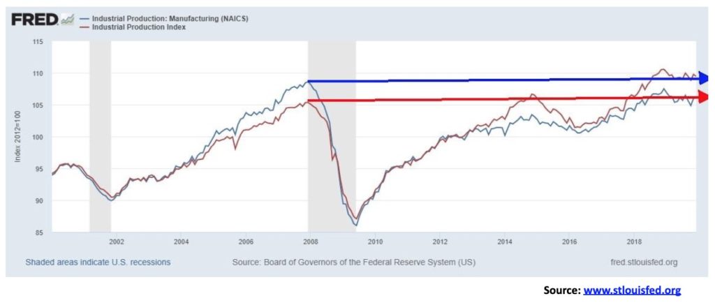
All the money and debt have created a false economy. If all that money was going into productive output, one would think that manufacturing production would have expanded, but it hasn’t. Our chart below shows that manufacturing production is roughly 2% lower than where it was in November 2007. Total industrial production is only about 4% higher than where it was in the same time period. All figures are for the U.S. Note that U.S. industrial production fell 0.3% in the latest month and is down 0.8% over the past year.
With industrial production weak, it is not surprising to learn that, even as employment grows, the number of people employed full-time is slowing. That number is only up 7.5% since November 2007. The U.S. population has grown almost 9% but the working-age population has only grown just over 5% as the number of retirees grows. The employment-population ratio is lower today than it was in 2007 at 61.2% vs. 62.7%, and well below where it was in 2000 at 64.6%. The labour force participation rate has also fallen to 63.4% from 66.0% in November 2007 and a peak of 67.3% in 2000. If the labour force participation rate were the same today as it was in 2000, then the unemployment rate would be 9.2%, not 3.6% (U3). That differential is showing up in the huge number of people not considered to be in the labour force.
GDP and employment growth have been falling steadily since 1950. This is despite the trillions pumped into the financial system since the 2008 financial crisis.
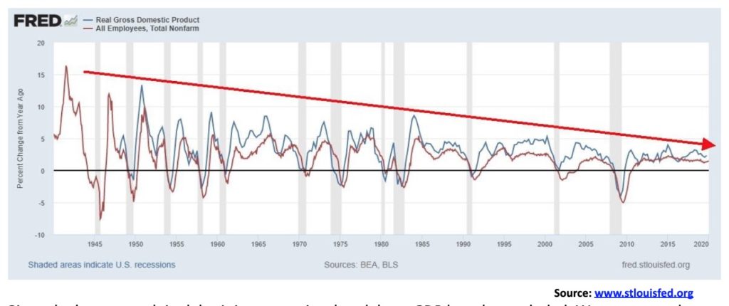
Real Gross Domestic Product Total Nonfarm Employees Annual Rate of Change – ©David Chapman
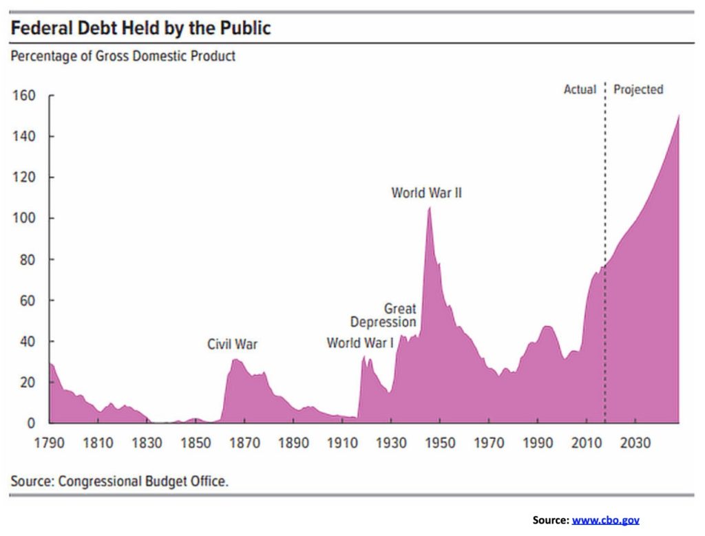
Given the huge growth in debt, it is no surprise that debt to GDP has also exploded. We are currently living with a debt to GDP ratio that was more appropriate to war-time than it is to the present; that is, unless one considers the “endless war” in the Middle East to be war-time. The chart below shows federal debt held by the public as a percentage of GDP.
Debt held by the public is just one measurement of government debt. U.S. gross government Federal debt is currently $23.7 trillion. Public debt is the amount of Federal debt held by the public. It represents roughly 76% of gross debt or about $18 trillion. By public we mean the amount of federal debt held by individuals, businesses, banks, insurance companies, state and local governments, pension funds, mutual funds, foreign governments, foreign businesses and individuals, and the U.S. Federal Reserve Bank. The remainder is intragovernmental debt held for social security, Medicare, etc. It is a liability of the U.S. government but has no net effect on the government’s overall finances.
The question is, where do we go from here? There are potential signs of an economic slowdown coming. While they were busy celebrating a slowing in the number of coronavirus (COVID-19) cases, that number suddenly exploded again, throwing a pall of uncertainty into the markets. The reality is that the COVID-19 is already causing severe disruption in China that will also resonate around the world. As the crisis grows, economic activity is grinding to a halt. Whether it is in global supply chain disruptions or a collapse in the tourist industry, the cancellation of flights to China or the shutting down of the gambling houses in Macau, all of this will have a negative effect on China’s GDP and global GDP.
No one knows how long this is going to last. WHO has stated there is no immediate cure for the disease. While the number of cases outside of China remains small (currently under 500) it could suddenly and unexpectedly explode. If it does, then the rest of the world could soon look like China with empty streets. No country has ever tried mass quarantine on this scale before. And it is difficult to police.
It is not as if there are not already enough problems. The EU is gripped with Brexit. The U.K. was a net payer to the EU of roughly £8.5 billion annually. That money will not be forthcoming. The EU is insisting on following its trade rules. The U.K. wants a different set of rules. The U.K. is faced with possibly splitting up itself. The EU and the U.K. are already facing tepid growth. Italy, France, and Austria are already showing signs of falling into recessions. In Asia, Hong Kong has fallen into a recession that is now exacerbated by the COVID-19 crisis. China’s economic problems flow into other South Asian economies including Vietnam, South Korea, and Thailand. Japan’s growth is tepid at best, despite years of QE and negative interest rates. Canada is being disrupted by First Nations protests spreading across the country that are shutting down railways and clogging ports. That is sure to translate into reduced growth.
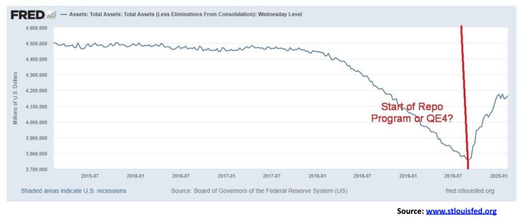
The answer to the crisis is more money from the printing presses. But the Fed started its repo program before the COVID-19 crisis got underway. The repo program was, we believe, to prevent a rise in interest rates. There is a potential banking problem out there, but where is it? We suspect either in the EU or Japanese banking system. Since the program got underway, the Fed’s balance sheet has exploded upward by $405 billion. At this rate, the Fed could add upwards of $1.1 trillion by the end of 2020. Since the repo program got underway in early September 2019, the S&P 500 has gained 16.5%. With all that money sloshing around, could it just be coincidence? Or is it “This Time It Is Different”?
We thought we were seeing double. But no, we weren’t. Markets have clearly lost their mind instead. From 45% to 1%. Yes, those are Greek bonds. The yield on Greek 10-year government bonds fell to 0.97% this past week. Let’s repeat that—Greek 10-year bonds fell to 0.97% this past week. What next? Negative interest rate Greek bonds? If there was anything that now personifies the troubles in the EU zone it is Greek bonds trading for less than U.S. government bonds. The current yield on the U.S. 10-year treasury note is 1.62%. No wonder funds are flowing out of the eurozone into the U.S. And all those funds flowing out of the eurozone—plus Japan because of ultra-low interest rates and China because of coronavirus—are putting upward pressure on the U.S. dollar and pushing the U.S. stock market into the stratosphere.
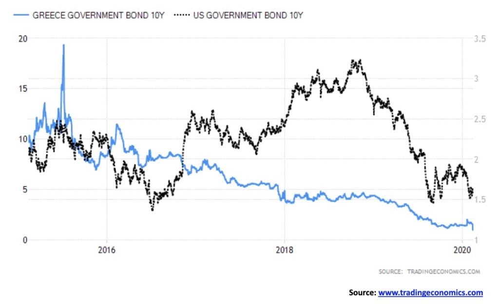
In 2011, Greek 10-year bonds hit 45%. That was the height of the EU/Greek debt crisis. Now they are under 1%. Still, Greek bonds are considered speculative grade and prices could collapse quickly if sentiment changed. Sure, Greece’s economy has improved with projected 2% growth. That’s better than the eurozone, but then one must remember Greece is coming out of a deep hole. In October, Greece even sold some T-bills at a negative yield. Frankly, that’s nuts. And there are those who believe that Greek 10-years could fall to 0%. Yet the rating agencies still have Greece rated as junk. Then again, maybe this is just another sign of how distorted markets have become. When the proverbial stuff hits the fan, it could get downright ugly. No, this time it is not different.
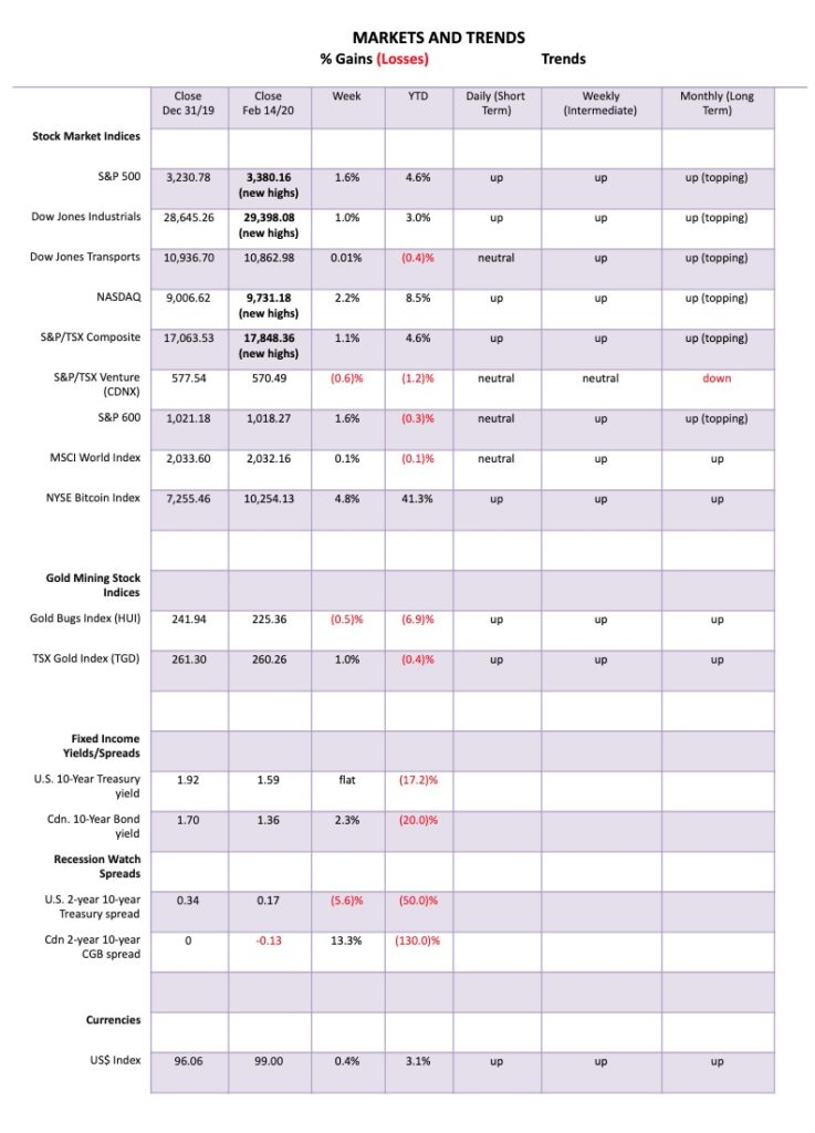
Coronavirus crisis—what coronavirus crisis? The markets, after a brief interruption, have shrugged off the coronavirus crisis. It’s something that is happening “over there,” but we’re okay. As well, the impeachment crisis is over. Trump rules and can now do, it seems, anything he wants, even with his latest of interfering in criminal cases before the courts. The imperial presidency. This week the S&P 500 gained 1.6% and once again set new all-time highs. Joining the party were the Dow Jones Industrials (DJI) (+1.0%), and the NASDAQ (+2.2%). Also making new all-time highs were the Dow Jones Utilities (DJU) (+2.2%), the Dow Jones Composite (DJC) (+1.0%), the NASDAQ 100 (+2.4%), the S&P 100 (OEX) (+1.2%), and the Wilshire 5000 (+1.8%). Many cite the record highs of the Wilshire as proof the market is going to go even higher.
Elsewhere, the TSX Composite hit new all-time highs, up 1.1% but the TSX Venture Exchange (CDNX) continued its woes, down 0.6%. In the EU, the London FTSE lost 0.6%, the Paris CAC 40 hit new all-time highs, up 0.5%, as did the German DAX, up 1.3%. China’s Shanghai Index (SSEC) continued its rebound, gaining 1.8% while the Tokyo Nikkei Dow (TKN) lost 0.2%. Hong Kong’s Hang Seng Index was up 1.5% but that index looks increasingly dangerous and some are starting to call Hong Kong a failed city because of the ongoing protests and now the coronavirus.
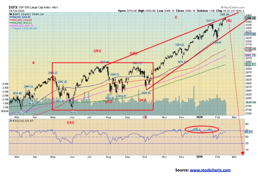
Could the stock market continue its melt-up? The answer is absolutely yes. Shrugging off the latest crisis seems to be the new normal. But just remember this is being driven by a) the huge repo program being carried out by the Fed; b) unprecedented continuance of global QE programs to try and save their economies, particularly in the EU and Japan, and now in China as well; and c) capital flows out of the weakening eurozone and fleeing the coronavirus crisis in China and Hong Kong. Add in continued borrowing and you have all the makings of a melt-up, ignoring growing negative fundamentals. But, as in 2000, the party eventually came to an end. We just can’t tell you when it will end, only that it will end and usually badly. If we like symmetry, then a top should come by March 2020 corresponding with the top twenty years ago as the high-tech dot.com bubble crashed and burned.
The S&P 500 appears to be at the top of its channel. But it could, as it has before, crash right through. Or it could just crawl up the channel as it moves higher as the channel itself steepens. All we can note is the downside points: under 3,325, caution; under 3,275, more caution as the lower channel breaks; under 3,000 and a bear market could be underway. 3,214 is the recent low so if that breaks it is a sign that a top is in. But as the melt-up continues the market becomes more dangerous. Caveat emptor.
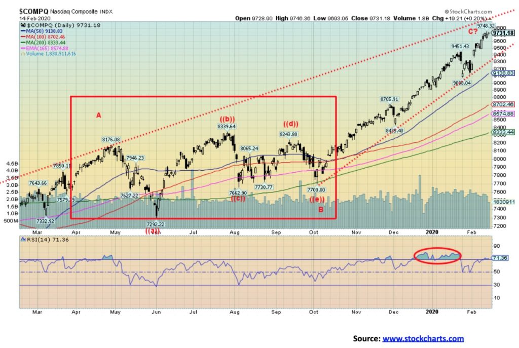
The NASDAQ, like the S&P 500, just keeps moving higher. The NASDAQ is driven by the FAANGs. We note that the RSI (and other indicators as well) are diverging negatively with the price action of the index. The indicators are making lower highs, even as the index makes higher highs. The NASDAQ’s RSI is once again over 70 in an area that often sees tops. Still, there is room for the NASDAQ to move higher in the channel with the top up around 10,000. Hitting 10,000 would no doubt trigger a wave of euphoria. We are now 6.5% above the 50-day MA. It should be noted that the NASDAQ in March 2000 reached 19% above the 50-day MA. Based on that, yes, the NASDAQ could have further to run. The run since October 2019 to now has seen the NASDAQ gain 26.3%. In 1999–2000, the NASDAQ rose 91.8% from October 1999 to March 2000. The final run from January 2000 to the top in March saw the NASDAQ gain 28%. The gain so far, since the low near the end of January, has been 7%. One wonders, is the NASDAQ following that 2000 pattern? If so, more gains should be seen.
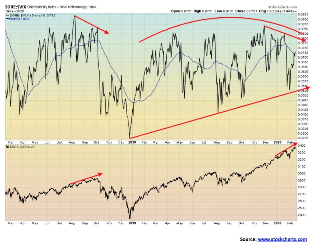
The negative divergences between the S&P 500 and the VIX Volatility Indicator (VIX) continue. We have noted that the same divergences appeared on the VIX before the collapse in October to December 2018. The VIX is showing topping patterns, whereas the S&P 500 just chugs higher and higher. It is, however, a warning—not the confirmation of a top, but it has to be taken into consideration. We are showing the inverted VIX above so that new highs in the VIX would correspond with new highs in the index.
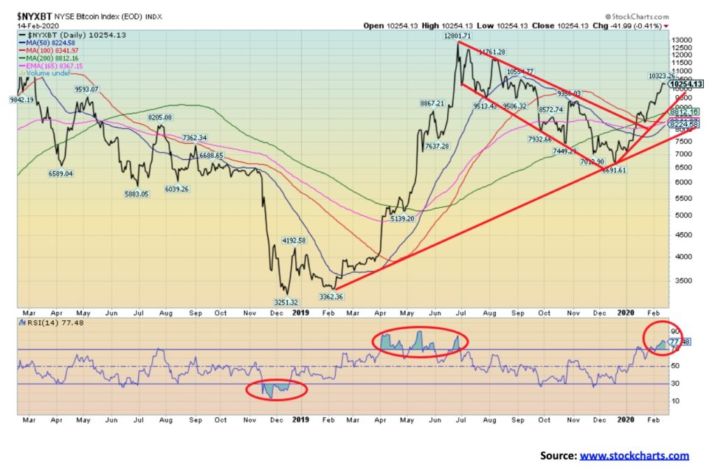
It’s been some time since we mentioned Bitcoin. But it has been on a bit of tear lately, up some $3,500 since December 2019. We suspect the current run-up could be the C wave of a larger ABC correction that began back in December 2018. The A wave carried to $12,800 while the B wave down took us just below $7,000. If this is a normal ABC corrective flat, then we could carry to near $13,000 before this tops out. We wouldn’t at this time expect a major run to the former highs near $20,000, although listening to the crypto bulls we are headed for $100,000. According to Coin Market Cap (www.coinmarketcap.com), there are currently 5,127 different cryptos with a global market cap of $304.5 billion. That’s only about 20% or so of Apple’s market cap. The biggest crypto is Bitcoin at $186.3 billion. The top three, including Bitcoin, Ethereum, and XRP, have a market cap of $231.3 billion, representing 76% of the entire crypto market. There are 19 cryptos with a market cap above $1 billion. Bitcoin is approaching overbought, but in the crypto world overbought is merely a phrase to represent a short pause before they surge again. Or not. The breakdown zone is currently around $8,500.
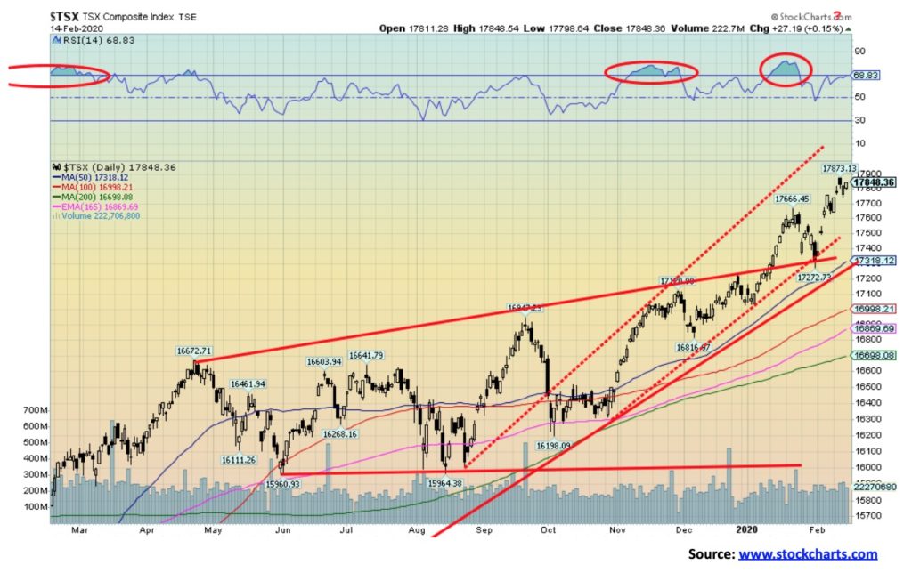
The TSX Composite continued its winning ways this past week, largely ignoring a slowing economy and the indigenous uprising gripping the country that has shut down rail lines. So far, that crisis has not had a major impact except in disrupting consumer travel and slowing delivery of some goods, but if it drags on much longer it could have a negative impact on the economy. The TSX Composite was up 1.1% on the week and is up 4.6% so far in 2020. Only one sub-index was negative on the week. Telecommunications lost 1.1% after hitting new all-time highs. That is a bit negative. Consumer Staples lost 0.1%, but that was essentially flat. All other sub-indices were up on the week with six altogether hitting all-time highs. Besides Telecommunications hitting an all-time high, the others were Income Trusts (+1.7%), Financials (+0.7%), Real Estate (+1.6%), Utilities (+3.0%), and Information Technology (+3.5%). Also up were Energy (+0.4%), Golds (+1.0%), Health care (+3.2%), Industrials (+1.0%), Materials (+1.0%), and Metals & Mining (+1.3%). Utilities have been barn burners. Utilities act as a bit of safe haven in periods of weakness because, no matter what, we need power. The TSX is displaying negative divergences with indicators, as the index is hitting new highs but the indicators are not. It’s a warning sign, not necessarily that a top is nigh. A breakdown under 17,500 would be the signal that a top is most likely in. There is potential within the current channel to reach 18,000 if this rally continues. Much, of course, depends on the U.S. indices, the state of the coronavirus crisis and its potential negative impact, and even the crisis with First Nations.
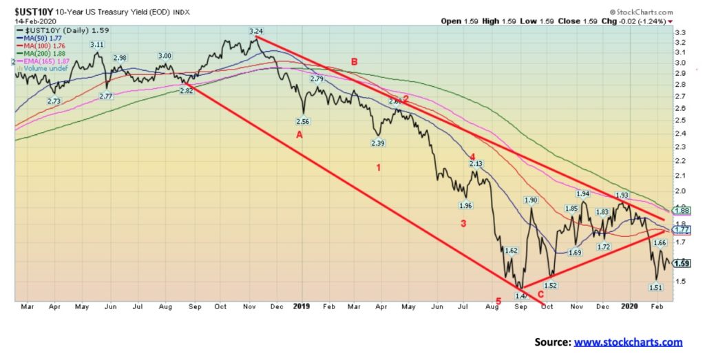
Interest rates, represented here by the U.S. 10-year treasury note, were basically unchanged this past week. The 10-year closed at 1.59%. After hitting a 5-month high of 1.93% in December 2019, the 10-year has fallen, driven lower by a combination of slowing eurozone economies, negative interest rates in the eurozone and Japan, and more recently the coronavirus crisis as investors seek out yield and a safety. U.S. bonds, along with gold, have acted as safe havens in the time of crisis. The 10-year appears to be pointed lower. As long as the recent high of 1.66% holds, odds favour lower interest rates. If the coronavirus crisis deepens and it begins to negatively impact the U.S. economy (it is already negatively impacting China, Asia, and the EU), then interest rates could fall further and there will be pressure to cut the Fed rate once again. A number expect the Fed to cut another ¼ point in June, regardless of what happens. Powell is on record as saying if the coronavirus crisis deepens, the Fed will take action beyond the current repo program. We can only assume that means more QE. Certainly the coronavirus crisis adds a high degree of uncertainty to the outlook.
On a worry note, U.S. inflation picked up in January to a year-over-year gain of 2.5%, the highest since October 2018. In December the rate was 2.3%. The market had expected 2.4%. The core inflation rate that the Fed pays far more attention to was, however, only up a paltry 0.1% in January. On Friday, the retail sales release showed a gain of 0.3% above the 0.2% expectation. Year over year retail sales were up 4.4%, but when you strip out inflation and population growth, retail sales were essentially flat. On a negative note, industrial production for January fell 0.3% and year over year was down 0.8%. Manufacturing production was also down 0.8% year over year in January. The preliminary February Consumer Sentiment Index came in at 92.6 above expectations of 90.5. We also learned that more downward revisions are coming for nonfarm payrolls. Last week, we noted that the first three months of 2019 saw a downward revision of 514,000 jobs. Another is due for December 2019 and the drop this time is 422,000 jobs. This will negatively impact 2019 GDP. Expect downward revisions there as well. Retail sales for 2019 are also to be downwardly revised, although these revisions probably won’t be out until June or July 2020.
President Trump has more recently offered two more appointees to the Federal Reserve, which is awaiting Senate approval. They are Christopher Waller and Judy Shelton. Both are well-known doves and will help tilt the Fed in Trump’s desired direction of lowering interest rates. Shelton is also a well-known believer in a return to the gold standard. Trump is also a believer. That ought to warm the inards of the gold bugs.
Interest rates appear to be headed lower unless, as we noted, 1.66% is taken out to the upside. It is even possible that the 10-year could fall below the recent 1.47% and even the all-time low of 1.39%. Trump wants negative rates just like the eurozone and Japan, even though negative interest rates are really a long-term losing proposition.
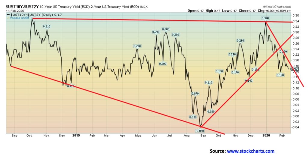
The recession watch 2–10 spread was little changed this past week at +17 bp vs. +18 bp the previous week. Our other recession spread 3-month treasury bills less the 10-year U.S. treasury note (3m-10) slipped to +1 bp from +3 bp the previous week. Negative spreads have, in the past, proven to be signs of an impending recession. However, recessions rarely got underway until the spreads turned positive again after a period of being negative. Negative spreads for the most part ended last August just as the Fed’s repo program was getting underway. The recession watch 2–10 spread was little changed this past week at +17 bp vs. +18 bp the previous week. Our other recession spread 3-month treasury bills less the 10-year U.S. treasury note (3m-10) slipped to +1 bp from +3 bp the previous week. Negative spreads have, in the past, proven to be signs of an impending recession. However, recessions rarely got underway until the spreads turned positive again after a period of being negative. Negative spreads for the most part ended last August just as the Fed’s repo program was getting underway.
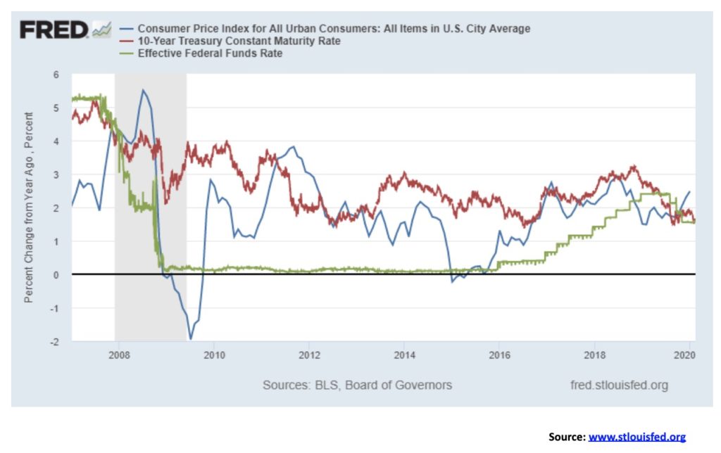
After trading above the rate of inflation for most of 2018 and 2019, both the fed funds rate and the yield on the U.S. 10-year U.S. treasury note have fallen below the rate of inflation. The fed funds rate only briefly traded higher above the rate of inflation, having spent the past decade with what we refer to as negative yields. Yields falling below the rate of inflation are usually good for gold as gold acts a proxy for the inflation rate with annual gains over time above the rate of inflation.
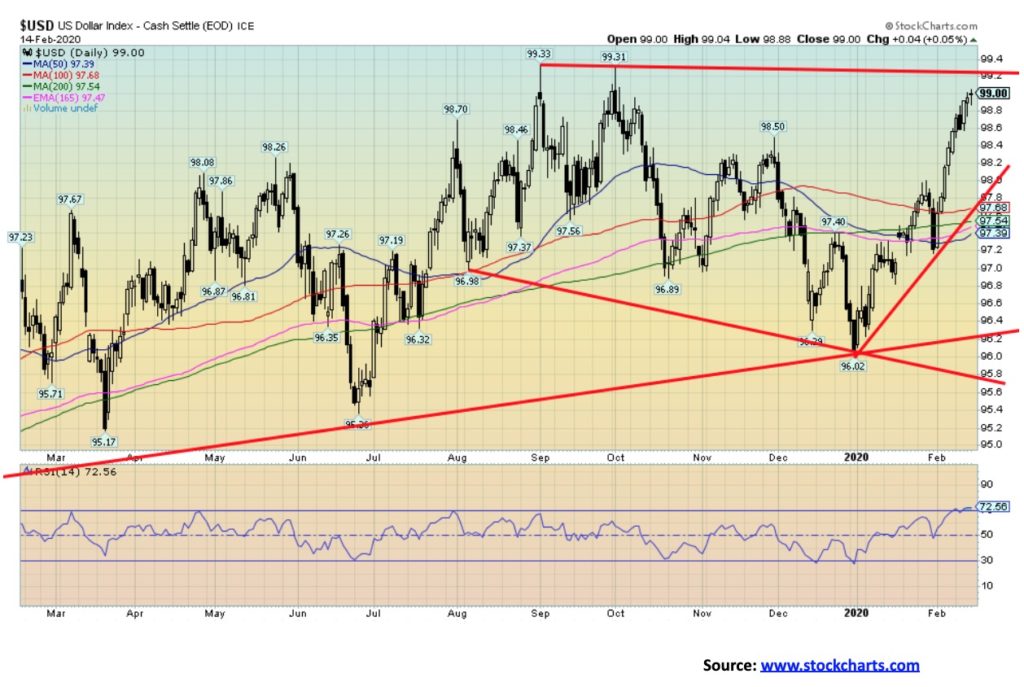
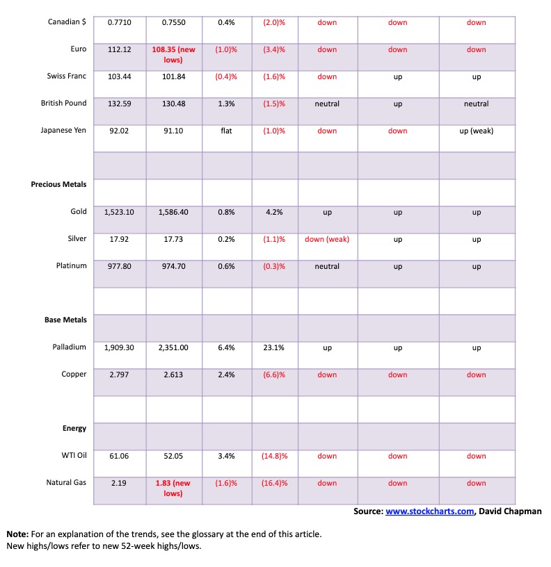
The US$ Index continues its hot hand. The U.S. dollar is benefitting from the coronavirus crisis, negative interest rates in Japan and the eurozone, slowing and even recessionary economies in the EU, Japan, Hong Kong and China, higher interest rates in the U.S., and a U.S. economy that, while not exactly booming, is outperforming nearly everyone else. The result is that capital flows out of the weak zones into the U.S. dollar which in turn finds its way into buying U.S. bonds and stocks. For the most part, the US$ Index has been up now for 10 consecutive days. Sentiment is hitting about 90%, a level often associated with tops. The US$ Index has not, however, made new 52-week highs. The euro, as we note next, did make new 52-week lows. The euro fell 1.0% this past week, the Swiss franc was down 0.4%, and the Japanese yen was flat. The pound sterling was up almost 1.3% and the Canadian dollar gained 0.4%. All the major currencies remain down on the year against the U.S. dollar. Despite the strength of the U.S. dollar, gold gained on the week. Surprisingly, the Chinese yuan has not weakened further against the U.S. dollar and is holding around US$1=7 yuan. That is actually down from a recent high (low for the yuan) of US$1=7.03 yuan. With sentiment extremely high and indicators flashing overbought, the odds of at least a pullback are rising. There is resistance from 99.20 to 99.30, but above 99.30 we could make a run towards 100 and new highs. A break back below 98.60 could signal a top, but we’d need to see a breakdown and close below 97.20 to confirm a top.
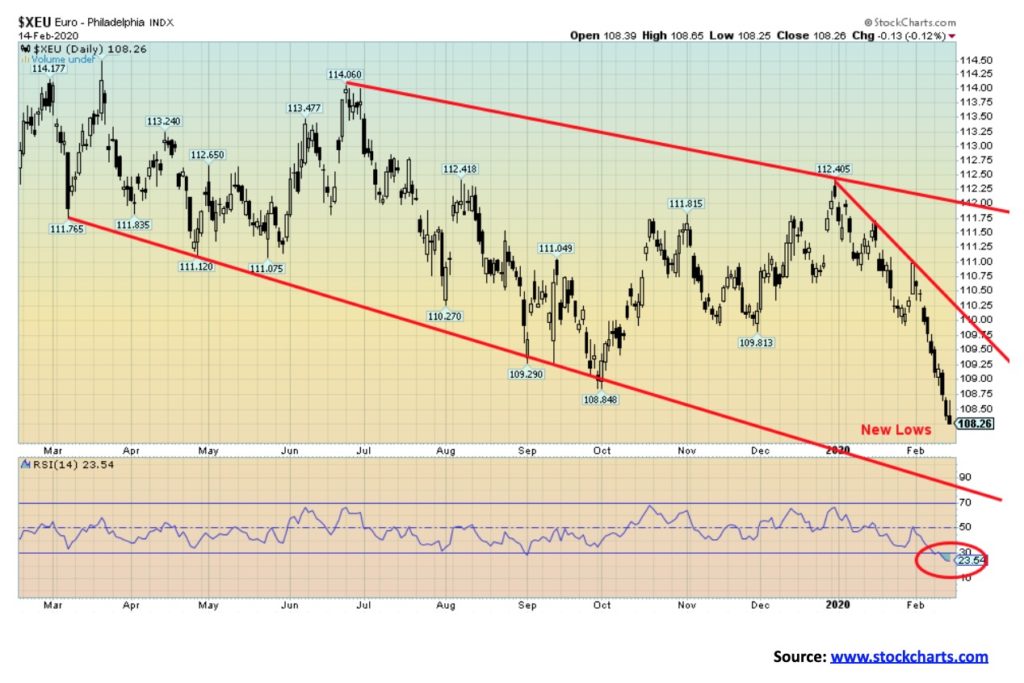
The euro plunged to new lows this past week. Negative interest rates, the coronavirus crisis biting European tourism, Brexit, slowing economies in the eurozone including some sliding into recession (Italy, Austria, and possibly even Germany) and you have capital outflows and a plunging currency. The new 52-week lows, are, however, not being seen by the US$ Index making new 52-week highs, a divergence. Sentiment on the euro has plunged to 8%. Indicators are in deep oversold territory. The most recent move has seen the euro fall effectively for 10 consecutive days. Odds are beginning to favour at least a bounce. Whether it would determine a final bottom remains to be seen.
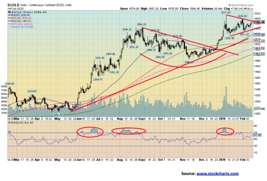
Gold enjoyed a positive week despite the strength in the U.S. dollar and a few somewhat decent economic numbers. The potential for a slowdown related to the coronavirus crisis helped keep gold up, along with thoughts of another cut in interest rates and the yield on 10-year notes falling under the rate of inflation. Gold gained 0.8% on the week and is now up 4.2% on the year. We continue to like the pattern that gold is forming as it could be a bull pennant. The pennant breaks out over $1,590 but we’d prefer to see a move and close above $1,600 to suggest a move above the recent high of $1,613. A break under $1,560 would be negative and a break under $1,535 would suggest a move down to test the 200-day MA near $1,460. A breakdown under $1,445 would be terminal and tell us that gold has entered a bear market. Our outlook on gold remains positive. The fact that gold is doing so well even as the U.S. dollar rises is a big positive. When the U.S. dollar turns down gold should do even better. Gold has acted as a safe haven during the coronavirus crisis.
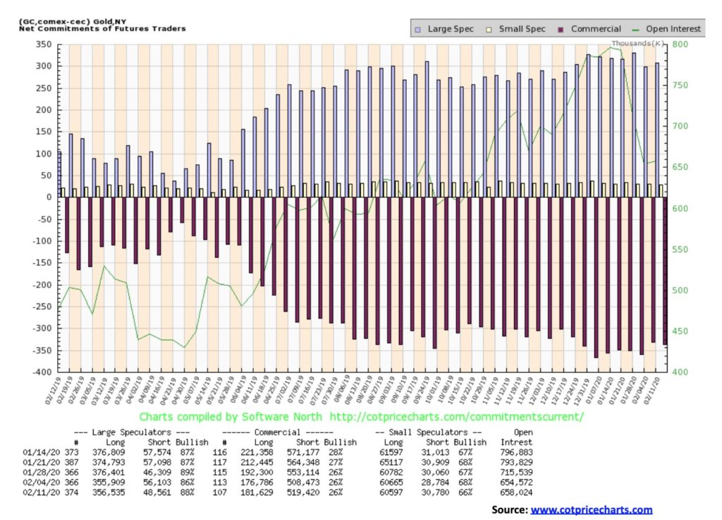
There was no change for gold’s commercial COT this past week as it remained at 26%. Long open interest rose about 5,000 contracts but short open interest was also up roughly 11,000 contracts. The large speculators COT (hedge funds, managed futures, etc.) rose to 88% from 86% as they cut their short open interest by about 8,000 contracts while long open interest was only up about 600 contracts. Overall, the COT remains bearish for gold. Surprisingly, the large speculators COT rose when there wasn’t a huge upward movement for gold this past week. Are they getting too bullish? We’d prefer to see it fall as they become discouraged.
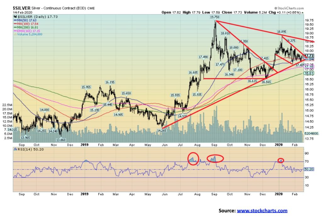
Silver eked out a 0.2% gain this past week. Once again, silver underperformed vis-à-vis gold. This is an ongoing concern of ours as silver should lead in a bull market. We have previously noted how gold made new highs on the recent move but silver did not, a negative divergence. The averages, or in this case, the metals should confirm each other. Nonetheless, the silver chart continues to appear positive. The consolidation followed the move from the December low of $16.56 to a high in January of $18.90. A breakout above $17.75 would be positive, but we really want to see a breakout and close over $18.50 to suggest higher prices. A breakdown under $17.40 would be negative and a breakdown under the December low of $16.65 could prove terminal and a bear market. The 200-day MA is currently at $16.81. In theory, silver could go either way here, but our leaning is towards an up move as the consolidation appears normal and not a topping pattern. We’ll feel a lot more positive over $18 and even more so over $18.50. Potential targets remain up to $20.25/$20.50 once we see new highs above $18.90.
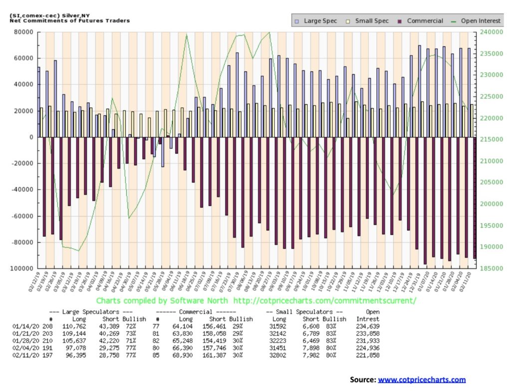
There was no change in this week’s silver commercial COT as it held at 30%. There were some small changes as long open interest rose by over 2,000 contracts but short open interest also rose up roughly 3,500 contracts. Overall, the commercial COT remains bearish. There was also no change for the large speculators COT as it stayed at 77%.
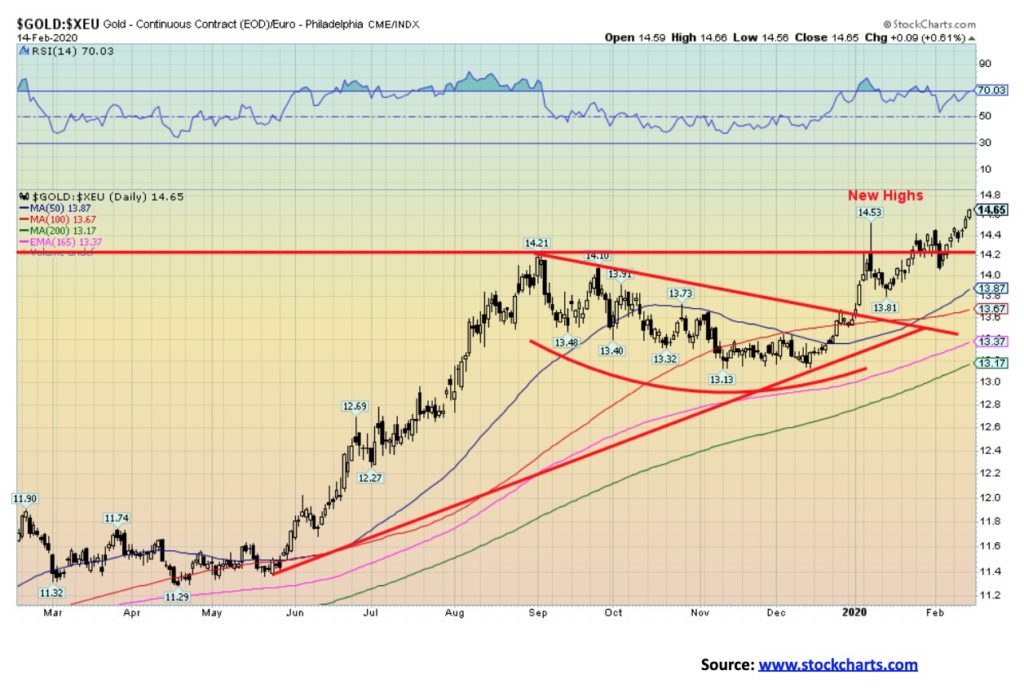
With the euro continuing to fall against the U.S. dollar and gold prices rising, it is no surprise to see gold expressed in euros rise once again to fresh record highs. Gold in euros appears to have broken out following a brief consolidation period through January and into February. Targets could be up to €1530 another €65 from current levels. We view record highs for gold expressed in other currencies as positive for gold expressed in U.S. dollars. Eventually gold in U.S. dollars should also make fresh record highs.
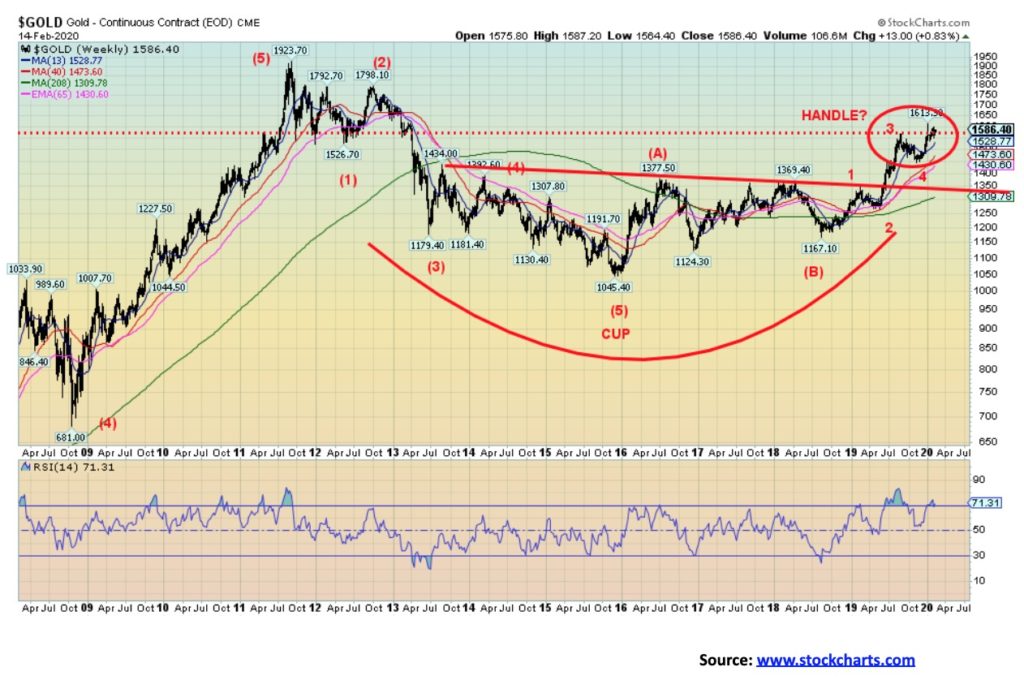
We continue to view the long-term chart for gold as bullish. Gold appears to have formed a potential multi-year cup and handle pattern. This type of pattern is not unusual in a bull market. After forming the cup, we have the breakout at $1,350/$1,370. Following a sharp breakout there is usually a period of consolidation that can last weeks (the handle). Measuring implications remain the same for a target for gold, somewhere between $1,725–$1,750. With gold starting to rise again, a firm breakout over $1,600 could send us on our way to the target. First, we need to get a close over $1,600 to confirm that we are most likely on our way to the next target. The bottom of the handle at around $1,445 should hold and needs to hold. Indeed, the first of trouble would be a break back under the recent low near $1,535. Not surprisingly, the bottom of the handle near $1,445 is just above the top of the cup at $1,435.
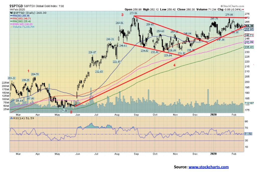
The gold indices and, by extension, the gold stocks had a mixed week. The TSX Gold Index (TGD) gained 1.0%, but the U.S. based Gold Bugs Index (HUI) lost 0.5%. The TGD is only down 0.4% on the year but the HUI is down 6.9%. That’s quite a difference. But yes, the indices are not equal. First off, the TGD has 38 components. The HUI has only 15. Everything in the HUI is also in the TGD. What happened on Friday is two components of the TGD, Dundee Precious Metals (DPM) and Lundin Gold (LUG) had strong up days. That helped the TGD outperform the HUI. Neither stock is contained in the HUI.
The TGD continues to display a strong upside bias despite the recent weakness. The TGD is holding the uptrend line from the May 2019 lows and is rising in a choppy back-and-forth manner, making higher lows. What is needed now is a breakout above 270 that could send the TGD to new 52-week highs. A breakdown under 255 would be short-term negative, but only a breakdown below 230 could potentially prove more terminal. Indicators are largely neutral and bullish sentiment has also pulled back. That should be helpful going forward. A firm breakout and close over the recent high of 272 could see the HUI rise to potential targets at 315 a 20%+ move from current levels. As noted, a break under 230 could be terminal and set off a bear market. The 200-day MA is currently at 235.
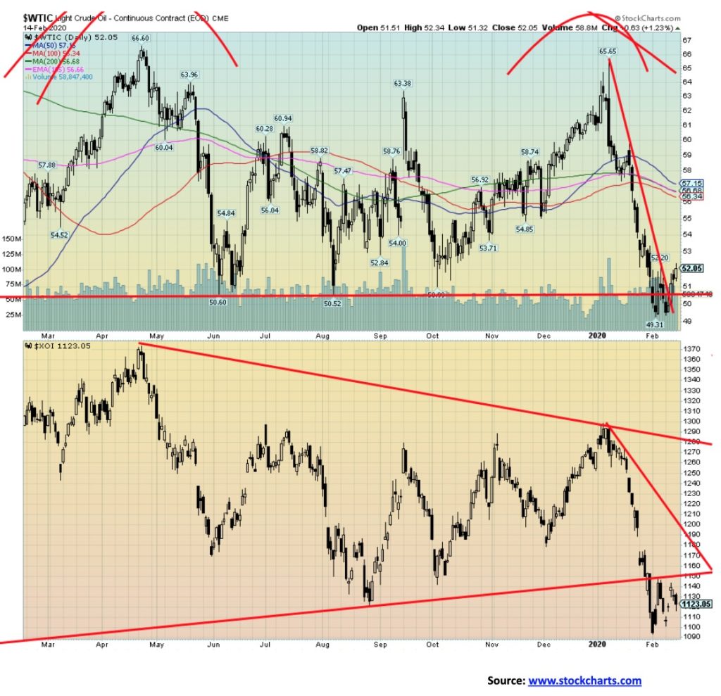
Oil prices appear to be now discounting the coronavirus crisis. After dipping below $50, WTI oil bounced back this week as fears of the worst case abated. WTI oil closed at $52.05, up 3.4% on the week. In dipping under $50, oil did make new 52-week lows. Natural gas (NG) also made new 52-week lows again and lost 1.6% on the week. The energy indices fared better with the ARCA Oil & Gas Index (XOI) up 0.6% and the TSX Energy Index (TEN) up 0.4% on the week. The energy stocks were buoyed by oil’s bounce back. Of course, that doesn’t mean things have changed, and if the coronavirus crisis deepens again oil could soon be falling sharply under $50 towards $40. One of the keys is the number of cases outside of China. If that starts to rise sharply, then all bets are off for higher prices. The decline has been quite steep so a relief rally was most likely overdue. And none of this suggests that oil is about to start climbing back towards $60 again.
The shale gas industry in the U.S. is facing troubles because of low prices. A number of write-downs occurred this past week. One, Occidental Petroleum (OXY) took a $1.7 billion hit. Could bankruptcies follow? The IEA is revising downwards its forecasts for demand. OPEC is still debating about supply cuts with Russia the main one balking. The low prices are not good for Alberta’s oil sands as investors continue to balk at further commitments there. It is not helping that large investors such as Blackrock are cutting back on oil sands investments because of environmental concerns. All of that puts the giant Teck mine in jeopardy, combining environmental concerns with low prices and irrespective of the demands of the Alberta government.
Major resistance for WTI oil is seen at $56. Only above $59 does WTI oil stand a chance of sustained rally. That is unlikely in the current environment. The XOI needs to regain above 1,170 to suggest higher levels. If the coronavirus crisis deepens, particularly outside of China, oil prices are likely to fall again.
—
(Featured image by Lorenzo Cafaro from Pixabay)
DISCLAIMER: This article was written by a third party contributor and does not reflect the opinion of Born2Invest, its management, staff or its associates. Please review our disclaimer for more information.
This article may include forward-looking statements. These forward-looking statements generally are identified by the words “believe,” “project,” “estimate,” “become,” “plan,” “will,” and similar expressions. These forward-looking statements involve known and unknown risks as well as uncertainties, including those discussed in the following cautionary statements and elsewhere in this article and on this site. Although the Company may believe that its expectations are based on reasonable assumptions, the actual results that the Company may achieve may differ materially from any forward-looking statements, which reflect the opinions of the management of the Company only as of the date hereof. Additionally, please make sure to read these important disclosures.


The TopRanked.io Weekly Affiliate Marketing Digest [The Top VPN Affiliate Programs Roundup]
Want to be let in on a little secret about two massive affiliate opportunities you can take advantage of today?...


Sustainable Finance Faces Hurdles as Green Asset Ratio Reforms Fall Short of Full Transparency
The Green Asset Ratio (GAR) measures banks' alignment with the EU Taxonomy but remains low due to methodological flaws and...


XRP Hits New All-Time High Amid U.S. Crypto Policy Shift and Ripple’s Expansion
XRP surged past its 2018 all-time high, reaching $3.65 amid renewed political support for crypto in the U.S. under Trump....


Germany Moves to Curb Medical Cannabis Abuse, Sparking Access Concerns
Medical cannabis imports in Germany have surged, but health insurance-covered prescriptions remain low. Easy online access raises concerns about abuse...


JPMorgan’s Data Fees Shake Fintech: PayPal Takes a Hit
JPMorgan Chase will charge fintechs for customer data, threatening business models reliant on free access. PayPal’s stock plunged 5.7% after...
 |
|
 |  |
 |
|
-

 Crowdfunding1 week ago
PMG Empowers Italian SMEs with Performance Marketing and Investor-Friendly Crowdfunding
-

 Markets5 days ago
Markets Wobble After Highs as Tariffs Rise and Commodities Soar
-
 Markets2 weeks ago
The Big Beautiful Bill: Market Highs Mask Debt and Divergence
-

 Africa2 days ago
ORA Technologies Secures $7.5M from Local Investors, Boosting Morocco’s Tech Independence