Business
The Dow Jones, CinC & the BGMI 1920 to 2021
Since March 15th the 52Wk highs at the NYSE have taken a rest, but on Friday’s close the NYSE saw a big 52Wk net of 412. I expect this will continue until it stops. I’m not trying to be cute; it’s just that historically trends such as we see above and below continue until they stop, to the great dismay of those who insist on buying at the top of the market.

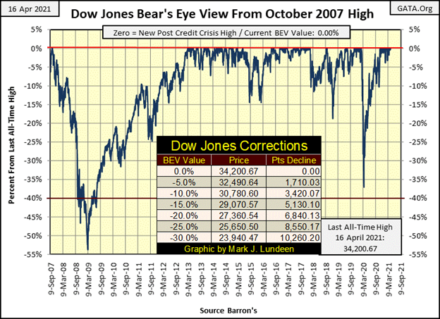
From last year’s March 23rd low (BEV -38%), two weeks ago the Dow Jones saw its 25th & 26th new all-time high (BEV Zero) in the BEV chart below, and this week the Dow Jones saw its 27th and 28th BEV Zero. This bull-market advance is hitting on all cylinders.
Doubt me? Look at the Major Market Indexes BEV values below. All week they were making market history, generating BEV Zeros. On Friday’s close twelve indexes closed at BEV Zeros, as the others (except for the XAU) were in scoring position – less than 5% from making a BEV Zero. Wow!
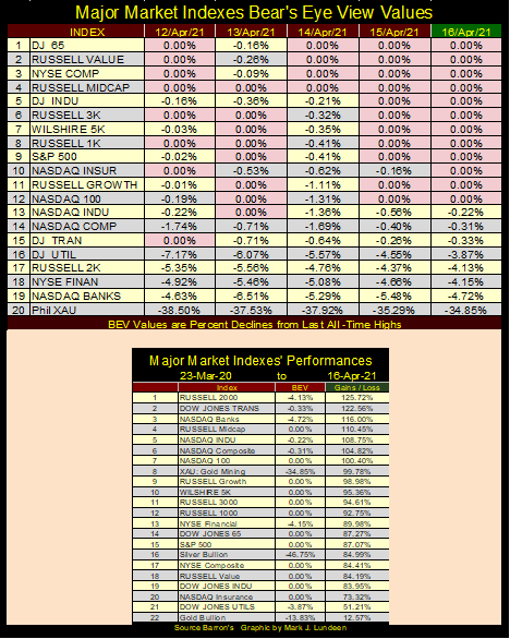
The market performance of these indexes for the past year have been outstanding. As seen in the table above, seven of these indexes have advanced by 100% or more from their 23 March 2020 bottoms. Gold (#22) is Tail-End Charlie, with its gain of only 12.57%, while everything else is up by 50% or more. You’re looking at market history here.
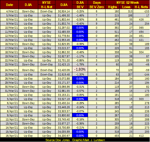
It’s not just these major indexes making history, as seen with NYSE 52Wk High – Low Nets below. Being a market watcher, I’ve created thresholds in the data I compile, with NYSE 52Wk High – Low Nets of +300 or more a flag that something bullish is afoot. Since March 8th, (below) look at all the 52Wk H-L nets of 300 or more, with a good sprinkling of +400 among them.
Since March 15th the 52Wk highs at the NYSE have taken a rest, but on Friday’s close the NYSE saw a big 52Wk net of 412. I expect this will continue until it stops. I’m not trying to be cute; it’s just that historically trends such as we see above and below continue until they stop, to the great dismay of those who insist on buying at the top of the market.
To those of this persuasion, the data seen below is most encouraging. Look at all the blue BEV Zeros the Dow Jones has made in the past six weeks. And with them the Dow Jones (my proxy for the general stock market) has moving up, a lot. Since March 5th, the furthest the Dow Jones has closed from a BEV Zero was only -1.80% on March 24th (highlighted in pink). Also, since March 4th the Dow Jones has advanced by 3,276 points, or 11.05% in only six weeks.
Are we at the top of this market advance? I really can’t say we are. However, looking at the major market indexes advances above, and the Dow Jones in daily bars below, in April 2021 its safer assuming the best of what the FOMC has to offer the bulls is best seen in the market’s rearview mirror. Though some good gains could still be available from these levels. Just keep in mind that as time and these advances continue, market risks greatly increase as potential rewards for assuming these growing risks approach zero.
* On Wall Street, they don’t ring a bell when it’s over *
But for as long as the “policy makers” can maintain bond yields at their current low levels, and the general public and money managers’ consumer-price inflation expectations remains low (what fools these mortals be), this advance can go on for longer than I currently believe is possible.
One sore point in this bullish landscape are stories such as we see below, where a New Jersey deli seeing $35,000 in sales for the past two years has a market cap of $100 million? Whiskey Tango Foxtrot!
Stories such as this remind me of the late 1990s dot.com bubble, where venture capital funds were offering high school kids who wrote a new program for the internet millions of dollars.
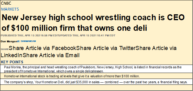
https://www.cnbc.com/2021/04/15/hometown-international-nj-deli-owner-worth-millions-in-stock.html
One thing lacking from much of what passes for investment information these days is a view of the markets from a long-term perspective. So, here’s a chart for the Dow Jones (Red Plot), US Currency in Circulation (Green Plot / CinC), and the Barron’s Gold Mining Index (Blue Plot / BGMI), data weekly closing basis going back to January 1920.
The Dow Jones is easy as it’s been published since 1885. CinC data is from the Federal Reserve, and was first published by Barron’s in the early 1930s. To push it back to 1920, I used annual CinC figures from Milton Friedman and Anna Schwartz’s book “The Monetary History of the United States. Barron’s began publishing its Barron’s Gold Mining Index in 1938. As it originally contained only two gold mining companies;
- Juneau Alaska Gold,
- Homestake Mining,
a good internet buddy of mine (Geoff) went through considerable effort to send me weekly data on Homestake Mining so I could push back the BGMI to January 1920. Geoff, the world has benefitted from your contribution to this important data series on gold mining – thanks!
What’s plotted below are the indexed values of these three data series, with 05 January 1920 = 1.00. Indexing these series together allows us to look at their inflated valuation for the past 101 years as if they were a horse race. As is evident below, growth in CinC (monetary inflation) has been the winning horse for quite a while.
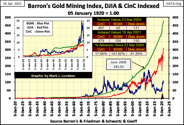
As I’ve stated before, precious metal assets don’t benefit from inflation flowing from the Federal Reserve; financial assets such as stocks and real estate do. If they didn’t the FOMC wouldn’t inflate the money supply as they have no interest in seeing the price of the old monetary metals (gold and silver) or their miners rise.
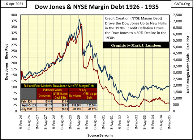
Here’s a chart for the Dow Jones (Blue Plot) and NYSE Margin Debt (Red Plot) from 1926 to 1935. Market valuations during the Roaring 1920s Bull Market were inflated using margin debt, as seen below. Deflation in market valuations came about with the withdrawal of margin debt in the 1930s.
The fuel that pushes valuations in precious metal assets higher is
* DEFLATION *
in the previously inflated financial assets valuations. An excellent example of this is seen in the chart insert for 1920 to 1970 in my chart indexing the Dow Jones, BGMI and CinC to 1.00. The Dow Jones from its January 1920’s 1.00 was inflated to 3.50 in September 1929 as the BGMI actually deflated to 0.79, a loss of 21% for the gold miners during the roaring 1920s bull market.
All this changed with the deflation seen during the 1930s. At it’s depressing 1930s peak in March 1936, the BGMI valuation had inflated to 5.50 from its 1.00 seen in January 1920 as the Dow Jones had deflated to 1.46 from its 3.50 seen in September 1929.
I find it interesting everyone talks about the Dow Jones bull market during the 1920s, a decade that saw the BGMI deflate by 21%. But what’s really interesting is how the BGMI’s bull market during the depressing 1930s was actually greater than the Dow Jones’ a decade before; up 5.50 compared to the Dow Jones’ September 1929 peak of only 3.50.
Again, looking at my chart for the Dow Jones, BGMI and CinC indexed to 1.00 = January 1920, we’ll compare the performance of the Dow Jones (Red Plot) and the BGMI (Blue Plot) to the expansion in CinC (Green Plot). The last time the inflationary growth in the Dow Jones exceeded the growth in CinC inflation flowing from the Federal Reserve was in 1966, as seen in the chart’s insert. Compare that to the BGMI, where from 1965 to 1996 the valuation for the BGMI remained above the growth of CinC, and this was during the 1980 to 2001 bear market for gold and silver!
The Dow Jones almost caught up to the Green CinC plot at the top of its 1982 to 2000 bull market advance. However, as seen in the chart, each succeeding bull market peak; October 2007 and now our current advance in the Dow Jones, has fallen farther behind CinC inflation. So, investors are seeing gains in terms of dollars, but the dollars they are receiving are losing value in terms of inflation, making investments in the current stock market advance a mug’s game.
While the last time the BGMI plot increased above the CinC plot was in 1996, the BGMI made a good effort to rise above CinC in 2008 and again in 2011, during a period of market history where inflation was flowing into financial market valuations. But let’s face it, since 2011 the BGMI has underperformed the Dow Jones.
However, market trends don’t go on forever, and I believe we are on the door step where we’ll see a repeat of deflation in the Dow Jones feeding second-hand inflation into precious metal assets, such as the BGMI as well as gold and silver bullion. Looking at the table below, it may have already begun.
If you take a quick look at my chart indexing the Dow Jones, the BGMI and CinC to 1.00, you’ll see the table below inserted into it. To make it easy for my readers to follow my comments, I’m also inserting it here.
I took the valuations for CinC, the BGMI and the Dow Jones from the indexed values seen in their indexed chart for Barron’s 23 March 2020 issue as well as their values for this week 19 April 2021. Data from Barron’s 23 March 2020 issue is important, as this was when the FOMC began “injecting” a trillion dollars into the financial system in a single month to prevent a market meltdown, and keep in mind these indexed values all began in January 1920 at 1.00.
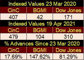
Comparing the gains from March 2020 with those of this week’s (April 2021), with an increase in CinC of only 17.69%, the gains seen by the BGMI have almost doubled those of the Dow Jones in the past thirteen months.
In the likely event that the decade to come, becomes a repeat of the 1930s, as depressing as that sounds, we just may see the indexed value of the BGMI in the table above once again exceed the indexed value of CinC. That would provide actual inflation adjusted profits to owners of gold and silver miners’ shares.
Is that possible? Damn right it is! In a major market sell off, one that the FOMC has proven to be ineffective to prevent, there will be tens and maybe hundreds of trillions of dollars of flight capital seeking a safe harbor from the storm. In such times gold and silver bullion were always beneficiaries of market chaos, and as the BGMI proved to be during the Great Depression Crash.
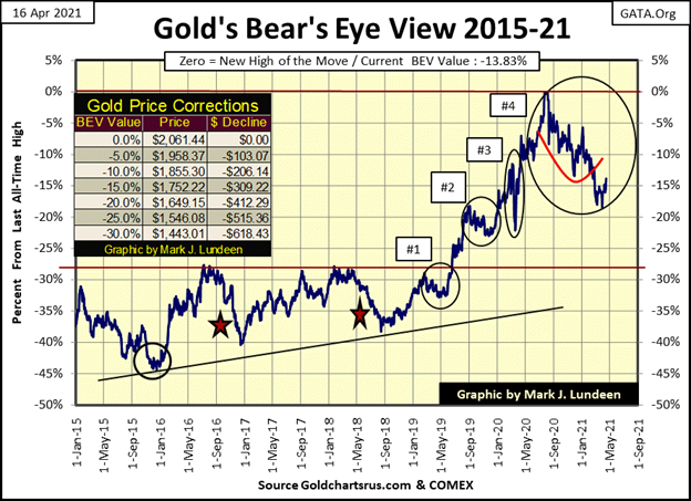
Let’s look at gold’s BEV chart. Gold closed the week above its BEV -15% line, with a BEV of -13.83% ($1776). So far, my call for the low of the post August 2011 correction is looking good. That low occurred on March 30th with a BEV of -18.53% ($1679).
Last week I published gold’s BEV chart going back to 1969. In it, it was obvious most corrections in the gold market go much deeper than just a BEV -20% correction, something the current correction has failed to do; deflate 20% below its last all-time high seen in early last August ($2061).
I’m thinking, maybe with that call of gold’s bottom a few weeks back I’m some kind of genius, a regular-market Einstein. Maybe it’s best I don’t say that too loudly for fear the “policy makers” might smite me by making one last effort in the COMEX futures market to drive gold down, deep below the BEV -20% levels seen below.
So, what comes next is dependent on what gold does next. Should gold next break ABOVE its BEV -10% line, I’m changing my first name to Albert. But then should gold next move be BELOW its BEV -20% line; you can call me Mudd.
All kidding aside, market action for gold is looking very good, and watching to see which BEV levels gold next breaks is the key for the gold market. After clearing its BEV -15% level on Thursday this week, will gold next break above its BEV -10% line ($1855) or break below its BEV -20% line ($1649). We’ll know more at next week’s close. Until then keep your fingers crossed!
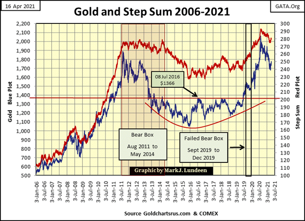
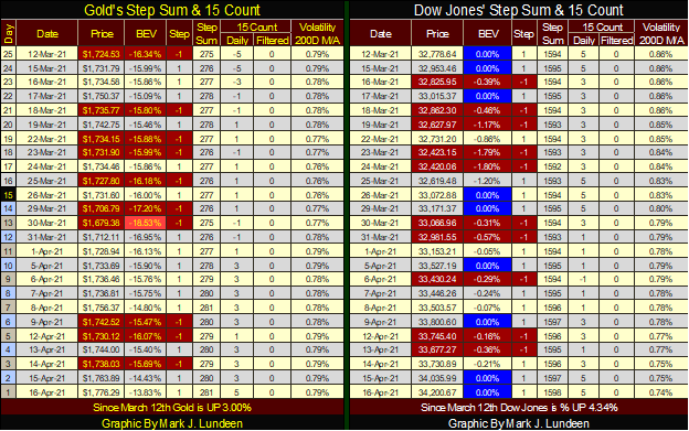
Gold and its step sum below look extremely positive. Both have begun a reversal to the up side, which hopefully will develop into similar advancing trends seen from 2006 to 2011 below. That is very possible, as the correction seen in the gold market since 2011 provides a tremendously strong base to support a big run to the upside.
No one knows what the future holds for us. I sure don’t! But I’ve been looking at charts for decades, and the gold and its step sum chart below is extremely bullish to my eyes. That few in the financial media are talking about investing in precious-metal bullion or in the companies that mine them tells us this is a good time to buy; before everyone else wants to.
Then below we have the Dow Jones and its step sum chart, and what a pretty picture it is too! But a picture of what? I’m looking at it and all I can see is that of a big market top formation.
Between gold’s step sum chart above, and the Dow Jones’ below, I believe the big money to be made in the years to come will come from investing in precious metals assets at today’s prices, and avoiding the general stock market until the Dow Jones deflates considerably from current levels.
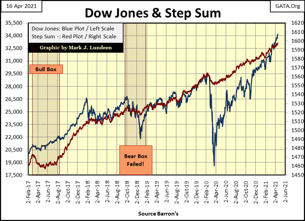
These charts can’t tell us when gold will begin its mad dash to $10,000 and above, or when the Dow Jones will begin a decline that resembles its 2007-09, 54% market crash, or even possibly its 1929-32, -89% market catastrophe. But they hint at the potential moves made possible by decades of market malfeasance by the “policy makers” (aka: the idiot savants) at the FOMC.
There are no small number of academic books on the Great Depression Crash whose authors have blamed that market catastrophe on the Federal Reserve’s inept credit creation during the 1920s and deflationary monetary policies of the 1930s.
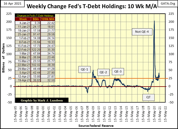
Now look at the Federal Reserve’s management of its balance sheet since the 2007-09 sub-prime mortgage crisis in the chart below. You are looking at monetary nincompoopery on a scale vastly greater than the Federal Reserve practiced in the 1920s!
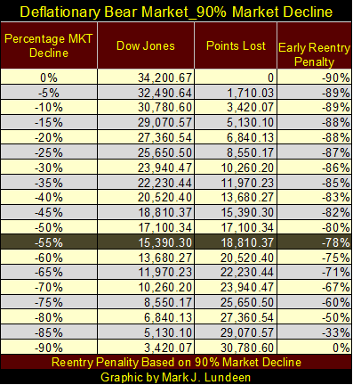
And what did the “policy makers” of the Roaring 1920s deliver come the depressing 1930s? An 89% market crash in the Dow Jones, as well as in real estate nationwide. The table below is not a prediction from me, though I do think it’s very possible. But should our pending bear market at the NYSE duplicate the disaster of the 1930s, from Friday’s close a 90% bear market decline would be as follows. The highlighted 55% market decline would be a repeat of the 2007-09 sub-prime mortgage Dow Jones bear market.
Next is gold’s and the Dow Jones’ step sum tables, with both looking good. I think I’ll leave it at that for the week.
I like money. Money provides people with options. Some people like snorting cocaine into their nose. Money lets them do that. Money also allows people to be generous with others who are not as fortunate as themselves. Money can also be used to increase one’s comforts in life, something which I admit appeals to me.
In the years to come, am I going to have more money than I can currently imagine? With my investments in precious metals assets, I’ve done pretty well in the past year. As the Federal Reserve approaches their primary goal of the total destruction of the American dollar as a global economic asset, I just may become very wealthy.
Whether or not I’ll enjoy this expected flow of wealth is something I currently can’t guarantee, for there are forces in motion beneath the surface of our world that would prevent that.
I have always been fascinated by history. Long ago in Catholic grade school, I remember reading everything I could on the Nazi and Communist Parties as well as WWII. I may have been in the fifth grade, but I knew something terribly wrong had happened not so long ago in Europe, with an evil that continued following the war in the form of communism.
Back in the 1950s and 60s, the Franciscan nuns who taught at my school were virulently anti-communist, a mindset which stuck with me ever since; thank you Sister Mary Clair. Though today the Catholic clergy for the most part has taken a hard turn to the left, stressing “social justice” and saving the planet from “global warming” ahead of the gospels of Jesus. The current Pope is a communist, an abdominal combination that would have been unthinkable decades ago.
I left “The Church” and became a protestant in protest. Though truth be told I wasn’t much of a Catholic following grade school, or a Christian until about ten years ago.
—
(Featured image by Grant Wickes CC BY 2.0 via Flickr)
DISCLAIMER: This article was written by a third party contributor and does not reflect the opinion of Born2Invest, its management, staff or its associates. Please review our disclaimer for more information.
This article may include forward-looking statements. These forward-looking statements generally are identified by the words “believe,” “project,” “estimate,” “become,” “plan,” “will,” and similar expressions. These forward-looking statements involve known and unknown risks as well as uncertainties, including those discussed in the following cautionary statements and elsewhere in this article and on this site. Although the Company may believe that its expectations are based on reasonable assumptions, the actual results that the Company may achieve may differ materially from any forward-looking statements, which reflect the opinions of the management of the Company only as of the date hereof. Additionally, please make sure to read these important disclosures.


Bitcoin Stalls Near $60K as Strategy Moves, ETFs Outflow, and EU MiCA Rules Take Effect
Bitcoin hovers near $60,000 with ETF outflows, while Strategy boosts reserves, sells BTC, and raises dividends to reassure investors. Ethereum...


Cannabis Dominates Global Drug Use: Trends, Risks, and Shifting Markets
Cannabis remains the world’s most widely used illicit drug, with 256 million users in 2024, surpassing all others combined. Growth...


Italy Approves First Hydrogen-Powered Train for National Rail Network
ANSFISA has approved Italy’s first hydrogen-powered train, the Alstom HMU214, for use on the Brescia–Iseo–Edolo line. Capable of 140 km/h,...


Cotton Market Weakness Persists Despite Brief Rebound
Cotton prices fell to new lows last week before a modest rebound. USDA data shows crop conditions remain worse than...


Eli Lilly Hits $1 Trillion Valuation Amid Strong Bullish Momentum
Eli Lilly stock hit a record high, surpassing $1 trillion market value after strong product demand. Shares surged over 7%,...
 |
|
 |  |
 |
|
-

 Markets1 week ago
Cocoa Market Faces Mixed Trends Amid Rising Supply and Weak Demand
-

 Africa6 days ago
Bank of Africa Expands Sino-African Trade Partnerships in Beijing
-

 Biotech2 weeks ago
Bavarian Biotech Sector Expands with Record Funding and Startup Growth in 2025
-

 Africa2 days ago
BOAD Approves Major Funding Boost to Drive West African Development