Markets
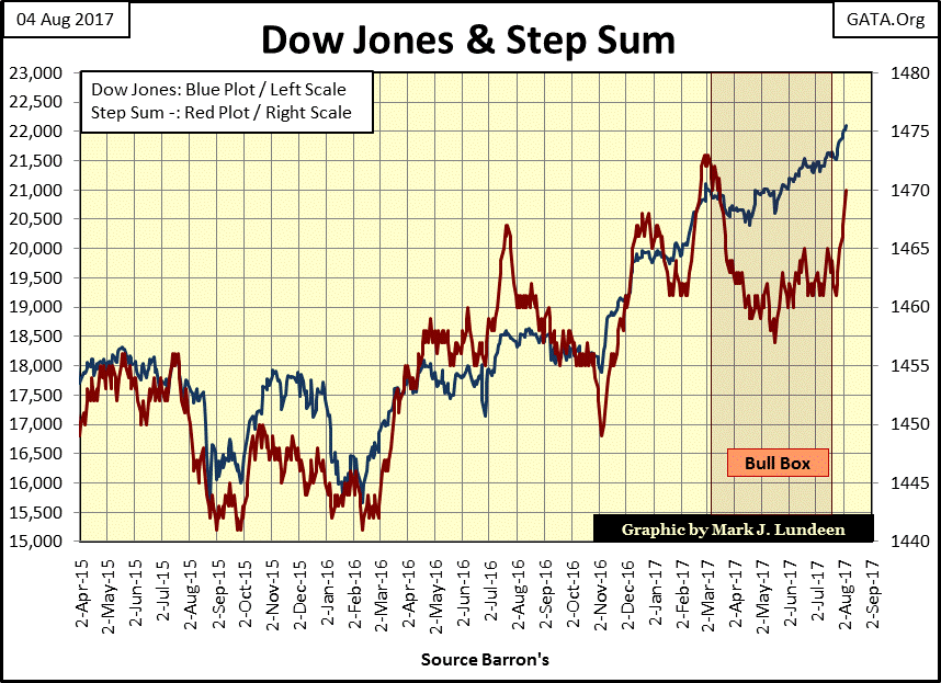
Dow Jones continues the trend of all-time highs
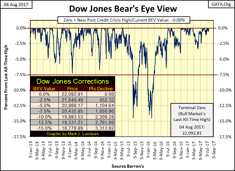
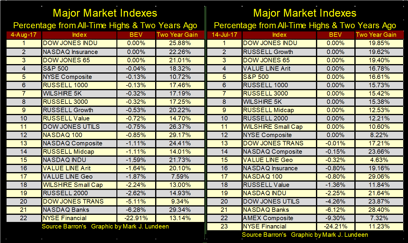
On July 14th the Dow Jones made a new all-time high, as did eleven other of the major indexes. On August 4th only two other major market indexes closed the week at a new all-time high.

Since July 15th, the Dow Jones has seen many new all-time highs. In fact, since July 11th the Dow Jones has increased from 21,409.07 to 22,092.81 at the close of this week, making twelve new all-time highs in the past eighteen NYSE trading sessions as it advanced 684 points (3.19%).
The thing that bothers me with the Dow Jones’ BEV chart below is it’s been a long time since the Dow Jones has seen a correction of just 5%. 5% corrections, and greater are pretty routine in a bull market, but we’ve haven’t seen one since July of last summer. And to get the Dow Jones to correct by 5% from its current lofty levels, it would have to decline 1,100 points.
That’s going to be a shock to many people when that happens. But central banks have been “injecting” their “liquidity” into the financial markets to where the Dow Jones is now over 22,000 points, so that’s the way things are.
© Mark Lundeen
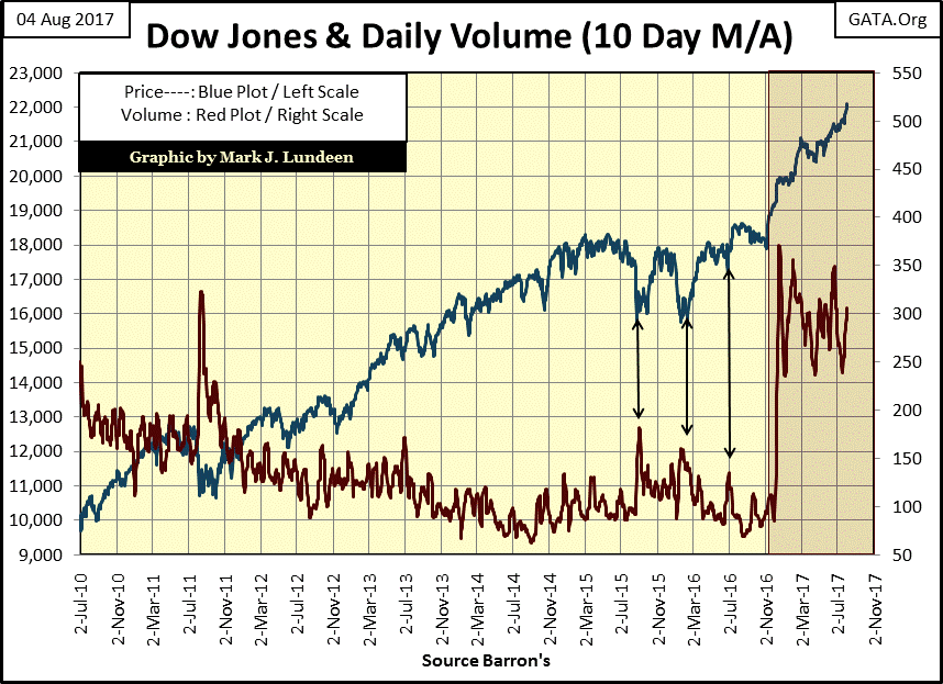
Since 2000, up to last November, the relationship between the Dow’s valuation (Blue Plot chart below) and its trading volume (Red Plot) had become inverted to what it was from 1900 to 2000. And what was that? Well, trading volume is demand for what Wall Street was selling the public, and like anything else, an increase in demand resulted in an increase in price – until the high-tech bubble of the 1990s began to deflate in the first two years of the 21st century. From 2000 to 2002, trading volume (demand) increased as valuations for the stock market deflated.
It was worse than just that; market valuations were also going to new all-time highs as trading volume (demand) collapsed! It’s not hard to figure out what was happening; the Federal Reserve was supporting the market on market declines, and withdrawing their support on market advances. This is clearly evident from 2011 to November 2016 in the chart below.
Then the November 2016 election came, where after almost seventeen years the market was once again advancing on rising trading volume. What should we make of this? Something big has changed; exactly what I don’t know. I’m not going to predict what trading volume for the Dow Jones is going to do when it sees its first 10% correction since February 2016 (BEV chart above). But a 10% correction in the Dow Jones also means a big 2,200 point decline in the Dow Jones, something that I suspect many people will be painfully aware of.
© Mark Lundeen
If the Federal Reserve is still in the market manipulation business, on the next big market decline we should see trading volume for the Dow Jones increase to new all-time highs in the charts above and below. If that doesn’t happen, we may have finally arrived at the point where the “policy makers” have decided to stand back and allow their inflationary bubble in the market crash and burn.
With Donald Trump as president, someone these people absolutely hate, making him their fall-guy may be their plan. If so we’ll see trading volume collapse with the valuation of the Dow Jones exactly as it did in the depressing 1930s. One thing is for sure, the mainstream media will say nothing about central banks being responsible for what is to come, and as a group will parrot the party-line about President Trump being responsible for the coming calamity.
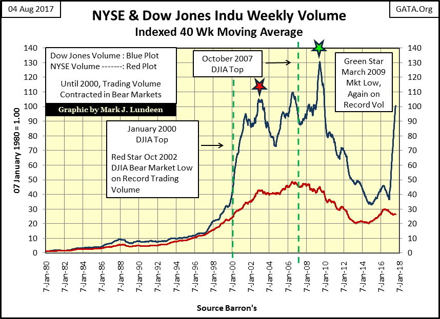
Here is a better chart showing the bizarre trading volume for the Dow Jones (Blue Plot) during the high-tech and subprime mortgage bear markets. Since 1900, when taxis in New York City were pulled by horses, there has been nothing like it. Now for the first time since 2000, Dow Jones trading volume is going up with the Dow Jones beginning last November.
© Mark Lundeen
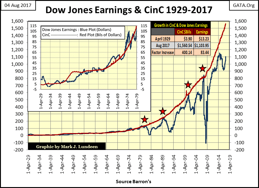
Here’s the chart for the earnings for the Dow Jones. I’m not an accountant, but looking at the data plotted below, I note how after the 1929 crash it took twenty years before the earnings for the Dow Jones returned to where they were in 1929. After the Dow’s earnings crashed in 2007, they were actually above to their highs of 2007 in 2011 and that seems a bit odd to me.
Also, I plotted US currency in circulation (CinC / Red Plot) along with the Dow Jones earnings below. It wasn’t always so from 1929 to 1980, but typically the Dow Jones generated a dollar in earnings for every $1 billion in CinC during these five decades. But after 1980, earnings for the Dow Jones decoupled from CinC. Looking at the chart below, something happened to the Dow Jones’ earnings, something that made them unstable. I believe this instability in the Dow’s earnings to be a result of the US Government taking the dollar off the Bretton Wood’s $35 gold peg in August 1971.
© Mark Lundeen
It goes without saying that “market experts” would disagree with this. But then you’ll never see a “market expert” discussing the chart above on CNBC for the publics’ benefit while examining historical data such as this is what I do.
Look at the table in the chart above. Since April 1929, when Barron’s first began publishing earnings for the Dow Jones, CinC is up by a factor of 400 while the Dow Jones’ earnings are up by a factor of only 83.44. What could that indicate? Obviously, the FOMC is having increasing difficulty getting their “liquidity” flowing into corporate America’s earnings, and the valuations of publicly traded stocks. Looking at the widening gap between CinC and the earnings for the Dow Jones, expect more instability to follow.
I’m expecting the current earnings for the Dow Jones will crash exactly as they did from 2007-09 sometime in the not too distance future. Also, that the usual suspects in the financial media will blame all on President Trump, and call on the experts in the FOMC to fix the stock market once again. They’ll do this as this is what they do for a living.
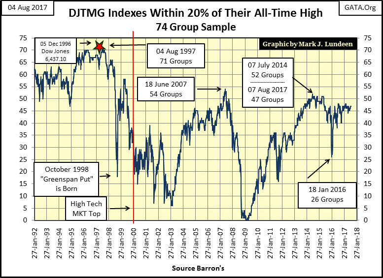
At the close of the week, the Dow Jones Total Market Group (DJTMG)’s top 20 was at 47. The Dow Jones may be making new all-time highs, but the broad market is just running in place and has been for well over a year.
© Mark Lundeen
Next are two tables for the major indexes I follow. On July 14th the Dow Jones made a new all-time high, as did eleven other of the major indexes. Today (August 4th) only two other major market indexes closed the week at a new all-time high.
This could all change by next week or next month. By October the top 20 above could find itself over 50, and the Dow Jones, along with most other of the indexes seen below rising to new all-time highs in a solid front.
© Mark Lundeen
But as sure as night follows day, as bull markets mature, they increasingly become more and more selective of what stocks and major market indexes are able to make new all-time highs until at the top exhaustion overwhelms the bulls and that’s it. At that point, Mr. Bear returns and begins taking out the garbage left over from the partying bulls (see photo below). For an advance that began in March 2009, how much longer can this “liquidity” driven bacchanal on Wall Street go on?
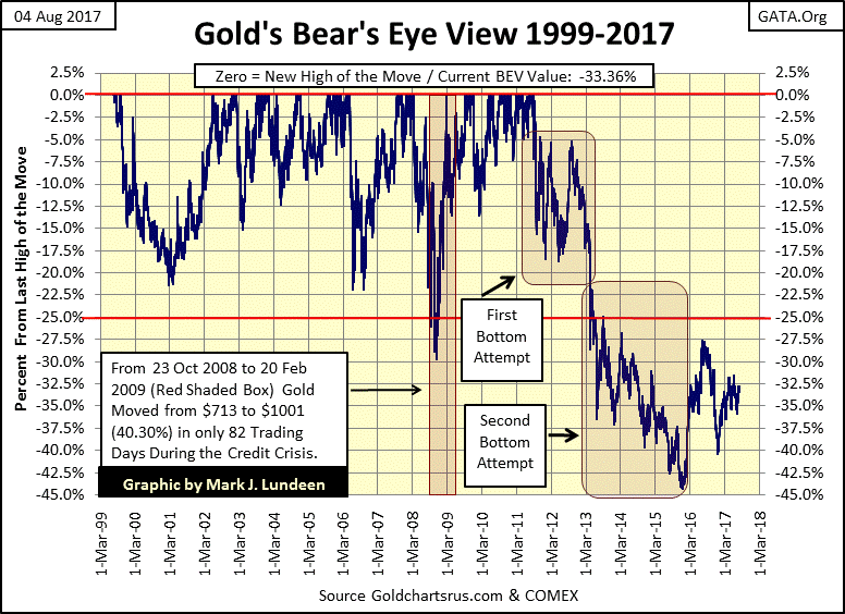
Moving on to gold’s BEV chart below, gold made an important bottom in December 2015. To be sure, nothing exciting is happening with gold (or silver) so far in 2017, but looking at its BEV chart below; gold is far above its BEV-44% of nineteen months ago. Now all it has to do is break above the BEV-27.5% of last summer and the bull market resumes; but when?
I expect when Mr. Bear begins mauling the financial markets the FOMC is currently manipulating, we’ll see some real excitement in gold’s BEV chart below. The key metric to follow will be bond yields and interest rates. Rising bond yields (capital flight from the debt markets), will become the prime mover for the gold and silver markets. Maybe we’ll see some excitement before Christmas.
© Mark Lundeen
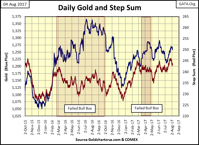
Gold’s step sum chart below isn’t being helpful. In my last article, I anticipated that a bear box was in the making and that the next thing to happen was for gold’s price and step sum plot to both turn down before we’d see the price of gold break upward. As you can see below, that didn’t happen. But since 2014, gold’s step sum boxes have been failing one after another. I’m going to blame it on the “policy makers” interfering in the market.
© Mark Lundeen
Not surprisingly, the bull box in the Dow Jones step sum chart below resolved itself exactly as most of the bull boxes I’ve studied have. From March to May of this year the Dow Jones’ valuation ignored the steeply declining step sum plot. What makes a step sum plot go down? More down days than up, yet the valuation for Dow Jones refused to follow. That’s bullish! Then in late July, the Dow’s step sum plots broke sharply upward, finally following the Dow’s rising valuation plot closing the bull box.
Looking at the Dow’s step sum chart below, the next few weeks and maybe months could be very bullish, but no guarantees on that.
© Mark Lundeen
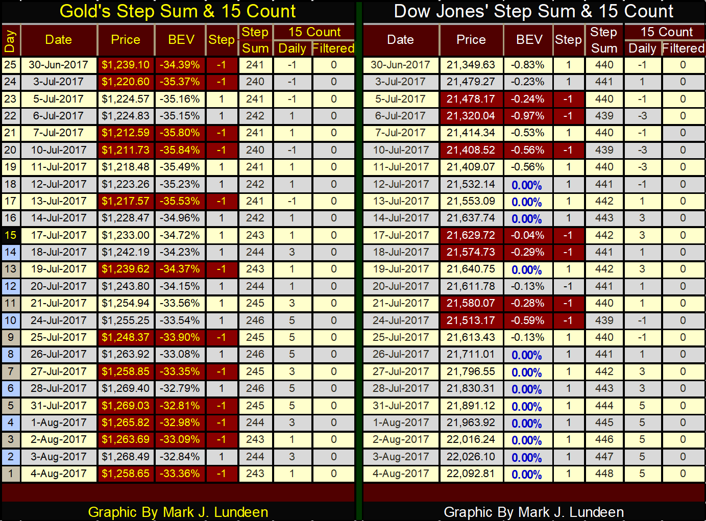
Here’s gold’s and the Dow Jones step sum and 15 count tables. Gold’s step sum is advancing, and so is the price of gold, but it’s mostly a holding action. Gold isn’t ready to make a big break out just yet.
Look at the Dow Jones. In the past twenty-five trading sessions it has closed down in only seven of them, and in the advancing days the Dow Jones is moving up nicely. Look at all the BEV Zeros (new all-time highs) in the BEV column.
© Mark Lundeen
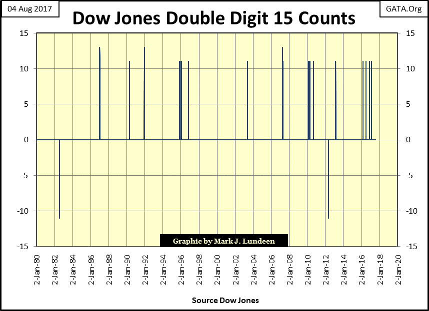
The Dow Jones hasn’t seen a down day since July 24th. Are we going to see the Dow with a rare double-digit 15 count by next Friday? I wouldn’t doubt it. Since February 2016, the Dow Jones has on four occasions seen its 15 count in the double digits. As you can see in the chart below – that’s a lot of them in such a short period of time. Maybe by next Friday, we’ll see history being made, and for the fifth time in eighteen months, we’ll see the Dow Jones 15 count in the double digits.
© Mark Lundeen
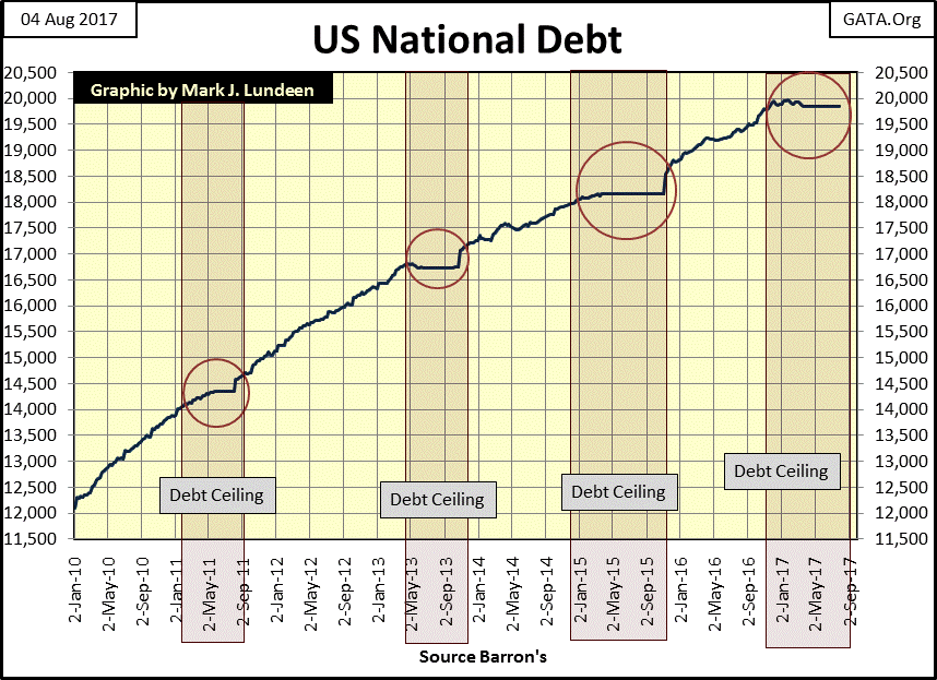
If you can believe it, the national debt peaked in early January at $19.952 trillion and since then in the past few months, has slowly gone down to $19.844. But I don’t believe it as I’ve seen this farce happen before.
Since January 2010, this is now the fourth time this has happened (see chart below.) If this pattern holds true, we’ll see Congress, currently dominated by Republicans, once again raise the debt ceiling this coming autumn, resulting in a spike in the national debt immediately after the debt ceiling is raised.
© Mark Lundeen
Here’s a link to a Politico article on this exact topic. The Republican leadership under Mitch McConnell in the Senate and House Speaker Paul Ryan is completely worthless. Between them and their RINO (Republicans In Name Only) followers in the capital, our constitutional system could come tumbling down and they wouldn’t care as long as they continue getting their perks of office.
What are they spending all this money on? They’ll never tell us for fear of what the public would do to them if we actually knew. I’ll tell you why the Wall Street / Washington establishment universally hate President Trump – he’s not a member of their club, and is completely capable of severing their connections to the US Treasury. If he can finally establish his control over the Federal Government, he’s the guy that would put an end to this corruption.
—
DISCLAIMER: This article expresses my own ideas and opinions. Any information I have shared are from sources that I believe to be reliable and accurate. I did not receive any financial compensation in writing this post. I encourage any reader to do their own diligent research first before making any investment decisions.


The TopRanked.io Guide to 2026’s Biggest and Best Affiliate Opportunities
Want to earn affiliate commissions on literal billions of dollars worth of revenue? Then this week, we've got something special...


Eni Advances Energy Transition with Major Investment and Emissions Cuts
Eni showcased its “Just Transition” report in Rome, highlighting stakeholder collaboration and progress toward decarbonization goals. The company invested over...


The German Fintech Market Shows Resilience and Strong Investment Growth in 2026
Germany’s fintech sector remained resilient in 2026 despite economic crisis and rising insolvencies. Investments reached €14.2 billion, showing strong investor...


Cannabis Legalization in Germany: A Mixed Interim Assessment
Germany’s cannabis legalization has reduced criminal cases and eased pressure on the justice system, while the black market is slowly...


Sustainable Restoration of the Haus Hövener Garden in Brilon
The Brilon Construction Workers Association is restoring the Haus Hövener garden into a cultural community space, funded through a €10,000...
 |
|
 |  |
 |
|
-

 Crypto2 weeks ago
Ethereum Under Pressure as Bitcoin Stalls and Crypto Tensions Rise
-

 Africa2 days ago
Côte d’Ivoire Cocoa Price Crisis: Record Decision Turns into Market Breakdown
-

 Crowdfunding1 week ago
Prestadero Sees Rising Female Loan Participation in Mexico
-
 Business4 hours ago
The TopRanked.io Guide to 2026’s Biggest and Best Affiliate Opportunities
You must be logged in to post a comment Login