Featured
Dow Jones closed lower this week; inflation streams from Federal Reserve
Dow Jones plunged at a rate of 6.71 percent, following a benign inflation brought about by Federal Reserve interest rate hikes.

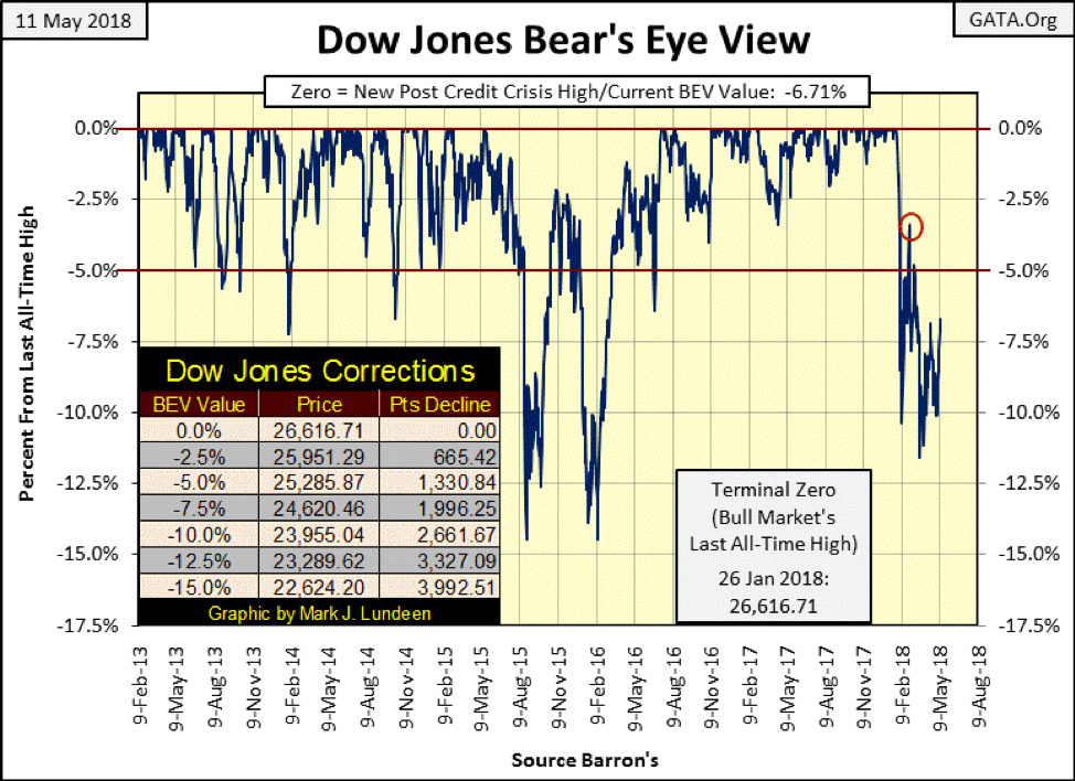
The week closed with the Dow Jones down 6.71% from its last all-time high in the BEV chart below. How hard would it be for it to make a new all-time high from here? One would think it’s not very hard, but I don’t have a horse running in this race, so I’m not emotionally involved whether the Dow Jones does or doesn’t see a new all-time high. I’m on the side of the bears because I know who the bulls are: a bunch of cheaters funded by monetary inflation flowing from the Federal Reserve.
That said, I know “cheaters never prosper,” or so Sister Mary Clair told us in the fourth grade. Still, it’s interesting to see these cheaters sleazing the stock market ever higher from the lows of last March. And as seen in the following charts, what a fine job they’re doing too.
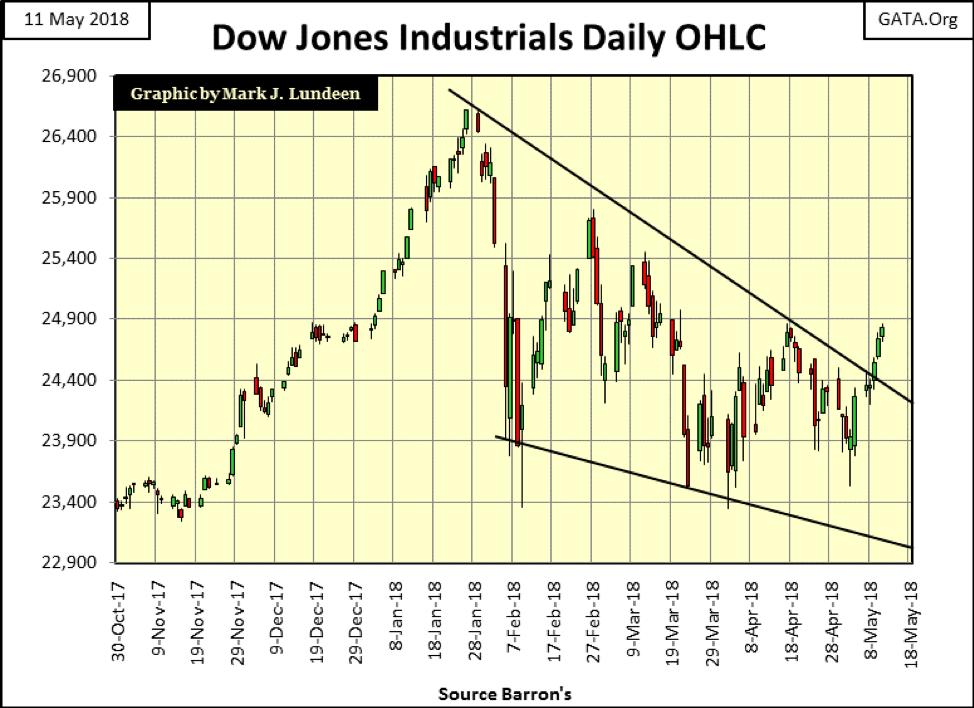
Remember, volatility is the slayer of bull market advances. From October to January, everything was just fine, until the Dow Jones began experiencing large daily moves in the chart below. Then beginning in April, daily volatility became subdued. Note how this week’s last three trading days finally broke above the upper trend line and in three tiny baby steps.
This has been a year of correction in the stock market. However, 2018 hasn’t seen much of a correction. In the BEV chart below, the Dow Jones’ last correction lasted from May 2015 to July 2016—twice attempted but failed to break below its BEV -15% line. So far in 2018, the Dow Jones hasn’t even broken below its BEV -12% line. Additionally, it’s been correcting for only four months.
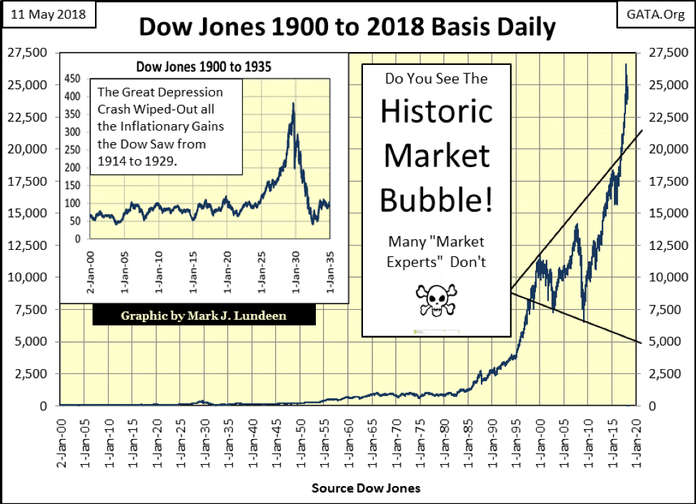
What’s next? Do we see the Dow Jones rising up to new all-time highs sometime in July or August? If that’s what the cheaters want, that may just happen. However, looking at the gains the Dow Jones has made since March 2009 in the chart below, a nine-year advance without a proper correction, reasonable people are wondering just how much higher the “policy makers” can stack this house of cards before gravity pulls it down.
Yep, I’m a big, bad bear on the stock market, but I’m enjoying the show the bulls are putting on.
Note on my DJTMG data below. In some charts and tables, I have 76 groups, and in others, I have 84 groups. The difference is from whether I included the main groups along with the subgroups. For instance, the DJTMG’s Energy sector contains an overall group called Energy and the subgroups such as Oil Majors and Drillers. Those graphics using only the subgroups have data for the 76 subgroups I used from the DJTMG. The graphics that contain 84 groups contain the overall groups along with their subgroups.
So why are there only 74 groups in the DJTMG’s top 20 table below? It’s a long story I don’t want to take the time to tell. However, my DJTMG data is good data; take it for what’s it’s worth.
Let’s look at the Dow Jones Total Market Group (DJTMG) top 20, or the number of the 74 groups I track that find themselves within 20% of their last all-time highs.
At week’s close, the top 20 in the table below was at 50. That’s not far from where it was in late January (53) when the market topped out. But the true status of the market is seen in the distribution of groups within five columns spanning from BEV-Zero to -15%, the columns containing the groups of the top 20.
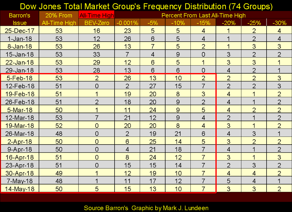
The table above illustrates how the current correction, beginning in Barron’s Feb. 5 issue, kicked groups over to the right and into columns increasingly farther from the BEV Zero column. And as of this week, the top 20 still hasn’t recovered where it was in Barron’s March 12 issue. The same is true for the Dow Jones, where on Friday, March 9, it was only -4.81% from its last all-time high, but this week closed with a BEV value of -6.71%.
My point is although we’re seeing the Dow Jones advance, looking at the table above, I can’t say we’ll see a recovery in the broad stock market back to where it was in late January. The DJTMG’s 52Wk Highs and Lows table below tells the same story. This week, we saw nine new 52Wk Highs and three new 52Wk Lows.
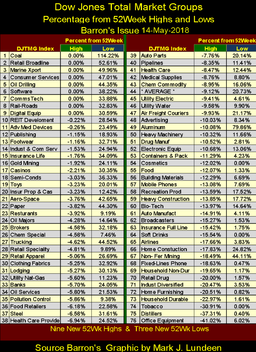
But in Barron’s Jan. 15, 2018 issue, the DJTMG saw 49 new 52Wk Highs in the table below. Then, look at the averages for the 52Wk Highs and Lows in these tables (#44 above and #58 below). At the close of the week, these 76 groups in the table above are on average 9.12% from making a new 52Wk High, while in mid-January (table below), they were only 2.35%.
That’s a significant amount of deflation the stock market has seen in the past four months. Note how #50 in May above is down -10.52%, while #50 just last January below is down only -0.38%. Nothing extreme during a correction in the market, but the bulls have a lot of work to do if they intend to reflate the broad market back to where it was last January.
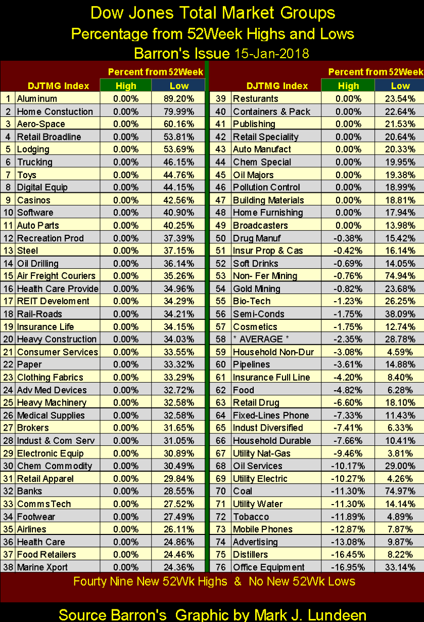
Also, January 2018 was a significant top in the broad market, a topping event not frequently seen as evident in the chart below. In Barron’s Jan. 15 issue, the DJTMG’s net 52Wk High – Low saw a +56, a peak not seen since 2013. After the 2013 peak (+63), 52Wk highs became increasingly rarer for the next three years until 52Wk Lows dominated the DJTMG in January 2016 with its -51 net 52Wk Lows.
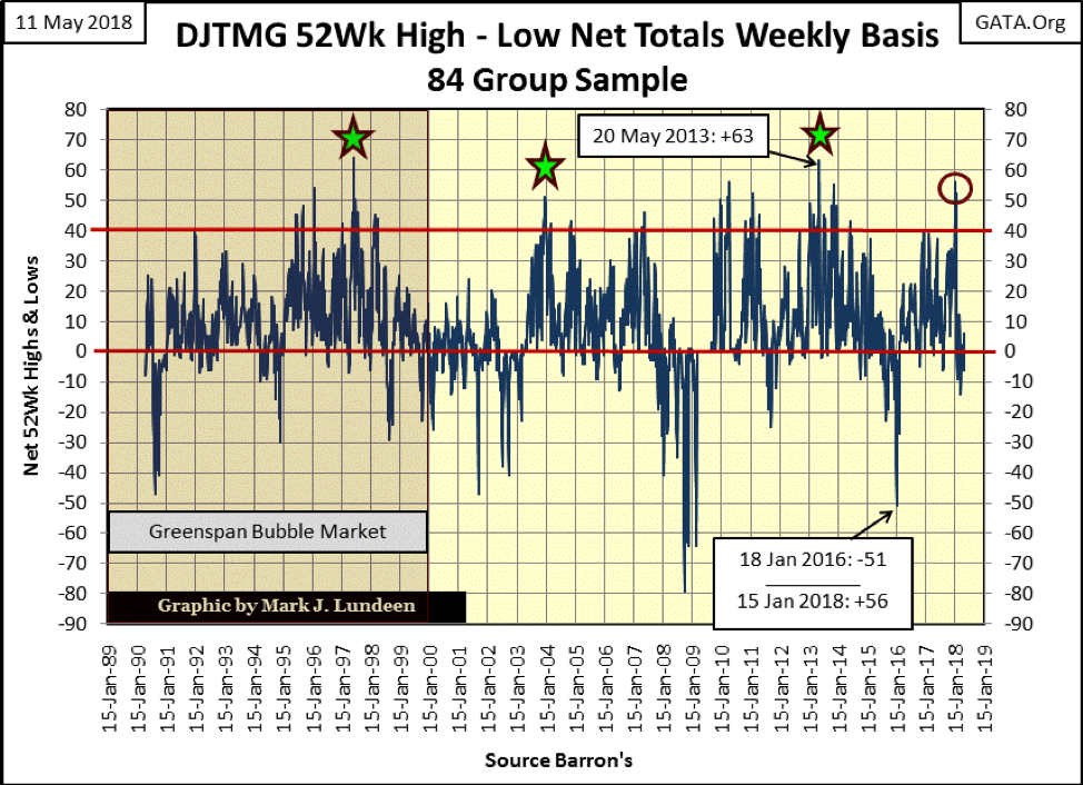
A diminishing quantity of 52Wk Highs in the DJTMG after a significant peak, as January’s +56, is a chart pattern clearly established since the 1990s. Don’t expect the current peak of +56 seen last January to be matched any time soon and most likely not until we see another peak in 52Wk Lows as we saw two years ago in January 2016.
That’s not bullish. But that doesn’t mean the Dow Jones itself can’t continue making new 52Wk Highs as an increasing number of groups within the DJTMG decline towards their new 52Wk Lows. That’s exactly what happened after the 1997 peak in DJTMG 52Wk Highs. Twenty years ago, the Dow Jones continued making 52Wk and new all-time highs until its January 2000 high-tech top as most groups in the DJTMG began their bear market declines years before the Dow Jones did. Looking at the chart above, this is easily seen.
But that was a long time ago; what about today? Well, I’m going with Sister Mary Clair’s advice with a slight modification. If cheaters never ultimately prosper, you don’t want to be long-term bullish in this market. But I wouldn’t be surprised if the Dow Jones should see new all-time highs before September.
So what’s currently primed for a major market advance? I still like the gold miners. Here’s a long term chart for the Barron’s Gold Mining Index (BGMI). At a time when most of the DJTMG is within 20% of their last all-time highs, the BGMI closed the week 70% from its last all-time high of April 2011, which is much improved from where the gold miners found themselves in December 2015: an 85% collapse in valuation from its highs of April 2011. To see how cheap the BGMI is in May 2018, it’s now trading at levels it found itself in the mid-1970s.
Also, take note of the 200 line in the chart. In 1977 and again in 2000, the BGMI bounced off this line as it began a major market advance. And where did the BGMI bottom in December 2015? This same 200 line.
People forget, but I don’t. In the circle below from December 2015 to August 2016, the BGMI advanced over 150% in eight months. That was a big move, and with big moves come big corrections. What has the BGMI has been doing since August 2016? I call it a correction of the December 2016 to August 2016 advance. From its highs of August 2016, its deepest decline was seen in December 2016, a 31% decline, and the miners have stayed range bound ever since as they wait for new marching orders.
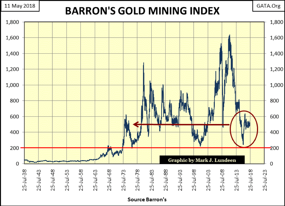
I don’t make any guarantees in my articles except promise my readers that like everyone else in risking money in the market, they’ll win and lose some. But the above long-term chart of the BGMI is a very compelling chart, especially after seeing the miners deflate 85% after their April 2011 top. If someone intentionally wanted to lose money going long in the market as a thought experiment, I believe they lost that opportunity with the BGMI after its December 2015 bottom. Like gold and silver bullion, the BGMI is only waiting for the general market to begin deflating before it takes off into bull-market history.
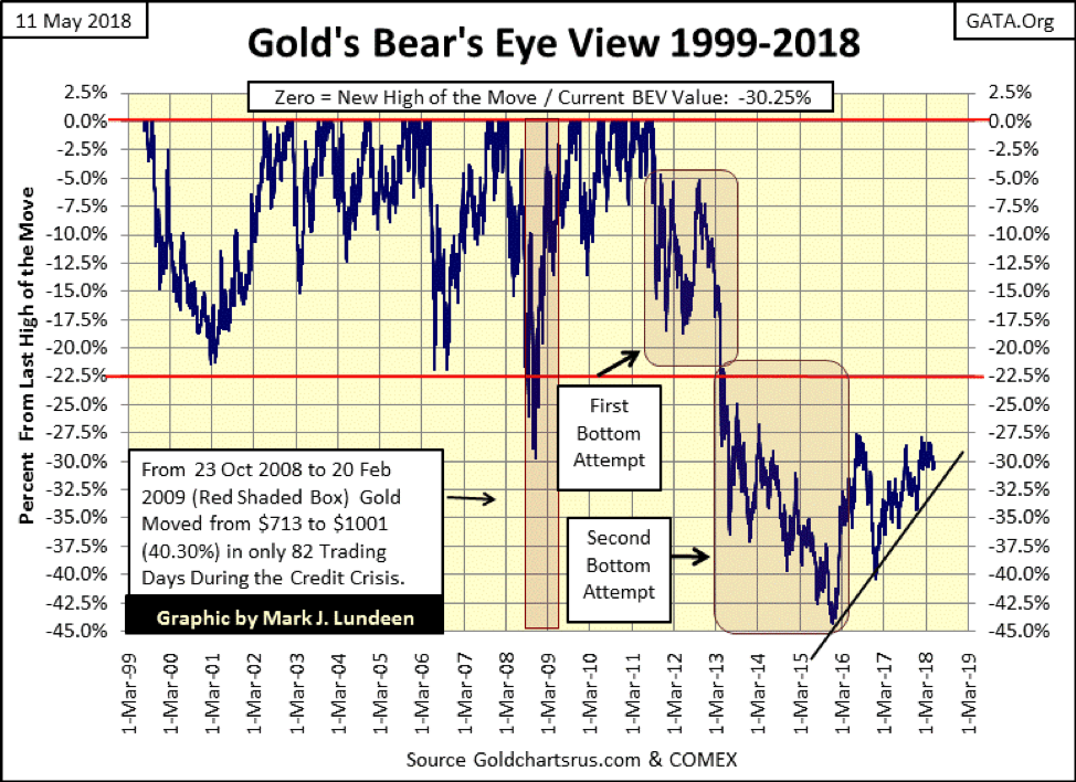
Like the BGMI above, gold in its BEV chart below saw a hard bottom in December 2015 and since then has done good. We’re only waiting for it to break above its BEV -27.5% line ($1,370) with some authority, and the advance should resume.
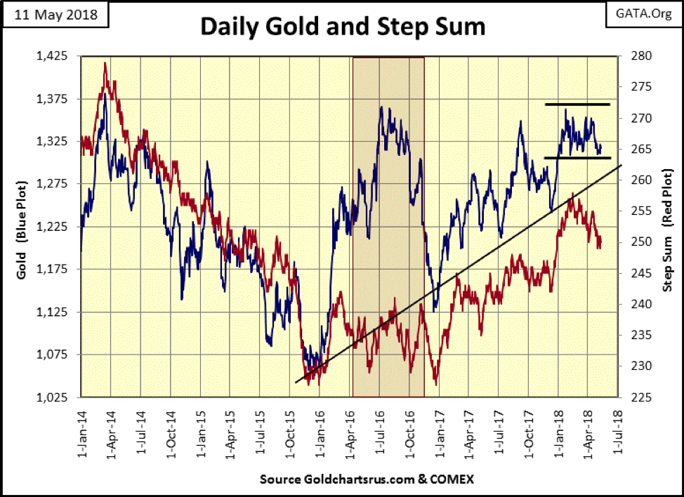
Below, we see market sentiment for gold (Red Plot / the step sum) trending down as its price (Blue Plot) refuses to break below its lower trend line—excellent! If this continues for another month, I’m going to have to call this a bull box, but will the bulls wait that long before they take gold above $1,375 in the chart? All in all, gold is looking good.
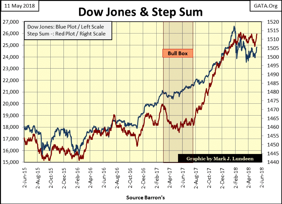
Here’s the Dow Jones step sum chart. The Dow’s market action of the past week has changed my short-term opinion on the stock market from bearish to bullish. The next few weeks could see the Dow Jones advance from here and go on to new all-time highs sometime in the next few months.
However, keep in mind that the old monetary metals are coming off very hard bottoms from December 2015, while the Dow Jones is near the top of a 20,000 point advance that began nine years ago in March 2009. Considering everything, it seems most of the potential for risk is in the Dow Jones (stock market), while most of the potential for reward is in precious metal assets.
Moving to gold’s step sum table below, its step sum is going down, but gold itself so far has refused to break below $1,300 under the selling pressure. In the past 15 trading sessions, gold has seen nine daily declines and only six daily advances (a -3 for its 15 count). After all that, the bears have only gotten a $7 decline in the price of gold. That’s not much reward for all that work.
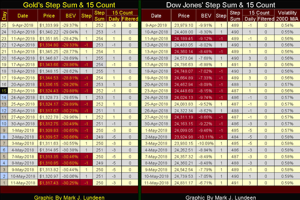
The Dow Jones advanced in its last seven trading sessions, gaining 900 points as it did. The only technical problem is its volatility’s 200 day MA ended the week at 0.59%. But as we saw earlier in this article, daily volatility for the Dow Jones is now going down. Should daily volatility continue declining, that should be a big plus for the venerable Dow Jones.
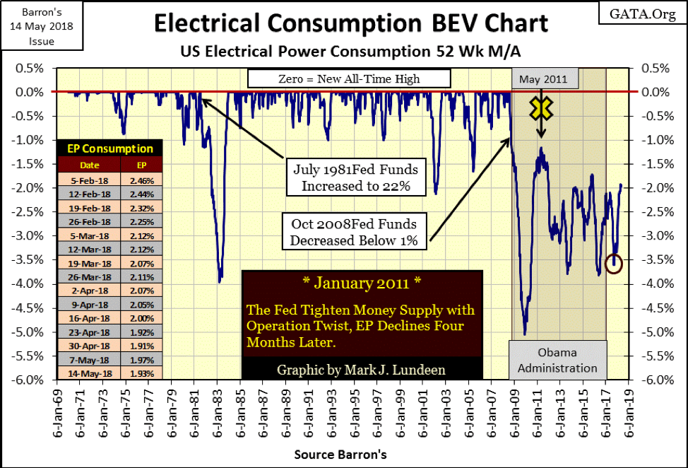
I haven’t covered electrical power consumption (EP) for a while; it’s time for an update. The chart below plots every weekly EP data point (Blue Plot) published by Barron’s since its Jan. 6, 1969 issue. What we’re looking at is the weekly consumption of billions of megawatts by the U.S. What’s good about this data is that it’s in watts, an engineering unit that unlike the U.S. dollar has remained unchanged since 1930.
Also, electrical power consumption is finely tuned to the economy. Turn on a 100-watt light bulb for illumination or a 500-horsepower electric motor to drive an assembly line, and the demand for EP goes up as it will go down when American corporations close their domestic factories and send those jobs overseas.
Due to seasonal demands for cooling and heating, the plot has a sawtooth appearance. The summer’s peak demand (cooling) occurs sometime in July to early September and is usually the larger of the two peaks. However, it’s not always as seen in August 2009 & January 2010 when winter’s peak demand for EP actually exceeded its previous summer’s peak.
An interesting fact is that Canada exports EP to the U.S. in the summer, and the U.S. exports EP to Canada in the winter. So the data charted below is really displaying EP demand for North America. As expected, its demand is minimal in the spring and autumn seasons when outside ambient temperatures are optimum for comfort.
To distinguish EP’s seasonal demand from its industrial component, I use a 52Wk Moving Average (Red Plot). Not perfect but good enough.
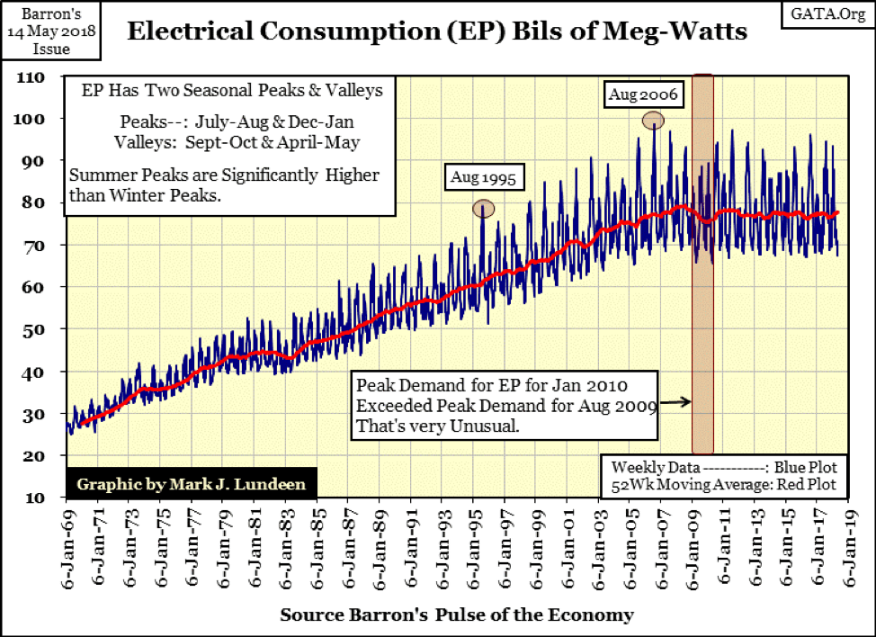
Let’s look at EP’s industrial demand. Below, using the 52Wk M/A above (Red Plot), I constructed a Bear’s Eye View (BEV) of the data. In a BEV plot, each new all-time high registers as a Zero Percentage; data points not new all-time highs register as a negative percent from their previous all-time highs. So, below is seen when the American (North American) economy grows, demanding ever more electrical power (EP). Those times when the economy is in decline, it demands less electrical power.
There’re notable events recorded in EP demand below. The first is the 1974-75 down spike. This, less than 1% decline occurred during the first Dow Jones 40% bear market since April 1942, a market decline that didn’t excessively bleed over to the general economy.
The next large decline in demand for EP occurred from 1981-83, a decline of 4% resulting from then Fed Chairman Volcker raising his Fed Funds Rate to 22%. This was also a time when all Treasury Debt yielded well over 10% as annual CPI inflation was deep into double digits for several years. This large increase in the Fed Funds rate began in 1979, and by the early 1980s, it had resulted in the largest and most painful downturn in the economy since the 1930s.
An interesting note: by January 1983, as EP demand bottomed 4% from its last peak, the Dow Jones was five months into a market advance that took it to new all-time highs, an advance that can be argued to have continued to January 26, 2018.
From 1983 to 2001, EP’s BEV chart began experiencing frequent declines of less than -1% that were absent before. I suspect this is from seasonal factors becoming an increasingly large factor in EP.
The next significant decline in demand for EP occurred when the NASDAQ High-Tech bubble deflated (2000–2002), a decline of over 2%; then the 1.5% decline of 2005 which happened on no news as the stock market inflated during the subprime mortgage bubble.
The next decline in demand for EP began in August 2008. Two months later, Congress conducted their subprime mortgage investigation on live TV. This has been a chronic decline in EP demand that continues to this day—ten years later. Since Barron’s began publishing this data series in August 1929, there’s never been anything like it.
Our current decline began with a 5% reduction in demand bottoming in December 2009. Looking at these charts, it now seems so clinical. But I remember those dark days when 5% of the economy shut down and those in 2008–2009 when fear of the future was everyone’s constant companion.
That didn’t last, and as with every other decline in EP since 1930, economic demand for electrical power began to recover. However, when Doctor Bernanke instituted his “Operation Twist” in January 2011, where the Federal Reserve began purchasing long-term Treasury debt, intending to push long-term bond yields down to “stimulate growth,” the result wasn’t as advertised. In effect, “Operation Twist” flattened the yield curve, and not surprisingly, in May 2011, demand for EP once again plunged.
Since May 2011, economic demand for EP has oscillated between -1.5% and -4%. The current bottom (Red Circle) occurred late last September and has advanced nicely since. I have no problem giving credit to President Trump for this recovery in the said demand. The question is whether or not EP will see its first new all-time high since August 2008. Perhaps sometime in the next year or so?
After decades of “monetary policy,” which facilitated tens of trillions of dollars of debt accumulation that predated the Trump Administration, I personally think EP won’t see a new BEV Zero for the foreseeable future. But I’d be pleased if I was wrong—as it would indicate a return of manufacturing and steel production in the continental U.S.
The next chart plotting the indexed values of EP and its 52Wk M/A along with CinC tell the tale. Looking at the chart’s insert, from 1960 to 1975, economic demand for EP increased at a rate greater than the flow of dollars from the Federal Reserve. But in August 1971, the U.S. Government decoupled the dollar from the Bretton Wood’s $35 gold peg, and by 1980, the rate of inflation finally became greater than the rate of economic growth as measured by EP.
In the main body of the chart, note EP demand (Red Plot / 52Wk MA) hasn’t even doubled since 1980’s indexed value of 25. At the close of last week EP’s 52Wk, MA was only 44.10. During these same 38 years, CinC’s indexed value has increased from 35 to 440.
I placed a table on the chart listing the actual values (not the indexed values) for CinC and EP’s 52Wk MA from Barron’s Aug. 4, 1930 and its May 7, 2018 issues. Comparing the data from these two series, one can fairly conclude that over the past nine decades, monetary inflation flowing from the Federal Reserve has increased by a factor of 10 times that of actual economic growth as seen in the demand for EP. That’s not good.
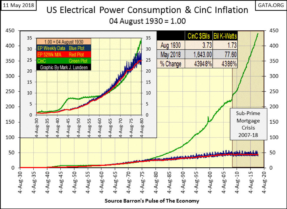
Anecdotal observations supporting this view is overwhelming, especially after August 1971 when the green CinC plot above begins its moonshot ascent above demand for EP. There have been inflationary bubbles first in commodity prices in the 1970s. Then, beginning in the 1980s, bubbles inflated in financial asset valuations, followed by deflationary busts.
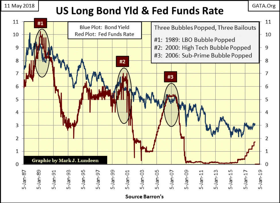
Below, we see the FOMC’s handiwork in the boom-bust cycle we’re now locked into. Following an inversion in the yield curve (#1,2&3), deflation takes hold of an asset class that was previously inflated. The FOMC then, once again, lowers its Fed Funds Rate far below the T-Bond’s yield and holds it there for years on end inflating another bubble in a different asset class.
But what does this have to do with EP? Well, that’s the point—absolutely nothing! Without a doubt, the growth in CinC since August 1971 has been decoupled from true economic growth as measured by EP. If inflating bubbles in the markets is all the Federal Reserve has done since 1971, with so little impact on the real economy, we don’t need the FOMC or their “monetary policies.”
Last but not least is examining EP’s seasonal factors. For years, there has been the unceasing talk of man-made CO2 global warming on Earth. Of course, with these claims of environmental disaster come demands for lifestyle changes from top global warming experts like Al Gore for restructuring society in a sustainable manner.
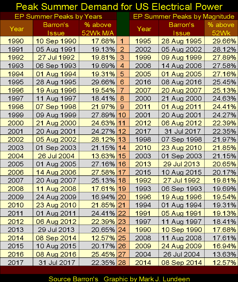
The chart below plots EP’s summer peaks, in percentage terms above EP’s 52Wk MA seen in this article’s first chart for EP.
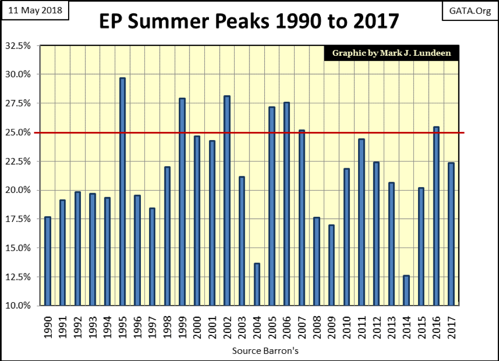
The table below lists the data plotted above by year (right side) and by magnitude (left side).
—
DISCLAIMER: This article expresses my own ideas and opinions. Any information I have shared are from sources that I believe to be reliable and accurate. I did not receive any financial compensation in writing this post. I encourage any reader to do their own diligent research first before making any investment decisions.
(Featured image via DepositPhotos)


Temotiva Launches Crowdfunding Campaign to Advance Preventive Mental Health
Temotiva Innovación Lab has launched a crowdfunding campaign through Santander X Explorer, marking a new phase for the University of...


Fed Policy Shift Raises Concerns Over Debt and Inflation Risks
The Federal Reserve is criticized for resuming balance sheet expansion through Treasury purchases despite expectations of tighter policy under new...


AI Adoption in Italian Retail Stalls Despite Strong Experimentation
A survey on AI in Italian large-scale retail trade shows companies are increasingly adopting artificial intelligence, but only 1.4% have...


Crypto Market Stays Stable as Bitcoin and Ethereum See Mild Declines
The crypto market remained stable despite slight declines in major coins like Bitcoin and Ethereum. Bitcoin held near $64,362, while...


WNBA Removes Cannabis From Banned Substances List in New CBA
WNBA removed cannabis from its banned substances list in a new CBA running 2026–2032, aligning with NBA policy and allowing...
 |
|
 |  |
 |
|
-

 Impact Investing1 week ago
Eni Advances Energy Transition with Major Investment and Emissions Cuts
-

 Biotech4 days ago
AseBio 2025 Report Highlights Growth and Future Potential of Spanish Biotechnology
-

 Africa2 weeks ago
Côte d’Ivoire Cocoa Price Crisis: Record Decision Turns into Market Breakdown
-

 Business1 week ago
The TopRanked.io Guide to 2026’s Biggest and Best Affiliate Opportunities
You must be logged in to post a comment Login