Featured
Is the Dow Jones overvalued given its dividend-cash payout?
In the past week, the dow Jones gained some traction but only recovered short of 3% from its last all-time high in July’s close. However, further declines are still expected in the Dow Jones and this week, market volatility saw a big increase. As far as the Dow Jones goes, it’s not really going up or down but stuck in its current mode of market stability.

This past week the Dow Jones saw some action in its BEV chart below, an almost 5% decline from a head and shoulder top formation. But since mid-week the Dow Jones recovered to just short of 3% from its last all-time high of last July at week’s close.
So what’s next? I haven’t a clue. My gut tells me further declines in the Dow Jones (my proxy for the broad stock market) are the market’s path of least resistance. But my brain tells me should the FOMC want this market to rise up to new all-time highs, or just remain range-bound between the 0.0% and -7.5% lines in the BEV chart as it has since February, well that’s what is going to happen.
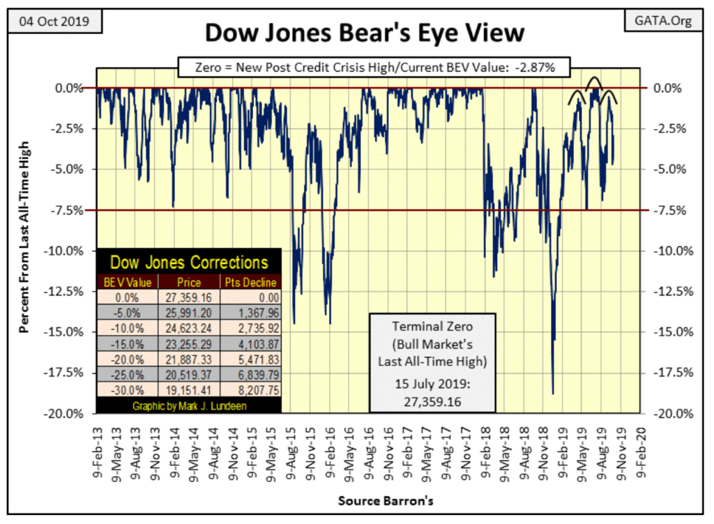
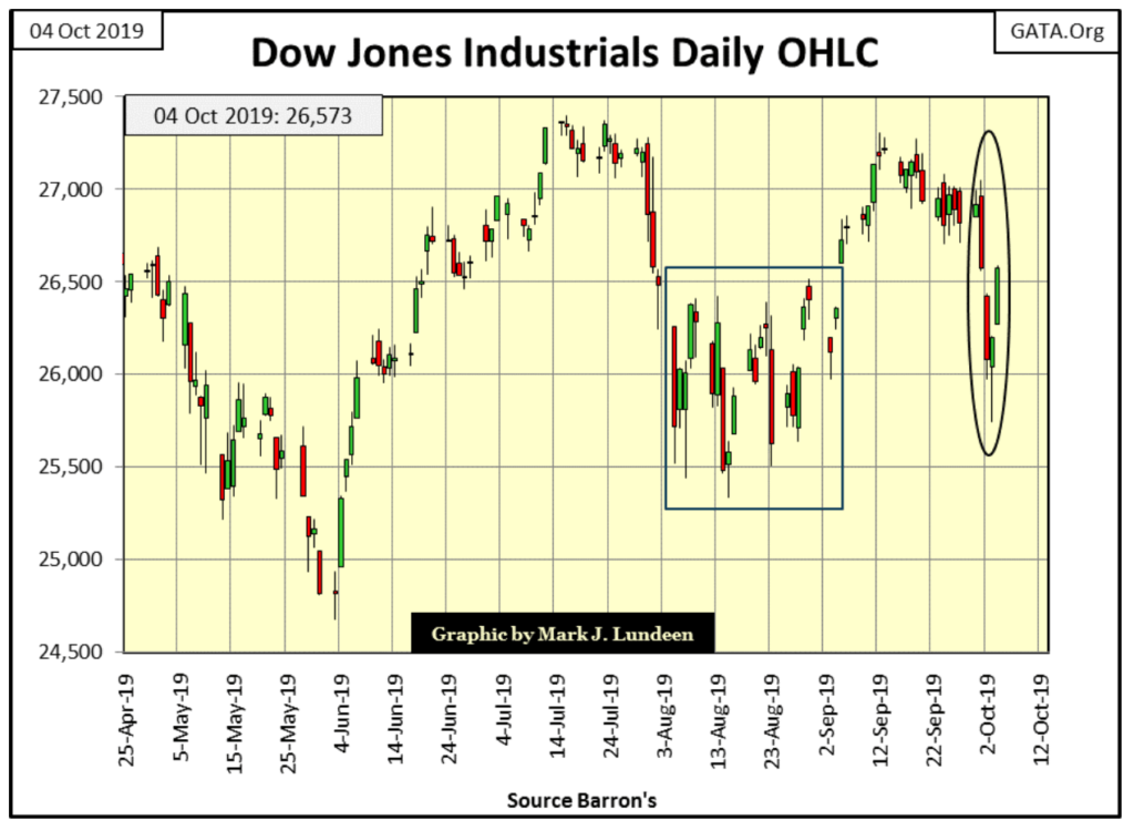
As seen in the Dow Jones daily bar chart below, market volatility saw a big increase this week, and rising volatility has NEVER been a good thing for the stock market. But so far, this spike in volatility is only a one-week affair. Should this volatility continue in the weeks to come, and we see the Dow Jones breaking below its BEV -7.5% line above sometime in October, then we’ll have something bearish to talk about. Like me, you’re going to have to wait to see what’s happening here.
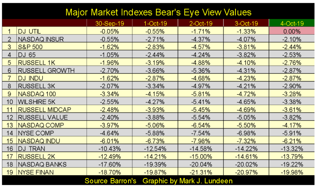
As seen in the Major Market Indexes BEV table below, the market as a whole followed the ups and downs of the Dow Jones this week. Look at the Dow Jones Utility Average (#1); at Friday’s close, it once again made a new all-time high. As a dividend play whose yield is above that of the 30yr T-bond, or Barron’s Best Grade corporate bonds, income seekers are finding utility stocks very attractive in this market.
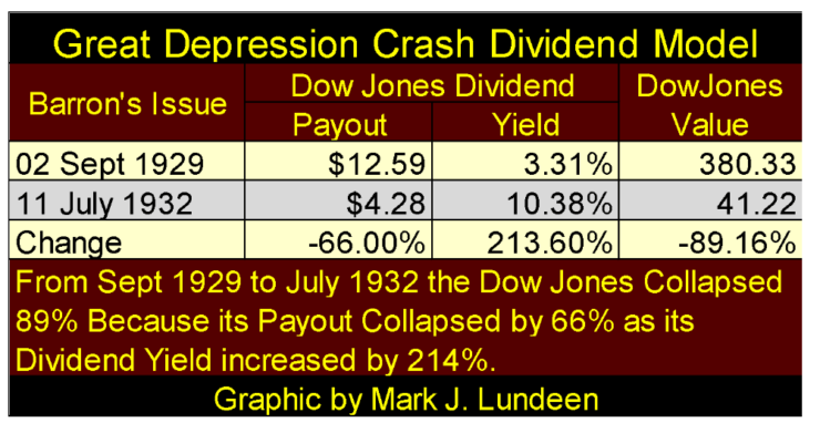
But utility stocks are still stocks, and stocks in big-bear markets see their valuations and dividend-cash payouts deflate, as was the case for the Dow Jones during its Great Depression Crash.
Still, if I had to choose between utility stocks and T-bonds I’d choose utility stocks as a source of income in this market. However, I expect the safest source of income today would be a dividend-paying gold or silver miner. In a big bear market with rising valuations for gold and silver, they’d actually increase their market valuation and dividend-cash payout as everything else deflated.
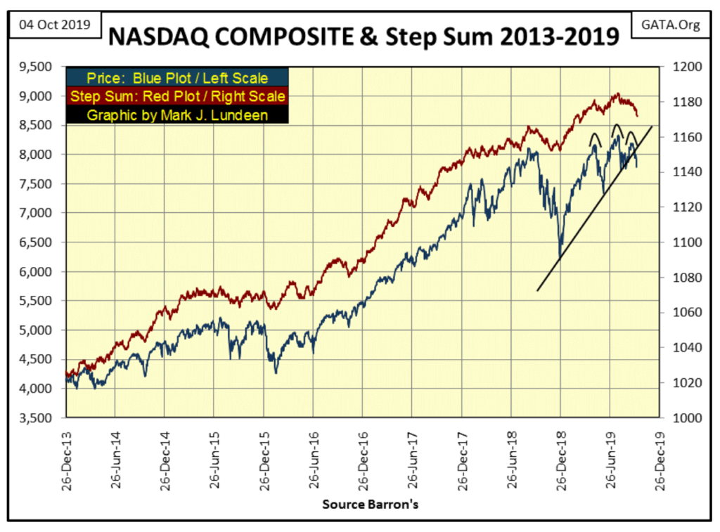
The NASDAQ Composite (chart below) is declining from a head and shoulder top formation as its step sum follows its valuation down. The NASDAQ Composite index has the appearance of a major market top.
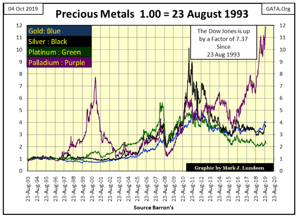
Below are the indexed values of the big four precious metals going back to 1993, and palladium is the stand-out metal. I looked at the Dow going back to August 1993, and at the end of the week, it had increased by a factor of only 7.37 compared to palladium’s 11.76.
So when are gold and silver going to outperform the Dow? The month and year I’m not certain of, but when the Dow Jones and NASDAQ Composite begin to deflate in a major way, you can be sure that gold and silver will be rising up to meet them on their way down.
In case you were wondering how palladium has performed compared to the NASDAQ Composite index since August 1993, the NASDAQ Composite at the end of this week was up by a factor of 11.18. So, palladium with its 11.76 has actually outperformed the NASDAQ too.
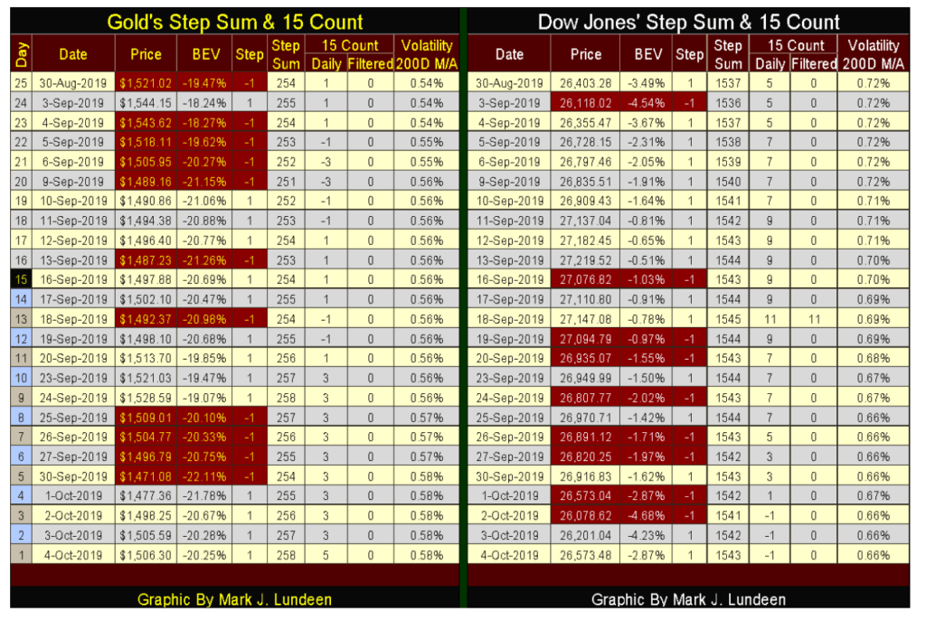
Lots of pressure in the way of COMEX paper gold flooding the market has been depressing the price of gold. COMEX gold open interest was at three-year highs just a few days ago; still, the price of gold is hanging on, near to its BEV -20% line in the BEV chart below. Considering everything, gold is looking darn good.
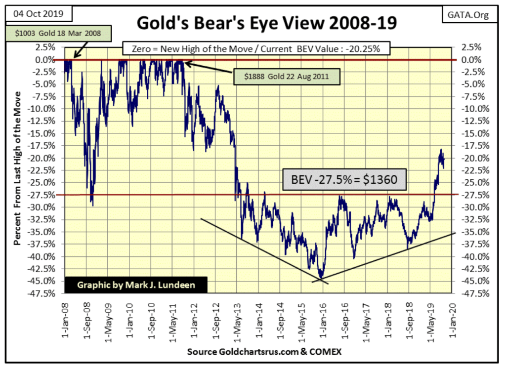
Gold and its step sum chart remain attractive. Not much to say about them other than we are waiting for something to happen that will take them higher or lower.
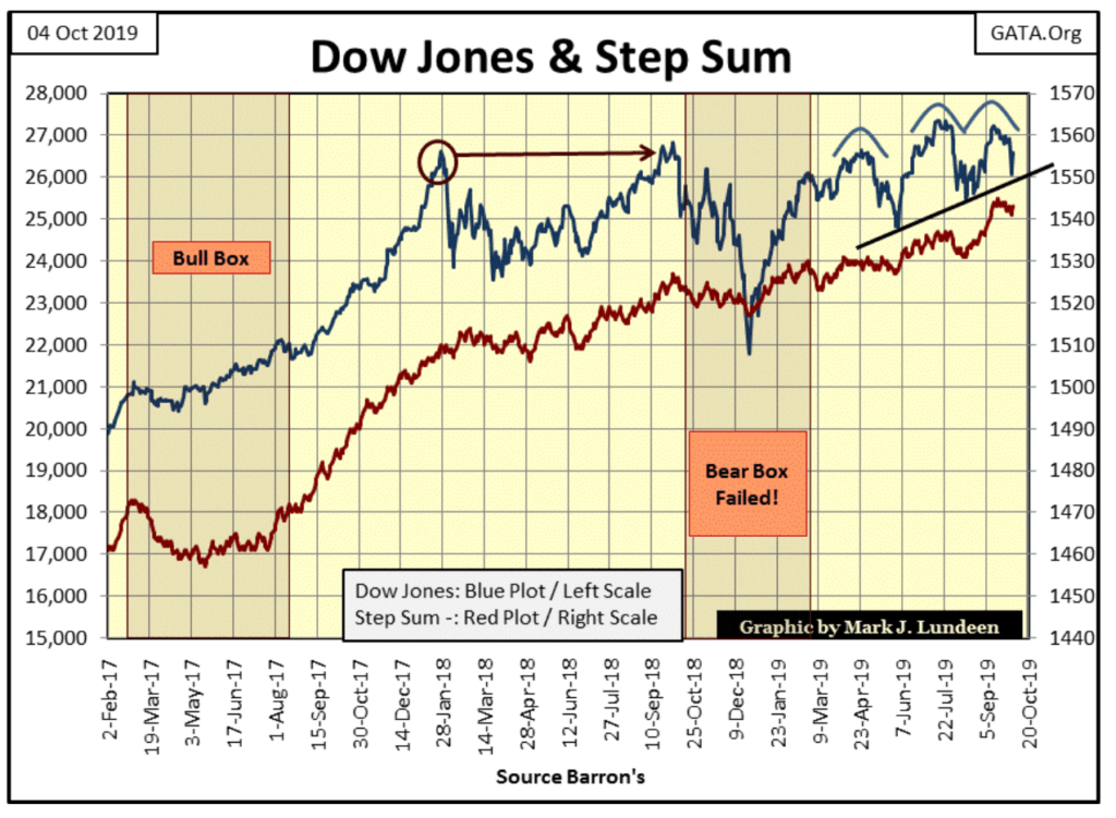
This week the Dow Jones (chart below) bounced off its rising trend line. That’s bullish. The market-sentiment indicator I call the step sum (Red Plot) remains bullish too, as has been the case since August 2017, even during last year’s 18% correction in the Dow. But since January 2018, the Dow Jones has done little to reward the bulls’ loyalty.
What we see below is not a roaring bull market advance but what they call “market stability.”
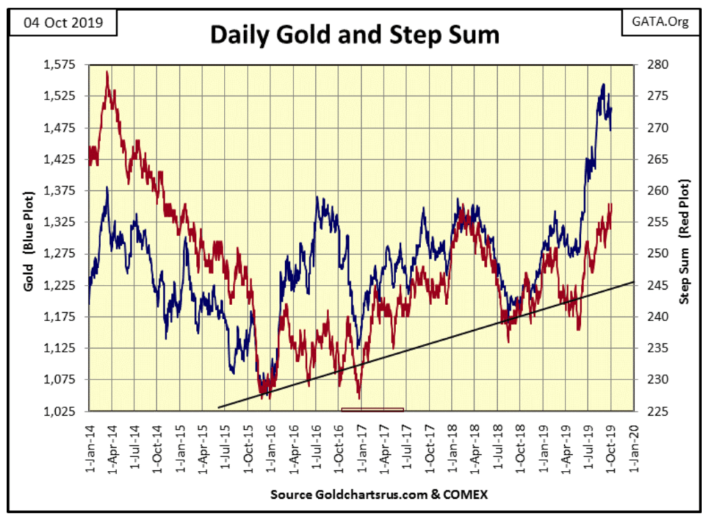
This week gold bounced off its September 30th low of $1471.08, gaining $35 as the week wore on, and with its step sum at a five-week high, I’m feeling optimistic about gold’s prospects for the remainder of 2019.
As far as the Dow Jones goes, it’s not really going up or down but stuck in its current mode of “market stability.” I can’t help but notice that on September 18th its 15 count increased to a rare +11, or 13 daily advances in a 15 day sample failed to do much for the bulls. Maybe the stock market has a problem, something like it’s overvalued.
When one states something is over or undervalued, one is making a comparison; making a judgement based on a set standard, or at least they should be. For myself, I like comparing the Dow Jones’ valuation to its dividend-cash payout, but before I go into that I need to give some background information, like a history of bull and bear markets in the Dow Jones.
The best illustration for that is my Bear’s Eye View (BEV) chart of the Dow Jones from 1885 to 2019. What’s a BEV chart? It’s a view of the Dow as Mr Bear sees it, with each new all-time high registering only a 0.00%, (aka; BEV Zero or Big Fat Zero as Mr Bear calls them) and each daily closing price NOT a new all-time high is registered as a percentage claw back from its last BEV Zero.
Looking at the Dow Jones in a BEV format compresses daily data spanning back to the 19th century into a range of only 100%:
- 0.00% = New all-time high
- -100%= Total wipeout in valuation
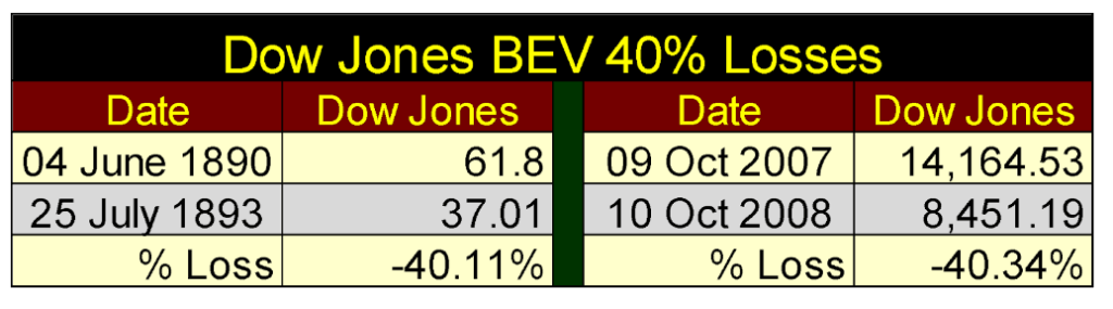
Looking at the market as Mr Bear does provides an excellent view of three centuries of the Dow Jones. For example; from 1885 to 1900 the Dow Jones traded under 100, while today it trades at over 26,000. But a 40% loss from an all-time high, whether it be from the 1890s or the 2000s is still a 40% loss of the Dow Jones, as seen in the table and BEV chart below.
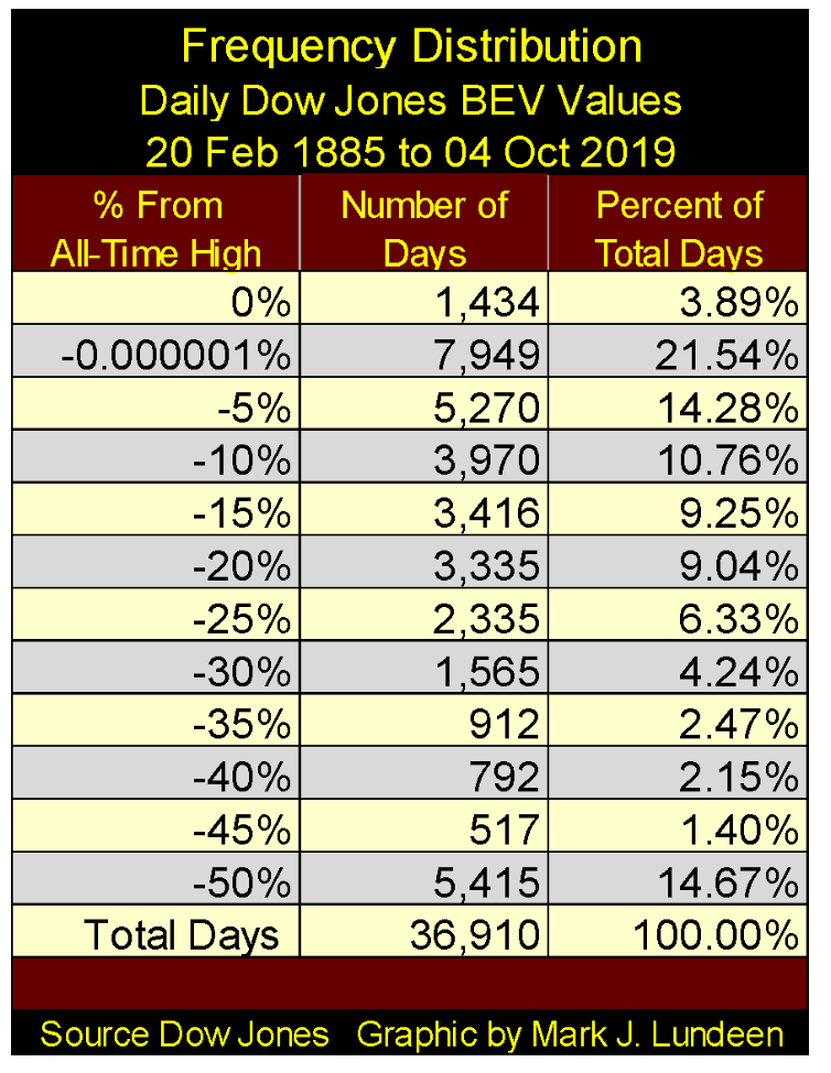
In the BEV chart below we’re not looking at the Dow Jones in dollars, but in terms of new all-time highs and percentage, clawbacks from those new all-time highs. One can’t make the 134-year history of the Dow Jones any simpler than that. And just how many BEV Zeros has the Dow Jones seen since February 1885? The answer to that question is found in the frequency-distribution table below: 1,434, or 3.89% of the 36,910 daily closings since 20 February 1885.
One more graphic before we go on to the Dow Jones BEV chart plotting the Dow Jones 40% Bear Markets; a table listing the nine Dow Jones 40% bear market declines since 1885. You’ll see that the sub-prime mortgage bear market of 2007-09 (#2) was the second deepest market decline for the Dow Jones since 1885.
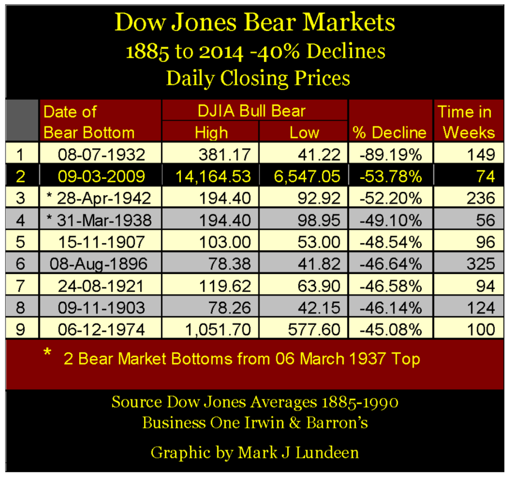
Should you count the times the Dow Jones had broken below its -40% BEV line in the chart below you’ll count eleven -40% market events, but I recognize only nine of them as actual 40% market declines.
The 1890s -40% bear market saw the Dow Jones break below its BEV -40% line twice, so in my opinion these two 40% declines are reckoned as one bear market, not two.
Something similar to this happened following the March 1937 top. It too saw two 40% bottoms; one in March 1938 (-49.10%) the other in April 1942 (-52.20%) but I DO count these -40% market declines as separate bear market bottoms. The March 1938 bottom was seen as a resurrection of the Great Depression, and was widely commented upon, and feared at the time.
This was not so for the April 1942 bottom. Coming four months after Pearl Harbor, this -50% decline in the Dow Jones was widely ignored by an apathetic public now totally exhausted after a decade of crashing markets on Wall Street. The public would not return to Wall Street until the baby-boomer generation came of age in the 1970s.
The -40% Dow Jones decline seen in 1914 (Red Triangle) I don’t count at all. At the end of July 1914, the NYSE ceased trading as WWI began, not opening for business again until December 12th; that plus Dow Jones Inc. reconfiguring its stock average from twelve to twenty stocks. I have this “-40% bear market” displayed in the BEV chart below, but I don’t include it in my table of Dow Jones’ 40% bear markets above as it’s not exactly clear to me what this 40% decline in the Dow Jones actually means.
With that all said, let’s look at the Dow Jones BEV chart from 1885 to 2019. With the exception of the Great Depression bear market, the crater seen in the middle of the chart, investors who purchased stocks soon after the Dow Jones suffered a 40% market decline did so at little risk to their invested funds.
This makes a lot of sense when one considers exactly what market risk is. In the case of the Dow Jones, since 1885 market risk has been that the Dow Jones will decline by something over 40%, leaving investors with something less than 60% of their invested funds.
As seen in the Dow Jones BEV chart below, when entering the market with the Dow Jones down 40%, there isn’t much risk left in the stock market. Though if one were following the financial media at such times when the Dow Jones was down 40%, “market experts” on the whole would say the exact opposite.
But traditionally market reports have been from the perspective of the bulls, who prosper when the Dow Jones is producing new BEV Zeros in the chart below, and suffer great pain when the Dow Jones has broken below its BEV -40% line. That’s just how the financial media typically chooses to see a market, be it a market for stocks, bonds or real estate – as a bull.
However, understanding the stock market as Mr Bear does, since 1885 seeing the Dow Jones break below its BEV -40% line is a solid indication the stock market is very near to its final bear market bottom, making a 40% decline an occasion to seriously consider reentering the market.
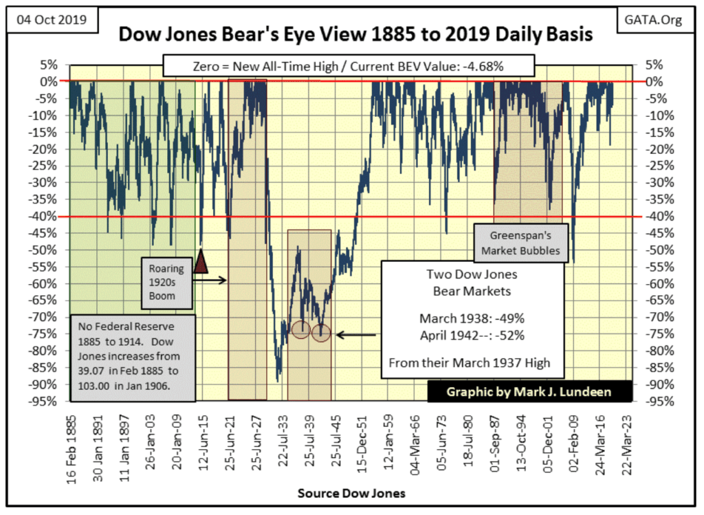
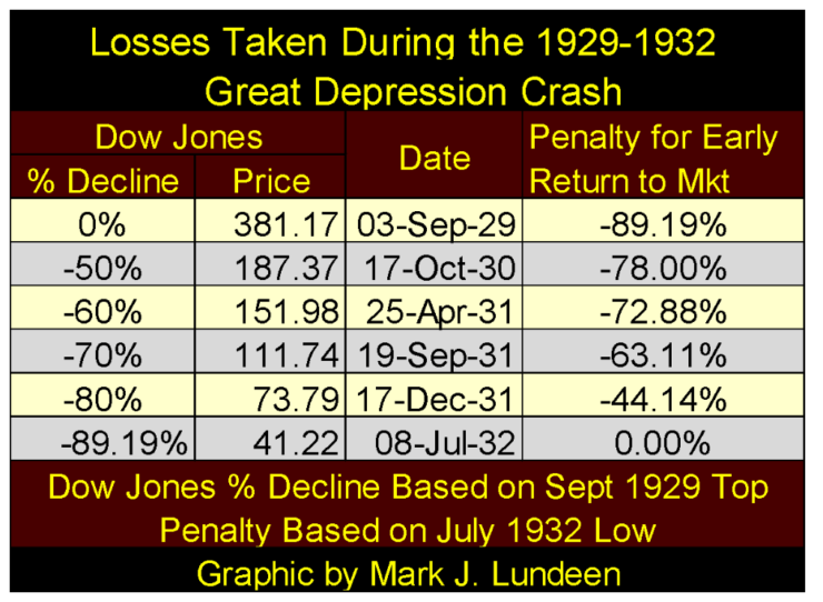
The exception to all this would be in the case of a massive deflationary-market collapse, as seen from 1929 to 1932 above. In such a massive deflationary collapse, the bear-market mathematics becomes truly grizzly, as seen in the table below.
Even with the Dow Jones down 70% on 19 September 1931 (two years into the bear market), to have entered the market at this point would have subjected one’s invested funds to a 63% loss at the actual market bottom in July 1932. Looking at this table, I can’t imagine the horror of living through such an event.
But the Great Depression bear market crash is market history, something that happened ninety years ago and hasn’t been repeated since.
Well, maybe it should have in 2009 during the sub-prime mortgage crash.
With that thought in mind, let’s examine the following chart which is a simple ratio of the valuation of the Dow Jones divided by its dividend-cash payout, or how many dollars of Dow Jones valuation a single dollar of cash payout has supported since 1925.
I have numbered boxes in the chart. These mark the bear-market bottoms in the table above. Pre-1925 bear market bottoms are not included for obvious reasons; I have no dividend-cash payout data before that.
This chart’s plot is divided into two eras:
- Before Alan Greenspan became Fed Chairman in August 1987
- After Alan Greenspan became Fed Chairman in August 1987
Before the Greenspan Fed, bull and bear markets were loosely bound between $30 of Dow Jones valuation for $1.00 of dividend-cash payout at market tops (Red Line) and $15 of Dow Jones valuation for $1.00 of dividend-cash payout at market bottoms (Green Line).
However, these limits are only guidelines that were frequently exceeded at market extremes. The Great Depression Crash bottomed with $9.63 of Dow Jones valuation being supported by $1.00 of dividend-cash payout. The Dow Jones market top of June 1987 (two months before Greenspan became Chairman of the Federal Reserve) saw $39.68 of valuation being supported by $1.00 of dividend-cash payout. On a dividend–cash payout basis, the Dow Jones in June 1987 was at its most overvalued situation since 1925; in other words, the Dow Jones was due for a big -40% market decline.
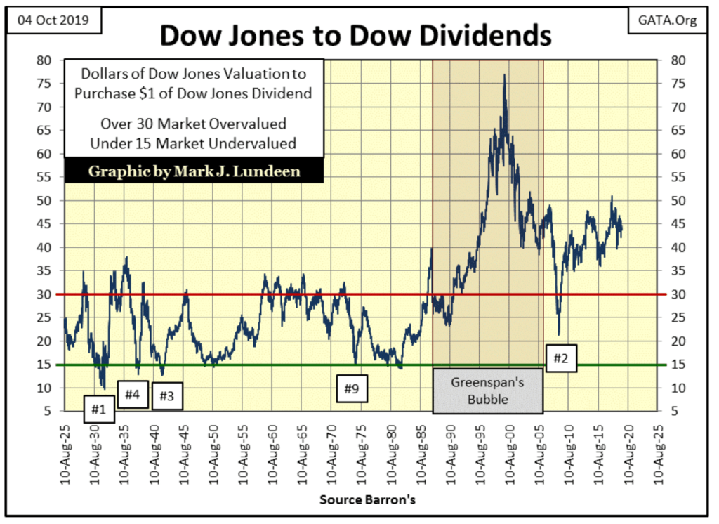
But that didn’t happen, as when the Dow Jones (my proxy for the broad stock market) began deflating in October 1987, Chairman Greenspan began “injecting ample liquidity” into the financial system, as he was frequently quoted on the nightly news of those dark days.
The Dow Jones closed on October 13th with a BEV value of -7.87%, or 7.87% from its last all-time high of just a few weeks before. At the close of October 19th (four trading days later) the Dow Jones had deflated to a BEV value of -36.13%. And that was that; no Dow Jones -40% bear market and a $1.00 of dividend-cash payout supported $28.25 of Dow Jones valuation; far above the traditional bear market bottom of $15.
Then nine years later in November 1999, at the top of the NASDAQ High-Tech Bubble, the Dow Jones saw an incredible $76.92 of valuation being supported by $1.00 of dividend cash-payout.
Within months of this top, the Dow Jones and the NASDAQ Composite Index began deflating. The Dow Jones suffered a 38% market decline in October 2002 (again just short a -40% decline), and with $1.00 of dividend cash-payout still carrying a huge $40.16 of valuation. The losses seen by the Dow Jones during the High-Tech bear market should have been much greater. The hot NASDAQ groups all saw market declines of over 75%, some over 85%.
Not since the Depressing 1930s had major stock groups sustained such massive losses, and Chairman Greenspan, cheered on by the financial media, once again began “injecting” massive amounts of “liquidity” into the financial system. Greenspan from October 2002 to October 2007 not only reflated the Dow Jones and the NASDAQ high-tech stocks, but with a little help from his global central banking brethren, also inflated a historic bubble in single family home mortgages worldwide.
But that’s another central banking tale-of-woe. As we are looking at the Dow Jones, from its October 2007 top (14,164.53) it deflated down to its second-deepest bear market bottom (6,547.05: a -53.78% loss) in March 2009 (see 1885 to 2019 BEV chart). Still, at this bottom, a $1.00 of the dividend-cash payout was supporting a big $21.37 of Dow Jones valuation as now Fed Chairman Dr. Bernanke began his first of three quantitative easings that reflated market valuations with trillions of dollars of “liquidity injections.”
But what would have happened had the market been allowed to deflate as it once had, before Alan Greenspan became Fed Chair, down to $15 of valuation for $1.00 of Dow Jones’ dividend-cash payout? As the Dow Jones dividend-cash payout in March 2009 was $310.14, the Dow Jones would have had to deflate down to 4,652, or a horrific 67% market decline in the Dow Jones.
The point of all this is to point out the Dow Jones has been wildly overvalued, in terms of its dividend-cash payout, since Alan Greenspan became Fed Chairman in August 1987. Each of the following Federal Reserve Chairmen (or Chairwoman) continued to over-inflate market valuations since 1987.
As a big believer of a “reversion to the mean”, I’m expecting a day is coming when Mr Bear will have his long-delayed day-of-reckoning and deflate the Dow Jones down to the point where once again a $1.00 of dividend cash-payout will support less than $15 of market valuation. Should dividend-cash payouts for the Dow Jones decrease, which during the Great Depression Crash they declined by 66%, we may see a future bear market that will rival the -89% market crash seen from 1929 to 1932 in the Dow Jones.
Here are some articles published this week. The first is Doctor Bernanke assuring everyone the Federal Reserve still has the “tools” to combat the pending deflationary event I pointed out above.
The next informs us that our end of the week recovery is because investors smell another rate cut by the Federal Reserve.
The week ended with the Dow Jones less than 3% away from making a new all-time high, yet the Federal Reserve’s committed to pump ever more billions of inflationary dollars into the financial markets. What did the FOMC do last December when the Dow Jones corrected 18%? It pumped inflation into the market at even a greater rate!
One of these days these now very stale Keynesian-market capers aren’t going to work in preventing the Dow Jones to once again deflate down to pre Greenspan levels in terms of dollars of valuation to $1.00 of dividend-cash payout.
In the next few years the Dow Jones will once again see a 40% market decline. When it happens I won’t be in a hurry to buy as there is plenty of reason to believe much worse will follow. In such a market where deflation and counter-party failure run riot, the place to be is in precious metal assets.
(Featured image by DepositPhotos)
—
DISCLAIMER: This article expresses my own ideas and opinions. Any information I have shared are from sources that I believe to be reliable and accurate. I did not receive any financial compensation for writing this post, nor do I own any shares in any company I’ve mentioned. I encourage any reader to do their own diligent research first before making any investment decisions.


The TopRanked.io Guide to 2026’s Biggest and Best Affiliate Opportunities
Want to earn affiliate commissions on literal billions of dollars worth of revenue? Then this week, we've got something special...


Eni Advances Energy Transition with Major Investment and Emissions Cuts
Eni showcased its “Just Transition” report in Rome, highlighting stakeholder collaboration and progress toward decarbonization goals. The company invested over...


The German Fintech Market Shows Resilience and Strong Investment Growth in 2026
Germany’s fintech sector remained resilient in 2026 despite economic crisis and rising insolvencies. Investments reached €14.2 billion, showing strong investor...


Cannabis Legalization in Germany: A Mixed Interim Assessment
Germany’s cannabis legalization has reduced criminal cases and eased pressure on the justice system, while the black market is slowly...

Sustainable Restoration of the Haus Hövener Garden in Brilon
The Brilon Construction Workers Association is restoring the Haus Hövener garden into a cultural community space, funded through a €10,000...
 |
|
 |  |
 |
|
-

 Biotech2 weeks ago
Early Use of Tirzepatide Shows Strong Results in Type 2 Diabetes Study
-

 Africa6 days ago
Morocco at an Energy Crossroads Amid Global Gas Volatility and Critical Minerals Opportunity
-

 Impact Investing2 weeks ago
Italy Advances Recycling but Infrastructure Gaps Threaten EU Targets
-

 Biotech4 days ago
EFPIA Warns Limited SPC Reform Could Weaken EU Pharma Competitiveness