Markets
Dow Jones struggles to keep its position in times of market volatility
In the past seven weeks, the Dow Jones has only advanced some 189 points, which isn’t much.

What was going on with Dow Jones last week and what was its position on the stock market?
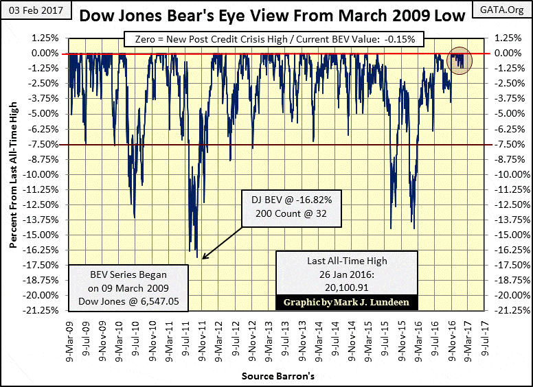
The Dow Jones is struggling to maintain its current lofty position. In its BEV chart below I circled the post-November advance, and it has all the appearance of a strong advance. But remember; to Mr. Bear, each new all-time high (BEV Zero) looks the same – a big fat ZERO and never more.
The Dow’s last BEV Zero occurred on Thursday last week (January 26th) with the Dow Jones closing the day at 20,100.91. But the Dow was also making new all-time highs in mid-December. On December 13th it did exactly that by closing at 19,911.21. So in the past seven weeks, the Dow Jones has only advanced some 189 points, which isn’t much. And during this span of time (36 NYSE trading sessions) the Dow has never declined more than 1.18% from an all-time high.
Take a moment and study this BEV chart. Since March 2009, there is no other period of time where we see the Dow Jones’ daily advances and declines so constrained as it has been since the November election.
-
(Source)
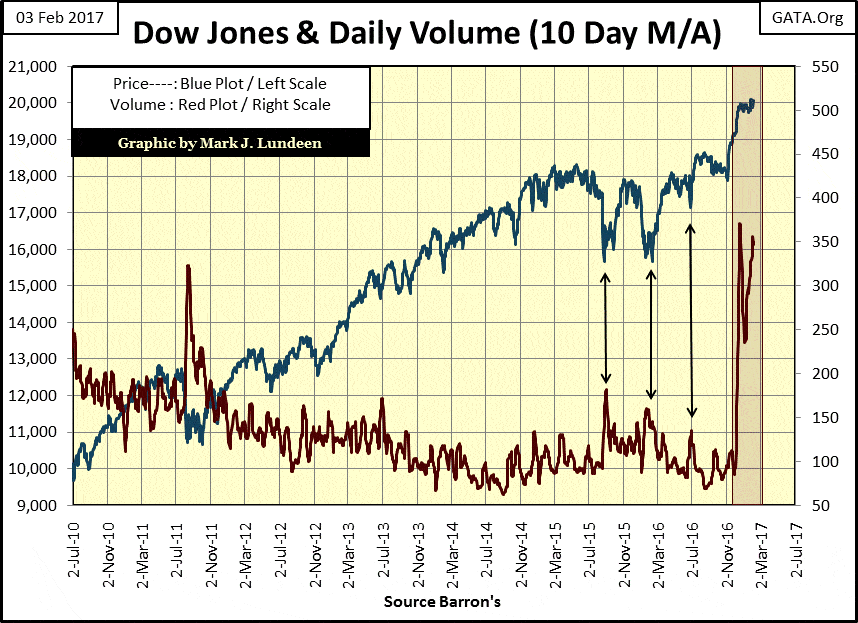
It’s just a fact, that for decades now there are people who believe they have an obligation, and actually, do have the power to check a deflation in the stock market. Since January 3rd, trading volume has once again exploded in the chart below. Is this investor demand? Maybe – but not likely. Makes one wonder what would the Dow Jones have done in the past two months had it not had a little help from some friends in high places?
(Source)
But the Dow Jones and its trading volume above is based on the market action of only thirty large blue-chip stocks. How’s the broad market performing? The best tool at my disposal for gauging that is the Dow Jones Total Market Group (DJTMG); a data set based on weekly closing prices going back to October 1988.
I have to explain something here; my data set of the DJTMG is not the same as the one at Barron’s. The DJTMG began being published in Barron’s in October 1988, and since that time there have been many adjustments to it that have annoyed me greatly. The value I see in my data is historical, but it’s hard maintaining historic continuity when significant changes in the groups are made every few years.
For instance, auto manufacturing, steel and oil producers haven’t changed over the decades, but the technology, financial and consumer groups have all had major reconfigurations, several times since 1988. And because of this, my nomenclature for the DJTMG, and the numbers of groups in it, are at odds to what Barron’s currently publishes, and has been for years.
I attempt to keep the old group names and ignore the newer nomenclature when possible. And the new groups created since 2000? I’ve made no effort to incorporate them into my DJTMG data set. But what I do have (75 groups spanning back to October 1988) is still good data to analyze the broader stock market with, and that’s good enough for me.
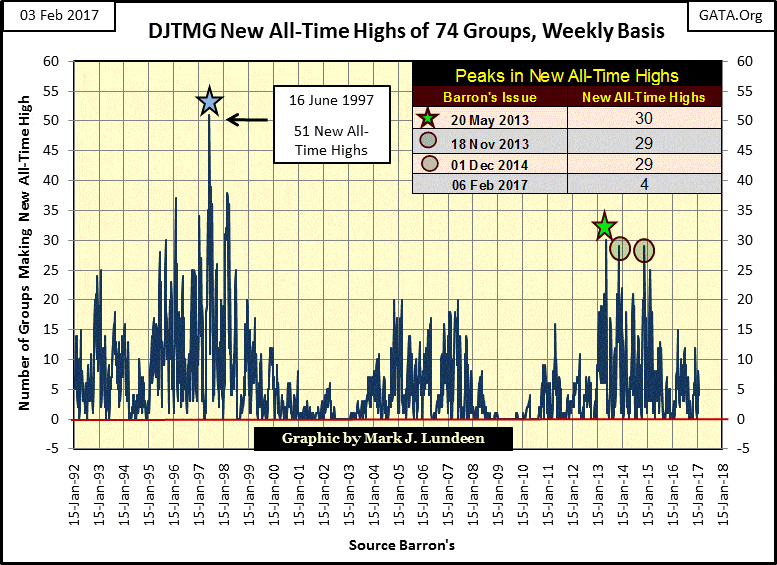
An excellent metric in my DJTMG is how many of its groups are making new all-time highs, as seen in the chart below. How the stock market reacted to the high-tech and mortgage bubble markets, and their following deflation are very evident, as is the post credit-crisis advance.
During market advances, new all-time highs in the DJTMG peak before the Dow Jones, and most of the major market indexes do. In the case of our current market advance, we see peak new all-time highs occurring in 2013-14. It’s been over two years since the DJTMG saw 29 new all-time highs in December 2014, exactly when the FOMC terminated its last dose of QE in the economy.
In February 2017, it seems odd having the Dow Jones making new all-time highs two years later, without a significant market decline. If you go back to the Dow Jones BEV chart above, there has been two 15% corrections, one in late summer of 2015 and the other in January 2016. And then in the summer/autumn of 2011, the Dow Jones saw a 16% correction. But after an eight-year advance in the market since March 2009, I’m expecting a bit more than three small corrections.
That’s just my opinion. But I believe it’s an accurate assessment that the “policy makers” acting behind the scenes are supporting the major market indexes, if not the broader market as seen in the DJTMG, for fear of what might happen if they didn’t.
(Source)
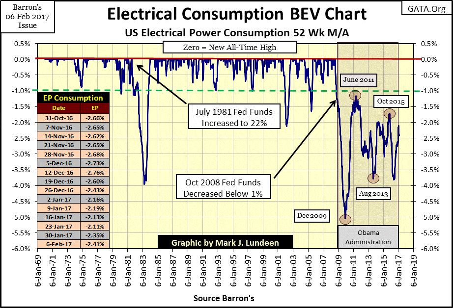
Well, maybe the stock market is so strong because, during the Obama Administration, the economy did so well. A quick look at Electrical Power Consumption (EP/chart below) for the American economy will put an end to that silly notion. The United States hasn’t seen a new all-time high in demand for EP since August 2008, because domestic manufacturing facilities have been shut down and exported overseas during Obama’s entire administration.
With Donald Trump now in office, it appears that’s changing and hopefully, we’ll see EP below once again making new BEV Zeros in the years to come. But there are structural problems in the debt and derivative markets that could force EP’s BEV plot far below the -5% seen in 2009.
The truth is; the economy is pregnant with counter-party risk as debtors in government, business and private citizens have taken on more debt than they can reasonably service. You can thank the “policy makers” at the Federal Reserve and in Congress for that.
But should counter-party risk give birth to debt default on a massive scale, you can be sure everyone in government, finance and in the media will be pointing their fingers at President Trump; the one guy in Washington who had nothing to do with any of it. The people we see on TV are loathsome, and deep down inside they know it too!
(Source)
That’s what happened during the Great Depression. Because of “stimulative monetary policy” executed by the Federal Reserve; after a long gestation in the 1920s, counter-party risk gave birth to the debt default in the early 1930s.
Don’t make the origins and causes of the Great Depression any more complicated than that. In the waves of debtors’ defaults that followed in the early 1930s, EP crashed by 17% as factories shut down assembly lines and businesses closed offices, turning off the lights as they sent their employees home until further notice.
I hope I’m wrong, but I don’t see any way around this, no matter who’s in the Oval Office. But at least with Trump in the White House, we have a real chance that finally the bastards responsible for this mess will be prosecuted to the fullest extent of the law, instead of once again being bailed out by the Federal government using taxpayer’s money.
The best protection for what I fear is coming is to have some gold and silver bullion, as well as precious metal miners in your portfolio. So how did gold do this week? Nothing spectacular, but gold appears to have made a firm bottom in December, and is now advancing along with its step sum. I like what I see below.
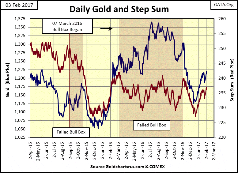
(Source)
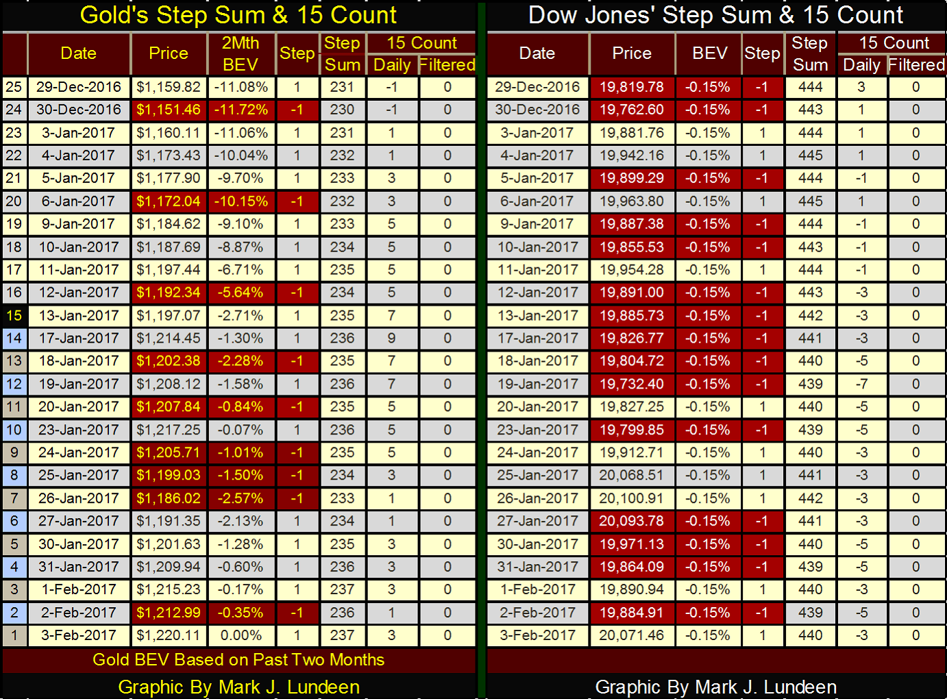
A quick study of gold’s and the Dow’s step sum and 15 count table below suggests that gold is benefitting from “liquidity” draining from the stock market. This could change by next week, but at Friday’s close gold is looking better than the Dow Jones; my proxy for the stock market.
© Mark Lundeen
If you hadn’t caught on yet, I’m a huge bear on the financial markets. For years now, I’ve made my case with charts and tables. But I believe Mr. Bear’s case against Wall Street’s bulls runs deeper; I don’t believe a society as corrupt as ours will find its current prosperity sustainable. I expect a total disaster is facing us all in the not too distance future.
The question I ask myself is; what other corrupt practices have been going on for years and decades that most people are completely unaware of? That’s an easy question to answer; more things than I have space to itemize in this article. But today most people still trust economic data compiled by Washington’s statisticians, such as Consumer Price Index (CPI), the unemployment rate, and Gross Domestic Product (GDP). They shouldn’t.
The government’s regulation of the financial markets is a proven farce. Harry Markopolos spent nine years attempting to get the SEC and the financial media to investigate Bernard Madoff’s Ponzi scheme, with no success. It wasn’t until the Madoff fraud imploded in on itself in 2008-09 that the SEC and Wall Street Journal were finally forced to deal with Madoff’s Ponzi Scheme.
Who in the SEC was fired for incompetence? No one. The financial media allowed the story to quietly go away, enabling the political class to once again do nothing to protect the public as members of Congress continue to curry favor with Wall Street.
Harry Markopolos is now warning everyone willing to listen about two more pending scandals, one in accounting the other in the insurance industries.
Both accounting and the insurance industries are government regulated. Have you heard anything about these in the main stream financial media? Of course not! Fortunately for us, BUSINESS INSIDER provided Mr. Markopolos a format to warn the public of these pending catastrophes, catastrophes that won’t become known to the public at large until after the coming bear market is well underway, as was the case with Madoff’s a decade ago.
I could go on with the insolvency in the global banking system, worthless market regulators, and fraudulent OTC derivatives by the hundreds of trillions of dollars that hang over everyone’s head. But I won’t, as it’s enough to know that we live in a very corrupt world, and the people in the mainstream media and government aren’t our friends. Unfortunately, at the end of the first week of February 2017, most of us are fat, dumb and happy.
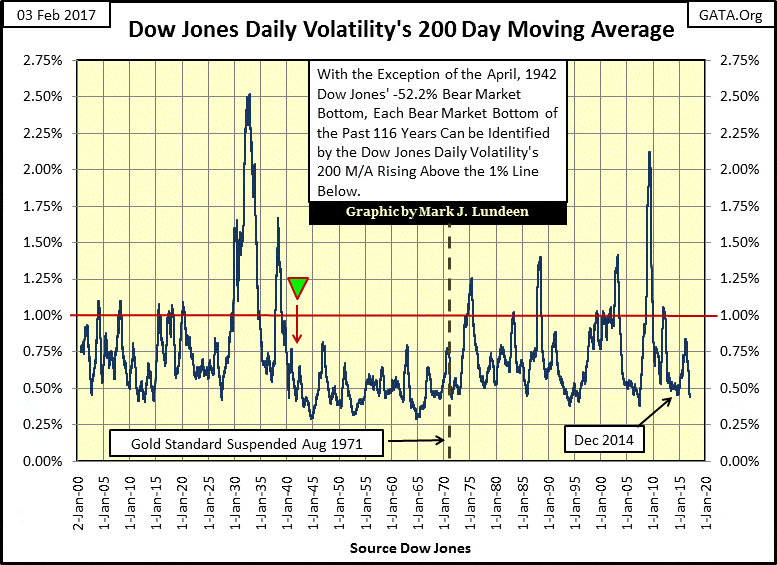
I know that to be true as daily market volatility for the Dow Jones is currently very low, as seen in the chart below plotting the venerable Dow’s 200 day M/A of its daily volatility from January 1900 to February 2017.
Bull and bear markets are discernable below by how they affect the Dow Jones’ daily volatility. Bull markets see low volatility, while bear markets, especially big bear markets see extremes in daily volatility. The two deepest bear market bottoms stand out below. The Great Depression bear market took daily volatility for the Dow Jones (200 day M/A) to over 2.50%, while the Credit Crisis bear market bottom saw daily volatility increase above 2.10%.
Today, the Dow Jones was up a big 187.55 points; a 0.90% day. Had today been a day of extreme volatility, a 2% day, the Dow Jones would have had to move up or down 401 points or more. My point is that during bear-market declines, big daily moves (both up and down) are common market events that for the most part are absent during sustained market advances.
(Source)
Currently, the Dow Jones daily volatility (200 day M/A) is below 0.50%. As it can’t get much better than that, in time I expect it will get much worse. Adept traders, those who can skillfully capture short-term capital gains, play a game most of us can’t. But for most retail investors, the chart above is now sending a strong sell signal, not a buy.
It may be months, or even a year or more before the stock market sees its next bout of distress selling, which will once again send the plot above over the 1.00% line. Bear that I am; I expect we’ll see the plot above increase over the 2.10% of 2009 before we once again see a strong buy signal, though I know most investors will be to traumatized by Mr. Bear to take advantage of it.
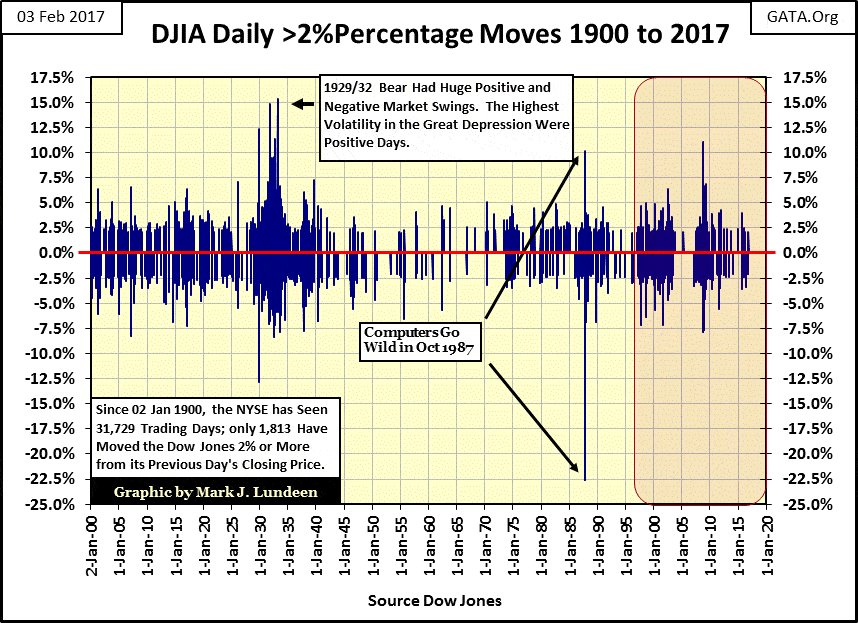
Let’s look at the actual daily volatility for the Dow Jones from 1900 to 2017 (next chart). I calculate my volatility in these charts by the percentage movement from one day’s close in the Dow Jones to the next. Those days that see the Dow Jones move 2.00%, or more (up or down) I call Days of Extreme Market Volatility, or 2% days. That is what’s plotted below – only those days where the Dow Jones moved 2% or more from its previous day’s closing price.
These extreme days look like common market occurrences in the chart below, but that isn’t true. From 02 January 1900 to 03 February 2017, the NYSE has seen 31,729 trading sessions, of which only 1,813 (5.71%) of them saw the Dow Jones close 2% or more from a previous day’s closing price – a 2% day. Still, that works out to about one extreme day for every twenty NYSE trading sessions. But in fact, these days of extreme market volatility cluster around bear markets, and are rare market events during bull markets.
Strangely, it’s during bear markets where the Dow Jones has seen its largest daily advances. Twice during the Great Depression the Dow Jones advanced 15% from one day’s close to the next. These positive extreme days weren’t buying opportunities. It was just Mr. Bear giving the short sellers a taste of what he was serving to the bulls.
The Credit-Crisis bear market saw the Dow Jones advance 11% from its previous day’s close in October 2008 – five months before the bear market bottom.
I show the huge double-digit daily moves seen in October 1987, but I don’t think they’re significant. These extreme moves were due to bad software in Wall Street’s computers – a glitch that hasn’t been repeated since. Thank God for that too! The one-day decline of 22.61% seen on 19 October 1987 put the NYSE in Mr. Bear’s trauma ward and presented Alan Greenspan with his first excuse to “inject ample liquidity” into the stock market.
(Source)
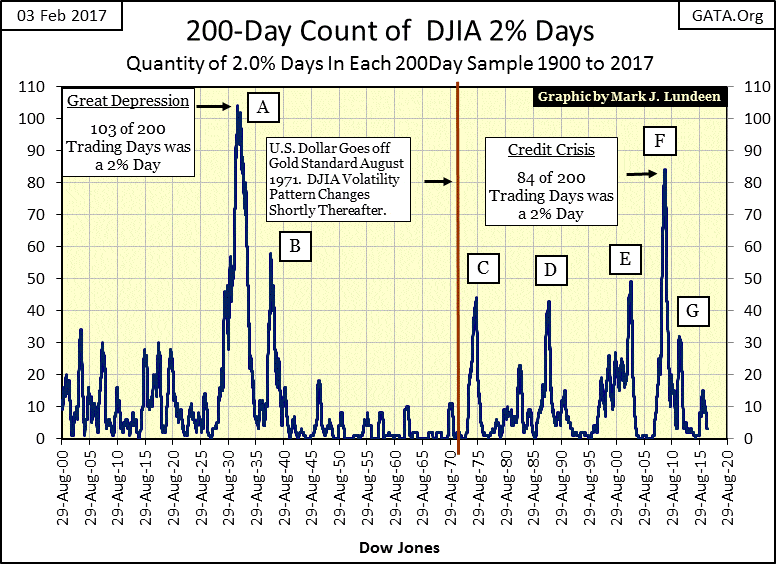
The data plotted above, while visually interesting, isn’t all that useful. A superior display of the Dow Jones’ 2% days seen above can be constructed by taking the count of Dow Jones’ extreme days of volatility within a running 200-day sample (a 200-day count), as seen below.
One can actually see the inflationary evolution of the stock market in this chart. It was only sixteen years after Congress’s 1913 creation of the Federal Reserve, before the spike in market volatility that defined the Great Depression, began to form in the chart below. At the bottom of the Great Depression bear market, every other day was a day of extreme market volatility, as Mr. Bear was busy slapping both the bulls and bears silly. And as you can see in the chart above, many of those 2% days were huge up days; days where Mr. Bear hammered the short sellers into the dust.
(Source)
We also see the 1937-38 bear market above, again seeing daily market volatility far above where it was before 1920. It’s interesting noting that the 1907 bear market, the financial panic that inspired Wall Street to finally create a central bank (the Federal Reserve), saw its 200 count increase to only 30 days of extreme volatility.
Strangely, the April 1942 bear market bottom, a 52.2% market decline in the Dow Jones, produced no spike in market volatility. After the investment horrors of the 1930s, the public was out of the stock market and wouldn’t be back for decades. Also, Pearl Harbor happened just four months before this bear market bottom, so everyone’s attention was on the war. Incredibly, in 1942 the stock market had a huge 50% bear market that no one in Washington, the media, or in the public bothered to note.
With market volatility for the next three decades at low levels not seen since the beginning of the 20th century, public indifference towards the stock market was the rule of the day until the early 1970s. What changed was with the abandonment of the Bretton Woods $35 gold peg; there was now plenty of “liquidity” to fuel a bull market at the NYSE. Also, the baby boomers, a new generation with no personal memories of the booms and busts of 1920-40s, came of age.
But beginning in 1971, the stock market entered a cycle of reoccurring booms and busts that I don’t believe has exhausted itself.
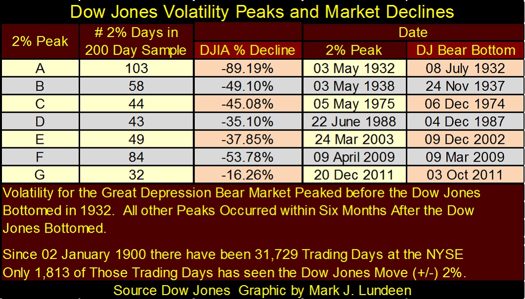
Here is a table listing the specifics for the volatility spikes seen in the chart above. I expect I’ll be adding volatility-spike H to the list before Trump is running for his second term.
(Source)
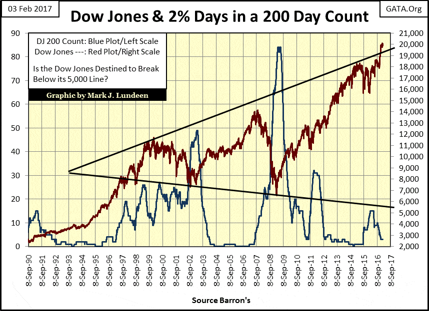
The 200 count for the Dow Jones is a useful tool in timing the market’s exit and entry points. In the chart below, we can compare the Dow Jones (Red Plot) to its 200 count (Blue Plot) since 1990. One fact is very evident; rising market volatility in the Dow Jones’ 200 count is a clear indication of pending market distress.
(Source)
With the Dow’s 200 count currently at 3, that isn’t happening just yet. But with the exception of the April 1942 50% bear market, every significant market decline of the 20th and 21st centuries has been heralded by increases in the Dow Jones 200 count, as seen in the charts above.
When the stock market once again begins to deflate, the Dow Jones will once again begin experiencing days of extreme volatility. At today’s valuation, that means daily moves (up and down) of over 400 points, driving the 200 count above 10.
Exactly how much above 10 will depend on how successful Mr. Bear is having in deflating the stock, bond & real estate markets’ current inflated valuations, and ridding the financial system of non-performing assets now currently masquerading as assets in the global banking system’s reserves. I expect that our current “policy makers” will also be finally exposed for the charlatans and frauds that they are.
—
DISCLAIMER: This article expresses my own ideas and opinions. Any information I have shared are from sources that I believe to be reliable and accurate. I did not receive any financial compensation in writing this post. I encourage any reader to do their own diligent research first before making any investment decisions.

-

 Cannabis4 days ago
Agential Cannabis 2026 to Drive APAC Market Growth and Global Industry Collaboration
-

 Africa2 weeks ago
Record State Funding Strengthens Support for Moroccan Associations in 2024
-

 Fintech6 days ago
Splint Invest Expands Access to Alternative Assets with Strong Growth and Data-Driven Strategy
-

 Business2 weeks ago
Understanding the Bear’s Eye View: A Clearer Perspective on Market Trends






You must be logged in to post a comment Login