Markets
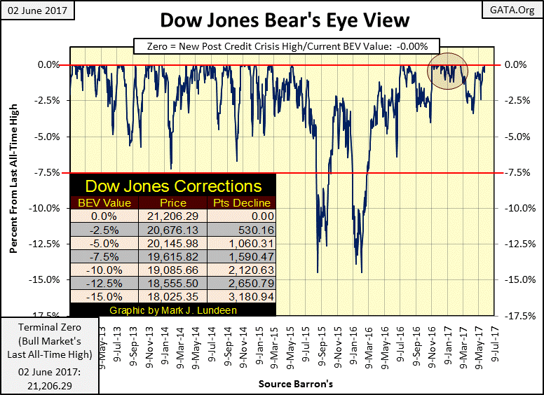
Dow Jones ended last week with two new all-time highs
The Dow Jones ended the previous week with two new all-time highs, But looking at the Dow Jones from years past, there have been times where it advanced with more enthusiasm than we’re seeing at the end of last week.

As expected, the Dow Jones saw two new all-time highs last week (Thursday and Friday). Just how much higher can the stock market go? On a point basis I really don’t know, could be enough to surprise me. But on a practical basis, for only as long as the central banks making this happen can continue manipulating market values higher without discrediting the faith-based systems their “monetary policy” and units of currencies are based on.
I’ve seen market commentators claim that central banks have been monetizing hundreds of billions of dollars of stocks and bonds a month for years. I believe it.
One thing is for sure, one day either these central bankers or Mr. Bear is going to pull the plug on the liquidity the financial markets are floating ever higher on, and then it becomes a whole new game.
© Mark Lundeen
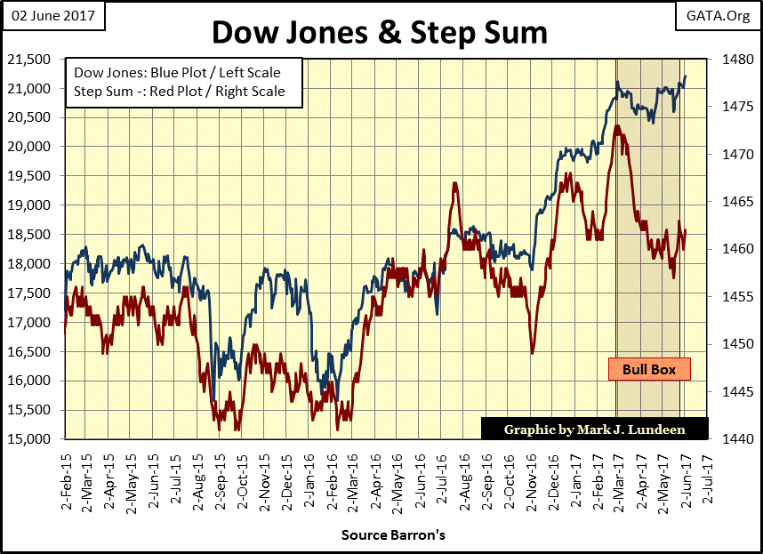
The Dow Jones ending the week with two new all-time highs, so we can say the bull box seen below is now closed. But looking at the Dow Jones (Blue Plot below) from years past, there have been times where it advanced with more enthusiasm than we’re seeing at the end of the week. From November 2016 to March of this year was a standout advance for the Dow Jones.
Currently, this market looks more like a contented cow chewing its cud than a rampaging bull. After an eight-year, 14,659 point advance, how much more can we expect?
© Mark Lundeen
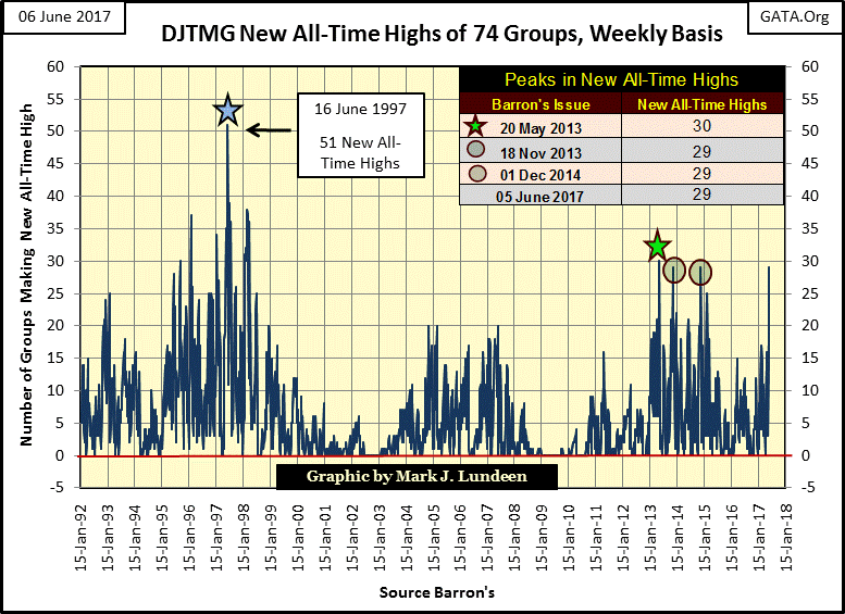
The Dow Jones Total Market Groups (DJTMG) saw 29 of the 74 groups I follow reach new all-time highs this week. For the market advance that began in March 2009, this series peaked at 30 in Barron’s 20 May 2013 issue. Normally, that should have been that as the bull market matured and then expired in the years that followed.
But these are not normal times. Four years after May 2013’s peak, is the DJTMG going to see a new and even higher peak in new all-time highs? I wouldn’t rule it out. But if that happens, and most likely it will, it won’t be a good sign. Quite the opposite, as it will be a liquidity driven (inflationary) market extreme that one day must be corrected for by Mr. Bear.
© Mark Lundeen
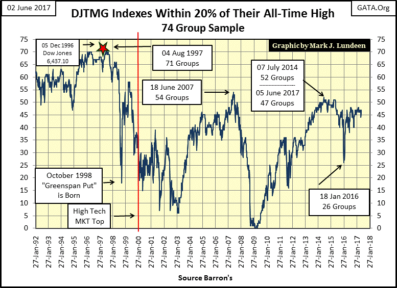
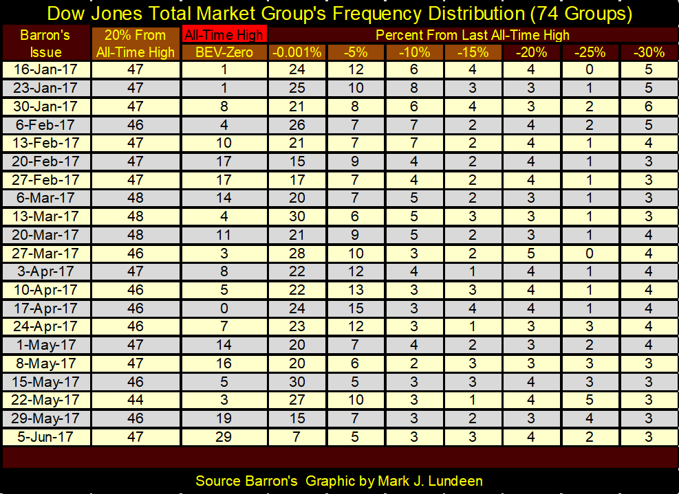
The DJTMG’s top 20 (chart below) isn’t showing any signs of increasing market strength. This week the top 20 ended at 47; still good ways from the post-March 2009 market high of 52 seen in the summer of 2014. This tells us the current market advance isn’t broadening to other groups currently out of favor.
So, if you’re thinking of making an investment in an out of favor sector because it’s currently “cheap”, chances are that it’s going become even cheaper until after the conclusion of the next bear market. If you’re going to risk your money in this market, jump on what is already going up, and be ready to jump off just as fast at the first sign of market distress.
The exemption to that rule would be the precious metals miners; a sector that’s historically counter-cyclical to the general stock market. In past times, the gold and silver miners have been the place to be during the big declines in the general market. There’s no reason to believe this will not prove to be true in the next deflationary market decline.
© Mark Lundeen
Next is the frequency table for the top 20 and new all-time highs plotted in the charts above. Obviously, nothing spectacular is happening with the top 20. Though we saw 29 new all-time highs this week, they’re from the same groups that have been in the top 20 for months.
We don’t see any groups making their way up from the sub -30% columns in the table below, which is an indication the current bull market is an aging one. The next big thing to happen in the top 20 chart above is for it to begin going down, as it did during the high-tech and mortgage bear markets. The tricky part of that prediction is forecasting when, and I don’t have a clue how to do that.
But bad things in the market happen during the September / October time frame. Should the top 20 plot above begin to decline in July / August, this would be something to follow very closely. Note how the top 20 (chart above) caught the top of the subprime mortgage market bubble. In Barron’s 18 June 2007 issue it peaked at 54 and began declining four months before the Dow Jones October 2007 peak. I’m expecting something similar will happen in the coming market turn down.
© Mark Lundeen
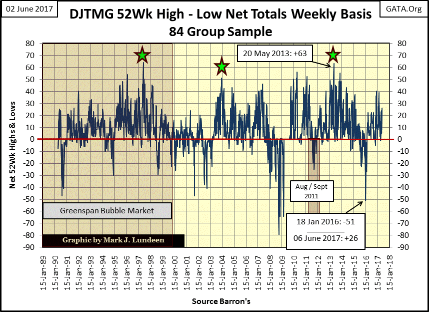
Another factor arguing against the bulls in the market is the DJTMG’s Net 52Wk Highs – Lows. It peaked in Barron’s 20 May 2013 issue at 63. This week the DJTMG’s 52Wk H-L Net was only 26.
Looking at the DJTMG’s 52Wk H-L Nets plotted below, at the end of the week, we didn’t see anything remarkable. The thought that occurs in my mind is how long before we see this 52Wk H-L Net become negative.
Between where 52Wk H-L Nets are now (+26), and the -51 seen in Barron’s 18 January 2016 issue, is a whole lot of central bank inflation in market valuation for the stock market. And yes it is that simple.
The way to use this information is to understand that when things look really bullish, one should be looking for an excuse to sell. And when things look really bearish (the big negative bottoms in the DJTMG’s 52Wk H-L data) one should be looking for reasons to buy.
© Mark Lundeen
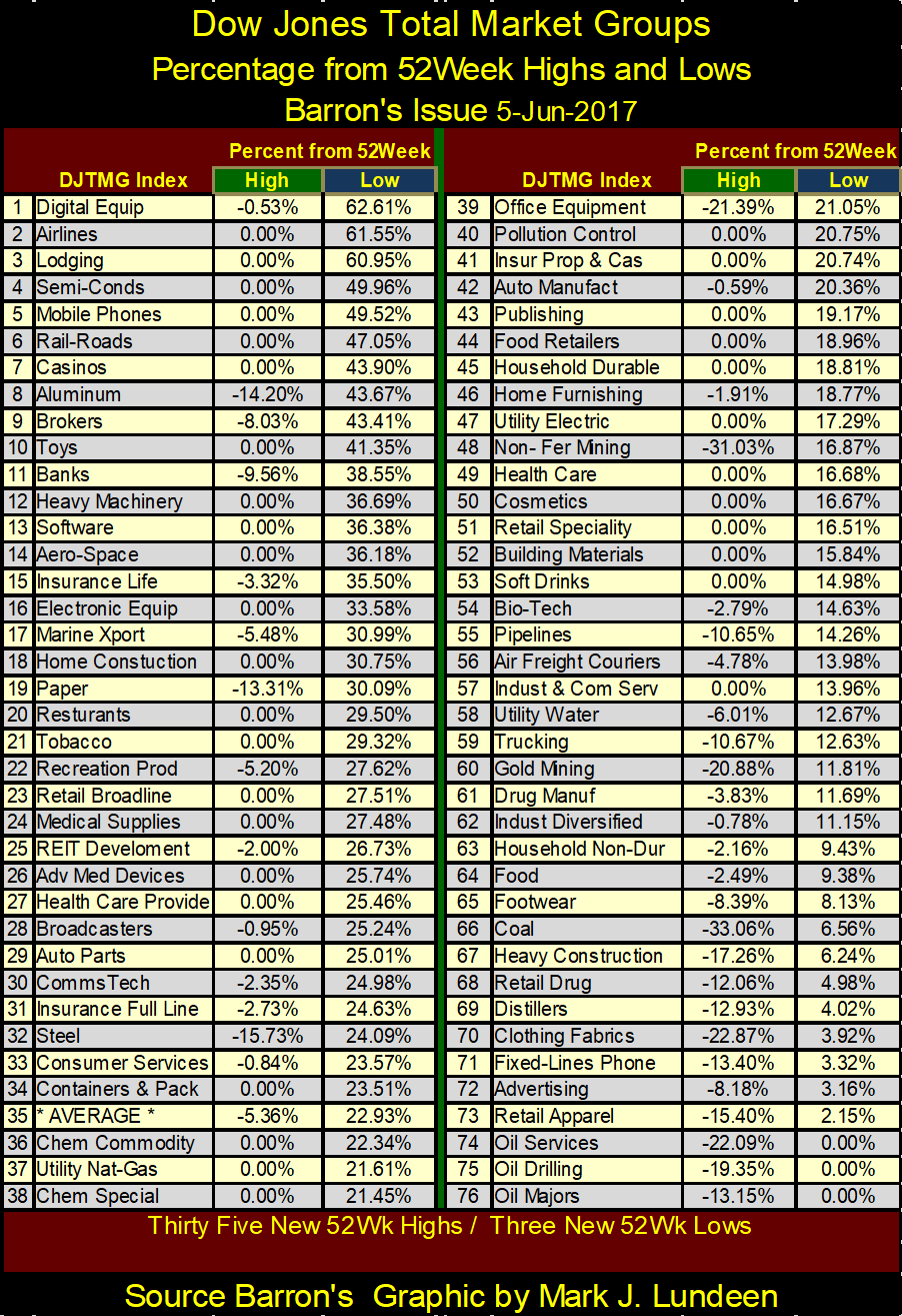
Here’s the table showing the performance for DJTMG’s 52Wk High Low data. The percentages given in the Green (High) tab show the group’s decline from its 52Wk High. The percentages given in the Blue (Low) tab show the group’s advance from its 52Wk Low.
Looking at the #1 performing group (digital equipment), it’s up 62.62% from its 52Wk Low, but off -0.53% from its 52Wk High. Airlines (#2) are up 61.55% and made a new 52Wk high (0.00%) this week.
The worst performing sectors (#74,75 & 76) are all oil based, and all made 52Wk Lows this week, and are off 13% to 22% from their 52Wk Highs.
© Mark Lundeen
The Dow Jones is up 23.72% from its 52Wk Low; that would place it between #32 & #33 in the table above. For those in the right stock groups, the past year has been very generous to them with gains of over 25% common. However, annual gains of 25% are hard to get on a regular basis. The gold miners (#60) were leaders all last summer, advancing 130% from their 52Wk Lows in this table from a year ago. A year later they’re down 21% from their 52Wk High.
After last year, it’s only fair to expect that they would take a rest. I expect good things to come for the miners in the years to come.
Moving on to gold and its step sum below, I’m beginning to look more favorably towards gold. Why not? Look at gold and its step sum plot over the past month; once again they’re going up together. Maybe not as fast as you or I would have them if we had our way, but going up nonetheless. Like the lows of December 2015 & 2016, I expect the lows we saw in May will also prove to be a hard bottom.
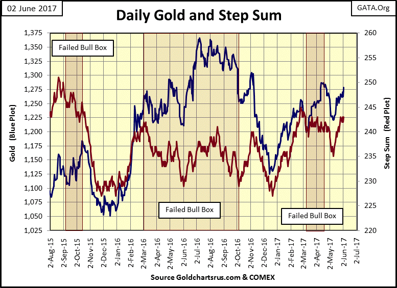
(Source)
But as noted in past articles, what the gold and silver markets need are major advances from these levels. For example, for the price of gold above to take out last summer’s highs with authority.
Someday it will happen; hopefully this summer. However, until the financial and real estate markets once again begin to deflate (rising bond yields and mortgage rates), motivating flight capital to flow into the old monetary metals, the market action in the metals and their miners will remain subdued.
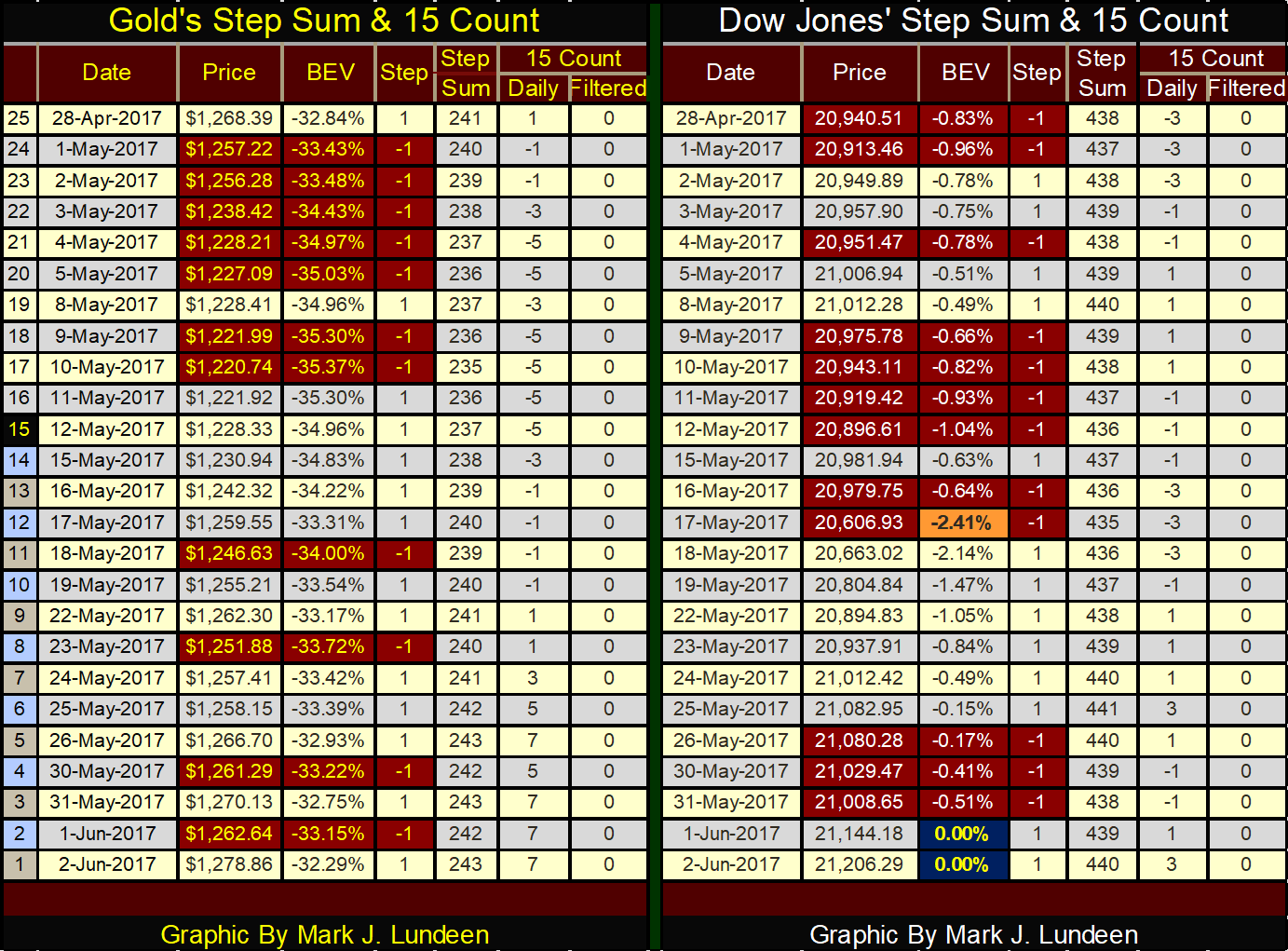
Below we see gold’s step sum advancing in the past twenty-five trading days; its 15 count has been 5 or 7 for the past few trading days. And for all that the price of gold has advanced by only $10 since April 28th. Well, there is always next week.
The Dow Jones has seen more down days than has gold in the table, yet ended the week with two new all-time highs (0.00% in BEV column).
© Mark Lundeen
—
DISCLAIMER: This article expresses my own ideas and opinions. Any information I have shared are from sources that I believe to be reliable and accurate. I did not receive any financial compensation in writing this post. I encourage any reader to do their own diligent research first before making any investment decisions.
Featured Image by Roland Weber via Wikimedia Commons / CC BY 3.0


Temotiva Launches Crowdfunding Campaign to Advance Preventive Mental Health
Temotiva Innovación Lab has launched a crowdfunding campaign through Santander X Explorer, marking a new phase for the University of...


Fed Policy Shift Raises Concerns Over Debt and Inflation Risks
The Federal Reserve is criticized for resuming balance sheet expansion through Treasury purchases despite expectations of tighter policy under new...


AI Adoption in Italian Retail Stalls Despite Strong Experimentation
A survey on AI in Italian large-scale retail trade shows companies are increasingly adopting artificial intelligence, but only 1.4% have...


Crypto Market Stays Stable as Bitcoin and Ethereum See Mild Declines
The crypto market remained stable despite slight declines in major coins like Bitcoin and Ethereum. Bitcoin held near $64,362, while...


WNBA Removes Cannabis From Banned Substances List in New CBA
WNBA removed cannabis from its banned substances list in a new CBA running 2026–2032, aligning with NBA policy and allowing...
 |
|
 |  |
 |
|
-

 Africa2 weeks ago
Côte d’Ivoire Cocoa Price Crisis: Record Decision Turns into Market Breakdown
-

 Business1 week ago
The TopRanked.io Guide to 2026’s Biggest and Best Affiliate Opportunities
-

 Fintech5 days ago
Fintech and AI: Adoption Grows, but Profits Favor Agile Innovators
-

 Cannabis2 weeks ago
Argentina Legalizes Cannabis Seed Sales Under New Regulatory Framework
You must be logged in to post a comment Login