Business
Current Woes in Bonds Promise Future Grief for Stocks: Focus on Dow Jones
If you’re bullish, maybe you should lower your expectations of what the stock market can do for you in the next few months and the coming year. Or better yet; just get out, and stay out until the market once again sees a firm trend in what it is going to be doing in the future. Whether that trend in the Dow Jones will be one of its zooming up to the moon or crashing to lows is not conceivable today.

It’s been three weeks since I last commentated on the Dow Jones’ BEV chart below, and not much has changed. Now in late September, as 2023 approaches its conclusion, maybe that is the story of the stock market. Since March, the Dow Jones has refused to deflate below its BEV -10% line, and stay there, and is also incapable of rising up to its BEV Zero line, to a new all-time high.
What’s going on with the stock market? It is waiting for something to happen. Whether that thing is good or bad, is something we’ll all have to wait with the stock market to see. My personal hunch is, whatever everyone is waiting for, it’s going to be something really bad. I base that opinion on what is going on in the bond markets, which I cover in detail later in this article.
But as it is with the Dow Jones BEV chart below, I have this feeling that should it break decisively below its BEV -10% line, it will then go on to break below its lows of last autumn; the BEV -20% line. But could the Dow Jones see a new all-time high, with a close at its BEV Zero line? Wouldn’t that be nice? But in a world where bond yields continue to rise, I’m not spending much time considering that possibility.
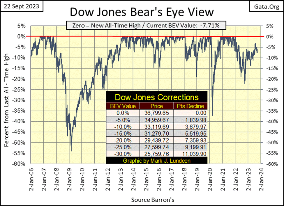
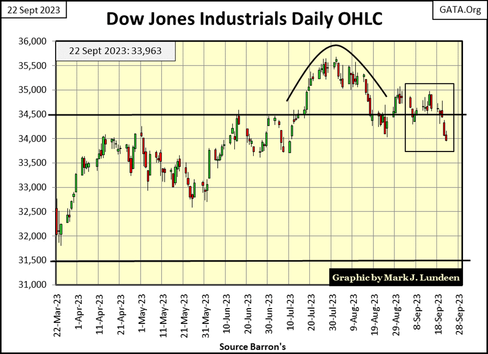
Next is the Dow Jones in daily bars. In late July and early August, the Dow Jones attempted to break above 36,000, but the weary old bulls wandering aimlessly around Wall Street, couldn’t make that happen. Now at this week’s close, the Dow Jones closed below 34,000 for the first time since early July.
If you’re bullish, maybe you should lower your expectations of what the stock market can do for you in the next few months and the coming year. Or better yet; just get out, and stay out until the market once again sees a firm trend in what it is going to be doing in the future. Whether that trend in the Dow Jones will be one of its zooming up to the moon or crashing to lows is not conceivable today.
In the history of the stock market, there have been many times when the best thing an investor could do, would have been to get out, and stay out for a considerable amount of time. If someone had exited the market in January 1929, and not have returned until January 1939, by January 1949 the world would have believed them to be a market genius. I’m thinking this is yet one more of those times when it’s best to be sitting in the market’s peanut gallery, to simply be an observer of what is happening below.
The 52Wk High-52Wk Low nets at the NYSE have been weak for a long time; really since the summer of 2022. It’s just a fact that for most of the past year, on a daily basis, 52Wk Lows have for too many days dominated the NYSE, and that is something that doesn’t happen in bull markets at the NYSE.
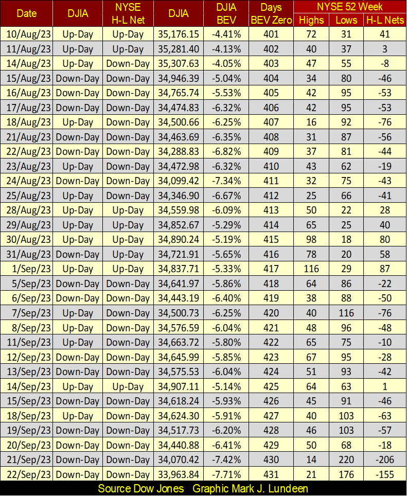
Note on Thursday and Friday of this week, the 52Wk H-L Nets fell below -100. Not a reason to panic. But not a reason to buy either.
Looking at the major market indexes’ BEV values below, the NASDAQ Insurance Index closed in scoring position (BEVs of -0.01% to -4.99%), and has been doing that many times in 2023. But its last BEV Zero was on February 6th of this year, so no one is seeing any capital gains in the insurance group. It’s more that no one is taking any capital losses in the insurance group, unlike everything else seen below.
So, what can be going wrong with a market advance that began long ago in August 1982? Maybe it’s that investors’ expectations are out-of-whack at the end of a forty-one-year market advance. Forty-one years it paid to stay strong during market weakness.
One of these days, that will just not be true. Especially when one considers exactly how the broad stock market has advanced for the past forty-one years – a bunch of idiots at the FOMC have been “injecting” massive volumes of “liquidity” into the financial system. The past forty-one-year advance has only been a massive inflationary bubble in the financial system.
All bubbles eventually pop. When this bubble goes, you’ll want your investment capital as far away from Wall Street as you can get it. I like gold and silver bullion, and precious metal mining shares.
Yes, I see the XAU is tail-end Charlie in the table below, and has been for years. But in the perverse logic of the market; when the market once again turns, when what has been going up is now going down, and what has been going down is now going up, the gold and silver miners in the XAU should once again be the prettiest girls on the dance floor.
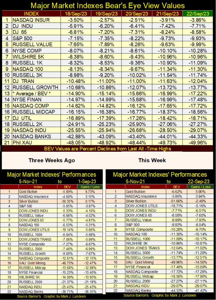
In the performance tables above, gold and silver bullion remain at the top, and have been there for a long time as the major-market indexes continue to deflate.
Below is the chart for the US national debt, or national disgrace as I prefer to think of it. It is a national disgrace because the people assuming all this debt in the name of the American People, to spend on only God knows what, have no intention of ever paying it back.
I’m not saying they won’t return every dollar they’ve borrowed; they’ll do that. It’s just those dollars will someday, maybe soon, be worth nothing. Then the worst part will be seeing the “market experts” and Wall Street economists in the financial media, looking straight into the camera, explaining to the gullible masses how no one could have seen this disaster coming.
Had the United States remained on the gold standard, where currency and credit creation were limited by a finite commodity – gold, what you see below, the national debt increasing exponentially, would not have been possible.
So, to enable the “policy makers” to increase debt and credit creation exponentially, is the most likely reason they took the US, and the global financial system off the gold standard in August 1971. In a world defined by Us and Them, suspending the Bretton Woods $35 gold peg was not done for the benefit of Us, but for Them.
In August 1971, the US National Debt was 406 billion dollars. In September 2023, the US national debt has now broken above 33,000 billion dollars. With all these new dollars circulating in the global economy, who is better off for it? The painful truth is that most people, as is the US Government and corporate America, are heavily in debt, and are not better off for it.
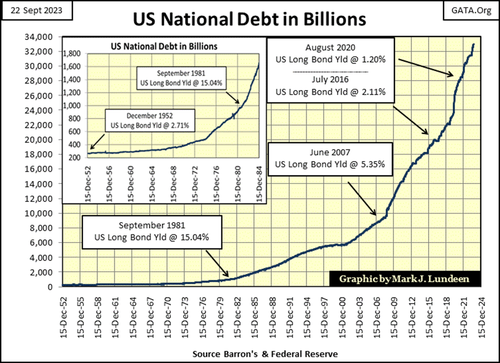
Not good, not good at all. With bond yields and interest rates rising, the servicing of this ever-growing $33 trillion-dollar dead horse, a non-productive burden on government finances will become crushing. It’s not just Treasury debt. Corporate debt and consumer debt have also risen to levels that would not be believed possible in August 1971. Rising bond yields and interest rates will impact them just as much.
There is a crisis looming over the horizon, that the wise can see coming.
All this debt is owned by someone; wealthy individuals, banks & central banks, insurance companies, and trust funds. Uncle Sam owes a lot more money than what is plotted above. For instance, the non-negotiable bonds backing his liabilities for the Social Security System, and who knows what else?
It’s just a fact; the Federal Government currently spends trillions of dollars every year, much of it borrowed from the debt market. The individuals on the receiving end of this massive flow of funds don’t take kindly to anyone who wants to turn off the valve to their flow of funds. Say, like to their useless war in Ukraine, their moronic carbon-free solar and wind power schemes, or to the anticipated second Covid vaccine, the deep-state is now planning for the 2024 presidential election year.
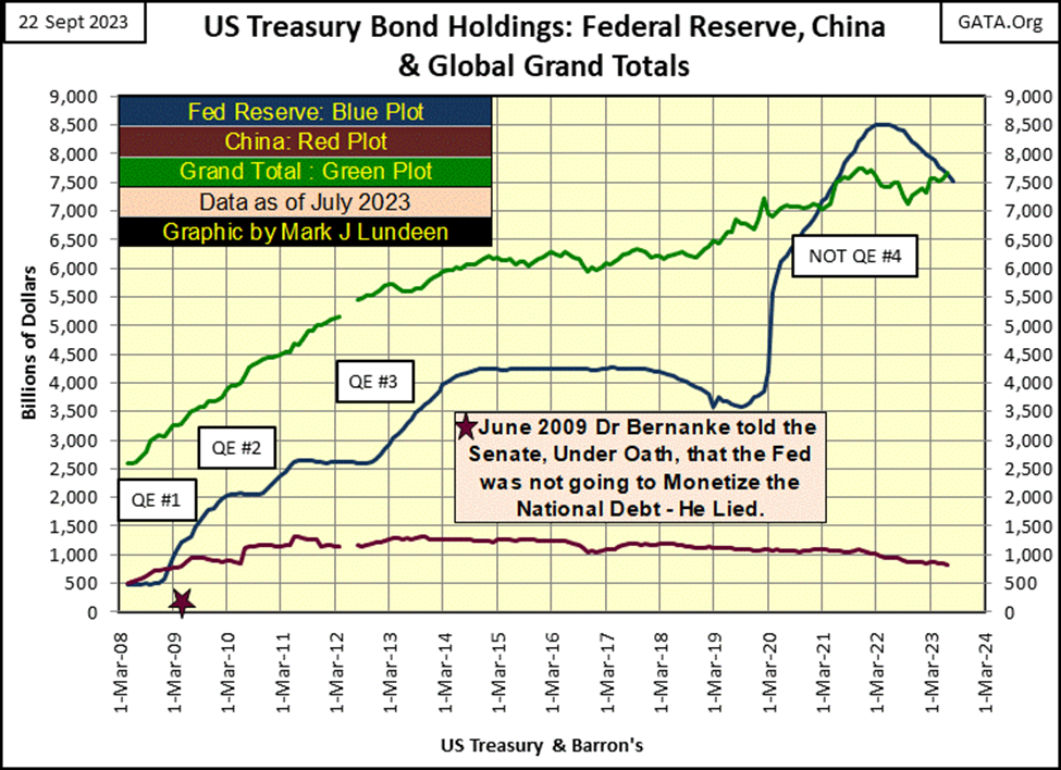
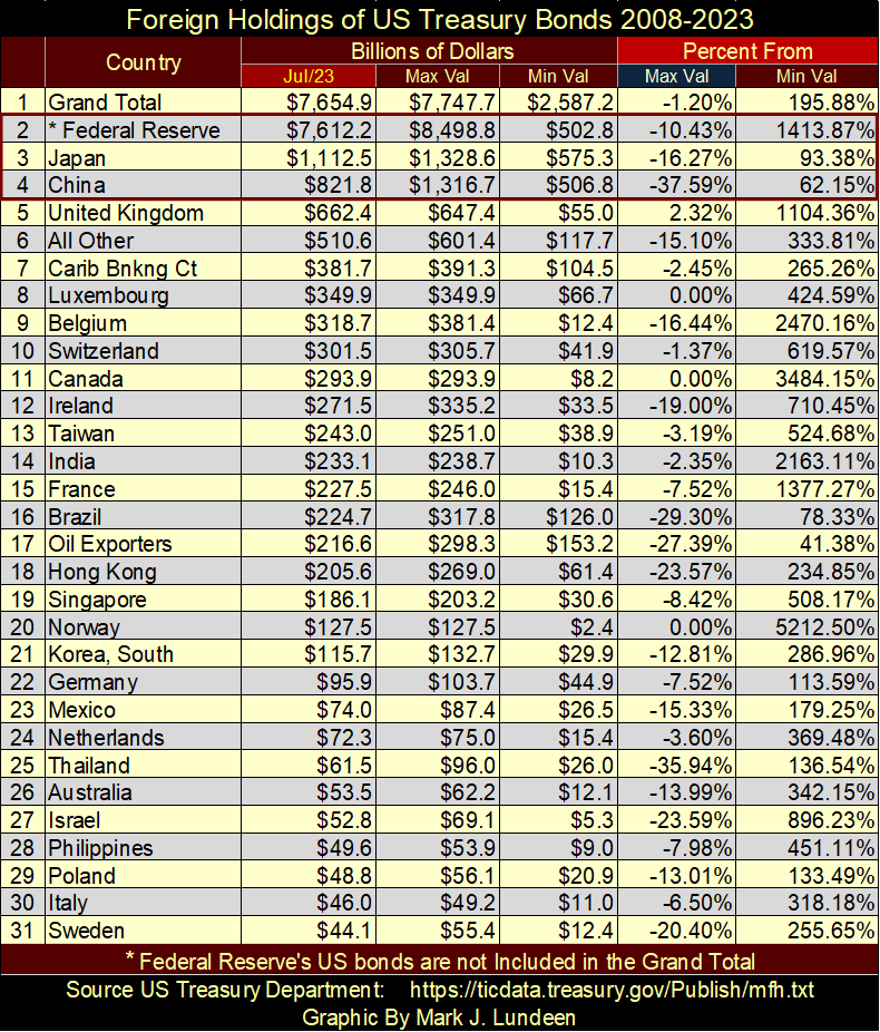
The US Treasury published a monthly database; of which country owns the T-debt seen above. It doesn’t break down what kind of Treasury debt, whether it’s 30d T-bills or 30yr T-bonds. The data is in US dollars, but I doubt these dollars are based on market valuation. Let’s look at the international holdings of US Treasury Debt, first looking at the holdings of T-debt by Japan and China, the two largest foreign holders of Uncle Sam’s IOUs.
China’s holdings peaked in July 2011, while Japan’s holdings peaked ten years later in November 2021. Note below how each nation’s holding of T-debt surged in the aftermath of the 2007-09 subprime mortgage crisis. No doubt because they too, like the United States wanted to “stabilize” the global financial system following this sub-prime debacle in the credit markets.
But that was then, and this is now. As seen below, both nations holdings of T-debt are down, China by 37.59%, and Japan by 16.27% from their peak. That means China and Japan have been net sellers of T-debt for years. So, who is buying what China and Japan have been selling in the Treasury market?
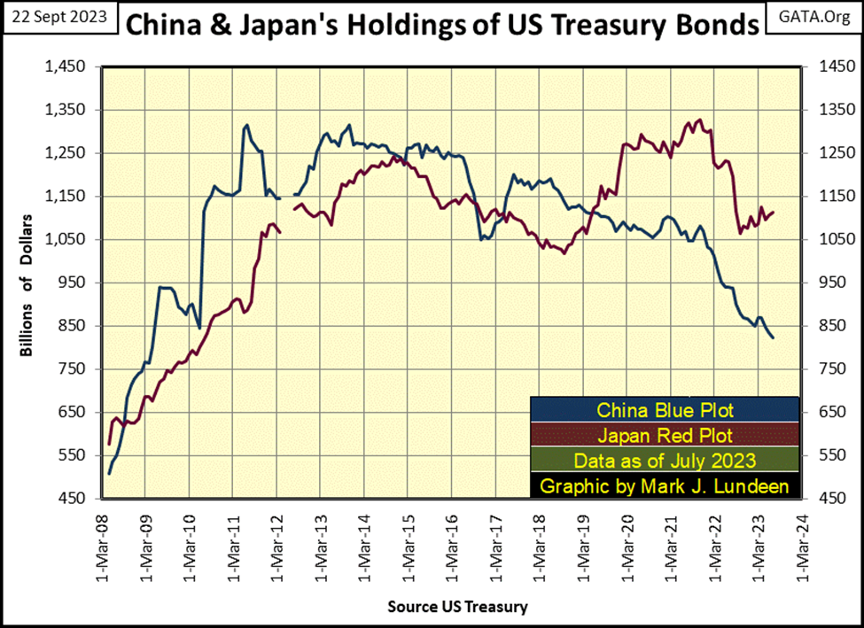
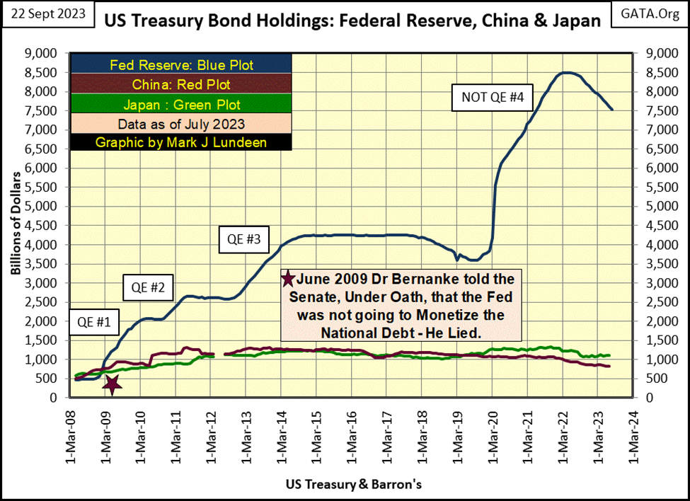
If you believe the data from the Federal Reserve, it’s not the FOMC, which has been a net seller of T-debt since it implemented its QT in May 2022. Data from the Federal Reserve is not included in this data set from the US Treasury, but I have it, so why not use it? Following its peak holdings of T-debt, the FOMC in the past fifteen months has sold off 10.43% of its portfolio of Treasury debt in its ongoing QT, as seen in the chart below.
Okay, the FOMC isn’t buying China’s and Japan’s Treasury debt in the debt market. We’re told they too are net sellers in the Treasury market. Looking at the Grand Total holding, published by the Treasury Department in the chart below, it too is down by 1.20% from its peak holding.
In these charts, we looking at trillions-of-dollars of sell orders going into the Treasury market. So, who is buying? Obviously, someone is absorbing the sales of T-bonds by China, Japan, the FOMC, and many other countries too. These unknown buyers must also be absorbing the tsunami of new debt currently issued by the US Treasury, at prices no sane person would be willing to pay to “stabilize T-bond yields,” or so it seems to me.
I’m just a retired enlisted man from the US Navy. Analyzing the international flow of funds in the Treasury market is a topic I claim no expertise in, and that is something my readers should keep in mind. But, does one need a degree in forensic accounting to understand the selling of Treasury debt is overwhelming its purchases in the charts above and table below?
Looking at the table below Percent From / Max Val column (blue tab), the reduction of Treasury debt from peak holdings is given. In July 2023, only three countries’ holdings of Treasury debt saw new all-time highs (BEV Zeros / 0.00%);
- Luxembourg
- Canada
- Norway
None of these countries were ever big holders of Treasury debt, as China and Japan still are today. So, who is buying all of Uncle Sam’s IOUs being sold in the Treasury market?
Odd things seem to be going on in the global debt markets. Odd things such as happened during the Enron debacle of the early 2000s. Two decades ago, Enron’s management dumped massive amounts of ill-considered debt and actual losses they wanted to hide from the market, into what was then called “Special Purpose Entities” (SPE). How did these SPE work? Don’t ask me, my background is in electricity. So, it’s quite possibly that SPEs from years ago, and today if they still exist, are excellent accounting vehicles used by ethical accountants.
But Enron was a massive fraud, managed by liars and thieves. Still, Enron’s SPE’s worked remarkably well, until they no longer did. At that point, Enron became the biggest fraud Wall Street had known up to that time. My concern is, that the global debt markets may be approaching their Enron moment too.
A few quotes on “monetary policy” seem appropriate here, so here they are.
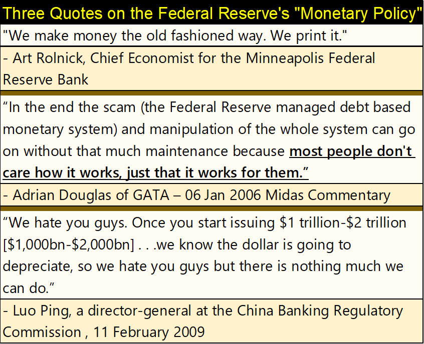
The last quote by Luo Ping was the Chinese reaction to Doctor Bernanke’s QE#1. In the chart below there is a table listing Doctor Bernanke’s monthly “injections of liquidity” into the financial system that got Director-General Luo’s attention. But when it came to devising “monetary policy,” Doctor Bernanke was a mere piker when compared to FOMC Idiot-Primate Powell, and his Not QE#4.
Powell “injected” over two trillion dollars of “liquidity” into the financial system from March to May 2020, and he is ready to do so again should the financial system once again need to be “stabilized.”
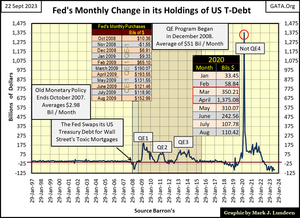
FOMC Idiot-Primate Powell’s Not QE#4, seen above, came about as a reaction to corporate-bond yields spiking in a selling panic during the first quarter of 2020. His QE#4 was the first time the FOMC “monetized” corporate bonds to “stabilize” the corporate bond market. But will it be the last?
The table below, lists the weekly closes for various bond yields and the mortgage rate, since the end of May bond yields have been rising, as bond prices have deflated.
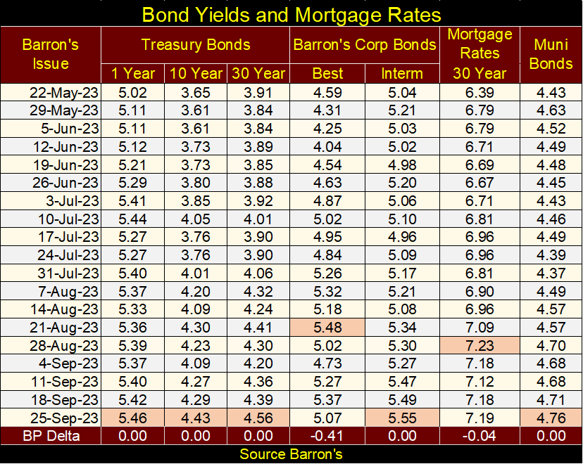
How much longer before the debt markets see another yield spike, as they did in early 2020? What are the idiots at the FOMC going to do about it?
Next is the chart for a 30yr T-bond, issued in February 2020. This week, it closed with its all-time high yield of 4.61%. Multiples of its 1.19% yield seen in Barron’s 03 August 2020 issue.
The painful fact of life in the bond market; these yield increases have had a devastating impact on bond values. This bond has lost half of its market value since August 2020, a bigger loss than any of the major market indexes seen in the table above.
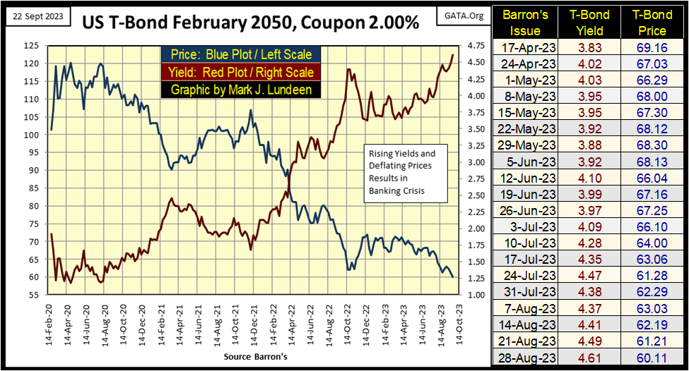
That is * NOT * supposed to happen in the bond market, but there it is. This brings up the topic I was talking about above; who is the chump with the necessary deep pockets, buying all the T-bonds China, Japan, the FOMC, and just about everyone else is selling at the Treasury market?
I don’t know exactly who is doing all this buying. But with the financial markets being “regulated markets,” come the day when these massive losses in the T-bond market must finally be recognized by someone, somehow, someway, that someone will most likely be the American tax payer. And once again, we’ll see the “market experts” and Wall-Street economists explain to the gullible public; that no one could have seen this catastrophe coming.
There is bad news coming from the real estate market.
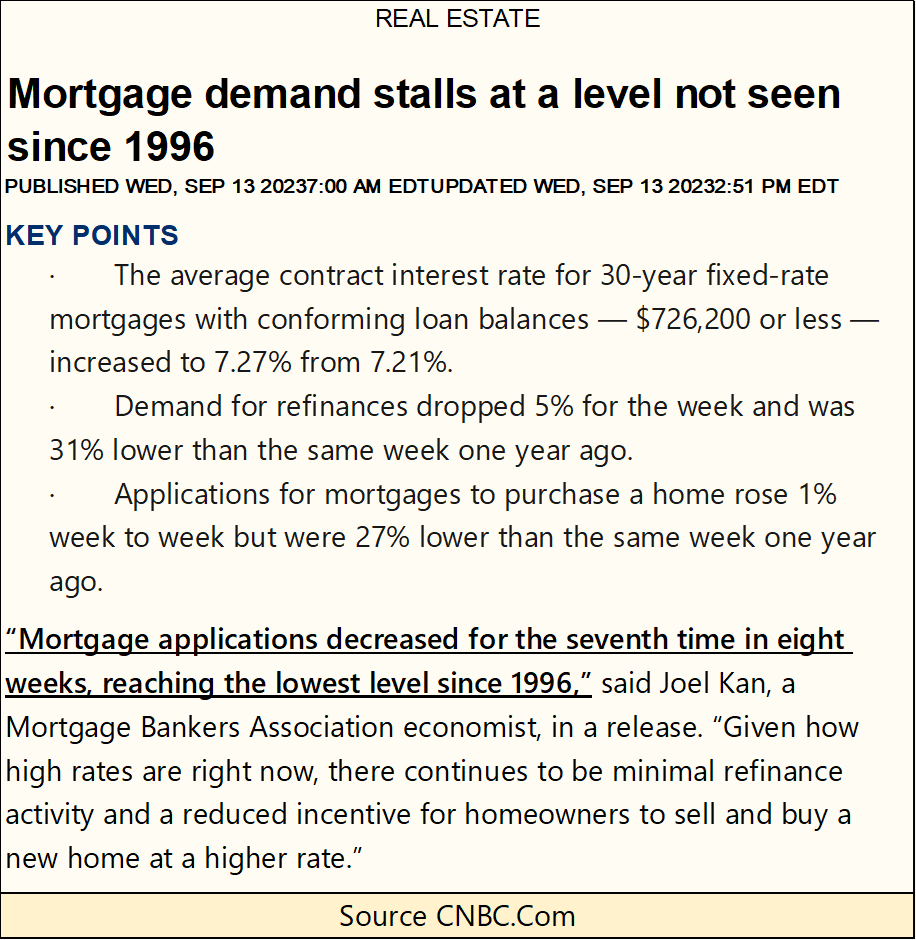
https://www.cnbc.com/2023/09/13/mortgage-demand-stalls-at-a-level-not-seen-since-1996.html
What is the problem with real estate? Mortgage rates have been rising since January 2021, when they bottomed at 2.65%. Since then, they have climbed to over 7%. This increase in mortgage rates has drained “liquidity” from the real estate market.
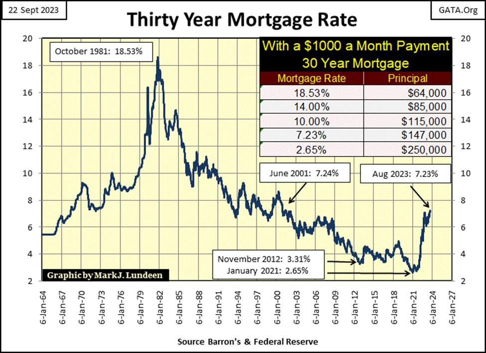
Exactly how raising rates from 2.65% to 7.23% did that can be seen in the table below, illustrating what a $ 1,000-a-month mortgage payment can get a “homeowner” from one rate to the other.
With mortgage rates at 2.65%, a prospective “home owner” could “qualify” for a $248,200, 30yr mortgage with their $1,000 monthly payment.
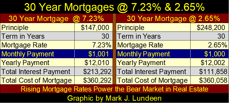
As rates have now increased to 7.23%, that same $1,000 a month payment now “qualifies” a “homeowner” for only a $147,000, 30yr mortgage. This increase in rates has contracted the available credit for the mortgage market by a whopping 40%. Before this bear market in real estate is over, I expect mortgage rates will once again be well over 10%.
I hate being a bear. Taking a hard look at the markets in September 2023 is so depressing. When I’m finished with this week’s comments, I’m going to have a few glasses of bourbon to kill the pain.
But before I have my taste of Kentucky, let’s first look at gold’s BEV chart for a little pick-me-up. Okay, not much new since I took my two-week vacation, but I only promised my readers a little pick-me-up. Still, it’s enough.
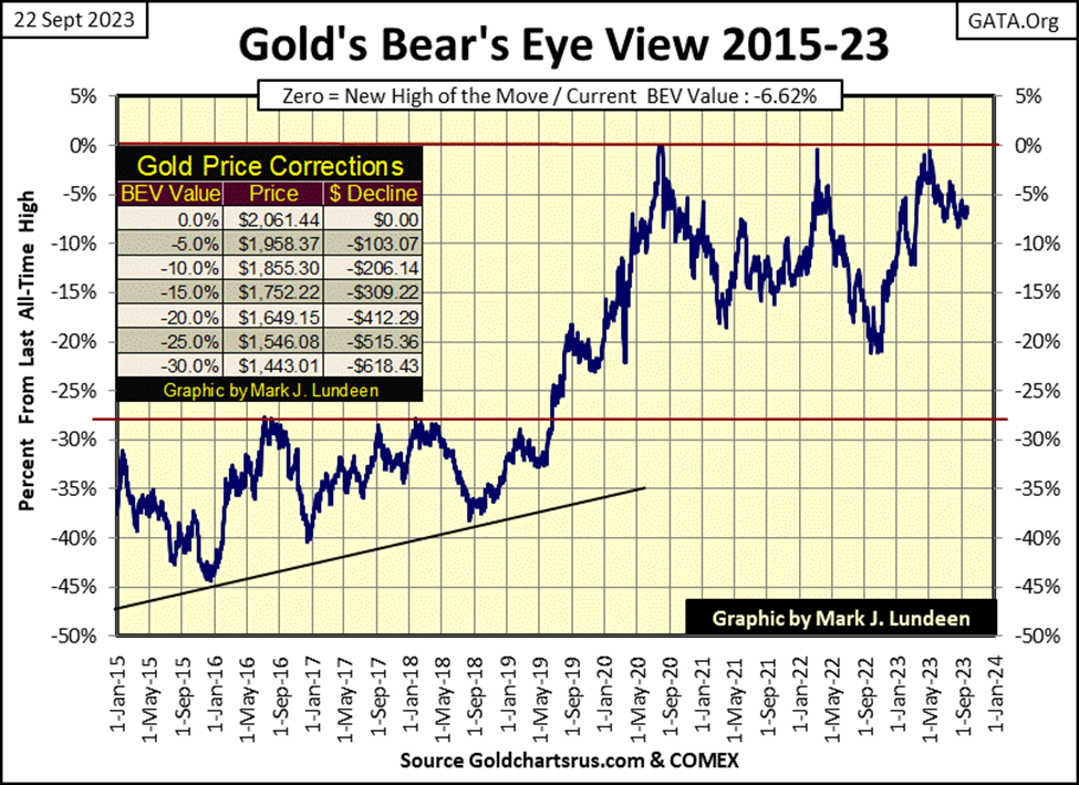
Why so, when gold’s BEV chart looks remarkably similar to the BEV chart for the Dow Jones at the top of this article? I admit that is true. Take a moment to compare the two BEV charts.
Here is the BIG difference separating these two BEV charts; the “policy makers” have for decades been “stabilizing” market values for the stock market, while for decades they’ve done all they could do to destabilize market values in the gold and silver futures markets. I see it this way; the “policy makers” can’t get the Dow Jones to close on its BEV Zero line with a new all-time high, and have failed to force gold back down below its BEV -10% line.
Come the day when all their market machinations are terminated by Mr Bear, values in the stock market will deflate explosively, as flight capital flees to the safety of the old monetary metals – gold and silver.
This is how I see this many decades-long market manipulation finally resolving itself;
- good for precious metal assets, and maybe cryptocurrencies too,
- bad for everything else.
Am I right? Like me, my readers are going to have to wait to see if I am.
Looking at gold’s side of the step sum table below, even after all those down days in the market, since August 22nd, gold doesn’t want to close below $1900. That is good. But as I’ve pointed out for quite a while, the bull market in gold isn’t going to get exciting until gold once again sees frequent days of extreme market volatility – 3% days, where gold moves (+/-) 3% or more from its previous day’s closing price.
So far in 2023, gold has seen only one day of extreme market volatility; on March 16th, gold closed 3.51% above where it closed on March 15th. And so far in 2023, gold hasn’t done much for the bulls. But in the fullness of time, in a market where bond yields have no where else to go but upward, in God’s good time, we’ll see plenty of volatility, and advances in valuation in the gold market.
But we are not there just yet. Until the gold market once again becomes a place of excitement, with frequent days of large, plus 3% daily moves in the price of gold, I do wonder how low gold’s daily volatility’s 200d M/A will decline. This week it closed at 0.62%.
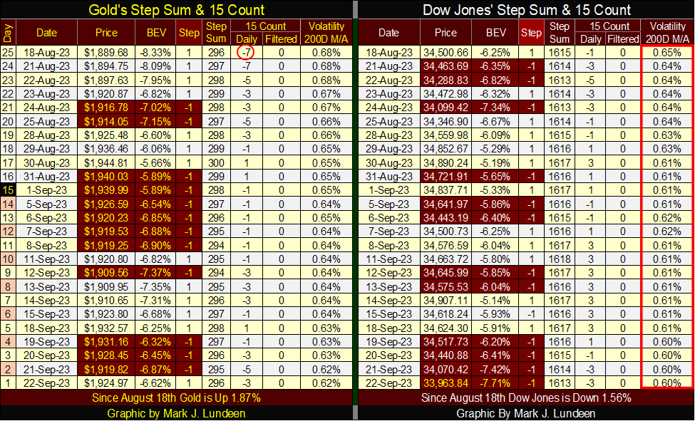
No brilliant market insights are to be seen on the Dow Jones side of the step sum table, but like on gold’s side, daily volatility for the Dow Jones continues declining, closing the week at 0.60%. Seeing the Dow Jones’ daily volatility’s 200d M/A decline, as seen above, is typical of a bull market.
But the Dow Jones hasn’t seen a new all-time high since 04 January 2022, so what kind of bull market is this? Well, it’s not a bull market. Most likely just more market manipulation by the idiots at the FOMC, “stabilizing market valuations,” which is what those dudes do for a paycheck.
__
(Featured image by Tech Daily via Unsplash)
DISCLAIMER: This article was written by a third party contributor and does not reflect the opinion of Born2Invest, its management, staff or its associates. Please review our disclaimer for more information.
This article may include forward-looking statements. These forward-looking statements generally are identified by the words “believe,” “project,” “estimate,” “become,” “plan,” “will,” and similar expressions. These forward-looking statements involve known and unknown risks as well as uncertainties, including those discussed in the following cautionary statements and elsewhere in this article and on this site. Although the Company may believe that its expectations are based on reasonable assumptions, the actual results that the Company may achieve may differ materially from any forward-looking statements, which reflect the opinions of the management of the Company only as of the date hereof. Additionally, please make sure to read these important disclosures.


TopRanked.io Weekly Affiliate Digest: What’s Hot in Affiliate Marketing [Changelly Affiliate Program]
It's official. TikTok is (potentially) dead. And, if you believe the news, that's gonna destroy thousands of small businesses and...


Terre et Lac Launches Crowdfunding for a Photovoltaic Power Plant
Terre et Lac, a Lyon-based company, launches a crowdfunding campaign for a solar plant in Voreppe. Residents of Isère and...


Qonto, Ledger, and Younited Credit, Leading Trio of the French Fintech Ecosystem
Qonto emerges as the top fintech in the latest rankings after its successful Series D funding. The 2024 Fintech 100...


Cannabis Clubs: Germany Introduces Strict Regulations
Germany introduces new regulations aimed at tightening control over cannabis clubs, following recent reforms. The Cannabis Act (CanG) allows limited...


Merck Invests Over 300 Million Euros in a New Research Center in Germany
Merck invests over 300 million euros in a new biotech research center in Germany, part of a larger 1.5 billion...
 |
|
 |  |
 |
|
-

 Cannabis2 weeks ago
Cannabis Legalization Reduces the Likelihood of Youth Using It
-

 Cannabis3 days ago
Cannabis Reform in Belgium: What Changes Does the Latest Report Propose
-

 Crowdfunding1 week ago
Consolidation in Sight in the Italian and European Crowdfunding Sector
-
 Impact Investing24 hours ago
Terre et Lac Launches Crowdfunding for a Photovoltaic Power Plant