Featured
Here’s why we are due for a market correction
If Dow Jones continues its 7 new BEV Zeros in the past two weeks, it can’t make a decent correction.

There’s one thing this market needs to do right now—make a decent correction. The Dow Jones hasn’t declined more than 5% from an all-time high since June of last summer, over fifteen months ago.
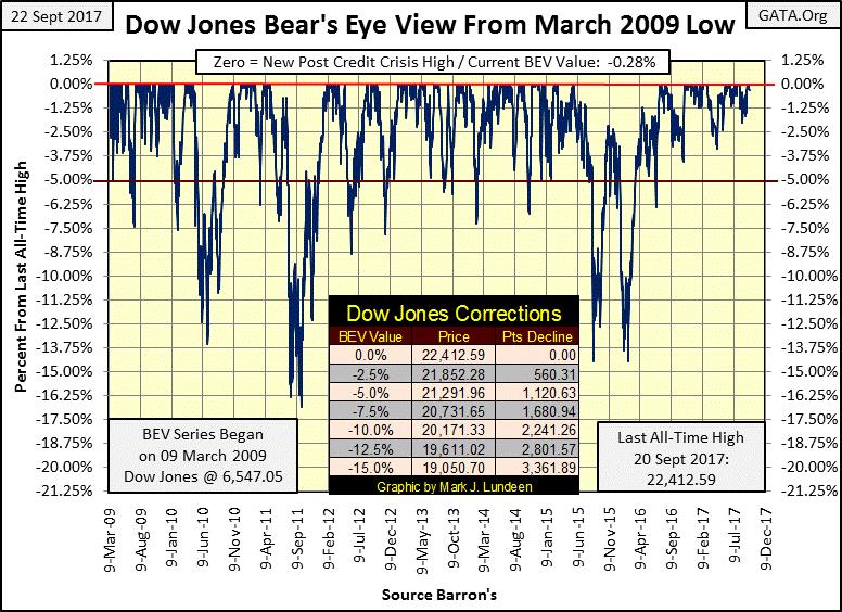
So, what am I complaining about? Well, obviously during bull markets valuations inflate. But as seen below, advances in bull markets also see frequent corrections, declines from BEV Zeros. This BEV chart begins on 09 March 2009, the absolute bottom of the credit-crisis bear market with the Dow Jones at 6,547. In the BEV plot below, every BEV Zero (0.00%) is a new high in the post-credit-crisis advance.
Since March 2009, the Dow Jones has advanced 15,865 points (242%), but the advance wasn’t uninterrupted. There was frequent price corrections below its BEV 5% line, and three times down into the double digits. This is how the bull markets advance in a BEV Plot—frequent BEV Zeros and corrections from those BEV Zeros.
© Mark Lundeen
What’s strange is how since June 2016, the advance in the Dow Jones stopped making its routine greater than 5% corrections, as it routinely did from 2009 to 2015. No doubt about it, something has changed in the stock market. But the bulls aren’t complaining, and why should they? I’m only pointing out that what we are seeing above is artificial, the result of implementing some “policy” by the FOMC.
One of these days, the Dow Jones will see a proper double-digit percentage correction and it will be interesting seeing what happens then. Will the FOMC have the means to drive the Dow Jones back up to a new all-time high, or will Mr. Bear finally take the Dow Jones down to even deeper percentage declines? When will all this happen? I haven’t a clue, but the key to the stock market’s future success or failure will be found following bond yields.
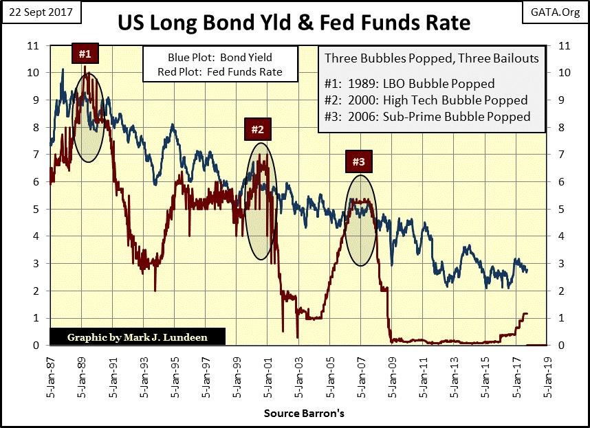
Plotted below is the yield for the US T- long bond and the Fed Funds Rate. In their relationship to each other, we can see each bull and bear market for the stock market since 1987. Falling bond yields (Blue Plot) and Fed Funds Rate (Red Plot) drove the stock market to ever higher levels, and every time the FOMC increased their red Fed Funds rate above the blue US T-Bond yield, an inflationary bubble somewhere in the market began deflating, taking the Dow Jones down with it.
Note how the FOMC is again driving its Fed Fund rate upward towards the bond yield. When they once again meet, expect another bear market; one that will be worse than the last (#3) where the valuation for the Dow Jones was cut in half.
However, I really doubt the FOMC will intentionally drive its Fed Funds rate upward above the bond yield in the current economic environment. They don’t want to take the heat from doing something like that, so don’t expect too many more rate hikes in the coming year from them. They’ll have to wait until bond yields are trending upwards again.
But then their “policy” is also responsible for low bond yields too, and they can’t reverse that “policy” without driving individuals, corporations and government at all levels towards bankruptcy. It’s not just the state of Illinois that’s currently struggling to service its massive debts even at today’s artificially low yields and rates.
And this $16 billion is just for Illinois’s current account payables. Unmentioned are its unfunded liabilities for state employee pensions and the outstanding municipal bonds it is currently servicing. I don’t have the data, but their debt loading must be in the hundreds of billions, and Illinois isn’t the only state or city that now finds its financial position in a precarious situation.
When was the last time an official from the FOMC talked about reducing its bloated balance sheet? An action if actually implemented would guarantee higher bond yields and interest rates, which they know would trigger a general deflation in the financial markets and widespread defaults in the bond market.
© Mark Lundeen
After decades of manipulating the markets, the college professors sitting around the big table at the FOMC now find themselves in a very difficult position, one with no painless way out. That goes for us too, and why I like gold and silver so much; assets with no counterparty risks. Mark my words, financial assets that appear solid in today’s market will become quicksand when we see the two plots in the chart above rising up to where they were in 2005-6.
And Mr. Bear is going to impose an impartial stress test on everyone’s balance sheet, as he always does in a bear market—it’s just what he does. With the global economy carrying levels of debt that seemed impossible decades ago, expect waves of defaults in the debt markets that haven’t been seen since the depressing 1930s. In an economy like that, don’t be shocked when bond yields and interest rates increase to levels today’s “market experts” believe impossible. I’m thinking double digits. We’ve been there before, so don’t think it can’t happen again.
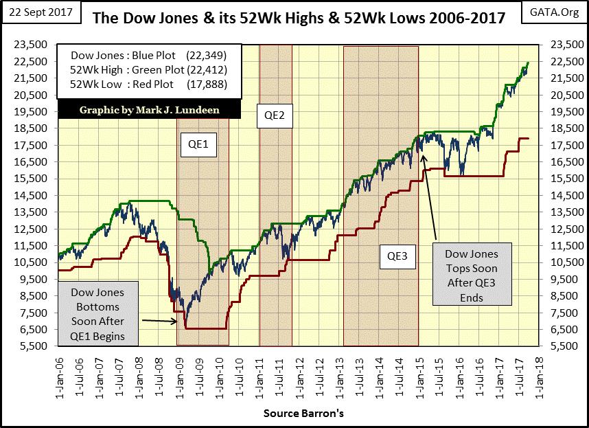
The Dow Jones with its 52-week highs and lows plots
Keeping its BEV chart above in mind, look at how the Dow’s blue plot has almost laid on top of its green 52Wk High plot since last November. We haven’t seen anything like that since 2006-07.
© Mark Lundeen
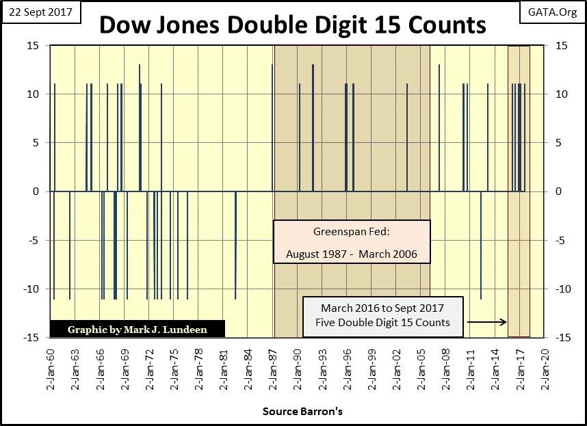
This week for the fifth time since March 2016, the Dow Jones’ 15 count has seen double digits in the chart below. What’s a 15 count? I take the daily closes of a market series like the Dow Jones and assign its up days a +1, decliners a -1; the 15 count is the running 15-day sum of the up and down steps made by the Dow Jones. In the chart below, I filter out all the single-digit 15 counts and the double-digit counts appear to be frequent market events. But since January 1960 the NYSE has seen 14,530 trading sessions, in which less than 100 have seen the Dow Jones’ 15 count in double digits.
That makes these Dow Jones 15 counts extreme market events. However, they’re not as important extreme-market events as NYSE A-D 70% Days (Extreme Market Breadth) or the Dow Jones 2% days (Extreme Market Volatility). Following days of extreme market breadth and volatility have proven very useful in analyzing the progression of a bear market, and that isn’t the case with these 15 counts.
What we see below is an evolution in the stock market, from a market driven by market forces to one controlled by college professors dictating “monetary policy.” The seventeen years spanning 1960 to 1977 wasn’t the greatest market for retail investors to be in. In fact, the general population had mostly been out of the stock market since the 1930s and didn’t return until the baby boomer generation came of age in the 1980s. Still, the Dow Jones generated both positive and negative double-digit 15 counts during these seventeen years.
But note how after 1977, six years after the US defaulted on the Bretton Woods’ $35 gold peg, the Dow Jones has only seen its 15 count go negative twice in the chart below. That’s four decades with only two negative double-digit 15 counts, and oddly enough neither occurred during a big bear market. The 2007-09 sub-prime mortgage bear market, the second deepest market decline since 1885 was free of them.
This wasn’t true for the big bear markets of the 20th century, yet for the two nasty bear markets seen since the turn of the 21st century, both have been free of negative double-digit Dow Jones 15 counts. The most likely reason for that is that since Alan Greenspan became Fed Chairman in August 1987, central bankers have increased their activities in the financial markets, and they don’t like it when the stock market is deflating. In post-August 1971 market declines, the Federal Reserve begins “supporting market stability” should the Dow Jones see too many consecutive down days, so we see only two negative double-digit 15 counts below after 1977.
© Mark Lundeen
What should we make of this? I believe we’re seeing yet another of those fingerprints left on the stock market by the “policy makers” as they dictate valuations in the financial markets. That’s especially so for the five double-digit +15 counts seen above since March 2016; the FOMC is manhandling stock market valuations ever higher. It’s useful to note that since March 2016 when this series of +15 counts began, the Dow Jones has only once seen a 5% correction (June 2016) as seen in this week’s Dow Jones BEV chart above.
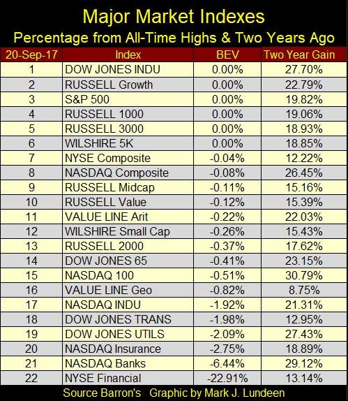
It’s not just the Dow Jones seeing new all-time highs. In the table below, the other major market indexes I follow are doing good too. The exception to this is the NYSE Financial Index (#22), still 23% below its last all-time high of 04 June 2007.
During the credit crisis, trillions of dollars of credit were sent their way, changes in accounting rules that allowed them to not declare bankruptcy when actually they were, the prohibition of short selling these banks’ shares during the 2008-09 crash and more! It’s almost as if these banks, with their huge political contributions to Washington’s elected officials, have bought our Congress.
© Mark Lundeen
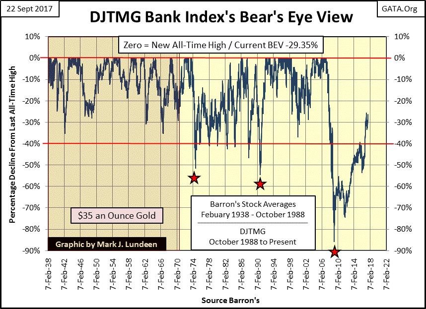
During the credit crisis, the NYSE Financial index saw a bear market decline of 78%; even after the US Government did all it could to keep these banks solvent. Here’s a BEV chart for the Dow Jones Total Market Group (DJTMG) Bank index. In March 2009 this bank index declined by 86% in the chart below, and like the NYSE Financial Index is a long way from recovering to its highs of 2007. I can’t help thinking of these banks as low-hanging fruit for Mr Bear when he returns.
© Mark Lundeen
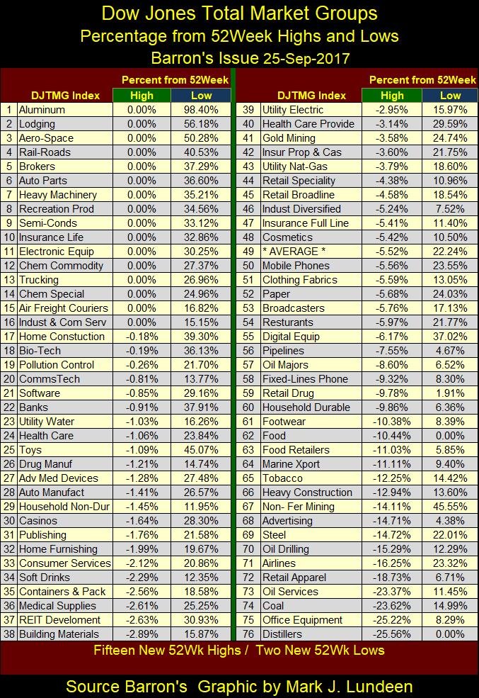
Here’s the Dow Jones Total Market Groups’ 52Wk performance table. Sixty of the seventy-six groups in it are within 10% of their 52Wk highs, with sixteen of them closing the week at their 52Wk highs. This is good bull market action.
Until the stock market begins to see multiple days of extreme market breadth (NYSE 70% Days) and extreme market volatility (Dow Jones 2% Days), I expect we’ll continue seeing further gains in the stock market in the weeks and months to come.
© Mark Lundeen
Outlook for gold and silver
I hate saying this, but as long as the stock market continues acting like this, I can almost guarantee that the gold and silver markets will continue disappointing their owners. Well, to hell with that! If central banks continue subsidizing us with artificially low gold and silver prices, prices disconnected from today’s market reality, I say take full advantage of this opportunity. I’m not predicting when counter-party risks once again become just another four letter word in the market’s lexicon, but when it does my readers will be glad for all the gold and silver they own.
However, saying that doesn’t cheer me up much. Being an optimistic person at heart, I hate cheering for Mr. Bear. Who enjoys thinking about the ruin he will one day inflict on all of us? But we’ve allowed politicians, bankers, and academics to have their way with the market for decades, and reasonable people know there are going to be historic consequences for what these people have done—think Illinois.
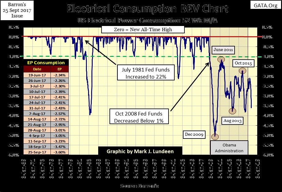
Looking at EP’s BEV chart below, those consequences (and higher gold and silver prices) may be nearer than we’d like them to be. Demand for EP has been declining since last May and has broken below its BEV -3.5% line this week. Should this trend in demand for EP continue, it’s a sure indication of economic contraction. How much longer can the “policy makers” hide the fact that the economy is in a recession, or continue inflating the financial markets should EP in the chart below continue falling as it has for the past four months?
© Mark Lundeen
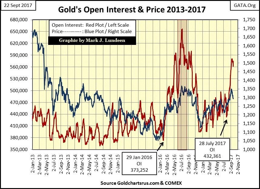
Here’s COMEX gold (Blue Plot) with its open interest (OI / Red Plot). Since late July the big banks have flooded the COMEX market with tons of digital gold, and this week the surge in the phantom supply finally broke the current advance in the price of gold.
From past experience, I’m expecting the price of gold and silver to trend down for the foreseeable future as OI collapses. But I note that neither the price of gold or OI has collapsed all that much as of the end of this week, so I’m not tossing in the towel on the current advance in gold just yet. However, if you’re looking to buy some of the old monetary metals, you’ll most likely find them cheaper in the weeks to come.
© Mark Lundeen
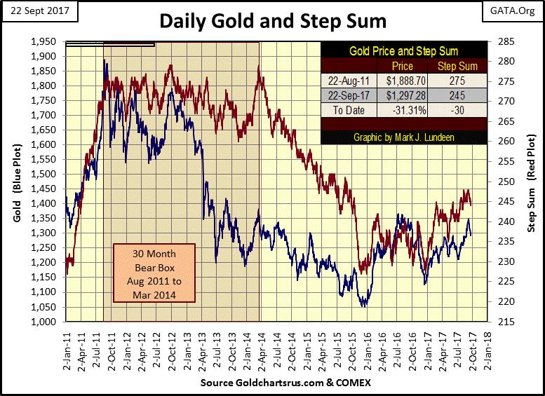
Still, looking at gold and its step sum below, I can say that we are still early in a major market advance that should have years to go. Looking at the post-April 2014 collapse in the red step sum plot tells us that bullish market sentiment was crushed by the time it bottomed in December 2015, making December 2015 a very hard bottom in the gold market. The bears in the gold market may want the price of gold below $1250, but I expect they’ll have a very hard time making that happen.
© Mark Lundeen
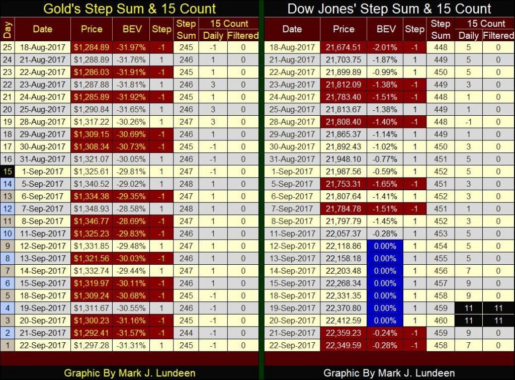
Looking at gold’s step sum and 15 count table below gives us reason to feel optimistic also. Gold’s step sum closed the week exactly where it was on August 18th, twenty-five trading sessions ago at 245, yet gold is still $12.39 higher from a month ago. So the bears are hard at work, but the rewards for their efforts are getting smaller as we approach 2018. Look at the big declines seen in early 2013 in the chart above; those days are now long gone and good riddance to that!
© Mark Lundeen
Moving over to the Dow Jones side of the table, look at the string of BEV Zeros (all-time highs) from September 12th to the 20th. Impressive, but not as good as last February which saw twelve BEV Zeros in its nineteen trading days. All and all, since last November’s election the Dow Jones has seen a very nice advance. In the 219 trading sessions at the NYSE since November 8, 59 of them have closed with the Dow Jones at a new all-time high (26.9%), that’s better than one in four.
How much longer can this continue is a mystery to me, but in late September I expect we are closer to the end of this advance in the Dow Jones than to its beginning.
—
DISCLAIMER: This article expresses my own ideas and opinions. Any information I have shared are from sources that I believe to be reliable and accurate. I did not receive any financial compensation in writing this post. I encourage any reader to do their own diligent research first before making any investment decisions.

-

 Crypto2 days ago
Bitcoin and Ethereum Stabilize as Altcoins Shift and Industry Faces New Challenges
-

 Cannabis2 weeks ago
Cannabis Stocks Show Signs of Rebound as Policy Shift Sparks Optimism
-

 Crowdfunding1 week ago
Italy Extends SME Guarantee Fund to Crowdfunding with New 2026 Framework
-

 Crypto6 days ago
Bitcoin Leads Modest Crypto Rebound Amid Mixed Signals





You must be logged in to post a comment Login