Markets
Electrical power consumption may indicate a stock market crash
Our current contraction in economic demand for EP has continued for the past 450 weeks; a full nine years come this August. The “new tools” of massive “injections of liquidity” known as QE, manipulating interest rates to almost nothing, and the implementation of mendacity in all things economic just hasn’t performed as promised.

All previous stock market crashes, from the Great Depression to the NASDAQ’s Tech Wreck, witnessed a sharp decline in electrical power consumption, which was followed by a swift recovery in demand for electrical power by the economy.
Last Friday promised some excitement for this week; what with the much-anticipated interest rate increase by the FOMC and the Federal Government hitting its debt ceiling on Wednesday the 15th. Come this Friday evening, it was all much to do about nothing, with the Dow Jones up twelve points for the week and gold twenty-five dollars higher than it was last Friday.
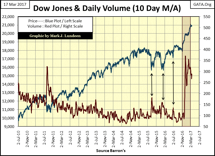
Looking at the chart of the Dow Jones (Blue Plot) and its volume (Red Plot) below, the Dow easily broke about its 19K and 20K lines in the chart, though it paused a bit before breaching its 20K line. The Dow Jones so far has only closed above 21K on three days (March 1-3).
I can’t tell you what the venerable Dow Jones will do next, but I can say with certainty that six months from now it will be some distance from its current 21K valuation. Whether that means above 22K or below 20K is something we’ll just have to wait to see. But I’m guessing it will be somewhere below its 20K line.
© Mark Lundeen
Maybe the key to the Dow Jones’ future is to be found in its trading volume, which currently is in decline. But that can change quickly.
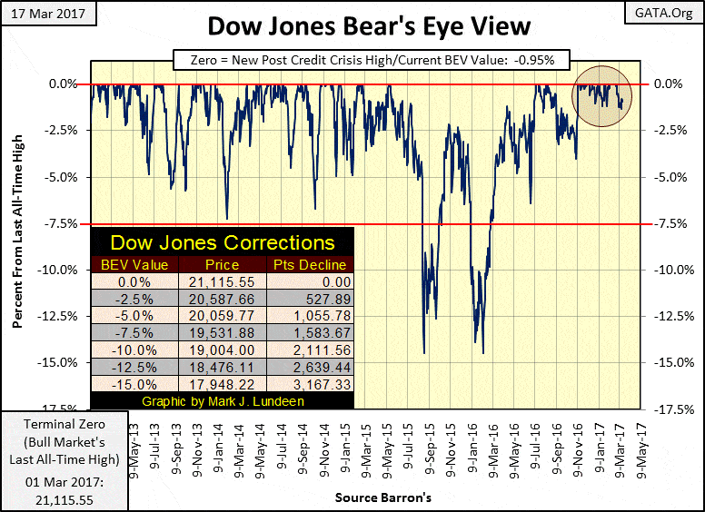
It’s been thirteen NYSE trading days (March 1st) since the Dow Jones saw its last all-time high. Since then, it’s been creeping slowly downward. On Tuesday (March 14th) it fell 1.32% from its BEV Zero of March 1st, seen in the BEV chart below.
I admit that isn’t much of a market decline. But since the November election, the Dow has seen more daily closings at all-time highs than not, that was until March 2nd. Has something changed in the market?
© Mark Lundeen
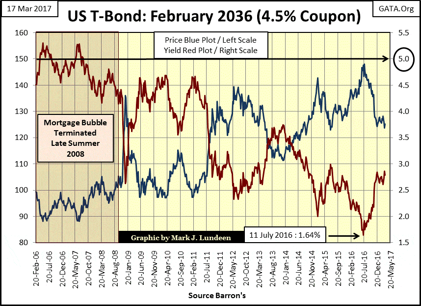
I think something has changed; bond yields and interest rates are rising. Below is a chart of the prices and yields of a 30 Year T-Bond issued in February 2006. Since this bond’s yield bottomed in July of last year, its yield has increased by 122 basis points (1.64% to 2.86%) as it’s seen its price decline by 16%.
For someone who purchased this bond last July, expecting an annual income of only 1.64% on invested funds, eight months later they’ve discovered they’ve lost 16% of their invested principal on an AAA rated US T-bond. Adding insult to injury, the IRS still expects them to pay income tax on their 1.64% interest payment! That has to be a shock to them, and rising rates has been true for most of the bond market as well as with mortgage rates.
Bond yields have been falling (bond prices rising) since October 1981. But it appears yields have bottomed last summer and are now on the rise with prices declining.
So far, the dividend yields for the Dow Jones and S&P 500 have ignored rising bond yields. But at some point, they’ll have to follow bond yields up should this trend in rising bond yields continue. The bulls in the stock market won’t like that!
There’s a threshold somewhere below the circled 5% yield in the chart below, where, should bond yields rise above, I expect a panic in the financial, and real estate market. It’s only to be expected in a market with such pathetic yields and great structural weakness.
The US Treasury market is a market believed by most to be a market that’s relatively risk-free, a market safe for widows, orphans and pension funds. But as we see below, it’s actually a market where an eight month, 1.22% increase in yield resulted in a 16% loss of principal – OUCH!
Should yields continue increasing (and they will over the next few years) at what current yield will the widow, orphans and fiduciaries say “I want out!” I expect long before yields increase to 5% – or so I would think. Regardless if this threshold of panic is below or above 5%, there is a yield somewhere above the current T-bond yield that is a line in the sand for both buyers and sellers of the US National Debt.
© Mark Lundeen
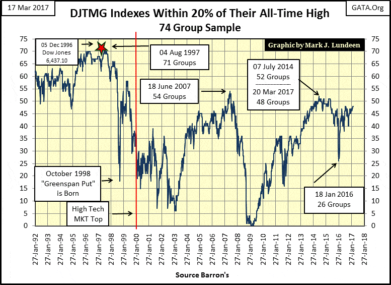
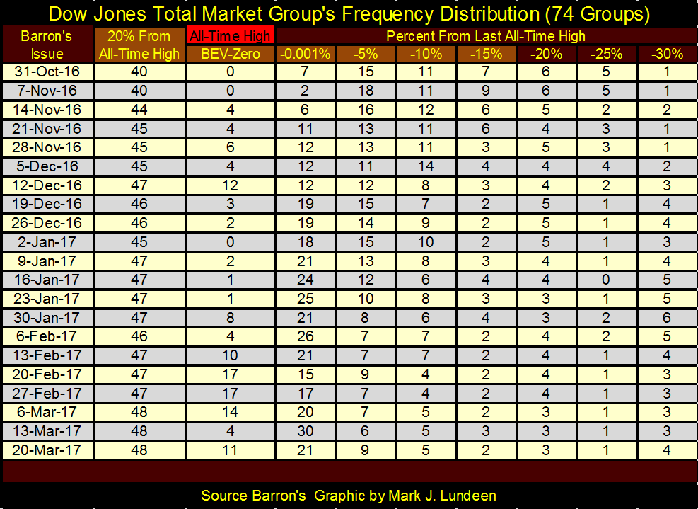
The Dow Jones Total Market Group’s top 20 remained at 48 at the close of this week.
© Mark Lundeen
And eleven groups in the DJTMG saw new all-time highs in the distribution table below (BEV Zero column). But groups from the lower columns continue to refuse migrating to higher levels, and that is very typical at bull market tops, as seen in the chart above.
© Mark Lundeen
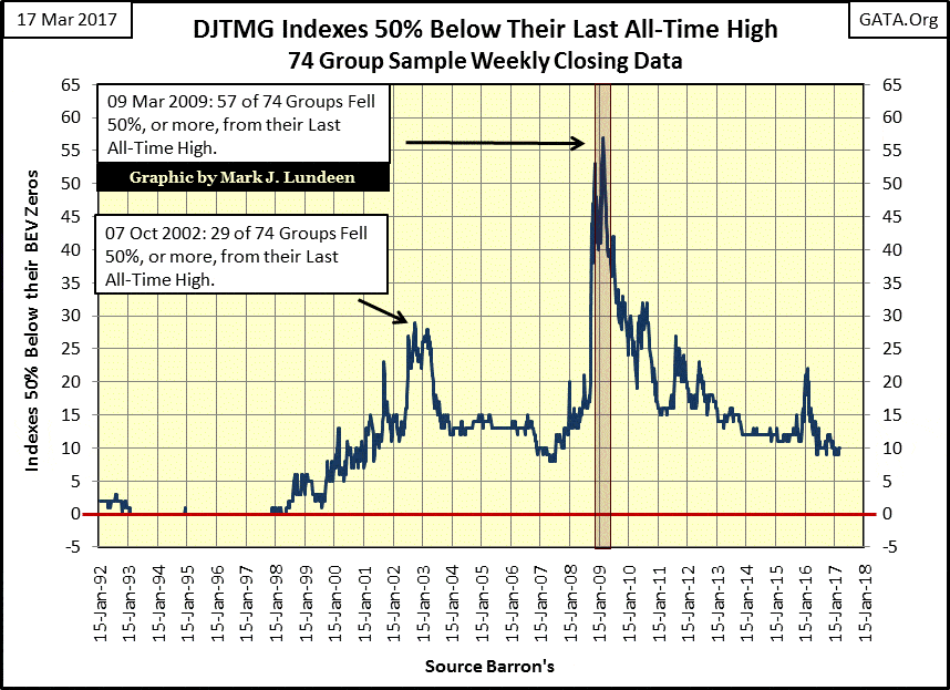
For your edification, here’s a chart for the DJTMG bottom 50, or the number of groups 50% or more from their last all-time highs. At the close of the week, the bottom 50 was at 10, a level where it has been at since last May.
I could be wrong with my following theory. But to get the stock market to move up to where the Dow Jones breaches its 21K level with any kind of authority, sufficient “liquidity” would have to flow into the stock market to move those 10 groups up above their 50% declines. But six of these groups are down by more than 70%, and two of those down by more than 90% from their last all-time highs.
As you can see, having the DJTMG’s bottom 50 below 10 really hasn’t happened since Alan Greenspan was inflating bubbles in the stock market in the 1990s. So my faith in further significant advances in the major market indexes is not very great. In fact, I expect the next big move in the bottom 50 is up, which is a very bearish view on the stock market.
© Mark Lundeen
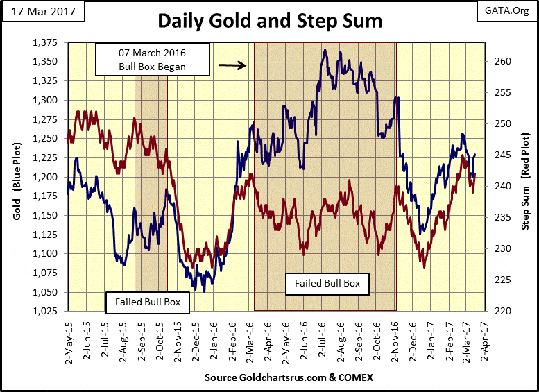
Here’s gold and its step sum. So far in March both plots have seen a correction, but began a rebound this week. I wish gold at $1,250 seen in late February would have held, as it turned out gold closed below $1,200 on March 9th. But with gold closing the week at $1,229 I remain short-term bullish.
© Mark Lundeen
But as I’ve been saying for longer than I care to remind my readers, I still believe we’ll need higher yields, as well as lower valuations for stocks and bonds, before we see gold and silver, as well as the precious metal miners do something spectacular to the upside. Give it some time; big gains in the old monetary metals are coming as bond yields continue to rise.
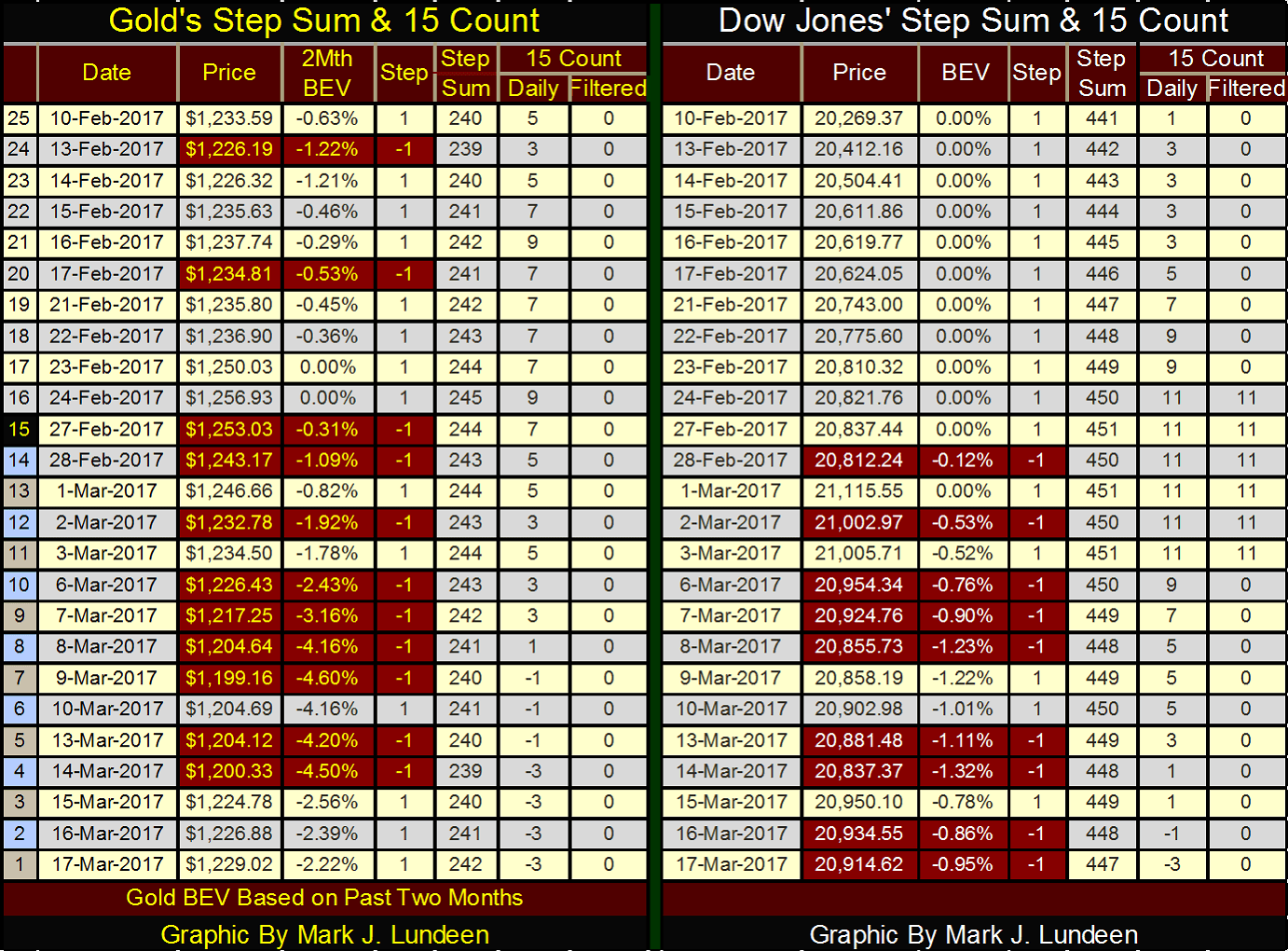
Here’s the step sum and 15 count table for gold and the Dow Jones. Gold has been under a lot of selling pressure since February 24th, but it’s seen three consecutive daily higher closings at the end of this week. The Dow Jones too has seen selling pressure since the end of February, but at the end of the week we see no indication that the selling has exhausted itself. I really think the key to understanding this market is that interest rates and bond yields are in the early phase of a prolonged increase. That’s bad for the Dow Jones, but good for gold and silver.
© Mark Lundeen
I don’t think I’ve covered economic electrical power consumption (EP) in any detail since last summer, so it’s time to do so again.
Barron’s began publishing electrical power consumption data in its 05 August 1929 issue. That’s a long time ago; some 4,572 continuous weeks of EP data points as of the end of this week.
My interest in EP began sometime in the early 1990s. The fall of the Iron Curtain was still recent history. There was a CIA analyst making the rounds of early morning network talk shows, telling everyone how he alone at the CIA predicted the imminent fall of the Soviet Union. What was remarkable, according to this analysis, was how all the economists and political scientists employed by the CIA failed to do so.
Why was he successful? Because he was studying the USSR’s ever declining electrical power consumption, while the academics were studying the official economics statistics published by the Communist Party. Who could believe it? It seems the Communist Party had been lying about economic growth for decades, while those who studied Russia’s EP consumption saw the truth in the declining fortunes of Soviet Socialism.
It was in the mid-1990s when I began compiling data from old issues of Barron’s. It took years and hundreds of dollars in parking fees to accomplish the task. One of the old data series I resurrected from obscurity was the Barron’s Gold Mining Index (BGMI).
Barron’s began publishing this weekly data series in 1938; it consisted of two gold mining companies: Homestake Mining and Juneau Alaska Gold. A good friend of mine from Down Under: Geoff, was kind enough to gather weekly Homestake data going back to 1920, with which I pushed the BGMI back to 1920. Geoff has provided additional years of Homestake data, which to my shame I have to say I haven’t done anything with yet – sorry Geoff!
To the point of this week’s article, Barron’s also published weekly electrical power consumption data, which to my surprise went back to August 1929.
Being a retired US Navy Chief Electrician, I’m especially fond of the EP data set as I saw electricity at work on the six ships I served in during my twenty years of service. One thing every electrician knows is that while voltage is important, it’s also overrated by people who don’t understand electricity. Volts are cheap. Its amperes (current flow measured in “amps”) that cost money, as a boiler or diesel engine somewhere has to increase fuel consumption to satisfy the increase in demand (more amps) for electrical power.
Amperes at rated voltage is the key to understanding what’s happening in any electrical grid. Just like at your home; when people turn electrical equipment on, like a 5-inch gun mount, the grid has to produce more amperes at * Rated Voltage * as demand for EP has just increased. When people turn things off, like a 250 HP fuel-oil transfer pump, the grid has to produce fewer amperes at * Rated Voltage * as demand for EP has just decreased. So, over the entire spectrum of an electrical system’s demand for power; rated voltage never changes, but the flow of amperes (Kilowatts) from the generator to the grid’s “load” does.
I’ll spare my readers a tedious explanation of impedance and reactance in an electrical system. Just keep the above truth in mind as you study the following charts of US Electrical Power Consumption – or EP, and you’ll sit in the same seat that a CIA analysis studying Soviet EP data found himself in decades ago.
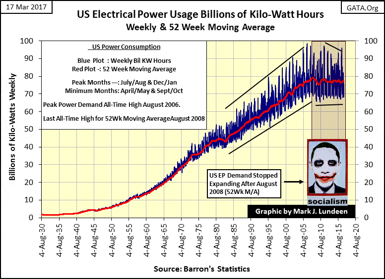
Here is the data as published by Barron’s from August 1930 plotted in the chart below (Blue Plot). I’ve skipped an entire year of data as I’ve constructed a 52Wk moving average (Red Plot) of the data. In the 1930s, most of this demand was from industrial and commercial users. Residential air conditioning during the summer months and electrical heating in the winter were not factors electrical utilities had to plan for, and wouldn’t be until the 1970s. But after 1970, we see the weekly data oscillate above and below the 52Wk M/A as seasonal demands for EP became significant factors in the power grid.
The need for using a 52Wk M/A to measure EP became apparent after 1970, as seasonal factors for heating and cooling began to greatly impact demand in the power grid.
© Mark Lundeen
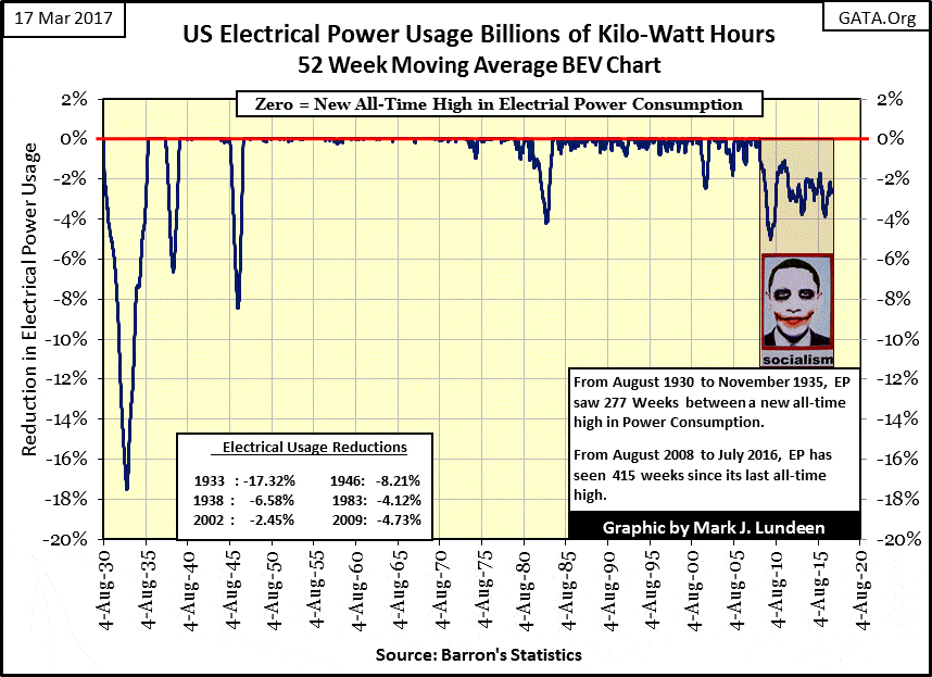
Next is a Bear’s Eye View (BEV) chart for EP, which should be studied along with the raw data seen in the chart above. What’s a BEV plot? A BEV plot looks at a market series like Mr Bear does; each new all-time high is equal to 0.00%, or BEV Zero. Understand that Mr Bear sees each new all-time high as a big-fat zero, as he’s only interested in how large of a percentage he can claw back from any particular all-time high, and that’s exactly what we see below.
At the bottom of the Great Depression, Mr. Bear clawed back EP demand by 17.3% as factories shut down assembly lines and commercial establishments turned off the lights and closed their doors for business during the Great Depression crash. But the economy soon rebound, and EP was once again making new BEV Zeros by 1935 as economic life once again rebounded.
However, the depressing 1930s saw two crashes in not just in the Dow Jones, but also in the demand for EP. In 1938 EP saw a 6.58% reduction in EP demand. But like the massive decline in 1933, after the 1938 bottom, demand for EP once again returned as the United States began preparing for the Second World War.
From 1939 to 1946, every week saw a new all-time high in demand for EP, as demand for industrial goods by the US war machine became insatiable. However, in 1946 demand for EP saw its second largest decline to date. This was a unique episode in the history of EP; the result of the American industrial base retooling from wartime to peacetime production.
© Mark Lundeen
From 1947 to 1974 the demand for EP by the American economy was amazing. With rare exception, the American economy saw three decades of weekly new all-time highs in the demand for EP. There is a small decline in EP in late 1974; this decline coincides with the bottom of the 1973-74 bear market; the first 40% decline in the Dow Jones since April 1942.
The next significant decline in EP occurred during the early years of the Reagan administration. In 1983, demand for EP declined by 4.12% as a result of Fed Chairman Volcker increasing US interest rates deep into double digits. Fed Funds increased to 22% and the US Treasury issued a 20-year bond with a 15% coupon!
The next two decades, as the previous two, saw remarkable growth in the American economy, as measured by demand for EP. But weekly BEV Zeros became rarer. Look at the chart above; the blue BEV Plot frequently found itself at some small fraction of a percent below a new all-time high. But I believe this was more due to seasonal factors becoming dominant events in the electrical grid than weekly micro-contractions in the economy.
The next economic driven decline in EP occurred during the 2000-02 deflation of the NASDAQ High Tech bubble. EP saw a 2.45% decline in 2002. Then came the sub-prime mortgage fiasco, and the demand for economic EP has never been the same.
It’s apparent in both EP charts seen above; the 52Wk Moving Average in the raw data and EP’s BEV chart, that EP’s last BEV Zero (last all-time high in demand for EP) was in August 2008 – two months before Congress gave Fed Chairman, Doctor Bernanke “new tools” to restore “economic stability.”
EP’s BEV plot above tells us how that worked out. All previous declines in EP, from the Great Depression to the NASDAQ’s Tech Wreck, saw EP decline to a bottom, followed by a swift recovery in demand for electrical power by the economy.
But our current contraction in economic demand for EP has continued for the past 450 weeks; a full nine years come this August. The “new tools” of massive “injections of liquidity” known as QE, manipulating interest rates to almost nothing, and the implementation of mendacity in all things economic just hasn’t performed as promised.
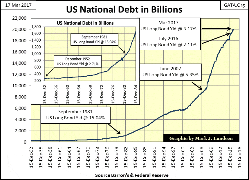
The problem with the economy is that it’s burdened with vastly more debt than it can bear. In October 1981, the US Treasury had to offer bond buyers a 15% coupon to sell its bonds as the US National debt had increased to a then-shocking $977 billion dollars.
The debt market thirty-six years ago looked at the rapidly approaching $1 Trillion dollar US national debt with fear and loathing! Today the national debt is on the cusp of breaking over $20 trillion, and who gives a damn that bond yields are far below double digits?
© Mark Lundeen
We can thank Alan Greenspan, Doctor Bernanke, and our Congress for what we see above! Yes, we can also thank our main-stream financial FAKE NEWS media whose “market experts” are always willing to go along to get along with the economic quacks and charlatans holding the reins of power in New York and Washington.
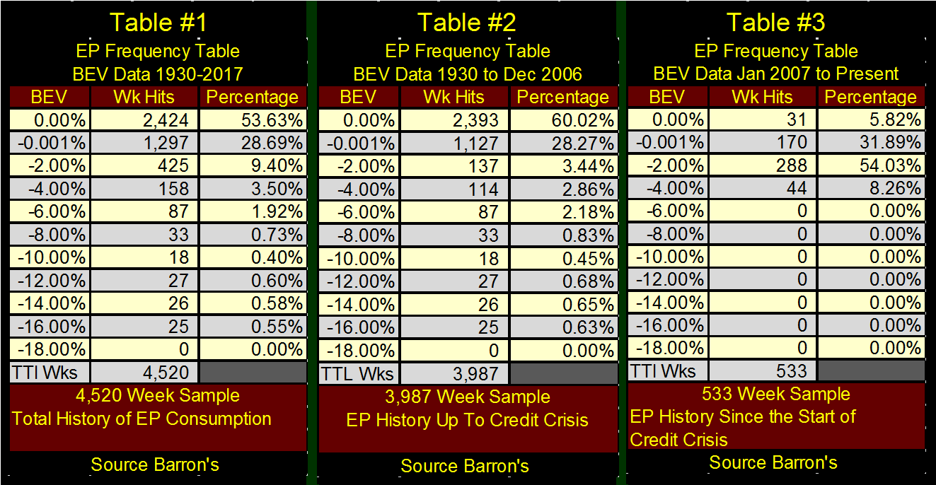
To better illustrate the pathetic “economic recovery” seen in the economic demand for EP by the American economy since the 2007-09 credit crisis, I’ve constructed the following frequency distribution tables below from the EP BEV plot of its 52Wk Moving Average. Regular readers of my articles know I use these freq tables with other data, as with the DJTMG’s top 20 and bottom 50 charts and tables. So maybe I should explain exactly what is displayed in them.
The base data is always from a data series’ BEV plot, where a 0.00% is a new all-time high. But to isolate actual new all-time highs from close calls of being one, I‘ve included a -0.001% row following the 0.00%. This row catches those data points just a whisker from being a new all-time high, and bundles them with data points down to -1.99% from their all-time highs. Next comes the -2.00% row, which bundles data points from -2% down to -3.99%, and so on and so forth down the table.
Looking at Table #1 (August 1930 to March 2017) we see how EP saw 2,424 weekly new all-time highs in the 0.00% row; over half (53.63%) of the 4,520 weeks in the sample are actual all-time highs in the demand for EP. During the Great Depression, there were 25 weeks where EP had fallen between 16% and 17.99% from its last all-time high in 1930. The pain from this 16% decline in the demand for electrical power is still burnt into the collective memories of people born decades after it happened.
Table #2 examines American EP demand up to December 2006. This omits EP demand during and following the 2007-09 sub-prime mortgage debacle, which didn’t really begin until after January 2007, as noted by Doctor Bernanke below.
“We do not expect significant spillovers from the subprime market to the rest of the economy or to the financial system.”
– Fed Chairman Ben Bernanke, May 17, 2007
Note that in December 2006, American demand for EP saw 60% of its weekly closes since 1930 at new all-time highs (0.00% row), and 88% of weekly closings not more than -1.999% (0.00% plus -0.001% rows) from their last all-time highs since 1930: amazing!
© Mark Lundeen
But with the sub-prime mortgage debacle, and its aftermath, all that changed as seen in Table #3. We see 31 new all-time highs since January 2007, but all those were recorded before August 2008, with the bulk of weekly closings in EP (62%) finding themselves 2% or more (-2.00% plus -4.00% rows) from their last all-time high recorded in Barron’s 04 August 2008 issue. We actually see more weekly data points in the -2.00% row in Table #3 than in Table #2 which includes data from the Great Depression crash.
It doesn’t take a CIA specialist in analyzing EP demand to understand that since August 2008, something profound has impacted the American economy that the FOMC’s three QEs, eight years of Zero Interest Rate Policy (ZIRP) and “Operation Twist” in January 2011 has not mitigated.
When the unstoppable force of tens-of-trillions of unserviceable debt crashes on the immovable object of FOMC “monetary policy”, once again we can expect that bond yields and interest rates will rise to levels not seen since the early 1980s. The financial system will be swamped with waves of debt default as Mr. Bear goes to work cleansing society’s balance sheet of unviable and illiquid assets.
Exactly when this will happen is still a mystery to me. However, my readers who take my advice of purchasing assets with zero counterparty risk: gold and silver bullion, will be glad they did so when this disaster becomes our economic reality.
And as the gold miners were the best performing stock group during the Great Depression Crash of 1929-32, with Homestake Mining increasing by 55% as the Dow Jones crashed by 89% in July 1932, I like the gold and silver miners too.
I also like President Trump. He’s a good man trying to do good in the snake pit called Washington DC. But he’s only human, and surrounded by enemies who want nothing less than to blame the impending disaster they know is coming completely on him. Just keep in mind that what is coming our way has been a long time coming, as seen in the stagnating demand for electrical power in the United States.
If you believe in God, and I do, this is a good time to say a prayer for our country and president.
—
DISCLAIMER: This article expresses my own ideas and opinions. Any information I have shared are from sources that I believe to be reliable and accurate. I did not receive any financial compensation in writing this post. I encourage any reader to do their own diligent research first before making any investment decisions.

-

 Business1 week ago
The Federal Reserve and War in Iran: Why It Matters to Your Money
-

 Fintech1 week ago
Lutech Acquires Talentomobile to Boost European Fintech Expansion
-

 Africa2 days ago
Why Small Businesses in the MENA Region Struggle to Scale Despite Access to Finance
-

 Africa1 week ago
Middle East Crisis Threatens Africa’s Growth and Economic Stability


You must be logged in to post a comment Login