Markets
Fed Funds Rate’s Next Move: Up or Down?
In recent weeks, the Dow Jones experienced volatility, briefly dipping below its BEV -5% line before rebounding. Despite the decline, it closed within 1% of its all-time high, suggesting a healthy correction. Similar trends were observed across major indexes. However, questions loom regarding the FOMC’s monetary policy and its impact on markets, especially amid uncertainty over interest rate adjustments.
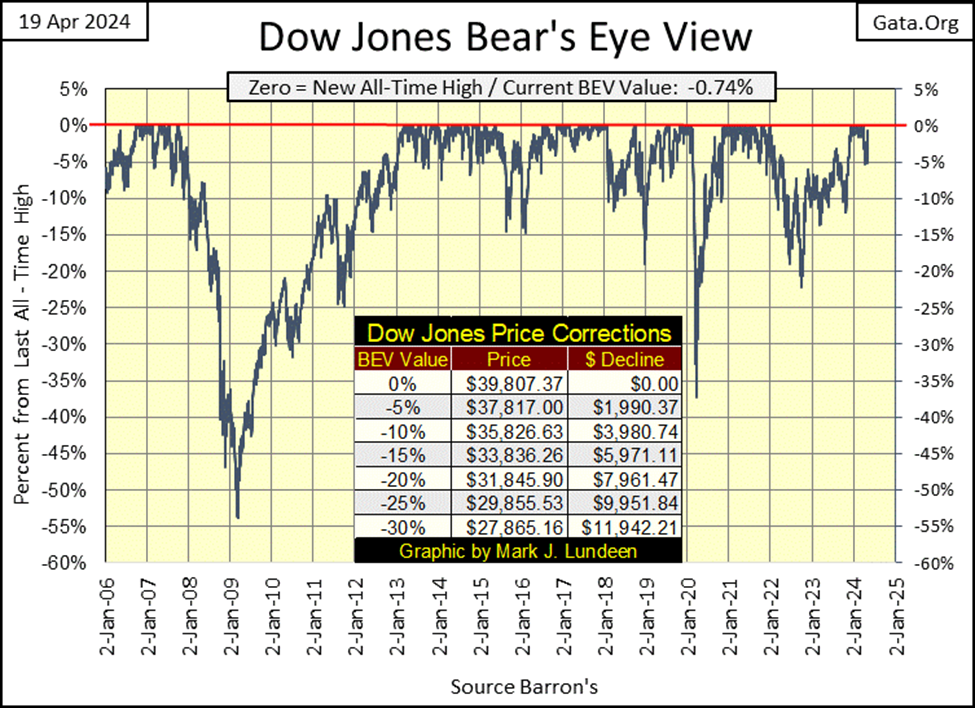
In the three weeks since my last article, the Dow Jones has seen some drama, as evident in the BEV chart below by it making a move to break below its BEV -5% line, thus closing outside of scoring position (-0.01% to -4.99%). Actually, on April 30th, the Dow Jones closed exactly with a BEV of -5.00%, a mere 0.01% outside of scoring position.
But at this week’s close, the Dow Jones closed with a BEV value of -0.74%, less than 1% away from its last all-time high, making the recent decline, a nicely done correction in the current market advance in the Dow Jones. I’m expecting additional BEV Zeros (0.00% = new all-time highs) in the weeks to come.
That was also the story for many of the major market indexes I follow these past few weeks. A move towards their BEV -5% lines, only to recover, and come very close to making new all-time highs at the close of this week. Look at these indexes’ BEV values in the table below.
On Friday’s close, eleven of these indexes were less than 1% away from their last all-time highs (BEV Zeros = 0.00%), with fourteen of them closing in scoring position. Come next week, I’m expecting we’ll see many of these indexes posting 0.00%; closes at new all-time highs.
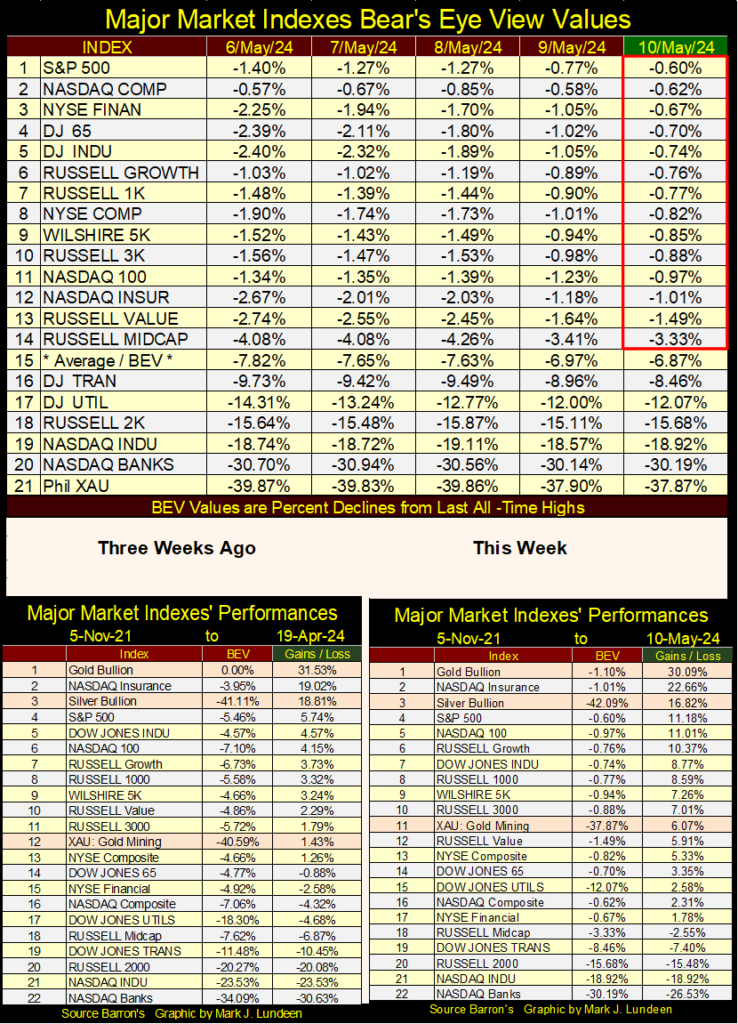
In the performance tables above, not much has changed in the rankings, with gold and silver holding on to their #1 and #3 positions, but the XAU is up a row from three weeks ago. If you compare the values in the green Gains / Loss columns, since the weekend of April 19th, all of these indexes are up nicely, and I’m expecting further gains as the year goes on.
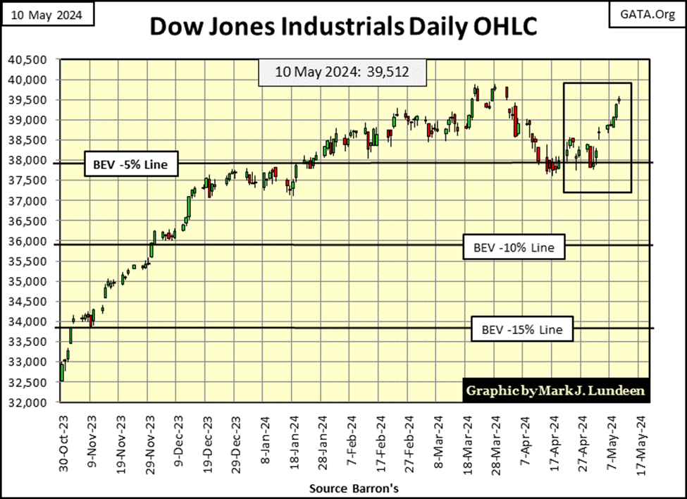
Why not expect additional gains in the stock market this summer? Look at the Dow Jones in daily bars below, from its new all-time highs of late March. The Dow Jones tested its BEV -5% line, twice, and failed too decisively close below it. Now since last Friday, the Dow Jones has advanced nicely, threatening to now take out its last all-time highs from last March.
All we see above appears to be very bullish for the stock market. But is there something looming over the horizon that could shut-down the party seen above; that is what will the FOMC do with its Fed-Funds Rate in the months to come?
The big question on everyone’s mind today is; will the FOMC lower their Fed Funds Rate this year, that would be bullish, or will they instead raise it, which is bearish. It wasn’t all that long ago everyone knew the answer to that question; the idiots were going to lower their Fed-Funds Rate not once, but several times in 2024. However now in May 2024, that is no longer so. So, what has changed in the economy that made the idiots begin doubting the wisdom of lowering their Fed-Funds Rate?
To better understand this current confusion in “monetary policy” at the FOMC, let’s take a historical look at the FOMC’s manipulation of its Fed-Funds Rate, and the consequences to the economy and financial markets when they do, whatever they do, to overnight rates in the banking system; their Fed-Funds Rate.
Below is a chart plotting the past seventy years of “monetary policy,” as seen by the FOMC raising, or lowering, overnight rates (Fed-Funds Rate / Blue Plot) in the banking system, relative to the yield for the US Treasury’s long bond (Red Plot).
• Times of Easy (loose) Money; when the FOMC is encouraging its (our) banking system to expand credit, to facilitate “economic growth,” are identified when the Blue Fed Funds Rate, is * BELOW * the Red long T-bond yield. During these times of easy money, the greater the spread between the two plots seen below, the more the FOMC is encouraging “economic growth.”
• Times of Hard (tight) Money; when the FOMC is discouraging its banking system to expand credit, to halt the “economic growth” it previously instigated, can be identified when the Blue Fed Funds Rate is * ABOVE * the Red long T-bond yield seen below. The farther the FOMC raises their Fed Funds Rate above the yields for the long-term T-bond, the harder their “monetary policy” becomes. Times of hard money, are hard times for the economy, and bear markets somewhere on Wall Street.
What is happening in the chart below, is best understood by knowing the Federal Reserve System, as controlled by the idiots at the FOMC, are either inflating a bubble somewhere in the economy or financial system, or attempting to pop the bubble they’ve previously inflated.
When the FOMC is “injecting” inflation into the financial system, via its (our) banking system, it lowers short-term rates. Before 1982, monetary inflation from the FOMC flowed into the commodity prices. We know that was true, as long-term bond yields also rose, with rising CPI inflation rates, into double-digit rates from the 1950s to the early 1980s.
Looking at the plots below, before 1982, the FOMC attempted to pop the bubble in consumer prices by raising their blue Fed-Funds Rate far above long bond yields, and note how far they were willing to raise their Blue Fed-Funds Rate above the Red long-bond yields. When confronted with double-digit CPI rates, and long-term bond yields, the FOMC was forced to raise their Fed Funds Rate deep into double-digits to pop their bubble in consumer prices.
From 1954 to 1982, was a time when the FOMC fought CPI inflation.
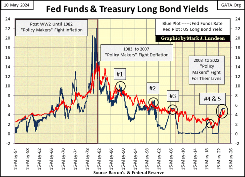
Everything changed after 1982, as monetary inflation from the Federal Reserve System ceased flowing into consumer prices. Inflation from the Federal Reserve System continued as before, but now its inflationary dollars flowed into stock and bond valuations trading on Wall Street, rather than into consumer prices.
This began a period when the FOMC no longer desired to pop the inflationary bubbles they created in the financial markets, as these bubbles were the “bull markets” everyone loved.
So began the period when the FOMC fought deflation (1983 to 2007). Yet to maintain their credibility as “inflation fighters,” they occasionally still had to invert the yield curve, and raise their Fed-Funds Rate above long-term bond yields. But note how after 1982 in the chart above, never by much. And when they did, a massive bubble (a bull market) in the financial system went bust;
• #1: The Merger & Acquisition Bubble,
• #2: NASDAQ High-Tech Bubble,
• #3: Sub-Prime Mortgage Bubble,
• #4: March 2020 Flash Crash,
• #5: The Everything is a bubble, bubble.
Note yield inversion #5 hasn’t resulted in a major market crash – yet.
The frequency distribution tables below are taken from the weekly Fed-Funds Rate data (Blue Plot) seen in the chart above, covering the periods seen when the FOMC was fighting deflation (prolonging a “bull market” they’ve inflated) in the financial system (1983 to 2007), and when they began fighting for their lives following their sub-prime mortgage debacle. I recommend my readers refer to the blue plot in the chart above, when studying the tables below.
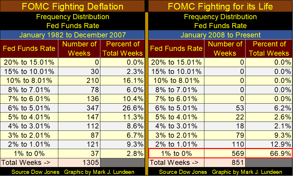
The thing to note about the table covering when the FOMC was fighting deflation, is how the idiots were willing to lower their Fed Funds Rate from around 15% in the early 1980s, to slightly below 1% in the aftermath of the NASDAQ High-Tech bubble bust. Small wonder everyone loved Alan Greenspan, as he was willing to do anything to keep “market valuations stabilized,” anytime Mr Bear was seen sniffing around Wall Street.
For the table covering the period where the FOMC was, and still is fighting for their lives, these idiots kept their Fed Funds Rate below 1%, well below 1% for a total of 569 weeks, 67% of the weeks since January 2008. In effect, these idiots were giving money away for free to Wall Street, to reinflate the financial system in the aftermath of their 2007-09 sub-prime mortgage debacle. With 52weeks per year, that is over ten years of panic, yes monetary panic at the FOMC in the aftermath of their sub-prime mortgage fiasco.
As a consequence of these eleven years of unnaturally low interest rates, corporations, governments, and individuals were motivated to take full advantage of the unlimited, and cheap credit (debt) being made available by the Federal Reserve System.
So, what is wrong with free money? Quite a bit actually. Had interest rates been allowed to float, fixed by the natural supply and demands of available, but limited bank credit in a free market, rates and yields would have been high enough to price out most marginal corporate projects, those “means of production” that will never be able to pay back the debt created to fund them.
And there is lots of economically marginal office space and manufacturing facilities out there. When Mr Bear returns to clean up Wall Street, corporate bankruptcies will become a major issue, largely due to these eleven years of free money seen above.
Then there is consumer debt, where the banking system received free money from the FOMC, and lent it out to the public at whatever rates “consumers” were willing to pay.
The following article from King World News informs us that even people earning over $100,000 a year are broke. How is that possible? It’s very simple; allow these big earners to use their $100,000 a year income, to finance a $200,000 a year lifestyle, all made possible, and encouraged by a banking system controlled by a bunch of idiots at the FOMC.
Fifty years ago, most people wouldn’t do something this stupid, because they knew better. But fifty years ago, most people didn’t go to college. Today, college graduates have even become “gender confused.” What chance do such people have at managing their income, without becoming bankrupted in the process of living their daily lives, when credit cards are made available to them?
Thrift, saving money for a rainy day was a virtue drilled into me by my parents when I was growing up. Today, thrift is just another dirty four-letter word to all too many people, and their lives will ultimately become a wreck for the lack of it.
To see the dilemma the FOMC has, in either lowering or raising their Fed-Funds Rate, let’s study the yield curves in the chart below. Geeze Louise, look at the yield curve from August 2020. Yields for everything less than a 30yr bond were less, much less than 1%, and that is how it was for over a decade!
But that was then, and this is now. So, keeping in mind that when the Fed-Funds Rate is * HIGHER * than long-term bond yields, money is tight. When the Fed-Funds Rate is * LOWER * than long-term bond yields, money is easy, aka; loose.
Currently, with the yield curve slightly inverted, Fed-Funds slightly higher than bond yields, so money is slightly tight. But note how bond yield since December have been rising. Should these bond yields continue this trend, in time they will become higher than the Fed-Funds Rate, making “monetary policy” easy, all without the idiots doing anything with their Fed-Funds Rate.
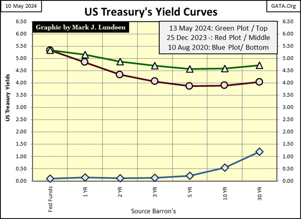
Question: do the idiots at the FOMC desire to have rising bond yields shift their “monetary policy” from tight to easy? They may desire exactly that. If they don’t, they’ll then have to raise their Fed-Funds Rate before that happens.
If they want to have their “monetary policy” become easy (loose), they don’t have to do anything, as the bond market is doing all that is necessary to make that happen in the months to come. That being the case, there is no need for them to lower their Fed-Funds Rate. That is unless some crisis strikes the financial market, which will always motivate the FOMC to lower their Fed-Funds Rate, most likely back to zero percent.
What do I know about what the FOMC will do next with their Fed-Funds Rate? Well, by my plumbing and hairy body, I know I’m a man. I know it’s best to live within one’s means, avoid debt when possible, and I always put some money aside for a rainy day. As far as what a bunch of over-educated idiots at the FOMC are going to do with short-term rates, I haven’t a clue. And I suspect as of today, May 10th, they don’t either.
Let’s look at some bond yields and the mortgage rate in the table below. Since early in 2024, except for the muni-bonds, yields have been trending higher.
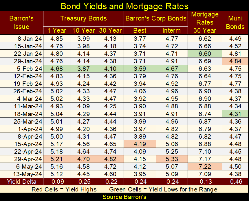
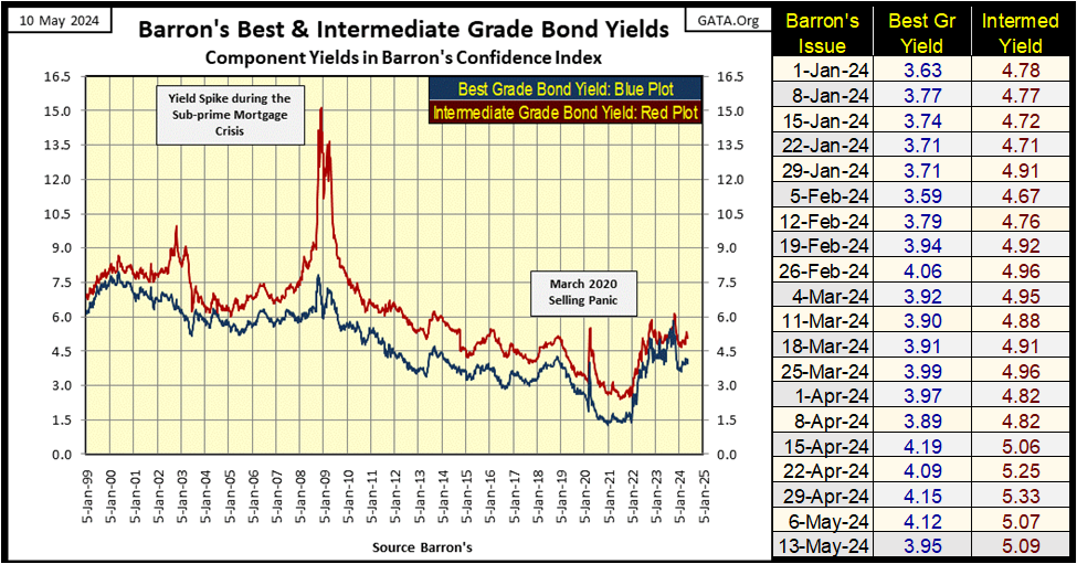
Here is a chart plotting Barron’s Best and Intermediate Grade Bond Yields. They are down from their highs of last December, but have been trending up since early February.
As I see it, the low in bond yields seen in the early 2020s was the bond bull-market’s top, for a bull market in debt that began forty-years earlier in 1982. We are currently in the early stages of a massive BEAR MARKET in debt. If so, and it is, bond yields and interest rates have nowhere to go but up for many years to come.
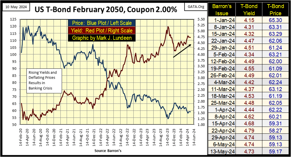
Next is a chart plotting the price and yield for a 30yr Treasury bond issued in February 2020. Since its valuation top in August 2020, this bond’s market price has been sliced in half, as its yield has increased from just under 1%, to 4.73% at the close of this week.
All the “free money” that entered the bond market before August 2020, isn’t looking like a bargain four years later. This bear market in debt will only get worse as yields continue rising in the coming years, and at some point, the financial markets will be in a crisis for what is seen in the charts above and below.
Some people get upset when I call the members of the Federal Reserve Open Market Committee (FOMC) a bunch of idiots. “Mark, it’s not professional.”
Well, I’m not “professional,” and never will be. But one doesn’t have to be “professional” to understand how the mess we’re seeing in the financial system is due to the FOMC’s incompetence in managing matters of “monetary policy.” I’m not a happy camper with it comes to their management of “monetary policy.”
What? I should call these monetary morons, the people who are destroying the dollar, and ultimately destroying the markets that use their dollar to bid on prices geniuses, or at least with a degree of dignity? Nope – I don’t think so.
This is a good time to move on to gold’s BEV chart below. Like the Dow Jones during my vacation, gold too made a move to close below its BEV -5% line, where it would have closed outside of scoring position. But as we can see, not only didn’t that happen, but gold has snapped back nicely, closing the week with a BEV value of -1.10%, just a little more than 1% away from its last all-time high.
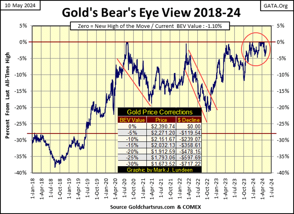
Like the Dow Jones, and most of the other major market indexes I follow above, gold is deep into scoring position. Exactly where it should be, if it is to make additional new all-time highs in the weeks to come.
Moving on to my indexed values for gold and silver below, where 02 January 1969 = 1.00, little has changed since late April when I last posted this chart. Hopefully, in the weeks to come that will change to the bulls’ benefit, with gold closing well above 55.0 ($2400), and silver finally breaking above 17.5 ($32.50).
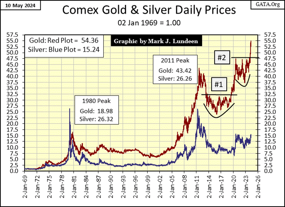
I like this chart indexing gold and silver since January 1969, as using indexed values allows us to see the actual comparative performance between gold and silver since January 1969.
Silver, which currently is struggling with its 15-line, looks like a dog today, but during the bull market of 1969 to 1980, silver outperformed gold by a good measure. Way back in January 1980 it peaked with a factor of 26.32, while gold managed only a factor of 18.98 during this precious metal bull market.
Then in the following forty-four years, as painfully evident above, silver lagged gold by a large measure. At silver’s 2011 peak, it failed to break above its high of January 1980, just pennies short of doing so.
Obviously, silver has no friends in high places, and hasn’t for a long time. But if this subpar performance in silver has been accomplished by manipulating its market price in the COMEX futures market, when this market pricing scheme comes undone, the advance in the price of silver could become explosive. What that would mean in the red silver plot above I can’t say, but the indexed gains in silver seen above, may one day match, and then exceed that of gold’s.
Silver breaking above the 55-line above, is silver trading at $94 an ounce. Damn right silver could do that, and then much more before this bull market in the old monetary metals comes to an end.
Looking at gold’s step sum table below, its last BEV Zero (0.00% = new all-time high) was on April 19th. Since then, gold saw a correction as its BEV value declined to a -4.22% on April 30th. But as I’ve mentioned in the past, during any market advance into new all-time highs, most of that market’s daily closing will actually be in scoring position (BEVs of -0.01% to -4.99%), or daily closes within 5% of its last all-time high.
For the past month in the gold market, that is exactly what happened; it daily closed in scoring position, with gold closing this week with a BEV value of -1.10%. After this brief pause in the market advance in gold, gold is now ready to make additional new all-time highs in the weeks to come.
Looking at gold’s 15-count, on April 15th it increased to a +9, making gold a very overbought market. Markets don’t like to be very overbought, so it wasn’t surprising seeing down days in the gold market soon to become more frequent than daily advances, with took gold’s very overbought 15-count of +9, down to a neural -3 at this week’s close.
After all those down days for gold in the past month, one would expect the price of gold would be down by a good amount. But that didn’t happen. After all of those down days seen below since April 19th, gold this week closed down by only 1.10% from its last all-time high; or down by only $26.21 in the past sixteen trading days.
This is excellent market action, justifying further gains for the price of gold in the coming weeks.
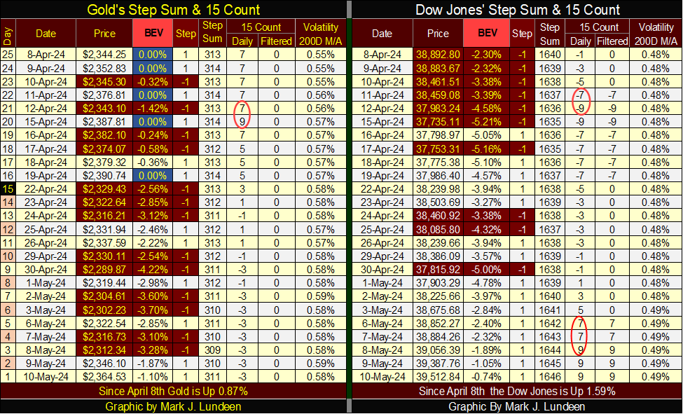
On the Dow Jones side of the Step Sum table was also interesting this week. The last all-time high (BEV Zero) for the Dow Jones occurred on March 28th, almost two months ago. Since then, the advance in the Dow Jones has been correcting. On April 12th, its 15-count had decreased to a -9, meaning the Dow Jones was now a very oversold market.
Markets don’t like being very oversold, so once again daily advances for the Dow Jones began overwhelming daily declines. To the point that by May 8th, the Dow Jones’ 15-count has now increased to a +9, making the Dow Jones now a very overbought market. This is very odd, seeing the Dow Jones’ 15-count rise from a -9 to a +9 in only eighteen NYSE trading sessions. It took a lot of buying to make that happen.
Looking at the Dow Jones BEV values, since April 8th, except for five daily closes, the Dow Jones has closed in scoring position, closing the week with a BEV of -0.74%. Meaning, the Dow Jones has only to advance by 295 points from this week’s close, to see another all-time high in this advance. That would be new all-time high #25, since December 13th when the Dow Jones made its first BEV Zero of this advance.
But will the Dow Jones see #25? Until the Dow Jones’ (and gold’s) BEV values close significantly below their BEV -5.0% line, and maybe even break below their BEV -10.0% lines, I must keep positive on these markets’ prospects of making new all-time highs. We will know more about all this by next week. Until then; I’ll remain a bull on the old monetary metals and the stock market.
What about bonds? Well, there are many trillions of dollars of bond trading out there in the debt markets. But I don’t see why I have to own any of them, so in May 2024, I’m passing on debt.
__
(Featured image by Anne Nygård via Unsplash)
DISCLAIMER: This article was written by a third party contributor and does not reflect the opinion of Born2Invest, its management, staff or its associates. Please review our disclaimer for more information.
This article may include forward-looking statements. These forward-looking statements generally are identified by the words “believe,” “project,” “estimate,” “become,” “plan,” “will,” and similar expressions. These forward-looking statements involve known and unknown risks as well as uncertainties, including those discussed in the following cautionary statements and elsewhere in this article and on this site. Although the Company may believe that its expectations are based on reasonable assumptions, the actual results that the Company may achieve may differ materially from any forward-looking statements, which reflect the opinions of the management of the Company only as of the date hereof. Additionally, please make sure to read these important disclosures.


Ali G Makes Surprise Wimbledon Appearance with Cannabis-Themed Satire
Sacha Baron Cohen revived his iconic Ali G character at Wimbledon’s men’s final, blending satire with British high society. Dressed...


Medelon Shooting Club Restores Hall After Successful Crowdfunding Campaign
The St. Engelbertus Shooting Club in Medelon raised €10,260 through crowdfunding to renovate its shooting hall after unexpected dry rot...


Biotech Revival: Big Pharma Bets on Innovation and Acquisitions
After a downturn, biotechnology is regaining attention as major pharmaceutical companies invest heavily in innovative platforms to offset patent losses...


PAASIFEJ: Results-Based Financing Driving Inclusive and Sustainable Rural Growth in Morocco
Morocco’s PAASIFEJ program, funded with 2.4 billion dirhams, supports smallholder farmers, women entrepreneurs, and youth across seven regions while promoting...


Ecobnb Turns Sustainable Tourism Into Measurable Impact
Ecobnb’s sustainable tourism platform generated significant environmental and social impact in 2025, avoiding 58,207 kg of CO₂ and adding 583...
 |
|
 |  |
 |
|
-

 Fintech2 weeks ago
Payhawk Reaches $100M ARR Milestone with AI-Driven Growth
-
 Africa4 hours ago
PAASIFEJ: Results-Based Financing Driving Inclusive and Sustainable Rural Growth in Morocco
-

 Impact Investing1 week ago
Italy’s Startup Ecosystem Shrinks but Becomes More Digital and Specialized
-

 Africa5 days ago
Senegal’s Debt Strategy: Choosing Between Restructuring and Financial Innovation