Featured
Why there are no financial asset futures markets before August 1971
The Dow Jones continues advancing towards new all-time highs.

At the close of the week, the Dow Jones found itself only 1.5 percent away from last October’s BEV Zero at 26,838.39; that’s only 413.4 points from making market history. Then in the Bear’s Eye View chart below, we see a lot of market history. Four decades of market history that has no parallel since 1885.
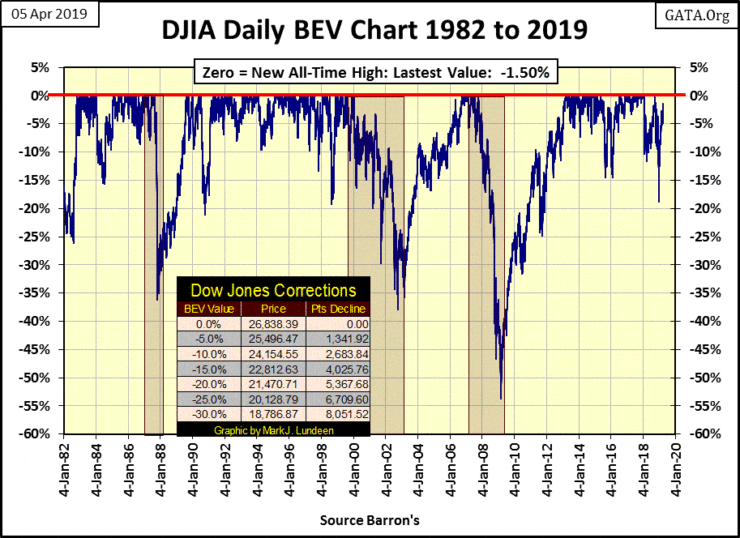
In January 1982, when the Dow Jones was trading between 840 & 880, there was one certainty in the stock market; when seeing the Dow Jones approach, then break above 1,000, it’s best to take your money and run before the market drops 20 percent to 40 percent.
Since 1966 the Dow Jones tried five times to break above, and stay above 1,000, failing on every attempt. So in 1982, at the very beginning of a bull market that took the Dow Jones above 26,000 in 2018, everyone knew the Dow Jones never would, never could break above, and stay above 1,000 for long.
Today there’s a new market certainty; market declines in the Dow Jones are always buying opportunities. It’s been that way since 1982. I can’t argue with success, so in the weeks to come we’ll all see the Dow Jones in new all-time high territory.
But I’ll tell you something about these rules; that the market can’t do that, or will always do this, at some point someone always changes them and they don’t ring a bell when they do it. But as of right now, few people would challenge the certainty that the stock market is in a perpetual bull market. The Frequency Distribution Table for the Dow Jones BEV Values below makes the bulls’ case.
But first look at the BEV chart above; since 1982 the Dow Jones saw a:
- 36 percent Bear Market in 1987
- 38 percent Bear Market in 2002
- 54 percent Bear Market in 2009
These are significant market declines. In fact, the 2007-2009 54 percent bear market was the second deepest percentage decline since 1885, exceeded only by the Great Depression crash.
But the bulls took all of them as mere speed bumps on the Dow Jones’ journey to infinity. And since 1982 (thirty-seven years) the Dow Jones has made 740 new all-time highs in the frequency table below. Those daily closings just short of a new all-time high, down to -4.99 percent from one (the -0.0001 percent row) amount to 3,925, or 41.77 percent of the daily closings in the 9,396-day sample seen in the table.
In the history of the Dow Jones (my proxy for the general market), going back to 1885, there has never been a similar four-decade long span that’s been this bullish.
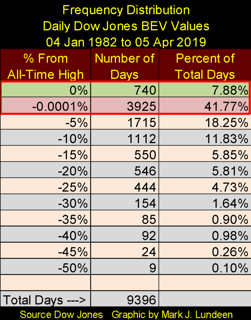
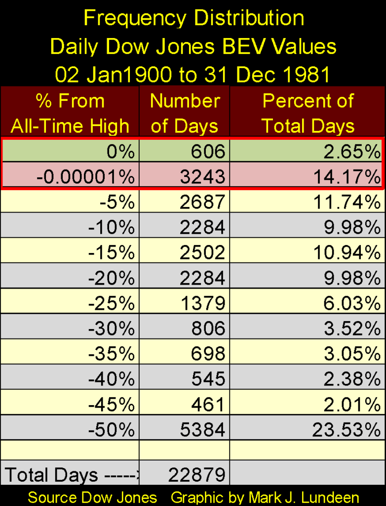
Compare the zero percent and -0.0001 percent rows above with the eighty-two years spanning from Jan 1900 to Dec 1982 below. Above (since 1982) the Dow Jones closed at or within five percent of a new all-time for 49.65 percent of NYSE trading sessions; below (from Jan 1900 to Dec 1981) only 16.82 percent of daily closings closed at or within five percent of a new all-time high.
Why the huge difference? American “monetary policy” freed from the restraints of the Bretton Wood’s $35-an-ounce gold peg has inflated a huge bubble in financial assets. If there is one market rule that no one is ever going to change, it’s that bubble valuations can’t stay inflated forever. I believe we can also include the rule of thumb that the higher a market flies, the farther it eventually must fall.
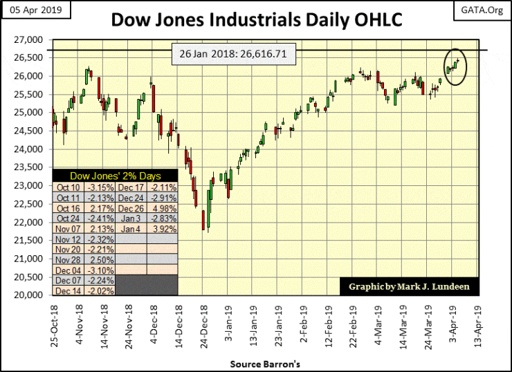
That on a day to come, the Dow Jones and the dollar it’s priced in will suffer a historic market decline is a sure thing. But looking at the Dow Jones’ daily bar chart below, with only 413 points separating today’s close from a new all-time high, the bulls closed the week in high spirits. A word of advice for the bulls out there: keep an eye out for those Dow Jones Days of Extreme Volatility!
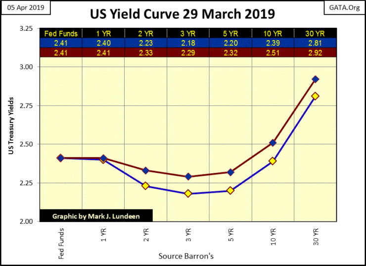
Last week’s yield inversion (Blue Plot Below) righted itself a bit this week (Red Plot). T-bond yields only out to 5yr were lower than Fed Funds, and the yield inversion itself has flattened. Is this the all clear signal that the economy isn’t going into a recession sometime in 2019? I wouldn’t count on it.
Gold in its BEV chart below continues looking attractive. But it’s been looking attractive since late January. The question on everybody’s mind is when will gold take out its BEV -27.5 percent ($1360) line? I’m not predicting anything here, but maybe gold will first have to break below the -32.5 percent line first before it moves any higher.
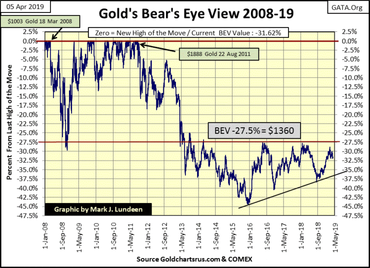
But then, after examining gold’s step sum chart below, I’d say gold is ready to do the right thing by the bulls and break above its -27.5 percent line in the not too distant future.
Look at the market action I’ve circled below. Since January gold (Blue Plot / Market Reality) has looked attractive as its step sum (Red Plot / Market Sentiment) has seen a sharp decline. That’s hard to do considering the selling pressure this drop in gold’s step sum represents.
One might say within the circle, we have a bit of a bull box being formed since January, and the thing about a bull box is that the bulls almost always win. In other words, at some point, bullish market reality is going to overpower declining market sentiment, resulting in strong advances in both plots below.
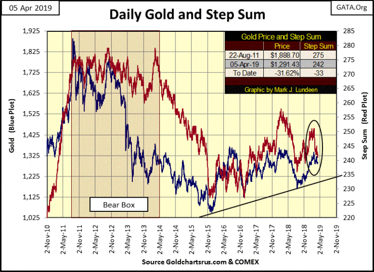
Sometimes these step-sum boxes fail, where above we’d see the blue gold price plot finally breaking down and head lower with its red step sum plot, as happened in early 2018 above. But as I’ve said, that’s not usually what happens with these step sum boxes.
Look at the bear box above from August 2011 to May 2014. For almost three years market sentiment (Red Plot / Step Sum) remained bullish as market reality (Blue Plot / Price of Gold) continued declining. This is why this box was called a bear box, because bearish market reality won. The bulls finally admitted defeat in April / May 2014, with the collapse in gold’s step sum.
In the coming weeks, it will be interesting seeing how this bull box in the gold market plays out, and I’m betting on the bulls.
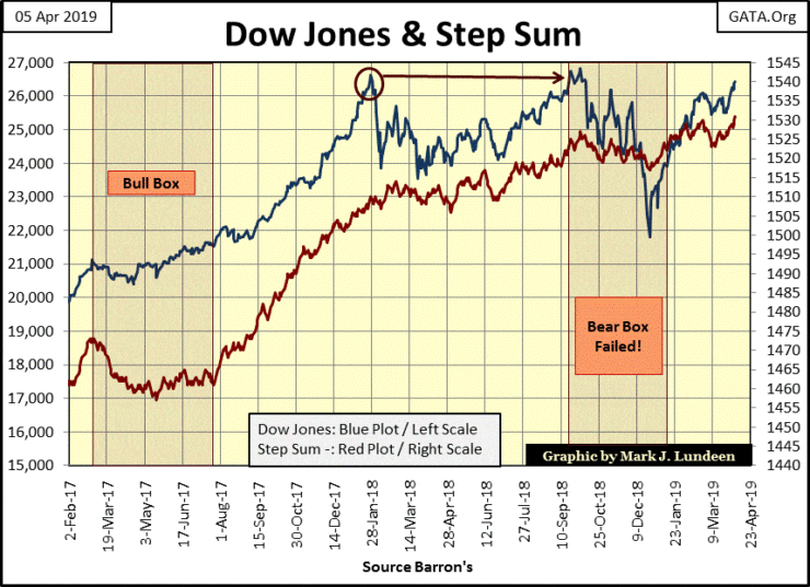
Here’s the Dow Jones step sum chart, where market reality and market sentiment are in synch and heading upward.
It wasn’t always that way. A bear box formed from the October 3rd top to the December 24th‘s low; an 18 percent decline in the valuation of the Dow Jones (Blue Plot) as market sentiment (Red Plot) refused to follow. But this bear box failed as it was the bullish red step sum plot that correctly saw the future by not collapsing. In early January, the Dow Jones reversed to the upside causing this bear box to fail, which is unusual, and darn bullish.
Looking at gold’s step sum table below, we see the pressure the bears have applied to the gold market. In gold’s 15 count not a positive count to be seen since March 4th, yet gold is up $2.97 in the past twenty-five trading days. That doesn’t seem like much of an advance, but with the gold market being dominated by declining days as it has for the past month, we’re lucky the price of gold isn’t down $50 or more.
Go back to gold’s step sum chart above and study the plots from August 2011 to December 2015, the three-year long bear box and the collapse in market sentiment in the last half of 2015. The bears really knocked the hell out of the bulls during those four years. Anyone who believed easy money could be made by buying gold in 2011 was long gone by December 2015!
That leaves the bulls’ camp with only true believers in the gold market today, people who the bears in the gold cartel are finding very difficult to push around.
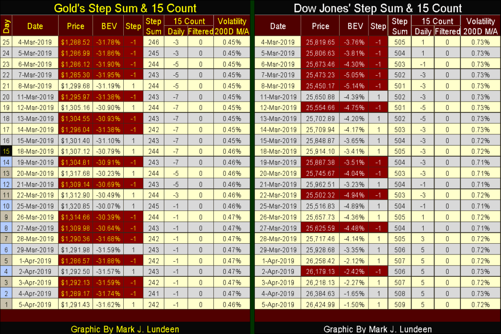
Bulls in the stock market are having it easy, as seen in the Dow Jones 15 count; six days in a row closing at +5. As we close the final gap between the Dow Jones of today and last October 3rd last all-time high, we may see the Dow’s 15 count rise up to a +7 or even a +9. How about a +11 or +13? That would scare me; as such extremes in market sentiment, usually, prove to be bearish market events.
Let’s focus on the futures market this week. Looking at my Commodity Trading Manual, published by the Chicago Board of Trade (CBOT), the Chicago Board of Trade is the world’s oldest and largest futures exchange. It began trading agricultural futures on 1848. The CBOT’s manual doesn’t give the dates, but if memory serves me right the CBOT didn’t begin offering contracts on Treasury and municipal bonds (and other financial assets) until the 1970s.
The Chicago Mercantile Exchange (CME) began trading butter, eggs and poultry in 1874. In 1972 the CME began trading foreign currencies and other financial assets, such as T-Debt and interest rates later in the decade.
Kansas City Board of Trade for over 100 years had been the predominant global marketplace for hard red winter wheat; in 1982 it began trading the Value-Line Stock Index contract.
The point for all this is before the 1970s the futures markets were primarily for agricultural commodities, tools farmers and food processors used to hedge the risks of weather for grains, or disease for cattle, chickens and hogs. What happened in the 1970s that created the need for markets trading futures contracts to hedge “risks” in financial assets?
If “economists” and “market experts” are honest, their answer to that question would be the US Treasury took the dollar off the Bretton Wood’s $35-an-ounce gold peg in August 1971. As a result, American “monetary authorities” created a quantum leap in market risks for foreign currencies, interest rates, and stock market volatility. Commodity exchanges were more than happy to create futures contracts to hedge these new and totally unnecessary risks.
Before August 1971, exchange rates between currencies were stable. Barron’s never bothered to publish exchange rates until their 01 September 1975 issue as they seldom changed. But after the termination of the $350an-ounce gold peg, it took only a few years before currencies began to vary widely, as seen in the Japanese Yen and UK Pound chart below.
For companies with global operations, calculating expenses for multi-year contracts, these swings in foreign exchange rates could transform a profitable project into a massive loss. Of course, having the ability to hedge exchange rate volatility at the CME was important.
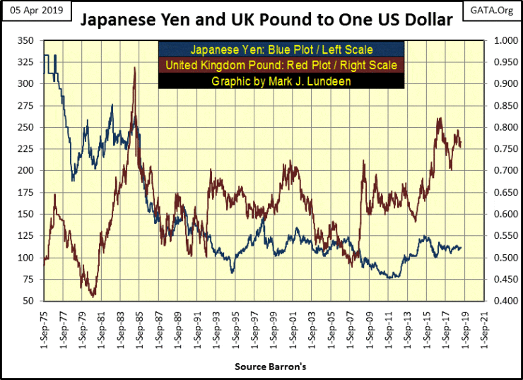
Barron’s editors protested the post-August 1971 “floating exchange rate regime,” as noted below in a 1979 editorial. Before reading the quote below, note what happened above to the yen and pound exchange rates from 1975 – 79. On 29 January 1979, Robert M Bleiberg, Barron’s Managing Editor said, “Extravagances and absurdities like floating exchange rates and Special Drawing Rights [IMF’s SDR] come and go. Gold endures. And what a lot it [gold and the dollar] has had to put up with. After insisting for decades — over-optimistically, in the event — that the dollar was as good as gold, the U.S. monetary authorities, by fiat, so to speak, desperately sought to prove that in global financial affairs it was better.
“First they closed the gold window thereby reneging on a generation of solemn pledges to the contrary. They threw their weight behind the Special Drawing Right, a bastard form of what John Exter has aptly termed the “I-Owe-You-Nothing.” Several years ago as hundreds cheered, gold was officially drummed out of the international monetary system and the IMF launched on a series of sales aimed at disposing of the barbarous relic forever. In turn, the Treasury beset by a plunging dollar has stepped up its own liquidation from 300,000 ounces per month to the current rate of 1.5 million,” he added.
In Barron’s Best & Intermediate Grade Bond Yields below we see how monetary inflation has impacted the bond market. From 1958 to 1971 bond yields were rising, with the continued issuance paper dollars into circulation in excess of the Treasury’s gold reserves (Table Below). It’s just a fact $35 on ounce gold peg can’t be maintained the increasingly more than thirty-five paper dollars are being issued in CinC per ounce of gold they have in storage.
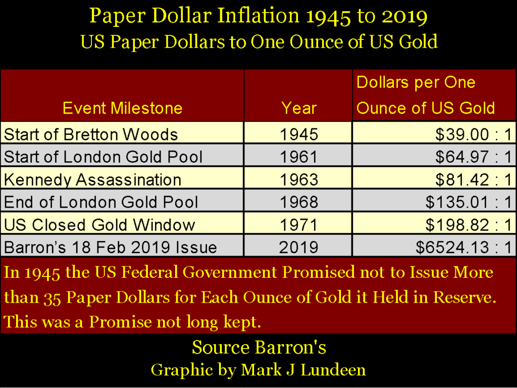
This created a run on the US gold reserves, beginning in 1957, which stopped in August 1971, only because the Treasury announced it had “temporarily suspended” the dollar’s $35 gold peg, a “temporary suspension” that continues to this day.
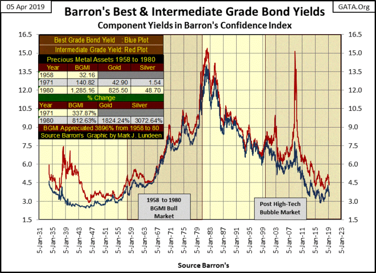
After August 1971, with the rate of dollar inflation increasing to ever greater levels, bond yields broke to double digits in September 1974; just three years later. Bond yields peaked in October 1981 and then began a decline that so far has lasted for the past four decades.
But considering the grotesque expansion in the American money supply since the 1930s, and current corporate balance sheets bloated with debt as never seen before, one has to wonder how bond yields today are at levels seen prior to World War II?
Note that volatility peaks seen below are bear-market bottoms, and the higher the volatility the deeper the bear market.
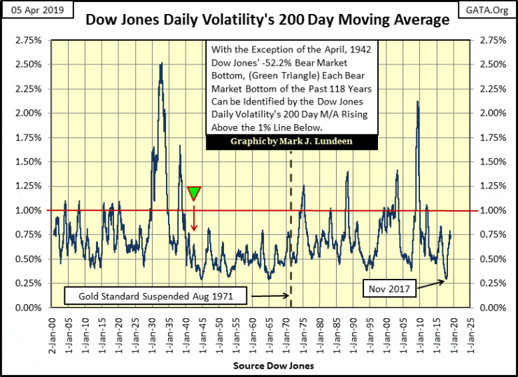
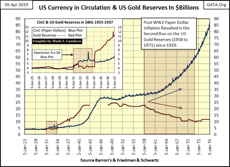
So far I’ve only shown how America’s perpetual inflation has impacted currency exchange rates, bond yields and daily volatility in the stock market. The chart below illustrates the currency in circulation (CinC / Blue Plot) inflation from $3.96 billion in 1925, to $86 billion in 1976 leaving the plot for US Gold Reserves (Red) far behind.
As of last week, CinC had expanded to $1,713 billion as US gold reserves since 1976 remain at about $11.04 billion.
Lastly I want to cover what I call “Base-Line Shifts” in commodity prices. A baseline shift occurs when former levels of resistance become levels of supports. Commodity prices always vary. But after a baseline shift occurs, prices begin to trade within a totally new range, as if playing the same tune on a piano, but up an octave on the keyboard.
The above description provides a good description of what these shifts look like in the charts below, but the factor that actually shifts these prices upward is the ever-rising ocean of “liquidity” the Federal Reserve has been “injecting” into the economy since 1957.
The first baseline shift for gold and silver happened in the early 1970s, to see why we only have to review the blue CinC plot in the chart above.
Gold and silver’s second baseline shift happened during the 2007-09 subprime mortgage crisis. The most likely reason for this shift in gold and silver prices is the inflation injected into the financial markets during the subprime mortgage bubble, began leaking into the price of gold and silver when the mortgage and stock markets began to deflate in 2008-09.
Since 2009, gold has kept much of the gains it has seen, while silver now rests at the highs of 1983, but shows no sign of breaking down any further.
Next are the charts for soybeans and corn. Like gold and silver above, we see two baseline shifts one in the early 1970s and again during the subprime mortgage bear market.
Lastly are the charts for hogs and cattle. The baseline shifts for pork and beef aren’t as clearly defined as those we see above but are there nonetheless.
These charts are important as they show the “liquidity flowing” from the Federal Reserve is once again flowing into commodity prices. That plus commodity prices can be sensitive to shocks in the financial markets, such as the termination of the Bretton Wood’s $35-an-ounce gold peg in August 1971 and the deflationary market meltdown during the subprime mortgage bear market.
During the next big market meltdown, it might not only be the gold and silver markets benefiting from flight capital fleeing deflation in the stock, bond and housing markets. Americans may wake up one day seeing their assets deflating as their commodity based consumer costs inflate in a shocking fashion.
(Featured image by allstars via Shutterstock)
—
DISCLAIMER: This article expresses my own ideas and opinions. Any information I have shared are from sources that I believe to be reliable and accurate. I did not receive any financial compensation for writing this post, nor do I own any shares in any company I’ve mentioned. I encourage any reader to do their own diligent research first before making any investment decisions.


The TopRanked.io Weekly Digest: What’s Hot in Affiliate Marketing [NiftyPM Affiliate Program Review]
As any marketer (affiliate or not) can tell you, the old "it's AI-powered" line has been a real champ when...


Fes-Meknes Drives Investment Growth with Diversified Sectors and Industrial Expansion
In 2025, Morocco’s Fes-Meknes region approved 444 projects worth 17.85 billion dirhams, creating over 18,500 jobs. Investment focused on energy,...


Peru’s Crowdfunding Sector Shrinks Amid License Revocation
Peru’s securities regulator revoked Inversiones Neurona SAC’s crowdfunding license at the company’s request, following compliance checks. Previously suspended for failing...


EU Biotechnology Law Aims to Boost Innovation and Cut Trial Delays
EU Commissioner Olivér Várhelyi proposed a Biotechnology Law to boost competitiveness, cut clinical trial times, and reduce fragmentation. Measures include...

BlackRock’s $94M Crypto Move Signals Rising Institutional Momentum
BlackRock transferred nearly $94 million in Bitcoin and Ethereum to Coinbase, signaling possible trades and rising institutional interest. Ethereum surged...
 |
|
 |  |
 |
|
-

 Impact Investing1 week ago
Net-Zero Asset Owner Alliance Introduces Transition Targets in Updated Climate Protocol
-

 Impact Investing5 days ago
ESG Funds Still Hold BP Despite Shift Back to Fossil Fuels
-

 Cannabis2 weeks ago
CBD and CBG Show Promise in Reducing Fatty Liver and Improving Metabolism
-

 Impact Investing2 days ago
ITAS Mutua Reports Strong 2025 Growth and Sustainability Progress