Featured
All-time highs more likely than recession despite unfavorable economic conditions
An interesting article spurred us to think more about today’s economic conditions vs. the conditions that led to the collapse in 1929 and the subsequent Great Depression and war.

Things like massive credit expansion low-interest rates are themes common to both periods. Combining our own thoughts with those of MacLeod we have put together a comparison of the two periods. It also fits very well with our thoughts on a 90-year cycle of wars, depressions, and social unrest. In many ways, the conditions today may be worse than they were 90 years ago. Naturally what is needed is the trigger. And sitting at the top of that is the massive amount of debt that has been accumulated. Never in history has so much debt been accumulated in such a short period of time.
Nonetheless, the markets may be poised for another run to all-time highs. It seems counterintuitive but it isn’t. All that is needed is the thought that things are well and they will get all the troublesome areas under control. However, it is all like a house of cards waiting for the wrong flick and the whole thing comes tumbling down.
Our recession spread is still not signaling a recession any time soon. The FOMC meets in March and it is now widely expected that the Fed will not hike. But watch the language. As long as the economic numbers appear to be good the Fed’s language may hint once again at rate hikes. Gold wouldn’t like that and we muse that gold may have made a temporary top. But the pullback should be the final one before an assault on $1,400 takes place. And gold has continued to be the top performer since the markets topped last September/October. That is the subject of our Chart of the Week.
A 90-year cycle of depressions and wars
In our report of January 28, 2019, we examined the possible existence of a 90-year cycle of depressions and wars. What struck us in looking at those collapses was the common themes that kept recurring. Monetary and credit expansion, currency wars, trade wars, speculation—whether in the stock market, land, or something else (a something else this time was Bitcoin and the cryptocurrencies)—are themes that pop up again and again. All of this was usually played out against the backdrop of wars and growing social unrest. The end result was a stock market collapse, sharply rising unemployment, wars, banking and business failures, bankruptcies, and, in some instances, droughts and famine that led to wars.
The causes of the financial collapse of 2008 were never fully addressed. The answer given was bail-outs on an unprecedented scale, ultra-low interest rates including sub-zero interest rates (Japan and the EU), massive amounts of liquidity provided through quantitative easing (QE), and the biggest credit expansion in history. None of these were solutions. They were merely huge bandaids to cover up and gloss over the rot that had set into the global financial system.
We read an interesting article from Alasdair MacLeod, entitled Currencies Threatened By a Credit Crisis, where he examined factors leading up to the financial and systemic collapse of the 1930s and how these same factors are at work today. If MacLeod is right (along with others who are giving similar warnings), then we could be faced with a coming collapse that no one is prepared for. The current rebound in the stock markets is being accompanied by a high degree of complacency that the worst of the slump that sparked the October/December 2018 collapse is over.
What we set out below is our attempt to compare the two periods leading up to, in the first case, the Great Depression and in the second case, leading up to where we are now:
The “Roaring Twenties” bull market got its start out of the short but sharp recession/depression of 1920–1921.
It was a deflationary depression complicated by the return of millions of veterans from WW1, the devastation caused by the Spanish flu that resulted in the death of tens of millions globally, and the failure of economies to adjust properly from a wartime economy to a peacetime economy. From the top in November 1919 to the bottom in August 1921, the Dow Jones Industrials (DJI) fell 46.6%.
The current bull market got its start out of the most serious financial crisis since the Great Depression.
It started with the crisis in the subprime mortgage market and developed into a full-blown international banking crisis, culminating in the collapse of Lehman Brothers in September 2008. Massive bailouts of financial institutions, accompanied by monetary policies, were geared to prevent a possible systemic collapse of the global financial system. From the top in October 2007 to the bottom in March 2009, the DJI fell 53.8%.
The “Roaring Twenties” bull market was one of the greatest speculative bull markets in history.
From the bottom in August 1921 to the top in September 1929, the DJI gained a spectacular 497%. Along the way, there were only a couple of shallow corrections, most notably the one from March to October 1923 when the DJI fell about 19%. The second one lasted briefly from October 1925 to March 1926 and the DJI fell only about 10%.
The “Roaring Twenties” was a period of unprecedented economic prosperity, although not everyone benefitted as society transitioned from a rural one to an urban one. Rural farming and coal mining stagnated during this period. Factories converted from wartime production to consumer production, setting off the age of consumerism. Benefitting industries were in autos, radio, cinema—especially the proliferation of movies culminating in sound movies—aviation, and early television. There were advances in medicine and it was an age of building, particularly of new infrastructure to accommodate the growing consumer society. There was much more. The bull market of the 1920s lasted eight years.
What the bull market of 2009–2018 lost in gains it gained in longevity.
The bull market that got underway in March 2009 and that may have made its final top in October 2018 lasted nine and a half years and rose 312%. Along the way there only two generally shallow corrections. The first occurred with the EU/Greek debt crisis of 2011 and saw the DJI lose 16.8% while the second drop occurred in 2015/2016 with the end of QE. The DJI fell 14.5%. While the bull market 2009–2018 was a broad market advance, it was dominated essentially by five companies known as the FAANGs—Facebook, Apple, Amazon, Netflix, Google (Alphabet).
The period has been dominated by technological advances, particularly with mobile phones and a shift to streaming which is challenging mainstream television and movies. Globalization has expanded on a huge scale. Robotics has also become a big thing. There were many dislocations as a result of globalization and technological advances which are causing social unrest. As a result of all the technological advances and globalization, incomes have mostly stagnated but the upper 20% of society has done very well with the upper 1% doing exceptionally well.
The yield on the U.S. 10-year Treasury note peaked in April 1920 at 5.67%.
Over the next several years the yield fell sharply, bottoming in March 1926 at 3.17%. The Fed began to tighten and, after a pause following the stock market crash, the tightening continued, topping in January 1932 at 4.26%. The 1920s was a period of massive credit expansion, although the main beneficiaries were commercial and industrial business as consumer loans had not yet taken hold.
The yield on the U.S. 10-year Treasury note peaked in June 2007 at 5.32%.
Following the financial crisis of 2008, the Fed pushed the key Fed rate effectively to zero. The 10-year bottomed in yield in July 2012 at 1.38%. The Fed began to raise interest rates in December 2015 and only recently announced a pause in interest rate hikes. The period 2009–2018 has seen an unprecedented credit expansion for both commercial and industrial business as well as for the consumer, and especially for government. Both the consumer and the government were largely absent from the 1920s credit expansion. Note that during the 1930s there were numerous sovereign defaults, most notably in Latin America.
On October 30, 1929, Congress passed the Smoot-Hawley Tariff Act.
The markets seemed to have gotten wind of it in advance and a massive stock market sell-off was underway. By the time the markets bottomed in November 1929, they had lost 47.9% from the stock market top seen in early September 1929. It was an unprecedented collapse and it was one of the most brutal destruction of personal wealth ever seen. A rebound rally did get underway that carried through until the end of April 1930 where it saw the DJI regain 48%. Smoot Hawley became law in June 1930. By that time the biggest stock market collapse in history was underway. It didn’t bottom until July 1932, and by that time the DJI was down 86%.
In January 2018, President Trump launched his trade war with China, slapping tariffs on washing machines and solar panels.
Soon he was expanding with tariffs on steel and aluminum against the EU, Mexico, and Canada and further tariffs on China. China retaliated with tariffs against U.S. soybeans and others. Others retaliated as well. The stock markets reacted negatively and by mid-February, the DJI was down just over 12%. As it turned out that was just about it. The market initially rebounded, falling again into early April 2018, but, overall, the DJI was only down just over 12%.
A rebound got underway into September/October 2018 as the DJI gained just over 15%, setting small new all-time highs. Trade war spats broke out again in September 2018, but this time the market reaction was more negative. By December 2018 the DJI had fallen over 19%. Soothing words from the Fed and indications that China and the U.S. would work out their trade disputes sparked a sharp rally in stocks that is still ongoing. So far, the DJI has regained almost 20%. While how it unfolds is different, it was trading disputes that triggered the stock market sell-offs in both 1929 and 2018.
During the 1920s, productivity grew but wage growth was actually suppressed as the power of unions fell.
By the end of the 1920s, 1% of the population controlled roughly 30% of the wealth—an unprecedented period of wealth concentration. The Great Depression and war leveled things out and wealth concentration was on a downward track until about 1978 when it started to rise again.
As with the 1920s, the past twenty years have seen wage growth suppressed and, again, the power of the unions has fallen.
But this time the wealth concentration is even higher than it was during the 1920s with 1% of the population controlling 47% of the wealth. Many live paycheck-to-paycheck and have little in the way of financial assets to draw on in the event of a job loss.
Does history rhyme or merely echo? A 90-year cycle is generational. The current generation forgets or dismisses what happened 90 years ago as that was then. It’s different now. Or is it? It is always the cry of “this time it’s different.” Except that it never is. The 1920s and 1930s saw the rise of fascist groups that ultimately seized power in Italy, Germany, Spain, and Japan. While they failed in Great Britain, France, and the U.S., they were present nonetheless. Today we see the rise of xenophobic alt-right groups, riots, and clashes on the streets of the United Kingdom, France, Spain, eastern Europe, and the U.S. Alt-right groups have seized power in a few countries such as Hungary, Poland, and more recently Brazil—and, as some would say, the U.S.
The Great Powers continued to circle each other even as WW1 was long over and Germany lost. But the tensions remained—Great Britain, France, Germany, Japan. Today, the Cold War is over but the Great Powers circle each other: U.S., Russia, and China. Ninety years ago, the circling culminated in WW2. Today the Doomsday Clock has been set to two minutes to midnight. A reminder of Albert Einstein’s quote: “I know not with what weapons World War III will be fought, but World War IV will be fought with sticks and stones.”
The world is at a potentially dangerous crossroads. Except it is not being reflected in the stock markets. The world is laden with debt ($250 trillion) and debt collapse has been at the heart of every major financial collapse and depression. Social order is under strain in the West. The Great Powers circle each other. And then there is the threat of the potentially devastating effects of climate change. We’ve already seen the devastation and cost of super-hurricanes, massive wildfires, earthquakes, monster and freak tornadoes, droughts, extreme flooding, rising seas, extreme weather including freezing cold and killer in winter, followed by killer heat in the summer. The expectation is there is more to come.
We are already seeing the effects in the financial sector as the banks pull in their horns, tightening credit conditions. Governments are strapped and constrained by their own debt constraints and, depending on the government in power, massive cuts could be coming to the public sector that could result in the loss of thousands of jobs. Trade wars are no panacea to the problems of the world. History has shown time and time again that trade wars are devastating to the global economy and often end in real wars. The introduction now of tariffs and trade wars as the economy is topping could eventually prove lethal to the economy and to the stock market.
Central banks are ill-prepared for another crisis on the scale of 2008. No wonder legislation was passed that in the event of another crisis there would not be bail-outs—instead, it is bail-ins, meaning it is the depositor and who are at risk. Central banks are diverging as both the Russian and Chinese central banks (CBR and PBOC) are leading the way in accumulating gold as their main reserve currency. China is the world’s largest producer of gold.
When the next crisis is upon us—and the question is when, not if—governments will likely, once again, have to resort to massive injections of liquidity. That, in turn, would lead to a massive devaluation in the value of their fiat currencies. They could apply severe austerity; however, that is assured to result in the loss of thousands of jobs. There is a way out but they are ill-prepared or unwilling to consider once again backing their currencies with gold. Gold, however, is currently grossly undervalued for what would be required to act as a stabilizer, as happened in the 1930s when Franklin Roosevelt devalued the U.S. dollar and hiked the price of gold to $35/ounce from$20.67/ounce. Today, that would be equivalent to hiking the gold price to around $2,300. The reality is it would need to be considerably higher to meet the requirements of what took place in 1934.
As we noted at the outset, we are ill-prepared for what may come. Many will outright dismiss the idea that it could even happen. What is needed is a trigger, a “Lehman Brothers” moment. High levels of complacency existed before all past collapses. We harken back again to “this time it’s different.” The only thing that is really different is that it is a new generation, as the previous generation who lived through the last collapse is gone. An ounce of prevention is worth a pound of cure.
Markets and trends
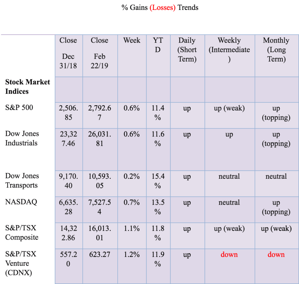
*New highs/lows refer to new 52-week highs/lows. © David Chapman
© David Chapman
The winning stock market continues. The S&P 500 was up another 0.6% this past week and is now up 11.4% on the year. Everyone else continues their winning ways as well. The Dow Jones Industrials (DJI) gained 0.6% and is up 11.6% in 2019, the Dow Jones Transportations (DJT) was up 0.2% this past week and is up 15.5% on the year, and the NASDAQ gained 0.7% and is now up 13.5% on the year. Elsewhere, the TSX Composite jumped 1.1% while the TSX Venture Exchange (CDNX) regained its winning ways, rising 1.2% this past week. Overseas, the London FTSE 100 was one of the few that slipped this past week, losing 0.9%. But not the Paris CAC 40 as it gained 1.2% and the recession-bitten German DAX was up 3.3%. The Tokyo Nikkei Dow (TKN) gained 1.5% while China’s Shanghai Index (SSEC) was up 3.1%.
The stock market continued to rise, buoyed by the possibility of a deal between the U.S. and China on the trade front and by the thought that the Fed might pause its interest rate hikes. The March FOMC is March 19–20 and the Fed is widely expected to leave interest rates unchanged. As well, U.S. economic numbers continue to be good—couple that with earnings that are still good and stock markets are propelled higher.
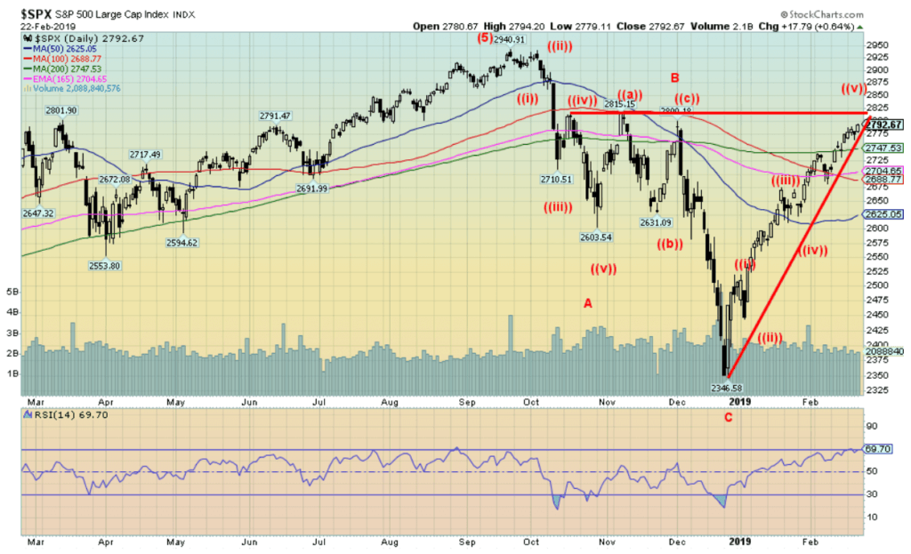
The question is: how much higher? We have mused about a run for the DJI to 30,000. It is possible, but we are not going to guarantee it. The S&P 500 would rise to around 3,250. Currently, there is major resistance at 2,825 and we note the RSI is quite high over 70, a level that is normally associated with pullbacks. But pullbacks can be shallow and a firm breakout above 2,825 could suggest new highs ahead and trigger a buying panic. We note pretty good support down to 2,700. Only a breakdown under 2,600 would turn the market more negative. The market remains in good shape and higher prices are indicated even if there was a pullback. And as long as the positives remain that way.
© David Chapman
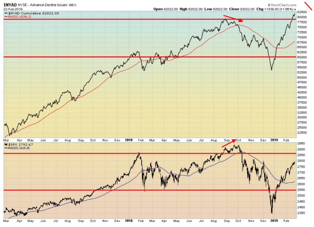
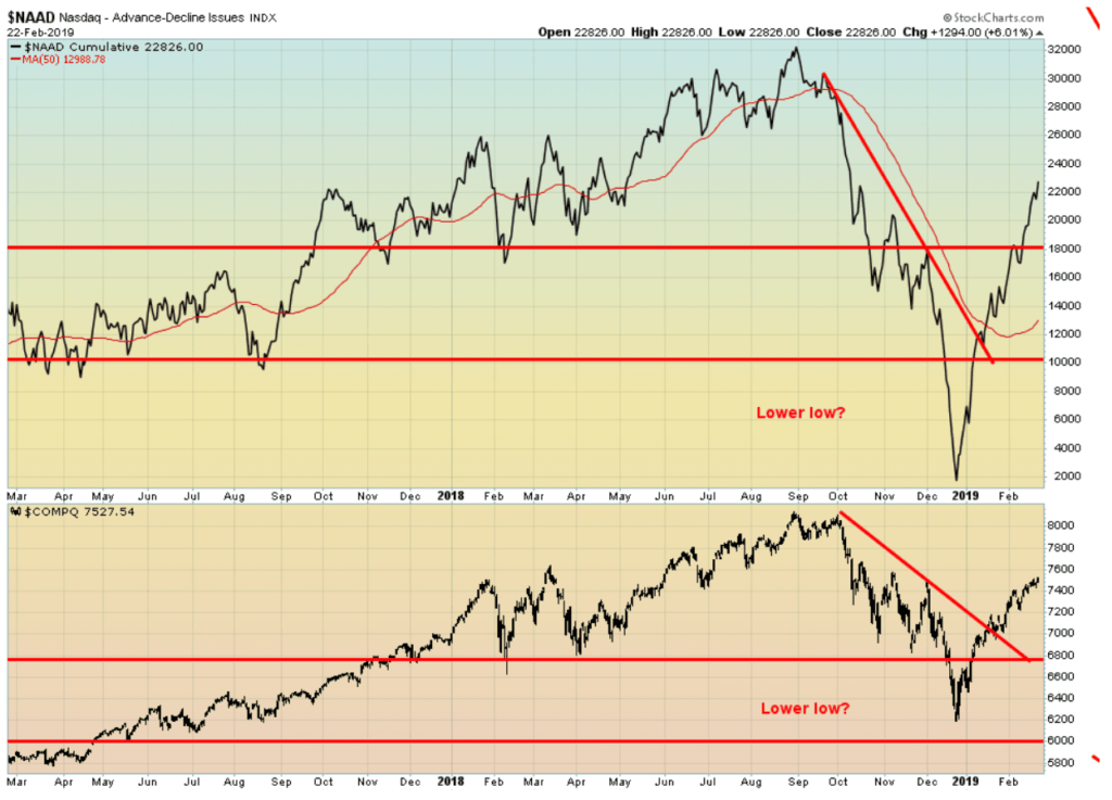
The NYSE advance/decline continues to soar into record territory even as the S&P 500 is itself not making new highs. Is this a divergence? At the top, in September/October 2018 the S&P 500 made new highs but the advance/decline did not. Now it is the opposite as the advance/decline line makes new highs but is not confirmed by the S&P 500. It may be that new highs for the S&P 500 are to come. The advance/decline line appears to be leading the way and that suggests that new highs lie ahead.
© David Chapman
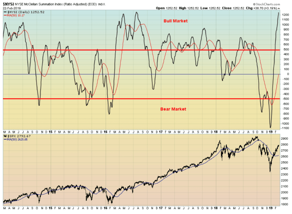
The McClellan Summation Index has soared high into bullish territory. At 1,252, it is as high as it has been at any time over the past five years. It doesn’t mean the market is going to pull back from here, but it at least suggests some waning momentum. Note that for the rise from November 2016 to the top in January 2018 the McClellan Summation Index never hit the same highs as it did in the initial runup from the February 2016 low. Yet the market made its best gains during that period. Still, the current high level does suggest that a pullback may be in order before the market resumes its upward trend.
© David Chapman
The NYSE advance/decline line may be making new all-time highs, but the NASDAQ advance/decline line is nowhere near all-time high levels. The NASDAQ has had a good runup from December and the advance/decline is higher, but generally, it is lagging. Maybe the NASDAQ is not as bullish as it looks. The NASDAQ advance/decline line is also diverging with the NYSE advance/decline line.
© David Chapman
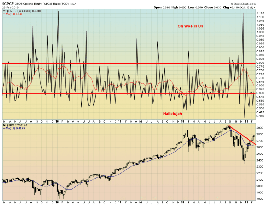
The CBOE options put/call ratio has now pulled itself out of the bullish territory and is more neutral. This may be a sign that the current rally is beginning to wane. A pullback that takes the put/call ratio deep into “Oh woe is us” territory would be a signal that the market is now too bearish. But we are nowhere near those levels.
© David Chapman
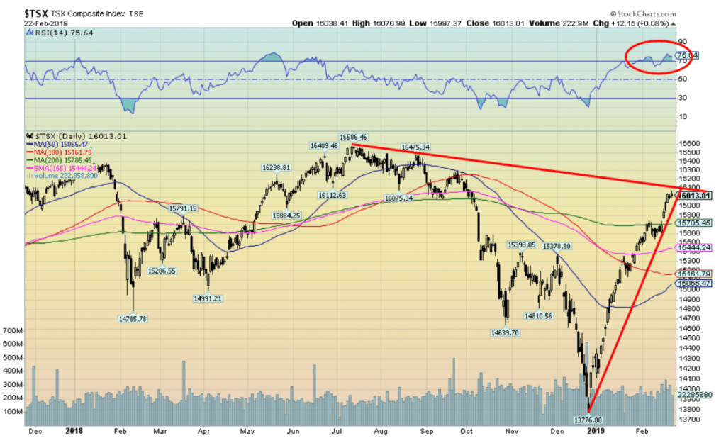
The TSX Composite has experienced quite a sharp rise from the December 2018 low. The gain thus far is just over 16%. Still, the TSX remains down about 3.5% from its all-time high seen in July 2018. It is now approaching downtrend line resistance. The RSI has been almost consistently over 70 for the past few weeks. The RSI can stay over 70 for some time as we saw last year, but eventually, it succumbs and a downdraft takes place—usually a swift one. We note strength in Income Trusts, Consumer Staples, Financials, Golds, Mining, Health Care, Real Estate, Information Technology, Telecommunications, and Utilities. We’d be cautious with the TSX at current levels as it appears poised for a pullback. Any pullback towards 15,000 would likely be a positive buying opportunity. Under 15,000 and all bets are off.
© David Chapman
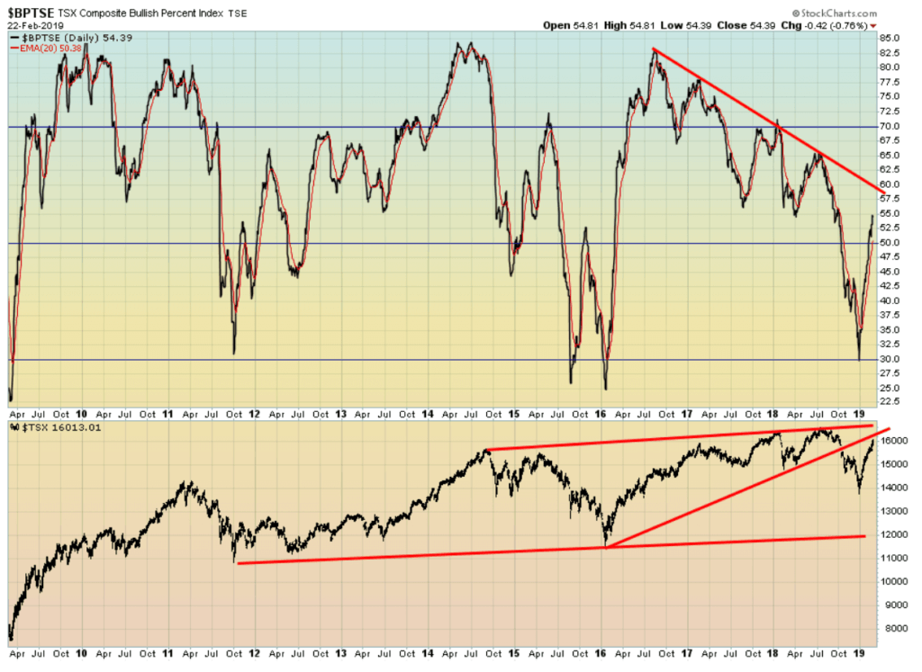
The TSX Bullish Percent Index is fairly neutral, despite the sharp rise in the index and given it is only about 3.5% from its all-time highs. Our expectations would have been that this index would be higher now. Except that it appears poised to make another lower high which is negative for the TSX going forward. Another sign that one should now start to be cautious about this recent rise.
© David Chapman
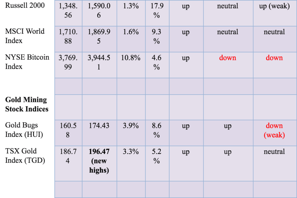
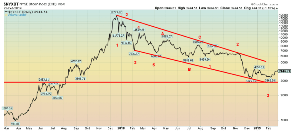
The bulls seem to be back in force for Bitcoin. Bitcoin put in one of best weeks in some time, jumping 10.8% this past week to over $3,900. Bitcoin is now incredibly up on the year with a gain of 4.6%. Major resistance is seen up to $5,000. We would be surprised if Bitcoin got that high. The Quadriga scandal continues to linger in the background. Regulators continue to pounce. But, on the good news side, Bitcoin’s daily trend has turned up for the first time in months.
A move above $4,100 could suggest a run to $5,000. We are not sure what is sparking the bullishness, but we do note that Samsung is planning for a private crypto storage key in its new Galaxy S10. There remains, for whatever reason, well over 2,000 different cryptos listed at Coin Market Cap and there are still a dozen cryptos led by Bitcoin with a market cap of over $1 billion. Overall, the crypto market cap sits at around $140 billion. At the peak in December 2017 Bitcoin’s market cap was at least $325 billion. Now it is at $72 billion a decline of 78%.
© David Chapman
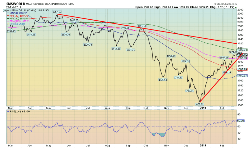
The MSCI World Index (excludes the U.S.) has, like other indices, been on a tear since the December bottom. Like other indices, the MSCI topped in January 2018 and since then has been in a steady downtrend. The downtrend accelerated from September to December 2018. In all, the MSCI fell almost 23% from its January 2018 top. The current rebound has seen the MSCI rise 11.6% which is sub-par for most of the other indices. The MSCI is now running into the 200-day MA currently near 1,890. Further downtrend resistance can be seen up to 1,925. Our expectation is that the MSCI could see rough going from here. A breakdown reversal, however, would not occur until the MSCI breaks back under 1,800.
© David Chapman
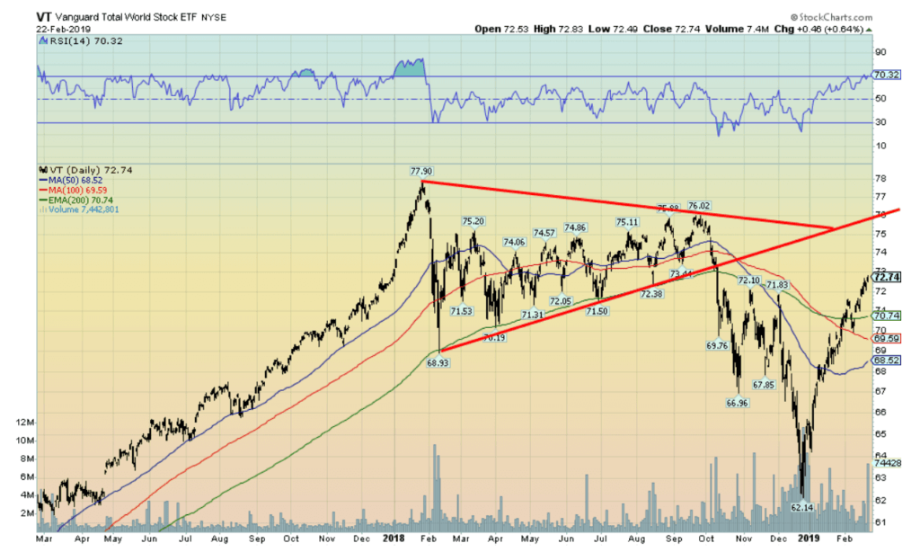
We thought we’d show the Vanguard Total World Stock ETF (VT-NYSE) as a proxy for the world stocks. Unlike the MSCI World Index, VT does contain a number of major U.S. stocks. Note that, after topping in January 2018, VT failed to make new highs into September/October as did the U.S. indices. The plunge into December was rather nasty and VT was down 20.2% from its January 2018 high. Since then VT is up 17% and a move over $74.25 could signal a rush to new highs for VT. Note the RSI is over 70, suggesting that a pause, at least, could occur here.
© David Chapman
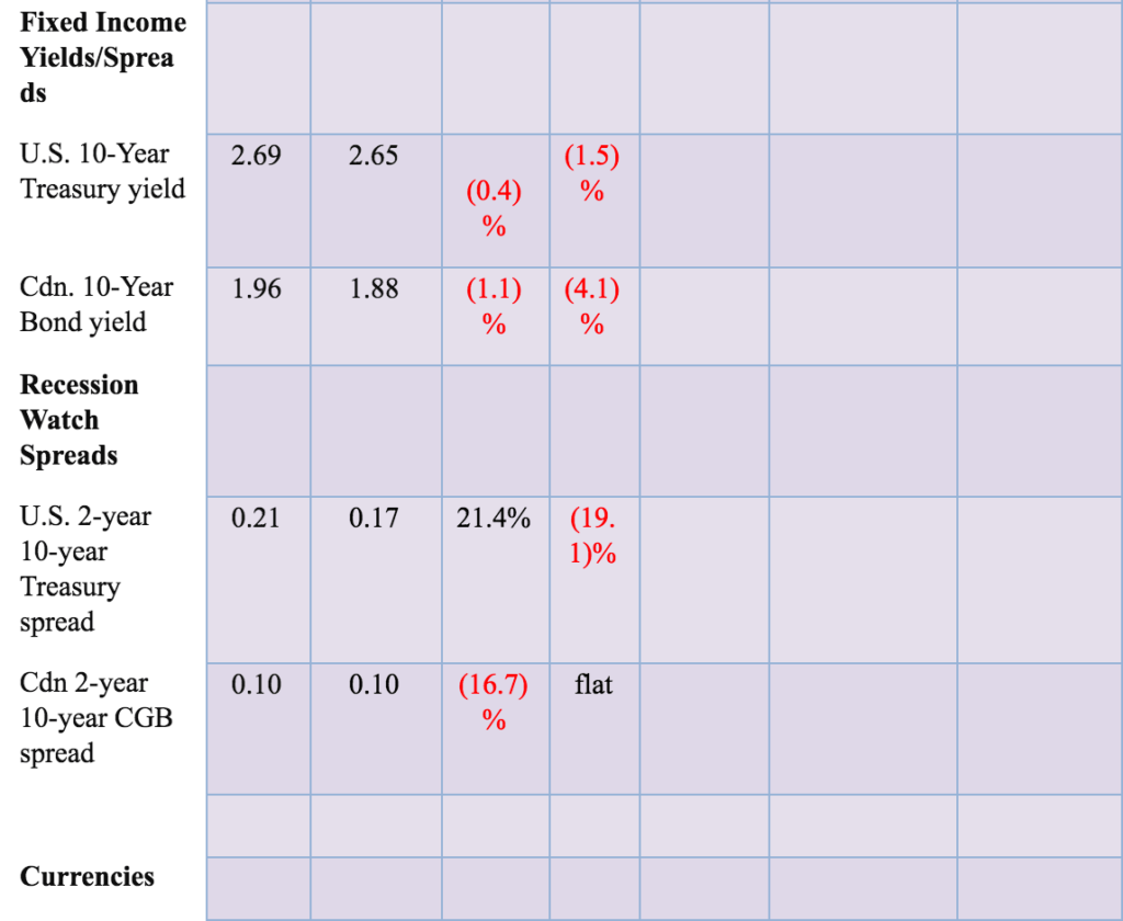
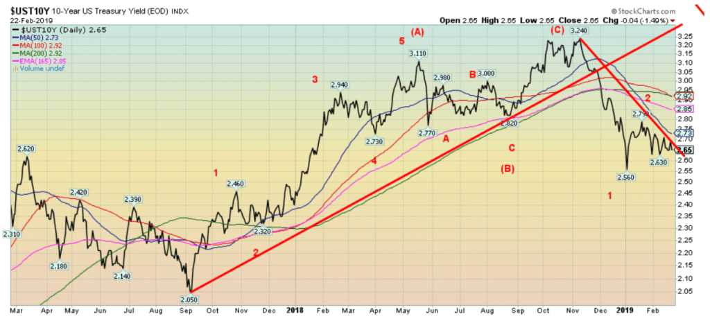
There is little to report here on the 10-year U.S. Treasury note. The yield slipped to 2.65% from 2.66% this past week. The yield appears to be trying to work its way lower, but unless there is firm evidence of a slowing U.S. economy then the odds of lower yields begin to dissipate. Any hint this month at the FOMC March 19–20 that the Fed might hike again could actually send the yield on the 10-year higher. So far, 2.56% remains the recent low. At best, we describe the current situation as neutral and the yield could go either way.
Recession watch spread
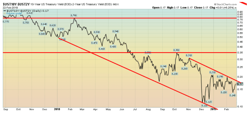
© David Chapman
The U.S. 10-year Treasury note 2-year Treasury note spread rose to 17 bp this past week. The spread continues to hint that the U.S. is, at least for the moment, nowhere near a recession. However, the trend does remain down as long as it stays under 18 bp. A break under 14 bp would signal lower levels ahead. Note the 2–10 spread generally bottomed with the stock market in December. The high over the past year of 78 bp generally coincided with the stock market top of January 2018.
© David Chapman
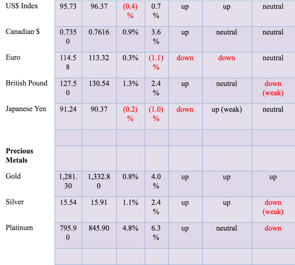
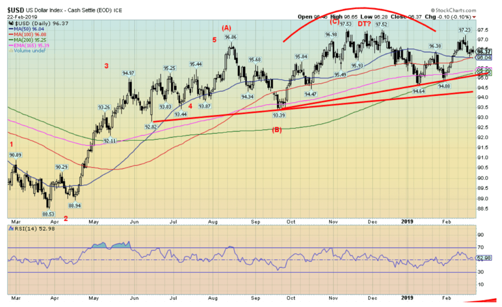
The US$ Index continues to trace out what appears to be a large topping pattern. It is one that has now stretched to almost one year. The US$ Index slipped 0.4% this past week. The euro gained 0.3% while the Brexit-challenged pound sterling was up 1.3%. The Japanese yen slipped a small 0.2% but the Canadian$ jumped 0.9%. The US$ continues to maintain its dominance, largely because the others are not doing well. Germany and Italy are sliding into recession as are Japan and the U.K.
A no-deal Brexit is not a good deal for the U.K., nor for that matter the EU. Japan is also sliding into recession; hence, the weakness in the yen. The Canadian$ is being buoyed by higher oil prices. The FOMC meets March 19–20 and, while it is widely expected that the Fed will leave rates unchanged, any hint that they might hike again could push the US$ higher. The breakdown point remains near 95 and especially under 94.50.
© David Chapman
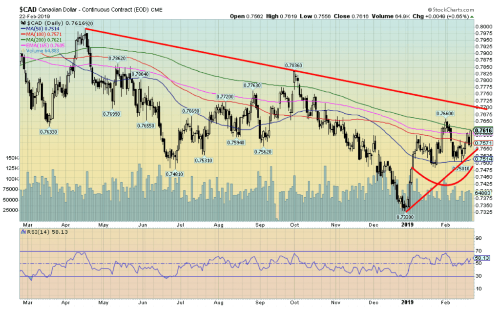
The Canadian$ has been buoyed by higher oil prices (no, it doesn’t care that much about the SNC Lavalin problem). The Canadian$ was up 0.9% this past week. A rising trendline from the 0.7330 low is now visible and our expectations are that we should next push towards the downtrend line near 0.77. A breakout over 0.77 would be quite positive and suggest higher levels to come for the Canadian$, probably up to 0.80/0.82. Only a break now below 0.75 could negate this positive scenario.
© David Chapman
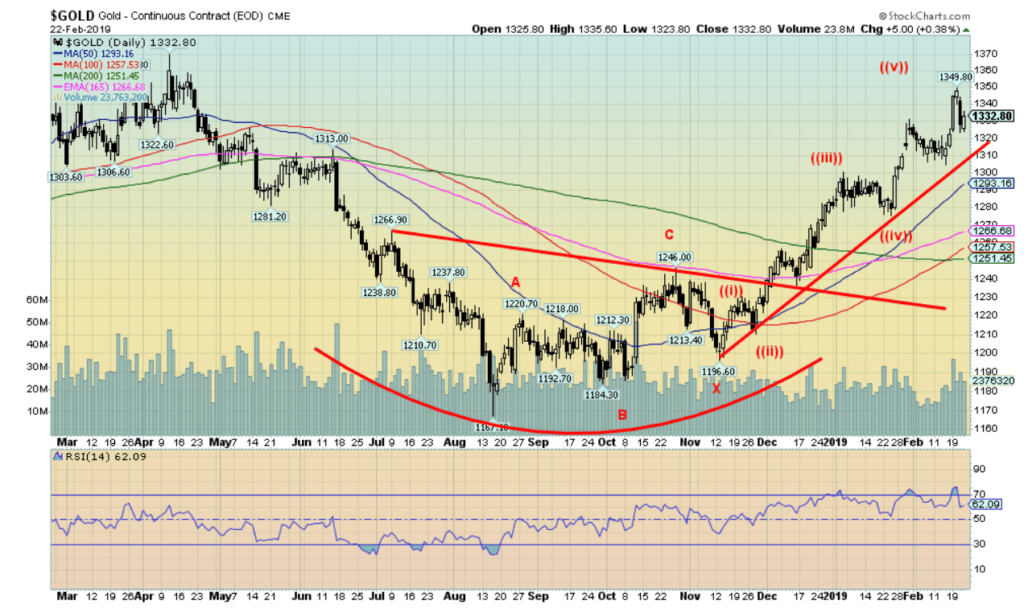
Gold pushed into our major resistance zone this past week with a high at $1,349.80. There is still some room for gold to make a higher high, but major resistance is now clear up to around $1,365. We have noted the major resistance that defines this zone with highs of $1,377, $1,362, and $1,369 respectively in 2016, 2017, and 2018. Our expectations are that the first approach to this major resistance zone will be met with failure, but ultimately this time we should push through to $1,400. We note that gold’s RSI hit over 70 this past week, a zone often associated with tops.
While we cannot rule out one more high here the question is how far will gold pull back. Currently, good support zones could be seen at $1,300/$1,310, but below that level, the next good support zone would be $1,280/$1,285 and below that $1,255/$1,260. Only below 1237 would we become concerned, and below $1,210 new lows would be possible. We doubt we will fall that far. Our best call is that gold could, yes, pull back to the $1,255/$1,260 zone.
PDAC is in a week and that annual gold miner’s fest often signals a top. As well, we have the March FOMC on March 19–20 and any sign that the Fed is thinking of tightening again could spook gold to the downside. A reminder that economic numbers in the U.S. continue to be positive. The woes of Germany and Japan have not translated themselves into the U.S. As well, continued signs of the U.S. and China talking nicely will also help push gold lower. Again, we can’t rule out some small new highs up to $1,365, but our suspicion is we have hit at least a temporary high.
© David Chapman
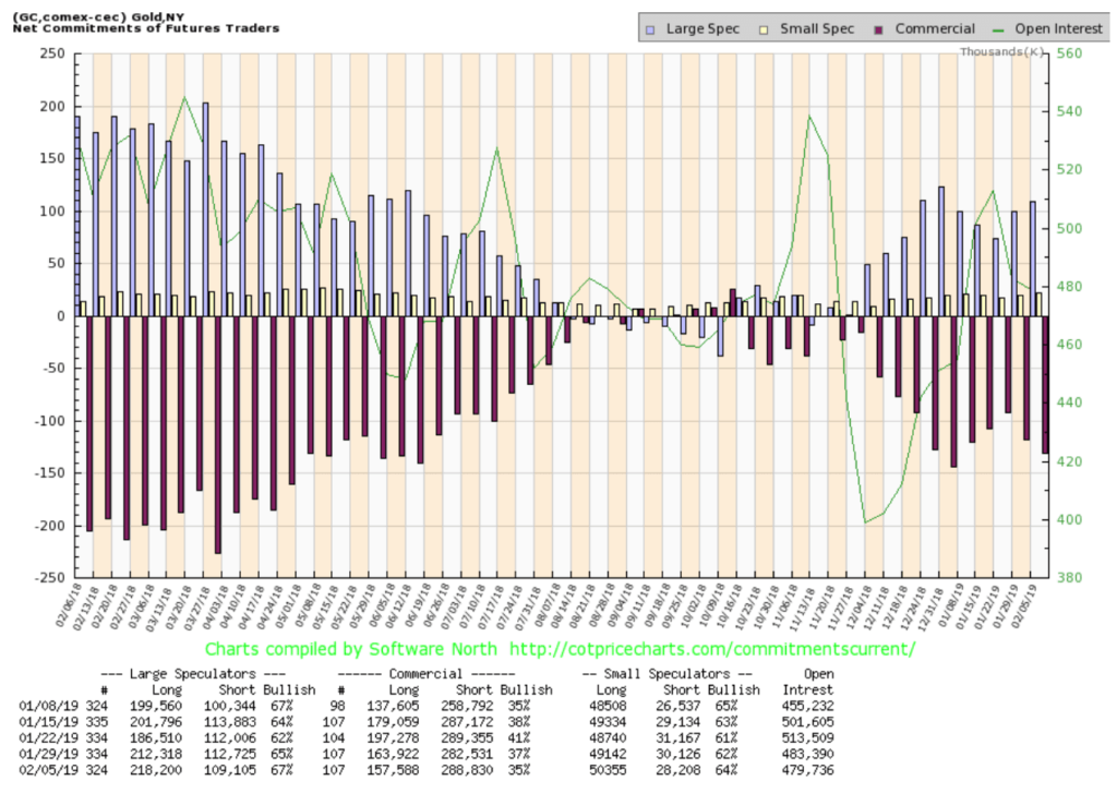
The commercial COT for gold slipped this past week to 35% from 37%. Note that the CFTC continues to play some catch-up on the data. This data is good only to February 5, 2019. If we were up-to-date, it would be good until February 19. Still, it is indicative since the trend has switched to the downside again. Long open interest fell about 6,000 contracts while short open interest rose about 6,000 contracts. The large speculators’ COT (hedge funds, managed futures, etc.) rose to 67% from 65%. This report isn’t overly bearish or bullish. To become more bearish, we would want to see consistent readings under 30% for gold. But the trend here is down. So, another sign that suggests a pullback.
© David Chapman
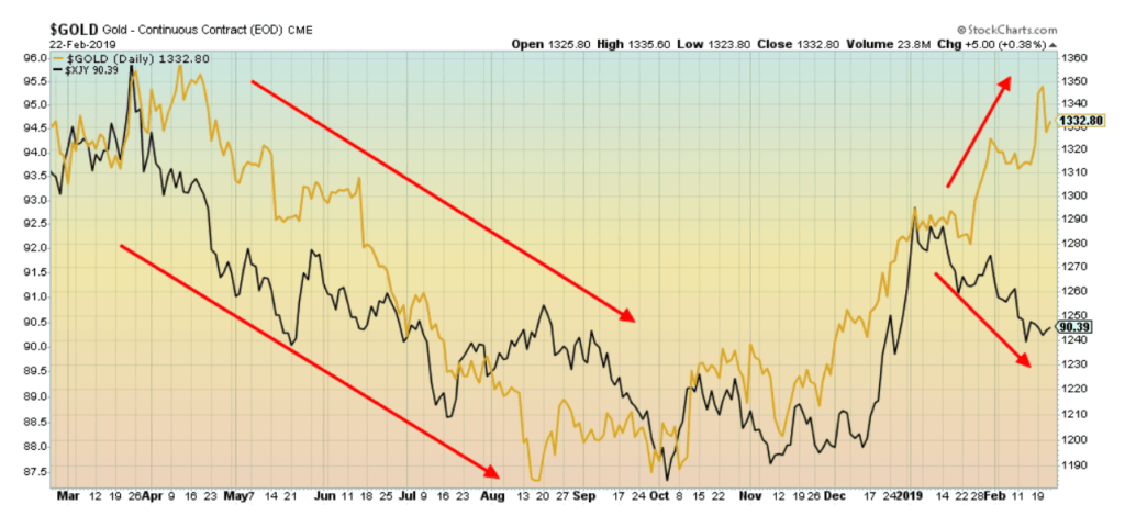
Gold and the Japanese yen tend to follow each other. So, when they don’t, it could signal that one of them is out of line. Here are gold and yen over the past year. Note that both followed each other down to lows in October 2018. They also started to rise again, but in early 2019 the yen changed course. Over the past few weeks the yen has been falling while gold kept on rising. One of them is out of line. We suspect that gold will soon join yen and slide.
© David Chapman
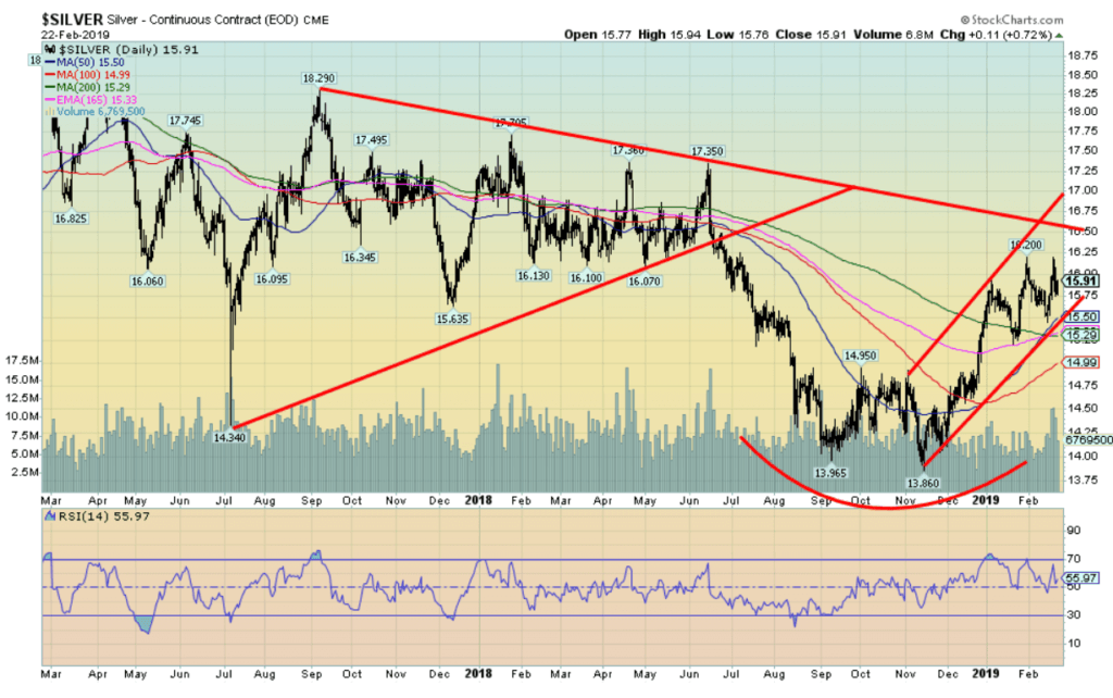
Silver prices hit a high this past week of $16.20, equalling the high seen on January 31, 2019. The failure to take that high out set up a potential negative divergence between gold and silver as gold did see new highs. In the end, silver managed to close up on the week by 1.1% but that was 1.8% off the high of the week. We like to see both gold and silver making new highs together, thus confirming each other. The failure this week of silver to confirm suggests to us a possible pullback. A potential pullback zone would be down to $15.50 and the rising trendline from the November low. If that broke, then silver could test back towards $15.
New highs above $16.20 would suggest that other factors are at play. We are somewhat disappointed that silver failed to meet our requirements of rising to at least $16.50. Silver has been sluggish on this rise and is nowhere near the highs of 2017 or even 2018. Gold, on the other hand, this past week is testing into those key areas of the highs of 2016–2018. Silver has been making progressively lower highs each year since spiking to $21.23 in 2016.
Still, we believe silver made an important low in November 2018 at $13.86. That low came ten years after the October 2008 low. Silver has exhibited in the past cycles of nine-year lows (range 7–11 years). It is interesting that the first low came in December 2015 which was seven years after the 2008 low and now the most recent one in November. It may also have been a multi-year double bottom for silver. Since we are still in the time frame for major cycle lows in silver, we cannot rule out completely another low in 2019. Silver regaining above $16.50 would signal that the low is in.
© David Chapman
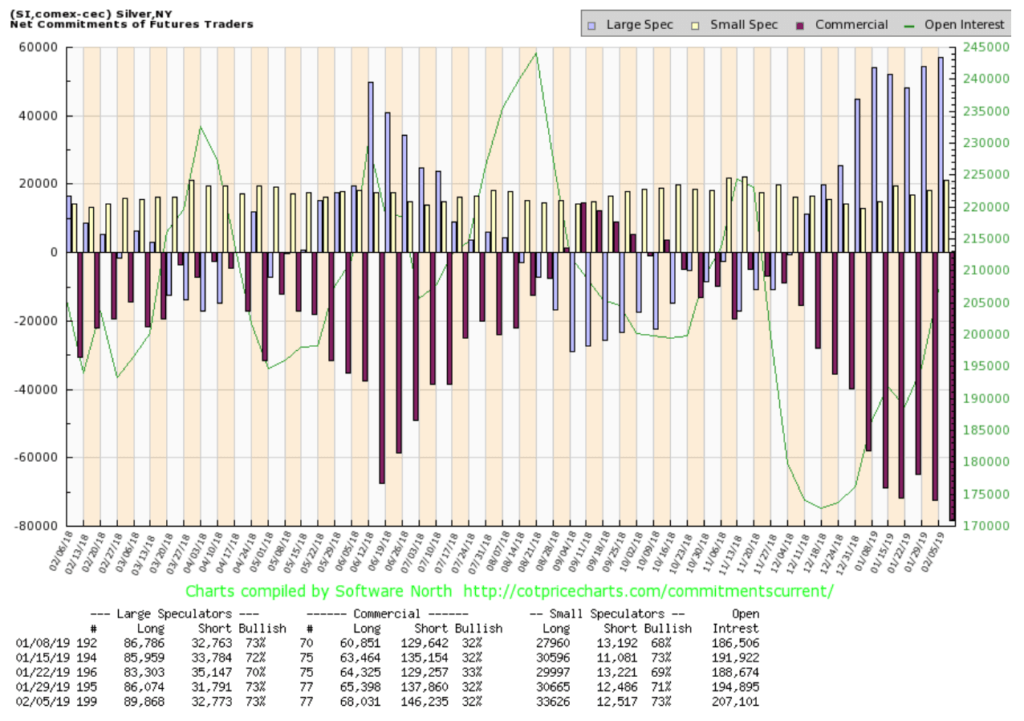
The most recent silver commercial COT was unchanged this past week at 32%. There was, however, a jump of about 3,000 contracts in long open interest and jump in short open interest of about 9,000 contracts. The large speculators’ COT was also largely unchanged at 73%. The COT is not outright bearish, but it is suggesting caution.
© David Chapman
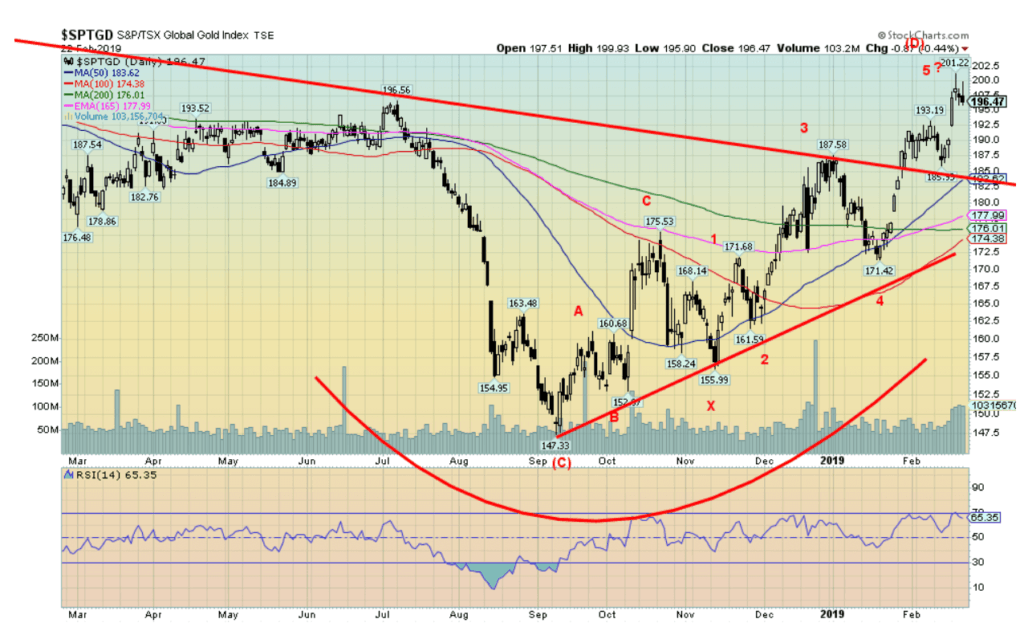
Have the gold stocks topped here? This past week the TSX Gold Index (TGD) spiked to a high of 201.22, then reversed and closed that day virtually unchanged. The TGD then closed 2.4% off the high, although it held on to its weekly gains with a gain of 3.3%. The Gold Bugs Index (HUI) acted similarly but still managed a 3.9% gain on the week. It is interesting to note that the TGD made new 52-week highs but the HUI did not—a possible negative divergence. It is also possible that the TGD has completed five waves up from the November low.
The pattern from the September low continues to appear corrective. The TGD also hit our target of 200. Our suspicion is we could now see a pullback. Key areas of support would be at 188.50, 180.60, and 174.25. Only below 168 would we become concerned that a steeper drop was in play. New highs would at least temporarily hold off any thoughts of a corrective pullback. The Gold Miners Bullish Percent Index (BPGDM) is at a pretty neutral 44%, so in theory, there is considerable room for gold stocks to go higher.
It is noteworthy that in 2016 the BPGDM was at similar levels. It wasn’t until July 2016 that the BPGDM hit 100%, an unheard-of level that signaled the top. Ultimately the TGD should go much higher. But a pause now would allow the gold stocks to regroup. Ironically, the announcement that Barrick Gold was proposing to take over Newmont may have inadvertently signaled the current top. Bullish events like this often trigger a top. We noted a number of individual stocks hit new highs this past week and then reversed back down again.
© David Chapman
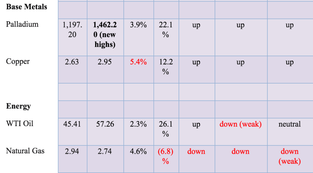
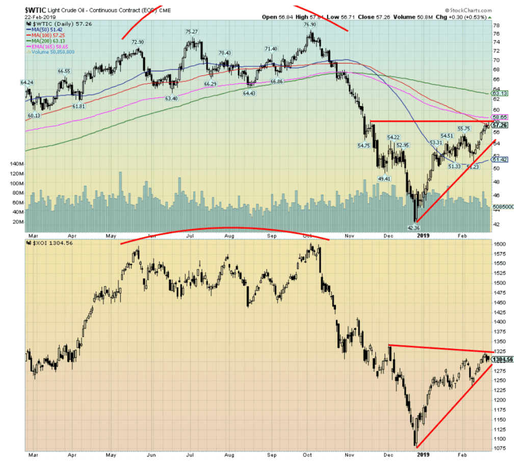
Oil prices continued their recent rise, jumping 2.3% this past week. WTI oil is now up 26.1% on the year. It is once again the big winner on the year. A reminder that oil prices started out 2018 on a tear but ended the year down. OPEC supply cuts, hope on the China/US trade front, and continued tensions in Venezuela all helped push prices higher this past week. WTI oil is now running into a zone of resistance that stretches from current levels near $57 and up to $63/$64. The 50% retracement level of the entire drop from $76.90 in October to the low of $42.36 in December is at $59.63.
WTI oil needs to regain above $69 to suggest that new highs above $76.90 are possible. Dampeners on oil prices would be surging production, particularly in the U.S. Despite the enthusiasm in the crude market it did not translate to the energy stocks as the NYSE Oil & Gas Index (XOI) was actually off small less than 0.1% on the week while the TSX Energy Index (TEN) gained a small 0.6%. It is possible that is a divergence and we could be poised for a pullback. Given that both the energy indices and WTI oil are at potential key MA resistance levels, a pullback might be quite logical.
Chart of the week
© David Chapman
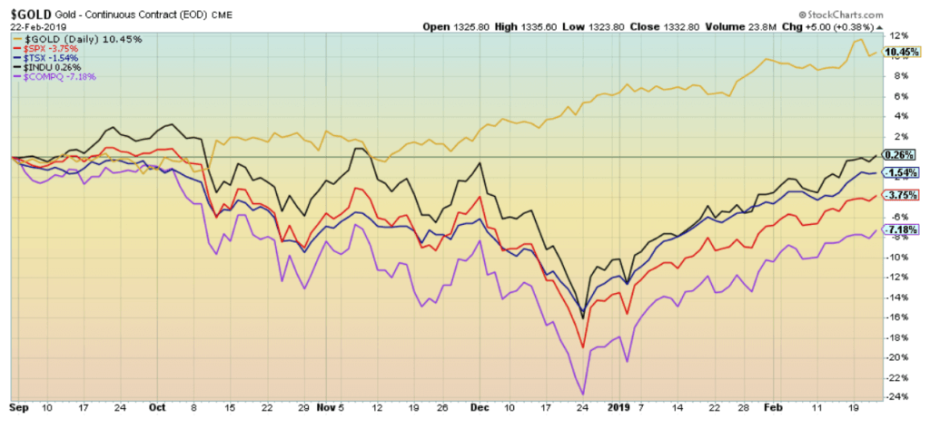
Our Chart of the Week is a reminder that, since the collapse in the market got underway in September, gold has continued to outperform by a wide margin. The indices have recovered nicely but with the exception of the DJI all remain down since September 1, 2018. The DJI has gained a small 0.3% while gold is up 10.5%. The NASDAQ has been the weakest performer as it remains down 7.2% since September.
(Featured image by DepositPhotos)
—
DISCLAIMER: David Chapman is not a registered advisory service and is not an exempt market dealer (EMD). We do not and cannot give individualized market advice. The information in this article is intended only for informational and educational purposes. It should not be considered a solicitation of an offer or sale of any security. The reader assumes all risk when trading in securities and David Chapman advises consulting a licensed professional financial advisor before proceeding with any trade or idea presented in this article. We share our ideas and opinions for informational and educational purposes only and expect the reader to perform due diligence before considering a position in any security. That includes consulting with your own licensed professional financial advisor.


Tilray Acquires HelloMD to Expand Medical Cannabis Digital Platform
Tilray Brands acquired HelloMD, a digital healthcare and medical cannabis platform, pending court approval on June 29, 2026. The deal...


Spanish Crowdfunding Market Reaches Record €761.6M in 2025, Driven by Real Estate and Crowdlending Growth
Spanish crowdfunding market reaches record €761.6M in 2025, driven by strong real estate dominance and rapid crowdlending growth, while donations...


Swedish fintech Lysa is preparing to enter the European ETF market
Swedish fintech Lysa is entering the European ETF market, registering its first ETF and expanding beyond its robo-advisor model. Managing...


Bitcoin Stalls Near $60K as Strategy Moves, ETFs Outflow, and EU MiCA Rules Take Effect
Bitcoin hovers near $60,000 with ETF outflows, while Strategy boosts reserves, sells BTC, and raises dividends to reassure investors. Ethereum...


Morocco’s Growth Holds at 4.6% as Agriculture Offsets Economic Pressures
Morocco’s economy grew 4.6% in Q1 2026, driven by a strong agricultural rebound offsetting declines in industry. Services expanded moderately...
 |
|
 |  |
 |
|
-

 Crypto1 week ago
RLUSD Launch in Japan Amid XRP Price Decline and Uncertain Outlook
-

 Crypto2 weeks ago
Crypto Market Stays Stable as Bitcoin and Ethereum See Mild Declines
-
 Business4 days ago
Dow Jones Near Highs Signals Strength Until Volatility Returns
-

 Africa1 week ago
Moroccan Bond Market Shows Mixed Signals as Primary Eases and Secondary Pressures Persist