Crypto
Bitcoin tumbles over 80 percent; Oil prices fall to new 52-week lows
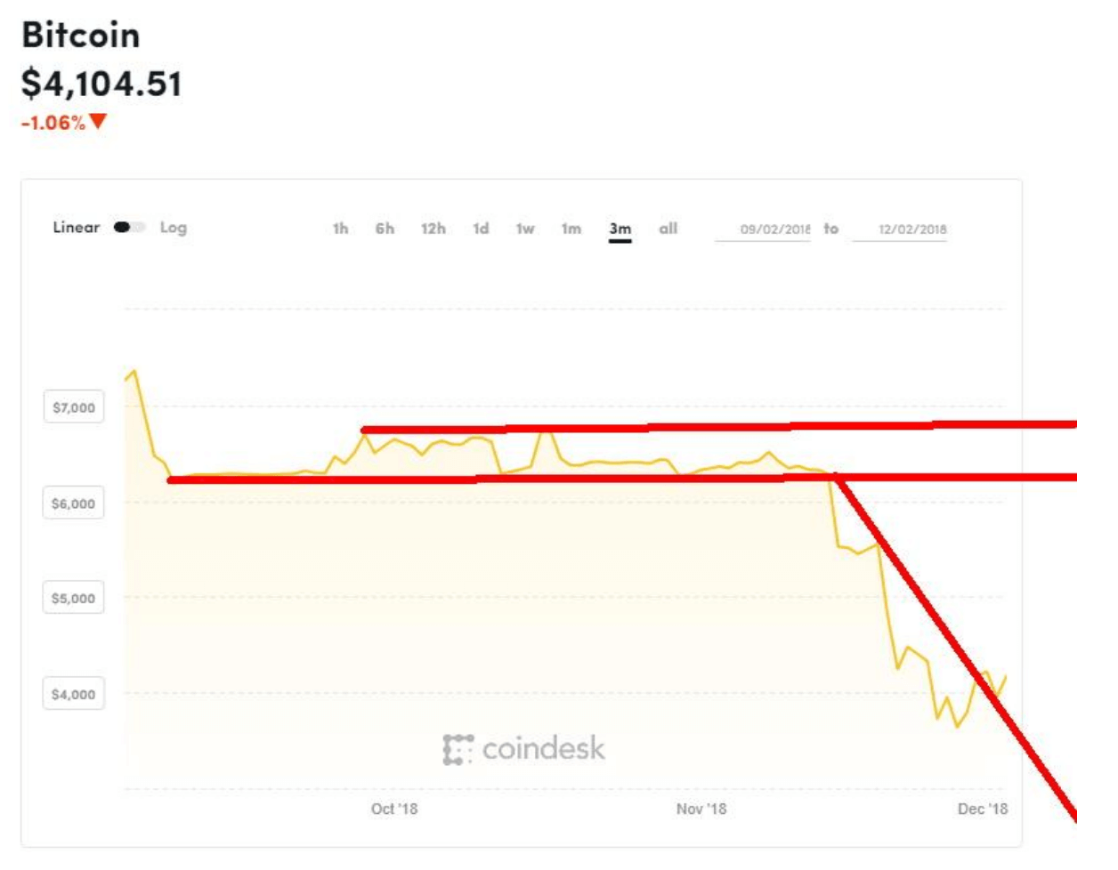
The Bitcoin bubble has exploded, with the cryptocurrency falling below $4,000. On the other hand, the energy sector thinks that oil has bottomed.

“Buy when you are scared to death; sell when you are tickled to death.”—market maxim (Cabot Market Letter, April 12, 2001)
“There’s nothing wrong with cash. It gives you time to think.”—Robert Prechter, Jr. (Elliott Wave theorist)
“If investing is entertaining, if you are having fun, you’re probably not making any money. Good investment is boring.”—George Soros (financier, philanthropist, political activist, author, philosopher, 1930–)
It is like night follows day, and like the four seasons spring, summer, fall and winter follow each other. It doesn’t matter where you start; the order stays the same. The economy and the markets also follow an order. For the economy, the order is prosperity phase, recession phase, contraction phase, and recovery phase; or, if you wish, boom, slow down, bust, and recovery. Some also call it expansion, peak, contraction, and trough. Nonetheless, the order remains roughly the same. The stock market also follows a path generally as early bull, middle bull, late bull, peak or top, early bear, middle bear, late bear, and trough. Unlike night and day and the seasons, the economy and the stock market do not follow a set period. And therein lies the difficulty of predicting the economy and the stock market.
Below is an interesting depiction of the economy and the stock market:
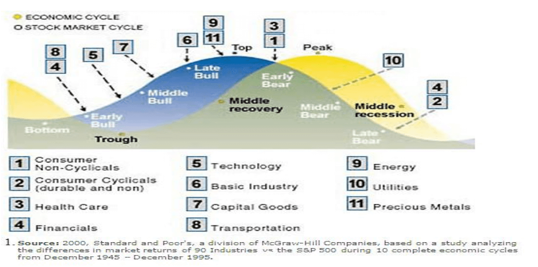
© David Chapman
The chart also includes which sectors are likely to do well during each phase of the stock market and the economy. Again, the timing is not easily predictable nor is the behavior of each of the sectors. No wonder when one writes about the stock market and the economy the disclaimers at the bottom are essential. Past performance is no guarantee of future results. However, if we tell you winter will start on December 21 and end on March 20, we can guarantee it. We can’t guarantee whether it will snow or not.
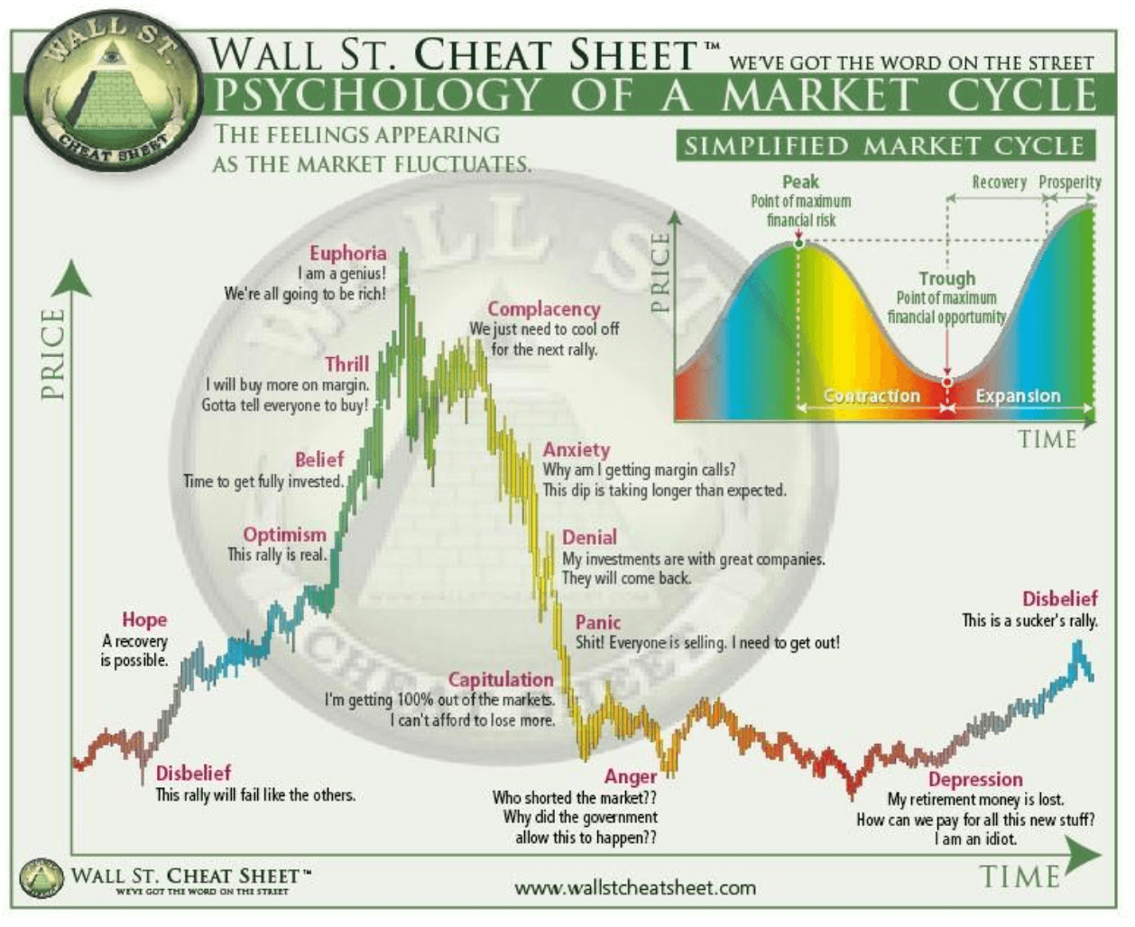
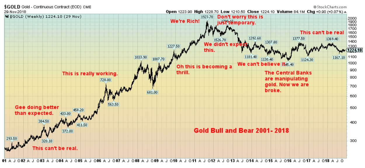
Below is one of my favorites. A psychology chart of a market cycle. We have witnessed a few markets that fit this profile perfectly. One of the first comparable charts we saw was the gold market of 1976–1985. That covered the disbelief to the euphoria through to anger and depression. The gold bull market lasted from 1976 to 1980. The gold bear lasted from 1980 to 2001, although along the way there were a few good rallies.
© David Chapman
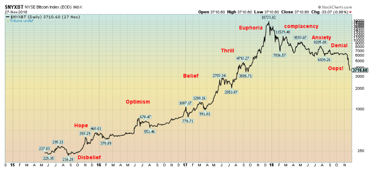
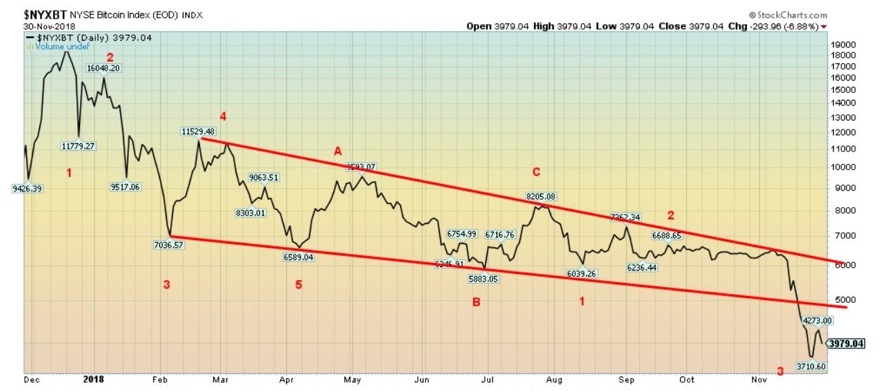
The recent Bitcoin market is a textbook example of the above chart. Note Bitcoin below. One should note that the Bitcoin market from bubble to collapse is not over yet. But we could be entering the panic phase. That tells us we haven’t reached the anger and depression stage. Given that Bitcoin has fallen 80%, one would think that the pain is over. But it probably isn’t.
© David Chapman
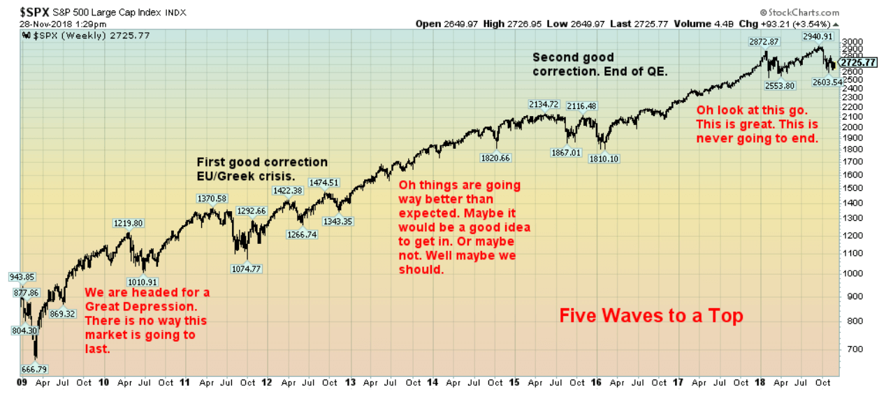
The recent bull market in stocks is also an excellent example.
© David Chapman
We’ve labeled this somewhat differently but the result is the same. Extreme euphoria accompanied the top in January 2018. Following the trade war correction in February/April, the market rebounded once again. This led to complacency. The belief was that even Trump’s trade wars couldn’t stop the market. But once again, the result was the downdraft in October. It’s early, but our suspicion is that we are still in the complacency stage where the belief will be that the market will regain its foothold and once again start an up leg. We doubt that, but then bear markets are tricky and will give off many false starts.
© David Chapman
The gold bull (2001–2011) and bear (2011–2015) is another excellent example of market psychology. Once again, we labeled it a bit differently to show the different stages. Gold went through a few corrections on its way to the top first in 2008. The 2008 correction was the steepest, but we note corrections through 2003, 2004–2005, and 2006–2007. Following the 2008 low, the market went almost straight up to the September 2011 top. This was the thrill and euphoria stage. What followed was the 2012 market where many believed that this was just another correction. In other words, complacency had set in and the firm belief was that all we had to do is wait for the next stage of the rally. The gold market was slammed in April 2013 and anxiety turned to denial and panic. By the time the market bottomed in December 2015, one was hard pressed to find a gold bull anywhere.
But the rebound since December 2015 has been quite inconclusive. This is typical of disbelief, that all of this has just been a sucker’s rally. And so far, that is what it looks like. Once again, sentiment in the gold market has plummeted and one would find it difficult to find many gold bulls around. Yet, it has all the earmarks of setting up for another strong move to the upside.
As the maxim says, “Buy when you are scared to death; sell when you are tickled to death.” As for the stock market, the seasons are shifting from a top to early bear. It is good to know where you are in the cycle.
Bitcoin watch
© David Chapman
“Down, down, down it goes. Where it stops nobody knows.”—unattributed expression
One of the biggest bubbles ever has burst. It is possible, though, that Bitcoin has fallen into the capitulation stage. We just don’t know how low this collapse can take us. This past week, Bitcoin fell under $4,000, falling near $3,500 at one point. The collapse under $6,000 suggested a minimum decline to around $3,700. Target achieved. But if Bitcoin keeps falling, the next target could be down to $2,200 or even lower. There are many ways to calculate the potential for Bitcoin’s decline. None of them are positive and ultimately Bitcoin could be back under $1,000.
The alternative currency at one time had a market cap of $327 billion, and many were suggesting that it could go to $1 trillion. Now it is headed the other way. The current market cap for Bitcoin at Coin Market Cap is around $70 billion and falling. The market cap of all the cryptocurrencies has fallen to just under $130 billion. That’s down roughly $9 billion on the week. The number of cryptocurrencies listed is currently 2,076, an increase of 5 from the previous week. It’s hard to believe that they are still issuing new cryptos—a sign to us that this market hasn’t bottomed. That they are still showing signs of hope—or maybe disbelief that it won’t fall much further, so get in on it now—indicates a perfect state of denial. There are 9 cryptos with a market cap over $1 billion, up from 8 last week. Bitcoin represents almost 54% of the total crypto market. The number of dead coins registered at Dead Coins remains at 934.
It is pointless to go over the many reasons why this market has collapsed. What continues to fascinate us is the cryptocurrencies’ market belief that they will rise from the dead and dying. Those horses have long since left the barn. Overall, this market remains in denial that it is a spent force.
© David Chapman
Markets and trends
New highs/lows refer to new 52-week highs/lows. © David Chapman
© David Chapman
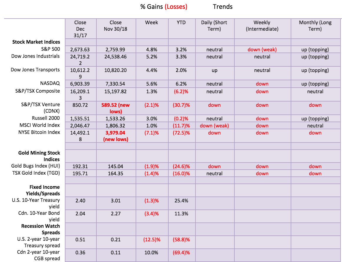
It was a gangbusters’ week for the U.S. stock markets. Every day it was up and up. The market was spurred on by Fed Chair Jerome Powell’s musings that the Fed rate may be approaching neutral. That helped spark the markets. The S&P 500 jumped 4.8%, the Dow Jones Industrials (DJI) was up 5.2%, the Dow Jones Transportations (DJT) rose 4.4%, and the NASDAQ jumped 5.6%. It put all the indices in black once again for the year. On the surface at least, the jump this past week may signal the year might be salvaged. The small cap Russell 2000 also rose but a more subdued 3% while the TSX Composite rose only 1.3%, held down by ongoing weakness in materials and energy. Only the TSX Venture Exchange (CDNX) continued its woeful ways, falling to new 52-week lows, down 2.1% on the week. The junior index is down a horrible 30% this year. The bear market has been insufferable.
Internationally, the MSCI World Index (MSCI) gained about 1%, the London FTSE 100 was up 0.4% shaking off Brexit woes, the Paris CAC 40 gained 0.6%, while the German DAX was up a small 0.1%. In Asia, the Chinese Shanghai Index (SSEC) was down 2.4% and remains one of the weakest of the international markets, down 21.7% on the year. The Tokyo Nikkei Dow (TKN) jumped 3.9%.
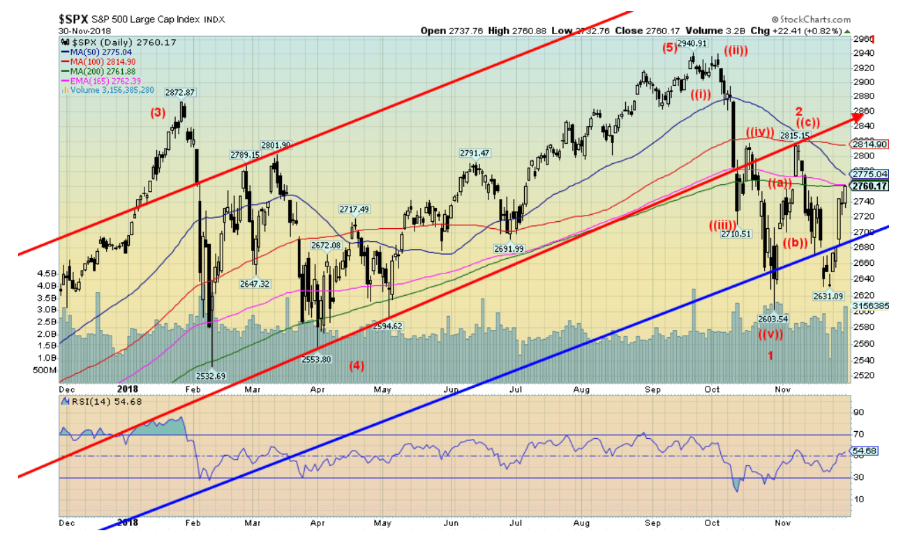
The rise this week wasn’t on great volume although it did pick up by Friday. We appear to have completed one wave down from the top on October 3 while the current wave is inconclusive. The first wave down bottomed at 2,603 on October 29. The second wave may have topped, although we suspect that it hasn’t and we are now in the process of making what should be the C wave of an ABC correction. We have noted that December tends to be positive. A rally could extend into year-end for the traditional ‘’Santa Claus” rally. In theory, the wave that topped on November 7 at 2,815 may be sufficient to complete the second wave. If that is correct, then the jump this past week is merely a correction to the wave that bottomed on November 23 at 2,631. Any move now up through 2,800 would suggest further gains should lie ahead. We doubt, however, that the market would make new highs even if the S&P 500 did make it through 2,800. Failure to follow through to the upside this coming week could be potentially negative.
© David Chapman
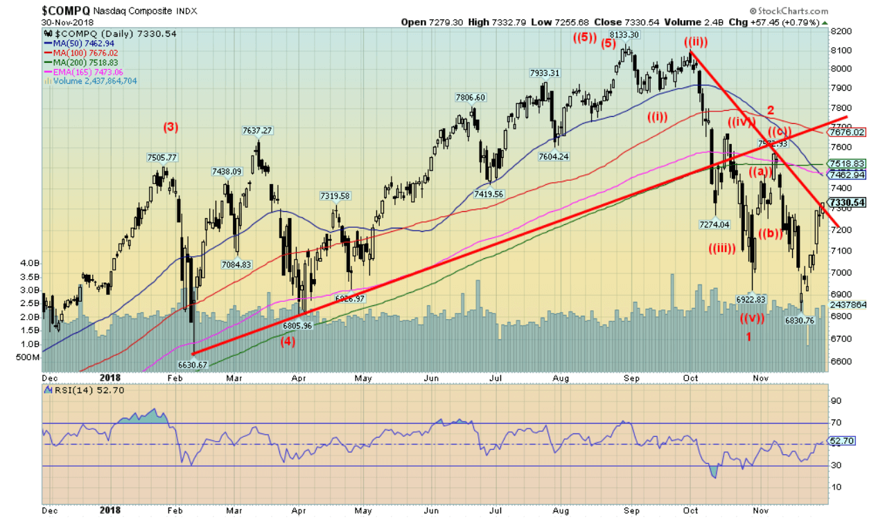
Unlike the S&P 500, the NASDAQ did make new lows below the October 29 low on November 23. We have seen corrective B waves make new lows (or highs) in the past, but it could be signalling that the rebound from October 29 is over. Unlike the S&P 500, the NASDAQ failed to regain the 50-day MA. The short-term trend only turned neutral this past week from down while the intermediate trend remained down. Most indices weekly intermediate trend is in down modes, suggesting to us that the bear market is underway. The question right now is, can the rally that was started this week have some life to it through December? The NASDAQ is being weighed down by the FAANGs. The former leaders to the upside are still leading, but this time the leadership is to the downside. We also don’t mind seeing divergences between the markets at this stage. Divergences suggest that one market could make somewhat higher highs but others do not. Only above 7,700 does the NASDAQ look a little more positive. Otherwise, rallies are an excuse to sell NASDAQ stocks.
© David Chapman
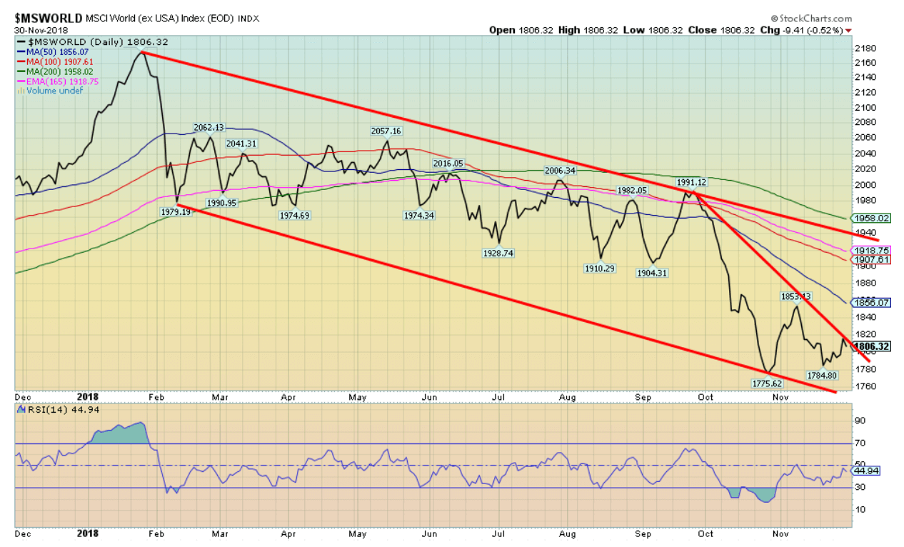
The MSCI World Index (MSCI) suggests to us that we are in a bear market. The MSCI Index has been relentlessly down since January 2018. This is a market entrenched in a downtrend. Emerging markets are the Achilles heel for the global stock markets and emerging market debt is potentially dangerous enough to spark a banking crisis if defaults occurred. And there is no shortage of potential country defaults. Major international indices are either pointed down or appear to be making a very broad top (TKN comes to mind). Few, if any, appear to be headed higher. The Brazil Bovespa Stock Exchange appears to be an exception as it recently made new highs.
© David Chapman
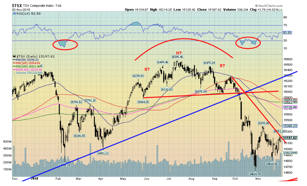
The TSX Composite is no exception to markets now caught in the grip of a bear market. Note the TSX made new lows below the February–April lows. The TSX recovered this past week, but it was feeble. We can categorize the various TSX sub-indices into roughly three categories: Topping, Bearish, Bullish. Most continue to look toppy but could remain somewhat bullish—Global Mining, Industrials, Real Estate, High Tech, Consumer Discretionary, and Consumer Staples. Ones that still look bullish include Health Care and Telecommunications. The ones that are bearish are Energy, Utilities, Financials, Materials, and Gold; although, as we note, the Gold sub-index could be forming a bottom here, but in the interim still is bearish. The large cap TSX 60 is outperforming the TSX Composite and still looks mildly bullish, but it could be topping. Most indices are either topping or are in early bear. Only Gold appears to be in late bear.
© David Chapman
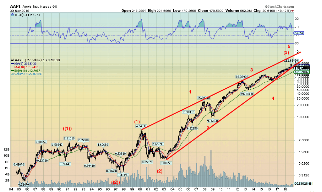
Here is a very long-term chart of Apple (AAPL) dating way back to its beginnings in the mid-eighties. What it looks like to us is that Apple may have completed an important five-wave advance from the lows of 2002–2003. Still, the wave may only be the third wave within a much longer-term uptrend. What we’d expect now is a sharp period of correction more akin to what was seen 1999–2003. That one saw Apple fall 83%. Ouch! That would pull Apple today down to about $40. Even a good Fibonacci 38.2% correction would take Apple down to around $160. Surprisingly, at $178 that’s not that far. A better one would be decline to around $90/$100. That wouldn’t be far-fetched and would be considered a normal correction, given the long run from 80 cents in 2003 to the top at $232.
© David Chapman
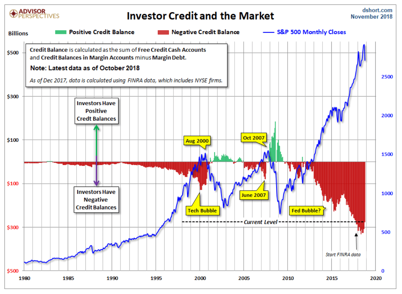
The October margin numbers are out. Overall margin debt has fallen in line with the market during October. This chart looks at a bigger picture of margin debt. What it encompasses is cash and credit balances in margin accounts minus margin debt. What it shows is that overall margin debt is astronomical compared to earlier periods, including the tech-bubble era and the housing crisis sub-prime crisis leading to the crash of 2008. It is a mind-boggling chart that, we believe, can only end in a disaster. Despite the drop in the market in October the negative balances eased only slightly. Of course, the alternative is that this time it is really different. But if one had looked at the numbers back in 2007 vs. 2000 one would have thought there was no problem. Well, no problem until there was one.
© David Chapman
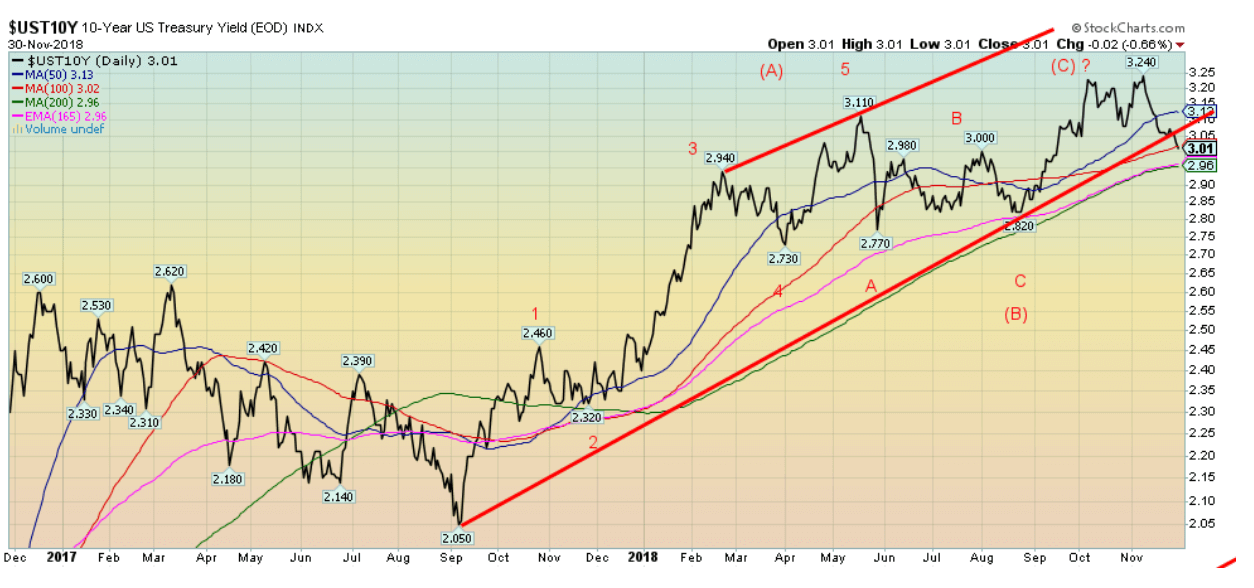
With Jerome Powell indicating a possible neutral rate for Fed funds, the U.S. 10-year Treasury note fell in yield this past week down to 3.01% vs. 3.05% the previous week. It appears to breaking that uptrend from the low seen last September 2017. Still, we have a little further to go before we believe the up-trend in rates is over. A breakdown under 2.95% would most likely suggest the uptrend in rates is over. It is possible that 3.24% was the peak although that was short of our projection of 3.45%. The wave pattern may have been a large ABC from the September 2017 low. This week Chairman Powell will make his annual testimony to the Joint Economic Committee of Congress on Wednesday, December 5. The FOMC rate decision is December 19. The expectation remains that the Fed will hike another 25 bp. Watch for November`s employment numbers due out this Friday December 7 for potential clues as to whether the economy is slowing or not. As usual we will review the November employment numbers in next week`s Scoop.
Recession watch spread
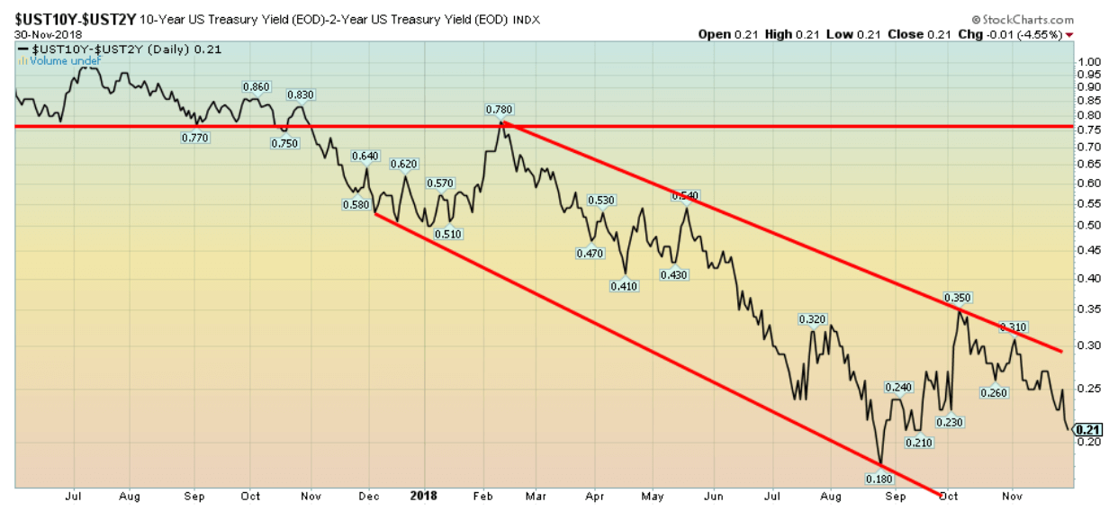
© David Chapman
The recession watch 2-10 year spread slipped again this past week, falling to 21 bp, down from 24 bp the previous week. All we can say is we are not yet in potential recession territory, but the trend remains firmly to the downside. The low was seen in August at 18 bp.
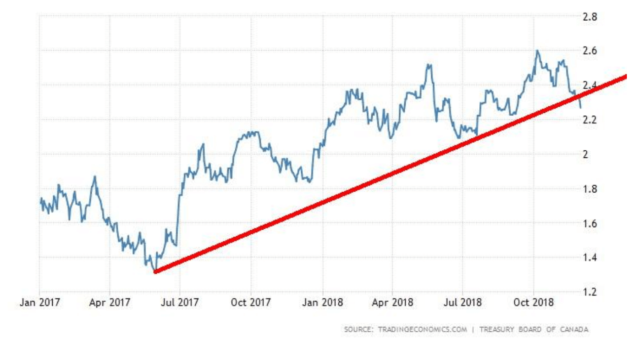
Government of Canada 10 year Bond © David Chapman
The Government of Canada 10-year bond appears to have also broken down under its uptrend from an important low seen in July 2017. If correct, that it too could be signaling that a top is in. The high was around 2.60% with the most recent reading at 2.27%. Canada’s 2–10 recession spread has fallen to 11 bp, although that is actually 1 bp higher than the previous week. Nonetheless, this chart and the U.S. 10-year chart indicate that holding long bonds now may not be a bad idea. However, be credit conscious. Junk bond spreads and even investment grade B bonds continue to see widening spreads to quality.
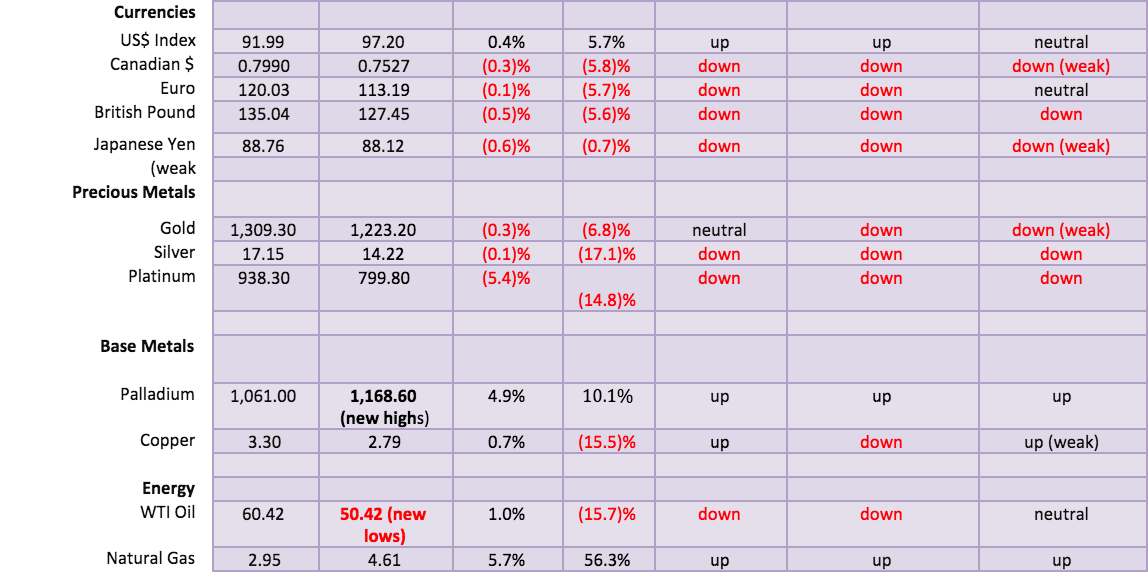
© David Chapman
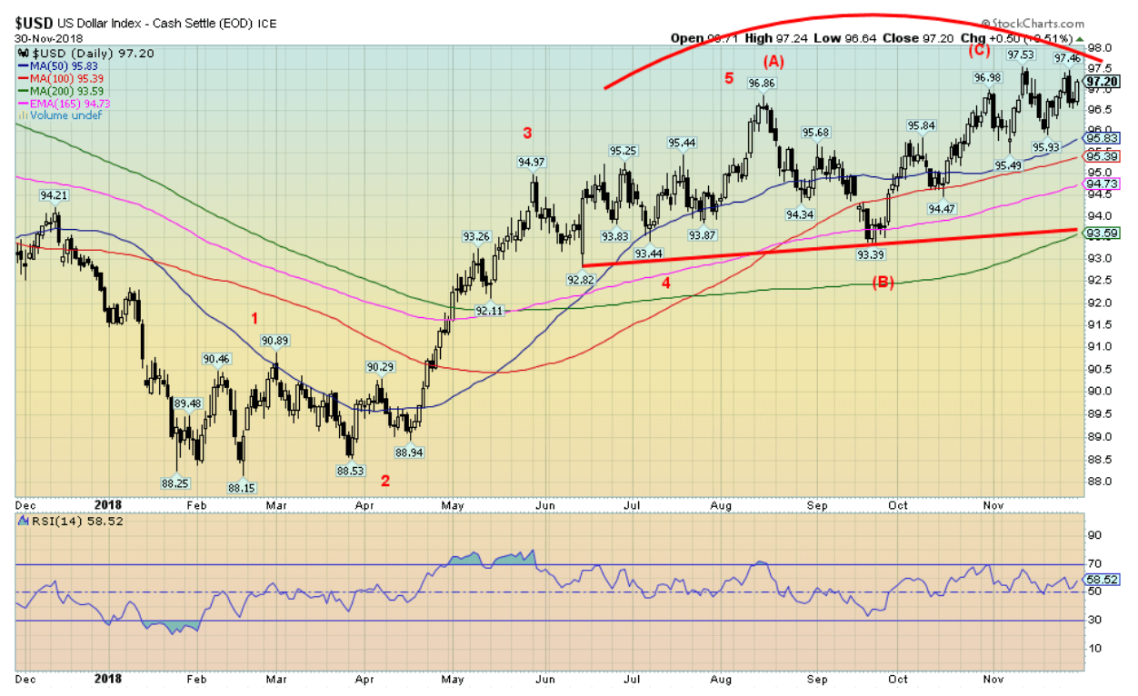
We continue to believe that the US$ Index is in the process of making an important top. Bullish consensus remains quite high, although it is off its recent high at 90%. We could argue that the US$ Index is making a potential head and shoulders top, albeit an awkward-looking one. The break point is at 96.25. A more key breakdown point is clear around 93.60. This past week the US$ Index rose 0.4%. The euro fell 0.1%, the Brexit-beaten pound sterling was off 0.5%, while the Japanese yen fell just under 0.6%. The Cdn$ was off 0.3%. All in all, it was a pretty minimalist week for the currencies. Nonetheless, our call that the US$ Index is topping out here remains. One can’t rule another higher high before it is over. But extreme bullish sentiment and a plodding market suggest to us that a top is underway.
© David Chapman
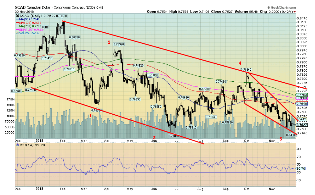
The Canadian dollar may be in the process of completing a five-wave decline from an important high seen January 2018. What remains to be seen is whether the current wave will make new 52-week lows below 74.81—the June 2018 low—or hold just above it. No rule says it has to make new lows although that is preferred. Closing at 75.27 on Friday it is not that far from new lows. Given the Canadian dollar’s general correlation with oil prices, a rebound in the depressed oil market could help spark a rebound in the Canadian dollar. Considerable resistance above from 76.50 to 77.50.
© David Chapman
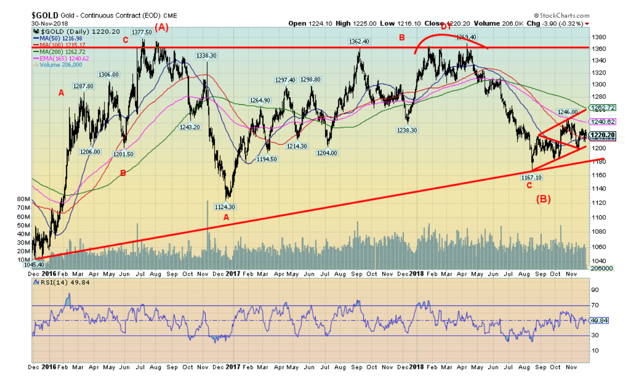
For the past two and half years, gold bugs have been frustrated by the lack of progress for gold prices following the strong rebound in 2016 that took gold from a depressed $1,045 to a top of $1,377. Sometimes it is difficult to discern patterns until much later in the game. And what we see emerging is a long corrective period that took us first back to $1,124 in December 2016 and more recently the decline to $1,167 in August 2018. In the interim, the July 2016 top was tested in August 2017 and again in January–April 2018. However, it failed to bust through what has now become major resistance around $1,370. But highly negative sentiment and a strong COT report should eventually propel gold upward once again. Gold this past week failed to gain any traction from Fed Chairman Jerome Powell’s musings about the Fed rate nearing neutral. It helped pop gold that day but it went right back down the next day. Gold was actually down this past week losing a small 0.3%. Silver was off even less, down 0.1%. The victim on the week was platinum, down 5.4%. Palladium gained 4.9% and made new 52-week highs and all-time highs while copper jumped 0.7%. The latter two are primarily industrial metals; however, palladium is considered a precious metal and copper has been a money metal along with gold and silver.
© David Chapman
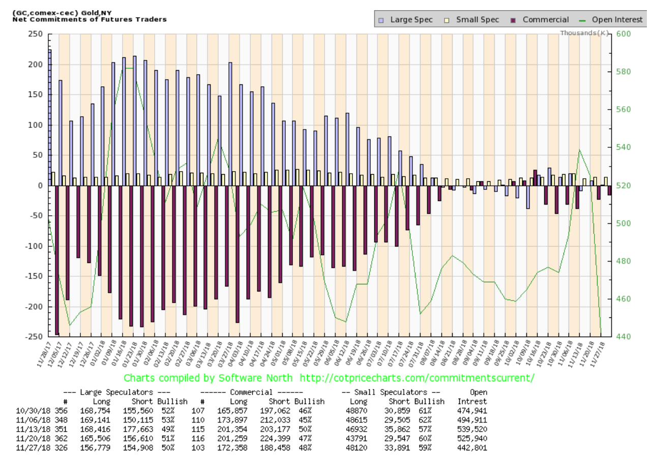
There was no COT report last Friday. Instead it came out Monday and then we received the regular COT report once again on Friday. The commercial COT for gold came in at 48%, up from 47% the previous week. Both long and short open interest fell with long open interest down roughly 29,000 contracts and short open interest down about 36,000 contracts. The large speculators COT (hedge funds, managed futures, etc.) was relatively steady at 50%, down from 51% the previous week. The COT report remains quite bullish. This has been one of the longest stretches of a commercial COT—roughly between 45% and 50%—that we have ever seen, already at roughly 17 consecutive weeks. Overall, the gold COT remains positive and bullish.
© David Chapman
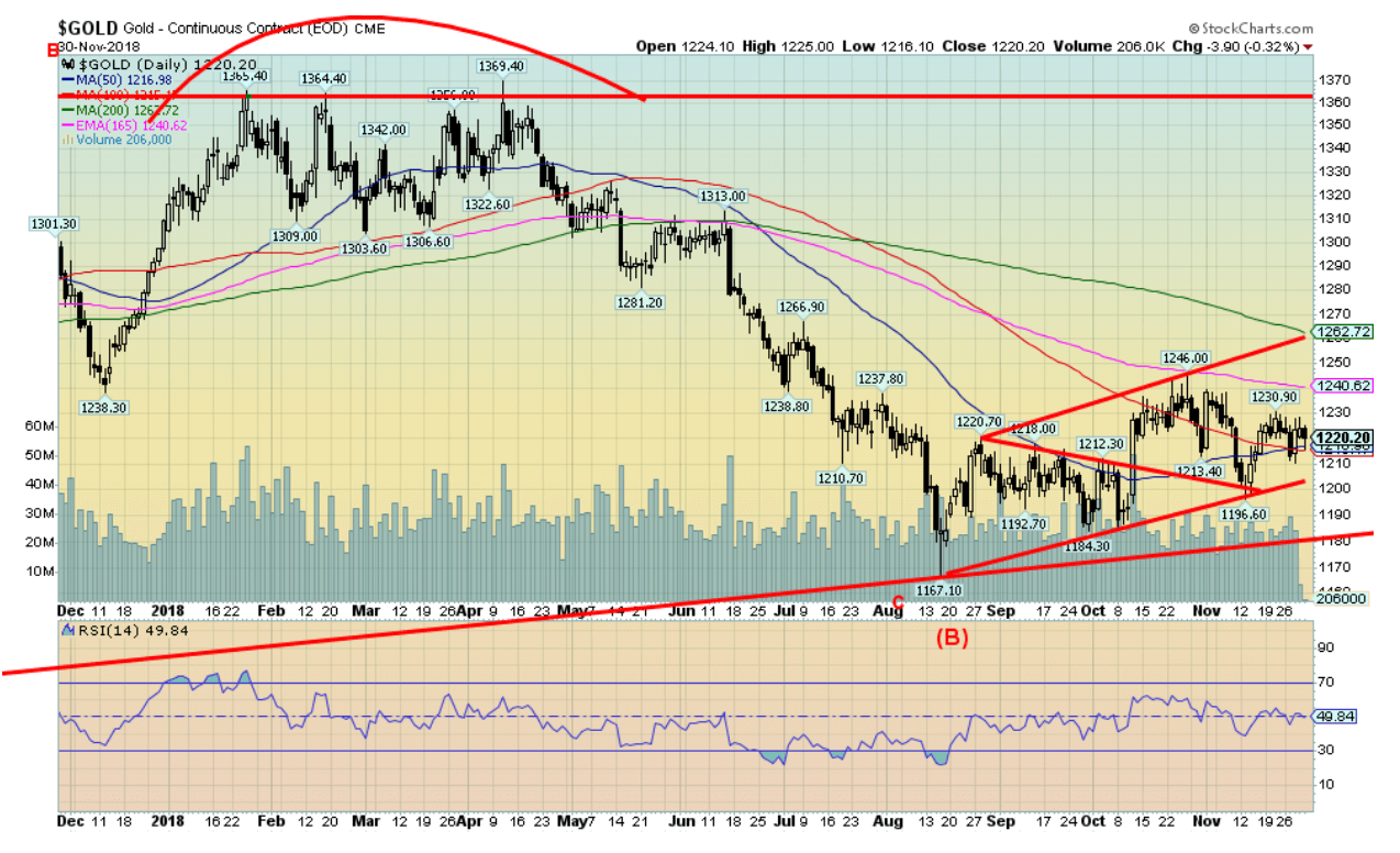
Here is a slightly closer look at gold. For the past three months gold has been trading in what appears to be a growing triangle. Support is seen at $1,200 and resistance is up to $1,260. Overall, we’d be concerned at a drop below $1,200 but would expect new lows on a drop under $1,1,80. There is resistance at $1,240 and above that level we should rise to $1,260. Over $1,260 and especially over $1,270 we’d look for a run to $1,300 and higher. There is some concern about what we see as low volume. So, it may be that the full corrective period that started way back in July 2016 may not be over yet. Elliott Wave International (www.elliottwave.com) have suggested that the real pattern is an ABCDE-type pattern. All we appear to have completed is the ABC. This may be the D wave. However, the E wave may not make new lows before setting up a bigger up move that could take us beyond $1,400. But this D wave, if correct, could take us back to $1,300 and up to $1,350 before another decline sets in. Gold has, over the past few years, seen a strong rally following the December FOMC. It was the rate hike in December 2015 that sparked the first big rally. But the rate hikes in December 2016 and 2017 also sparked rallies, just not as strong as the December 2015/July 2016 rally. The FOMC rate decision is December 19. We would expect a good up move in gold after that meeting.
© David Chapman
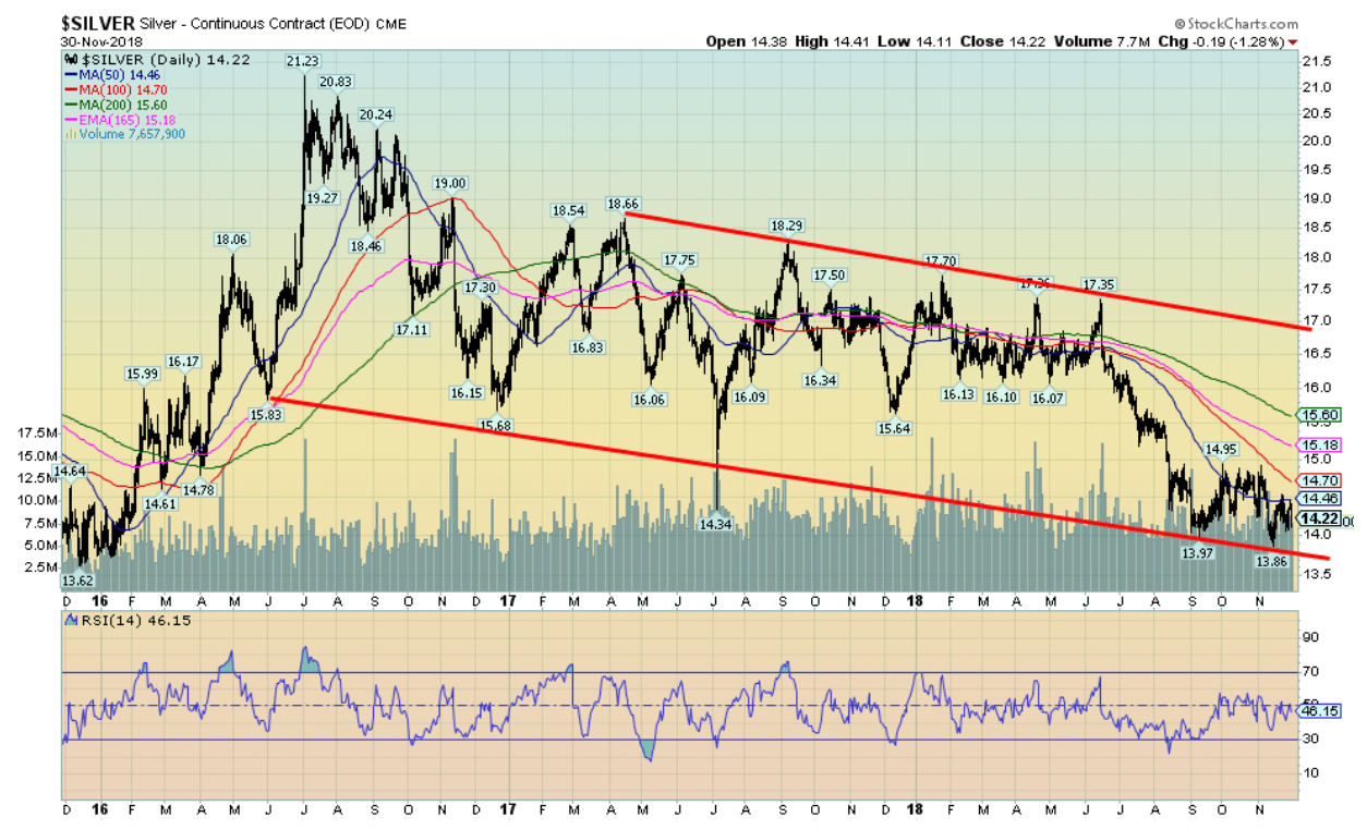
Here is a picture of silver since that important low back in December 2015 at $13.62. Like gold, silver made a strong move into July 2016, hitting a high of $21.23. That’s been the high-water mark since. The rest of 2016 saw silver fall all the way back to $15.68. The rally that followed was subdued and only reached as high as $18.66. It’s been a downward drift ever since and in June 2018 silver fell off the ledge, leading to the recent decline to $13.86. We noted at the time that the lower low in silver was not confirmed by gold and that this could be a positive divergence. Since then we are up, but the up move has been feeble at best, keeping alive thoughts that we could see another new low. Resistance has occurred at $14.45 to $14.50, but there continues to be resistance up to $15 and up to $15.60. So, silver has a lot of work to do to convince us that the white metal is going to rise from the dead.
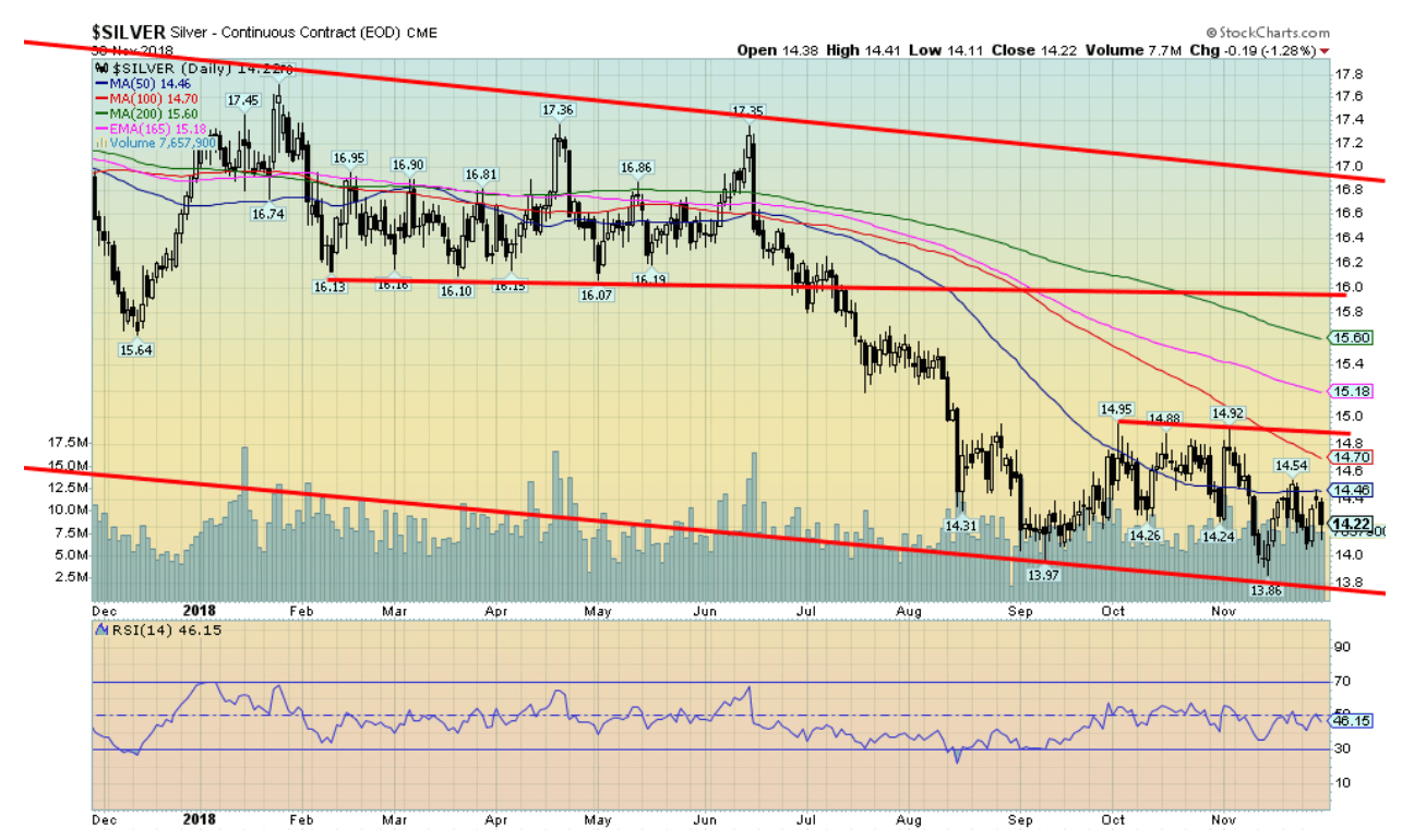
© David Chapman
Here is a tighter time-frame for silver. It shows the consolidation pattern that has been forming over the past several weeks. Resistance is pretty clear up to $15 with $14.95 being the recent high. Support is fragile at $14 and then the recent low at $13.86. There appears to be little to recommend silver here—except that sentiment is terrible at about 7% bulls and the commercial COT (below) remains positive. The gold/silver ratio remains ridiculously high in favour of gold at 85.8. If a silver rally does get going then that ratio would fall.
© David Chapman
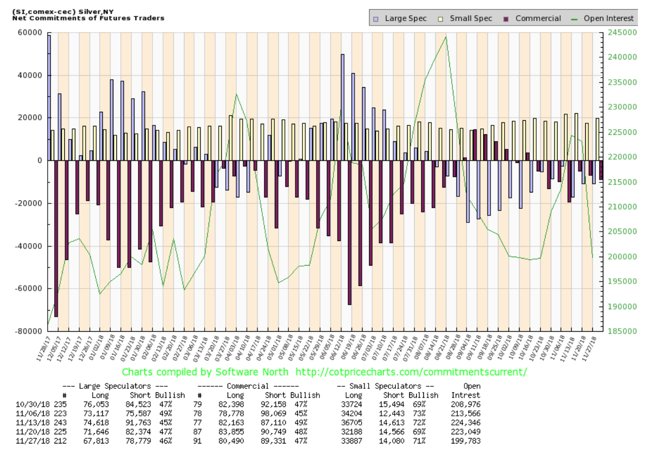
The silver commercial COT remains quite positive at 47% although off from the previous week’s 48%. Long open interest fell just over 3,000 contracts while long open interest dropped over 1,000 contracts. The large speculators COT remains negative at 46%, down from 47% the previous week. Managed futures continue to hold a record short position.
© David Chapman
The gold stocks, as represented here by the TSX Gold Index (TGD), did not fare well this past week. The TGD lost 1.4% while the Gold Bugs Index (HUI) dropped 1.9%. All things considered, given gold and silver did little this past week, the drop was not drastic. The TGD remains positive looking and appears to be making a triangular type bottom. What is needed is a spark to send the TGD over 177. Support is at 160, but a drop under that level could suggest a test of 156 and down to 152. Resistance is at 170 and again at 177.
For those who are interested in details about the physical gold market, Bullion Star posted an excellent look at that market using a series of charts from Gold Charts R Us. It covers physical gold markets in China, Russia, India, Switzerland, and London. Excellent site. And, of course, we have frequently used Gold Charts `R` Us great charts (subscription required). Good reading if you’d like to get an understanding of the physical gold market.
© David Chapman
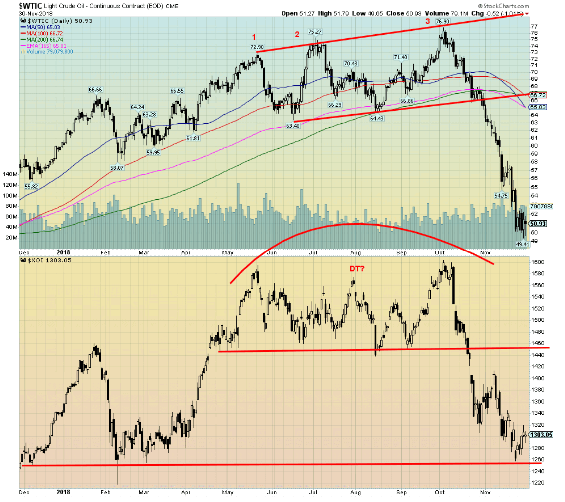
The misery in the oil patch continues. This past week WTI, oil fell to new 52-week lows, dipping briefly under $50 to hit a low of $49.41. We guess we shouldn’t complain as our last fill was 98 cents a liter here in Toronto—first time under $1 in awhile. WTI oil is down roughly 34% from the high seen in October. It has been a precipitous drop. One key thing this past week was that the energy stocks, as represented here by the Philadelphia Oil & Gas index (XOI), did not make new lows, a potential divergence. One reason may be that while WTI oil has been falling, natural gas has been rising in price, gaining another 5.7% this week. As well, WTI oil made new 52-week lows, then reversed and closed higher on the week by 1%. The reversal may be signaling a bottom but we’d need to see more evidence this coming week with upside follow-through. A low would be welcome as the market has quickly become quite depressed, especially in Alberta Canada’s major oil patch.
Chart of the week
© David Chapman
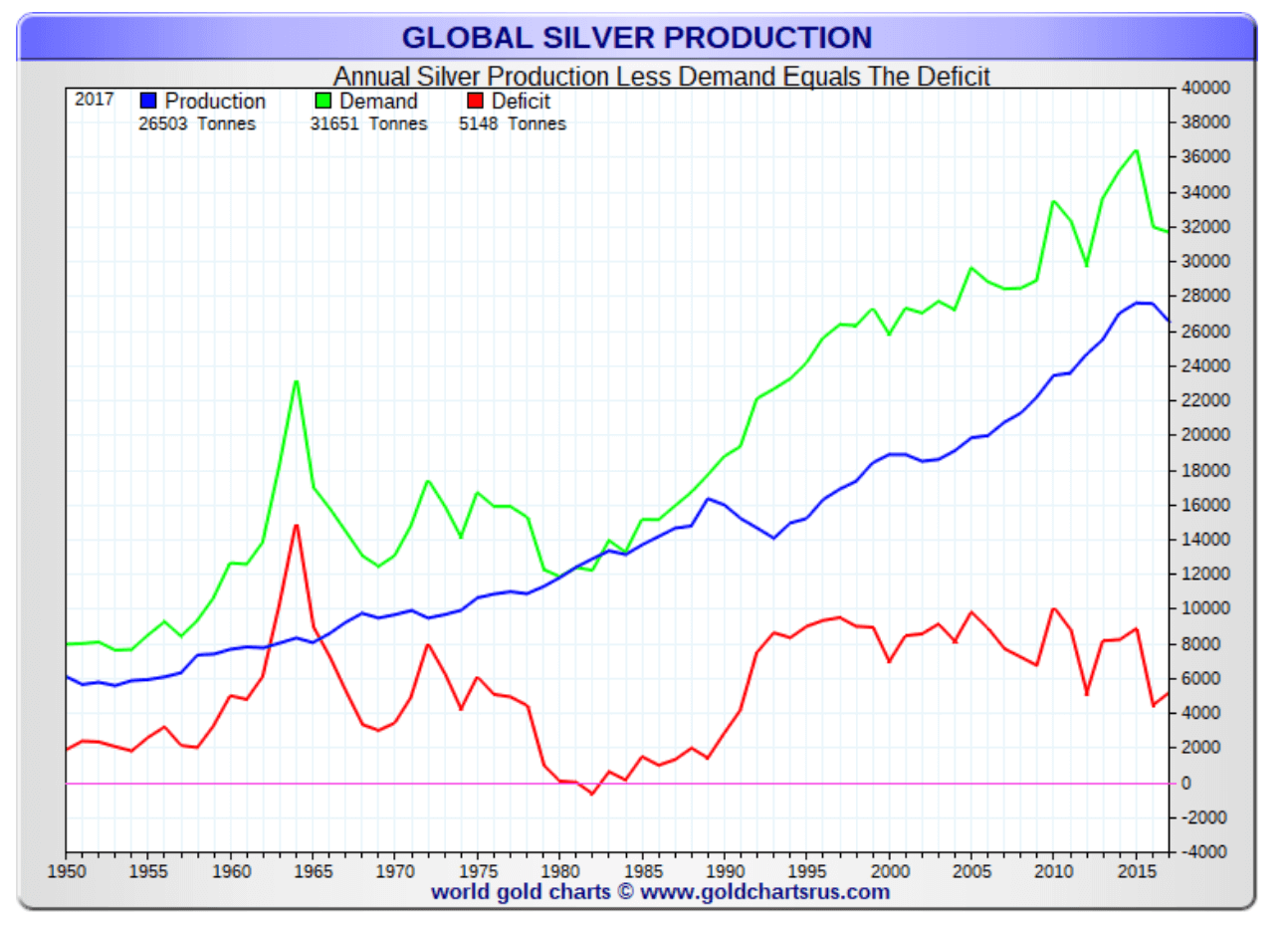
Our colleague Mike Ballanger who writes regularly for GGM Advisory Inc. (GGM- Gold and gold miners) recently put out a piece on silver, centering on silver investment demand. We thought we’d take a look at the overall picture. The above chart doesn’t include 2018, but the picture hasn’t changed much. Overall, silver has been running a deficit for years with the latest showing a deficit of 5,148 metric tonnes. That translates into 165.5 million troy ounces of silver.
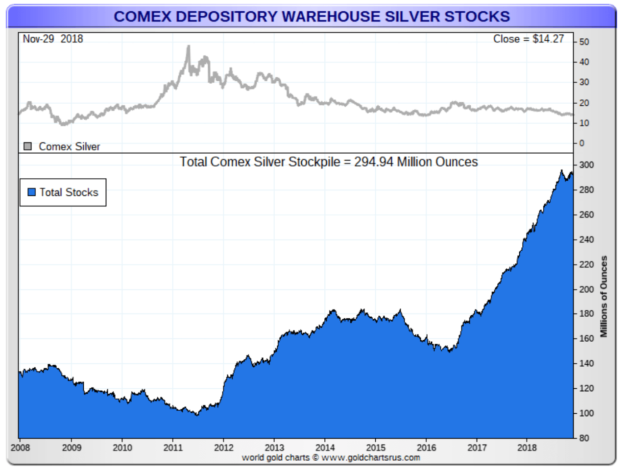
But as the next chart below shows, the inventory of silver stocks held at the Comex has been rising for years. Supplies total 294.9 million troy ounces of silver. Now that is made up of registered stocks (fully available for immediate delivery against contracts for a total of 83.7 million troy ounces) and eligible stocks (acceptable for delivery against contracts for a total of 211.2 million troy ounces). Grant you, eligible stocks can be quickly converted into registered stocks, but generally the eligible stocks are not considered to be available for delivery at this time and in many instances the owners of those eligible stocks may not wish to make them available. The big rise has been in eligible stocks. The biggest increase has been the J.P Morgan stockpile that now stands at around 150.5 million troy ounces. Some may be stockpiling for the long term but it is interesting that J.P. Morgan has seen its biggest increase in stockpiles in the last two years, basically doubling previous holdings. Of J.P. Morgan’s 150.5 million troy ounces, 145.4 million troy ounces are eligible stocks and not currently available for immediate delivery.
© David Chapman
Investment demand (coins and bars) has fallen over the past few years. It peaked at 292 metric tonnes in 2015. Today it is down roughly 57% from those lofty days with 2018 expecting 125 metric tonnes. But that is still 123% above 2007 when coins and bars consumed only 56 metric tonnes. Investment demand overall has exploded since the financial crisis of 2008. Jewellery demand has also grown by 8% during that period, but industrial demand has actually fallen by 11% and silverware has also declined, down 8%. Overall consumption is up only 0.5%. But offsetting that has been a decline in production.
The high industrial demand has been in electric vehicles and photovoltaics. Demand for silver for solar panels has actually declined. The biggest drop has come in Mexico, the world’s largest silver producer. Production declines have basically followed demand declines. While demand has fallen off in the U.S., it continues to rise in China and India, particularly for investment demand.
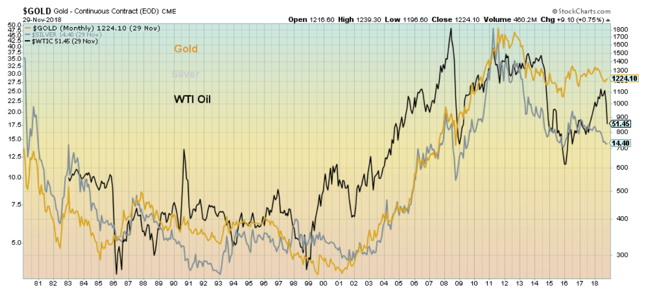
Commodities tend to follow one another; at least, certain commodities tend to follow one another. That is true for gold and silver, but oil prices also tend to move along with gold and silver prices. So, if oil prices rise, gold and silver prices rise as well and vice versa. Our chart below shows the relationship between gold, silver, and oil since 1980. But gold and silver prices shouldn’t be dependent on the price of oil. They are not always in sync.
What could be key for gold and silver, as Ballanger points out, is the massive $247 trillion of global debt. We have often noted the massive growth of debt since the 2008 financial crisis. While gold and silver prices rose sharply in the first few years after the financial crisis, the past seven years have not been so kind to the precious metals. Instead, stocks, bonds, and real estate exploded in price thanks to the massive amount of debt. Gold and silver prices languished. That suggests to us that when the global debt implodes, as it historically does, gold and silver prices could rise sharply and demand could quickly outstrip supply.
© David Chapman
(Featured image by DepositPhotos)
—
DISCLAIMER: David Chapman is not a registered advisory service and is not an exempt market dealer (EMD) nor a licensed financial advisor. We do not and cannot give individualised market advice. David Chapman has worked in the financial industry for over 40 years including large financial corporations, banks, and investment dealers. The information in this newsletter is intended only for informational and educational purposes. It should not be considered a solicitation of an offer or sale of any security. The reader assumes all risk when trading in securities and David Chapman advises consulting a licensed professional financial advisor before proceeding with any trade or idea presented in this newsletter. We share our ideas and opinions for informational and educational purposes only and expect the reader to perform due diligence before considering a position in any security. That includes consulting with your own licensed professional financial advisor.


Tilray Acquires HelloMD to Expand Medical Cannabis Digital Platform
Tilray Brands acquired HelloMD, a digital healthcare and medical cannabis platform, pending court approval on June 29, 2026. The deal...


Spanish Crowdfunding Market Reaches Record €761.6M in 2025, Driven by Real Estate and Crowdlending Growth
Spanish crowdfunding market reaches record €761.6M in 2025, driven by strong real estate dominance and rapid crowdlending growth, while donations...


Swedish fintech Lysa is preparing to enter the European ETF market
Swedish fintech Lysa is entering the European ETF market, registering its first ETF and expanding beyond its robo-advisor model. Managing...


Bitcoin Stalls Near $60K as Strategy Moves, ETFs Outflow, and EU MiCA Rules Take Effect
Bitcoin hovers near $60,000 with ETF outflows, while Strategy boosts reserves, sells BTC, and raises dividends to reassure investors. Ethereum...


Morocco’s Growth Holds at 4.6% as Agriculture Offsets Economic Pressures
Morocco’s economy grew 4.6% in Q1 2026, driven by a strong agricultural rebound offsetting declines in industry. Services expanded moderately...
 |
|
 |  |
 |
|
-

 Africa1 week ago
Moroccan Bond Market Shows Mixed Signals as Primary Eases and Secondary Pressures Persist
-
 Crypto1 day ago
Bitcoin Stalls Near $60K as Strategy Moves, ETFs Outflow, and EU MiCA Rules Take Effect
-

 Africa1 week ago
Morocco’s Economic Growth Outlook Strengthens for 2026
-

 Impact Investing2 weeks ago
AI Adoption in Italian Retail Stalls Despite Strong Experimentation
You must be logged in to post a comment Login