Featured
Have financial markets learned from previous mistakes?
Gold, aside from being previously used as money, is strongly linked to stocks and bonds
This time is different. It has a nice ring to it. It is also a mantra we have heard many times. Financial crises are something that happens to other people, in other countries at other times, as Reinhart and Rogoff wrote in their 2009 tome. They are not something that happens to us. If that is correct, then the 2008 financial crisis never really happened as the central banks, led by the Federal Reserve, came along and made it go away. All is hunky dory. All is good.
History is littered with financial crises. Economic crises, currency crises, currency debasement, inflation crises, stock market crashes, huge speculations followed by equally huge crashes (asset price bubbles), banking crises, sovereign debt crises, domestic debt collapses—all occur with stunning regularity and have since ancient times, dating back to the ancient civilizations of Mesopotamia, China, and Egypt. Themes are played out over and over again going largely along the lines of “it can’t happen again until it does.” These kinds of crises have brought down empires. And invariably the authorities and the experts didn’t see it coming.
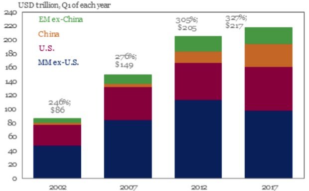
According to the latest study by the Institute of International Finance (IIF), global debt levels have soared to $233 trillion. Since the end of 2016 and Q3 2017 total debt incurred by households, government, financial and non-financial corporations have leaped by $16 trillion. Debt has leaped by roughly $90 trillion since the financial crisis of 2008. The debt breaks down with $63 trillion in government debts, $58 trillion in financial, $68 trillion in non-financial, and $44 trillion in households.
According to the study, major increases in debt were seen in non-financial debt in Canada, France, Hong Kong, South Korea, Switzerland, and Turkey. In Canada, household debt to disposable income has hit 171.7% as of Q3 2017. But sharply rising household debt is not limited to Canada as the U.K., the U.S. and others have also reported huge increases in household debt. In the U.S. the November consumer credit leaped by $28 billion, the highest since December 2010.
We noted last week that total U.S. debt has increased by $19.2 trillion since 2008 whereas GDP has grown only $5.9 trillion, implying it took $3.25 of new debt to purchase every $1 of GDP. The biggest increase in U.S. debt since 2008 was the U.S. national debt, leaping by $11 trillion as the U.S. government used taxpayers’ funds to bail out the financial system during the 2008 financial crisis. U.S. National debt to GDP ratio leaped as a result from 70.6% to 104.9%. With the U.S. officially over 100% of debt to GDP, they join an elite group that includes Greece, Lebanon, Italy, Portugal, Yemen, Jamaica, Egypt, Mozambique, Eritrea, Gambia, Barbados, and Japan. Japan leads the pack with an astounding government debt to GDP ratio of 240%. Many of the countries on the elite list of over 100% debt to GDP are economic basket cases.

© David Chapman
© David Chapman
In 2007, before the Great Recession of 2007–2009 the thinking at the time was: everything is fine because of globalization, the technology boom, our superior financial system, our better understanding of monetary policy, and the phenomenon of securitized debt (Reinhart & Rogoff, This Time is Different, pg. 20). The thinking at the time was that the U.S. could never have a financial crisis like some emerging market. Then it did, and it nearly brought down the entire global financial system until it was bailed by the large central banks including the Federal Reserve, the Bank of England (BOE), the Bundesbank, the European Central Bank (ECB), and the Bank of Japan (BOJ). It didn`t stop there as the Peoples Bank of China (PBOC) also ensured their financial system did not collapse.
Yet in reading a recent economic report from one of Canada’s banks the tone is very similar in that many expect the current growth to continue accompanied by measured hikes in interest rates. Despite unemployment being at the lowest levels seen in years, the expectations are that the labor market will continue to tighten. Manufacturing indices in the U.S., the EU, China, and the U.K. have reached their highest levels since 2004. Inflation remains low. Tax cuts in the U.S. are expected to heighten demand. Stock markets continue to reach record highs in the U.S. and EU.
In other words, the outlook today is as rosy as it has been before previous major tops in markets. Threats of war, constitutional crises, debt collapse, and many other threats to the global economy are firmly in the background. Complacency levels—or more correctly confidence levels—are as high as they have ever been. What could possibly go wrong? It seems to be a “what, me worry” world. It should scare the “bejesus” out of us. But it isn’t.
These are exactly the kind of conditions that Reinhart and Rogoff are referring to when they wrote This Time is Different. What seems fine and manageable could quickly become unmanageable. That is what happened in 2008 when suddenly the markets were down 50% and the entire global financial system was sitting on edge of a cliff. The financial collapse was saved by a massive bailout from the western central banks. Since then the western countries have put in place bail-in legislation. That means that in the next collapse that threatens to take down the global banking system it will be debt holders and depositors whose funds will be bailed-in, meaning their debt and deposits will be turned into equity.
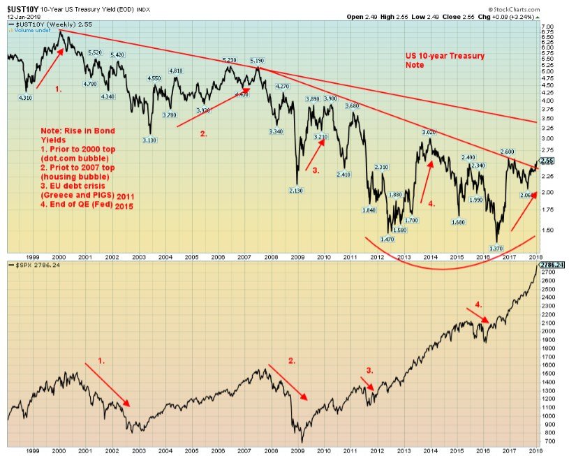
The key to watch is the bond market. Rising bond yields precede a stock market correction and potential recession. Since bottoming in July 2017, the U.S. 10-year Treasury note has seen steadily rising yields. Rising bond yields preceded all stock market tops since 2000 including the dot.com/high tech bubble, the housing bubble and stock market top in 2007, the EU debt crisis that included Greece and the PIGS in 2011, and the fear of the Fed ending QE that led to the stock market top in August 2015.
© David Chapman
Bill Gross of Janus Henderson, a well-known bond guru, and manager of a $2.2 billion bond fund, has warned that the U.S. bond market has begun a bear market although not, as he notes, “a dangerous one.” The yield on the 2-year U.S. Treasury note has exceeded 2% for the first time since the financial crisis of 2008. China has warned that they are cutting back sharply (eliminating?) on their purchases of U.S. Treasuries. China currently holds over US$1 trillion of U.S. Treasuries and has been its largest buyer. Japan also holds over US$1 trillion of U.S. Treasuries.
That has sparked a rise in bond yields and sharp sell-off of the U.S. Dollar. With worries about the state of “safe investments”—i.e., U.S. Treasuries—in the U.S. there has seen a net outflow of funds. Beneficiaries have been the European market and Asian markets.
The weekly chart of the 10-year U.S. Treasury Note indicates that it appears to be breaking out of a down channel. The top of the next channel is up at 3.50%. We expect the 10-year could rise towards 3%. Bill Gross has also acknowledged that could happen. While EU central banks, the BOJ, and the Fed could take up any slack in the purchasing of U.S. Treasuries, given that the Fed and the ECB want to start selling off their huge holdings to bring down the size of their balance sheets, having to purchase more U.S. Treasuries to pick up any slack from China would be counter-productive. Couple this with the desire of the Fed to normalize interest rates with the potential for four interest rate hikes in 2018, all this puts upward pressure on U.S. Treasuries yields (prices fall as prices move inversely to yields).
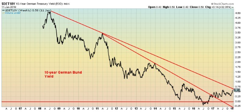
It is not just the U.S. that is seeing rising bond yields, either. Japanese government bonds, U.K. gilts, and German Bunds are also feeling upward pressure on interest rates. Where negative interest once predominated, in the EU and Japan yields have been steadily rising and are no longer negative. This is shown in the chart below of the 10-year German Bund.
© David Chapman
The real danger lies over in the high-yield market, sometimes referred to as junk bonds. Rising U.S. Treasury yields put upward pressure on all other yields, particularly the high-yield market where major vulnerabilities could lie. The estimated size of the global high-yield market is at least $2 trillion. But that may not be all as it is estimated that upwards of 30% of corporate debt is a high-yield risk. The high-yield market can contain leveraged loans, high-yield bonds, asset-backed securities, and even floating rate loans. The debt is primarily owned by pension funds, insurance companies, and retail mutual funds. Other owners would be hedge funds and other equity and income funds. Recall it was the collapse of some high-grade structured credit and leveraged bond funds of Bear Stearns that triggered the start of the financial panic of 2008.
This time is different has a nice ring to it. In the end, the only the thing that might be different is what the ultimate trigger of the next collapse might be. Debt has given us the illusion of wealth. As we move deeper into the current cycle the question is not “if”—the question is “when.” With $233 trillion of debt outstanding all it promises is that when the next collapse does get underway it potentially could be bigger than what happened in 2007/2008. Reinhart and Rogoff have shown in their book that financial crises are a regular occurrence. We live in a highly leveraged economy and, while the financial cliff may not be visible, it might not take much to provoke a crisis of confidence that pushes us all off.

© David Chapman
After falling 35% from mid-December until the end of 2017, Bitcoin recovered gaining roughly 35% on January 6, 2018. It didn’t last. Since then Bitcoin has fallen roughly 21% and is threatening to make new lows. With Bitcoin, one thing is ensured—volatility.
It has now been almost a month since Bitcoin made its all-time high. That’s not unusual as Bitcoin has gone through corrections before lasting somewhat longer. What it has done is take out some of the speculative fever that was gripping not only Bitcoin but the entire cryptocurrency market. It seemed the height of irony that the North American Bitcoin Conference to be held on January 18/19, 2018 in Miami could not would not, or had to stop accepting Bitcoin as payment for tickets. Seems that there were too many issues with fees and network congestion. Odd, wouldn’t one say, that the biggest, most important conference on Bitcoin ever cannot process payments in its much-ballyhooed currency.
There is probably no argument that the technology behind Bitcoin and the myriad of cryptocurrencies, many of who will fail, is fantastic and can, like the Internet, only expand. But what has not been proven is that Bitcoin and the cryptocurrencies are actually useful for economic transactions. We still cannot pay our taxes with Bitcoin nor buy a loaf of bread or a cup of coffee. Instead, they are the darling of the Libertarian crowd who are always looking for a way to circumvent government.
But it is the ability to circumvent government that is attracting the government to try and find a way to get control of it. Ultimately the question is: can Bitcoin and other cryptocurrencies replace current fiat currencies and effectively eliminate central banks? The answer is, probably not.
And then comes word that the Korean government is trying to ban the trading of cryptocurrencies via exchanges. Well, at least, that is the plan, but it appears the Korean parliament has to agree to it and that has not yet happened. And some believe it will never happen. Those thoughts are also spreading into other Asian countries such as China and Japan where the trading of cryptocurrencies has really taken off.
What all this has done is spark some doubt in Bitcoin and other cryptocurrencies. It is possible all this is another consolidation that, once it is complete, will see Bitcoin and others soar to new highs. Our new favorite Dogecoin soared to a market cap of over $2 billion on January 7, 2018, but has now settled back and has a current market cap of about $1.4 billion. It may be a dog, but it has a bite. Most cryptocurrencies have seen losses in the past week as the potential for curbs rose.
Bitcoin has broken its steep uptrend line and may now be poised to fall and test a gentler uptrend line currently near $10,000. That would be quite a blow to the Bitcoin crowd as at those levels Bitcoin would be down almost 50% from its all-time highs. But that is what happens to bubbles. Eventually, they bust and the final fall can actually be 90% or higher. Great technology, but can you do anything with it? You can’t even buy your way into its own conference with it. Maybe that says it all.
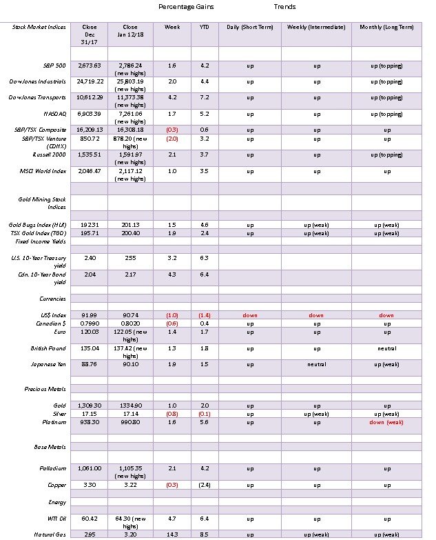
Markets and Trends
© David Chapman
Note: For an explanation of the trends, see the glossary at the end of this article.
New highs/lows refer to new 52-week highs/lows.
© David Chapman
“Up, up here we go, go. Where we stop nobody knows.” —Far East Movement, Rocketeer 2010
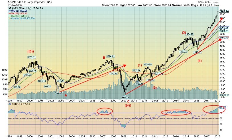
An overthrow in technical analysis occurs when a market appears to break out of a defined channel (or could break down) only to fail and quickly return back into the channel. In this case, the S&P 500 appears to be overthrowing a channel that has formed since the lows of February 2016. The overthrow occurred over a week ago. So, is this an overthrow or the start of a serious blow-off top?
The overthrow is occurring against historically optimistic sentiment and overbought indicators. The daily RSI indicator remains stuck above 80. But if a blow-off top is underway then the indicators could remain overbought and optimism could stay high and even get very high. Sometime back we considered whether the market could enter a period of a blow-off top. Based on the corrective period that occurred from August 2015 to February 2016 we calculated a potential target of 2,458. When that level fell, the next target became 2,658. That target has now fallen as well. So that brings us to the next potential target at 2,982. That is 196 points away or a 7% gain from current levels. It is possible.
If, however, this is an overthrow then the market needs to turn around now and fall back below 2,736. Momentum may be declining and the NYSE advance-decline line ratio of 1.13:1 may be mild, but if a true blow-off is occurring it won’t stop the market from rising further. Such is the nature of a blow-off.
Normally in a blow-off one sees a big jump in volume and a decline in open interest. The market is rising on balance volume but open interest, rather than falling, has actually been rising for the S&P futures. The commercial COT for S&P 500 futures has been rising as the large speculators COT is falling. That suggests to us it is the commercials remaining and adding to longs while the speculators are thinking this has gone too far and are either shorting the market or pulling out. The large speculators short open interest has been rising. If a blow-off is really getting underway then they might be forced to cover their shorts. In the interim there appears to be little in the way to stop this market from rising further.
© David Chapman
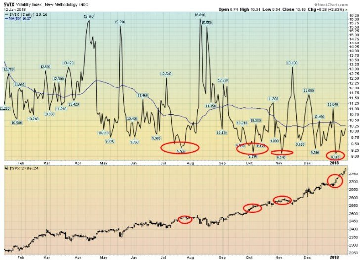
The VIX volatility indicator has been hitting record lows recently (the VIX moves inversely to the stock market and measures fear and greed in the markets). The last low occurred on January 3, 2018 closing at 9.15 but hit a record intra-day low of 8.94. Since then the VIX has been rising and closed at 10.16 on Friday. It is interesting that the VIX, rather than falling further with a rising market, is instead rising. Just a tiny bit of fear is coming back into the market. This phenomenon also occurred during the NASDAQ blow-off in late 1999–early 2000 when, as the NASDAQ rose, the VXN was also rising. This could be an early-warning sign.
© David Chapman
Here is the S&P 500 dating from 1998. The huge corrective pattern from 2000 to 2009 played out as a possible ABC correction and may have formed cycle wave 4. Cycle wave 1 topped in 1966 having run from 1949–1966 with cycle wave 2 (corrective) bottoming officially in 1982 (1966–1982) followed by cycle wave 3 that topped in 2000 (1982–2000). If that is the case, we are currently in cycle wave 5, a wave that could complete the long wave up from the Great Depression and war. Maybe it is no surprise that the wave is ending in a potential blow-off (or melt-up as some might call it). Since the low of February 2016 there has barely been a down month.
© David Chapman
Here is the Dow Jones Transportation (DJT) index. It too appears to be taking off in a blow-off. The rising channel that was seen from December 2016 to December 2017 has potential targets for the DJT up to 11,565 or about 190 points from current levels. Given the sharp rise, only a break currently under 10,600 might negate the potential to rise to those levels.
© David Chapman
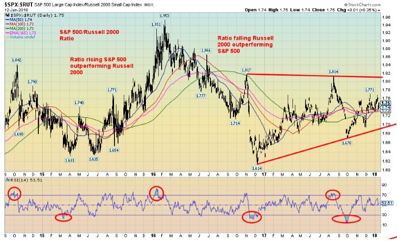
Oddly, the S&P 500/Russell 2000 ratio is not exactly setting the world on fire in favor of the small-cap stocks. In a strong bull market, the small cap stocks (Russell 2000) tend to outperform the large-cap stocks (S&P 500). In a falling market, the large-cap stocks tend to outperform as they are a safer play compared to the small-cap stocks. Since September 2017 the ratio has been rising, suggesting that the large-cap stocks are outperforming the small-cap stocks. But it is not exactly a “gangbuster” rise. Still, it is an interesting sign, suggesting the current rally is occurring primarily in large-cap stocks and, if we dig deeper, is probably occurring in a narrowing universe of stocks. In that respect it reminds us of the famous “nifty-fifty” rally of late 1972 that preceded the 1973–1974 collapse when the DJI fell 45%.
© David Chapman
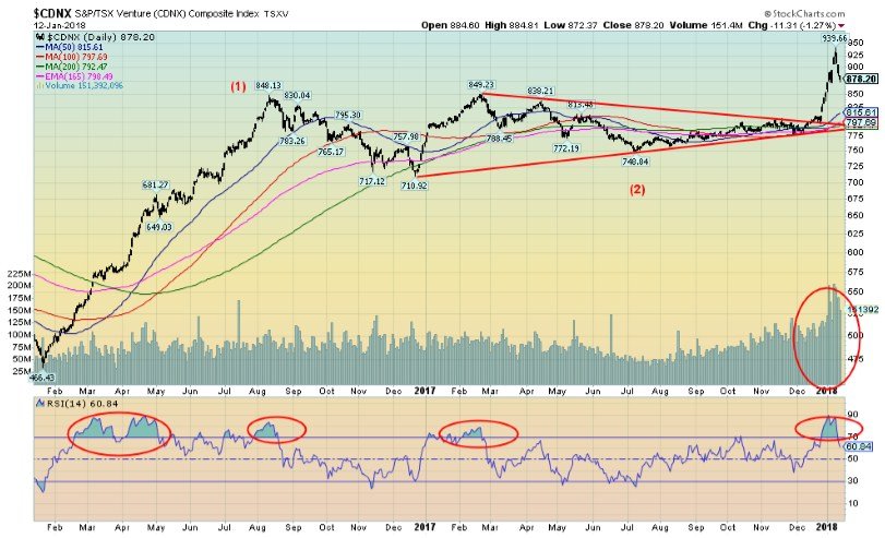
We showed the chart of the TSX Venture Exchange (CDNX) last week as we wanted to point out the CDNX has broken out of a 2-year channel. This is a very positive development for junior markets, particularly junior mining markets. The CDNX is 50% materials—junior gold and metal miners. Yes. there has been a pullback this past week but this is encouraging for a sector that has been hugely out of favour for the past several years. Note the huge volume that accompanied the breakout. This is another sign that the market is shifting and this overlooked and undervalued sector is coming into play. Given the dominance of material stocks on the CDNX we view the CDNX differently than say the Russell 2000 that is dominated by small-cap companies but few mining companies. The CDNX is starting what could be a powerful move to the upside targeting potentially to 988 and even to 1,075. Higher levels could be seen if those potential targets were to fall.

© David Chapman
In trying to imagine a world where quantitative easing (QE) has turned to quantitative tightening (QT) it is probably no surprise to see bond yields rising. The U.S. 10-year Treasury note rose to its highest level since March 2017, closing at 2.55% this past week. A firm break above 2.60% could send the 10-year bond yield towards 3% and even as high as 3.20%. There are many who believe the great bond bull is over. With both the Fed and even the ECB wanting to cut their balance sheets and some signs that inflation could be picking up, bond dealers want to balance their portfolios. That means selling particularly long-dated securities and buying shorter date securities or, in the parlance of the markets, shortening duration. Apparently, the pool of bonds with sub-zero yields (which were quite common in the EU) have fallen over $1 trillion in the past couple of weeks. Owning these sub-zero bonds might have made sense when the expectation was deflation and QE was driving bond prices higher, but in a world where inflation is picking up and QE has turned to QT holding these bonds no longer makes much sense. It is not just in the U.S. where this is occurring as it is occurring in the EU and Japan as well, although to a lesser extent. As we noted in our essay, rising bond yields precede a falling stock market. Bond yields are probably not high enough yet to spook the stock market but it could be coming.
© David Chapman
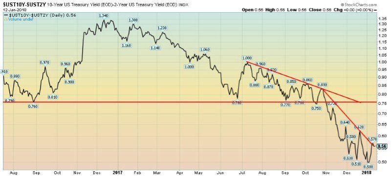
The 2–10-year spread jumped this past week back up to 0.56% from 0.51%. So far, it appears the downtrend line currently in place is stopping the rebound. We are watching the 2–10 year spread because a narrowing spread usually precedes a recessionary period. The 2–10 spread went negative before both the 2000–2002 stock market collapse and recession and the 2007–2009 stock market collapse and recession. We are nowhere near a negative spread at this point, but the direction of the spread is down.

© David Chapman
The US$ Index appears to be moving into its next phase to the downside. This past week saw the US$ Index break under its September 2017 low of 90.99, thus eliminating all pretense that a rebound of the US$ could continue. Potential targets are down to 86.90 with further potential for a decline to 84.40. Only a rebound that takes us back up over 92.50 might change this negative scenario. Disarray in the U.S. government, China cutting back on purchases of U.S. Treasuries, uncertainty as to what the Federal Reserve will do, and a lack of stimulus from the U.S. government (whatever happened to the infrastructure program) are all combining to bring the US$ down. The Cdn$ lost ground against the US$ this past week as well (as did the Mexican Peso) as NAFTA concerns rise. The big winners were the Euro, the Pound, and the Yen. Follow-through this coming week to the downside will help confirm the recent fall. Indicators are, however, somewhat oversold as the RSI slips under 30 so a bounce is possible. Nonetheless, a further break below 90.70 would help confirm the US$’s current slide.
© David Chapman
As the US$ falls, gold rises. Gold continued its recent run to the upside gaining $12.60 this past week or just under 1%. But gold in other currencies faltered due to the weakness of the US$ and the strength in other major currencies. Gold in Euros was off about 0.5%, in Japanese Yen down 0.8%, and in British Pounds down 0.2%. But the weakness of the Cdn$ allowed gold priced in Cdn$ to rise 1.6%. Gold has also been rising in a host of emerging market currencies and has hit a record against a basket of currencies that includes the Chinese Yuan, the Mexican Peso, the South Korean Won, the Turkish Lira, the Indian Rupee, the Russian Ruble, and the South African Rand. Gold’s rise is for much the same reason that the US$ has been falling. It also shows that gold is a hedge against currency debasement and depreciation of fiat currencies.
A reminder as well that Russia and China have led the way over the past few years in shoring up their international reserves with the purchase of gold. Since 2008 Russia has increased its gold reserves by 1,259 metric tonnes and China has increased their holdings by 1,242 metric tonnes (at least, that is what is officially reported by China as imports and other figures suggest it is most likely considerably higher). As well, it has been reported that according to Basel III rules for banking stability the Office of the Superintendent of Financial Institutions (OSFI) has said that Basel III rules will be applied to the Canadian banking system. That would give gold bullion the highest status as a risk-free asset (reported by Brandon White of Bullion Management Group (BMG)).
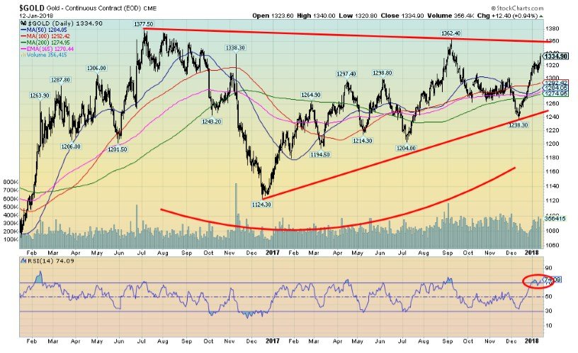
Gold has easily surpassed its October 2017 high, leaving only the September 2017 high of $1,362 and the July 2016 high of $1,377 ahead. The RSI has hit over 70, but if a strong bull is getting underway then it won’t make too much of a difference as we have seen with the U.S. stock market. Silver has failed to take out its October 2017 high so that is a niggling divergence that needs to be resolved. We need silver to lead and so far it is lagging. As well the gold stocks as represented by the Gold Bugs Index (HUI) and the TSX Gold Index (TGD) have also failed to take out the October 2017 high. Again, our preference is that they lead, not lag.
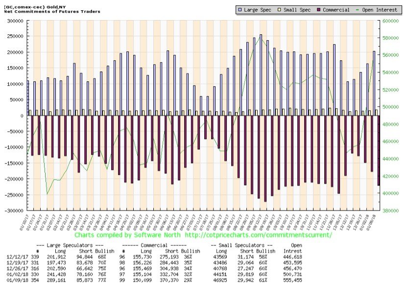
What was impressive this past week was a surge in gold prices despite a jump in the commercial COT.
© David Chapman
The commercial COT fell to 29% from 32% as the commercials added about 38,000 contracts to the short side and trimmed the long side by roughly 5,000 contracts. The large speculators’ COT rose to only 77% from 76% as long open interest jumped a big 48,000 contracts, but short open interest also rose by just under 8,000 contracts. The reporting date for the COT was January 9 and gold jumped $21 in the following three days. The jump in the COT is worrisome as we start to approach the September 2017 highs against the backdrop of silver and the gold stocks lagging. A drop back under $1,310 would be worrisome. But a consolidation would be positive.
Gold has made higher lows now for the past two years. Despite the recent hike in interest rates, the Fed rate is still below the rate of inflation, implying real negative interest rates. With the huge volume of debt outstanding, rising interest rates could be a death knell. So as long as the interest rates remain negative, the outlook should remain positive for gold.

© David Chapman
As we noted, silver prices are lagging gold failing to take out the October 2017 high of $17.50. Still, the pattern noted above for a possible head and shoulders bottom is compelling. A major breakout over $18 could see silver rise to at least $22.65 with further potential to $25.50. A break back under $16.80 would, however, be somewhat negative and could imply a decline to test $16.60/$16.70. Below $16.60 would be more negative and imply a decline to $16.30. The silver commercial COT fell to 37% this past week from 40% and is down from 44% just two weeks ago. Long open interest fell roughly 3,000 contracts as short open interest rose about 10,000 contracts. The large speculators’ COT jumped to 65% from 59% as long open interest jumped about 9,000 contracts and short open interest fell about 6,000 contracts. Silver’s failure to take out the October 2017 is worrisome so until we do confirm gold’s rise, it is something for us to be concerned about.

© David Chapman
Like silver, the gold stocks have been sticky even as the TSX Gold Index (TGD) jumped 1.9% this past week and the Gold Bugs Index (HUI) was up 1.5%. The performance while admirable was sticky. We expect more. The TGD is now testing its 200-day MA while the HUI has moved above its 200-day MA. Still, the TGD lies just below a potential major breakout at 202 although we prefer a firm breakout above 205. The HUI needs to take out 205 to beat its October 2017 high and a major breakout above 220. Still, like silver, the bottom patterns that have been forming on the TGD and the HUI are compelling as we believe it is a matter of when not if, they break out to the upside. The TGD has good support down to 195 and 190, but below 190 we would be worried about a test down to 180.

© David Chapman
Call it the illusion of inflation. At least that is how Don Popescu, a gold and silver analyst www.popescugold.com terms it. Since the end of the gold standard in August 1971, the Dow Jones Industrials (DJI) has gone up over 27 times. But when one prices the DJI in gold the DJI has actually fallen roughly 15%. Hard to believe, but one would have been better off holding gold over the DJI. Gold has unique properties in that it can’t be destroyed, it is actually quite rare, and it is negatively correlated to stocks and bonds. It has also been used as a means of money for thousands of years. Gold coins were first struck by King Croesus of Lydia back around 550 BC. Gold circulated as money long before the introduction of paper money. Even as late as the late 19th century the world was on a gold standard and only began to falter after 1930 and the Great Depression. The US$ was initially backed by gold at $35/ounce following the Bretton Woods agreement in 1945. But that collapsed in August 1971 and since then the world has embarked on another long experiment with fiat currencies. History has shown that eventually, all fiat currencies collapse. Just because it hasn’t happened yet doesn’t mean it won’t.
GLOSSARY
Trends
Daily – Short-term trend (For swing traders)
Weekly – Intermediate-term trend (For long-term trend followers)
Monthly – Long-term secular trend (For long-term trend followers)
Up – The trend is up.
Down – The trend is down
Neutral – Indicators are mostly neutral. A trend change might be in the offing.
Weak – The trend is still up or down but it is weakening. It is also a sign that the trend might change.
Topping – Indicators are suggesting that while the trend remains up there are considerable signs that suggest that the market is topping.
Bottoming – Indicators are suggesting that while the trend is down there are considerable signs that suggest that the market is bottoming.
(Charts of courtesy of Stock Charts, GoldChartsRUs, CotPriceCharts, Coin Desk, Elliot Wave, Bis, Haver, IIF, Gold core)
_
Disclaimer: David Chapman is not a registered advisory service and is not an exempt market dealer (EMD). We do not and cannot give individualised market advice. The information in this newsletter is intended only for informational and educational purposes. It should not be considered a solicitation of an offer or sale of any security. The reader assumes all risk when trading in securities and David Chapman advises consulting a licensed professional financial advisor before proceeding with any trade or idea presented in this newsletter. We share our ideas and opinions for informational and educational purposes only and expect the reader to perform due diligence before considering a position in any security. That includes consulting with your own licensed professional financial advisor.


PayPal’s Slowdown: From Fintech Leader to Low-Growth Dividend Stock
PayPal has shifted from fintech leader to low-growth, value-style stock, losing over 25% in market value and trading at a...


Tilray (TLRY) Falls as Bearish Momentum Persists Despite Marketing Push
Tilray (TLRY) fell 3.32% to $4.44, remaining below key moving averages and signaling continued bearish pressure. Despite a £1 million...


ESG Gap Persists as Firms Struggle to Link Sustainability to Financial Value
KPMG’s Global Survey shows a major gap between ESG awareness and financial integration. While 72% of managers understand sustainability strategies,...


Bitcoin and Ethereum Slide as Market Pressure Builds Amid Strategy Concerns and Layer 2 Disruptions
Bitcoin fell below $60,000 with heavy ETF outflows, pressured by concerns over Strategy’s finances and its STRC stock decline. Ethereum...


AI Venture Builder Launches €600K Crowdfunding Round to Scale Secure AI Solutions
AI Venture Builder, an Italian-British firm developing AI applications and vertical startups, returns to CrowdFundMe with a equity campaign. After...
 |
|
 |  |
 |
|
-

 Impact Investing1 week ago
AI Adoption in Italian Retail Stalls Despite Strong Experimentation
-

 Impact Investing4 days ago
EU Weighs More Free Emission Permits in ETS Review to Boost Industry Competitiveness
-

 Impact Investing2 weeks ago
SBTi Net-Zero Standard 2.0 Enhances Corporate Climate Action
-
 Crypto2 days ago
Bitcoin and Ethereum Slide as Market Pressure Builds Amid Strategy Concerns and Layer 2 Disruptions
You must be logged in to post a comment Login