Featured
The fluctuations on the stock markets are strongly connected to the pandemic
Markets reversed sharply on Monday July 13th but recovered and once again posted gains. But the NASDAQ nor the FAANGs Microsoft etc. did not and all closed down on the week. We look at high fliers, think Tesla and Zoom, and vaccine saviours this week. The velocity of money and the sharply rising money supply are the subject of our chart of the week.

Zoom! Maybe we should call this the zoom economy, given that Zoom Video Communications Inc. (ZM-NASDAQ) has become ubiquitous. It has also “zoomed” into the stratosphere.
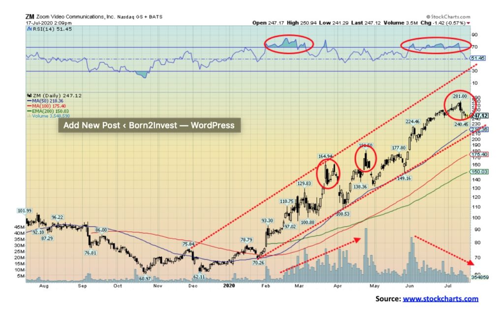
Zoom! It’s up 277% in 2020. Since it began trading in April 2019, it has “zoomed” up over 600%. At the beginning of the year, hardly anyone had heard of it. Now everyone uses it. Has it now topped? Of course, that is hard to say just yet. Until it busts back under $200 it remains in an uptrend. Yes, like a number of other stocks, Zoom put in an outside reversal day on July 13, 2020. We call that a key reversal in that Zoom made a new all-time high and then reversed, taking out the low of the previous day and closing below the previous day’s low. Like the rest of the market, Zoom bounced back. We can’t help but notice the declining volume even as Zoom “zoomed” higher. That’s quite different than what we saw February through May as volume rose and Zoom “zoomed.”
Zoom has been a metaphor for today’s market as, along with the FAANGs, Microsoft, and Tesla—plus the latest flavour of the day in biotech stocks that are going to save us all from COVID-19—they have led this stock market. As to everyone else? Well, does it matter? We’re in the midst of a pandemic, millions are unemployed, hundreds of small businesses are going bankrupt, and numerous larger ones too. But that is all moot as long as the stock market keeps on going up. That is, until it doesn’t.
The race has been on to find a vaccine for COVID-19. After all, if you are the company that comes up with the cure, it could be worth millions. It’s a global search and dozens of companies are involved in the U.S., China, the EU, and, yes, in Canada as well.
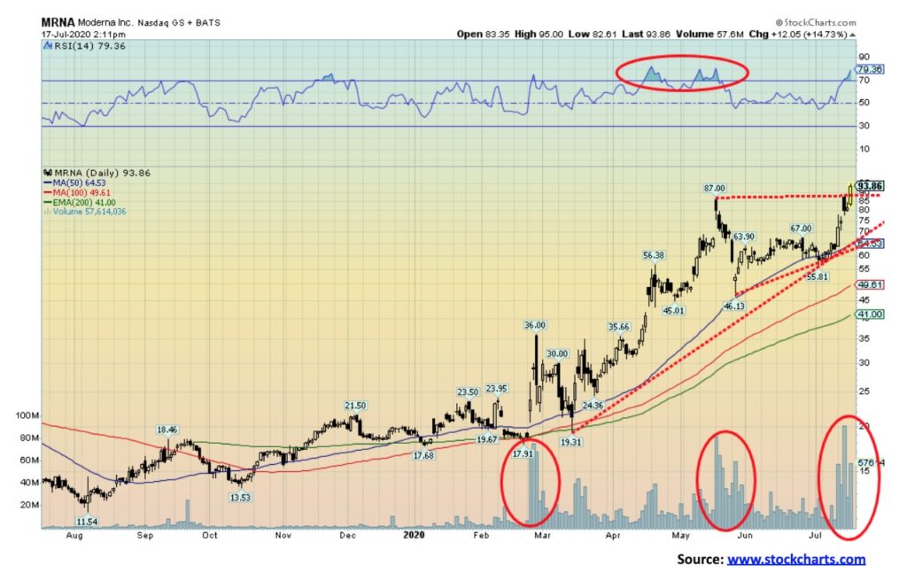
Some of the returns this year have been mind-boggling. We can’t hope to name them all. Above is a chart of Moderna (MRNA-NASDAQ). Moderna has fired up the market with the potentially positive early results. In the world of biotech companies searching for solutions for COVID-19, even the most mundane news on them can fire up their stock. But has Moderna topped on the news? Doesn’t look like it. At least, not yet. But what if the early promise proves to be not as good as initially advertised? The fall could be rapid.
Moderna is up over 300% in 2020 with most of that gain coming since the March 2020 low. On July 15, Moderna gapped open, spiked to a high and then reversed, closing sharply off the highs although still up on the day. Now Moderna is breaking out over $90, suggesting it could go even higher. Targets could be up to $130. But if Moderna fell and broke under $62 the fall could be swift, with targets down to almost $20. The sector is not for the faint-hearted.
One of the biggest gainers we found in the sector is Novavax (NVAX-NASDAQ), up an incredible 2800% thus far in 2020. A Chinese stock we noted was CanSino Biologics (CASBF-OTC) that has doubled since its debut for trading in the U.S. in April 2020. However, on the Hong Kong Exchange CanSino is up 270%. A small Canadian company we noted that has developed rapid, point-of-care diagnostic health tests for COVID-19 is Sona Nanotech (SONA-CSE). Sona is up an incredible 6,200% thus far in 2020. While the gains for some have been spectacular, many are up only marginally and some are even down.
Other major names in the sector seeking a solution to COVID-19 are AstraZeneca (AZN-NYSE), Gilead Sciences (GILD-NASDAQ), Glaxo-Kline (GSK-NYSE), Johnson & Johnson (JNJ-NYSE), Sanofi (SNY-NYSE), and Pfizer (PFE-NYSE). Some smaller ones we noted are Inovio (INO-NASDAQ) and Cytodyn (CYDY-NASDAQ).
The race for a vaccine is on, but most experts do not anticipate any significant solution until sometime in 2021 and even into 2022. Many will show promise, but the reality is development and human trials are time-consuming. There is no miracle cure. In the interim, the numbers are soaring with the U.S. now registering almost regularly over 60,000 new cases a day and the world 200,000 or more. That’s at least 1,000,000 every five days. At the current rates, cases globally could top 48 million by year end with upwards of 1.5 million deaths. The U.S. has become the basket case of the world for COVID-19. Yet the airwaves and newswires abound with conspiracy theories on how the COVID-19 is a manufactured crisis to allow some people to take over the world and turn us all into compliant robotoms. There are cries of tyranny when forced to shut down or put on a mask. It is almost as if Dr. Evil is behind all of this.
Sentiment in the stock market is quite high right now. The question for everyone is: Is there anyone who would short Amazon at $3,000 or Tesla at $1,500? Fund managers would be rewarded for buying the stocks at these prices and probably fired for shorting them. There is Warren Buffet’s saying: “Be fearful when others are greedy; and, be greedy when others are fearful.” We note Buffet stepped into the market and bought Dominion Energy’s (D-NYSE) gas pipeline network during the collapse of oil prices. Energy stocks have been down in the dumps in 2020. Would anyone have bought WTI oil at negative $40? Probably not.
Sentiment towards many biotech stocks is quite high for fear of missing out on the one that finds the vaccine for COVID-19. But there will probably be more misses than hits and the real hits are still a year away. We live in very difficult times. As Bruce Mehlman has written (The Great Acceleration – July 14, 2020) that the year 2020 has become a year like no other: pandemic, recession, mass protests, and a potentially violent and intense election. Since 1900 only three years have had three of the four – 1919 pandemic, recession, mass protests; 1957 pandemic, recession, mass protests; and, 1968 pandemic, mass protests and an intense election.
A shift has been on as politics moves from the center towards the extremes of both left and right. Globalization is in retreat as beggar thy neighbour policies take hold. World trade is forecast to fall by at least 15% in 2020. Nationalism is on the rise. There is a lack of global leadership. Virtually every country in the world (over 90%) is in a recession, or worse, something that has never happened before. The two major economic powers (China/U.S.) are waging economic war with each other while both sides also build up their military. Yet technology is unleashing what may well be a 4th industrial revolution. But technology is also bringing increased cyber attacks and the potential for infrastructure failures. And dare we mention the potential for extreme weather events.
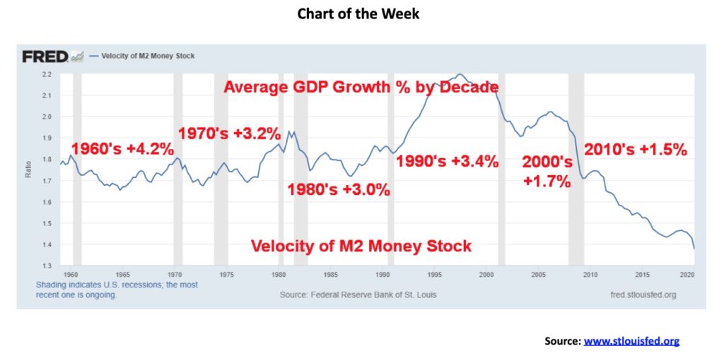
The velocity of money is rarely talked about. That may be because people don’t understand it. Yet its concept is pretty simple. The generic definition is that it is the frequency at which one currency unit is used to purchase goods and services within a given period of time. The simple formula is GDP divided by money stock. Simply put the velocity of money is the speed with which money circulates through the economy. It is also tied to how fast credit is created in the economy. So the more money that is created and turns over in the economy, the more the velocity of money rises. As money turnover slows even as credit creation grows, the velocity of money falls. But what if more and more money is being created yet the velocity of money keeps on falling? (Note: we are not getting into a deep economic/academic discussion of what money velocity actually represents).
Since peaking in the 1990s the velocity of money has been falling. Here we use M2 which is M1 (currency in circulation, i.e., notes and coins, demand and chequing deposits, and non-bank currency, i.e., travelers cheques) plus savings accounts, money market deposits, and time deposits under $100,000.
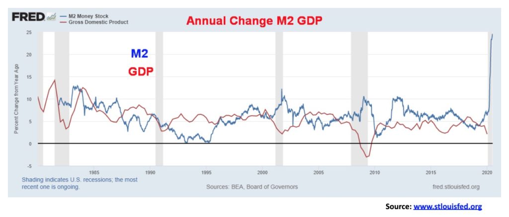
In an ideal world, one wants to see GDP and money supply growing at the same rate. But that hasn’t been the case. Money supply has been growing but GDP hasn’t been growing as fast. The result is the velocity of money has been falling. And translated another way, it takes more and more dollars (money creation) to purchase an additional dollar of GDP. Now, as our chart below shows, GDP is falling while M2 is rising. That could push the velocity of M2 money down even further.
The velocity of M2 money peaked in 1997 at 2.2. Since then it has been falling. It first bottomed in 2003 at 1.9 and then rose into 2006 (the peak of the housing bubble) when it hit 2.0. Despite years of increased money supply and massive credit formation it has taken more and more dollars to purchase an additional dollar of GDP. Why? Maybe it has something to do with the fact that all the money and credit creation is actually not going into production; instead, it is going into speculation. Or companies borrow money to buy back their stock. That actually produces nothing and contributes nothing to GDP.
The chart above only goes to Q1. Given the sharp rise in M2 since the outbreak of COVID-19 in March the velocity of M2 money is now down to 1.09 from 1.37 at the end of Q1.
With the U.S. economy and most of the rest of the world falling into recession, the odds favour the velocity of money to fall even further. And remember, all of this is occurring against the backdrop of historically low interest rates that are at or near zero. As the velocity of money plunges towards zero (is that even possible?), the economy effectively grinds to a halt. Could the velocity of money even turn negative?
Spending in the U.S. (and everywhere else, including Canada) to combat the COVID-19 is in the stratosphere. The U.S. budget deficit is expected to rise to at least $5 trillion this year. That would represent roughly 25% of GDP, a record that’s unheard of, even in war time. The U.S. federal debt as a result could hit $27 trillion or more and the federal debt to GDP would rise to over 130%. That would put or is already putting the U.S. in the big leagues of government debt to GDP along with Japan, Italy, and Greece. What that also tells us is that growth over the next year will be moribund at best. Think Japan since 1990.
To put things in some perspective, Canada`s debt to GDP while up sharply is still relatively benign. Federal debt to GDP for Canada despite the huge expenditure to combat COVID-19 is currently about 47%. But that is up sharply from where it was in 2019 at around 34%. As noted that is just Federal debt. Add in provincial debt and the number soars to around 100%. Add in the U.S. states debt and the U.S. debt to GDP is about 139%.
If growth is moribund, then there is a real risk that creditors could go on strike and not lend or that governments decide the debt is too high and they have to bring in austerity measures. Austerity measures would only exacerbate an already bad situation. Defaults and bankruptcies could become the norm.
As the U.S. slides further into debt, coupled with the fallout from the pandemic, mass protests, and a polarized electorate, the risk then becomes that the U.S. dollar collapses. The U.S., and by extension the world, faces a long road of slow growth, high debt, but low interest rates and inflation. All of that would also contribute to a further rise in the wealth gap unless a revolution or something else gets in the way of that. One can only hope we just muddle through because muddle-through could be the best scenario compared to the alternatives.
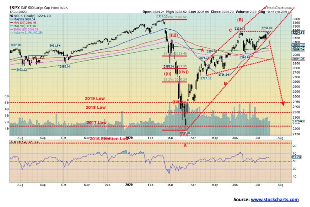
Stock markets took a hit on Monday July 13 but by the week’s end recovered and even managed gains. The markets took a hit as coronavirus numbers soared and further lockdowns loomed. But with thoughts of more Fed stimulus dancing in their heads, the markets recovered. Who cares if there are 30-40 million unemployed and tens of thousands of businesses that will just go out of business. The big ones are flying and all one has to do is own the FAANGs, Microsoft, Tesla, and the flavour of the day to find the vaccine.
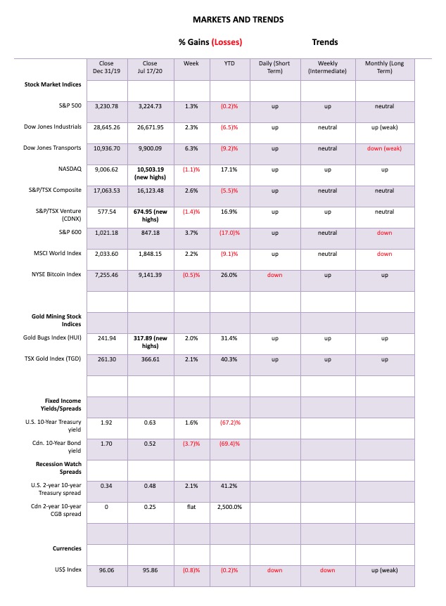
This past week, the S&P 500 gained 1.3% and is now almost back to break even for 2020. The Dow Jones Industrials (DJI) was up 2.3%, the Dow Jones Transportations (DJT) gained 6.3% (a surprise), while the NASDAQ made another all-time high but, in another surprise, reversed and actually closed down 1.1% on the week. Is the party over? The S&P 600 (small cap) gained 3.7%. Bullish sentiment has shot up to levels that now exceed the peak readings seen at the February top. The S&P DSI (www.tradefutures.com) has gone from 74 to 91 in seven weeks. At 91 not only is that high, it is close to the record high. Readings over 90 for sentiment indicators are often indicative of a top in the market. All week the S&P 500 tried to make new highs for the move since the March low and did eke out a 5-point gain over the June 8 high. But neither the DJI nor the DJT nor anyone else has been able to match the NASDAQ in making new all-time highs. An unresolved divergence.
In Canada, the TSX Composite was up 2.6% but the TSX Venture Exchange (CDNX) faltered and lost 1.4%. In Europe, the London FTSE gained 2.6%, the Paris CAC 40 was up 2.0%, and the German DAX gained 2.3%. In Asia, China’s Shanghai Index (SSEC) made new highs, then reversed and closed lower, dropping 5.0%. But the Tokyo Nikkei Dow (TKN) gained 1.1%. Has the SSEC topped?
Some economic numbers helped the U.S. indices as retail sales saw a 7.5% gain for June when the market expected a gain of only 5%. But keep in mind that is before the recent jump in coronavirus and fresh lockdowns. The same was seen for the Philly Fed manufacturing index that came in at 24.1 above the expected 20. Initial jobless claims didn’t help at 1,300 thousand, only slightly below the previous week’s 1,310 thousand. Continuing claims were 17,338 thousand below the expected 17,600 thousand and below the previous week’s 17,760 thousand. Nonetheless, jobless claims remain highly elevated. Housing starts for June were slightly better than expected at 1,816 thousand, but that remains sharply down on the year. The market was steadied by the Michigan Consumer Sentiment that fell to 73.2 when it was expected to show a reading of 79. Inflation remains a non-factor as the core CPI year over year was 1.2%. Given the 10-year U.S. treasury note is at 0.63% negative interest rates remain. The 1.2% core gain is below the Fed’s target of 2.25%.
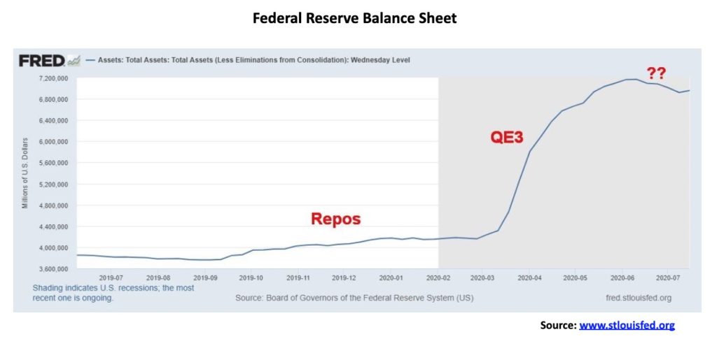
With the rising coronavirus numbers and thoughts of further monetary stimulus, the market gained. But will it hold? The Fed balance sheet this week showed the first gain since the week of June 10. Fed assets rose $38 billion, but that is still down $210 billion since June 10.
The key may have been the reversal in the NASDAQ (see next chart). If the FAANGs and other high flyers falter, the mini-bull since March may be over.
If the market is to go higher, we must close that gap left on February 23/24 between 3,225 and 3,337. We are poking our head into it, but the zone also is a potential fail-zone. Failure will start to show itself if we take out the July 9 low of 3,115. Confirmation comes on a breakdown under 3,000. We are terminal under 2,900. July tops are not unusual. We recall the July 1990 high before a 20% plus drop. In 2007 the market actually topped in July, even though the final high was not seen until October. However, it was only marginally over the July top and there were many non-confirmations. That preceded the 2008 55% financial crash. We are reminded that the March collapse took out the 2019 and 2018 lows. Taking out a prior year’s lows usually signals that we are entering a major bear market. But, as we saw in the 1970 crashes, these were followed by powerful rallies where everyone declared the bear to be over.
As noted, we need to close that February gap if we have thoughts of new all-time highs. Otherwise, we are now at the perfect fail-zone.
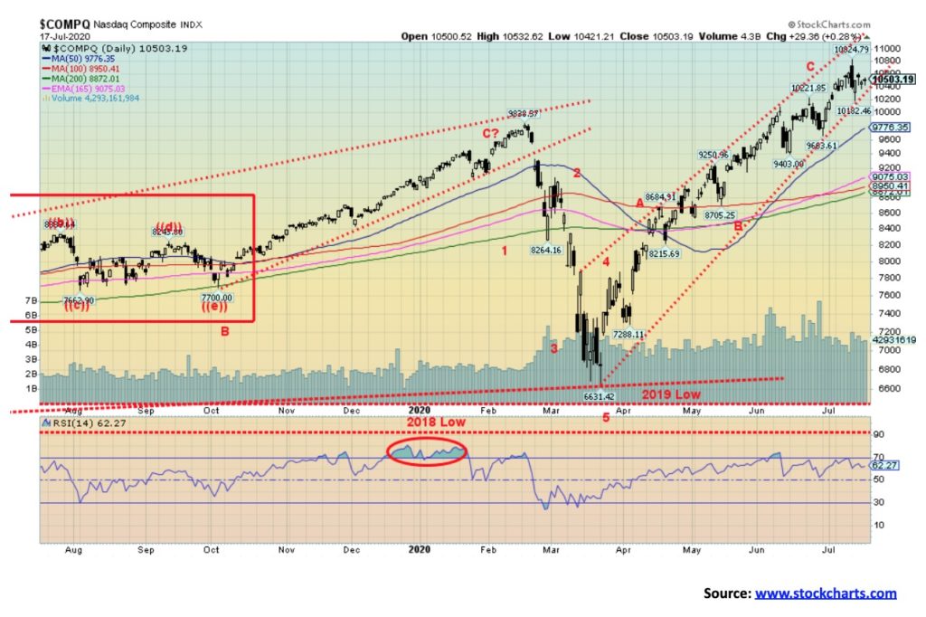
The NASDAQ did it again. It made another new all-time high, but then something happened on its way to Nirvana. July 13 (no, it wasn’t a Friday) saw a plunge because of the massive upsurge of coronavirus cases and fresh shutdowns looming. The NASDAQ tanked and never recovered. A huge reversal day and by week’s end the NASDAQ fell 1.1% even as everyone else saw gains. The NASDAQ had a key reversal day on July 13 and came perilously close to a key reversal week. Yes, the NASDAQ closed lower and, yes, the NASDAQ saw higher highs and lower lows than the previous week but it failed to close under the low of the previous week. So, a big reversal week without the close below the previous week’s low. No surprise that the big leaders all made new all-time highs and everyone closed lower on the week: Facebook -1.2%, Apple -2.2%, Amazon -7.4%, Netflix (the biggest loser) -21.6%, Google -1.7%, and Microsoft -5.1%. Oh yes, and Tesla -2.8%. They all fell despite the other indices being up on the week. A major non-confirmation.
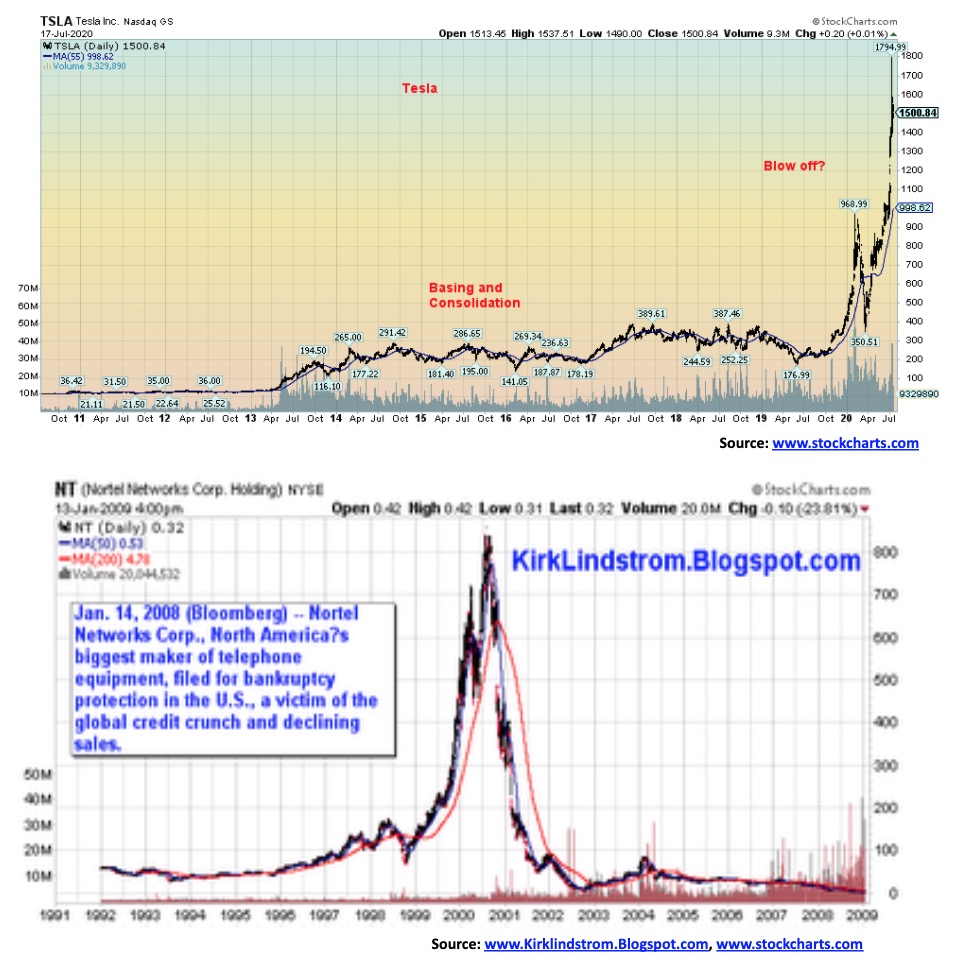
Could history repeat itself? From a low in 2019, Tesla soared over 900% into 2020. From a low in 1999, Nortel soared over 900% into 2000. We like the symmetry. Could Tesla meet the same fate? Flavours of the day have a habit of becoming major crash victims.
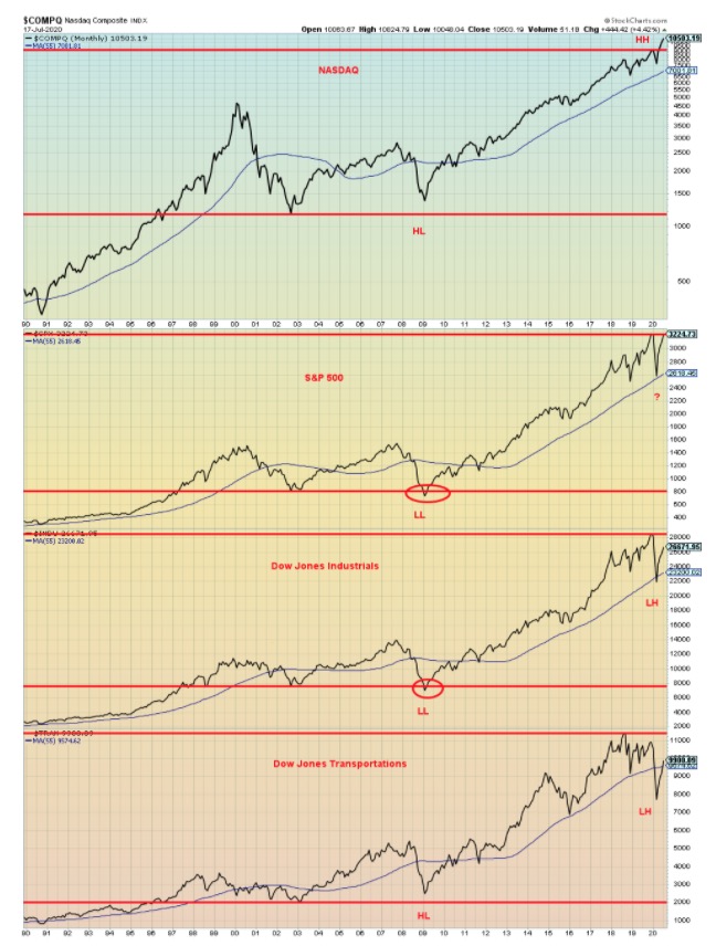
The long-term chart on the previous page highlights the divergences between the major indices that often show up at major turning points. The chart shows the NASDAQ, S&P 500, Dow Jones Industrials (DJI), and Dow Jones Transportations. Note what happened at the major turning point of the 2009 low. Both the S&P 500 and the DJI made lower lows below the low of 2002. But the NASDAQ and the DJT did not. Dow theory states that the averages must confirm each other. In this instance they did not and it signaled the end of the bear market. Confirmation did not come until all four indices regained above their 55-month moving average. (Note: HL – Higher Low, LL – Lower Low, HH – Higher High, LH – Lower High).
Flash forward to today. The NASDAQ is making new all-time highs. The S&P 500 appears poised to join the NASDAQ. But the DJI is lagging. As to the DJT, well, it is now only above to regain its 55-month moving average. And not only is the DJT not near its previous 2020 high but it is far short of its all-time high set in 2018. While the S&P 500 could well join the NASDAQ in making new all-time highs, it remains to be seen if the DJI can join them. The DJT first needs to regain the 55-month MA before we can even think about it making new all-time highs once again.
If, however, this potentially major divergence is correct, confirmation would only come once all four indices have fallen below their 55-month MA. For the NASDAQ that is at 7,002, S&P 500 at 2,618, DJI at 23,200, and the DJT at 9,574. The DJT is barely above its 55-month MA currently 9,900.
Divergences are an important part of technical analysis. Dow Theory is at the core of technical analysis. The averages must confirm each other. Currently, they do not.
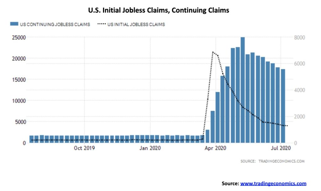
For the 17th week in a row initial jobless claims topped the million mark. Before the pandemic the highest weekly claims came during the 1982 recession when initial claims were 695,000. This past week initial claims came in at 1.3 million which was above the expected 1.25 million. It was only 10,000 below the previous week’s mark. Since March, total claims are 51.3 million. The 4-week MA is at 1.38 million. Continuing claims also were once again high at 17.34 million, just below the expected mark of 17.6 million.
What is concerning in the numbers are the rising claims for unemployment as a direct result of the pandemic. Job losses are rising. Initially, they were due to the lockdowns and enforced closures. Now the job losses are coming because of the sharp deterioration in business which is sparking outright layoffs. These layoffs are coming from U.S. states, municipalities, and businesses not designated for lockdown or closure. There is a program in the U.S. called the Pandemic Unemployment Assistance Program. Its numbers have been steadily rising. The total that accounted for 14.3 million of the 17.34 million continuing claims.
These numbers always have a lag of upwards of two weeks built into them. With many more closures coming as a result of the massive surge of COVID-19 in numerous states, the expectation is that these numbers are going to rise again. What all this appears to be pointing to is that the July nonfarm payrolls could begin to see a reversal of the gains recorded during May and June. Remember that the big gains of May and June recouped only about 36% of the losses seen in March and April. All that suggests is nonfarm payrolls could once again turn negative and the unemployment rate could rise.
Adding to the unemployment woes is the expected decision not to extend the $600/week benefits that came as a result of stimulus legislation. The claim is it is a disincentive to work. The extension is not supported by the White House or the Republican-dominated Senate. The expectation is that without the extension the cutback will have a negative impact on household expenditures and result in further cutbacks elsewhere. It could also result in an uptick in evictions and a rise in homelessness as the payments allowed people to keep their heads above water by being able to pay their rent and buy food. A massive uptick in employment would help, but, by all indications, that is not going to happen.
We note that there are cries to cut CERB in Canada as well. The same analysis applies here. Currently the CERB has been extended again.
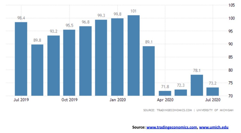
The University of Michigan consumer sentiment index unexpectedly fell to 73.2 for July, down from 78.1 in June. That was well below market forecasts of 79. It pushed the index back towards the levels seen in April and May. All indices were down with the current conditions index falling to 84.2 from 87.1 and the expectations index down to 66.2 from 72.3. A good part of the reason for the fall was the huge surge in coronavirus cases in the U.S., coupled with the increasing political polarization. According to the surveys, grave concern remains going forward with the spread of the coronavirus, deteriorating economic conditions, and social unrest.
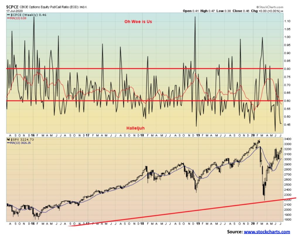
We continue to be fascinated by the almost record low for the CBOE Put/Call ratio. At 0.45, it almost matches the 0.40 we saw just before the March 2020 coronavirus crash. Doesn’t bode well.
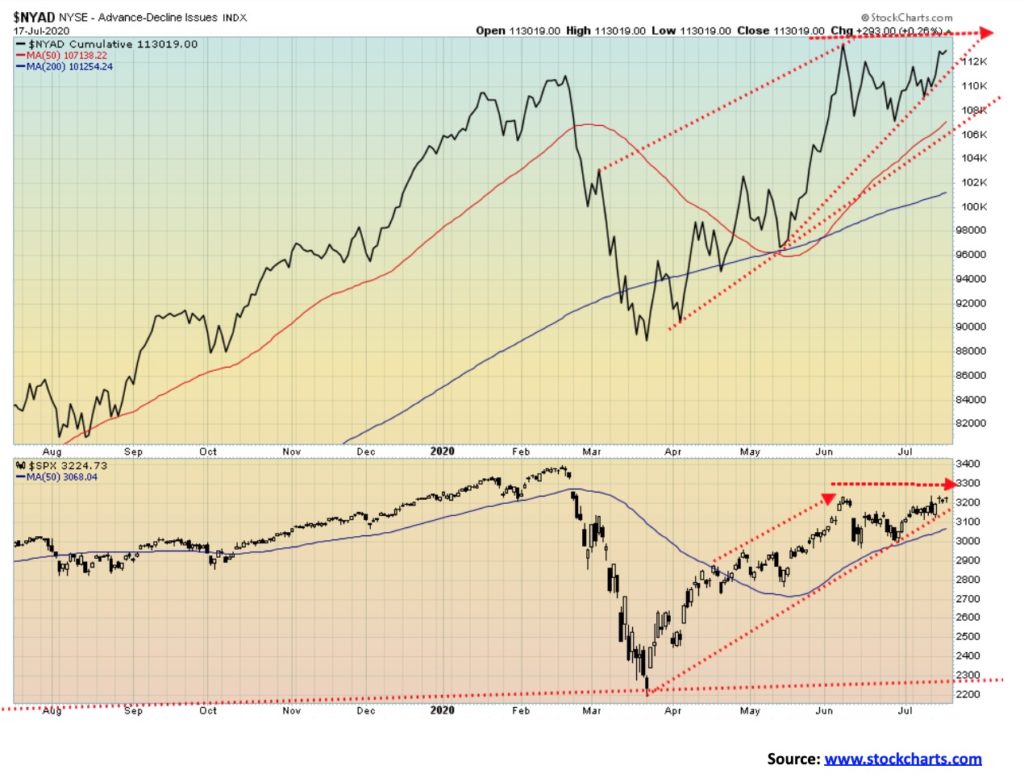
The bulls’ great hope. The NYSE advance-decline line is poised to once again make new all-time highs, even though the S&P 500 is still a bit away from its February high. If anything, they are diverging as the advance-decline line has made new all-time highs but the S&P 500 has not. We believe it misled us in February and we believe it is misleading us again.
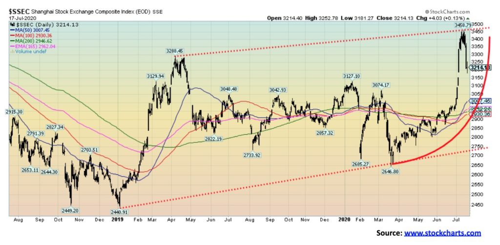
Is the party over for the Shanghai Stock Exchange (SSEC)? From a low in March to the recent high, the SSEC soared over 30% making fresh 52-week highs. No, the SSEC did not make new all-time highs. It is well away from that level of 5,178 set back in 2015. Following that high the SSEC crashed 53% into 2018. The recovery has been fitful and has been based on China’s potential recovery from the coronavirus crisis of February/March 2020. Yes, China has been showing signs of recovery. After plunging 6.8% in Q1 year over year, the Chinese economy recovered in Q2 growing by 3.2% year over year. That’s a far cry from the regular 6.5% throughout 2019 and earlier. In terms of growth, the Chinese economy peaked back in 2005 at 15.3%. Since then it has been downhill but growth remained elevated. Maybe the SSEC is realizing this could be short-lived. Maybe they looked at the growing tensions between China and the U.S. and realize that neither one of them can win an economic war. Maybe the U.S markets should heed. And don’t forget that China’s government budget deficits are almost as big as the U.S.’s. Okay, not that high. And China has a lot more fiscal room with a public debt to GDP ratio of 53% vs the U.S.’s 130%. As well, their external debt to GDP is only 16% vs. the U.S.’s 120%. By comparison, the U.S. is a basket case.
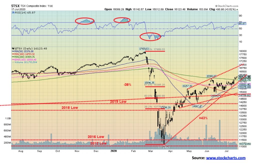
The TSX Composite gained 2.6% this past week. The TSX took a hit like everyone else on July 13 but recovered quickly and actually went on to make new highs for the current move this past week. The TSX also closed over the 200-day MA for the first time since February. However, we do note that if this is a bear market rally as we suspect, then usually the 200-day MA doesn’t hold.
All the sub-indices gained this past week except, notably, one. Information Technology (TKK), which had been the big winner so far in 2020 saw a new all-time high reversed and closed lower on the week, losing 2.8%. there were some impressive gains this past week from some of the sub-indices. Leading the way was Utilities (TUT) with a 6.5% gain. Right behind was Telecommunications (TTS) with a 5.9% gain. The major leaders were Income Trusts (TCM) up 4.2%, Consumer Discretionary (TCD) +4.6%, Health Care (THC) +4.9%, and Industrials (TIN) +4.5%. Materials (TMT) was up 2.1% and saw new highs while Metals & Mining (TGM) gained 3.6% and also made new highs. But is Infotech the canary in the coal mine? Like the U.S. tech stocks, it has been a big winner and it is still up 40% on the year, tied with Golds (TGD) for the lead.
Over on the TSX Venture Exchange (CDNX), we noted last week how it looked a bit toppy, hitting resistance zones and running into the four-year MA. Well, we guess it’s no surprise that it too made new 52-week highs this past week, then reversed and closed lower. While it was a reversal it wasn’t a key reversal and it never took out the low of the previous week. We suspect it could just be setting up a needed pause. Many of the junior mining stocks have already doubled and tripled and a pause may be needed.
As for the TSX, it has filled a big gap left on the charts from February/March. But this could also be the fail zone. We are trading at weekly resistance. We need to overhaul 16,750 to tell us that an assault on the highs is possible. To the downside the major support is seen at 15,000. Below there, a new down leg could get underway. We continue to like Golds, Metals, and Materials but are now a bit wary about Infotech.
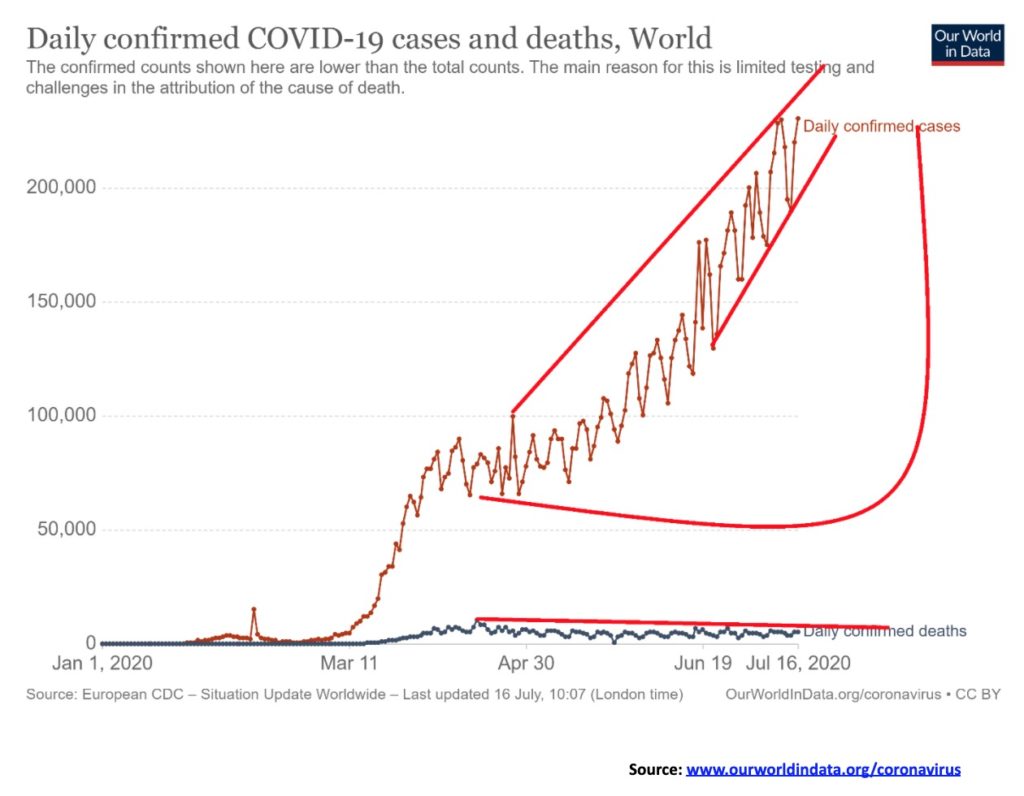
Up, up, up and away! The number of cases seem to grow, grow, grow daily. The big three – U.S.A., Brazil, India. But gaining rapidly and now number 5 – South Africa. Who`s next? Over 200,000 new cases daily. At this rate we`ll be crossing 50 million before year end. As to deaths well maybe upwards of 1.5 million by year end. And that`s assuming the daily numbers don`t rise further. The big three in deaths isn`t the same as the big three in case. Deaths – U.S.A., Brazil and U.K. But Mexico is gaining rapidly and India could also rise quickly. In many instances in countries like India the number of cases and deaths are probably underreported. Deaths are pretty steady and have not surged with the rise in cases. But could that change?
Sunday July 19, 2020 – 13:39 GMT
Number of cases – 14,465,556
Number of deaths – 605,813
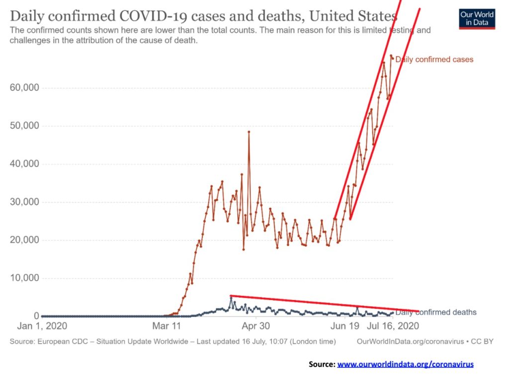
We are loath to say it, but what the heck! USA! USA! USA! MAGA! Number 1. Refrigerator cars to haul out the dead in Texas. ICU units overflowing. Florida, a state of 21 million people makes Canada, with 37 million people look like pikers. New York still leads in cases but California, Texas and Florida are gaining rapidly. U.S.A. with 5% of the world`s population has 26% of the cases and almost 24% of the deaths. MAGA. We can`t find the top as the channel is straight up. A blow off top? Deaths at least seem to be steady on a downward tract.
Sunday July 19, 2020 – 13:39 GMT
Number of cases – 3,835,430
Number of deaths – 142,883
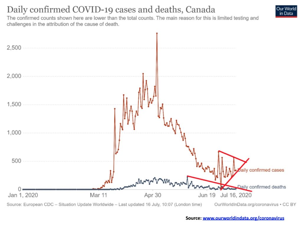
Triangular formations after a long downtrend are in some ways ominous. Let`s hope we just waffle through the triangle and don`t breakout to the upside. Otherwise Canada could soon be facing a resurgence in cases. Deaths have been on a steady downward tract. Canada is way down the list at number 21 globally but in terms of deaths we are number 14. But that is out of over 200 countries (many of them small). In terms of cases we are about 0.3% of the population or 2,913 per million. The U.S. is 1.2% or stated another way 11,584 per million. And numbers are rising. The triangle is symmetrical. So, in theory a symmetrical triangle could break either way up or down. Symmetrical triangles following a long decline are usually bottom formations. So, we`ll see.
Sunday July 19, 2020 – 13:39 GMT
Number of cases – 109,999
Number of deaths – 8,848
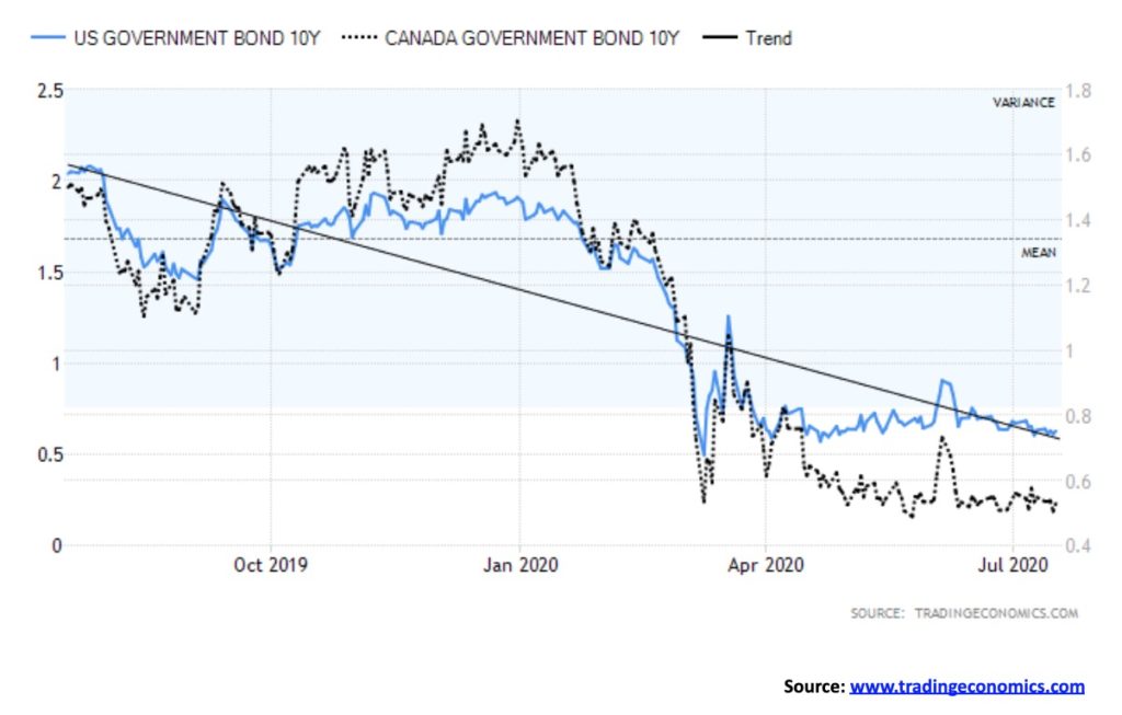
There is little to say about interest rates these days. This past week saw little change for either the U.S. 10-year treasury note or the Canadian 10-year Government bond (CGB). The U.S. note rose to 0.63% from 0.62% and the CGB fell to 0.52% from 0.54%. The BofC met this past week and, as expected, they left rates unchanged at 0.25%. Tiff Macklin, the Governor of the BofC, painted a bleak picture for the Canadian economy going forward, but was somewhat more optimistic for 2021. Going forward, we have little expectation of seeing a rate rise. Have we entered the twilight zone of permanently low interest rates à la Japan 1990 and onwards? The FOMC meets again July 28/29. We expect no change in rates. The question is, how gloomy will Powell be? And is more stimulus forthcoming?
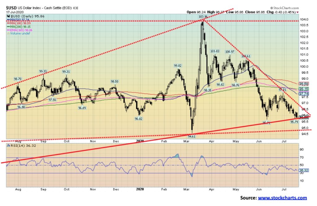
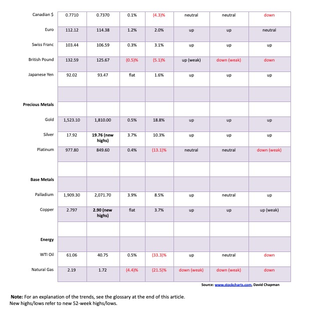
The US$ Index continued its recent downward trend. The US$ Index fell 0.8% this past week and is now down 0.2% on the year. The major gainer was the euro, up 1.2%. The Swiss franc gained 0.3%; however, the pound sterling was down 0.5% and the Japanese yen was effectively flat off 0.04%. The Canadian dollar was up a small 0.1%. The U.S. dollar is weakening, due to many contributing factors: the growing political and economic uncertainty in the U.S., the sharply rising U.S. debt (with a federal debt to GDP ratio of over 130%), the rising budgetary deficits, the rising tensions between the U.S. and China, and concerns that the U.S. stock market may be topping. That is sparking a flight out of the U.S. dollar and primarily into the euro as well as gold. The US$ Index appears to be on the cusp of a breakdown under 95.80 and then a breakdown under 95. A breakdown under 95 could send the US$ Index down to 88. We witnessed what we believe was a blow-off top when the US$ Index soared from 94.60 to 104 in a matter of nine weeks at the height of the coronavirus crisis. Now the coronavirus is having the opposite effect as the US$ is falling. The belief is the U.S. is out of control and its inward retreat is not only bad for the U.S. but it is bad for the world. Only a handful of countries welcome U.S. visitors. Everywhere else, particularly the EU, Canada and most of Asia it is “stay home.” Even where they are still welcomed, U.S visitors may have to go through quarantine and submit to COVID tests. U.S. visitors to Canada, if apprehended, have faced stiff fines and deportation. All of this lessens the demand for U.S. dollars and a strong reason why the U.S. dollar should go lower. However, we acknowledge that given we are at a potential major support zone we could once again witness a save and a rebound. A rebound that would, once again, most likely a temporary situation.
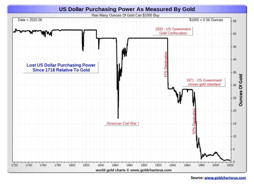
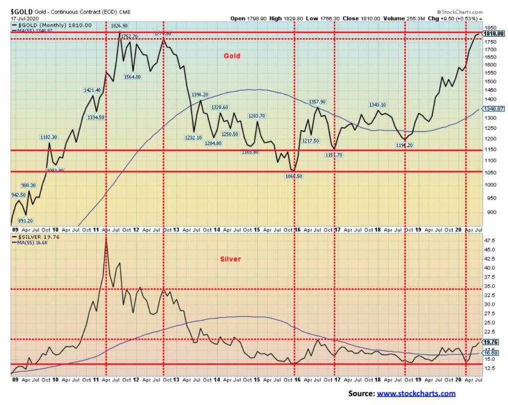
The long decline of the purchasing power of the U.S. dollar relative to gold. For years, except for a few blips and the U.S. Civil War, a $1,000 bought you over 50 ounces of gold. That changed dramatically with the gold confiscation and devaluation in 1933. The initial shock was a 41% devaluation. But it didn’t stop there. After Richard Nixon closed the gold window in 1971, the U.S. dollar devalued a further 52%. Today, a $1,000 will get you only 0.56 ounces of gold. In total, that’s a 99% devaluation of the U.S. dollar as measured by gold. So, which would you rather own? U.S. dollars or gold?
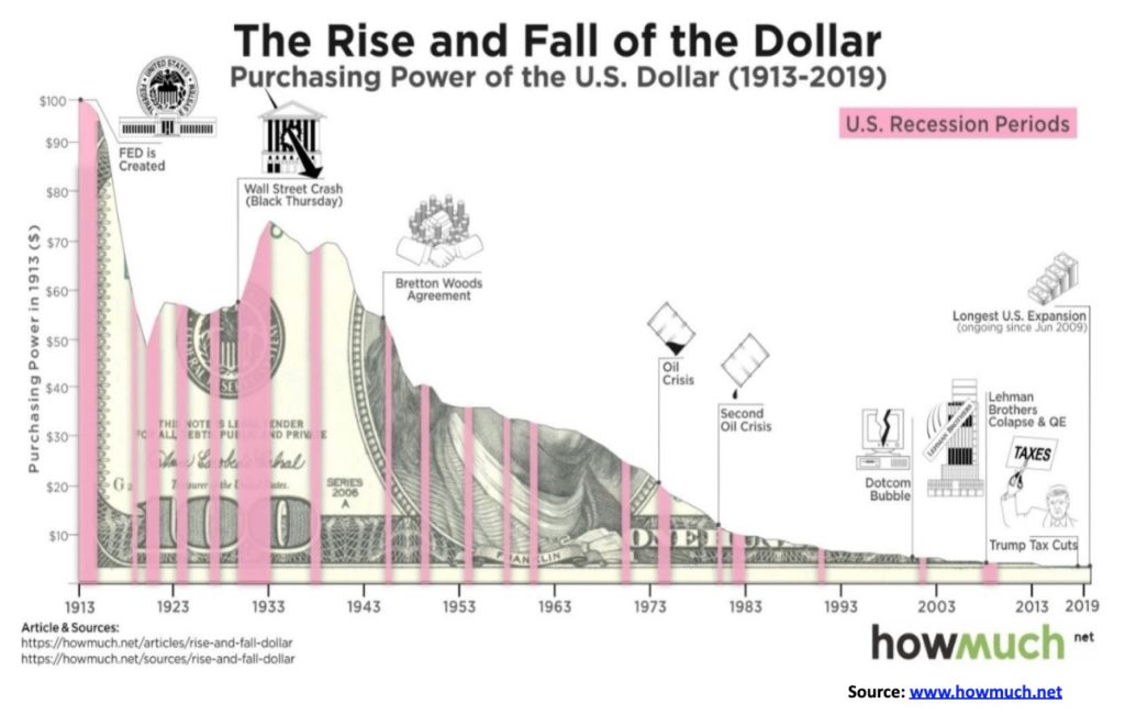
Same answer, different picture. This one shows the purchasing power of the U.S. dollar since the founding of the Federal Reserve in 1913. Rather than being related to gold as was the previous chart, this one is related to the CPI. But the answer is the same. A 99% devaluation. Well actually a 96% devaluation. What would cost you $1 today would have cost you 4 cents in 1913. Oh yes, gold has kept pace for you. In 1913 gold was $20.64. If gold had kept pace with the rate of inflation it would be at $537 today. Instead it is $1,810, proving that by holding gold you maintain your purchasing power. And in this case more than maintain. Yet gold remains grossly under-owned, under appreciated and under understood, relative to other assets.
Gold gained a small 0.5% this past week as it was up for the sixth consecutive week. Silver continued its recent outperformance, gaining 3.7%. Platinum was up a small 0.4% and continues to lag. Near-precious metals such as palladium crossed back over $2,000 with a gain of 3.9% while copper made 52-week highs even as it was flat on the week. Copper is enjoying a resurgence and is now up 3.7% on the year. Platinum is the laggard, down 13.1% in 2020. Investment demand for gold continues to be strong with holdings in the SPDR Gold Trust (GLD) continuing to rise. Gold holdings in ETFs are 150.85 million ounces up from less than 100 million ounces at the beginning of the year.
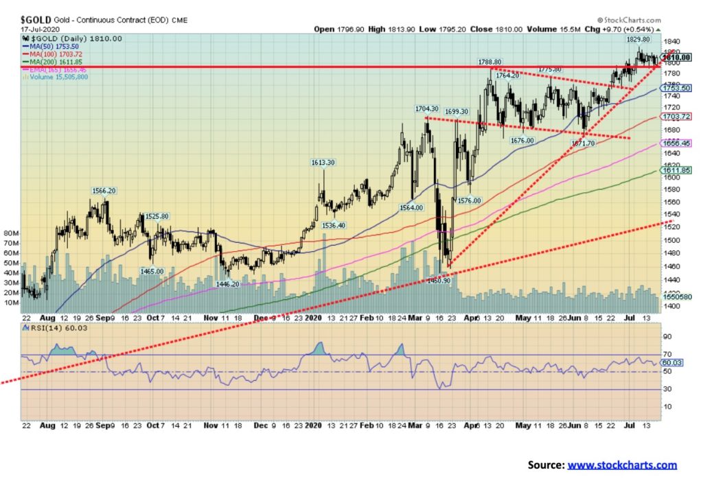
Factors helping gold rise include the rising coronavirus numbers, particularly in the U.S., the potential for more Fed stimulus, exploding central banks balance sheets, negative real interest rates, the falling U.S. dollar, the rising political and economic uncertainty, and geopolitical concerns with the rising tension between the U.S. and China. The potential is for gold prices to rise further towards our first targets of $1,950. Gold is up 18.8% thus far in 2020 and has outperformed the stock indices, although it has not outperformed the FAANGs and Microsoft nor Tesla. $1,670 remains major support although a break under $1,780 would be of some concern for at least a short-term pullback. New highs are needed over $1,830 to suggest we are on our next wave to the upside.
Gold should continue its winning ways, although we do get concerned when bullishness gets too high. A good reason why periodic pullbacks are healthy. Something to spook the weaker longs. Along with the rise in gold prices we are seeing steady buying of the gold stocks and a strong renewed interest in the junior gold mining exploration stocks. Many of them have already doubled and more this year. Seasonally, gold tends to perform well into August/September before a pullback into October. Usually we look for a low in gold prices in the June/July period. We had a low in June but it was a higher low. If that’s correct, then we could rally strong into August/September before faltering again. Just keep the breakdown points in mind.
Earlier, we noted the major divergences that took place between the major stock indices. Like the stock indices we can also note major divergences between gold and silver. Many believe the two are in locked in sync, and while generally that is the case, we often note major divergences between the two at major turning points.
In 2011, Silver made an all-time high. Gold was also making new highs as well at the time. Silver’s high came in April. However, four months later gold made an all-time high (close basis) in August 2011 while silver did not. This turned out to be a significant divergence. In 2012 it happened again. In September 2012 gold appeared poised to break out and move back towards the 2011 highs. Silver was nowhere near breaking out and was not only well below its April 2011 high it was also well below its August 2011 high. That was a significant divergence and it proved fatal in 2013 when the precious metals market collapsed.
In 2015 both gold and silver made fresh lows together. Again in 2016 both gold and silver made higher lows together. However, in 2018 silver made a new low below its 2016 low but still above its 2015 low while gold did not make new lows below its 2016 low. That proved to be a buy signal and gold soon surpassed its 55-month MA. Silver, meanwhile, has struggled. In 2020 silver plunged below its 55-month MA and tested the low of 2018. Gold was nowhere near its 2018 low. What followed was both started to rise once again. Silver has finally cleared its 55-month MA but remains below its highs of 2016 and well below its high of 2012. Gold has not only fully cleared its 2016 high it has now cleared its 2012 high.
This has been an ongoing major divergence between gold and silver that remains to be resolved. Until this divergence is resolved we remain somewhat cautious about this great rally. So far, it has been a gold rally with silver lagging badly.
These divergences have happened before. In 1999 and 2001 gold was making new multi-year lows in particular below gold’s 1993 low and below a 1985 low as well. However, silver did not confirm that low making a higher low vs. its 1993 low and a higher low to its 1985–1986 low. That proved to be a major turning point and for the next several years both gold and silver rallied into the 2011 highs. Divergences between indices or even similar commodities are often clues to major turning points.
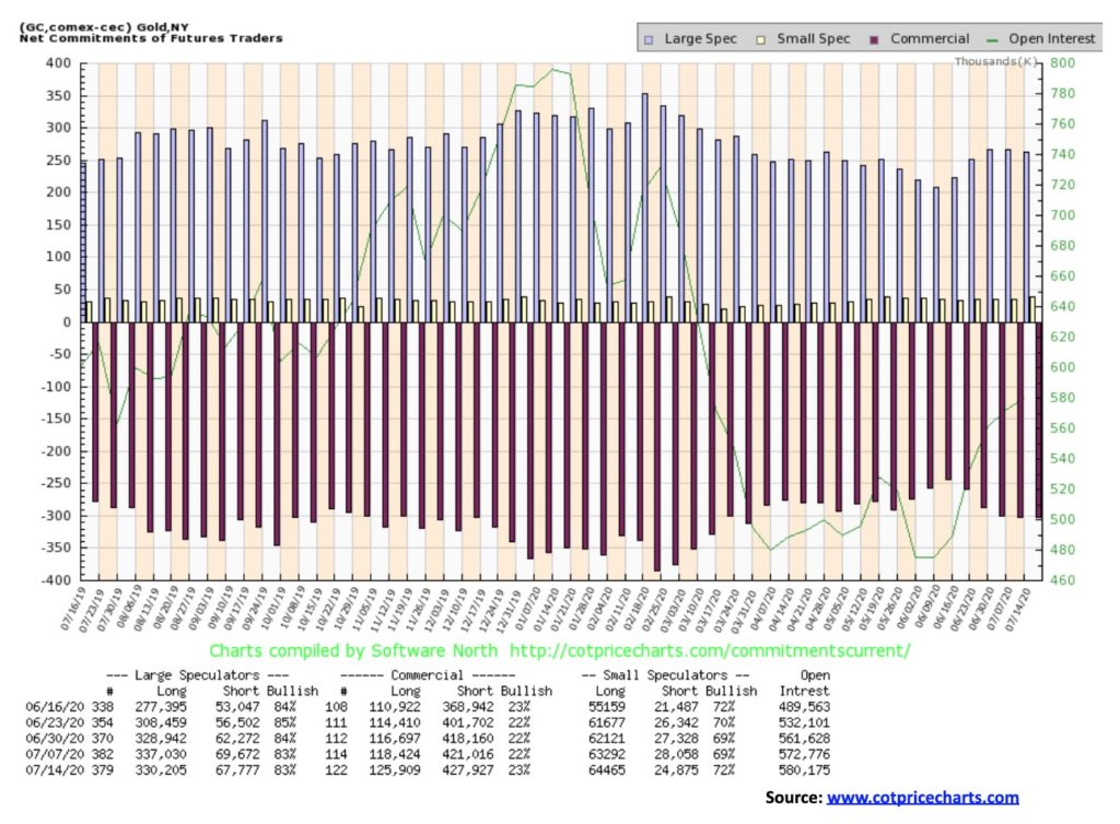
The gold commercial COT improved slightly this past week to 23% from 22%. Long open interest rose over 7,000 contracts even as short open interest also rose about 7,000 contracts. The large speculators COT (hedge funds, managed futures, etc.) was steady at 83% although long open interest fell almost 7,000 contracts and short open interest dropped about 2,000 contracts. Overall open interest rose in line with the rise in gold prices on the week. That’s positive. The gold COT remains somewhat bearish even if it has improved.
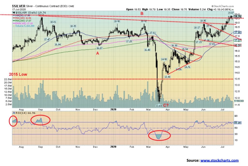
At last silver posted a new 52-week high this past week at $19.87, slightly surpassing the September 2019 high of $19.76. We still need to clear that level. Confirmation would come with a close over $20. If we can close over $20, then we could look at the July 2016 high of $21.23 as the next hurdle to overcome. Above that would be the August 2013 high of $25.12. The April 2011 high of $49.82 is but a distant memory. With an RSI of 67, silver would appear to have some room to move higher before reaching above 70. Silver has been a strong performer of late and is finally starting to outperform gold. Silver gained 3.7% this past week vs. gold’s gain of 0.5%. Silver is up 10.3% thus far in 2020. Both gold and silver have been on a winning streak since bottoming near $17 in mid-June. Silver investment demand has jumped recently. At the beginning of the year the iShares Silver Trust (SLV) held 362.6 million ounces of silver. The most recent numbers we saw recorded 516.1 million ounces of silver in SLV a gain of 42%. It’s a record high. In total there are 1,376.325 million ounces of silver in silver ETFs. That’s up from about 1,100 million ounces at the beginning of the year.
As well, as we have noted, the gold/silver ratio has fallen to 91.6, the lowest level since February 2020. Still, we need to see a breakdown under 83 to suggest that the long uptrend in the gold/silver is over. Just getting the gold/silver ratio back to 70 would be an accomplishment. At that level it would suggest that silver should be $25.85 at current prices. We highly doubt gold would fall to $1,385 which would also make the gold/silver ratio at 70 with silver at $19.76. A breakdown back under $19 would send up caution flags for silver while a breakdown under $18 would be negative. Major support is now at $17. The next upside target is $20. A firm break over $20 would suggest the next target to be $21.25.
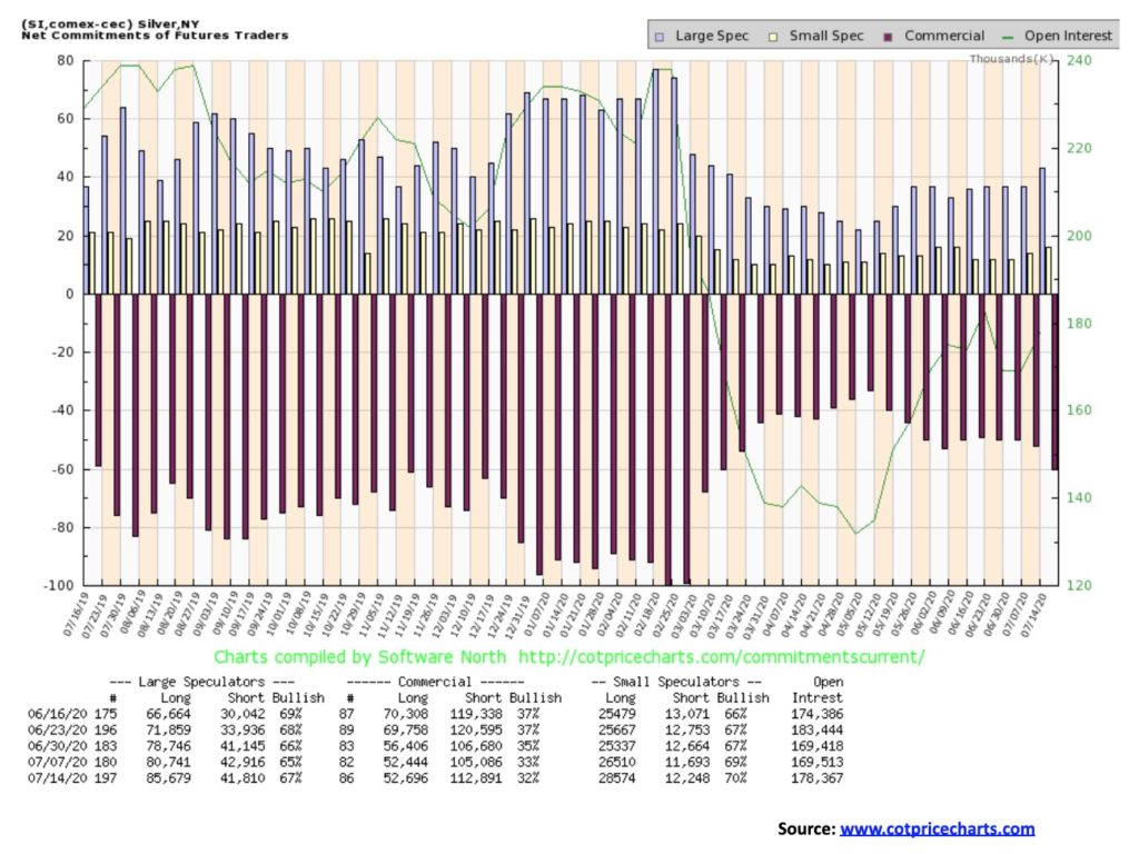
The silver commercial COT slipped this past week to 32% from 33%. It is down from its high of four weeks ago at 37%. This past week long open interest was relatively flat while short open interest jumped over 7,500 contracts. The large speculators COT rose to 67% from 65% as their long open interest rose roughly 5,000 contracts and shot open interest fell about 1,000 contracts. The silver COT hasn’t turned bearish but as silver prices rise, the commercial COT should slide further.
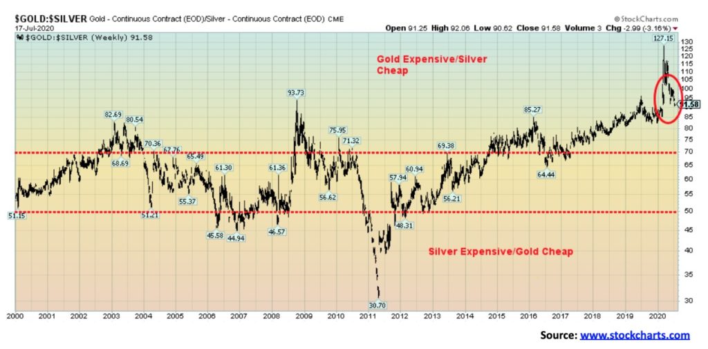
Gold remains quite expensive compared to silver. As we have noted in the past, we have never seen such a prolonged period of time where gold has remained so expensive relative to silver. On a positive note, we have now made new lows for the gold/silver ratio. It may signal that this trend should continue. The gold/silver ratio recently spiked to an all-time high. Over the past 100 years there have been only three other occasions when the gold/silver ratio spiked over 90: the first was in 1941, the second was in 1990, and the third in 2008.
In 1941, gold was fixed but silver was more free trading. In 1990, it signaled a top for both gold and silver and both fell into lows in 1993. The 2008 top in the gold/silver ratio also proved at the time to be a bottom for both gold and silver as both started the rally that culminated in the 2011 high. A high in the gold/silver ratio signals going forward that only silver will outperform. It doesn’t necessarily point to the direction of the metals themselves. As noted, 1990 was a high for both while 2008 was a bottom for both. No matter what, going forward silver should outperform.
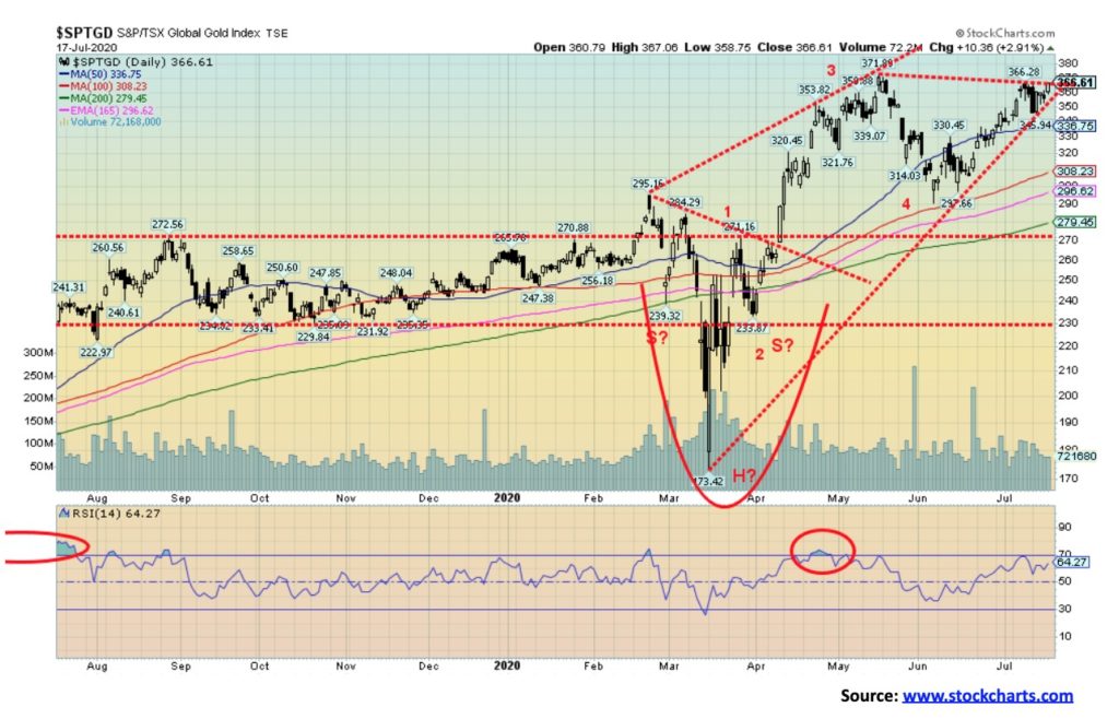
Gold stocks enjoyed another solid week to the upside. The TSX Gold Index (TGD) gained 2.1% while the Gold Bugs Index (HUI) was up 2.0%. The HUI is once again just shy of making new 52-week highs while the TGD remains just under its 52-week high. Another good upward push this week could see new highs of both indices. Despite the down day on July 13, the gold stocks spent the rest of the week regaining that drop. So, the fact that both the HUI and TGD managed an up week was quite positive considering that sharp drop seen on Monday. Both indices are indicating we should see new highs. Support for the TGD is at 345 and under 325 a more serious decline could get underway. For the HUI, those points are at 300 and 270. Overbought conditions have lessened, but sentiment remains high and that could be a problem going forward. We continue to note the divergence between the TGD and HUI in that the HUI made new 52-week highs recently but the TGD did not. The TGD is up 40.3% on the year and the HUI up 31.4%. We still have targets of 385 for the TGD. There could be higher targets as a firm break to new 52-week highs for the TGD above 372 could target up to 445. Just be mindful of downside support and maintain at minimum strong mental stops.
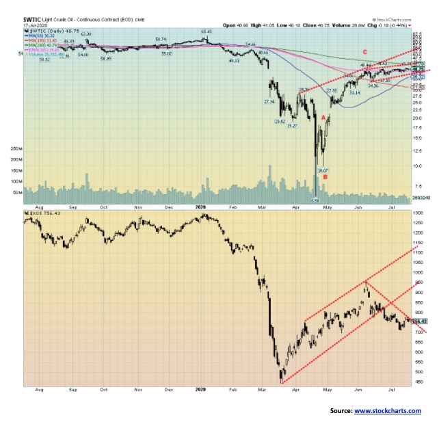
Since early June 2020 WTI oil has hovered in the $40 zone. Yes, there was a short-lived blip down to $34 early on, and an attempt to break above $42, but mostly it has been locked in a tight trading range. Now you have two events trying to push and pull oil in two different directions. To the downside, the COVID-19 numbers are rising sharply, resulting in second lockdowns which should feed itself into reduced demand once again for oil. On the upside, OPEC was talking of easing cuts and as part of that deal those who didn’t comply initially with cuts moved to limit supply. Irrespective of all the maneuverings, the WTI oil chart is suggesting that oil prices could be poised once again for a downward move. The recent breakdown in the energy stocks appeared to signal that oil prices should soon follow to the downside.
It didn’t help that gasoline demand has been sliding once again in the U.S. Normally this is a peak demand period because of the summer driving season. Instead, demand has fallen the past couple of weeks as the coronavirus cases have spiked. Once WTI oil breaks under $36, a downward move should get underway. Under $31 would confirm. Major support would be seen at $20/$22.
This past week WTI oil gained a small 0.5% but remains down 33.3% on the year. Natural gas (NG) slipped 4.4%. However, NG is starting to look more bullish. The summer can sometimes see a rise in NG prices, often due to hurricane weather in the Gulf. Energy stocks were up on the week with the rest of the market as the ARCA Oil & Gas Index (XOI) gained 2.6% and the TSX Energy Index (TEN) was up 2.7%. Despite the rebound in the energy stocks, they appeared to be fading by the week’s end.
—
(Featured image by energepic.com via Pexels)
DISCLAIMER: This article was written by a third party contributor and does not reflect the opinion of Born2Invest, its management, staff or its associates. Please review our disclaimer for more information.
This article may include forward-looking statements. These forward-looking statements generally are identified by the words “believe,” “project,” “estimate,” “become,” “plan,” “will,” and similar expressions. These forward-looking statements involve known and unknown risks as well as uncertainties, including those discussed in the following cautionary statements and elsewhere in this article and on this site. Although the Company may believe that its expectations are based on reasonable assumptions, the actual results that the Company may achieve may differ materially from any forward-looking statements, which reflect the opinions of the management of the Company only as of the date hereof. Additionally, please make sure to read these important disclosures.


PayPal’s Slowdown: From Fintech Leader to Low-Growth Dividend Stock
PayPal has shifted from fintech leader to low-growth, value-style stock, losing over 25% in market value and trading at a...


Tilray (TLRY) Falls as Bearish Momentum Persists Despite Marketing Push
Tilray (TLRY) fell 3.32% to $4.44, remaining below key moving averages and signaling continued bearish pressure. Despite a £1 million...


ESG Gap Persists as Firms Struggle to Link Sustainability to Financial Value
KPMG’s Global Survey shows a major gap between ESG awareness and financial integration. While 72% of managers understand sustainability strategies,...


Bitcoin and Ethereum Slide as Market Pressure Builds Amid Strategy Concerns and Layer 2 Disruptions
Bitcoin fell below $60,000 with heavy ETF outflows, pressured by concerns over Strategy’s finances and its STRC stock decline. Ethereum...


AI Venture Builder Launches €600K Crowdfunding Round to Scale Secure AI Solutions
AI Venture Builder, an Italian-British firm developing AI applications and vertical startups, returns to CrowdFundMe with a equity campaign. After...
 |
|
 |  |
 |
|
-

 Cannabis2 weeks ago
Cannabis Legalization in Germany: A Mixed Interim Assessment
-

 Impact Investing3 days ago
EU Weighs More Free Emission Permits in ETS Review to Boost Industry Competitiveness
-

 Impact Investing2 weeks ago
SBTi Net-Zero Standard 2.0 Enhances Corporate Climate Action
-
 Crypto19 hours ago
Bitcoin and Ethereum Slide as Market Pressure Builds Amid Strategy Concerns and Layer 2 Disruptions