Business
The FOMC’s garbage grinder
At the peak of the credit crisis in the autumn of 2008, the total portfolio of US T-debt held by the FOMC was about $480 billion dollars. In April this year the FOMC “monetized”$418 billion dollars in a single week! Now that is what I call “policy making”, but looking at the QE-1’s 10Wk M/A peak in May 2009; its $50 billion. That’s about 10% of the Fed’s total holding of US T- a 10% increase is a lot!
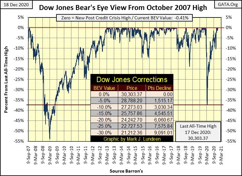
This week the Dow Jones saw its fourth post March 23rd bottom BEV Zero on Thursday, with the first of these four happening on November 16th. There is a pattern here; the Dow Jones goes on to a new all-time high, and then (or so far) it takes a break for a week or so before it does so again. If you skip down to the Dow Jones 15 Count Table below, this pattern is clearly evident. Not a market mania, but good market action for the bulls.
Of course for decades the Dow Jones hasn’t gone on to new all-time highs without a little help from its friends at the Federal Reserve Open Market Committee; the FOMC. These “open market operations” at the FOMC “monetize” debt, and then “inject” the resultant effluence back into the financial system to lubricate it and to “stimulate the economy.”
It’s very “scientific”, so much so that unless someone has a degree of no less than a BS in economics, the FOMC won’t even let them into the room with the garbage grinder where they do all of this sophisticated monetary stuff. Well, that’s what my barber told me.
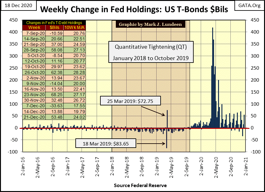
They “injected” an additional $53.48 billion into the financial system this week, as seen in the chart below. In an economy whose markets have trillions of dollars of market capitalization, that doesn’t seem like much. But during the 1990’s high-tech and the 2000’s mortgage bubbles, the FOMC had to monetize only about $3.5 billion * a month * to keep those parties going. We’re dealing with banks and their fractional reserve system, where every dollar deposited by wage earners in a bank or the FOMC can be used to create many additional dollars in credit – bank loans.
The plot below is the data found in the $Bils column in the table; the actual weekly change in the FOMC’s portfolio of US T-debt. In the first week of April 2020, the FOMC “injected” a whopping $418 bil into the financial system.
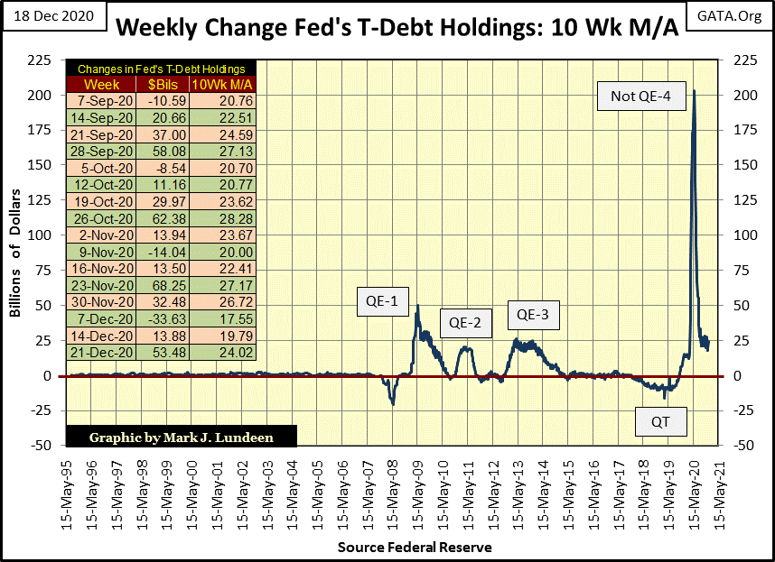
The next chart’s plot is based on the table’s 10Wk M/A column, a ten week moving average of the data. The FOMC’s current Not QE-4 at its 10Wk M/A peak in May 2020 was about four times that of Doctor Bernanke’s first QE at its 10Wk M/A peak in May 2009. The current Not QE-4 reflated the Dow Jones from a -37.5% market collapse back up to a new all-time high in just eight months. That’s pretty impressive, but looking at these QEs, why in 2020 did it take eight months, instead of eight weeks or eight days to reflate the Dow Jones when the FOMC was “injecting” monstrous levels of “liquidity” into it?
Let’s look at the Federal Reserve’s balance sheet holding of US T-debt (Blue Plot) in my next chart. The effects of all these QEs (and one QT) on the Federal Reserve’s balance sheet below are very pronounced.
At the peak of the credit crisis in the autumn of 2008, the total portfolio of US T-debt held by the FOMC was about $480 billion dollars. In April this year the FOMC “monetized”$418 billion dollars in a single week! Now that is what I call “policy making”, but looking at the QE-1’s 10Wk M/A peak in May 2009 (chart above); its $50 billion. That’s about 10% of the Fed’s total holding of US T-debt from just over a half year before – a 10% increase is a lot! But that’s what it took to turn around the global financial system, then in a state of collapse.
Just last May when the Not QE-4’s 10Wk M/A peaked at $200 billion, the Federal Reserve’s holding of US T-debt was $5,605 billion dollars. So the $200 billion “injection” was about only 3.56% of the Federal Reserve’s total holding of US T-debt. That’s significantly less than the 10% from QE-1, but it’s a massive increase nonetheless. In terms of the Federal Reserve’s total holdings of US T-debt, this year’s Not QE-4 is not as large as the QE-1 from 2009, but then last March’s market decline was nowhere as bad as it was in October 2008.
The fact to take away from this is the higher the Federal Reserve’s holding of US Treasury Debt becomes (Blue Plot below), the larger the “injection of liquidity” into the financial system (chart above) is required to counter deflationary trends in the markets. This growth in the Federal Reserve’s balance sheet is why a dollar of QE in 2020 doesn’t have the same economic impact as it did in 2009.
The “policy makers” understand this perfectly, as explained by Doctor Bernanke; the Father of Quantitative Easing, in November 2002.
“Like gold, U.S. dollars have value only to the extent that they are strictly limited in supply. But the U.S. government has a technology, called a printing press (or, today, its electronic equivalent), that allows it to produce as many U.S. dollars as it wishes at essentially no cost. By increasing the number of U.S. dollars in circulation, or even by credibly threatening to do so, the U.S. government can also reduce the value of a dollar in terms of goods and services. We conclude that, under a paper-money system, a determined government can always generate higher spending and hence positive inflation. Of course, the U.S. government is not going to print money and distribute it willy-nilly……..”
– Ben S. Bernanke, Federal Reserve Board Governor, November 21, 2002.
How long before this massive loss of purchasing power for the dollar be translated into consumer goods prices, gold and silver bullion, as well as share prices for their miners?
Sometime in 2021 to 2024 (the next presidential term), expect a weekly “injection of liquidity” of over a trillion dollars in an effort to prevent a meltdown in the stock and bond markets, and one trillion dollars may prove to be insufficient.
“A billion dollars isn’t what it used to be.”
– Bunker Hunt; Congressional Testimony on the Hunt Brothers’ 1970s silver market manipulation.
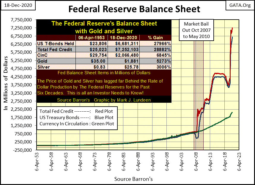
Stepping aside any reference the FOMC has to the stock and bond markets; just looking at the Federal Reserve’s balance sheet above is alarming for what its impact on the US dollar’s purchasing power is going to be in the not too distant future.
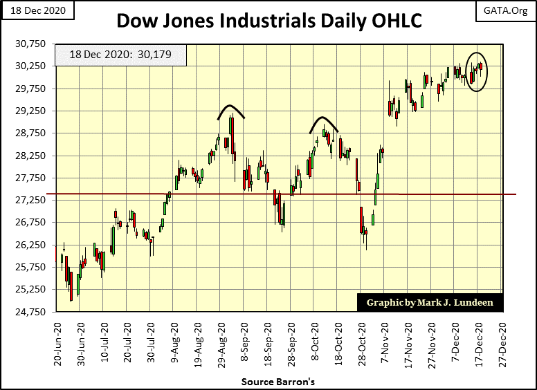
The Dow Jones in daily bars below is looking good. It’s been crawling upward since early November; however I don’t think that will continue for long. Whether that implies the Dow Jones is about to make a big break out to the upside or begin deflating down to lower levels I don’t care to guess. But if the Dow Jones began 2021 with a big break out, that would be fine with me.
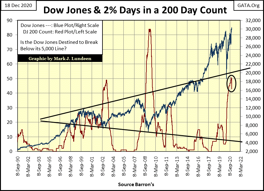
The Dow Jones 200 count (Red Plot below / number of days of extreme volatility in a 200 day running sample) is finally coming down. It peaked at 51, but closed the week at 43, and will soon collapse to much lower levels as the Dow Jones 2% days from last winter’s market meltdown are removed from the 200 day sample in the next two months.
Bull markets on Wall Street are always low volatility affairs. Seeing daily volatility so low now in the market, where a 1% move in the Dow Jones from one day to the next is a big move, is a very positive indication that for the foreseeable future the stock market is going to be going up.
Maybe we won’t have any big problems in the stock and bond markets until once again the Dow Jones begins seeing those dreaded days-of-extreme volatility, days the Dow Jones moves +/-2% or more from a previous day’s closing price.
Increases in volatility are never good for the stock market, but can be for gold and silver. So, rising volatility in the stock market signals the market is being deflated, while rising volatility for gold and silver signals these markets are making big moves that could be either up or down.
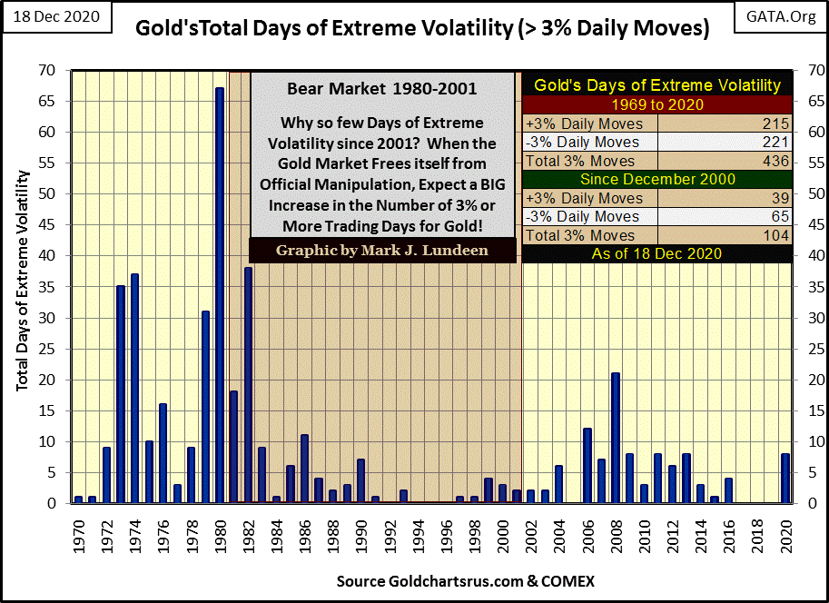
Below I’ve plotted the volume of days of extreme volatility for gold by year going back to 1970, or days where gold moved more than +/-3 from a previous day’s closing price. One fact that stands out is how market volatility for gold was much greater before the mid-1980s. Why would that be? Market manipulation in the gold (and silver) market has increased greatly since 1980; looking at annual volatility below strongly suggests that.
Following gold’s highs of August 2011, the market began a 45% correction that bottomed in December 2015. The gold market has been rebounding since then, but excitement in the gold market has been constrained. Gold saw no days of extreme volatility for three years; from 2017 to 2019.
Gold in 2020 has been a good market for the bulls, a year where gold saw eight 3% days. Two of them were positive 3% days while the other six were negative 3% days. But a 3% day, be it positive or negative is still a 3% day. I’m not surprised with this increase in volatility; gold has finally broken out to new all-time highs above $2000 in August 2020.
If gold is to advance to higher levels in the years to come, I expect 2021 will see even more days of extreme volatility than it did 2020. And when the heavy hand of “policy” is finally lifted from the gold market, and the price of gold is allowed to rise unhindered, we should see a big spike in 3% days.
Silver’s days of extreme volatility (+/-5%) are plotted below. The comments for silver are for the most part the same as for gold, except silver has seen nineteen 5% days (11 positive & 8 negative) in 2020.
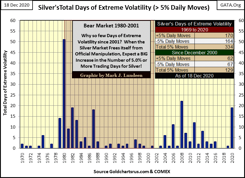
If you look at the post March 23rd advance for gold and silver in the performance table below, gold (#21) since its bottom with its eight 3% days has advanced 19.19% at week’s close, while silver (#6) with its nineteen 5% days has advanced 83.88%. Quite a difference.
This week my table listing the Major Market’s BEV Values is coming a bit out of sequence, but here it is. Thursday was a good day for the stock market with twelve indexes closing at new all-time highs. The market pulled back a bit on Friday; still at week’s close fourteen of these indexes were in scoring position, or within 5% of a new all-time high. I’m expecting more of the same for the remainder of 2020 and in the first month of so for 2021.
I remain a big-bad bear on this market, but I’m a big bad bear with a bullish outlook on the market for at least the next few months. Until the Dow Jones once again begins to experience those dreaded days-of-extreme market volatility (+/-2% days), that’s my story and I’m sticking to it.
The XAU in the BEV portion of this table is underperforming the financial indexes. It wasn’t long ago when the XAU was closer to a new all-time high than the NASDAQ Bank index, but not any longer. But in the performance table at the bottom, the gold miners in the XAU closed the week at #2, up 94% from their March bottom while the NASDAQ Bank index close the week at #15, up a puny 63% from their March bottom. “Puny?” In December of 2020 I’d say any major market index that hasn’t see an 80% advance off its March 23rd low is a pathetic underperformer, though I know there are those who will take exception to this.
But what are all of these indexes going to do when the FOMC finally blows out the dollar with their massive levels of monetary inflation, as seen in their unending program of QE? As 2020 comes to a close, I believe gold, silver and precious metals mining are not just superb investments, but a great hedge against our pending monetary disaster.
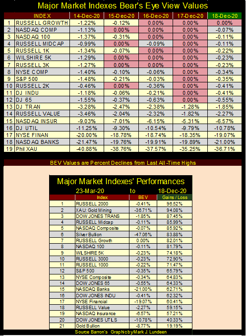
Seeing the gold miners above outperform both gold and silver bullion is a good sign of even better things to come for precious metals investments.
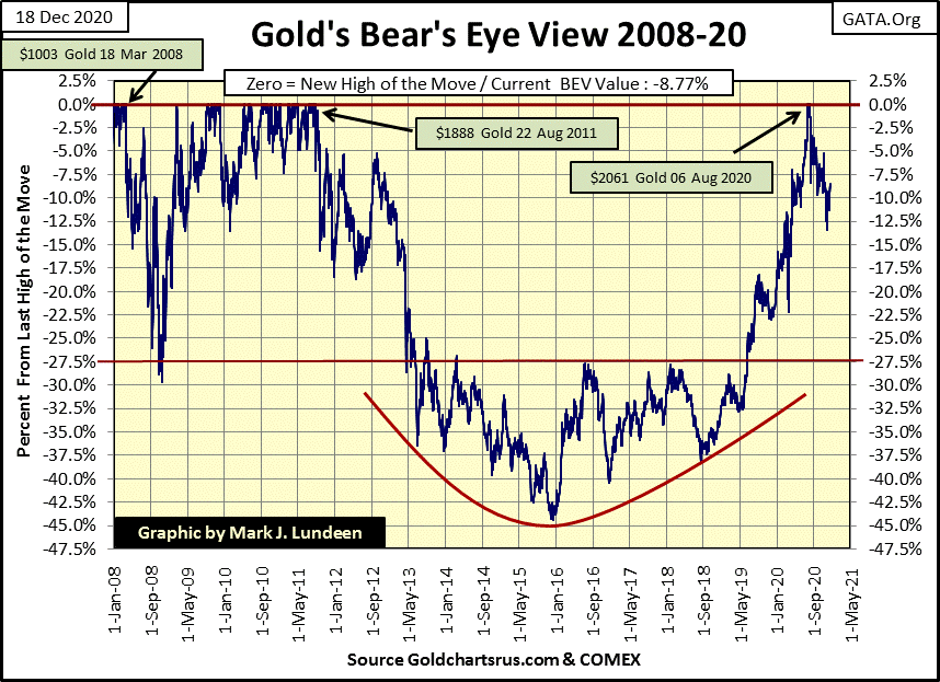
Gold’s BEV chart below is looking great! Gold’s correction bottomed on November 30th with a BEV of -13.44%. The bears, so far, have failed to get gold to close below a BEV of -15%, and this week gold closed above its BEV -10% line, at -8.77%.
Maybe the bad old days where the price of gold languished below its BEV -27.5% ($1360) line below, and couldn’t get above, and stay above this critical level in the chart below are now over. Gold has been in a sustained advance since June 2019 when it finally broke above this key level, where for six years the BEV -27.5% line capped every advance gold made – until June 2019. There is no reason to believe this advance is over. What’s the gold bull’s credo for 2021? I’d recommend “upward and onward!”
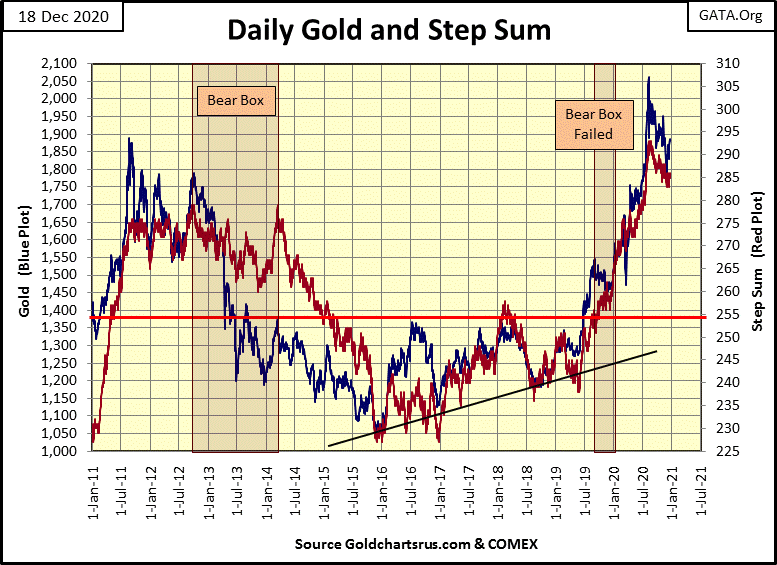
Next is gold’s step sum chart. Gold and its step sum have been correcting since early August. They could break down to new lows for this correction, and then maybe are now ready to resume their advance into market history. Personally, I’m on the side expecting some historical market action in gold and silver in the first quarter of 2021.
The Dow Jones and its step sum are looking good. Should it advance above 31,000 I’ll have to remove that curve for a double top, because it won’t be a double top anymore. No hurry on my part as I know that the winds on Wall Street can shift from fair to foul is an amazingly short period of time.
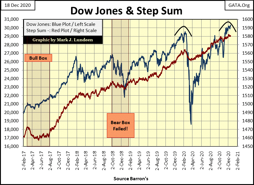
I see in its step sum table below gold is seeing its 15 count going positive. This indicates that gold may be entering a period of more advancing days than decliners. Should the price of gold benefit from this positive swing in its 15 count, it just may be making new all-time highs sometime in January. Let’s keep our fingers crossed!
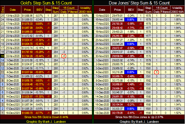
On the Dow Jones’ side of the table, its 15 count has been positive since November 13th, and the Dow Jones has benefitted from seeing more daily advances than declines. I’ve highlighted its four new post March 23rd BEV Zeros (new all-time highs) in blue & white.
Finally a link to Eric King’s, King World News with a twenty minute interview of Alasdair Macleod. Alasdair expects some bad things coming in 2021. How bad? Real bad, but 2021 should be good for investors in gold, silver and their miners.
It’s an ill-wind that blows no good, but for most people making money in the precious metals in the years to come, it isn’t going as enjoyable as in past booms. A lot of people are going to be hurt bad, and that isn’t a source of happiness for me no matter how well I do.
The problem is politicians around the world, as well as those states in the union controlled by Democrats, have shut down their economies due to the CCP Virus. Don’t even get me started with the CCP Virus idiocy!
“Count on government stupidity. It has created more massive economic & social problems than any other man-made entity in the history of the world. Understand this, you gain. Misunderstand this, you lose.”
– Paul Mladjenovic
Here’s a new economic law I just came up with. Okay I came up with it after listening to the excellent KWN interview below. If you insist: yes I ripped this off from Mr. Macleod’s comments in the KWN interview. In a world where the dead from the CCP Virus pandemic are piling, yes CORPSES PILING HIGH on the sidewalks of New York, LA and everywhere else faster than society can bury them; why should my readers care where I steal my material from?
Bad things happen when political morons shut down the means-of-production in a global economic system that is as heavily weighed down by debt as is ours.
– Lundeen’s Law
* Counterparty failure as far as the eyes can see! *
As this is my last article for 2020, I best wish a Happy Hanukkah and or Merry Christmas and a Happy New Year to all my readers. May the Good Lord grant all of us and our families a happy and prosperous 2021. I don’t know if the Lord is going to listen, but it’s good if I, and my readers ask for it anyways.
When I was a kid I always looked forward to a Charlie Brown Christmas on CBS. The dancing was the best.
Here’s the Vince Guaraldi Trio’s sound track. It’s the best jazz for Christmas!
Finally, here’s a little clip from A Charlie Brown Christmas explaining the true meaning of Christmas.
The Good Lord willing, I’ll be back in Mid-January.
__
(Featured image by geralt via Pixabay)
DISCLAIMER: This article was written by a third party contributor and does not reflect the opinion of Born2Invest, its management, staff or its associates. Please review our disclaimer for more information.
This article may include forward-looking statements. These forward-looking statements generally are identified by the words “believe,” “project,” “estimate,” “become,” “plan,” “will,” and similar expressions. These forward-looking statements involve known and unknown risks as well as uncertainties, including those discussed in the following cautionary statements and elsewhere in this article and on this site. Although the Company may believe that its expectations are based on reasonable assumptions, the actual results that the Company may achieve may differ materially from any forward-looking statements, which reflect the opinions of the management of the Company only as of the date hereof. Additionally, please make sure to read these important disclosures.

-

 Cannabis1 week ago
Germany’s Medical Cannabis Market: Legal Reform, Falling Prices, and Rapid Expansion
-

 Business4 days ago
Global Markets on Edge as Iran Conflict, Inflation Pressures, and Financial Risks Intensify
-

 Impact Investing2 weeks ago
ESG Funds Still Hold BP Despite Shift Back to Fossil Fuels
-

 Biotech1 day ago
NHS Funds Breakthrough CAR-T Therapy Breyanzi for Lymphoma Treatment in Spain


