Featured
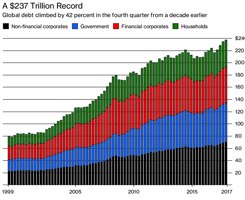
Global debt climbs to $237 trillion
The world enters the “mother of all bubbles” with global debt rising to $237 trillion. Japan, the U.S. and China make the list of top three heavy debtors.
It has been more than a week now since the FBI raid on Trump’s personal lawyer Michael Cohen’s office and the U.S./U.K./France air strikes on Syria. It would seem that all has quieted down. The stock market has returned to its winning ways as earnings season gets underway. So far, so good as earnings led by Netflix (NFLX-NASDAQ) have been positive. They are having a calming effect by crushing volatility as the CBOE Volatility Index (VIX) has broken its uptrend line and is at its lowest level since early February 2018 when it was rising sharply. Not surprisingly, open interest on VIX futures was at record levels before this drop.
Oh yes, the Mueller investigation trudges on, Stormy Daniels remains firmly in the news, and Assad is still in power in Syria, but otherwise, things have calmed down and the market can get on with what it does best—by rising. All of this reminded us of the calming words after the 1929 stock market crash and especially as the market moved into 1930 and was rising again. All was well again. It wasn’t, of course.
Lurking in the background is a “mountain” of debt. It is the “bogeyman” under the bed; the “monster” in the closet; and, the “Freddy Kreuger” in your dreams. The IMF warned this past week that the debt burden of the global economy is deeper today than it was before the financial crisis of 2008. The latest numbers put the global debt at a mind-boggling $237 trillion. That is up from roughly $140 trillion before the financial crisis. It was also pointed out according to the Bank for International Settlements (BIS), the central bank for the central banks, that there is also some $750 trillion outstanding in derivatives. Granted, derivatives are not the same as debt as the amount is notional value. Actual exposure depends on replacement value, netting agreements and others.
The global debt was estimated to have increased some $21 trillion in 2017. That’s equivalent to the U.S. national debt. Many are calling global debt the “mother of all bubbles.” Half of the global public and private debt is accounted for by three countries—U.S., Japan, and China. Debt has grown the fastest in China over the past decade, much of it going to wasted infrastructure projects, bank Ponzi schemes, and to money-losing state enterprises. In the U.S., since Trump became President, debt has increased by over $1 trillion to $21.1 trillion. Given little to no offsets to the recent U.S. tax cuts it is expected that the U.S. national debt could reach $24.4 trillion by 2022. Not surprisingly, the IMF has issued warnings on the U.S. The IMF had earlier issued warnings about the high level of household debt, citing Canada in particular.
© David Chapman
There are also high debt levels in emerging economies, much of it denominated in US$. A rising US$ would make that debt considerably more expensive. Countries such as Venezuela, Greece, Ukraine, Pakistan, and Argentina top the list of sovereigns most likely to default. Many U.S. states could default with Illinois and California being the most vulnerable. Many pension funds in the U.S., Canada and the EU are considerably underfunded. Most Canadian provinces carry a high debt burden even as most retain an A- or higher credit rating. Many municipalities in Canada and especially in the U.S. are vulnerable to high levels of debt.
Rising interest rates are the biggest risk to high debt levels. A quarter-point hike in interest rates adds $52 billion a year in interest payments to the U.S. national debt. Rising interest payments crowd out spending in more important areas. Throughout history, rich and poor countries alike have been lending, borrowing, crashing, and recovering their way through an extraordinary range of financial crises. Each time, the experts chimed “this time is different”—claiming the old rules of valuation no longer apply and that the current situation bears little similarity to past disasters. They have also been consistently wrong. (Loosely translated from “This Time is Different, Eight Centuries of Financial Folly” by Carmen M. Reinhart and Kenneth S. Rogoff.) The only thing different this time is the debt is bigger than it has ever been.
Economic war between the U.S., Russia and China
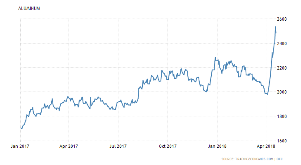
It is not surprising that sanctions against Russian oligarchs and their companies and trade tariffs against China are having a negative effect. They are following the rule of unintended consequences. We noted last week that the sanctioning of one of the companies, Rusal, was having a major impact on global metal markets.
Rusal is a major aluminum producer. They provide an estimated 6% of the world’s supply. Companies are now scrambling to secure a new supply that is no longer there because it has been cut off by Rusal. The sanctions caused both the Russian stock market and the Russian Ruble to suffer a mini-crash, and also sent aluminum prices soaring.
© David Chapman
Aluminum prices are expected to soon hit $3,000/tonne. Not only have the sanctions hit Rusal and its global operations—which include mines, smelters, and refineries around the world in 13 countries over 5 continents—but they are negatively impacting American corporations such as Boeing and Ford Motor who are major users of aluminum to make their planes and cars. The sanctions are also impacting the production of alumina. Alumina, a product that uses aluminum oxides, is heavily used in the manufacture of zeolites, fire retardant/smoke detectors and has a use in refractories, ceramics, and polishing and abrasive applications. Rusal supplies about 7% of the alumina market. The sanctions are also negatively impacting other metal companies such as Glencore, Rio Tinto, and BHP Billiton. Incidentally, Rusal is only the world’s second-largest producer of aluminum. The largest is China’s Hongqiao Group. Ironically, Trump placed tariffs on Aluminum from China. All this merely adds to the chaos.
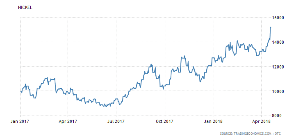
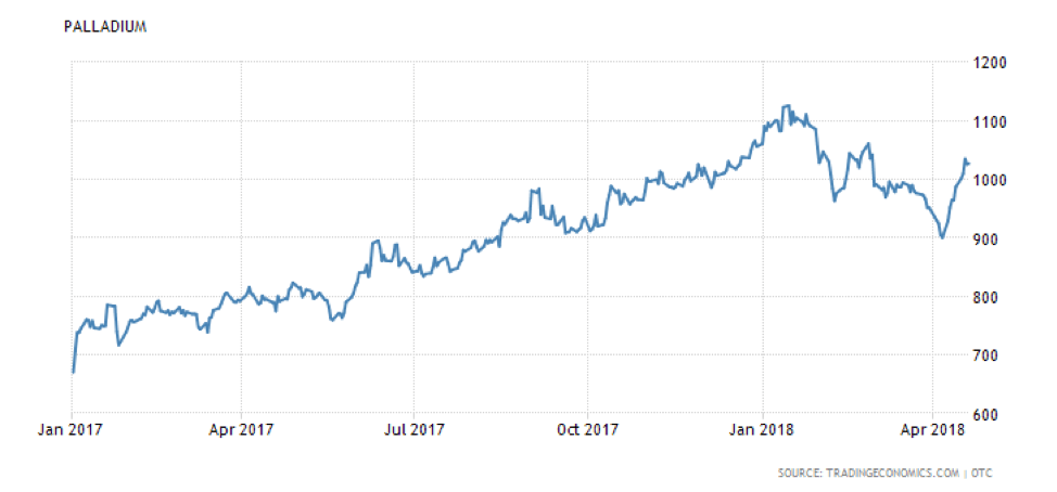
Nickel prices have also jumped as there are fears of further sanctions. Russia is also the world’s largest producer of palladium, a member of the platinum group of metals (PGMs) that is used in car manufacturing. Not surprisingly, palladium prices have also jumped sharply.
© David Chapman
© David Chapman
While palladium prices are below their all-time highs seen in January 2018, it would not be surprising to see them move to new highs. One positive in this is that metal companies are seeing their stock prices jump. Big gainers have been companies like First Quantum Minerals, Freeport McMoran, and Alcoa Corp. who hit its highest level since 2008.
The repercussions, however, don’t end with the sanctions against Russian companies. The trade war tit-for-tat between China and the U.S. is also having a negative impact. Following the imposition of tariffs on China that hit aluminum products, robotics, aircraft parts, vaccines, and dishwashing machines as well as many other items, the Chinese retaliated with their own tit-for-tat tariffs that hit soybeans, cars, and chemical products amongst others. China hit many agriculture products many from states that backed Trump, including Iowa. Aircraft parts and engines were a top U.S. export to China, totaling some $16.3 billion. Soybeans are a top agriculture product with $12.4 billion exported to China every year. Not surprisingly soybeans prices have jumped, but they were low anyway and the jump has not been as dramatic as what was seen with aluminum and nickel.
Despite the rising trade tensions between China and the U.S., they have at least agreed to sit down and negotiate. Whether this comes to anything is moot as the mere thought of any negotiations has helped improve the mood in markets.
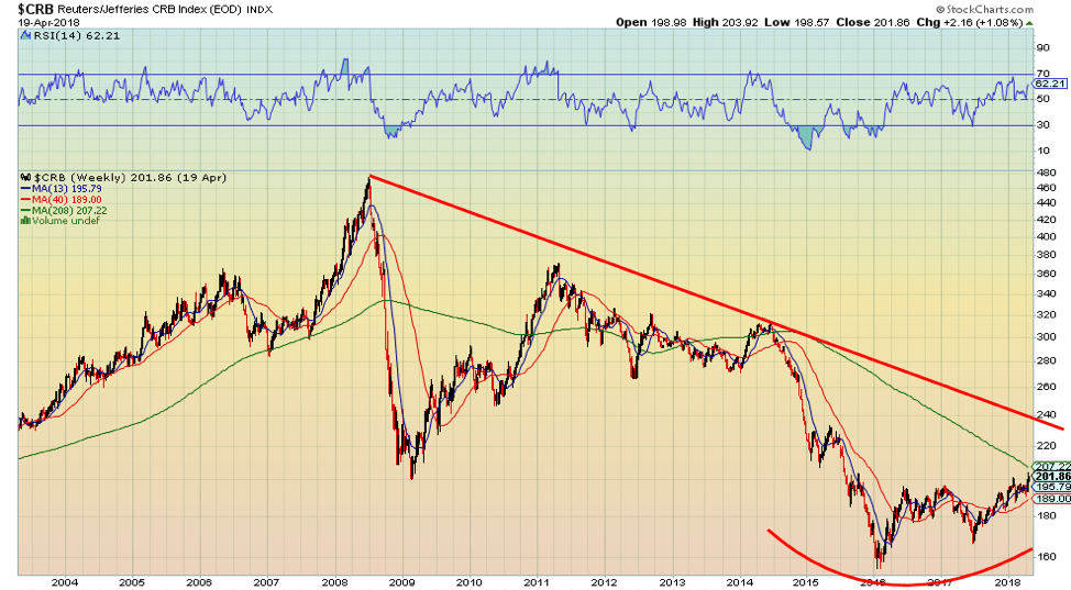
Quite a number of commodities have been jumping in price lately. All of that is eventually going to feed into the economy in the form of rising inflation. The CRB Index, an index of 19 commodities, is the most recognized measure of global commodities. It recently has jumped to new 52-week highs. It does, however, remain well off the all-time high seen in July 2008. Energy has the biggest weighting with crude oil being the largest component.
© David Chapman
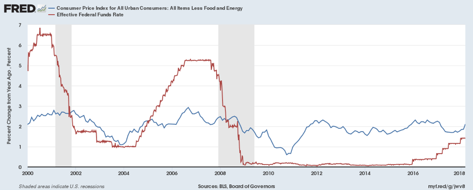
It is notable that the core CPI (less food and energy) has reached 2.1% year over year. That is now slightly above the Fed’s target of 2%. The current Fed rate is 1.50%–1.75%, still below the rate of core inflation. The Fed is expected to hike rates at least two more times in 2018. Note how the Fed rate has been lagging behind the core rate of inflation since the financial crisis of 2008. That implies we have negative interest rates, meaning the rate of interest does not cover the rate of inflation. But it is now catching up. However, core inflation is also rising thanks to rising commodity prices. Before previous recessions, the Fed rate was positive in relation to the core inflation rate. The expectation is the Fed will hike rates until that effective interest rate is positive once again. But remember what is driving this as we see commodity prices rising thanks to trade wars and sanctions. There are consequences for everything.
© David Chapman
Bitcoin watch!
© David Chapman
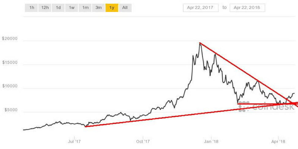
The recent rebound in Bitcoin continues. After bottoming near $6,600 earlier in the month, Bitcoin has rebounded at roughly under 30% to test $8,500. A breakout over $8,500 could suggest further up moves to $9,000. Many are now excited that Bitcoin may have bottomed. Calls for a return to $20,000 are not unusual. Given that Bitcoin has broken a downtrend line that is giving considerable support to the bulls. However, at best we believe this may just a corrective move to the downswing that got underway back in mid-December 2017. Despite the recent improvement Bitcoin is still down 56% from its high.
If Bitcoin can hold above $8,500 then the next potential target could be $9,600. Bitcoin could even rally back to around $11,500 if it does pick up steam. But despite the rebound stories of scams, money laundering, and regulation continue to lurk in the background.
The New York Attorney General has launched an inquiry into Crypto Exchanges. The inquiry is seeking information on the exchange’s operations, its use of bots, conflicts of interest, outages, and other issues. One of the keys is consumers don’t have sufficient information that would allow them to assess the fairness, integrity, and security of trading platforms. The focus is on internal controls and safeguards to protect consumer assets. In a lot of respects, this is no different than what is required in the banking and securities industry. All we can say is welcome to the real world, cryptos.
While some have welcomed the inquiry, there are others who are hostile. One Kraken is refusing to answer the inquiry, claiming since they no longer operate in the state of New York they don’t have to answer questions. After all, the whole purpose of cryptos was to operate outside the system. Regulation defeats that purpose.
An interesting side story we saw involves Pornhub, the world’s leader in adult entertainment. Apparently, Pornhub now accepts Verge (XVG) as payment. Verge is listed on Coin Market Cap as the 24th largest crypto with a market cap of just over $1 billion. It trades at just under 7 cents and there is an estimated 14.9 billion circulating supply. Verge is amongst those cryptos that tout their confidentiality along with Monero (XMR), Dash (DASH), and zCash (ZEC). All are amongst the top 25 cryptos and all except Verge have seen solid up moves in the past week: Monero has gained 28%, Dash is at about 18%, and zCash is up, just under 18%. Verge is actually off this past week but had surged to over 9 cents from 4 cents before pulling back.
The number of cryptocurrencies continues to grow. There are now 1,574 listed at Coin Market Cap. That is up about 25 alone in the past week. The market cap of all the cryptos is listed at about $375 billion. It is, to say the least, a very crowded space.
Buy gold?
A recent report of Maudlin Economics said the investment managers, hedge fund managers, and economists who gathered at the recent Strategic Investment Conference (SIC18) talked a lot about gold and how it was time to move into gold. Maudlin noted this group doesn’t normally talk much about gold but it did this time. He also noted that GaveKal and their research co-founder Louis Gave, who normally view gold as “just a rock,” were even warming to it. GaveKal is one of the world’s leading and most notable providers of global investment research. GaveKal is headed by Charles and Louis Gave and Anatole Kalestky. Other partners are Arthur Kroeber and Pierre Gave.
SIC18 cited rising interest rates, the Fed shrinking its balance sheet, record high stock market valuations, and the return of volatility as reasons why gold is the ultimate hedge. The conference cited that “gold is money” and has been for 5,000 years. Speakers cited the growing technical base for gold, growing inflation and gold’s performance as an inflation hedge, and the devaluation of money as reasons to hold gold. As Mauldin noted, this is not a group known for touting the virtues of gold. Maybe we should pay attention.
The chart below shows the S&P 500 plus the S&P 500 expressed in gold. Note the S&P 500 and the S&P 500 in gold both topped with the dot com bubble of the late 1990s. After that, while the S&P 500 recovered from the dot com bust of 2000–2002 the S&P 500 expressed in gold did not and gold kept outperforming. While the S&P 500 took off after the financial crisis of 2007–2009 resulting from the bursting of the housing credit bubble, the S&P 500/Gold ratio continued to favor gold. The past few years have once again favored the S&P 500, but the S&P 500 in terms of gold has lagged considerably. The S&P 500/Gold ratio appears to be rolling over. If that is correct, the next move should favor gold over stocks (S&P 500).
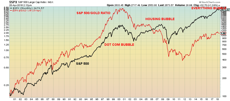
© David Chapman
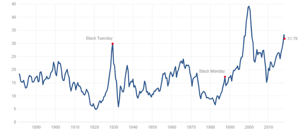
As we noted, valuations are quite high. Below is the Shiller PE ratio. It shows that multiples are as high as they have ever been with only the valuations seen at the top of the dot com bubble exceeding today’s levels. Multiples are even higher today than they were at the top of the housing bubble of 2007 and above the Roaring Twenties stock market bubble. It is a warning sign.
© David Chapman
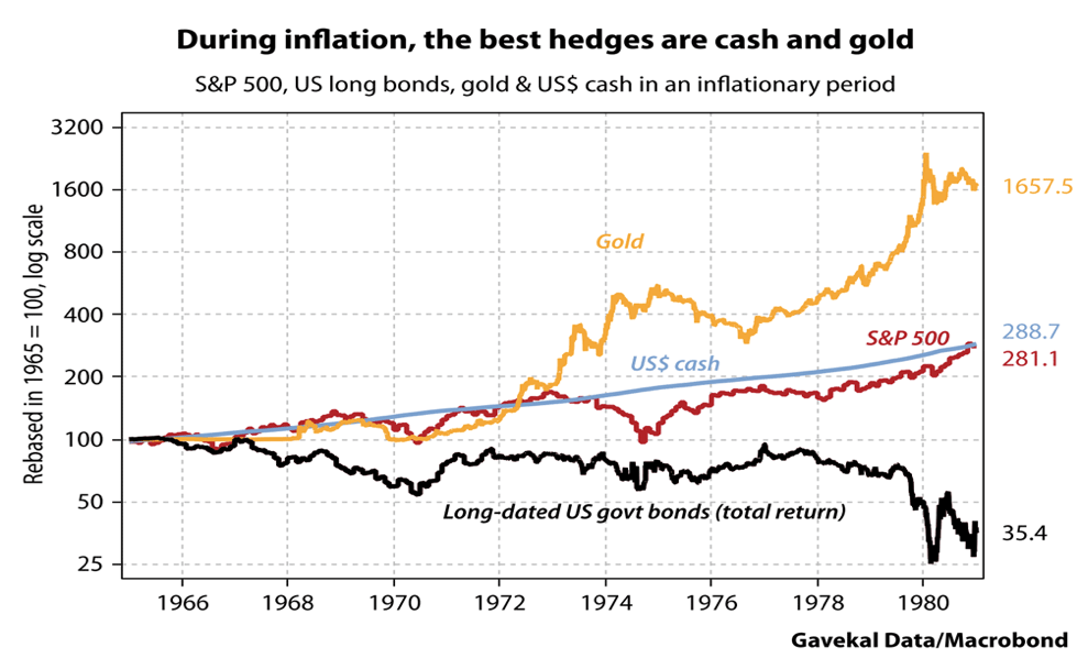
The chart below was shown by Louis Gave at the SIC18 conference. It shows the performance of gold, cash, and U.S. Treasuries as hedges during inflationary booms. The presumption here is with rising commodity prices we could be headed into another inflationary boom. The chart shows the period from 1966 to 1980. Bonds performed poorly while cash and the S&P 500 were about the same. Gold outperformed. Gave also noted emerging markets should continue to do well. Strong performances in emerging markets are also good for gold because when they are feeling richer they buy gold.
© David Chapman
The conference was attended by a well-known group of global economists, including Canada’s David Rosenberg of Gluskin Sheff. Mr. Rosenberg cites growing global protectionism led by the U.S. as a prime reason why gold prices have higher to rise. It is noteworthy that Mauldin points out that gold is not purchased for the purpose of speculation. It is a hedge or insurance against government actions that result in rising interest rates, protectionism, or wars. It is also a hedge against currency devaluation, a financial crisis, and a black swan event. We noted previously that during recessions gold has outperformed the stock market. Gold has also been the best performing asset since 2000, outperforming the S&P 500 by a factor of 4.4. Since 2000, the world has been rocked by a series of financial crises and has been constantly in a state of war since the events of 9/11. With rising inflation, rising protectionism, rising political risk, and rising market risk holding gold in one’s portfolio is a wise thing to do.
Markets and trends
© David Chapman
© David Chapman
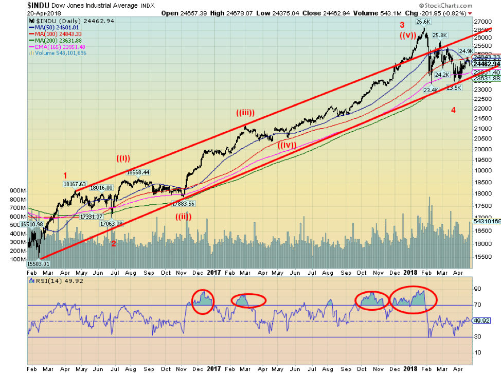
Stocks faltered this past week but still managed an up week although gains were trimmed by Friday. Some disappointment with tech earnings, particularly chipmakers and rising long-term interest rates, helped push the market lower into Friday’s options expiration close. Overall, however, the recent earnings reports have been good. The Dow Jones Industrials (DJI) and the other indices ran into resistance at the 100-day and 50-day MAs. We continue to view the recent action as a fourth wave correction with one more wave to the upside to come. However, we note that wave can double top or make new highs. It need not be a sharply rising wave as we saw from November 2016 to the top in January 2018. The good news has very likely passed. Now trade wars, real wars, and political wars are going to dominate the headlines and weigh on the market going forward.
Overall, the DJI was up 0.4% this past week while the Dow Jones Transportations (DJT) were big winners, gaining 2.0%. The S&P 500 jumped 0.5% while the NASDAQ was up 0.6%. The Russell 2000 small cap index fared well again with a gain of 0.9%. The continued decent performance of the small cap index buoys our thoughts that we should eventually make new highs again or at least go back towards the January 2018 high. In international markets the London FTSE 100 gained 1.4%, the German DAX was up 0.8%, the French CAC 40 gained 1.8%, and the Tokyo Nikkei Dow (TKN) jumped 1.8% as the Japanese Yen weakened. The loser was China’s Shanghai Index (SSEC) down 2.8%.
While we believe this is a fourth wave correction, Elliott Wave International wave count shows the DJI making its fifth and final wave top in January 2018. Elliott Wave is looking for another sharp down move before a bigger upward correction sets in. In some respects, we are aligned, but the timing may differ.
© David Chapman
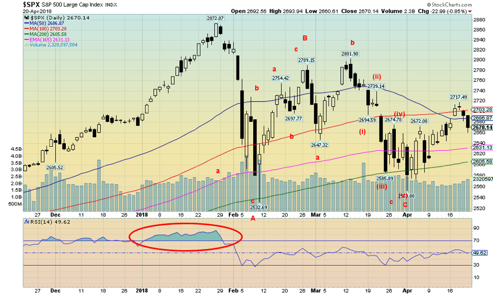
A closer look at the structure of the S&P 500 reveals what we believe is a series of corrective waves following the January 2018 top. The S&P 500 attempted to regain above the 50-day MA but was pushed back on Thursday/Friday. This coming week could tell the tale. If the market opens lower on Monday, then odds favour further declines to test the 165-day EMA at 2,630 and the 200-day MA at 2,605. So far, the 200-day MA has held, but another decline through it would not be surprising if the market were to continue lower this coming week. The other side is, only new highs above 2,718 would confirm that the S&P 500 is poised to move higher. Volume has not been impressive on the recent rise. That is another sign that the moves may be corrective in nature. Volume was heavier on the February decline but not overwhelmingly heavy. Notably, volume dried up on the decline into late March/early April.
© David Chapman
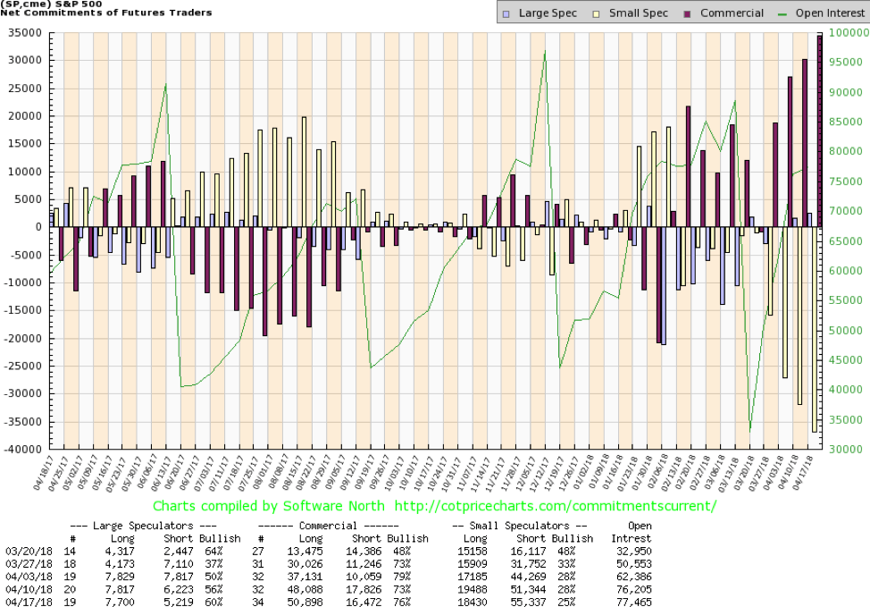
One reason we remain positive and bullish is the commercial COT for the S&P 500. The commercial COT improved this past week to 76% from 73%. Long open interest rose almost 3,000 contracts while short open interest fell over 1,000 contracts. The COT report did, however, come out just before the decline seen on Thursday/Friday this past week. Notably, the large speculators (hedge funds, managed, futures etc.) actually became more bullish and their COT rose to 60% from 56%. Commercials for S&P futures would be market participants like banks and funds whose business is to be in the stock market. In the past a bullish commercial COT has been a precursor to a rise in the stock market. Note how they quickly got short just before the February 2018 drop in the markets.
© David Chapman
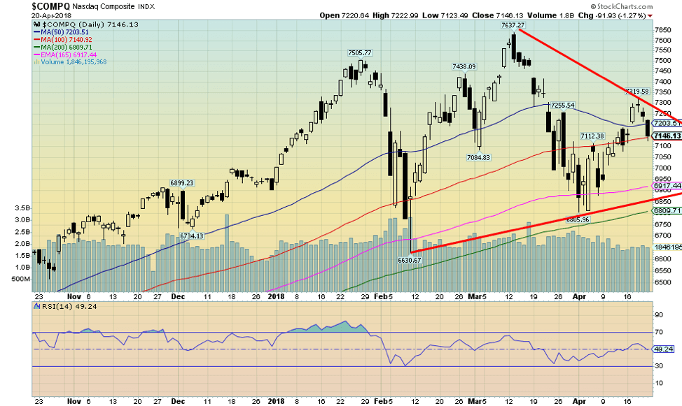
The structure of the NASDAQ is very similar to the S&P 500. The tech-driven index poked its head above its 50-day MA but appears to be failing. As with the S&P 500, a higher opening for the NASDAQ this coming week should be positive but a lower opening would most likely suggest we are headed lower. Support is seen down to 6,900 and 6,800. New highs above 7,320 would be positive and help resume the current uptrend.
© David Chapman
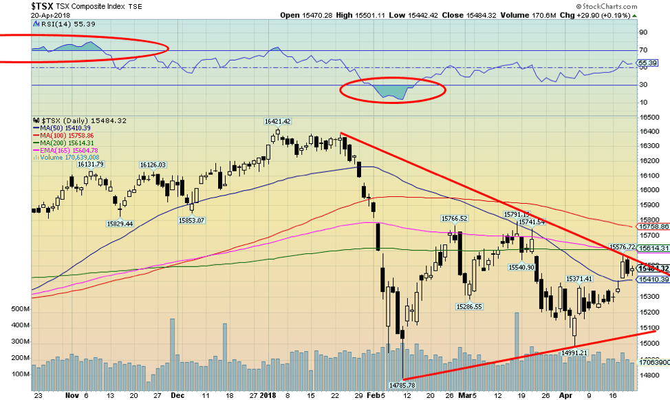
The S&P TSX Composite has been considerably weaker than its U.S. counterparts. However, going forward the TSX Composite could outperform. The reason is that, given the rise in oil prices and metal prices, sectors such as Metals & Mining, Materials, and Energy could start to outperform and help pull the TSX Composite higher. As we have noted as well, higher interest rates are actually good for the banks as they gain from the spreads which tend to widen during a period of rising interest rates. So, Financials could do well. But other areas such Utilities, Telecommunications, Income Trusts and Real Estate could be weaker because of rising interest rates. At this point the TSX Composite is testing resistance at the converging 200-day MA and the 165-day EMA. Above near 15,760 is the 100-day MA. Support is at 15,400 and down to 15,100. Indicators are somewhat neutral here.
© David Chapman
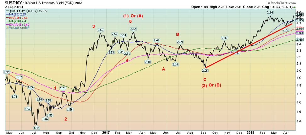
Bond prices fell this past week as yields that move inversely to prices rose. The yield on the 10-year U.S. Treasury note rose to its highest level in weeks, spurred on by rising metal prices and the potential for rising inflation. As we have noted, rising commodity prices, particularly aluminum and nickel but also rising oil prices, are raising expectations that inflation will rise. In turn, rising interest rates negatively impact the stock market and have contributed to the sell-off seen over the past few days. But what is really key is that rising rates put huge pools of bond funds at risk. There is also concern about the potential for bond defaults, particularly some sovereigns. Our expectation and target for the 10-year remains at 3.20%. Given this past week’s rise we may be there faster than we expect. In looking at the wave structure from the September 2017 low this should be the fifth and final wave to the upside.
Recession watch spread
© David Chapman
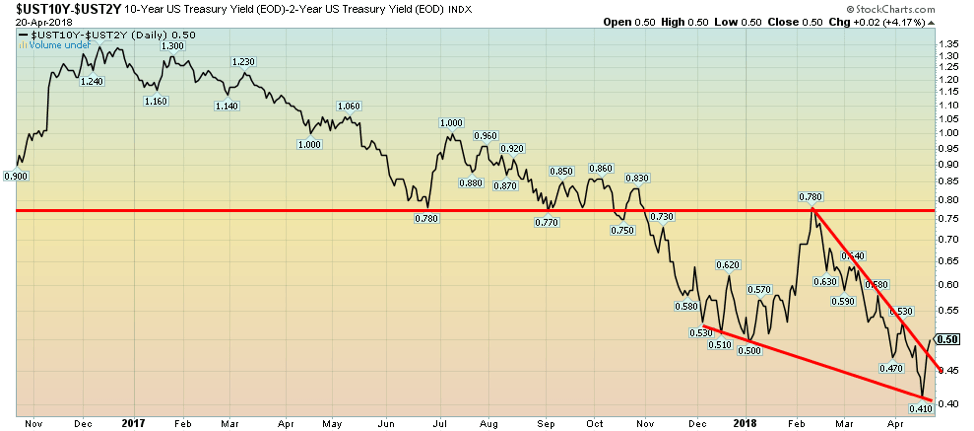
The two/ten spread widened out this past week to 50 bp as the 10-year bond rose to its highest level in weeks. The spread also appears to have broken a potential wedge triangle, suggesting it might have further to rise before it resumes its downtrend. But, as we note below, just because the spread is widening again it doesn’t mean that all is good. As we noted, rising 10-year bond yields are being driven by rising inflationary expectations. The trend is down for the 2–10 spread and our expectation is once this upward correction is over the downtrend should resume. The Fed remains committed to two more rate hikes in 2018. Whether the BofC follows is moot. We note the BofC left rates unchanged at its most recent meeting. Unlike the Fed, the BofC is not noted for telegraphing its intentions in advance. Better to watch short rates in the market as they would normally start rising before any BofC rate hike. The 2–10 spread in Canada widened to 40 bp this past week from 35 bp the previous week.
© David Chapman
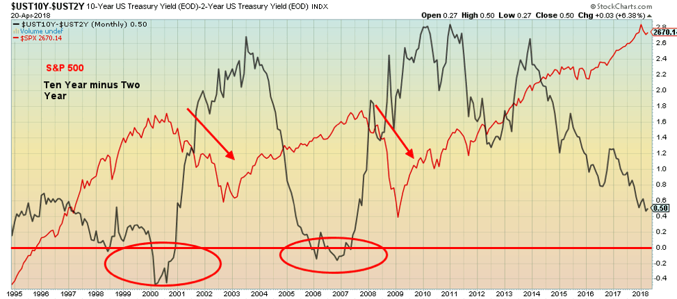
Scott Barlow of The Globe and Mail wrote an article about something we have been observing for some time. His article Flattening yield curve a worrying sign for investors, and the economy (The Globe and Mail, April 19, 2018) noted the flattening yield curve and how in the past when the curve inverted (meaning short rates were higher than long rates) it was a predictor of impending recessions and market weakness. Certainly, since 2000 it has been a sure sign as the yield curve inverted in 2000 and again in 2006/2007 just as or just before the dot com/high-tech crash of 2000–2002 and the housing bubble crash of 2007–2009.
Has it always been a solid predictor? Well, (not shown) the yield curve inverted in the early 1980s as both the stock market and the economy swooned, and again in 1989 before a market correction and recession in the early 1990s. Yield curves also inverted in 1973 before the 1974/1975 market collapse and recession. There are often lags between an inverted yield curve and a market drop and recession.
Barlow correctly notes the two year is a proxy for borrowing costs while the ten year is a proxy for the market’s view of future economic conditions. Rising short-term interest rates always come at the end of the cycle, not at the beginning. But the yield curve is not inverted yet, even as it has flattened considerably in the past four years. Longer rates pushed by rising inflation may have further to rise before they start falling again. The Fed has vowed two more rate hikes in 2018 and more to come in 2019. It is when the ten year starts falling even as the Fed continues to hike (and the BofC as well) that the curve flattens further and inverts.
Barlow goes into more depth than we will here, so his article is worth a read. We will continue to follow the 2–10 spread to guide us as to when a recession might occur. While the negative signs are growing, we are not there yet. But we do note the yield curve can flatten and invert suddenly, so we should not assume we have time before a recession hits.
© David Chapman
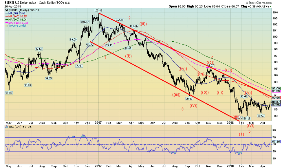
Has the US$ Index broken out? This past week the US$ Index broke out and closed over the 50-day MA and just over 90. One of the prime reasons was rising interest rates. For the past several weeks the US$ Index has traded primarily between 90 and 88.50 with highs around 90.50 and the February low at 88.15. Since the start of the year, the US$ Index has been mainly in that range. If the US$ Index is poised to correct the long down move from the highs of December 2016 at 103.82 it could, in theory, reach as high as 94.10 and even up to 96.00. It would be the most significant correction in months. Rising interest rates would be one of the prime reasons that the US$ rallies. Since the US$ Index is primarily made up of the Euro, the Euro would decline as would the other components including the Cdn$. Significantly, the Cdn$ fell to 78.50 down 1.1% on the week. Oddly, commodities have been rising in price including aluminum, nickel, copper, and oil. But gold might set back as gold usually acts like currency against the US$, although there have been periods when both the US$ and gold rose in price together. There was a period of about one year in 2005 and again in 2010 when both the US$ Index and gold were rising in tandem. Not surprisingly, during the 1970s when the US$ was falling sharply gold rose to a then-record price of $875 in January 1980. When the weak US$ was reversed in the late 1970s and the Fed, under Paul Volcker, hiked interest rates to 20%+ the US$ strengthened and gold prices collapsed. It may be that the US$ Index once again fails. A firm breakout over 90.6 would confirm that the next move is up while a break below 89.20 would confirm that the US$ was poised to fall further.
© David Chapman
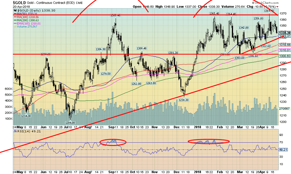
Just as it appeared that gold was poised to break out over long-held resistance at $1,370 gold turned and fell back down culminating in Friday’s drop of roughly $10 that took gold back down under $1,340. The entire zone between $1,350 and $1,370 continues to prove difficult to break through. Since topping back in July 2016 at $1,377 gold has been through a series of ups and downs testing up to $1,360/$1,370 now on four occasions in September 2017, and January, February, and April 2018. Just as it gets there it is almost like some unseen hand comes in and pushes it back down again. Naturally, the gold conspiracy theorists are out in full force, accusing the central banks. There is, of course, some excellent circumstantial evidence supporting that theory. The charge has been led by GATA.
Since the beginning of the year, gold has traded primarily between $1,305 and $1,365 with an average probably somewhere around $1,335. We keep reading other newsletters, all calling for gold to break out over $1,375 and head to $1,400 and higher, but it keeps failing. Continued failure makes us nervous that instead of going up it could go down. A rising US$ Index doesn’t help. However, rising commodity prices and even rising interest rates may help. The anti-gold group keeps repeating the mantra that higher interest rates are bad for gold, but it should be pointed out that gold rose sharply in the late 1970s, a period of sharply rising interest rates. What should be positive for gold is negative interest rates and a collapsing yield curve along with rising inflation and rising commodity prices. Global geopolitical jitters also help as gold becomes a safe haven. The central banks of Russia and China keep adding gold reserves with the stated desire to strengthen their currencies the Ruble and the Yuan.
Despite our current nervousness of the failure of gold to break out over the obvious we continue to hold to the position that gold will eventually break out over $1,375 and head to $1,400 and higher with a potential to even rise as high as $1,700. But that might not stop another test to the downside once again. The rising trendline from the December 2015 low currently comes in around $1,290. We suspect that would contain any decline. In the short term, gold has some pressure on it, but ultimately it will break out over $1,375 and head sharply higher.
© David Chapman
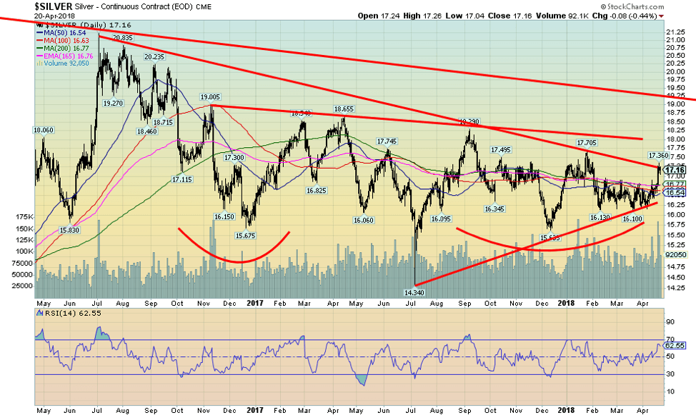
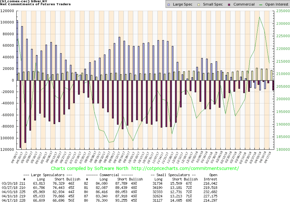
Silver put in a strong week, jumping 3% and is now up just under 0.1% on the year. Silver hit a high of $17.36 this past week before settling back. Silver has broken out of what appears as a box formation and leaped over all the MAs of 50-, 100-, and 200-day, as well as the 165-day EMA. Most of the move was accomplished in one day when silver leaped over 50 cents on April 18, 2018. Volume was high which is what one would expect on a key breakout. We are optimistic that silver prices are still headed higher but admittedly there was resistance here at roughly $17.25. A firm move above that level would see next resistance at $18. Once through $18, silver prices could move quickly to $19/$19.25. Support appears strong down to $16.75 and again down to $16.50. This past week’s move in silver was encouraging. In turn, rising silver prices should also take gold prices higher. The one niggling concern is the recent strength of the US$ and the negative impact that could have on precious metals prices.
© David Chapman
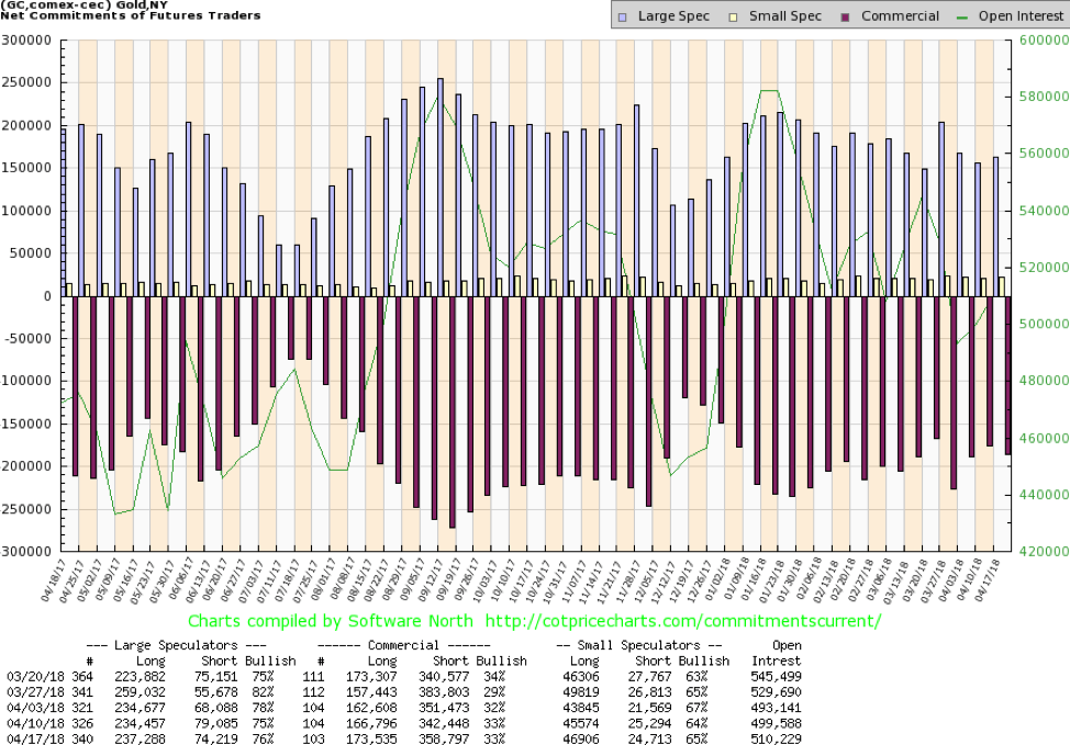
The commercial COT for gold was unchanged this past week at 33%. However, there was an increase of about 7,000 contracts for long open interest and short open interest jumped just over 16,000 contracts. The large speculators’ COT (hedge funds, managed futures, etc.) rose to 76% from 75% as they added to longs while cutting shorts. Overall, the commercial COT remains mildly bullish. For it to become more bullish we’d have to get readings of 40% or higher as we saw in December 2017.
© David Chapman
The silver commercial COT pulled back this past week to 45% from 49% as the longs trimmed their position by about 7,000 contracts and shorts rose about 5,000 contracts. Not surprisingly, the large speculators COT jumped to 50% from 45% as they trimmed their short positions by just over 13,000 contracts while adding about 1,600 contracts to their long positions. The silver commercial remains bullish despite the pullback, although obviously not quite as bullish as it has been. With silver appearing to jump but hitting another resistance level one can only hope it doesn’t end there.
© David Chapman
Gold stocks as measured by the TSX Gold Index (TGD) appeared to break out of an ascending triangle this past week. The rally, unfortunately, fizzled at key resistance of the 165-day EMA and the 200-day MA. Now the pattern is starting to look like an ascending wedge triangle which is somewhat bearish. Preference would have been that the TGD surged through 195 to test resistance at 200. Alas, no such luck. The good news, however, is that the TGD is at least continuing an uptrend. There appears to be good support down to 185, but under 182 the TGD is liable to test the February lows. The U.S-based Gold Bugs Index (HUI) also stalled just under the 165-day EMA and the 200-day MA. These zones have proven over the past several months to be stiff resistance, although at times both the TGD and the HUI break over those levels only to fall back again. Gold stocks remain cheap compared to gold (and silver) and while sentiment has improved it is nowhere near universal euphoria. Downside appears to be limited but frustration remains with regard to any upside breakout, despite all signs suggesting that the gold stocks should be accumulated.
Chart of the week
© David Chapman
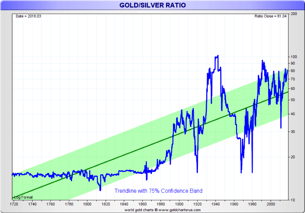
Here is a very long-term chart of the gold/silver ratio. It is interesting to note that when the U.S. was constituted in 1787 gold and silver were set as legal tender. In 1792, the gold/silver ratio was set by law at 15:1. In France, in 1803, it was enacted at a ratio of 15.5:1. Ancient civilizations of Greek, Roman, Egyptian, Chinese, Babylonians, Assyrians, and Sumerians also paid close attention to the gold/silver ratio. It varied in these ancient civilizations from 2.5:1 in Egypt, to 5:1 in ancient Syria, 12:1 in the Roman Republic, to 8:1 in ancient Japan. In the medieval world, it was set at about 15:1 and 16:1. In nature, the ratio is about 16:1. Even the Bible indicated a ratio of 15:1. Yet for most of the past century, the ratio has averaged about 47:1 and currently sits at 78:1. Silver in the ancient world was synonymous with money.
The ratio started to come unglued following attacks on the gold standard and the move to a fiat currency system. It has soared notably since 1971 when the world was taken off the gold standard for good by former President Richard Nixon. Since about 1880 the ratio has been as high as 100 but also as low as 17:1 at the time of the Hunt Brothers’ attempt to corner the silver market, and gold soared to $875 in early 1980. In 2011, at the time of the last gold/silver peak in prices, the ratio had fallen to 32:1. If silver was priced as it was set from ancient times to just over 138 years ago the price of silver would be just over $80 vs. gold at $1,325. Odds favor silver outperforming gold going forward.
—
DISCLAIMER
David Chapman is not a registered advisory service and is not an exempt market dealer (EMD). We do not and cannot give individualised market advice. The information in this newsletter is intended only for informational and educational purposes. It should not be considered a solicitation of an offer or sale of any security. The reader assumes all risk when trading in securities and David Chapman advises consulting a licensed professional financial advisor before proceeding with any trade or idea presented in this newsletter. We share our ideas and opinions for informational and educational purposes only and expect the reader to perform due diligence before considering a position in any security. That includes consulting with your own licensed professional financial advisor.


Temotiva Launches Crowdfunding Campaign to Advance Preventive Mental Health
Temotiva Innovación Lab has launched a crowdfunding campaign through Santander X Explorer, marking a new phase for the University of...


Fed Policy Shift Raises Concerns Over Debt and Inflation Risks
The Federal Reserve is criticized for resuming balance sheet expansion through Treasury purchases despite expectations of tighter policy under new...


AI Adoption in Italian Retail Stalls Despite Strong Experimentation
A survey on AI in Italian large-scale retail trade shows companies are increasingly adopting artificial intelligence, but only 1.4% have...


Crypto Market Stays Stable as Bitcoin and Ethereum See Mild Declines
The crypto market remained stable despite slight declines in major coins like Bitcoin and Ethereum. Bitcoin held near $64,362, while...


WNBA Removes Cannabis From Banned Substances List in New CBA
WNBA removed cannabis from its banned substances list in a new CBA running 2026–2032, aligning with NBA policy and allowing...
 |
|
 |  |
 |
|
-

 Fintech1 week ago
Temenos to Acquire Additiv to Boost AI Wealth Management
-

 Africa5 days ago
Remote Work Reshapes Sales Management: Key Lessons for Moroccan Leaders
-

 Fintech2 weeks ago
German Fintech Investment Slumps as AI Becomes Key Focus
-
 Crypto2 days ago
Crypto Market Stays Stable as Bitcoin and Ethereum See Mild Declines
You must be logged in to post a comment Login