Featured
Global debt hits historical high; Gold and bonds climb as stock markets decline
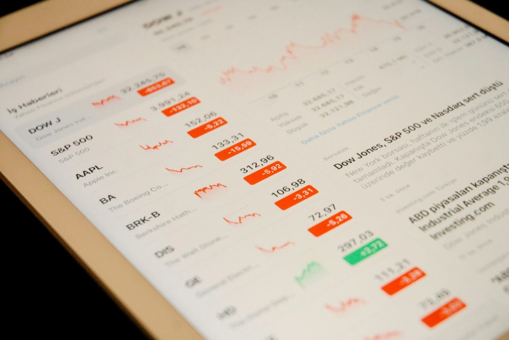
Global debt now at $245 trillion, the highest in history. The stock markets fell over 3 percent while gold rose 2 percent and bond yields head to 3.45 percent.

“There are very few instances in history when any government has ever paid off debt.”—Walter Wriston, Chairman & CEO, Citicorp, 1967–1984
“Blessed are the young, for they shall inherit the national debt.”—Herbert Hoover, U.S. president 1929–1932
“I found this national debt, doubled, wrapped in a big bow waiting for me as I stepped into the Oval Office.”—Barack Obama, U.S. president, 2009–2012, 2013–2016
It has been a dramatic, disturbing week. But then it had already been noted that October can be a scary month. On October 24, 2018, there was a full moon. The October full moon is known as the Hunter’s Moon. It just happened that, on that day, the story burst that pipe bombs were delivered to two former U.S. presidents, plus others. The stock markets fell over 3 percent, the worst one-day loss since last February. The bubble, it seems, is bursting. The attempted assassination of two former presidents reveals the divisions that have been plaguing the U.S. for years. The stock market collapse, pushing the market into negative territory, reveals that the ever-growing debt bubble could be on the verge of bursting. The two are not connected. But they both show a disconnection.
Debt is the elephant in the room. At an estimated $245 trillion globally (upwards of $100 trillion higher than it was in 2008), there has never been a time in history that it is so high. Government debts may never be paid back. They merely default. When corporations and consumers can’t pay back their debt they declare bankruptcy. It raises the question: can a country or anyone live without debt?
Well, they probably can, but typically countries that show a low debt to GDP ratio are also countries with lower standards of living. Typically, countries that have little or no debt do not have a developed bond market and there are a few ways people can save. People would have to go outside the country to purchase savings vehicles such as bonds. A country that runs a persistent surplus is effectively withdrawing money from the system. The same can be said of corporations and consumers. If they don’t use debt, they may not be able to expand or purchase anything beyond what their cash flow and savings allow them to do.
If you are lucky, you live in the oil-rich nation of Brunei. This small sultanate on the island of Borneo has one of the highest GDP per capita in the world and quite possibly the lowest government debt to GDP ratio in the world at about 2.7 percent. At the other extreme is Japan, with a gross government debt to GDP ratio of 237 percent while the Central African Republic brings up the rear in terms of GDP per capita. Brunei does not even have the highest GDP per capita. That honor belongs to the oil-rich nation of Qatar. Two countries, the United Kingdom and Japan, have the highest debt to GDP (debt includes governments, corporations, banks and consumers) in the world at over 600 percent.
Government debt, along with corporate, bank, and consumer debt is a fact of life. Debt has been with us for centuries, dating back to ancient Greece and Rome. Excessive debt accumulation, whether it relates to governments, corporations, banks or consumers, has consistently resulted in debt and banking crises over the centuries. Excessive debt accumulation results in illusions, whether it is an economy doing better than it seems, inflating housing or stock prices, or making corporations and banks appearing to be more profitable than they really are.
History is littered with banking crises, sovereign debt defaults, currency crises, inflationary collapses, and currency debasement. Debt crises happen over and over again. The same countries are often involved over and over again in debt crises. Since 1970, dozens of countries have been involved in debt crises, some repeatedly. Argentina and Venezuela are two countries that pop up again and again.
Here’s a capsule summary of the key crises since 1900: the financial panics in 1901, 1907, the crash of 1929 and subsequent Great Depression with multiple sovereign debt defaults, the energy crisis of the 1970s, the Latin American debt crisis of the 1980s, the early 1980s recession, Black Monday October 1987, the savings and loan crisis of 1986–1995 that saw one-third of the S&Ls fail, the early 1990s recession, the Asian financial crisis of 1997, the Russian financial crisis of 1998, the Argentina economic crisis from 1999–2002, the high-tech/dot.com collapse of 2000–2002, the 2007–2009 financial crisis triggered by the default of the sub-prime mortgage market and the bursting of the U.S. housing bubble resulting in the most massive bailout in history and the collapse of hundreds of banks, the EU sovereign debt crisis that got underway in 2009 and continues today, the Russian and Ukraine debt crisis of 2014, the Brazilian economic crisis of 2014–2018, Venezuela 2012–2018, and finally the Turkish currency and debt crisis of 2018. We left numerous smaller ones out.
Argentina today is a country gripped in crisis. The peso is collapsing, inflation is rising, foreign currency reserves are dwindling, the economy is teetering on the edge following a 6.7 percent decline in GDP in June, and unemployment is rising. Argentina has had to seek an IMF bailout with the latest package $57 billion but coupled with massive austerity cuts. Some 28 percent of the country already lives in poverty. That, in turn, has triggered protests that are being met by riot police, rubber bullets, water cannons, tear gas, and charging motorcycles.
In 2012, we were visiting Buenos Aires, Argentina. On one of the evenings when we went out for supper, we were met with blockades, hundreds of police, and thousands of protestors lining the Avenida 9 de Julio, billed as the world’s widest grand avenue. The restaurant we planned on going to was on the other side. Undeterred, we waded through the crowds as they marched banging their pots, crossing the huge, 18-lane Avenida. If we had a concern it was: What if the protests turned violent? We might find that we had a bit of a problem getting back to our hotel, especially having to cross the wide Avenida. Fortunately, nothing untoward happened, but protests of this nature are common in Argentina. Protesting in Argentina, it seems, is the second favorite sport behind soccer.
The U.S. was founded in the midst of a long economic depression and a violent revolt. The American revolutionary war lasted from 1775–1783. There were stock market panics in 1785, 1792, and 1796–1797. In 1790, interest on the U.S. Revolutionary War debts assumed from the states was deferred until 1801. It was expected the debt would default. When it became clear the new government would honor the debt the crisis passed. The U.S. was founded on debt, and since its founding, there has been a series of banking crises and depressions. Note our chart below that shows the U.S. public debt as a percentage of GDP dating from the founding of the country. War and depressions have been major causes of the debt soaring.
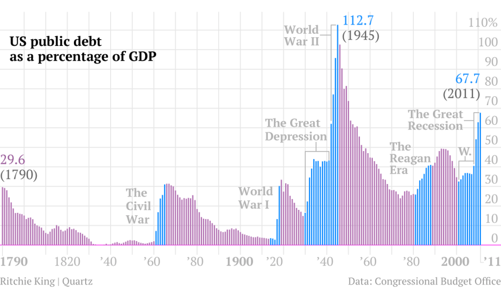
© David Chapman
The chart above only goes until 2011. Today, the public debt totals $15.8 trillion and the public debt to GDP stands at 82.3 percent. Note: this is the public portion of the U.S. national debt. Public debt is held by individuals, corporations, pension funds, governments, Federal Reserve banks, foreign governments, central banks. There is also intragovernmental debt which is U.S. debt held by government trust funds and other federal funds. Together, they currently total $21.6 trillion, and the total debt to GDP stands at 105 percent.
© David Chapman
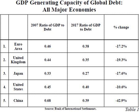
Debt does not buy what it used to. There was a time when additional debt allowed the economy to grow faster. Not any more. Even as we add debt, the economy grows more slowly. It takes increasing amounts of debt to purchase that additional dollar of GDP. John Mauldin flipped the old debt to GDP ratio to read instead GDP to debt in his recent “Thoughts from the Frontline,” “Debt Alarms Ringing.” What it shows is that debt is losing its ability to stimulate growth. According to the chart above, in 2017, a dollar of non-financial debt only generated about 40 cents of GDP. Fifty years ago, according to Mauldin, it generated $4 of GDP. And even back in 2007, before the 2008 financial collapse, it generated 45 cents of GDP. It seems it is the law of diminishing returns. The solution for getting more GDP is to take on more debt. It just takes a lot more. Eventually, one has trouble paying it back.
The U.S. has its own history of defaults or, more correctly, debt restructuring. Following the deferment default of 1790, nine states including three that repudiated their debt occurred in 1841–1842 during a period of a steep depression; from 1873–1884 ten states defaulted during a period known as the “Long Depression”; and, finally, in 1933 the government declared invalid provisions that the debt could be paid in gold. We are also reminded that, when the U.S. under President Richard Nixon closed the gold window and took the world off the gold standard in August 1971, it was a default.
There have been an estimated 47 recessions (including depressions) since the founding of the U.S. The U.S. was founded in the midst of an economic depression. That works out to be roughly one every five years. Since 1970, there have been seven, or roughly one every seven years. We are now nine years from the end of the last one in 2009.
There have been three notable depressions, plus at least four others that were referred to as depressions, including the economic depression at the time of the founding of the U.S. Given three notable depressions that work out to be roughly one every 81 years. There was the Depression of 1836–1846 and the Long Depression of 1873–1879, and even afterward, the U.S. was punctuated by recessions and panics that lasted until 1904. Then came the Great Depression of 1929–1933 with the echo of the steep recession of 1937–1938. The Great Recession of 2007–2009 had been the steepest since the Great Depression. 2018 marks the 85th year from the nominal end of the Great Depression.
Cycle analyst Raymond Merriman has, through his research, determined that the longest stock market cycle is one of 75 years. Its half cycle is 37.5 years and 18.75 years would be the half cycle to the 37.5-year cycle. The Great Depression stock market cycle low was in 1932. The last major stock market low was March 2009, 77 years later. That was 35 years after the last 37.5-year cycle low seen in December 1974. The previous 18.75-year cycle low was October 1987, given it was 21 years and 5 months from the March 2009 low.
Merriman noted there was often a secondary low following the 75-year low that came in 3–22 years later, but with a tighter range of 6–15 years. The 1938 stock market low came 6 years after the 1932 low. That collapse could be in the range of 35–50 percent as it was in 1937–1938. Using the tighter range our expectations would be for a major stock market low to occur sometime between 2015 and 2024. The drop in 2015–2016 was not steep enough to qualify. The 18.75-year cycle has a range of 13–22 years so its potential range for a low is from 2022–2031.
The 18.75-year cycle usually breaks down into three 6.5-year cycles (range 5–8 years). The low of August 2015/February 2016 was almost exactly 6.5 years after the March 2009 low. The next 6.5-year cycle low is due in 2020–2023, so again it falls into the range of the other suggested cycle lows. There is also a well-known 4-year cycle (range 3–5 years). The stock market low for the 2011 EU debt crisis occurred in October 2011 which was roughly 2.5 years after the March 2009 low. That seemed early for the 4-year cycle low but then four years later the lows of August 2015 and February 2016 occurred. The current gyrations in the market gave us a low in February 2018 and possibly another one now in October 2018. These gyrations and potential stock market lows are coming 3–3.5 years after the February 2016 low.
If as we suspect this an example of the 4-year cycle low then it suggests to us the possibility of another run-up in the stock markets to another crest before the markets fall into the next 6.5-year cycle low. We noted the next 6.5-year low is due from 2021-2023. If the current declines are an example of the four-year cycle low the next one is due in 2021-2023, overlapping the 6.5-year cycle.
All of this is playing out against the backdrop of a multitude of world issues: rising interest rates, a rising U.S. dollar, growing debt problems in emerging markets (Argentina, Venezuela, and more), growing debt problems in China (real estate), ongoing debt problems in the EU (Italy), signs of stressed loans in the U.S. (cars, student loans), topping in housing prices (Canada, U.S., EU), growing social divisions leading to violence (EU, U.S.), trade wars (U.S./China, but also with EU and others), and growing global Great Power tensions (U.S./China/Russia). Markets may climb a wall of worry but at some point, an event happens and, as we have seen with the gyrations in February and October 2018, gains can be wiped out faster than the market rose.
The U.S. national debt is once again on the rise. During the last year of the Obama administration, the U.S. national debt rose $1,006 billion. Overall, during the Obama administration in 2009–2017, the national debt rose $9.3 trillion, almost doubling. The huge increase, especially in the early years, was a direct result of the financial collapse of 2008.
During the first year of the Trump administration, the U.S. debt jumped by $546 billion. So far, in the second year of the Trump administration, the U.S. national debt is up by $1,202 billion (Source: www.treasurydirect.gov). The $1.5 trillion tax cuts were passed in December 2017, giving permanent tax cuts to corporations and largely benefiting the 1 percent. It was conservatively estimated that it would add at least $1.5 trillion to the national debt over the next decade. Given the rise in the national debt in the first year, the $1.5 trillion addition might be conservative.
The U.S. can’t live without debt—a national debt that now stands at $21.7 trillion, the highest in the world—and a debt to GDP ratio of 105 percent.
Bitcoin watch
© David Chapman
The cryptos continue to elicit not much more than a yawn these days. Gone are the glory days of December 2017 when Bitcoin soared toward $20,000 and the market cap of the cryptos was nearly $1 trillion. Today the market cap of all of the cryptos is hanging tough at around $208 billion and Bitcoin, with a market cap of $112 billion, represents over half of it. At its peak, Bitcoin had a market cap of nearly $325 billion. Today, Bitcoin sits down nearly 70 percent from those heady days and many more cryptos are down 80 percent, 90 percent, and more from their peak. Many just ceased to exist even as more and more new cryptos have come to life. Why, we are not sure. Maybe there are some readers who can explain these mysteries.
Even the news is becoming bereft of much that’s interesting. Scams, hacks, frauds, money laundering, and regulatory scrutiny continue. A few got rich. Many lost their entire investment in what was supposed to be the next big thing. Cryptos will most likely survive, but surely there is little need for over 2,000 of them.
There are still 16 cryptos with a market cap over $1 billion according to Coin Market Cap. That’s the same as last week. There are now 2,070 cryptos listed at Coin Market Cap. That is actually down one from the previous week. That’s the first decline we have seen in weeks. The market cap of all cryptos is $208.5 billion, up $0.8 billion on the week. The number of dead coins at Dead Coins is unchanged again at 929.
The bulls continue to believe that Bitcoin is finding a bottom. That remains to be seen. The price of Bitcoin has remained relatively steady, trading between $6,200 and $6,700 for the past month. There is no argument here that Bitcoin couldn’t have a pop to the upside, but we believe any upside breakout now would most likely be a false move. The trend is down and we expect that eventually, Bitcoin should break to the downside.
The industry is leery of regulation. No surprise there. After all, the crypto industry was created to circumvent government oversight and to have anonymity. But many also want regulation now to attract more users, particularly institutional investors. Unfortunately, one can’t have it both ways. With increased scrutiny and continued pulling down of the shield of anonymity, the attitude may well become: so, what’s the point. There remains a limited number of areas where one can actually use Bitcoin or other cryptos. And certainly not over 2,000 of them.
© David Chapman
Markets and trends
Note: New highs/lows refer to new 52-week highs/lows. © David Chapman
© David Chapman
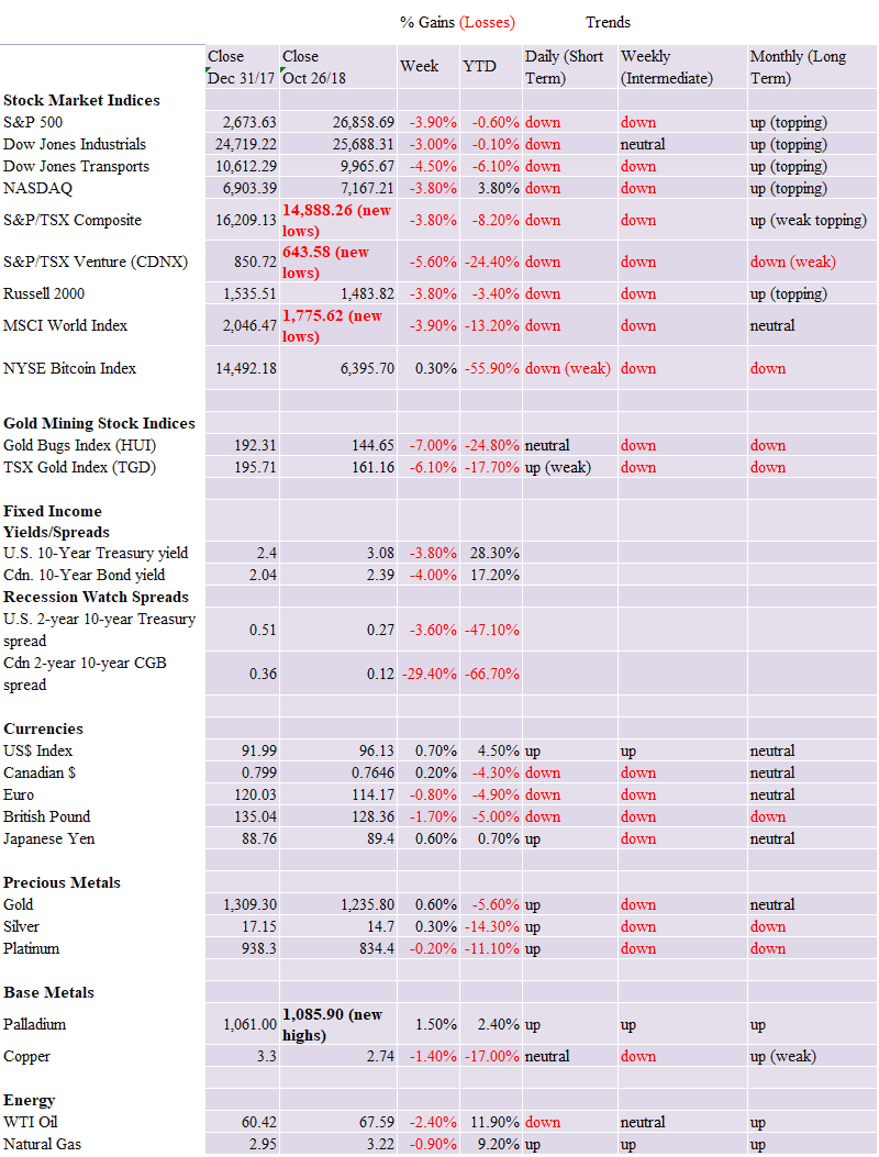
It is now reassessment time. It had been our belief that the recent correction was a potential fourth wave with one more wave to the upside to come. However, this past week the S&P 500 fell 3.9 percent and turned negative for the year. The weekly intermediate trend was pulled into down for the first time in years. The S&P 500 dropped sharply under the 200-day MA. All this has changed our opinion. The final top may now be in. Markets everywhere fell. The Dow Jones Industrials (DJI) fell 3 percent and is down 0.1 percent on the year. The Dow Jones Transportations (DJT) fell 4.5 percent and is down now 6.5 percent in 2018. The NASDAQ fell 3.8 percent but remains up on the year by 3.8 percent. It is at this point the lucky one. The Russell 2000 fell 3.8 percent and it too is down on the year by 3.4 percent.
Foreign indices fared little better. The MSCI World Index was down 3.9 percent and is down 13.2 percent on the year; the Paris CAC 40 fell 2.3 percent and is off 6.5 percent on the year; the German DAX dropped 3.1 percent and is now off 13.3 percent in 2018; the Japanese Tokyo Nikkei Dow (TKN) fell 6 percent and is down 7 percent on the year, while the London FTSE 100 fell 1.6 percent and is off 8.6 percent on the year. The lucky winner on the week was the Shanghai Stock Index (SSEC) as it gained 1.9 percent but remains down 21.4 percent on the year. In Canada, the TSX Composite fell 3.8 percent and is off 8.2 percent on the year while the TSX Venture Exchange (CDNX) dropped 5.7 percent and is down 24.4 percent on the year. Both the TSX Composite and the CDNX made new 52-week lows.
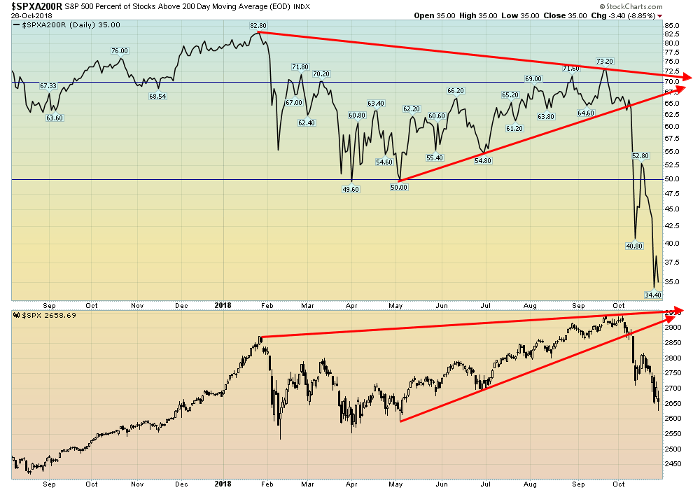
It is now possible that the market has made its final top. A decline under the February/April decline would confirm. The major line is at 2,500 even as the lows in February/April were seen at 2,532 and 2,553. The low so far is 2,628. Given that the S&P 500 dropped below the June low of 2,691 it was the “killer” that said to us the market may well have made its final top. Still, at this point, the market is deeply oversold and a rebound is quite possible. The election is now less than two weeks away and we have noted that markets tend to perform positively following the mid-terms. Fewer losses by the Republicans than expected and even the Republicans holding the house could spark a sharp rally. The Senate is too close to call as to whether it could change hands. The key is the house. Even if the Democrats take control and the numbers are about as expected it could spark a rally. If the stock indices have entered a bear market as it appears, the question is: how will 2019 play out? We don’t expect the final low for this bear to occur until at least 2020 and even further out as we discussed in our main essay. So, 2019 could play out in a very choppy manner. But the key now is recognizing that the decline this week has changed the picture and there is a possibility that the final high is in.
© David Chapman
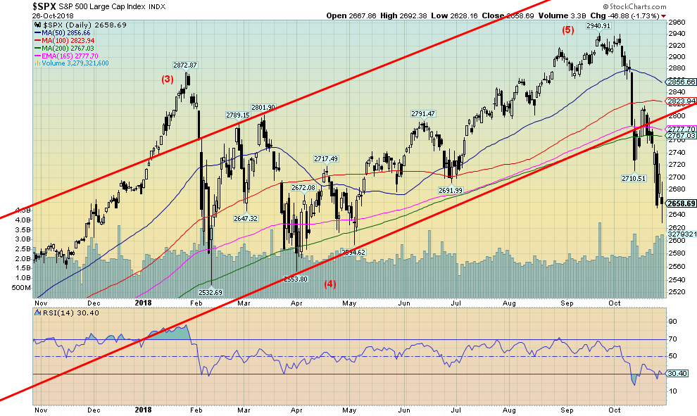
Banks are supposed to be one of the leading indicators of the economy. But the KBW Bank Index (BKX) couldn’t even make it back to its 2007 high. Furthermore, it has diverged with the S&P 500. As the S&P 500 moved to new all-time highs after the decline in February/April the KBW Index failed to follow. This could be a significant divergence. Also, the KBW Index has broken down under its 40-week MA, suggesting it has now moved into a bear market. The index is down almost 20 percent from its late 2017 high which puts it into the official bear market territory. The KBW Bank Index appears to be leading the market. Another warning sign that the party that started in 2009 may be over.
© David Chapman
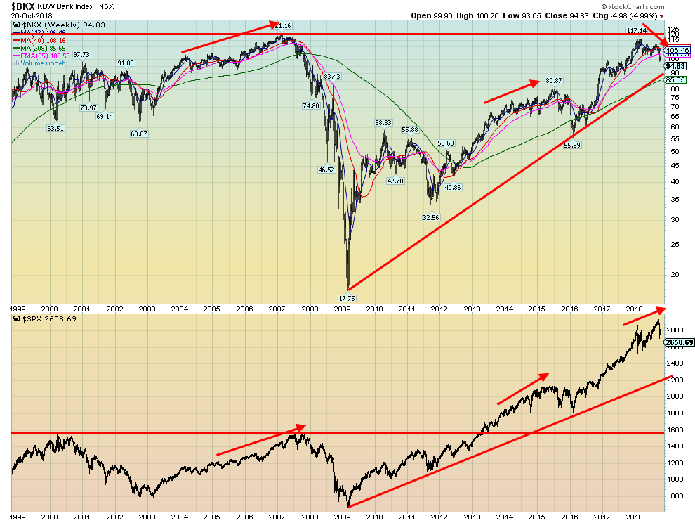
As with the Bank Index, the S&P 500 diverged with the Semiconductor Index (SOX) at the recent top. While the S&P 500 made a new high the SOX did not. The semiconductors are a key component of the economy. This chart shows that the SOX has fallen below the 40-week MA for the first time since 2015/2016. The rising trendline from the 2009 major low comes in around 930 so the SOX still has a considerable way to fall to break that level. Nonetheless, the divergence with the S&P 500 and the breakdown under the 40-week MA spell trouble.
© David Chapman
The percentage of stocks in the S&P 500 trading above their 200-day MA has fallen to 35 percent. That means that 65 percent of the stocks in the S&P 500 are now trading in a bear market. The level is now lower than what it was during the February/April decline. Major support remains down around 2,500, but once that falls the market would be confirmed in a bear market, one that could last for some time.
© David Chapman
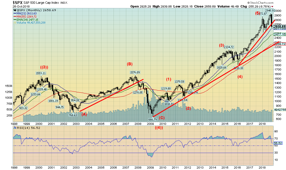
Here is a long-term monthly chart of the S&P 500. The S&P 500 appears to be breaking down under an uptrend line from the February 2016 low. However, it remains well above the uptrend line from the 2009 low. The RSI had been largely over 70 now throughout 2017 and 2018, indicating an extremely overbought market. It was a matter of time before it broke to the downside. Nonetheless, the S&P 500 appears to be approaching the 21-month MA and could find support there. In the two previous bear markets, once the market broke under the 21-month MA it usually remained that way for several months.
© David Chapman
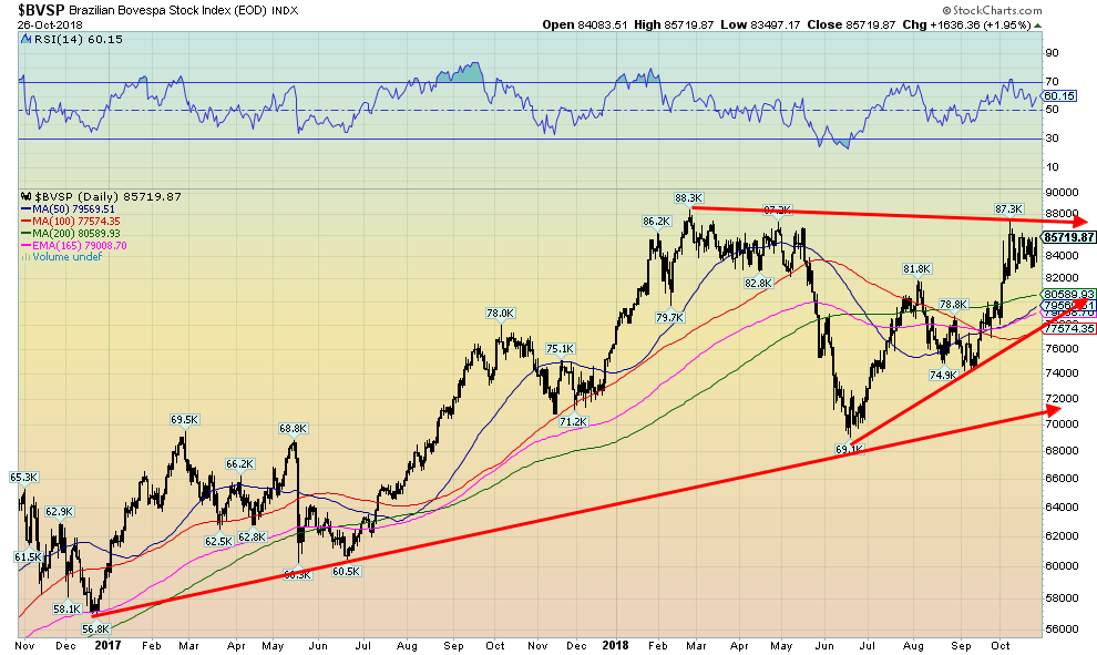
This is not a chart we would usually show, but given the elections this week in Brazil we thought it appropriate to have a look at the Brazilian Bovespa Index (BVSP). Given the controversy surrounding the potential winner of the election Jair Bolsonaro, a far-right, dictatorship-loving candidate, it was surprising to find the BVSP up in contrast to what has been going on with other indices in the world. Brazil has been wracked with considerable polarization and violence and his election could be met with even more violence. But the markets seem to love it. However, they could be topping out here. Failure to make new all-time highs could set up a double top. The BVSP also appears to be forming a large triangular pattern. The pattern breaks down under 77,500 and especially under 71,000.
© David Chapman
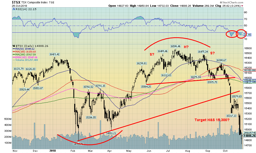
The TSX Composite broke down this past week following the lows in the U.S. markets. The TSX lost 3.8 percent on the week and is now down 8.2 percent on the year. The TSX is down 10.3 percent from the high seen in July. The head and shoulders pattern suggested a drop to at least 15,300. The next target below that would be a decline to 14,800/14,900. The low this week was 14,732. As a result, the TSX made a new 52-week low, albeit just barely. This decline is much more dangerous than the one seen in February and the odds now of regaining the highs is probably low. The RSI is in the low 20s and suggests that a rebound could soon take place. As well, given that the TSX has achieved the next target a rebound is also likely. Considerable resistance would be seen up to 15,900/16,000 with interim resistance at 15,500. If the market were to continue to fall, then the next potential target is down to 14,100/14,200.
© David Chapman
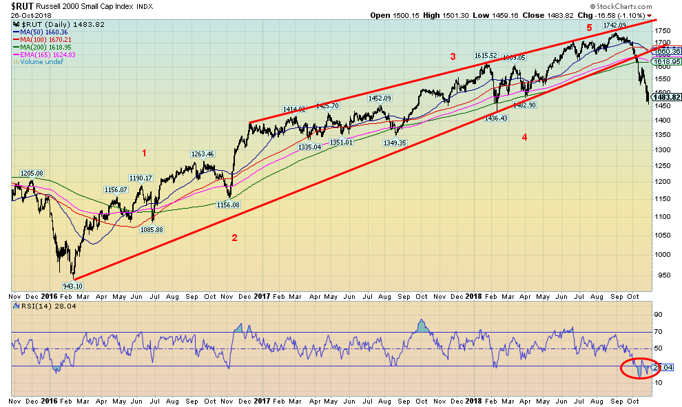
The small cap Russell 2000 index appears to have broken down from its long uptrend from the February 2016 low. This suggests to us the long rally is now over. The Russell is now down 14.8 percent from the August high and is down 3.4 percent on the year. The RSI, currently at 28, suggests the market is oversold but it is not a guarantee that the market will rise. The 2018 low is at 1,436 and a breakdown under that level would be quite negative. The Russell is going to have considerable resistance now up to 1,620 to 1,660.
© David Chapman
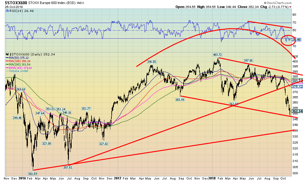
The European stock markets appear to be breaking down, as seen in the Euro Stoxx 600 Index, above. Note it has taken out the lows seen 2017 and early 2018. The market is probably overstretched to the downside right now so a rebound could occur shortly. There is support down to 335 but it is unsure as to whether the market can fall that far at this point. On the weekly Euro Stoxx chart the index is breaking down from a long consolidation.
© David Chapman
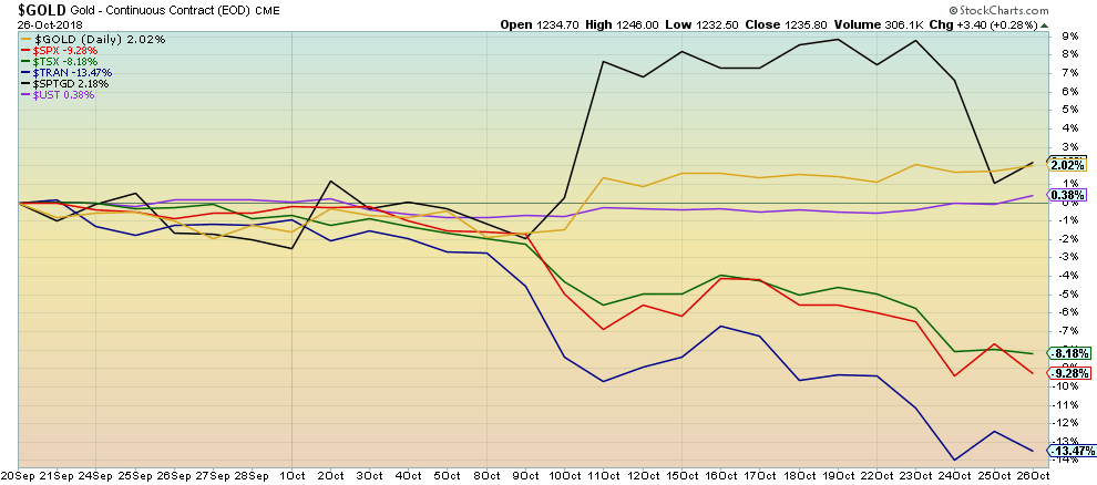
This is a reminder that, in times of stock market stress, safe havens such as gold and bonds usually outperform. Since the stock market topped on September 20, the S&P 500 is down 9.3 percent while the TSX Composite is off 8.2 percent. The Dow Jones Transportations (DJT) has fallen even more by 13.5 percent. On the other hand, gold is up 2 percent, the gold stocks as represented here by the TSX Gold Index (TGD) have gained 2.2 percent, and the U.S. 10-year Treasury note is up 0.4 percent. We demonstrated in an earlier missive that gold has consistently outperformed during times of stock market declines.
© David Chapman
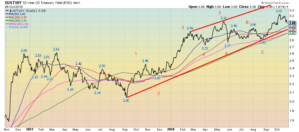
The yield on the U.S. 10-year Treasury fell to 3.08 percent this past week, down from 3.20 percent the previous week. Bonds benefitted from a flight to safety as the stock markets fell 3 percent+ this past week. That is not a surprise as bonds (and gold) are usually considered safe havens in times of stock market stress. There is significant support for the 10-year down to 2.97 percent/3.00 percent. Below 2.90 percent, the 10-year could fall a lot further. The recent rise in bond yields suggested the potential for a rise to 3.45 percent before this peters out. A rebound in the stock market would probably see bonds sell off (prices move inversely to yields). Only new highs above 3.23 percent would suggest a continued up move to the 3.30 percent level.
Recession watch spread
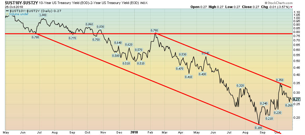
© David Chapman
The 2–10 spread slipped this past week to 27 bp, down from 29 bp the previous week. It remains above the 18 bp seen in August. As a result, there is little sign yet of an impending recession. The trend for the 2–10 spread remains down but is still far from turning negative.
© David Chapman
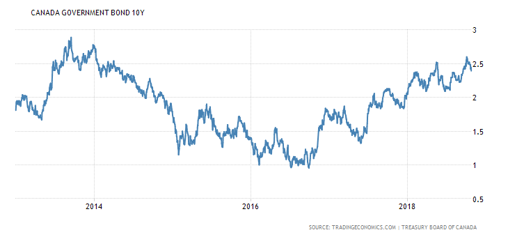
Despite the Bank of Canada hiking the bank rate to 1.75 percent this past week, the Canadian 10-year government bond yield fell to 2.39 percent from 2.49 percent the previous week. Canada’s 2–10 spread has fallen to 12 basis points (bp), down from 17 bp the previous week and 36 bp at the beginning of the year. The spread is edging closer to going negative. Still, yields remain firmly in an uptrend. It would take a break under 2 percent to suggest that the uptrend is over. Canadian bond yields remain behind the U.S. and that has helped contribute to a weaker Cdn$.
© David Chapman
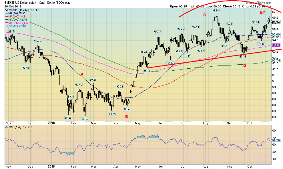
The US$ Index rose 0.7 percent this past week despite a falling stock market. Bullish economic reports helped as GDP for Q3 rose to an unexpectedly strong 3.5 percent. This followed the strong 4.2 percent rise for Q2. Despite the strength in the Q3 GDP, it did nothing for the stock markets that were down 3 percent+. It is acknowledged that the tax cuts are probably helping, but the expectation was that the boost would be strong at first and then eventually peter out.
The result of the rise in the US$ Index is that it throws into doubt the high that was made at 96.86 back in August. After rising to 96.62 on Friday the US$ Index faded the rest of the day and ended down, losing 0.3 percent. Brexit issues were cited as helping to strengthen the euro on Friday. The euro ended the week down 0.8 percent while the pound sterling dropped 1.7 percent on Brexit fears. The Japanese yen rose 0.6 percent while the Cdn$ was up a small 0.2 percent. The reversal seen on Friday for the US$ Index bodes poorly for the coming week. Downside follow-through is essential if the reversal is correct.
The Fed is committed to hiking rates again in December by another quarter point. President Trump has been a constant critic of the Fed and has even become personal, criticizing Fed Chairman Jerome Powell. The Fed, however, is likely to ignore him. Trump is a critic of raising interest rates and the high U.S. dollar.
The US$ Index may be making a double top. Given that the last two waves unfolded in what appears as 3s in an ABC-type pattern, it suggests to us that the rise from the January 2018 low has unfolded, not in an ABC pattern, but an ABCDE-type pattern. Usually, those patterns form as a symmetrical triangle, not as a rising pattern. However, we have seen them in the past. The lack of a five wave advances suggests to us it is all corrective and we should not break out to challenge the January 2017 top at 103.82. It is interesting to note that gold has been rising recently despite a rising U.S. dollar.
© David Chapman
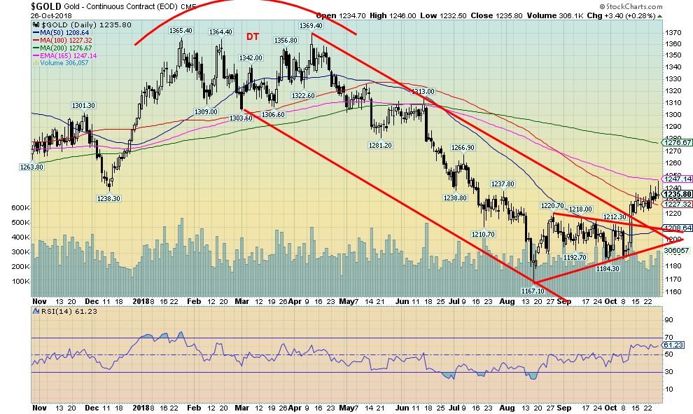
Gold prices continue what we are terming as a creepy crawly or stealth rally. Gold did burst out of what appeared as an ascending triangle at the lows when it took out $1,215. The pattern projects up to at least $1,270. The high so far has been $1,246, suggesting there is more room to move higher. The 200-day MA is up at $1,277 and that should also attract prices. Over $1,280 (on a close basis), gold should rise to $1,300 and higher.
Gold hit the 165-day exponential MA this week before pulling back towards the 100-day MA. Sentiment towards gold remains subdued if not negative. As a demonstration of the creepy crawly move, gold was up only 0.6 percent this past week as the stock markets were falling 3 percent+. Silver gained 0.3 percent while platinum fell a small 0.2 percent. Palladium jumped 1.5 percent. We have noted previously that gold may be trying to make a 34-month low. As measured from the December 2015 low, gold is now 34 months from that low. The range for the 34-month low is +/- 6 months and was centered around October 2018. The low of $1,167 in August may qualify.
We can’t rule out a secondary low, possibly in November, before gold takes off. Gold has, over the past few years, been making significant lows in the November/December period. They may be examples of the 11-month cycle low which is itself the 34-month low divided by three. It has a range of 9–13 months. Support now for gold should be seen at $1,220 and down to $1,210. Resistance now remains up to $1,250. Gold has been rising despite a rising U.S. dollar. That is generally construed as bullish for gold going forward.
© David Chapman
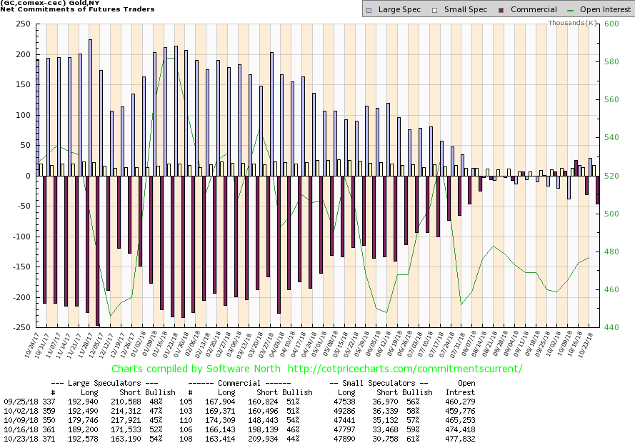
The gold commercial COT remained bullish despite another drop this past week. The gold commercial COT fell to 44 percent from 46 percent the previous week. Long open interest fell just under 3,000 contracts while short open interest jumped over 11,000 contracts. No surprise: the large speculators COT (hedge funds, managed futures, etc.) jumped to 54 percent from 52 percent as they added roughly 3,000 longs and trimmed their short position by over 8,000 contracts. The market appears to be moving normally as gold prices creep higher. The gold commercial COT usually doesn’t become bearish until it drops into the low 30s or even into the 20s. The large speculators often reach upwards of 300,000 longs at the top.
© David Chapman
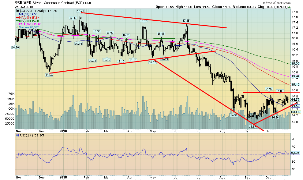
If gold prices are creeping higher, silver prices, it seems, are creeping even more slowly—higher at best, but looking more like they are standing still. Silver did eke out a small 0.3 percent gain this past week. Silver is up 5 percent from the September low. On the month, silver is essentially flat. Silver remains down 14.3 percent on the year. The gold/silver ratio is not far off its all-time high of 85.83 currently at 84.07. Silver appears to be forming what should be a bullish ascending triangle (flat top with rising lows). If correct, silver breaks out over $15 and would project at least to $16. There appears to be good support down to $14.50, but below that level, the price breaks down and could retest the lows. Interim resistance can be seen around $15.20 and $15.50 once through $15.
© David Chapman
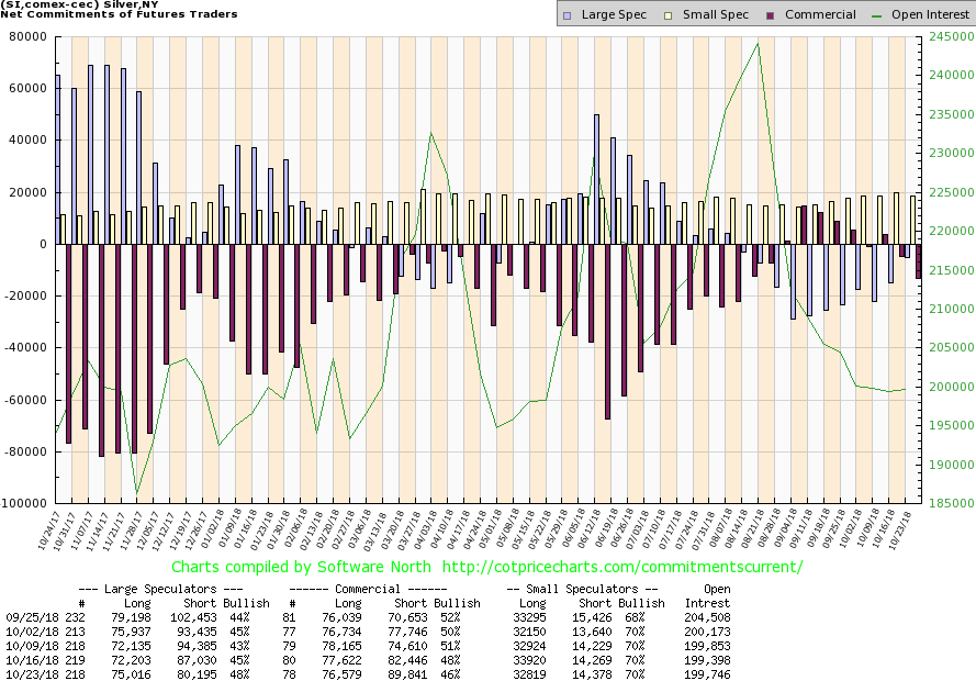
The silver commercial COT, like the gold commercial COT, slipped this past week—falling to 46 percent from 48 percent the previous week. Long open interest fell about 1,000 contracts while short open interest rose roughly 7,500 contracts. The large speculators COT rose to 48 percent from 45 percent as they added just under 3,000 contracts to long open interest and cut their short open interest by roughly 7,000 contracts. This, as with gold, is normal action when the market rises. We are not as yet at levels that we would consider to be bearish. The report remains bullish.
© David Chapman
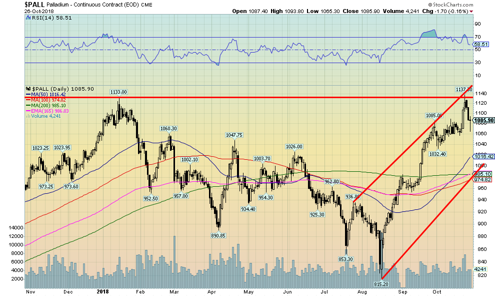
Palladium hit small new all-time highs this past week. The catalyst was the ongoing dispute between Russia and the U.S. Russia is one of the world’s largest palladium producers. Palladium is widely used in the automotive industry and is experiencing high demand. But there could be a supply crunch because of the ongoing dispute between the two countries. Besides the U.S., China is also a major consumer of the metal. Supplies are moving into deficit and that has helped to send palladium prices higher. Palladium is one of the few metals actually up on the year, even if it is only 2.4 percent. After hitting the new high this past week prices pulled back. So, it will be key that they regroup and rise to even higher highs. Only below $1,030 and especially under $1,000 would we consider palladium may have topped. Gold and silver should, in turn, follow palladium prices higher.
© David Chapman
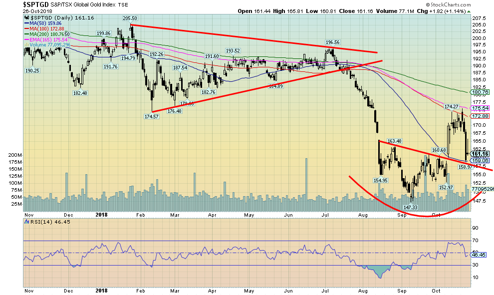
The gold stocks, as represented here by the TSX Gold Index (TGD), took a hit this past week when Goldcorp (G-TSX) reported extremely disappointing earnings. Given that gold was actually up marginally that day, the drop did not appear to be justified. As well, gold finished the week up as well. But down the gold stocks went. The TGD dropped 6.1 percent on the week and the Gold Bugs Index (HUI) fared even worse, losing 7 percent. All this might be is a test of the neckline of the possible inverse head and shoulders pattern. The HUI did penetrate its neckline but it doesn’t necessarily invalidate it. The inverse head and shoulders pattern had potential to rise to 175 at a minimum. The TGD hit a high of 175.53, thus satisfying the pattern.
So, is that it? Given that gold remains bullish, this may just be a head fake from the stocks. They may have also been falling in sympathy with the broader market. We were reminded that, during the 1987 stock market crash, while the DJI was falling 33 percent in during the October 1987 crash the gold stocks, represented then by the Philadelphia Gold & Silver Exchange (XAU), fell 43 percent. Gold, on the other hand, rose about 5 percent. The TGD did rebound the next day, but after starting out strong they faded the rest of the day. The TGD has support here in the 160/162 range. The key is that the TGD does not break back under the right shoulder at 153. If that happens, new lows may lie ahead. Regaining 165 would be positive. The gold stocks remain depressed and undervalued. That alone should prevent any significant free fall.
© David Chapman
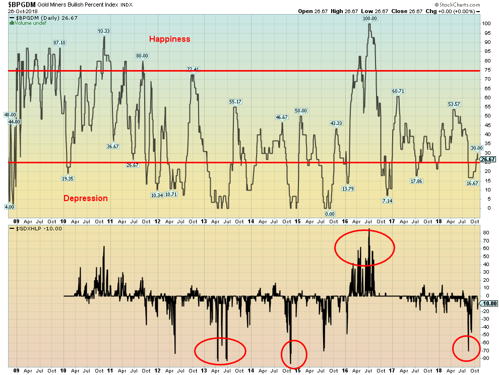
This is a sentiment chart for the gold miners. The Gold Miners Bullish Percent Index (BPGDM) is currently at 26.67, a level that remains somewhat negative for the gold stocks. It is, however, rising which is encouraging. It is struggling to come out of the “depression” zone. The Gold Miners New Highs-New Lows Percent Index is about even these days at -10. It is a far cry from the -70-recording seen in August 2018 at the bottom. The gold stocks have been trying to rally, as these charts indicate. They suggest that the rally has considerable room to move higher. However, this is not a guarantee and gold stocks could well fall back again before moving higher. But this does indicate the growth potential for the sector.
© David Chapman
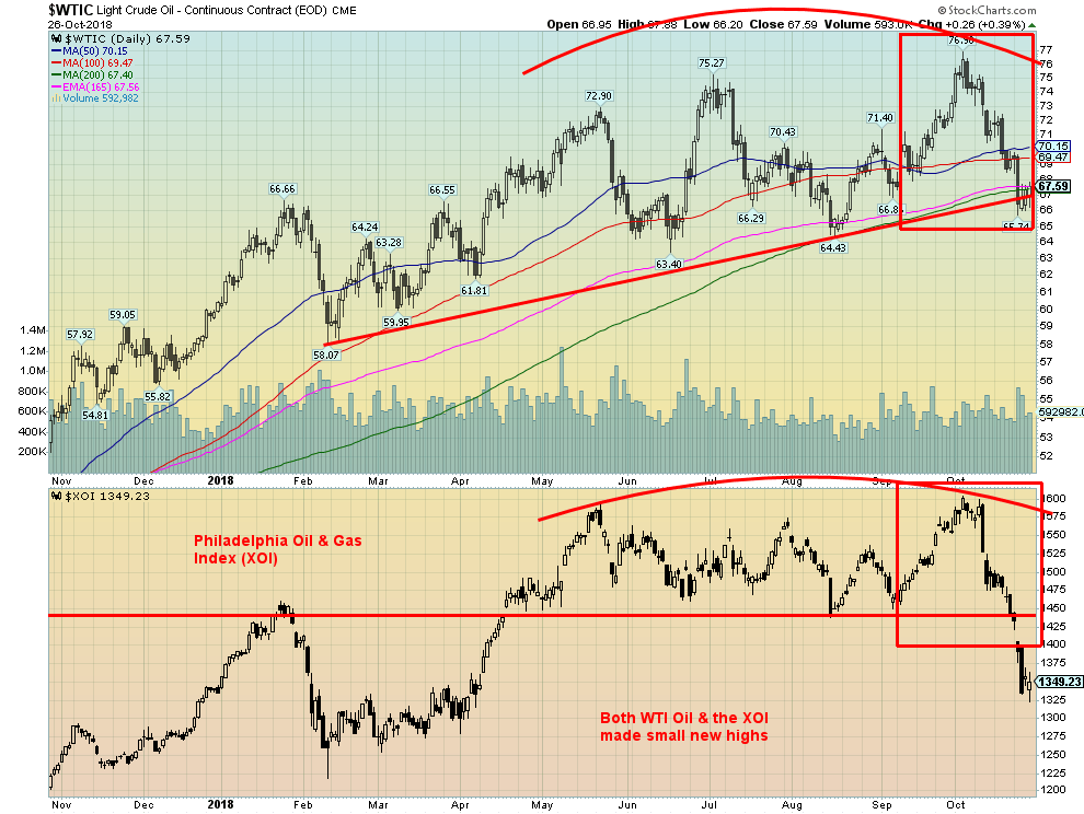
WTI oil fell another 2.4 percent this past week. However, it is still up on the year by 11.9 percent. WTI oil appears to be trying to find support at the 200-day MA. It penetrated the level this past week and failed to close back over. It did not, however, break down as did the Philadelphia Oil & Gas Index (XOI). That is encouraging. This week could be crucial. Oil prices need to recover, as otherwise, oil will follow the stocks to the downside. The chart pattern appears to be negative. WTI oil has made three thrusts to new highs: first in May to $72.90, then again in early July to $75.27, and finally in early October to $76.90. It is a pattern we have seen before and it usually ends with a market decline. The stocks, as represented here by the XOI, could be leading the way. New lows and especially a break under $65 could send WTI oil down to the mid $50s. The awkward double top on the XOI could see the index fall to around 1,280. At the close of 1,349 on Friday it doesn’t have much further to fall.
Chart of the week
© David Chapman
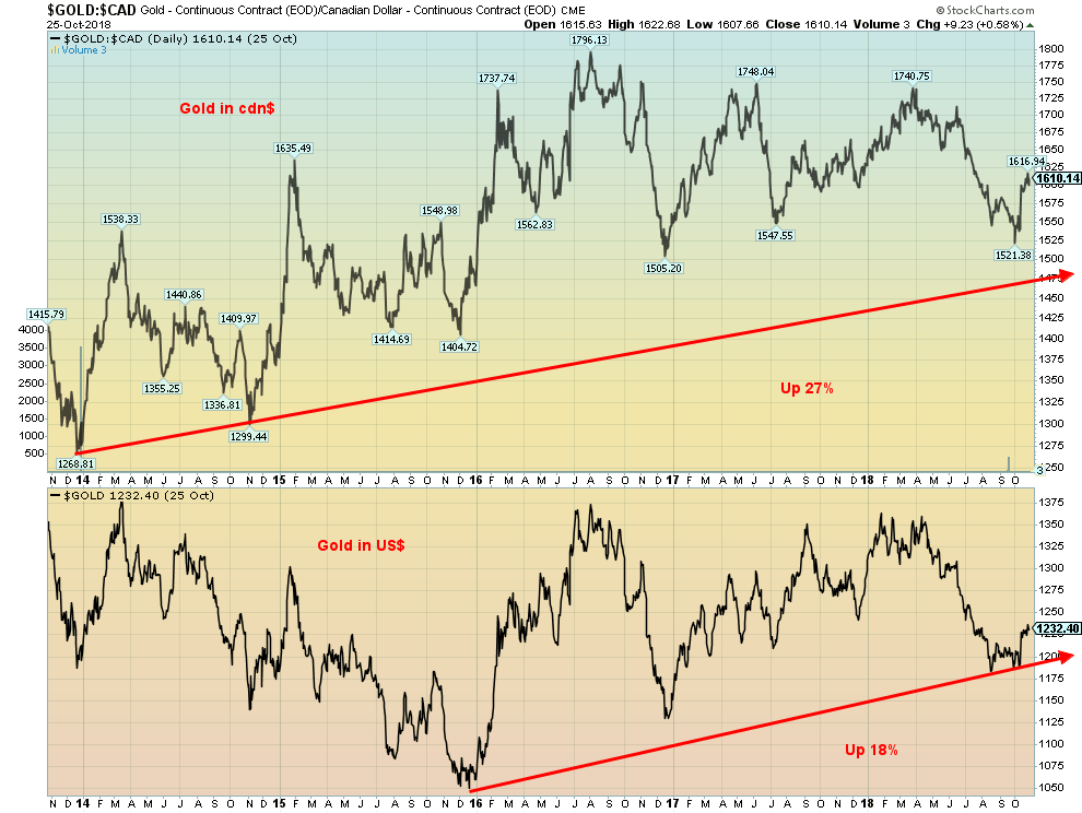
Is gold really in a stealth rally? That was a question posed by Ross Norman of Sharps Pixley, a London bullion broker on October 25, 2018. Norman contends that everyone has the tendency to look at gold only in U.S. dollars as that is the currency it trades in within the bullion market. Norman is right. There are few that we ever see that look at gold in other currencies. Since we live in Canada, when we purchase physical gold we don’t buy it in U.S. dollars; we buy it in Canadian dollars. So, we are used to looking at gold priced in our home currency. It is the same for someone living in the Eurozone, or Japan, etc. They don’t purchase physical gold in U.S. dollars; they purchase it in their home currency.
Gold, expressed in Canadian dollars, made its low close over the past seven years way back on June 27, 2013, at $1,260. Gold in U.S. dollars closed at $1,200 that same day. Fast forward to today and gold in Canadian dollars closed at $1,610 for a gain of almost 28 percent. Gold in U.S. dollars closed at $1,232, a small gain of 2.7 percent. Grant you, the Canadian dollar has fallen in value against the U.S. dollar by 19 percent since that time. However, it shows that holding gold can protect one against a decline in the value of the currency. The low for gold in U.S. dollars came on December 17, 2015, at $1,045. Gold in Canadian dollars closed at $1,463 that day.
The same has been repeated for gold in other currencies. In euros, gold’s low was seen on December 30, 2013, at €867. Today, it is at €1,084 for a gain of 25 percent. In Japanese yen, the low was made on June 27, 2013, at ¥1181 while today it is at ¥1385 for a gain of 17 percent. Finally, in pound sterling, the low was seen on August 5, 2015, at £695. Once again today it is at £961 for a gain of 38 percent. In all instances, their currencies have fallen vs. the U.S. dollar. When this is shifted to sharply falling currencies we can note that in Russian rubles gold was 39,274 in December 2013, while today it is at Russian rubles 80,730 for a gain of 106 percent. In June 2013 gold in Turkish lira was at 2,367 while today it is at Turkish lira 6,942, a jump of 193 percent.
The same can repeat over and over again, depending on the currency. As bad as gold has been doing over the past seven years, what all of this shows is that gold acts as wealth protection for those suffering currency weakness—which means for those outside of the U.S.
(All charts are courtesy of Stock Charts, Trading Economics, Stlouisfed.org and COT Price Charts.)
(Featured image by DepositPhotos)
—
DISCLAIMER: David Chapman is not a registered advisory service and is not an exempt market dealer (EMD). We do not and cannot give individualized market advice. The information in this article is intended only for informational and educational purposes. It should not be considered a solicitation of an offer or sale of any security. The reader assumes all risk when trading in securities and David Chapman advises consulting a licensed professional financial advisor before proceeding with any trade or idea presented in this article. We share our ideas and opinions for informational and educational purposes only and expect the reader to perform due diligence before considering a position in any security. That includes consulting with your own licensed professional financial advisor.


Bitcoin Stalls Near $60K as Strategy Moves, ETFs Outflow, and EU MiCA Rules Take Effect
Bitcoin hovers near $60,000 with ETF outflows, while Strategy boosts reserves, sells BTC, and raises dividends to reassure investors. Ethereum...


Cannabis Dominates Global Drug Use: Trends, Risks, and Shifting Markets
Cannabis remains the world’s most widely used illicit drug, with 256 million users in 2024, surpassing all others combined. Growth...


Italy Approves First Hydrogen-Powered Train for National Rail Network
ANSFISA has approved Italy’s first hydrogen-powered train, the Alstom HMU214, for use on the Brescia–Iseo–Edolo line. Capable of 140 km/h,...


Cotton Market Weakness Persists Despite Brief Rebound
Cotton prices fell to new lows last week before a modest rebound. USDA data shows crop conditions remain worse than...


Eli Lilly Hits $1 Trillion Valuation Amid Strong Bullish Momentum
Eli Lilly stock hit a record high, surpassing $1 trillion market value after strong product demand. Shares surged over 7%,...
 |
|
 |  |
 |
|
-

 Crowdfunding2 weeks ago
Wyrmgold Launches Crowdfunding Campaign for Believe in me! (please)
-
 Business2 days ago
Dow Jones Near Highs Signals Strength Until Volatility Returns
-
 Crypto1 week ago
XRP Under Pressure Amid Macro Forces, Fed Policy, and Regulatory Shifts
-

 Markets6 days ago
Commodity Markets Pause as Oil Falls, Metals Correct, and Grains Show Mixed Signals
You must be logged in to post a comment Login