Featured
Gold & Dow Jones’ step sum symmetry
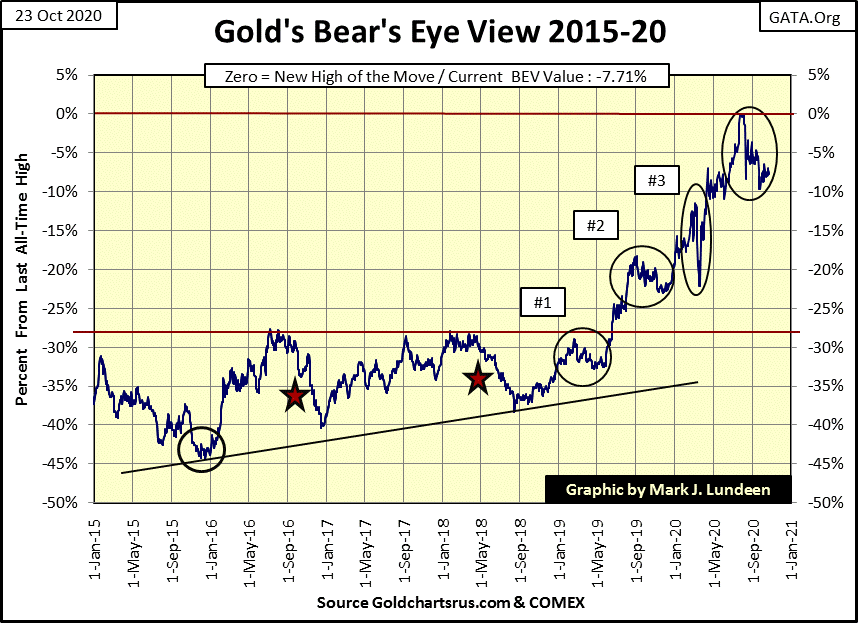
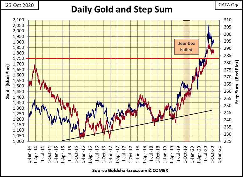
Like the Dow Jones, gold too is range bound between its BEV Zero and BEV -10% lines below. This is becoming tedious; I’d actually regard it as a positive development should gold break down to its BEV -15% line as its 15 count decreased down below a -5, making gold an oversold market. One thing is for sure; future prices for gold are going to be much higher than they are today.
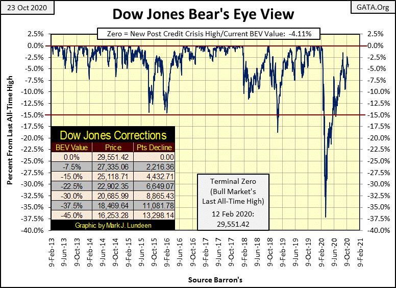
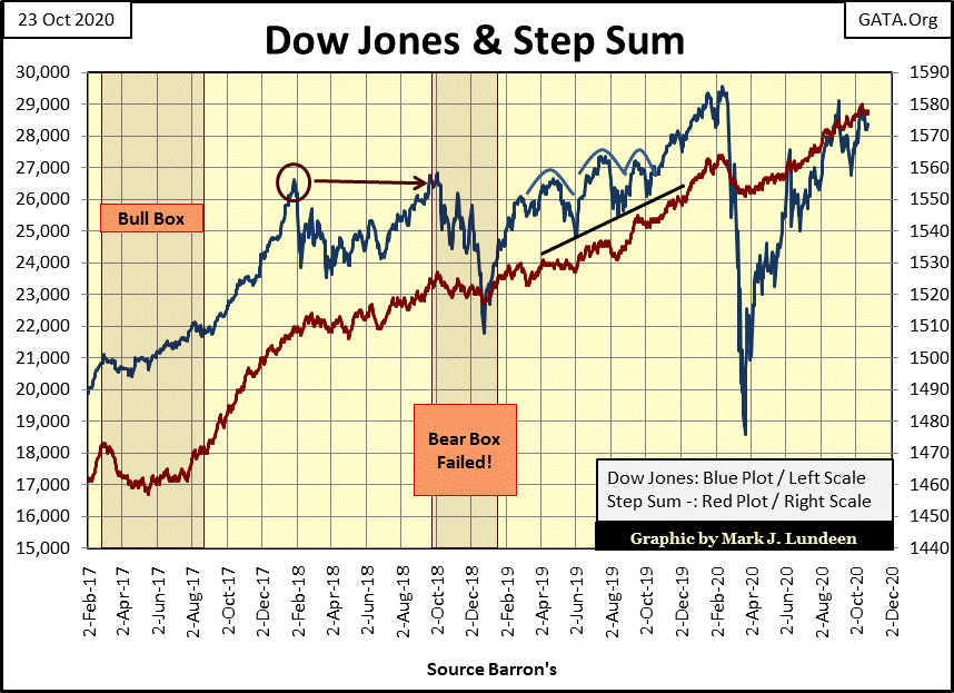
The Dow Jones remains range-bound in the BEV chart below, though at week’s close it was in scoring position; <5% from making a new all-time high. But since August (three months ago) we’ve been here before, and so far the bulls (the FOMC) haven’t had what it takes to push the venerable Dow Jones into market history. That would be a new BEV Zero, its first since last February in the chart below, or a close above 29,551.42 in a point chart.
Here’s my chart on the FOMC’s weekly “injections-of-liquidity” into the financial system. This week they “injected” $62.38bil and they couldn’t even get the Dow Jones to close above last week’s close. For the week the Dow Jones was down 271.
That’s actually a shocking fact when one considers how much “liquidity” the FOMC “injected” into the market to inflate both the 1990s high tech and 2002-08 sub-prime mortgage bubbles – on average less than $3bil A MONTH
Who are these idiot savants who dictate “monetary policy” at the FOMC? They’re actually brilliant people, who somehow missed something along the way. I’m a big history reader, and historians’ judgement on civilizations that have destroyed their money via monetary inflation is universally harsh. Be it Rome, Byzantium the Spanish or British empires, historians recognized when their end draws nigh, these formerly great empires’ money became increasingly worthless from inflation.
So, why are the idiot savants so eager to “inject liquidity” into the economy? Maybe it’s as simple as it’s either that or go back to their university and teach twenty somethings Keynesian economics.
But make no mistake; what the idiot savants are doing with debt creation and monetary inflation is implementing a program of destruction on the global economy. Holding gold and silver may make one rich in the coming world, but it won’t make you happy. Holding gold and silver may not make one rich either if these evil people get their way and manipulate society to go cashless. In a cashless economy, there is no escaping from “policy’s” economic impact. When every purchase and sale is a digital transaction, there is no place to hide, and that’s how they’d like it.
Here’s a quote from the 7th century that for some reason brings to my mind Alan Greenspan’s legacy to the world.
“If you wish to perform an exploit and to make a name for yourself, destroy all that other people have built up and kill the entire people you have conquered; for you cannot put up a building better than those constructed by your predecessors and there is no finer exploit than destruction with which you can make your name.”
– Fredegar; 7th century chronicler recording a mother’s advice to her son. “Medieval Civilization 400-1500” by Jacques Le Goff
So much for that; here’s this week’s major market indexes BEV values. No BEV Zeros for the week. Also the XAU closed the week at #20, below the NASDAQ Banking index, but not by much.
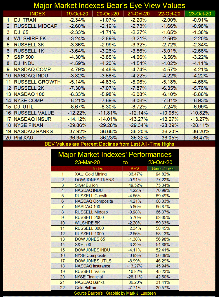
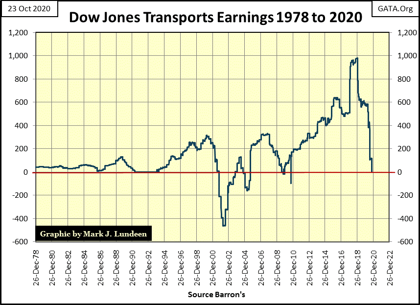
The XAU in the list above remains at the #1 position. What’s odd is how the Dow Jones Transports can come in at #2 when its earnings has gone to zero, dropping from a $1000 just two years ago.
The problem with the Transports’ earnings is the CCP virus is killing the airlines, whose earnings are all currently deep in the red. Barron’s used to publish earnings for the Dow Jones Averages, but not any longer. Instead they publish PE Ratios, from which I derive earnings. But when earnings go negative, PE Ratios are recorded as N/A, and so my chart below has Transport earnings as zero, but must actually be negative. So what’s with the Dow Jones Transports closing the week at #2 in the list above?
Looking at the Dow Jones in daily bars, a week later the case for a double top improves. What would have to happen for me to claim that in fact a double top is currently in effect? Should the Dow Jones break below 26,763, seen on September 23rd (Red Line), I’d proclaim that in fact the Dow Jones has put in a double top.
Though with things as they are in today’s market, the FOMC would most likely come to the bulls’ rescue. So as with most things happening in the market today, I’m just a spectator sitting in the peanut gallery looking at the market with little enthusiasm.
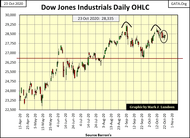
Before I get excited about anything with the market, I’d want to see the Dow Jones deflate below its BEV -15% line in its BEV chart above, or a break below 25,119 in a price chart. As I see things, a break below the BEV -15% line would suggest the FOMC is defending itself against a market mauling by Mr Bear, without much success.
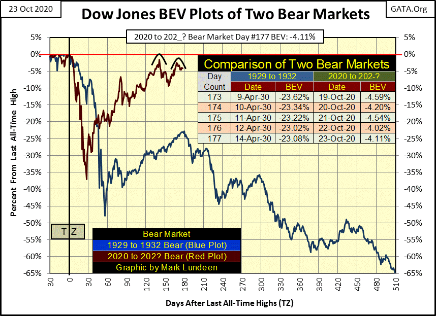
Looking at my comparison between the Great Depression market crash and our own market decline and recovery of 2020 below, the case for the post March recovery being only a dead-cat bounce has yet to be put to rest, and won’t be until the Dow Jones sees a new all-time high.
What do I think will happen? I haven’t a clue. With the presidential election less than two weeks away, an election I believe President Trump will win in a landslide; I’m expecting the “progressives” are going to riot in the streets. Mass social disorder is never good for the stock market, but frequently is for gold, silver and the mining stocks.
I spent years compiling data from old issues of Barron’s. I’ve also spent years trying to make sense out of it. Ask yourself; what do markets do? One thing they do is either close up or down from their previous day’s closes. I use these daily advances and declines (steps) to construct a single item A-D line I call a step sum. I plot these step sums with their source market series (Dow Jones or gold) in the step sum charts that you see in my articles.
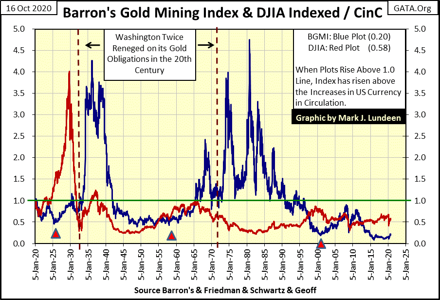
A comparison between the Dow Jones and gold can only go back to 1969, as that was when the price of gold was finally allowed to float in the market. But using the Barron’s Gold Mining Index (BGMI), we can compare market performance between precious metal assets, the BGMI with financial assets, and the Dow Jones going back to 1920.
Here’s a chart I used last week plotting the BGMI and Dow Jones as ratios to CinC for the past century. This chart illustrates how precious metal assets (BGMI) and financial assets (Dow Jones) are generally, if not always counter-cyclical to each other; when one is coming down, typically the other is going up. This is especially so after August 1971 when the United States took its dollar off the Bretton Woods’ $35 gold peg.
With the stock and bond markets now so near to their all-time highs, that’s a nice thing to know. Is it possible to obtain a more intimate insight into these markets using step-sum analysis? I think it is.
The data plotted above is end of week data, and I wanted to use daily data series. So I used daily gold and Dow Jones data going back to June 1969.
I’ve taken these daily steps farther with what I call a Step Sum Symmetry Plot, where I compare the step sums of two different market series, for instance gold and the Dow Jones. Why a step sum symmetry plot? Because since 1969 the daily goings on between gold and the Dow Jones are remarkably similar to each other; typically if gold closes higher, so does the Dow Jones, and if the Dow Jones closed down, so does gold. But sometimes this market symmetry is broken, where one closed up and the other down.
The table below displays the logic table for the symmetry. When gold and the Dow Jones advance or decline together, a zero is generated. A +1 is generated when gold advances as the Dow Jones declines. A -1 is generated when gold declines as the Dow Jones advances.
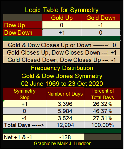
The frequency table above shows the results for the past 12,904 daily closings for gold and the Dow Jones since 02 June 1969. I’m not interested in the 5,984 daily closings where gold and the Dow Jones maintains their symmetry, the daily closings where a zero is generated.
The data I’m looking for is found when their symmetry is broken and a (+/-)1 is generated. I subtract the -1s from the +1s in the table above, and at this week’s close the gold and Dow Jones symmetry plot registered a -128. In other words, since 1969 the Dow Jones has closed higher than gold by a net of 128 daily closings. After a half century that’s not much, but there it is.
To provide a better illustration of what I’m doing here, the table below show gold and Dow Jones with their daily closings, steps, their symmetry and symmetry plot value. Those days where gold closes down as the Dow Jones advanced are highlighted in red and a -1 is generated. On those days gold closed up as the Dow Jones closed down, are highlighted in green and a +1 is generated.
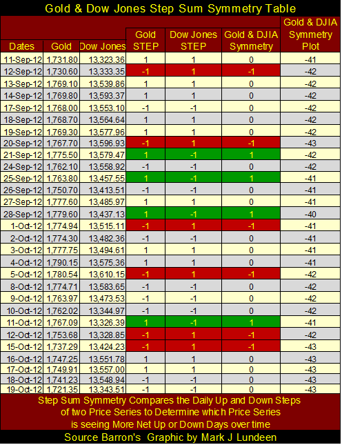
As is typical since 1969, most days saw both gold and the Dow Jones advance or decline together, which generates more zeros than (+/-)1s. No matter, over the course of these twenty-nine trading days, the gold and Dow Jones symmetry plot decreased by 2, as the price of gold decreased by $10.45 and the Dow Jones advanced by 20.16.
Keep in mind that what we’re analyzing above isn’t a comparison between gold and the Dow Jones’ actual price performance, which in a step sum chart I call market reality. Step sum symmetry is a comparison between their step sums, which is a measurement of the market’s expectations, or market sentiment. So, it’s expected that price trends in gold and the Dow Jones are not bound to trends in their step sums or in their step sum symmetry plot seen below.
So what good is the step sum symmetry plot for gold and the Dow Jones seen below? When taken with the actual price action in the gold and stock markets, I believe their step sum symmetry can provide a unique insight into market psychology.
Let’s look at gold’s first bull market from 1969 to 1980. The Dow Jones from 1966 to 1982 attempted to break above 1000, and stay above 1000 five times, only to fail each time. This created a condition in the stock market I call the “Battered Bull Syndrome” where it becomes generally accepted that going long in a particular market is widely considered as an act of foolishness.
Most people during this time chose to invest their money in a savings account or US Savings Bonds than risk their hard earned money in the stock market. The era’s annual double-digit increases in consumer prices couldn’t be denied, and the connection between rising costs-of-living with a bull market in gold and silver was obvious to all as gold increased from $42.90 in 1969 to over $800 in January 1980. During this same period of time silver increased from $1.67 to $48.70.
As expected, during this time gold saw more daily advances than did the Dow Jones, driving their symmetry plot up from zero to over 100.
The next five years the symmetry plot trended sideways as gold declined by 60% and the Dow Jones finally broke above, and stayed above 1000 for the first time in history. I infer from this the gold bulls didn’t believe their bull market was over, and the bulls in the stock market were expecting the Dow Jones to once again crash down below its 1000 level as it had so many times before.
After March 1985 all that changed. In the next sixteen years their symmetry plot declined from +100 to below -100 as the Dow Jones saw more daily advances than did gold until June 2001. It was during this time the Dow Jones closed over 11,000, far above the 776 it saw in August 1982, while gold declined by 70% from its highs of January 1980.
But the 1980 to 1999 bear market in gold didn’t bottom in June 2001 (Green Triangle), but in July 1999. And the 1982 to 2000 Dow Jones bull market in stocks also didn’t top in June 2001, but in January 2000. So why did the Gold and Dow Jones Step Sum Symmetry plot continue down until June 2001? Because it took that long before market sentiment for gold and the Dow Jones to recouple with the new market reality.
Look at the period from July 1999 to June 2001 (1st Red Circle). It was the Dow Jones that was deflating in valuation during this time, not gold. Gold’s absolute bottom was at $253 in July 1999. In early 2001 it made a double bottom at $255 as the stock market continued deflating for another year during the High-Tech bust. Yet within the red circle the gold Dow Jones’ symmetry plot declined by about twenty-five, as market sentiment remained pro financial assets, and anti-precious metals.
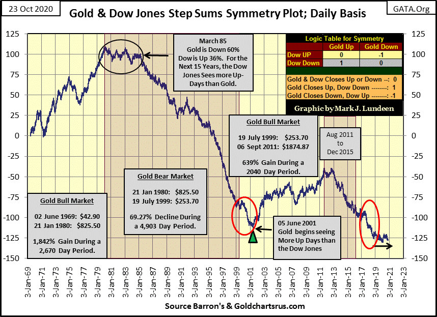
This is getting too long. As I don’t want to bore my readers I’m moving on to the August 2011 top for gold. The symmetry plot didn’t begin to decline until December 2012; gold had yet to decline 15% from its highs of August 2011. Four years later in December 2015, gold saw a 44.25% decline as the symmetry plot declined with the price of gold. Gold then began its current recovery as the symmetry plot continued to decline until late 2018 (2nd Red Circle). Since January 2019 the symmetry plot has trended sideways as gold (and the Dow Jones) both advanced to new all-time highs.
So where does market sentiment for gold and the Dow Jones stand today? As their step sum symmetry plot has moved along its -125 line for the past two years, the bulls in both financial and precious metal assets remain optimistic about their markets. But on a long term basis, these markets are counter-cyclical to each other as monetary inflation flowing from the Federal Reserve flows into one, and then into the other.
Seeing both gold (if not silver and mining shares) and financial assets currently near their historic highs is a historic anomaly. Someone is wrong and I believe it’s the financial asset bulls. The day is coming when financial assets will begin a long term deflation as precious metal asset valuations begin to inflate.
As this symmetry is based on market sentiment (step sums), it may be a lagging indicator on the price action for the Dow Jones and gold and silver. But a real time indicator when market sentiment for financial assets acknowledges they are in a bear market and the gold and silver markets recognize they are in a bull market.
It’s always nice to have confirmation that a major change in the market is taking place and this is mine – when the Gold & Dow Jones Step Sum Symmetry plot once again advances upward.
Like the Dow Jones, gold too is range bound between its BEV Zero and BEV -10% lines below. This is becoming tedious; I’d actually regard it as a positive development should gold break down to its BEV -15% line as its 15 count decreased down below a -5, making gold an oversold market.
One thing is for sure; future prices for gold are going to be much higher than they are today. But until then we’ll have to deal with the nonsense we see below. And this is nonsense, when since mid-March the FOMC has “injected” $2.64 Trillion into the financial system and this is all gold gets from it?
But one of these days, and that day may not be that far away! Over at King World News, Eric King published a very important article on the Federal Reserve’s balance sheet with comments by James Turk.
When the end comes, it will come as a flood.
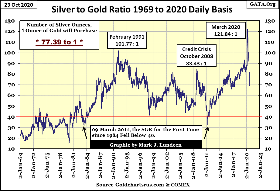
This cheers me up; seeing the Silver to Gold Ratio (SGR) close the week at 77.39 ounces of silver for one ounce of gold, far from the 122 ounces of silver for one ounce of gold seen last March.
There is actually nothing wrong with the market action for gold, silver and the PM miners. Gold closed over $2000 for five days in early August. The XAU was up over 100% from its lows of last March, and the SGR has dropped by forty-five ounces of silver since March. After achievements such as these in only seven months, it takes a while for the market to digest the gains.
So what am I whining about? I’m a human being, and I want it all now. Well, I’ll just have to wait until the market is willing to give me what I want – damn it.
In gold’s step sum chart below the price of gold (Blue Plot / Market Reality) is correcting from its highs of early August, as is its step sum (Red Plot / Market Sentiment).
Above I said a 15% correction in gold or gold declining down to $1750 would be a positive development. I’m sure there are those who would disagree with that. But gold has been correcting for almost three months now, and so far has only corrected down to $1861.
Is it possible for the bears to drive gold down another $100, down to and then below the $1750 line in the chart, thus taking out all of last summer’s gains in gold? Anything is possible in the markets, but not everything is likely. So let’s be positive and assume gold’s lows ($1861) for this correction are in.
Now on to the Dow Jones’ step sum chart below. Like gold’s step sum chart, the Dow Jones step sum chart has changed little since August. And for this week I think I’ll leave it at that.
Gold in its step sum table below has seen its fair share of selling since its high of early August. It never saw a 15 count of -7, so technically it has yet to become oversold. No matter, you can see bear tracks all over this table. Yet through it all the bears have yet to drive gold down past its BEV -10% line. The closest they’ve come was on September 23, a month ago with a BEV of -9.69% ($1861.70).
Look at all the selling gold has seen since September 23rd, and a month later gold closed the week with a BEV of -7.71% ($1902.53). That’s 1.98 BEV points, or $40.83 higher than a month ago. I don’t think the bears are having much fun trading gold these days.
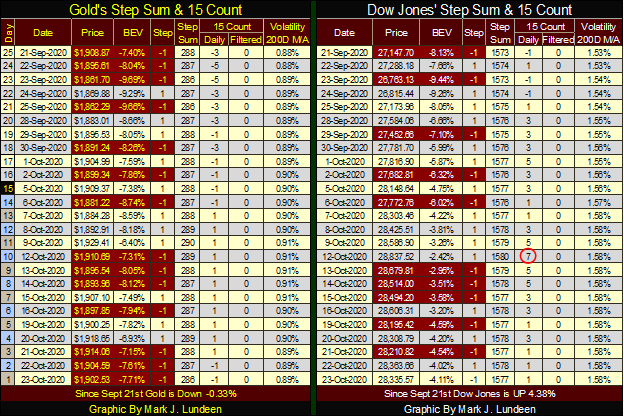
The Dow Jones on October 12th saw a +7 for a 15 count, indicating the stock market was overbought. Since then the market has seen more daily declines than advances and has come down a bit.
I’ll have more to say when I come back in two weeks. Remember to save some of the candy for the kids on Halloween night, and for my American readers; don’t forget to vote on Tuesday, November 3rd.
__
(Featured image by PublicDomainPicture via Pixabay)
DISCLAIMER: This article was written by a third party contributor and does not reflect the opinion of Born2Invest, its management, staff or its associates. Please review our disclaimer for more information.
This article may include forward-looking statements. These forward-looking statements generally are identified by the words “believe,” “project,” “estimate,” “become,” “plan,” “will,” and similar expressions. These forward-looking statements involve known and unknown risks as well as uncertainties, including those discussed in the following cautionary statements and elsewhere in this article and on this site. Although the Company may believe that its expectations are based on reasonable assumptions, the actual results that the Company may achieve may differ materially from any forward-looking statements, which reflect the opinions of the management of the Company only as of the date hereof. Additionally, please make sure to read these important disclosures.


The TopRanked.io Guide to 2026’s Biggest and Best Affiliate Opportunities
Want to earn affiliate commissions on literal billions of dollars worth of revenue? Then this week, we've got something special...


Eni Advances Energy Transition with Major Investment and Emissions Cuts
Eni showcased its “Just Transition” report in Rome, highlighting stakeholder collaboration and progress toward decarbonization goals. The company invested over...


The German Fintech Market Shows Resilience and Strong Investment Growth in 2026
Germany’s fintech sector remained resilient in 2026 despite economic crisis and rising insolvencies. Investments reached €14.2 billion, showing strong investor...


Cannabis Legalization in Germany: A Mixed Interim Assessment
Germany’s cannabis legalization has reduced criminal cases and eased pressure on the justice system, while the black market is slowly...


Sustainable Restoration of the Haus Hövener Garden in Brilon
The Brilon Construction Workers Association is restoring the Haus Hövener garden into a cultural community space, funded through a €10,000...
 |
|
 |  |
 |
|
-

 Impact Investing1 week ago
World Environment Day: Warming Risks and Clean Energy Breakthroughs
-

 Crypto2 weeks ago
Ethereum Under Pressure as Bitcoin Stalls and Crypto Tensions Rise
-

 Africa5 days ago
Côte d’Ivoire Cocoa Price Crisis: Record Decision Turns into Market Breakdown
-

 Crowdfunding2 weeks ago
Prestadero Sees Rising Female Loan Participation in Mexico