Markets
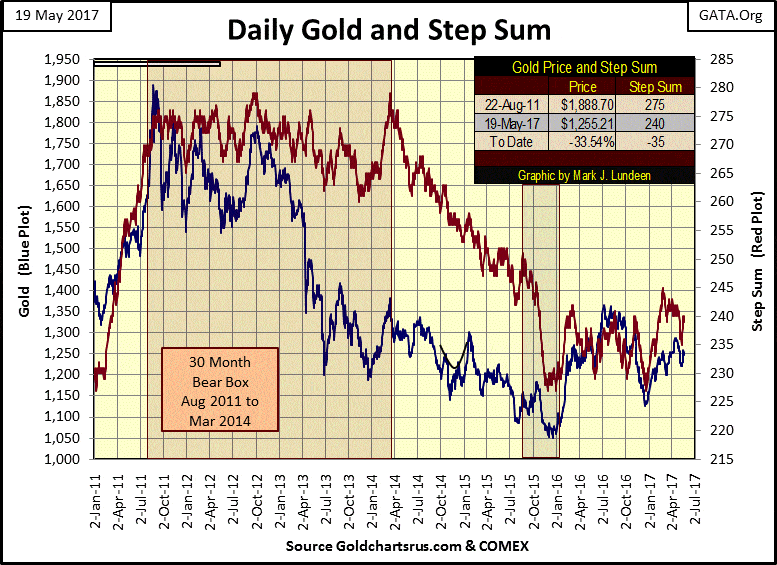
Gold experiences failure of three of its bull boxes
From August 2011 to April 2014, the bulls saw every down day as a buying opportunity. After April 2014 the bull finally had to deal with the reality that gold was in a bear market. Gold’s step sum collapsed as they exited the gold market.

Recently, gold has seen three of its bull boxes fail, which is very unusual.
Wednesday saw a bit of action in the stock market. The Dow Jones closed 1.78% (373 points) below Tuesday’s close. People following the stock market tend to focus on the points. Seeing the Dow Jones move down 373 points in a single session seems like a lot of points, and yes, it is. But the points (dollars) the Dow Jones is valued in today have been corrupted by the FOMC’s “monetary policy” of the past century.
In 1982, had a day occurred where the Dow Jones moved 373 points, it would have resulted in an approximate 30% move in a single day, something that has yet to happen. To date, the record daily percentage decline occurred on 19 Oct 1987, where on a 508 point decline the Dow Jones dropped 22.16% from a previous day’s close. The largest daily decline during the Great Depression Crash occurred on 28 Oct 1929. Nine decades later, this day is still recalled as “Black Monday”; a 38.33 point decline resulted in a breathtaking 12.78% decline in the Dow Jones.
In 1929 that’s all it took, but in 1929 Ford was also selling automobiles for less than $500. As things are today, this week’s 373 point decline only resulted in a 1.78% decline in the Dow Jones.
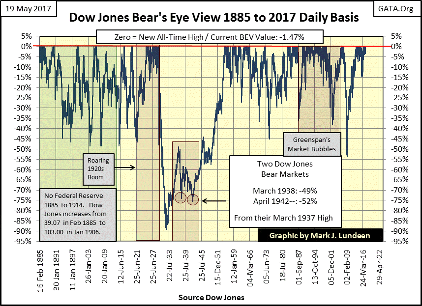
The inflationary erosions in the US dollar, created by the “monetary policy” of the past century, is why I like to look at market history with my Bear’s Eye View (BEV) charts. In effect, a BEV chart compresses price data into a range of only 100%;
- 0.00% (BEV Zeros) = new all-time highs
- -100% = a total wipe out in valuation
BEV charts ignore points. Rather they focus on percentage declines from all-time highs. So, a 40% decline from the late 19th century can be directly compared to a 40% decline in the 21st. Though the 40% decline in the Dow Jones from a time when steam engines and steel-railroad tracks were considered high tech may have taken only a 15 point move in the Dow Jones, its impact on an investor’s capital was the same as a 40% decline today.
As you can see below, the 373 point decline seen this week didn’t make much of an impact in the 132-year history of the Dow Jones.
© Mark Lundeen
I noticed something this week and placed four boxes in the BEV chart below to illustrate it. Since early 2016 the Dow Jones has on four occasions attempted to break lower, and each decline fell short of its previous decline. That happened again this week too, as on Wednesday the Dow Jones declined -2.41% from its last all-time high, just short of its -2.50% line before it once again recovered at week’s end.
This pattern of the past year and a half just looks odd. As if someone is always watching to make sure the Dow Jones gets patched up every time it begins to deflate.
One of these days we’ll see the Dow Jones break below its -7.50% line in the BEV chart below. That would be a 1,584 point decline from its last all-time high of March 1st of this year. That will get everyone’s attention, but not as much as when it crosses its -15% line (a 3,167 point decline). A percentage decline the Dow Jones twice failed to do below in 2015 and early 2016.
© Mark Lundeen
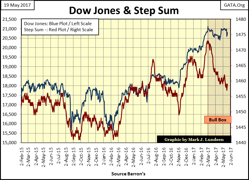
The Dow Jones’ bull box in the step sum chart below is still intact. Seeing the step sum decline as it has, tells us the market has seen a lot of down days with little effect on the valuation of the Dow Jones itself. That’s a real sign of strength, even if that strength is only from the willingness of central bankers to “inject” sufficient “liquidity” into the stock market when it declines below “established parameters.”
I’ll remain short-term bullish on the stock market until this box either closes by having both the blue and red plots break boldly upward or until it fails (seeing both plots break lower). Currently, we don’t know how this box will resolve itself. But the potential for the Dow Jones seeing new all-time highs before it begins a massive, deflationary bear market is there.
© Mark Lundeen
What’s the potential percentage decline in a massive, deflationary bear market? In past weeks I’ve used the Dow Jones dividends to estimate the potential damage. Based on historical ranges of rising dividend yields and falling payouts during bear markets, a decline in the Dow Jones between 70% to 95% is very possible. Why so much? Because since 1885, the stock market’s valuations have never been so grotesquely over inflated as they are today.
Personally, I’d say such a decline is likely when Mr. Bear once again overrules the FOMC’s valuation models for the stock market. But when this is to happen is something I can’t say, as I don’t know.
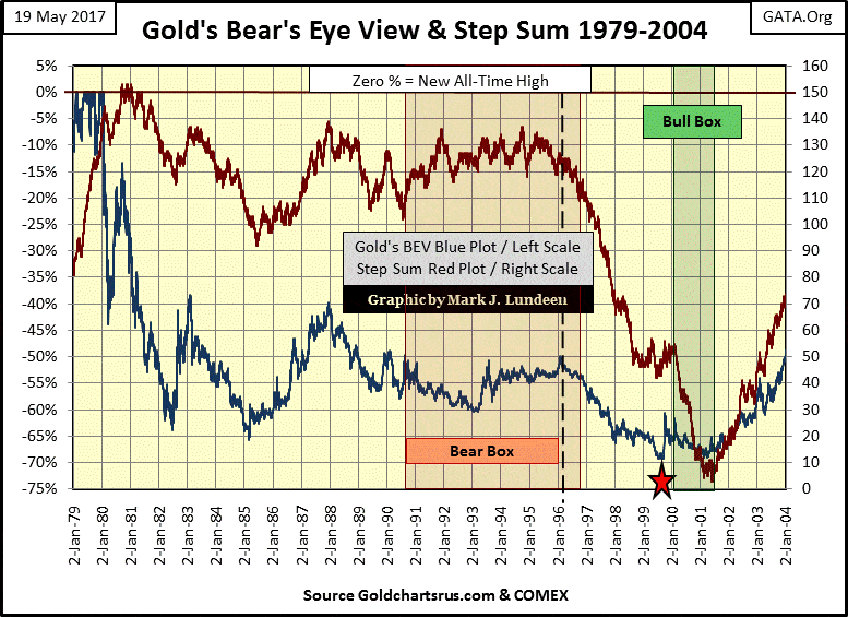
Recently, gold has seen three of its bull boxes fail, which is very unusual. Here’s a BEV plot of gold and its step sum from 1979 to 2004. There was a huge five-year bear box during gold’s 1980 to 2001 bear market.
Keep in mind what the two plots in a step sum chart represent. The price plot (Blue) represents market reality, while the step sum plot (Red) represents market sentiment. Whenever a market’s reality and sentiment diverge from each other, it forms a step sum box. Whether a box is a bull or bear is determined by the price plot. In a bull box, the step sum plot appears bearish. In a bear box, the step sum plot appears bullish. Typically, market sentiment proves to be wrong whenever a step sum box forms.
© Mark Lundeen
If I was following step sum analysis during the 1990s (which I wasn’t), I don’t know if I would have identified this bear box for what it was until its step sum plot began to collapse in 1996.
This was a grizzly bear of a bear box. From 1980 to 1996, with the price of gold down over 50%, one can just feel the confidence in the gold bulls believing a recovery was right around the corner. The lower the price of gold fell, the cheaper it got, or apparently, the bulls believed. After a daily decline, they’d dash in the next day buying, establishing a pattern that for six years prevented the step sum from collapsing during one of the 20th century’s most significant bear markets.
But with the closing of the box in 1996 came a preponderance of daily closings that were lower than the previous days. That’s what makes the Red step sum plot collapse; declining days overwhelming daily advances. For the gold market from 1996 to 2001, it saw its step sum collapse for five full years as the bulls finally exited in despair from the gold market.
Note the Red Star fixed at the summer of 1999 identifying the actual low price of gold during this bear market ($253.70). After this low, the bears were unable to drive the price of gold lower. As seen in the step sum plot in the bull box above, the bears were working very hard to do just that – but failed.
This set up a two-year bull box, where market valuations ignore the overwhelming selling as evident in a collapsing step sum. This bull box closed in 2001 when both gold’s valuation plot (Blue) and step sum (Red) briskly reversed upwards.
Here’s gold’s step sum chart from 2011 to the present. Once again, the gold bulls endured a huge bear box from 2011 to 2014. In April 2014 (almost three years into the current decline) the gold market actually saw more advancing than declining days at the point the bear box began to close. From August 2011 to April 2014, the bulls saw every down day as a buying opportunity. After April 2014 the bull finally had to deal with the reality that gold was in a bear market. Gold’s step sum collapsed as they exited the gold market.
© Mark Lundeen
I placed a box around late 2015. It’s not a bull or bear box; it’s there just to draw your attention to what the step sum did from October to December 2015. Exactly as gold’s step sum did from 1999 to 2001, in late 2015 gold’s step sum plot dropped like a rock as the bulls exited the gold market in despair.
Take a good look at gold’s step sum plot from August 2011 to December 2015. As we saw in the step sum during the 1980s and 90s, December 2015 (like the summer of 2001) identifies a point of selling exhaustion – the end of a bear market decline. That tells me that the low of December 2015 is a very hard bottom. I expect we’ll never again see gold trading at $1050.
This step sum chart is very positive for the future price of gold, though at week’s end I’m as tired as anyone else of the poor market action in the gold and silver markets. No matter, gold’s step sum chart above strongly suggests that the gold bears are not as strong as they once were and that the bulls are, for good reason, once again gaining confidence.
Here’s gold step sum chart going back to 2015. I marked the most recent bull box as failed after the price plot dropped like a rock with its step sum a few weeks ago. As you can see, since July 2015 that’s happened twice before in the gold market. Seeing so many step sum boxes fail in so short of time is very unusual.
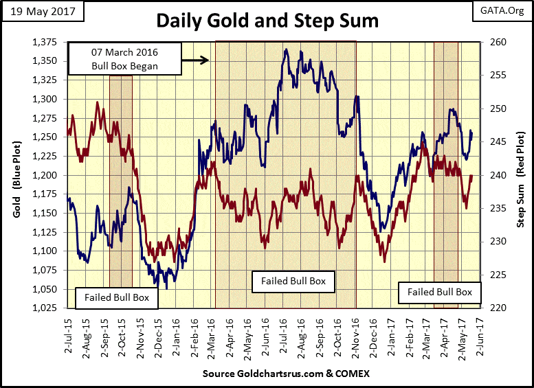
© Mark Lundeen
But beginning last week on Thursday, gold’s price and step sum plots reversed briskly upwards. So, did the box fail or not? I’ll let my readers make that call. But if I was using this box to trade gold (something I never do), exiting the market when the plots turned down together was the right thing to do, just as seeing these plots rebound in the past week as a strong buy signal. However, as strong buy signal doesn’t promise explosive gains in the short term. Only that buying now offers protection from market declines at these levels.
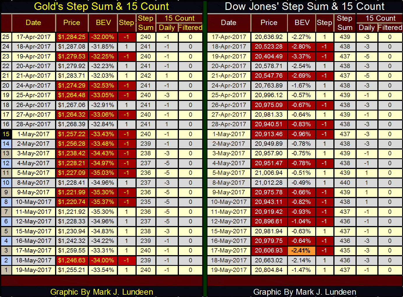
Here are gold and the Dow Jones step sum tables. The step sum and 15 counts are good technical indicators. But the reality is that there is no market where one can take a position on a step sum or 15 count, making the trend in a market’s price series all important.
And on that basis, the Dow Jones is out performing gold. Since April 17th the Dow Jones (unlike gold) has advanced in spite of a declining step sum and at times a lower 15 count than gold. Short term, the Dow Jones has more going for it than gold and silver – short term that is.
© Mark Lundeen
Long term, I still like the old monetary metals and fear what is coming to the stock and fixed-income markets. I’m just noting the obvious at the end of the week. There is something else that is obvious; the day Mr. Bear forces the “policy makers” out of the way in the precious metals and the financial markets, we’ll see history being made in these markets. You’ll be glad you purchased gold and silver at their current and greatly subsidized prices when that happens.
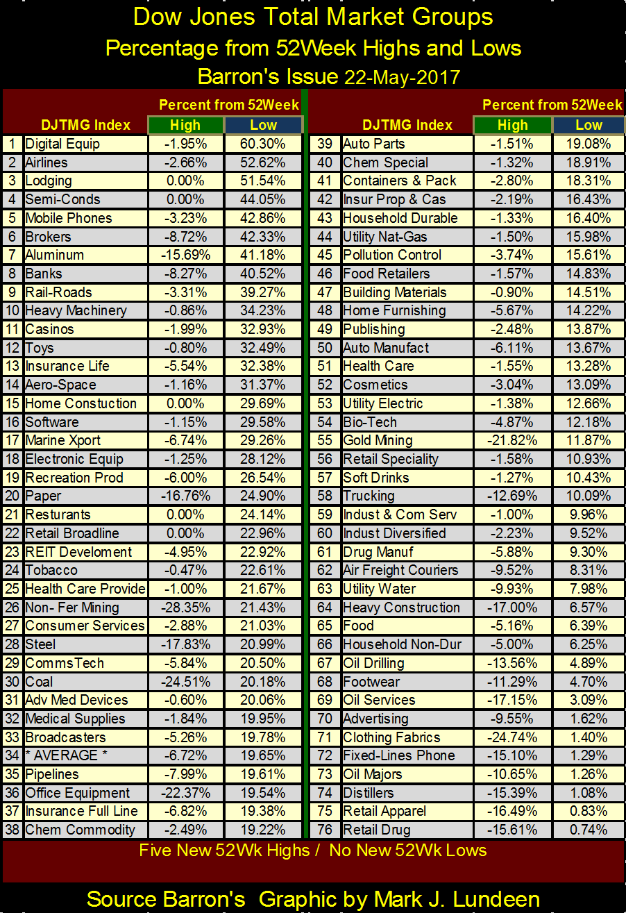
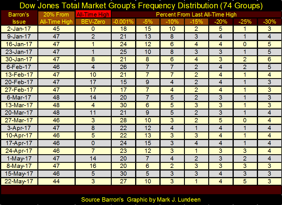
Let’s see how the Dow Jones Total Market Groups (DJTMG)’s 52Wk Highs and Lows are at the end of the week. In the seventy-six groups seen in the table below, there were five new 52Wk Highs and no new 52Wk Lows.
© Mark Lundeen
The major market indexes below are doing fairly well, if not as good as some of the DJTMG groups above.
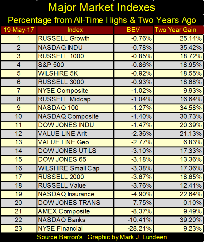
© Mark Lundeen
Unfortunately, both tables above look at the market with a rear view mirror. Is there something that can be used as a leading indicator? Why yes there is: the DJTMG Top 20 plot. And this week it did something it hadn’t done since last November’s election; ended the week below 45.
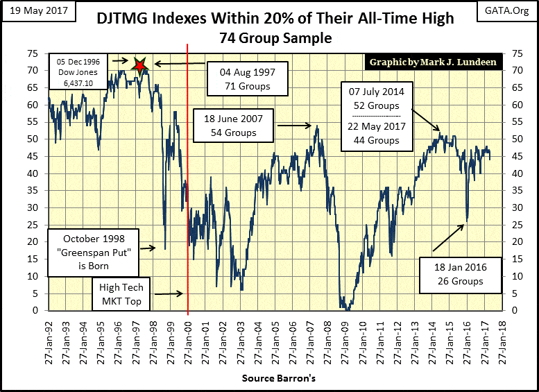
© Mark Lundeen
This may not seem a major achievement for Mr. Bear. However, as seen in the twenty-five years plotted above, once the Top 20 establishes a trend (up or down) it tends to continue until either the bull or bear market has fully expressed itself.
In the weeks to come, seeing the Top 20 begin a declining trend in the plot above and the table below would be bad news for the bulls, even if the major market indexes remain near their current levels. This bears watching.
© Mark Lundeen
—
DISCLAIMER: This article expresses my own ideas and opinions. Any information I have shared are from sources that I believe to be reliable and accurate. I did not receive any financial compensation in writing this post. I encourage any reader to do their own diligent research first before making any investment decisions.


Temotiva Launches Crowdfunding Campaign to Advance Preventive Mental Health
Temotiva Innovación Lab has launched a crowdfunding campaign through Santander X Explorer, marking a new phase for the University of...


Fed Policy Shift Raises Concerns Over Debt and Inflation Risks
The Federal Reserve is criticized for resuming balance sheet expansion through Treasury purchases despite expectations of tighter policy under new...


AI Adoption in Italian Retail Stalls Despite Strong Experimentation
A survey on AI in Italian large-scale retail trade shows companies are increasingly adopting artificial intelligence, but only 1.4% have...


Crypto Market Stays Stable as Bitcoin and Ethereum See Mild Declines
The crypto market remained stable despite slight declines in major coins like Bitcoin and Ethereum. Bitcoin held near $64,362, while...


WNBA Removes Cannabis From Banned Substances List in New CBA
WNBA removed cannabis from its banned substances list in a new CBA running 2026–2032, aligning with NBA policy and allowing...
 |
|
 |  |
 |
|
-

 Cannabis1 week ago
Cannabis Legalization in Germany: A Mixed Interim Assessment
-

 Impact Investing5 days ago
SBTi Net-Zero Standard 2.0 Enhances Corporate Climate Action
-

 Crypto2 weeks ago
Bitcoin and Ethereum Stabilize as Markets Watch ETF Flows and Institutional Moves
-
 Business2 days ago
Fed Policy Shift Raises Concerns Over Debt and Inflation Risks
You must be logged in to post a comment Login