Markets
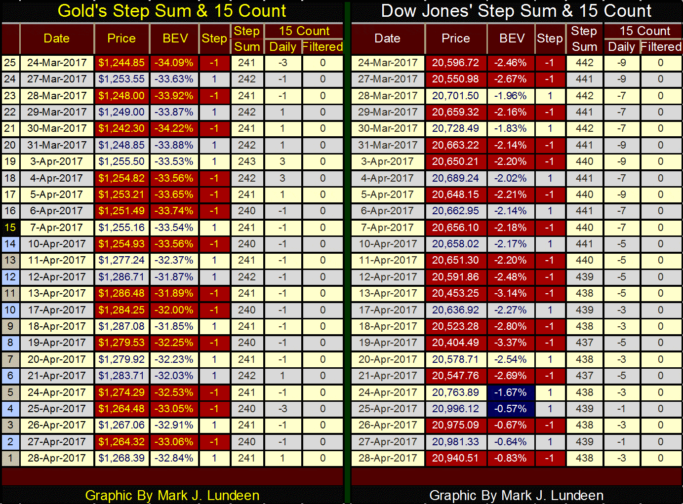
Gold lost $15 last week
As aggravating as the current situation is for gold and silver, there are more technical and fundamental reasons to like the metals and their miners than stocks or bonds.

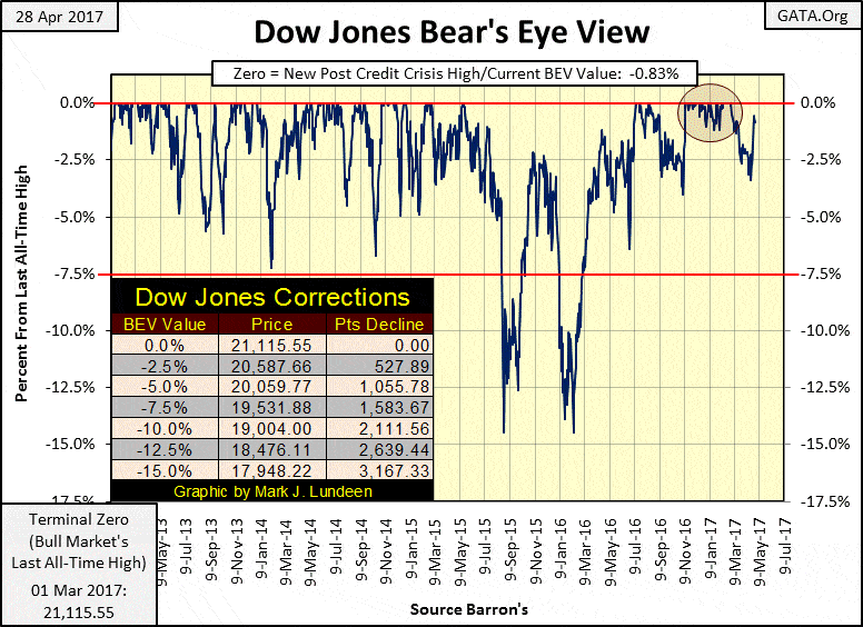
Gold lost $15 last week, but its step sum and 15 count ended where they were last week. Following this market is an exercise in frustration. Last week, the Dow Jones appeared ready to roll over. I expected the Dow Jones to be closer to its -5% line than its -2.5% line at the close of this week. But as you can see the Dow’s BEV chart below, it came charging back this week on Monday and Tuesday. However, I note the Dow failed to break above its last all-time high by Friday’s close. I find that interesting.
© Mark Lundeen
So, what should one do in a market such as this? First, ask yourself what do want the market to do for you? Personally, I like it when the market doubles my money. After eight years of rising valuations, seeing this market double your money in the next few years is unrealistic. What’s very possible is a large, double-digit percentage loss of one’s invested funds.
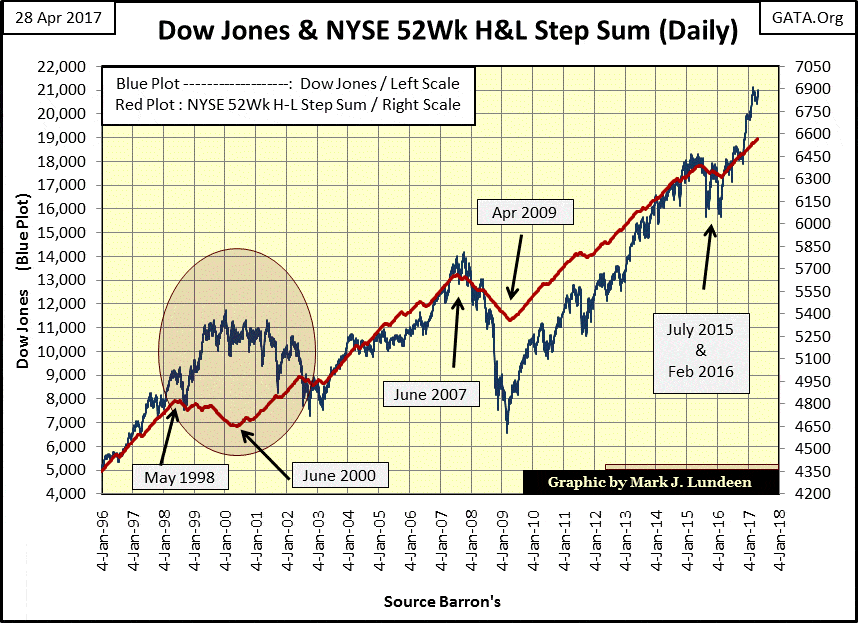
Look at the Dow Jones and the NYSE 52Wk Highs and Lows’ step sum below. The NYSE 52Wk High & Low step sum is constructed as follows, those days where there are more 52Wk Highs than Lows are given a +1. Day where there are more 52Wk Lows than Highs are assigned a -1. And like all step sums, the NYSE 52Wk Highs and Lows step sum is simply a single item A-D line using its daily +/-1s.
Except within the egg, where the bull market of the 1990s became an exclusively high-tech bull market, a rising step sum for the NYSE 52Wk Highs and Lows data goes hand in hand with a rising Dow Jones. But eight years of more 52Wk Highs than Lows is a long time, which tells me this market is due for a significant correction.
© Mark Lundeen
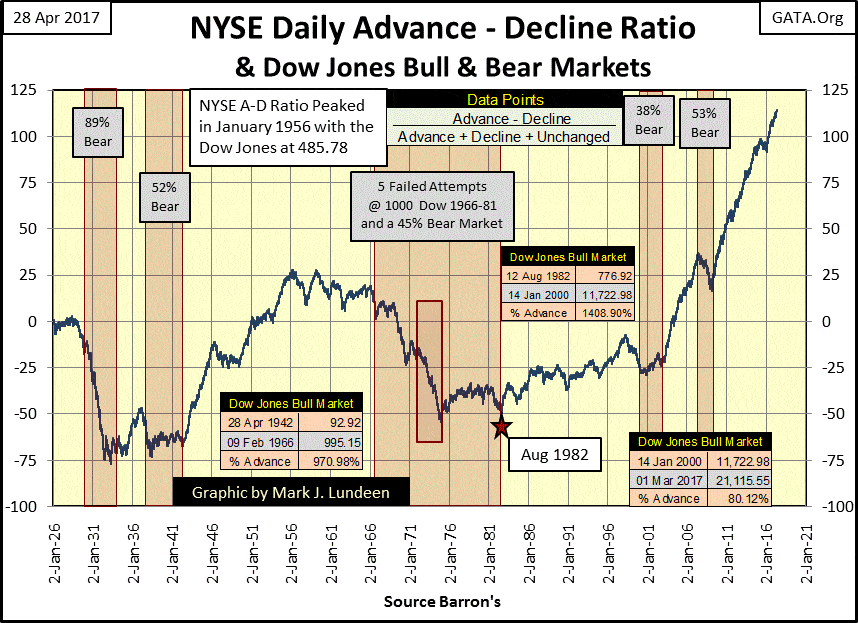
The NYSE Advancing-Declining Ratio (below) going back to 1926 points out an oddity of the current market advance. Three major bull markets occurred during this span of time:
- 1942 to 1966
- 1982 to 2000
- 2000 to 2017
There are those who would question my using 14 January 2000 as the end of one bull market and the beginning of another, and I see their point. But my point is how the NYSE A-D Ratio behaved from 1982 to 2000, and how that behavior changed from 2000 to 2017.
From 1982 to 2000 (18 years), the Dow Jones advanced 1400% as the ratio only advanced some 25 points.
From 2000 to 2017 (17 years) the Dow Jones has advanced only 80% as the NYSE A-D Ration increased by over 125 points. Looking at the plot since 1926; never has the NYSE seen so many daily advances with so little effect on the Dow Jones.
© Mark Lundeen
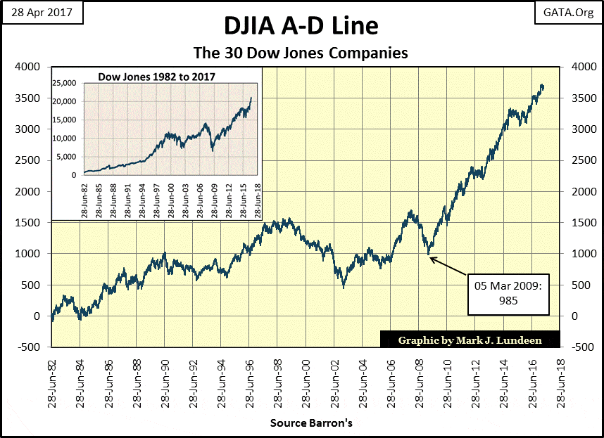
Here’s the A-D line (not a ratio) for the thirty companies comprising the Dow Jones going back to 1982. From 1982 to today, there isn’t much difference from what we see above with the NYSE’s A-D ratio.
© Mark Lundeen
What should we make of this? I suspect this is yet another finger print left on the scene of the crime by the “policy makers” as they manhandled market valuations ever higher. They seem to always get what they want from the financial markets. I expect the “policy makers” are ultimately going to discover that they are not above the laws of nature, such as the law of diminishing returns.
After the big advances seen on Monday and Tuesday, with the Dow Jones closing just 3.88 from 21K and the NASDAQ closing over 6K for the first time in history, there has to be a reason. I doubt rising tensions of nuclear war flooded the market with buy orders, so central bank intervention in the market seems a reasonable assumption.
Here’s a chart from the Market Watch article. In 2006, during the heady days of the single family, sub-prime real estate boom, the combined totals of assets held as monetary reserves by the Federal Reserve, ECB, BoJ, BoE and SNB was a bit over $3 trillion. Eleven years later their totals are over $14 trillion, with $1 trillion added in the past twelve months.
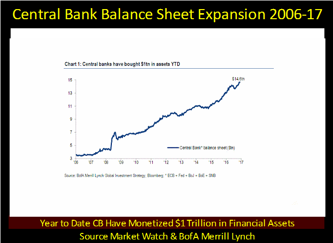
(Source)
These guys know how to manage “monetary policy!” Here is the Federal Reserve’s balance sheet going back to 1953. The effect of the mortgage crisis on the Fed’s balance sheet was a historical event in central banking.
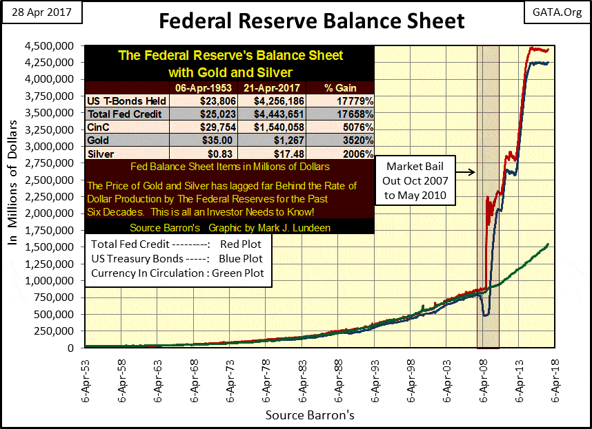
© Mark Lundeen
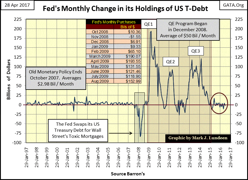
However, it appears the Federal Reserve hasn’t joined in on the inflationary merrymaking of the past year. Below we see the month over month monetization of US Treasury Debt going back to 1997.
It’s incredible how from 1997 to 2007 the Federal Reserve inflated huge bubbles in both the stock and real estate markets by monetizing on average only $2.98 billion dollars a month in the Treasury market. Also, from the perspective of the Fed’s balance sheet, the NASDAQ high-tech bear market (2000-2002) was a non-event. Not so for the sub-prime mortgage bear market.
The sub-prime mortgage debacle was a market bubble leveraged to grotesque proportions. The banks, their regulators, and Congress encouraged known deadbeats, people with a solid record of being unemployed and not paying their bills, to assume six-figure mortgages with little or no money down.
Not surprisingly, in 2007 when the mortgage market began to deflate, it threatened to take down the entire global banking / commercial payment system as America’s deadbeats walked away from trillions of dollars of their debt owed to the banks. All that plus the tens of trillions of dollars of interest rate derivatives that came into the money during the mortgage crisis, tens of trillions the big NY banks couldn’t make good on.
The severity of the situation the Federal Reserve found itself in is painfully apparent in the Federal Reserve’s balance sheet, as seen in the charts above and below.
© Mark Lundeen
Beginning in late 2007, the FOMC began swapping US Treasury bonds it held as dollar reserves for Wall Street’s non-performing mortgages. Then in early 2009 Doctor Bernanke began his first of three quantitative easings.
History records the Dow Jones bottomed on 09 March 2009 (6,547: a 54% bear market). What’s rarely, if never mentioned is how the Federal Reserve monetized over 190 billion dollars of the US national debt in both March and April of 2009 (see table in chart above). Had the FOMC not intervened in the financial markets with this massive “injection of liquidity”, the financial markets would have continued shedding market value as the global banking system closed for business. We would have seen a repeat of the 1930s, and for the same reason – malfeasance and incompetence at the highest levels of government and finance.
At the end of this week, the Dow Jones is now 14,400 points from where it was eight years ago. Values in the real estate market are back where they were in 2006. But don’t take this as a sign of health in the economy. Wall Street’s and the economy’s reckoning with Mr. Bear has only been postponed, accruing interest and penalty payments for the past eight years.
Why is that? Because no one has learned a damn thing since then! Long ago people knew that one got through life by hard work, thrift and savings. They learned that by surviving the depressing 1930s. The 1920s siren’s song of “buy now pay later” was rejected by most people by several generations of Americans.
That’s not true today! Be they members of Congress in matters of government, corporate officers managing industry and commerce, or humble wage earners budging their living expenses, it seems everyone today is as quick to take advantage of credit “at attractive rates” to leverage their income as when Alan Greenspan was Chairman of the Fed.
The credit cancer from the student loan program has now metastasized into the baby boomer generation.
Then there are the sub-prime auto loans. I provide this link not to recommend or advise against this auto finance company, but to show that once again the Federal Reserve System is being reckless with the credit they are creating.
It’s just a matter of time before Mr. Bear returns and marks to market many trillions of dollars of dubious credit instruments. But will the FOMC allow him to purge the economy of its unviable debts and inflated valuations in the financial markets? Or will we see the implementation of a QE4 in the chart above?
Like me, everyone will just have to wait to see how this resolves itself. But the smart money isn’t expecting the Dow Jones to double in value in either case.
However, if history is any guide (and it usually is) the future for gold, silver and the precious metals mining shares are brilliant. Though I can’t deny that currently they are having some difficulty.
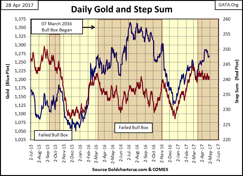
Then again maybe I’m just being a big whiner. Looking at gold and its step sum below, there is actually nothing wrong with the chart. The bull box is still intact, and the price of gold is up nicely from its bottom of last December. But that doesn’t matter as I expect most of the gold bulls want the price of gold well above its highs of last summer. Damn it; we’re tired of waiting!
(Source)
But students of the market, those who have been around the block a few times will tell you that human psychology and investment decisions don’t mix well.
Recall what the stock market felt like in January 2000 or October 2007. Those were times when the bulls in the stock market could get a good night’s sleep, but a year later how things had changed.
Look at the price of gold in the chart above. In December 2015 I was getting letters from my readers thanking me for my efforts, but all was lost as far as they were concerned when it came to gold and silver. Seven months later market psychology became euphoric, just before the big decline of last year.
Now in late April, everyone is grumpy about gold, silver and the mining shares. I expect a year from now, anyone who buys at these prices will be very happy they did. Still, the old monetary metals may see further declines in the weeks ahead.
Here are gold’s and the Dow Jones’ step sum tables. Gold lost $15 this week, but its step sum and 15 count ended where they were last week.
© Mark Lundeen
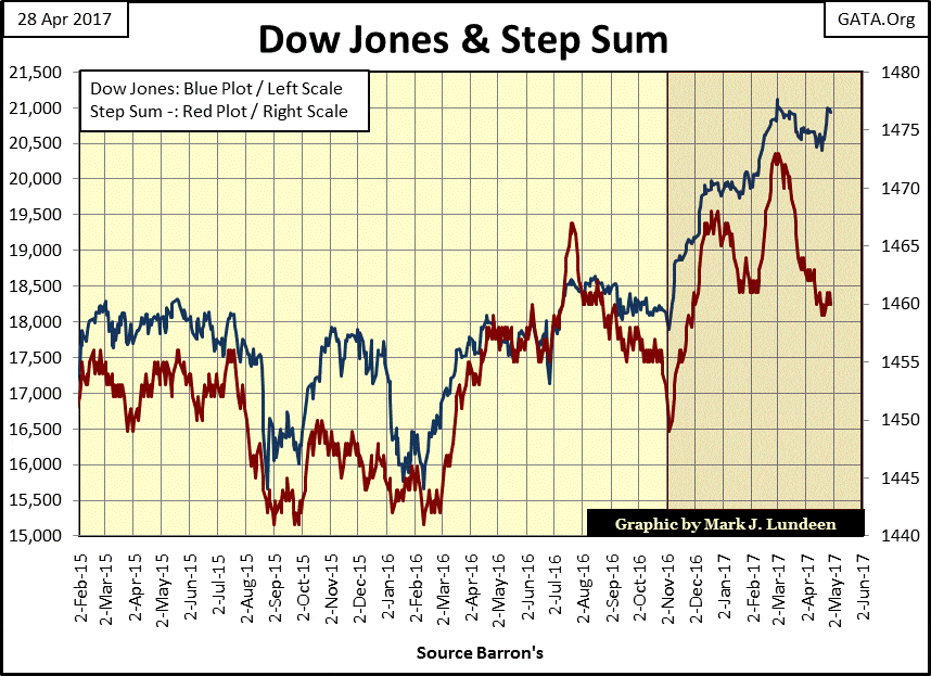
As per the articles on the central banks monetizing stocks and corporate bonds I posted earlier in this article, we see someone gave the Dow Jones a big shot of “liquidity” on Monday and Tuesday. There was no follow up in the following days. With the Dow Jones closing on Tuesday only 3.88 from breaking above 21K, it seems odd to me that the bulls would lose interest in this important psychological level so easily. But then there is always next week.
The Dow Jones and its step sum below looks good. The highlighted area isn’t a bull box. I placed it there to highlight the post-November election advance. But since early March, the Dow Jones’ step sum has seen a big decline with little effect on the valuation of the Dow Jones. If this continues for another week or two I’ll have to place a bull box in this chart.
Dow Jones at 22,000? Don’t think it impossible if the “policy makers” make the effort.
© Mark Lundeen
So, don’t be surprised if the Dow has some surprises for us bears in the months to come. But my investment horizons go far beyond the next few months. Precious metals are coming off the bottom of a nasty four-year bear market that ended in December 2015. The Dow Jones has been going up, really since August 1982 and that bullish trend’s days are numbered!
As aggravating as the current situation is for gold and silver, there are more technical and fundamental reasons to like the metals and their miners than stocks or bonds.
I’ve said it before, we may not see much in the way of excitement for gold, silver and the mining shares until the stock and bond markets begin to deflate as yields and interest rates return to where they were in early 2007.
© Mark Lundeen
Until then, gold’s and the Dow Jones step sum charts may both continue much as we see them at the end of this week.
—
DISCLAIMER: This article expresses my own ideas and opinions. Any information I have shared are from sources that I believe to be reliable and accurate. I did not receive any financial compensation in writing this post. I encourage any reader to do their own diligent research first before making any investment decisions.


SBTi Net-Zero Standard 2.0 Enhances Corporate Climate Action
The Science Based Targets initiative (SBTi) has released Corporate Net-Zero Standard Version 2.0, a major update to its global framework...


Europe’s Cannabis Shift: Rising Use, and New Risks
EUDA report shows cannabis remains Europe’s most used illegal drug, with 22 million adults trying it. Use is highest among...


Remote Work Reshapes Sales Management: Key Lessons for Moroccan Leaders
Remote work is rapidly expanding among Moroccan managers, yet practices lag behind. Insights from France show higher productivity but weakening...


Corn Prices Slip Amid Strong Crop Conditions and Favorable Weather
Corn was lower again last week on Midwest rains despite a neutral WASDE report. The report showed slightly higher beginning...


Advances in Biomarkers and Targeted Therapies Transform Kidney Care in Autoimmune Disease
New biomarkers and targeted therapies are reshaping the management of kidney damage in autoimmune diseases like lupus and vasculitis. Experts...
 |
|
 |  |
 |
|
-

 Fintech1 week ago
German Fintech Investment Slumps as AI Becomes Key Focus
-

 Cannabis2 weeks ago
CBD Vending Machines Face Ban Under New French Restrictions
-
 Crowdfunding5 days ago
Sustainable Restoration of the Haus Hövener Garden in Brilon
-

 Crowdfunding2 weeks ago
Impact Food Launches Crowdfunding to Expand Plant-Based Fast Food Concept
You must be logged in to post a comment Login