Markets
Gold prices keep increasing, silver breaks the downtrend
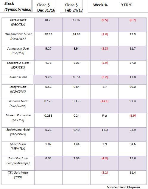
Gold stocks were weak again this past week. As a result, our model portfolio was down losing on average 4%.

According to the Economist “Big Mac” Index, the US$ is currently overvalued against most currencies. The US Dollar is at its highest value in 14 years which is causing global dislocations. Trump has suggested that the US Dollar is too high and that alone caused the US Dollar to weaken. Fed Chair Janet Yellen seems to agree and has said that the high US Dollar is a “drag” on US growth.
Model Portfolio
Gold stocks were weak again this past week. As a result, our model portfolio was down losing on average 4%. Oddly, the losses were mostly seen with the large cap stocks as the junior exploration stocks were generally to the upside. The exception was Aurvista (AVA.V) following a sharp run-up. It was probably no surprise that some profit taking set in. Stakeholder Gold (SRC.V) had a good up-week and is now up about 54% in 2017.
© David Chapman
MARKETS AND TRENDS
© David Chapman
Note: for an explanation of the trends, see the glossary at the end of this article
Note: New highs refer to new 52-week highs.
Key Economic Numbers Week February 6-10, 2017
(Source)
(Source: www.shadowstats.com, www.data.bls.gov, www.statcan.gc.ca, www.tdeconomics.com)
Note: % M/M unless otherwise noted
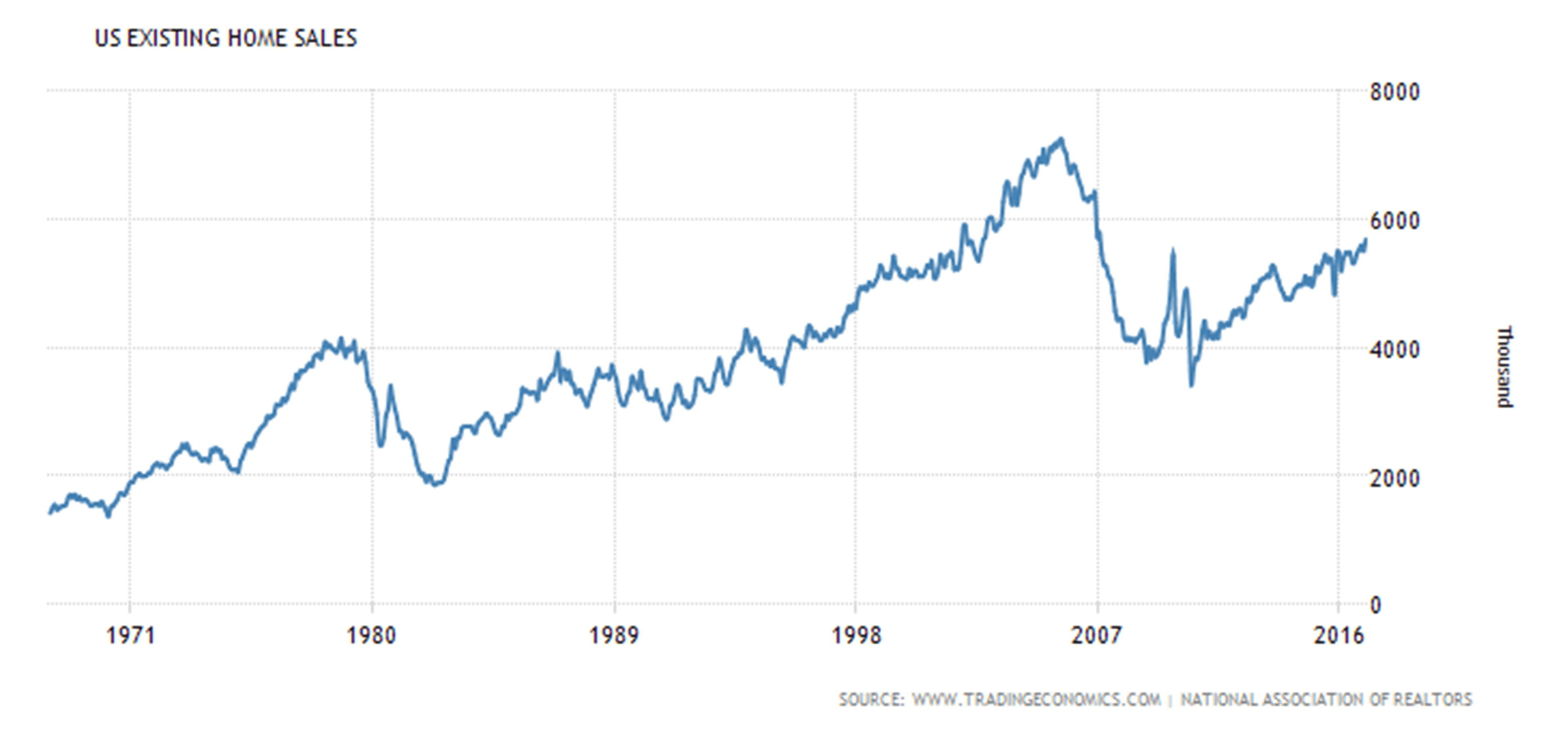
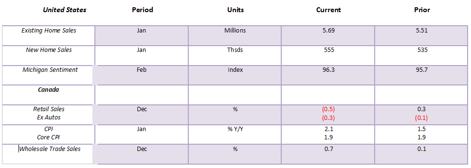
US existing home sales jumped 3.3% this past month but remain down around 21.5% from the highs recorded in 2006. New home sales were up 3.7% from the previous month, but also remain down 60% from the highs recorded in 2004. At best, it is continued stagnation in the US housing market. Naturally the improvement from the previous month will be hailed as evidence of the strength of the US economy. New housing sales remain at low levels at the lower end seen in the 1970s through the 1990s. This coming week sees the release of a second estimate for Q4 GDP growth (expecting 2.1% vs. 1.9% previous), the January trade balance (expecting deficit of $66 billion), and the ISM employment and manufacturing indices.
(Source)
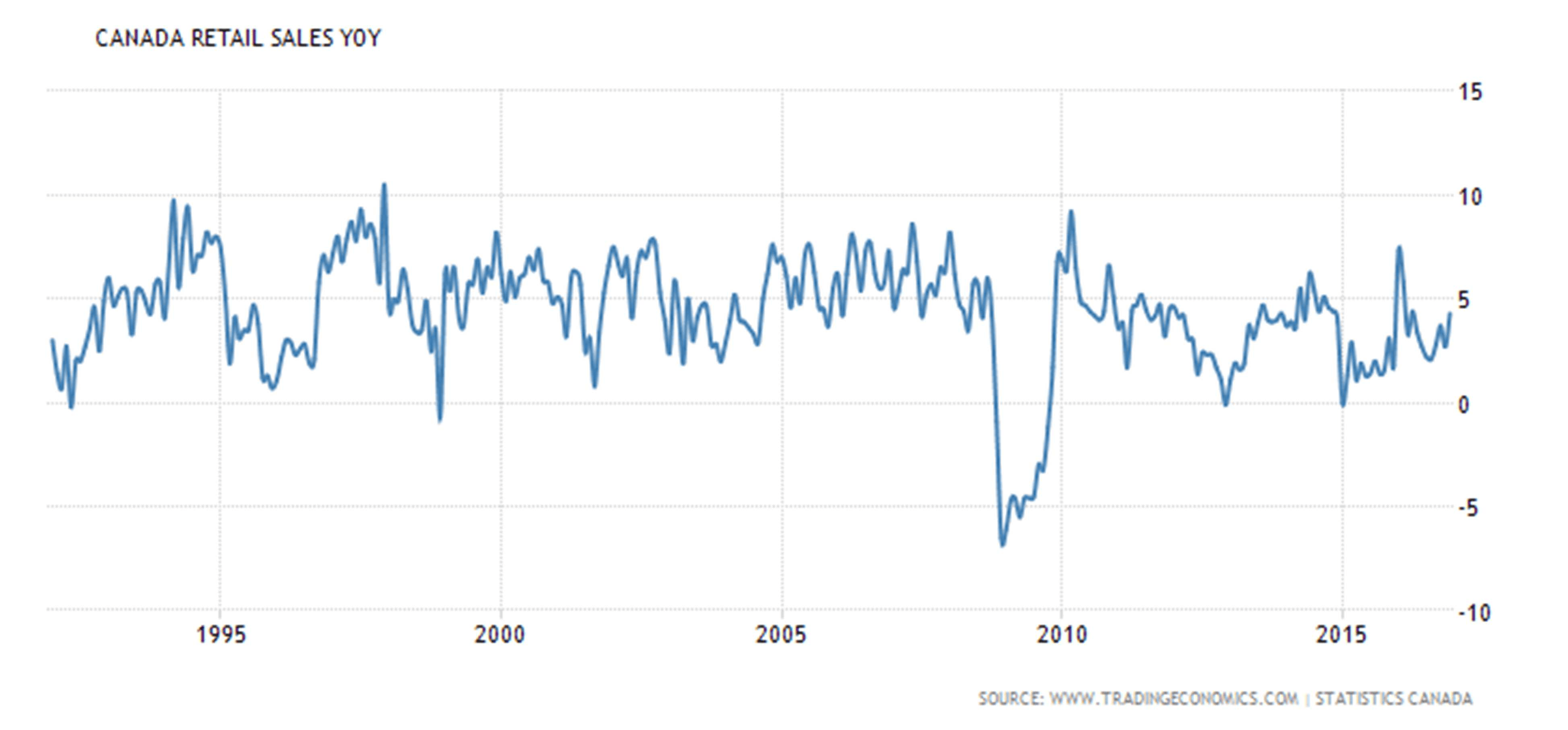
Retail sales in Canada fell 0.5% month over month in December but on the year, they were up 4.3%. These are disappointing numbers considering December is supposed to be a big month with Christmas. Despite the disappointing retail sales economists remain upbeat that the Canadian economy could continue to improve. Some bank economists believe the Canadian economy grew 2.2% in 2016 surpassing the expectations of the BofC who was looking for 1.5% growth. This coming week the BofC meets and there is absolutely no expectation of a rate hike. The BofC rate would remain at 0.50%. The BofC is looking at an improving Cdn$, low inflationary expectations and near term at least there has been some upward pressure on interest rates.
(Source)
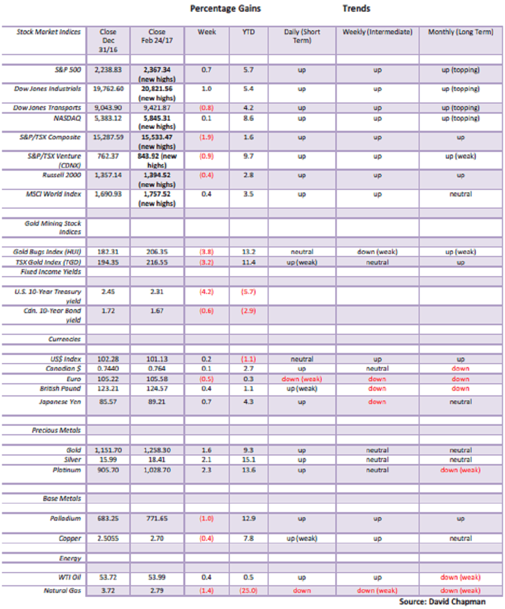
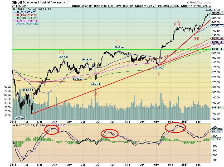
The Trump rally continues. Nothing seems to impede it. Once again, the Dow Jones Industrials (DJI), the S&P 500, and the NASDAQ made new all-time highs this past week. There was, however, one notable exception and that was the Dow Jones Transportations (DJT) that did not. This has the potential to be a divergence. Obviously, it is an unconfirmed divergence. We note as well that the daily MACD indicator is so far making a lower high even as the DJI makes new highs. This is also a divergence but again an unconfirmed one. There are a number of others as well with the indicators.
We continue to believe that the DJI is working on intermediate wave (3) (waves (1) and (2) complete) to the upside starting from the low in February 2016. It is clear that minor waves 1 and 2 are complete; however, we are not so sure that recent pause was wave 4 as it was rather short compared to the correction seen from August to November 2016 (wave 2). Instead, it could be that wave 3 up is unfolding as instead a rise of (i), (ii), (iii), (iv) and (v). That could easily put the top sometime in March and following a wave 4 correction a rise to a final top this summer.
We are reminded that in 2000 the markets did not see their top until March even as the DJI made its top in January 2000. So a top in March would not be unusual. The DJI has closed higher now for 11 consecutive days from February 9 through February 24. This is the longest stretch of higher closings in 30 years, last seen in January 1987 when the DJI closed higher for 13 consecutive days. Short covering is certainly helping push this rally. But there could also be an element of panic taking hold that the “boat” is being missed. The DJI currently breaks under 20,500.
(Source)
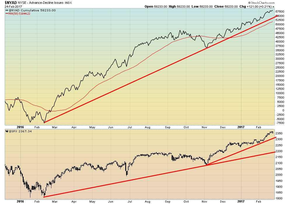
If one looks at the NYSE advance decline issues there is no sign of any divergence or even hesitation. This is one indicator that appears to agree that this market has not yet topped and has further to go. The rise now may be getting into the realm of irrationality but that is the reality of a “bubble” market.
Ideally, what one wants to see is the advance decline line falling even as the market is rising. That is just not happening. When the market topped back in 2000 the advance decline index was falling, not rising. Back in 2007, the advance decline line topped in April and by the time the market made its final high in October 2007 the advance decline was well into a decline. So until the advance decline tops and starts to decline even as the market keeps going higher we won’t get any clear signal on a top.
(Source)
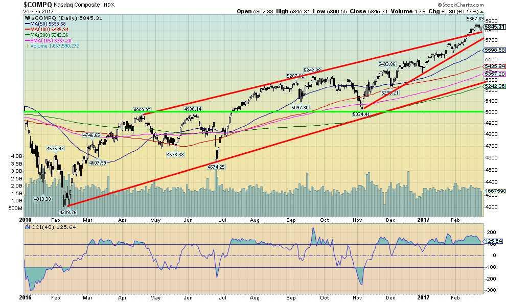
Here is the NASDAQ. It too has been making new all-time highs. The NASDAQ was a bit weaker than the DJI and the S&P 500 this past week. Yet of the indices the NASDAQ has had the best gains this year.
Could the NASDAQ be slowing ahead of the other indices? Time will tell, of course, but this past week saw the NASDAQ appear to give up its leadership role. The NASDAQ breaks under 5,700.
(Source)
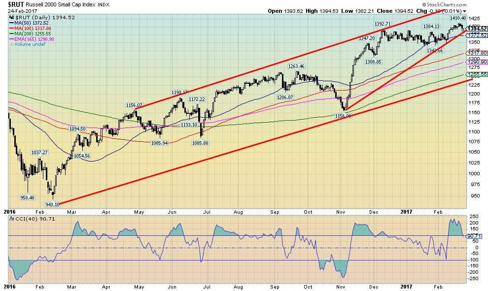
The Russell 2000 small cap index lost some momentum this past week even as it too made new all-time highs. The Russell 2000 made a new all-time high, and then closed lower on the week by 0.4%. Could the Russell 2000 be setting itself up as an early warning for the big cap indices? It is only one week, so follow-through to the downside will be important, especially if the big cap indices continue to rise. Again, at this stage it is a possible warning.
(Source)
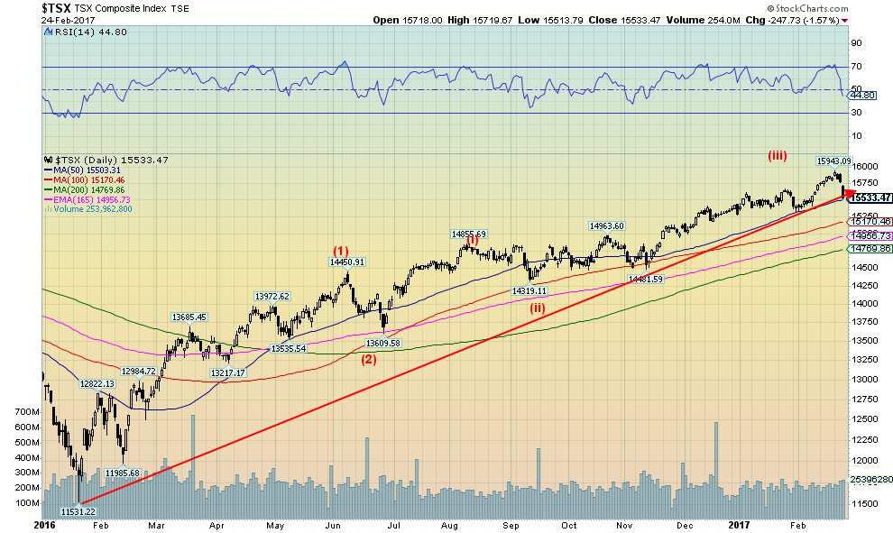
The TSX Composite also made a new all-time high this past week, then reversed and closed lower by 1.9%. The banks have been reporting. Both the CIBC (CM.TO) and the Royal RBC (RY.TO) reported stellar results. But the news triggered a sell-off in the banks. Buy the rumor—the banks are going to have stellar results; sell the news—they did. The TSX has had quite a run from the January 2016 low up 38%. That compares favourably with the DJI up 34.7%, the S&P 500 up 30.8%, the NASDAQ up 39.3% and the DJT up 49%. The small cap Russell 2000 also gained 49%. The real star, however, has been the TSX Venture Exchange (CDNX). gaining 82% from its early 2016 low.
(Source)
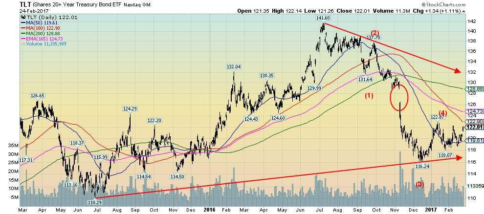
Bonds may not yet be finished their recent rally. While we labeled the move to 122.87 as wave (4) the action is suggesting that level may fall and the iShares 20 year Treasury Bond ETF (TLT) may yet have more to run to the upside. While the recently released January FOMC minutes plotted a course to higher interest rates, the market reacted opposite to the view of higher rates. Even Janet Yellen was more “mum” then usual about the potential for higher interest rates at the March FOMC. So bonds rallied and the US$ fell. That in turn helped gold break to higher prices this past week. There is resistance up at 123. but above that level a run to 125 is possible and even eventually to the 200-day MA up near 129. The 10-year US Treasury note could see its yield fall to around 2% from the current level of 2.31% and the recent high of 2.60%. There is interim support around 2.20%. Canadian bond yields also fell this past week with the Government of Canada 10-year benchmark falling slightly to 1.67% from 1.68%.
While Trump’s proposed policies are a potential negative for interest rates and could have the Fed tightening, the market appears to be signaling that the odds of a March rate hike are diminishing.
(Source)
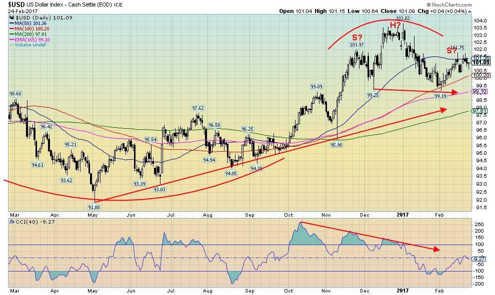
There was little change to the US$ Index this past week gaining a small 0.2%. The Euro was the weakest against the US$ (down 0.5%), while other currencies such as the British Pound and especially the Japanese Yen improved (0.4% and 0.7% respectively). The Cdn$ gained a small 0.1%. As a result, our potential head and shoulders topping pattern remained intact. The neckline is down around 99 and if it breaks, the potential targets are down to the 94/95 zone. Trump wants the US$ down as he believes it is a huge drag on US exports while Yellen wouldn’t mind a lower US$ as she believes the high dollar is a drag on the economy.
(Source)
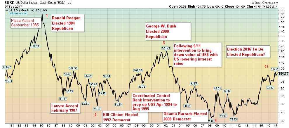
Here is a long-term chart of the US$ Index. This is the trade-weighted US$ Index that contains six currencies only (Euro 57.6%, Japanese Yen 13.6%, British Pound 11.9%, Cdn$ 9.1%, Swedish Krona 4.2% and Swiss Franc 3.6%). There is also published a trade-weighted broad US$ Index that contains the six currencies noted above along with other currencies including Argentina, Australian, Brazil, Chile, Colombia, Hong Kong, India, Indonesia, Israel, Korea, Malaysia, Mexico, Philippines, Russia, Saudi Arabia, Singapore, China, Taiwan, Thailand, and Venezuela. The index shifts over time depending on the level of trade with the US.
The history of the US$ from August 1971 when former President Richard Nixon took the world off the gold standard and moved to world of fiat currencies and eventually floating currencies against the US$ is one that has seen huge up and down swings in the value of the US$. The US$ fell roughly from 1971 to 1979/1980 before massive central bank intervention in currency markets coupled with a huge hike in US interest rates started the US$ on a huge rise. With the US$ now grossly overvalued the Plaza Accord was struck in September 1985 to help push the US$ back down. It fell too fast and only two years later there was the Louvre Accord of February 1987 designed to stabilize the US$.
That was not enough and by 1994/1995 with the US bond market in free fall the world’s central banks led by the Fed and the BOJ intervened to help push the US$ back up again. It was also designed to help the overvalued Japanese Yen and push it down to try and save the moribund Japanese economy. By 2001 the US$ was overvalued again and the events of 9/11, coupled with central bank intervention and a rapid decline in US interest rates, helped push the US$ down once again. The 2008 financial crisis signaled the next bottom in the US$ and the Fed’s programs of quantitative easing (QE) and low interest rates helped improve the US economy. When QE ended and the Fed hinted at hiking interest rates the US$ began a rapid ascent bringing us to today.
This is actually a chart we prepared before the US election and then updated for this week’s edition. We had observed that over time that the US$ tended to rise under Democratic Presidents and fall under
Republican Presidents. It wasn’t exact by any means. But the recent history showed the rise of the US$ under Clinton (Democrat) the fall of the US$ under Bush 2 (Republican) and the rise once again under Obama (Democrat). If the US$ was to top out and fall, it suggested possibly that a Republican could win the White House in 2016. A Republican did win. Our expectations are that the US$ could go into a decline over the next four years. And, who knows, possibly yet another accord (the Trump Accord).
(Source)
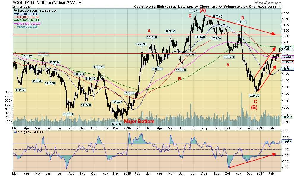
With the US$ falling as a result of statements from Trump calling China currency manipulators and Yellen soft-talking the economy a little the US$ fell this past week (although it ended the week essentially flat), and that in turn helped push gold through $1,240 resistance. With a high on the week of $1,261, gold has now pushed into the next level of resistance at $1,260. PDAC gets underway the week after this one and PDAC often signals a top in gold into PDAC either just before it or just after it. Last year gold pulled into a high around March 10 then was soft until a low in late March 2016. After that gold pushed up through $1,300 before correcting once again into a low in late May. Gold’s seasonals tend to be weak into the May/June period once a high is seen around PDAC.
Gold made what appears to be an important bottom in December 2016 and since then has been on a steady rise. The first wave topped around $1,220 in mid-January while the pullback took gold down to $1,180 by the end of January. That may have been the 2nd wave. Gold has since embarked on what we believe is a wave 3 to the upside, one that could take us to $1,330/$1,335 in March. Only a break back below $1,220 might change our current outlook. While we believe that there is potential into the $1,300 zone in March there remains the potential for more. The current conditions appear ideal for gold, given the desire to lower the value of the US$ and the political uncertainty created in the White House.
Resistance for gold is here at $1,260 and up to $1,265 but above $1,270 gold should rise rapidly to $1,300. The 200 day MA is here up to $1,264.
(Source)
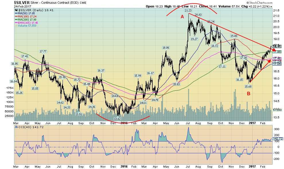
Unlike gold, silver did break out over its 200-day MA this past week with a high of $18.46. Silver also appears to have broken the downtrend line from the July 2016 top. If so, silver prices could start to move upward now. There has been very little in the way of pullbacks since the silver rally got underway from a low of $15.68. Silver has now moved up almost $3 and is up 17% from those lows. Silver appears to have established some support in the $17.70/$17.80 zone and below that at $17.30/$17.50. A break under $17 would, however, be negative and throw the rally into doubt.
As with gold, we are optimistic here on silver with the potential to rise to targets up around $24 to $26. Silver should also continue to outperform gold going forward. Indicators are not yet overbought at levels that might indicate that the market is becoming frothy.
(Source)
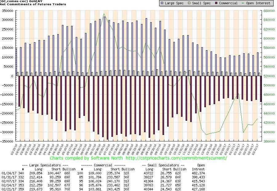
The commercial COT for gold slipped to 30% from 31% this past week. Short open interest jumped roughly 10,000 contracts with long open interest falling about 2,000 contracts. The large speculators COT rose to 70% from 67%. Neither the commercial COT nor the large speculators COT are at levels that might suggest a top. For the commercial COT that usually comes in the low 20s and for the large speculators that usually occurs over 80. Nonetheless, the COT report should be monitored each week. It is an indicator but does appear to help identify potential tops and bottoms but the report does not call the top or the bottom.
(Source)
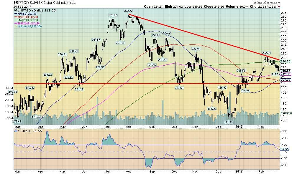
For the second week in a row gold stocks as represented here by the TSX Gold Index (TGD) pulled back. The index ran into resistance at the 200 day MA (currently at 226) with a high of 232. The pullback so far is roughly 7%. The TGD remains up almost 26% from the lows of December 2015. Despite the pullback, the gold stocks appear poised to move sharply higher in 2017 as they did in 2016. Last year saw the TGD gain 50%. At one point, the TGD was up 148% from the lows of September 2015. Despite the impressive gains over the past year or so a reminder that the TGD remains down roughly 52% from the highs of 2011. The Gold Bugs Index (HUI) remains down even more almost 68% from its 2011 high.
There remains lots of latitude for the gold stocks to rise. Remember that the gold stock universe is quite small with a market cap of less than US$150 billion. Apple the world’s largest company has a market cap of over $600 billion. The result is that when the buyers step into the gold stock market it is quite small and that can result in swift moves to the upside. It works the opposite way in a bear market.
Another interesting comparison is that the world’s above ground supply of silver stocks is estimated at around one billion ounces. At the current prices of about $18.50, that makes its valuation about $18.5 billion. Bill Gates, the world’s richest man is estimated to have a net worth of $79 billion. That makes Bill Gates richer than many countries putting him at about number 66. If Apple were a country, it would rank at number 21 just below Saudi Arabia in size.
GLOSSARY
Trends
Daily – Short-term trend (For swing traders)
Weekly – Intermediate-term trend (For long-term trend followers)
Monthly – Long-term secular trend (For long-term trend followers)
Up – The trend is up. Down – The trend is down
Neutral – Indicators are mostly neutral. A trend change might be in the offing.
Weak – The trend is still up or down but it is weakening. It is also a sign that the trend might change.
Topping – Indicators are suggesting that while the trend remains up there are considerable signs that suggest that the market is topping.
Bottoming – Indicators are suggesting that while the trend is down there are considerable signs that suggest that the market is bottoming.
—
DISCLAIMER: This article expresses my own ideas and opinions. Any information I have shared are from sources that I believe to be reliable and accurate. I did not receive any financial compensation in writing this post, nor do I own any shares in any company I’ve mentioned. I encourage any reader to do their own diligent research first before making any investment decisions.


The TopRanked.io Guide to 2026’s Biggest and Best Affiliate Opportunities
Want to earn affiliate commissions on literal billions of dollars worth of revenue? Then this week, we've got something special...


Eni Advances Energy Transition with Major Investment and Emissions Cuts
Eni showcased its “Just Transition” report in Rome, highlighting stakeholder collaboration and progress toward decarbonization goals. The company invested over...


The German Fintech Market Shows Resilience and Strong Investment Growth in 2026
Germany’s fintech sector remained resilient in 2026 despite economic crisis and rising insolvencies. Investments reached €14.2 billion, showing strong investor...


Cannabis Legalization in Germany: A Mixed Interim Assessment
Germany’s cannabis legalization has reduced criminal cases and eased pressure on the justice system, while the black market is slowly...

Sustainable Restoration of the Haus Hövener Garden in Brilon
The Brilon Construction Workers Association is restoring the Haus Hövener garden into a cultural community space, funded through a €10,000...
 |
|
 |  |
 |
|
-

 Crowdfunding2 weeks ago
Prestadero Sees Rising Female Loan Participation in Mexico
-
 Business3 days ago
The TopRanked.io Guide to 2026’s Biggest and Best Affiliate Opportunities
-
Business1 week ago
TopRanked.io Weekly Affiliate Digest: What’s Hot in Affiliate Marketing [+ The Best Affiliate Program Directory on the Internet]
-

 Crowdfunding2 weeks ago
Spain’s Crowdfunding Sector Surges as Real Estate and SME Financing Expand
You must be logged in to post a comment Login