Featured
Gold stocks closed at a higher rate, silver remains disappointing
Gold stocks look promising when it made a recent high as early as January 2018. Because of this, various investors are betting on higher prices of gold.

Retirement? Are you kidding! Only one generation of Americans was ever fortunate enough to have the luxury of retirement. The rest of Americans will probably die in a Walmart parking lot while on duty [working in a retirement job].
—unknown wise person, in response to an online retirement article
It is better to have a permanent income than to be fascinating.
—Oscar Wilde
I have enough money to last me the rest of my life, unless I buy something.
—Jackie Mason
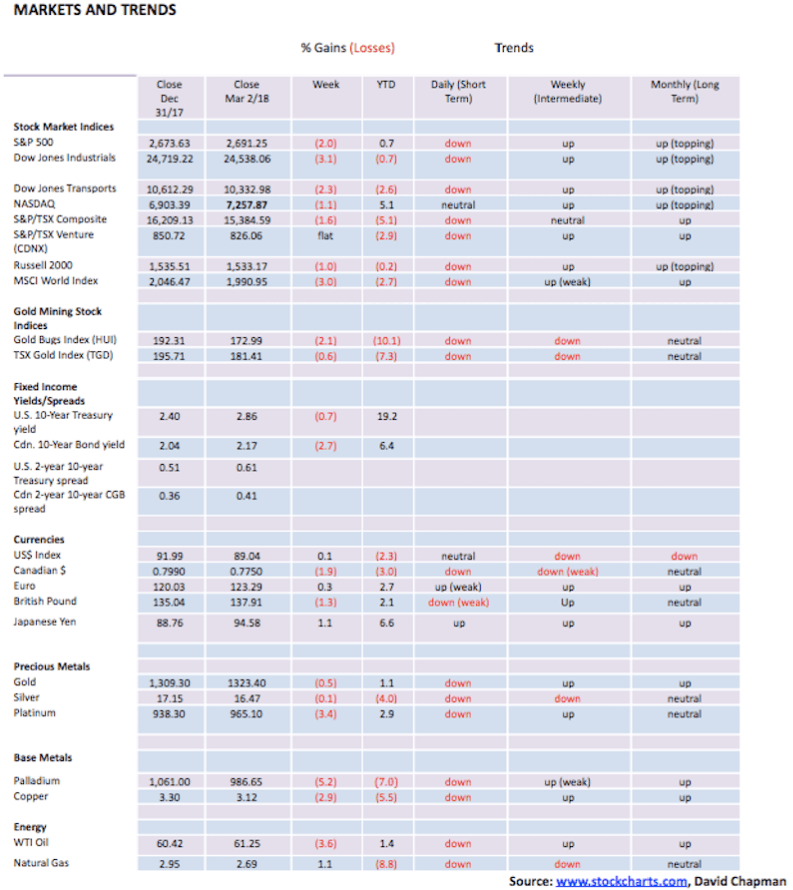
Stock markets just put in their worst month since January 2016. The Dow Jones Industrials (DJI) closed down 4.3 percent on the month. Losses have continued into March. At one point the DJI was down 12.2 percent from its January 2018 all-time high — a significant correction by any measurement. Other markets fared no better with some being worse. The S&P 500 was off 3.9 percent, the NASDAQ lost 1.9 percent while the Dow Jones Transportations (DJT) dropped 5.4 percent. The small-cap Russell 2000 dropped only 4.0 percent; that the smaller cap stocks that usually lead the way down held in so well is encouraging. In Canada, the S&P TSX Composite was off 3.2 percent while the small-cap TSX Venture Exchange (CDNX) dropped 4.1 percent. It is encouraging when the CDNX outperforms the DJI, even if marginally.
Investors could be looking at these markets nervously, and opening their February statements gingerly. After all, the baby boomers are entering their retirement years and what many are discovering is that their pensions and portfolios may be insufficient to carry them through retirement. This is especially true of those who are discovering that their company pension fund is underfunded, and their retirement benefits may not be as large as they anticipated.
Some, such as the retirees at Sears Canada, were even more shocked when they found out their pension payments could be slashed by at least 19 percent. Ask retirees about Stelco, Algoma Steel and Nortel, and they might understand the feeling. It seems shareholders and executives benefited. Not so many retirees. Since 2010, Sears Canada paid out $1.5 billion in dividends and share buybacks, more than five times the $267 million hole in its defined benefit pension plan, according to the Canadian Centre for Policy Alternatives.
And this took place against the backdrop of the Ontario government reducing the pension solvency funding requirement from 100 percent to 85 percent, all in order to make it easier for corporations to underfund. Many have. And in the U.S., it has even spread to state and municipal pensions in addition to many corporations. So, what are investors to do? Despite a recent hike in interest rates, bank deposits, GICs and safe government bonds all yield generally below the rate of inflation following many years of depressed interest rates thanks to quantitative easing (QE), and the world’s central banks sending interest rates to zero and even lower in order to combat the global financial crisis of 2007-2009. Safety comes with a price as well. Many were or are depending on the markets to make up the differential, but a bad month like February may make many nervous.
Since the financial crash of 2008, it has been stock markets that have led the way. For example, the DJI is up a stellar 254 percent since March 2009. Gold, on the other hand, has only mustered about a 40 percent gain, especially following the collapse of 2013. But when one goes back to the beginning of the current century the story is different. The DJI is only up 117 percent while gold has gained 355 percent.
Sometimes these things depend on when you pick your start date. Pick 1980 when gold peaked, and gold’s performance doesn’t look so good — up only 55 percent vs. the gain on the DJI of about 2,800 percent. But go back to August 1971 when former President Richard Nixon ended the gold standard, and gold is up roughly 3,600 percent while the DJI is still only up about 2,800 percent as stocks treaded water throughout the 1970s. If you adjust for inflation, the gain on the DJI is trimmed to only 364 percent while gold has gone up 406 percent. For the DJI, that is before dividends.
So performance does depend upon where you start. For most investors, it starts when they put their money in the market. Put it in at the top and performance may not look so good. But one can’t always jump in in March 2009. More likely few if any did. Investors tend to jump in at the top and bail at the bottom.
Where investors should really be nervous is the massive amount of debt that is outstanding globally. While the focus is often on sovereign debt, the bigger concern should be on corporate and consumer or individual debt. It is the latter two that have grown sharply since the financial crisis of 2008. In Canada, household debt to GDP has grown from about 80 percent back in 2008 to over 100 percent today. Oddly enough, in the U.S., it has gone the other way as it has fallen from over 95 percent back in 2008 to about 78 percent today. Canada apparently has the highest household debt levels in the world relative to the size of Canada’s economy. That is a vulnerable area for not only consumers but for financial institutions too.
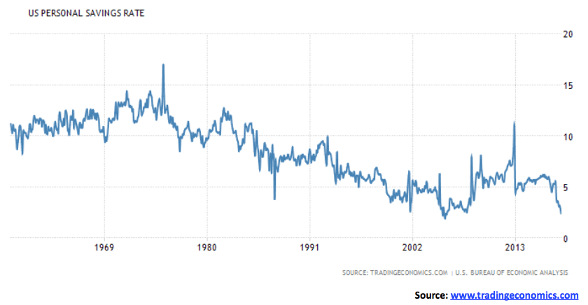
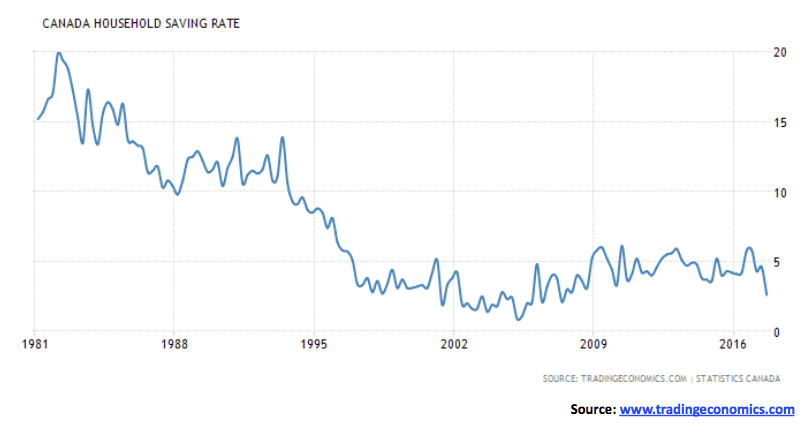
It was therefore surprising to discover that personal savings rates are plummeting in both Canada and the U.S. In Canada, the rate sits at 2.6 percent while in the U.S. the rate is 2.4 percent, a level that is not far off its record low of 1.90 percent seen in July 2005. Canada’s record low was also seen in 2005 at 0.90 percent. Both savings rates plunged from about 5 percent. Low personal savings rates do not bode well for the future. It is noteworthy that drops in the personal savings rate preceded recessionary periods. Maybe it is a warning sign. Investors should be wary.
© David Chapman
© David Chapman
Trade Wars and Real Wars!
Almost all wars, perhaps all, are trade wars connected with some material interest. They are always disguised as sacred wars, made in the name of God, or civilization or progress. But all of them, or almost all of the wars, have been trade wars.
—Eduardo Galeano, Uruguayan journalist
The headlines blared, “Trump Stokes Trade War Fear.” Back in 2016 when Trump was a candidate for the presidency, we looked at what some of his policies might mean if he were elected. One of his biggest concerned trade. At the time, we believed any move toward trade wars would be bad for stock markets and the U.S. dollar but positive for gold. This is what occurred in the 1930s when what was known then as the Smoot-Hawley Tariff helped trigger trade wars. Inevitably, this led to not only trade wars but also sovereign defaults and eventually real war, culminating in WW2.
In November 2016, when Trump was elected president, we reiterated that stance that his proposed policies were not good, especially for trade, and added that his potential leading candidates for appointments could lead to disruption and dysfunction in the White House. Seems we are now getting it all — in spades. The U.S. appears to be at war with itself over gun control, the environment, the Mueller investigation, and other issues.
Trump had already attacked washing machines and solar panels. And now, he has added steel and aluminum with his announcement of tariffs on Mar. 1, 2018. The Dow Jones Industrials (DJI) fell almost 400 points, and the U.S. dollar lost about 40 basis points. Gold reversed a downward spiral and closed higher. Curiously, Smoot-Hawley was signed into law on June 17, 1930. Over the next two years, the DJI fell about 82 percent. Naturally, nothing has been signed into law — yet. But the move toward countermeasures is already under way in Canada and the EU. China is not expected to stand still.
In trade wars, there are no winners. And trade wars (or we could also call them economic wars) inevitably lead to real wars. But as the quote from Eduardo Galeano notes, they are never advertised as trade or economic wars. Today, the rhetoric is about North Korea wanting nuclear weapons, their ability to hit the U.S., and their selling of chemical weapons to Syria. Syria is using chemical weapons on its own people. Iran wants to become a nuclear power, and their forces in Syria are a threat to Israel. All of this may or may not be true. Not unlike the so-called “weapons of mass destruction” that Iraq and Saddam Hussein had. Or they are bombing their own people like Muammar Gaddafi of Libya? But are Kim Jong-Un, Bashar Assad, and the Ayatollahs of Iran the real targets?
In January 2018, the Pentagon announced its new defense strategy called for aggressive steps to counter Russia and China. General Mattis, Trump’s Secretary of Defense, declared, “We have no room for complacency and history makes clear that America has no preordained right to victory on the battlefield.”
NATO troops (predominantly U.S.) are poised all along the border of Russia in Europe, allegedly to stop Russian aggression. U.S. military bases line the Pacific, allegedly to contain Chinese aggression. In all, there are about 700 U.S. military installations around the world outside the U.S. costing the U.S. billions to operate. U.S.-dominated wars over the past 17 years have cost, according to most sources, an estimated $4.4 trillion, adding considerably to the U.S.’s annual deficits and massive debt obligations. Officially, the U.S. acknowledges the expenditure of at least $1.6 trillion, still a substantial amount.
The complaint is China and Russia are pursuing an aggressive military strategy. Russia seized Crimea and threatens Ukraine. China is threatening its neighbors in the Pacific. China and Russia are also leading the way in trade with such things as the “New Silk Road” by moving away from the U.S. dollar, building gold reserves, and creating Chinese-dominated counterparts to the U.S. dominated World Bank, IMF and WTO. The U.S. dollar has been questioned as to why it remains the global reserve currency. U.S. global hegemony is under attack. The loss of U.S. global economic dominance and the U.S. dollar as the world’s reserve currency would be economically catastrophic for the U.S. In the past, global wars have been triggered over less — what’s different now is all parties have nuclear weapons.
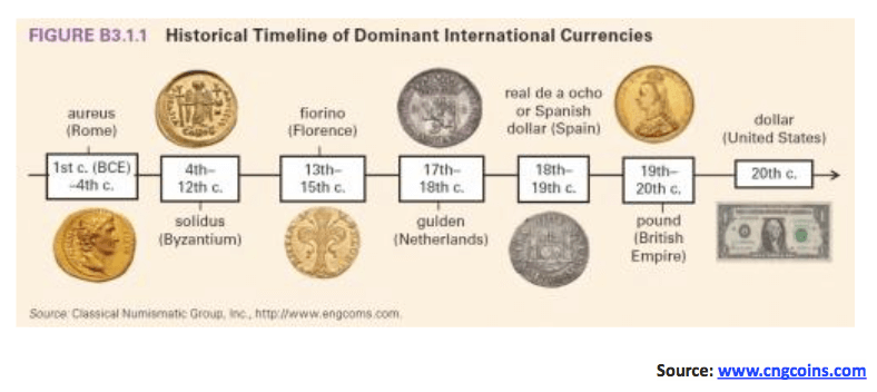
Reserve currencies have a history of coming and going as empires rise and fall. Since the 15th century, the Fiorino of Florence, Italy, followed by the Ducat of Venice, Italy, the Netherlands Dutch Guilder, the Spanish Real, the Portuguese Escudo and the British Pound Sterling have served as the world’s reserve currency. All were at one time associated with empires that rose, and then fell. History is about the rise and fall of civilizations and empires. Today’s dominant empire, the U.S., is in many ways no different from previous empires that today no longer exist. At the heart of them were issues over expansion, over expenditure to pay for and protect the growing empire, and ultimately wars with challengers.
© David Chapman
Our concern is the markets as stock markets would fall and gold (and precious metals) would have the potential to soar if all this deepens and were to come to pass. It is not to say that any of this could come to pass. But it all needs to be watched. And announcements of tariffs on steel and aluminum are a distraction and ultimately not the real target. But they, in turn, could set in motion trade and currency wars that could eventually lead to real wars.
© David Chapman
Bitcoin Watch
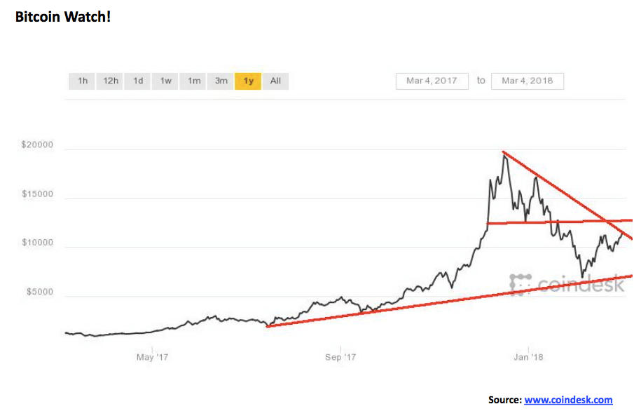
Are Bitcoin and the cryptocurrencies on their way to recovery? When we left a month ago, Bitcoin was trading closer to $6,000. Now, it has crawled back over $11,000. Is this a corrective recovery or the start of a new run-up to new highs? Is it consolidating or bottoming?
The suspicion is this is merely a consolidation or correction within the context of a longer-term decline. Volumes for not only Bitcoin but all cryptocurrencies have fallen sharply. Regulators continue to circle. The SEC is investigating. Scams still come to light. Lawsuits are still being launched against exchanges and those who started a cryptocurrency.
There are over 1,500 different cryptocurrencies listed at www.coinmarketcap.com. That is way too many. Hundreds of them have negligible market caps. Over 400 are under $100,000 market cap, of which 350 are listed with no market cap or barely any. Over half are under $1 million and two-thirds are under $5 million market cap.
There are bizarre ones—besides Dogecoin, we saw DopeCoin, Monkey Project, LuckChain, CannabisCoin, FedoraCoin, PutinCoin, InflationCoin, CrowdCoin, FuckToken (yes, FuckToken), PiggyCoin, WhaleCoin, Atomic Coin, RonPaulCoin, WomenCoin, Mao Zedong, Ride My Car, Braincoin, PeepCoin, and numerous versions with the word Bitcoin in it. Dogecoin is the 35th largest crypto with a market cap of $634.5 million, amazingly (down from a peak of $1.7 billion). It’s an admitted fake or satire.
FuckToken, whose symbol is, you guessed it is FUCK, has a market cap of just under $1.1 million. There are almost 71 million FuckTokens outstanding, and they currently trade at just over 2 cents. Incredibly, its market cap peaked at over $4 million back in early January. FuckToken is described as a social cryptocurrency that helps everyone around the world give a FUCK. It allows users to send and receive money almost instantly with extremely low fees. It is built on the Ethereum blockchain. FuckToken has been described as satire, taking a jab at all the other crypto coins that are trying to be serious. Their claim is that, basically, all of this is just BS. No kidding.
We continue to hold to the premise that the bubble has burst and Bitcoin and many other cryptos should fall 80 percent or more from their peaks. Many will just disappear. Technically this still looks like a consolidation bounce-back. There should be considerable resistance for Bitcoin between $11,000 and $12,500. If Bitcoin were able to regain above $12,500, then it might find some legs. Currently, Bitcoin is trying to potentially break a downtrend line from the December highs. A breakdown back under $9,500 could send Bitcoin back down towards the lows and $6,000.
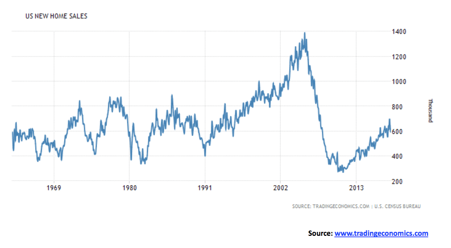
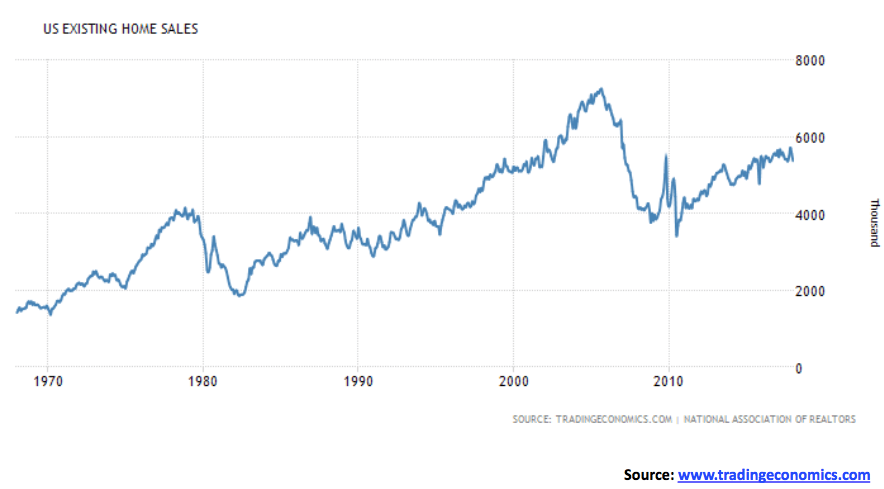
US home sales
© David Chapman
© David Chapman
It seems rather pushy to say that the U.S. housing market has improved immensely. Yes, it has improved, but as these charts show, new home sales are barely back to where they were in the 1980s and 1990s, and existing home sales are about two-thirds of where they were at the peak in 2005. Both fell in December 2017. Existing home sales fell 4.8 percent in 2017, the largest annual drop since 2014. New home sales are faring even worse, currently just over 40 percent of where they were at the peak. The latest sales of single-family homes were down in January 7.8 percent from December. The great housing recovery? Seems the economy is still looking for it.
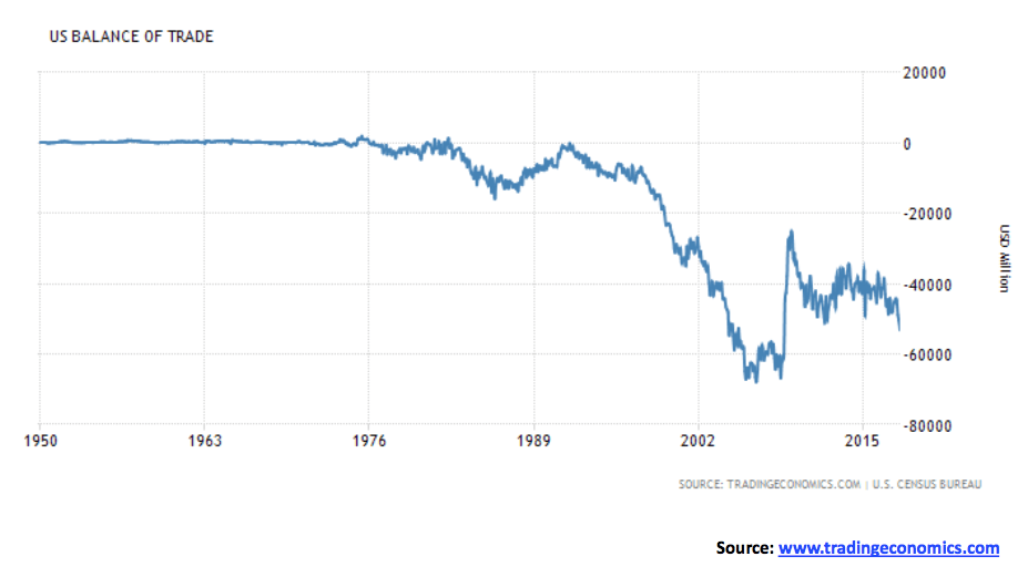
US balance of trade
© David Chapman
Okay, maybe Trump is on to something. The U.S. trade deficit widened in December to $53.1 billion — that’s above the expected $52 billion and the downwardly revised November trade deficit of $50.4 billion. Seems the trade deficit is going the opposite direction President Trump wants it to. Americans, it seems, purchased more consumer goods including cell phones, cars, and pharmaceuticals. Yes, exports rose in December as well but imports rose faster. Americans cannot get enough of their gadgets that for the most part come from other countries.
Judging from the slope of the chart the odds favor the trade deficit to widen more. But initiating trade wars is not the answer to reining in the trade deficit. For the U.S., it was always a quid pro quo as the U.S. purchased goods from the rest of the world and the rest of the world financed their deficit by purchasing their Treasuries. In trade wars, the Treasuries may suddenly come back to them. And then how will they pay for them?
© David Chapman
© David Chapman
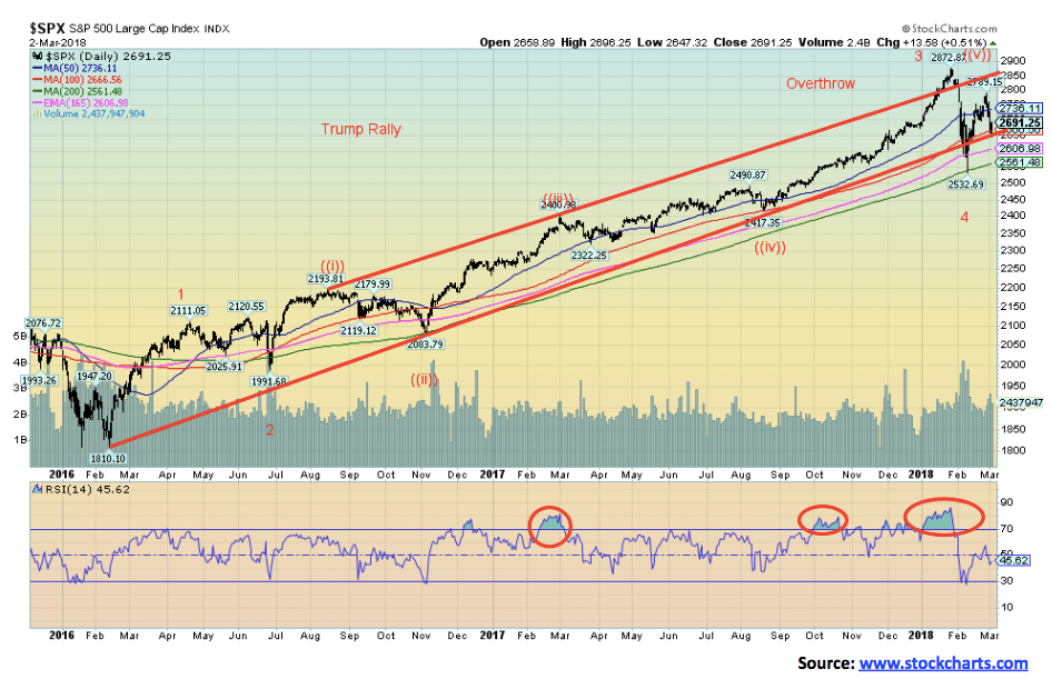
For every action, there is usually an equal but opposite reaction. For months, the Trump rally traced out a very distinct bull channel. Then in January 2018, the rally leaped over the channel, seemingly headed into new territory. It would have been unusual that following months of a bull channel, it would suddenly leap up again. Could the market then be moving into a “blow-off” phase? Or is this just an overthrow? Well, now it is appearing as an overthrow. To balance the overthrow, the market reversed suddenly and viciously (thanks to rising interest rates and strong statements from the new Fed Chairman) and the market plunged below the previous bull channel line. Was this a classic underthrow to balance off the overthrow?
By the time the dust cleared, the S&P 500 had lost about 12 percent from the January all-time high of 2,872.87. The S&P 500, along with other stock markets tested down to the 200-day MA. The classic bounce-back rebound took the S&P 500 back up to just over the 50-day MA, but Trump’s recent pronouncements about trade have caused the stock markets to shed gains quickly.
The S&P 500 wound up down 2 percent on the week. The Dow Jones Industrials (DJI) suffered even more, losing 3.1 percent. So far, the S&P 500 is holding up on the year, but the DJI is now down on the year. Other markets also suffered as the Dow Jones Transportations (DJT) lost 2.3 percent this past week and is now down 2.6 percent on the year. The NASDAQ fared well, losing only 1.1 percent and still has a 5.1 percent gain on the year. The small-cap Russell 2000 lost just over 1 percent this past week and is down only a small 0.2 percent in 2018. The fact that the small-cap index is faring so well could bode well going forward.
Elsewhere in the world, other markets also fell. The London FTSE lost 2.4 percent and is down 6.9 percent in 2018. The Paris CAC 40 dropped 3.4 percent and is off 3.3 percent in 2018. The Frankfurt DAX dropped a sharp 4.6 percent and is now down 7.8 percent this year while the Japanese Nikkei Dow (TKN) fell 3.3 percent and is off 7.0 percent in 2018. China was not spared either, as the Shanghai Stock Exchange (SSEC) fell 1.1 percent and is off 1.6 percent so far this year. Canada wasn’t spared either, as the S&P TSX dropped 1.6 percent and is now down 5.1 percent in 2018 while the small-cap TSX Venture Exchange (CDNX) was actually flat this past week but remains down 2.9 percent in 2018. Finally, the global index the MSCI World Index fell about 3.0 percent and is now down 2.7 percent this year. Markets everywhere are responding negatively to rising interest rates, the end of QE, and the threat of trade wars (and maybe even real wars).
The recent low for the S&P 500 at 2,532 now becomes important. As long as the market can hold above that level, then odds favor a rebound. We continue to believe that this is a fourth wave up from the key February 2016 low at 1,810. Elliott Wave International count is different, and they believe we have completed five wave ups and have made an extremely important and possible final top. Deferring to them, they could be right. We are holding out some hope that there remains one more wave to new highs before the market makes what should be the final top before the onset of at least a two-year bear market.
Below 2,532, the key level for the S&P 500 is at 2,417, the August 2017 low. As well, there is the March 2017 low at 2,322. If those levels were to break, we would be in a bear market. To the upside, the S&P 500 topped recently at 2,789, so it will be a key going forward to take out that level. Above 2,800, the odds increase that new highs would be seen. Numerous indicators are fairly neutral right now so the markets could go either way. Friday’s action started out weak, but as the day progressed, the markets rebounded and closed generally higher on the day. Follow-through in this coming week would be important if the more bullish case is to take hold. Failure and breakdown under 2,600 would suggest that new lows are a possibility.
© David Chapman
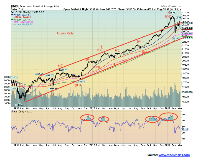
Here is the DJI with the wave count of Elliott Wave International applied. If you compare the two charts, you will see where the differences lie. Elliott Wave concludes that we have reached the zenith and the market has topped.
The two waves down from the top would be minor waves 1 and 2 of what should be ultimately a 5-wave decline. The DJI held above its 200-day MA and did not underthrow, as did the S&P 500. The 200-day MA is currently just above 23,000.
Previously, we had viewed a breakdown under 23,250 as being negative for the markets. The DJI held that level. The DJI is currently testing the 100-day MA. Like the S&P 500, the DJI rebounded on Friday after being substantially lower earlier in the day. Follow-through to the upside this coming week is important if a more bullish case is to develop. Volume was high on the breakdown and predictably is lower on the current rebound. Volume was also lower this past week despite the general sell-off. Indicators are generally somewhat neutral even as short-term trends have turned down.
© David Chapman
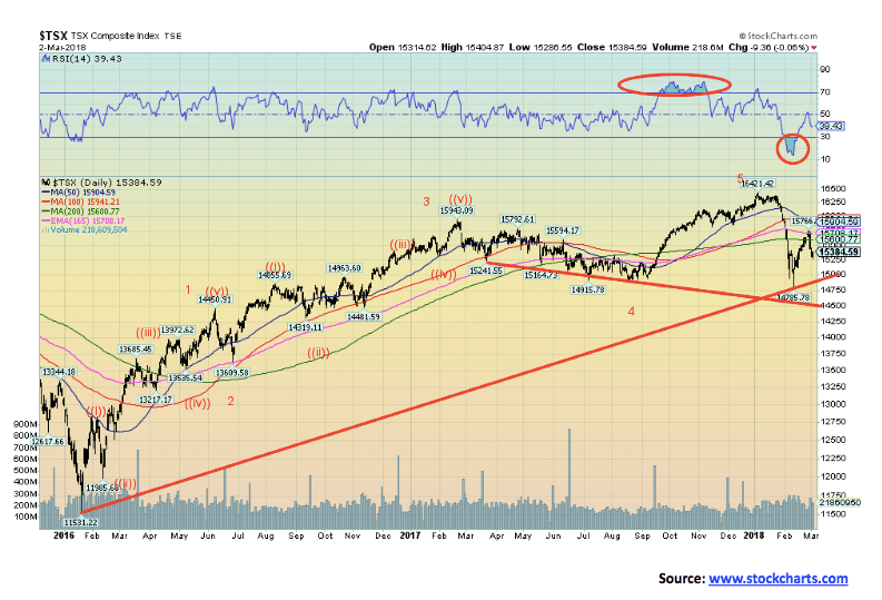
The S&P TSX appears much weaker than its U.S. counterparts do. The S&P TSX may have completed five waves to a very important top. We note that the sell-off busted through the 200-day MA and took out the low of what we labeled as wave 4. The subsequent rebound took the S&P TSX back to about the 165-day exponential MA before failing and dropping back below the 200-day MA. Another negative development.
Volumes were not particularly robust up or down. The TSX, however, is dominated by energy, metals and financials, so it is necessary to look at individual sectors. Sectors that are looking toppy or potentially negative are income trusts, consumer staples, real estate, telecommunications, and utilities. Financials look mixed here. Information technology just made new highs. Health care could be in the process of a rebound. Appearing potentially more bullish are golds, metals, materials, and energy. Also looking potentially higher are industrials and consumer discretionary. It remains to be seen just how the TSX performs here. Certainly, the chart looks negative, but if it can regain back above 15,900, then higher levels are possible.
© David Chapman
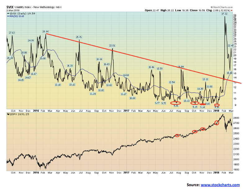
It is no surprise that volatility leaped during the recent selloff. The volatility index (VIX) jumped to its highest levels in two years. This followed months of the S&P 500 moving higher and the VIX making a series of record lows. We consistently warned that low volatility is usually followed by high volatility, sparking a market selloff that would be vicious and swift. It didn’t disappoint. That said, the VIX is currently at levels well above the lows seen from July through December 2017.
Even if the S&P 500 were to return and make new all-time highs it is highly unlikely the VIX will follow and make new lows. More likely is the VIX making considerably higher lows and a strong divergence with the price action of the S&P 500.
This is what is normally seen at important tops where the price index (S&P 500) makes new highs (or lows) and the VIX does not confirm by making new lows (or highs). The market has not yet made that divergence. That is another reason why we believe that we could see new highs before this market makes its final top. The caveat is new lows and a breakdown in particular under the 200-day MA and 2,400.
© David Chapman
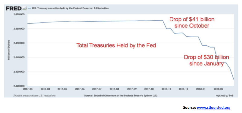
If one wonders why there has been upward pressure on U.S. Treasury bonds and notes culminating in a stock market selloff, one may need to look further than the Fed embarking on selling off its portfolio. This was noted months ago by the Fed. But now, it is happening. Since October 2017, Treasuries held by the Fed have fallen $41 billion and since the beginning of the year, they are down $30 billion. They are also selling off Mortgage-Backed Securities (MBS), but that process is a lot slower as they are only down about $5 billion since the beginning of the year. More likely is that MBS will mature and not be replaced. That is presuming, of course, that the MBS held are still worth something. Going forward, it is more likely the Fed will sell off U.S. Treasuries as opposed to MBS.
© David Chapman
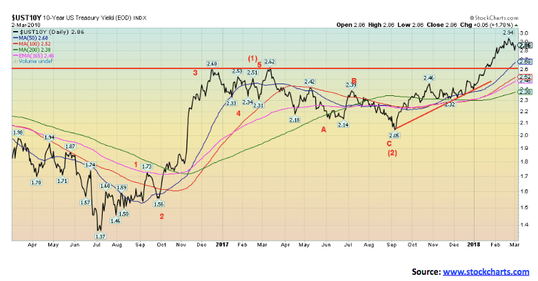
Have interest rates topped? We are not sure yet. Our original target for the U.S. 10-year Treasury note was a yield of 3.19 percent. At a high of 2.94 percent, the notes are short of the target. Still, the drop while important has not as yet breeched anything to suggest a top is in place. There is considerable support down to 2.68 percent the 50-day MA and levels down to 2.60 percent. Below 2.60 percent, a top would be confirmed. But that is a long way off right now. Major support can be seen down to 2.30 percent. Odds continue to support higher yields going forward. The 3.19 percent yield target remains valid. Support may be materializing down to 2.80 percent.
© David Chapman
Recession Watch Spread
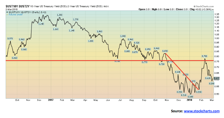
After leaping as high of 0.78 percent and testing the breakdown line that formed over the past few years near 0.75 percent the 2-year 10-year spread has begun to narrow once again. The spread is now back to 0.61 percent but still above the low of 0.50 percent seen in early January. We continue to monitor this spread for potential signs of an impending recession.
Before both the 2001–2002 and the 2007–2009 recessions, the 2-10 spread had turned negative. Negative spreads or an inverse yield curve are not unusual before a recessionary period as the yield curve flattens and goes negative. Currently at 0.61 percent, the spread is well above levels normally associated with recessions. A breakdown under the previous low at 0.50 percent could set in motion another rapid decline in the spread toward negative spreads. Targets would be at least down to 0.22 percent.
© David Chapman
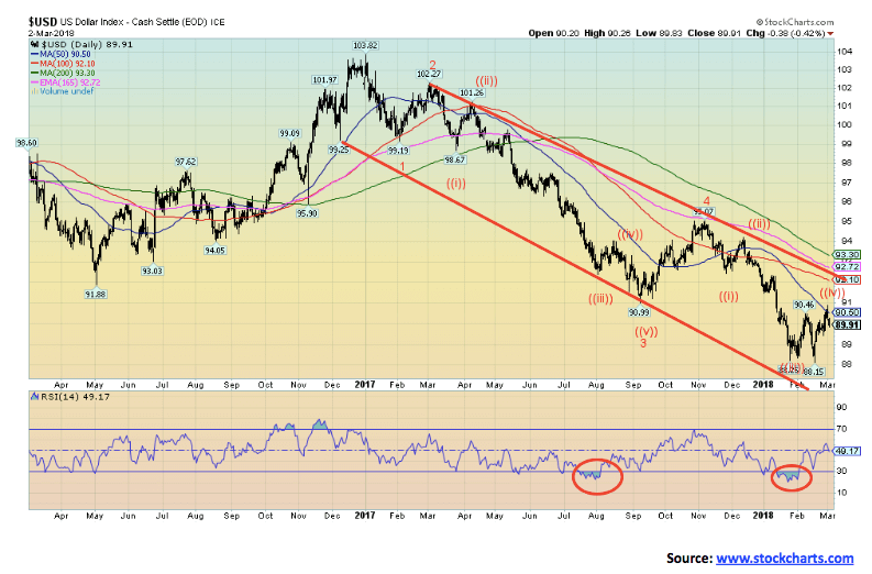
The reaction of the US$ to Trump’s announcement of tariffs to be placed on steel and aluminum was immediate on Mar. 1, 2018. After hitting a high of 90.89 the US$ Index reversed and closed 61 bp lower at 90.28. Follow-through on Mar. 2 took the index down another 38 bp. Curiously, the US$ Index hit the 50-day MA at 90.50 but failed to break through closing lower.
This demonstrates once again that one needs to pay attention to these key MAs. There is a bit of tussle going on as to whether the US$ Index has indeed topped out or after a short pullback, it regroups and starts another upward climb. After hitting a low of 88.15 on Feb. 15, the index had been climbing on the back of the potential for higher interest rates in the U.S. and the continuing decent economic numbers emanating from the U.S.
Statements from the Fed that the U.S. economy is doing fine helped. Other issues were largely pushed into the background. But the potential for trade wars where nobody wins is unnerving for the US$. Added to that is nervousness that trade wars could also lead to foreign buyers not buying U.S. Treasuries any longer and even dumping them.
As of December 2017, foreigners are holding some $6.3 trillion of U.S. Treasury securities, of which China has the largest holdings of $1.18 trillion. Despite fears of Chinese dumping or not buying any longer, that number is actually higher than the $1.06 trillion held a year earlier. So, US$ up, or down?
A break under 89.40 would most likely suggest that the dominant trend (down) would remain. Our original target for the US$ Index of about 86.80 has still not been hit. Trump’s trade wars are not going to be positive for the US$. Nor is the widening investigation by Mueller and his team that continues to encircle the Trump presidency. Trump’s continued attacks on Attorney General Jeff Sessions, attacks that could be a setup for a Nixonian “Saturday Night Massacre” would not sit well with either the US$ or stock markets. But it remains a real risk. On the other hand, it would be positive for gold. New highs above 90.89 would be positive, but we now doubt that is going to happen.
© David Chapman
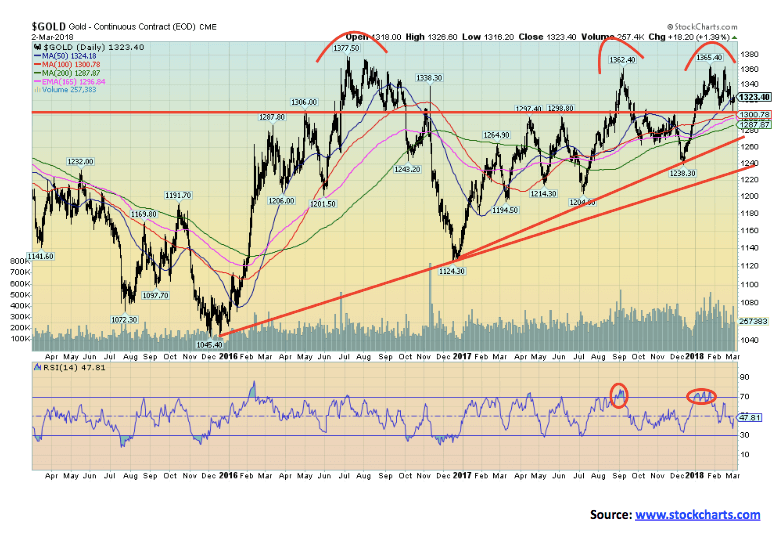
Gold and the precious metals continue to baffle and bewilder. Almost everyone agrees prices should be higher given fundamentals and the deteriorating global political situation. But fear of higher interest rates and continued strength for the U.S. economy have kept a lid on things. Interesting divergences are emerging, however, that could prove to be positive going forward. Gold made new highs in January 2018. Silver did not. Nor did the gold stocks as measured by the Gold Bugs Index (HUI) and the TSX Gold Index (TGD). Then this past week before the Trump tariff announcements gold made slight new lows below its early February 2018 low. Silver just missed making new lows while the gold stocks (HUI, TGD) also made interesting divergences. Both the HUI and the TGD took out their December 2017 low. Then this past week the HUI made new lows but the TGD did not. As a technical analyst, we view divergences between comparable markets as interesting. If the market is truly to the downside than all should be making new lows. They are not. Both gold and silver remain well above their December 2017 low even as the stocks did make new lows.
This last phenomenon is interesting as in early 2016, we saw the HUI plunge to new lows below the December 2015 low but gold, silver, and the TGD did not. What followed was the best rally in years for gold, silver, and the gold stocks. The stocks, in particular, were on fire as the HUI gained 188 percent in July 2016 and the TGD was up 131 percent. Interestingly, since then the HUI and the TGD remain well below those July 2016 highs as does silver; gold has challenged its July 2016 high of $1,377 but has failed thus far to take it out. All this action also reminds us somewhat of what took place in 2012/2013. Gold had plunged from its highs of $1,923 in September 2011 and on three occasions, it plunged to around $1,525. Gold kept trying to recover, even making slight new highs on a few occasions. But silver and the gold stocks were not cooperating. Silver made lower highs on each of its bounce-backs from the $26 zone. The HUI and the TGD were tracing out lower highs and lower lows. The result was when gold broke down under $1,525 in April 2013 the verdict was swift and devastating. If something similar were to take place now, only the opposite, gold could explode upwards once it firmly busts through $1,375. That could be a play on the old adage that for every action there is an equal but opposite reaction.
There is a void on the gold charts, roughly between $1,400 and $1,525. On the way down in 2013 and in the years that followed, very little trading took place in that range. Since then the range has been largely between $1,150 and $1,350 with outside forays down to $1,050 and up to $1,375. All that suggests that once gold breaks that range, and odds favor to the upside, the move could be explosive. Currently, we want to see gold hold $1,290/$1,300, but it needs to take out $1,350 to the upside. Trump’s tariffs were very helpful as the US$ sunk and gold reversed its downtrend and moved higher. So did silver and the gold stocks, both of which need to become leaders if we are to move higher.
© David Chapman
A positive divergence that has been encouraging is that gold expressed in Cdn$ has been outperforming gold in US$. Gold in Cdn$ made its low back in June 2013. Since then, gold in Cdn$ is up 37 percent vs. a gain of about 27 percent for gold in US$.
Yes, it has been a reflection of the weaker Cdn$ vs. the US$, but one of the characteristics of gold is that it maintains purchasing power even as the currency weakens. Gold is an alternative currency that cannot go to zero, unlike stocks, bonds, and even currencies (many who have just become defunct). Gold in Cdn$ is only about 11 percent off its high of September 2011. Gold in US$ is still down 31 percent from its comparable high. Gold is a hedge against inflation, deflation, currency devaluation, and government. Yet, it remains grossly under-owned compared to other assets.
© David Chapman
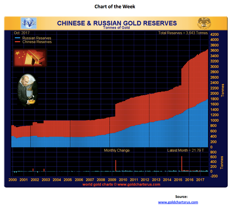
Speaking of gold being underowned, that is not the case with the Chinese and the Russians. In the latest month, it is estimated, according to the World Gold Council, that China and Russia added another 21.79 tons of gold to their reserves. China, at least according to official figures, added 0.01 tons. The Russians added the rest and its gold reserve holdings, at least officially, are now somewhat equivalent to China.
China and Russia now hold the sixth and seventh largest gold reserves in the world, behind the U.S., Germany, the IMF, Italy, and France. While gold reserves make up roughly 65 percent to 75 percent of the U.S.’s, Germany’s, Italy’s, and France’s total reserves, gold constitutes only 2.4 percent of China’s reserves and 17.7 percent of Russia’s. Their aim is to achieve gold reserves on the same basis as the four western countries.
That implies a lot of gold buying and how to do it without pushing up the price. Both are purchasing gold to shore up and back their currencies, the Yuan and the Ruble. China sees itself as eventually having the Yuan become a global reserve currency alongside the US$. Naturally, that is not good for the US$ nor for the U.S — hence, the tension between China and the U.S.
Interestingly, 100 years ago or so, the global reserve currency was the British Pound Sterling, and the economic challenger was the German Deutsche Mark as Germany and the Deutsche Mark were threatening to supplant the Pound and Britain as the global economic powerhouse. Well, we know what happened there.
© David Chapman
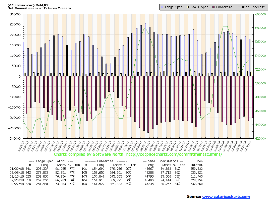
The commercial COT for gold improved this past week to 31 percent from 30 percent as short open interest fell roughly 8,000 contracts while long open interest rose about 7,000 contracts. This is not the levels we saw in December 2017 before the latest rally for gold got underway, but it is encouraging. We’d prefer to see it closer to 40 percent to 45 percent as it has in other periods before strong rallies took place. But the direction is positive. The large speculators COT (hedge funds, managed futures, etc.) fell to 77 percent from 80 percent as they cut their long positions and added to shorts. But all this occurred before Trump’s tariff announcements. So next week’s COT should be interesting.
© David Chapman
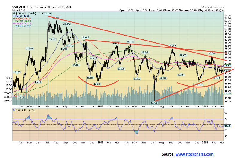
Silver has been a gross underperformer, but as we noted under gold, this past week saw gold make slight new lows below its early February low while silver did not, just missing it with a low of $16.16 vs. $16.13 earlier. Overall as well, silver held its potential $16.25 breakdown zone closing at $16.47 following the Trump tariff announcements.
If gold has been frustrating, silver has been even more so. There is a case for silver to break down and a case for silver to bust to the upside. We are optimistic that the breakout should be to the upside. There is considerable resistance up to about $17, but above that level, the key levels are at $17.25 and $18. A break above $18 could project silver up to about $22.75. That would take out the July 2016 high of $21.23. Silver remains down roughly 67 percent from its high of September 2011. It is grossly undervalued considering supply/demand.

© David Chapman
The silver commercial COT is the most encouraging we have seen in some time. This past week, the silver commercial COT rose to 46 percent from 45 percent as short open interest fell roughly 9,000 contracts, and while long open interest also fell roughly 4,000 contracts, the net effect was positive.
Interestingly, the large speculators COT fell to 49 percent from 52 percent, and for the first time that we can recall, short open interest actually exceeds long open interest. The commercial COT for silver is now in a better position than it was last July 2017 before a $4 rally took place or a gain of about 27 percent. Our expectations here are that silver could be poised to break out and make a significant move to the upside.
© David Chapman
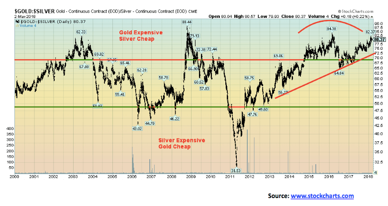
Silver remains frustratingly cheap compared to gold. While many silver bugs go on and on about a 16:1 relationship between silver and gold in nature the reality is quite different. The ratio has ranged from 31.5 to 88.4 since 2000. Most of the trading has taken place between 47.5 and 67.5. But for the past few years, the ratio has remained stuck above 70. The current ratio is 80.37, and we have rarely seen it remain so high for so long. Silver is cheap when compared to gold. If a strong rally gets underway for the precious metals, the expectation is that silver should outperform gold. To get to a ratio of 47.5, silver would need to be trading near $28 vs. the current about $16.50 assuming gold remains as is at $1,323.
© David Chapman
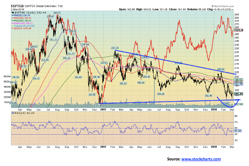
If silver is frustrating, the gold stocks are even more frustrating. As one pundit noted they are acting more like stocks than the underlying commodity. Both the HUI and the TGD plunged to new lows earlier in February even below the December 2017 low and not far off the December 2016 low.
This past week, the HUI plunged to new lows but the TGD did not — a divergence. Both reversed sharply following the Trump tariff announcement. Our chart has overlaid gold. As one can see, gold is nowhere near its December 2017 low, but the gold stocks weren’t paying attention and made new lows. Another divergence.
As we noted earlier under gold, we saw this phenomenon back in early 2016 as well. What followed was a very strong rally for gold, silver, and the precious metals with the gold stocks in particular enjoying a very strong move. The TGD gained roughly 131 percent from March until July 2016. Neither the TGD nor the HUI have been anywhere near those levels since. Gold stocks remain exceptionally cheap when compared to gold.
© David Chapman
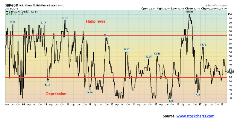
We have divided the Gold Miners Bullish Percentage Index into three spheres — happiness, just right (not labelled), and depression. Right now, we are closer to depression than we are to happiness. One wants to buy when the index reads depression and sell when it reads happiness. The last time we had happiness was in July 2016 when the TGD made a move of 131 percent from March to July and the HUI gained 188 percent in the same time frame. Holders of gold stocks could use a little happiness right now.
—
DISCLAIMER
David Chapman is not a registered advisory service and is not an exempt market dealer (EMD). We do not and cannot give individualised market advice. The information in this newsletter is intended only for informational and educational purposes. It should not be considered a solicitation of an offer or sale of any security. The reader assumes all risk when trading in securities and David Chapman advises consulting a licensed professional financial advisor before proceeding with any trade or idea presented in this newsletter. We share our ideas and opinions for informational and educational purposes only and expect the reader to perform due diligence before considering a position in any security. That includes consulting with your own licensed professional financial advisor.


Gilead HSV Plan Could Transform Market Outlook
Gilead’s upcoming development plan for Assembly Biosciences’ HSV drugs could reshape the herpes market. ABI-5366 and ABI-1179 have shown strong...


Talentir Secures €4M to Transform Global Payouts
Talentir, an Austrian-Swiss fintech, raised €4 million led by Redstone to scale its AI-powered payout platform. Using stablecoin infrastructure, it...


Coastal Cities Lead as Heat Strains Italy’s Urban Livability
Italy’s 2026 Climate Livability Index shows coastal cities, led by Ancona, outperform inland areas as global warming intensifies. Adriatic locations...


Bank of Africa Expands Sino-African Trade Partnerships in Beijing
Bank of Africa strengthened Sino-African ties by signing partnerships in Beijing with CIEC Group and CCCME to boost trade, investment,...


Commodity Markets Pause as Oil Falls, Metals Correct, and Grains Show Mixed Signals
Commodity markets in Africa saw mixed movements during June 15-19, 2026, with oil declining sharply, precious metals correcting, and grains...
 |
|
 |  |
 |
|
-

 Crypto7 days ago
Crypto Market Stays Stable as Bitcoin and Ethereum See Mild Declines
-
 Crowdfunding2 weeks ago
Sustainable Restoration of the Haus Hövener Garden in Brilon
-

 Fintech3 days ago
Mollie Expands Across EEA With €350M Investment to Strengthen European Payments Network
-

 Cannabis1 week ago
Europe’s Cannabis Shift: Rising Use, and New Risks
You must be logged in to post a comment Login