Business
Google Calendar gets a new look and more features
Google Calendar has new features in order to address the feedbacks from its users.

Google rolled out on Tuesday a new look of the web version of Google Calendar.
Google Calendar on the web now has a sleek design and has features also offered on the mobile app.
In a blog post, Lars Krüger, Product Manager of Google Calendar, said the updates aim to “help users manage their time more efficiently and get more done.”
Responsive layout
“We’re taking a lot of what you know and love from Calendar’s mobile application, like the modern color palette and sleek design, and bringing it to the web with a responsive layout that auto-adjusts to your screen size.”
“We’ve also added more features for enterprises to help teams schedule and prepare for meetings,” Krüger also said.
New features
Krüger acknowledged the feedback given by Google Calendar or G Cal users on how to enhance the Calendar to suit their needs and thus came out with the updates.
In the new G Cal, users can:
1. See conference room details when booking a room. G Suite administrators can enter a conference room’s details so employees would know its location, size and if it has audio-visual equipment and accessible to wheelchairs. G Cal users can hover over the name of the conference room, and a pop-up window will show the room’s location and amenities.
2. Add rich formatting and hyperlinks to Calendar Invite. Links to relevant files in the Calendar Invite can be opened directly from the “Event Detail” view. The new feature can help the user create more detailed agendas and ensure that all materials are in one place before a meeting.
3. Manage multiple calendars. Users can view and manage calendars in separate columns, making it easier for those who manage multiple calendars (administrative assistants, for example), to schedule meetings. A user will just click “Day” view and select the calendars to compare.

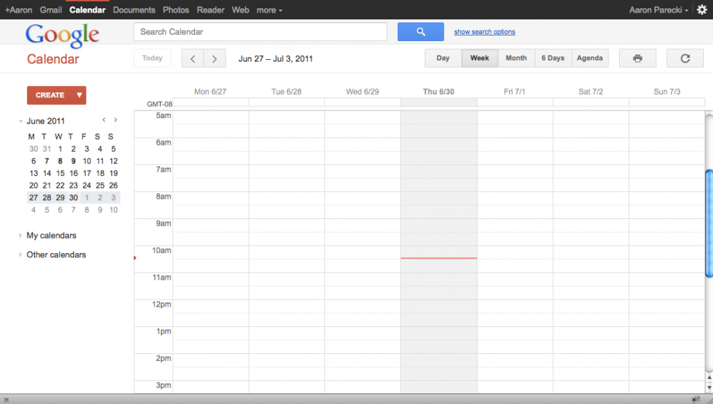
Google Calendar just underwent a sleek makeover and also got new features to go along with the redesign. (Photo by Aaron Parecki via Flickr. CC BY 2.0)
Other new features in the improved G Cal are:
- Contact info of meeting participants can be seen by hovering over their name in a Calendar invite;
- View and restore deleted items in one place in case a user accidentally deletes a meeting;
- “Day,” “Week,” and “Month” views are more accessible and feature better compatibility with screen readers.
Details about the changes can be viewed here.
Those who use the Calendar for personal use just have to click “Use new Calendar” in the upper righthand corner of the main Calendar view.
Mashable described G Cal’s new look as “fine.”
“We’re finally breaking free of bland, basic web design—so now you might be excited to sift through all of your Calendar invites on your desktop,” Mashable said.
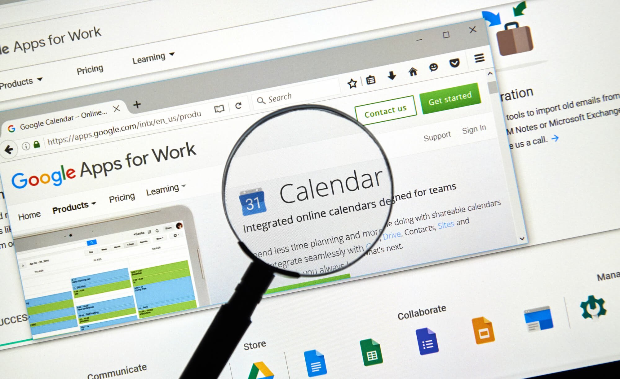
(Featured image via Deposit Photos)
—
DISCLAIMER: This article expresses my own ideas and opinions. Any information I have shared are from sources that I believe to be reliable and accurate. I did not receive any financial compensation in writing this post, nor do I own any shares in any company I’ve mentioned. I encourage any reader to do their own diligent research first before making any investment decisions.

-

 Impact Investing1 week ago
ITAS Mutua Reports Strong 2025 Growth and Sustainability Progress
-

 Markets5 days ago
Cocoa Markets Steady as Weak Demand and Rising Supply Signal Potential Surplus
-

 Crowdfunding2 weeks ago
ProQuote Launches Crowdfunding to Continue Media Gender Census
-

 Impact Investing2 days ago
H&M Advances Sustainability and Cuts Emissions by 2025


You must be logged in to post a comment Login