Featured
Has the stock market topped?
The stock market opens the early quarter of the year with minimal gains. Gold and silver remain bullish, thanks to the policies set out by lawmakers.

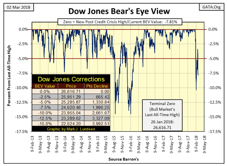
I was going to take another week off, but then the stock market this week seemed worthwhile to comment on. For one thing, the current correction is obviously different from the others seen in the Dow Jones’ BEV chart below. From a BEV Zero to a 10 percent decline in only nine trading days. A 10 percent move in a BEV plot is nothing big, but seeing one take place in only nine days is worthy of note. Then the bulls take the BEV plot back to -3.41 percent just 11 days later, when Mr. Bear takes the plot back down to -7.81 percent at the close of today.
An exciting 25 days to be sure; 25 days that can be studied in detail in the Dow Jones step-sum table below. All in all, I get the feeling the stock market’s action is being accelerated; that we’re entering a period of market history where big things can happen in a short period of time, and that’s never bullish.
Next is a chart plotting the Dow Jones with the NYSE 52Wk Highs – Lows step sum plot (Red Plot). For every day the NYSE sees more 52Wk Highs than Lows, it’s a +1; more 52Wk Lows than Highs and it’s a -1. The step sum, being a single item advance decline line, merely adds the (+/-) 1s, and that explains the red plot below. And what does the NYSE 52Wk H-L step sum tell us? Those times when 52Wk highs dominate the NYSE, the step sum advances taking the Dow Jones (my proxy for the general stock market) with it. When it declines, 52Wk Lows (and Mr Bear) dominates the NYSE.
Since March 2016, 52Wk highs have dominated the NYSE, as seen in the rising step sum. But beginning on Jan. 30 (23 days ago), only seven NYSE trading sessions have seen more 52Wk Highs than Lows, something not seen in the past two years. However, up to the end of this week, this new development in 52Wk Lows dominating the NYSE has yet to turn this step sum down in the chart below, and that is something I’m now watching very closely.
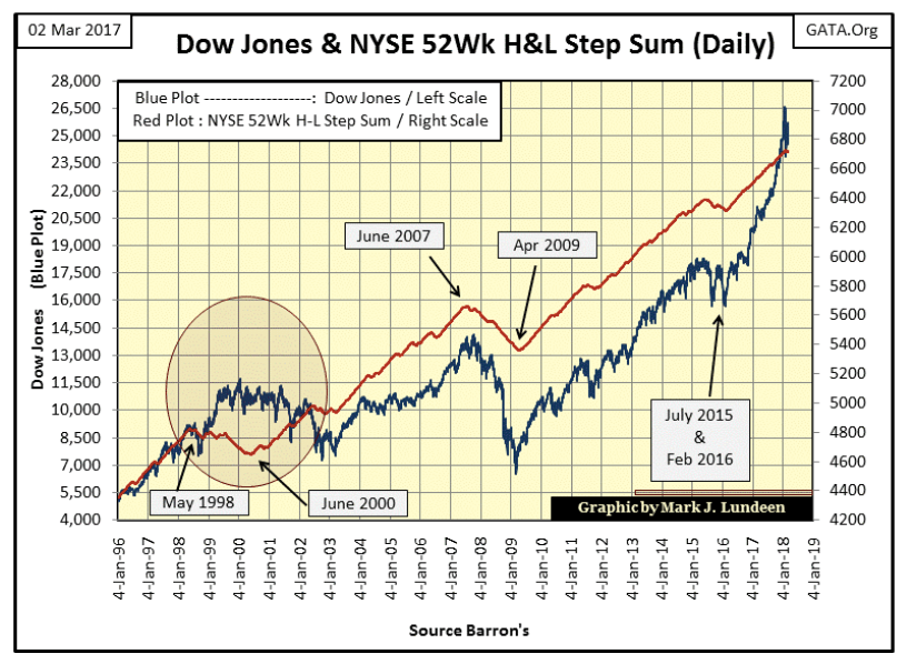
I can’t say this new development in NYSE 52Wk Highs and Lows portends a pending disaster in the market. But if one was looming ahead of us, it would begin exactly like this.
A more serious development in the market is how the Dow Jones Total Market Group’s (DJTMG) top 20 has topped and is now going down, ending the week at 50 groups within 20 percent of their last all-time highs.
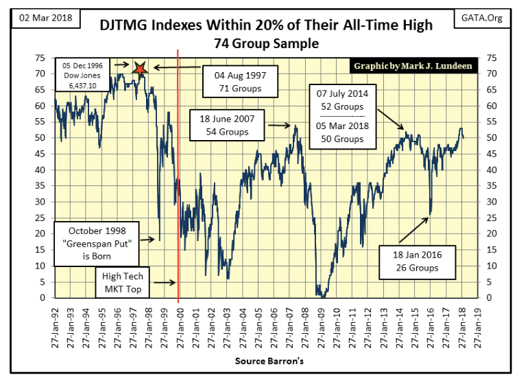
The frequency table below for the DJTMG tells the story better than I, or the above chart can. From October to the end of January, we see the double digits in the BEV Zero (new all-time highs) and the -0.001 percent columns. These are DJTMG groups at or just a whisker away from a new all-time high. Those groups in the -5 percent to the -15 percent columns were single digits.
But all that changed in Barron’s Feb. 20, 2018, issue and in the weeks that followed (Red Box).
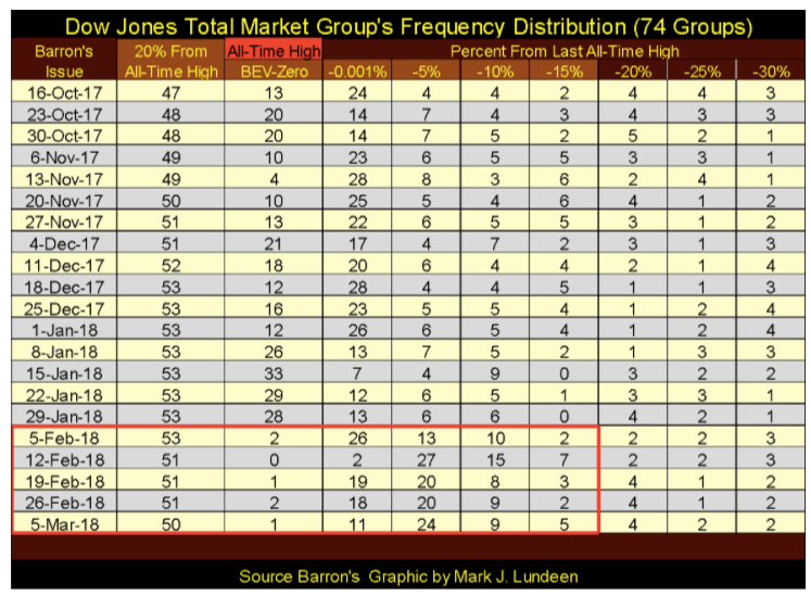
It takes buying to make a market go higher, but gravity alone can take a market down. What we’re looking at in the table above is the beginning of a buyer’s strike in the stock market. The big bulls in the stock market are, and have been central banks doing their “market stability” thing, and corporations with their share buyback programs, or maybe they were until Feb. 1. Looking at the table above, it’s as if someone turned a switch and something changed since the end of January.
Should this development continue, the shifting of the groups to lower levels in this frequency-distribution table, and resulting decline in the DJTMG’s top 20, it will be very bearish for the stock market.
Will these groups continue shifting toward the table’s right? I believe there’s a good chance they will, based on the fact that the Dow Jones is coming off a historic low in market volatility seen in the chart below. Beginning on Feb. 2, the Dow Jones once again began seeing days of extreme volatility, days where the Dow Jones moves +/-2 percent or more from a previous day’s closing price. In fact, for the five trading days from Feb. 2 to 8, the Dow Jones saw four days of extreme volatility, as well as three NYSE A-D 70 percent days; days of extreme market breadth. This was a bear market feeding frenzy not seen since the depressing 1930s.
However, in the following three weeks, the stock market has been free from both days of extreme volatility and market breadth. Has the danger passed? I don’t think so, and you can see the problem in the rise of the Dow Jones Volatility’s 200 Day Moving Average chart below. Volatility bottomed in November 2017, and has been rising since, and that’s not bullish.
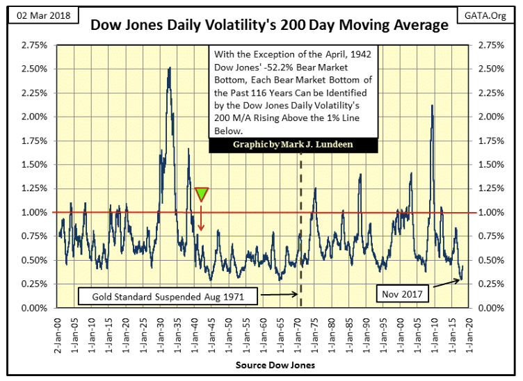
Below is the frequency distribution table for the 118 years of daily data seen above. I’ve divided the data into two groups, from Oct. 30, 1900, to Jul. 30, 1971, and from August 1971 (the suspension of dollar’s $35 gold peg) to Mar. 2, 2018.
The Great Depression is seen in the two top rows in the table to the left, with the top row’s fourteen days being a historic buying opportunity. These days of extreme market volatility were not at the actual bottom of the 1929-32 market crash (Jul. 8, 1932), but close enough for bragging rights that one was buying at the bottom of the Great Crash.
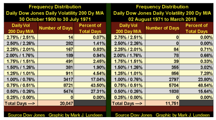
Moving to the right side of the table, the 84 days seen in its 2.25 percent / 2.01 percent row shows the bottom of the sub-prime mortgage market. But it’s in the public record how the sub-prime mortgage bear was an aborted bear market. A bear market the “policy makers” terminated before it came to full term.
Why is that an important point to keep in mind? Because in doing so the “policy makers” prevented Mr. Bear from liquating all the garbage assets Wall Street sold to the public as investments, as well as the garbage that was then (as is still now) pretending to be financial reserves in the banking, pension fund and insurance systems. In doing this, the “policy makers” prevented many, if not most of the large financial companies from going under, as did Bear Stearns and Lehman Brothers in 2008. But at best this was only a stay of execution for the criminal empire now lording over Wall Street.
I’m anticipating how in the coming bear market, the “policy makers” will not have the means to abort Mr. Bear’s task of stress testing the assets on everyone’s balance sheets, or prevent him from deflating decades of inflated valuations from financial assets as they successfully did in 2007-09. Think historic bear market for stocks, bonds and real estate, and the impact of such a bear market on the lives of billions of people. I wouldn’t be surprised if the daily volatility seen by the Dow Jones in the summer of 1932 wasn’t surpassed by a good measure at the bottom of the coming bear market.
Below is a frequency table for daily volatility (NOT the 200 day M/A seen above) for the Dow Jones. The left table spans daily closings from Nov. 1, 2016, to Nov. 30, 2017, the right table from Dec. 1, 2017, to the close of this week, Mar. 2.
In the left table, we see only one Dow Jones 2 percent day in the 2.50 percent row. The 2 percent row has two days in it, but these were daily moves ranging between 2 percent down to 1.51 percent, and neither day broke above the 1.999 percent threshold required to be a day of extreme volatility. The largest quantity of days is found in the 0.5 percent row: 216 (79.12 percent), and these are daily moves between 0.5 percent down to 0.01 percent, averaging for these 13 months only a 0.33 percent move in the Dow Jones from a previous day’s closing price. That’s very low market volatility, as we would expect during a major market advance.
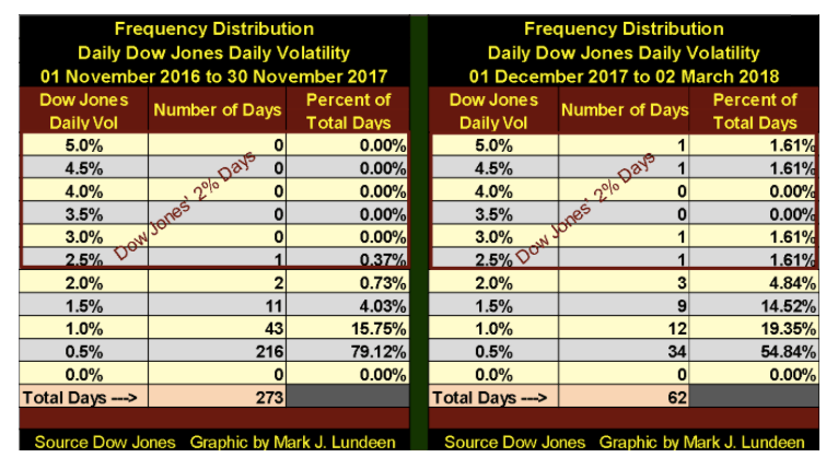
However, since Dec. 1, daily volatility for the Dow Jones has increased significantly, as seen in the table to the right. Looking at its 0.5 percent row, only 55 percent of the Dow Jones’ daily closings since Dec. 1, has seen daily volatility of 0.5 percent or less, and daily volatility of greater than 1.00 percent (the 1.5 percent and greater rows) has increased noticeably. In fact, the daily average since Dec. 1 has been 0.74 percent, and this increase in daily volatility in the Dow Jones has not been a positive factor in the market.
Next is a chart for the actual daily volatility data for the Dow Jones for the two frequency tables seen above. As I noted earlier, it’s as if after January someone turned a switch. If daily volatility for the Dow Jones continues increasing, it’s a very bearish development for the stock market.
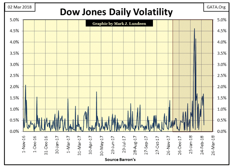
What should we make of this? I like to see this as the bulls are finally beginning to feel Mr. Bear’s hot breath on the backs of their necks. Rising volatility is yet another reason not to fall in love with the stock market in 2018.
Here’s gold’s step sum chart. Everybody is down on gold, except me and other forward-thinking individuals, because the chart below is actually constructive for future higher prices for gold, silver and the mining shares. What would it take for me to change my opinion? Something I don’t believe is going to happen: much lower prices!
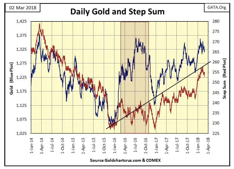
However, I don’t think that is going to happen. The “policy makers” had their way with the price of gold from August 2011 to December 2015, including a 30-month bear box (August 2011 to March 2014) that broke the back of bullish sentiment in the gold market by the time gold bottomed in December 2015. I believe what we are seeing in the chart above, is gold’s “climbing a wall of worry,” which is exactly what happens early in every major bull market before the public is attracted by an asset’s rising valuations.
That’s not saying the “policy makers” no longer have influence in the precious metals market — they do, as seen in the Silver to Gold Ratio (SGR) below. The SGR closed the week at 80.21, a very high number.
Seeing 80 ounces of silver going for the same price as a single ounce of gold is as ridiculous as seeing the current U.S. Treasury’s 30-year bond yielding only 3.13 percent at the close of this week. And both conditions, a SGR of over 80 and the 30-year T-bond yielding a preposterous 3.13 percent, are the result of the implementation of “monetary policy,” the prohibition of true-price discovery by the official sector in the market place.
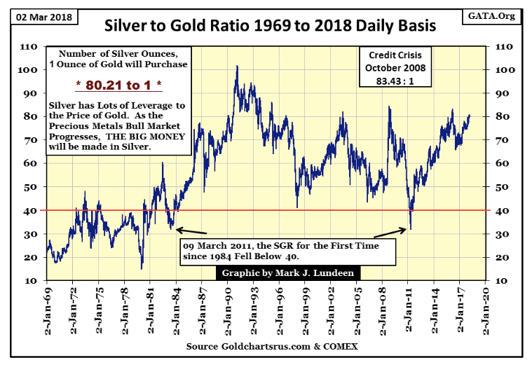
In the months and years to come, I’m expecting the SGR to plummet deep below 40 in the chart above as U.S. T-bond yields find themselves far above where they are now. The net effect of this will be much higher prices for gold, silver and share prices for the companies that mine these metals, as stock and bond valuations deflate far from where they are today.
Looking at the Dow Jones step sum chart and only one thing comes to my mind; I’m looking at an important and historical market top in the stock market. Only one thing will change my mind on that — the “policy makers” will have to “inject” sufficient “liquidity” into the financial system to re-inflate the stock market enough to drive the Dow Jones to a new all-time high. But will they? At some point, they have to decide whether they will, or come to the conclusion that they can’t continue inflating market valuations forever.
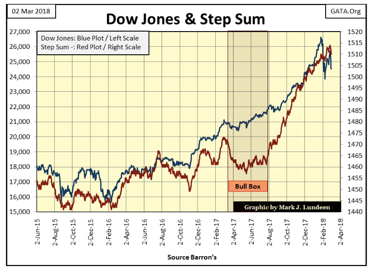
I’m going to believe (not know) that the “policy makers”’ hands have been played out and their perpetual bull-market gambit is over. That the last Dow Jones’ all-time high seen on Jan. 26 (26,616.71) is the last all-time high of a market advance that actually began on Aug. 12, 1982, with the Dow Jones at 776.92.
If I’m wrong, I want the “policy makers” to prove I’m wrong with a new Dow Jones all-time high. And even that won’t change my bearish opinion on the longer term prospects for the stock market. After thirty-six years of rising markets, how much more can the bulls squeeze from this very old and moldy turnip?
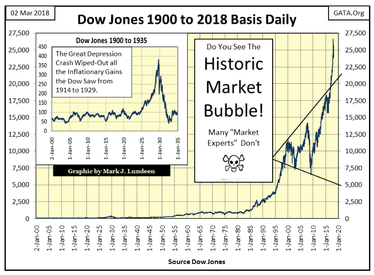
Look at this chart of the Dow Jones going back to January 1900 (below). Do you really believe the stock market in March 2018 offers much for further gains in the foreseeable future? Even if the “policy makers” are successful in re-inflating the Dow Jones to 30,000, that’s only a gain of 13 percent from its last all-time high. Offsetting that possibility is a pending bear market whose potential for the destruction of wealth may very well exceed those of the depressing 1930s. What we see below is one ugly chart for the stock market!
In good conscience I can’t recommend anybody to risk their hard earned money in the stock market, not while an alternative exists, for a historic bull market in gold and silver is now in the making.
Lastly are my step sum tables for gold and the Dow Jones. In the past 25 trading days, the price of gold is down 2.07 percent. Not bad considering its 15 count closed the week at a -1, more down days (8) than up (7) in the past 15 trading sessions.
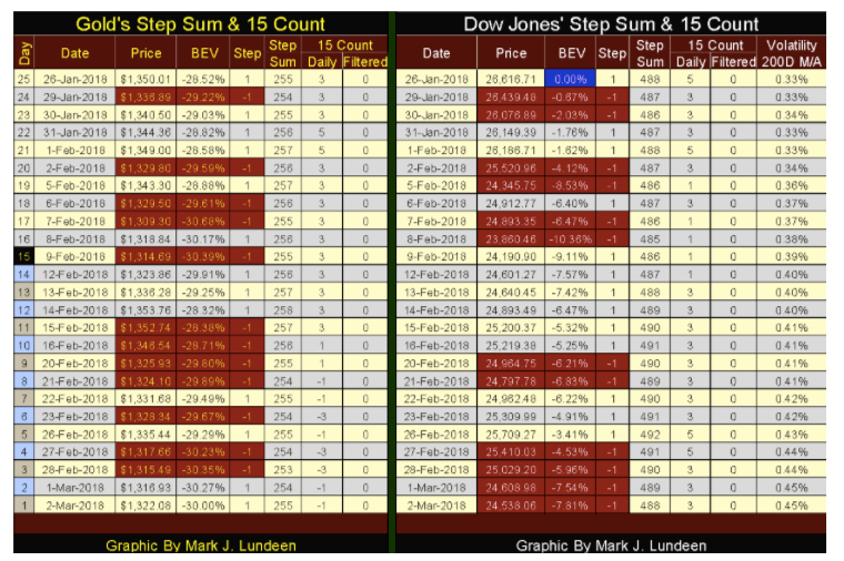
The Dow Jones’ 15 count ended the week at +3 (9 up days and 6 down), which as seen in its side of the table how since Feb. 9, the Dow Jones has seen more daily advances than declines. Yet for all that going for it, it still has lost 7.81 percent since Jan. 26.
We should also note how the step sums for both are unchanged since Jan. 26, indicating that neither gold or the Dow Jones are off and running to the up or down side. But that will come, just don’t ask me exactly when these markets make their next big moves. Like my readers, I’m just sitting on the sidelines watching and waiting for the next big trend in both these markets to develop.
—
DISCLAIMER: This article expresses my own ideas and opinions. Any information I have shared are from sources that I believe to be reliable and accurate. I did not receive any financial compensation in writing this post. I encourage any reader to do their own diligent research first before making any investment decisions.


The TopRanked.io Guide to 2026’s Biggest and Best Affiliate Opportunities
Want to earn affiliate commissions on literal billions of dollars worth of revenue? Then this week, we've got something special...


Eni Advances Energy Transition with Major Investment and Emissions Cuts
Eni showcased its “Just Transition” report in Rome, highlighting stakeholder collaboration and progress toward decarbonization goals. The company invested over...


The German Fintech Market Shows Resilience and Strong Investment Growth in 2026
Germany’s fintech sector remained resilient in 2026 despite economic crisis and rising insolvencies. Investments reached €14.2 billion, showing strong investor...


Cannabis Legalization in Germany: A Mixed Interim Assessment
Germany’s cannabis legalization has reduced criminal cases and eased pressure on the justice system, while the black market is slowly...


Sustainable Restoration of the Haus Hövener Garden in Brilon
The Brilon Construction Workers Association is restoring the Haus Hövener garden into a cultural community space, funded through a €10,000...
 |
|
 |  |
 |
|
-

 Crowdfunding2 weeks ago
Spain’s Crowdfunding Sector Surges as Real Estate and SME Financing Expand
-

 Cannabis3 days ago
Argentina Legalizes Cannabis Seed Sales Under New Regulatory Framework
-

 Fintech1 week ago
Zulu Powers Instant Corporate Payments Launch in Colombia
-

 Business5 days ago
Dow Jones Rally Faces Uncertainty Amid NASDAQ Reversal
You must be logged in to post a comment Login