Business
I’m calling it – Gold at new all-time highs before December
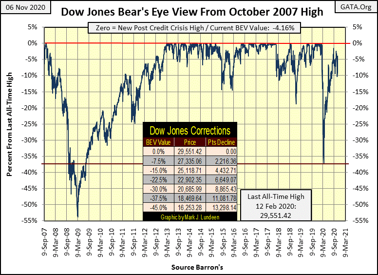
Last week in a stunning collapse, the Dow Jones closed below its BEV -10% line for the first time since day 118 in my chart (July 31st). I’m glad I took last week off! If not, I would have said something dumb like the next stop for the Dow Jones was below its BEV -15% line. Rather, we find the Dow Jones closing this week once again above its BEV -5% line, almost exactly where it was two weeks ago.

My last article was two weeks ago with the Dow Jones’ BEV closing the week at -4.11%. This week the Dow Jones closes with a BEV -4.16%. Boring stuff, until you realize that in-between these two Fridays the Dow Jones twice actually broke below its BEV -10% line. It doesn’t appear dramatic in the BEV chart below, but the Dow Jones dropped to the BEV -10% line in just five days last week, and recovered back above the BEV -5% line this week.
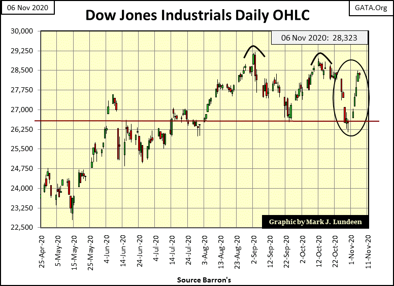
This dive, and recovery from the BEV -10% line is best seen in the Dow Jones daily bar chart below. Two weeks ago, right from Monday’s opening, Mr Bear made a move to take the Dow Jones below its BEV -10% line, then this week the FOMC fought to make things right for the bulls. I’ve been watching markets for decades, and I don’t believe the Dow Jones has ever seen a similar ten, ultimately self-canceling days at the NYSE.
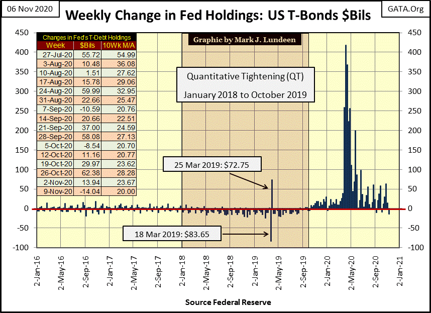
After the two weeks seen above, I thought we’d see something interesting happening with “monetary policy” at the FOMC. But as you can see in the table on the chart below, nothing outrageous happened for the weeks of November 2nd & 9th. What a change from last February / March, when the FOMC was “monetizing” as much as $400 bil in a single week, including “monetizing” junk bonds.
When we study “monetary policy” below (weekly increases and decreases, over and below the Red Line), it’s easy concluding something fundamentally bad has happened to force the termination of the much anticipated quantitative tightening (QT) back in October 2019. Fed Chairman Powell made a brave statement to reassure the market that his QE-4 was a not QE-4 in the quote below.
“I want to emphasize that growth of our balance sheet for reserve management purposes should in no way be confused with the large-scale asset purchase programs that we deployed after the financial crisis.” – Federal Reserve Chairman Powell. 08 October 2019
But looking at the change in “monetary policy” since October 2019, just a year ago, and the FOMC’s stunning reaction seen below in February & March 2020, and its repeated weekly “monetization” of plus $50 billion since, how long before things in the stock and bond markets become interesting again?
Little has changed in central banking over the decades. Robert M. Bleiberg below warned us of Fed Chairmen long ago.
“To serve as a central banker, as BARRON’S again reminded its readers early last year when G. William Miller took over at the Fed, one needn’t be a flim-flam man, but it helps.” – Robert M Bleiberg: Barron’s Managing Editor, 11 June 1979
Last week in a stunning collapse, the Dow Jones closed below its BEV -10% line for the first time since day 118 in the chart below (July 31st). I’m glad I took last week off! If not, I would have said something dumb like the next stop for the Dow Jones was below its BEV -15% line. Rather, we find the Dow Jones closing this week once again above its BEV -5% line, almost exactly where it was two weeks ago.
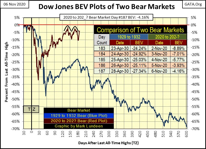
This is why I don’t day trade or make short-term market predictions; its tough getting it right when one wages agains the FOMC’s market “policies” such as higher precious metals and lower financial assets. Longer term, I’ve been right on the metals if not for stocks and bonds.
Here’s the major market indexes BEV values. No new all-time highs (BEV Zeros / 0.00%), but the first twelve indexes are in scoring position, or within 5% of making a new all-time high. In the past being in scoring position almost guaranteed an index would soon be making a new BEV Zero. I’m thinking of before February 2020 when the FOMC began “monetizing” $100 billion a week *plus* in response to a 37% market plunge in the Dow Jones.
But since August when the stock market recovered from its losses of last spring, seeing these indexes below in scoring position, potentially to make a new BEV Zeros may happen, but not as they did in years past. For instance look at the percentage advances from Monday to Tuesday this week, most of these indexes made huge one day advances, and then begain to slowly float up to their BEV Zero lines before they stalled.
Are we going to see a multitude of new BEV Zeros below next week? Maybe, but the way things have been since August, most likely not.
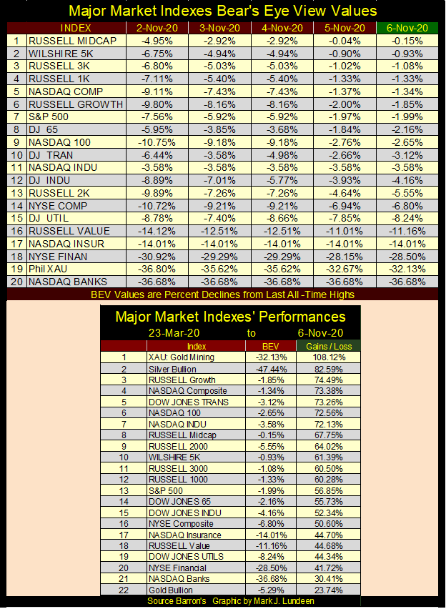
In the performance table above the gold miners remain at #1 and silver bullion at #2. So why is gold tail-end Charlie at #22. Why is gold underperforming silver?
It’s been awhile since I looked at daily volatility for the old monetary metals, so let’s do it.
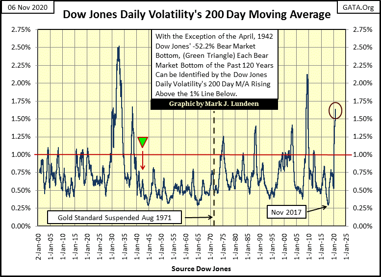
Daily volatility, or the daily percentage moves the old monetary metals see from their previous day’s closing price contains information on the market. In the stock market, rising daily volatility is almost exclusively a bear market phenomenon. Historically, when daily volatility for the Dow Jones’ 200 day moving average increases above 1% in the chart below, the stock market was approaching an important market bottom, and the higher the percentage advance the deeper was the bear market bottom. Or so it was until 2020.
Below we see the bottoms for the Great Depression; an 89% bear market decline resulted in daily volatility increasing above 2.5%. The next deepest bear market bottom was in March 2009, a 54% bear market decline resulted in a daily volatility increase of 2.1%. The current increase in daily volatility is the third largest in the past 120 years, following a market decline of only 37% – what?
2020’s rise in daily volatility is a historic anomaly; one I assign to market interference by the FOMC’s termination of a vicious, twenty-seven NYSE trading session, a 37% decline in the Dow Jones (wow!). Last winter, had Mr Bear been allowed to deflate market valuations unfettered, daily volatility in November would now be much higher and the Dow Jones much lower.
But as it is, today the Dow Jones is within 5% of its last all-time high as daily volatility closed this week at its third highest levels in the past 120 years. This is yet another of those fingerprints of the “policy makers” to be found on the stock market.
But these days of extreme-market volatility (Dow Jones’ 2% days) are now very stale and will be exiting the 200 day moving average beginning next week to early January. Soon, Dow Jones’ daily volatility will drop as quickly as it had risen.
Daily volatility for the old monetary metals functions differently than it does for the stock market, as seen below. Above rising volatility indicates a bear market bottom is approaching (until post March 2020). Below, rising volatility indicates the market for gold and silver is on the move. The move could be bullish or bearish, and at times first bullish and then bearish as was the case in 1979 & 1980 where volatility increased as gold and silver soared to record highs up to January 1980, only to see volatility rise even higher, much higher as a twenty-year bear market began after January 1980.
Let’s study silver’s daily volatility (Blue Plot). But silver has yet to break above its last all-time high of $48.70 seen in 17 January 1980. Actually, silver today is still about half that ($25.60). So, I’m going to discuss the gold market while looking at silver’s volatility. Does that make sense? Well it does to me as where gold is going (to new all-time highs), silver will soon follow, so here we go.
Below I have a red triangle marking peak daily volatility, when gold first broke above $1000 for two days in March 2008, after which volatility in the precious metals began declining until January 2011. Daily volatility for the precious metals once again began increasing in 2011, where silver almost took out its all-time high of $48.70, falling just short by pennies in late April, while gold (Black Triangle) continued advancing to $1888 in August 2011.
Gold saw a 45% market correction in December 2015 as silver declined by 72% from its highs in April 2011. The metals then began their current advance, as daily volatility continued to *decrease* for the next four years. How is that possible? It’s just a fact that relationships between one market metric and another are not bolted together. They work when they work, and don’t when they don’t.
But looking at the fifty years of market history below, seeing market volatility rise in the precious metals tells us something is happening, and right now what is happening is the price of gold and silver are rising with their volatility. And that has been especially so since their March 2020 lows.
If the trend is your friend, and it most certainly is, then the rise in daily volatility seen below is a promise for even higher prices for gold and silver as 2020 draws to a close and 2021 soon becomes a fact of life. Gold’s daily volatility (Red Plot) has underperformed silver’s (Blue Plot) since last March.
I’m expecting gold’s market performance to improve greatly when its daily volatility breaks above the 1.00% line seen below. I think it’s remarkable that gold closed above $2000 for five days early last August with its daily volatility so low (0.79%). As the bull market in gold and silver resumes, expect some big increases in daily volatility to occur with these gains.
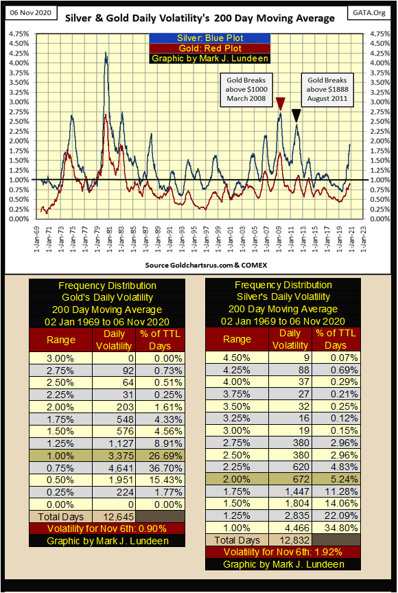
Of the two monetary metals, silver’s daily volatility is greater, much greater than is gold’s. And in their current advance gold’s 200 day M/A has increased to only 0.90%, while silver’s is 1.92%. If you go back to my chart for the market’s BEV values above, in the performance table at the bottom of that chart you’ll see that silver is #2 advancing 82% since last march’s bottom, while gold is at the bottom (#22) advancing only 23%.
Why gold is underperforming silver so badly may be explained by looking at their frequency distribution tables above. Gold with a volatility of 0.90%, places it in its 1.00% row of its freq table, where it’s been for 26.69% of its daily closings since 1969. In other words, on a volatility basis there is nothing exciting going in the gold market.
Silver, with its volatility at 1.92% places it in its 2.00% row, where it found itself at for only 5.24% of its daily closings since 1969. In other words, on a volatility basis something exciting *IS* going in the silver market. I’m anticipating that in 2021 daily volatility for both gold and silver will continue to increase, taking the price of gold and silver up with it.
As the bull market in gold and silver continues in the coming years, I’m expecting historic market action for the old monetary metals in terms of both price and volatility. Just keep in mind that rising volatility is how bull markets force weak hands out of their positions during corrections in the bull market. Nimble traders can make good money during bull market corrections, but most people can’t.
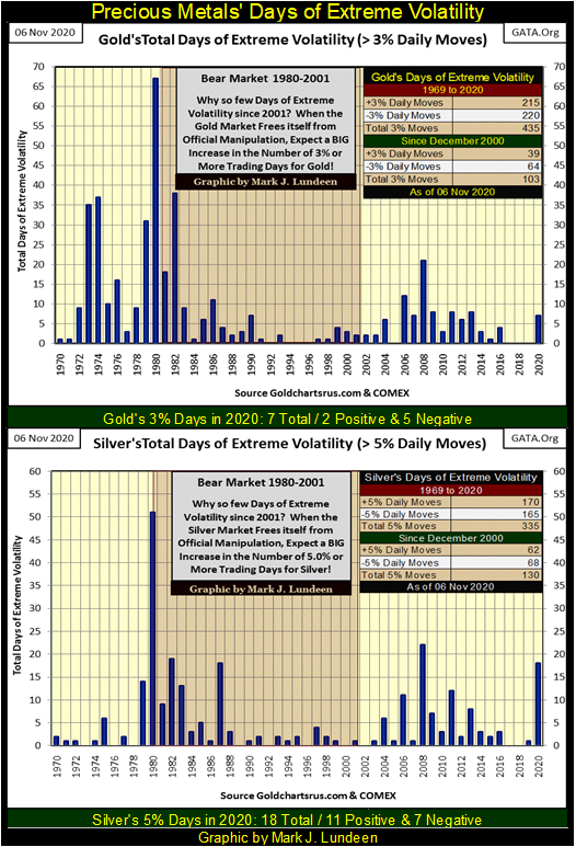
Look at gold and silver’s days of extreme volatility in the chart below; huge daily percentage moves are common in the gold and silver markets. Just last August silver was down 16% from one daily close to the next. But real cowboys (and cowgirls) know how to ride their bulls – they get on their bull’s back and hold on for dear life!
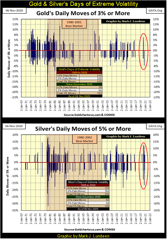
In my next chart I’ve taken the data seen above and organized it by how many days of extreme volatility occurred per year since 1969. So far in 2020 gold has seen seven 3% days. I say “3% days” as the (+/-) 3% is a threshold level that once crossed denotes a day as seeing extreme volatility, though gold may have actually moved 5% or more. For silver, its threshold level is a (+/-) 5% day and so far silver has seen eighteen 5% days in 2020. Two of them taking silver up by over 10% from one day to the next, and last August one extreme day took silver down by 16%.
Comparing gold’s to silver’s chart below; as rising daily volatility in the old monetary metals is now coupled with their rising prices, I’m not surprised seeing silver with its eighteen days of extreme volatility for 2020 outperforming gold, that so far in 2020 has seen only seven days of extreme volatility.
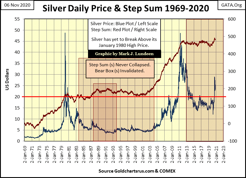
I almost never publish a chart of silver and its step sum because its step sum never collapses whenever silver is in a bear box, and hasn’t since 1969 as seen below. I believe this is because of silver’s industrial demand. What does Apple or General Motors care about the price of silver as long as silver is available for their needs?
In other words; bear boxes end as bulls finally realize they are on the wrong side of the market, and so develop buyer’s regret, which leads to the collapse in a market’s step sum which terminates the box. However industrial demand never develops buyers regret in the silver market, so bear boxes in the silver market always fail.
But one thing silver’s step sum does do is rise up with the price of silver during sustained market advances. Looking at silver’s step sum below (Red Plot) since January 2012 it has failed to break above its 475 level, but since its bottom in May 2019 (440) silver’s step sum has broken above this critical 475 level. In mid-August it was at 491, and closed the week at 483. As 2020 comes to its conclusion, silver with its step sum now coupled to its rising price plot below looks really good!
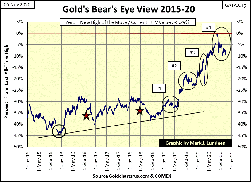
Unlike the Dow Jones, gold has yet to break below its BEV -10% line in its Bear’s Eye View chart below, though twice in correction #4 it tried to. As this correction began in early August (three months ago) it’s beginning to feel a bit dated.
Seeing how gold almost closed in scoring position this week (within 5% of a new all-time high), I’m going to do something I may regret before Thanksgiving three weeks from now, and predict gold will see new all-time highs before the end of November.
Just keep in mind as with all of my market predictions, should they fail, blame my failure on the idiot savants at the FOMC. But should I prove to be correct, it’s because I’m a real wise-guy when it comes to the markets.
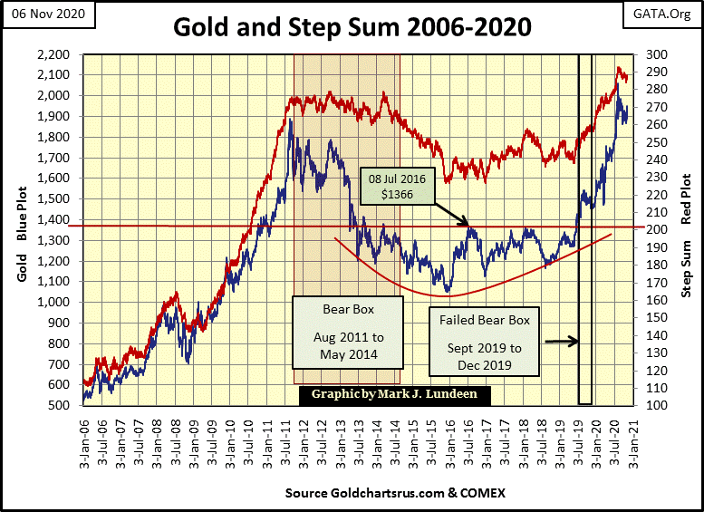
Gold (Blue Plot) and its step sum (Red Plot) below continue looking strong, but now must break above their highs of last August. For the price of gold that is a close above $2061.44, and a step sum above 293. With help from the Good Lord above, maybe the price of gold will do that before December, with its step sum following soon after. If gold is in a bull market, and I believe it is, things like these happen.
For the Dow Jones and its step sum chart below, everything looks good, but it’s been looking good for weeks. What’s needed now is for the Dow Jones to first break above its highs of early September, and then its last all-time high of last February, and then surge above 30,000 taking its step sum up with it.
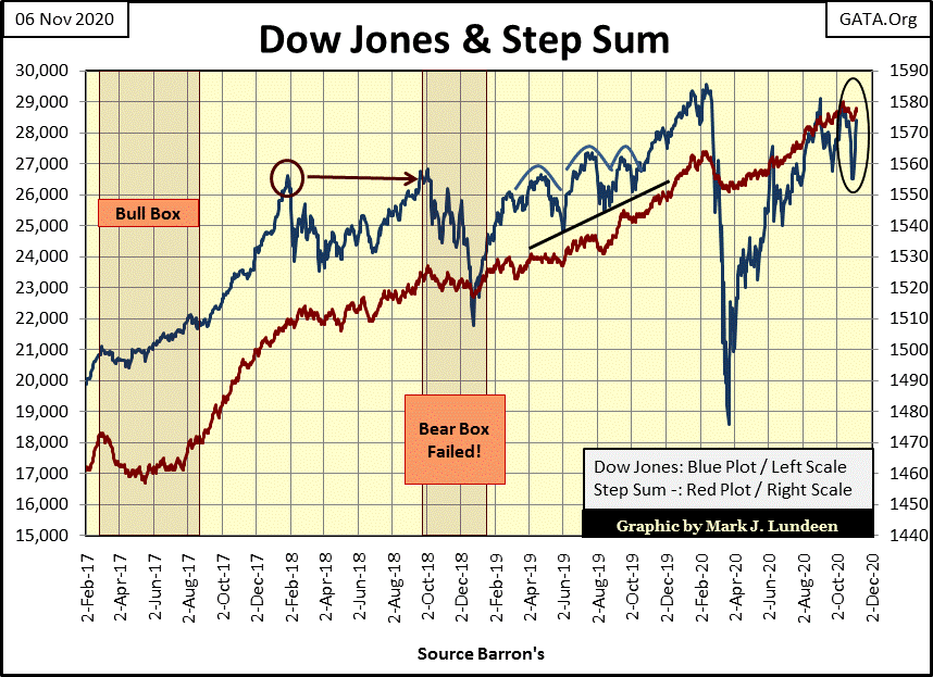
The Dow Jones could do all that plus more. But keep in mind that unlike the bull market for gold and silver, the stock market has been advancing since August 1982, making this a real old geezer of a bull market. That plus since last March the FOMC has been “monetizing” junk bonds issued by the same corporations whose shares are trading at the NYSE and NASDAQ exchanges, and injecting the resultant effluent back into the economy to keep this aging bull market properly medicated. This may not be hygienic, but so far it has been effective.
But in a financial system with interest rates and bond yields at historic lows (chart below) thanks to the FOMC “monetizing” even junk bonds, how much longer can this farce of a bull market in stocks and bonds continue?
Should the Fed-Funds Rate and bond yields seen below once again increase to their pre sub-prime mortgage crisis levels (pre January 2008); something over 5%, a gradational-black hole would form on Wall Street that would suck the wealth out of any asset with counter-party risk attached to it. That pretty much includes everything but precious metals assets, which I include precious metals mining shares.
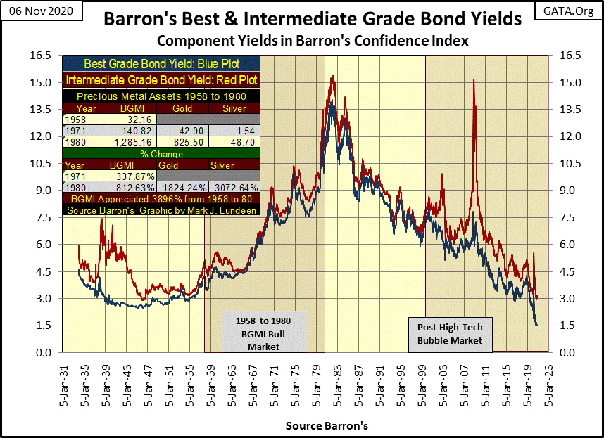
One of these days this chart will be included in every text book used for Economics 101 to teach college freshmen bond-market fundamentals. And on that day in the distance future, a day with the Fed-Funds and bond yields at something above 5%, every professor will ask “what were they thinking of” as their students nod in agreement.
Next is my step sum tables for the gold and the Dow Jones. Not too much to say about this table this week, but I want to cover their daily 15 counts below.
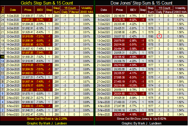
First what is the 15 count in the tables above? It’s a measurement of a market’s state of being overbought or oversold.
If you look at gold’s and the Dow Jones freq tables at the bottom of the chart below, you’ll see what makes up a count from +15 to -15. To make a count of +15, during a fifteen day sample the market in question must see fifteen continuous advancing days. To make a count of -15, during a fifteen day sample the market in question must see fifteen declining days.
As you see in these frequency tables, neither gold or the Dow Jones since December 1970 has ever seen a (+/-) 15 count. But gold did see a +13 on August 6th. Looking at its freq table, this fifteen count of +13 is a first in fifty years, telling us how overbought the gold market was in August when the current market correction began; historically overbought. Gold was due for a correction.
Gold’s 15 count (Blue Plot) below since this +13 has corrected back to a -5 in the chart below. The counts of and in-between (+/-) 5s are considered neutral, so in the past three months gold never became oversold. This is just an opinion of mine, but I believe the gold market has worked off last August’s fifteen count of +13, and will soon be advancing again.
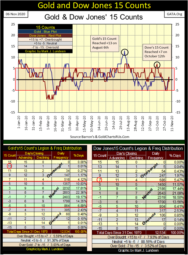
The fifteen count for the Dow Jones (Red Plot above) became overbought on October 12th when it increased to +7. October 12th forms the second top in the double top seen in the Dow Jones daily bars chart at the beginning of this article. Take a moment and look at this chart. What happened after the Dow Jones saw this +7 fifteen count on October 12th? It began a bit of a correction that ended on Monday of this week.
—
(Featured image by Reverent via Pixabay)
DISCLAIMER: This article was written by a third party contributor and does not reflect the opinion of Born2Invest, its management, staff or its associates. Please review our disclaimer for more information.
This article may include forward-looking statements. These forward-looking statements generally are identified by the words “believe,” “project,” “estimate,” “become,” “plan,” “will,” and similar expressions. These forward-looking statements involve known and unknown risks as well as uncertainties, including those discussed in the following cautionary statements and elsewhere in this article and on this site. Although the Company may believe that its expectations are based on reasonable assumptions, the actual results that the Company may achieve may differ materially from any forward-looking statements, which reflect the opinions of the management of the Company only as of the date hereof. Additionally, please make sure to read these important disclosures.

-

 Markets4 days ago
Sugar Markets Rise as Global Supply Outlook Strengthens
-

 Crypto2 weeks ago
Bitcoin Holds Steady as Institutions Move In and Crypto Markets Stay Neutral
-

 Crowdfunding1 day ago
Hotel Stay Project Supports Wildlife Conservation in Japan
-

 Impact Investing1 week ago
Closing the Gap: From Climate Commitments to Urgent Action


