Featured
Impacts of war in world markets examined
Here are some of the impacts of war in the history of world markets and how it changes the world economy.

The headline blared “The Next War,” The Economist, Jan. 27, 2018. Yes, The Economist. The 175-year-old English-language weekly magazine newspaper was tackling the sensitive subject of the potential for war between the “great-powers.” Empires rise and fall and war between the “great-powers” seems to go on forever. In modern times since the dawn of the 19th century, the “great-powers” have varied, but the main ones have at various times been Austria-Hungary, Britain and the United Kingdom, China, France, Prussia and Germany, Italy, Japan, Russia and the Soviet Union, the United States and the Ottomans (Turkey). All have fought at various times with or against each other. Yes, even the U.S. and Britain were enemies during the War of 1812–1814.
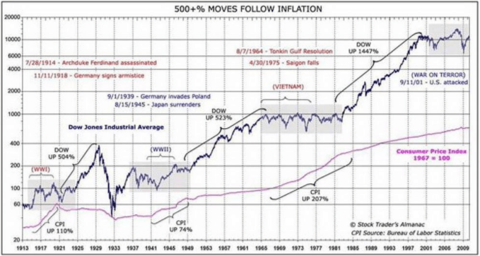
But how does war impact markets? Markets hate uncertainty, and war creates uncertainty. When WW1 broke out after the assassination of Austrian Archduke Franz Ferdinand on June 28, 1914, the world’s major stock markets were all closed. Never had that happened before. It was strange for that to happen given that capital was free-flowing between the major countries and all countries were on the Gold Standard.
Apparently, it was the fear of massive selling and repatriation of funds that helped trigger the closure of stock markets. In 1914, currencies and money flowed quickly because of the advent of telegraphs and other forms of modern communication. One hundred years earlier when the world and the “great-powers” were also effectively at war through the War of 1812–1814, and the Napoleonic wars money could only move as fast as the ships that carried it from one country to the next.
Fast-forward to another 100 years. The NYSE and NASDAQ shut down after the Sept. 11, 2001, attacks and they stayed closed until Sept. 17, 2001. The NYSE had fallen 7.1 percent or 684 points on the first day following the attacks. As it was 100 years earlier, it was feared that losses would be horrendous and that firms could go bankrupt. But the so-called “War on Terror” was underway. It is now a war that seems to go on forever.
War seems to be ongoing. When major wars like WW1 1914–1918, WW2 1939–1945, and even Vietnam 1964–1975 and the War on Terror raged, bear markets dominated, punctuated by up cycles. One might argue that the War on Terror doesn’t even rank as it is not a war where the “great-powers” are fighting directly. Nor was Vietnam in that respect. However, the War on Terror has been going on for 17 years, while the U.S. in Vietnam lasted 11 years from 1964–1975—longer, if one goes back to France’s involvement in Vietnam and the French Indo-China colonial wars from 1946–1954.
© David Chapman
Even lesser wars caused considerable consternation in markets. Ones that come to mind were some negative reactions when the Korean War 1950–1953 broke out, during the period of the Cold War and the Cuban Missile Crisis October 1962, the First Gulf War 1990, and the Second Gulf War 2003. Markets reacted negatively, either before, after, or during.
But one thing the chart above shows quite clearly is following the end of the war, especially major ones, stock markets took off. The “Roaring Twenties” followed WW1, the great bull of the 1950s and 1960s followed the Great Depression and WW2, another great bull followed the end of Vietnam, and while the War on Terror is ongoing and certainly other factors were at play, the market has been doing nothing but go up for the past nine years. (Chart originally seen at Seeking Alpha).
But the war between the “great-powers”? That is something else again. Today the “great-powers” are defined as the United States, Russia, and China. All three are major nuclear powers. Along with the U.S. would be nuclear power allies the United Kingdom and France. Lesser nuclear-armed powers include India, Pakistan, North Korea, and Israel. While the rhetoric has been between the U.S. and North Korea, North Korea is a side-show. As The Economist article effectively points out, the Pentagon has issued a new national defense strategy that puts China and Russia as the main threats to the U.S.
Russia and China are engaged in “great-power” competition with the West both economically and militarily. China’s economic growth has brought them into direct competition with the U.S. According to the Stockholm International Peace Research Institute (SIPRI), U.S. military expenditure in 2016 was $611 billion. In reality, it is probably much more given special operations and other expenditures not included in the official figures. China is a distant second at $216 billion, and Russia is an even more distant third at $69 billion, although Russia spends a much higher proportion of its GDP on the military than either the U.S. or China does.
Russia and China have been challenging the U.S. global hegemony, particularly the dominance of the U.S. dollar as the world’s global currency also known as the “petrodollar.” Because of the economic dominance of the U.S. and the U.S. dollar, all other countries basically fall in behind. Unless they don’t and they challenge that hegemony as Russia and China have been doing. The result is ongoing conflicts in Europe where Russia borders with Eastern European countries, and in the South China Seas where China has been exercising its military power. All other wars are usually proxy ones between the three.
China, in particular, and Russia want to break the dominance of U.S. dollar hegemony by establishing the Chinese Yuan as the major trading currency of Asia. Trade and even oil are being traded in Yuan, and China is in the process of re-creating the Ancient Silk Road from China to Europe. Other countries including Iran are also trying to break free of the dominance of U.S. dollar hegemony. Other countries who tried to break from U.S. dollar hegemony such as Iraq were invaded (2003), and its leader Saddam Hussein overthrown, and Libya (2011) where its leader Muammar Gaddafi was also overthrown, having tried to create a Pan-African currency using the Libyan gold dinar.
But Russia and China present a much bigger challenge than either Iraq or Libya, given both possess a serious nuclear arsenal. It is highly unlikely a nuclear confrontation would be risked given the devastation that could cause. But as The Economist notes, Russia and China’s ability to create a “grey zone” between war and peace means that wars would more likely continue as proxy ones. Iran, North Korea, and even Turkey and Syria are merely bit players against the backdrop of the “great-powers.”
As to the stock markets, the threat of wars can cause sudden shakedowns, even mini-panics. The threat of “great-power” wars also has an impact on gold and interest rates. China has already announced they will not be buying U.S. Treasuries like they used to and may even sell some of their $1 trillion-plus holdings. This has a negative impact on U.S. interest rates outside of the Fed. While The Economist’s special report on “The Future of War” is slanted toward the West, it is still a fascinating series of articles. However, unless there is the serious threat of war, its impact on markets will be muted or short-lived.
What Might Happen While We are Away
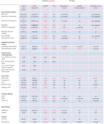
Well, the verdict is in. January 2018 was an up month for the stock markets. The Dow Jones Industrials (DJI) gained 5.8 percent. According to the January barometer — a barometer that has had an 86.6 percent accuracy ratio since 1950 — this should be an up year for the markets. But here’s the caveat. There have been nine major errors in 67 years since 1950. Six of them have come since 2000 including 2001, 2003, 2009, 2010, 2014, and 2016. That’s only a 64.7 percent accuracy ratio since 2000. Has the January barometer stopped working? Time will tell.
Last week, we noted that Jan. 31 was a super blue blood full moon with a lunar eclipse. We noted there could be volatility within a few days either side of Jan. 31. The market did not disappoint. Monday, Jan. 29, 2018, was a down day after the DJI closed once again at a record high on Friday, Jan. 26. On Tuesday, the DJI gapped lower, and in a flash, the DJI was down 2 percent, over 600 points from its record close. Friday’s collapse of over 600 points took the DJI down over 1,000 points from its record high. RSI that had been screaming over 80 came down quickly to 46. Volatility leaped. Rising interest rates were cited as the primary reason for the sudden drop.
So, is this it? The top is in? Naturally, that is not confirmed and is unlikely to be confirmed until the DJI breaks an important weekly low. The last weekly low on the charts is around 23,250. If the market recoups and makes new all-time highs again then the trend remains the same — up.
Even if we were to have a sharp correction right now, as long as the previously mentioned 23,250 holds, then new highs remain possible. February is the weak link in the so-called “best six months.” And the markets tend to be weak into Presidents Day on Feb. 19, which also happens to be Family Day here in Ontario. There is also no distribution pattern for the stock markets. A distribution pattern could form if the markets were to break to the downside, then recoup and work their way back up to new all-time highs or just fall short of the previous high (classic double top). We continue to see the market higher even if a corrective period could unfold now. Any top may take until March/April to form, or if later, in July or even as a late as October.
We see two negatives on the horizon. The first one is the Feb. 8, 2008, deadline (again) for funding the U.S. government. The last time resulted in a three-day shutdown of the government. They keep kicking the can down the road. The Treasury is likely to run out of cash by mid-March, largely due to lower revenues because of the Republican tax cuts. They have continually passed short-term funding bills and may again. But the reality is the parties can’t agree and, in many respects, remain far apart. A major sticking point is the trade-off of Trump’s wall and higher security for allowing the “Dreamers” to stay in the U.S. and find a way to citizenship. The markets were forgiving the last time around. They might not be so forgiving this time if we actually do come to another shutdown.
The second negative is the growing clash of wills between the White House and the FBI and the Department of Justice (DOJ). At the center of the controversy is a memo the White House has released to Congress on the Russia election investigation. The memo alleges improper FBI surveillance in the Russia probe, implicating not only the FBI but also the DOJ along with the Obama administration, including former Secretary of State and Presidential candidate Hillary Clinton. The conflict puts the White House and the Republicans into direct opposition with the FBI and the DOJ and Trump’s own hand-picked man to run the FBI after James Comey was fired along with senior officials in the DOJ. The real target here is to take down the Mueller investigation, one that is starting to get too close to the President.
Trump believes the FBI and the DOJ have conspired against him and that attempts to discredit his election through the investigation of the Russia collusion is just a conspiracy theory run by the “Deep State.” Conspiracy theories have been a constant theme on Fox News and numerous right-wing newspapers and TV programs. Terminating Mueller for any reason could trigger a constitutional crisis, the likes of which the U.S. has never seen before.
The Trump White House and the Republicans have been fired up, attacking the media (fake news), the environment (climate change does not exist), and universities (useless waste of time and run by elites). Now they are going at the heart of the U.S. itself with attacks on the FBI and the DOJ. In some respects, it is also an attack on democracy. No matter what, the Republican base believes all of this and would be fired up if there was ever a hint that Trump was to be impeached.
Will this break in February over the next few weeks? This is most likely something that could take some time to play out. Think of it as Watergate Redux. But if it broke out markets could most likely react quite negatively. Markets hate uncertainty.
Bitcoin Watch!
© David Chapman
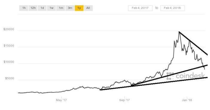
Regulators circling, exchanges being hacked, scams abounding — no wonder Bitcoin and the cryptocurrencies are sinking. Bitcoin is now down upwards of 60 percent from its December top. Upwards of $180 billion in value has been wiped out and over $600 billion has been wiped off of cryptocurrencies since the December top. Could bankruptcies and other disasters await those who leaped into the sphere? Stories abound that upwards of 20 percent of the market had been mortgaging their homes and other borrowings to get in on what had been a hot market.
We take no credit for pointing out that Bitcoin and the cryptocurrencies were in a huge bubble, and once it burst it would take no prisoners. The bubble has burst and the question is how low will we go? If like many other bubbles, Bitcoin and the other cryptos should ultimately fall at least 90 percent with many falling even further. Since there remain over 1,400 cryptocurrencies listed at www.coinmarketcap.com, we suspect that many of them will just disappear.
It is also a lesson for those in the stock market that has gone up over 300 percent since 2009. And we might add a lesson for those in marijuana stocks that have also shown signs of being in a bubble that appears to be bursting.
Amazingly Dogecoin still sits at #45 with a market cap of about $490 million. But that is down from $1.9 billion on Jan. 7, 2018, a decline of 74 percent. Bitcoin peaked at a market cap of $329 billion and is now down to about $139 billion, a decline of 58 percent. Still, we see ads touting, “The next Bitcoin is coming says ‘crypto genius.’”
Yes, support zones will kick in. The market tried to defend Bitcoin at $10,000, but now that that level has fallen, the next support zone should kick in around $7,800–$8,000. The 200-day MA is currently around $7,800 and the Fibonacci 61.8 percent retracement level from the 2017 low is around $8,000. Below $8,000, there is some support down to $7,200, and below that down to $6,200. Bitcoin now needs to regain back above $10,000 to suggest it might rebuild its base. Otherwise, there is only one direction and that is down. Despite the carnage, there will be many who will extoll why people should stay in and even preach that these are excellent levels to get in.
We’ve heard the stories before. Most of the stories are bankrupt. The advice should be ignored until Bitcoin and the cryptos can find their proper role. Are Bitcoin and the cryptocurrencies dead? Probably not. But their role is going to have to be redefined and the technology behind Bitcoin and the cryptos are not going away. The need for regulation has always been there. The trouble was, many thought cryptocurrencies were beyond the arm of the regulators. Overconfidence and greed killed it. It is now fast becoming just another story for “Extraordinary Popular Delusions and the Madness of Crowds” (1841) by Charles MacKay.
U.S. Jobs Report
The U.S. jobs report for January was released on Friday. Nonfarm payrolls for January came in considerably stronger than expected at 200,000, well above the expected 180,000. December’s report was revised upward to 160,000. Employment was strong in construction, food services, bars, healthcare, and manufacturing. As in the past, a large number of jobs were part-time. A surprise was that average hourly earnings rose 9 cents to $26.74 or 0.3 percent. The past three months have seen a strong jump in average hourly earnings. This has the bond market fretting about inflation.
As well, the stronger than expected jobs report keeps the pressure on the Fed that they will continue with their ongoing rate hikes in March, June, September, and possibly even December. But an unknown is that Jerome Powell, the new Fed Chair, is a Trump appointment, and in the past, Trump appointments have tended to be “Trump” men taking their instructions from the White House. The outgoing Fed Chair Janet Yellen was not a Trump appointee. As well, the Fed Board of Directors has had high turnover and most appointees owe their position to the Trump administration. There is some fear that as a result, the Fed will lose its independence.
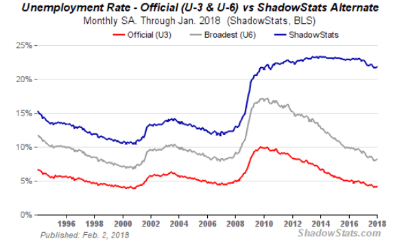
The official headline unemployment rate (U3) was unchanged at 4.1 percent although the reality was it ticked up from 4.07 percent to 4.15 percent. The U6 unemployment rate rose slightly from 8.08 percent to 8.19 percent (8.1 percent to 8.2 percent) while the Shadow Stats rate rose to 21.8 percent from 21.7 percent. The BLS U6 rate is the broadest measurement of unemployment and includes short-term discouraged workers and marginally-attached workers along with part-timers wanting full employment. The Shadow Stats unemployment numbers are the U6 number plus long-term discouraged workers, and the report adjusted for changes made back in 1994 to define numerous workers out of existence.
© David Chapman
© David Chapman
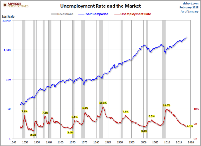
Unemployment rates seem to uncannily top and bottom (inversely) with the stock market. So, given the low level of unemployment (U3) and the high level of the stock market, be wary.
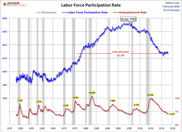
© David Chapman
The current labor force participation rate is at 62.7 percent. This is down sharply from the peak of around 67 percent that prevailed throughout the 1990s. A lower labor force participation naturally pushes the unemployment rate lower. But note during the 1990s, the unemployment rate was at today’s levels and there were, on a percentage basis, a lot more people in the labor force. That is why the Shadow Stats unemployment number is so high as these discouraged workers are no longer considered a part of the labor force. If they were, the official headline unemployment rate (U3) would be a lot higher than 4.1 percent.
MARKETS AND TRENDS
© David Chapman
Note: For an explanation of the trends, see the glossary at the end of this article. New highs/lows refer to new 52-week highs/lows.
© David Chapman
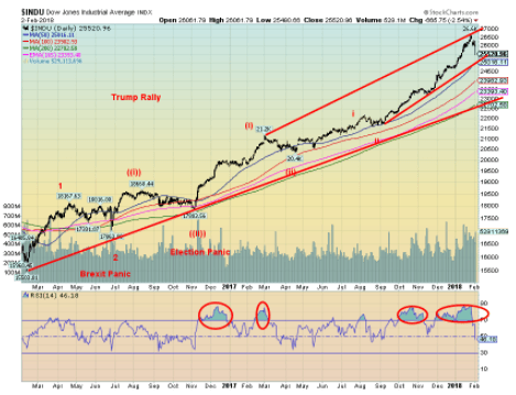
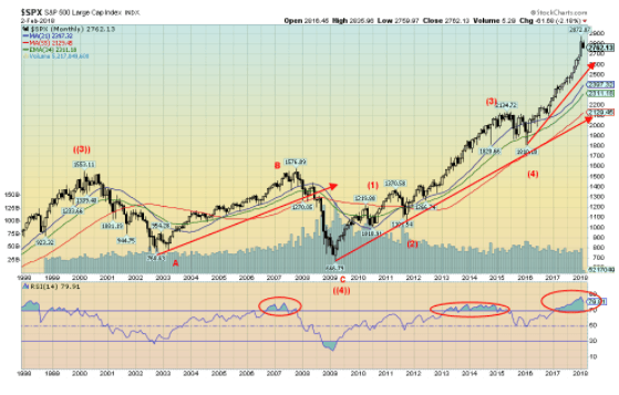
Has the market finally cracked? Friday’s 666-point drop (actual was 665.75) was the largest daily drop since a 680-point collapse on Dec. 1, 2008, during the 2008 financial panic and credit crisis. Losers led gainers by a sharp 8.7 on the NYSE. It was the strongest downside breadth since September 2016. All of the Dow Jones Industrials (DJI) stocks were down on the day as were 469 of the 500 S&P 500 stocks. Are we going from extreme optimism to extreme pessimism? The RSI indicator for the DJI quickly fell to 46 after being over 80 for weeks. If we are patient, we could soon see 30 or lower, which would indicate a highly oversold market and potential low.
Bear markets are not made in a one-day drop. But if Monday was followed by another huge downdraft, then we could have the makings of a 1987-style crash. But it’s only February, not October. Okay, we had the super blue blood full moon with a lunar eclipse on Jan. 31, and we did warn last week that we could well see some increased volatility. Well, we got it in spades. The market is now down 3 percent from the all-time highs of Jan. 26. That’s not much really. First, good support comes in at the 50-day MA near 25,000. That also coincides with an up-trend line. Next up is the 100-day MA near 24,000 and finally the 200-day MA near 22,700. One would not have an official bear market until we fell below the 200-day MA and were down 20 percent. A drop of 20 percent would take us under 21,300.
Even if we were to get a good drop right now, it probably wouldn’t define the end of the bull. In mid-January 2000 the DJI topped, followed by a 13 percent drop into mid-February. Over the next several months, the DJI made a series of ups and downs before topping again (a lower top) in early September 2000. That was followed by another 14 percent drop. By mid-March, the market was down even more. But again, it recovered and rose almost back to the January 2000 highs by mid-May 2000. That was it. The DJI collapsed 37 percent in October 2002, with most of the decline coming after the Sept. 11, 2001, attacks.
The year 2007 saw a 5 percent drop in February, then an 11 percent decline from higher levels in July 2007. The final top came in October 2007. October 1929 saw the famous stock market crash, but it too was followed by return action that took it back toward the high iinMay 1930 as the DJI gained 48 percent. Then came the deluge. So, depending on how this one plays out, a recovery back to the highs, or even new highs, remains highly probable. The question is how severe will this drop be. The Brexit panic shaved only 6 percent off the markets. This one was sparked by higher interest rates, higher wages from the January jobs report, and to some extent the release of the memo by the Trump administration. The potential for rising interest rates after years of extremely low interest rates was, in the end, the prime reason for the drop.
Our last target for the DJI was at 26,155. That was passed in January. The next potential target to the upside is at 29,135. That seems fanciful right now. But then we are sure many thought 26,155 was fanciful. We had also noted back in June 2017 that this market could end in a blow-off. Even in a blow-off, the first good drop is not necessarily a signal that the final top is in. We have labeled our thoughts on the Elliott wave count and all this might signal is the end of wave 3 of 3. That differs sharply from Elliott Wave International whose count has the market terminating. Since we consider ourselves rank amateurs beside Elliott Wave International, we can defer to them. Maybe it is the termination. But, as we note, our experience is the first good break in the market is not necessarily the end. It all depends on the return action.
We continue to believe the final top should be seen in 2018 followed by a two-year bear market. But that final top could come as late as October 2018. First, let’s see how deep this pull-back goes.
© David Chapman
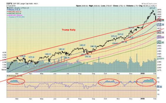
The S&P 500 has fallen back toward the top of the bull channel. The breakout from that channel occurred in early January 2018, and it was believed this was what we call an overthrow. A firm break back into the channel might confirm the overthrow. The bottom of that channel currently comes in around 2,650 so a breakdown into a more bearish market would not occur until we broke under 2,650 and preferably under the 100-day MA near 2,630. The 200-day MA is down near 2,530. The last time we tested the 200-day MA was the election mini-panic low in November 2016.
As with the DJI, the RSI for the S&P 500 has fallen quickly to 46 after being over 80 for weeks. We knew it wasn’t sustainable, but it wasn’t clear where the top might have been. The latest target for the S&P 500 based on the August 2015/February 2016 mini-bear market was 2,980. The recent high was seen at 2,873. So we are short. Does that mean it is no longer valid? No, not until we have a confirmed top and that wouldn’t occur until we drop and close under 2,400. That seems a long way off, and it is a 16.5 percent drop from the highs. So a drop that far would constitute at least a mini-bear. The August 2015/February 2016 mini bear fell in all just over 15 percent.
© David Chapman
Here is the big picture. The major market indices went through a series of bear markets from 2000 to 2009. First came the high tech/dot.com bear of 2000–2002, then the credit crisis and financial panic of 2007–2009. The former saw the S&P 500 fall 50.5 percent while the latter was a drop of 57.7 percent. Since then we have been up since March 2009, making this one of the longest bull markets in history with only two corrections in 2011 and 2015/2016. The first one was a drop of roughly 19 percent and the second one fell roughly 15 percent. We know we are in the fifth and final wave of this bull market, but cannot yet say with clarity where the final top will occur or at what level. We only know we are long in the game.
The “Roaring Twenties” bull market lasted 2,932 days from a key low in August 1921. There was only one significant correction along the way vs. two this time. The current bull is 3,252 days thus far. Preceding the final runup during the 1920s, there were two significant corrections. The first occurred in 1916/1917 that saw the markets fall over 40 percent, and the second was a collapse in late 1919 to 1921 that saw the markets fall about 48 percent. Given the similarities in the two markets (the two bears in 1916/1917 and 1919/1921 corresponding to the bears of 2000/2002 and 2007/2009), John Johnston of Davis Rea mused to me whether the current bull market could end in a 1929-style crash. Certainly, the conditions are there with rising interest rates, a falling U.S. dollar and a mountain of debt estimated globally at $233 trillion. As well, we have the potential for a constitutional crisis in the U.S. History doesn’t repeat, but it does rhyme.
© David Chapman
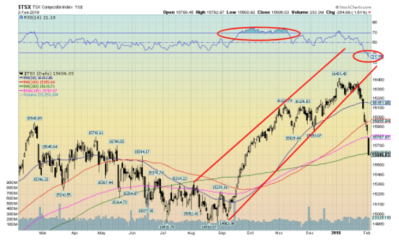
The S&P TSX Composite not only fell this past week but it actually constituted a mini-crash. Okay, it is only 5 percent from the high on Jan. 4, 2018, but it felt like more. And we have gone from an RSI that was consistently over 70 to one that is now under 30 having fallen to 21 on Friday. By most measurements that is considered oversold.
The TSX Venture Exchange (CDNX) also took a hit this past week and is down almost 14 percent from its January high. The CDNX is testing its breakout line following a two-year sideways market. The CDNX remains exceedingly cheap at these levels. With the exception of Information Technology, all TSX sub-indices were hit, some hard. The most consistently oversold sub-indices are the interest-sensitive Telecommunications and Utilities. There are few signs of a bottom just yet, but the grossly oversold conditions could be setting up a strong rebound. Materials, Golds, and Energy are the sub-indices that continue to form what appears as long-term bottoming patterns. Most others have been forming topping patterns, but given the current oversold conditions, some such as Income Trusts, Real Estate, Finance, Industrials, and the Consumer sub-indices could see strong bounce-backs once we determine a low.
© David Chapman
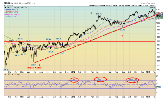
Here is the EuroNext 100 Index representing the top European companies. One could argue that the EuroNext has been forming a top over the past several months and, like its U.S. counterparts, it fell this past week and is down 3.5 percent from its high on Jan. 23, 2018. But compared to the U.S., the news out of Europe has been relatively good as their economies improve and the ECB is talking of ending its QE program. Yes, there are serious problems with Italian banks, and a collapse there could be the start of a banking crisis. And there is Brexit, but that is mostly going to negatively impact the United Kingdom. And there is still a chance that Brexit never happens. The British Pound has looked stronger of late.
Nonetheless, with rising interest rates in the U.S. and a falling U.S. dollar plus the potential for a constitutional crisis, Europe is looking somewhat more attractive. We have been rising with a series of higher highs and higher lows so, on any pullback that holds above the August 2017 low of 971, Europe might be attractive.
© David Chapman
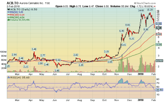
We couldn’t resist. This is Aurora Cannabis (ACB-TSX), one of the leading marijuana stocks. Aurora fell 16.8 percent on Friday and is down 44 percent from the high seen on Jan. 25, 2018. This constitutes a crash. Volume was high of over 55 million shares. Grant you, there are 470 million shares outstanding. But, like all bubbles, these marijuana stocks were flying high on fumes with no earnings and the hope, wing, and prayer of legalization that was going to make everyone rich. It appears to us that like marijuana itself, Aurora and other marijuana stocks have gone “Up in Smoke.” No fears. When they fall to zero one can ask for the share certificate to roll into a “doobie.”
© David Chapman
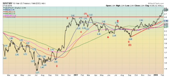
U.S. Treasury bonds as represented by the 10-year U.S. Treasury note rose to 2.84 percent this past week from 2.66 percent the previous week. Rising interest rates were cited as the reason for the steep stock market decline on Friday. The U.S. jobs report was stronger than expected and average hourly earning recorded their third consecutive strong monthly rise. As well, the recently passed U.S. tax bill has implied that deficits could total $1.5 trillion to $2 trillion over the next decade. This is against a falling U.S. dollar and China announcing they will no longer participate in U.S. Treasury auctions (or at least that is what they say).
With a total public debt of $20.6 trillion one wonders where the U.S. will get their money from. Rising average earnings suggests rising inflation as well. Ergo, that is why the market was spooked on Friday. Our projection for this rise in interest rates continues apace. Our target is at least 3.20 percent and we are getting closer. We could have a rebound (or in this case a pullback as yields move inversely to prices), but we believe our target should be seen before this is finished. The 10-year yields bottomed way back in July 2016 at 1.37 percent. A rise so far of 1.47 percent doesn’t seem like much, but it is a 107 percent hike in interest rates. Rising interest rates reverberates back into the economy in terms of mortgages, car loans, etc. The last time the 10-year was this high was back in 2014. From 2000 until the financial crash of 2008, the 10-year never fell below 3.13 percent.
© David Chapman
Recession Watch Spread
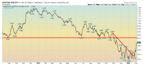
With the jump this past week in the 10-year U.S. Treasury note the 2–10 (2 refers to the 2-year U.S. Treasury note) spread also jumped up to 0.69 percent from 0.53 percent the previous week. This probably is not a surprise, but our expectations are that this spread should continue to narrow over the next several months. A reminder that before the 2000–2002 recession and the 2007–2009 recession, the 2–10 spread was negative. It is not an essential prerequisite, but it is not unusual to see negative yield spreads, also called an inverse yield curve before recessions.
© David Chapman
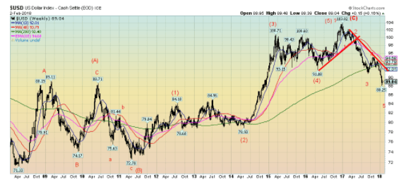
The US$ Index made a feeble recovery this past week up 0.2 percent. Surprisingly, the Euro was also up gaining 0.3 percent. But the Japanese Yen was knocked back losing 1.3 percent. The British Pound lost 0.2 percent while the Cdn$ was off 0.5 percent. The current decline that is underway has potential targets down to 86.90. However, the market is oversold sufficiently enough that we could see a rebound. Major resistance would be up at 92.
As can be seen by the long-dated weekly chart above, the US$ Index topped back in January 2017 at 103.82. By our wave count, we completed a bull move that got underway back in 2011. The topping pattern suggests that the US$ Index could fall as far as 80. Rising interest rates are not helping the US$ Index. Instead, there is fear of dumping of US Treasuries and repatriating the funds.
China has said they will not be participating in Treasury auctions going forward and could even start dumping some of their $1 trillion-plus holdings. Political dysfunction in the U.S. is not helping either as the Trump administration pursues possible trade wars. Witness their recent slapping on tariffs on washing machines and solar panels. As well, the Trump administration continues to threaten the termination of NAFTA. The negative politics in the U.S. are making a lot of people nervous. Treasury Secretary Steve Mnuchin intonated that he wouldn’t mind a lower US$ even if that was somewhat countered by Trump himself.
If not US$, then where? If Brexit were to actually fail, then the Pound could be attractive. The EU may have its problems, but the zone seems calm compared to the U.S. these days. As well, Japan is calm compared to the U.S. except for maybe missile threats from North Korea. The US$ has a history of going through wide swings. The US$ Index fell sharply through the 1970s but reversed course in the late 1970s. The US$ then topped in 1985, and thanks to the Plaza Accord, it once again fell precipitously. The strong U.S. economy in the 1990s propelled the US$ back up again topping out in 2001. Then came another long decline before it bottomed once again in 2011. The US$ may have topped once again and another long decline is underway.
The US$ Index is oversold, sufficiently that a bounce is quite possible. But once it is complete another leg down should get underway.
© David Chapman
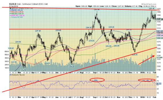
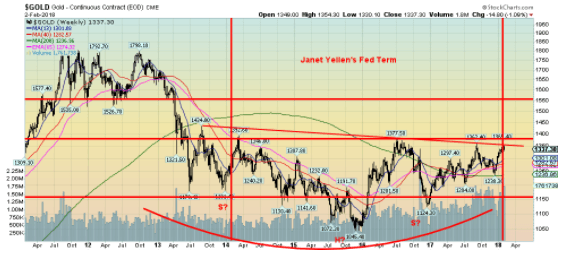
Friday’s market sell-off dragged the precious metals with it. That should not be too surprising as often the precious metals are dragged down with the broader market when a sell-off comes. As well, it was not surprising that gold ran into resistance at the $1,350/$1,360 zone as we had previously noted. Two important tops over the past two years were seen at $1,377 in July 2016 and at $1,362 in September 2017. We did, however, make new 52-week highs when gold punched through to $1,365. Trouble was it was a lonely new high as neither silver nor the gold stocks, as represented by either of the Gold Bugs Index (HUI) or the TSX Gold Index (TGD,) made new 52-week highs. Trader sentiment for gold had also shot up to 91 percent so the market was getting a little too bullish too soon. A pullback would be normal and healthy. Volume did pick up on the recent rise which was positive.
On another positive note, platinum support below can be seen at $1,330, $1,320 and down to $1,280/$1,300. The 200-day MA is currently at $1,280. We would be surprised if we did reach that low, but it cannot be ruled out. The fact that we did close successfully over $1,310 and made new 52-week highs suggests to us that gold should eventually break through the July 2016 high of $1,377 and head for $1,400 and higher.
The low in December 2017 we believe was a normal 11.3 monthly cycle low, and we also believe it was an important 34-month cycle low. From the key October 2008 low we saw important lows in December 2011, November 2014, and now again in December 2017. The low of December 2015 we believe was an important 7.8-year cycle low coming as it did within the acceptable range of that cycle of 86-102 months, according to analyst Raymond Merriman. If this is correct, we should be starting a new up 7.8-year cycle to the upside. Often the first third is the strongest.
As long as we hold above $1,290/$1,310, gold should regroup and eventually take out the key resistance of $1,350/$1,360.
© David Chapman
Here is the big picture over the past five years since that key top in September 2011. As the chart shows, trading for gold during the Janet Yellen Fed was largely contained between $1,150 and $1,360. Gold appears to have formed a huge head and shoulders bottom and the $1,350/$1,360 zone appears as the potential neckline. The head and shoulders pattern has potential targets up to $1,750.
Despite trader sentiment reaching 91 percent recently, a precious metals portfolio manager told us that no one — as in absolutely no one — is interested in gold and gold stocks. Okay, there are always the gold bugs who are perma-bulls. Do keep in mind, however, that gold, unlike stocks and bonds, will never go to zero. Gold is a hedge against inflation, deflation, government largesse, and global turmoil. It is a wealth preserver, not an investment. During the Great Depression, gold outperformed all other asset classes as many stocks and bonds went to zero and banks failed. Gold, if you recall, was revalued upwards to $35/ounce and the gold stocks soared even as the DJI was plunging 89 percent. The chart above highlights the key resistance gold currently faces. But once through $1,400, there is a lot of room to move quickly to $1,500.
© David Chapman
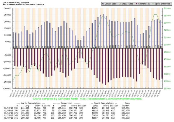
The commercial COT for gold remained unchanged this past week at 29 percent. Short open interest fell roughly 16,000 contracts while long open interest also fell, losing about 7,000 contracts. The large speculators COT (hedge funds, managed futures, etc.) also remained unchanged at 77 percent. That was despite a roughly 7,000 contracts decline in long open interest.
Thee commercial COT is not ideally in a spot that would suggest a low is in just yet. Normally one would see it up around 40 percent. On the other hand, it is not widely bearish either. The silver commercial COT slipped back this past week to 37 percent from 39 percent. Commercials lightened their long open interest by about 4,000 contracts while adding about 2,000 contracts to their short open interest. It is no surprise the large speculators COT jumped to 64 percent from 62 percent despite a drop in long open interest of roughly 4,000 contracts. Short open interest was also down by about 7,000 contracts. We are not sure whether the large speculators are just not as confident about silver as they were or what. Like the gold commercial COT, the silver commercial COT is not yet at levels that would be bullish.
© David Chapman
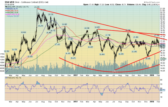
Silver was miserable this past week falling 4.2 percent vs. gold’s decline of 1.1 percent. Silver is now down on the year. As we noted silver failed to make new 52-week highs along with gold. This negative divergence is translating now into weaker silver prices. That is odd, considering the low stocks of silver. Silver in relation to gold remains quite cheap here as it has over the past few years.
Normally in a bull market, one wants to see silver outperform, not underperform as it has been doing. Until it starts to outperform, the relative performance of the precious metals could remain weak. We continue to believe that silver is forming a huge head and shoulders bottom pattern with a potential neckline at $18. A firm breakout over $18 could see silver having targets up to $22.30.
Elliott Wave International has a more bearish outlook for silver than we do. They believe that silver could be making a five-point reversal pattern of the type ABCDE with the A wave topping at $18.65 in April 2017, the B wave would be the key low at $14.34 in July 2017, the C wave topped in September 2017 at $18.29, while the D wave bottomed in December 2017 at $15.64. The E wave is the current top in January 2018 at $17.70. Key is that silver does not break down under $16.25 on our charts and could in theory project down to around $12. Again, we doubt this scenario, but we do respect the opinion of Elliott Wave International. Silver has resistance up to $17.50 and especially at $18 but once over that level, a strong up move should get underway.
© David Chapman
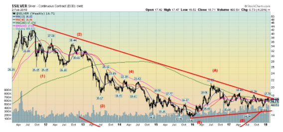
Here is silver’s big picture from the important May 2011 top. We continue to believe that a powerful bottom pattern is forming and once silver breaks free of $18, we should see a strong move. The above chart has potential targets up to about $30, but first, we need to break over $18.
Analyst Ray Merriman notes that silver’s long cycle is 18.5 years. The 18.5-year cycle breaks down into three seven-year sub-cycles. Merriman notes an important cycle low for silver in 1993 and if the 18.5-year cycle is correct, then the December 2015 low would qualify as that low. The seven-year cycle trough had important lows in November 2001, October 2008, and again in December 2015. That suggests that the next one is not due until 2021–2023. As with gold, the first up phase can often be the most bullish. As long as silver holds above $16.25 and especially above $15, silver should regroup and eventually break through above $18.
© David Chapman
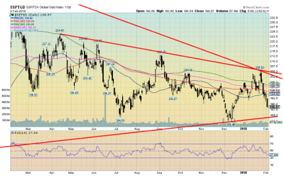
The gold stocks were hit this past week along with the broader stock market. And as usual, the gold stocks were hit harder than pretty well everyone else. The Gold Bugs Index (HUI) fell 7.5 percent this past week while the TSX Gold Index (TGD) dropped 5.9 percent. The gold stock indices very quickly went from up on the year to down on the year.
In a bull market, we want to see the gold stocks leading. Of late they have been a drag, and all this week’s drop confirms is that the gold stocks also lead to the downside. The TGD has considerable support down to 185 but, as we had noted in previous write-ups, key resistance was in the 202–205 zone. Note, we got to 205.50 and then failed. We are now down 8.1 percent from that level. The TGD’s all-time high of 455 seems an unfathomable way away. A firm break-out over 205 could see the TGD reach potential targets up to 265. Even the July 2016 high of 283 seems quite a distance away. The gold stocks remain extremely cheap compared to gold. We have never seen them remain this cheap for such an extended period.
© David Chapman
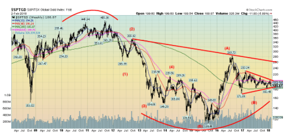
Here is the TGD’s big picture. As with both gold and silver the TGD appears to be making a huge bottom pattern and the correction of the past year or two is appearing as a bull correction symmetrical triangle. As one can see there appears to be significant resistance up at 260, an area that happens to coincide with our potential target once the TGD breaks out over 205. Again, we want to see the TGD hold support at 185 and especially the December 2017 low of 172.
© David Chapman
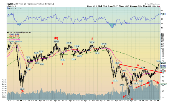
WTI oil prices appear in the throes of a new up leg. WTI oil has broken out over the four-year MA at $58.25. We could argue that WTI oil formed a huge head and shoulders bottom pattern from 2015 through to 2017. The neckline was seen around $52 and has potential targets up to $88.50. Continued turmoil in the Mid-East would, we suspect, be the catalyst. There hasn’t yet been a good test of the neckline so a pullback in oil prices down to $55 or even in a worst case back to $52 would not end the bullish scenario. A breakdown under $50 would, however, be quite negative. There is little chart resistance up to about $85/$90 for WTI oil.
GLOSSARY
Trends
Daily – Short-term trend (For swing traders)
Weekly – Intermediate-term trend (For long-term trend followers)
Monthly – Long-term secular trend (For long-term trend followers)
Up – The trend is up.
Down – The trend is down
Neutral – Indicators are mostly neutral. A trend change might be in the offing.
Weak – The trend is still up or down but it is weakening. It is also a sign that the trend might change.
Topping – Indicators are suggesting that while the trend remains up there are considerable signs that suggest that the market is topping.
Bottoming – Indicators are suggesting that while the trend is down there are considerable signs that suggest that the market is bottoming.
(All charts are courtesy of Stock Charts and COT Price Charts.)
__
DISCLAIMER: David Chapman is not a registered advisory service and is not an exempt market dealer (EMD). We do not and cannot give individualized market advice. The information in this article is intended only for informational and educational purposes. It should not be considered a solicitation of an offer or sale of any security. The reader assumes all risk when trading in securities and David
Chapman advises consulting a licensed professional financial advisor before proceeding with any trade or idea presented in this article. We share our ideas and opinions for informational and educational purposes only and expect the reader to perform due diligence before considering a position in any security. That includes consulting with your own licensed professional financial advisor.
(Featured image via DepositPhotos)


The TopRanked.io Guide to 2026’s Biggest and Best Affiliate Opportunities
Want to earn affiliate commissions on literal billions of dollars worth of revenue? Then this week, we've got something special...


Eni Advances Energy Transition with Major Investment and Emissions Cuts
Eni showcased its “Just Transition” report in Rome, highlighting stakeholder collaboration and progress toward decarbonization goals. The company invested over...


The German Fintech Market Shows Resilience and Strong Investment Growth in 2026
Germany’s fintech sector remained resilient in 2026 despite economic crisis and rising insolvencies. Investments reached €14.2 billion, showing strong investor...


Cannabis Legalization in Germany: A Mixed Interim Assessment
Germany’s cannabis legalization has reduced criminal cases and eased pressure on the justice system, while the black market is slowly...

Sustainable Restoration of the Haus Hövener Garden in Brilon
The Brilon Construction Workers Association is restoring the Haus Hövener garden into a cultural community space, funded through a €10,000...
 |
|
 |  |
 |
|
-

 Impact Investing1 week ago
World Environment Day: Warming Risks and Clean Energy Breakthroughs
-

 Crypto2 weeks ago
Ethereum Under Pressure as Bitcoin Stalls and Crypto Tensions Rise
-

 Africa4 days ago
Côte d’Ivoire Cocoa Price Crisis: Record Decision Turns into Market Breakdown
-

 Crowdfunding2 weeks ago
Prestadero Sees Rising Female Loan Participation in Mexico
You must be logged in to post a comment Login