Featured
An insight into the cycles of the bond markets
As we move forward into our season of discontent, lockdowns and political wars the Dow Jones Industrials (DJI) hits 30,000. It is like we live in two different worlds. We have a lot of charts this week. Fear & Greed indices, record lows in the put/call ratio and more. Bears are being slaughtered. But elsewhere millions are unemployed, support systems are ending into Christmas, evictions, bankruptcies and food lines grow.

“Buy when it snows…” is an old stock market saying. The first good snowfall of the season hit us here in Toronto on November 22. Since then, the S&P 500 is up 2.3% and just shy of new highs, the Dow Jones Industrials (DJI) has gained 2.2% hitting 30,000 and record highs, and, not to be left behind, the TSX Composite is also up 2.3%. The other half of that saying is “…sell when it goes.” The period from November to April is known as the best six months of the year. Since 1950 the average annual gain from November to April for the DJI is 7.5% with 55 up years and 15 down years (Stock Trader’s Almanac www.stocktradersalmanac.com). But the so-called bad period hasn’t exactly been shabby with 43 up years and 27 down years, with an average annual gain of roughly 0.6%. The period May to October does contain the worst month of the year, September.
But now it is nearly December and we begin a period that is full of stock market clichés. Think of the “Santa Claus Rally,” followed by the “January effect.” We just came out of U.S. Thanksgiving and there are clichés surrounding that as well. Maybe the most intriguing is what happens to markets after an election. Once again, we go to the Stock Trader’s Almanac. They note that since 1944 stocks tend to move up earlier when the White House occupant is popular. But they do even better, especially in November and December, when an unpopular administration is ousted. One can come to their own conclusions as to whether they believe the Trump administration was popular or unpopular. It depends on who you talk to.
Generally speaking, however, the record is better when incumbents win except for November/December when an unpopular incumbent loses. Then the markets tend to do quite well. What that appears to suggest is that president-elect Biden might see a good stock market in November/December (November has been good so far, up almost 13% for the DJI), but come the New Year things might not be so rosy.
Incoming president-elect Biden is facing considerable challenges. Anything could derail him and the markets. The first year of the presidential cycle is the weakest of the four years with 22 up years and 24 down years, but it has eked out a gain on average of 3% annually. Years ending in one are also mixed with 10 up years and 8 down years since 1831 with an average annual loss of 0.3% and a cumulative loss of 5.4%. That includes 1931 when the stock market fell 52.7%. So, the signs are not great for the incoming president.
As one pundit declared, Biden is swimming into an ocean of troubles. The country is deeply divided and violence could still occur if Trump’s supporters truly believe the election was stolen. There is a raging pandemic, even as vaccines may yet save the day. And there is no guarantee that the rollout of the vaccine will be as good as to what is being promised. The global threat of climate change has not gone away. The economy is in a recession with the official and unofficial unemployed estimated at over 21 million. Unless there is a second Cares Act and a stimulus package before year end, tens of thousands, even millions, could find themselves with no visible means of support and facing evictions, bankruptcy and homelessness.
Numerous small businesses are already on the brink of bankruptcy and larger companies haven’t been immune. The debt load is huge with Americans saddled with some $85.8 trillion of debt (governments, corporations, financial corporations, consumers) representing roughly 31% of all the debt in the world, now estimated at about $277 trillion. Some estimates suggest it could be $300 trillion by the end of Q1 2021. The debt to GDP level for the U.S. is now 402% (in 2016 it was 356%) with the federal government debt to GDP at around 128%. When one adds in state and municipal debt, the ratio rises to 143%. The U.S. is the most indebted nation in the world. The trade deficit is $855 billion ($734 billion in 2016), despite the Trump years of trade wars. Over 35 million are living in poverty, almost 11% of the population, while some 45 million are on food stamps and over 28 million are without any form of health insurance. Yet the U.S. is also a country with over 18 million millionaires. There are also 788 billionaires with a net worth of over $3.4 trillion. Wealth inequality is at levels rarely ever seen and is a source of considerable friction.
That is just a snapshot of the domestic problems. Internationally, the U.S. will no doubt re-join world organizations such as the Paris Agreement on climate change and also the World Health Organization (WHO) as well as patch up broken relationships with allies and NATO. Problems still exist in many hotspots including Afghanistan, Iraq, Syria, Libya, and North Korea and Biden will be faced with how to deal with China and Russia. Dealing with these issues in a way that will not increase tensions will be a challenge. As we slide into the New Year ongoing tensions are heating up once again with Iran.
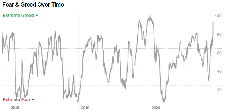
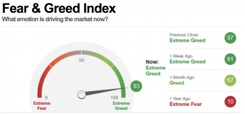
So, just how do these markets look going into December? We have noted that they are a bit stretched. The put/call ratio remains at or near record levels in favour of calls. The Fear/Greed Index (shown below, thanks Mike) is registering 93, suggesting nearly extreme greed (very extreme would be 99/100). That is the opposite to what the index was registering in March when it hit a low of 1 (extreme fear). Our charts below show first the fear and greed as an index. Note the extreme fear registered March/April 2018, December 2018, and March 2020. Extreme greed is registered in January 2018, and especially January/February 2020. We are now back there again. Once again, none of this is to say that the market is going to fall tomorrow. What it is, is a warning sign saying “buyer beware.”
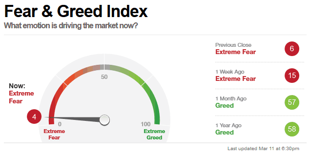
In January 2018 at the peak the S&P 500 was 13.3% above the 200-day MA. In October 2018 it was only 6.6% in front of a 20% drop. February 2020 saw the S&P 500 11.3% above its 200-day MA before a 35% + drop in the March 2020 pandemic crash. Today it is 15.4% above the 200-day MA. That’s another warning sign. The market is abuzz with warning signs, but are they being heeded? These are all things that make one say “Hmmmm”. The first Fear & Greed Index below is November 2020 (93) while the second CNN Fear & Greed Index is back in March 2020 (4). Back in March 2020 it eventually hit as low as 1.
Fear & Greed Index
Source: www.investingcube.com
One of the big issues with indicators such as the Fear & Greed Index, the Buffett Indicator along with P/E ratios, P/S ratios, P/B ratios, etc. is they are just that—indicators. None of it suggests that when they hit extremes one should rush to the exits and get into cash because the market is about to crash. History tells us that markets over time just keep going up and up. That is despite a 20% collapse into December 2018, a 37% collapse into March 2020, and a 55% collapse into October 2008. Even the 89% collapse of 1929–1932 came back, although it took 25 years for the DJI to regain the 1929 high. The Tokyo Nikkei Dow (TKN) is still looking to regain its 1990 high some 30 years later.
Buffett Indicator (orange) vs. S&P 500 (shaded area): 1951–present
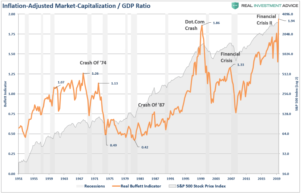
The Buffett indicator did pick important tops in 1966, 1973 (a lower high to 1966), 1999 (dot.com crash), 2007 (a lower high again), and the current level a record at 1.94. Again, it is a warning. Mostly one looks at these in hindsight. Maybe it doesn’t scream get out of the market and into cash because a crash is coming but it does indicate that one should be cautious. And there is always the old adage of “you can’t go broke taking a profit.”
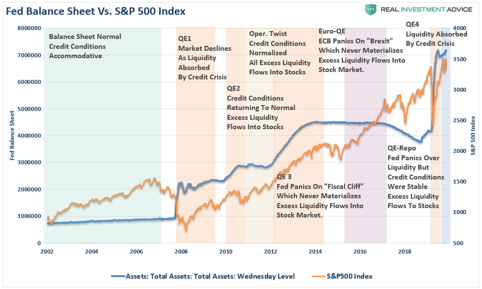
We have often shown the correlation between the massive growth of Fed assets and the rise in the stock market. There is absolutely no doubt there is a correlation. Stimulus, the Fed’s QE, and record ultra-low interest rates all contribute to creating excess liquidity in the financial system. And that excess liquidity finds its way into the stock market. The excellent chart below shows that. When the liquidity starts to dry up, that is when the market will fall. And in today’s hyper-sensitive market that could easily mean a 20% to 35% decline. But will it turn into a 50% plus decline?
Fed Balance Sheet vs. S&P 500: 2002–present
The challenges facing the incoming president are considerable, and the debt is just one of them. All of this is against the background of hyper-partisan politics and a deeply divided country where the election is still being disputed in the courts. Cases could still make it to SCOTUS (Supreme Court of the United States) where, given the Conservative majority, anything could happen. No matter what the incoming administration does, half the country will be against it. The danger is the growing propensity for conspiracy theories as preached by QAnon. With the debt already on a steep upward trajectory (since 2016 federal debt has grown $7.5 trillion or 35.5%, while all debt—federal, states, municipalities, corporations, financials, and consumers—is up $18.4 trillion or 27.2%), the consensus is that the Republicans will suddenly discover that all debt is bad again. That could spell difficulty in attempts to bring forward stimulus packages or raise taxes. Senate wins in Georgia in January for the Democrats might ease that problem but won’t end it.
December brings us the Santa Claus rally. It normally starts around Christmas and lasts into early January. It has failed only 12 times since 1969. The cliched saying is “if Santa Claus should fail to call, bears may come to Broad and Wall.”
Chart of the Week
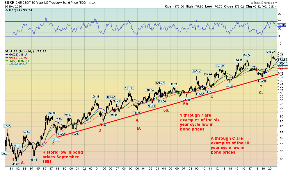
There is one thing we find about interest rates: they have reasonably predictable cycle patterns. According to Ray Merriman of MMA Cycles (www.mmacycles.com), long-term bonds show a good long-term pattern of 18-year cycles. The 18-year cycle breaks down into three 6-year cycles (range 5–7 years) and the 6-year cycle breaks down again into either two 3-year cycles or three 2-year cycles. The above chart shows the U.S. 30-year Treasury Bond.
The major cycle low was seen in October 1981. Major lows were seen in January 2000 (18 years, 3 months) and again in October 2018 (17 years, 9 months). The next one won’t be due until 2036 (range 2034–2038). The 6-year cycle is also pretty steady with lows showing in 1987 (6 years), 1994 (7 years), 2000 (6 years), 2007 (7 years—we note a double bottom in 2004 and 2007 although the 2004 low seemed early), 2013 (6 years), and 2018 (5 years). The next 6-year cycle low is due 2023–2025.
What we do note is that the 3-year cycle low now appears due. The spike seen in March 2020, we suspect, was the crest of this cycle. Or, what could be happening is that the 2-year cycle is kicking in as it would have been due October 2020. But if it is to go to a 3-year cycle which is more typical that low wouldn’t occur until October 2021 +/- 4 months. A low might test the rising 21- and 55-month MAs (166 and 157 respectively) or even the rising 34-month (163) exponential MA.
The 3-year cycle is far more common than the 2-year cycle. So, our suspicion lies with the 3-year. What all that suggests is that interest rates stand a good chance of rising into 2021 (yields move inversely to prices). As noted, the evidence suggests the cycle topped in March 2020. If interest rates are higher going into the new year (prices lower), then the odds are we are headed for a 3-year cycle low later in 2021.
Even in an environment where interest rates have been artificially maintained at record lows now for years, a period of rising long-term interest rates could spell trouble for the bond markets. Having been through a number of cycles in our career we recall quite well bond market collapses in 1984, 1987, 1994, 2000, 2013, and 2018. It doesn’t take a huge rise in interest rates to reveal problems particularly in the corporate bond market and with huge bond funds. A move from current levels where yields double could cause problems. Usually it was a big bond fund blowing up. As well, a period of rising interest rates often precedes a drop in the stock market.
MARKETS AND TRENDS
| % Gains (Losses) Trends | |||||||
| Close Dec 31/19 | Close Nov 27/20 | Week | YTD | Daily (Short Term) | Weekly (Intermediate) | Monthly (Long Term) | |
| Stock Market Indices | |||||||
| S&P 500 | 3,230.78 | 3,638.39 | 2.3% | 12.6% | up | up | up |
| Dow Jones Industrials | 28,645.26 | 29,911.03 (new highs) | 2.2% | 4.8% | up | up | up |
| Dow Jones Transports | 10,936.70 | 12,560.39 (new highs) | 2.7% | 15.2% | up | up | up |
| NASDAQ | 9,006.62 | 12,205.85 (new highs) | 3.0% | 36.0% | up | up | up |
| S&P/TSX Composite | 17,063.53 | 17,019.10 | 2.1% | (0.3)% | up | up | up |
| S&P/TSX Venture (CDNX) | 577.54 | 740.45 | 0.6% | 28.2% | up | up | up (weak) |
| S&P 600 | 1,021.18 | 1,059.73 (new highs) | 3.9% | 3.8% | up | up | up |
| MSCI World Index | 2,033.60 | 2,029.25 | 2.0% | (0.2)% | up | up | neutral |
| NYSE Bitcoin Index | 7,255.46 | 18,721.39 (new highs) | 16.0% | 158.0% | up | up | up |
| Gold Mining Stock Indices | |||||||
| Gold Bugs Index (HUI) | 241.94 | 281.22 | (5.4)% | 16.2% | down | neutral | up |
| TSX Gold Index (TGD) | 261.30 | 308.20 | (4.9)% | 18.0% | down | down (weak) | up |
| Fixed Income Yields/Spreads | |||||||
| U.S. 10-Year Treasury yield | 1.92 | 0.84 | 2.4% | (56.3)% | |||
| Cdn. 10-Year Bond yield | 1.70 | 0.68 | 3.0% | (60.0)% | |||
| Recession Watch Spreads | |||||||
| U.S. 2-year 10-year Treasury spread | 0.34 | 0.69 | 4.6% | 102.9% | |||
| Cdn 2-year 10-year CGB spread | 0 | 0.43 | 13.2% | 4,300.0% | |||
| Currencies | |||||||
| US$ Index | 96.06 | 92.39 | (0.4)% | (3.8)% | down | down | down |
| Canadian $ | 0.7710 | 0.7700 | 0.8% | flat | up | up | neutral |
| Euro | 112.12 | 119.58 | 0.8% | 6.6% | up | up | up |
| Swiss Franc | 103.44 | 110.51 | 0.7% | 6.8% | up | up | up |
| British Pound | 132.59 | 133.02 | 0.2% | 0.4% | up | up | up (weak) |
| Japanese Yen | 92.02 | 96.12 | (0.2)% | 4.4% | up | up | up |
| Precious Metals | |||||||
| Gold | 1,523.10 | 1,788.10 | (4.5)% | 17.4% | down | neutral | up |
| Silver | 17.92 | 22.64 | (7.1)% | 26.3% | down | up (weak) | up |
| Platinum | 977.80 | 964.80 | 0.8% | (1.3)% | up | up | up (weak) |
| Base Metals | |||||||
| Palladium | 1,909.30 | 2,439.70 | 5.0% | 27.8% | up | up | up |
| Copper | 2.797 | 3.42 (new highs) | 4.0% | 22.3% | up | up | up |
| Energy | |||||||
| WTI Oil | 61.06 | 45.53 | 7.3% | (25.4)% | up | up | down |
| Natural Gas | 2.19 | 2.84 | 2.5% | 29.7% | neutral | up | up (weak) |
Note: For an explanation of the trends, see the glossary at the end of this article.
New highs/lows refer to new 52-week highs/lows.
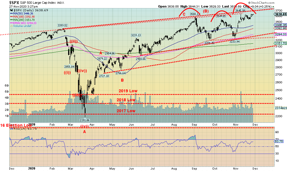
The S&P 500 came oh, so close to making new all-time highs this past week, confirming similar all-time highs seen by the Dow Jones Industrials (DJI), the Dow Jones Transportations, and then just this week the NASDAQ. Then all the major indices would confirm each other. The high was 3,644 while the all-time high remains at 3,646. Everybody enjoyed another up week as a vaccine is coming and Trump is making nice, saying he’ll step down if the Electoral College confirms the vote, giving Biden 270 EC votes or better. The trouble is, the vaccine may be out this month or maybe it won’t be. It has still not been fully tested on the broader population. In the interim, the number of cases continues to surge as do the deaths. As to Trump making nice, well, the lawsuits continue and there is a chance they may get to go to SCOTUS. Trump has asked Biden to prove he received 80 million votes, ignoring the fact that Biden doesn’t have to prove anything as that is not his role. Instead, that is the role of election officials in certifying the election and the Electoral College that meets on December 14, 2020.
This past week markets maintained their bullish stance. The S&P 500 gained 2.3%, the DJI made new all-time highs, up 2.2%, the DJT was up 2.7% and also made new all-time highs, and the NASDAQ eked out a new all-time high, up almost 3.0% on the week. The small cap S&P 600 was up 3.9% and also made all-time highs. Not to be outdone, the MSCI World Index also made new all-time highs, up 1.6% on the week. In the EU the London FTSE was up 0.8%, the Paris CAC 40 gained 1.9%, and the German DAX was up 1.5%. In Asia, China’s Shanghai Index (SSEC) gained 0.9% and the Tokyo Nikkei Dow (TKN) made fresh 52-week highs, once again gaining 4.4%. In Canada, the TSX Composite was up 2.2% and the TSX Venture Exchange (CDNX) gained 1.2%. All in all, another momentous celebratory week.
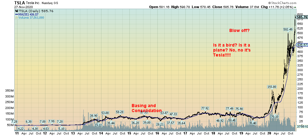
But dark clouds are gathering. The Investors Intelligence Advisors’ Survey (percentage of bulls) hit the second greatest extreme since 1987 at 64.6%. The first greatest extreme was seen in January 2018. We note other extremes with some of our later charts, particularly the CBOE put/call ratio that hit a record low of 0.38 this past week. Another extreme reading was seen in the National Association of Active Investment Managers Exposure Index that hit 106.41, meaning fund managers are long and leveraged. The highest readings before that were seen in October and December 2017 just before a significant top in January 2018. Seems that fund managers have a herd mentality like everyone else. In March 2020 at the bottom of the crash the AIME Index was 10.65, suggesting they were quite pessimistic. We can’t help but notice that Tesla has been making all-time highs, making Elon Musk the second richest human on earth as Tesla was admitted to the S&P 500. It was a buying frenzy. It is also a bubble that could burst.
What we need now is evidence that we have topped. Otherwise, the trend is up so why fight the trend? But, with so many indicators flashing warning signs, buying more at this time does not seem like a good idea. As well, we have noted previously that smart money is selling even as what they call dumb money is buying. The first sign of trouble comes under 3,500. The second sign of trouble is under 3,400 and the big confirmation of a top comes under 3,300. Under 3,100 the market could panic. The S&P 500 is bouncing up against a trendline that connects the high of January 2018 and runs along the high of February 2020 and just catches the recent highs. That is a sign that the trend line has some significance. A firm breakout above 3,700 might suggest that we are going to continue higher. But we doubt that is going to happen and the risk to the downside is rising.
So, what might spark a drop? A delay in the vaccine. A constitutional crisis. Or war in the Middle East as our comments under our oil analysis suggest following the assassination of the Iranian nuclear scientist. Or it might be something else all together. The warning signs are flashing.
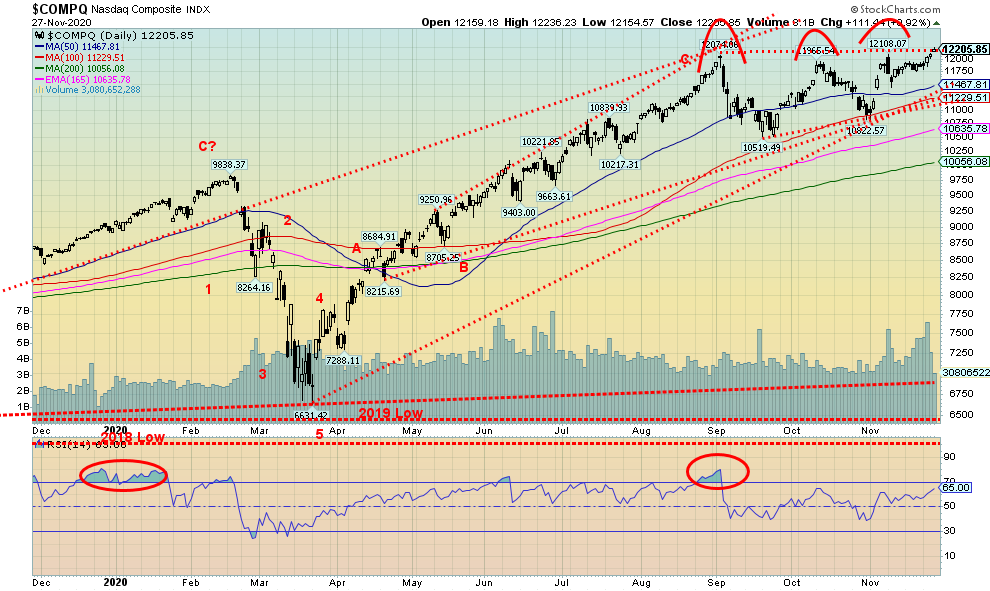
Like the other indices, is the NASDAQ poised to probe higher or getting ready for a fall? The big FAANG stocks are no longer leading. Even as this past week Facebook gained 3%, Amazon was up 3.1%, Google jumped 2.5%, and Netflix was up 0.6% but Apple fell 0.8%. Microsoft gained 2.3% while Tesla remains the big star, jumping 19.3% and once again making all-time highs as it becomes a part of the S&P 500. The NASDAQ eked out a marginal all-time high as it gained about 3.0%. We say marginal because the high this week was Friday at 12,236 vs. a high on November 9 at 12,108. On November 9 the NASDAQ made its high, reversed, and then closed lower. As the week ended, the NASDAQ was pushing up against a ceiling threatening to break out. We could argue that once the NASDAQ made a high in September at 12,074 it has been forming what we might call a rising or ascending triangle. That’s characterized by the rising lows and relatively flat highs. If that’s correct, then a firm breakout above 12,250 could suggest a move to 13,790/13,800. Given the market is overextended and there are other signs that we are overextended, it seems improbable that we could continue higher. But logic is not a part of the equation here. On the other hand, a break back under 11,425 would suggest a possible top is in. But even then, we would need to firmly break down under 10,500 to confirm that a top is in.
U.S. Initial Jobless Claims
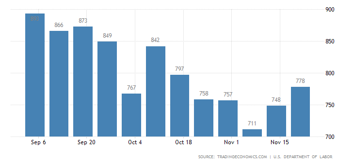
Once again, the initial jobless claims rose. This time it was 778,000, up from 748,000 a week earlier and well above market expectations of 730,000. This is not pointing to a positive jobs report due out December 4, 2020. Currently, the expectation next week for nonfarm payrolls is a gain of 500,000. We wouldn’t be surprised to see that number fall. The unemployment rate is expected to remain steady at 6.8%. Where the real crunch could come is the December jobs report, due out the first week of January. Continuing jobless claims remained steady at 6,071,000, down from the previous week’s 6,370,000. The expectation was for 6,000,000. But that number is somewhat misleading as it is estimated that between 18 to 21 million remain out of work. With the Cares Act expiring in December and no talk of any stimulus plan on the way, many are going to face evictions. Already the food lines have become horrendous, more reminiscent of the Great Depression. But no worries. The DJI is at 30,000.
Michigan Consumer Sentiment Index
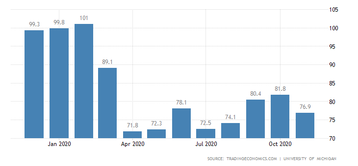
The final Michigan Consumer Sentiment Index was revised lower, once again to 76.9. That’s down from the 81.8 reported for October. It remains above the low of 71.8 reported back in April 2020 at the height of the first wave of the COVID-19. The all-time low was seen at the height of the early 1980s recession when it was recorded at 51.7. The all-time high was seen at the height of the dot.com boom in the late 1990s at 111.40. More recently the index was over 100 in late 2019. During the Great Recession of 2007–2009 and up to 2011 the index saw prints below 60. It was reported that the November confidence fell largely because of the rise in COVID cases and deaths along with the outcome of the election. Apparently, Republicans are more pessimistic than Democrats.
S&P Case Shiller Home Price Indices
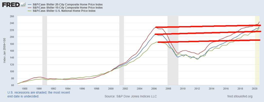
We are not sure whether one can say that U.S. housing prices are in a bubble. However, as this chart shows U.S. home prices based on the 20-city composite, the 10-city composite, and the National Home Price Index have all soared past the highs seen in 2006. This may be the natural order of things, given that over time everything just keeps going up despite periods of corrections. We saw this chart at BMG Group (www.bmg-group.com) and thought it interesting to show. The Canadian housing index, as measured by Teranet and National Bank of Canada (www.housepriceindex.ca), has been even more dramatic, long surpassing the highs seen in 2008. The Canadian house index is up 84% since that peak in August 2008. The U.S. National Home Price Index is only up 23% since its pre-Great Recession peak in June 2006. The Case-Shiller 20-city composite is up only 12% from its April 2006 peak. Canadian and U.S. home prices have diverged considerably. Canada’s has been in what may be considered a bubble. Here in Canada, we are already seeing rents and condo prices fall, around 10% or so, so far. Could the broader housing market soon follow?
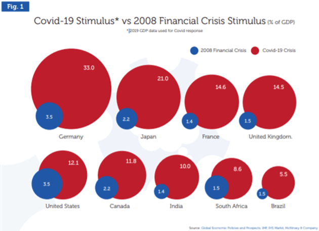
If you ever wondered why markets levitate so much while Main Street is groveling in unemployment and homelessness, you need look no further than this rather interesting chart we found. It shows the staggering amount of stimulus provided by different countries following the 2008 financial crisis vs. the COVID-19 crisis of 2020. Germany alone has apparently provided 30 times more stimulus (in current dollars) than the Marshall Plan after World War II. Anyone telling you the natural order of things is for markets to just keep going higher obviously hasn’t paid attention to the huge excess liquidity that all this stimulus has generated. And all that excess liquidity finds its way into the stock markets.
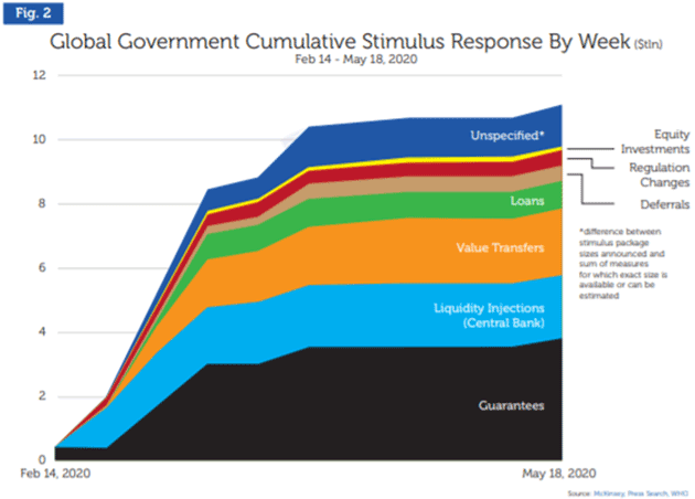
This is just another way of looking at all that stimulus. We noted earlier that global debt is now up to an estimated $277 trillion and is forecast to reach $300 trillion by the end of Q1 2021. Staggering amounts of money. Print, print, print. And one wonders why gold is not at $10,000/ounce instead of about $1,800/ounce, given the massive debasement of money that all this money printing generates. Yet we still have no hyper-inflation. Not yet, anyway. Does any of this money ever get paid back? No.
Despite all this money being pumped into the financial system, one thing is clear. Irrespective of the coming vaccine, millions of jobs have been lost and tens of thousands of businesses have failed. Many of them may never come back or, if they do, it will take years.
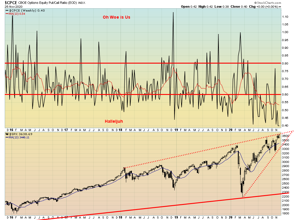
Wow! Another new low for the put/call ratio, down to 0.40 (low on the week was 0.38). We’ve never seen that before. Is there a bear alive anywhere? Love that huge wedge triangle.Page Break
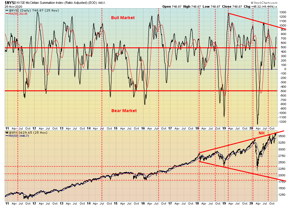
The NYSE McClellan Summation Index (RASI) is diverging. Even as the S&P 500 prints new highs, the RASI is well short of its former highs seen back in June 2020. It takes on meaning only when the markets reverse and fall. The NYSE advance/decline line is not diverging. It soared to a new high this past week even as the S&P 500 barely scratched its way back to its high and the DJI, DJT, and NASDAQ all made marginal new highs.
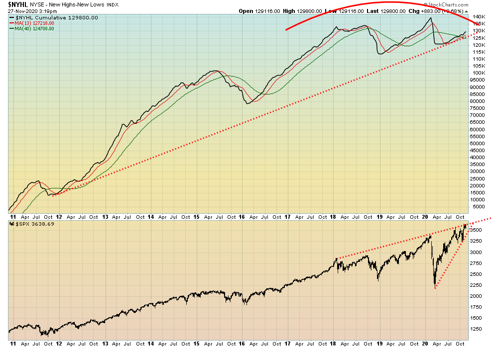
This is one we rarely show: the NYSE new highs – new lows Index. It’s diverging and making what could turn out to be a head and shoulders top. Another indicator suggesting caution for the market.
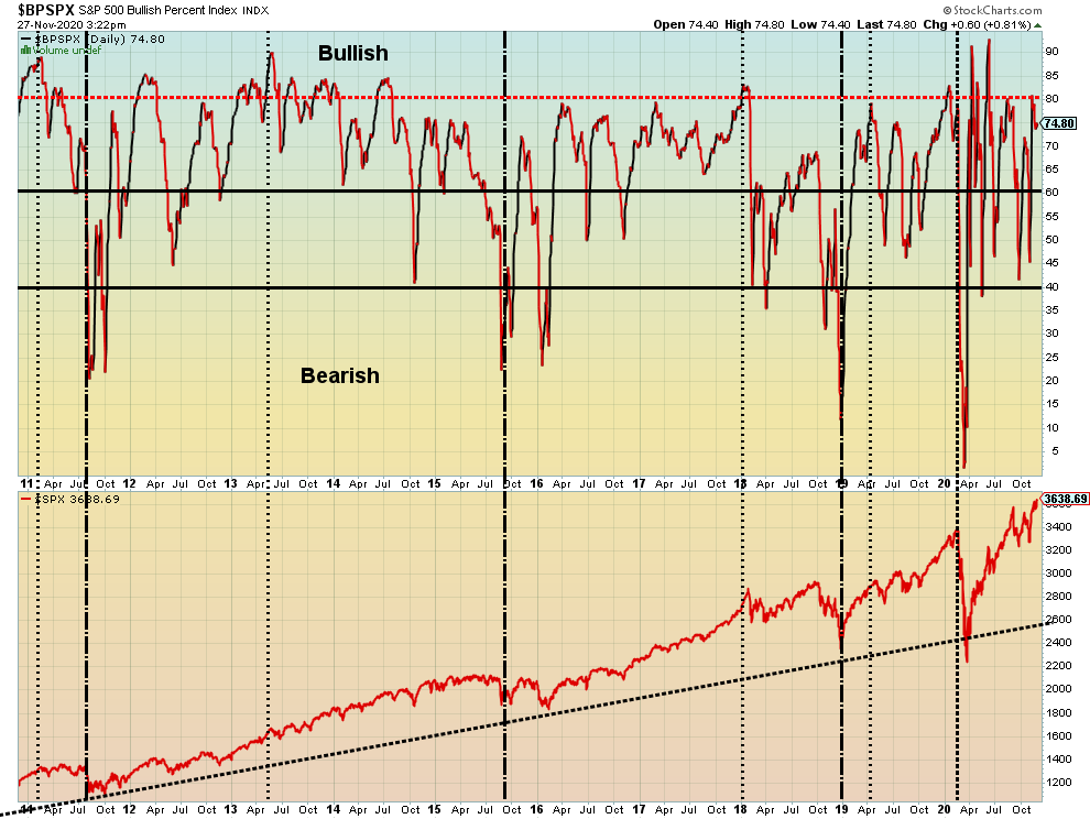
The S&P 500 Bullish Percent Index is also diverging with the S&P 500. It’s making lower highs even as the S&P 500 lingers at or near its all-time highs. Is this another divergence indicating caution in the market?
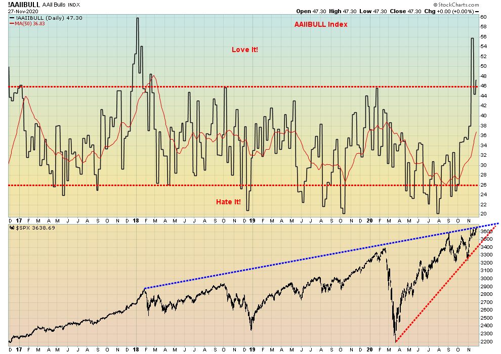
Another bull/bear indicator diverging with the price action of the S&P 500. Lower highs on the indicator, higher highs (barely) for the S&P 500. Another note of caution.
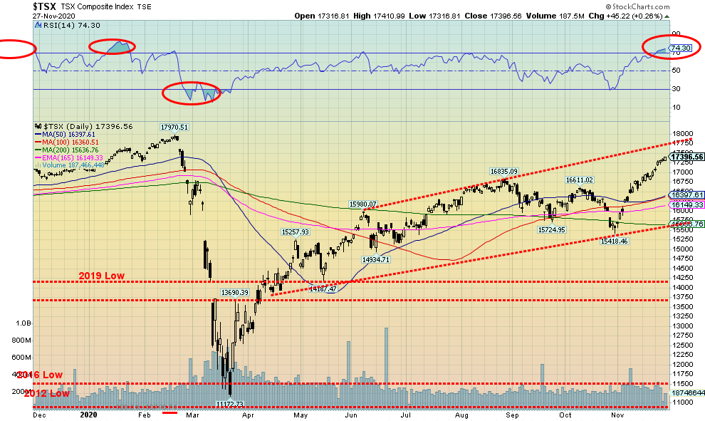
The TSX Composite keeps chugging higher, gaining 2.2% this past week. The small cap TSX Venture Exchange (CDNX) was also up, gaining about 1.2%. Only two of the 14 sub-indices were down on the week. Golds (TGD) fell 4.9% while Materials (TMT) was off 1.5%. Leading the way to the upside was Energy (TEN), jumping a healthy 11.3%. Energy appears to have come out of its doldrums and is leading an upward charge. Still, it remains down 37.4% on the year and will likely finish in the red. Information Technology (TKK) remains the best-performing sector, up 49.2% in 2020 but cooling of late. Info Tech gained 3.7% on the week while Financials (TFS) was next, up 2.4%. Utilities (TUT) was the only other one over 2%. Note the RSI on the TSX has hit 74 and that is a warning sign that this market is getting somewhat extended. Still, the top of that channel near 17,750 looks enticing. A pullback here wouldn’t hurt to ease the overbought extension. But overall, the TSX might not suggest a top is in until we break back under 16,400. Volume has not been impressive, suggesting to us that this entire move might only be a correction to the major plunge in March 2020. We still view the March crash as the A wave and we have been working on the B wave with the C wave to come.
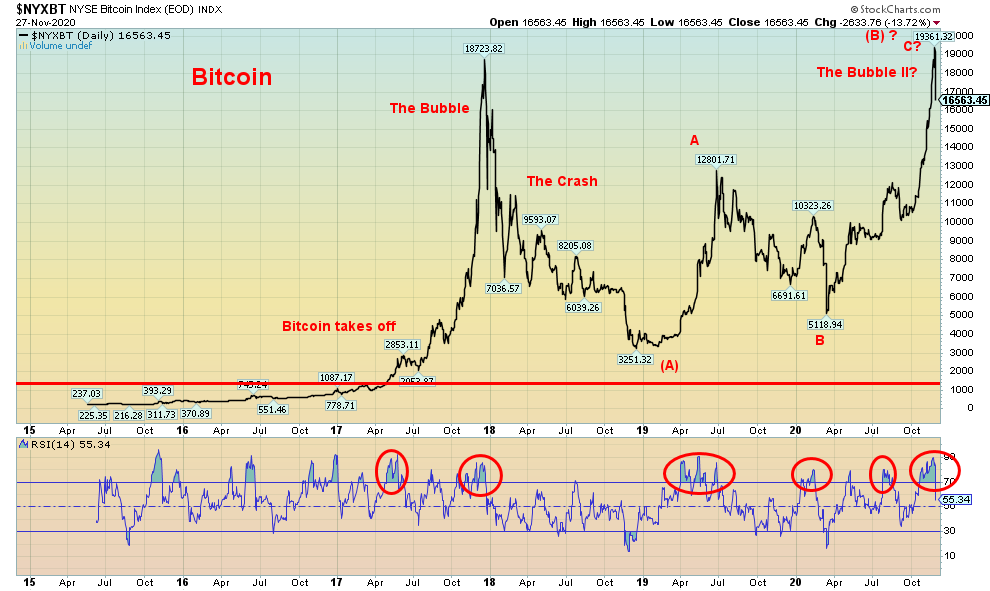
Bitcoin rose to a record level of $19,361 on November 24 and immediately after plunged almost $2,800 to close at $16,563 on Friday. So, was this another Bitcoin bubble that has now burst? And we now look forward to a crash similar to 2018? Naturally, we can’t quite say that yet. At this point we believe we’d have to see a plunge under $13,000 to suggest a crash is underway. A normal correction here might take Bitcoin back to just above $13,000 which is why we suggest that a crash might not get underway until we break down under $13,000. Certainly, Bitcoin is coming down from horrendous overbought levels not dissimilar to what was seen back in late 2017. Given the number of times the RSI has screamed over 70 in the past few years, extreme overbought is almost normal for Bitcoin. Still, the drop in Bitcoin this past week might be a warning for the U.S. stock market as the DJI has had a pretty good track record of tracking the cryptocurrencies up and down, despite some lags. Bitcoin remains the largest crypto with a market cap of $328.4 billion, representing almost 62% of the entire crypto market. There remain some 7,800 cryptos noted at Coin Market Cap (www.coinmarketcap.com). Some 27 cryptos have market caps over $1 billion. Together they make up almost 94% of the market. It’s amazing that 0.3% of the market numbers represents 94% of the market cap.
COVID Cases
We have seen a number of arguments about the likelihood of a person dying of COVID-19. The ratio that is widely reported is what is known as the “case fatality rate.” There is also the “crude fatality rate” and the “infection fatality rate.” Quite simply, the case fatality rate is “the number of deaths from COVID divided by the number of diagnosed cases of COVID all times 100.” The trouble with it is obvious as there may be many cases not reported and there may be related deaths that are not reported as dying from COVID. Based on the numbers we have today, the case fatality rate is 1,461,286/62,753,442 * 100 = 2.3%. For the record, the case fatality rate for the common flu is 0.1%.
Many who object to the lockdowns, masking, etc. use the crude fatality rate. All that means is they change the denominator to the total population. The result is, that includes all who have been reported as infected, plus those that have been infected but not reported, plus those not infected. The total world population is estimated at 7,794,798,739. So that means the crude fatality rate is 1,461,286/7,794,798,739 *100 = 0.019%. A big difference of 2.282% or 99.2%. No wonder they call COVID-19 just the sniffles. Most of the population has not been infected and may never be. But the danger is there that without exercising caution many more could become infected and reported as infected and that in turn results in more deaths. Still the argument is that 99.98% recover. So, what’s the big deal?
In previous pandemics the ability to track the number of cases was far more difficult. So, they would just use the crude fatality rate as they really had no idea what the actual number of cases were. Even the Spanish flu used the crude rate. And going back even further to the days of the bubonic plague or the Black Death it was even harder. Today, many who come down with COVID-19 wind up in the hospital and a smaller number on ICUs. In earlier times hospitals were not as plentiful and there were no ICUs.
In more ancient and medieval times, no wonder the phrase “bring out your dead” developed as those that came down with the plague just died in their homes, often on the same day. The bodies were eventually collected and burned in a pyre or buried in a mass grave or, if you were lucky, in a proper grave. Today they have mobile morgues to pick up the dead in the U.S. The plague just eventually ran its course. In the worst cases, one third or more of the population was wiped out. A reminder that upwards of 90% of the population of the Americas was wiped out following the arrival of the Europeans through disease (plagues from which they had no immunity), slavery, and wars. We hope that never happens again.
If there is one thing they don’t know, it’s the infected fatality rate. Many more might be infected, not know it, may never be diagnosed with it, and, of course, don’t die from it. But they may pass it on unknowingly. The total number infected would be a higher number than the number of cases reported.
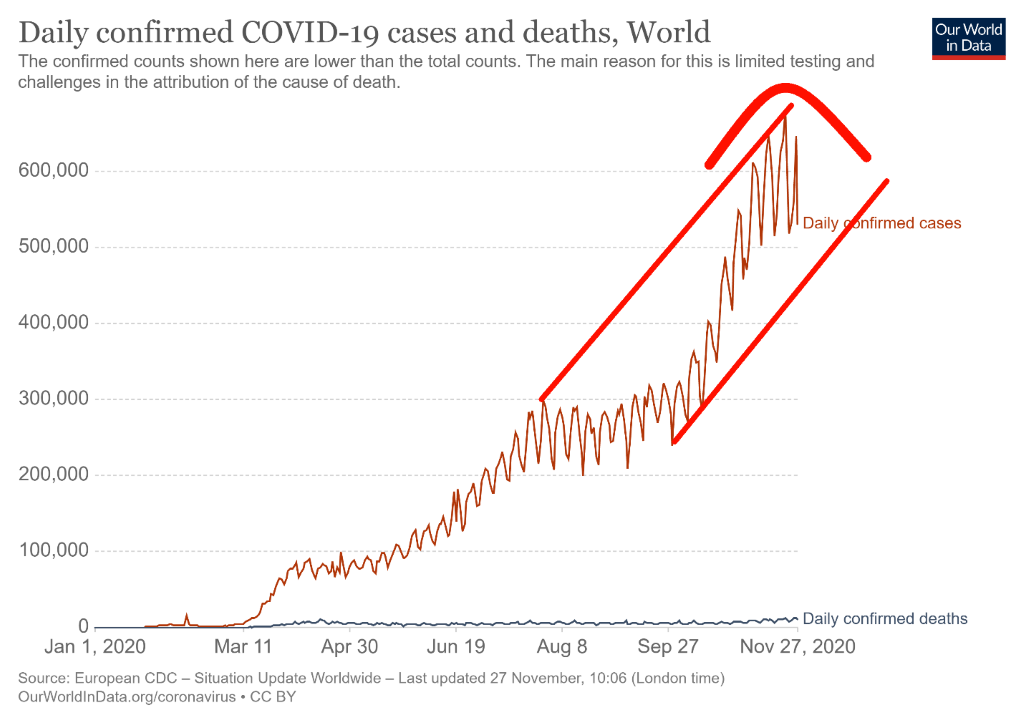
COVID-19 cases keep on rising. The reported number of cases now exceeds 62 million, with roughly a million cases every two days. The number of deaths exceeds 1.4 million and they are recording upwards of 10,000 deaths daily. The 7-day average for cases is now over 580,000 every day. The good news is that has flatlined somewhat over the past few days. The 7-day average for deaths daily is 10,205, making the deaths/reported cases ratio 1.8%. That’s down from what was seen in the first wave when the ratio peaked at over 9% in April. That is a huge 80% drop in deaths/reported cases. However, it says nothing about the state of the survivors, many of whom will have lifetime problems as a result of the disease. We don’t want to read too much into what appears as potential topping action on the number of cases. There have been days when over 600,000 cases are reported. We’d be more optimistic if the number of cases daily were to fall below 500,000 once again and stay that way. Otherwise, the number of cases could keep on rising in its bull channel. Twelve countries have now reported over one million cases as Germany passed that mark this past week. Poland is fast approaching one million cases. Outside of the U.S. who leads in terms of number of deaths, three other countries have reported over 100,000 dead – Brazil, India and Mexico.
COVID-19 Coronavirus Cases and Deaths November 29, 2020 15:42 GMT
Number of Cases: 62,753,442
Number of Deaths: 1,461,286
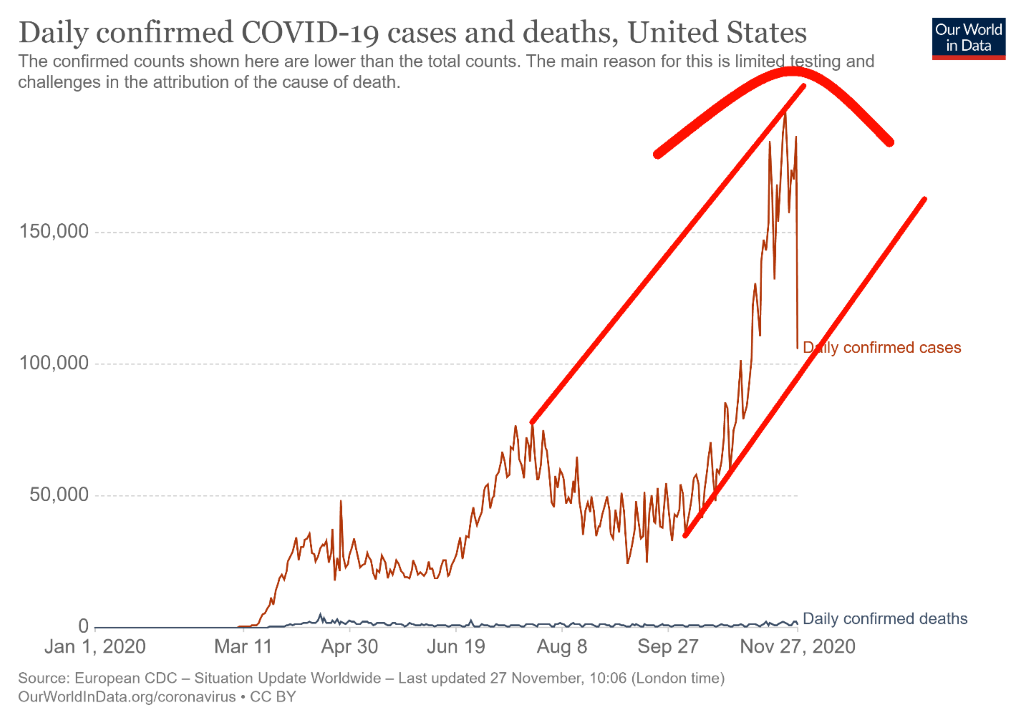
Yes, that looks like the U.S. had a huge plunge in the number of cases reported on November 26. The reality was, however, that 20 states did not even report that day; otherwise, the number would likely have been a lot higher. The next day, over 200,000 were reported, but some of that might have been a catch-up. The U.S. did hit over 200,000 cases on November 21. Deaths are routinely over 1,000 every day and upwards of 2,000/day with a 7-day average over 1,600. Over 2,000 deaths were reported on November 25. While everyone is excited about a coming vaccine, the reality is it isn’t here yet and cases and deaths could rise further before the vaccine is available. In the interim, mobile morgues patrol in Texas picking up bodies. Many hospitals are overwhelmed. It is unknown how many cases might come out of Thanksgiving as tens of thousands ignored recommendations to not travel at this time. The U.S. peaked out in deaths way back in April at almost 5,000 dead on April 16. The ratio of dead to reported cases has come down sharply since then. Only two states (Texas and California) are over one million cases with Florida fast approaching that level. Overall, the U.S. is marching towards 14 million reported cases and over 270,000 dead. The U.S. adds at least one million cases every week, usually faster.
COVID-19 Coronavirus Cases and Deaths November 29, 2020 15:42 GMT
Number of Cases: 13,619,437
Number of Deaths: 272,334
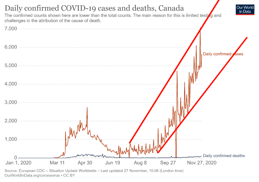
Canada’s cases keep on rising even as the number of deaths remains at levels lower than what was seen March through May. Canada reported a day when there were over 7,000 cases. Canada’s case count has been rising such that Canada has vaulted back into 29th place in terms of cases, up from 31st. In terms of deaths, Canada now sits at 12,000, good for 24th place. Canada has actually fallen from 22nd place. Our deaths-to-cases ratio is 3.3% but back in April to May it was over 7%. Daily now, Canada is averaging just under 2%, a big drop from the April/May period. But the number of cases keeps on rising and that is putting pressure on hospitals. As in other countries Canada is facing a backlash to masks, social distancing and crowd gathering. Violence has broken out in a number of instances as it has elsewhere.
COVID-19 Coronavirus Cases and Deaths November 29, 2020 15:42 GMT
Number of Cases: 366,518
Number of Deaths: 12,000
US 10–Year Treasury Note, Canada 10–Year Government Bond (CGB)
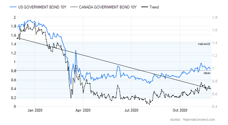
Yields on the U.S. 10-year treasury note rose marginally this past week to 0.84%, up from 0.82%. The Canadian 10-year Government of Canada bond (CGB) was also up to 0.68% from 0.66%. As we noted in our chart of the week, we are wondering whether interest rate yields are poised to move higher as we move into 2021. Cycles appear to suggest that they could. Economic numbers were a mixed bag once again this past week. The Markit Manufacturing PMI was at 56.7 and the Markit Services PMI was also at 57.9. Anything above 50 suggests expansion. Both numbers were better than expected. Case Shiller home prices rose 6.6% year over year, well above forecasts of a 5.1% rise. Durable goods orders for October came in up 1.3% above the 0.9% expectation. The trade deficit was $80.29 billion for October, slightly below the expected deficit of $82.0 billion. The initial jobless claims were higher at 778,000 when the market only expected a rise of 730,000. Personal income for October fell 0.7% while personal spending rose 0.5%. Both were off expectations of a gain of 0.2% for personal income and a rise of 0.4% for personal spending. The November Michigan consumer sentiment index was 76.9, below the expected 77. The Chicago PMI came in at a strong 61.1 vs. an expected 53. For the most part, the stronger economic numbers weighed on interest rates. The U.S. 10-year continues to trade below breakout levels of first 0.90% and then 1.00%. If we can clear 1.00%, then the odds favour a rise to at least 1.20%. We suspect the low for the year is in.
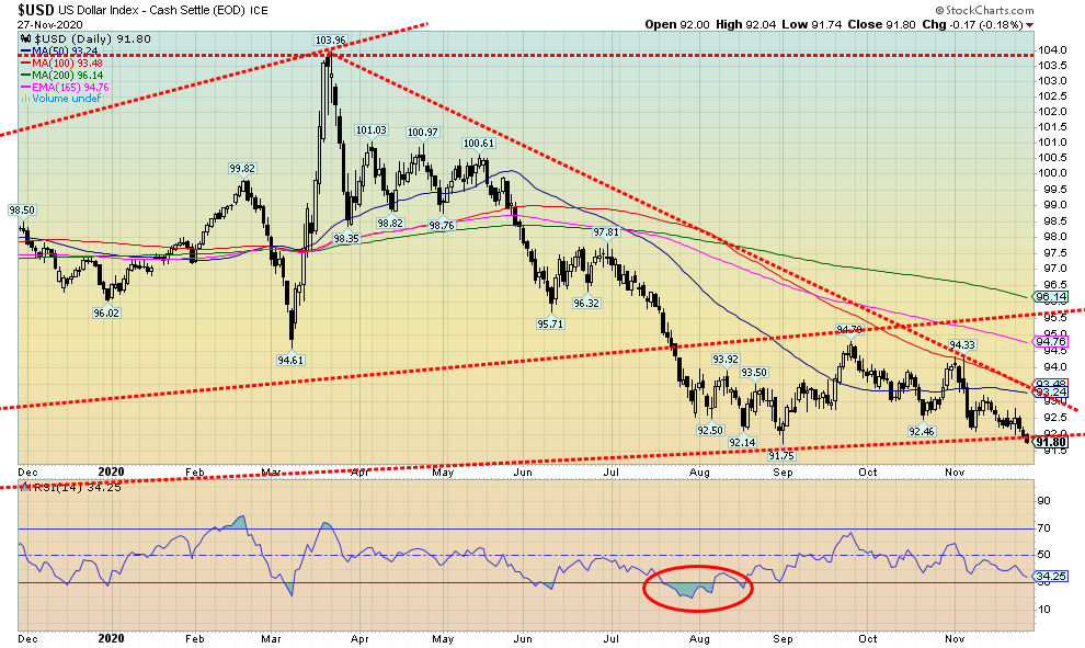
Is the US$ Index prepared to break down? That would appear to be the case, given this week’s collapse to 91.80. That is just barely above the September 2019 low of 91.75. The US$ Index fell 0.6% this past week. The currencies were up as the euro gained 0.8%, the Swiss franc was up 0.7%, the pound sterling gained about 0.2%, while the Japanese yen was off a small 0.2%. The Cdn$ gained 0.8%. It is unusual for the US$ Index and gold to fall at the same time, but that is exactly what happened this past week. The US$ Index could either plunge through 91.75, setting up a potential decline to 88.50 or we could still rebound here and retest the 93.25 zone. We can’t rule that out. Either way, we believe the US$ Index is poised to move lower. The question is, will it do it now or will it rebound again first before resuming its downward trajectory? We will see how the events of the assassination of the Iranian nuclear scientist play out. The U.S. dollar can still attract safe haven status, regardless of the turmoil in the Middle East. And if oil prices were to rebound and there is turmoil and shortages in the Middle East, then that is to the U.S.’s advantage given their position as a large oil producer and an exporter. That would be U.S. dollar positive. This could be an important week.
Gold did not have a good week. It fell 4.5%. Stop losses, we believe, were triggered once gold fell under $1,800. That in turn triggered a wave of selling that dropped gold below its 200-day MA before closing at $1,788. The low was seen at $1,776 on Friday. Gold has made new lows for the move down. That’s the bad news. The good news silver continues to diverge, not making new lows for its move down. Platinum, copper, and palladium were all up on the week as was oil. We have rarely ever seen gold maintain a bearish stance while the others are bullish. As well, the US$ Index fell this past week so gold falling in the face of a decline by the U.S. dollar is also unusual. If, as we suspect, gold is in a downward channel there is room to move lower still towards $1,750. The bullish consensus for gold may not yet be bearish enough to justify a low.
We are reminded that gold cycles are generally fairly predictable. What we appear to be doing is falling into the 31.3-month cycle low. The last one was seen in August 2018 at $1,167. The previous one was seen in December 2015 at $1,045. The next one is due April 2021 +/- 5 months. We are now into that time frame. We do note as well that gold has had a fairly good record of lows in December (could also be November or very early January as well) since its peak of $1,924 in September 2011. Since that peak, we note lows in early January 2012, December 2013, November 2014, December 2015, December 2016, December 2017, November 2018 (secondary low to the actual low in August), and November 2019 before a run-up that culminated in the March 2020 crash. With an RSI now approaching 30, gold is not quite oversold enough to suggest that we may have hit a bottom.
We believe, at least until further evidence suggests otherwise, that this past week was engineered takedown particularly after gold broke under $1,800. We had consistently noted that the commercial COT remained bearish. Given the Thanksgiving holiday, the weekly COT report won’t be available until Monday. So, at this point we do not have a report to make on the COT.
The question on our mind is, how strong will the rally be once we do find a low? A bearish rally would fail to take out the August high of $2,089. We are down a good $300 from that high. One can talk all they want about the coming vaccine or that the presidential transition will be orderly, but the reality is the vaccine is still not here and we don’t know what problems will be encountered with its rollout. As well, the presidential transition is anything but orderly as lawsuits continue and taking them to SCOTUS appears to be next on the agenda. And, as we discuss in our oil commentary, the assassination this week of a top Iranian nuclear scientist has some wondering whether the U.S. and Israel are prepared to start a war in the Middle East.
A bearish rebound would fail somewhere up around $1,950. Failure to break out over that level could suggest yet another plunge to new lows. The December 2015 low was also an important 7.83-year cycle low. So, the next one is due sometime between late 2021 to 2024. If we are, as we suspect, making the 31.3-month cycle low, then this is the second one dating from December 2015. To make the next up move bullish we would need to see new highs above $2,089. The first major hurdle is over $1,950. Next, we would have to break out over $2,015 to begin to suggest new highs ahead. That number could change somewhat if gold were to plunge to further new lows, something we cannot rule out just yet.
As we move into December it is important that we find a low for gold. But then it becomes dependent on the strength of the rebound rally. As noted, a bullish rebound doesn’t even begin until we have cleared at least above $1,950. In between, there is resistance at $1,825 and $1,875. Support is down to $1,750. But below that we are nervously eyeing long-term support way down at $1,625.
Silver fell 7.1% this past week. That’s the bad news. The good news is that, despite the fall, silver has still not taken out its earlier low at $21.81 seen in September. That is a divergence with gold that did see new lows this past week. Other areas of positivity were platinum and copper prices. As previously noted, platinum gained 0.8% this past week and copper prices hit a new 52-week high, up almost 4% on the week. Are platinum and copper leading? Palladium also put in a robust 5.0% gain on the week. The weakness was seen only in gold and silver. Silver fell because gold fell and, as we noted, gold fell because of a technical takedown once prices were below $1,800. Silver is currently down at the 165-day exponential MA. The 200-day MA is further below at $20.60. Silver is down just over 24% from its August high of $29.92.
None of this is to suggest that silver can’t fall below the September low of $21.81 and join gold. Lows for gold and silver into the December are not unusual. Since the major peak for silver back in 2011 at $49.82 we have seen lows in December (some even extended into very early January) in 2011, 2013, 2014, 2015, 2016, 2018 (November), and even a short-term low in December 2019 before the March 2020 crash.
We are reminded that silver has exhibited fairly steady major cycle lows every 7–8 years. 1993, 2001, 2008, and 2015 saw significant lows for silver. The next one is therefore due into 2022. But if it came in early, we could see a significant low in 2021. We will only know the longer-term bull cycle is still alive if silver was able to exceed the $29.92 high of August 2020. Any rally out of here that fails to break out over $25 would be bearish.
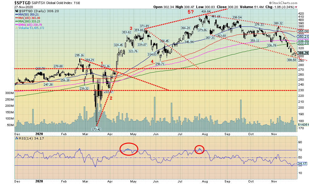
Gold stocks did not have a good week. The Toronto Gold Index (TGD) fell 4.9% while the Gold Bugs Index (HUI) was off 5.4% on the week. The gold stocks have maintained their gains for the year with the TGD still up 18.0% and the HUI up 16.2%. The bad news is, that is about half what they were earlier. The TGD is down 26% since its August high. That constitutes a bear market. To put that in perspective the TGD suffered through four corrections of 15% or more during the 2008–2011 bull market. The four saw drops of 24.5%, 25.5%, 40.5%, and 15.6% respectively. The 2000–2008 bull market was even worse with six corrections, all exceeding 28% with the highest a drop of 42% along the way to total a 365% gain over the eight years. The 2008–2011 bull saw the TGD rise in total over 200%. So far, this is the second sharp decline since a significant low was seen in September 2018. The March 2020 crash saw the TGD fall 41.2%. But the TGD is still up 110% from the September 2018 low.
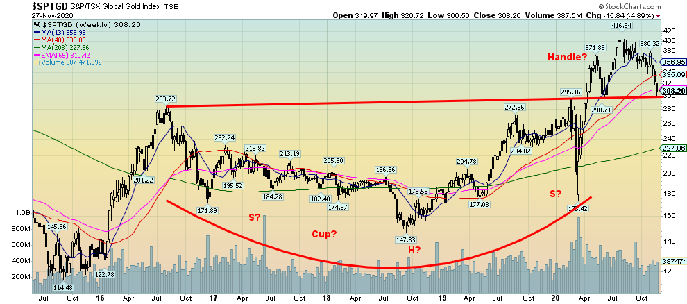
Our weekly chart of the TGD shows what appears to be a huge head and shoulders pattern that formed between August 2016 and April 2020. The pattern had a projected target of at least 436 for the TGD. So far, the high has been about 417. But this could also be a huge cup and handle pattern. If that is correct, then we are in the process of forming the handle. If we were to break out to new highs above 417, the target could be as high as 565.
On the weekly charts the TGD has fallen into a potential area of support near 310 and the 65-week exponential MA. On the daily charts the TGD is just below the 200-day MA. Friday’s action saw the TGD not make any new lows while leaving a potential small bullish engulfing pattern on the charts. The TGD first needs to regain above 335 but no breakout is possible until we are over 370. The RSI dipped briefly below 30 on November 24. The March crash also saw the TGD’s RSI dip only briefly under 30. The Goldminer’s Bullish Percent Index (BPGDM) is currently at 34.50. That’s not quite into deeply oversold territory. In March the BPGDM fell to a low of 7.70. Lower levels were seen in December 2015, October 2016, and September 2018. Other indicators are also not in what we would call deeply pessimistic territory. But there is enough going on with a still contested election, the threat of war in the Middle East, and, of course, the continued growth of debt and more stimulus on the way, even if we don’t know exactly when. All of these favour gold and ultimately the gold stocks as well.
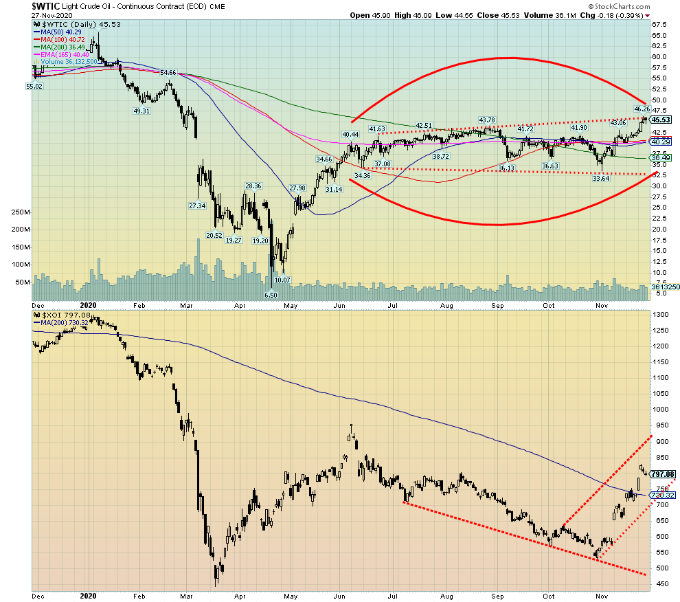
Are oil prices poised to break out? If rising energy stock prices are an indicator, then WTI oil could be poised to follow. This past week WTI oil hit a high of $46.26 before settling back and closing at $45.53, a gain of 7.3%. It is the highest WTI oil has been since the March 2020 crash. Natural gas (NG) was also up 2.5% but remains short of its recent highs. The energy stocks enjoyed another strong week with the ARCA Oil & Gas Index (XOI) jumping 8.8% while the TSX Energy Index (TEN) was up 11.3%. In looking at the chart WTI oil appears poised to break out to the upside and out of the wide-ranging sideways pattern that has prevailed since May.
We guess the word for the energy markets is hopeful. Hopeful for a vaccine. Hopeful for an OPEC cut extension. The energy stocks appear to be leading the way as they have leaped over the 200-day MA and appear poised for higher prices. Grant you, they are a little over extended with the TEN having an RSI of 77 and the XOI’s RSI at 69, down from highs over 70 earlier in the week. So, a pullback or just a pause would be healthy. But if this is a strong bull, then the RSI can remain elevated for some time.
There are hopes for the vaccine, even if that is a few months away. But OPEC might help here since they are leaning towards a 3-month extension of their cuts. A wildcard is the assassination on Friday of the top nuclear scientist in Iran. Could something be brewing in the Middle East? Earlier, there were secret meetings between U.S. Secretary of State Mike Pompeo, Israeli Prime Minister Benjamin Netanyahu, and Saudi Crown Prince Mohammed bin Salman. Recall that President Donald Trump has already asked about bombing Iran’s nuclear facilities (which are quite deeply buried). The request came following his failed election vs. Joe Biden. The question has become, are Israel, the U.S., and Saudi Arabia willing to start something? Iran claims no nuclear weapons and the UN inspection has repeatedly verified that fact.
An attack on Iran could spark a sharp rise in oil prices. The question would be, could Iran choke off the Straits of Hormuz where roughly 21% of the world’s oil flows through? It is the world’s most important oil transit point. China, Japan, and others, despite supposed sanctions on Iran, receive Iranian oil. But it would also cause problems for Saudi, Kuwaiti, Iraqi, Qatari, and UAE oil, all of whom ship through the straits. The explosive Middle East would become even more explosive. Naturally, all of this is speculation. Nobody denied the meeting did not take place between Pompeo, Netanyahu, and bin Salman.
Something else we have learned in following oil reports is that Venezuela has resumed oil shipments to China, despite sanctions. As well, there are reports of pirates operating in the Bay of Campeche, part of the Gulf of Mexico. Against that background, shale bankruptcies are continuing.
Things could become heated and that could spark a breakout for oil prices.
__
(Featured image by D’Vaughn Bell from Pexels)
DISCLAIMER: This article was written by a third party contributor and does not reflect the opinion of Born2Invest, its management, staff or its associates. Please review our disclaimer for more information.
This article may include forward-looking statements. These forward-looking statements generally are identified by the words “believe,” “project,” “estimate,” “become,” “plan,” “will,” and similar expressions. These forward-looking statements involve known and unknown risks as well as uncertainties, including those discussed in the following cautionary statements and elsewhere in this article and on this site. Although the Company may believe that its expectations are based on reasonable assumptions, the actual results that the Company may achieve may differ materially from any forward-looking statements, which reflect the opinions of the management of the Company only as of the date hereof. Additionally, please make sure to read these important disclosures.


The TopRanked.io Weekly Affiliate Marketing Digest [The Top VPN Affiliate Programs Roundup]
Want to be let in on a little secret about two massive affiliate opportunities you can take advantage of today?...


Sustainable Finance Faces Hurdles as Green Asset Ratio Reforms Fall Short of Full Transparency
The Green Asset Ratio (GAR) measures banks' alignment with the EU Taxonomy but remains low due to methodological flaws and...


XRP Hits New All-Time High Amid U.S. Crypto Policy Shift and Ripple’s Expansion
XRP surged past its 2018 all-time high, reaching $3.65 amid renewed political support for crypto in the U.S. under Trump....


Germany Moves to Curb Medical Cannabis Abuse, Sparking Access Concerns
Medical cannabis imports in Germany have surged, but health insurance-covered prescriptions remain low. Easy online access raises concerns about abuse...


JPMorgan’s Data Fees Shake Fintech: PayPal Takes a Hit
JPMorgan Chase will charge fintechs for customer data, threatening business models reliant on free access. PayPal’s stock plunged 5.7% after...
 |
|
 |  |
 |
|
-

 Crowdfunding1 week ago
PMG Empowers Italian SMEs with Performance Marketing and Investor-Friendly Crowdfunding
-

 Markets5 days ago
Markets Wobble After Highs as Tariffs Rise and Commodities Soar
-
 Markets2 weeks ago
The Big Beautiful Bill: Market Highs Mask Debt and Divergence
-

 Africa2 days ago
ORA Technologies Secures $7.5M from Local Investors, Boosting Morocco’s Tech Independence