Featured
Interest rates surge; Iran nuclear deal intensifies global tension
Interest rates spike through the roof and hit a new record high at 3.11%. As the U.S. cuts ties with Iran, the latter wants to divert oil payments in Euros.
Bubbles and crashes occur throughout history. There actually doesn’t appear to be any set frequency as to when crashes will happen. Since 1950 we note crashes (not necessarily U.S. stock market crashes) in 1962 (Kennedy Flash Crash), 1973–1974 (oil, Watergate), 1980 (gold), 1987 (Black Monday), 1990 (Iraq, Oil), 1991 (Japan), 1992 (Pound Sterling), 1997 (Asian Financial Crisis), 1998 (Russia), 2000 (dot-com), 2001-2002 (9/11, dot-com), 2008 (global financial crisis), 2010 (EU), 2013 (gold), and 2015 (China).
Over the past 100 years or so, dating back to 1900, there have been at least two prolonged periods of a strongly trending upward markets. The first occurred from 1944–1966 following the end of the Great Depression and war, while the second occurred from 1982–2000 and featured the high-tech/internet/dot-com bubble that culminated in 2000. The most recent rise (2009–2018) is actually fairly short, so far, compared to the other two. It has been known as the “everything bubble.”
All other periods would have to be considered long periods of consolidation. That would have included the “Roaring Twenties” stock market rise, subsequent crash, and the Great Depression. Indeed, the entire period from 1900–1944 was one long consolidation in some respects despite the extremes. The next consolidation period was 1966–1982, and the most recent was 2000–2009.
The question now is: Is the current consolidation the start of another period of consolidation that ends in a crash? Or is it merely a pause in a long-term bull market? During the 1944–1966 bull market, there were significant pauses in 1946–1949, 1952–1953, 1956–1957, and 1961–1962. The steepest decline was the 1961–1962 mini-bear when the Dow Jones Industrials (DJI) fell 25%. Following that, the DJI rose 86% from 1962-1966. By comparison, the January/February 2018 drop was only 12.2%. But then, the initial drop in July 2007 as the sub-prime mortgage market began to unravel was only 10.7%. Many thought the crisis that sparked the drop was over as the markets regrouped and made slightly higher highs in October 2007.
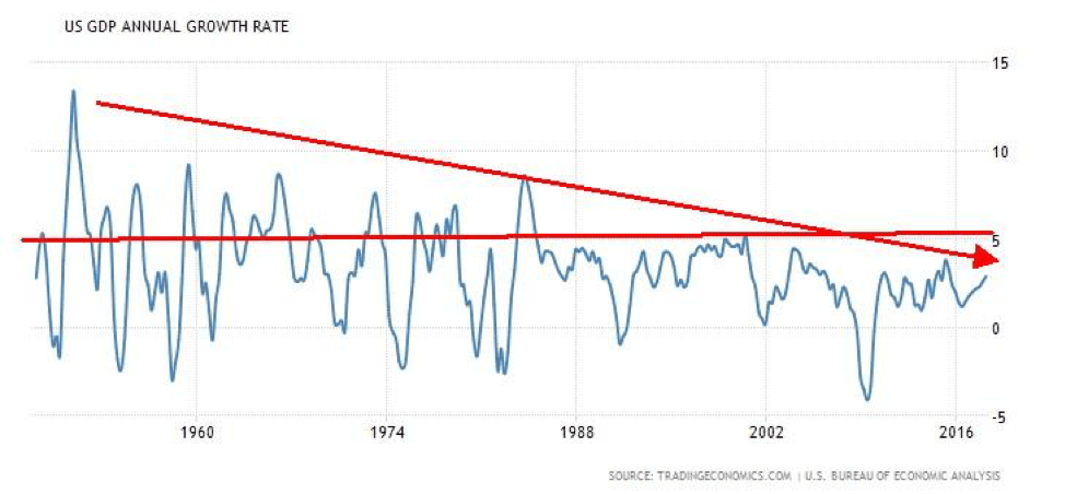
Usually, when the economy comes out of a recession, the first year or two sees strong growth. The chart below shows annual GDP growth rate. Note that recessions in 1953, 1957, 1960, 1970, 1974/1975, 1980/1983 all showed GDP annual growth rates of 5% or more following the recession. Following the early 1990s recession, the annual GDP growth rate faltered and failed to really record any year over 5%.
Following the 2001/2002 recession, the annual GDP growth rate fell short of 5%. Coming out of the 2007/2009 recession, the annual GDP growth not only failed to reach 5%, but it was consistently short of the growth rates out of both the 1990 and the 2001/2002 recessions.
© David Chapman
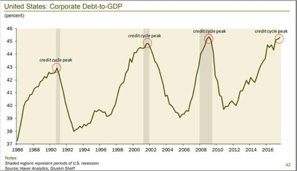
Recall as well that in all of those recessions, the Federal Reserve (Fed) pushed interest rates increasingly lower until finally after the 2007/2009 financial crisis and recession interest rates fell virtually to zero. As well, the Fed engineered an aggressive refinancing of the financial system with quantitative easing (QE). But there was one thing in common following each of those recessions, and that was a massive increase in debt. In 1980, total debt in the U.S. (government, corporate, and personal) totaled $4.4 trillion. Since then, debt has increased by $65.8 trillion or 1,395%. Today, it sits at $70.2 trillion. While everyone loves to talk about how government debt has exploded (and it has), the worrisome part is corporate and consumer debt has also exploded.
Corporate debt to GDP is as high as it has ever been. As John Mauldin of Mauldin Economics argues, the U.S. economy—and the world economy, for that matter—have been increasingly built on a mountain of debt. Mauldin argues we no longer have business cycles; we have credit cycles. But the debt can only grow for so long; then it becomes stretched and it doesn’t take much to set off a credit crisis. We have seen that in spades, more and more—going all the way back to the crisis of 1974/1975. Increasingly, it required more and more debt out of each crisis to buy an additional dollar of GDP. When it becomes too stretched, as it did in 2007, it breaks, and the crisis is so severe that it could bring down the global economy. Each subsequent crisis has been worse than the previous one and each crisis required more and more debt to drag the economy out of its slump. Yet, despite all the debt, the economy can’t even grow as fast as it did 40-50 years ago after a recession.
© David Chapman
Storm clouds are now gathering. Usually, following a sharp decline from a top, there is return action to either a double top or even small new highs. Given we are now almost four months from the Jan. 26, 2018, top, the likelihood of new highs is starting to become somewhat suspect. Does that mean we could have a crash at any time? Probably not, as these things take time to play themselves out. It is worthwhile, however, to review some of the storm clouds we see gathering.
- Record debt. Globally, debt has reached $237 trillion. The U.S. alone has $70 trillion of the debt or 30% of global debt. Government and corporate debt in the U.S. is at record levels. Consumer debt is up but is in better shape than what it was back in 2007 in some respects, even as it has also hit record levels. U.S. consumer debt recently hit a record high at $13.1 trillion. The high debt is a feature of all the western nations and many others such as China. Emerging markets are quite vulnerable. Emerging market debt is estimated at over $50 trillion. Much of this was borrowed in US$. A rising US$ makes it difficult to pay back the debt in US$. In seeking higher yields, U.S. pension funds have purchased a lot of this debt. Sovereign debt collapse could occur in Venezuela, Argentina, Ukraine, and even in western nations such as Greece and Italy. Overall, global credit (debt) has been growing faster than global GDP. That is never a good sign.
- On the surface, the economy continues to perform well, but employment numbers have been softening and the unemployment rate has been falling, primarily because of a drop in the size of the labor force, not because more people are working and the number of people not considered to be a part of the labor force has been growing. Earnings have been good and should continue as such, but P/E ratios are extremely high, at levels that exceed those seen in 1929 and 2007, although below what was seen in 2000. Rising inflation should benefit commodities and energy in particular. Consumer confidence remains high, but that could change quickly if unemployment starts to rise. With unemployment at a multiyear low, it is highly unlikely it has much more room to move lower, and the risk shifts to the upside.
- Interest rates have been rising. The 10-year U.S. Treasury note is now over 3.00%, hitting a recent high of 3.11%. The Fed plans on hiking the key Fed rate at least two more times in 2018 and more in 2019. There are even suggestions the Fed might hike three times in 2018. Higher interest rates have been putting upward pressure on the US$. A higher US$ is negative for foreign borrowers in US$. The reality is a lot of US$ debt has been issued in the past several years outside of the U.S. Higher interest rates and a higher US$ are a double whammy to this debt. The Fed has a history of starting to hike rates too late and then raise them too high, thus sparking the next crisis. Also, the Fed is continuing with its quantitative tightening (QT) program whereby they are reducing their balance sheet. This has the effect of taking money out of the financial system. Higher interest rates are starting to bite as delinquencies rise for car and student loans in particular.
- War clouds are gathering, particularly in the Mid-East where Israel and Iran recently exchanged fire after the cancellation of the Iranian nuclear deal by the U.S. Strife continues on the Israel/Gaza border. North Korea has canceled summits with the U.S. because of the decision by the U.S. and South Korea to hold military drills. Once again, Trump is threatening regime change if they don’t get rid of their nuclear weapons. Tensions remain in Europe along the Russian border, particularly in Ukraine and in the South China Sea with China.
- International trade remains under duress, and the threat of trade wars remain. The U.S. has announced numerous trade tariffs and China has taken retaliatory action. NAFTA remains in a state of flux. Trump wants to reduce the U.S. trade deficit, but his actions are actually making it worse. While the US$ has been rising, the likelihood is that it will change as Trump pushes for a lower US$. Tariffs are like a tax. While the U.S. cut tax rates with one hand, they raised taxes via tariffs with the other hand. Problems are already showing up in a number of industries that are negatively impacted by tariffs or the threat of tariffs from other countries.
- There are ongoing threats to global US$ hegemony, with Iran announcing it will take payment for its oil in Euros. The prime reason is the U.S. is cutting off Iran from the global financial system. Instead, Iran will use foreign exchange bureaus and wants no transactions in US$. The EU has indicated it may accommodate them, given how upset they are with the U.S. over sanctions that are negatively impacting their trade. The EU is already steaming over the U.S. pulling out of the Paris Accord and the TTIP (Transatlantic Trade and Investment Partnership), plus rising oil prices that hit the EU hard. Maybe it’s a coincidence, but soon after Iran’s announcement, the U.S. canceled the Iranian nuclear deal, reinstated sanctions including declaring that the head of the Iranian central bank was a terrorist and a shooting war started between Israel and Iran. However, the main threat to the global dominance of the US$ is coming from China who is in the process of creating a Yuan trading zone in China by creating counterparts to the U.S.-dominated institutions of the IMF, the World Bank, and the SWIFT payment system. Also, China is building the new Silk Road that will link 68 countries, 65% of the world’s population, and 40% of the world’s GDP. The currency will be the Chinese Yuan. Russia and Turkey are also switching to Euros and avoiding US$. But the EU, in looking for ways around Iran sanctions, is headed for a collision course with the U.S., along with the one already in progress with Iran, China and Russia.
- Whether one wishes to accept global warming as a fact or not is moot, with increased frequency and severity of storms, floods, droughts, and more. Sea levels are rising and threatening populations. There are estimated to be over 65 million refugees in the world—record levels as a result of war, famine and global warming. The cost of all of this is putting more upward pressure on sharply rising global debt and creating instability.
- Finally, the EU itself is on a collision course with itself following the election of a number of hard right governments in Hungary, Poland, Austria and now in Italy. All are also anti-EU. It could lead to the breakup of the EU itself.
In an environment of gathering storm clouds, can the stock markets make new all-time highs? Some, such as the Russell 2000 and the S&P 600 (small cap), already have. Internationally, the Paris CAC 40, the Singapore Straits Time Index, and the EuroNext 100 Index have as well. But following an initial break of over 10%, the record for the markets returning to the previous highs is not particularly good. After an initial break in 2007 of 10.7%, the markets eventually made new all-time highs almost two months later. By the end of May 2018, we will be four months from the January 2018 top. Following the top in January 2000, the DJI made a series of ups and downs for the next 19 months but never again made new highs. The events of September 2001 (9/11) started a crash. There was a strong rebound in February 2002, but then the market once again crashed into the October 2002 low.
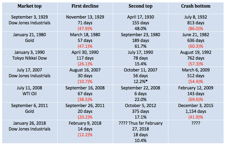
So, while new highs remain possible, the odds are starting to slip. The table below shows us the time of the market top followed by the first decline. We note the time it took to make the low following the top and how much the market lost. The crash of 1929 is still the steepest one-time decline, although gold’s crash in 1980 is just behind. We then note the secondary top, how long it took to get there from the low and the gain. While gold in 1980 had the biggest gain, it took just over six months to get there. The shortest was WTI Oil in 2008, where the market rebounded 22% and topped just six days later. Finally, we note when the crash bottom took place and how long it took to get there after the secondary top. The biggest decline was the Great Depression collapse where the DJI fell 86% from its April 1930 top. It took the equivalent of two years and 3 months to get there. WTI Oil collapsed almost 70% in five months. Gold’s collapse from 2011 to 2015 took the equivalent of three years and two months, but the decline was only about 42%.
The high so far, following the first decline, came a mere 18 days later as the market gained a meager 10.4%. Could that be it? Time will tell as it only starts to become confirmed once the market makes new lows.
*New highs © David Chapman
None of this suggests the markets can’t make new all-time highs and are going to crash. What makes it a possibility that no new highs will be seen, and after that, the market could crash is the pattern that appears to be forming (technical) and the gathering economic storm clouds (fundamental). Even if new highs are seen, the gathering storm could send markets into a tailspin although the final low might not be seen until 2020 or even as late as 2022. According to Ray Merriman and his studies of long-term cycles, he has noted 2022/2023 as a potential period for a significant stock market low.
Some have noted the possible presence of a 90-year cycle in stocks. A fascinating series of bank failures and wars occurred during the 1550s and into the 1570s where a major economic depression took place. A series of stock market lows, economic depressions, and war took place during the 1670s and into the 1690s. A further series of economic depressions and wars took place from roughly 1760 (Seven Years’ War) and up until the 1780s (American Revolution). The 1870s and up into the 1890s was known as the period of the “Long Depression.” The 1970s saw the steepest recession since the Great Depression of the 1930s.
While none of those cycles catches the upcoming 2020s, other cycles do. 2022 is 90 years from the Great Depression low of 1932. There was a major economic depression in the late 1830s, culminating in a major stock market low in 1843. Ninety years earlier is 1753, and the early stages of a depression and the Seven Years’ War (1756–1763).
The conclusion is the current market needs to be watched carefully for signs that the rebound underway is going to fail. While new highs are possible, a failure to regain those highs is also possible given we are now four months from the all-time high seen in January 2018. Warning signs are there, and investors should be cautious going forward.
Bitcoin watch
© David Chapman
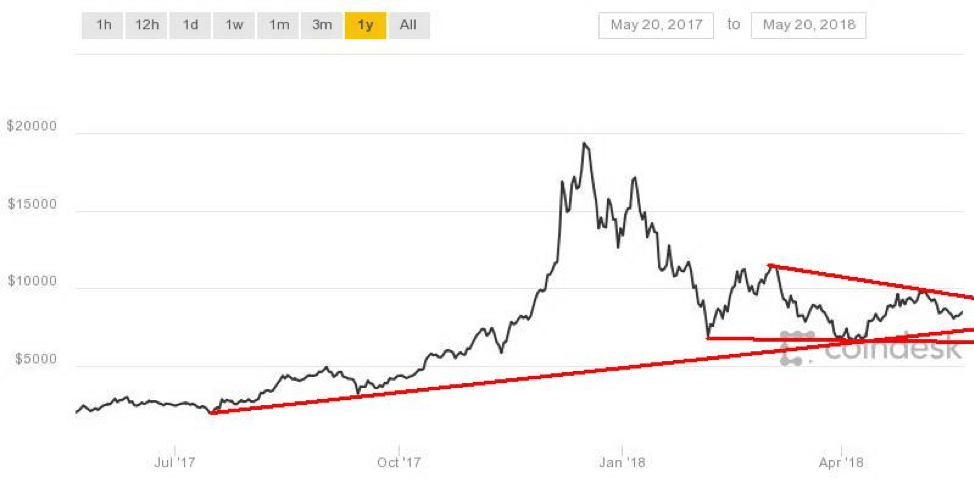
Once again, the bloom has come off Bitcoin and the cryptocurrencies. After hitting almost $10,000 on May 5, 2018, Bitcoin has fallen almost 20%, briefly dipping under $8,000. A firm break under $8,000 could send Bitcoin tumbling towards the lows seen on April 6, 2018, near $6,600. It is interesting to note the top in December coincided with the start of futures trading on the CME and the most recent top roughly coincided with an announcement from Goldman Sachs that they were going to offer derivatives on Bitcoin. The introduction of derivatives on cryptos means that trades can both buy and sell and go outright short. It introduces arbitrage opportunities. All of this helps narrow spreads, and it also allows short sellers to attack Bitcoin.
Over the past week, very few cryptos are up. Most are down to varying amounts. Of the top 25, only two, ZCash (ZEC) and Binance Coin (BNB), have seen gains. The biggest gain was ZCash, up roughly 48% after the Winklevoss twins’ Gemini digital currency exchange became the first in New York to receive a license to trade the privacy-focused cryptocurrency. Trading starts on May 22. Yes, the same Winklevoss twins who accused Mark Zuckerberg of Facebook fame of stealing their idea called ConnectU, as featured in the film “The Social Network.”
The market cap for all cryptos has fallen to $366 billion, down roughly $20 billion from the previous week. Total market cap has fallen almost $100 billion in the past few weeks. The number of cryptos has also fallen to 1,593 from 1,604 the previous week. We have long noted that there are far too many cryptos and many should fail. There remain 24 cryptos with a market cap of over $1 billion. Bitcoin remains the largest with a market cap of about $138 billion. At its peak, Bitcoin had a market cap of $324 billion, thus a decline of roughly 57%. Cryptos are not for the fainthearted.
We noted a story that China said they found 421 fake cryptocurrencies. Most of them are deployed overseas. China has also said most cryptos are being used to launder money. As well, some 271 ICO’s out of 1,450 ICO’s have been flagged as fake. We have said consistently that there are too many cryptos, and that money laundering and other scams most likely proliferate. Another reason this market has further to fall.
It is difficult to say just yet what kind of pattern Bitcoin is forming. It is possible that it is forming a descending triangle, which would be bearish. But the evidence so far is only lower high. We most likely need a few more.
Markets and trends
Note: For an explanation of the trends, see the glossary at the end of this article. New highs/lows refer to new 52-week highs/lows. © David Chapman
© David Chapman
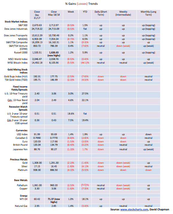
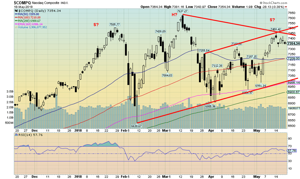
This past week, the S&P 500 fell 0.5% while the Dow Jones Industrials (DJI) also fell 0.5%. The Dow Jones Transportations (DJT) eked out a small 0.2% gain while the NASDAQ fell 0.7%. Here in Canada, the TSX Composite bucked the trend, gaining 1.1% thanks to strength in energy stocks. The junior TSX Venture Exchange also gained up 0.4%. But the real winner on the week was the small cap Russell 2000 that jumped to new all-time highs with a 1.2% gain.
In overseas markets, the MSCI World Index lost 0.5%. European markets were, however, generally up. The Paris CAC 40 gained 1.3% making new all-time highs. The German DAX gained 0.6% while the FTSE 100 closed the week up 0.9%. The Tokyo Nikkei Dow (TKN) jumped 0.8% but the Shanghai Stock Exchange (SSEC) lost 0.3%.
The S&P 500 managed to crawl back over the 100-day MA but it has been on reduced volume. This tends to make the rally suspect. This past week the S&P 500 managed to hold above the 100-day MA, but it is a shaky one. Left unchallenged for the moment is the March high of 2,802. If the market could take out that point then odds begin to shift that new highs could be seen. Failure would be a break back under 2,675 and the 50-day MA. At that point, odds begin to suggest new lows ahead. The pattern that formed following the January high still potentially suggests new highs but given we are now almost four months from that high time is running out. We can’t dismiss the thought that a chop-chop market very similar to 2000/2001 might take place. The two waves that took place following the high are in our opinion too short of a period to qualify as intermediate waves. This is why the 2000/2001 might be more likely. Those two waves were the collapse into February 9, 2018, at 2,532 and the subsequent bounce back to a high on March 13, 2018, at 2,802.
We know it is “sell in May and go away,” but there are often important lows in the early part of spring that turn into summer rallies. So we have to watch for that as well. That could give us more credence for a chop-chop market ahead.
© David Chapman
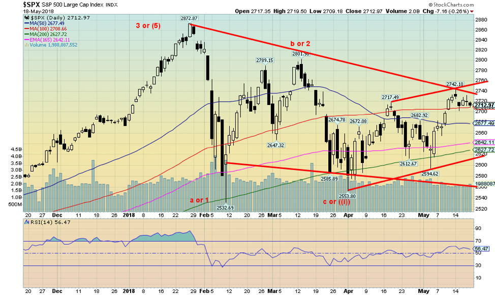
The NASDAQ index made new all-time highs on its return action into the March high. It was the only index to do so. A negative divergence with the DJI, the DJT, and the S&P 500. The NASDAQ has moved nicely higher and, unlike the S&P 500, has nicely cleared the 50- and 100-day MAs. But like the other markets, the NASDAQ faltered this past week. It may be a pause before higher prices. But we need some volume and failure now could set up a potential head and shoulders top pattern. The breakdown point is at 7,000 and has the potential to send the NASDAQ down to targets at 6,000. That is why it is now important to see a move by the NASDAQ early this week that takes out the January high at 7,505. That would begin to bust the potential H&S pattern.
© David Chapman
If there is one thing that holds out hope for new highs, it is the performance of the small cap stocks, represented here by the Russell 2000. The small cap S&P 600 also made new all-time highs this past week, but the S&P 400 (mid caps) did not. Usually, in a bear market, it is the small caps that get hit first and the hardest. But they aren’t as susceptible to the Trump’s trade moves as the large cap and mid cap companies. So they may be benefitting from that. In theory, the breakout suggests much higher prices, but if the other markets turn down the Russell 2000 will follow. And remember so far only the Russell 2000 and the S&P 600 are making new all-time highs. The others are not and that is a potential negative divergence. The RSI is also getting high but it has been higher and for longer. So that is not a particular issue just yet.
© David Chapman
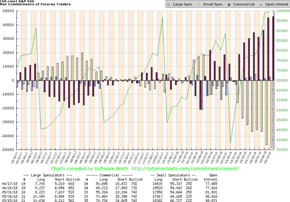
The commercial COT for the S&P 500 remains high at 74%, unchanged from the previous week. The commercial COT continues to suggest that the S&P 500 could move higher. The large speculators COT (hedge funds, managed futures etc.) actually rose slightly this past week to 56% from 53%. There really wasn’t much movement in the long and short open interest for the commercial COT. The COT seems to indicate higher levels ahead for the S&P 500, but it doesn’t necessarily guarantee higher prices.
© David Chapman
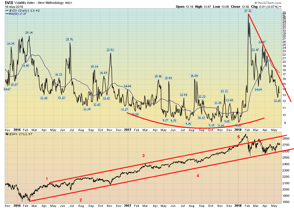
Volatility, as measured by the Volatility Index (VIX), has come down quite a bit from the high seen in February when the S&P 500 was plunging. The high of 37.32 was the highest seen since August 2015. While volatility has come down from its highs it is highly unlikely that the lows that were seen during 2017 will be seen again. The last time we had prolonged high volatility was the drop in the market in 2015/2016. The recent peak was, however, only about half the level seen in 2008 at the height of the financial crisis. Despite the recent drop in volatility, it remains well above the low levels seen throughout 2017.
© David Chapman
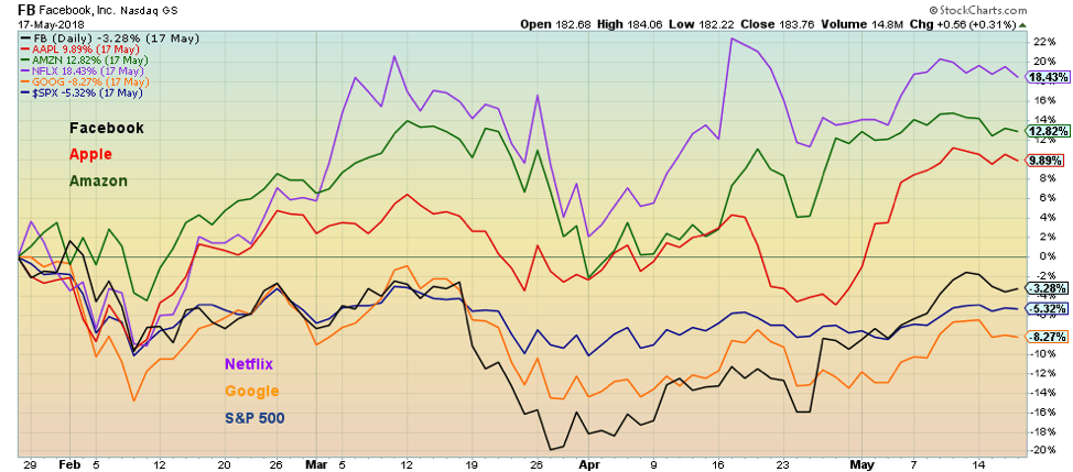
It is interesting to observe the performance of the FAANGs (Facebook, Apple, Amazon, Netflix, Google) since the market top in late January. The FAANGs led the market up so they could, in theory, lead the market down. We have compared the performance of the FAANGs since the January top vs. the performance of the S&P 500. The winner: Netflix (NFLX), up 18.4%, followed by Amazon (AMZN), up 12.8% and Apple (AAPL), up 9.9%. They are, however, the only ones in positive territory. The others are all down but not by a lot. Facebook (FB) given all its troubles recently is only off 3.3%, while Google (GOOG) is the biggest loser, down 8.3%. The S&P 500 has fared marginally better, off 5.3% from its top. The FAANGs are hanging in. But all seem to be rolling over in looking at this chart. Thanks to John for the suggestion to show this chart.
© David Chapman
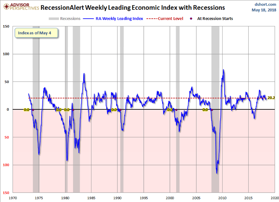
Here is an interesting index known as the Weekly Leading Economic Index (WLEI). It examines 50 different time series from corporate bond composites, treasury bond composites, stock market composites, labor market composites, and credit market composites. It has a one-week lag. This chart uses data back to 1973. The chart indicates that things are slowing but are not in recession territory. It dipped under 0 back in 2016 but it never triggered a recession. As we have often noted, we are deep into this cycle, one that is being propped up by huge amounts of credit. As with interest rates, it is going to put pressure on the economy and it could (should?) trigger another credit crisis.
© David Chapman
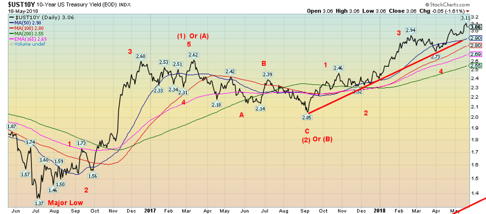
The U.S. 10-year Treasury note hit a high this past of 3.11% before pulling back, closing at 3.06% up from 2.97% the previous week. The 10-year is now getting closer to our long-term targets of 3.20%. The 10-year appears to have been rising in a distinct five wave pattern since its low at 2.05% back in September 2017. As we showed last week, bond yields (yields move inversely to prices) are most likely approaching a potential 6-year cycle high (6-year cycle low for prices). The last significant low was seen in 2013 so, in theory, upward pressure on interest rates could remain into 2019. Higher interest rates are seeping into the economy as mortgage rates are rising (in Canada as well), and delinquencies are rising on car loans and student loans. Housing starts and new home sales have sagged recently so it is possible that higher interest rates are beginning to dig. The homebuilders index is down 16% from its high. Corporate debt is also slowly becoming shaky as well. Of course, a 3% yield on the 10-year really doesn’t seem all that high in an historical perspective. But one needs to keep in mind that the 10-year is up about 124% since its low in 2016. A move of that magnitude has caused recessions in the past. The higher yield is also sparking the US$ higher as well as fund flows move out of lower interest rates in the EU and Japan for higher yields in the U.S. A higher US$ is not particularly good for foreign borrowers who have borrowed heavily in US$.
Recession watch spread
© David Chapman
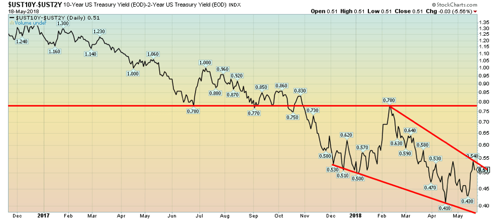
The 2–10-year spread widened this past week to 0.51% from 0.43% the previous week. A widening spread appears to be taking the pressure off thoughts of an impending recession. But a reminder that the trend is down and the Fed is expected to hike the Fed rate at least two more times in 2018 and possibly more in 2019. All that should eventually put downward pressure on the 2–10 spread as 10-year yields hit a possible peak and begin to decline, even as the Fed keeps hiking rates.
© David Chapman
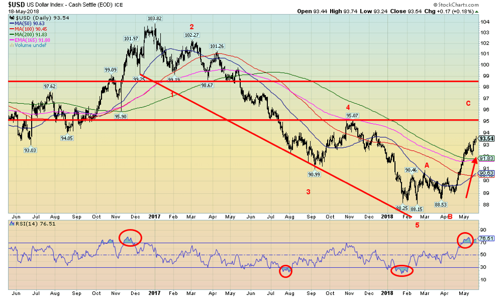
Onward and upward is the byword for the US$ Index. This past week the US$ Index jumped firmly over 93, closing at 93.64. That resistance line up near 95 looks increasingly inviting. Just as gold sentiment has fallen to 10% the US$ Index sentiment has jumped to 90%. So far, there appear to be five distinct waves to the upside from the low in late March 2018 at 88.53. Given the high sentiment, a corrective wave should soon be seen. The Euro, of course, has been doing the opposite and its sentiment is the mirror opposite of the US$ Index. As well, the US$ Index has seen consistent readings over 70 since the beginning of the month. That can go on but it doesn’t last forever. The driver, of course, has been higher interest rates as the 10-year soars over 3% and the 2–10 spread has rebounded back to 50 bp. As well, economic numbers continue to be okay but not spectacular. The Fed is poised to hike the Fed rate further and all that adds to upward pressure on the US$. There appears to be solid support down to 92. Ultimate targets should be at least 95 and we are getting close.
© David Chapman
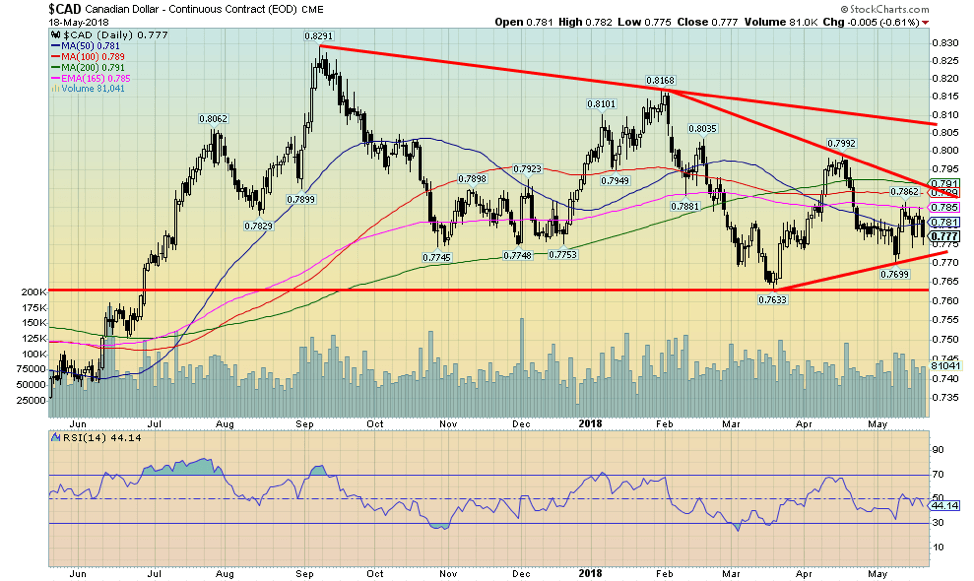
The Canadian$ appears to be caught in a no-man’s land—part-way between resistance at 79 and support just above 77. A break to the upside could see the Cdn$ rise to 85. A break to the downside would send the Cdn$ down to 70/71. The driver could be NAFTA. A successful conclusion would see the former while a failure would see the latter. Yes, NAFTA is that important for Canada. Unfortunately, it is at the whim of a President who is only focused on pleasing his base and not on what actually makes economic sense. Huge tariffs, for example, on Canadian softwood lumber have raised the price of the average U.S. home by at least $1,300. A lower Cdn$ also puts upward pressure on interest rates so it is a bit of a double whammy.
© David Chapman
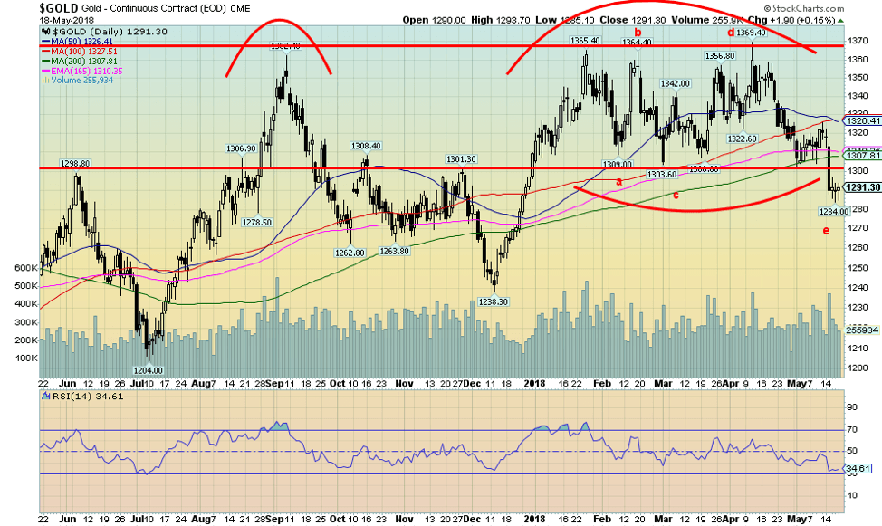
This past week gold fell 2.2% and is now down 1.4% on the year. Gold also fell below what appeared as a sideways pattern, making new lows below $1,300 and all the lows seen earlier this year. In what may turn out to be a significant divergence neither silver or the gold stocks as represented by either the Gold Bugs Index (HUI) and the TSX Gold Index (TGD) made new lows along with gold. Naturally, this divergence is not yet confirmed. A rise back over $1,300 and especially over $1,326 would go a long way to confirming the divergence as long as the stocks and silver stay above their lows. Gold sentiment has fallen to around 10% according to the “Daily Sentiment Index” (www.trade-futures.com). We are intrigued by what may be an ABCDE type corrective pattern formed over the past several weeks. The E wave, which may or may not be complete, appears to have fallen in 5 waves. That is what one would expect from an E wave down. These type of consolidation patterns are not unusual. But for “gold bugs” it has been a huge source of frustration as there appear to be lots of reasons why gold should rise. But a stronger US$ and higher interest rates are overwhelming the more positive reasons. It is possible that gold will fall further before this move is over. Minimum objectives appeared to be down into the $1,270/$1,275 zone. Ultimate objectives could be down to $1,230 although we doubt that should occur. Given the upward pressure on interest rates and a stronger US$ it can’t be ruled out. Watch this week’s FOMC minutes for more clues on interest rates. The $1,270 zone is a solid support zone, but if broken, then $1,230 is clearly possible. Once this move is over we expect a significant rally that should carry us over major resistance at $1,370 (a level that everyone knows about). Targets then could be up to $1,425 to $1,450. That level has been long awaited.
© David Chapman
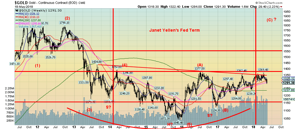
Here is the big picture for gold. According to Elliott Wave International, gold fell in five waves from its September 2011 high with the bottom coming in at $1,045 in December 2015. Since then, there appears to have been an A wave up topping at $1,377 in July 2016 and a B wave down bottoming at $1,124 in December 2016. And since then, gold has been rising in an uneven manner, making a series of higher lows. That should be defined as an uptrend. Except the rallies have been stalling out consistently, just below $1,370 and the July 2016 high of $1,377. It is possible that gold is making a rather large multi-year head and shoulders bottom with the neckline at the aforementioned $1,370 level. If it is correct, then gold has the potential to rise to targets up at $1,760. Now that would warm the hearts of the “gold bugs.” First, however, the US$ rally needs to find a top.
© David Chapman
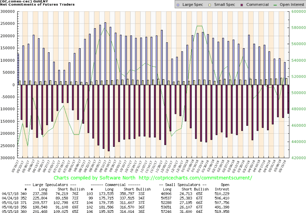
The gold commercial COT improved to 38% this past week from 36% the previous week. This is a positive development. Short open interest fell over 2,000 contracts while long open interest jumped over 14,000 contracts. Total open interest rose almost 28,000 contracts. The large speculators COT (hedge funds, managed futures, etc.) fell to 65% from 69% as the large speculators increased their short position by roughly 18,000 contracts. Their long open interest was also up by about 3,000 contracts. This week’s move in the COT is viewed as positive. It is almost at levels seen back in December 2017 just before a 10%+ move in gold prices.
© David Chapman
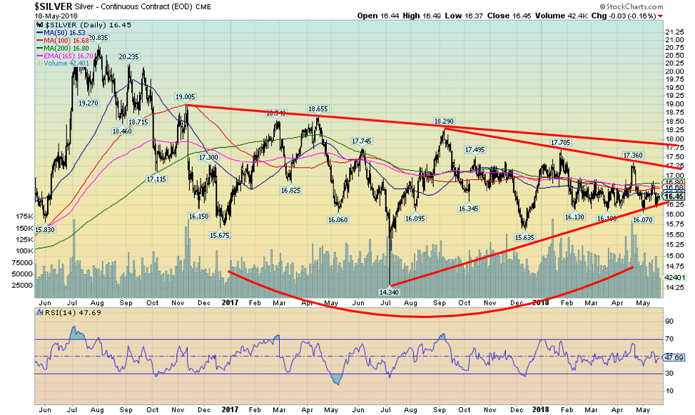
As we noted earlier silver prices held up nicely this past week. Unlike gold, they have not seen new lows below the May 1, 2018 low at $16.07. Silver also continues to hold its uptrend line from the July 2017 low. Silver continues to form what we believe could a huge head and shoulders bottom pattern with the neckline up around $17.90. A firm breakout above $18 could see silver prices rise to potential targets at $22.50. Given this week’s positive divergence with gold (so far, anyway) odds favour an upside breakout, not a downside break. Sentiment indicators have fallen sharply according to the “Daily Sentiment Index” from www.trade-futures.com. Sentiment currently sits at 10%. The last time sentiment was that low was in December 2017. Any reading under at 10% or lower tends to indicate a potential bottom. Emotion runs rampant with silver prices (and with gold too).
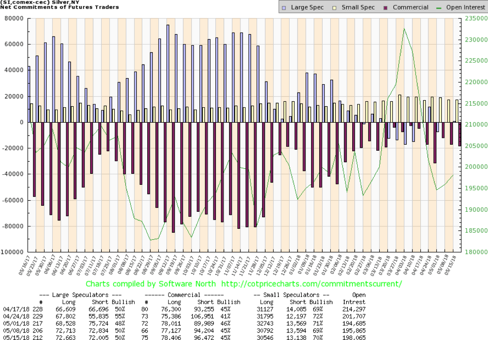
© David Chapman
The silver commercial COT remained steady this past week at 45%. There was little movement overall, although long open interest was up just over 1,000 contracts and short open interest jumped just over 2,000 contracts. Total open interest rose just over 2,000 contracts during a down week. The silver commercial COT remains positive near levels seen last December just before a 13%+ move in silver prices. The large speculators COT was also steady at 50%. The silver COT overall remains bullish towards silver.
© David Chapman
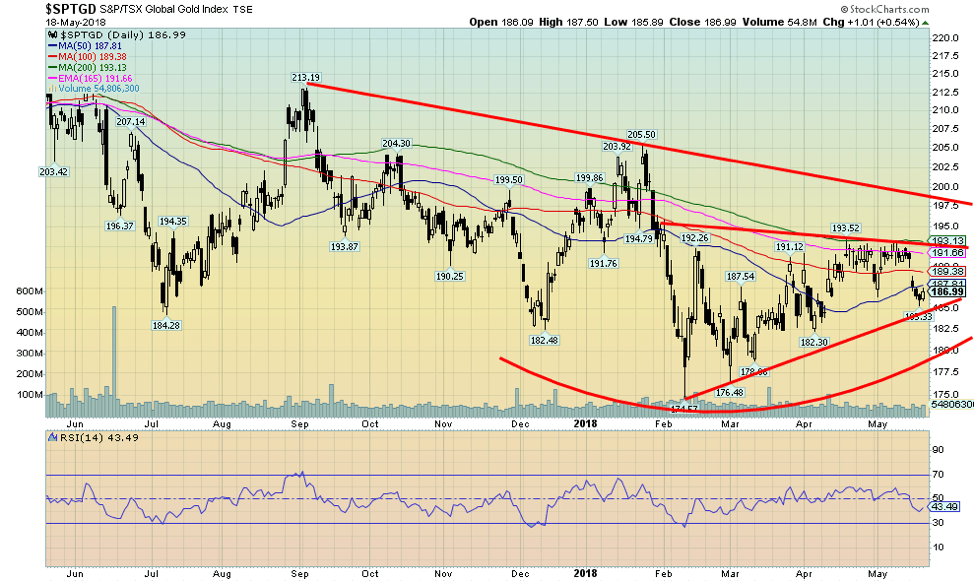
Gold stocks fell this past week along with gold and silver. The TSX Gold Index (TGD) fell 2.3% while the Gold Bugs Index (HUI) was off 2.5%. Both remain down on the year by 4.5% and 7.6% respectively. It has been an unhappy year for the “gold bugs.” Worse, the TGD remains down 58% from its all-time high seen in 2011 and the HUI is even worse down 72%. That’s the bad news as the TGD is up 64% from its 2015 low while the HUI is up almost 80%. Small consolation, but one would not want to see those levels again. As we noted earlier while the gold stocks were down this past week they did not see a new low below the February 2018 low. Only gold holds that honour. That is a positive divergence and as we noted with both gold and silver it potentially buoys positively for the gold stocks going forward. We still like what appears to be a rising or ascending triangle forming. The TGD breaks out above 193 and potentially projects up to 214. That would allow the TGD to clear further resistance seen at 200. The TGD’s downside appears limited. All signs point to accumulation going on. What is needed is the spark to see the TGD break upside resistance.
Chart of the week
© David Chapman
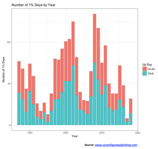
We found this chart of 1% days interesting. The chart is from the people who publish “The Rude Awakening, The Insider Network, The Rundown,” and a host of other newsletters. They were originally a part of Agora Financial, a publishing group out of Baltimore MD. They specialize in advisory newsletters and have a vast array for every type of interest and investor. They have extensive research teams.
What this chart shows is the number of 1% days each year. The red bars are negative moves and the blue bars are positive moves. The bigger the bar, the more volatility was seen in that particular year. Notice the bars surrounding the high-tech/Internet/dot-com bubble and crash. Volatility shot up, much of it on the negative side. The same for the period surrounding the financial crisis of 2008. Interestingly, 2017 was the quietest year in three decades. Now volatility is picking up again and is the highest since 2016, four times already what it was in 2017. High volatility makes it difficult to get a sense of where the market is going. But rising volatility also appears to point to difficult markets ahead. Something to keep in mind.
(Featured Image via DepositPhotos)
__
DISCLAIMER: David Chapman is not a registered advisory service and is not an exempt market dealer (EMD). We do not and cannot give individualized market advice. The information in this article is intended only for informational and educational purposes. It should not be considered a solicitation of an offer or sale of any security. The reader assumes all risk when trading in securities and David Chapman advises consulting a licensed professional financial advisor before considering a position in any security. That includes consulting with your own licensed professional financial advisor.


Temotiva Launches Crowdfunding Campaign to Advance Preventive Mental Health
Temotiva Innovación Lab has launched a crowdfunding campaign through Santander X Explorer, marking a new phase for the University of...


Fed Policy Shift Raises Concerns Over Debt and Inflation Risks
The Federal Reserve is criticized for resuming balance sheet expansion through Treasury purchases despite expectations of tighter policy under new...


AI Adoption in Italian Retail Stalls Despite Strong Experimentation
A survey on AI in Italian large-scale retail trade shows companies are increasingly adopting artificial intelligence, but only 1.4% have...


Crypto Market Stays Stable as Bitcoin and Ethereum See Mild Declines
The crypto market remained stable despite slight declines in major coins like Bitcoin and Ethereum. Bitcoin held near $64,362, while...


WNBA Removes Cannabis From Banned Substances List in New CBA
WNBA removed cannabis from its banned substances list in a new CBA running 2026–2032, aligning with NBA policy and allowing...
 |
|
 |  |
 |
|
-

 Impact Investing1 week ago
Eni Advances Energy Transition with Major Investment and Emissions Cuts
-

 Biotech4 days ago
AseBio 2025 Report Highlights Growth and Future Potential of Spanish Biotechnology
-

 Africa2 weeks ago
Côte d’Ivoire Cocoa Price Crisis: Record Decision Turns into Market Breakdown
-

 Business1 week ago
The TopRanked.io Guide to 2026’s Biggest and Best Affiliate Opportunities
You must be logged in to post a comment Login